
Excellent mix of photos this time around, from a variety of sources — Mike Hersh, Mako Mameli, Paul Wiederecht, and Brendan Slattery. My thanks to all, and keep ’em coming.
• Pretty sweet American Legion uniform here. Note the belt, which seems more like a dress style than an athletic accessory.
• Tulsa Oklahoma — Oil Capital of the World (or at least it was in 1952). That’s former Seattle Pilots pilot Joe Schultz in the Oilers uni. Also, the umps’ caps almost look like velvet, although I suspect that’s a trick of the light.
• Awwww. That’s Hyman Cohen, who I’m guessing was the only Jewish player on the 1954 Des Moines Bruins. I’m a total sucker for that little cubbie.
• A Dodger posing with palm trees in the background and no logo on his cap — I’m guessing that means he was wearing a letter, not a number, on the front of his jersey. Too bad we can’t see it. Maybe an X..? Also, note those monster undersleeve cuffs!
• Super-cool chest emblem for the Amarillo Gold Sox. That’s Phil Linz, who would later become Yogi Berra’s personal harmonica accompanist.
• Have I ever mentioned how much I love texture? That’s Pitt football coach Mike Milligan, circa 1947.
• We’ve seen dugout jackets, dugout sweaters, and dugout sweatshirts, but I think this is the first time I’ve seen a dugout stadium blanket. Looks like the logo was chain-stitched — wow. Also: What a great little water fountain!
• Interesting to see Calvin Hill without sleeve stripes.
• I think we may have seen this shot before, but just in case: Here’s a really good photo of the White Sox unveiling their 1971 uniforms.
• And here are the Kansas City A’s trying on their new 1963 threads. Interesting to see that the jacket sleeve carried a uni number.
• I knew Billy Martin had worn a little cross pin on his cap while skippering the Rangers, Yankees, and A’s, but I’m not sure I realized he’d done it as far back as his early-’70s stint with the Tigers.
• So much to like in this shot of the Milwaukee Braves’ equipment manager.
• Check out the uniforms being worn by these softball teams that were getting some pointers from the Babe. The teams were called the Americanettes and the Roverettes, and the photo was taken on the day after Lou Gehrig’s iron man streak ended.
• This has gotta be one of the greatest sweaters ever, no? That’s Olympic diver Pete Desjardins, circa 1923.
• And here’s a similarly great sweatshirt. That shots’s from 1955.

Where’s that corrupt, bribe-friendly customs official when you need him? An absolutely fascinating uni-related story is unfolding around the Bolivian soccer team. If you’re fluent in Spanish, you can read about it here; otherwise, here’s a synopsis from reader Doug Mulliken:
Bolivia’s new kit kit is manufactured by Walon, a company in neighboring Peru. When the Bolivian Football Federation tried to import the shipment from Peru into Bolivia and then on to Argentina, where the Copa America is now taking place, they declared it all as “sporting goods” with a value of $2000. Bolivian customs, however, said it’s worth $19,000 and confiscated it all. They’re holding it until the team pays the $9000 duty.
As a result, Bolivia has been forced to use its old kits for the tournament. And here’s the best part: Because the shipment included the entire kit production, including warm-up outfits and winter coats, Bolivian expats living in Argentina have started donating their winter clothes to the players so they can stay warm.
If they don’t pay the duty soon, Bolivian customs will auction off everything. Keep in mind, they would be auctioning off all of Bolivia’s kit for the next four years — not only what they would use for the Copa America but also for the 2014 World Cup qualification.
I have been searching for an English-language article about it, but no luck yet.
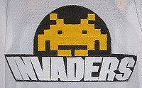
Vote early and often: I mentioned in yesterday’s Ticker that the Dayton Gems are holding a fan vote to choose which beer league team’s jersey they’ll wear for their Beer League Night promotion next season. What I didn’t mention — because, frankly, I didn’t actually click through all the designs — was that one of the entries is the fabulous Invaders design, created by our own Ryan Connelly.
If Ryan’s design wins, the Gems would make and wear a set of Invaders jerseys for a game, plus they’d host the Invaders for a night, plus-plus they’d make a cash donation to a charity of Ryan’s choice.
Please help Ryan out by going to the Gems’ home page and casting your vote down toward the lower-right side of the page (they didn’t exactly make it easy to find). Do it on all your browsers, on all of your computers. Because really, what could be better than a fun night in Dayton? (Don’t answer that.)

Achtung! Summer break update: Just a few days now before I take my annual summer sabbatical from the site, which will run from July 11 through August 7. But we’re going to do a few things differently this year. Here’s the deal:
• I will handle all the content this weekend, so Phil can gear up for the Herculean task that awaits him during my absence. These two weekend posts will not feature any of Phil’s usual sections (tweaks, “Benchies,” etc.) — they’ll be just like my usual weekday entries, only they’ll be running on Saturday and Sunday.
• Phil’s Herculean task will actually be a bit less Herculean this year, because we’re trying a wild science experiment: Phil will do the lead entry each day and webmaster John Ekdahl will compile the Ticker. Phil will fuse the two sections together each morning, Frankenstein-style. Or John may experiment here and there with posting the Ticker later in the day — we’ll see. That’s ultimately up to them.
• Important! → Since John will handling the Ticker, as of Sunday anything sent to the Uni Watch e-mail address will be auto-forwarded to him. If you send me an e-mail at that address asking about, say, my dry rub recipe, John will send it back my way. But if there’s something you really want me to see during my break, you’re better off sending it to plukas64 at gmail (NOT uniwatching at gmail). Of course, there’s no way anyone’s gonna remember that, but I just thought I’d mention it.
• Just to make things extra-confusing, I’ve also reactivated the special address I use each summer for news regarding new college football uniforms. That addres is newcollegeuni at gmail. So if you hear about a college team unveiling new threads, please send that info to that address. Thanks.
That oughta do it. At least for now.
Uni Watch News Ticker: A guy from the Buffalo area is trying to raise awareness for Lou Gehrig’s disease by walking 400 miles to NYC while wearing a Gehrig uni. Unfortunately, the jersey has an NOB (with thanks to Anthony Congi). ”¦ Attention DIYers: Very unusual to see a blank jersey from this era with green trim. Someone snap it up and do something purdy with it! ”¦ Patrick Newman has put together a round-up of this year’s alternate Japanese baseball uniforms. ”¦ Reprinted from yesterday’s comments: Dig this amazing photo of Jim Brown bowling with a medicine ball while surrounded by Hollywood stars (killer find by Robert Marshall). ”¦ Someone on Etsy is selling baseball-themed wedding cake toppers and knows enough to ditch the black (with thanks to John Muir). ”¦ Also on Etsy: little memorial-style numerical patches, available in white and black. ”¦ Jeff Holmes notes that the German Women’s World Cup team’s jersey font is Comic Sans. “Well, okay, it’s not actually Comic Sans,” he acknowledges. “But it’s really, really close. Close enough for graphic designers to cringe.” ”¦ “Brad Richards and Rod Gilbert hit the ice today for a Garden of Dream Foundation event,” writes A.J. Frey. “Rod is obviously wearing a new Reebok jersey, but is still wearing his old Cooper gloves from back in the day. I pin them to sometime around this period.” ”¦ Also from A.J.: Some new uni numbers for the Rangers. Additional info on Brad Richards’s number choice here. ”¦ Genius contribution from Marc Viquez, who reminds MLB (and all the rest of us) that the dangers of awarding stars to certain players was amply demonstrated by the Sneetches. ”¦ A men’s fashion blog has some advice for MLB (with thanks to Kenneth Wilson). ”¦ The Houston Dynamo just brought in a new player named Daniel Cruz. “The thing is, they already have a player named Dany Cruz,” notes Anthony Bales. Wonder how they’re going to manage the NOBs?” ”¦ Dayne Wills reports that the Potomac Nationals (Nats high-A affiliate) recently wore Civil War-themed jerseys, to commemorate the 150th anniversary of the Civil War in the Woodbridge/Manassas region. ”¦ Someone on a UConn message board is claiming that the football team will have NOBs this season. No official confirmation yet, however (with thanks to Gregory Koch). ”¦ Nick Sands recently took a tour of Ford Field and took a few photos in the locker room. ”¦ New soccer kit for Juventus. “That away jersey is awful,” says Kenny Loo. ”¦ I’m still calling it the Fort Duquesne Bridge. Let’s hope the plan outlined in that story never comes to pass (with thanks to Daniel Rerko). ”¦ In the Very Very Bad Idea Dept., Marc Viquez reports that the New York Federals — a travel team in the Can Am league — has a logo that’s sort of a bizarre Mets/Yanks hybrid. Yikes. ”¦ Here’s an even worse idea: The new NHL EA Sports video game suggests that the league’s Reebok logo creep has morphed from the vector to the wordmark. Can’t say I’m thrilled about the lack of vertical arching on that Ranger’s NOB, either. Here’s hoping both of these elements are just video game snafus. ”¦ A green jacket that belonged to Bobby Jones is going up for auction (with thanks to Mike McAllister). ”¦ Some serious sock stripeage being shown by the Richland County All-Star softball team in Illinois (with thanks to Jem Hunt). ”¦ The Reading Phillies are planning to wear hot dog vendor-themed jerseys (with thanks to Joel Willy). ”¦ Here’s an article about a truly beautiful light bulb (thanks, Phil). ”¦ Here’s something we all missed over the weekend (well, all of us except Jeff Downe): Jon Rauch of the Jays was tossed from a game on Saturday and had to be restrained by skipper John Farrell, who ended up ripping Rauch’s jersey right off of him. Scroll down to see video of the incident. ”¦ There’s a trend in Japan involving socially and sexually aggressive chicks who like to eat raw meat. Works for me — book me a flight! ”¦ Baseball Hall of Fame curator Tom Shieber has discovered new evidence that the first shinguards ever worn in a ballgame were worn by umpire Charles Daniels in 1880. He’s written an excellent piece about it for his blog. ”¦ Topper Edwards reports that many South African rugby fans are “extremely unhappy” with the team’s new World Cup jersey, because it has a tiny Springbok on the sleeve rather than a large one on the chest, as had been worn for the past 105 years. “This is considered sacrilegious for any rugby fan,” he says. “It’s like if the Yankees got rid of their famous NY logo.” ”¦ Here’s a weird one: Giants pitching coach Dave Righetti was apparently wearing one of last October’s World Series jerseys last night. “Dirty gamer or trying to snap a three-game slide?” asks Christian Cisneros. ”¦ Barry Bremen, the imposter who wore various uniforms to crash assorted games over the years (his capers are mentioned here and here), has died.
The “velvet” look is because the photo has retouched by an airbrush artist…
link
Was done all the time for newspaper photos. In the unretouched version the hats just disappared into the night sky.
Just looked closely. Artist didn’t use an airbursh. Was done with a paintbrush.
Did some quick work on IMDB & the Jim Brown bowling photo is from The Split.
Here’s some movie posters from The Split
link
That’s disappointing. I was hoping Jim Brown just hung out with those guys in his spare time. (No pun intended)
Love Emo Donald Sutherland sitting in the background.
The 2nd link for the Babe item is incorrect.
Couple of things:
The “additional shot” link for the Babe’s bit actually links to a Page 2 article about a Nike collector.
Based on the stars featured in that Jim Brown shot, that would be coming from the 1968 movie “The Split” (thank you, iMDB), though whether or not that picture was of a scene that was in the film, or just the stars goofing off during a break, I wouldn’t know (seeing as how I’ve never seen the film).
“Here’s a weird one: Giants pitching coach Dave Righetti was apparently wearing on of last October’s World Series jerseys last night. “Dirty gamer or trying to snap a three-game slide?””
***”on of last October’s” should be “one of last October’s”
Thanks. Now fixed.
RIP john mackey
I suppose not many here ever saw John Mackey play, but the guy was a beast, an absolute beast. Fast, tough. Sometimes he seemed almost impossible to bring down.
First really fast tight end. The term “in space” wasn’t around yet, but when he caught the ball “in space” it made you lean forward to see what was coming next.
Mackey kind of resembled Marion Motley from the clips I had seen of Motley.
From TSN’s website story on Mackey, who was only 69…
Long before the results of studies of concussions, brain trauma and CTE became a battleground in the NFL and other levels of football, Mackey began suffering from dementia, and his wife began letting the league know that she needed help. The cost of his care was skyrocketing, his pension didn’t nearly cover it, the league was in its oft-repeated habit of denying additional help because it couldn’t connect his situation to any specific football-related cause. She had to return to work while taking care of him.
Sylvia Mackey reached out to then-commissioner Paul Tagliabue and then-union chief Gene Upshaw to let them know that men like her husband, who helped build the NFL into the empire it is today, were not being taken care of late in life.
She and her husband never launched verbal (or in some cases physical) attacks on Upshaw and the union as many of his retired peers did so often. But she got results, in the form of the “88 Plan,” named for his jersey number, providing funds for nursing-home care, home care and other needs for players suffering as he was.
Read more: link
Wow, the new Juve home kit appears to have the same weird/gradient striping that Inter Milan wore last season.
I love it when cities rename bridges. For 70 years the spans that connected the Bronx, Manhattan and Queens was known as the Triborough Bridge. Then in 2008 they renamed the the 72 year old bridge after Bobby Kennedy. The man served NY for 3.5 years, hardly any real time compared to other long standing NY’ers who contributed far more to the state and city. But when the pols can do anything they want like run for a third term after two public referendums say NO… what the hell.
I have no problem with the city trying to put a little coin back into the pockets of the good citizens of P-burg. But we all know that the money is spent before the city even gets its hands on it… I guess I mainly have a problem renaming a 40 year old structure. Is it the Willis Tower or Sears Tower? Is it the Ft Duquense Bridge or the 5th/3rd Bank Bridge?
In situations like you mentioned, where a building/bridge/etc. drops a well-known name to be christened something else, especially something as stupid as naming it for a politician… how often do people actually try to use the correct name? In my hometown there was a new highway bridge proposed to cross the Tennessee River. It probably spent twenty years in the planning stages, and was generally called the Patton Island Bridge, after the island it crossed over. A few years after it was finished, it was “officially” named something different. The new name (inspired by what Native Americans called the river), while not necessarily bad, just didn’t have the cache the original unofficial name did. Several years have passed now, and I can’t think of one person that I’ve ever heard use the new name in casual conversation.
Is this a regional thing, or would this happen basically anywhere in the country? Is it laziness, or people just rejecting the idea to rename something that is already well-known?
This has occurred in Philly from time to time. Delaware Avenue (which runs adjacent to the Delaware River) was re-named a few years ago as Columbus Boulevard (for a couple of mile stretch), although good old Chris was never a visitor here. All the locals still call it Delaware Ave. There are two river drives on either side of the Schuylkill River. They were originally called the East River Drive and West River Drive, pretty straight forward. Then came a movement to rename the West Drive as Martin Luther King, Jr. Drive, and the East River Drive as Jack Kelly Drive (after the local Olympic rower who died of a heart attack while jogging). No one I know call those drives other than East and West.
It goes away after a while when the vast majority of people have no familiarity of the old name. You don’t hear Friendship Airport (BWI) anymore, for instance.
I don’t think it’s regional. Way back when my hometown was first founded it was split along East/West lines. There are a small handful of streets in the present day which bear different names depending on which side of town you’re on – regardless of the fact it’s the same street.
This applied to the main road in town up until about a decade ago. On the West half of town it was First St. and on the East half it was Norwood St. When the city made the switch to “West Main” and “East Main” it took a LONG time before you heard those names in casual conversation and you still hear people call the road by its former names.
The city also replaced an old bridge when I was in middle school. I’m fairly certain they didn’t “officially” carry over the old bridge’s name to the new one but you’d never know it when you hear people talk.
I still call it the Sears Tower
As do I.
And it will always be the 59th Street Bridge to me.
Queensboro to me, as it is more consistent with the Brooklyn and Manhattan that way
“Slow down, you move too fast,
Got to make the mornin’ last…”
eff that
it’s the ed koch memorial bridge now
wait…he’s not dead
who the hell names bridges for LIVING people? seriously?
Phil, wouldn’t you want to someday give someone directions that included “go over the bridge named after me”?
So now it’s..
“Feelin’ Groovy (The Ed Koch Memorial Bridge Song)”?
I mean, shouldn’t it be?
I suppose once we finish cleaning and correcting “Huckleberry Finn” we’ll move on to song titles and lyrics.
There’s something sorta creepy about naming something “memorial” after a not-yet-deceased person.
Yes, there is.
Or would be, since that’s not what they did – it’s the link, not “Memorial Bridge.”
“that’s not what they did — it’s the Ed Koch Queensboro Bridge, not “Memorial Bridge.””
~~~
dammit, the sarcasm buttons are broke again
yeah, i know it’s not the MEMORIAL bridge…but there is something that borders on, if is not outright creepy, about naming an edifice, particularly not something that person had a hand in building, after a living person…it’s certainly not the only example, of course…just kinda fucked up
I was going to mention Koch and sorry I didn’t. But he needs something named after him. Hell Robert Moses has a beach on the Island and a parkway along the Niagara River named after him. So time for the city to wisen up.
This is nothing… Minneapolis-St. Paul International Airport was initially named Speedway Field (it was on the site of an old racetrack.
Then it got changed to Wold-Chamberlain Field in honor of two WWI fighter pilots, then Minneapolis-St. Paul International Airport…then terminals were named after former MN Senator Hubert Humphrey and Minnesotan Charles Lindbergh.
But where this all comes back to the topic of naming rights is when the Metropolitan Airports Commission apparently sold the naming rights to the folks at Sesame Street and the Lindbergh Terminal is now “Terminal 1” and the Humphrey Terminal is now “Terminal 2”
Wouldn’t be so bad if every time you boarded a flight you weren’t met with a certain voice saying, “Elmo loves you, please fly safely!”
Sidebar…
“Speed” Holman was a famed local aviator and, I believe, auto racer.
St. Paul’s Holman Field still bears his name.
Have no idea if there’s a connection between Speed Holman and Speedway Field, but I suspect there may be.
the Lindbergh Terminal is now “Terminal 1″ and the Humphrey Terminal is now “Terminal 2″
Honestly, that’s because people were having trouble remembering which was which. Especially those passing through and transplants unfamiliar with state history.
Hell, I’ve lived here all my life and I’d have to remind myself once in a while that “Humphrey” was the newer one, and to take a different exit off the freeway to the airport.
There is a road right by my work that has changed names twice in the past 10 years. It was called hwy 100 for years and then the Canadian Government downloaded all the road to local government so they changed the name to Airport Rd. Which made sense since it was the road you take from the main highway to the Airport. A few years ago it was renamed to Veteran’s Memorial Parkway. That is fine and it is a good tribute to the fine people who severed in the Canadian Military but people still refer to that road as hwy 100. That was two names ago.
Sorry, Ricko…couldn’t help making up the Sesame Street part… At the time, I thought the name change was kinda dumb, but it’s grown to a sort of weary acceptance.
The Twin Cities Speedway and Speedway Field predate Speed Holman’s major flying accomplishments (1910’s and early 1920’s compared to Holman’s 20’s-30’s…although it’s not hard to imagine Holman perhaps making his name based upon activities there.)
That’s what I was thinking, that if anything his “Speed” nickname sprang from the racetrack rather than the other way around.
At the Denver airport (DIA), the official name of the main terminal is “Jeppesen Terminal” (named for the Jeppesen company (which was founded by E.B. Jeppesen) that creates maps/charts for aviation, and is located in Denver).
I’m pretty sure that Jeppesen paid a healthy amount to have their name added (and there is a large “Jeppesen Terminal” sign as you approach the main terminal). However, in the entire existence of the airport, I’ve never heard it once referred to as the Jeppesen Terminal.
“Pretty sure”? Or did it really happen?
I always thought it was named after the man, not the company. They’ve got a statue of him watching over the security queue and everything.
Not a bad deal for the company, though, except that nobody ever uses the terminal’s name.
I’m too lazy to research how much (if any) was paid to DIA.
Jeppesen started the Jeppesen company, so I would assume (yeah, I know) that from that standpoint it’s representative of both (because obviously you can’t have the company without him).
Watched the Indians and Yankees last night. Has anyone noticed that the Indians have lost their uniform identity? They seem to have a mishmash of the old style and the new style and are trying to transition away from the old style (Chief Wahoo style). I’m not sure you can keep up with the mishmash of caps, helmets, and uniforms they have, which means they, like a lot of teams mixing throwbacks and alternates into the mix, are losing their identity.
They really have two completely distinct identities. The cream home alt & road grays are one look, while the script & Wahoos are another. I really believe that we will see Wahoo hats disappear in the near future because of the heavy promotion of the “C” logo and the fact that tons of the “C” hats are selling.
I think you’re right. Perhaps relegate Chief to the sleeve after all these years. The catcher was wearing the “C” road helmet at home last night, by the way. Always notice such things. Maybe the two identities will slowly go away as they move more toward the “C” look, but right now there is a uniform set for each identity.
Maybe it was just my TV, but did the Indians’ hats last night look more royal than navy?
Been noticing that for a while.
The Indians’ Chief Wahoo hats definitely are a lighter shade of navy than the Twins’ navy, for sure. Really obvious when they’re playing one another and can make the evaluation under identical lighting circumstances.
Checked it on games telecast both from the Dome and Target Field.
I too was thinking the same thing. Not crazy about the look.
July 11 through August 7, huh? Four weeks. What, you work for the Greek government or something? Do you think we ENJOY coming here every day and sweating blood to come up with something — anything — to keep up your Nielsens? I know I promised you I’d zip it regarding that big “advance” that my friends Vito and Dominic got for you, but nothing should bother you while you’re sipping Veuve Cliquot on the deck of your fancy yacht in the Aegean, or Sheepshead Bay, or whatever.
Loved that shot of the Babe instructing the women softballers. (Look at their faces!) Loved Pete Desjardin’s everything, loved that vintage baseball jersey with the green trim (Moose! Grab it!), loved Phil Linz looking like Buddy Holly.
Don’t worry, Mr Wonderful, we will be just fine, thank you very much. Hi, Phil!
True story: Conn declined my July 4th party invitation because he was in Bermuda.
I was working with unemployed Bermudian coal miners.
“Because really, what could be better than a fun night in Dayton?”
Having grown up in Dayton I can think of…well…not much worth doing. Good luck Ryan!
On a Uni-related note though, I recently came across this image while doing some research on some earlier generations in my family who played for the Dayton Triangles – one of the original NFL franchises. Great stripes, great texture, great jersey:
link
Don’t take this the wrong way, as I’m not singling you out, but I always find it funny when people claim that they’re hometown basically, well… sucked. And I’ve been there too, although having been gone a while I find myself sort of missing it. Still, I think just once I would like to hear somebody say something like, “My hometown was great. There was never a boring night!”. The arguments over whose town sucked the most especially crack me up.
I’ll say it: My hometown — Blue Point, Long Island — was (and still is) great. I don’t want to live there again, but it was a great place to grow up.
Paul, you would have to be the one to break the mold, huh? As I said, I especially like my hometown now, though I wonder how much of that is just the goggles of time past. Growing up I had plenty of fun, but I know there were a lot of people that complained that there wasn’t much to do. Then again, teenagers are never happy anyway.
I’ll say it as well.
I grew up shuttling between Milwaukee, NY and LA, but still consider Milwaukee my true hometown. And it was a fantastic place to grow up. Long summer days in the parks, baseball games at County Stadium, and sneaking into concerts at Summerfest.
Besides, what’s not to love about a state where “sausage” is its own diverse food group?
“…Then again, teenagers are never happy anyway…”
***
This is true. My teenhood coincided with the 1960s, and I regarded the genteel precincts of Larchmont, NY as a golden cage. Not for me the upwardly-mobile pastimes of swimming and sailing. Bourgeois irrelevance. Each summer morning — starting June 1960 and ending September 1964 — I would hitch-hike to the Winged Foot Golf Club and caddy. I was a member of a minority of local white teenagers (“rabbits”) who were allowed to supplement the basic core of black men from the South and white men from the Bronx. My father was distressed about this — he was worried (correctly) that I would learn bad things — but didn’t forbid it. Carrying two bags per round was also great money back then (10 to 12 bucks). Even though my desertion of the Larchmont lifestyle was born of teenage ennui, even snobbery, it was probably the best thing I’ve ever done. Anyway. Ten years ago, I take my 20-year-old daughter to Larchmont, show her around. “Dad. This is paradise.”
My wife says the same this about Islip!
No offense taken at all. To be honest I had a great childhood and great experience being raised in Dayton – something I wouldn’t change for the world. The majority of my family still live there, and they are incredibly happy. It’s just slightly painful seeing all of the changes (unfortunately not many for the better in my opinion) in the city now that I am on the outside and only visiting from time to time.
I grew up in a Dayton suburb. There really isn’t much going on. However it was a great place to grow up. In a related note, the Dragons (Reds’ A farm team) are about to set the record for consecutive sell-outs for a North American professional sports team at 815. That’s every seat at every game sold since the team was formed and the stadium built in 2000. Not too shabby Dayton!
An A-ball team has sold every seat for every game for 11+ years?
I guess that reinforces your point that there really isn’t much going on.
I loved the shin guard article. The picture accompanying it shows the umpire with one shin guard and the writer wondered why that would be. Perhaps back in those days umpires knelt on one knee behind the catcher? Or perhaps he stood off slightly to one side of the catcher exposing that one leg to the pitcher? Good stuff.
I’ve never really thought much of my hometown. It was a boring old suburb, but we had a ton of fun anyway. I’m not sure what else I’d want from a hometown.
We just needed streets, a place to play ball, fields and hills, and a dime store for buying cigar– I mean candy.
Wait… Bolivia was wearing their new kits against argentina in the opening match.
link
so, i did a little more research on this. that picture of bolivia v. peru is NOT from the current copa america, but i did find it on the ca2011.com website.
from what i can find about it, the shipment that has been confiscated apparently includes primarily warm-up gear, winter coats, shorts, and sweatshirts. from the AFP article i found, looks like it is primarily training/warm-up gear that has been confiscated, NOT match kit.
here’s the link for the AFP article (also in spanish): link
In related news, St. Peter sets up special checkpoints to make sure it really *is* Barry Bremen at the Pearly Gates
i am not a religious scholar, but st peter might not have any sway over barry’s entry into heaven. st peter is new testament and a christian, not old testament ten commandment mout sinai march his people across the desert, and barry is jewish. i’m just sayin’ mr. bremen might get past pete’s checkpoints.
Love the Pitt script in link photo. I never knew until recently that the whole script thing was based originally on the link of link, for whom the city is named.
This is terrific, Mr B. The photo is excellent in itself, but Pitt’s signature is beyond.
I never knew that either. Now I do. Very interesting.
re: the Dynamos something that I can never understand is the need to add another “level” of distinction to a NOB. This is just a pet peeve of mine.
Case in point – the Canucklehead’s Sedin twins.
link
Adding the H and D to the NOB makes no sense to me, as shouldn’t you as a fan just know that “22” is Daniel? I mean isn’t the numbers they were the true separator of which is Henrik and which is Daniel? It just never makes sense to me why the H/D needs to be on the NOB.
Isn’t the number the primary identifier of who the player is anyway? I mean if you don’t know which Sedin, Sutter, or Smith is which, there’s an app for that!
Somewhere from the hoary underworld, Harold Ballard is screaming…
If you should know who the player is anyway, then what’s the point of the NOB to begin with??
I think it’s just there so that the coaching staff can tell who is who….
As a Bruins fan watching the Canucks in the Stanley Cup, I needed the D and H to tell the twins apart. Yes I can see the numbers but I can never remember which number belongs to who. With the D and H, I can know who is on the ice in a second rather than taking a few seconds to think about who it is.
For the Dynamos players- just go with the same last name and let the fans try to figure out which is which. If you got the same first name, forget it. Just regular NOBs and let the people try to figure it out. It’d be fun actually.
I’m not sure if it was name related or not, but Herculez Gomez just wore “Herculez” as his NOB with the Colorado Rapids a few years back.
Maybe the Dynamo could just have like..”Dany” and “D. Cruz”?
That’s not Juventus away kit, it’s the third jersey, which most wear less than 5 times a year. As an AC Milan fan, I can’t wait to see how silly they look on the pitch.
Certainly no worse than Palermo does most of the season in Serie A.
Plus, the pink is a traditional color for the Old Lady.
What I love about that 1971 ChiSox set…besides how they look… is the complete incongruity between the home and road uni. They look like they’re from two separate seasons.
-Jet
That was a uniform that cried out for muttonchop sideburns.
Those link should have been dyed white. Looks just like a sock, eh?
Good catch :D
Is #25 Tommy John? I found a listing that he was #25 for his entire White Sox career which went from Jan 1965 to Dec 1971. However it doesn’t really look like him to me. Maybe they had someone else model his uni?
That’s definitely not TJ.
Only guy I recognize is the GM, Roland Hemond. Looks like they grabbed a couple guys from a bar band on Rush Street.
The GM in that White Sox photo looks like Dave Thomas from SCTV made up to look like Bob Hope.
link
I notice in the photo of the K.C. A’s uniform unveiling that the jersey has ATHLETICS in block letters on the front. I thought the green and gold vests only featured the “A” on the left chest.
Not at first. They began the season with “ATHLETICS” in the same fancy font as the previous. season Somewhere mid-stream in ’63 it was changed to the “A”.
link
I love this site.
:)
thanks
Re the Reebok logo in the video game: I hope this IS the way they put the logo on the jerseys next year. Especially in that screen shot, it could be a simple white bar on the back as much as anything else. The vector logo is unmistakable. I’d rather have none of the above, but given a choice of the two, I’ll take the one that could be mistaken for nothing.
That said, IF they go this route, will they have to redesign the jerseys with existing Reeboxeseses? The Blues would look sillier if they had that long, skinny logo inside a tall box:
link
link what the Wilmington Blue Rocks wore against the P-Nats for Saturday night’s Civil War Sesquicentennial game. Supposedly commemorating a game between a civilian team and some Union soldiers prior to First Manassas in 1861. That’s a “71st” on the Blue Rocks bib. Unis were screen printed with sewn tackle-twill letters.
Also, mad props to the Blue Rocks: Not only did every player show socks, they all wore actual stirrups.
Also, several P-Nats players had their jerseys link to some kind of UnderArmour undergarment. Hard to see in the photo – not ideal lighting for a phone camera – but that’s not a belt. It’s riding up from under the pants, like the the waistband of a pair of briefs. Two or three P-Nats players were flashing the UnderArmour underoos in the on-deck circle.
Looks like a belt to me as you can see where the belt loops are and the UA is between them.
In person, six feet away from the on-deck area, it seemed quite clear that it was not the belt, but rather something riding up from under their pants when they bent over, and that they may not have been wearing belts at all. Might it have been an illusion, and that was just a belt, and their pants were folding strangely when they stood up straight? Possibly, but I’d like to see a photo of a UA belt with the logo dead center in the back like that, and so far I haven’t been able to find one.
It looks like he is wearing a belt (that is not doing it’s job), and the UA sliding shorts undergarment is showing as his pants are sagging.
Looking through some of the new ebbets fiels flannels stuff, the team playing the cannons should have been dressed like the old montgomery rebels.
thanks for finding that pic R.S…i couldnt find one…where did you sit during the game?
i never thought i would read about the passing of barry bremen here. he coached my little brother’s baseball teams with my dad for two years, and i baby sat for his kids one of whom had CP since i was one of the only kids big enough to lift him up the flight of stairs to his bed. which of course would lead to me baby sitting more and more kids with disabilities, which would lead to my mom reinforcing this behavior with me, which in all likelihood effected my decision to teach special needs kids for 6 years down the road. small world, thanks barry. but mr. bremen was a fun guy, a nice guy, who had all of his uniforms and costumes on display in his house, morgana was my favourite. rest in peace mr. bremen.
moose,
Thanks for the unique insight. The fact that you knew Mr. Bremen on a personal level (at some point), and read about his passing here….small world indeed.
i called pops, and my little bro, all kinds of stories, it was an odd day.
The Milwaukee Braves “equipment manager” is longtime Braves trainer Dave Pursley, who retired from the Braves following the 2002 season. He began working for the franchise as the clubhouse attendant for the Class B Evansville Braves. He became the assistant trainer for the Milwaukee Braves in 1961. He became head trainer in 1969.
Now we know why the Brewers wore their throwbacks Wednesday evening on a non-“Retro Friday” day: slump-buster. And, thankfully, they won:
******************
Gallardo also hatched the idea of having the Brewers wear their retro uniforms as a means of changing their luck.
******************
link
Those Potomac unis are stupid and horrible. I am an ACW living historian and I can tell you those so called “Civil War” uniforms are shite. Furthermore, how disrespectful is it to try to make a cheap buck on the back of the deaths of approximately 2 MILLION American men and women. Big time thumbs down!
They were shite link, absolutely. But the night was a fundraiser for the link. The game was opened by the US Army 3rd Infantry color guard in Civil War uniforms, bearing a Civil War-era US flag and a Union battle flag, for the national anthem. The Manassas 150 committee had a big promotional table, and local reenactor groups were on hand for demos and recruiting. The P-Nats didn’t stand to make any more bucks, cheap or otherwise, on the night than they would have on any other Saturday night game.
Plus, it’s not true that 2 million Americans died in the Civil War. The real number is somewhere below 700,000. That represents 2 percent of the antebellum population, not 2 million.
Minor League Baseball is the apex when it comes to mixing sports with a full on family entertainment venue. Once in a great while, a MiLB club will “get it right” with a uniform promo. But, it’s usually a disaster (see Jeter’s flag uni last wkend).
One thing you can count on, is that MiLB will continually outdo themselves on the eye sore chart. The other thing you can count on is that people expect that from MiLB.
Personally, I like it, bad unis and all. It’s what make MiLB one of the most unique fan experiences on the planet.
The wire photo of the Dodger without the logo on his cap is none other than the immortal Original Met Choo Choo Coleman who was in the Dodger organization 1959-60.
Yo, Clarence!
Great Choo Choo story (apocraphyl?):
When Coleman was with the Mets, Ralph Kiner had him on Kiner’s Korner after a game once. Ralph had some time to fill, so he asked him a question he figured would eat up some time:
KINER: We are here with Mets catcher Choo Choo Coleman. That’s some nickname: Choo Choo, why don’t you let the fans know how you got such a great nickname.
COLEMAN: Ralph.. I don’t know
Choo Choo Coleman was NOT a big talker…
Another one which may have been from the same interview:
KINER: What’s you wife like?
COLEMAN: She likes me…
-Jet
that should read “what’s YOUR wife like?”
“Here’s an article about a truly beautiful light bulb (thanks, Phil).”
Yes. Spread the word about LEDs. I’m slowly stocking up on them and getting rid of the few CFLs we have. Never liked them anyway.
Good job, Jim. They cost more than CFLs but last about 5x as long. Honestly, changing light bulbs once every ten years is a guilty pleasure of mine!
Besides, there’s only one link right Teebz? ;)
I wonder if the CFL plan to use some of the money from all those light bulbs to sign players away from the NFL.
(Mike was gonna ask that in “Benchies”, but now I’ve used up the line. Ohdarn.)
Purdue just announced their new court design: link
I saw that on Facebook last night. I’ll admit that I liked the Special at center court more, but I’m just fine with this version.
This Cooper hockey gloves on Rod Gilbert are not 70’s era gloves. (a) Cooper used that pattern extensively as a company identifier:
link
link
link
And the cuffs are far shorter, and cuff roll much thicker than was offered in the 70’s – more like the old Ducks colour scheme than the ’70’s Nordiques gloves offered above.
The streaking C logo on thr cuff was also not part of the 70’s Cooper identity. That puts them as late 80’s/early 90’s gloves.
SB
I was really wondering why he wasn’t wearing his own jersey. I mean really, Rod Gilbert wearing a Dubinsky jersey? Good player and all, but when you have your number hanging on a banner behind you…
A Dubinsky jersey? I really don’t think so. Every kid is wearing #11, and just over Gilbert’s right shoulder is a kid wearing an ecru and sand-colored hoodie under his jersey. (Along with a blue helmet, of course.)
Looks like #19 in between Gilbert and Richards is Ruslan Fedotenko, now #26. Which means that that is probably Fedotenko’s last blue #19 jersey. But what’s that on HIS left shoulder?
This has nothing to do with anything posted today, but I was watching the Mets/Dodgers barn-burner last night (along with 3,000 of my closest friends), and was wondering about lineups and uniform numbers. Here’s the Dodgers (awe-inspiring) starting nine from last night’s game, with their uni numbers in parentheses:
1B Loney (7)
2B Carroll (14)
3B Uribe (5)
SS Furcal (15)
LF Velez (3)
CF Kemp (27)
RF Ethier (16)
C Ellis (17)
P Kuroda (18)
TOTAL: 122
Four other players appeared in the game for LA last night–P Elbert (57), PH Thames (33), P MacDougal (66), and P Guerra (54)–but thankfully didn’t start. Obviously, it would’ve helped if Aaron Miles (6) or Dee Gordon (9) had started instead of Furcal and Carroll, but 122 still seems pretty low to me.
Is there any way we can track this? Maybe the lowest uni-numbered starting nine this year? Or am I just reaching for a way to get the Dodgers some kind of record besides crummiest owner?
I can’t believe I did this, but I checked all of Matt Garza’s starts for the Cubs this year and the lowest-numbered lineup was this one (I can’t remember which game it was and I’m not going back to check), which totaled 132.
1 – Fukudome, RF
15 – Barney, 2B
13 – Castro, SS
22 – Pena, 1B
16 – Ramirez, 3B
9 – DeWitt, LF
18 – Soto, C
21 – Colvin, CF
17 – Garza, P
Maybe they’ll start this same lineup at some point with Reed Johnson (#5) in center instead of Tyler Colvin.
Yay. Now I have a reason to watch the Cubs.
How about 140 for a starting “10”
Toronto April 2 vs Minnesota:
Yunel Escobar, SS (5)
Aaron Hill, 2B (2)
Jose Bautista, RF (19)
Adam Lind, 1B (26)
Edwin Encarnacion, DH (10)
Jayson Nix, 3B (28)
Juan Rivera, LF (20)
Jose Molina, C (8)
Mike McCoy, CF (18)
Kyle Drabek, P (4)
I’m still obsessing over this. Here’s the lowest I found yet.
Atlanta Braves, 4/3/11 vs. Nationals. Starting lineup:
LF Prado (14)
CF McLouth (13)
3B Jones (10)
C McCann (16)
2B Uggla (6)
RF Heyward (22)
SS Gonzalez (2)
1B Freeman (5)
P Hudson (15)
TOTAL 103!
You guessed it. I need a life.
“I’m still calling it the Fort Duquesne Bridge.”
Same here. Although if Allegheny County goes through with their idea, they ought to let Duquesne Brewing have the first crack at that bridge.
“A men’s fashion blog has some advice for MLB”
The suggestion I’m most on board with is:
“2. Make the stadiums look more nostalgic and less like amusement parks.
For all the bright plastic, bounce houses, and ever present souvenir stands, kids just aren’t taking to baseball like they used to. One of the few things baseball has is its ties to a time when things were classic and rarely trend driven or disposable. Ball parks should look like brick and mortar shrines. Not like a Chuck-E-Cheese.”
Although I’m not keen on going so far as to make them shrines. There’s a happy medium that should include souvenir stands and simple ballpark food stands. Anything else is a major distraction, and if you’re paying a boatload to go to a ballpark, you should be focused on the game. I know that flies in the face of modern marketing, but if I owned a team my motto would be “If you’re not here to watch the game, go home.”
“Ball parks should look like brick and mortar shrines. Not like a Chuck-E-Cheese.”
~~~
that’s the most sensible thing you’ve said in a long time…oh wait, you didn’t ;)
seriously though…the author of this is spot on…you’re there FOR THE GAME (at least, that’s why i always went to the park; maybe they dynamics have changed since i was but a wee lad)…i know it’s not that way for others, but if you don’t give them the distractions, then perhaps they will learn to love and appreciate the game…if you give them excuses not to watch it, then you have succeeded
they’re building mallparks now, and obviously, that’s a successful business model…i won’t begrudge the economics of the situation…it was just a far, far better time when you watched a game, learned it and loved it…rather than the situation you have now, where you need to be “entertained” by something other than the entertainment for which you supposedly paid
These comments, and the story of a “Field of Dreams 2” spoof that was on SportsCenter yesterday, makes me think of a certain cornfield in Iowa.
I guess today, if Ray heard a voice saying “if you build it, he will come”… he would first go to several local corporate entities to see if they wanted to sponsor the build.
Presenting the “Coca-Cola Field of Dreams at Verizon Cornfield, brought to you by First Iowa Bank”. With Shoeless Joe wearing pajama pants and proudly displaying his four All-Star stars on his inaccurate Majestic uniform and flat-billed New Era hat.
Oh, like that many former NFLers could make it there without getting arrested for DUI.
And, come on, if we’re gonna do a believable football version, have the farmer turn his barn into a strip club.
“Mallparks”.
Love it!
Hot dog vendor themed uni’s – the next step is obviously Hot Dog themed uni’s (i.e forget the vendor shit) – Is there no depth too low for minor league team to debase their product?
Well they gotta get fans in the seats somehow. It’s not like they can rely on star players. Anyone who’s really any good isn’t going to be there very long.
/granted, hot dog vendor themed unis are kinda dumb
Forward them all the mail that says,
“You May Already be a Weiner.”
(oh, no, a Thursday groaner)
:)
The hockey gloves that Rod Gilbert were wearing in the photo shoot with Brad Richards were definitely not from the 70s, but at a minimum mid 80s-early 90s.
You can see the Armour Foam mark between the thumb and the fingers – and Cooper didn’t come out with that in that design until the mid-80s IIRC. Those gloves also look a bit slimmer than ones made in the 70s
Paul, I’m surprised you reported on the South Africa rugby jersey without any context. The relocation of the Springbok logo to the sleeve is not like moving the Yankee logo, it is more like moving Chief Wahoo off the Indians caps. While iconic, the Springbok logo is seen by some black South Africans as a relic of apartheid. What to do with the logo has long been a point of contention in the country.
link
i live in south africa and i play rugby for a “black” (in south african english this means any race other than white) club. your statement is WAY oversimplified. MOST black south africans have embraced the springboks (by that i mean both the team and the logo) as a symbol of change. there are only very few (most of them in positions of power within the ruling ANC government) who want to change it.
there are a fair number of all black supporters, especially in the western and eastern cape, but i can say with confidence that those people who support new zealand would not switch their allegiance to south africa even if the springbok emblem was removed entirely.
the “context” of moving the bok emblem, as you say, is being provided by conservative whites who are worried that the logo will be removed entirely. yet, it is interesting to note that canterbury has deliberately released TWO jerseys – the world cup shirt, with no ABSA sponsor and the bok emblem on the sleeve, and the non-world cup shirt with ABSA sponsor and bok logo on right chest. both canterbury and SARU have gone to great lengths to explain that this shirt will be used for all non-world cup test matches in the future, including the forthcoming tri-nations.
John, I didn’t report on that context because I didn’t know.
dgm, many thanks for the all the interesting info.
Paul, this is really pretty interesting stuff that I’ll admit I knew very, very little about. How about an ESPN column on it? Or is it too “heavy”?
The ABSA branded jersey is the one the Springboks where in all matches EXCEPT the world cup. Like the FIFA World Cup, the Rugby World Cup is a “clean” event meaning that no sponsorship other than those authorised by the event organizers. No one will be wearing sponsored jerseys there. Additionally, since 1995, all teams have been required to display the RWC logo on the right breast of the opposite their national badge or logo. This forces teams that normally display two logos, like South Africa and Australia, to choose one to move to the sleeve.
The real source of the controversy is the requirement of all South African national teams to display the protea national sports logo either in additional to, or instead of their team logo. Since 2009, the Springboks have worn both. However it is one thing for the springbok to share space with the new logo, but entirely something else for it to be relegated to the sleeve. The SARU requested an exception form the World Cup logo rules, but were denied.
John – you make a good point about context, however when I lived in Cape Town from 2004-2007, I saw many Springbok supporters of all colors proudly wearing the jersey as a symbol of pride and unity (remember the iconic moment when Nelson Mandela showed his incredible ability to bring the post-apartheid nation together when he sported the Springbok jersey and cap during the 1995 Rugby World Cup in SA).
dgm – you’re spot on about the very few in the ruling ANC party, and that most non-white South Africans have embraced both the team and logo, especially I think since the Springboks have for the last 15 years had a number of young “black” and “coloured” (so-called mixed race) stars.
From a purely rugby perspective, the team has been called the Springboks for the last century. Changing the chest logo to a protea (which by the way is the nickname of the cricket team) and relegating the Springbok just doesn’t seem sporting.
link
I just did a very quick colorization of the Pitt 1947 picture.
Hey, very nice!
thanks, as I said a very quick try
Yes, nice job, Larry!
Re; selling naming rights to things to raise revenue.
Lukas, do you even give a fuck about this country that you live in?
Seriously.
Given that you live in NYC, I’m assuming that you occasionally glance at the NYTimes and if so you may have seen a recent story about Wilmington NC having to shut down it’s fire trucks because they have no money.
You obviously think this is a great thing, and god forbid if they got money to repair said trucks by selling the naming rights to something. O NOOOOOOEEEEEEEESSSSSSSSSSSSSSSSSS!!!!!! The sky is falling!!!!!!! The sky is falling!!!!!!!!!!!!!!!
Give me a fucking break.
You are Nazi scum with this ‘absolutely no naming rights to anything EVVVVVVVVVVVVVAAAAAAAARRRRRRRRRRRRRRRR!!!!! bullshit.
You just want the USA to collapse into fucking anarchy.
You sicken me.
The Nazis had a strict policy against selling naming rights, did they?
Godwin’s Law!
You know what I’m really gonna miss on my summer break?
Guess.
irony?
Heh heh.
Aw, there’s a big Nazi rally that’s happening while you’ll be gone? That sucks that you’ll have to miss it.
Well, cheer up. There will be others.
By the way, are the other fellas cool with you being Jewish?
that’s the best part spankinator, that’s the best part. or is it the part where lukas, accused mostly of being a commie here is accused of being a rightwing national socialist. i mean paul’s politics are clearly too far to the right for my tastes, with his 7ist plots and what-not, but a nazi? paul the nazi, that is funny stuff, funny funny stuff. or is the best part where he accuses a national socialist of wanting anarchy? that’s like jesus and satan meeting for a cocktail at sports bar to discuss quilting for corn’s sake. no, the best part might be when he is doing the ironic speech for paul and says “0-NOES” ha! can you see paul dropping an o-noes or a rotfl? fucking great man, that was one of the best comments ever. this site rocks.
Well, Flapjack-san makes a good point. Clearly, Paul wants the entire city of Wilmington to burn to the ground. It’s right there in the ticker. He has opened my eyes to the truth I was unable to see before.
Dig:
I’m still calling it the Fort Duquesne Bridge. Let’s hope the plan outlined in that story never comes to pass
(with thanks to Daniel Rerko).
James, that’s flat-out awesome. Well done.
link is a good metaphor for when things go wrong here.
I love it when people call people out by using just their last name…that must mean he’s serious (which, we already knew by the stone cold name he chose).
It takes me back to my middle school gym teacher.
What a moron.
Why DO you hate America Paul?
MIIIIIIIIIIIIIISSSSSSSSSSSSSSSTTTTTTTTTTTTTTTTEEEEEEEEEEEEEEEEERRRRRRRRRRRRRRRRRRRRRRRRR PAAAAAAAAAAAAAAAAAAAANNNNNNNNNNNNNNNNNNNNNNNCCCAAAAAAAAAAAAAAAAAAAAAAAAKKKKKEEEE!!!!!!!!!!!!
Mr. Pancake, get lost. am I making myself clear, you troll?
The men’s fashion site failed to mention that the players are stepping on their baggy pants? There’s no hope. Nobody has any taste anymore, even the “experts”.
According to Hang Up and Listen, the font on the German women’s team is a free downloadable font called Action Man.
Ah, but can we ID the players?
link
I’ll offer Dick Howser and Jerry Lumpe (although not sure if Howser was still in KC in ’63).
You’re dead-on regarding Lumpe. Not sure about the other guy, though.
Bobby Shantz.
Actually, I’m not at all sure it’s Bobby Shantz, but I’ve noticed that Bobby Shantz has been the correct answer to a lot of who’s-that-guy-on-the-left questions, and he did play for the A’s. So: I’m pretty sure that Bobby Shantz, no?
Finally got a chance to go to baseball-reference.com
Dick Howser wore #1 and was the incumbent SS, but was traded to Cleveland in May of ’63.
I figured the photo was of the team’s DP combination. Lumpe played 2B.
Not a bad guess, size-wise, but Shantz last played for K.C. in ’56. He was a Cardinal in ’63.
Thought we might get to see the new Lightning jerseys on ice at the rookie development camp, but that was not the case.
Some players got some new logo swag:
link
link
But the on-ice uniform has not changed yet:
link
I do like the coach with the new logo jacket and old logo hat:
link
And I love the look of Vladlslav Namestnikov NOB stretching over the practice jersey’s pit stains:
link
Joe Mauer starting at 1B tonight vs. White Sox in Chicago.
Playing defense in a softcap might be a strange experience for him. Not necessarily new, but strange.
New, indeed. Has done nothing but catch and DH in the majors.
Unassisted DP for Mauer in bottom of 1st.
Hey, this first base thing? Piece of cake.
Is he wearing the white paneled front soft cap?
No, just the regular red-billed road fan cap.
He had (I think they said) 15 chances—not all of them easy, by any means—without an error.
Couple shots right at him, some less-than-perfect throws to handle.
Like we should be surprised? The kid was only National High School Player of the Year in both football and baseball, and an all-state in basketball.
For a long time, the running joke around here was that best quarterback for any Minnesota team was playing for the Twins.
Actually, that may be true again, come to think of it.
Oklahoma is doing a ‘best of the Switzer Center’ series…some great stuff on display.
link
Milwaukee Brewers in their throwbacks again tonight against the Reds. Looks like they might be doing this for a while if it means they keep winning.
Good for the Brewers. They should go to those full time.
My favorite Barry Bremen story: clad in his Yankee uni at the ’79 All-Star Game in Seattle, he introduces himself to Indians reliever Sid Monge. Barry: “I’m an impostor.” Sid: “Me too.”
thanks for the Invaders love today Paul!!! and thanks for the great response UW! the Invaders jersey was practically born & raised on this site… so let’s get our baby into the major (minor) leagues ;-) vote early, vote often, vote all month long LOL. really though, thanks guys! i’m excited to see what happens either way. you guys are the best
Voting website link again please.
Never mind. I wasn’t thinking I could just look above!
Love that Amarillo Gold Sox uniform logo. Too bad the minor league team that brought back that nickname this season didn’t have the sense to do something like that, rather than carbon-copying Boston’s uniforms.
Rangers wore white with red hats tonight
A huge thank you for linking up to the vintage sports numbers in my etsy shop ( link )!!