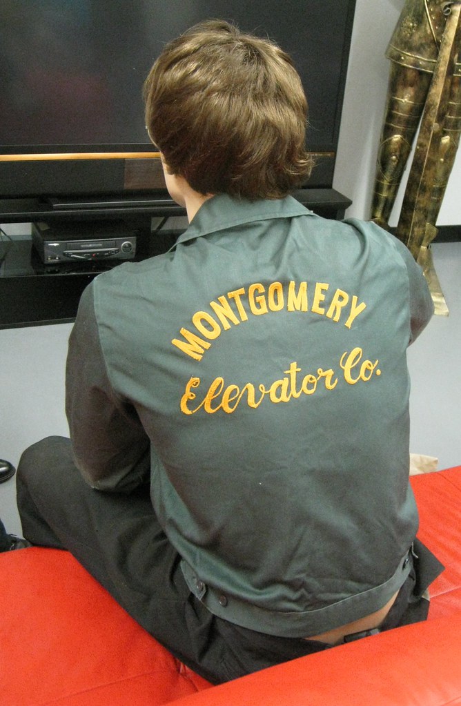
Yesterday I attended the opening reception for a new museum devoted to elevators (yes, really). The work uniform you see above — which was being worn by a mannequin, not by a live person — was one of the exhibits. Super-nice chain-stitching, no? Other uni-related items on display included elevator jackets, elevator sleeve patches, and this killer elevator apron. (No elevator operator’s uniform, though, which I found mildly disappointing.)
There was also a large assortment of non-uni-related elevator ephemera, including elevator advertising, elevator stock certificates, elevator hardware, elevator letterhead, elevator slide-rule thingies, elevator cheesecake, elevator technical drawings, elevator catalogs, elevator books (that was my single favorite thing in the place), and more. All of this stuff comes from the collection of one guy, a career elevator professional named Patrick Carrajat. It would be fair to say I found myself relating to his obsessive pursuit of a singular passion. (You can see all the photos I took here, and a good article about the museum ran in yesterday’s Wall Street Journal.)
New ESPN column today, in which I offer my take on the new Bills uni set, among other things. Enjoy.
Rock and roll reminder: Remember, Centro-matic — the band fronted by baseball painter Will Johnson — is playing tonight at the Mercury Lounge. I’ll be there, and I’ll be looking for Uni Watch readers wearing jerseys.
Uni Watch News Ticker: Here are South Carolina’s College World Series championship logos (with thanks to Andrew Shain). ”¦ A bunch of bootleg Giants T-shirts are being given to Haiti (thanks, Brinke). ”¦ If you were signed into the Dodgers’ system in the late 1940s — or maybe if they were recruiting you — you were apparently given a copy of this pamphlet. Here are two of the interior pages (awesome find by Bruce Menard). ”¦ Kyle Mackie notes that the NCAA Football 12 video clips that have been released so far show the zebras wearing traditional striping and white knickers. Word I had heard, and reported, was that they’d be wearing wider stripes and black slacks this year. ”¦ Michael Princip has uploaded some photos of the 1976 Seahawks TAK-29 helmet. “It’s an important design in the evolution of helmets, a hybrid in the transition from suspension to the encased foam-padded cells,” he says. ”¦ Here’s a fun little report, including video, regarding England’s last manufacturer of tennis balls. ”¦ The Amarillo Sox have a new mascot (with thanks to Matthew Robins). ”¦ Some very nice Negro Leagues paintings here (with thanks to Mike Hersh). ”¦ More than a year ago — maybe more than two years ago, although I’m not sure about the exact date — Dave Mann told me that one of his designs had been ripped off by a minor league hockey team. He asked me to keep quiet about it, but now he’s written a detailed account of whole affair. ”¦ Buy me some peanuts and Cracker Jack anything that doesn’t include peanuts. That’s the cry at an increasing number of ballparks (thanks, Kirsten). ”¦ Flag-desecration caps will be worn by over 72 minor league teams this weekend (Matthew Robins again). ”¦ Matt Mitchell thinks he’s found the new Bengals mascot. After all, he notes, “They are dogs.” ”¦ Brent Hardman’s wife’s cousin is playing on a summer league team that wear a bizarre Blue Jays tequila sunrise hybrid design. ”¦ Pablo Sandoval must have torn his pants, because there’s a big patch on his right leg (screen shot by Brian Deutsch). ”¦ News flash: Players selected in the NBA draft like to wear fancy suits. ”¦ Interesting new kit for the French rugby team. “According to nike, the design is a tribute to the 1999 and 2007 World Cups when the French team beat the All Blacks,” writes Florian Michot. “I don’t like it — our color is blue, not blac,k and i’m afraid it will look messy on TV.” … New home and away kits for Werder Bremen (with thanks to Kenny Loo). ”¦ CNBC’s Darren Rovell sent me a note last night informing me that, contrary to what I wrote yesterday, Nike exec Charlie Denson was indeed referring to uniforms — and not to T-shirts and related product lines — when he told Rovell, “We’re going to be aggressive. Some teams are willing to go further than others.” I appreciate the correction, but it doesn’t change the basic fact that teams like the Bears, Packers, etc. will never subject themselves to major swoosh engineering. This news does give us a timeline, however, since Rovell’s piece said that Nike will “start pumping out products for retail” next April, which means any teams that do go for Nikefication will presumably unveil their new threads at the draft.
“Even when Whitey Bulger was on the lam in L.A., his hometown allegiance was plain to see (big thanks to Trevor Williams)”
Uh, no.
Look closely at that picture’s caption. The shot was from BEFORE Whitey blew town, taken on Castle Island, which is in Boston, NOT California. That’s not to say he didn’t wear Red Sox caps in California, but as of yet there’s no photographic proof.
Sorry, but it’s a picture people here in Boston have seen thousands of times over the past dozen or so years.
I’m heading down there later this AM. I bet I see Whitey.
Mea culpa. Will fix.
Baseball Hall of Famer George Sisler wearing the Brooklyn Dodgers satin blue uni in the Dodgers pamphlet.
Indeed he is…which is part of the reason that I sent it along to Paul. Looks a lot like Duke Snider at the batting tee as well.
Really neat stuff
“Flag-desecration caps will be worn by over 72 minor league teams this weekend.”
Evidently, baseball has a lot of fans who are patriotic.
Certainly lots of fans who want to be seen as patriotic. In substance?… Meh
Evidently, baseball has a lot of fans who are patriotic.
Fans who are patriotic, but who don’t know or follow the basic rules of flag etiquette. Back in my day, they taught the link to every third grader. I think respecting the flag is a hell of a lot more patriotic than desecrating the flag for profit. See USC3 §176, (e), (g), (i), and (j).
Also, link!
RS-
Should the flag patch on this jersey be on the left sleeve?
(j) No part of the flag should ever be used as a costume or athletic uniform. However, a flag patch may be affixed to the uniform of military personnel, firemen, policemen, and members of patriotic organizations. The flag represents a living country and is itself considered a living thing. Therefore, the lapel flag pin being a replica, should be worn on the left lapel near the heart.
Sorry, link?
Touché! But how do you know I don’t wear it with the buttons in the back, Kris Kross style, thus putting the flag on the left sleeve?
First, that’s not an athletic uniform, it’s a shirt, since I don’t wear it to play sports, or do anything remotely athletic. Second, that’s a patch, not a lapel pin. Third, even granting that it was a mistake to sew that flag onto that jersey, so what? The Flag Code is what it is, and basically every instance of flag-on-jersey use by MLB is a clear and obvious violation of at least two, in most cases four, sections of the Flag Code. It’s not even arguable. If the best defense of pro baseball’s behavior is “Hey, the guy pointing out their violation once sewed a flag on a jersey himself,” well, clearer evidence of the bankruptcy of the defense of MLB and MiLB I couldn’t invent if I tried.
And perhaps most importantly, I think I’ve been quite consistent in my pet crusade against false patriotism in differentiating between individuals and for-profit corporations. When MLB or MiLB violates the Flag Code and puts the flag on uniforms and caps and then lets its players soil the flag by sliding in the dirt and grass and whatnot, and then sells replicas of the same for profit, that’s not patriotism. That’s an obscenity. If a fan wants to go to a ballgame with flag patches sewn all over his Jeter jersey, if he wants to wear the flag like a cape, my reaction is, “whatever.” Because I know that however misguided, it’s coming from an authentic place. He means well.* A company – and all sports teams and leagues and merchandise manufacturers are companies – is not a person. A company has no heart to be in the right or wrong place, so there is no doubt for it to get the benefit of.
But, hey, I know, let’s paint the flag on all the bases and home plate for patriotic holidays too! That way players can show how much they love the country by stepping on the flag! And hey, how about screen printing the flag onto charcoal briquettes – that way the tailgate grilling can be really patriotic by burning dozens of little flags! They have really good food dyes these days; they could put the flag onto hot dogs if they wanted, and wouldn’t it be super patriotic to eat a flag dog at the ballgame? And they could hand out flag handkerchiefs to fans, so if anyone needs to blow his nose or spit or something, he can do that into the flag too! What about flag toilet paper in the ballpark bathrooms? Because anything you do with the flag is by definition patriotic, right?
*But if the false patriots among us ever succeed in amending the Constitution to ban flag desecration, I will make it my hobby to seek criminal prosecution against every flag-wearing numbskull in a Jeter jersey.
do you support flag burning?
The relevant question is not whether someone “support(s) flag burning.” The question is whether flag burning is Constitutionally protected speech, which the Supreme Court has ruled it is. And while I have no plans to burn a flag, I definitely support that Constitutional principle.
Here’s a question I’ve always been curious about: How many people would be upset by someone burning a copy of the Constitution? That strikes me as a much greater (but still protected) offense.
Phil, I support the “right” to burn flags.
The government, and it’s visual representations, should not be protected from public acts of scorn by it’s citizens.
fear not, scotty would never get tricked by my verbiage
Those aren’t flags that are on the caps, just visual representations of the flag using red, white and blue colors and stars and stripes. Certainly there is no desecration occurring.
I agree. While I find almost all forced patriotic sports displays to be incredibly tacky, most examples are not directly desecrating the flag (though the Redskins sewing the American flags on cheerleaders crotches in memory of those who died on 9/11 certainly comes close to desecration). And I think Paul’s use of the phrase is a bit tongue in cheek. If anything the hats are an attack on good logo and uniform design sense.
I dunno- putting a flag in a cheerleader’s crotch seems VERY American to me.
Correct. Making caps out of *actual flags* would be desecration.
“Otis, my man!!”
shama langa ding dong
Charlie Sheen was juicing for Major League.
link
He was winning!!
That picture of Whitey was taken when he was IN Boston. No photo of him in Santa Monica exists, at least to the media and our knowledge.
RE: Amarillo Sox mascot.
Whatthe…??
This Nike-NFL thing concerns me. One of the things I love about the NFL is that it is such a clean-looking game. There are a few dog uni’s in there, but for the most part, the look is very crisp across the league, and it’s what makes the games appealing to the eye. I know the old-school teams aren’t going to mess around, but I just hope none of the other teams try to get too cute. /frets
The NFL is going to look like the NFL.
Yes, Nike is responsible for Oregon – and they also supply Penn State. They’ll do what the NFL teams want, not the other way around.
I know you’re right about teams not looking like Oregon, but even with the teams maintaining control, my faith in some them isn’t as strong as yours. The Vikings are a perfect example. Whether you like the color scheme is one thing, but their uniforms as of a few years ago were crisp and sharp looking, especially the all-white. They just looked good. And look what they let Reebok do to them. It’s fucking disgraceful, and it’s actually hard to watch a Vikings game because of that stupid shit.
I don’t want even a handful of other teams to follow suit with Nike. I hope they stay strong.
…and how do you know if Reebok was the deciding factor?
Did they “let” Reebok do that, or did they “tell” Reebok to do it?
I understand (but disagree with) your stance of “please NFL don’t change”, but I don’t think Nike matters.
And what NFL teams want is to sell jerseys. If changing up the look, as the Eagles and Giants have both done in the past fifteen years, can sell a few more, they’ll happily let Nike do it for them.
Your point about Penn State is a good one – but Nike also has gotten Ohio State to kill their classic look at the end of every season in the game against Michigan. Not sure if that was Ohio State’s doing or Nike’s, but it is a brand as strong as most NFL teams (if not all). And they have ruined their classic look for Team Nike on the biggest stage they play on.
I just love the naievety about Nike not touching certain “hallowed” uniforms.
The last time they could do uniforms they got the Steelers to change their number font (which still looks ridiculous).
They will do whatever they want and sell it to the teams somehow.
The Steelers number font is great, and I don’t even like the damn team.
yeah, um
no it’s not
+1
it’s not
Of course it’s not, what was I thinking? We want all 32 teams to use the exact same block number font, well, except for Chicago because they’ve used rounded numbers for long enough that it’s ok now. Anything else is a horrible abomination. Silly me.
no, THE, not at all
i have no problem with rounded numbers, but the “slash” helvetica italic is just not a good looking font
and the stillers did try to match their front helmet numbers with the new font, so i can understand *why*
nikethey did itbut that doesn’t make it a good font in and of itself
I understand Nike wanted to tweak the Steelers unis even more (logo, possibly a yellow/gold alternate), but the Rooneys put the Stop sign on that
Yes, it is.
Wow, that targeted advertising at the bottom of the page really link for this “get off my lawn” crowd.
it’s just not a great font for a uniform at all. might work in nascar. not to mention they fixed something that wasn’t broke at all.
The steelers is not slash helvetica. It’s italics Futura. Get it right!
Don’t get fonts wrong around me, especially when it comes to my two favorite, Helvetica and Furtura (Wes andrerson uses Future in all
Of his films. Also, Wes Anderson is a personal deity of mine.)
yeah…futura…helvetica…i always get them confused
but the point stands
“In 1997, the team switched to rounded numbers on the jersey to match the number font (Futura Condensed) on the helmets, and a Steelers logo was added to the left side of the jersey.”
courtesy of the always correct wiki
the stillers present TWO instances where their uniform really needs varsity block, because the two most likely (futura condensed) or their funky workmark both look shitty when rendered in numeral form
like i said, i get why swooshie changed the font, but that doesn’t mean i like it
you want rounded numbers that look great? have the titans dress like this when nike takes over the contract next spring
Fuck. AGAIN?
How did that end up here? Ignore that cuz I’m gonna repost it in the right spot.
“i have no problem with rounded numbers, but the
“slash” helvetica italicPirates number font is just not a good looking font”/fixed
Right town, wrong team, Phil.
if it was a tad bit thicker, it would be a great font. as it is though, it just looks bad…
It may be a small attribute, but part of the reason the NFL looks “crisp”, is because they maintain standards of dress. In the NFL, players get fined if a jersey is left untucked, or socks not pulled up, etc.
That’s a HUGE visual change from college football (although, it gives college ball a more amateur feel, as it should).
It doesn’t necessarily mean the uniforms are great, but at least their uniform in appearance.
*they’re
Not only did France drop red and add black for their RWC kit, the Alternate is solid white…just like England. Ugh, nice work Nike. It’s almost like you took a team that is playing on the biggest stage of their sport and didn’t use any of their actual colors in the uni…oh yeah, you’re Nike, you do that…
“… Interesting new kit for the French rugby team. “According to nike, the design is a tribute to the 1999 and 2007 World Cups when the French team beat the All Blacks,” writes Florian Michot. “I don’t like it – our color is blue, not blac,k and i’m afraid it will look messy on TV.”
Florian is right and Aingle too. Ugh. Ugh. The old uniform of blue jerseys, white shorts, and high red socks was so gorgeous and quintessentially French. This latest thing is so merde.
Is it customary in rugby for a team to incorporate the colors of a team it defeated into its uniform? Has this happened in other sports?
There was that whole Hershey Bears thing where they wore patches of the teams they beat in the Calder Cup finals..
Does anybody actually believe that? It’s BFBS.
Kind of like SMU wearing black in the Armed Forces Bowl to “honor” Army – even though the jerseys had been ordered long before the opposition was known.
At least Nike came up with a sports-based lie instead of the crock they served up about the US WNT wearing black to look like a spider.
It’s almost to the point where uniforms are making sports unwatchable.
As I recall, France originally went to the black so that New Zealand would be forced to change their all-black uniforms when the two teams played each other (I think New Zealand went with a white jersey, and their current change jersey is gray).
It’s almost to the point where uniforms are making sports unwatchable.
No, no it’s not.
Just to be clear, they are not wearing black. The jersey displays the 2 shades of blue worn by France in their 2 victories over the All Blacks in the RWC.
The top half is the traditional French blue, as worn in 1999 – link
The bottom half is the “night” blue worn in 2007 – link
Is it a good concept – NO!
Is it a good look – NO!
Is it better than the last RWC – YES!
BTW – their change jersey is also getting the same, though much more subtle, two-tone treatment – link
um
Yikes!
It’s a candy-corn on Viagra.
link
link
“The Amarillo Sox have a new mascot,” and it’s a bumble bee with an erection.
Hey Kids! Who’s up for some baseball?
Looks like the Amarillo Sox’s mascot was excited to be at the game.
link
This was supposed to be a reply to LI PHIL
Paul, admit it. It crossed your mind a time or two if you could create a big enough distraction in order to get that jacket off that mannequin without anyone noticing.
*”Oh my God, everyone look, it’s Paul McCartney!” Everyone looks and Paul makes the switch. Paul moseys out whistling with his hands in his pockets.*
Aaaah, but makes the switch to WHAT? THAT is the key to pulling off the heist!
I fully admit it.
Paul, you get a lot of heat for your reactiOns to Nike, some from me. However, your coverage if the Nike-NFL storylines have been very balanced, even defensive of the league. I agree with your stance: teams are responsible for their uniforms. And they’ve been making mistakes without Nike for years.
Level-headed readers besides me exist? hooray.
Please explain the VCR and suit of armor.
Standard Issue.
It’s a timeline of modern history. The suit of armor to represent the best in protection technology 1000 years ago (not to mention standing as a deterrent to Paul). The elevator repair suit is to represent the style of the early 1900s, then you have the 1980s VCR and the 2000s flatscreen.
The suit of armor was “holding” a catalog from an elevator company called Armour. Really.
shouldn’t they be suing these guys and these guys too?
Nice.
Great pics of that Seahawks helmet – but it must have just been for the 1977 season since the 1976 helmet was plain silver.
It was only plain silver on Topps football cards.
/seriously, it’s not funny anymore people
Thanks. I have always thought they were plain silver in 1976 – but I just did some research and found out I was wrong. Sorry.
Well heck, I still find it cute, THE!!
Yeah – I had no idea The Jeff was the one who decides what’s funny.
Almost every fucking time anyone mentions the Seahawks around here, there’s some dipshit saying they had plain silver helmets their first season. I can see why The Jeff is like enough already, shit ain’t funny.
I say we start a rumor saying that all NFL teams HAVE to drastically overhaul their uniforms and colors by 2012 and watch the panic in the streets.
If you’re dumb enough to believe that, you should have your TV and computer taken away from you because you’re a danger to yourself and other.
Terry Duroncelet Jr. likes this.
~~~~~~
I think we need a “Like” button on this site, Paul.
First look at Garmin-Cervelo’s new kit, to be worn during Tour de France link
link
Team Garmin-Cervélo Tour de France, 2011 flickr set, will no doubt keep updating
link
Jersey front and back
link
Loving that the argyle’s playing a bigger role. Since Cervelo moved in, they ditched orange from the uniforms, and relegated the argyle to sleeve cuffs.
The more argyle, the better!
I wish they had at least included a little orange, but prominence of Argyle is very welcome
I’m actually a little bummed. I ordered the Ryder Hesjedal t-shirt from their site, not one bit of argyle.
However, great sleazy irony as it’s got a Canadian flag on it, and the shirt is made by American Apparel.
The elevator stuff is fascinating. But also insanely depressing. Between the letterhead illustrations, the catalog listings, and the various ephemera of companies that no longer exist, it’s like one darn example after another of things we don’t make and stuff we can’t do anymore in this country. And it’s not like industries where we don’t make the stuff because we don’t need it any more; elevators are more common now than they were back then.
On the other hand, there were several instances of letterhead and whatnot promoting various companies’ safety records. I don’t really want to go back to the days when passenger survival was an issue for elevators. Or anyway, if my life really does still depend on some guy with a little paper slide-rule telling him how much strength is left in a frayed elevator cable, I don’t want to know.
We still make ’em, there are just less and bigger companies. Otis ain’t exactly dead.
And passenger survival hasn’t been an issue since the safety elevator in the mid 1800’s. Getting stuck? Injuries from doors chomping you? Different story.
As for frayed cable, it happens. Wouldn’t you rather that your elevator repairman actually knew how much strength was in the thing rather than guessing? The safety factor on such things is such that the minimum the cable could hold before replacement would be a fair bit more than an elevator full to the posted limit. To me, it’s a neat little tool.
Has anyone yet posted a screen shot of rising Phillies folk hero Vance Worley’s glove, with “VANIMAL” written along the thumb, yet? I hadn’t noticed it until last night, but I didn’t have the technology for downloading the image.
Today’s post brings me back to my childhood. My father was the VP at a bank in downtown Chicago that – as late as the 1970s/early 1080s – had a manually operated elevator, complete with uniformed operator. My dad must have been more important than I’d realized at the time, because I can’t tell you how many hours I spent personally at the controls going up and down and up and down the building.
Looking back, I can now appreciate the contrast that within his offices, my siblings and I would also spend countless hours on the cool technology of computer-produced punch cards that we were allowed to make, sometimes providing each other “coded” messages, sometimes just trying to make crude pictures for one another!
Sorry for the sidebar, but interesting that all these memories come out three days before the four year anniversary of his death. Love you, Dad!
florida panthers red jersey:
link
sans vertical “bettman stripes”… step in the right direction!
The “premier” jerseys now have the Reebok wordmark instead of the vector?
not sure what to think of that really…
clean looking jersey though:
link
I dont think so… I just bought a Bruins Stanley Cup Jersey. In the preview it showed the wordmark on the back collar, which worried me, but when it arrived at my house, it had the Vector.
They’re also $10 more than they used to be, and still feature the ridiculous jocktag.
Better, but still not great. If there’s ever a team that needs to blow things up, that’s the one. New logo, start the jerseys from scratch. The color set is fine, but everything else needs major work.
couldn’t disagree more. the only change i’d like to see with the logo is the addition of the broken hockey stick on the primary.
the red jersey: all they would need to do is wrap the stripes the full way around the sleeves (same goes for the white, and if there is a blue)
white (and blue): also get rid of the bettman stripes
alt: all in all, not a bad jersey
Today’s ESPN column is up:
link
Paul,
RE: your comments on the purple used by the Kings. As you know I’m a long time reader here, so maybe I’m forgetting if you did explain this… why specifically do you distain purple as a color in a uniform?
Not judging you, one can’t argue someone else’s liking/disliking of any color… I’m just curious.
I happen to like purple, personally.
Man, too bad there isn’t some kind of Uni Watch FAQ.
link…
Speaking of purple, have the LA Kings given up on the vintage throwbacks they wore a couple of times last season? I think they should have made them the alts!
Tough to come in second but I’d once again like to thank Paul, Phil and all the guys I competed against.
Thanks to all the People who voted for me and Congrats to Chris.
I voted for yours Tim but those top two were practically interchangeable in my book of fine Winnipeg hockey uniform design. And the other three were also on the lead lap. Great job all of you. I unfortunately didn’t get the time to compete, but I see it wouldn’t have made a difference.
Those Google ads are link for the “get off my lawn” contingent here.
Hey, I don’t even have a lawn!
you do have a nice backyard tho ;)
Paul,
All I said was that they found their target demographic. I didn’t say you were part of it.
For the record, everyone’s welcome to hang out on my lawn… all 600 square feet of it.
Wait. Forgot about the front and side of the house.
Make that 900.
Appropriate for today, from the archives…
link
Well, this was posted on Facebook by my cousin. I don’t know how she came across it, but it was billed as a leaked Jets logo for the upcoming season.. Take it for what it is, I guess..
link
Umm…. you do know where that came from, right?
Looks familiar- I smell a lawsuit!
Here’s an interesting uni-related story:
Ajax Amsterdam (basically, the Yankees of Dutch soccer) lost a major trademark case today. They sued a souvenir-salesman for selling knock-off jerseys, but the judge in the case discovered that Ajax had improperly registered their trademarks back in ’96. As a result, the team’s color scheme and uniform design have been declared public domain.
The full is here:
link
(sorry, I haven’t been able to find an article in English, though Google Translate can make it somewhat readable)
Well, that’s not how American trademark law works.
Paul, great link to the piece about Dave Mann’s legal issues with New Era.
It underlines the problem with the internet, and DIY designers. If you’re going to create graphic designs, and have any desire to EVER be compensated for your work, then take the time to register it.
I’ve spent many years as a “professional” graphic designer, and applaud the “DIY designers” for putting in the time and effort to create their work. Unfortunately, Dave’s story isn’t an uncommon one (the only uncommon part is that he took legal action, which in most cases is David versus Goliath, with Goliath having deep enough pockets to wait out David).
Also, get off my lawn!
Yup, pretty good article but it all boils down to…did you copyright that? Unfortunately, Mr. Mann learned a harsh lesson. And how will that affect the weekend uni-tweakers here? Will all of you copyright your work from here on out? Some of you have had great designs (I’m looking at you Mr. O’Brien) that to me are pro-team worthy. Going forward, will it be necessary to have the tweaks copyrighted before they even get posted here?
And confidentiality agreements when you try to present your “top secret” design to a big company.
The new University of Kentucky football uniforms were unveiled. They look alright I guess. They have the Secretariat silks like the basketball unis.
link
Thank God that the ‘Cats are getting away from the “blue gazing ball” helmet.
The blue one looks like the one on a pedestal in my Grandmother’s back yard by the bird bath.
Pac-12 helmet schedule
link
does MJ’s golf bag have enough “jumpman” logos on it? geez
link
Surprised he doesn’t have a jumpman belt buckle. Cuz ya know, belt buckles are all the rage right now.
Awful new uniforms for link. They stripe on the stomach looks bad on fit guys–how is it going to work on anyone with even the slightest gut? Also, the white shorts look like tighty-whiteys with the dark background.
Paul, your criticism of Darren Rovell and CNBC is way over the top. The quote is that “some teams are willing to go further than others.” I can easily name some teams (Falcons, Cardinals, Vikings, Bengals) that are willing to go further.
um
Vilk family photo?
I’d wear the white shorts in the middle with the white socks…but you ain’t gettin’ me in any of those jerseys.
I’d wear the
white shorts in the middleblue shorts on the right with the white socks…but you ain’t gettin’ me in any of those jerseys./fixed
Underpants.
(link)
Just down the river from John O’Donnell Stadium link in the Quad Cities, on the east bank of the Mississippi River is Montgomery Kone Elevator Co. link Presumably, that’s a testing shaft.
Two hours to go…
Wondering if I should grow a lockout beard.
Gary Bettman must have an ear-to-ear smile.
Better yet…this could mean the renaissance of the MISL!
Congrats to the Edmonton Oilers for losing the Bettman bib! Now it is time for the Avs to do the same!
After the Rbk Edge takeover, the only teams that improved were the Bruins, Sharks, and Canucks. Every other teams’ sweaters came out less than or equal to what they came in with.