[Editor’s note: Today Omaha native Bryan Redemske serves up his annual College World Series uni preview. Enjoy. ”” PL]
By Bryan Redemske
Each year, ESPN focuses its cameras on Omaha for the College World Series ”” the city’s annual moment in the sun. The coverage typically turns into a love letter to the area via video montages, cute little kids in little league uniforms, ringing aluminum and panoramic shots of the neighboring zoo.
But the longtime home of the Series is gone now ”” Rosenblatt Stadium is closed (you can buy a piece of it in at this auction), the festivities moved downtown to a new $130 million ballpark. If the previous 60 years of the College World Series in Omaha were a celebration of funnel cakes, front-yard parking in a run-down neighborhood, beer tents and RVs parked down the hill, from here on out it’s all about the downtown skyline, the new ballpark and the sketchy warehouse district just a block down the street, out of camera view the NCAA-approved … well, everything.
Though the Series’ setting has changed, the teams involved will be familiar to almost everybody ”” even the most casual of college baseball fans … like pretty much everybody in the city that spent millions to lock up the tournament for another 25 years.
Unlike previous CWS pieces I’ve written for Uni Watch, what follows won’t be a point-by-point rundown of every single uniform combination. Maybe it’s because Florida State sucked the life out of me in 2008 (13 different uniforms, I believe), but mostly it’s because I don’t have access to the full-on, newspaper-style Associated Press photo wire. (I run a bike shop now and try as I might, I just couldn’t get the owners to buy into a yearly AP subscription. It’s a drag, but I manage.) What you’ll see instead will give you an idea of each team’s identity ”” and what they’ll bring to the table in Omaha.
Florida
Like a lot of Nike teams, Florida has a pretty consistent look on the diamond. Unlike football or basketball teams, college baseball programs are often left to fend for the scraps of athletic department budgets. As such, many of them cycle in a new uniform set over a span of two or three seasons. And sometimes you end up with the look that Oregon State sported on its back-to-back title runs a few years back: Lots of different jerseys with a bunch of different typefaces and logos. It’s just what they had kicking around.
Florida doesn’t appear to be one of those teams. The Gators have a home white set, road grays and a blue alternate. There’s a white cap and a blue cap. Earlier this season, a retro-style jersey found its way to the field. And that’s pretty much it. It may not be very exciting, but it’s consistent. Points for that.
Texas
And while we’re talking about consistency, here’s Texas. The Longhorns have looked the same for a long, long time. There’s a white pinstriped vest, a white sleeved jersey, a burnt orange jersey, a gray vest and a gray sleeved jersey (which was worn in the Series opener on Saturday). The burnt orange jersey is worn with both white and gray pants.
And as a side note, Texas is wearing custom Nike spikes while in Omaha. I don’t imagine the state of Nebraska has often found its way onto the back of a pair of shoes.
California
If you’re looking for the sentimental favorite in Omaha ”” the team the city adopts and fawns over for 10 days ”” Cal might be it. Last fall, the university announced it was cutting baseball, along with four other programs. This spring, thanks to a massive fundraising effort, baseball was spared. Two months later, the Bears are in Omaha. (Note to Bears: Omaha can’t fall in love with you if you get eliminated on Tuesday.)
California, despite what its football team has worn over the past few seasons, keeps it pretty straightforward on the diamond. Home whites, road grays and an alternate yellow jersey. Best of all ”” and this is true with most well-outfitted teams ”” all of the uniforms look like they go together. Kind of like the Oregon (or Cal, really) football bit: It may be out there, but it’s all one system. So in a strange, twisted way, it works. Cal’s baseball uniforms just work.
Vanderbilt
While the other programs were pretty easy to find, Vanderbilt must have a cone of silence in place around its baseball program. There are photos for only three or four games up on the official website, and while the post-game YouTube videos of coach Tim Corbin’s Q&A sessions are nice (seriously, they’re up there and very thorough), they don’t shed a lot of light on uniforms. This, from the No. 1-ranked team for a good chunk of the season.
The home uniform is a pretty classic look ”” white, with black and gold. The pants stripes are maybe a little thick, but they’re not bad. There’s an alternate black jersey and … well, that’s all there is. Seriously, cone of silence. Though I like what I see.
Texas A&M
Here’s another media blackout school. Plenty of game reports, plenty of interviews … and no photos. Luckily, the Aggies have looked very similar for a number of years. The maroon jersey is worn with both white and gray pants, and the full gray set is pretty clean and classy. They only jersey that falls short is the white one, which has contrast-color side panels and pits.
As a side note, befitting of its history as a military school, Texas A&M wore camouflage jerseys earlier this season against Texas. It looked … well, better than the Padres, at least.
North Carolina
Last time around ”” which here means last time I dug all of this stuff up ”” North Carolina’s equipment room caused me to reconsider the merits of the endeavor. Between the regular uniform set, the old regular uniform set and the “new for Omaha” uniform set, the Tar Heels’ clothing options were pretty ridiculous.
This time around, there’s the home whites ”” the jersey is actually a sleeved one, not a vest ”” and a pair of powder Carolina-blue jerseys. One has the familiar-for-baseball Carolina script, while the other is pretty reminiscent of the Kansas City Royals’ old look. The retro-style jersey has also been paired with matching pants and … for a good reason, at least … pink socks.
In the past, navy blue jerseys and caps have been in the mix, though it looks like the ‘Heels have toned it down a bit there. It’s mostly Carolina blue and white, which is what teams from Chapel Hill should be wearing all the time, anyway.
South Carolina
Remember earlier when I mentioned schools that have too many jerseys in play, and they don’t look like they go together? That would be South Carolina, the defending national champion. Really, there are two distinct sets: the “classic” set and the “newfangled” set.
The “classic” set has a pretty simple home white/road gray thing going. The other has a funky script that’s hard to read ”” especially on the red jersey. The pinstriped set is OK, but that wordmark is pretty heavy. If it was just a matter of the “classic” set, I’d say South Carolina would be in the running for best-dressed at the CWS.
Virginia
The top seed in the CWS, the Cavaliers almost ”” allllmost ”” went off the deep end with jerseys. I’ve long enjoyed the interplay between navy and orange, and it’s especially cool when properly executed on a baseball uniform with a bit of white. So I’m digging the home white set. And I like the navy alternate, too. The orange … well, if you must. Retro? Eeesh. Camouflage? Come on, now.
You had me through the first two jerseys, Virginia. But what’s this? A second blue jersey? And check out No. 18 on the left ”” Tyler Wilson. No captain’s patch on the second blue jersey.
Points for looking good no matter what (minus the camo bits), but points taken away for two different jersey typefaces. Also, that “V” on the caps matches pretty much nothing in either uniform set. So close, Virginia.
””
Sadly, it’s not all about baseball in Omaha this week (or next week or next month). The Missouri River is out of its banks, and it’s only going to get worse. For a look at life outside the ballpark, check out this story by my former newspaper colleague Liz Merrill.
———
Paul here. Major thanks to Bryan for compiling this report. The bike shop’s gain is definitely the Ohama World Herald’s loss.
The last word: I don’t listen to ESPN’s “Hockey Today” podcast, but reader Trevor Williams does, and he informs me that the podcast crew — Barry Melrose, Steve Levy, and Scott Burnside — wrapped up the NHL season by engaging in a bit of uni-related banter, as follows:
Barry Melrose: It’s great that the Boston jersey won. Let’s admit it — the Boston jersey is a hundred times better-looking than the Vancouver jersey.
Steve Levy: Than any Vancouver jersey in Canucks history.
Melrose: Actually, it’s a million times better than most of the Vancouver jerseys. It’s only a thousand times better than the Vancouver jersey now. So we’ve got a beautiful jersey that won the Stanley Cup.
Levy: We’re on a good here stretch, right? You’ve got your Blackhawks jersey winning last year. Here’s the Bruins. Maybe the Leafs turn next?
Scott Burnside and Melrose: Ohhhhh!
Burnside: It is time to go.
Melrose: It’s not a fantasy show.

A good walk spoiled: Expecting to see uni-related U.S. Open coverage here today? It’s coming — tomorrow. For now, we’ll just mention that Frederick Jacobson missed a belt loop during yesterday’s round (a good spot by Jason Lord). More tomorrow.
Uni Watch News Ticker: I’m not sure who Kuehl Becker is or what he did, but he definitely did it. ”¦ Someone on Etsy is making really nice DIY standings signs. Lots more available, in various sports, here (nice find by Ben Traxel). ”¦ Chad Todd found a really gorgeous 1964 Schwinn bicycle catalog. ”¦ Here’s a little piece about the Dolphins’ various shades of aqua over the years (with thanks to David Millheiser). ”¦ Interesting note from Tyler Kepner, who writes: “Saw Seth Meyers at Wrigley on Friday singing ‘Take me out to the ballgame.’ Of course he was wearing a Cubs jersey, No. 21, which I figured would be his number, because on Twitter he’s @sethmeyers21. I know he’s a Red Sox fan, so I thought maybe the 21 was for Clemens. Nope — turns out his dad loved Roberto Clemente. So there you go.” ”¦ Ladies and gentlemen, I give you the Cornhusker State the Swoosh State. Texas will be wearing that shoe design in the College World Series, which of course is played in Omaha (with thanks to Ken Singer). ”¦ Michigan football doesn’t have a mascot — yet (with thanks to G.R. Brackle). ”¦ Charlie Samuels’s day in court will come at the end of next month. ”¦ Don Montgomery notes that the Bruins banner hanging at City Hall in Boston has the wrong logo. The “B” should have serifs. ”¦ “Everything I Know about Postmodernism I learned from the Phillies” is a fun article title, even if the actual article is only so-so (with thanks to Chris Cocca). ”¦ Okay, the whole naming rights thing has now officially gone off the deep end. ”¦ Ben Revere of the Twins laid out for a great catch on Friday night and ended up breaking his belt. You can see video of the play here (with thanks to Blake Meyer). ”¦ While doing a bit of vintage shopping on Saturday, I came across a sweater with a tag that made me smile. ”¦ The video on this page shows that the Red Sox posted a congratulatory sign for the Bruins at Fenway (with thanks to Ryan Mandel). ”¦ Why do Cerezo Osaka’s uni numbers include a little flower illustration? “Because ‘cerezo’ is Spanish for ‘cherry blossom,'” explains Jeremy Brahm. ”¦ In a move that will surely go down as one of the legislative triumphs of the 21st century, the state of Ohio is on the verge of allowing people to bring concealed guns into sports stadiums. That noise you just heard was Mike Brown ordering bulletproof glass for the owner’s box at Paul Brown Field. ”¦ Turns out that that 9/11 decal is being worn by all New York-Penn League teams, not just the Brooklyn Cyclones (as noted by Dan Cichalski). ”¦ Two high school baseball notes from Pennsylvania: North York High uses the Yankees’ NY cap logo, and Tunkhannock High wears uni numbers on the back of their caps (with thanks to Art Savokinas). ”¦ Does Nick Swisher always wear a flapless helmet for BP? “It’s definitely his helmet, because it has his uniform number on it,” notes Matt Bierman. ”¦ Samm McAlear notes that Chisox catcher Ramon Castro has his uni number on his shinguards. And while we’re at it, when did that last little shingard extension — the part that extends out beyond the toe — come into being? Definitely didn’t exist in the ’70s or ’80s. Always looks sorta caveman to me, like something from a Neanderthal skeleton. ”¦ Really interesting article about trying to make aluminum bats play more like wooden bats. ”¦ A Walmart in Miami was selling Heat championship T-shirts the other day. Oopsie. ”¦ The national anthem was performed yesterday at Nats Park by a guy playing a bat-shaped fiddle (with thanks to John Muir). ”¦ Major, major find by Daren Landers, who came up with the Reds’ page from the 1981 MLB style guide. Among the highlights: (1) The stirrups are specifically designated as “Low Cut.” (2) Sannies! In a style guide!! (3) Interesting to see that the home jersey has set-in sleeves while the road jersey is raglan. (4) Does anyone remember ever seeing that jacket? Cuz I sure don’t. ”¦ A bunch of Cards went hig-cuffed and stripe-socked again yesterday. ”¦ Another team showing the striped hose yesterday: the Rays. I’m not positive, but I think the whole team was doing it. ”¦ Meanwhile, have I mentioned that this patch is totally freaking huge? Yes, I have, but it’s worth mentioning again. ”¦ Looks like the Gary Railcats were wearing some very old-school throwback jerseys (but not pants) the other day (with thanks to Bob Delano). ”¦ Dan Cichalski has come up with what must be one of the all-time worst Topps airbrush jobs. ”¦ You Learn Something New Every Day Dept.: Remember when Giants Stadium has the old Meadowlands logo at midfield? What did those four blue stars stand for, anyway? Turns out each one represented a property run by the New Jersey Sports and Exposition Authority (great info from Mako Mameli). ”¦ Oh fer Chrissakes, did MLB really put the date on last night’s Wrigley Field bases with a semicolon instead of a comma? C’mon, gang, that’s third grade stuff (good spot by eagle-eyed Justin Bates). ”¦ Some chick at Wimbledon is apparently determined to make a fool of herself (thanks, Brinke). ”¦ You don’t often see the letter “A” with an ogonek. That’s MichaÅ‚ BÄ…kiewicz of the Polish mean’s volleyball team (big thanks to Jeremy Brahm). ”¦ Small photo, but on July 7 the Angels will be giving away a “flashback cap,” which features every cap logo from the team’s history — “except the late-’90s Disney logo, which is notably missing,” says Michael Sambuceti. ”¦ Auburn’s players got their BCS title rings last night (with thanks to Jeff Hunter). ”¦ The police force in Victoria, Australia, is getting New York-style uniforms (as noted by Murray Conallin). ”¦ Mike Rowinski notes that until last week the A’s had only worn their gold alt jersey when Gio Gonzales pitched. But they’ve now worn the golds for five consecutive games — and have won all five of them. ”¦ Big Uni Watch get-well wishes to Packers seamstress Marge Switzer, who fell while doing some yard work the other day and suffered a few broken bones. Marge (who I had the pleasure of interviewing a few years back) is an essential member of the Packers family and of the larger uni-verse. Here’s wishing her a speedy recovery.
Since paul didnt use this today, ill throw it out to everyone…
On 590 in toronto friday, the sportswriters on the show were talking about vancouver riots and all the people wearing vancouver sewaters participating and if the canucks neededd to change jerseys, since the old/current ones are now “tainted” after the riots.
Right. I guess that’s why the Canadiens haven’t won the Stanley Cup since 1993.
People in the Pacific Northwest like to riot. Look at the WTO riots in Seattle a decade or so ago. Maybe they’re old Berkeley students or friends of the Unibomber.
When Toronto won back-to-back World Series in 1992 and 1993 there was no violence whatsoever. They don’t call it “Toronto the Good” for nothing, eh.
If you look at the pictures, though, the majority of people are NOT wearing Canucks jerseys. It’s just a handful of yahoos who give jersey wearers a bad name.
link
There was at least one guy in a Tap-Out shirt.
link
Must have been the instigator, eh?
Nah, it’s probably the same folks who started trouble at the Olympics and any time the WTO comes to town.
If the current ‘nuck’s sweaters being worn by the rioters is reason enough to retire them, they’ll have to retire just about every throwback jersey as well.
I’ve seen about 39 different iterations of Canucks jerseys in those photographs, enough that I wouldn’t think that one “look” would be associated with the riots.
I can’t find the link to Mr. Landers’ major find.
Now included. Here:
link
Was there supposed to be a linked picture for the Reds’ style guide?
Yes. Now in text. And here:
link
A lot of the links either don’t open to a new window/tab, or are just not working.
Working on it.
“…the facilities that are home to Ohio’s major professional sports teams plan to continue to ban weapons, for safety reasons.”
So no weapons still allowed at any professional games. College stadiums are out since it is school grounds. But still, crazy measure to put in the House.
“the state of Ohio is on the verge of allowing people to bring concealed guns into sports stadiums. “
~~~
that sound you just heard was jim vilk polishing the old glock
Remind me to stay away from Dirty Jimmy.
Do you feel lucky, punk? Well do you?
Nah, I’m pseudo-pacifist. I will slap fight you, though, if you back me into a corner.
I meant semi-pacifist…not pseudo…
Silly Phil. You don’t polish a Glock. You polish a Colt, but you clean a Glock.
Say, has UW ever covered uni issues in the shooting sports? It’s mostly the same run-of-the-mill attire you see in all minor individual sports – that is, casual clothes with some functional customizations and lots of advertising – but still, there are some interesting nooks and crannies of uni-dom out there. Especially in Olympic shooting events, where at this point they’re basically just shooting bb guns and the attire is often actual performance gear. And there’s always the costumed shooting sports, like Cowboy Action Shooting and Zoot Shooting. I do a little Cowboy Action shooting, and for most shooters, the uniforms and equipment are more important than the actual competition. Almost like I’d assume a softball league of UW readers would be.
One of my Hy Peskin photo round-ups included this shot:
link
I believe that is the full extent of shooting coverage that has appeared during Uni Watch’s 12-year history. I know nothing of that world, but I’m certainly not opposed to covering it. Scott, maybe you’d like to pen a guest entry on this topic..?
“Minor individual sports – casual clothes with some functional customizations and LOTS of advertising”
Let’s not forget the Bassmasters in this category as well…
link
Do not, I repeat DO NOT wear a Ravens or Steelers jersey to a Browns game.
/why does my state have to be so stupid at times?
Browns still won’t allow guns in the stadium. Don’t worry about it.
Batteries and frozen dog biscuits, on the other hand…
I actually wore a Steelers jersey to Municipal Stadium in 1984. No one messed with me. Then again, my friend had decent seats and I went nowhere near the bleachers. I may be dumb, but I’m not stupid.
Allowing guns in bars is bad enough on its own. There’s a reason it’s illegal in Texas to have a weapon, any weapon, in a place that serves alcohol.
Does this mean that it’s illegal for Chuck Norris to enter a bar or restaurant in Texas?
or a lebron jersey
That bat-fiddle player is Glenn Donnellan of the National Symphony Orchestra here in Washington. link of his rendition of the anthem. He calls it a “link.” He’s become a bit of a fixture at Nationals Park; I think this is the third year in a row he’s brought his electric bat-fiddle to play the anthem.
Donnellan’s violin is only the second-most famous link, of course.
Thanks for the uni preview on the College World Series. Carolina, Vriginia, Florida, and Cal looked great over the weekend (though I noticed that Carolina and Cal wore white pants instead of gray even though they were the visiting teams).
All in all, I’d say the Omaha unis beat the MLB unis. The Texas home whites are hard to beat, but this is the year of the Cal Bears, and they look solid.
PS What’s a funnel cake?
Seriously?!
link
Remember, you can’t spell “funnel cake” without F-U-N!
The absolute worst thing about getting diagnosed with diabetes last year? Well, aside from the pure absurdity of being a rail-thin 30-something guy with no family history, and a good diet and exercise regimen getting that disease? No more funnel cake for me. At least as long as I’m able to manage the disease without insulin. And when the day inevitably comes that I have to take up insulin, which I pray will be many years or decades away, the first thing I’m going to do is find myself a funnel cake.
One of these days, funnel cake is going to go through what cupcakes went through in the 2000s. Smartypants chefs are going to be making like buckwheat funnelcake with miso frosting and whatnot. There’ll be savory funnel cakes alongside sweet. There’ll be funnel cake boutiques opening in all the hip neighborhoods, and funnel cake “reality” shows on TV. One of these days, man, just you watch.
That is at least a half-million-dollar idea. Maybe a full million! Whaddaya say, Scott — you and me, equal partners (except you can’t sample the product, too bad).
We can even use that line I cited above as the name for our shop: You Can’t Spell Funnel Cake Without F-U-N!
That’s a great slogan, Paul, but it’s a bit retrograde for actual commerce. In today’s marketing environment, you’ve got to take it a step further, either into understated implication or overstated reification. So you either make it Funnel Cakes, but with the FUN somehow emphasized, like how WIN gets the underline in Twins, or you call your trendy boutique/food truck “Funcakes.” Ditch the “NEL” entirely. Then you use your slogan within a vintage-themed subset of your marketing materials, where you can get away with ambiguity between earnest and camp.
Heck, funcakes.com is currently not in commercial use, and is being squatted by some sort of domain prospector.
I’ve always thought that funnel cake and skee-ball were the perfect combination, and with skee-ball beginning to become urban-trendy again, there’s gotta be room in the market for skee-ball parlors with gourmet funnel cakes.
Anyway, heck yeah, I’m in, but only as long as you give me a minority share in Oykea, too. ;-)
They sorta already have that here in Pittsburgh at Kennywood. It is a funnel cake covered in strawberries, ice cream, and whipped cream. Not sure if other lo-cals have this available (Doesn’t seem like a difficult evolution from sweet cake to sweet cake with ice cream & strawberries.)
link
Funnel cakes taste like happiness and are what anti-depensant pills are made of.
Cal looked similiar to its Bay Area neighbor, the Oakland A’s, yesterday. And looked great too. Navy blue and gold rock.
link
And I can’t believe the university considered dumping the baseball program. Are you kidding me? Sheesh.
Aside from universities like Rice or Long Beach State, how many D1 schools have baseball programs that really compete with the money sports for popularity?
Outfitting a baseball team is very expensive. Every player has one or two bats, plus gloves, shoes, batting gloves, and that’s before the actual uniforms. Plus, every home game the team has to supply at least 30 balls, most of which can’t be reused in later games. If the team isn’t popular and only drains money then the school is going to consider cutting it. Then you get the fundraising rallies to save the team, like Cal had this year.
Let’s just drop baseball altogether then. Or maybe baseball can get tips on saving money from the football programs.
I wasn’t saying they shouldn’t exist; I was saying that they often need more fundraising than other minor sports and it’s understandable that a major university would go through the process that Cal went through. I went to Rice, so you can probably imagine that I care a lot about college baseball.
The state of California has had to make some pretty draconian budget cuts due to the economic downturn, so Cal (along with all other UC schools) is also caught up in that mess. Baseball is an expensive sport to field and doesn’t make money from tickets and merchandise like football does, except at a few schools where it’s popular. It also requires a large roster, so because of Title IX all of those scholarships have to be made up in some other women’s sport, adding extra cost to the program.
Water under the bridge, anyway, as they were able to save it. Cal’s athletic department and alumni base hadn’t really made baseball a priority in fundraising in recent years either, as the team was rarely a contender, though that may change now.
Re: The lettering on the fronts of college baseball jerseys. If you go with script, pay the calligrapher the extra money and go with the hand-drawn word. Typeset scripts always look wrong and fussy.
I don’t think Canucks fans will be truly happy with their uniforms until they get Johnny Canuck front-and-center…
If they could just promote the third jersey to full-time status, and lose the “VANCOUVER/orca” combo, that’d be a step in the right direction. If any team should’ve been wearing their thirds this postseason, it’s the Canucks.
Keep in mind, tradition for the Canucks *consists* of redesigning the uniform…
[quote]Okay, the whole naming rights thing has now officially gone off the deep end.[/quote]
Geez, and I thought that happened last week, when the City of Toronto’s executive committee received this report: link
I believe all the links are now fixed and functional.
Paul, that young woman at Wimbledon may indeed be “determined to make a fool of herself” (who can plumb the soul’s deep deaths? etc), but I like the IDEA of wearing clothes made out of tennis balls, and the shirt’s not that bad.
Cheeseheads! Re Paul’s astonishing vintage sweater-label find: When was the last time you remember Wisconsin promoting itself as “The Nation’s Playground”? What was being referred to? I mean, I love Wisconsin (SW corner especially), but I’ve never thought of it as particularly frolicsome.
Paul, don’t pretend that you knew what “ogonek” meant before Brahm tipped you off.
Can’t wait for tomorrow’s US Open review. My homeboy is a great kid (they say), but man, those belt buckles…
Should be “soul’s deep depths,” but “deaths” ain’t bad.
Until I saw the picture, I was expecting the little ‘o’ that gets attached to vowels, like in Ã…ngström. Now what is that mark called?
Duh. It’s a link.
I had no idea what an ogonek was, but with wikipedia you can find anything. That is disturbing.
When I was in school at Florida, we had a fabulous Dodger-like white button-down uniform with “FLORIDA” in a similar script to the Dodgers’ and blue caps. I can’t remember anything else they wore in that era (1984-87), but I loved the simplicity of those whites.
Here’s a question. Have there been many instances in the past where one team has worn another team’s logo on their jersey?
link
Manitoba Moose wore the Hershey Bears’ logo on their shoulders to rub a previous Calder Cup win in their faces.
Plus, the Milwaukee Brewers have worn Braves’ throwback before…
The Moose never won a Calder Cup, Mike, but you have the teams right. The Hershey Bears wore home and road jerseys this season with three logos on them: their own, the Manitoba Moose, and the Texas Stars logos. The reason? To celebrate their back-to-back Calder Cups over the Moose and Stars.
I link with photos displaying the three logos. ;o)
I knew you’d have my back on that one, Teebz. Thanks! ;-)
the Brewers logo has also been on the AHL’s Milwaukee Admirals jersey
link
Vanderbilt has actually worn this multiple times this season also. This photo was on the news ticker April 26th of this year.
link
I believe Vandy wore the red, white, and blue alterantes every Sunday this season as a way to honor our military.
Looking at that Schwinn catalog takes me back to my own experience with Schwinn… back in 1985, my dad got me and my sister our own Cruiser Supremes (this was toward the end of the down period of the Cruiser class, as mountain bikes based on that paradigm were coming into vogue).
I’m glad to say that, at least in 1990, that Schwinn guarantee was intact, as one day while riding my bike, the down tube on the frame snapped (thankfully, it wasn’t jarring enough to throw me off the bike, as I wasn’t going fast). We took it in to the dealer, and got the frame replaced for free. Interestingly enough, while the 1985 Cruiser frame was a standard diamond frame with a straight top tube, my 1990 frame had a slight curve on the top tube, making it a little more retro.
Currently my bike hangs in the garage at my grandmother’s house, as I have no place to keep it at my apartment building. It needs a new chain anyway…
I like Florida’s matte-finished batting helmets.
That’s a great look! A&M and South Carolina both wore them last night too. I think it looks old school, more like an old hat than a helmet.
Isn’t there some major uniform news happening tonight in Pittsburgh, where the Bucs and O’s are going to wear unis commemorating the 1971 Fall Classic?
If not tonight, is the throwback game scheduled for Tuesday?
I believe it’s Tuesday. My brother’s supposed to go tonight and tomorrow…wish I could tag along, because that’s one of my favorite uniform matchups of all time. Yep, even better than the colorful ’79 Series (although if the Bucs didn’t wear pillbox hats, then ’79 would have been my favorite).
Thanks for the info. Last year the Bucs did wear the 1971 hat with their current home white uniform. Perhaps on the 50th anniversary of the bicentennial, we’ll see the 1976 mustard pillbox hat with the mustard uniforms.
I’m curious how these multiple shades of aqua were pinpointed. Seems to me that using old photos is out of the question due to variables in film, development, exposure, lighting, aging, etc. (seems a lot of old photos have a noticeable warm tint to them, for example, and some have more contrast than others). Also seems to me that using actual uniform specimens could have its uncertainties as well, given the fact that old fabrics were often not all that colorfast. Add to it the fact that jerseys in that day seemed to be used much longer than the jerseys we see today, and the laundering technology was likely not as sophisticated, allowing the potential for fading to be even greater.
That turquoise color must have been a handful for the Dolphins. Like purple, it changes in the wash. You can tell that teams don’t like messing with unusual colors; too many things can go wrong. A couple weeks ago there was a thread about the old Broncos’ jerseys, which were more red than orange. I liked the dark (burnt) orange but you could tell the NFL didn’t, and foisted the more readily-available bright orange on the Broncs.
I’m curious about the same thing. Since the writer is using the Gridiron Uniform Database images to illustrate the different aquas does that mean that the GUD was looked at and then it was concluded, “aha, so there have been seven different aquas” or was any additional evidence brought into play. Not doubting anyone’s expertise here, just asking. Even when I first saw the Dolphins’ uni history on the GUD the variation in aquas seemed unexpectedly marked, particularly the ’86 to ’87 change.
I’d guess that the writer didn’t do much more than that.
As for GUD, they probably got the colors from a combination of photos and TV footage… and probably just guessed at a few of them. There’s no doubt that the Dolphins aqua has varied a bit over the years, but I doubt it was really intentional, prior to the 90’s anyway.
Re: UVa’s uniforms.
You don’t have to worry about seeing the Camo and retro jerseys in Omaha. Those were a one time game during the middle of the season and won’t be brought back out this year.
As for the C on #18’s jersey. The captaincy rotates week to week for UVa. So, the picture that is shown with him having a C was taken a different week than this past week. Also, the blue might be just a BP jersey this week in Omaha so a C wouldn’t be necessary since it won’t be worn in games.
link has more than one issue… in addition to having the 1995-2007 logo instead of the current one, the stripe pattern doesn’t quite match the current look either. The stripes shown were worn on the white jerseys from 1967-1995; the current white jerseys have a black center stripe with thin white stripes above and below. (Although the white center stripe is used on the black jerseys… but the banner’s not black.)
On top of all that, that’s the State House, not City Hall.
I don’t know if this has been linked/mentioned, but here is a video created by Jostens showing the making of the Packers Super Bowl rings. This video was shown at the Ring ceremony this past Thursday right before the team received their rings:
link
——–
On a different note, hey Paul, why wouldn’t you go on the Dino Costa show this past Friday night? I couldn’t believe my ears when he said he wanted to get you on, and he loved the Uni Watch site, but then he stated you didn’t want to come on. Just curious if you didn’t agree with what he was talking about or if you just don’t like his opinions in general. I don’t know if you were listening at around 10:30pmET on Friday, but he was really disappointed you wouldn’t come on. Please let us know if you decide to do an interview in the future.
He said that? That is total bullshit. Their booker guy sent me an e-mail at 7:21pm on Friday (I’m look at the e-mail right now) asking if I could come on that night. As you might imagine, I already had — and was in the middle of — Friday-night plans, so I declined.
I’ve enjoyed being on that show and would be happy to do so again. But I need more than a few hrs’ notice on a Friday night.
I should clarify, he did state that you couldn’t come on because you did need more notice, not that you “didn’t want to”. But then, he kind of mocked you by saying, “Excuse me Paul, for interrupting your big Friday night plans.” It all sounded in jest though, and he did say he was disappointed that he couldn’t talk to you. Did he want to talk to you about the Mets uniforms? Because later in the show he did talk about their black uniforms and how much he hated them.
RE: Swisher’s cather’s helmet.
Swisher, Posada and Teixeira all wear the catcher’s style helmet for BP. It’s because they are switch hitters.
Vanderbilt’s uniforms are definitely difficult to find on-line, but there are some photos of the gold-top alternate here:
link
Photos of the vest top with block-style lettering instead of script are here:
link
The red white and blue alternates (which I don’t get, but understand as a patriotic gesture) already mentioned by another commenter are here:
link
Some good shots of the occassionally-worn and very nice retros, with stockings and throwback hats are here:
link
I think there may also be a road gray out there somewhere, but I don’t have photos.
Hope everyone enjoys these and the rest of the CWS.
That Bruins banner w/ the wrong logo appears to be hanging on the Massachusetts State House (link), not Boston City Hall (link).
I wonder if that Heat T-shirt is actually from 2006… Iron Man’s wearing his Extremis-era armor, and Captain America has his classic look; since James “Bucky” Barnes took over the role, the costume’s had a much different look.
Funny thing is, I’m not a regular comic book reader anymore…
link
So, so bad…so, so glorious.
Immense.
You know you’re a uni-watcher if you see the terrible NY logo and it bothers you. You know you’re a hardcore uni-watcher if you also notice the NOB and that bothers you more. And you know you’re a hopeless uni-watching extremist if the fact that the NOB is red bothers you most of all.
Nice. I fall into the 3rd. Extreme!
See Also:
link
Better image, (I actually own at least two of these cards). Note the Saints jersey in the background.
link
There is nothing more endearing in the world of sports collectibles than a hideously rendered airbrush job. Bring ’em on!
It’s interesting that Texas is the only one of the six teams wearing Nike cleats that got a special shoe for the CWS. I guess this probably means that the team sprung for them and it wasn’t a Nike promotional thing.
Also, h?ow great would UNC’s powder blues look with white socks and a few blue stripes, and white hats with a blue brim?
UNC also has Carolina Blue spikes.
I was very surprised not to see this story on here this morning: Matt Holliday supposedly wore a pair of Red Schoendienst’s pants in Saturday night’s Cardinals game.
link
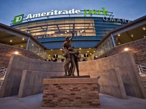
“Rosenblatt” is just funkier and cooler than “TD Ameritrade”. It reminds me of a middle-school teacher with a hip Dick Tidrow moustache, and leather patches on the sleeves of his corduroy blazer. Yup, a shout-out to Mr. Rosenblatt! Isaac Young, represent!
They try very hard not to let the public know that the TD stands for Toronto Dominion. Git yer dern fore-een hands off our World Series, ye dern Canajins!
Much as TD Bank bills itself as “America’s Most Convenient Bank” to cover at least two countries in North America and allow for possible expansion in the Western Hemisphere(?).
I can’t believe the Royals agreed to go into St Louis wearing a cardinal-red patch representing the state of Missouri. Couldn’t they have had a blue version? Or a neutral color for both teams? It made the enormousness and silly placement of the patch stand out that much more.
Hmm, Cardinal red + Royal blue…
South Carolina has the link in the CWS. Hands down. Their link away combo works great too.
UVA gets some props for their bad-ass link. I love the link cap look. One of the mid-90s uni-variations that link link link.
Heh. I just looked at those photos.
That’s my link.
Here’s a link from today’s Chicago Tribune that advocates (facetiously) contracting the Cubs and White Sox into one team. Any body wish to take a stab at designing the “new” Chicago White Stockings” uniforms as suggested in the article ?
Don’t know about the unis, but for caps, how about link?
Nice – but I was hoping that someone could improve upon this linkof a design
Those new police caps for Victoria, Australia with the checkered-flag band resemble the Chicago P.D. more than New York.
The checkered (sillitoe tartan) hatband is originally a Scottish thing and is used throughout the UK. I’m pretty sure they’re the norm in Australia as well.
Anyway, aside from the hats, when I see solid a solid navy police uniform, I don’t think of New York. I know they’ve been wearing the navy for years, but my mental image of an NYPD officer still has a light blue shirt.
Who the hell taught that Rays player on the left to blouse his pants?!
link
Are his pants tucked into his socks?
Yes. Kids these days…
I have read the site for years and I really like most of the posts, but I am very disappointed in all the hate for the Joplin patch. I understand not liking the enormous nike swoosh creeps and everything, but did you guys not see the photos from joplin?
as a St. Louisan and Cardinals fan I think it is fair for me to say that not a lot of people in Missouri cared about the size of the patch or whether it was red or blue. Its not like the Cards and Royals have a huge rivalry. I can for sure say that had the Cards worn blue patches for Joplin in KC I would not have had a problem.
If you want to complain about opening day patches that will be auctioned off with the money going in the pockets of greedy owners, thats fine. I agree completely but in this situation the entire weekend was spent raising funds for the victims in a tornado ravaged town. In today’s sports world where there are guys getting duis and assault charges on a near daily basis can’t we praise two teams that decided to do something right?
Again, I love the site paul.
PS those Cards faux-Stirrups look great
I have said exactly NOTHING negative about the Joplin patch. I have only observed — accurately — that it is really, really big, and that it probably has more logos on it than any other patch has ever had.
I don’t think anybody is downplaying that they’re trying to do something good. It’s okay to criticize the design. That’s not saying anything about the sentiment or reason behind it. Those are two separate things.
Josh, your post kinda pisses me off.
Not one person (that I’ve seen) has said anything negative about the purpose of the games/patches.
I have family in scattered throughout the state of Missouri, and I still think the patches looked like shit.
It looked especially bad on the Royals, as they had no room on their sleeves.
I can appreciate what the patch represents, but when it looks that shitty, there is no defending it.
Re: Rays stirrups
Most of the game’s starters were wearing the stirrups. John Jaso, the starting catcher, and Elliot Johnson, who pinch-hit for Jaso in the 8th, did not. Kelly Shoppach, who caught the 9th inning, did.
Surely, it’s no coincidence that neither Jaso nor Johnson collected hits in the game. ;-)
And who didn’t go high-cuffed for the Cards yesterday?
link.
All of the Nike teams except Vandy all had customized nikes. Carolina’s were all baby blue which actually made me favor the pajama pants style worn by some of the players because the baby blue shoes and socks were just too much. Texas A&M was by far the best looking team because everyone including the coaches all were their pants up with the higher stirrup look. Absolutely classic
I’m not sure if the rules are still being enforced, but in 2008 teams were only allowed to wear 3 different jersey sets in the CWS.
Three sets? In an eight-team, Swiss elimination bracket, you can’t play more than eight games. Why would you need three sets for that?
A home set, an away set, and an alt set that you inevitably need because one loss in a set means it’s cursed forever and if you wear the cursed set again, it’s two losses and you’re out. OF COURSE. *eyeroll*
Laundry turnaround. All teams in the CWS get their laundry done by only one service (or at least they did). If you’re game goes until late at night, and then you have to play in the morning, you want to be able to get the team dressed regardless if last night’s uniforms are ready. In ’08 we had a couple days like that. With rain delays, I wasn’t able to get the laundry to the service until past midnight, and then needed to have the guys dressed at 9 the next morning. Very little turnaround, and no room (or need) to risk waiting on the laundry service.
That’s a lame excuse.
You can still multiple sets of home whites and road grays (or whatever the standard uniforms are) if laundry service availability is a concern. A third option isn’t necessary.
You can still *have* multiple sets…
This is college baseball, not the pros. Frankly, some teams don’t have two complete white sets or two complete grey sets. I know my team didn’t, because the program couldn’t afford them. The colored jersey is used during the season for the same reason — laundry turnaround. Not out of vanity, but out of necessecity.
For example, in Omaha we had: 2 grey pants, 1 white pants, a jersey, a grey jersey, and a red jersey. During the regular season roadtrips, it was 2 grey pants with a grey jersey and a navy jersey.
Correction: this is bigtime college baseball. Of North Carolina, Florida, Texas, Virginia, California, South Carolina, Texas A&M and Vanderbilt, Vandy’s probably the only one where sports isn’t a major emphasis, am I right? Maybe Cal after that?
That’s almost true, except that Vanderbilt is one of the schools where the baseball team is a big deal. Note that a lot of those are southern schools that don’t have great football programs.
Does anyone know what throwback the Tigers will be wearing against the Dodgers this week?
I thought all Dodger opponents for the “throwback” games were wearing 1944 unis. I’m pretty sure I read that on Uni Watch so it must be true.
I’m surprised UNC and
USCSouth Carolina don’t get into some kind of argument over who gets to wear “Carolina” on their jerseys. Or have they?Virginia looks better than all of them, though. Love Texas, too. They need the Longhorn logo on the white helmet instead of a T.
We were here first; we’re the real Carolina.
Sincerely,
UNC
Yesterday I posted a more complete description of my design that Paul selected for the ESPN.com Uni Watch feature link.
Thanks again to Paul and everyone who votes for me.
That’s a really nice design, Tim.
I will say that, when you first glance at it, the white visor looks like the bottom of a ski cap pulled down over the player’s eyes. Then again, maybe that’s just me.
You’re not the first to say that exact thing, I think Vilk said it the other day almost verbatim. It’s a bit overdone – even I agree.
Gotta tweak the template.
Nope, I told him the same thing the other day. Good to see it’s not just *me*.
But you already knew that…
Not particularly related to anything, but I was playing Tecmo Super Bowl yesterday and it just happened to give me a color vs. color/a> matchup.
link
That’s not entirely uncommon in that game.
/I prefer the updated 32 team rom though.
If you look closely at the way teams are designed in Tecmo, you notice that the way the programming worked was that the helmets seemingly had to be colored the same as the pants. That worked fine for, say, the 49ers, but it meant that some teams got some weird looks that were nothing like their real unis (for example, the Steelers have gold helmets), and some (Vikings, Eagles) are perpetually in their road uniforms.
God, I love Tecmo Super Bowl.
“The coverage typically turns into a love letter to the area via video montages, cute little kids in little league uniforms, ringing aluminum and panoramic shots of the neighboring zoo”
Take out the ringing aluminum and you have an ideal setting. I know wood bats break, but aluminum isn’t the answer. Tweak the ball, make a new bat (wonder if link ever thought of tinkering around with this), but do something else.
Well, at least there’s an article in the ticker that addresses my concerns. Good to see that improvements have been made.
Plastic Lumber huh? I believe that’s called Wiffle Ball, and those break too.
Generally not a fan of alt-colored baseball jerseys, but I saw a Texas A&M highlight on ESPN last night, and I really dig their maroon jersey.
Maybe I could be a convert. The Stanford pullovers look good, maybe TA&M with a maroon pullover and grey/white pants?
link
It’s pretty startling how much the addition of those beautiful striped hose liven up what is, in all actuality, a pretty bland uniform (beyond the birds/bat, it’s pretty much a blank canvas)…
link
beyond the birds/bat, it’s pretty much a blank canvas
Beyond the chest insignia, MOST jerseys are blank canvases, no?
I think p was referring to the lack of sleeve piping, a headspoon, pants piping, or any other form of contrast other than the belt. Most jerseys do have something to set off the pure white besides the chest insignia.
And he was referring to the overall uni.
I think the Cards are the only NL team that wears pants that are devoid of any piping/striping/design element (no the MLB and Majestic logos don’t count).
OK, yeah, the Dodgers’ home pants are plain white.
jdreyfuss and JTH pretty much answered for me – no striping/piping, kind of looks directly off the rack from a sporting goods store. Not saying they’re the only ones, but the Cardinals need a bit of striping where, say, the Dodgers don’t.
And I’d say no teams benefit more from showing socks/stirrups than St. Louis. If there’s one team that the pajama era has hurt more than any others, it’s the Cards.
“It’s pretty startling how much the addition of those beautiful striped hose liven up what is, in all actuality, a pretty bland uniform”
~~~
and for about 100 years or so, that’s what made baseball baseball
now…you need to wear a softball jersey to “inject” color …
but hey, it’s not about aesthetics, right? it’s all about player comfort
I was just getting ready to post, that’s the whole point of stirrups. To add some extra color, extra flair to the jersey.
But [the A’s have] now worn the golds for five consecutive games – and have won all five of them.
I think Uni Watch has covered this before, but there has to be some kind of connection here. Players feel better — and therefore play better — with cooler digs? (Though I think the logo on those otherwise beautiful alts needs to be link.) Placebo effect for a uni-wearing superstition?
Funny how the better-looking teams (see: Yankees, Canadiens, Celtics, Fighting Irish, etc.) tend to be the most successful over the long haul.
The Indians are certainly playing better this season after changing their uniform lineup.
With the notable exception those pesky Cubs.
Ah, very true. I prefer to think of them as the exception that proves the rule.
I expect some kind of inverse effect takes place long-term as well: teams changing to trendy threads to try to jazz things up, then going right into the tank as players are obviously put into a supreme funk by having to wear such atrocities. Especially sad when they veered from a solid look. Too many examples to name here, but as a start: White Sox, Blue Jays, Brewers, Mets, Niners, Dolphins, Bills, Lions, Falcons, Wizards, Rockets, Bucks, (LA) Kings, Islanders, Oilers …
Unless they made a radical change in the late ’50s, I don’t think you could really use the Lions as an example of that happening.
I didn’t want to get too detailed and specify the timeframes I was thinking of (e.g., ChiSox have gone back and forth too many times to count), but yeah, the suffering Lions might be exempt. I was thinking of their going from bad (pre-black) to simply dreadful.
I still like my general point, a few outlying “successes” (Seahawks, AZ Cards, arguably ’70s-era Pirates) notwithstanding.
They mentioned the A’s wearing gold jerseys five straight games on today’s Baseball Today Podcast, and proceeded to question what Paul Lukas must think about the jerseys, and incorrectly assumed that he is not a fan because they are neither white nor gray.
HELP!
My son was just selected for his Little League’s all star team. We live near Vancouver, WA. He loves to wear Twin City 7 inch stirrups. The all stars are wearing red socks, so I need to get him two pair of size medium 7 inch solid red (scarlet) socks. His first game is a week from today.
Usually, I buy socks from baseballsavings.com, but they are out of red and will not have any in stock until July 15. Every website I have been to this morning is out. Does anyone have a suggestion where I could go to find a couple of pairs of stirrup socks for my son?
Thanks for any help you can provide…
– greg brown –
did you try googling for an online retailer?
Yes – I googled for about an hour. It seems all the outlets that normally carry stirrups are out of my son’s size.
I figured that if there were any place in the US that could get me a couple of pairs of red stirrups by next Monday, someone reading this blog would know.
UNC had special Tarheel Blue cleats on Saturday, should be wearing them today too.
link
I’m surprised Nike hasn’t gotten cute and put a black shank panel on UNC’s shoes for any teams.
North Carolina playing right now wearing navy jerseys and white caps with navy visor/logo. No carolina blue anywhere but the number on front of the jersey
There are a lot of stupid things done in the world of uniforms, but few things are stupider than wearing a pinstriped uniform with a non-pinstriped hat of the same color. (Looking at you, ‘Horns.) In a related story, lots of white caps at the CWS this year, no?
No Carolina-blue spikes on the Heels (or the rest of the foot, for that matter) today.
UT repeated a sin committed by the Diamondbacks and the Pirates (see Ben Fortney’s entry above).
Indeed. Even worse in the Pirates’ case. At least Texas sometimes wears a white jersey (which I love). Pittsburgh “matched” gray hats only with a gray pinstriped jersey. A pretty awful case of two elements that are completely fine on their own, combining to ruin each other.
The Angels are another team that has unwittingly made a tradition of ravenously using up and discarding identities. It could be the Halos are actively trying to disparage that period of their history– it could also be that Disney owns the insignias and emblems from that era. I would have guessed there was merely no space on the hat, but the pinstriped uniforms were left off the throwback schedule, as well.
Paul, I recollect seeing that odd-looking Cincinnati jacket when it came out, but I can’t offer any proof. Was it Brad Lesley-era?
Good article on the CWS unis. I was able to attend my first CWS game on Saturday. Never went to the old stadium, but the new one is a very nice ballpark.
Something goes on in Omaha during the CWS that most people don’t know about. Triple Crown Sports hosts the Slumpbuster youth baseball tournament over the same time the CWS is being played.
Teams from all over the country come to Omaha to play. While I wasn’t a big fan on Omaha, it was a great experience, and all our boys (11 years old) had a great time playing teams we wouldn’t normally play, and getting a chance to go to the CWS.
I think the organizers said there were over 500 teams in this year’s tournament. That’s a lot of families traveling to Omaha. I suspect this three week stretch makes up a major part of the tourism dollars Omaha receives on an annual basis.
I work at Schutt Sports & checked the graphics on the Father’s Day base jewels this afternoon. No semi-colon. All of the jewels are made at one time, using the same piece of artwork. The appearance of a semi-colon may be a light relection, or maybe an air bubble in the lensing material. There were a few extras & I’ve got a picture if you’re interested.
From the Topps archives: Didja know the ’69 Angels wore two-tone stirrups? Me neither, but Tom Satriano knew. link,!hUE3u01owE)BN9sC93wdQ~~0_3.JPG
Let’s try the express train: link
Johnny Cupcakes, a relatively small t-shirt/boutique with roots in Boston, is releasing a clever t-shirt to celebrate the Bruins Stanley Cup Victory:
link
As an aside, the owner takes great pride in the clothing and shop aestetics…might be worth an interview.
Who the hell pays $40 for a t-shirt?! Massholes I guess.
better question: who the hell pays $200 for a polyester shirt?
Yeah…Massholes. That certainly deserves a harsh insult. Good thinking.
I didn’t post it thinking the price could be the talking point, just thought it was a neat little piece of design that some would appreciate on this website.
EpicMealTime’s alternate logo?
When I used to look at the Cardinals striped socks I saw a thick white stripe with thin equally spaced black-red-black stripes set within that stripe. Now, starting in the last few years, I usually see two white stripes with thin black stripes equally spaced within a red field.
I know this is only an optical illusion sort of thing but was there a change in the spacing of these stripes in recent years where every stripe, especially the white bits, are the same width? Maybe I’m just looking at them differently.
aren’t those stripes navy?
i hear what you’re saying about the “optical illusion”
look at the rays rups…those sure don’t look like white-columbia-white-navy-white-columbia-white on a navy field, but two separate white-columbia-white sets, no?
Exactly. They both seem like two separate stripe “elements” instead of one large feature, if you know what I mean, which is the way I always used to “see” it.
yeah…I was actually going to write “or navy”. I was never sure what that color was – but I was more interested in the stripes themselves.
I think we need a “I’m calling it Rosenblatt” t-shirt.
Brandon Phillips is wearing a black compression sleeve tonight vs the Yanks. I think that is the first time I have seen that this year. It looks terrible.
I might be mistaken that he (or any Red for that matter) hasn’t wore it this year but here is a screenshot anyways:
link
Nevermind, I just looked back through game photos this year and he has wore the black sleeve before. I am losing my mind.
Although this is more proof of the need for Ditch-the-Black.
those second blue jerseys for UVA are their warmups. they wear em strictly pregame.
The Dolphins jerseys are aqua. But teams that adopted that color post-1990 call it teal. They are the same color: blue-green. Why the change in language? Was the word “teal” linked to the (short-term) marketability of the color?
All I know is:
Aqua=acceptable
Teal=fad
Sure, they’re both mixes of blue & green, but they aren’t the same color. Aqua is pretty much an equal mix of blue & green. Teal is more blue.
It is Northern York, not North York and they are located in Dillsburg PA. All of there sports teams mimic NYC teams. The baseball team has white jerseys with purple pins and NY on the chest. The football team looks like the Jets and the basketball team looks like the Knicks.
I forgot to add the links.
link
And the basketball must have changed up this season. They don’t look much like the Knicks. Now.
Marlins will wear black/gray road unis in “home” series at Safeco: link
The Jeff approves of this.
I’m going to the game on Saturday and will take pictures. Will the Mariners go with white uniforms? Blue? Teal? Unfortunately I will probably not be able to load the pictures on my Flickr page for at least a few weeks as I’m traveling and then moving from San Diego to Cincinnati in early July.
Great, I’m moving to Cincinnati in two weeks. No joke. That concealed firearm story is the last thing I wanted to read.
You spelled Omaha in “Omaha World Herald’s” Ohama.
Barry Melrose is the man who thought Steven Stamkos wouldn’t make it in the NHL. I take ANYTHING he says with a grain of salt. Garish Bumblebee colours over a blue and green sharp sweater. More anti-Canadian B.S.
In case anyone cares…..the V-Sabres logo doesn’t match anything else because it was originally designed as a stand-alone logo for the football team helmets back in 1995. For a long time the school produced a lot of merch with both the sabres logo and the old big block V, and the baseball team kept wearing the block V hats for a fairly long time IIRC. V-Sabres doesn’t really lend itself to a baseball jersey, though.