The Packers received their Super Bowl rings yesterday. By coincidence, reader Ray Barrington was recently looking at the Wisconsin Historical Society’s web site and found a bunch of really wonderful Packers artifacts. Let’s take a peek:
• Here’s a Packers sideline coaching staff card. “Doesn’t say what it entitled the bearer to do, but it was limited to 100 ‘coaches,'” notes Ray.
• Here are three examples of Packers letterhead, all from 1950 and all concerning the team’s stock offering. One of them has green graphics, another is in navy and gold (probably my favorite of the bunch — look at that football whizzing across the top!), and the last one has green and gold. Interestingly, that last one mentions that the team has won five championships, while the other two claim six.
• I love this 1951 promotional placemat, even though the use of orange is an odd choice for the Pack.
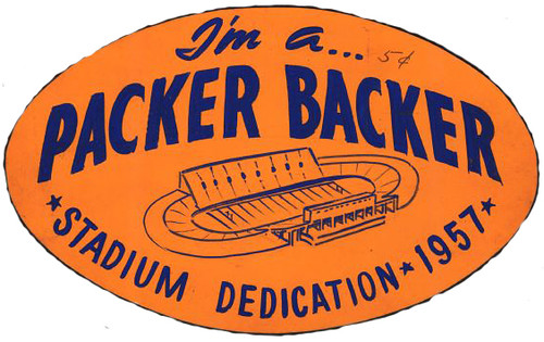
• Orange shows up again in this sticker. The stadium in question is, of course, Lambeau Field.
• Here’s yet another example of Packers letterhead, this time from 1959.
• Now that’s a nice-looking ticket stub. It’s a sure bet they wouldn’t use the word “crippled” or the silhouette of the kid on crutches nowadays, though.
• Hmmm, turns out that the “G” on the helmet doesn’t stand for “Green Bay” or for “Greatness.”
• Dan Devine didn’t have a particularly distinguished run as the Packers’ coach, and stickers like this one couldn’t have helped.
• Finally, here’s a Packers item that Mike Hersh found in the latest Mears auction catalog: an amazing Packers lawn ornament, which belonged to team photographer Vernon Biever. You can see the full auction listing for it here.

Summer Break News: As you may recall, I’ve taken a break from the site during the past two Augusts. This year, due to a variety of factors, will be slightly different: I’ll be away from the site from July 11 through Aug. 7 — a four-week span. Phil will run the site during that period, possibly with help from Johnny Ek, so we’ll still have daily content. Just not from me.
I’ll still be writing ESPN columns during that period, and it’s possible that I’ll make a cameo appearance on the site as well. But taking an extended break from the daily Uni Watch grind over the past two summers has proven to be quite restorative, and I’m looking forward to doing it again. Thanks for understanding.
ESPN reminder: In case you missed it yesterday, my latest ESPN column — about reader-submitted concepts to rename and redesign the Thrashers — can be found here.
Incidentally, in that column I mentioned how much I liked Kurt Snibbe’s idea to use a jet’s contrail to form the jersey’s lower stripe. But reader Adam Blank informs me that that’s been done before, albeit in a slightly different way, by the ECHL’s Pensacola Ice Pilots.
Uni Watch News Ticker: Here’s an absolutely superb article about the military uniforms worn in the Civil War, which weren’t as simple as blue vs. gray. ”¦ Anyone know why Yunel Escobar has written “K-A” on his cap? (As spotted by Casey Levene.) ”¦ Reprinted from yesterday’s comments: A surfing company has teamed up with the NFL to create NFL board shorts. ”¦ A New Mexico football player was arrested at an airport for wearing droopy pants. ”¦ Best thing about the Vancouver riots, Part 1: sexytime! ”¦ Kevin Wang was stuck in his office when the Mavs held their championship parade. “I decided to listen to the coverage on the radio online, so I went to the website for Sports Radio 1310 The Ticket,” he says. “The splash page that greeted me stood out, as they evidently used a stock photo of Dirk Nowitzki from last season or earlier (the Mavs redesigned their road uni this season).” ”¦ There are NOBs, and then there are NOSs — that’s name on sleeve. That shot is from an SCTV skit that Brian Mazmanian turned up. ”¦ New hoops uniforms in the works for UNC Wilmington (with thanks to Ken Watlington). ”¦ Best thing about the Vancouver riots, Part 2: The cops were wearing hockey gloves. ”¦ An orthodox Jew on the Israeli women’s basketball team requested permission to wear a T-shirt under her jersey for reasons of religious modest, but FIBA denied the team’s request, so now the team has created a special jersey for her (with thanks to Adam Soclof). ”¦ New third kit for Liverpool. ”¦ Remember USA Soccer’s “tie-dye” kit from 1994? Here’s a story about the guy who designed it (big thanks to Matthew Robins). ”¦ Blue undershirts are no longer part of the Nats’ wardrobe, but Jonathon Binet notes that Livan Hernandez was wearing one on Wednesday night. Even weirder, Pudge Rodriguez wore his blue catching gear — normally only worn on the road — for that game. ”¦ New away kit for Manchester City (with thanks to Peter Fischbach). ”¦ The Daily Mail has published a big feature on this year’s EPL kits (with thanks to Chris Cruz). ”¦ Here’s Brian Gordon wearing his non-leather glove yesterday. ”¦ Further proof that soccer is un-America: The L.A. Galaxy will unveil their new third jersey on July 4th, when they’re supposed to be grilling and drinking like the rest of us (with thanks to Isaac Rosenthal). ”¦ I’d been told — and had previously reported — that the Rays would be wearing this Tampa Smokers design as a throwback this season. Now it turns out that they’ve wussed out on the stogie. “If they’re so worried about promoting smoking, why choose the Smokers in the first place?” asks Cork Gaines, quite reasonably. ”¦ Best thing about the Vancouver riots, Part 3: Four different Canucks jerseys in one photo (with thanks to Dom Lewis). ”¦ Here’s a good survey of Penn State football uniforms through the years (with thanks to Bryan Koval). ”¦ Just in case you’ve been under a really big rock and didn’t realize that the 10th anniversary of 9/11 is approaching, the Brooklyn Cyclones are wearing a helmet decal all season long to remind you. ”¦ Here are the uniforms for the 2012 CHL All-Star Game (with thanks to Kenn Tomasch). ”¦ Adam Yarnevich spotted a bunch of Chiefs jerseys, including this one, on sale at Marshall’s for only $20. “It took me a minute to realize that the TV numbers were on the shoulders instead of the sleeves, where they should have been,” he says. ”¦ I bid on this beautiful old hockey jersey, but the price got a bit out of hand. ”¦ This is really sad: A high school in the Bronx has a football field that’s 20 yards too short. ”¦ But here’s something even sadder.
I had a feeling that the Rays would wuss out on the cigar! Makes me love my Smokers jersey even more. Actually wearing it today, too…
And I do want that hat!
here’s more info on that photo from the Vancouver riots.
link
this picture gives a better view of what really happened
link
For some reason the picture reminds me of a modern day version of the famous picture of the couple kissing in Paris in the 1940’s or 1950’s. More violent, sexier but still a picture that somehow captivates.
I believe you’re thinking of the picture of the serviceman kissing the woman on V-J day in New York City: link
I love that several of those Green Bay items (letterhead and Devine sticker) have “Packers” or “Pack” in quotation marks like that.
Dan Devine didn’t have a particularly distinguished run as the Packers’ coach, and stickers like this one couldn’t have helped.
“The Pack is Devine” seems pretty positive-sounding to me.
Nice to see that Penn State has a long tradition of ridiculously boring unis. Best of them had numbers on the side of their helmets.
Make that “marvelously boring unis.”
Meh. White and dark blue with nothing else. Maybe if I was a fan of the B1G or PSU I would enjoy them more.
In looking at the ESPN column, something stood out for me: the varied ways in which “Jets” are represented on these uniform designs.
The former Jets logo features an impressionistic delta-winged aircraft (maybe Canada’s only modern indigenous interceptor, the Avro Canada CF-105?), but it isn’t really meant to be identifiable as a specific plane. J. Morrison’s “Jets” and T. Fesmire’s “Squadron” are similarly represented in abstract.
Some of the designs were more realistic, though. K. Snibbe’s design features what looks like an F/A-18 (an aircraft actually flown by Canada), while C. Giorgio’s looks mostly like a B-52 to me (never flown by anyone but the United States airforce). A. Hill’s design looks to have an F-35, which is projected to be Canada’s next generation of frontline aircraft. As opposed to all the NATO aircraft above, J. Hayden’s MiGs features a very realistically represented MiG-15.
All of the realistic planes above are military in origin, so does that go along with the aggressive mascot trope or the soldier dress-up? Is a civil passenger plane just not cool? And what’s the consensus: abstract or realistic?
Re: the military planes… I don’t know about anybody else, but when I hear the word “jet”, I don’t think of passenger airplanes. I think of military jets. To me, the word “jet” has become synonymous with military planes. I’m not sure exactly why or how, but that’s just how my mind works. For me, it seems only natural that the “mascot” for the Jets would be some kind of military plane. But hey, your mileage may vary.
I guess that in today’s environment, it would give them the obvious, possibly unfortunate tie-in of military dress-up uniforms and such. Hopefully they will never go that route.
I guess the NY Jets don’t use a realistic representation (except for 1963), but their cheerleading squad is called the Flight Crew, so that sounds like more of a passenger airline reference. That doesn’t address the actual design at all, though.
I was a sentient being, albeit a teenager, when the Titans became the Jets. Sonny Werblin wanted to make it clear that a new regime was in power. Sonny’s favorite color was green, so goodbye to navy and gold. Name-wise, Sonny wanted something peppy, cool, up-to-date, big-time, and not in thrall to the Giants for its metaphoric nomenclature. The Mets were not very good but indisputably big-league and surprisingly popular, so rhyming a monosyllable made sense; civilian jet travel was still new and glamorous (the term “jet set” does not denote USAF Phantoms); and then there were the guys who fought the Sharks in West Side Story.
Throw in that odd jet plane logo they had for a while (abstract, non-lethal-looking), and I would say that the Jets (of New York, at least) definitely wore mufti.
The Jets also played at Shea stadium which is next to LagGuardia so I’m sure that helped too.
Very sad about the Lehman H.S. football field. Unfortunately, it sounds like what I would expect from our government: Give you $5MM for new bleachers and lights for night games, but make sure you can’t use the field for your #1 sport.
Also of note in the article: The “N.F.L.” I suppose its grammatically correct, but I don’t know that I’ve ever seen periods used before.
Most media outlets follow the AP style guide, but the NY Times has its own style guide, which among other curiosities calls for the use of periods in acronyms of four letters or fewer. Hence N.F.L., N.H.L., N.B.A., U.S.F.L., etc.
But not link?
Or is it an acronym/initialism thing?
And it’s just link…
So it must be initialisms.
Maybe we should R.T.F.M.
So basically it’s a $5 million baseball/softball field. A $5 million baseball/softball field with what look to be brown turf infields.
If you’re going to leave it 60 feet short of being useful for anything else, just call it what it is and put some dirt down.
They should just do what they did at Wrigley for the Northwestern game, just play in one direction, and if you run an interception back, if you get to the 15 yard line (or however much they can fit, call it a touchdown. It’s not exactly regulation, but then neither is having to play all your games on the road all these years. If they can play on a modified field in Austin in the Arena league (not to mention the Sneaker-game for the NFL championship in (was it 1932?) then they can do it in high school.
Roller Hockey, circa 1926:
link
I think I would like to see some of the bowling shirts advertised in the background.
Killer pic!
-Jet
I believe that’s John Candy with the extended NOB. John’s character always had to correct his coach’s pronunciation of his last name, because he wouldn’t say it right. An obvious dig at former Leaf’s coach Punch Imlach’s propensity of mangling some of his player’s names.
Hey, some names are tough.
Poor Vinny Del Negro never did learn how to pronounce Kirk Hinrich’s name correctly — his FIRST name.
Billy was a simple farm boy, who realizes his dream of playing for the legendary Toronto Bay Leaves, only to fall in love with a hippie chick, who teaches him that the violence of organized sports is immoral. It was a send-up of Canadian film board movies of the era: Candy was playing Darryl Sittler, playing Billy. Eugene Levy played Gordon Lightfoot, who sang the Canadian national anthem. Joe Flaherty played a guy — Dick Bedloe, maybe? — who did the sports on CHCH; he wore outrageous hats during his broadcasts (this guy predates Don Cherry’s crazy blazers by a generation). It was very, very funny, especially when they showed Billy in his early years, playing shinny on a frozen pond, Falstaffian John Candy on skates, knocking the tar out of a bunch of ten year olds. The uniform had a giant bay leaf where the maple leaf should have been.
Here is a link to that link.
Nice potential for the colorists over on Shorpy this morning: link, a Washington, DC roller hockey team. I’m guessing the “W” is for “Washington” in this case?
Aw crud, Jeff must’ve been typing this while I went for coffee. Apologies.
When I saw that the Packers had put Charles Woodson’s post-NFCCG speech on the inside of their ring I almost teared up. That is an awesome touch. Really the whole ring is well thought out all the way through. Very proud moment for Packer fans! :D
I love Packer fans. My best friend is a Packer fan. I loved today’s Packer items (especially that 1950 letter inviting the recipient to a meal but warning him that the new “economy program” of the Packers meant that everyone was “Dutch treat — okeh?”). I really really love the Packers lawn ornament that the Geat Hersh found.
Honest.
But those rings, Jeremy, those rings…
…are awesome? …have a lot of thought put into them? …are a display piece, not a piece of jewelry? …include elements on the inside of the band that are very special to the heart of what it means to be a Packers player and also a Packers fan?
I’ll accept any of those answers.
Is it all that suprising the Rays don’t want to equate “Smokers” with smoking? After all, they don’t want to equate Rays with, you know, rays.
4 different Canucks jerseys in one riot photo – how did they manage to not have the Halloween “V” version representin’?
-Jet
Maybe that jersey was already represented in the paddy wagon?
There are actually at least five different jerseys visible in that pic.
– black plate of spaghetti
– white plate of spaghetti
– white stick-in-rink
– two blue/maroon orcas.
– current home jersey (mostly obscured, but you can see it just to the left of the guy in the black jersey’s head)
There’s also a current blue jersey way in the background if you look closely enough.
And it’s tough to say, because it’s just the sleeve on the guy on the left (who appears to be adjacent to the guy in the blank dark-blue Pro Player replica Orca jersey), but that could be a current jersey or a throwback (which the Canucks ware as part of the 2003-04 Vintage program, and again as a third in 2006-07).
And it’s also hard to tell if the white stick-in-rink is this past season’s Reebok edition, because the way the hemline around the waist appears, it looks straight-cut, instead of the stupid baseball jersey cut Reebok implemented in 2007. Sorry, it makes sense in baseball because, like dress shirts, those unis are tucked in as a rule. I defy you to find any actual sweater or sweatshirt that has anything but a straight hemline at the waist!
Am I the only one who thinks it’s really tacky for the Cyclones to wear a 9/11 patch all season long? It would be fine if it were just for one game or even for a week, but the whole season?
I’m not trying to belittle 9/11 (I was three miles from the attack when it happened); I just think it’s a weird gesture to plaster a reminder of a tragedy that happened 10 years ago for a whole season.
I agree. And really, in the grand scheme of things, what does baseball (or any other sport) have to do with 9/11? Not a thing. Should my office put up a banner referencing the ten-year anniversary? What’s the difference? Hell, I’d almost say that a lot of office workers in tall buildings in major cities would have a lot more of a reason to put up a memorial than athletes. At least they could have some sort of emotional connection to the tragedy, imagining a plane crashing into their own building. But still… while it is no doubt one of the worst yet most memorable events in American history, and the most recent… I just don’t see why the tributes can’t be saved for that week, if nothing else.
Exactly when did sports teams and leagues assume this responsibility to ‘educate’ us? Seems to me the floodgate opened when they stuck flags on everything during Desert Storm.
Normally, we don’t celebrate/recognize/honor the beginning of things. Not Pearl Harbor, not the firing on Fort Sumter, and so on.
But we’re human, we need to feel…something. Just to reassure ourselves we’re still alive, that we DO feel. Especially as technology makes us increasingly less personal.
And I wonder, is all this preoccupation with sadness—this apparent need to share feeling bad about something, to have a patch or memorial for the passing of anyone and everyone–because right now it’s just so damn hard to find something significant to share feeling GOOD about?
this preoccupation with sadness–this apparent need to share feeling bad about something, to have a patch or memorial for the passing of anyone and everyone—because right now it’s just so damn hard to find something significant to share feeling GOOD about?
I don’t think that’s quite it. I think:
1) Due to a number of factors (technology in general, the internet in particular, the increasing fragmentation of niche-driven marketing, the increasing corporatization of everything), people feel alienated from each other, and from — for lack of a better term — “authentic” experiences. So they’re looking for something, ANYTHING, that feels real and that lets them feel like they’re connecting with each other.
2) There’s a contingent of people whose concept of “patriotism” is so warped that they won’t be satisfied until everyone is saluting a flag with “Taps” playing in the background 24/7.
My theory: I think it’s just another way for sports teams to bend over backwards to show how much they care…about everything. A lot of it is simple PR. “They care, so I’ll spend my money to go to their games” is the underlying hope.
That may sound cynical, but I’ve seen the future of sports uniforms and it’s a chilling sight. It came from last season’s MISL Milwaukee Wave and their decision to not have a regular home uniform.
link
I’d be surprised if they didn’t do that again. After all, that’s even more of a proverbial turn of the ratchet than MLB’s stars & stripes caps. How do you say no without being perceived as not caring? Soon other teams will catch on, then other leagues. Before you know it, there will be no more regular uniforms – just a custom jersey for each game with the name of the cause-du-jour on it. And there are an endless supply of causes, non-profits, holidays and civic observances from which to choose. It’s coming.
I agree that it is unnecessary, but:
I thought it was a pretty cool decal. They managed to include the twin towers, the outline of Pennsylvania, and the Pentagon in one image.
I thought it was pretty creative!
Not just unnecessary, imo, but pathetic. Ricko’s got it.
And Paul’s got it, too….
I agree. Paul’s points are the other part of mine, the groping for something authentic to feel, and for quite some time the candidates all seem to have been downers.
That’s why I don’t know that—on a visceral level—the celebrations of OBL’s death weren’t so much about celebrating a man’s death as much as they were about the authentic feeling that, “Holy crap, we actually came out on the upside of something for a change.”
I thought it was a pretty cool decal. They managed to include the twin towers, the outline of Pennsylvania, and the Pentagon in one image. I thought it was pretty creative!
Creative? I can’t even imagine a more literally representational way to design that sticker. It could not possibly be less creative. Nothing in that sticker has any degree of abstract meaning whatsoever; every single element stands for itself and nothing more.
It’s a great design for, I don’t know, an airbrushed painting on the side of a Harley’s gas tank. Or if you’ve got one of those conversion vans with no windows on the side, and you want something kind of slick and patriotic and less “I kidnap small children” than blank paint on the side of your van. Beyond that sort of use, it’s pretty crappy. Cleanly executed and all, but as a work of either art or design, crap of impressive purity.
Put link on the helmet, though, and I wouldn’t complain. “Honoring” 9/11 all season and ordering fans to “Never Forget” as though (A) We could or (B) It’s a sport’s team’s damn business to tell us what to think is still a cynically dickish thing to do, but at least the sticker would be a design with some level of creative thought behind it.
“… Put this design on the helmet, though, and I wouldn’t complain…”
I would.
Yeah, I would too, actually. But I would complain less, and that counts for something.
Interesting note about the differing Packer letterheads claiming to be both five and six time world champions. As of 1950 the Pack had only won three times – 1936, 1939, and 1944.
No, they won in 1929-30-31 as well. The first team to win three straight NFL titles (and, of course, the second in 1965-66-67)
Yes, the Packers were declared NFL Champs in 1929-30-31, but that was before championship games were played. In that era, the team with the best regular season record won it all, they did have enough teams for two divisions back then, but decided not to hold a title game.
So when talking about three time NFL Champs, the 1965-66-67 achievement is regarded as the more impressive achievement.
From Grantland today: An article discussing the bagginess of current baseball uniforms and the steroid era’s role. link
Yes and no to that Pensacola Ice Pilots striping.
The Four airplanes are F/A-18s, they represent the Navy’s Blue Angels demonstration team which is based in Pensacola. The four stripes are the smoke trail that they leave behind when they fly so they’re easier to see.
Further evidence that veggies can be link.
Thanks, JTH. That is the best thing I have seen in quite a while. Damn.
The Bronx HS field is 40 yards too small for football-presumably they’d need end zones.
Actually, looking at the picture better, the field is 100 yards including the end zones. So I think it could actually be used for soccer since there is some leeway in the length of the pitch.
Can’t the billion dollar corporation–the NFL–throw some money and goodwill at that that high school and build them a regulation field?
After throwing a 3-hit SHO, I imagine we’ll see more of Livo and his blue undershirt.
Two 15-team leagues in MLB?
Right. Owners, I would think, would shoot that one down real quick. At least an “all 15 in the same pennant race” template.
Why? Because perception is reality.
How’d you like to have the task of marketing tickets for a team that had finished between 12th and 15th for the past few seasons? Much easier if only three or four teams finish ahead of you, in your division anyway, after 162 games.
Exactly. It’s hard enough building a fan base in Washington for a team that finishes in fifth place most seasons. Can you imagine if the Nats were finishing 15th or 14th every year instead? Sheesh.
Sure, an unbalanced schedule is not 100 percent fair. Nor is it 100 percent fair that some teams have 3, 4, or 5 division rivals. But hell, even Old Man Selig’s fantasy of returning to 8-team leagues with no playoffs because that’s how they did it when he was 13 isn’t 100 percent fair. Even if every team plays every other team the same number of times, the Yankees will still never have to play the Yankees, and the Pirates will never get the gift of 12 games against the Pirates to pad their schedule. How are the Nats supposed to compete when they have to play the Phillies a bunch of times every season, but the Phillies never have to play the Phillies? Every schedule is unbalanced one way or another. That’s life.
All this just so the Jays and Rays have a marginally better chance of making the playoffs? Is MLB on the verge of collapse due entirely to the lack of a few thousand fans per game every August in Toronto and St. Pete? No? Then this, folks, is a solution in search of a problem.
While I agree with the gist of what you are saying… it’s a pretty telling statement that some fans would actually be that stupid.
“Nevermind that our record was 12th in the league last year… we only finished 4th in the league, so this team is on its way up! I should buy season tickets!”
Damn it. Try to make a point about people being stupid, then say something dumb yourself. That should be “we only finished 4th in the DIVISION”… maybe I should just stop posting for the day and get back to work.
“Nevermind that our record was 12th in the league last year”
Never mind it? Most ticket buyers don’t even KNOW it.
As I said, perception is reality.
“We’re #14, our owners don’t give a shit” isn’t much of an ad slogan.
Well as they say in France… “too-shay”.
“We’re #14, our owners don’t give a shit” isn’t much of an ad slogan.
~~~
i think the pirates already copyrighted that one
Ricky Rubio will wear number 9 for the Minnesota Timberwolves, according to this article:
link
And Ricko can take part in the 9 games for $9 a ticket plan that accompanied the announcement.
They’re only offering $9 to go to 9 of their games?
Gonna hafta do better than that.
I mean, there’s parking and gas and…
Oh, wait.
They’re still trying to SELL tickets.
My bad.
The NBA made a BFBS Mavs replica jersey based off of the locker room championship t-shirt. UGGGGGGGGGHHHHHHH!!!
link
by the time i get back sunday i am going to have 7 days worth of UW reading to catch up on, but real quick while i have rare access to the net…
tonight at the zhou brother art center in bridgeport(chicago), the pineapple(kate), is having her first major solo show post mfa, it is quite exciting. for those who don’t know the zho B space is a giant warehouse turned into art studios where they have a third friday art walk(much like where i was in pilsen before the move). but on the main floor there is a huge main gallery where she will be showing from 7-10(?). and while this may be an odd place for a UW party, all are welcome, shaggy, spanky, er, james, clubmedsux, everyone. there is a bar where you can buy cocktails, beer, and wine, but i will make sure there is plenty of old style on hand in a friends studio for those who like free beer. and it is free admission obviously. to find me, i shaved my beard down into a giant handlebar with some chin music, i sort of look like a three musketeer, so look for the 6’5″ musketeer for a beer from a uw peer. as a bonus, if this entices you, while i am not normally a big fan of the dorks who do this sort of thing, apparently behind the building outside there is going to be some sort of fire juggling pyrotechnics extravaganza with some sort of flame throwing bouncy house or some bs like that. okay? okay. i am sure i will see none of you there, have a great weekend people.
D’Artagnon! Come! We must go to save the king!
JimWa, yesterday:
But are there others like me here, to whom the facemask colors don’t really mean anything?
Me too. I’m obviously uni-obsessed enough to hang around here, but I can’t remember ever noticing a facemask color at the stadium.
Facemasks and stirrups… stripes and piping
These are a few of my favorite things
HOLY SHIT IS ANYONE SEEING HOW BIG THE ROYALS PATCHES ARE RIGHT NOW?
They’re so big, Felipe Paulino can’t lower his arms.
link
Looks better on the Cards’ sleeves, but it’s still big.
link
Oh it’s a Joplin thing. Good cause. But it’s huge and right on the upper breast. I’m sure it’s been talked about already but it’s shocking me.
USA beat russia today in the Churchill Cup, a rugby tournament, while wearing a cool uni…
link