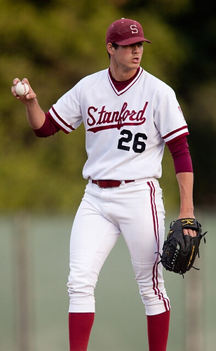
both of his stirrup loops poking out? And what if he did it all the time? Like, on purpose?
That’s Mark Appel, a sophomore pitcher for Stanford. As you can see, he habitually wears his stirrups out of the shoe. It doesn’t look so bad from the front. But from the back — ugh.
This look is apparently a fairly recent thing for Appel. He was wearing his stirrups normally in these shots from the spring of 2010 and in this video clip from April of 2010.
But this video — which was produced just prior to the start of the 2011 season and mentions Appel’s “incredible summer and fall” — is peppered with photos of his stirrups-out style, suggesting that he shifted to that format in the summer or fall of 2010. All of the 2011 images of him that I’ve been able to find show him with the loops unlooped.
I’ve never seen a player do this before, so I was looking forward to interviewing Appel and asking him about it. Unfortunately, despite my repeated requests, the Stanford PR department declined to make him available to me (seriously, guys, the whole thing would’ve taken five minutes). So here’s an imaginary interview, re-creating the discussion I suspect Appel and I would have had if I’d been allowed to talk to him:
Uni Watch: Interesting hosiery style you have there, Mark. What’s it all about?
Mark Appel: Coach says we have to wear stirrups — that’s the team rule — but I never liked the feel of the fabric under the soles of my feet.
UW: The fabric loops were uncomfortable?
MA: Yeah. So one day I tried leaving the loops out and it felt way better, so I’ve been doing it that way ever since.
UW: And your coach is okay with it?
MA: He said if it helps me pitch better, and as long as I’m still wearing stirrups, then it’s fine with him, yeah.
UW: Had you ever worn stirrups before arriving at Stanford?
MA: No. In high school we just had regular socks. In Little League, too. But when I came to Stanford, Coach said we have to wear stirrups, so we wear ’em. I don’t even really know what they’re for, to be honest.
The Jeff: Neither does anyone else. They’re pointless and they look stupid besides. Your coach should wake up and join the 21st century already.
UW: The Jeff, what are you doing in the middle of this interview?!
TJ: Don’t look at me. You’re the one who said it was imaginary.
UW: Quiet, you. Mark, have your teammates had anything to say about all this?
MA: Yeah, some of ’em kinda kidded me about it at first, because it looked a little different. But they’re used to it by now.
———
And there you have it, at least theoretically.
Meanwhile, just as we named the Pedro Porthole and Breathing Ethier, I think we should come up with a name for Appel’s unusual hosiery stylings. I confess that I’m stumped. Anyone..?
(Special thanks to Blair Riffel and Kevin Zdancewicz for bringing Appel to my attention.)
Uni Watch News Ticker: Here’s a really nice Tiger Stadium usher’s uni. ”¦ You know how sidewalks tend to be pockmarked with dark splotches of chewing gum? There’s a guy in London who makes little paintings on the gum splotches. ”¦ Rob Onolfi got a bunch of screen shots showing Bills LB Darryl Talley’s Spider-Man undershirt from 1990. ”¦ Remember those photos of John “I’m a PC” Hodgman wearing old-school football gear? “I had a chance to speak to Hodgman last weekend while he was co-hosting a pub quiz,” writes Mark McGinnis. “The pictures that have surfaced are from an abandoned project where he was to play an ex-football star. This was to be a not-so-inside joke, since he is a complete nerd who failed epically on the brief sports section of the quiz (for which his co-host wrote the questions).” ”¦ Yesterday I mentioned that the U.S. Army was making a headwear change. Now David Cline has provided the official memo spelling out the new rules. “It adds a few more details, plus you get to see how specific and details Army memos are,” he says. ”¦ Everyone knows the Mets are going to be trading off pieces of the team, and they’ve apparently started with Mr. Met. Kenny Jacobson spotted someone wearing that T-shirt yesterday. ”¦ Flag-desecration cap on tap for the West Virginia Power. “I’m pretty sure these will be worn on July 2nd, when the Power and the radio company I work for are working together on a Salute to The Troops Night,” says Joshua Exline. ”¦ Here’s a really good piece on college hoops players who wear No. 53, which happens to be the sport’s least popular number (with thanks to Casey Gross). ”¦ Kyle Drabek was sent down to the minors yesterday, which I believe means there are no pitchers with single-digit uni numbers currently in the bigs. ”¦ While looking for something else, I came across this great shot of two kids re-enacting the Twins logo pose. ”¦ Don Montgomery was in a men’s room at a place in Cape Cod called the Hot Stove when Larry Craig walked in and noticed that the walls were plastered with old newspaper sports pages. One of them, from 1937, included an AP report about a minor league game in which the teams wore polo helmets! Hey, cross-dressing and a men’s room mentioned in one Ticker item, not bad. ”¦ Cody Ross continues to look sharp in the striped hose. “Why can’t all the Giants players do that?” asks Sean Robbins. ”¦ This white undershirt thing appears to be spreading. That’s Miguel Cabrera from last night. “I’ve been a lifelong Tigers fan and I can’t recall seeing that before,” says Robert Waynick. ”¦ CNN ran an story yesterday about how watching TV increases your risk of diabetes, heart disease, etc. The poster child for this cautionary tale was a coach potato wearing an Islanders jersey. Draw your own conclusions. ”¦ Indians catcher Carlos Santana wears No. 41. But as Kyle Peterson notes, his knee savers are marked with No. 25. ”¦ “The worst-kept secret in the NHL is that the Kings will make their black alternates and “LA” logo the primary home uni and logo next season,” writes Marc Gilbert. “Their possible new [primary] center ice logo can be seen in their newly launched 3-D seat locator page for next season.”
Carlos Santana plays for the Indians, not the Tigers.
#oops
He was probably still thrown by the Tigers-clad Mr. Met… and the Indians did play in Detroit last night.
He also plays a mean guitar, FWIW.
(Somebody had to say it)
he also plays guitar.
Ugh. One can only hope he stops that practice after he gets a foot caught in the flappy stirrup while running. How about spurs?
link
How about you combine the two to form “spurrups”
I’m liking spurrups…
I was going with Jackhosiery, but spurrups is pretty good.
I was gonna say Appel Eye, since the opening makes a pointy oval shape and there’s the little pun in there similar to the others.
Thanks, it’s good to know that I now haunt your imagination.
Although I don’t really think that they look stupid, but they are a bit impractical and unnecessary. Colored socks are a perfectly acceptable way to maintain the same appearance.
“CNN ran an story yesterday about how watching TV increases your risk of diabetes, heart disease, etc.”
____
Yeah, of course it does. As does sitting at a computer, or reading books, driving long distances, or anything else you might do while sitting on your ass for multiple hours a day. If you don’t live an active life, you’re at higher risk. Let’s not be stupid and blame it specifically on TV.
Zactly. The TV has literally nothing to do with it. Between physics and biology, there is not one possible mechanism of causation that can lead from moving lights on glass or plastic screen to organ degeneration in a mammal. It’s not only not possible, it’s not even conceivably possible.
It’s the sitting around that does it. TV is just the thing people are most apt to watch when sitting around.
Much like the commercials where, “this product, alone with diet and exercise, will help you lose weight!”.
Really?
disrupspect
App’s Flaps
creamer has a photo of the new bills helmet
gray face mask!!! = awesome
Stupid. So, so stupid.
The Bills used the charging buffalo with a gray mask for 2 seasons. They used a blue mask for 8 seasons.
I am so god damn tired of gray masks as a part of retro design. The only reason they even exist as “traditional” or “old school” is because the paint chipped on the ’59 Packers. Seriously, you don’t think the rest of both leagues would have copied that in the 60’s? It only took 9 seasons for the entire league minus 2 (SF & StL – OAK, DAL, PHI were justified by color scheme) to copycat it after ’74, and that was after most teams’ helmet designs had become firmly established. In the 60’s, when helmet logos were still new, they’d have jumped on it even quicker.
Any team using a gray mask now for anything other than a one time throwback uniform is stupid. It’s gray mask for gray mask sake and it’s every bit as detestable as the BFBS. I can’t stand the Steelers, but at least they were smart enough to put a black mask on their retro alt.
The navy stripes are so thin as to be nearly invisible as well, so that’s also kinda pointless.
I think it would look better with blue mask. I like the gray masks against some colors, but it’s so close to white that it clashes.
with *a* blue mask
“Stupid. So, so stupid.”
I’ve said it before and I’ll say it again, I think white and gold helmets look best with gray facemasks. I think gray offers just enough contrast without going overboard. I feel that colored masks, like the blue masks that the Colts wore with their white helmets, offer too much contrast and are some what distracting. The same problem exists with red masks like the 49’ers wore and the Patriots continue to wear, red just sticks out too much when paired with a light colored helmet. The only redeeming part of the Arizona Cardinals’ otherwise garish and updated for the sake of being updated uniforms are their simple but traditional and beautiful white helmets with gray masks. Even if the rest of the Bills’ new unis don’t look good, they’ll still have nice helmets in my view if they go with these link.
It does look nice, but I still prefer the link.
I think you meant this one link
Didn’t you?
It doesn’t really matter why teams wore gray cages in the Golden Age. It only matters that they did, and the image resonates with football fans to this day.
Sure, the NFL’s aesthetic today would be different if the Packers wore link when Lombardi started his run to daylight. The league would also be different today had the Maras convinced Lombardi to return to New York in 1961, or any number of “what if” speculative moments.
History is history, and the Bills are just trying to tap into a little of it with their new helmets. Not the first, and they certainly won’t be the last.
Or, better yet (since I grabbed the wrong graphic), if Bart Starr had worn link while sneaking across the Ice Bowl end zone and dropping back to pass to Max McGee in Super Bowl I’s California sun.
I think the why behind a tradition should be important. I guess that’s why I’m opposed to a lot of traditions, because their reasons for starting are usually no longer real or meaningful.
Sure, use the gray mask on a throwback uniform – I have no problem with that, it’s accurate. But when you’re designing a *new* uniform, even if it is heavily inspired by a previous uniform, you don’t need to keep a stupid mismatched element that only existed originally due to chipped paint. And, in the case of the Bills – they wore a blue mask with that logo for longer than they used a gray one. The “classic white charging buffalo helmet” (if there is such a thing) had a blue mask.
I can understand The Jeff on this, as his feelings are similar to my own regarding another uniform element that these days is being regarded as “traditional” – the shoelace on the collar on a hockey sweater. These serve absolutely no function on a modern uniform – especially the Reebok Edge where you have that triangle with the NHL shield on it, which makes the lace-collar jerseys functionally identical to the V-neck. It’s ugly and pointless, and if someone gave me a laced-up jersey, I’d go out of my way to make a spectacle of removing that goddamned shoelace!
Yes. Yes I did.
The thing that made Buffalo’s helmet unique was the HUGE logo. No one else had a logo that took up that much real estate. That pic makes the buffalo seem awfully small. I hope it’s some kind of poor mock up.
I think the idea of grey face masks is not at all ridiculous when you think of what it is. A cage. Football is meant to evoke gladitorial images and many of those guys wore cages made of iron. So in that sense, grey is a design element.
Dark facemasks do not look good on light colored/white helmets. So the options for this helmet is white or grey. White on white looks too 80’s to me. So grey is really the best looking option here for me.
Seriously? That huge helmet logo was one of the things that made them a laughingstock. Every other team made fun of it.
The smaller logo is accurate for what they’re going for… since, ignoring the navy trim, the gray mask makes it a harkback to ’74 rather than ’82, when the logo was enlarged to it’s current size.
I don’t really see anything “80’s” about a white mask on a white helmet though. The Texas Longhorns and the Colts both started doing that in 1977.
/*shrugs*
Bell bottoms may have started in the 60’s but they are viewed as a 70’s thing. So the Colts and Texas started in ’77…3 whole yrs before the 80s
/*eyeroll*
I guess I missed all the laughing about the big logo. And since these arent throwbacks, but brand new uniforms with old design elements mixed with new, why do they need to be the same size as they were in ’72? Me? I like the big buffalo.
Regarding white facemasks, I always hated the Vikings switch to white in the early 80s during the Tommy Kramer era.
Wouldn’t mind seeing the Steelers return to gray cages, since
gray is a small part of the logo.
Lastly, I would like to see the Cardinals switch to a red facemask.
They just had to go and add the navy for no reason whatsoever.
And I know more folks here probably prefer the charging buffalo, but I always liked the standing version and it’s quiet nobility. I also love that it’s based on this…
link
No implied motion/speed-lines needed.
I was going to suggest a name referencing Appel and a link, but after five minutes, I got bored. I’m out of ideas.
Appeling ‘Rups.
Stanford has some beautiful baseball unis
Pullover jerseys don’t look so bad when paired with regular belted pants (and when everything is tailored nicely), right?
Best part is that they will never be confused for Staanford due to placket issues. I like pullovers! Or even zippers!
Eh, I’m still not a fan of the pullovers. It just looks cheap to me.
Now, zippers, on the other hand, I could get behind. I was never really sold until the Braves throwbacks they wore against the Dodgers a little while back. Those were damned fine unis.
Pullovers? No.
They had their moment. It was fun. But when I see one today I think softball….not that there’s anything wrong with softball.
I just think pullovers are better when you have script on your chest. The Reds home would look awful as a pullover. They need the buttons and the placket down the center. But I do think pullovers are better when we can eliminate the DBaacks, Philllies and Braaves among others.
So, you’re saying “not that there’s anything wrong with that?”
Sorry, there’s just never a bad time to shoehorn in Seinfeld.
link
Pullovers? Yes.
Beats seeing “RAAYS” and “Philllies,” or even link
Is it just the pic, or do the sturrups look a shade or two lighter than the rest of the color on the jersey?
While the pullover is definitely more tolerable with belted pants, Stanford would look immensely better in a button down or zip front. Pullovers just look cheap and lazy.
How ’bout the *other* famous cereal. Appeloops/Appelloops/AppelLoops.
The deal-a-day site Woot! has a link that takes Mr. Red/Mr. Met in a shambling new direction.
Definitely ordering one.
So you had to win the Masters to get a job at Tiger Stadium?
Whoa, I thought I was the only one who hated the feel of the little fabric strip under my foot! Never resorted to leaving the strip out though, that’s goofy.
Appelflaps
Stirrup loops out = Mudflaps
I like where you’re going with this. Maybe “Mudflappels” to incorporate the kid’s name.
Mudflappels…
Could say the kid was mudflappeling…
Thanks for the assist, Keith.
We need to bury Breathing Ethier and possibly make an overwrought memorial patch so we can make money off of it. Andre isn’t Breathing Ethier anymore. He no longer deserves to have that term named for him.
How about “Looper”
“a Looper?”
“Yeah, looper….you know…a jock…a caddy”
Andre isn’t Breathing Ethier anymore. He no longer deserves to have that term named for him.
I disagree. He pioneered it. Hell, Pedro isn’t even playing anymore, but it will always be the Pedro Porthole.
gungala gung galunga
“Cinderella story. Outta nowhere. A former greenskeeper, now, about to become the Masters champion. It looks like a mirac… ITS [not] IN THE HOLE!”
Cody Ross continues to look like a complete dick in those non-baseball socks.
If the stripes being maybe 2 inches too high makes you look like a total dick, what does pajama pants dragging on the ground do?
That makes you look like a complete dick too, Jeff.
So there’s no middle ground?
No Jeff, there’s not.
“That makes you look like a complete dick too, Jeff.”
~~~
im guessing he’s never heard that phrase before
Sorry.
He’s totally cool in those. And the current NLCS MVP can damn well wear anything he likes as far as I care. Ross is Boss.
Appelflaps is perfect, JW. And Walsh is right about Stanford unis in general: reliably excellent.
So glad I didn’t go with my first intuition:
Unincoregible (sic)
The “Spiderman” undershirt was actually a Spyder ski racing suit. Spyder’s trademark look was the spiderwebs back in the day.
Seriously, why CAN’T all the Giants (who wear high socks at least) wear the striped socks? Why do the Giants’ equipment people, management, whoever need to provide unstriped socks as well? So stupid, and a (mostly) missed opportunity, that hopefully Ross will help change.
So glad this was done in Chicago and not, say, Arkansas:
link
Appel bottoms?
Is he wearing boots with the fur?
The failure to wear the Stanford stirrups properly is disappointing. At least Stanford finally closed one other “loop de loop” on their unis: Back in the day the “a” and “o” on “Stanford” weren’t closed. My brother and I still say “Stunford” as a reflex everytime we see their baseball team on TV.
link
The guys depicted in the Twins logo the kids were mimicking are named Minnie and Paul.
Yeah.
But that doesn’t make the link any more or less awesome.
Not sure about the socks that Juan Nicasio was sporting last night for the Rockies…
link
The Rockies have always used socks with very prominent laundry tags. The player is supposed to write his uni number in the little white field, so the equipment staff knows whose socks are whose. Wouldn’t be a problem if Nicasio hadn’t cuffed his pants overly high.
Despite his many faults, Don Sutton instantly moved way up my list of favorite broadcasters when he said, “Boy, it sure is nice to see the Braves in some regular white jerseys for a change.” Glad to hear some one working for the organization who’s not afraid to voice some displeasure for the Sunday home reds and the Thursday road na……oh yeah, I forgot they wear the friggin’ navy shirts almost every night on the road now.
Appelplectic
Ding ding! Winner.
Let’s hope one bad Appel doesn’t spoil a whole bunch of future stirrup wearers.
Hmmm… close but not quite.
If we go with something along these lines, it should be “Appelplectic fit” or just “Appelplexy.”
I vote Spurrups. Appelflaps is fine, but I like the broader definition to suit anyone who choose to look this stupid on the field.
Pound for pound, on it’s own merit, I actually prefer Spurrups as well.
That said, keep in mind that our brief Uni-Sniglet history has a tradition of including the name of the pioneer (Breathing Eithier, Pedro Porthole).
link|=g3t
Can someone explain to me how this is ok but for the Mets it’s not?
Because the Mets took the step to block it and the Heat hasn’t.
And the Heat might, after seeing this. Paul had those Meats shirts out for a while before he got the cease-and-desist.
I musta missed a memo..,.did the Mets pitch a fit?
link
Try this link.
Oh, I wouldn’t be surprised if somebody in Miami is typing up a cease and desist right now. Assuming anybody is aware of it.
This reminds me of a line of parody team logos I was thinking about where “Meat” or a type/cut of meat was used in place of the team name.
That shirt would have been better using a flamming meat ball and not a raw steak…
In regards to Miguel Cabrera wearing a white t-shirt under his jersey. Most times when Cabrera is wearing short sleeves, he is wearing a white t-shirt underneath. He even did this last season. Here is a photo of Cabrera last year. He actually wears the white t-shirt on the road also.
link
Miguel Cabrera actually wears the white undershirt is most cases when he wears short sleeves. He wore the white undershirt last year also. Here is a photo.
link
What about Appel Bottoms?
I knew I wasn’t the only person that didn’t like the feeling of those loops on the bottom of my feet. Thank God Marshall had some football socks left over.
Given the “O” shape the loops create, I’m suggesting:
Appel-O’s
How is the Los Angeles Kings’ jersey switch for next season a “worst-kept secret”? They announced it months ago, and even took to the playoffs in their new home uniforms.
Exactly. It’s almost like someone forgot to tell them that it was supposed to be a secret. No one’s supposed to know, and they’re blurting it out to everyone they can find.
Very disappointing the Kings rejected their original color scheme, the throwbacks are insufficient. The purple/gold jersey with the huge crown was a terrific look, and was a nice link with the Lakers. I would even take the solid gold Kings’ uniform over the boring black.
purple & gold – lakers… kings? vikings?
Amen, brother.
Or, since by permitting the behavior on the part of one of its players implicates the school, not just the player, in the crime, how about:
Syrrups
or
Syracuffs
And holy cow, I stewed over those puns for like hours, and then realized 2 seconds after posting that I’d been confusing Syracuse with Stanford all day. As the man said in A Few Good Men, “Don’t I feel like a fucking asshole.”
“Stanford” plus “stirrups”? I’ve got nothing.
Cardinal Sin?
Did the same thing a few days ago when replying to the comments on the Michigan/ND game. I kept thinking it was Ohio State & Michigan.
Good to know I’m not the only one that looks like a “fucking asshole” from time to time :).
Ankle Breakers?
Unsanitaries?
Jockeys? (’cause they look like horse stirrups kinda)
StoredUps?
TurnedUps?
ShankenUps? (i.e. “Shaken, not stirred.”)
BlurUps? (no solid reasoning for this name other than the rhyme)
…more to come perhaps.
PullUps? (diapers / the bottom is pulled up)
PureUps? (because /everything/ is pulled up so it’s ‘pure’)
Unhooked Hosiery?
Holesiery? (the ‘rup creates a ‘hole’)
Appel Socks?
Changes to the Chicago Tribune, it’s layout, logos and fonts. link
Seems to me like they’re trying to draw in today’s readers with the look of an old-time newspaper. That concept may work in athletic aesthetics, but I think it could kill a newspaper.
Stirrup loops out = Appel Bottoms?
A Winter Classic in…Cleveland?
link
OK, it’s an NCAA game (which I’d rather watch anyway), not the NHL. Gonna need more than a sweater vest for that game, OSU fans.
/Go Blue
“OK, it’s an NCAA game (which I’d rather watch anyway)”
Big fan of the full cage, are ya?
Yeah, that too.
How about “Cameltosiery”
Not that it is a physical reference to cameltoe, but the thought that you see it, and at first you think “hmmm, interesting”….then quickly realize “that’s fucked up”.
Watching the LA/ Cinn throwback uni game at the moment and everyone is sporting the pajama look. I guess it takes alot of extra work to sport the stirrup look and the players just do not have the time! Geez……..
The navy with red bill caps are nice at least.
It’s because of Majestic. They’re making the throwbacks for these Dodger games now, and I knew that they would ruin it big time. I’m calling it right now: in terms of throwbacks, Majestic is the Adidas of MLB.
James Loney and Tony Gwinn (sp?) are the only properly-dressed players I’ve seen today.
*Gwynn
I think the navy caps are a little dark. They look almost like the lame black road caps from 2000-2006.
Very disappointing on the pajama front, as well.
On a positive note, I think if you swap out the navy cap for the regular home red cap, these could be a sharp road uniform for the Reds.
Failed Appelication
I like Appel Bottoms
That is a fabulous photo of the re-enactment of the “Twins logo pose”. I hereby nominate it for the unoffical UW photo hall-of-fame. It has all of the elements of a UW classic: The kids are cute, their uniforms are great, the nostalgia factor is huge, and, as an added bonus, they are having fun with a timeless, iconic logo.
The Appel Abberation
Here’s what I’m missing from the Appel discussion – why doesn’t SOMEONE (preferably the coach) tell the kid to wear his uniform right?
Is the kid such a superstar that he can do whatever he pleases? Is this another example of treating college kids like superstars.
Kid is in for an awakening after he graduates and meets his first single-A manager.
New 3rd Kit for Liverpool FC (I am digging it):
link
You know your organization is well run when… link
link
Barca’s BBall team is totally ripping off their Futbol team.
link. It’s an link.
They should totally sue… um… themselves.
‘Tis the way things are done in Europe, Timmo.
For instance, here is Poland’s Cracovia link and link
The link on the other hand, decided not to play along.
Has anyone suggested “appelsocks”?
How about Poison Appels?
Since it looks like Boston will defeat Vancouver for the Cup tonight, depriving the Canucks of an unusual uniform oddity.
Could be wrong, but I can’t think of another pro sports champion who used a different color scheme which at one time, then returned to the original color scheme. Also, in the history of that franchise, the other color scheme was used more frequently in franchise history.
This is true of the Canucks, who used the “V” style uniform color scheme for a longer period of time than the blue/green original combo. This happened before the Canucks went red/blue, and before they finally returned to the blue/green. To clarify, there was a point in Vancouver
history where the most common color scheme in total years was the “V”
Looks like Reebok did a pretty good job with the Stanley Cup championship gear.
link
‘Cept they have the Hawks celebrating in their photos. link
Is it ironic or fitting that the Vancouver riot police are wearing hockey gloves?
How about StirOuts!?!
The Buffalo Bills official site has been posting unirelated articles in prepration for the Uni Release event next week. This one on Uni Extremes in Bills history is pretty cool. There are others on the site as well if you wa nt to check them out.
link
Our company has specialized in NFL.NBA, MLB , NHL link .If you are interested in it ,pls feel free to contact us .
Yahoo email : link .