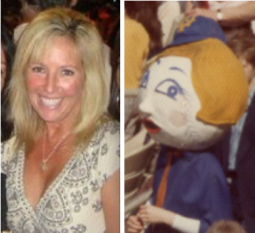
The increasingly indispensable Mike Hersh has found yet another way to be indispensable. Mike’s wife works with woman named Lynn Farrell, who has an unusual line on her résumé: Back in the mid-1970s, she was a live mascot for a big league ballclub. Specifically, she was Mrs. Met. You can see a few shots of her plying her trade alongside Mr. Met in these photos.
Mike and his wife recently arranged for me to interview Lynn about her experiences. Here’s how it went:
Uni Watch: First and foremost, let’s clear up one very important thing: Were you Mrs. Met or Lady Met?
Lynn Farrell: They told me I was Mrs. Met. And when I signed an autograph, that’s how I signed it.
UW: How did you get this job?
LF: My father, Dan Farrell, was a photographer for the Daily News in New York for 50 years, and he mainly covered sports. He heard about the job, and he told me about it.
UW: So you just applied for it..?
LF: It was more like he kinda had an “in,” and I got the job. He brought me over to Shea Stadium, and they handed me the dress with the cape and the head. The eyes were metal screens.
UW: What year was this?
LF: That was 1975.
UW: And how old were you then?
LF: I was 17.
UW: Were you a Mets fan?
LF: Yes, I was a big Mets fan. I grew up on Long Island, and my dad would often take us to the ballpark when he was working. We’d sit up in press booth to watch the games.
UW: So this was like a dream job for you. Did you have it just for that one year?
LF: No — two years. And that head was made of plaster of paris. It was so heavy! I was like 100 pounds at the time, so if I leaned a little to one side, I almost toppled over. Nowadays, when you look at Mr. Met, it looks like his head is all foam.
UW: Yeah, he’s spoiled.
LF: He doesn’t need neck muscles like I did.
UW: For those two seasons that you worked, did you work with the same Mr. Met, or was it two different guys?
LF: It was the same guy both years. He was actually my boyfriend — we’d been dating since I was 15. My father arranged to get the job for him, too. And I actually ended up marrying him. We were married for 25 years, but we got divorced later on.
UW: Oh, I’m sorry. But still, that must have been quite a trip. You’re teen-agers, you’re dating, and now you’re working together at this job where you’re sort of fake-married.
LF: Yeah, we went from being Mr. and Mrs. Met to being Mr. and Mrs. for real. We got married when we were 18.
UW: Wow. Were you still working as Mr. and Mrs. Met then?
LF: I’d just finished doing it.
UW: So being Mr. and Mrs. Met was like your engagement.
LF: Yeah, kinda.
UW: What was your work schedule like?
LF: Once school let out, I worked every home game during the summer. I’d go out on the field with Mr. Met. We’d stand together for the national anthem. And then we’d walk through the stands and sign autographs during the 5th and 7th innings.
UW: What would you do for the rest of the game?
LF: Sit and watch it!
UW: Where?
LF: In the press booth. I’d take the head off and watch, and then they’d want us out there for the 5th and 7th innings.
UW: What was your pay?
LF: I got paid $100 cash in an envelope for every game. That was a major amount of money. I already had a job at McDonald’s, and it would take me a whole week to make $65 at that. So this was so much better. Plus we got all the hot dogs we could eat! And soda too.
UW: And they would literally hand you an envelope of cash? That’s so Mafia!
LF: I know, right?
UW: Was Mr. Met paid the same amount as you?
LF: Yes, we got the same.
UW: Wow, so you were striking a blow for gender equality and pay equity. Who was your boss?
LF: I don’t remember his name. Some guy who helped run the stadium.
UW: Were you the only Mrs. Met during those two seasons, or did you rotate with other Mrs. Mets?
LF: I was the only one.
UW: When you went around signing autographs, did you talk to fans?
LF: No. We were told not to talk.
UW: What if a fan asked you something?
LF: You just shook your head yes or no. I kinda stopped going through the stands, because guys were grabbing my legs.
UW: You were getting harassed?
LF: Yeah. So I figured out that it was better to stand in one place, at a railing, with a guard. That’s when I’d sign the autographs.
UW: Ah, so you let people come to you. Smart strategy! But in these photos of you, you and Mr. Met are close together. Is that how the two of you usually worked, as a pair?
LF: Yes.
UW: And even with your supposed husband right there, fans were basically groping you?
LF: Yeah. You couldn’t really see out of that big head, so you’d feel someone on your leg but you couldn’t see it, and I’d have to turn my whole body and hold the head to look down — it was a little rough. Later on, I often wondered what happened to Mrs. Met, and maybe they just thought it was easier not to have to deal with all that stuff that I dealt with.
UW: Would you also pose for photos with fans?
LF: Yes, sometimes.
UW: Did fans ever ask you to marry them?
LF: No. But some older men would say they were in love with me.
UW: Did you interact at all with the players?
LF: No.
UW: Did you have your own locker room?
LF: Not really. It was more like a storage room where you’d change and leave your stuff.
UW: What about your father — was he there for most of the games when you were working?
LF: Yeah, he was usually there taking photos.
UW: Was that weird, working a job with your father right there?
LF: Well, I wouldn’t see him. But it was a good feeling to know that he was there. Now, he was friends with all the players.
UW: These photos of you as Mrs. Met — did he take those?
LF: Yes, he did. From the press level.
UW: Are you still a Mets fan today?
LF: Oh, yeah. I still go to games.
UW: When you see mascots at a ballgame — whether it’s Mr. Met or another team’s mascot — do you think you look at them or perceive them differently than other fans do, because of your experience as a mascot?
LF: Yeah, definitely. The head, the costume — I’m always looking at them.
UW: Have you seen that the Mets now have a Mets Hall of Fame at the stadium?
LF: No, I haven’t.
UW: It’s pretty good, and it includes what they claim to be the original Mr. Met head from 1964, which looks like it might be the same one your boyfriend was wearing. [As an aside, reader Jarrett Mattina recently pointed out to me that the mannequin in the Mets Hall is wearing his stirrups backwards, something I’m sure Lynn’s boyfriend would never have done. ”” PL]
LF: Oh, I’ll have to go see that!
UW: Do you ever tell people about your experience as a mascot?
LF: Sometimes I’ll be talking to people and they’ll mention the Mets, and I’ll say, “I was Mrs. Met!” And they usually think I mean that I was a big fan or something like that. And I’ll say, “No, I was really Mrs. Met!”
———
Great story. Oh, and if this guy happens to be a Uni Watch reader, I’m interested in purchasing that shirt from you. Thanks.

Collector’s Corner
By Brinke Guthrie
Has anyone done a study to see if items featured here on CC end up selling for a higher price? Maybe I should get a kickback! Here are the latest items whose sellers should at least send me a thank-you card:
• This is pretty cool: a stamp book for the 1954 New York baseball Giants.
• Speaking of the Giants, check out this 1954 World Series press pin.
• Luv Ya Blue! That’s what you’ll be saying with this collection of vintage Oilers glasses.
• *Here’s a great LP commemorating the first 100 years of MLB — and dig the cover art.
• I had one of these (for the Cowboys): an NFL helmet “hubcap” for your bike!
• Here’s a cool NFL sticker sheet, circa 1980.
• And speaking of stickers, everyone loves Sir Saint and Dem Bums. And then there’s this Cowboys sticker, which graced our family Ford station wagon back in the day.
• Here’s one from Mike Hersh: a set of Twins binoculars.
• And we wrap up with one from Paul: a giant Adidas trefoil pillow!
Seen something on eBay that you think would make good Collector’s Corner fodder? Send your submissions here.

Culinary Corner: Last night I attended a “Beef, Beer, and Butchery” event at the excellent East Village restaurant Back Forty. Chef Shanna Pacifico was mixing up some superb steak tartare, plus there were several other fine beef-related hors d’oeuvres that I neglected to photograph (including some spectacular beef heart, which basically tasted like steak, not like offal). But the highlight was a demonstration by Fleisher’s Meats honcho Joshua Applestone, who showed off a few roast-tying techniques.
If you’re at all kitchen-fluent, then at some point you’ve probably cooked a roast (of beef, of pork, a whole chicken, whatever) on a bed of root vegetables. It’s a classic method, right? But Applestone showed us a trick I’d never seen before: He cooks his roasts on a bed of marrowbones! So the rendered marrow and meat juices commingle in the pan, and then you can baste the meat with the resulting ambrosia (and suck the marrowbones dry afterward). Total fucking genius.
Uni Watch News Ticker: Some dude in California has created a Nike museum. Even I think that’s pretty cool. ”¦ Who’s that good-looking basketball squad? It’s the Green Bay Packers hoops squad, photographed on Feb. 15, 1963 (great find by Mako Mameli). ”¦ I know, I know, everyone used to smoke back in the day, but it’s still jarring to see the Iron Horse doing it (with thanks to Matthew Robins). ”¦ Blair Parsons reports that curling is apparently coming to about the last place you’d expect: Texas. ”¦ Bit of a cock-up in yesterday’s Miami Herald. ”¦ Someone over at Yahoo Sports suggested that Todd Coffey’s throwback pants were too short. But of course they were just right if he’d simply bloused them properly. Jeez. ”¦ Here’s another piece on Coffey, only this one includes a great extended passage from an old Shirley Povich piece about the 1936 Sens’ uniforms (with thanks to William Yurasko). ”¦ The Mavs might not get championship rings (with thanks to Chester Baker). ”¦ Absolutely spectacular article about the embossed pattern on Oreos, and about cookie embossing in general. Among other positives, it includes the spectacular term “3D biscuitry” (great find, Kirsten). ”¦ Look what happens if you turn the Dodge Viper logo upside-down (with thanks to Ronnie Poore). ”¦ Did you know Coca-Cola made cigars? I didn’t, until Mike Hersh pointed me toward this catalog. ”¦ Dan Cichalski reports that Will Clark took BP the other day in a full 2011 Giants uni, complete with championship sleeve patch — except it had an NOB. Bogus. ”¦ Tottenham Hotspur (that’s an EPL team) has created an app on their Facebook page that allows fans to customize the team’s new kits. “Here’s what I think their home, away, and change kits should look like,” says Terence Kearns. ”¦ The new album by Nodzzz — a great little San Francisco band — is called Innings and its back cover design features an endearing baseball field configuration that I’m surprised not to have seen before. ”¦ Looks like the North Adams Steeplecats are wearing old-school Packers-style hose (with thanks to Shane Bua). ”¦ The new U.S. women’s soccer home kit looks like a nurse’s uniform. As for the road kit (scroll down a bit), someone at Nike was actually paid to write, with a straight face, “The away kit features a black bodice and red piping inspired by the beautiful but deadly Black Widow spider. Similar to the spider, the US Women’s National Team will have a unified and bold look but they will need to be deadly on the pitch to win the tournament.” Uh, right (with thanks to Evan Sadler). ”¦ The U.S. Army is making a headwear change: berets are out, baseball caps are in (big thanks to Morris Levin). ”¦ “Li-Ning is the official sponsor of the NBL in China,” writes John Brilliant. “So if you wear Nike shoes on court, they make you put Li-Ning stickers over the swooshes.” ”¦ This is pretty great: Back in the early ’80s, the Spokane Indians were an affiliate of the Angels, so their logo character was an angelic Indian (with thanks to Coachie Ballgames). ”¦ Dodgers’ next throwback game will be tomorrow against the Reds, who’ll be wearing their 1944 grays (with thanks to Sean Kesling).
Untold Uniform Stories: Missing helmets in Miami
link
Good stuff!
Why were so many people wearing the same (hideous) hat at that Mets game? Promotion?
Bucket Hat Day!
Wow. My favorite story since I don’t know when. Mrs Met! My favorite mascot!
[Somewhere in your Vault of Fame, you’ve got a photo of that spectacular Mr & Mrs Met T-shirt, Paul: couldja wouldja show it again, please?]
So many things to love: the concept; Lynn’s geniality and self-awareness (and she looks, great!); the $100 envelopes; the 100 pound head; the changing closet; the dad, the boyfriend, the husband, the ex. Man.
Hersh, the trophy is in the mail. Now back to the ticker.
Somewhere in your Vault of Fame, you’ve got a photo of that spectacular Mr & Mrs Met T-shirt, Paul: couldja wouldja show it again, please?
I believe you’re referring to this, Conn, yes?:
link
But on that shirt, she’s Lady Met, not Mrs. Met. That’s why I started the interview by asking Lynn to clarify what she was called.
Yep, that’s the photo. And of course you’re right; that’s Lady Met on the shirt. Was there ever a Mrs Met explicitly designated as such? For some reason, I think I remember I thought there was a Mrs Met in the 1960s ….
[This is where Scott steps in, reminding us that Einstein, not to mention Berkeley and Hume, have shown us that the very act of perceiving creates a new reality quite as real as the “real” reality; hence, Mrs Met lives, beyond the interesting but modest tactile reality of Lynn Farrell’s summer job.]
I need help, that’ for sure.
Honestly, I had never been aware (or else had forgotten) that there was ever a Mrs. Met until I was introduced to Lynn. I have no memory of the live mascot herself (weird, since I was a very passionate Mets fan in the mid-’70s), and I don’t recall her representation being used either.
What I *do* remember is that I had a pennant back in ’71 that included Lady Met. So it’s possible that Lady Met was sort of soldered onto my brain early on and that I interpreted all subsequent female mascots as Lady Met, no matter what they were officially called.
Wow – Mrs. Met. What a find!
I don’t know if link are the same, though. If they are, it’s definitely been repainted – look at the lines around the eyes – but somehow the nose looks pointier to me.
Craig Calcaterra likes the interview, he just posted it on hardballtalk’s site.
Connie, the trophy goes to my wife for this one.
I’m just confused as to why Mr. and Mrs. Met are wearing blue and orange, and no black. It IS a Met team color, right?
(Now excuse my feeble attempt at sarcasm, while ducking from whatever it is that Paul and Phil are sure to throw at me)
As lovely as that interview was, she couldn’t have been the first Lady/Mrs Met — In one the Mets Yearbook films that SNY runs, there is a film snippet of a Met promo tour, with, yes, a ‘Lady Met’ – and if memory serves, the same costume. I THINK it was the 1965 season promo film – but don’t quote me!
First, what a great interview (and I have absolutely ZERO interest in the Mets).
Second, and I can’t believe it hasn’t been mentioned (but maybe I’m just a pig), If the pic next to the Mrs. Met pic is current, then Lynn is living well…she is a beautiful woman (given that she was 17 in 1975).
Anyway, can you imagine a 17 year old girl being asked to wear a 100lb plaster mascot head (while being groped) in today’s world? Kudos Lynn, for your effort!
Great interview. After spending 3 years as the University of Texas mascot, I can assure you that girls still wear heavy costume heads (Hook ‘Em’s head was made from fiberglass). Groping is part of the territory for any mascot, male or female. I can’t count the number of times drunk fans tried to do to much to me or any of us who were Hook ‘Em.
Hey, Arthur, ever think of a group-interview-reminiscence of your fellow college mascot people?
Patrol caps are NOT baseball caps.
Yes they are, considering that style of hat was developed and/or popularized by baseball a long, long time ago.
No, not really.
link
Patrol/Field/Utility caps history trace back to the 18th century Kepi, Shako, and Forage caps of military wear.
That’s great, but they’re using traditional baseball caps nonetheless.
Yeah, unless there’s a new, more baseballish design, I’d have to agree with FDD that link. The article does refer to them as patrol caps and not baseball caps.
On the other hand, link and they make cops look like mall security guards.
Interesting. I think you’re right, FDD, that the kepi is the direct ancestor of the modestly-peaked forage caps that the American, German, and Japanese armies wore in WW2 and thereafter.
But I might argue that the baseball cap is the direct ancestor of the big-peaked military headgear first worn by higher-ups in the US Navy of WW2, eg Admiral Halsey. I think it’s no coincidence that the baseball cap look first predominated in the armed forces of the US and Latin America (Cuba included), good beisboleros all. Nowadays — as Paul has entertainingly chronicled — the baseball cap is ubiquitous, among civilians and soldiers alike. I’d argue that that ubiquity (even for military uses) comes from the baseball cap, not the forage cap, and that the most important (unconscious) promoters were baseball-cap-wearing American non-baseballers, especially young African-Americans.
I stand corrected. They’re wearing pillbox caps. ;)
It’s a patrol cap (also called a “leg cap” by the Airborne).
Per Army Regulation 670-1, Wear and Appearance of Army Uniforms and Insignia, para 3-5 b (1), “The patrol cap (formerly called the BDU cap) is worn with the BDU in field environments when the Kevlar helmet is not worn.”
The one that looked like a baseball cap was OD green, not camo, and was phased out around 1983.
I served in the Army for 23 years, and wore the patrol cap while in the field, and the maroon beret in garrison. The patrol cap was more useful, as the beret provided no shade and smelled like a wet sheep when it rained. But the paratrooper beret wasn’t designed for shade — it was a mark of distinction, as was the green beret of the Special Forces and the (formerly black, now tan) beret of the Rangers.
Happy Flag Day!
Funny twist to this whole argument: “patrol caps” or “underway hats” on board Navy submarines ARE baseball hats. We could wear whatever hat we wanted underway. Those Army covers are NOT baseball caps though, sorry.
Yeah – The Army is returning to Patrol caps, not baseball caps, and not pillbox caps. There are differences, especially when you consider the style in which most Army Soldiers wear their caps. i.e. about a 1/2 inch too small, flattened across the top of the head, while popping up the front. Similar to this guy/rendering:
link
I still have one from my ROTC days in college, size 7. (for the record, I was a Medical shakeout)
This was the best line from the entire article:
“WASHINGTON (AFP) — The US Army is abandoning the beret, after a failed 10-year experiment.”
Who knew you could “fail” a “10 year experiment” in the hat world?!
Pretty much every article has had an equally worthless headline. Since the Army isn’t “Ditching” “Abandoning” “Dumping” or “Shelving” the black beret. Every soldier (yes every) will still be required to be issued, and maintain one.
It is still the primary headgear of the Army Service Uniform.
I hope these are the grey unis, the Tigers wear when they play the Dodgers in a throwback game.
link
BTW, Paul. Nice story on Mrs. Met, I always wondered what it was like to be a mascot.
A few thoughts:
1) What’s Sly Stone doing on that Baseball’s First 100 Years album cover?
2) Can we pitch in to buy Todd Coffey a mansiere?
3) How many days before the US Women’s Soccer Team begins playing?
I saw a commercial for the Women’s World Cup last night..I believe it’s the 20th of this month.
Re: Todd Coffey’s pants –
Is he really THAT opposed to high-cuffery that it had to come to that? Those pants are obviously tailored to show some sock.
perhaps he doesn’t want to feel restricted by his uniform
1) His jersey should have been a size larger.
2) I watched part of this game, and when Coffey threw a pitch, his pants leg would ride up and show the stirrup. I just think he didn’t know how to high-cuff.
For the record, here’s link, to give you an idea of Povich’s uni ideal.
He spent his entire baseball career with the Nats as a player, manager, scout, farm system director and, with an accounting background, as the team’s controller. He stayed in that position when Cal Griffith moved the franchise to Minnesota.
Are we absolutely sure this isn’t a promo for Larry the Cable Guy’s show on The History Channel?
link
Saw a story on Coffey once, and I came away with the impression that he just “doesn’t give a rat’s ass” what people think.
I think it’s entirely plausible that he didn’t give it a second thought.
“…came away with the impression that he just ‘doesn’t give a rat’s ass’ what people think.”
I think that’s perfectly clear, yes.
Paul – more about Coke-cola cigars: link
Also, the former Mrs. Met is a fox!
My first reaction to seeing the Coffey photo was, “Funny, I don’t remember having pitched a major league baseball game last night.” My second reaction was, “He must be planning a post-game trip to seashore, to dig for clams.”
The “angelic Indian” looks mighty angry, and there’s some menace in the way he handles that bat. He’s an avenging racist stereotype angel.
The Angelic Indian is an interpretive gold mine. I love him.
While watching the final The Finals game a couple nights ago, the Dallas blue uniforms with grey/silver numbers caught my eye and made me wonder how often you see colored jerseys without white numerals. I decided to research it until the Heat made a comeback. Please note alternate uniforms are not included, and it was late, so I’m not sure about being 100% accurate. It turns out it’s a great deal more in the NBA than anywhere else:
NBA – 19 white, 11 color
NFL – 29 white, 2 color
NHL – 24 white, 6 color
MLB – Primary uniforms are/are meant to be either white or grey
I don’t know what made me decide to research this, but watching the Mavericks win tonight, it caught me as odd to see them with dark uniforms and non-white numbers on their backs. I wondered how often that happened in pro sports. It turns out it’s a great deal more in the NBA than anywhere else:
NBA – 19 white, 11 color
NFL – 29 white, 2 color
NHL – 24 white, 6 color
MLB – Primary uniforms are/are meant to be either white or grey – no research done on 3rd jerseys
Interestingly, in my home town of St. Louis, there are NO pro sports teams with colored jerseys and white numbers. The Blues and Rams have gold/yellow, there’s no NBA team, and even the Cardinals don’t wear alternate jerseys for game play.
A double post within a post. Awesome… ;)
You’re missing an NFL team though, it’s 29 white, 3 color. Raiders, Rams & Saints (and the Titans have colored shoulder numbers but white on the main body)
Whoops … copy, paste (only once), delete, edit … gotta remember that. I’d e-mailed this to Paul, but it didn’t make the cut, so I thought I’d mention it here. Sorry about the doubling up!
I know you didn’t include alts, but you did make reference to the Cards not having one so I’ve got to point out that the link.
Oh yeah … good call!
The Mavericks road uni’s drive me nuts. Navy lettering on a royal background is a bad idea. “DALLAS” is pretty much illegible on the jersey.
Oddly, they get it right on their warmups…
link
Yeah, the navy ends up looking like black. If you’re gonna go double blue you gotta do it like Villanova or the Toronto Argonauts (powder and navy). But…I’d still wear it.
Will Mark Cuban buy the Mavs Championship Rings?
See the last paragraph on the left side of the story.
link
My bet is he goes w/ big old belt buckles. Texas style.
Yeah, I think I read that somewhere recently.
Paul, how did you miss an obvious question for Lynn? Does her ex-husband still have that jersey with the huge “Mr. Met” on the back?!
-Jet
perhaps she does now
Loved the Lynn Farrell recollections (I could envision the envelope with the Mets logo and address, crumpled, folded, being slipped to the 17 year old–“Here ya go, kid”– as she closes the door to the storage area deep in the bowels of Shea, water dripping from an overhead pipe….).
…and the cookie embossing link!…and…and…I owned that Baseball The First 100 Years lp!
Believe it or not, that album got a CD release. I own it.
Hi there…Mrs.Met here..AKA Lynn…just wanted to say ..when I was handed the envelope my first time working, I had no idea how much was inside. No one told me how much I would get paid. When I opened it, I was shocked! After all, it took me six days working at McDonalds to make $65.00. My father later asked me…what did they give you? I said 100 bucks and he said…good. Nothing more said. I don’t know who the guy was, that paid me, but he was a grumpy old fat guy. Life was good as Mrs. Met! LOL!!
I like the US) Women’s new white uni tops (You say “look like nurses’ uniforms” as if that’s a bad thing. Clean, distinctive, and I like the blue trim. The black-with-red-trim is terrible.
I like Terence Kearn’s kit designs for Tottentham. Footie needs more yellow.
I will like Kirsten’s suggestion of the cookie-imprinting business, but later.
The new uniforms look horrible. They were bad in the pictures and they looked even worse on the players.
The only think that could make them even worse than before is some silly verbiage about them being BFBS because of a spider.
The whole thing is just disgusting – and I still think we won’t win the World Cup mainly because of the uniforms.
I’m a huge women’s national team fan – named my dog after Julie Foudy in 2002, though in DC sports fashion I misspelled it “Foudi” – but man, it’s going to be hard to root for USA in those black shirts. Just exactly how much does a designer or corporate suit have to hate America to dress a national-team athlete in black? A lot, I’d wager. We have three national colors; black ain’t one of them. We have numerous national symbols; the black-widow spider ain’t one of them.
But you know does wear black as a national color? Germany. And guess who’s been the biggest thorn in the side of the US national soccer teams, men’s and women’s, for the last decade? That’s right: Germany.
So, you know, on behalf of all Americans, thanks Nike!
Black is even MORE inexplicable when you remember that one of our national colors is dark blue. Then again, there aren’t any deadly dark blue spiders I can think of, so black was clearly the only way to go here.
Hang on for a few months, Connie. Norwich City were promoted to the Premier League for the 11/12 season, so you’ll be seeing a lot more yellow come August.
Good news. So, please, for this Yank: who get relegated, who got promoted…
From one to another..
Down:
West Ham United
Birmingham City
Blackburn Rovers
Up:
Queens Park Rangers (automatic)
Norwich City (automatic)
Swansea City (beat Reading in the play-off final)
Uniwise, QPR wear blue and white hooped shirts, Norwich wear yellow shirts with green shorts/trim, and Swansea wear white, with black trim.
Shane,
BlackPOOL, not BlackBURN went down. Shame too. I liked their Tangerine Dream strips. But glad since my Spurs could of use the 5 points we left on the table from them…
COYS
TK
You would think I’d remember this, being a United fan. United beat Blackpool on the last day of the season to send them down.
AUUUGHHHHH.
I’ve been out of the country for a couple weeks, so forgive me if this has been covered, but do we know yet how to get our hands on those blue 1944 Brooklyn Dodgers throwback jerseys?
I’m pretty sure we’re still at the DIY or nothing stage.
I wonder if some older Met fans will read this article and think, “Hey I remember going to a game that year. I groped the leg of a 17 yr old.”
Times were a bit different, but still…creepy.
Funny, that was the first thing I thought of when I read that part of the interview (and mentioned it in the first post).
Can you imagine being at a game, and thinking “oooo, here comes Mrs. Met, I’m gonna get me some leg!”.
Times were indeed different.
link
Anyone else notice the typo on the packaging?
offical!
I hope I wasn’t the only one really wanting to make a joke about Mrs. Met needing more neck muscles.
Hmm..not sure why the Will the Thrill mention got a bogus afterwards. Will Clark was taking BP in full uni as part of a Giants Legends game that occurred before the actual Giants game on Saturday. While at first glance I thought Will’s jersey was too white to be a 2011 Giants home jersey, after comparing with other photos from the season I have to agree that it is a “cream” colored jersey and not a “white” one. I will defend the NOB though as again it was for a legends game. While as a devoted Giants fan, I wouldn’t need the NOB for Will the Thrill, I would need it for someone like the Count of Montefusco…
I see both sides here. Would the Yankees put names on the back just because its a legends game? I doubt it. Personally, I’d RATHER go without names on back and stir up some discussion, at least for a little while.
That said, its 2011, and we’re all lazy, especially sports fans. Just watch the graphics package on Sportscenter for a few seconds. Very few want to take the time to figure out who is wearing what number.
As a Giants fan and a Uni Watcher, I’m pretty disappointed that the Giants decided to put names on back for the Legends game. But since they SELL home jerseys with NOB in the official team store (also EXTREMELY disappointing), I suppose I shouldn’t be surprised.
That’s not the Giants, that’s MLB. All teams do that, even the Yanks.
One of the formative moments in my uni-awareness was the closing ceremony for Milwaukee County Stadium in 2000. Dozens of Brewers and Braves legends all assembled on the field in throwback uniforms, complete with NoBs.
I remember thinking “But… they didn’t wear…” and having the moment almost spoiled for me by it.
Even the Yanks?
link
He’s talking about the retail replicas. They all have NOBs.
He’s referring to selling jersey’s with NOB at team store not putting them on players at legends games.
Ah, didn’t see this. Stupid “new” comment format.
*grumble, grumble*
Also, #22 is currently being worn (by the less than Clarkian Eli Whiteside), so perhaps some differentiation was merited. Not that the two could ever be confused for one another…
I know that currently the Giants don’t wear NOB’s at home but when Clark played I believe they did: link
That’s true, though perhaps they should have gone all the way and put Clark in the uniform style he actually wore:
link
Giants had NOBs at home through 1999. Once they moved into the new park, they removed the NOBs and changed the home uni color from white to cream.
Well, Gehrig didn’t have to worry about dying of lung cancer, since there was a disease with his name on it. (Is that in bad taste? C’mon guys, he’s been gone 70 years!)
Those NFL stickers can’t be from 1980 — Bears still had gray facemasks in 1980. They’re from 1982 at the earliest.
God, this is such a great site!
They’re from ’82. The Lions switched to blue in ’83.
What Connie said — good catch by both! And if it hasn’t been suggested already (or even if it has), why not have a “What’s Wrong with this Listing?” submission area for Collector’s Corner? Collect ’em on a separate webpage called “Caveat Uni Emptor” or something …
This isn’t meant *at all* to call out Brinke’s work, which is always stellar, but would be fun for all of us uni detail geeks — and might even help those thinking of bidding.
The ‘Skins have the “tucked” feathers. That was 1982. I hated that decal!
I am so excited about the Reds throwbacks. I just hope they are completely accurate. Maybe they will realize how amazing they navy is with the uniform and want to make it a permanent change.
Also, I just noticed that Comrade Marshall has the 40s Reds stirrups. I will be getting those.
Uh… why? Doesn’t baseball have enough teams using a combination of red & navy?
I think he meant it’s better, for the Reds, than the red and black they’re now using.
Doesn’t mean I don’t long for them to wear just red and white. I’ll take the white pins hats of ’58 through the late ’60s, the Big Red Machine look, or even the Deion Sanders era over their current unis anytime.
Do the Dodgers’ opponents have to match time periods to whatever LA is wearing on a particular throwback day? If not, Cincy squandered a perfect opportunity to wear link and avoid another instance of red & blue.
Plus, we all know this throwback deal is part shameless cash-grab, and who wouldn’t want a uni with Mr. Redlegs?
Good call.
Or those, yes.
“Or those, yes.”
Uhhhh….. you sure about that?
(link)
Going back to just red and white would be more than fine…but if they want the pointless black drop-shadow and black bill on the road cap why not make it navy?
The Reds need a Ditch-the-Black campaign like the Mets.
Also, yes the the ’56 road uni are so amazingly beautiful and cooky.
“The Reds need a Ditch-the-Black campaign like the Mets.”
~~~
wouldn’t they prefer one that actually works?
So, it looks like Jeter might be on the shelf for a little bit. Long enough for the Brewers to be in town for hit 3,000? If that’s the case, how awesome would it be for the Brew Crew to wear AL-era throwbacks for that series?
Of course, how awesome would it be for them to revert to that look full time? Ah, we can only dream for now.
The one potential good thing that could come out of the proposed MLB realignment would be if Milwaukee would revert to the AL full time.
So, of course, they’re talking about moving Arizona or Houston to the AL.
Milwaukeeans don’t want to go back to the NL. At the time, there was huge anticipation, and when the Royals declined to make the switch for some bizarre reason (they were given first crack), Brew City baseball fans went nuts.
So no, you’d have to drag the Brewers kicking and screaming back into the Junior Circuit. White Sox for Cubs isn’t a good trade.
totally agree, I love the Brewers in the NL.
Do the Rangers (Army) still get the wear berets?
I’m assuming the Green Berets won’t be making the switch. Three out of one hundred men would be pissed today.
Stupid Prince song. GET OUT OF MY HEAD!!!
Ugh. Your caps locked text put a crappy MDFMK song in my head. :(
I hope you’re happy.
Is Prince’s real name Barry Saddler?
Prince out. Elphaba in.
Rangers will still wear the tan berets they got stuck with when Shinseki decided to give their black berets to the whole Army. Special Forces will still wear their green berets, and paratroopers will still wear their maroon berets.
Everyone else goes back to patrol caps, which will make everyone happy — except perhaps for the Rangers, who got a raw deal out of it.
Here’s the link to Shinseki’s original announcement: link
Why can’t the Rangers just go back to the black berets?
Because the Army standard dress headgear will still be the black beret. It’s not going away. It’s just going to be treated more like the garrison cap. Units will still be allowed/required to wear the black beret with the ACUs as directed by their commanders.Parades, functions, what not.
If the opportunity arose, I have to wonder if the Rangers would even go back to the black beret. They have thoroughly embraced the linkage of the tan berets to the buckskin clothing of Rogers Rangers.
And frankly, the tan berets have a more distinctive look. I say this as someone who wore a black beret from ’96-’99.
If the US Women’s team is going to have a black and red kit they should have 3 kits, especially at the World Cup (they shouldn’t have a red and black kit but if they do they should at least have a red or blue one to go with it).
We should be able to identify with them as a nation, which is really tough to do when they aren’t wearing our colors and their kit is based off of a spider notorious for eating their mates.
Even worse their home kit is white and black, which means no blue for this team, nor will any of the kits feature more than 1 US color. Terrible job Nike.
Is it really a “terrible” job by Nike? I am 100% sure I would never have thought about which kits the US women were going to wear in the WC, until their first game.
However, if I am asked (and, I’m also 100% sure that won’t be happening), I can tell you what both kits look like.
So, Nike wins again, we continue to talk about their work.
They did a terrible job at creating a kit that represented the US. I don’t care what their goal was, their purpose was to create a representation of the US, and they failed in doing that. I’d rather they design a kit that gets me talking about it in a positive way (last year’s kits and this years Indivisible kit for the men), but its considerably easier to produce a bad concept than a good one so Nike takes the easy way out and in the process screws over its client and country.
Yeah we’re talking about it but its in a purely negative way, this isn’t college football where people will talk about how weird Oregon looks while watching them play, this is Women’s Soccer where nobody really pays attention to the event. The Women’s World Cup is a niche event, and you are more likely to lose customers over a bad design/concept than gain any by getting people talking about said bad design/concept.
And let’s not forget that these travesties didn’t make their way to a site dedicated to uniforms for almost an entire month after the story was posted and 2 1/2 months after they first went on sale… Talking about something for the first time ~75 days after they went on sale is definitely not what Nike was aiming for.
How the hell can anyone call a nasty, disgusting, poisonous black widow spider “beautiful”?
guess its just my arachnophobia, but the last word i’d use to describe those things is ‘beautiful’
“… guess its just my arachnophobia, but the last word i’d use to describe those things is ‘beautiful’…”
Yes, it does seem to be your phobia thing.
[Mr. Fox (voice of George Clooney) in Wes Anderson’s The Fabulous Mr Fox: “I’m not AFRAID of wolves. I have a PHOBIA about them.”]
I realize its sub-rational or meta-rational or whatever, but some people (like me) think spiders are beautiful and some people are with you. Black Widows are especially pretty.
“…Black Widows are especially pretty…”
But those black unis are ugly. Still like the white ones, though.
I occasionally hear people saying that I have a phobia about purple.
As I like to remind them, I don’t have a phobia about purple; I loathe purple. If anything, purple should have a phobia about me.
That’s the funniest thing I’ve read all day…..It’s been a long day
Terrific gallery of WWII bomber photos over at Life, including a good many in color. link with a baseball theme. Here’s link with incredible nose art featuring a caricature of every member of a B-29 crew.
Interesting timing, given link.
Stupid spam filter. what the hell was wrong with the link I posted?
Fox Soccer intro’d a new logo today. It will launch in August: link
So which mascot is crepier, Mr. Met (I’m leaving the Mrs. out of this) or Mr. Redlegs? Personally, I find the Redleg character to be creepier. It may be the large haunting eyes or the toothy smile or perhaps even the upturned collar point but man, that dude haunts my dreams.
To paraphrase 40 Year Old Virgin:
Why are the Cubs always tellin’ me to fuck a goat?
link
Story: link
Can anyone refer me to any articles that describe the shirt sponsorship that Uruguayan club FC Penarol entered into?? Apparently, it was the first shirt sponsorship in history….I would like to know who sponsored it, how it looked, and how the public reacted to it…
Thanks,
Ric
Posted this last night, still looking for some help:
I just finished watching an episode of Prime 9 on the greatest regular season catches of all time, and one of them was a catch by Senior Griffey. They were going through all his great accomplishments and one of the clips caught my eye:
When he received the Commissioner’s Trophy (MVP) in the 1980 All Star Game, he had a little star in the middle of his Cincinnati “C”
link
Anyone know if Senior was the only one to do this in the game? Did his teammates also do it? Fellow all-stars?
That’s a Stargell Star. Willie gave it to him once he was named the game’s MVP.
Here’s another shot:
link
Mentioned in my column about uni-notable All-Star Game moments:
link
Gotcha, thanks Paul. I looked around the site’s archives and then the web, but couldn’t find anything so I brought it up here
Did you guys just switch servers or something because the header looks different somehow (like teh space above it? Sans Ads maybe…) and the site is loading faster than I’ve ever seen.
loved the lady met story. i shook her hand at a few mets games at that time. i really enjoyed the tons of photo’s taken by her dad .