[Editor’s Note: Last year Jason Levine ”” possibly shown at right ”” prepared a assessment of the Stanley Cup Finals goalie masks, which ran in the middle of this weekend post. He’s back today with this year’s version, just in time for Game 1 tonight in Vancouver. Enjoy. ”” PL]
By Jason Levine
I’ve been a Bruins fan for 30 years. Not a bandwagon rider, not a “What happened to the Nordiques?” occasional rooter. No, I’m hardcore. As a kid, I would draw pictures of Pete Peeters in his goalie stance. Later, I crafted my own Bill Ranford-style black Cooper helmet, complete with cat-eye cage. I still have the satin Starter jacket with the spoked B on the chest that I got in middle school. And the replica Doug Keans sweater I had as a kid hangs in my home office. And, yes, I was at the famed 1990 “lights out” finals game at the Boston Garden.
So this year’s Stanley Cup mask comparison is going to challenge my objectivity. But it’s worth the effort, because this year’s masks present an interesting battle of differing approaches.
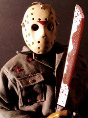
Let’s start with Vancouver starter Roberto Luongo. He’s always scored points with me for switching up his mask frequently (a trait he shares with Tim Thomas) and for using the dark cage almost exclusively since he broke into the league in 1999. But whereas his cage used to fade into some very intricate and lively mask designs, now it offers a marked contrast to the relative simplicity of his current headgear. The cleanly painted Vancouver V contrasts well with the “weathered” off-white background, though I’m torn on whether it’s good or bad that this particular off-white appears nowhere else in the Canucks livery. Why can’t Roberto at least wear matching weathered pads and gloves?
The skating Canuck on the forehead is much better than the oversized logo that was on another retro mask he donned this season. Definite minus points for the relatively obnoxious Reebok logo, however.
All in all, this mask works quite well, especially in terms of how it conveys Luongo’s size in the net and how it contrasts with Vancouver’s home and road sweaters. This design catches the eye and evokes the speed of the game with the simple but bold striping. Luongo’s backplate is clean, which seems appropriate here.
(As an aside, this is not a new look for Luongo. Back in 2006, when the Canucks first experimented with reverting to their original colors, Robert wore a similar mask with slightly less weathering. It marked a stark contrast to the mask he wore for most of that season.)
Luongo’s backup is Cory Schneider. Here’s the story on the origin of his mask. The design honors several former Canucks goalies. Great concept, but the design is a bit too chaotic, since it attempts to pull logos from several eras onto one palette. Plus, and I can’t stress this enough, the white cage pulls your eye away from the design. I would have tried reflective silver, or maybe the Luongo off-white.
Now to the Bruins. Let’s start with the starter: Tim Thomas is actually in his second stint with the Bruins. Before playing in Europe, he saw a little action in 2002-03 and wore a fairly traditional modern mask. But when he rejoined the Bruins in 2005, he brought along this unique hybrid setup from Sportmask. Over the past few seasons, that hybrid setup has evolved into a more traditional mask format, albeit with less traditional artwork.
This season Thomas rolled out what I call his “paint-by-numbers” design (further details on it can be found here). It’s a complex setup, and the first time I saw it I thought Thomas was going to send it back to be colored in, especially since his previous masks were pretty lively.
While I love this intricacy of the artwork on the current mask, I wish he’d add some color to it (a good Photoshop contest in the making, perhaps). In addition to looking plain, the lack of color makes the artwork too difficult to read from a distance. And I’m torn regarding the forehead crest, which is apparently taken from a medallion Thomas wears. I can’t argue with the message, but it’s rare to see goalies display “personal” trademarks in such a prominent place. Usually that’s backplate fodder. The “TT” personal logo on the chin is a bit better, because it’s more subtle.
Thomas has forgone the cat-eye cage this season and turned to a style reminiscent of this Mike Liut setup. As for the backplate, it’s one of the best in the league.
Thomas is backed up by Tuuka Rask, who’s worn the same design ever since he first saw action for the Bruins in 2007. I don’t necessarily hold that against him, because it’s a pretty effective setup. The Bruins teeth and claws bring some drama, and I love the gold cage. Plus the subtle use of a decidedly un-Bruins red in the Bruin’s eyes conveys that there will be blood — a great hockey touch. The surname on the chin is bit big, but that’s okay, because the viewer’s eye is definitely drawn first to those teeth. Meanwhile, Rask’s backplate features a Finnish flag and an aggressive last name treatment. Overall, a quality effort.
So who wins this battle of melon cases? I hate to say it, but I think I have to give the nod to Luongo. Fortunately, I don’t think that will have any bearing on the outcome of the series.
CONTEST! With the Thrashers having flown north — and not just for the summer — the relocated franchise and the NHL will soon be unveiling a new team name, logo, colors, uniform set, the works. Of course, they’ll botch it up, so we may as well do it ourselves, yes? Whip up your best concepts for the team’s name, logo, and uniforms (you must include all three) and send them directly to me by June 8 — that’s one week from today — and I’ll feature the top entries in an upcoming ESPN column.
Meanwhile, a quick post-mortem on the Thrashers: Obviously, nobody will miss the embarrassing sleeve treatment or history’s worst NHL alternate jersey, but I’ve always liked this jersey (I hate how they ruined the Bettman-striped version), in part because I’ve also always liked this logo. I love how it has no outlines, no black lines — just fields of color. Much like the original Wizards logo, I consider this to be one of recent history’s more underrated designs. I’ll miss it.
Finally, it’s worth noting that the Thrashers are the second NHL team to leave Atlanta (the first, of course, being the Flames). How many other cities have lost more than one team from the same major sports league? Off the top of my head I cam up with the following:
• Cleveland lost the Rams and the original Browns.
• New York lost the Giants and Dodgers.
• L.A. lost the Chargers, Rams, and Raiders.
• Washington lost the Senators — twice.
I’m sure there are others I’m overlooking, but that’s enough to get us started.

Moo and Oink Dept.: Over the past half-dozen years or so, a neighborhood shop called Fleisher’s Meats, located in the Hudson Valley town of Kingston (that’s roughly 2.5 hours north of NYC), has become arguably the most important butcher shop in the country. That status is partially due to Fleisher’s high-quality product, which has been embraced by consumers and restaurants alike. More importantly, though, Fleisher’s has established a broad range of training and apprenticeship courses, which are teaching a new generation of butchers (something near and dear to this carnivore’s heart).
Now, in a development that is likely to keep me from ever moving out of my current apartment, Fleisher’s is opening a shop in Brooklyn. And it’s going to be right around the corner from me.
I already have a relationship with Fleisher’s (their upstate shop sells a certain T-shirt of mine) and I’m looking forward to being involved with the new outlet in some way. More details soon.
Too good for the Ticker: Got a note last night from Mike Fitzpatrick. It began, “This is probably way to obscure and old to even warrant investigation”¦”
An opening line like that usually means that the topic at hand is either a total snooze or brilliantly sublime. In this case, happily, it was the latter.
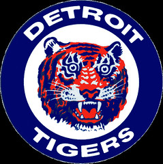
“Back in the mid- to late ’80s,” Mike’s note continued, “the Tigers’ warm-up jackets included a dot in the lower-right part of the old English D. As a kid, I always wondered why it was there. It seems too deliberately separate from the rest of the pattern to simply be a result of a manufacturing glitch or something like that.”
Indeed it does. I’d never noticed that before! Does anyone know more?
I happily confess that this is my favorite type of Uni Watch subject matter — the small, overlooked detail that’s been right under my nose (and maybe yours too..?) for decades. I’m smiling now just thinking about it! Big thanks to Mike, who’s note totally made my night.
Uni Watch News Ticker: Some designer guy is trying to create an art book about the AirMax1 (thanks, Kirsten). ”¦ Here’s a great old Astros lunchbox (with thanks to Michael Koch). ”¦ Also from Michael: Stetson University is accepting ideas for a new mascot. ”¦ In a vaguely related item, the UC Berkeley Graduate School of Journalism is accepting design concepts for a revised food nutrition label (with thanks to Brian Mazmanian). ”¦ Yikes, imagine if Chief Wahoo were an NHL mascot. ”¦ Mets Police blogger Shannon Shark thinks the Mets should retire Gary Carter’s number. I respectfully but firmly disagree. Carter played only five seasons at Shea — way too small a span to justify number retirement, whatever his level of performance. Speaking of which, his numbers for the last three years of his Mets tenure were very weak (look at 1987, ’88, and ’89). Carter will always have a special place in Mets history, but you don’t retire a guy’s number because of one at-bat in Game 6 of the ’86 Series, or for what he accomplished in Montreal, or because he has cancer. Indeed, retiring Carter’s number now would be such an obvious knee-jerk response to his illness that it would trivialize his on-field accomplishments. You want to give him a Gary Carter Night, a sleeve patch, a fund-raising drive for cancer research, whatever, that’s fine. But for a franchise that has always had a high bar for retired numbers, Carter doesn’t make the grade. ”¦ The Fashion Institute of Technology just opened a new exhibit devoted to the intersection of fashion and sportswear. I’ll be checking it out soon. ”¦ Someone at the Dallas Coca-Cola bottler has some major spelling and punctuation issues. Patrick Woody took that shot at an Albertson’s in the Casa Linda neighborhood of Dallas. ”¦ This would make a fine addition to the Uni Watch library if not for the price (nice find by Robert Marshall). ”¦ New wordmarks for Maryland. ”¦ Here’s one of the more unusual championship ring designs I’ve seen. Click on the photos to see larger versions (nice find by Mark Weinstein). ”¦ A blog called the Nationals Enquirer had to change its name to Nats Enquirer because the National Equirer tabloid threatened legal action (with thanks to William Yurasko). ”¦ As usual, the A’s got the short end of the flag-desecration stick on Monday, since the caps never match their color scheme. But they made up for it, sorta/kinda, by wearing camo caps during BP. Hey, at least they matched the team’s colors! Now, you could say that the A’s can now claim the prize for wearing twice as many asinine faux-patriotic headwear designs on Monday as everyone else — in fact, I’ll say that right now — but the story is slightly more nuanced than that. Turns out that the A’s got those camo caps by trading A’s caps with a real military unit. And Dallas Braden went further by trading his entire uniform (let’s see A-Rod try to cross the mound while Braden’s decked out in camo!). Full details — including a lead sentence that mistakenly conflates Memorial Day with Veterans Day — here (with thanks to Michael Cross). ”¦ Recent Pirates call-up Josh Harrison is wearing No. 62, but Brian Young notes that he’s apparently wearing Evan Meek’s batting helmet. ”¦ I often describe things I like as “tasty,” but some things are tastier than others. Dan Cichalski spotted that jersey over the weekend at the Cape Cod Baseball League Hall of Fame. ”¦ Also from Dan: Ever wonder why Jays pitcher Kyle Drabek wears No. 4? Here’s the full scoop. ”¦ Two great finds by Bruce Menard: an old Tigers prototype and what Bruce accurately describes as “the best trainer’s jersey ever!” ”¦ When a major college football coach resigns in disgrace, what’s the best thing to do? Exploit the situation for promotional purposes, natch (with thanks to MJ Kurs-Lasky). ”¦ Here’s a probable first: The Newark Bears are charting pitches on an iPad (with thanks to Dan Cichalski). ”¦ Here’s a good look at how the NBA Finals patch looked for both teams last night. ”¦ We’ve all seen pitchers wearing a jacket while running the bases. But have you ever seen a pitcher wearing a “World Champions” jacket? (Great discovery by Jerry Wolper.) ”¦ I recently ran a wire photo of Joe Montana wearing No. 19 during the run-up to Super Bowl XVI. Now Brendan Slattery has found a color shot that was presumably taken the same day. ”¦ New logo for the Pac-12 championship game (with thanks to Kyle Mackie). ”¦ David Pealing notes that this year’s Madden cover should be fined due to the exposed knees. ”¦ Phil and I are catching tonight’s Mets/Bucs game at Shea, and we’re planning a little sartorial maneuver that should make for a good photo-op. Details tomorrow. ”¦ What with the holiday weekend and all, I neglected to acknowledge the death of visionary beat poet Gil Scott-Heron. Gil had his problems, and also his limitations, but at his best he mixed up a potent brew of intellect and outrage that spoke truth to power and called bullshit for what it was. Although I’ve always been partial to “Whitey on the Moon,” his signature tune remains “The Revolution Will Not Be Televised,” which reads like an anti-branding manifesto for our (and all) times. RIP, brother.
Link above should read “Josh Harrison” and not “Pedro Alvarez.”
Duh. Thank you. Now fixed.
Does it count that the Minnesota Timberwolves had the moving van all packed up, the MapQuest printed, and were about to pull out of the Target Center loading docks headed for N’Awlins before David Stern put the kibosh on it?
No? If a stadium proposal by the mayor of St. Paul gets traction, Minneapolis could lose the Lakers (to L.A.) and the Timberwolves (to St. Paul). This is making the assumption that the Timberwolves do, in actuality, still play in the NBA and not the NBDL.
You may argue “same market”, but considering that you have to go through Soviet-style checkpoints to go from Minneapolis to St. Paul and vice versa…
If going from Minneapolis to St. Paul is not the same market than the Rays leave the market all the time, because every time their highlights are on Sportscenter, they go from St. Petersburg to Tampa.
I think I need a tongue-in-cheek graphic. LOL :-)
I think the T’Wolves moving to St. Paul would be analogous to the Giants and Jets moving from the Bronx (via New Haven, CT and Queens) and Queens, respectively, to East Rutherford, NJ; the Dallas Cowboys moving from Dallas to Irving to Arlington; the Bills from Buffalo to Orchard Park; the Patriots from Boston to Foxboro; the Capitals from Landover, MD to downtown D.C.; the Redskins from downtown D.C. to Landover, MD; the Rams and Angels from L.A. to Anaheim; etc.
How do the Nets fit in? Does Long Island to East Rutherford, NJ count as an in-market move? Does East Rutherford to Newark to Brooklyn? Hmmm…..
The backstory to the A’s camo caps doesn’t slightly kinda sorta just maybe mitigate things a little bit. It completely transforms a gesture that is usually false patriotism into a meaningful, authentic gesture. The correct response to anyone claiming to “support the troops” is to ask, “How, and which ones, specifically?” Well, the A’s cap gesture is such that the team can actually answer that question. The A’s did something that benefitted actual soldiers and a charity that does actual work to support servicemembers and their families. And those weren’t New Era caps made with obsolete camo fabric and sold to fans at $35 a pop; those were military-issued patrol caps with no brand insignia, not for sale in the team store (but available for $12 at any army surplus shop). And they only wore the camo during hitting rehearsal.
So that’s the A’s doing everything right. Good for them, and shame on any team that does any less while claiming to “honor” or “support” the troops.
Well said. When I first saw the link I thought “Great, here we go again”. But I’ll support this kind of gesture 11 times out of 10. You certainly summed it up better than I ever could too.
Ya’ know, it’s really hard sometimes to define just what “class-act” means – however I think this fills the bill.
They’ve been saying it’s the first time in the modern NHL (which generally means post-1967 expansion) that a city has lost two NHL teams, but if you go way back, there are a couple of prior examples:
Montreal Wanderers (1918, folded after 4 games in the inaugural NHL season)
Montreal Maroons (1938, suspended operations, folded)
Quebec Bulldogs (a.k.a. Quebec Athletic Club – 1920, moved to Hamilton)
Quebec Nordiques (1995, moved to Colorado)
RIP Gil Scott-Heron, he was one of my favourite artists of all time. I’ve seen him live 2 years ago, it was absolutely amazing..
I discovered GSH when I was 15, in 1975, when I saw him perform the song “Johannesburg” on Saturday Night Live (the debut season), was riveted, and became a huge fan. His personal struggles are well documented, but his body of work and influence on generations of artists will be his lasting legacy. One of the greats.
Meanwhile, this Thrashers logo always appealed to me….
link
…but I would have like it even more had the bird been a solid color (brown?) with the yellow outline. A great hockey crest in my opinion. Simple, direct, unique.
I have the sweater with that logo on the chest (aka the original away sweater).
Why they ever went away from it, I don’t get. The Thrashers were touted back then as the only team with different primary logos for each sweater.
I’m one of the few native Georgians that love hockey; I fell in love with it the first time I saw it live.
But I believe Atlanta will never get another NHL team.
Yessir. And Paul’s right about “Whitey on the Moon.”
Thomas’ insignia and lack of colors on the mask were due to his name being all over trade rumors all summer, when they were making his mask. He left off team colors and logos and put on his own “logo”, rather than having to change the whole thing later. I guess he was planning to color it later, but then decided he liked how it looked and how it matched his new white pads, which he got because it makes him look “bigger” to the shooter. Almost every goalie has white pads these days. Personally I love how it is so detailed without being overly gaudy like some masks these days…
Maryland already had a “Maryland” wordmark logo as part of it’s identity
link{Fathead/15-16053X_maryland_logo_sheet?scl=1%26$layer_1_src%3Dis{Fathead/shim%3Fscl%3D1}}
The new one is just not good. I hope “Terps” doesn’t go away all together…that will be a shame.
I don’t think the above link worked – maybe this will
link
i like the state flag themed band under the Maryland wordmark. it would make a swell stripe on the football helmets.
Agreed. Put the State flag stripe thingy with this script:
(link)
and you’re set.
That Thrashers logo looks, from a distance, like a hockey stick being flushed down a toilet.
A classic example of getting the first uniform right, and screwing up each successive one worse and worse.
The original Thrashers uni template was pretty good. They weren’t trying to look like an original 6 team but didn’t get too out of hand. The problems started when they got the genious idea of putting two different crests on their home and roads. Their logo set was awful. An identity that disjointed/abstract/geometric should have never been approved.
Then, because a small strip of color in a logo completely justifies and entire jersey of that color the powder blues were born. A team that committed to an “edgy” (no pun intended) uni identity from the outset adding a color as subdued as powder blue is a terrible idea. As far as the “Atlanta” sleeve treatment, on the jersey as a 3rd I didn’t much mind it. The problem was they followed in the footsteps of every other NHL franchise and promoted the thing to their full-time home unis. No way in hell that thing deserved to be a full-time uni.
Not to out-do themselves, they then added the red monstrosity. In short, the Thrashers identity has always been a clusterfuck of everything that is wrong with logo and uni design.
I still say that sleeve treatment reminds me of link.
Logo has always reminded me of the link logo
I guess I’ll get in on the whole “what hockey uniform-related thing reminds me of something” party. The Vancouver Canucks “Blade of Glory” identity from 1978-1997 always reminded me of the “Screaming for Vengeance” album cover from Judas Priest.
(link)
So I’m confused… can the Winnipeg team become the Jets again, or does the Phoenix franchise still hold the rights to that name and those colors?
Teams keep their intellectual property, such as names, when they change names. But, remember, the “Phoenix franchise” is actually owned by the NHL now. Since the NHL thus owns the name, and we know that the Coyotes are now not going back to Winnipeg, my guess is that if the new Winnipeg owners want it, we will see the Jets next year.
I was wondering the same thing. In addition, the nickname is already in used by another professional major-league team. Would the ostensible Winnipeg Jets owe the New York Jets some money?
Did Edmonton have to pay Houston?
Or Florida Carolina?
Or L.A. Sacramento?
Make that “Or Kansas City/Omaha/Sacramento Los Angeles?”
We’re talking about major sports, Jim. ;)
Texas / New York Rangers.
Apropos of nothing: I always thought the Colorado Rockies should have been named the Denver Bears.
The NHL owns the rights to all defunct teams (as I think someone noted here yesterday). It came in a local discussion here (St Paul) about if the Wild could ever use the North Stars logo for a throwback. The answer is yes, because Dallas does not have control over that logo, even though they are technically the North Stars. The NHL has control over that logo (and the Jets, Whalers, Rockies, etc). So all a franchise would have to do is get permission from the NHL to use a defunct team’s logo, for either a throwback or permanently as could be the case with Winnipeg. Needing the NHLs permission has nothing to do with the Coyotes/Jets being currently owned by the NHL.
Hey Jason, great post! But you missed one thing. Tuukka did briefly sport a new mask. It was a cool tip of the cap to Cheevers. link I’m not sure why he ditched it so quickly but if I remember correctly he had a poor game the one time I recall him wearing it.
Great catch Quality. Looks like Tuuka wore it exactly once, gave up five goals to the Red Wings and that mask hasn’t seen the light of day since.
And hockey players try to tell us they’re not superstitious…
You rock, Jason.
Paul,the “embarassing sleeve treatment” link doesn’t work, thanks!
RIP GSH
Worked fine for me, but I’ve swapped in a new URL, just in case. Here:
link
It messed up for me the first time I clicked too, then I clicked once more and it worked fine, maybe it was just messing with us!
Thanks for confirming that I wasn’t going nuts!
It may be because my TV sucks, but at the beginning of the season, I thought Thomas was wearing a blank white mask.
After getting better looks at it, it’s been growing on me all season.
a rat done bit my sister nell
I was planning on posting some high-minded comment about how that “GO MAVRICKS!!” sign was probably laid out by someone who doesn’t speak English as their first language, and who isn’t much of an American sports fan, and is indicative (as are most of the “hilarious” confectionery misspellings on that “Cake Wrecks” website) of the rise of non-English speakers, particularly Spanish speakers, in the workplace, and that the error is less ignorance or laziness than an honest mistake, based on an developing mastery of English. Then I did a quick search, and found over 18,000 websites from plainly American sources, all of them devoted to analyzing the Heat-Mavricks matchup, and I realized that it’s got nothing to do with a non-native workforce or an emerging understanding of English: We’re just stupid people.
I figure that somewhere in the production process of that banner, a text message exchange was involved.
“Gna mk banner 4 Mavs. Txt me wht u want it 2 say & il have Knko’s print it”
“OK: GO!!! Mavrick’s”
That sign definitely comes from a dumb, text-y place. I can’t imagine how the hell someone didn’t catch that at any point between printing and actually hanging the banner in the window.
I’m reading the link about Gary Carter and agree with Paul that his number should not be retired.
Retired numbers are getting to be an epidemic, and one of the problems is that it’s almost impossible to speak out against them without being consiered insensitive.
I’d like to make two proposals:
(1) Replace the system of “retired numbers” with “mandatory numbers”: when a truly great player retires, we want to remember him, and that means keeping his memory, and his number, alive. How about requiring that a player on the roster wear that number in all future seasons, with it never being allowed to go unused?
When families name their children, they go out of their way to use names of older family members that they admire; they don’t ban future children from having them! Nobody would ever say, “Your grandfather Thomas was a great man, so no child in this family will ever be named Thomas again.” That’s ridiculous! We do the opposite: we keep his memory alive by giving his name to his descendants. So it should be in sports — we should not celebrate something by making it forbidden. Rather, make sure that there’s always someone in the “family” connecting us to that hero from the past.
(2) Have only one retired number at any one time. Let’s say the Mets had chosen 37 for Casey Stengel way back when, and then they wanted to do that for #14 Gil Hodges. So they open up 37 and take 14 away. Now they want to draw attention to Gary Carter, so they take away 8 and reinstate 14 and 37 and 41 and 42. Carter gets a very special place in Shea Stadium for this year, since there are no other banned numbers that his has to stand alongside. Maybe (God forbid) some other Met dies suddenly in a future season and they choose him as the honoree that year. But we don’t end up with an endless series of banned numbers that today’s players and future players are unable to enjoy.
I’m leaning toward the first one — what do you guys think?
I’m against retiring any numbers, period. Yes, have *honored* numbers, and raise a venerated player’s jersey to the rafters; but keep all numbers in circulation.
I’m with Walter.
That first idea is very intriguing. Don’t know how well it could be pulled off in practice, since so many people are attached to “their” numbers, or you’d have people on the other side saying, “A-Rod’s the one wearing 3? Who is he to think he can live up to the Babe?!” But it’s an original idea and I’d like to see some franchise try it out.
I have no problem with teams retiring numebers. If done right it is a great honor. If done wrong it can be a mess.
I agree with Paul that Carter shouldnt have his number retired for the same reasons I dont think Reggie Jackson has any right to have his number retired with the Yankees.
I think the Mets should retire the numbers for Dwight Gooden (16), Mike Piazza (31) and John Franco (45), instead of Carter.
It used to be this way in soccer, when numbers corresponded to position. It’s still pretty much this way in international competitions: being assigned “10” is the highest honor in Brazil and Argentina.
Tragedy seems like a bad reason to honor a player. the Astros retired “32” to honor Jim Umbricht, whose greatest claim to fame is dying of cancer. That’s very sad, but is that enough to merit that honor? (The Astros team MVP award is called The Jim Umbricht Trophy, so they have found a good way to honor him that doesn’t involve retiring his number.)
I think a Ring Of Honor is a fine idea that has already been in use. Display the name and number of an all-time great.
Use that number for your current special players. The Reds could save #13 for a stud SS prospect, or #5 for a catcher…make it special. Don’t take it out of circulation. Give the current players something to live up to.
You don’t even need to use the numbers on “special” players – those special guys should be able to choose their own numbers. Just let anyone who wants it have it. Maybe you end up with 16 representing 3 different great players… or maybe you don’t – but the first guy’s legacy isn’t ruined by a bad player wearing his number for a couple seasons.
I kind of like the way my two favorite teams, the Toronto Maple Leafs and Blue Jays both “honour” their legendary stars by raising a banner with the player’s name, number and, in the case of the Leafs, his likeness.
The only way that the Leafs will retire a number is in case of his death while active (Bill Barilko, Number 5, died in a plane crash in ’51 at age 24 shortly after scoring the Cup-wining goal) or by suffering a career-ending injury (Irvin “Ace” Bailey, Number 6, career ended due to a fractured skull after being sucker-punched by Eddie Shore).
This way both clubs pay homage to their stars without ending up with a lot of outlandish uniform numbers.
When families name their children, they go out of their way to use names of older family members that they admire; they don’t ban future children from having them!
Not necessarily. In some cultures, for example, it’s considered bad form to name a child for any living elder – something about not wanting the angel of death to get confused and take the child when the adult’s time is up. So if grandpa Michael is to be honored, his grandson might be named Matthew, but not Michael.
Which, as a model for numbers, would suggest that numbers be retired during the life of the honored player, but then put back into use upon his death.
Personally, I’d prefer the model of retiring numbers only for players who are considered, at the time they play, the greatest player in franchise history. Plus any players who were denied the wider recognition they deserved on account of Don Freakin’ Mattingly playing the same position at the same time and winning nine straight Gold Gloves with his bat. But aside from that one exception, only players who were considered the best in team history when they played. Which would cut the chaff considerably; the Yankees, for example, would have to retire a lot of numbers that don’t start and end with “3”.
“un-retire.” The Yankees would have to un-retire a lot of numbers that aren’t 3.
right
like those undeserving bastids who wore 4, 5 & 7 especially
I’m not one for perpetuating a person’s name (rest easy, folks – there will be no Jim Vilk Jr.), and I’m also in favor of retiring numbers. BUT, it has to be done judiciously and sparingly. Cort is exactly right – tragedy alone is a bad reason to retire a number. Very bad. It’s all emotion and no reason, and once it’s done you can’t go back on it and how do you say no to the next tragic death and the next? In life there are lots of tragedies, but very few legendary role model ballplayers. Retire a few numbers, and have a ring of honor as well.
“rest easy, folks — there will be no Jim Vilk Jr.”
~~~
you say that like it’s a bad thing
Y’know, FDR greenlighted baseball after Pearl Harbor to keep American’s spirits up.
But, as someone here observed, there’s a certain morbidness to MLB (and other sports, too) right now that’s getting a little annoying. So caught up in memorializing. Paul Splitdorf was a fine pitcher but, seriously…
News flash to all you young ‘uns: People die. And the rest of us live with it. Because, thankfully, life goes on and that keeps us going right along with it. Otherwise, wallowing and coping difficulties would be the standard state of affairs. Much like it’s getting to be in MLB, actually.
My mother was prone to deep wistfulness over my grandpa’s dying at 72. Finally one day I said to her, “Mom, he’d be 99 this year. We’d probably have have lost him by now no matter what. Let it go.”
Death is part of life. Grieve a moment, remember. Then get on with things.
I appreciate the concept of retired numbers and I’m not sure there should be any hard and fast rules as to how the decisions are made. Whenever I’m at a ballpark, I like seeing how a team recognizes its greats with those tributes. I also like that the Yankees put the retired numbers, and the names of the players who wore those numbers, on the rosters inside the game program. I don’t think any other team does that.
I believe that the Dodgers only retire numbers of players elected to the hall of fame. Gil Hodges (14) and Carl Furillo (6) are not retired to the best of my knowledge, and they were really integral to the great Dodger teams of the late 40s and early 50s. So that might also be a guidline to follow.
This is true, and a good system. The exception to the rule, however, is Jim Gilliam (#19), a popular player and coach that died suddenly at the end of the season, and the Dodgers chose to honor him by retiring his number.
Also, Fernando Valenzuela’s number (#34) is unofficially retired–the equipment manager won’t issue it! I think that’s kind of a cool way to go, too.
The Dodgers should retire # 6 for Steve Garvey, # 31 for Mike Piazza, and # 55 for Orel Hershiser.
They should make # 34 available again since Valenzuela’s career ERA is 3.54 and is only 20 games above .500 in his career W-L record.
Yesterday, Paul showed us a close-up of the NBA Finals patch both teams are wearing. Here’s a closeup of link for the warmups.
In link I’d have to give the slight uni nod to Miami. But that’s because I miss link so much.
I love college hoops, maybe more than the NBA, but one reason to love the pros more – link Well, the only system is that it has to be from 0-99, and that’s good enough.
Although I think Miami’s unis are better, from head to toe my vote for best-dressed goes to link
Go Mavs.
The Heat do have the better uniforms. In fact, Miami has an underrated look – I really like how they include yellow with red and black, and the Miami wordmark is pretty cool. Just get rid of the italicized numbers.
The Mavs road’s would be MUCH better if DALLAS was in white. Navy blue doesn’t pop off of a royal background at all. Also, they need to drop silver along with that goofy number font (and yes, it does match the wordmark, but it still sucks).
In the A’s camo hat photo, the players aren’t wearing the same Majestic fleece pullover. The guy on the right was wearing the pre-2010 version, and the one in the center was wearing the 2010-now version. I see this all the time that there will be 1 or 2 guys on a team that have the outdated team-issued gear. It doesn’t bother me (I understand wanting to hold on to the old style, they were more comfortable), it’s just something I notice each time.
RE: The mysterious Tigers dot. That’s a 1986 Topps card, so the picture is probably from 1985, which makes me think it might be something celebrating the 1984 World Series victory.
Any idea when the Sparky picture was taken?
One more image, also from 1985:
link
Well, my 1984 WS hypothesis is seeming less likely…
Hard to tell, but I think there’s one in this picture (presumably from 1986):
link
Also, not very clear, but it looks like it migrated upwards on the Olde English D later:
link
Sidenote; I hope Steve Searcy has ‘Future Star’ emblazoned on his business cards.
[passes baton]
Here is a picture from the 1984 World Series clubhouse victory celebration. The dot is there.
link
Forgot the link:
link
I’m pretty sure I read somewhere that the dot means the player is wearing a radio equipped hat.
link
When I was growing up, one of the high schools in Buffalo, Lafayette High, was nicknamed “The Violets”. Their hockey sweaters were purple with white trim, with crossed sticks and a small bouquet of violets silkscreened onto the chest. It was weird, but kind of cool, a rather delicate graphic for a rough and tough sport.
“Thrasher” could have been the same sort of thing, an inoffensive little Southern songbird representing a bunch of hockey players. Instead of going understated, they chose garish colors, and ridiculous jersey designs, and a stylized bird that looked slightly psychotic. It would have been so much cooler if they’d gone with something like the crest for West Brom in the Premiership, and not chosen that red-yellow-orange-sky blue color combo.
I don’t know that there is a professional sports team in any city, anywhere, that generates less hometown enthusiasm than the Atlanta Thrashers, and I think lousy design (not to mention playing hockey in Georgia) has a lot to do with it.
(On an unrelated note to New Yorkers: I just saw Palin and Trump on TV, eating pizza with a fork. Is that normal, or is this another example of Life Imitating ‘Seinfeld’?)
There’s nothing strange about eating pizza with a fork; I’ve always done it, particularly when it’s a “fillet” slice that comes from the middle of a large pie that’s been cut into squares (and thus has no crust).
In non-New York areas, is it somehow taboo to use a fork?
“a large pie that’s been cut into squares” = Sicilian pie. A pro can still navigate the middle pieces sans utensils.
My children are 5 and 2 and have been taught to never put a fork to a piece of pizza. A messy proposition when dealing with a ten-month old, yes, but a lesson learned.
/ born and raised mere miles from the greatest city in the world
Not normal at all for a regular slice. (But normal for fancy brick oven pizza.)
In fact the signature NY move when eating pizza is to bend the slice in half lengthwise. You kind of make “the claw” with your hand and your index finger goes inside the “V” created by the crust. This lets you to eat a slice with one hand while allowing you to read your newspaper/carry your briefcase while you walk/etc. with the other. Of course, some say that it leaves a hand free so that New Yorkers can gesticulate while eating and talking at the same time.
Weird how when you grow up you assume that everything that happens to you is the norm. It was only when I got to college and people asked me what I was doing with my pizza that I discovered that this was a NY thing. (Don’t even get me started on “Sliding Ponds.)
A good pizza isn’t so thin & greasy that you have to fold it in half to keep it from flopping over in your hand and dumping the toppings on the floor.
“On an unrelated note to New Yorkers: I just saw Palin and Trump on TV, eating pizza with a fork. Is that normal, or is this another example of Life Imitating ‘Seinfeld’?”
~~~
i was so hoping he’d have ordered sketti & meatballs and pushed one of the meatballs to her with his nose
/lady & the trump
//i’ll be here all week
growing up in suburban CT…
if the pizza was too hot, eat the first slice with a knife and fork…then move to hands only when cool.
the cheese! it burns…
I have lived in Manhattan for 25 years, and spent lots of time here as a kid and teenager. One may eat a pizza with a fork, I suppose, and I may have even seen such a few times. But no, cool guys don’t, cool guys never do, at least not within the five boroughs. If the cheese is too hot, wait. If the topping falls off, pick it up off the floor. And then eat it. You may not want to be a cool guy, which is OK, but I am still a cool guy.
Don’t get me started on Trump and Palin.
Cool guys don’t eat pizza with a fork. I do.
“Instead of going understated, they chose garish colors, and ridiculous jersey designs, and a stylized bird that looked slightly psychotic. It would have been so much cooler if they’d gone with something like the crest for West Brom in the Premiership, and not chosen that red-yellow-orange-sky blue color combo.”
But they went with the red-yellow-orange-sky blue color combo anyway because FUCK EVERYONE!!
While Thomas’ mask looks more conventional he’s still the only NHL goaltender using a Sportmask Mage (latest iteration is the Mage RS, the one pictured in 05-06 is the 1st generation Mage). But with the Mage’s evolution from helmet/cage to single piece design only Chris Osgood still wears the birdcage.
Anyway, this lifelong Bruins fan loved Jason’s write-up. My first game was the Triple OT Klima game in the ’90 Finals, I was five years old, my half-sister won a raffle for balcony seats at center ice and took me and my dad. It was my introduction to a 21 year relationship best summed up with The Buzzcocks “Ever Fallen in Love (With Someone You Shouldn’t)”. And it’s an obsession I’ve introduced to my girlfriend who in a little bit of uni-ephemera has taken a liking to knee-high Whaler’s color scheme socks and wearing my old Andy Moog home replica for good luck throughout these playoffs.
Here we go Bruins, here we go
From the Mothership yesterday:
link
Love that Cavs/Mavs mashup. And boy is it ever true. My two favorite teams are the Cavs and Whoever is playing LeBron.
But…being that it’s Cleveland we’re talking about…He’ll get his ring. Just like Art…Gahhh
I’d wear that…but only because I like the Mavericks as well. Although my motto all playoffs has been “Anybody but Miami,” I don’t hate them. It’s just not the same as rooting against the old Pistons. These guys may have come together under questionable conditions, but they play good basketball. Yeah, LeGone will get his ring…eventually…but I’m not writing off Dallas yet.
Did someone day “Moo and Oink”?! link Best Commercial ever: link
Here are 3 more 2-time losers from the NBA:
Chicago: Stags (folded), Zephyrs (became Baltimore Bullets)
San Diego: Rockets and Clippers both moved away
St. Louis: Bombers (folded), Hawks moved away
And then St. Louis also lost the Spirits, who didn’t make the cut when the ABA and NBA merged.
You say “didn’t make the cut,” I say “made the shrewdest deal in the history of sports.”
link
See Terry Pluto’s outstanding book Loose Balls for an excellent breakdown on said topic.
Here is another 2-time loser:
NFL
Chicago: Tigers folded, Cardinals moved away
If counting franchises that folded:
Already been mentioned that Los Angeles lost the Chargers, Rams and Raiders, but they also lost the Dons of the AAFC.
Chicago’s AAFC Rockets folded.
Baltimore lost the Colts twice; the AAFC franchise that played in the NFL for one season, and the current NFL franchise that moved to Minneapolis.
Dallas lost two franchises called the Texans: the NFL one folded after only one season, and the current NFL franchise now known as the Kansas City Chiefs, which of course relocated while still in the AFL.
“moved to Indianapolis* Ugh, I should know better than that. Shame on me for trying to read this page and do actual work at the same time.
in addition, baltimore lost the original orioles to new york, where they are now the yankees. (you heard of them?)
While AAFC eventually merged with the NFL, it was still a separate league. But if we’re counting teams in the same sport that left their cities or folded, who can forget the Los Angeles Express of the USFL and the Los Angeles Xtreme of the XFL? Maybe in a different era they would’ve been good enough to attract talent and compete with the NFL for fans, perhaps even pull of their own mergers.
Yeah, yeah, I’m reaching… :)
That Astros lunchbox was stadium giveaway a few years back after they slimmed Junction Jack.
Tuuka Rask for the Bruins actually wore a new mask this year for one game – he wore it, they got smoked, and then in his next game he went back to the old one.
link
Football movers:
New York: Brooklyn/New York Yankees/Yanks/Bulldogs (NFL/AAFC) in various combinations, mergers and foldings eventually moved to Dallas, TX
Dallas: Dallas Texans (AFL – i.e. the KC Chiefs) and the above ex-NY franchise(s) as the Dallas Texans (NFL) – who moved to Baltimore, MD
Baltimore: AAFC/NFL Colts (folded) and the NFL ex-Texans (above) – who moved to Indianapolis
Which reminds me of the whole city versus franchise concept we debate on occasion – the name “Baltimore Colts” pre-dated the franchise that would eventually move to Indianapolis by several years, so who had more “rights” to the name – the business franchise or the city???
I think the distinction between a team moving and a team folding is very important.
If a team moves… they *should* be able to keep the rights to their old name, Cleveland Browns bullshit aside.
If they fold… then essentially that name no longer exists. Legally, I’m sure the league gets it. Personally I think that’d be a situation where it should be readily available for any new team in the city to revive if they want it. Of course most teams that fold do so because they weren’t exactly popular or successful…
So, in my opinion, the Thrashers should not be allowed to revive the Jets name, because the Jets franchise still exists as the Coyotes. In reality… I wouldn’t be surprised if the NHL lets them anyway.
Being the hub of the Canadian wheat-farming industry, Winnepeg could keep the “Thrashers” moniker. But instead of referencing a little brown bird, it could evoke images of large industrial machinery tearing up the harvest…
“…Roses have thorns, eh?” –Bob McKenzie
Would that mean changing the vowel to be the Threshers?
“Legally, I’m sure the league gets it.”
If a team folds, it probably is broke.
There means that anyone who steps forward and claims ownership of the name (or anything else) is gonna get chased by bill collectors.
In most cases when a team folds, NOBODY owns any of it…because nobody is stupid enough to claim it.
Oops – I was posting almost the exact same thing while you posted this. My apologies.
I was just playing devil’s advocate anyway – I would think that any team would want to change their name/identity after a move, mainly to have a fresh start and because many team names/mascots have a “local” identity and most of the time that identity simply does not fit the new town (i.e. no trolleys to dodge in Los Angeles, etc.) so a new name is probably a good idea anyway.
As far as Winnepeg – “Jets” as a mascot is a bit generic (is their a big aircraft industry in Manitoba? is the arena in the flight path of a major airport?) and, history wise, the only thing going for it is that team that left (and gained a much better localized nickname in the process) happened to have that name. A new/fresh/different name would be better.
I’m pulling for either Rough Riders or Roughriders…
Bluebombers?
“Roughriders” or “Rough Riders” is profanity in Winnipeg, Jim. It will NEVER happen thanks to the province’s hatred of the CFL’s Saskatchewan Roughriders, Winnipeg’s most hated CFL rivals.
So “Banjos” is out as a nickname as well, huh?
link
How about:
Winners (it’s alliterative)
Pegs (for that rap beat “Winni- – Peg-Pegs”)
Whinnies (the mascot is a horse, of course)
Win (continuing the NHL’s tradition of bad grammer)
Wind (lots of that on the plains)
or, my actual, serious idea:
Whips
link
(THAT is a cool logo!)
Just got an email from the Bills saying the will unveil their new uniforms on June 24th. The email has a picture hinting that the new helmet will be white, have a red center stripe with blue stripes on the outside, and a navy blue thin stripe on the outside of those.
Here’s the picture: link
I hope they manage to put that navy on the pants & jersey too, or it’s going to look really dumb on the helmet like that.
I knew they would screw them up somehow.
Maybe that small strip of navy is there to match the Joe Ferguson style navy facemask?
I thought the Thrashers’ primary logo was a minor classic (not quite the classic that say, the Original Six’s are, but near them).
They had a lot of good elements: the primary, the secondary (Flying T), a solid color set of navy, gold, and burgundy/copper. But it seemed that they emphasized the wrong elements (light blue never seemed to fit, the Flying T was a better shoulder patch than front crest, their asymmetrical sleeves were terrible; the last set of alternates was horrible) and de-emphasized the wrong elements (the burgundy/copper at least referenced the brown thrasher namesake; any move that de-emphasized the primary was bad).
NHL 2-time losers:
Quebec: Bulldogs became Hamilton Tigers, Nordiques became Phoenix Coyotes
Montreal: Wanderers and Maroons both folded.
Ahem… Nordiques became the Colorado Avalanche.
For what it’s worth, Gary Carter’s number is retired by the Nationals with respect to his time in Montreal. And his name is in the Washington baseball ring on honor behind the Presidents Club seats at Nats Park. It’s not as if no one in MLB is acknowledging his contributions to the game (and Andre Dawson’s).
For what it’s worth, Gary Carter’s number is retired by the Nationals with respect to his time in Montreal.
And that’s exactly as it should be. He was the premier catcher in the game during his time with the Expos. He wears an Expos cap on his Hall of Fame plaque, too (although he didn’t want to, because he thought it would limit his marketability). That’s the franchise he’s most closely tied to.
The Nats re-retired the Expos retired numbers so quietly that a lot of Nats fans don’t even know about it yet. I’ve had to share link with people to prove it. The Nats were pretty conspicuous about un-retiring Expos numbers when they came to town in 2005, but much quieter about the re-retirement.
They really need to retire #20 and #33 too. I’m a firm believer that there should be a 1:1 correlation between players so great you erect giant bronze statues of them at the ballpark and retired numbers. “Sorry, kid, you can’t wear number 20. It’s already in use by that guy out in the left-field concourse, and he’s gonna be here longer than you.” I know that Gibson and Hondo never played for the Nats, but that’s an argument to be had before erecting 12-foot statues of them in the outfield, not after the bronze statues go up but before the numbers are retired.
It’s all such a gray (no pun intended) area for our rather bizarre club here in DC. We’re talking about guys who played in Pittsburgh, Montreal – or have their records essentially owned by the Rangers or Twins. Such an odd history for DC baseball.
If it had been up to me back in ’04, the Expos would have become the Grays when they moved to DC. Making the franchise a permanent tribute to the Negro League era and all players who were denied the chance at Major League Baseball as a whole. Also, I kind of wish that Montreal could start a AAA team – call them the Expos or Royals and hold many of their baseball memories in a new park. That would be a more appropriate place to honor the likes of Carter, Dawson and Jackie Robinson for his time with the Royals.
And you probably don’t need to convince me about retiring ’20’ here in DC, check out my Uni Watch card…link
Agreed. The only thing I’d add is that the main Senator/Twin worthy of honoring doesn’t really have a number to retire, and the only Senator/Ranger worthy of honoring isn’t thusly honored by the Rangers (or the Dodgers or Tigers, for whom he also played). Nobody else is retiring Hondo’s number, and nobody else really should. No toes to step on with #33.
Pittsburgh has already retired #20 for Pie Traynor, so the Nats would be in the clear on Gibson too.
Hey, don’t forget Roberto Clemente also played for the Montreal Royals.
Regarding this topic, we have to understand all teams like to honor the past, even if that past is shorter than others, or checkered. For example, the Portland Trail Blazers retired a few numbers of players off their 1977 NBA team, who looking back, didn’t deserve the honor. They were good players, but clearly not on the level of a Clyde Drexler. Currently, there is a trend of building statues on both the college and pro level.
Because there is a recent, direct shift of the Expos to Washington, I agree with the retirement of the numbers for Carter and Dawson. And there should be recognition inside the Nats stadium about those Montreal years. But that’s where it ends. I hope no one in Washington has the bad idea of building a statue for any great player who didn’t play a day in that city.
Warren Spahn was a legendary pitcher, but it’s absolutely ridiculous to have a statue of him outside Turner Field. Spahn never threw a single pitch for the Braves in Atlanta, and he could be recognized in other ways. That organization would have been better off with a Greg Maddox statue, or someone who actually contributed to the memories of baseball in Atlanta. One of the few exceptions to this rule, would be Jackie Robinson.
“I hope no one in
Washington(insert city here) has the bad idea of building a statue for any great player who didn’t play a day in that city.”~~~
wha?
so, it would be totally cool for the mets to honor john mcgraw, mel ott, carl hubbell, or roy campanella, jackie robinson, or dixie walker…even though none ever played for the mets…but you wouldn’t allow their statues in san fran or LA?
oh…right…you do make an exception for jackie
Another disappointing decision by the Nats.
I think Frank Howard wore 9 until Ted Williams came along in ’69. He was big enough they should retire all 3 numerals.
You’re right, but it’s #33 on the statue in left field.
Other cities that lost two or more sports franchises:
Kansas City(3) : Athletics(MLB), Scouts (NHL), Kings (NBA)
Philadelphia: Athletics (MLB), Warriors (NBA)
Baltimore: Bullets (NBA), Colts (NFL)
Boston: Braves (MLB), Redskins (NFL)
Cleveland: Rams, Browns (both mentioned in article) plus NHL Barons and WHA Crusaders
Seattle: Pilots (MLB), Sonics (NBA)
The whole point of the exercise was multiple teams in the same league, or at least sport.
Not the same league but the same sport:
New Orleans lost the Jazz (NBA) and the Buccaneers (ABA) to relocation.
And they’re very close to losing the Hornets too. I predict within 4-5 years by all accounts (I live down here).
milwaukee lost the brewers to st. louis (browns) after 1901 (i was devastated) & the braves after ’65.
One more multiteam loser city:
St. Louis: Browns (MLB), Cardinals (NFL), Hawks (NBA), Spirits (ABA)
See my comment above.
True, but only the Hawks and Spirits played the same sport, and they weren’t in the same league.
Joe Montana – 19
third graph in this article
link
“He’s so great that last week he had to practice in a No. 19 jersey, 49er fans having glommed all his No. 16s.”
“Obviously, nobody will miss…history’s worst NHL alternate jersey”
Um, actually…
Is the circle inside the Tigers “D” actually a ® ?
Boston, NFL.
Redskins to Washington in 1937, where they promptly won a championship.
Yanks to New York in 1949 to become the Bulldogs.
St. Louis, NHL came within a whisker in 1983 to make it a twice fail (Eagles, 1935).
Wasn’t it Wild Bill Hunter who was going to build an 18,000 seat arena in three months and the team was going to be called…the Saska-Tunes???
I remember that the Blues did not even participate in the Entry Draft that year.
You’d be correct, Tim! The Blues were going to move in the summer to Saskatoon, Saskatchewan.
link
I’ll be glad when ALL professional sport leagues officially ban link during the games. Shouldn’t this guy be charting pitches or something?
*sarcasm tag*
speaking of cities losing their franchises to other towns, how quickly we forget the USFL:
the Breakers started out in Boston, moved to New Orleans, then to Portland.
the Stars moved from Philadelphia to Baltimore
the Outlaws started out in Oklahoma, but later merged with the Arizona Wranglers
“the Outlaws started out in Oklahoma, but later merged with the Arizona Wranglers”
~~~
yeah, like you couldn’t see that one coming
And those Arizona Wranglers were actually the first incarnation of the Chicago Blitz.
The Washington Federals almost became the Miami Federals, but instead turned into the Orlando Renegades.
The Michigan Panthers merged into the Oakland Invaders…so given the plight of today’s Lions, you could say the Detroit area lost two football teams…
Hey, now! The Lions are poised to make a roaring comeback in the NFC North… if they ever get this whole lockout BS resolved (stupid “millionaire players vs. billionaire owners”…).
/pun intended
Also, the Michigan Panthers merged with and became the Oakland Invaders.
The Washington Federals moved to Orlando and became the Renegades.
The Chicago Blitz, after literally swapping the entire team with the Arizona Wranglers after the ’83 season, folded after the ’84 season.
The Pittsburgh Maulers also folded after ’84.
Much of this was due to the announced move to the fall for ’86; USFL teams in NFL markets (Chicago, Philadelphia, Pittsburgh, Detroit, Washington, New Orleans) who couldn’t get stadium access or just didn’t want to compete either folded or moved away. New Jersey, L.A., Houston, Tampa Bay and Denver stayed put, as did teams in non-NFL markets Jacksonville, Birmingham, Memphis, Oakland, Arizona and San Antonio.
I still miss the USFL. I think they could have made a long-term go of it as a spring league; maybe not in all of those NFL markets, but by ’85 they were playing some pretty good football.
Just to clarify: The original Arizona Wranglers of ’83 became the Chicago Blitz of ’84, which folded after the ’84 season.
The ’84 Arizona Wranglers merged with the ’84 Oklahoma Outlaws, and became the ’85 Arizona Outlaws.
Like most everyone here, I won’t miss the Thrashers at all. They have been a visual mess since Day 1, with uniforms and a logo that reeked of late 90’s overdesign. Like Cort said above, it would have been cool and unique had they gone with a realistic little bird. Instead, we got Angry Toilet Bird and 2,000 different colors.
Also, Atlanta just isn’t a good sports town. Hockey doesn’t work there. And I say that having lived there as a kid, rooting for the Flames. Now link was a well dressed team!
link
LA also “lost” the (NFL) Los Angeles Buccaneers of 1926-1927 though they were a travelling team that never actually played a regular season game in LA. Story here:
link
Wonder if there’s a 95-year old somewhere who’s still bitter about that loss.
Ricko, you have any younger relatives out in LA? ;)
Well, the L.A. Buccaneers killed their own chances to succeed. Had a contract to televise only their home games. But then never played any.
Total lack of marketing sense.
Well, that and back then people thought the nickame has something to do with a bounty on road agents.
(That’s all true, btw. I read it on the Internet. So did you. Just now. It’s in the three paragraphs right before this one).
I believe Milwaukee has had two baseball franchises leave town.
Milwaukee Brewers AL (1901) to St. Louis Browns (1902-)
Milwaukee Braves NL (1953-65) to Atlanta Braves (1966-)
re: Mets retiring Carter’s number.
Paul states: “Carter played only five seasons at Shea – way too small a span to justify number retirement, whatever his level of performance.”
So is that the magic number for retirement ~ 5 years with a team ?
If that is the case then the Yankees need to unretire 44 because he only played 5 years with the team.
Seems to me, if you own a team you gather together the people you trust to decide such things. You say, “I think we should retire _____’s number.” If they all say, “Yes, we probably should” it’s a good idea. If even one of them says, “I dunno, I’m not sure”, then re-think it. Becuase its really pretty subjective when you come right down to it.
That’s maybe the way it SHOULD be done. What seems to happening more these days is the teams see if there’d be enough “buzz” that they could make a promotion out of it.
I agree with Paul about Carter, but this isn’t the sort of thing that admits to creating a single, universal rule like over/under 5 years. If Gary Carter had come up with the Mets, played 5 years at his peak, and then died in a tragic offseason birdwatching accident, then heck yeah, retire his number in Queens. But the guy played 12 of 19 seasons in Montreal, including most of his best years. As a Met, he was a player in decline, and a below-replacement-value batter for three of his five seasons. That’s just not a guy whose number you retire.
Reggie Jackson, I actually wouldn’t retire his number if I ran the Yankees. Smacks of Steinbrennerian vanity, frankly. But three of his five pinstripe seasons were career years, he led the Yankees to four postseasons, three World Series, and two championships in a brief window between two of the team’s darkest eras. Reggie packed what could count as a very successful career’s worth of accomplishment into those five seasons in the Bronx.
Tyler Kepner of the NY Times just sent me the following note:
the Phillies, as you probably know, have a strict policy that you have to be a HOFer to have them retire your number. Hence, they have only 5 retired numbers, for Bunning, Ashburn, Roberts, Carlton and Schmidt. As for the Mets, I know Gil Hodges is not a HOFer, but Seaver and Stengel are, and so is Carter. Yes, he only spent 5 years there, but so did Reggie with NYY. And it’s always struck me as a shame that nobody from that memorable 1986 team has his number retired. Why not Carter, who fits the Hall of Fame criteria even though he hit only .249 for the Mets? As for retiring it because he has cancer, well, not that it makes it right, but there are plenty of similar precedents with other teams (Astros have a couple, and the Celtics have Reggie Lewis). Plus, and you hate to say this, but wouldn’t you rather retire his number while he is still alive? I don’t see a downside.
========
And here’s what I wrote back to him:
I disagree with the HoF standard. If it were that simple, Carter never would have worn 8 for the Mets to begin with, because they would already have retired it for Yogi, who was a player, coach, and pennant-winning manager for the franchise.
Duke Snider played for the Mets, too. Should his number be retired? What about Warren Spahn’s?
I feel, strongly, that retired numbers should reflect the player’s contribution to, and connection with, the team. For example, I think it’s a tragedy that the Mets didn’t retire 7 for Ed Kranepool when he hung ’em up. Not an all-time great player, natch, but he had a unique connection to the team, because he was the only player to appear in each of the team’s first 18 seasons. He *was* #7 — nobody else should ever have worn it. (Now, of course, it’s too late, because Reyes has made the number his own.)
As for Carter, I’m in no hurry to honor his number while he’s living, because I don’t think it should be honored after he dies either. Is it sad that he has cancer? Of course. Was he a great player? Yup. Does he deserve to be only the second Mets player ever to have his number retired? Not even close.
I’m torn about retiring Carter’s number, and I think Paul’s rationale makes a lot of sense. Retiring numbers can get ridiculous after a while; the Islanders are a great example. (Bob Nystrom? Seriously? Great guy, franchise icon, but come on. Ditto Clark Gillies.)
But here’s the thing: Why have the Mets only retired the number of one player? Is it because they have a high bar for the honor, or is it because they haven’t had that many decent players, let alone all-time greats who made their careers as Mets, in their 50-year history?
Let’s face it; the Mets have had a lot of lousy and mediocre players come through Queens over the decades. Even when they’ve won, even during their one stretch of sustained success in the mid-late ’80s, they did it with role players and shooting stars, not all-time greats.
The Jets have the same problem. In 51 seasons they’ve drafted exactly two Hall of Famers, one of whom made his career elsewhere, and only one other Hall of Famer made his career as a Jet. I even think retiring Joe Klecko’s number might have been a stretch.
I think one of the very few things the Wilpons have done right is that they’ve maintained a high bar for number retirements. It’s precisely the sort of thing I’d expect them to have watered down, but they haven’t done so.
So yes, the team has very few retired numbers. So what? The team has produced only one all-time great (Seaver), several other greats who played for the team did so for only small portions of their careers (Carter, Hernandez), and other potentially worthy players turned their lives into train wrecks, thereby making them much trickier propositions when it comes to honoring them (Strawberry, Gooden).
I think cases can be made for Krane (see my comment above), Tug, and I suppose Piazza (I’d never do it, but it seems inevitable). Time will probably heal enough of the wounds for Straw and Doc to be honored as well (although I’m not sure I’d go that route either).
But Carter? Please. His credentials — as a Met, not as an all-time great catcher — don’t match up to any other name I’ve cited here.
And if they don’t end up retiring (m)any more numbers in the foreseeable future, again, so what? Who says they should? Personally, I’m glad they’re really selective about it.
@Graf Zeppelin ~ All numbers retired by the Islanders execpt for Nystrom’s 23 are in the Hall of Fame. In addtion, Bill Torrey and Al Arbor, also HOF memebers (builders catagory) have banners.
The reasons why Nystrom’s number is there is his team ambassadorship and May 24, 1980.
I had this discussion with another life-long Mets fan over the weekend. Paul you’ve swayed me on Carter… but with the Wilpons in desperate need of some good PR (and the 25th anniversary of ’86), I can still see it happening.
I think #17 will happen at some point since Hernandez is still closely associated with the team, and #31 is a lock (he and Seaver “closed” Shea and “opened” new Shea), probably after he goes into Cooperstown. I seriously doubt Straw and Doc, waaay too much baggage.
No, 31 is tricky. Franco wore it for about half his Mets tenure (indeed, he gave it up so the catcher could wear it) and then switched to 45, as a nod to Tugger.
All three of those players — Franco, Tug, Mike — could arguably deserve number retirement, esp. given the numerical intertwining. I’ve been predicting for a decade now that the team will retire the two numbers (31 and 45) for all three players. And I’d actually be OK with that.
Right; I didn’t realize Gillies was a HoFer. My error.
I know why they retired Bobby Ny’s number, and I get it. I like Bobby Ny; used to work with him. At the time they did it, though, it seemed like a PR/money grab. The team was in last place, post-lockout, drawing poorly, nobody wanted to play there, absentee ownership, and was about to adopt a fishstick logo.
“The team was in last place, post-lockout, drawing poorly, nobody wanted to play there, absentee ownership, and was about to adopt a fishstick logo.”
~~~
and things have changed so much since then
The Chicago White Sox do a great job with restraint in retiring numbers. Remember, they’re over 100 years old… so they do have quite a few. But many are not Hall of Famers, but mean a lot to fans of the team. Harold Baines is a great example- not a Hall of Famer, doesn’t diserve to be, but a total icon for those of us who grew up in the 1980’s following the White Sox:
link
That’s the right approach, and “icon” is the right word to describe what should make for a number retirement. Gary Carter was never an iconic Met. Reggie Jackson was an iconic Yankee.
Twins do it right, too. Hall of Famers plus not-quite-HOF-material franchise players Kent Hrbek and Tony Oliva. Twins wouldn’t cheapen anything to retire numbers for Kaat and Blyleven, either, but I’d rather see restraint than the opposite.
True, restraint is a good word to use in these matters, because once a mistake is made in retiring a number or building a statue, the damage is done.
Mistakes can be made even with much older franchises when emotion plays a role. The Pirates have had many hall of famers and a ton of excellent players, but they really dropped the ball in the case of Billy Meyer.
Meyer managed the Bucs from 1948-52, and was a popular figure, but had a winning percentage of only .412, with no postseason appearances. Meyer also had health problems, and resigned after the disastrous 1952 season. Inexplicably, the Bucs retired his # 1 in 1954(and Meyer died in 1957).
Baines is a weird case, though. They retired his number while he was still an active player, after his first stint with the team — which became a bit awkward when he came back and had a SECOND stint with the team.
One thing I think we should all be able to agree upon: An active player’s number should never be retired, even if he’s moved on to another team.
Indeed, I thought that was stupid when they did that. He diserved to have #3 retired… but only when *he* retired.
You think that’s awkward, how about the federal government retiring Grover Cleveland’s number? He served one term as the 22nd president, then won the popular vote but not the electoral college against Benjamin Harrison, who was given #23. Then when Cleveland won his third straight popular vote, the only person other than FDR to do so by the way, he won back the presidency. But everyone was all like, “Oh, sorry, we already retired #22,” so Cleveland had to take #24 in his second stint with Washington. So he’s both the 22nd and the 24th president.
Just as well, though, since the 22nd president ranks just behind Polk among the best one-termers, while the 24th president ranks not far behind Hoover among the worst one-termers.
Does it count if the team folded or was disbanded instead of moved?
The National League link were eliminated after the 1899 season.
Then the first American League Baltimore Orioles after two years in the league (1901 & 1902) moved to New York to become the Highlanders and later the link.
Technically these were two different leagues as the AL and NL were not yet merged.
Phil and I are supposed to go to Shea tonight. Looks like it might be an interesting night:
link
So, Paul, is there a plan for succession at Uni Watch? Let’s say you and Phil are swept up in a dark funnel cloud and your battered remains are found at the New York State pavilion of the 1964-65 World’s Fair. Then who gets to run this place?
Just asking.
Did I mention that Ek got us the tickets for tonight’s game?
fuck
i just saw margaret hamilton riding by on a schwinn
I’ve actually seen a coupla twisters at fairly close range, because I went storm-chasing back in 2000. Here’s the article I wrote about it:
link
Well, good, a couple of seasoned weather-watchers like you two should be able to tell the difference between what sounds like a freight train and an incoming flight at LaGuardia.
so i started to walk into the water…i won’t lie to you boys, i was terrified..but i pressed on and as i made my way past the breakers a strange calm came over me…i don’t know if it was divine intervention or the kinship of all living things but i tell you…at that moment i was a marine biologist!
I was in the Metrodome one summer day when a line of tornadoes passed through the Twin Cities. We could hear the sirens going off outside, and then the roof of the Dome turned inky pea green. (This was a season or two before they added the orange roof lights.) Eery sight, that.
hope that you guys are stubhubbing the tix…
#1, I would never pay face value by buying tix directly from the Mets, because I don’t want to put extra $$$ in Fred’s pocket.
#2, I would never pay face value because I’m not totally fucking stupid.
Re: Gil Scott Heron
link #relevant
Would they be retiring Carter’s number if he wasn’t sick? In all likelihood, the answer is “no.” Carter needs support and encouragement, not pandering.
Deadspin has this picture of a messed up Cubs logo in the bowls of Wrigley:
link
Meant “bowels”
So I clearly want to enter the Winnepeg Hockey Team design contest but I would kinda like some input on the team name.
Personally, I hate the name Moose, the Jets color scheme bores me and the ‘Falcons’ seems like a slap in the face to ATL – but I can probably be talked into anything.
Personally, though (and I Kinda want to start a discussion on this too) I have always found alliteration sports team names to be very weak (Manitoba Moose) but have also noticed that some beginning letters almost always go well with other beginning letters.
FOR EXAMPLE: C and B
Chicago Bears
Cincinnati Bengals
Cleveland Browns
Chicago Bulls
Charlotte Bobcats
Cal Bears
Columbus Blue Jackets
Boston Celtics
Baltimore Colts
etc.
They all just sound good rolling off the tongue…
“…I would kinda like some input on the team name…”
Tim, it’s a contest. It’s a competition. If I gave you some (reliably good) advice on euphony, it might earn your entry a place in Paul’s column and it might move my entry into oblivion. My entry would definitely be a winner if it weren’t for that sticky business of having to actually submit some imagery instead of just describing it. Guys like you who can do graphics have an unfair advantage.
But you seem like a good person, Tim, so here’s an idea: Winnipeg Wankers. Sure-fire winner.
PS to Paul: That Sandwich jersey is fabulous.
Maybe we could work together and BOTH gain entry to the UW front page – Hockey is a team sport, why can’t design be?
Now you’re talking!!
If you really like the Idea shoot me an email (TimEOBrien@gmail)
I’m stuck in moderation for some reason but what I said was: “Maybe we could work together and BOTH gain entry to the UW front page — Hockey is a team sport, why can’t design be?”
And what did I just say about alliteration…
Connie is too harsh on Timmay. Here’s a real suggestion, based both on link and the sound principles of consonant sequencing: the Manitoba Ruperts. You’ve got the M-R thing, and you’ve got a solid body of non-sibilant consonants separated by clean vowels. It’s perfect, and since I probably won’t get around to entering, I happily cede the Manitoba Ruperts to young master O’B.
Let’s get something corrected here immediately because it dives me absolutely effing nuts.
It’s Winnipeg. We get that we’re small town for major pro leagues, but the least that could be done is spell the city’s name right. Even bloody U2 misspelled the city’s name at the concert on Sunday. They spelled it “Winipeg”, and Bono spent the night mocking his crew between songs for their error.
Next, the team will not be called “Winnipeg” in any way, shape, or form. Don’t even bother with the city’s name because it will not be used. True North Sports and Entertainment is about hockey in Manitoba, not just Winnipeg. Get used to the “Manitoba” moniker, people – that’s what you’re going to call them.
And turn that damned bolding off, Teebz!
Geebus cripes. LOL
Apparently “drives” is now spelled “dives”.
Well, let’s just say that I effed that up royally. I may need to hire someone to write these comments for me.
Now I kinda just want to spell Whinnapeg wrong on purpose. I mean, you could spell Winapeg so many ways and still get the basic sound right that it would just infuriate Wennepeggers to the point of insanity.
haha.
So the ‘Manatoba’ means the death of the Jets name or would they just alter it to the new location name? Bettman even said they could have ‘Jets’ for free.
Winnebago?
See, there’s another strong candidate for Timmay: Manitoba Monikers. Or maybe just the Moniker. Or the Monocle: plain white jersey with a thin black circle. (“You know, for kids!”) No other decoration at all. Except on the third jersey, where a giant hazel-irised eye appears inside the circle.
Let’s get something corrected here immediately because it dives me absolutely effing nuts. It’s Winnipeg.
I once spent a stint writing newspaper editorials. The strongest negative response I ever got was to an editorial in favor of a referendum Australia was holding on becoming a republic. (Who knew there were so many Australian monarchists in America?) The second-most negative response I got was when I misspelled “Ottawa” in an editorial against Quebec independence and the copy desk didn’t correct it. Not one letter disagreeing with the policy position, but more than a dozen Canadian expats furious at the arrogant American who showed his contempt for their country by misspelling its capital city.
Lesson: Do not misspell Canadian city names. You wouldn’t like link when it’s mad.
You could always call them the Winnipeg Manitobans. The Manitoba Manitobans might be laying it on a little thick, though.
Paul, I thought you talked about how stupid it was to slide into first base? Zobrist is TOTALLY going to fall a few feet short.
link
Concerning Gil Scott-Heron, has anyone ever noticed the similarity of GSH’s “Whitey’s on the Moon” and “Walking on the Moon” by the Police?
That had never struck me until last night, when I was writing the little notice at the end of today’s entry.
The Schneider mask in this article is actually now retired – damaged by a shot to the chin in practice. He recently received a new lid which has a fantastic take on the old retro look.
link
If that pitcher is on the Newark Bears, why does it read “Eagles” on the side of his cap?
link
“On July 16, 1999, the County of Essex opened the Bears & Eagles Riverfront Stadium as the new home of the Bears. The stadium name pays tribute to the city’s former Negro League Team, the Newark Eagles, formed via the merger of the Newark Dodgers and the Brooklyn Eagles in 1936.”
Even though I am an Eagles fan, I can’t express how happy I am that Vick DIDN’T make the cover of Madden ’12 and that someone like Peyton Hillis did.
Although, I did vote for Aaron Rodgers…
Also, where did the person get the Madden 12 cover?
“someone like Peyton Hillis”
What’s that supposed to mean, huh? White people? ‘Cause Mike Vick’s a little too dark to sport the cover?! Racist Cracker!
[I’m white. That was a joke. I hate that I have to spell this out to people. Sadface.]
Ahahahah, yeah, exactly, especially when link were on it two years before.
aight…outta here peeps
see ya at the game, boss
retired numbers, HOFs and franchise faces..I know it isn’t that scientific but one thing I’ve always done is when I hear a players name ~ I think what franchise do I associate him/her with..and the same with teams ~ who do I think of first. (for a frame of reference I’m in my mid 40 and lived in NY and DC for most of my life)
when I think of Carter ~ I see him and Pete Rose in the Expo baby blue.
when I think of the Mets ~ I see Tom Terrific with that crazy pitching motion.
Two things:
– You forgot San Diego (Rockets and Clippers). Without a new arena, no chance they’ll make it a hat trick.
– A “fresh start” for Winnipeg would have been easier if the original Jets had become the Phoenix Jets. Then the ex-Thrashers would have had no choice (see Calgary Flames, Indy Colts, Phoenix/Arizona Cardinals). But they didn’t, and now “Jets” should legitimately be on the table as a name selection.
I think “Jets” is the right call – it’s a recognizable brand with the fan base. Would the fans buy anything with a new name? Sure, but they’d do the same if you revived “Jets” and introduced a new logo for the 21st century. Beats a minor-league name like the Manitoba Moose (which itself was an import – they were originally the Minnesota Moose).
Plus, they don’t HAVE to be a continuation of the Jets/Coyotes. The Washington Senators played in the AL in 1960 and 1961, but they were two different teams. Same with the 1950 and 1953 Baltimore Colts, and the original/current Ottawa Senators.
Speaking of Madden, I noticed today that in the game, the Raiders “alternate” link are an option as a uniform. Have the Raiders ever worn a silver jersey? I doubt it because I can’t find any evidence that they ever did.
I wonder if Alzheimer Al might try it sometime while they’re in Overstock.com Coliseum…
Raiders have never worn the silver jersey.
…which is a damn shame. I really think they should just wear that as their road jersey and ditch the white entirely.
Other very early NFL cities that lost multiple NFL teams:
Cleveland: Bulldogs, Tigers, Browns, Indians, Rams
Detroit: Heralds/Tigers, Panthers, Wolverines
St. Louis: All-Stars, Gunners (only 3 NFL games), Cardinals
I was going to say maybe we should limit the list to only the times when anyone cared that the team left town, but that would eliminate the Flames and Thrashers.
And that’s where the whole discussion began.
There was probably a little more passion for the Flames, seeing as how they not only actually made the playoffs in 6 of 8 seasons, they even won a couple of games!
And by “couple”, I mean exactly two. In different seasons. But still, they were generally more competitive than the Thrashers.
This Cubs logo photo & story are from the Chicago Tribune Cubs beat writer & is from the Chicago Tribune website:
link
Late on the scene.
Goalie mask designs drive me nuts. I’ve said it before.
Luongo’s stripe pattern on a plain white mask. Perfecto.
I remember you diggin this Thrasher design, Paul.
link
Manitoba Polar Bears.
At least one team will be retiring Shaq’s number…eventually.
link
At least the Mets looked like the Mets…and Paul and Phil weren’t swept away by a twister, so I can say this with a smile: link
I am so lucky to read your post!link
link thank you!