[Editor’s Note: Back in early 2009 and I featured a DIY project by Rob Waynick. He’s back today with a new DIY jersey (see above). Enjoy ”” PL]
By Rob Waynick
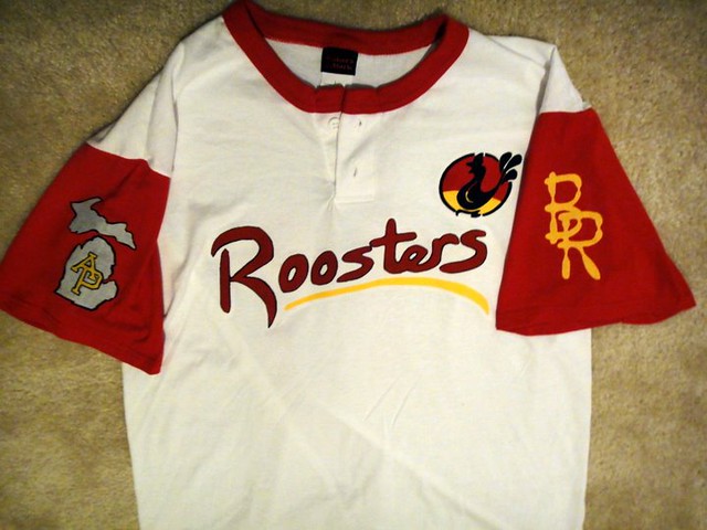
I recently did a faux throwback-style jersey for my old beer league softball team, the Big Roosters. I designed all the logos by hand on paper, traced them on a product called Wonder Under, ironed that onto the fabric, cut out the logos, and applied them with an iron.
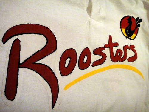
The chest logo is a combination of a few different MLB designs — Cardinals, Mets, and I’m sure a few others that contributed subconsciously. The simple yellow underline is from the recent Cubs throwbacks, which I really liked:
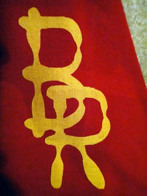
The “BR” on the left sleeve is an old type font I created. If you look closely, you can see that the letterforms are made from softball bats:
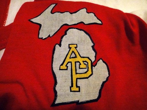
The right-sleeve patch is obviously the state of Michigan, with the “AP” being the logo of our city, Allen Park:
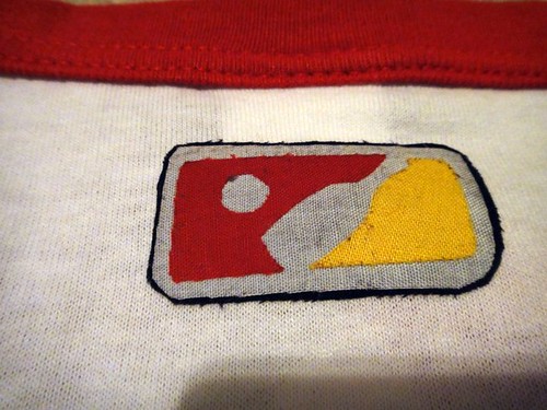
On the back is a beer league softball logo I created, based on the MLB logo [I’m pretty sure we can definitively say that this one owes nothing to Harmon Killebrew ”” PL]:
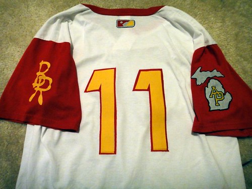
Each of the logos actually has several layers, since this was all done with fabric. Very tedious work that most people won’t appreciate, but those who like to analyze all the details will understand. All in all, this jersey represents about 15 hours’ worth of work.
While we’re at it, here are some photos of my brother’s half-Michigan, half-Michiagn State Halloween costume. Paul will most likely not be pleased with the double logo creep, but it had to be done.

Collector’s Corner, by Brinke Guthrie
The NFL may have a work stoppage, but fortunately eBay is always open for business. Here’s our latest haul:
• Item of the week: this 1969 Seattle Pilots bank.
• Never seen this Buffalo Braves logo before — it’s usually been that stylized B (which until this very moment I didn’t realize featured a feather — duh).
• Keep track of your 1941 Cleveland Rams with this schedule.
• We all know the Cowboys’ color scheme has been screwed up for years — never more so than on this 1960s bobblehead
• Speaking of bobbles, ever seen a ’Skins one with the feather down the middle?
• I just like the look of this old helmet — reminds me of my sixth grade YMCA football team from 1970 (bottom row, third from left).
• You were a superstar if Mom packed your lunch in one of these.
• Fianlly, PL, here’s a New York sports item that’s decidedly un-PC. What say you? [I’m more offended by the misplaced apostrophe (should be Li’l, not Lil’) and the misspelling (should be Dribbler, not Dribber) than by the bobble itself. ”” PL]

Seen something on eBay that you think would make good Collector’s Corner fodder? Send your submissions here.
You know what to do, Part 1: Paul here. Big thanks to Rob and Brinke for their content today — good stuff.
Now then: All you Seattle-area readers should mark your calendars, because Scott Turner’s band, RebelMart, has two shows coming up this weekend. On Saturday the 28th, 8pm, you can catch RebelMart at the Pegasus Coffee House on Bainbridge Island. “There’s no cover, and everything, including nightcaps, will be done in time to catch the last ferry back to Seattle at midnight,” says Scott.
The other RebelMart show takes place the following day, Sunday the 29th, at the Northwest Folklife Festival at the Space Needle. “I’ll be busking there throughout the day with guitar, harmonica, mandolin, bodhrán, mohawk, and a Rammstein T-shirt (gotta do something to rankle the folk folks),” says Scott. “It’s a great festival. Even if you don’t find RebelMart there, it’s a worthwhile day of music.”
You know what to do, Part 2: I’m wearing my rally cap this week for home-stretch fundraising drive for Project Neon, which aims to create an iPhone app that will make it easy to find the coolest neon signs throughout NYC (and, eventually, in other cities. The app will be free, but creating it is not, so please consider helping out. Thanks.
Uni Watch News Ticker: Outmania! Additional shots from Josh Outman’s glorious 2011 season debut here. ”¦ That game also provided a stirrups-vs.-stirrups moment, when Peter Bourjos of the Halos stepped in against Outman (screen shot by Seth Moorman). ”¦ Add another name to our roster of catchers who wear their helmets with the brim facing forward: Wellington Castillo. He was in the Cubs’ lineup Sunday night against the Bosox, who had front-brimmed Salty behind the plate, making for a rare front-brimmed vs. front-brimmed match-up (good work by Andy Chalifour). ”¦ Interesting note from Nate Farrer, who writes: “In my hometown of Nashua, New Hampshire, there’s a mural on the side of a local tire shop for Don Newcombe and Roy Campanella, who played for the minor league Nashua Dodgers in 1946. The team is believed to have had the first racially integrated roster in the U.S., as Jackie Robinson spent his minor league days in Montreal.” ”¦ Steven Little has created some interesting infographics regarding team colors. ”¦ Here’s a truly remarkable infographic on the history of advertising (big thanks to Coleman Mullins). ”¦ Here’s a good piece on Philly-area uniforms. It also includes news that the Phillies will be wearing 1984 throwbacks on July 22 (with thanks to Art Savokinas). ”¦ As you may have heard, this week’s New Yorker has a big article about Fred Wilpon, which is accompanied by this photo. Three players (plus a skipper), three different undershirt colors. And people wonder why this team is such a mess. ”¦ Pretty groovy SF Giants poster, with Japanese graphics, available on Zazzle (nice find, Brinke). ”¦ The new Mountain West logo will be unveiled on June 6 (with thanks to Bryan Stevens). ”¦ Serious throwback action for Brookfield Central High School in Wisconsin (with thanks to Jason Werth). ”¦ Here’s a better look at Kevin Durant’s orange-backed NBA socks (with thanks to Matt Mitchell). ”¦ The Orioles can’t spell Jordan Zimmermann’s name, and their network can’t spell a simple baseball abbreviation (with thanks to William Yurasko). ”¦ New away kit for Manchester City, along with some interesting thoughts from the designers: “The shirt is designed so that when a player celebrates a goal or links arms with team mates, the black and red stripe remains consistent. For this reason, there is no seam on the underarm, as traditional stitching can distort the shape and flow of a stripe” (with thanks to Timothy O’Malley). ”¦ Before he became a wrestler, Macho Man Savage was a minor league infielder in the Reds and Cardinals systems (with thanks to Ronnie Poore). ”¦ Lots of people are fussy about their uniform numbers, but Cam Newton isn’t one of them (thanks, Brinke). ”¦ Remember the Continental Football League? I don’t, but it was apparently a “minor league” in the late 1960s. Lots of cool I’d never heard of it until Warren Humphrey pointed me toward this video clip, which is basically a slideshow of old photos, logos, program covers, etc. ”¦ Start with the Padres’ swinging friar, add some Mexican wrestling, and stir in a few other pop culture references, and you have Bruce Jaynes’s favorite San Diego taco shop. ”¦ Here’s an interesting one from the Ricko files: Paul Hornung wearing No. 35 in a Pro Bowl. “Can’t even think of another player in the league at the time who wore No. 5 and would have had seniority over Hornung,” says Ricko. “There wasn’t more than a handful of single-digit guys at most.” Weird. Anyone..? Of course, my big Paul Hornung mystery is why the last syllable of his name is pronounced “ing,” even though it’s spelled “ung.” ”¦ Bill Belichick dresses like a slob for Pats games but got all dressed up for last night’s Bruins/Lightning game (screen shot by Alan Kreit). ”¦ Your latest Under Armour spokesman, at least at last night’s Rangers/Chisox game: Bush 43 (with thanks to Dan Cichalski). ”¦ Hmmm, is this first time Mr. Red has appeared on a boxer’s trunks? Even weirder, the boxer in question is Ray Edwards of the Vikings (hey, he has to make a living during the lockout). Turns out he’s from Cincy — hence the logo (good spot by Jimmy Lonetti. ”¦ “Since I am a Sonics fan and what should be my team is getting killed by the Mavs, I thought I’d share this photo of current Thunder guard Nate Robinson posing with a Sonicsgate shirt,” says James Nagasawa. “I love the irony of it.” Not sure if the Rockies cap adds to the irony, but let’s be glad the photo was dimly lit — nothing clashes with green/gold like purple. Ugh. … Finally, do you know how to play baseball? Here, let Goofy show you (thanks, Phil):
I’ve seen that Buffalo Braves logo before — when I was a kid, I had a set of NBA logo mini-basketballs (with displays designed like mini-courts, with clear backboards) that used the logo. IIRC, it was only used for a year, two at the most.
That was the first Braves logo when they debuted in 1970. The original colors were Blue, Red and Gold. They then switched to Orange & Black and introduced the feather-B logo. When they finally changed colors to Columbia Blue & Black they kept the stylized “B” and its partly-Orange feather. The team used three different color combinations in just eight years of existence.
I bought a 10-game pack of tickets for the ’76-’77 season. I saw Dr. J’s first league game with the Sixers, saw the Celtics minus Dave Cowens who was having his brain cramp, and visited the Lakers’ dressing room. Barney Tiernan, who made the Lakers’ uniforms, arranged that visit.
Sadly the old ‘Skins bobble is all too common. I don’t know if I’ve ever seem a correct one!
Also, the Un-PC Knicks boble is only un-PC because of the description–not the actual item.
Random:
Agree on the assessment of the Knicks “Dribber.”
I see Jersey Jays and Philadelphia Bulldogs ephemera at memorabilia shows from time to time, it never seems to sell so I don’t imagine it made a mark on too many people’s memories.
I posted the link to the Gonzalez Inquirer article in yesterday’s comments (May 23, 2011 at 9:54 am).
“RebelMart” sounds like the name of a place to stock up on Confederate reenactor gear.
I remember watching that Goofy cartoon when I was maybe 10 years old and just being in stitches. Seems not quite as funny now, but I marvel at the work that went into animating each frame by hand.
is this belicheck’s daughter?
Girlfriend:
link
Wow! Talk about out-kicking your coverage.
He must have a nice “hoodie”…..
Is it me, or does Bill Belicheck look like he’s in extreme pain when he smiles? He must be a real hoot on dates :o|
Got all the Continental Football League helmets and logos right here:
link
Rollover the helmets to get a better view of the logo
The pitchfork design makes me wonder if the Norfolk Neptunes were sponsored by Nike.
Cool Continental league video, and great helmet/logo site. They bring back memories of seeing the 1969 championship game as a kid, in old Bush Stadium (home of the Indians before Victory Field). An overtime thriller…
I lived in Indianapolis for 3 years (2002-2005) and I went and checked out Bush Stadium while I was there. Of course, it hadn’t been used for years and I was sad to see it in such condition but I wanted to see where the last Continental game was played. Cool that you got to see the Caps beat the San Antonio Toros 44-38?
Love the Norfolk Neptunes (pitchfork/trident logo)
HATE NIKE!
Seems Nike didn’t do much creative work for Arizona State after all. Rotate the trident 90 degrees and sdd a little flair to the staff and there you go.
44-38 indeed! I still have the program somewhere…
Those team color infographics are a neat idea… they definitely show that the MLB could use a bit of expansion to it’s color palette.
I’m not so sure about the NFL one though. There’s a few teams that are a bit questionable in their placement. A little bit of rearranging and the NFL teams could look even more diverse. Pewter as it’s own color instead of lumped in with silver, for example.
I had the same issues with the MLB one. It’s awesome and all, but I’d have liked to have seen the teams ordered on the lines between colors with some relationship to the degree to which they use one color versus the other. So the line between red and royal should have the Phillies at the top, then probably the Rangers and the Cubs on bottom. Nats and Angels closest to the red on the red/navy axis, Padres on top on the navy/tan axis, and so forth.
Also, I’d have liked to have seen brick red separated from brighter red, but that’s sort of just complaining. A meaningful ordering of teams on their respective axes would have made the infographic more accurate.
I hope we see an update for 2012, since the Marlins’ Miami redesign is likely to force a significant revision of the chart. Royal will probably have to take the “home plate” position if teal is no longer a primary Marlins color.
Also, I probably would have put the Tigers in the Navy/Orange category rather than Navy/White
Yeah, I had the Tigers in Navy/Orange until I started looking around and saw blue and white considered their colors with orange being a third on away uniforms. Could definitely go either way.
Also points that a team needn’t go to teal or brick or something to stand out.
Maroon/Burgundy would work as a dominant color.
Or flat-out Kelly Green.
Or Orange.
“Back to basics” sometimes can be a very, very good idea.
Was speaking of MLB.
In MLB, any green would be a standout. As would any use of brown or yellow. I was going to say purple, but then I remembered the Rockies, and then I remembered what the Rockies actually look like, so I’m right back to saying any use of purple would also make a team stand out.
Color schemes that MLB isn’t using:
Red/Black
Red/Gold
Royal/Black (it can work: see the St. Paul Saints)
Green/Blue
Green/Orange
Green/Red
Green/Black
Burgundy/Gold
Burgundy/Orange
Burgundy/Blue
Brown/Gold
Brown/Orange
Brown/Green
Brown/Blue
Brown/Red
Purple/Gold
Purple/Green
Blue/Gold
Throw in teal, which is a perfectly fine color if used with care, and the whole range of pastels that no one uses other than powder blue, along with the full list unused X/White combos, and there’s no need for any two teams to share colors.
Cincinnati is using Red/Black, Milwaukee is using blue/gold. No league really uses Brown for good reason. Maroon and gold is underused in the NHL and Baseball.
I count Cincy as red/white, with black as a tertiary color. As for Milwaukee, they don’t use gold, they use a color that’s the same color as the metal gold, but we can’t call it gold, since we have to call the color that the other 1.2 billion English speakers call yellow “gold” when we’re talking about sports unis. Because that’s what it was called in a catalog once in 1967 or something; I’m not clear on the reason why. Ask Ricko. Anyway, point is, the Brewers are Navy/Not-Really-Gold-More-Like-Tannish-Because-Gold-Means-Yellow-Not-Actually-Gold-For-Some-Reason.
brewers are navy/glitter-gold, which is probably worse.
Nice tribute to Newcombe and Campanella in Nashua. I think Campanella also served as an interim manager during the ’46 season and could arguably be considered the first black manager in an integrated league. Holman Stadium also had recognition for both players.
1. Steven Little’s infographics on team colors are phenomenal.
2. I was just talking about those Goofy cartoons with my parents this past weekend. Other favorites from that series include link and link. Classics!
“Steven Little’s infographics on team colors are phenomenal.”
~~~
agreed; he screwed up the mets tho
Yeah, they should be next to the Jays, right?
It’s pretty crazy that only two teams (Bucs and A’s) utilize athletic gold as one of their primary colors, right? This is the power of accurate infographics – instant information.
Thanks, guys. Finding the two predominant colors for some teams was tough. I knew the Mets introduced black, but I thought it was the third color. Do they consider blue and black their main colors?
“Do they consider blue and black their main colors?”
~~~
fred does
The Mets are fine, I think.
Now that you fixed the Lions, I don’t really have any complaints. There’s a couple teams I might put in different spots, but they’re not really wrong where you have them either.
If you’re going to base it on the colors in the team logo then Buffalo is correct as royal blue. In reality, their uniform color scheme is currently navy.
Likewise, if you go by the logo then KC has no yellow- I would think they are a red and white team. Would the Pats be silver and blue with red as the accent based on their uniforms?
Narrowing it down to 2 colors isn’t always so easy.
Yeah, narrowing it down to two was the tough part. Sometimes you can find the team colors listed out with the most important being first. Other times it’s a judgement call between logos, uniforms, etc.
…and I just noticed that Pitcher Goofy switches from right handed to lefty for the “spinner” pitch.
Please tell me I’m not the only one…
Brookfield Central High has nicer uniforms than 75% of the major leagues, for pete’s sake.
The link for the outman stirrup v stirrup screenshot is missing…
Now fixed. Here’s the shot:
link
Outmania Rules! The compare/contrast between him and the batter says it all.
I like the look of the batter’s stirrups better, actually. Outman shows way too much sock for my taste. And the softball top sort of ruins the whole effect.
Yeah, Outman’s stirrups are WAY too 70’s for me as well.
Outman’s looking much better with his pants more tapered. Gets away from the baggy pants with hiked up stirrups look that is quintessential 1970’s Little League.
I don’t think we’ll find even one MLBer who wore his stirrups that high with anything but obviously tapered pants during that era, largely because teams didn’t even issue baggy pants to players. If we do manage to ferret out one or two (and would take some ferreting, indeed), it will only prove the point, not discredit it.
You know who wears their pants right? College softball players. Plus, all the ponytail ribbons are sort of endearing.
Here is more high school throwbacks – Lee’s Summit North – Lee’s Summit Missouri.
link
49ers to have decal to honor Joe Perry this year
link
Yet the St. Louis Cardinals are doing nothing for Marty Marion.
Either they are choosing to not fall in step with the current trend, which would be to their credit…
Or it’s because he finished with the crosstown Browns, which would not.
(For those who don’t realize how good Marion was, and his place in Cardinals’ history, do a little homework)
no one likes stl. marty
He is kind of an EABOD.
City’s new away socks, while not as hoopy as last year’s, are still rather nice:
link
We all know the Thunder have a seriously crappy identity on the whole – bad nickname, bad logos, bad uniforms. I hadn’t really watched them much until this series against the Mavs, but so many things about them are wrong that it’s driving me nuts. Like:
The court
link
You have a light royal blue and yellow court with a predominantly navy and orange logo in the middle. It looks like they got the wrong court delivered and decided to slap the logo on it and keep it anyway.
It’s no secret the uniforms are a mess
link
but seriously – navy, yellow and orange sleeve and neck trim coupled with royal blue lettering/numbering? Horrible. Again, it looks like their uniforms are a mashup of two completely different teams. And also, both of those teams already look bad.
I had to google OKC’s colors (for the record – Light Blue, Orange-Red, Gold, Navy, White). If someone has to do that to figure out what colors you wear, it is not good.
They really need to pare it down to that light royal and orange, which would be a nice scheme.
I love the color of the road uniforms. It’s a bright, vibrant blue, similiar to the color the Mets used to wear. ;)
And I love the collar trim of navy, gold, and red-orange. It looks like a naval ribbon (several of which use that trim).
link
The court looks beautiful, especially compared to the cluttered college courts of today.
I think OKC is doing O.K.
Actually, I think they are some of the better looking uniforms in the league, and my tastes are traditional.
It would not surprise me to see the Thunder add a third uniform in navy or gold.
Wow, really? I can understand liking that royal blue they use, but the uniforms as a whole? Just a total mess.
I like the colors. You have a good point in that they have a lot of colors, though in this case I think they go well. I also like the traditional stripes on the collars, which many teams have abandoned. I guess they could spruce up the unis, but there’s a lot to like about some of the core elements. I also like that there are no frills, weird designs, horns, airport abbreviations, or trendy colors. on them.
I was in Oklahoma City two weeks ago and almost bought a t-shirt with that logo, I liked it all so much.
I don’t think the Thunder look as good as, say, the Grizzlies, but OKC isn’t too shabby.
Granted, link doesn’t compare to
link but it’s a lot better than
link
A thought on the Paul Hornung #35 maybe…
Timmy B may be the one to give any credence to this, but since most of the Pro Bowl’s ‘back in the day’ were in LA, and the uniforms didn’t change all that much (if at all), could it just be that it was treated kinda like Little League is now? “Here’s what we have available – pick what you want.” Maybe they just didn’t have a #5 to offer. Did they maybe just have a stock of Eastern Conference/Western Conference uniforms to pick from?
Or maybe the equipment manager didn’t like Green Bay and didn’t feel like customizing for PH. Or maybe it was purposely picked to honor someone with #3 that PH thought shpuld have been there. I’m 39 so I can’t think of who wore a #3 back then.
Nope. All we have to do is look at Pro Bowl photos from about 1957 on to see that players wore their own numbers. I mean, I watched those games and have no recollection whatsoever of widespread differences in player numbers from their regular season numbers. Was like today, where the guys who DIDN’T wear their regular numbers was what was noticeable.
That’s why the Hornung photo jumped out at me, and why I saved it in the first place all those years ago.
Now, very early in the history of the Pro Bowl there may have been some holdover jerseys, yes.
Or perhaps they re-numbered jerseys. That’s believable. The numbers were sewn on and, after all, the jerseys were worn only once a year, so there wouldn’t be severe issues with fading, etc. And they weren’t worrying about a lot of closeups in the TV coverage the way they are today. The games were telecast in b&w until at least sometime in the ’60s, too, so not a ton of detail could be seen in the images “going home”.
1/15/61 NY Times has the West roster and here are the players and jersey numbers for the West:
9 Bart Starr (GB), 19 Johnny Unitas (BAL), 23 Abe Woodson (SF), 24 Lenny Moore (BAL), 25 Ed Meador (LA), 26 Jon Arnett (LA), 28 Yale Lary (DET), 29 Johnny Morris (CHI), 34 Nick Pietrosante (DET), 35 Paul Hornung (GB), 39 Jim Taylor (GB), 43 Andy Nelson (BAL), 44 Night Train Lane (DET), 48 Les Richter (LA), 51 Jim Ringo (GB), 53 Dan Currie (GB), 56 Joe Schmidt (DET), 61 Art Spinney (BAL), 62 Bill George (CHI), 65 Bill Forester (GB), 66 Bruce Bosley (SF), 71 Forrest Gregg (GB), 73 Leo Nomellini (SF), 75 Alex Karras (DET), 76 Henry Jordan (GB), 77 Jim Parker (BAL), 78 Stan Jones (CHI), 79 Bob St. Clair (SF), 80 Jim Phillips (LA), 81 Doug Atkins (CHI), 82 Gail Cogdill (DET), 83 Gino Marchetti (BAL), 84 Jim Doran (DAL), 85 Charlie Kruger (SF), 88 Jim Gibbons (DET).
If I can do the EAST:
11 Norm Van Brocklin (PHI), 16 Milt Plum (CLE), 20 Tom Brookshier (PHI), 21 Tommy McDonald (PHI), 22 Ray renfro (CLE), 23 Bernie Parrish (CLE), 24 Bobby Mitchell (CLE), 30 Tom Tracy (PGH), 32 Jim Brown (CLE), 34 Maxie Baughan (PHI), 36 John Reger (PGH), 41 Jerry Norton (STL), 42 John David Crow (STL), 43 Jim Patton (NY), 44 Jim Hill (STL), 51 Bob Kyahat (WSH), 55 Ray Wietecha (NY), 60 Chuck Bednarik (PHI), 61 Sam Huff (NY), 62 Mike Sandusky (PGH), 64 Jim Ray Smith (CLE), 66 Jack Stroud (NY), 70 Bob Toneff (WSH), 71 Frank Varrichione (PGH), 72 Ernie Stautner (PGH), 73 Roosevelt Brown (NY), 76 Mike McCormack (CLE), 77 Rosey Grier (NY), 78 Marion Campbell (PHI), 80 Andy Robustelli (NY), 81 Leo Sugar (STL), 82 Bill Anderson (WSH), 84 Bobby Walston (PHI), 85 Pete Retzlaff (PHI), 86 Sonny Randle (STL)
Well, hell’s bells, I stand corrected.
And apparently the photos I still have just happen to be of players who wore their own numbers (Van Brocklin, Arnett, Moore, Lary and others). Not the mention the guys I chose when I made my Kid Cards of the game each year.
Cuz there are a whole lotta different numbers there.
Must have been a year or two later, after the AFL began their own All-Star Game and for the most part DID assign players their regular season numbers, that the NFL changed its policy.
Aw, hell, last night as I was lying in bed nodding off I couldn’t remember which knee I had scoped nine years ago.
Maybe I’m losing it. Best I retire from UW. I’ll stick around for any resolution of the Dark Horse Helmet debate (and keep doing “Benchies”), but when my once-formidable memory starts playing tricks with me…it’s time to walk away.
Not playing ball anymore, either.
“You got to know when to hold ’em,
know when to fold ’em…”
ricko my man,
Please don’t fret. I’ve been corrected more than I’ve been correct.
Those roster numbers are STRANGE. Baty Starr #9?? Sam Huff 61?, Brookie 20 (half of 40???), Retzlaff 85?? Night Train 44?!?!?
I give up.
Can someone tell me exactly what look Colby Rasmus was going for last night?
The pant legs are around his calves, he’s wearing solid red socks, instead of the striped Cardinal-issued beauties, and his pants are too baggy to be pulled up.
link
If he were wearing stirrups would be sorta the “Jim Lemon-early Frank Robinson” look…
link
link
btw, that’s a Spring Training photo of Robinson. That’s the uni the Redlegs wore through 1955. But the time he came up in ’56, they’d switched to vests, red hats and dropped any navy blue.
link
Real quick, and rough, MS Paint alteration.
Added stirrups and removed the excess white on the cleats.
link
Nice MS Paint job, but you forgot the stripes! It’s the Cardinals
I know. Was just pointing out that “mixing style eras” gets a little odd…and that stirrups with sanis and one-tone shoes mitigate it a lot.
In that sense, was a “generic template” alt, not so much a “one-team” fix.
Just stumbled on a nice shot of the L.A. Rams’ first dark jersey from ’57 or so, the ones with a white edge on the front and back numbers…
link
I don’t think it’s quite fair to call out Dubya for sporting an UnderArmour logo. For one thing, UA polos are suddenly everywhere since last fall. Over the winter, I visited my brother-in-law, who for as long as I’ve known him has only ever worn two outfits: The tux he wore to his wedding, and logo-free black t-shirts. Yet my whole visit, he wore UnderArmour polos with the UA logo on the chest. It seems like all of the stay-at-home moms in my neighborhood got together sometime around March and traded whatever brand of pastel sweats were previously issued to stay-at-home moms for UA polos. (A vast improvement, from a spectator’s point of view.) And the whole idea of polo shirts having a maker’s mark right there dates to the mid-1930s and Izod’s crocodile. So it’s more like, “Hey, look, Dubya was wearing a polo shirt.” No logo creep to see here; please move along.
Polo shirts should be cotton, and maybe this one was. Cotton is no longer the enemy, according to UA.
pretty sure those are 95% Polyester / 5% Elastene …
their “charged cotton” seems limited to beaters, muscle shirts & tees
“I’m sewing tigers on my shirts, and alligators, ya wanna see the inside, huh, i’ll see ya later”
The charged cotton is actually really nice. It’s not as tight as the pictures suggest (if you buy the right size, of course). My friend has one, and he’s as thin as a rail, and the shirt itself if really nice.
Then he wear’s Reebok’s ZigTech shoes, which looks weird with the UA logo on his left nipple.
Wow, link sounds so much more genteel than link, even though they’re pretty much the exact same thing.
Yet no one has noted that it is virtually impossible to buy batting gloves without a prominent “maker’s mark”.
So isn’t the issue really HOW prominent?
That little Majestic “M” is a fart in a windstorm compared to what most suppliers do.
You’re telling me. Shoes are even more difficult. When link popped up this spring, it was a really exciting moment for me.
How to get logo-less cleats (well, so they look like that anyway) with any brand.
For this, we’ll assume the idea is to get all black cleats.
1. Go to Hardware Store. Buy smallest can of acetone (you won’t need much) and a bit of very fine steel wool.
2. Go to Shoe Repair shop. Buy can of black spray-on shoe coloring.
3. Pour acetone in to a small bit of steel wool and scrub the area where you want the color to change (this strips off the manufacturer sealant and creates tiny scratches and will help the color be taken into the material).
4. Spray the areas with the black shoe coloring.
5. Let it dry. Spray again. Maybe even one more time.
Works on most any cleat, but is best on real leather.
After that, just give ’em another shot of black spray to touch ’em up when they need it.
The whole thing should cost around $10-$12 (the shoe coloring will be the most expenseive item)…and you end up wearing the cleats you like and are comfortable in, in all black. Not cleats you have to live with because they were the only all-black you could find.
(This process was imparted to me be a veteran Shoe Repair Shop owner…when I asked him it should be done).
Wow, “maker’s mark” sounds so much more genteel than “logo creep”, even though they’re pretty much the exact same thing.
Fair enough, but even so this isn’t logo creep. Logos in that spot on that type of shirt have been unremarkably common for nearly eighty years. It is, as far as I’m aware, the oldest form of logo-on-clothing emblazonment. The polo-shirt nipple-brand is the point from which all other clothing logos have crept. It’s logo creep’s Patient Zero: If we undid all instances of logo creep, ever, Dubya’s shirt would still have that UA logo.
im not sure how you can say this isn’t “logo creep” or a “maker’s mark” or whatever term we want to accord it…
is it the first example of it? sure (probably)
is it so commonplace as to seem innocuous? sure
but it sure is logo creep
i can’t see how you wouldn’t define it as such…it’s a logo and it’s on the garment … ON…THE…GARMENT — the very definition of logo creep…the only way it’s NOT logo creep is if there is NO LOGO…or the logo is HIDDEN (like on a neck tag)
i don’t mind it and i don’t have a problem with it in the least…but it’s still logo creep
I think what he’s saying is that “logo creep” is when a logo creeps to a place it shouldn’t be/hasn’t been before.
He seems to be arguing, that a part of polo shirts are makers marks, and for anyone to have a logo on a polo shirt there isn’t creeping to a new/not ok place because as a society we have accepted makers marks on polos and even included that into their identity.
And that, folks, is a waaaay too in-depth thought about polos.
All I’m really saying is that it’s not “creep” if it’s already crept. I’d go further and say that, since this is the first known example of logo creep, it’s not logo creep, it’s just logo. But even granting that it’s logo creep, it’s logo creep that happened eighty years ago. As a phenomenon, it’s only just barely younger than numbers on uniforms. Shall we now condemn the Yankees for “number creep” on their uniforms?
Other things about as old as polo-shirt nipple logos: Manufacturer logos on automobiles; Parking meters; Airline logos on aircraft tails; Logos on baseball gloves; Beer in cans; Television.
well, we can argue semantics till we’re blue in the faces, but i think we’re in agreement that a logo on a shirt, creep or not, isn’t really the worst thing in the world
it’s also, for the most part, a personal choice, as you or i would choose to wear nike kicks or levis jeans…all of which are also festooned with the maker’s mark
but it is still a logo, and because it appears on the garment, i’m saying it’s logo creep
now…
in the spirit of true logo creep, such as the majestic mark on every baseball team except the yankees, there is a difference — that team already HAS a logo — its own — so the addition of the maker’s mark is a bad kind of logo creep
paul said it better than i, or you, or anyone else ever could, in what may be my favorite Uni Watch column ever
there, he differentiates between logos on shirts and on uniforms, and i suppose you could argue that the latter constitutes creep while the former is just a logo
again, i think we’re arguing the same thing here, and i have no problem with a logo on a shirt, whether it’s a croc, a tigre, a swoosh or a pair of arcs that form two letters
Forget Dubya’s shirt, what’s the logo on the hat the guy right behind him is wearing?
Virginia Military Institute ballcap I believe
link. And if I’m reading the body language correctly, he’s Dubya’s Secret Service body man. Not sure how they train agents to deal with big-league catchers tacking the president!
The Wilpon thing gets even worse, Paul. Check out this photo from an article about the New Yorker article: link The black NY logo, black piping, and black trim on the bill. Triple yeccchh.
“The Wilpon Message: I’m Too Stupid
To Have Known About Madoff“/fixed
The Roosters jersey is a lot of fun.
Someone ought to mention that.
Good job, Rob W. Whimsy is important. And all too often neglected these days.
Yep.
Double yep.
Sports is supposed to be fun. Wish more players, fans and marketing folks remembered that.
sports, like the interwebs, are serious business
Agreed, Jimmer. Why can’t new teams just be link?
i liked it too. i’m still holding out hope that the last logo(a play on the MLB logo) is a ball & beer bottle and not a ball & softball bat – because it is a beer league.
Well, unless the league uses Snoopy bats, I’d reason it’s a beer bottle. Baseball bats are larger in diameter than softball pants, not the other way ’round.
“Baseball bats are larger in diameter than softball pants, not the other way ’round.”
*snicker*
Yeah, Rob did a great job on those. I always enjoy the DIY stuff featured here.
That Seattle Pilots coin bank is cool. But not $300 cool.
I have one exactly like that except that it is Cincinnati Reds one. I got it at Arby’s after the Reds won the NL Pennant.
I was at my folk’s house back in April and my Dad asked me if I would go through some old boxes in the garage and see if I could get rid of some of the crap in them.
Among other treasures I found, was a 1974 program from a Tampa Tarpons/St. Pete Cardinals game at Al Lang Stadium and guess who was listed on the roster…..Randy Poffo, aka Randy “Macho Man” Savage.
RIP Macho Man
When ever wrestling would come to town (Cincinnati) during baseball season, Macho Man Savage would visit with Marty Brenneman and Joe Nuxhall in the radio booth during Reds games.
Marge Schott wasn’t happy about it, but Marge wasn’t happy about most things.
Class act.
I don’t know if this was discussed – But Oregon not only wore camo for their spring game, but they are wearing a military ranking on their sleeves (corporal I believe).
scroll down to Oregon (#2) link
It’s one thing to argue about whether Camo “honors” the military, but this is completely over the line and should not be tolerated.
Corporal typically is peak up…but I’m sure not gonna disagree with your comment.
Maybe it’s a camo version of a Chevron station attendant?
Now, if I thought there was even the REMOTEST chance any of these kids actually thought they had any obligation whatsoever to ponder enlisting…
If that resembles anything it would be closest to a Petty Officer Second Class in the Navy. link
Honestly, though, I think those chevrons on the jerseys are just a cheap imitation, just like the ribbon stack on the chest that has no real military ribbons.
In other words, it’s shallow as well as phony?
Bingo.
Which makes Oregon exactly link. Anyone can enlist in the military, but it takes a real patriot to wear military-themed costume jewelry. However did the Navy SEALs manage to get OBL without the help of those heroes in Oregon?
…but you don’t realize they’re going to war this season…
Sarcasm intended
Absolutely nothing the Ducks wear surprises me. They could trot out in full surgical scrubs and I wouldn’t miss a beat. It’s sad when you get to the point of “shocking”, it’s beyond say when it’s the “norm”.
It’s cool how the rows of bricks provide the padding rolls on Campy’s chest protecter in the Newcombe/Campanella mural.
Maybe Hornung played as a halfback in the Pro Bowl, since link says he was a versatile player.
That’s a good thought, but a reach.
And again, assumes Pro Bowl players weren’t given their regular numbers, which they were.
Hornung kept his Notre Dame #5 with the Packers largely for PR puposes. By the time of that Pro Bowl his ill-fated and short-lived experiment at playing QB for the Packers was long gone, an idea dead and buried well before Lombardi ever arrived in Wisconsin.
He most definietly was a full-time RB and PK wearing #5 by then.
Not sure if the Rockies cap adds to the irony
No, but a Brewers had sure should.
had = hat
The cross pollination of sports teams continues:
link
I wasn’t able to get to UW until late this afternoon (work messes up everything!).
I belly laughed when the first thing I saw was a Nike advertisement at the top of the page. Loved it.
(note: giving you a hard time Paul, believe me, I understand generating income from advertising!)
“Never seen this Buffalo Braves logo before – it’s usually been that stylized B (which until this very moment I didn’t realize featured a feather – duh).”
When I was a kid, I didn’t think it was a feather, either. I thought it looked like a rocket B, and the red was the fire coming out of the exhaust (as I said, I was a kid – cut me some slack). Always thought it was a cool logo, but when I realized it was a feather I *really* thought it was cool.
True, and that logo was used in the early Buffalo uniforms, but was dropped later. I don’t recall the most common Braves uniform having any red at all, just blue(it was a more conservative design, like Boston)
Joe Patterson of the D-Backs is rocking the ‘rups
Nice to see a DIY today. Great work Rob.
An early look at some of the throwback caps that will be worn by several teams later this year:
link
Why does MLB make the throwbacks in Cool Base now (besides the obvious $) Mickey’s Place has all of those in wool.
First: a bit of revisionist history on that pirates hat, should be more yellow – link
Second: Jesse, I’m sure players 97 times out of 100 would prefer to wear the cool base if only to stay – well – cooler while playing. This should be reason enough to understand why.
If not, a uniform is part of a players equipment and feel and if you change that, players and feel off or disturbed. You don’t expect them to change mitts or bats for one game, you shouldn’t expect them to change the cloth of the uniform.
After having my seahawks uni concepts featured on a bunch of seahawks fan sites, I am convinced that all of their fans love terrible design.
… so much love for neon green.
Quote from a Seahawks site: “I’ve always thought that teams just looked ‘tougher’ in black pants.”
Where does that mentality stem from?!
Women’s college volleyball?
true, it is very… entertaining link
Probably the same place that “bad guys wear black” comes from. Bad guys = tough guys = team is tougher in black (unless they’re the Bengals)
Logo Creep? Talk about ad creep: link
I stopped by uniwatch and it was all ads and no content: link
Yeah, we had a few hiccups this evening. I think they’re all fixed now.
UW’s version of logo creep
I know the feeling, unfortunately I just have to wait for my website’s host to do something when timeobrien.com crashes.
@Tim: What’s your web browser?
Firefox 4.0.1 for the mac – I turn off my tool bars when taking screenshots, if that’s why you’re asking.
Not sure how flattering this t-shirt is… link
From: link
It has a 90s feel to it. Especially that ‘1/R’ crossover…
Don’t know if anyone’s seen this, but Yankees pitcher David Robertson started a foundation that is helping victims of the Alabama storms. It has a pretty neat uni-based name: High Socks for Hope. link. I feel like this is something every uni fan can get behind.
Thanks You learn a new thing everyday!