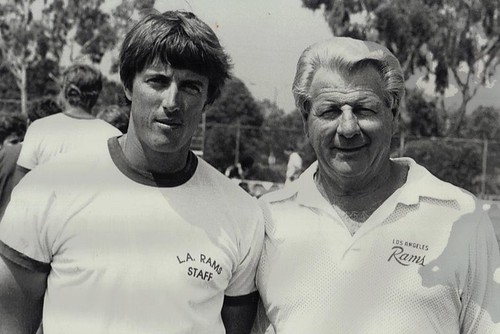
Yesterday I ran the transcript of Robert Harvell’s interview with longtime Rams equipment manager Todd Hewitt. As many of you know, Todd was born into the job, because his father, Don Hewitt (shown above at right, with Todd at left; additional photos here), served as Rams equipment manager before him.
Helmet Hut co-founder Jim Parker conducted a short interview with Don Hewitt in 2007. Sadly, Jim and Don have both passed away since then, but Helmet Hut’s Curtis Worrell was willing to share the interview transcript for publication on Uni Watch (he also posted it on Helmet Hut). It isn’t as wide-ranging as Robert’s interview with Todd, but it addresses some really interesting points, especially about the Pro Bowl’s pre-Honolulu days. Check it out:
Jim Parker: Don, How did you outfit the players for the 1960s-era NFL Pro Bowls, which were held at the Los Angeles Coliseum?
Don Hewitt: Back then the players arrived on the Tuesday before the game, which was held on Sunday afternoon. We would furnish only their game jersey, pants, and socks. Once in a while a player would arrive and find that he was missing something and I would try to substitute for it from my regular Rams equipment inventory.
One of the first things I’d do on Tuesday was to gather the players’ helmets and send them to a local reconditioner, Hub Athletic Service, to have them painted gold. There was very little physical contact in practice and the players wore sweat pants rather than padded football pants. When their helmets came back from the painter, I would stripe and decal the helmets with NFL logos.
After the game ended, I set up a table just outside the locker room. Glen Davis, the former great running back from Army, would sit there with me and distribute game paychecks to each player, but only after they had handed over their game-issued jersey, pants and socks to me. Unlike today, where the Pro Bowl players get to keep everything, we reused those uniforms year after year. In those days, the jerseys did not have the player names on them so they were easy to reuse the following year.
JP: Can you recall any instances at the Pro Bowl where you had to improvise because there were problems with the normal equipment routine?
DH: Well, I worked 14 Pro Bowls, so as you would expect, not everything went perfectly. I remember one year Dick Butkus showed up with broken shoulder pads and a cracked helmet. When I showed him the defective equipment, he just shrugged and said not to worry about it and that he had worn it like that all season. There was no way I would allow him to wear that stuff in a game where I was responsible for the equipment, so I sent his shoulder pads off for repair and I pulled a similar-sized helmet from my regular Rams inventory for him to wear — I’m not sure if he even noticed or cared.
Walter Payton had a quite different attitude than Butkus. In the 1989 Pro Bowl, he played into the third quarter of the game and then sat on the bench for the remainder of the game. After he sat down, he removed his helmet and called me over to ask me if I could safeguard it. It was a rare Wilson padded helmet that was no longer produced and could not be easily replaced. He really loved that helmet and was worried that it might get lost or taken by someone as a souvenir. I had my son Todd take it immediately to the locker room and had him lock it up in a special locker. After the game I repacked it myself and made sure it was delivered back to the Bears.
One year in the late 1960s, I was not so fortunate. The Pro Bowl players were using the UCLA locker room and facilities during the week prior to the game. Each night, before I left the locker room, I made sure that the heavy steel entrance door was not only double-locked but I also had a padlocked heavy steel chain threaded through the door handles for extra security. You can imagine my surprise when I arrived early the next day to find seven helmets were missing. I can still remember some of the missing helmets — Tommy Nobis, Paul Krause, and Deacon Jones. I had no idea how anyone could have gotten into that locker room, and then I noticed something not quite right with the bottom of the steel door. Upon closer inspection, I discovered that someone had actually used a blow torch to cut out a small entry hole. What was so unusual was that they also took the time to weld the cut out piece back so that it looked almost untouched! I guess it sounds somewhat funny now but back then I was really mad.
JP: Bob Brown, who was recently inducted into the Hall of Fame, played for the Rams and wore a padded type helmet. Can you tell us about this unique helmet?
DH: Bob originally played for the Eagles, where he wore a helmet made by MacGregor. The model that he wore included an exterior strip of padding attached to the center ridge of the shell — it was about four inches wide. Ohio State wore these type of helmets in the early 1960s. Irv Cross also wore a similar helmet when he played for the Eagles, although he switched to a conventional Riddell suspension helmet when he was traded to the Rams. When the Rams acquired Bob from the Eagles, the helmet was no longer being produced by MacGregor. He actually wore the same helmet for the Rams that he had worn for the Eagles.
Of course the helmet was originally Kelly green (Eagles colors), so I painted it navy blue. I hand-traced the ram horn logo from a regular Riddell helmet and made a template. I put the template over Bob’s Macgregor helmet and actually hand painted the white ram horn logos on each side of his helmet. I remember that it was a very difficult trying to paint those horns on because the wide padded area down the ridge of the helmet overlapped a large portion of the side of the helmet, creating an uneven surface where the horn was normally applied. And since he was a lineman, his helmet was subject to many bumps and scratches, so I had to carefully touch up both the navy shell area and the white horns after each game.
Whenever someone like Bob wore an unusual or non-standard piece of equipment, I always kept a back-up for it in my inventory. I kept three extra pairs of prescription goggles for Eric Dickerson, and I even kept an extra custom-made kicking shoe for Tom Dempsey that cost $1000. But I was never able to keep a back-up padded MacGregor helmet for Bob because they were not available. If something had ever happened to that helmet, I would have had to talk him into wearing a more conventional helmet, but fortunately we never had to deal with that.
JP: How did you determine what type of mask a player should wear?
DH: I would hang the different style masks on the wall and the player would pick out the type of mask that he wanted to wear. I was never able to persuade Tommy McDonald to wear a mask — all I would tell him was, “It’s your teeth.” Vince Feragamo wore a Dungard mask, and when he left our team to play in Montreal in the CFL, he called and asked if I would send his Dungard mask to him, which I was happy to do. When Joe Namath was traded to the Rams at the tail end of his career, he brought the old bolt-on cage mask that he wore with the Jets. Most linebackers wore some type of cage facemask, but I remember that our great linebacker Maxie Baughn insisted on wearing only a plastic Riddell two-bar mask.
I drilled facemask attachment holes for every helmet. For most of the helmets, I drilled the holes in the conventional mounting position, depending on the type of the mask, as recommended by Riddell. A few players requested that I position their mask in a slightly unconventional position or angle. Roman Gabriel wore a one-bar mask and he requested me to change the angle of the mask to it protected more of his mouth area instead of the nose area. Whenever I had to change the attachment position of a player’s mask, I would usually have to also replace the helmet with a new one, because the new drill holes combined with the existing holes would dangerously weaken the old helmet shell.
———
My continued thanks to Helmet Hut’s Curtis Worrell for his generosity with these interviews. If you haven’t poked around his site, I strongly recommend doing so — there’s a huge trove of information to be found there.
Surprise ESPN piece: The NFL writers and editors at ESPN.com just voted on their top 10 current NFL helmet designs. Then they asked me to do a companion piece on helmets that are no longer being used (at least not as primary designs), so that’s what I did.
Uni Watch News Ticker: I scored this nifty Durene warm-up top on eBay yesterday. More pics when I receive the item from the seller. ”¦ How cold was it in Chicago on Monday night? So cold that Alexei Ramirez was wearing a Fudd cap — on May 16! (As noted by James Huening.) ”¦ Third item on this page postulates that the Padres’ newfound offensive prowess coincided with the team getting new BP jerseys (with thanks to Brian Hilemon). ”¦ Kyle Mackie was at a recent A’s/Chisox game and spotted someone with an A’s chest protector backpack. ” It’s got Suzuki’s name on the bottom corner, so maybe it was a giveaway involving him, or maybe it was something sold in the team store,” says Kyle. “Either way, never seen something like this before.” ”¦ The Lehigh Valley Ironpigs will wear hockey-themed jerseys on Saturday (with thanks to Thom Dennis). ”¦ Interesting trademark case involving the NHL (with thanks to Jay Winkler). ”¦ New football uniforms for Purdue. I don’t have a Rivals subscription, and most of you probably don’t either, so Scott Misner helpfully provided the text of the article, which I’ve worked up into this page. The most interesting thing is the repeated reference to Nike’s “Speed Machine” uni line — hadn’t heard of that before. … Interesting to see that UConn gave the Prez a jersey with an initial. “Did Michele get one too?” asks Tyler Kepner. Not sure about that, but at least UConn is being consistent — look at this shot from last year. ”¦ Latest team to go BFBS: FC Barcelona (with thanks to Chad Jorgenson). ”¦ What’s even better than an old uniform made by Wilson? An old uniform promoting Wilson. I’m gonna be bidding on this one, so hands off! ”¦ “These LaDainian Tomlinson cleats are already three years old,” says Matt Powers, “but I just found an interesting feature: LT’s boss facemask is on the sole. ”¦ Bob DeLano notes that Edinson Volquez had some major underbrim stickerage going on last night. ”¦ And here’s a great one to go out on: Someone on the Chris Creamer board found a video clip of the Bengals’ 1981 uniform unveiling. Check it out:
Does anyone know if a person, or a team, can still purchase heavy duty cotton or cotton blend Football Practice Jerseys from anywhere? The kind that could actually be worn by teams in tackle football? Someone mentioned recently about finding “Wrestling Shirts” or Jerseys available somewhere – perhaps by Russell or Champion – but I can not locate them on the internet anywhere.
Do I need to go through a particular dealer? or is it something that no longer exists? Any help wil be appreciated.
Clearly, the UConn jersey is meant for the link.
So I’ll ask again today: was yesterday the first time the Astros wore their brick red caps on the road? I thought their standard road attire was the black caps with brick red jerseys, but yesterday they had the red caps with gray jerseys.
well I live in houston, and see at least parts of most games, and i’ve never seen the red caps on the road. thanks for the head’s up
From Alyson Footer, Astros Sr. Director of Social Media, “Here’s the skinny on the gray uni-red cap combo: pretty simply, they just thought it would look cool and gave it a whirl. What say you?”
You beat me by 10 minutes in posting that!
It looked sharp to me. I hate the softball tops, so the gray jerseys will always be preferable. And the brick red caps was a nice touch. I’d make that their primary road uniform ASAP.
I told Alyson Footer as such. The Red cap looks great with the grey/grey uni, but they better not change to the Black cap with the home alt whites!
I saw that as well and thought it looked great. I have always liked the road greys (which they rarely wear these days) but the brick red Astros hat is one of my favorites. I hope it becomes their regular road hat!
Barcelona, BFBS? Yeah, I suppose – but in the world of club soccer wearing away colors separate from the traditional home colors is the norm. So I guess you could also say that their 10/11 away kits were Sea Foam Green for Sea Foam Green’s sake…
link
A clean, all black look is an improvement over that strip.
I was going to comment on this as well. It’s been discussed many times here on UW, but it’s hard to say any 3rd kit is BFBS in soccer. Those kits, as many have already stated, are really designed so they can practically be guaranteed to be a different color than the team they’re facing. It’s Black For Contrasting Sake (BFCS?)
The black shirt in soccer is a rather recent phenomenon. If you recall, refs and linesmen wore black kits about 98% of the time. The only others who wore black was usually the goalkeeper (Hans Tilkowski and then Sepp Maier usually wore black when keeping for West Germany in the 60’s and early 70’s).
There were many sides who wore black striped shirts (Newcastle, Inter, AC Milan, Eintracht Frankfurt come to mind), but almost never did teams wear a 100% black shirt until probably the 1990’s.
The 2% of the time that the refs did NOT wear black that I know of is when Sctland wore their navys. The refs then normally switched to red or maybe green.
So, I’m not so sure to give soccer a free pass on BFBS just yet.
I’d say its BFBS. I understand that its hard to consider the change kit BFBS because its well, the change from different colors. But FCB has had a past of using bright, unique colors for their change kit.
Yellow, Pink/Orange, Green…
Plus, their arch-rival Real Madrid’s change kit is allegedly black as well. Neither side will be happy that they will have the same color (hence why Barca never uses a white change kit).
Spot on. This is clearly BFBS, since Barça could have easily gone for a color that exists within their current template. A predominantly yellow kit with bits of red, for example, would emulate the colors of the Catalan flag. I can honestly say that seeing the BFBS shirt with the sponsor’s logo was the exact moment I stopped think that Barça were anything “mas que un club”.
interesting story. When the LT cleats came out I was talking to my Nike rep and he showed me all the things LT wanted to put on them that most people don’t notice. On the back of the cleat if you turn it side ways it is actually his number 21. On the tongue of the cleat there are 33 small stars and 1 bigger star. The bigger star represents the 34th star which was the number of his favorite football player Walter Payton.
Why would Lawrence Taylor be involved in designing LaDanian Tomlinson’s cleats?
Hey, if multiple players can have “Snake” for a nickname, then there’s no reason that 2 players can’t both go by their shared initials.
I beg to differ there is only one LT, and it isnt that washed up RB playing for that other team in Giants stadium.
To me there is only one LT, and it isn’t that drug addicted sex offender
Darn right.
Was Lionel Taylor, Denver Broncos.
First in pro football to catch 100 or more passes in a single season. 1961, in vertically striped socks and brown pants, even.
And, get this, the Chicago Bears had him at linebacker before they cut him.
No horse to discuss. Pre-horse.
:)
LT…registered sex offender…where I live…aarrgghh!
maybe you should move
or burn his house down
Thank you for some sanity. There is not a worse nickname in sports. Not only did Tomlinson take (or, more likely, was assigned by lazy, uncreative sports TV people)Taylor’s nickname, he already had a great nickname, L Train. What a waste and depressing lack of creativity.
I love the image of Glen Davis holding back the All-Pro paycheck until the star in question returned jersey, pads, and pants. Life in the fast lane.
Here’s something else from Don Hewitt:
“… Bob originally played for the Eagles, where he wore a helmet made by MacGregor. The model that he wore included an exterior strip of padding attached to the center ridge of the shell – it was about four inches wide. Ohio State wore these type of helmets in the early 1960s…”
As did a few other schools. I liked those helmets, though the only ones I can remember now were OSU (pictured) and Harvard. So why didn’t they last? Was the exterior foam pad useless for injury-prevention, or was the basic head-hugging design just not as protective as the new generation of Ridell suspension models? Or did people just think they were too dorky-looking for words?
Duke wore them…
link
rick~
didn’t the blue devils wear them before the buckeyes? i want to say woody adopted them after the match-up with the dukes in 59. or it sprung from woody’s friendship with bill murray, or something like that.
lots of schools wore exterior padded macgregor helmets and equipment managers, even at the pro level, were known to produce homemade versions for players. regarding the discontinuation of the design, it was discovered that the exterior padding (protrusion) not only reduced the impact deflection benefits of the helmet design, but actually caused “grabbing” on impact which contributed to neck injuries.
Thanks, Robert.
Although the news reporter didnt understand all the fuss about the new uniforms………sure benefitted the Bengals.
They lost to the 49ers in the Super Bowl
You might want to check how lousy the Bengals were the season before (49ers, too, for that matter). Losing the Super Bowl hardly equates to being a sucky team.
Oh, wait, I guess it does, doesn’t it.
Forgot about that.
only if you do it 3 or 4 times
link
actually, b, was thinking more these guys, but yeah…buffalo works too
Hey, there are generations of kids in Africa that think that Fran Tarkenton and Jim Kelly were the greatest QB’s of all time.
For those who weren’t born or too young to remember those 1981 Bengals uniforms, it was a big deal at the time, very radical. Funny how those uniforms seem conservative compared to the current design. Nationally, the reaction was mixed at best, although I liked them. The term “varicose pumpkin” was used by detractors of the helmet.
But as the surprising Bengals kept winning well in 1981, talk of these radical uniforms faded, too bad Cincy won’t return to this look today.
Hall of Famer Killebrew dies at 74
link
He was the person whose likeness was used for the MLB logo:
link
I’m pretty sure it’s still debatable that his likeness was used for the MLB logo. It’s been discussed on here the last few days…
Right, it’s a continued debate. It’s not definitive one way or another whether his image or likeness was used in the making of the MLB logo.
Um, no — it’s NOT debatable. It wasn’t Killebrew.
Oh, sure it’s debatable — in the same sense that it’s debatable as to whether or not the President was born in Hawaii.
THE donald says it’s killer
zing.
you done did just get hueninged.
ah-cha-cha-cha
Note that the player in the MLB logo appears to be batting either left-handedly or right-handedly depending on your “perspective” of the logo.
For the umpteenth time: Killebrew was NOT the basis for the MLB logo:
link
But your article makes it sound more like a he-said, she-said argument as to whether Killebrew was the basis of the logo or not. Was Killebrew wrong to believe that his image was used in the making of the MLB logo?
If you read carefully, you’ll see that I worded the article in a way that allowed Killebrew to retain some dignity. He was prince of a guy who was sincere in his belief, but he was mistaken.
He said vs. he said isn’t exactly a fair fight when one guy simply *believes* something and the other guy is the one who actually DESIGNED THE LOGO.
When Jerry Dior was fighting to receive official recognition from MLB that he was the logo’s designer, every single claim he made checked out. In other words, everything he said ended up being corroborated by his former co-workers, by MLB research, etc. That’s why MLB eventually acknowledged that he did indeed design the logo.
If Dior says the logo wasn’t based on Killebrew, then it wasn’t. The end.
Probably worth a UW entry as Killebrew’s funeral approaches. Not to rehash the facts of the case, which Paul has already done yoeman’s work to establish. Rather, this is a fundamental conundrum in the epistemology of art and design. Sure, we now know that the person who chiefly created the logo did not base the design on Killebrew. But art is not a one-way street of meaning. We know, for example, that much of the meaning that readers take from great novels was never intended by the authors. Art often surpasses the intentions of the artist once it encounters the public. Art is an exchange, and meaning builds from both sides of the exchange.
Which brings us back to the MLB logo and Killebrew: The legend seems to have sprung up organically, and almost immediately. In fact, it was at first widely assumed that the logo was either Mantle or Killebrew, for the understandable reason that both the stance and the profile resembles each man. Over time, certainly by the early 1980s, the Killebrew myth had largely won out, at least in most of the country beyond New York, and had become an element of folk wisdom of such strength that it was widely believed even within MLB and the sporting press.
So here we have an artist who says, “No, that’s not Killebrew,” and we have the viewers, who quite understandably look at the art and say, “Wow, look at that – it’s Harmon Killebrew.” The author of the symbol intends it to mean one thing; the reader of the symbol finds that it clearly means another. Who is right? Is there even such a thing as “right,” as a “true meaning” in such a case? If Melville tells us that the white whale is just a white whale, a character or plot element that is only particularly itself and nothing more, are readers wrong to see Moby Dick as a metaphor for God or untamed nature or any of the dozen other things that readers see in literature’s most renowned cetacean?
So is that Killebrew in the MLB logo? Not according to the artist’s intention. We can stop the enquiry there, and it’s true enough as a matter of intention and historical fact, but to do so is to invalidate the possibility that the viewer plays any role in creating meaning in art. And to do that is to invalidate the concept of criticism itself, and with it to invalidate this here blog. If, however, we admit that criticism is possible, that the viewer plays a role in creating meaning in art, that communication is at least in part about decoding meaning from symbols, and not only about encoding meaning into symbols, then yes, that is Killebrew in the MLB logo. If that’s what the symbol is understood to mean, then that’s what the symbol means, even if that is not what the artist intended when he created the symbol. So the answer is both no and yes, depending on which side of the symbol we favor: the artist, who intended a certain meaning when creating the symbol, or the public, who reads a different meaning when viewing the symbol.
So maybe, just maybe, there really is a #3 on the player’s back, just below the frame of the logo, and it’s been there all along.
Beautifully stated, as usual, Scott. But it doesn’t quite address the urban myth.
If you want to say the logo IS Killebrew (or Mantle, or whomever), be my guest. That’s an interpretive thing, a function of how we receive images and project our own meanings on them.
But people (and media sources, including the AP, who I contacted earlier today to help set the record straight) are saying that the logo WAS BASED ON Killebrew. That’s very different — it implies a specific creative process, a specific chain of events. And in this case, it is patently false.
Oh, sure, throw in the three simple words “was based on” and destroy my whole argument. Thanks, Lukas. Thanks a lot. ;-)
I say it’s Killebrew and I say to hell with it. But of course Paul is right; the origin is what it is, and it ain’t Killebrew. Though from a certain point of view, and we’re talking here about the point of view where Darth Vader killed Luke Skywalker’s father and old Ben Kenobi isn’t a manipulative, lying SOB, isn’t “based on” still open to interpretation? I mean, it just looks so much like Kellebrew’s batting stance. Even granting that the designer didn’t consciously set out to base the logo on Killebrew, if he was any kind of baseball fan, Killebrew’s beautiful swing had to have been in his mental mix when creating the logo. You look at Killebrew, and you look at the logo, and how could the one not have been based at least somewhat on the other?
Maybe? Just a little?
Nah, Paul’s right.
Erudition, thy name is Scott. OK:
“…So is that Killebrew in the MLB logo? Not according to the artist’s intention. We can stop the enquiry there, and it’s true enough as a matter of intention and historical fact, but to do so is to invalidate the possibility that the viewer plays any role in creating meaning in art. And to do that is to invalidate the concept of criticism itself, and with it to invalidate this here blog…”
Methinks thou over-reachest.
” True enough as a matter of [artist’s] intention and historical fact” is pretty darn true, and certainly sufficient for Paul to bristle when someone says “His was the likeness that was used…” or even “The issue is still in doubt.” No, the issue is not in doubt. But does that invalidate impressions or images evoked in the mind of a viewer? No; you’re right; that lies in a realm beyond factual truth. But surely one can also presume that an aesthetic reaction doesn’t obliterate the “historical fact.” The reaction can become a widely-shared social perception or value, which can create a meaning of its own, which might be described as a fact in the deconstructionist mode, but Joe Friday and Paul can certainly understand that distinction. It’s fine that people think George Washington threw a coin across the Potomac downriver from what is now DC, and it played a modest part in fomenting the legend of the Great Man who was also one strong tough physical specimen (which he was!), but no, he didn’t throw that damn silver dollar. And no, Harmon Killebrew, isn’t the MLB model, and, yes, John Ford had it right about “print the legend,” but it was the John Wayne character who killed Liberty Valance.
Anyway, Scott, thanks for the opportunity to bloviate. Perhaps work calls…
“it just looks so much like Kellebrew’s batting stance.”
~~~
it looks like a lot of guys’ batting stances…including batting stance guy
the baseball world, and the world in general, lost a great player and human yesterday, but lets not accord him an honor that he doesn’t deserve (and he deserves plenty, but not this)
the MLB logo is everyman
“the John Wayne character who killed Liberty Valance.”
And it was former L.A. Ram Woody Strode’s character who tossed him the rifle he used to do it.
(see how nicely everything hangs together at UW?)
So “Pompey” (Strode’s character) gets an assist, right?
Damn, you are good. What was the name of the John Wayne character?
Wayne was Tom…Donofan? Something like Donovan but not quite. Or maybe it was Donvaan. With my hearing, could have been.
I promise I won’t go to imbd.com for at least half an hour, just let it percolate.
I think the whole point of Dior’s logo is that it could be Killebrew, in fact it could be anybody! It’s just ambiguous enough where it doesn’t represent one person but rather the whole league…you know except for American League pitchers.
“Tom Doniphon” (from imdb.com)
I think the whole point of Dior’s logo is that it could be Killebrew, in fact it could be anybody!
link? I’m link quite so link. Aside from the
scotty,
please…your four examples weren’t even born when dior created the logo, so if you want to refute the myth, at least find some older dudes with crazy stances
secondly, IT IS NOT KILLEBREW
just like (as ricko pointed out) the NBA logo isn’t jerry west, although you can likely find a pixture that resembles him in the same pose as was used
talk all you want about how great a man he was, how good he was for the game, how he was a mentor to those who came after him (all of which are wonderful and should be said)
just please drop the “well it could have been him” stuff…seriously, it’s not funny anymore (not that it ever was)
Wait, so we’ve gone from “People say it was based on Killebrew, but it’s not,” to “It doesn’t even look like Killebrew anyway”?
I’ve stated over and over again that of course it wasn’t Killebrew, and I’ve even mocked myself for the degree to which my rambling might be taken to suggest otherwise. The MLB logo was not based on Killebrew. Nonetheless, the myth that Killebrew was the model for the logo has survived for three generations now. The myth didn’t arise at random; this isn’t somebody claiming his Pop-Tart looks like Jesus. There really is a resemblance that’s at least a little more specific than “the logo is a batter, and Harmon Killebrew is known to have held a bat in his hands at some point in his life.”
The myth arose, apparently organically, because the resemblance was pretty obvious at the time. Even though we now know it was a coincidence. Or, I don’t know, whatever you call a connection that’s even weaker than a coincidence. The myth has persisted, indeed grown to become almost universally accepted folk wisdom, because most people still see the resemblance. The resemblance is close enough that the myth doesn’t just seem plausible, it seems likely. It’s not true, of course, just as many things that seem plausible or even likely are not true, but there you are. Al Kaline didn’t look like that; Frank Howard didn’t look like that; Clemente didn’t look like that; Orlando Cepeda didn’t look like that; Frank Robinson didn’t look like that. Killebrew did.
Then again, Hank Aaron and Joe Morgan also had kind of Killebrew-esque stances, what with squared shoulders, tucked heads, and high elbows. Actually kind of surprising, now that I think about it, that Joe Morgan hasn’t claimed to be the model for the MLB logo. That’s totally something Joe Morgan would do, which makes it all the more a shame that Killebrew himself seemed to have believed and indeed promoted the myth that he was the model.
Anyway, point is, to say that the myth is not unreasonable, to point out that there really is a resemblance between the logo and that one guy, is not to say that he was or could have been the model, or that the myth is true. He was not. The myth is false. It’s just an interesting, and maybe even poetically appropriate, coincidence. Or, again, whatever you call a connection that’s even weaker than a coincidence.
mother of corn, can i say one thing here?
this isn’t “art”, it’s “design”. there is no subtext, no transcendent expression of experience or ideas, no stimulation of thought, no deeper meaning or context, it’s a logo of a dude with a bat, it isn’t duchamp. you can say, hey that looks like killer, but the designer said it isn’t killer so it isn’t killer. the designer was not engaging in artistic expression, he was creating a design. so you can say the logo resembles killer, but you can’t gleam for a moment about a logos artistic expression because it has none. let’s articulate this madness by taking a journey to yesteryear, and in our best olde tyme gallery gent with a kilnk monocle voice, have a conversation with an adoring young lass with one of those lacy turn of the century umbrellas and ten gallon floral hat at he metropolitan museum of logos…
“hmmmm, buttercup, i think i see a killebrew, yes indeed, i do.”
“no daaaahling, the artist was clearly expressing the dichotomy of good and evil with the blue and red fields, the ball player is superfluous to the logo’s expression.
“hmmm. maybe it’s mantle?”
“oh blithington, you always see into the artists soul in such a fascinating manor. perhaps you have found the meaning. it is killebrew trapped in the eternal stuggle, and it is up to the viewer to find that mutual identification. blithington, you are a genius!”
“thank you buttercup, but what i can not figure out now is it a right or left handed batter?”
people, puh-lease.
Whatever. I can’t believe the MLB logo’s meant to BE anyone, any more than the NBA logo sprang from, “Let’s make Jerry West our logo figure.” It’s only that the photo the artist used for reference, because the particular position worked for his concept, happened to be a photo of West.
I really think the MLB logo is an amalgam. As it should be. A logo like that should look like everybody and nobody. I have photo of Johnny Bench that looks almost exactly like it. Dick Allen, too. Not an uncommon moment to capture when a batter’s at the plate.
A parallel, perhaps. At least three people claim to have written McDonald’s “You Deserve a Break Today” jingle, Barry Manilow being one of them. Bottom line, based on everything I’ve read, is that there’s all right and they’re all wrong. No one person actually wrote it, but they all played various roles: lyrics, melody, arrangement.
So it is, I think, with the images in such logos.
Although, in that vein, I could ask this wonderful TRIVIA QUESTION:
Who, or what, is Stubbs Farley?
His image has been seen by millions over the years, and still is by hundreds of thousands every day.
And, yes, this is uni-related. Indirectly.
Well, considering the logo has been worn for 100th anniversary (1969) and 125th anniversary (1994) celebrations and is currently worn on the nape of the neck of virtually every baseball jersey and the back of practically every MLB cap, yeah.
My question is…what was considered the official MLB logo prior to 1969?? The eagle logos for the National and American Leagues have been around for what seems like eons.
Ah, apparently there is some debate on the subject of Stubbs Farley.
Let’s instead, ask who is “Steamboat” (or at least that appears to be them most accepted set of circumstances).
Same image, though.
And it’s still uni-related. Indirectly.
No one wants to play?
Okay…
link
Well, maybe it ISN’T Steamboat. lol
So was that horse blue or brown???
I’d like to see the Dick Allen MLB logo with a cigarette dangling.
I give this discussion a ‘G’ for Greatness.
The whole logo-Killebrew thing is entertaining stuff. Makes me want to shout out the words of Tom Servo: “HE’S NOT MERRITT STONE!!!”
*head asplode*
The helmet ranking article brings up an interesting question. When ranking items in a purely aesthetic sense, should tradition or longevity play any roll at all?
In other words, Dallas and Green Bay both made the list. San Fransisco and New Orleans (who have practically the same helmet in a different color scheme) did not make the list. The Vikings and their horned helmet made the list, but the Eagles and their winged helmet didn’t. Ditto for St. Louis.
Another example: if you like the Yankees’ home unis, shouldn’t you also like the White Sox’ home unis by default?
If you’re truly ranking them on aesthetics, no, history shouldn’t matter. But, given the people involved, it probably did.
Although in the example of Green Bay vs San Francisco, the Packers helmet consists of 3 colors and only 3 colors. The 49ers helmet has 5. You’ve got the mismatched facemask and the black trim on the logo. Granted, they are similar enough that a fan of one would probably like both… but I can see how one could have a preference.
Right, I forgot that the 49ers went to a gray facemask a few years ago. That’s significant. Should the black trim around the SF count too? Technically, I guess so.
I guess I just get tired of seeing “best of” lists where an item get ranked just because a team has worn it forever or the author has some kind of other non-aethetic attachment to it.
Also, “Speed Machine uniforms”?
I’ll take that over “Pro Combat” any day.
Here he comes, here comes Speed Racer…
Given today’s and yesterday’s posts, how could your helmet list NOT include the classic Rams design, either in the standard blue-and-gold or the intervening blue-and-white version?
Read the rules: My list could not include current designs. And the Rams’ previous designs are just slightly different-colored versions of the current design.
I said last night the simple “3” on the Twins’ right sleeves was black. It’s navy. Was hard to tell on TV, but there’s a photo in the Strib this a.m.
Nice. That it isn’t black, I mean.
Twins did this with both the Puckett and the Herb Carneal patches, too. At the time, knockoff merchandise popped up, and you could tell the fake from the legit from the thread color. Knockoffs were black.
And agreed: The Twins got it exactly right.
Another quick note from the White Sox game last night – Dallas McPherson had a superscript “c” in his NOB:
Eh, forgot the link.
link
Walter Payton would not have played in the 1989 Pro Bowl, having retired in 1987.
and the last Pro Bowl played at the LA Coliseum was 1978. methinks his memory was a little cloudy. maybe he was thinking of Gale Sayers, maybe 1969?
Wikipedia says the 1979 Pro Bowl was played at the Coliseum; it’s gotta be that one.
That was the last one played on the mainland before they moved it to Honolulu for the next 29 years. Interesting.
Payton did keep the same helmet from his rookie year at least through Super Bowl XX.
while it’s true that payton sported the no-longer manufactured wilson f2000 model helmet throughout his career with the bears, he didn’t wear the very same helmet for all of those years…
I’m guessing it was a typo – by 1989 the Pro Bowls were all in Honolulu, anyway. Assuming Hewitt on worked Pro Bowls in L.A., he must have meant the 1978 one for Payton….the 1950-71 & 1978 Pro Bowls were the ones in L.A. From 1972-77 they were in other sites around the league and from 1979 on (except for 2010) they have all been in Honolulu.
a nice pro bowl reference:
link
Here’s a terrific link that’s also right in the UW wheelhouse. Used American t-shirts, many of them sports-themed, dumped into third-world markets, re-imported to the USA and sold to raise funds for charity projects in said third-world countries. Takes what is basically one of the great evils of the modern world and turns it into a little bit of good. And, more importantly for our purposes here, brings to light some fantastic sports designs.
Such as link, which combines my own high school alma mater, student-designed logo and all, with a vintage ad for one of the great burger joints of all time. Sports, design, and meats: If this was still for sale, I’d have had to buy it for Paul. Plenty more nuggets in the mine, and it appears the founders are looking to grow their project and repatriate more shirts.
Nice project. But ugh, those apostrophe catastrophes….
That really is a very cool project.
Decent, if small, look at the #3 memorial patch.
link
Several here…
link
I apologize if this has been mentioned here before…
link
Nice ESPN article. Is the Colt’s throw back helmet picture from last season? If so, it has the old NFL logo on it.
No, last year they used a blue helmet. The white throwback is from Thanksgiving 2004, before the new NFL logo was created.
Thanks Jeff.
That’s, The Jeff.
That Suzuki chest protector backpack has been around a while. It was a giveaway I believe from 2009
It was a season ticket holder giveaway. Here’s a better photo from the A’s blog: link
Anybody else notice that Purdue article mentions that the basketball team will eb wearign sweatback next season?
“Coach Matt Painter’s Boilermakers will also feature a new look during the 2011-12 season. They’ll be the silhouette style used by Michigan State, Illinois and Ohio State and others for next season.”
I noticed that, and the fact that silver is being discussed as a color option. I hope that doesn’t happen- silver is not part of the Boilers’ color scheme…
I am frightened by the ramifications. Sweatback? In black? If not, would they wear gold? I haven’t liked their golds in past years. What would they put in the sweatbox design? The Bell Tower? The Engineering Fountain? The Big Drum?
Also, co-sign on the dislike of silver. Stick with gold and black. It’s fantastic on its own. Don’t go SFSS…..
I’m guessing the sweatback will somehow incorporate bricks… Maybe the moon, a train… the engineering fountain? There are a lot of options.
And yes, silver does not need to be in play for the jerseys. Black, old gold, and white.
So first Barca finally sell out and get a proper sponsor, and then they go BFBS? Karma better slap them down HARD next Saturday. A fourth Champions League title for United, thank you very much.
Speaking of, I got an email from United’s today..Barca are wearing their standard blue/red stripes for the final, and United is wearing their white change kit.
Sorry, Shane. Barça plays too durn purty. A joy to watch. Love most things Mancusian, but the Barcelona game is sweet.
Re: Basha Restaurant
A “Lighten up, Francois” is definitely called for.
What pisses me off (as a small business owner), is that the NHL (or any company looking to “protect” their branding) spends time and resources on this kind of nonsense.
It irritates me, because in order to go through the proper channels to get licensed to manufacture, sell, etc. their merchandise is very, very costly. Yet, in just about any city in the United States, you can find knock off merchandise.
Take the resources, and direct them at the people whom are ACTUALLY trying to illegally profit from their protected branding, instead of harassing a small business that is clearly showing support for a local team.
Ah c’mon, Paul…no Oilers helmet on the list?
link
Old news now, but hopefully the new ownership will right 19 seasons of misguided uni-missteps and change back to blue and orange with the H star caps, as it should have always been.
link
$680M for the Astros… and meanwhile Atlanta Spirit would be lucky to get $100M for the Thrashers.
The A’s did give that chest guard backpack as a giveaway and so did the Giants in ’09. can’t find a picture though..
link
please…can we not go there today?
no Fun.
If I ever open a soccer pub, it’s getting one of those.
exactly.
Hope you’re not in the U.S.A.
Except for a few towns, opening a soccer pub here is right up there with starting Frederick’s of Tehran, isn’t it?
Well I went to college in Bloomington, IN and that place is *fairy* soccer crazy (IU men’s soccer has won 7 National Championships making it the second most decorated IU team behind men’s swimming) and is a college town so a bar will fill up on most weekends no matter the theme.
Are you calling soccer fans fairies?
Correction: fairly
some could be fairies, but no, that wasn’t my point, haha
“some could be fairies, but no, that wasn’t my point, haha”
(link)
Here’s some speculation about the numbers that the Dolphins’ draft picks will wear: link
Sad day for good design in Chicago
link
Before I forget I want to say how much I enjoyed the Atlanta Hawks uniform history that was linked to the other day. I hope he can get the full site up and running, or even a book like Okkonen’s but NBA-wise. Really great and overdue.
Yes, that was some outstanding work.
I didn’t know the Bengals uni unveiling needed to be found. I saw it like three months ago…
Killebrew update: An AP writer named Dave Campbell wrote a widely circulated Killer obit that included the inaccurate myth about Killer’s connection to the logo. This morning I wrote to him and told him that the story is a myth. His response: “Obit was written a few years ago, and the myth must have slipped thru the fact-checking machine.”
Since then, two things have happened:
1) Campbell issued a follow-up tweet:
link
2) He now tells me he’s interviewed Jerry Dior and will be doing a follow-up article that should be out this afternoon. Good for him for following thru!
Weirdest thing happened last night at the Twins/Mariners game –
Both teams scored a total of 3 runs
Each team had 3 hits
And it was the 3rd day of the week
Weird
Anyone else find it odd that the AP writer had written Killebrew’s obit a “few years ago”? Is this standard business in the news world?
Absolutely.
Same in TV.
Yeah, they don’t want to be caught off guard or unprepared so many famous people have their obits written well before anyone suspects they’ll die and then they can fill in the few stray facts (like cause of death) and then publish them.
I had to write an obit for a living famous person in a ‘Reporting the Arts’ Journalism class in college.
A step-relative was a senior producer at Headline News, and CNN has a producer/editor/writer DEDICATED to this task (usually somebody new). And they have keep updating it too. Not as easy as it sounds, because for show biz and sports people they have to get rights to clips…but he said that MLB/NFL, etc generally have a 30 second blurb ready for members of their respective HOFs, and most active stars…
This is standard practice for any big journalistic enterprise. The NY Times obituary for Bin Laden was mostly written in late 2001 — shortly after 9/11. Two writers worked on it, one of whom died last year. In other words, the obit outlived the obit writer.
A similar thing happened with the NYT’s Liz Taylor obit.
Details on all of this here:
link
In other words, the obit outlived the obit writer.”
They all do eventually.
Still kinda creepy.
Here’s a link look at how it works.
Thank you, RS! Knew that’d come up.
I’d be surprised if it wasn’t written in 1976.
The contrarian in me just wants to say: I both dislike the Steelers helmet logo and obviously don’t like that it’s number 1 on the espn poll and, sacrilege of sacrileges, vehemently dislike Pat Patriot. I don’t like Flying Elvis either, so I wouldn’t exactly say I prefer him, but still.
perhaps you’d prefer the tri-corner hat?
That’s another example of getting it right the first time and getting it wrong ever since then.
Not really (I’m not sure if you say this in jest – the tri-corner hat logo is okayish, but ugly on a helmet). There isn’t really any Patriots logo I like, but then again it’s not like that should particularly matter to the team.
I’m kinda salty that my hometown Eagles are like #19. I personally think the winged helmet is one of the most creative helmets in the NFL, next to the Rams and ahead of the Vikings in my opinion, because it adapts the team identity on the helmet more than a logo could. Also, I enjoy almost any helmet with a number on the side, like the Tri-hat Pat’s and the Chargers.
I’d agree with that. Although, I would put the Chargers at the top.
As a Denver resident, and Bronco fan, I was surprised to see “our” helmet was as high on the list as it was. I did the fan poll, and ranked one or two from the bottom.
The Iggles’ helmet is nice enough, and maybe this is stupid, but I can’t help but look at them without thinking – “…but birds don’t have wings on their heads!”
So I am a little behind on reading, but did the guy who was looking for the Brooklyn Dodgers hat ever find what he was looking for?
If not, I think I may have found one for him on the website, homage.com. The only downside is it is a snapback hat, not fitted. Also, as far as i can tell, it is not a New Era hat either.
link
Any word yet given the decline on black this season for the mets if they may break out the blue caps this weekend at the stadium?
“…and I even kept an extra custom-made kicking shoe for Tom Dempsey that cost $1000.”
One thousand dollars? For one shoe? In 1975?
Calling Mr. Powers…how much would that be in today’s dollars?
Great video clip on the Bengals- I’ve seen that one before. Worked with Denny Janson & Walt Maher when they were @ WKRC TV and I was upstairs with ‘those crazy rock n roll guys’ @ WKRQ.
PS- is it me, or does Don Hewitt look like Jimmy Johnson?
No, I know it’s not just me.
The hair is almost exactly the same.
The Bengal on the left in yesterdays posted video is wearing the canvas Acton turf shoes that were discussed on Uni-Watch after a posted image of Rocky Blier back on March 8, 2010. They were originally thought to be curling shoes.