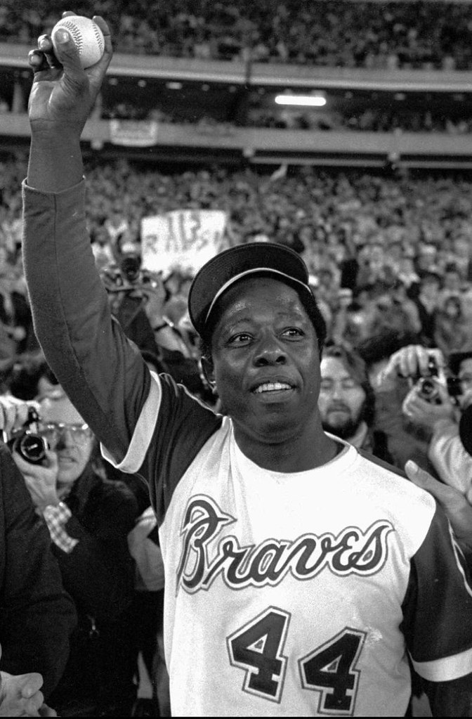
It was 37 years ago tonight that Hammerin’ Hank hit No. 715. I was 10 years old and the time and remember it clearly. NBC televised the game nationally, so I was watching in my living room when Aaron finally passed the Babe. The next day, a full-page photo of Aaron’s record-breaking swing ran in the New York Times (I think it was an “NBC Congratulates Henry Aaron” ad, or something like that), and I tacked it up on my bedroom wall, where it stayed for several years. And of course I’ve seen video of the homer countless times, just as you probably have.
In short, I thought I’d pretty well internalized and catalogued all the visual details of No. 715. But in Monday’s comments, Rick “Ricko” Pearson mentioned a uni-related aspect to Aaron’s historic shot that I’d never noticed.
First, remember that Aaron had tied Ruth, hitting No. 714, four days earlier — April 4, which was Opening Day in Cincinnati. Let’s compare photos of the record-tying and -breaking home runs:
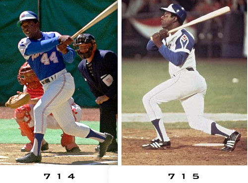
Aside from the obvious fact that Aaron was wearing a road uni for the first shot and home whites for the second one, notice anything else?
It’s gotta be the shoes!
Ricko says Aaron went back to plain black spikes right after April 8. I haven’t found photographic confirmation of that (good luck finding a photo of, say, Aaron’s 716th home run), but I have no reason to doubt Ricko on this — he was paying attention to this kind of stuff back then. So for the sake of this discussion, let’s take his word for that.
Now, Adidas-striped cleats weren’t unheard of in 1974, but they were uncommon. A few teams wore them as standard-issue footwear — most notably the White Sox, A’s, and Phillies — but that’s because they wore colored shoes, which were still unusual in those days, so a team had limited options. But for the teams that still wore black cleats, logo branding — whether by Adidas, Puma, or whomever — was much more the exception than the rule. Take a look, for example, at this photo of Aaron being mobbed by his teammates after hitting No. 714 on April 4. I count two players with striped shoes: Ralph Garr (wearing No. 48) and one unidentified player buried in the back of the photo. Everyone else is wearing solid black.
So why did Aaron switch to Adidas-striped footwear after tying the record and then, if Ricko is correct, switch back to basic black after breaking it? One potential answer: Maybe Adidas, recognizing a marketing opportunity for an occasion that would be watched by millions, paid Aaron to wear the branded shoes once he was on the threshold of passing the Babe.
If so, it would mean Aaron was a pioneer in yet another way. Shoe endorsements and product placements were practically unheard of in 1974, especially for black athletes (remember, Aaron was getting death threats during the week he tied and broke the record). So did Aaron and Adidas help pave the way for all the shoe shenanigans that have followed? And if Adidas tossed Hank a bit of extra coin, just how much coin are we talking about?
Aaron’s known as a pretty private guy, so my hunch was that he wouldn’t be willing to discuss this, but I wanted to give it a try. He still works for the Braves as a Senior VP, so I pestered their PR department all week long to let me speak with him. I also queried Adidas, although I doubted they’d have any records of this sort of thing.
Meanwhile, as I waited to hear back from them, I contacted Jerry Reuss, who was pitching for the Pirates in 1974. I wanted to get his take on what MLB footwear culture was like back in those days. He had a lot to say on the subject, plus he had his own interpretation of the two Hank Aaron photos:
I see Adidas shoes in both Aaron pictures. In the Cincinnati picture [i.e., home run No. 714], the stripes were covered with shoe polish. Since logos were relatively new on baseball shoes in those days, the clubhouse attendants didn’t pay much attention to the stripes and brushed the liquid shoe polish over the whole shoe.
Just making a guess here, but the Braves traveled from spring training to Cincinnati where they opened in 1974. Hank probably wore the same shoes he wore in Florida, which were Adidas shoes with many coats of black polish. When the Braves played their first homestand against the Dodgers (April 8-11), Adidas probably had a number of new pairs of shoes waiting for Hank and other members of the Braves. Hank, like other players, opened a box of new shoes, laced them and tried them during batting practice. Chances are they were comfortable and Hank wore them for the historic home run. ”¦
Here are some pictures I posted from the 1973 Houston Astros. You can see a smattering of Adidas shoes in this team picture. You can also see some Adidas stripes in this 1973 spring training shot. ”¦
As for me, I wore non-logo shoes from Rawlings in 1974-1975. I had a contract with Rawlings that provided a combination of four gloves/shoes, which was standard for most players at the time. During spring training of 1976, Pennsylvania-based Brooks shoes provided spikes for the Pirates’ players. I wore them during the 1976 season.
Other companies saw the light and wanted a piece of the action. I sported Converse for this 1977 picture. When I joined the Dodgers, I switched to Adidas as I had my first shoe contract that included both cash payment and equipment.
All very interesting. I was digesting this when I finally heard back yesterday from Aaron’s assistant, who wrote, “There is no significance [to the change in cleats from 714 to 715], he would just grab a pair out of his locker.” Then I heard back from Adidas: “The archives are in Germany and they said they’d look through them today, but we haven’t heard back from them, unfortunately.” Sigh.
One other thing: While I couldn’t find any photos of Aaron in the days right after he hit No. 715, I did find a fair number of date-specific shots of him from 1974. Here they are, in chronological order:
• March 1: Adidas-striped.
• June 4: Adidas-striped. (Also, note that Ralph Garr, who was wearing Adidas on April 4, is now wearing Puma.)
• June 18: solid black.
• July 8: Adidas-striped, perhaps partially blacked out.
• July 23: Adidas-striped.
• August 14: solid black, but it looks like there are Adidas stripes that have been blacked out.
• Oct. 2: solid black.
Looks like Aaron switched back and forth between being striped and stripe-free quite a bit during that season (perhaps due to some zealous shoe polishing, as Jerry Reuss suggests). So maybe the switcheroo between 714 and 715 was nothing more than one of his many footwear flip-flops in 1974.
One last item: About a month after the ’74 season ended, Aaron went to Tokyo and engaged in a home run hitting contest with Japanese slugger Sadaharu Oh. There were some Adidas stripes on display for that event — but they weren’t being worn by Aaron.
——–
Update! An hour or so after this entry was published, the increasingly indispensable Mike Hersh came up with a photo of Aaron wearing Adidas stripes while hitting a home run off of Charlie Hough in April of 1974. A quick peek at Aaron’s career home run log reveals that this was homer No. 716, hit on April 11 — just three days after the record-breaker. So the real story here is — wait for it — Ricko was wrong! Aaron did not go back to basic black after passing the Babe (or if he did, he went right back to stripes again a day or two later).
All of which sorta renders a lot of today’s entry moot. But it was still a fun topic to research.
Another update! Reader Jim Kohler just checked in with this:
During all of the hoopla immediately following number 715, NBC broadcaster Curt Gowdy needed to kill some time until the game was resumed. One of the things he talked about was the cleats Hank Aaron was wearing. He said that they had been left behind in the visitor’s clubhouse by Joe Pepitone after the Astros had visited Atlanta. Aaron somehow ended up with the cleats and liked them, so he wore them.
I clearly remember Gowdy saying this because I was a native Long Islander and rabid Yankees fan, and Pepitone was one of my favorite Yankees in the ’60s
Hmmmm — curiouser and curiouser. I’d be interested in finding the full broadcast of that inning, just to see if Jim is right.
Membership update: Scott and I are slowly but surely making our way through the flood of new enrollments that resulted from the recent “Get ’em before the price hike” promotion resulted in a deluge of new membership enrollments, which Scott and I are slowly but steadily processing. I mailed out a bunch of finished cards earlier this week , and now an additional batch of card designs has been added to the card design gallery (including Gregory Koch’s UConn sweatback treatment, shown at right, and also Bob Lane’s Shea Stadium centerfield wall design). The printed versions of those last eight designs in the gallery should be ready to mail out early next week.
As always, you can make the membership scene yourself by signing up here.
Uni Watch News Ticker: In a move that probably doesn’t meet with Michael Pollan’s or Mark Bittman’s approval, Melky Cabrera ate something off of his bat the other day. ”¦ “I am a high school baseball coach in Springfield, Ohio,” writes Jordan Shumaker. “Because of a delay in getting our new uniforms, we wore white on the road on Tuesday, which left both teams in all-white unis.” ”¦ Odd soccer development the other day, as Eric Hassli of the Vancouver Whitecaps scored a goal and celebrated by removing his jersey — which revealed another jersey underneath. And that’s when things got weird (with thanks to Alex Ozenberger). ”¦ Purdue’s mascot is getting another makeover. ”¦ The hat police cracked down on Rickie Fowler at the Masters (with thanks to John Kimmerlein). ”¦ For years I’ve been after the Mets to ditch the black, but now it looks like they may need to ditch the red as well. Chris Pastore spotted that shirt at a shop in Las Vegas. ”¦ The WNBA is switching to Adidas’s Revolution 30 uniform system, and at least two teams will have new uni designs: the Mercury (further info here) and the Mystics, who are adding a jersey sponsor (further info here). ”¦ Reprinted from yesterday’s comments: Someone at SI.com did a really nice job of photo-researching and art-directing this slideshow on relocated franchises. Start clicking thru the photos and you’ll see what I mean. ”¦ Check out the 5 on Lance Bouma’s TV number. Looks more like an upside-down 2, no? (Excellent catch by Don T. Smith.) ”¦ New soccer ball for the new NASL. ”¦ Nice to see Orlando Cabrera wearing stirrups. ”¦ Brett Crane notes that Justin Rose’s caddy had some NOB problems yesterday at Augusta. ”¦ Meanwhile, Sergio Garcia’s caddy was wearing a Real Madrid undershirt (great catch by Jared Rosen). ”¦ Dan Kurtz reports that the Doosan Bears — that’s a Korean baseball team — are celebrating Bears Day on Sunday, with a special uniform for the occasion. ”¦ Hmmm, must have been a knuckleballer pitching that day. That photo’s from a sensational trove of over 100 archival baseball photos from the Boston Public Library. … Rick Friedel reports that Nick Markakis was using a white bat last night. ”¦ Two interesting old ad found by Mike Hersh: a 1906 ad for boys’ baseball uniforms and a 1919 spot for a golf suit with a “pivot sleeve.” ”¦ If you like baseball sweaters even a fraction as much as I do, you’ll love this old White Sox cardigan — mmm, tasty (big thanks to Sam Shipley). ”¦ About five years ago I became mildly obsessed with this book about Japanese baseball uniform history, which has really wonderful illustrations (you can see a little something I wrote about it by scrolling down to the “Far East Meets West” section of this ESPN column). Now C. Todd Davis informs me that several of the illustrations from the book have shown up as uni-history timelines for the Kintetsu Buffaloes and the Hankyu Braves.
link on the Mystics new sponsor has a picture with the white jersey as well.
just waiting for movi to wake up and say he wishes the braves would go back to the royal blue tops instead of this
i second that idea
Motion carried.
That would be a much better alt! You could even make a button-down version of that.
Loved the feather on the sleeve.
Man, I love those shirts. Look link. Someone in the upper deck could pick out 28 and 48 with no problems whereas Johnny Bench’s back will be an indistinct red splotch.
As a Braves fan, damn near ANYTHING would be better than those awful navy tops they’re wearing. I’d even take the link.
Here’s a picture of Hank Aaron (adidas) from the April 14, 1974 edition of the Florence Times-Tri Cities Daily. The caption references Aaron belting a homer off Charlie Hough. Hough served up #716.
link
Ah, that changes things — maybe Ricko wasn’t right after all!
I’ve added an update at the end of today’s main entry.
yeah looking at the before photo….those are clearly adidas, i can tell from the heel tab.
ps one day prior–part of cincinnati was leveled, and xenia oh WAS leveled- i remember it well.
link
Love the bowling news on the opposite page. Some of the names are great, Lash Fish Market and Team #8.
Hey, that’s my hometown! Cool.
I was at Riverfront Stadium on Sunday, April 7, 1974 in hopes to see Aaron hit #715. But now I know that there wasn’t a snowball’s chance in Hell Aaron wasn’t going to hit it in Atlanta in front of the home team. I was 14 years old.
But, I did get to see Phil Niekro pitch and it was Bat Day.
I got a Pete Rose bat. And still have it.
Lance Bouma’s number is the way it should be. Here’s a nice side by side. link
Correct, Jukierules. I remember Dana Murzyn wearing the same design back in his day:
link
Anyone see this?
A look at all of the Nikes that Seinfeld wore on his show…..
link
Was in the Ticker a few days ago.
As disgusting as Melky eating something off his bat is, that was back on July 28, 2010 – not a few days ago. One of the rare times the Braves wear their road grays, I might add.
Burger King jersey team, assemble!
link
Yikes!!!
-Jet
Oh the humanity!
RE Hassli: The FIFA rules are that you get a yellow card for removing your shirt, doesn’t matter what’s underneath it. He got red because he already had a yellow card in the game.
I think it stems from the 2002 World Cup final when Kleberson scored for Brazil, and it took him about 3 minutes to get his shirt back on.
The funny part is Hassli saying he had no clue about that rule. Which has been in place worldwide since 2004. Yes, even in France.
So the real story here is – wait for it – Ricko was wrong!
~~~
uh oh
Okay, so he wore them for a few games. Probably until the next time the shoes needed a full-on shining, more than just a cleanup. That’s what, three-four games, tops, depending of field conditions?
At that time I was really curious about it, so I checked on Aaron every way I could the rest of that season (not much cable TV around in 1974, but I did subscribe to TSN), and there were no white adidas stripes every time I saw him on TV (or a photo of him). Not that season nor, as far as I could tell, for pretty much the rest of his tenure with the Braves.
If anything, Aaron definitely gave every indication of being one of those who didn’t care much for these “flashier” cleats.
And I guess that’s why I’ve been wondering all these years, was it…
…just a fluke?
…or a short-term term “shoe deal” to leave the stripes showing during the 715 run?
One fact remains: 1974 was the fourth season Adidas had been around MLB, yet Aaron appeared to step into the box with the three stripes showing on his Adidas for his first time ever in the nationally televised game after he had tied Ruth. And very shortly went back to his regular solid black.
Too bad it if it was a fluke. Was a missed opportunity. Aaron could have picked up a chunk of change.
One thing sure, it doesn’t look like Aaron had a full-on shoe deal with Adidas or the stripes would have been showing all the time.
I learned something today. That I’d have had a lot more info if I’d had the Internet in 1974. I apologize for that. Sincerely.
Looking backward at it from this point in time, I don’t know why I even bothered.
It’s ok Ricko, we forgive you.
link
Did the best I could with what I had.
And I did also pose it as question to Paul. WAS it just a fluke that Aaron’s first time in a regular-season batter’s box with Adidas stripes clearly visible was when his next HR would be #715? Or did perhaps Adidas cut a check to him to be certain they showed?
Cuz they sure as hell weren’t showing for #714.
That much we DO know.
Just throwing this out there…could it be possible that AP wirephoto was from a different day? It’s not as if you see Charlie Hough in the picture.
Search for something long enough online or through old newspapers and you’ll notice that editors sometimes just use any old photo that suits their purpose. I’m not saying that’s the case here, but it is a possibility.
I really enjoyed today’s entry, Paul. I was 8 years old when I saw him hit that homerun on TV and this Canadian boy has been a baseball fan ever since. I remember choosing Hank Aaron’s milestone as the subject of my shoebox diorama that we had to do for a classroom project that year.
It is a crime against humanity that the Astros ever got away from link look. Seriously, how fly is that?!
Middle row, 2nd player from left: That’s ex-Met Tommie Agee, his waistline going in one direction and his skill set in the other. He was my Very Favorite Player (long story), but when he lost it, he really lost it.
I pray every day the (hopeful) new owner will go back to that uniform (or the similar navy blue based one).
I even had a dream about it the other night.
It is a crime indeed. If I had to assemble a Top Ten baseball uni list for myself, this would make the list. When you consider all of the nonsense this team has worn since then, why they can’t return to something as logically beautiful like this is beyond me.
Jerry must be honored to have worn such a magnificent uni!
-Jet
How fly is that jacket that the trainer is wearing. I’m guessing he’s a trainer. I don’t know.
And… check out his white Puma “Clydes” with the orange stripes!
That’s Jim Ewell, the trainer, wearing the white Astros jacket.
At the very least, they need to bring back the orange hat with the blue star. Best hat they ever wore and still a bestseller in Houston, even among my generation.
I nominate this for creepiest Uni Watch post title ever.
In reference to Markakis’ bat, would a white bat make it harder to see the ball coming off? Why else would he use it (awareness days aside)?
Snowman awareness day?
That is FUNNY!
Are we sure that wasn’t just an ash bat with a very light finish? They usually stain bats maple, but ash itself is a very light wood.
Greetings – I have an answer to your Hank Aaron cleat mystery, though I have no proof – only my memory of Curt Gowdy saying it.
During all of the hoopla immediately following number 715, Gowdy needed to kill some time until the game was resumed. One of the things he talked about was the cleats Hank Aaron was wearing. He said that they had been left behind in the visitor’s clubhouse by Joe Pepitone after the Astros had visited Atlanta. Aaron somehow ended up with the cleats and liked them, so he wore them.
I clearly remember Gowdy saying this because, as a native Long Islander and rabid Yankees fan, Pepitone was one of my favorite Yankees in the 60’s.
I wonder if it would be possible to obtain a copy of the broadcast for historical review.
That’s all I know – hope it helps.
I’ve added this as another update to today’s main entry.
Has MLB scrubbed any YouTube evidence that a man ever hit a baseball with a bat? I have the homer itself, but wouldn’t know where to put it before MLB would Silkwood its brake line.
We’ve all seen the homer… What we need, based on Jim’s account, is the several minutes of hoopla AFTER the homer. Do you have that, Kenn?
(And yes, MLB is extremely aggressive about policing unauthorized YouTube material.)
No, I don’t. Pretty much ends with Craig Sager’s Trench Coat. I’m sure someone out there has the game.
Here’s the thing, though – the last time Joe Pepitone could have left his shoes in Atlanta as a member of the Astros was 1970.
The Astros sold Pep to the Cubs on July 29, 1970, so the last time he would have visited Atlanta as an Astro was May 27 (when he went 2 for 3 with a homer off Phil Niekro in an 8-1 Atlanta win).
Aaron kept those shoes from May 27, 1970 until April 8, 1974? Really?
The Cubs traded Pepitone to the Brave in May, 1973 (they got Andre Thornton in return). Pepi was with the Braves for only a month, and then ended up in Japan. It is possible that he had those Adidas spikes while with the Braves and just left them behind.
THAT makes a lot more sense, that Pep would have left the shoes in Atlanta when HE left Atlanta in May of 1973 and that Aaron would have still had them a year later.
So it’s the Astros part of the story that doesn’t add up.
The Astros were the last team that the Braves played at home and the last two games of the season in 1973.
I don’t see whats wrong with the SI slideshow. It all seems kosher to me.
Who said there was anything wrong with it? I said they did a great job with it!
I thought you were being sarcastic. I thought it was a game of find the mistake.
There is something wrong with it. They forgot all the franchise moves in the USFL.
Note, they said the four major professional sports. Not the four major sports leagues.
I believe Paul was recommending it. Team locale changes were depicted through photos of the same player making the same move (+/-) but wearing Before and After unis. Cool idea, good research, nice execution. Or am I missing something subliminally snarky?
Right on, Conn. No snarkiness on this one. Excellent before/afters. They really went the extra mile to create an superb slideshow.
The thing I took away from the slideshow – which, yes, is excellent – is professional sports has some pretty smarmy owners. No news flash there. It just sucks that fans get so emotionally attached to local teams, fork over boatloads of tax money and at the end of the day, hey, it’s the owners’ teams. When given a chance to make a buck, they hose the proletariat every fucking time.
Al Davis, Bud Adams, Art Modell, Bob Irsay, and so on and so on. You’re dead-on, Flip… buncha money-grabbin’ douchebags, this lot. It constantly amazes me that the owner of a team that takes full advantage of fan loyalty and their hard earned tax dollars can just up and move the team without so much as a by your leave and fans are powerless to prevent it.
Filthy lucre… that’s all it is. The root of all evil.
Here’s one for ya – new uniforms for the NSC Minnesota Stars of the (new) NASL:
link
The nice touch at the bottom of the back of the shirt? That’s the Loch Ness Monster, or “Nessie.” The Stars’ home field, the National Sports Center or NSC (enN-ESS-cee) is referred to by the locals as “Nessie” and and “Nessie” is on the bottom of the back of the shirt.
…but at least the slideshow gave us a great look at the Colorado Rockies (NHL) uniforms: link
Good point.
As much as I love those Rockies uniforms, it’s the goalie’s mask that really does it for me.
Agreed. The Rockies had amazing uniforms.
“… the increasingly indispensable Mike Hersh…”
Since Paul has now used this description at least two times, and since Hersh shows no signs of dispensability, I suggest we go straight to acronym. IIMH?
The Boston Public Library archive is spectacular, as is that Japanese book that knocked Paul out a few years ago. I don’t care much about Henry Aaron’s spikes, actually (sorry!), but it sure is fun to read the stuff from those who do care.
I do feel a little let down by the revelation of Ricko’s fallibility.
>I do feel a little let down by the revelation of Ricko’s fallibility.
Tell me about it. Say it ain’t so!
The Japanese uni-history book is available from Japanese Amazon, by the way:
link
That’s the only source for it I’ve been able to find (and it’s how I got my own copy five years ago).
Wow… coupla really nice, player-in-mid-air-sliding-into-the-plate shots from that Boston Public Library collection:
link
link
The Kintetsu Buffaloes logo is wonderful:
link
Wow, absolutely.
Their uniforms are absolutely gorgeous. I love everything about them.
You posted this Houston team pic from Jerry in regard to shoes, but never mind the shoes, I’m looking at a uniform so magnificent it makes my eyes water…
link
-Jet
The biggest mistake in sports history was the Astros going to navy and gold – relinquishing all of their ties to the original navy and orange. The current brick, black, and sand is just a slap in the face of Houston baseball fans. I live every day in sadness the ties to navy and orange may just be gone forever.
Please please please go back to navy and orange (preferably to the 1970s design).
Is the man on the far left wearing an Astros bowtie?
Man, would I love to have that white jacket the trainer is wearing.
Leo Durocher’s last team photo. Wow.
Someone’s gotta explain that Vancouver Whitecaps penalty shot to me. The first time they show it, the shooter shoots to the left corner of the net, where the goalie dives to HIS right and misses the ball. Then the shooter throws his jersey into the crowd.
Now… they show it a second time, from behind the net. This time the goalie dives to his right again, but the shooter lobs an easy shot into the RIGHT side of the net that the goalie just vacated!!! And then the shooter tears off his jersey!
Am I losing my mind? They look like two different shots, yet the shooter tears off his jersey at the end of each one…
-Jet
Great catch! I don’t know how to possibly explain it.
Maybe the MLS is fixed and the replay was filmed earlier?
i think you’re lossing your mind. LMAO. watch where the ball ends up in the net.
but really, i thought the same thing and had to watch it again. tricks the brain a bit
Yeah, I just watched it a third time, it’s the same shot but those camera angles and the fact that it’s in slo-mo the second time really had me fooled.
-Jet
Does anybody have a screen shot from yesterday’s Masters coverage of Gary Woodland?
The UA logo on his shirt was the largest logo like that I have ever seen. It had to be 2-3 times the normal size of a UA shirt logo. It practically covered his entire left chest area.
link
Very, uh, classy.
Yet another example of me picking on Nike and giving everyone else a free ride….
This photo fails to capture his equally huge UA belt buckle, which i found more disturbing than the shirt.
Here’s the belt buckle:
link
And here’s a photo from a Masters practice round. His caddie is wearing UA, and Woodland has the belt buckle, but he’s wearing a smaller logo on his shirt. Guess he saved the big guns for start of the tournament. Be interested to see if he does it again today.
link
Was hoping someone would notice that monster logo.
Ricko, I (was) a golf club professional (like Johnny O) for about 6 years in GA, so I don’t usually miss stuff like that.
Luke Donald wears a Polo logo that’s almost as big. Gotta be so the TV cameras definitely pick it up.
Just saw Woodland on 18. His UA logo is back to normal size today.
As a proud boilermaker, it pains me to show this to everyone… But the new Purdue Pete was leaked yesterday… and it is not good.
link|newswell|text|FRONTPAGE|s
i bet his papa is proud though:
link
I know Pete has been redesigned before, and I shouldn’t act like the sky is falling just yet. . .but I really hope that’s really not the final product. Really, really hope that’s not it.
The Hank Aaron post really made my day, my birthday in fact. I was eight years old that day and I remember feeling so proud that such a historic event happened on “my” day.
Years later when I found out just how much racial crap Mr. Aaron had to put up with on his way to that record I became even more respectful of both the event and the man.
Thanks for bringing back the good memories of that day. Hank will always be my home run king.
Happy Birthday!
“Since logos were relatively new on baseball shoes in (1974”)
Sure didn’t take ’em long to worn their way into the sport, though. The White Sox logo was link.
I think that might be the worst logo creep ever. I mean, it’s one thing to have a logo stuck somewhere on a jersey where we don’t really like it… but to have the stripes *in* the team logo? I think we’d rip a team apart if they did that today.
There are white Riddell’s in the “Swingin’ A’s” logo.
Again, in both the Chisox and A’s examples, those are teams that wore colored shoes, and there weren’t many options for those teams. Those cleats were team-issued — the whole team wore them, so they really were part of the uniform.
And why the statement about 1974 is not incorrect.
They WERE relatively new as a matter of individual player preference.
From what I’ve seen based on the sample Mercury and Mystics designs, is every WNBA team going to have the same number font? And so does this also mean that ALL the uniform designs are the same except for the team colors? That pretty much sucks. Every team might as well have the same color scheme with the only way to know one from the other the fact that the home team wears white. Ugh.
Here’s a longshot…is it possible that Aaron had to wear different shoes because the ones he wore while hitting #714 were stolen or went to the Hall of Fame?…and he wore the striped Adidas while waiting for another pair of black ones to arrive?
It’s possible, but if he wanted black stripes he would have just blacked out the stripes with shoe polish.
There is a picture here (you’ll have to scroll down a bit) that is dated May of 1974 and shows Aaron wearing Adidas spikes. The picture is taken in LA and the Braves played the Dodgers on May 17-19, 1974
link
Also a couple photos of the Angels’ short-lived navy/red stirrups. On Bill Rigney visiting the mound, for one.
The high school coach guy from Springfield OH shouldnt be panicking. I’m sure in the more “improverished” districts, like Cleveland, Columbus, and Cincy, they probably go white on white all the time, because they only make one uniform. Clemente H.S., one of the baseball rivals of Lane Tech (the school of the cool indian head jacket) is actually one of the few Chicago Public League teams to acknowledge having both home and road baseball uniforms. I lived by Chicago Vocational High School and have seen countless gray-on-gray baseball games.
I remember my brother played baseball his senior year at Beachwood High School (an affluent suburb of Cleveland) and he only had one uniform — a black jersey with gold trim and white pants with gold socks.
I know jack about the minutiae of baseball, but I can tell you that the first NBA player to get a shoe endorsement was the Knicks’ Clyde Frazier, who had the Puma Clydes named after him back in 1973 (which were really just customized Puma Suedes).
They were some gorgeous shoes – Clyde’d wear white with either orange or blue stripes, and sometimes he’d even mix it up with one of each…
Puma’s “Big Three” consisted of Namath, Reggie and Clyde…those ad campaigns breaking in the same year.
link
link
link
link
Suzy Kolber should have known better; “Namath scores on or off the filed in Pumas”!
I had a pair of Clydes and had no idea who Clyde was at the time!
Wasn’t Chuck Taylor the first basketball player with a shoe endorsement?
Well, technically, he was working for Converse at the time. Apparently he made all sorts of improvements in the shoe and they eventually put his name on them (though he didn’t get any royalties, just a salary for his regular job). It wasn’t because he was an awesome basketball player and Converse said “People will buy more of our shoes if we put the name of this awesome basketball player on them.”
At least, that’s how I understand the story.
Maybe Melky Cabrera was testing the age-old question, “Does your chewing gum lose its flavor on the ball bat overnight?”
Paul, those link and the entire book were done by Ritomo Tsunashima, who’s basically the Marc Okkonen of Japanese baseball uniforms. Not only has he written that book — let me know if you want me to pick one up for you — but he also has a regular column in Weekly Baseball called “Only Yesterday” (the title is in English) in which he looks back at one classic uniform and often compares it to whatever that team is wearing now. It generally appears at the very end of each issue and is always a pleasure to read. And when other magazines do any kind of uniform-related piece, he’s the guy they call.
He has his own link, plays on an amateur team, and is also a bit of a bobblehead buff. He keeps link.
In fact, if you ever wanted to do an interview with him, I could translate if need be.
“He … is also a bit of a bobblehead buff.”
***
Marshall, where are you?!
Mark,
What a tremendous site! Thanks for sharing!!
“New soccer ball for link
Nice. Very nice. Now, will this spur the MISL to bring back the original link ball? I sure hope so.
By the way, why is it when I google “MISL rocket red ball,” most of the images are of cheerleaders…and not just soccer cheerleaders?
im not ganna google that, but are you getting ving rhames in pulp fiction-type stuff?
The MISL (2.0, this is 3.0) DID bring back the rocket red, in 2004. I have link in my spare bedroom. Then they went away from it for some reason.
Regarding the SI franchise relocation slideshow:
I nominate link for most depressing uniform downgrade…
Well, let’s call it a tie with link.
Whalers to Hurricanes.
I’m not even an NHL fan, but the Whalers logo is in the running for Best. Logo. Ever.
It was painful to see the Jets leave Winnipeg. But I did like that Coyotes logo. The stuff along the shoulders, arms and waist was pure junk, but the skating Native-themed coyote was pretty cool, I thought.
The worst is definitely the ‘diques to Colorado. Hideous.
This link from the Boston Public Library would be a great candidate for colorization, huh?
Same with link
I’ll offer this one.
Yes, we know the colors (except the nylon sleeves might have been that olive green), but I offer mostly because…
“Look how he looked when the world was young”
link
that one is great rick, except it might be a tad too small, resolution wise — not that the excellent colorizers can’t work around that; the BPL ones are about three times higher resolution
Been looking for a larger one, without success.
Speaking of the world being young…
Wearing this to work for casual Friday and because Twins’ Home Opener is this afternoon…
link
Seems fitting. Was 60 years ago this year that the Giants called up their new centerfielder after his short stint hereabouts (35 games, hit .477). Giants owner Horace Stoneham ran an ad in the Minneapolis newspaper aplogizing to fans for calling him up.
And, no, I don’t him being here; I was only 4. But I sure do remember hearing about him as soon as I discovered baseball.
that’s awesome…trying to remember where i saw that jersey before…
thinking, thinking
~~~~
mets home opener today — not even wearing proper friday rups…just a rough week
but i’m going to tuesday night’s game, so i’ll be sure to rupresent there
Yuk. Was 20 pounds underweight.
(this is where this is supposed to be)
New alternate/alternative “Pitching Fish” logo for the Bowie Baysox:
link
The Baysox are one of my favorite minor league teams, but I’m not really on board with this. Maybe if the fish was wearing a sock? I just like the regular logo better.
One of my favorites as well (I get to a few of their games each season), and I second your comments about the logo — I’m underwhelmed.
Baysox are a class organization in a great ballpark, and this is an underwhelming alt logo. But isn’t the lede here how much the Baysox are playing up the teal lately? Used to be a distant third-place accent color used only sparingly, and mainly only within the context of the primary “B” logo. Last few seasons, it’s practically displaced black as the team’s second color. Now, with this alt logo, it seems to be overtaking orange as the team’s primary color. At least in terms of what the team presents to the public.
Aren’t the Baysox the team that’s using an unpaid intern as their radio broadcaster this year? One of the EL teams in that area is, and it’s causing quite the kerfuffle among broadcasters.
My new quarterly classes started this week. This means that I get 100 to 125 new students. Remembering all of those names is a daunting task.
Three of them are pretty easy.
Michael Thompson:
link
Kenny Perry:
link
and Tyler Rose:
link
I have between 110-120 students in the class I teach at ASU every fall, and I’m lucky if I get to recognize a third of them on sight by the end of the semester. The ones that sit down front have the best chance.
are you teaching wood shop too?
you mean the suck ups KT? man i hated those kids in college
Here’s my tweak of the week. link to cross the divide between the fans (Bullets) and the organization (Wizards).
No, it’s not the Wulletz… but it does contain one of my favorite alternates I’ve ever done…
Very nice job Tim, though as a younger guy it has a definite 70’s vibe to me. May be b/c the number font and the logos you did aren’t in bright, clean white and green, more of a flat green and grey. But the main logo reminded me of this link which i’ve always liked.
Yuk. Was 20 pounds underweight.
Yesterday, Scotty Pippen got a bust presented to him (although it’s more than your average bust and cuts off right at an uncomfortable place).
The weird part? The only white on the bust was the NBA logo. All the uni white is gold (although the uni is red, it’s based on a pic of Scotty in the home whites).
link
also, not sure if the NBA logo was a late edition, but this pic sure makes it seem like it…
link
The natural tone of the bronze gets washed out under the lights as the piece angles upward, so the white tone may just be an illusion. There’s nothing wrong with being photorealistic on the bust of course, since the NBA patch was there. It’s not like Adidas had them put a vector on the chest that wasn’t there when he played.
link
def white and not bronze. Not really a logo creep, just wierd that it got added late (although so was the armband if you look at final and the work in progress).
I just don’t get why it’s the only white item and I don’t get why they would put him in a road uni when this is for the UC and the picture is of him in white…
just sayin’
Anyone notice on the 10/2/74 pic of Hank he looks like he’s got a big “bubble butt”? Doubt it’s a helmet (looks to be wearing one, another on the ground next to him) and doubt his in the field cap would retain that roundness. Any clues on what it could be?
link
Now that’s a Swisher sweet jersey.
Loving the MLB Extra Innings free-view … not enough to pay for it after 4/11, but still loving it. Observations about watching the Red Sox and Yankees this afternoon:
1. They’re running an ad for BP jerseys. Seriously. I can see putting it on the website, that’s a chance at a sale with minimal effort. Making a full-fledged TV commercial? Come on. We’re talking about (batting) practice.
2. Love the John Krasinski/Alec Baldwin commercial. If it’s not a national spot, it should be.
3. Opening Week logo behind home plate. Here’s a quiz for whatever MLB “executives” make the decision for what version of the logo goes behind home plate: The logos are painted for each team behind home plate before each teams’ ____________ at their own park. Now fix it for 2012, wouldya?
Gee, I sort of like that teams do different things with the “Opening” logo. Week, Day, Series, etc., it’s all good. The last thing baseball needs is the logo to be standardized at each park.
I’m a student at Cal Berkeley and we got an email today from the Chancellor saying the baseball team will be reinstated after originally being announced the team was going to be cut.
The email linked to this page:
link
and I had to share due to the awesome picture of Vince Bruno batting with his blue ‘rups and gold sannies. Nice!
Just Manny being Manny … in retirement. It’s been fun.
Over some sort of drug/substance issue. Kind of feels like we’ve been down this road before.
If anyone else is watching SNY’s coverage of the Mets’ game…what the heck is Keith Hernandez wearing?! A fur accented coat with camo gloves??
yes
Yes!
Keith mentioned the gloves during one of the Philly games. He wears those because he can write with them on. I think they had longer discussions of them during some of last season’s games.
link here’s a screenshot of it
Paul,
The Aaron discussion reminded me of a more recent shoe logo issue from the 80s. Forgive me if you’ve dealt with this or I am imagining it, but I recall a situation where Mike Schmidt, having signed an endorsement deal with the Evil Empire (the one in Oregon, not the Bronx), pasted the swoosh on some other brand of shoe because either Nike did not have a shoe for him in burgundy or the ones the sent did not fit properly.
This resonated with me because I wore only Nike’s at the time as they fit while other brands did not. (I never saw athletic shoes in wide sizes in local outlets until the 90s.) I wondered whether athletes got custom sized and fit shoes if the off-the-shelf shoes form the company with which they or their teams had contracts did not fit.
The Tribe are looking good in their new road grays, they are also wearing the block C batting helmet, another sign of slowing phasing out Chief WaHoo!
I like that they went with the block C batting helmet. When they wore the red block C hat they wore the Wahoo helmet, so I thought maybe they just had one helmet
I think the Tribe will eventually drop the Wahoo caps all around. As someone stated on this site a couple of days ago, the fans would complain big time if they got rid of Wahoo all together. Slowly but surely Wahoo is going away!
So you did manage to get the sweatback design on my card? Awesome. By the way, if anyone’s wondering why I got the school name for the NOB, I’m UConn class of 2014, ie “UConn ’14”. Although I expect the sweatback will change now that we have a third national championship. But seeing as we haven’t announced so yet, I’m assuming this isn’t it.
didn’t see anyone else mention this, but that jason bay t-shirt is from last year’s majestic player’s choice series, where the players design their own merchandise. jason bay designed his jersey and t-shirt in canadian colors (red and white), thus the red mets logo.