Mears Auctions recently sold a bunch of old Sporting News photos, and the increasingly indispensable Mike Hersh singled out a bunch of uni-notable shots, all of them baseball-related. Let’s take a look:
• Here’s a great shot of the Boston tricentennial patch as worn by the Red Sox (here’s the full auction listing).
• Another patch you don’t often see: Cleveland sesquicentennial (full listing).
• Love the tiger’s head logo worn by 1922 Vernon Tigers (full listing).
• Another team with a cool animal-head logo: the Waterloo Hawks (full listing).
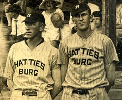
• Here’s a weird one: A team in Hattiesburg, Mississippi, broke their lengthy city name across two lines (full listing).
• Lots of these Sporting News uniform photos have been showing up lately. I’d love to get my hands on one of those jerseys (full listing).
• I’m sure most of you knew this already, but the Dodgers’ interlocking “LA” logo was being used long before Dem Bums relocated from Brooklyn (full listing).
• Major find here — check out the pants striping. I’ve see rear-leg stripes on football pants before, but I’m not sure I’ve ever seen it on a baseball uni. Meanwhile, dig the thickly textured chenille chest logo (full listing).
• I love the variety of uniforms you get to see in all-star team portraits. That one’s from the 1950 Texas League all-star game (full listing).
• Here’s a chance to root for the home team — literally. This was basically a throwback game — full details here (full listing).
• Who’s that on the right? None other than Johnny Bench, as a minor leaguer in 1967 (full listing).
• We’ve often mentioned how Brooks Robinson had a sporting goods company (which, among other things, made the solid-orange uniforms that the Orioles wore in the early ’70s). Here’s Brooksie himself at his retail shop. Photo is dated February of 1969, which means Robinson was still a few months shy of his 32nd birthday — sure looks older than that in the photo, though (full listing).

Time warp, continued: Yesterday I mentioned that the lowercase Padres logo that appeared on the team’s uniforms beginning in 1978 had actually appeared on the cover of the team’s 1969 program. Now Jon Helfenstein reports that it was also on the ’69 yearbook and media guide, plus Robert Walker says it was used on the team’s letterhead from from 1969 to 1984.
“It might also have been used in the latter part of the ’60s while the Padres were in the PCL, although I cannot verify that,” says Robert. Either way, it’s still fascinating to see that this logo — which is generally considered to be the very epitome of late-1970s design — actually predates that period by at least a decade. Just goes to show that we sometimes project assessments onto things to suit our preconceived notions.
Research project: As most of you know, I’m not a sneakerhead and am not particularly knowledgeable when it comes to footwear. So here’s a question for you: When did it become common for MLB players to wear logo-branded cleats, instead of plain black (or other solid colors)?
Looking back at old photos, I can see that certain teams appear to have been consistently footwear-branded, like the 1972 White Sox. But I think that’s because the Sox wore red cleats, which were still uncommon then — they probably wore Adidas because it was the only brand available. I’m more interested in knowing when individual players started wearing footwear logos (presumably as part of their endorsement contracts). If you know about this chapter in MLB history, please speak up. Thanks.

Collector’s Corner, by Brinke Guthrie
Great time of the year for sports, with NCAA hoops, the Masters, and the start of the MLB season. But it’s always the perfect time for fun items on eBay. Let’s take a look:
• Here’s a 1975 Southern California Sun pocket schedule, featuring what I consider to be one of the best sports logos ever.
• Take a look at these great retro reproduction NFL helmets for the Pack and the Jets.
• This 1940s baseball wind-up catcher was supposedly made “in occupied Japan.”
• Love the typeface on this 1971 Giants media guide.
• I wonder who wore this Shaw-Ott Drugs baseball uni way back in the day? (And they’re still in business!)
• Want a uniform with a little more flair? Try these striped baseball pants from the ’60s.
• Volvelle alert: You’re always on the ball with this 1969 NFL Penalty Spotter.
Seen something on eBay that you think would make good Collector’s Corner fodder? Send your submissions here.
Ridiculously short notice: The 2011 edition of Maple Street Press’s annual Mets magazine is out now (with a contribution from a certain uniform columnist), and the occasion is being marked with a gathering tonight. I’ll be there for the early stages of the evening, although I’ll have to duck out by 7:45pm or so. All are welcome, the $10 buffet can’t possibly be overpriced by more than, say, $8, and I hear the LaGuardia Airport Holiday Inn hookers are still charging off-season rates because the Mets haven’t had their first homestand yet (that’ll be all over once the ballplayers are around and start paying them big league money), so come on down. See you there!
Double your cholesterol pleasure: It turns out that the great borough of Brooklyn will be hosting two beefsteak events over the next three weeks. The first one, which I recently mentioned here on the site, is the latest installment of the Brooklyn Beefsteak, which will take place in two seatings this Sunday at the Bell House. But now it turns out that the folks at Sheep Station — the site of several Uni Watch parties over the past few years — are doing a beeftsteak of their own, on April 21.
Both events are all-you-can-eat and -drink, and I believe both are including a free apron to take home as part of the admission price. The Bell House beefsteak will be a boisterous mass feed in a large space; the Sheep Station event will be considerably smaller and somewhat more refined (patrons are being asked to wear a jacket and tie, nice dresses, etc.), although it should still be plenty festive. Sheep Station tickets are a bit more expensive — $70, as opposed to $50 for the Bell House — but the higher price gets you roasted potatoes and, I’m fairly certain, a higher level of service. On the other hand, the Bell House event will have a live band. In short: Both shindigs should be plenty of fun, and good values to boot.
I’m friendly with the people putting on both beefsteaks and can safely say that they’ll all do a fine job. Can’t decide which one to attend? The obvious answer: Go to both. That’s what I’ll be doing.
Uni Watch News Ticker: On Sunday I went down to check out the new Williamsburg Flea. Wasn’t planning to buy anything — just wanted to check out the scene — but ended up dropping $20 on an old All Detergent bucket that was too Warholian to resist. Then yesterday I got myself a nice palm plant and put it in the bucket. Not bad! ”¦ Oops, the Nats have done it again (with thanks to Andrew Cosentino). ”¦ And maybe they even did it again. Can that typo on Laynce Nix’s jacket be real? Maybe it’s a Photoshop prank, or maybe the missing letter is just folded under. Or maybe it’s jus the Nats’ latest snafu. … Good to see that illustrator extraordinaire Joe Petruccio has revved up his daily Mets sketchbook blog for another season. ”¦ New uni set for TCU football. “The new uniforms have a frog skin print on the numbers and an interesting collar (though you can’t tell from those pics),” says Jeff Gdula. “The helmets have also been changed: The frog is gone, leaving only the arched ‘TCU’ on the side, with a black stripe down the middle. Also, the helmets have frog skin. The number font will be exclusive to TCU as well.” ”¦ Nike has come out with green-soled golf shoes for the Masters (with thanks to Dennis Reid). ”¦ Elena Elms sent in two items relating to UNC baseball: First, this tequila sunrise jersey was worn by B.J. Surhoff in the mid-1980s. And the Tarheels did the pink-for-cancer thing the other day, but with a unique twist: pink sannies! “OK,” says Elena, “so it looked like someone threw a red T-shirt in the wash with all the whites.” ”¦ Speaking of UNC, here’s a slideshow of all of Roy Williams’s ties from the past season. ”¦ Interesting interview about Nike’s sweatback designs. Key passage: “We had to actually get some rules re-written to allow having graphics on a uniform and the amount of contrast that we were hoping for.” In other words, Nike is the tail wagging the uni-rulebook dog. Lovely, just lovely (with thanks to Cody Van Ryn). ”¦ Yesterday I ran a team portrait of the 1875 St. Louis Brown Stockings in pullover jerseys. Now Peter Nash has sent in a photo of a late-1880s Buffalo squad that shows two players in similar attire. Almost looks like the guy at top-left is wearing sansabelt pants, too! ”¦ There are lots of things you could say about this photo, but I’ll just say this: Great socks! (Big thanks to Mark Kaplowitz.) ”¦ Some Little League belts have dangerous levels of lead (thanks, Brinke). ”¦ Jan Danbom sent along photos of some interesting college softball stirrups, as worn by Cal Baptist and Concordia-Irvine. Also, look at this game between Dickinson State and Hope International — two teams with nearly identical uniforms. ”¦ Easton has entered the lacrosse helmet market (with thanks to Jeff Brunelle). ”¦ TicketStubCollection.com is on the verge of hosting its 5,000th ticket, and site founder Russ Havens is offering a prize package to the person who uploads the 5,000th stub. ”¦ “I noticed the webbing of Koji Uehara’s glove during the Orioles’ home opener,” writes Sam Cat. “A little Googling brought up this 2009 article, which mentions that the webbing includes a silhouette of his pitching motion.” ”¦ “Nike’s really stretching now,” says Nick Schiavo, and it’s hard to disagree after seeing this. ”¦ Reprinted from last night’s comments: Good photo showing how the Brewers’ grounds crew uses lighter-colored dirt to stencil the team logo onto the back of the mound. ”¦ Hey, look who’s Breathing Ethier: Nick Swisher (good spot by Shaun Tunick). ”¦ Here’s yet another jersey based on the White Sox beach blanket design.
The context if the article suggests that the uniform rule-changing took place in the Olympics. Recall in Beijing that a number of teams had to change or cover up their logos because the IOC decided to crack down on their rule banning the logos of countries’ sports federations (similarly in Vancouver, several hockey teams had to drop beloved logos to comply). So it would seem that the uniform manufacturers don’t have total carte blanche to run wild — although I’d wish the IOC wouldn’t be so arbitrary with their own rules.
“In other words, Nike is the tail wagging the uni-rulebook dog. Lovely, just lovely.”
Yes, it is quite lovely. I’m not really a fan of the “sweatbacks” but less uniform design restriction means more creativity. That’s a good thing. Look at some of the old quirky ABA & NBA uniforms like the Warriors “The City” jerseys or the Nets with the stars going up one side. You don’t get things like that with restrictive uniform rules.
This article also illustrates quite well the point that a lot of terrible uniform designs can be attributed to the individual schools’ decision-making. There’s more than likely a nice, classy, subdued option in every presentation, but they continually choose the flashy, trendy option.
Shhh… ~It’s always Nike’s fault~
With all of these mess ups from the Nationals and Wizards it proves that there really are no smart people working in Washington!
Hmm… I wonder if they’re hiring for a quality control position?
I don’t think the baseball pants have rear striping. I think the stripe has merely moved to the back of the pitchers leg when he lifted his leg to pitch, or pose, whatever. The other leg seems to have the stripe on the side, where it belongs. Just my opinion.
great call — if you look at the picture closely, you’ll see the stripe on the left leg is down the side of the pants — totally looks like rear striping due to the distorted angle and motion of the pitcher, but they’re just thick side stripes
I saw the same thing. You guys beat me to the punch. It just shows that great minds think alike. LOL
I don’t know Phil. If you look, the “rear” stripe on the left leg is awfully close to the pants inseam. The stripes placement, in conjunction with the pants seams, just appears unlikely to be a normal side of the leg placement.
Like modern day jeans, the legs of those old flannel pants would sometimes get unbelievably twisted during laundering and drying.
The hoopla over “rear pants striping” is obscuring the fact that the pitcher is sportin’ some sweet stirrup stripe-age…
-Jet
Man, Beaumont had a link that year.
I was thinking that too. It looks like San Antonio was pretty good as well.
Nike……TCU had a great helment decal. The frog was wonderful, and had a classic feel to it. Sad day for the Horned Frogs.
I like the frog, but I wonder if it would’ve looked too much like a link from a distance by itself. I agree, though, they should’ve cleaned up the frog and dropped the wordmark, instead of the other way around.
Having said that, I’m glad they made the move to one or the other. I hate football helmets with mascot/wordmark combo logos, like link, link, TCU, etc. The only one I can get down with for some reason is link.
Agreed. Helmet looks better now. Actually, whole uniform looks better now, but, I never liked the arched TCU. I’d rather see a TC monogram of some sort.
The entire uni set is very clean, and I’ve always liked the frog skin. Nike can make very clean designs when they feel like it, but it has lost some character. No rose in the frog’s mouth, so on and so on.
The rose was only in the frog’s mouth for the Rose Bowl. Though if I were TCU I’d leave the rose in the frog’s mouth all season, like wearing “World’s Champion” baseball uniforms.
“The only one I can get down with for some reason is LSU.”
maybe due to the seperation?
TCU has taken a step back with this uniform, if you’re going to remove the frog from the helmet, then move it to the jersey or pants. Also, I’m not sure about the uniqueness of the TCU numerals. That style looks like the Pitt pro combat uniforms the Panthers used against West Virginia.
Almost but not quite. The Pitt font was a true stencil to hearken to Pittsburgh’s steel industry. TCU’s font has a more “jagged” stencil (that’s the only word I can think of to explain that the color block is a triangle), likely to simulate the horns of a horned frog. Luckily for TCU, the numbers appear to only be one color, rather than the gold-to-white gradient that Pitt’s were. If they had been simply gold, I would have been alright with Pitt’s. That and if WVU hadn’t smoked my Panthers…
No more “Top 5” appearances for TCU. Depending on their opponent, they could end up being an “&1” selection instead.
I may be seeing a Washington conspiracy, but I’m beginning to wonder if the Nats are trying to drive our esteemed blogger insane. I guess we’ll know for certain if we suddenly see light purple swooshes on a special one-off dark purple Nats jersey (or vice versa).
Ah, who am I kidding, conspiracies in Washington? Who ever heard of such a thing?
Can some one explain how the Nationals did it again? Other than assming that Josh Willingham isnt a Nat, what gives? Sorry some of us need to be TOLD This instead of it being implied for not going over each MLB roster with a fine tooth comb!
From the article:
“But I’m also not sure whether a bathroom ad featuring a member of the Oakland A’s is the best way to promote a Washington franchise.”
By the way, there were only about three sentences in this ‘article.’ Not that tough to figure the whole thing out. Use your life skills.
You guys are a little hard on people you know? Although I should have read a little more carefully, those of us at work skimming over things dont have the time
I’ll admit that I totally missed it at first, too. But, I skipped right to the picture instead of reading the article. But, then I actually read the article and figured it out.
You had time to type out a comment that is about equal in length to the article that would have answered your question if you had just read it.
I guess with all the changes going on this off-season, they didn’t get around to putting up new ads in the toilets. It’s not like they misspelled a players name during Opening Day introductions or any…oh wait, never mind.
Fantabulous stuff from Sporting News via Mike Hersh. I’ve already directed our attorneys to put Hersh on a $5 million annual retainer.
I realize that there are more of us who tell the colorizers what to do than there are colorizers, but those attorneys will send an additional $2 million to each artiste-des-couleurs who tackles the 1920 Red Sox in those tricentennial duds with the Pilgrim hat on the sleeve.
I don’t want to say (anymore) that I hate Paul because he’s good at things. Like bowling, or cooking, or wardrobe expansion. Not for nothing (as they say) is he our leader. But the acquisition of the detergent bucket, with those insane lower case letters and sublimely meaningless name and wonderful colors and everything… well, it’s just hard to take for someone naturally inclined to envy and begrudgery.
And look at this — “…It turns out that the great borogh of Brooklyn will be hosting two beefsteak events over the next three weeks…” — the guy even knows how to say borough in Gaelic.
>>And look at this — “…It turns out that the great borogh of Brooklyn will be hosting two beefsteak events over the next three weeks…” — the guy even knows how to say borough in Gaelic.<< Oops. Will fix that typo to the non-Gaelic spelling. Hope to see you at at least one of the beefsteaks, Conn!
$5 million! Thanks! That makes my life a lot easier and my wife a lot happier.
Check’s in the mail.
That pair of Powers knit-striped baseball pants is NOT from the ’60s but actually the mid to late 1970s. Powers didn’t start making the knit style uniforms until after Rawlings came out with the Pirates’ duds in 1970. And the fact that the pants have a two-snap “sansabelt” waist definitely puts them in the 1970s era. Again, I say that I wish these eBay sellers knew exactly what the hell they were selling.
That White Sox style “beach blanket” jersey was lettered by the local dealer. The team name looks like direct screening while the NOB and numbers are heat-sealed vinyl (AKA “Vin-Flex”).
Majestic and Ranger Athletic used to stock both the “tequila sunrise” and the Sox’ “beach blanket” jerseys in four or five color combinations. Majestic also offered coaches’ polo shirts in the same combinations. Both jerseys were inexpensive enough that we sold them for baseball, softball, little league and basketball shooting shirts. Ah, the ’80s. You had to be there.
Don’t forget the seller of the South California Sun schedule calling it an NFL franchise.
Terry:
What accounted for “custom” kinds of striping for the Tequila Sunrise jerseys in the 70s/80s? (that is to say, something other than Astros orange, Tulane green, Seton Hall/Carolina blue, or the Louisiana Tech red, white, and blue?)
Could you get as few as 30 (i.e., one team) from Majestic, or did you have to go to Medalist or Ranger Athletic?
Lead-laced brightly colored belts? Is it a conspiracy to keep uniform colors dark?
Red & royal pinstripes? Cue the Texas Rangers. Woof.
I think it could be the basis of a nice old-tyme look for the Nationals.
Perhaps it’s a conspiracy to keep kids from eating their belts.
really late on this, but i LOVED the article from saturday mark (and phil). super interesting, great work!
Thanks, Ry Co 40!
it blows… my… mind… that you do that work in MS paint!!! i mean, you use that program better than some people i’ve seen use adobe illustrator! and my favorite line:
“Some people do woodworking projects, some paint, some build ships in bottles or shake a stick. I make logos & wordmarks”
Almost two decades of experience & that MS-Paint Line tool is the most comfortable drawing tool I have ever used. Funny I write / draw / throw left-handed, but use the mouse right-handed, it’s like having two left hands!
The other technique I use for color flooding is color selecting & then using the Eraser tool & holding the right mouse button if the remaining 16 colors or so are too spread out & would take many floods.
I don’t use this method too much anymore, but it’s a tutorial for making near perfect outlines; tho it included a lot of quick Ctrl-V keystrokes and patience, something I came up with in the mid-1990s but it works:
link
Why is there lead in the belt at all? I was expecting the article to say it is somehow an adulterant in the buckle’s alloy, but it’s in the nylon? How does that even happen?
The dyes used to color it, I would venture.
Normally wouldn’t be a huge deal, but if you’re going to harp on typos, you might want to spell it Laynce Nix like it does on his birth certificate.
The warm-up jacket is folded, you can see the beginning of the “i” just to the left (Nix’s right) on the jacket.
Agree w/the first commenter to the WaPo “Willingham pic in the john” piece. The Post is indeed a glass house.
Not folded, the jacket’s unzipped so his posture is causing the right lapel to overlap the left, hiding the I.
In any case, the “i” is there. Non-story.
Forgot to add that part, that I thought the “i” was just folded under. But, in the end, I’m just a little disappointed Nix isn’t back on the Reds this year.
Yep, not unlike seeing “Philllies” on warm-up jackets and jerseys in use. Start winning more often and people won’t make as big a deal over this.
Thanks for the catch — now fixed.
Re: the “Made in Occupied Japan” marking, there’s an entire collectibles market for items with that marking. In the 1920s the U.S. dictated that goods imported from Japan bear a “Japan” marking. In the post-WWII era, 1945-1952 roughly, the U.S. prohibited Japanese imports generally, except for goods manufactured in a region controlled by the occupation government (SCAP). Hence the marking. Goods with that designation don’t have an enhanced market value to my knowledge, it’s more a matter of them being an historical oddity.
Clint Courtney alert! Texas League all-star photo, back row, third from left. A hero to all of us short, bespectacled, good-field no-hit catchers.
Hey! I noticed that, too. And I know I should know the other Beaumont player in the back row wearing glasses, too.
Chuck Stobbs?
Just can’t quite get it.
Courtney was, I beleive, the first MLB catcher to wear glasses.
I don’t think so, as Stobbs spent all of 1950 with the Red Sox.
I do see the journeyman knuckleballer Lou Sleater (also briefly a Nat) in the front row.
I love seeing pics of those San Antonio Missions unis from the years they were a Browns farm club. They very closely echoed the Brownies (maybe hand-me-downs?) but often sported their own unique “SA” monogram on the caps. Maybe a good one for the colorizers?
Don’t know that Stobbs wore glasses, either. Was a grasp at a memory. Also though about Arnie Portocarrero, but not him.
Arrrgh. Really bugging me.
Even checked the 1950 Beaumont Roughnecks roster…
link
Guess he must just look like someone else who played in the majors.
Gotta love a team called the “Shreveport Sports,” too, dontcha.
Here’s a look at the 1950 Texas League…
link
Ricko, Stobbs did wear glasses on the field link
If anyone’s wondering about San Antonio’s “SA,” it is very, very close to the one Arizona State baseball uses.
Gil McDougald, third from right, back row.
Long-time Yankee shortstop, likely most remembered for being the guy who drilled Herb Score with a line drive, effectively ending a career that had hellacious potential.
Yeah, but if Herb had never gotten hit in the head he wouldn’t have been the lovable malaproper I grew up with.
I think he’s actually the fourth from the right.
Could well be. On this PC if I go to the photo to double check something I lose the comment I’m writing.
Breathing Ethier? New here…don’t get it.
Andre Either was the first we noticed cutting out the logo on his undershirt.
Maybe that’s one to add to the link.
More specifically, Ethier cut out the swoosh on his undershirt COLLAR, right around the adam’s apple area. We kicked around a few ideas for what to call this phenomenon, and we ended up with Breathing Ethier.
Could a new shoe deal explain Swishers need to ‘Breath Ethier’ he wore Nike Spikes for years, looks like he switched to NEw Balance this year.
tp://sports.yahoo.com/mlb/players/7435/photos#photoViewer=urn%3Anewsml%3Asports.yahoo%2Cgetty%3A20050301%3Amlb%2Cphoto%2C0e9d7815cc5cd4203752feff546d8dd2-getty-109235365nl005_detroit_tige%3A1ed
Brooks Robinson Sporting Goods:
link
I think it’s a marvelous label. I especially like that he used link, which is still my favorite of theirs.
You know, Chase, that really is a beaut of a logo. I have always preferred the less-cartoony versions of the bird for front-of-cap purposes, but you’re right about this little guy and the whole overall design.
I gotta say, I generally like the O’s uni, but I would just be tickled if they went back to the cartoon bird. I’m generally not the biggest fan of cartoony logos, but for some reason, the Oriole just nails it for me.
I’d like to see the cartoony bird logo on the home hats and the less-cartoony bird on the road hats. They’re both great in their own way.
“Time warp, continued …”
Paul, thanks much for following up on the Pads typeface story as it solved a mystery for me. On eBay I recently snagged a SD bobblehead from the early ’70s (and yes, I’m very sure of the date) that has, yes, that “padres” face on the little guy’s jersey. No pictures (sorry), but I was puzzled about that lettering and just thought over the years someone just tacked on the new one (though it looks “authentically” worn); I didn’t care, it’s a cool bobble (has the Swinging Friar as a logo on the cap, of all places) — but now I know it’s even cooler. Thanks again.
Despite what the seller says, pants with this kind of waistband weren’t around until the ’70s…
link
Ooops. Missed Terry’s comment regarding same. Sorry.
That Hattiesburg baseball team picture– classic. Great find, Mike. My dad lives in Hattiesburg, and will get a kick out of seeing that. And for those of you not aware, Hattiesburg is also the home of University of Southern Mississippi (where a certain No. 4 played college QB).
Also, like Brinke, the So Cal Sun logo is one of my favorites as well. Through Ebay, I’ve purchased on old SoCal hand towel and a cnavas bag with the logo. The magenta and orange color scheme also make it so seventies-perfect.
I believe the majority of the WFL logos were created by the same guy, but I’ll be damned if I can remember his name. He was the art director for The Grusin Group out of Chicago. They were deeply involved with WTT and even moreso with the WFL (Ed Grusin was marketing director for both). I know his art director did the logos for those leagues, and the Chicago franchises (Aces and Fire) as well as the WHA Chicago Cougars.
The only first-year WFL logos that DON’T look like his style are the Houston Texans, New York Stars and, possibly, Jacksonville Sharks (although it’s so elegantly simple that it might be his work).
The WFL centralized a lot of stuff, including unis (maybe moreso than any league that had gone before), as can be easily seen in the similarity in the their designs.
Loved the Sharks logo, as well as the Fire and…well, actually almost all the WFL logos. I think the only one I didn’t like was the link
That was the second year, of course. Don’t think that particular group out of Chicago was working with the league then.
Sweet detergent can. You might want to drill or nail some holes in the bottom. Those palm plants need to drain, big time.
Seeing that “All” label makes me think of two things:
1. Principal Skinner losing his job and doing laundry for the first time. He stood at the vending (detergent) machine and rattled off a bunch of one syllable brand names.
2. The artists formerly known as the Descendants. Smalley, not Milo.
The palm is still in its original pot, which has holes in the bottom. I just put that pot into the All bucket.
I’ll root-root-root for any “home” team sporting stirrup stripe-age like this…
link
-Jet
Can’t say I’ve ever been a fan of powder-blue baseball unis but this ChiSox get-up slays me every time:
link
I don’t know if it’s the generous doses of red from head to toe, or the smart white outlines around the lettering and numbers, but this is just works for me on so many levels…
-Jet
I like the big (ten-inch?) numbers on the backs. The Phillies used to have those, too. So easy to read. Ditch the NOBs and bring them back!
YES.
I like those, too. They’re as nice as if not nicer than the Phillies’ powder blues of the era.
During the ’70s someone in the AD at my high school got crazy and switched the school colors from navy and white to Columbia Blue and white. Then someone went even crazier and added red to the mix. Our baseball unis were identical to those White Sox unis save the lettering (white on powder blue heat-sealed, no sleeve numbers) and were worn home and away (not a wealthy public school district). Our football unis were direct copies of the Houston Oilers.
The school dropped the red in the early ’80s and has since gone back to navy and white. Their football unis are very plain, look like Georgia Southern. I’ve seen photo of other school teams wearing navy with Columbia Blue and white trim, so some nod to the ’70s still remains.
Now that’s interesting because I don’t like the Phillies’ powder blues from that era at all. Something about that shade of red being closer to burgundy doesn’t work for me, and yet the unis aren’t all that different as the Phils have the same white outlining on everything. I just like the bright “fire red” of the Chisox and how there’s so much of it that it seems to “neutralize” the powder blue which I normally don’t like…
-Jet
Personally, I’m not that crazy about all the red. It just seems wrong for the White Sox to have more red than the Red Sox in that era (1971-75). In fact, they’re about as red, if not more so, than the Reds! (Cincy had the plain pullovers, while Chicago’s home unis had red pinstripes…)
Then again, it’s arguably a better look than Bill Veeck’s fauxbacks from 76-81.
Yeah Rob, I sort of have to “suspend belief” and overlook the illogic that the team is named the White Sox and have more red than the Red Sox… I just love the unis…
-Jet
As long as the sox are white couldn’t the rest of the uniform be any other color? ;-)
I actually liked the link, with the name and number in white outlined in navy. Too bad the numbers on back didn’t match. White stirrups with navy sanis looked odd too, should’ve reversed those.
I’ve seen the front of that jersey in many photos, and just assumed the number on the back was white, too. You’re right, that would’ve been sweet.
I’m not a fan of NOB, but if you have to have it, it should be HUGE like that!
Wow, that hooker reference was “out of left field.”
“Hookers”… that’s what the Jay Hook Fan Club members used to call themselves. I’m sure that’s what Paul was referring to… ;)
-Jet
My favorite Hooker is in link. It’s home to the link American Legion baseball team (or it least it was when I went through there while stormchasing in 2000).
no way man, in my horchata link is the best hooker.
by the way, not that it matters, but somebody yesterday, 8tracksomethingorother, asked what “horchata” meant after i was off the site. despite making up words like roofus-goofus, headspoon, etc, and expecting people to understand me, i couldn’t for the longest figure out what something simple like “IMHO” meant when people posted. i had a feeling, but it didn’t always seem to fit(i’m dumb), so i just made something up In My HOchata. so if i say that, i am just saying in my opinion. who cares? nobody, i know.
My favorite such reference in sports was when the Vancouver Blazers’ Dave Hutchison (I believe it was) got stabbed by a prostitute on a Vancouver street during the ’73-74 season.
One writer suggested she’d probably get sentenced to two minutes for hooking and two minutes for slashing.
Can’t really think of airport hotels (esp. ones near ballparks) without thinking of hookers. Comes with the package.
A swimming teacher in my high school had the nickname “Hooker”… due to his ability to score with the hook shot back when he played high-school basketball.
So when do we find out about our prizes from the NCAA Tourney Pool? :)
Vince is tabulating as we speak.
on the tcu uni’s and numbers unis and helmets are a worse then last years. also the number is not just for tcu exclusive michigan state has the exact same unneeded slash in the number
Are we now beginning to realize that for sports teams there’s far-too-often a chronic (and self-deluding) condition that believes “trend-following” is actually “trend-setting”?
Yes, sporting goods stores used to sell striped stirrups (lower right corner)…
link
Shame on TCU for all the superfluous purple in the football uniforms. Stick to the school colors – black and carbon.
I never saw a brand logo on a major league shoe until the 71 White Sox. The Phillies were there early, too. When I think of “team colored” spikes, I think of those two as the pioneers. Not sure when individuals first signed shoe contracts, though.
1971 was also when I first noticed aluminum bats, marketed to little leaguers at first: lightweight, no broken bats or dangerous splinters, etc.
Yup, both Phillies and White Sox went to red Adidas in ’71.
A’s switched from white Riddells to white Adidas in ’72. Royals went to royal Adidas when they adopted doubleknit, including the powder blue roads.
Among the first players I remembering seeing wearing Adidas that weren’t team issue was Dick Allen with the ’71 Dodgers, who were still wearing black shoes. Also Ron Fairly of the Expos, who at least wore them in the ’71 ASG.
Back then, sporting striped shoes in the ASG was what wearing white cleats became in later years. A number of Reds players (Joe Morgan, Dave Concepcion) also wore whie-sriped red Adidas in ASG’s when the team policy still was solid black shoes.
Sorry for the typos, etc. On my way out the door.
Nats v2.0 went to white adidas in ’71 as well.
I know I’ve seen the ad in either their yearbook, media guide or programs. Don’t have them handy, would have to pull them out of storage.
Squint hard and you can see ’em link (particularly on Teddy Ballgame).
Senators didn’t start ’71 in white Adidas, but they sure did finish in them.
In the SI story from opening week in ’71 about all the new unis (including the red-shoed White Sox and lower case Angels and Phillies) there’s a photo of Washington’s Curt Flood running the bases against the A’s at RFK, and he’s wearing black shoes. That fact is even mentioned in the cutline.
That same story also mentions that the Orioles tried orange shoes, but didn’t like them.
Story begins on thumbnail page 36…
link
From that story…
“The Senators wore stiff new white shoes with red and blue sripes in pre-game practice (trying to break them in enough so that they could be worn in games). The Orioles wore tradiitonal black shoes with renewed appreciation after trying orange shoes and hating them.”
Frank Howard as a white shod Senator…
link
So, Ricko, based on the SI article, can we put a date on that ’71 Nats team photo? Can we surmise that they wore the unbroken-in shoes for that photo? I love this kind of sleuthing.
Absolutely. They didn’t wear white shoes in ’70, and by ’72 they were the Rangers (as reflected in the content accompanying the Frank Howard photo).
I figured the photo was taken after the team had come north but before the start of regular season play…or maybe during that first week.
Ry Co, let me know if/when you plan on getting more of those Ryberto’s caps, they came out sweet. Would love to purchase one.
i’ll let you know for sure
i posted some cool pics and a pretty fun video of the Ryberto’s Fitteds if you guys want to go have a quick look:
link
that post is fanshmasic rylol. and even though your music scares and confrazes me, that video was super-duper.
ahhh… i made a facebook joke about “the dougie” the other day, so my cousin (that made the video), used that as a jokie. haha. glad you like! perfect desert setting!
TCU’s new unis are basically Pitt’s pro combat uni but purple instead of blue…
Ole Miss’ new mascot (Rebel the Black Bear) made his debut today at the Blair E. Batson Children’s Hospital in Jackson, MS. Whether you like the mascot or not, you have to admit that’s a pretty nice way to break him in.
link
To set the record straight, we are still the Ole Miss Rebels with a black bear mascot, similar to other schools who have mascots different from their nickname. Many OM fans believe we’ll eventually be the Mississippi Black Bears. Time will tell I guess.
And when that happens, will the University of Maine slap a C&D on the University of Mississippi?
Good question. We Rebels love Maine because they beat our arch-rivals Mississippi State in football a few years back. A year or two later, Maine played at Ole Miss in a baseball regional and the Ole Miss fans adopted the Maine team as their “other” favorite team in the regional. Maybe as long as we don’t steal their logo, we’ll be ok.
Altoona Curve’s new home hat includes a reversible rally cap with their rally mascot Al Tuna on it. This is definitely going to be a love it or hate it idea….
link
Oh, yeah, on a hot night, nothing like the smell of sweaty tuna.
Said the clients at the LaGuardia Airport Holiday Inn…
So basically, they’re wearing two hats at once, with one brim, right? Maybe the difference is negligible and it will be easy to adapt, but I would guess that that would be uncomfortable…
Seems like more of a fashion cap than a real baseball cap, but for the minor leagues anything goes.
link
Anyone tell me what that logo is on the bottom right part of the Butler shorts?
It’s the Horizon League conference logo
link
Ah gotcha. Last night I thought it was an Under Armor logo so I was like huh? Nike on the top and Under Armor on the shorts? But Butler’s got the player’s number on the back of the shorts as well. Interesting pair of shorts it has.
An interesting few paragraphs in terms of summarizing how, despite all the interest generated by “bracketology,” the NCAA Basketball Championship maybe just isn’t what it used to be (from Greg Couch, AOL Fanhouse)…
“…maybe they (Butler) showed just what critics were saying all along about college basketball: It isn’t any good. The stars all run off to the NBA as soon as league rules allow it, after one year of college. So the NBA is having one of its best years, loaded by stars, including Chicago’s Derrick Rose, who would be a senior now.
“And college hoops? Without stars, it was left to rely on old values such as hustle and teamwork and defense. Butler was going to prove you could win it all with those things.
“Instead, the team with the best player won.
“Kemba Walker, sure first-round draft pick, had a bad first half, but finished with 16 points and nine rebounds, and was named Final Four MVP.”
I would agree with the notion of the quality of play in recent years has declined in college basketball. The exodus of star players, some of whom get bad advice, has taken a toll, especially on the big name teams.
While the championship game was ugly, the tournament itself was still packed with excitement, and the TV ratings were strong. I think Greg Couch was placing too much emphasis on the title game. Sometimes in sports you get poor championship games, the super bowl had a string of those in the 80s and 90s.
Connecticut earned the win, despite having won of the worst shooting percentages by a national title winner in years. Kemba Walker(shot 5-19 Monday), is no Derrick Rose at this point in his career, but he deserves the accolades by stepping up in the second half.
Having the most NBA ready player on the floor helps, but UConn’s team defense was big. Butler’s Shelvin Mack and Matt Howard are great college players, but they were simply horrible. The Bulldogs played as though this was their first title game appearance. Butler did play well enough defensively to win, but 19% shooting is inexcusable. Had either Mack or Howard played to their normal level, this game could have been up for grabs.
On a uniform front, I miss those old ESPN final four highlight shows of past years. The styles were interesting, especially the early 70s Jacksonville Dolphins, led by Artis Gilmore. That team played UCLA for the title, and they had the school name curved below the front jersey number. Unlike the late 70s Knicks design, I don’t think the JU jersey number was as large, so it seemed to direct more attention to the school name.
“While the championship game was ugly, the tournament itself was still packed with excitement, and the TV ratings were strong. I think Greg Couch was placing too much emphasis on the title game. Sometimes in sports you get poor championship games, the super bowl had a string of those in the 80s and 90s.”
Exactly.
Butler just picked a bad time to have a bad game. And yeah, I’ll admit that they probably wouldn’t have been in the title game if every “student athlete” stayed in school for four years. Then again, I wonder how things would have been if Gordon Hayward hadn’t left Butler early.
I used to complain that the one-and-done culture was going to ruin college basketball, but I don’t know. If you’re left with no stars but kids who are “left to rely on old values such as hustle and teamwork and defense,” is that such a bad thing? If you really like basketball, that should be just as enjoyable as watching a team loaded with blue-chip recruits.
Plus, if all the star athletes leave early, that’s less pressure for a school to change its look to satisfy them. Instead, they’re left with the kids who will say, “Yes sir, I’m proud to wear your classic uniform. When’s practice?”
Oh well, so ends another season. The only thing worse than last night’s field goal percentages is a day without college basketball.
i watched (and for the most part, enjoyed) the tourney, but now that it’s over, it’s nothing but baseball 24/7 until football starts
the period between the end of the super bowl and the first pitch is the worst time to be a sports fan…only the tourney salvages things some — they really should move it up by a full week so as not to impinge upon the first week of the MLB season (which itself, moved up a week this year)
one thing is a truism about this now…the “good” schools (read: non-mid-majors) get their high schools stars who will bolt after one season (since the lebron rule), so you’re definitely going to see many more mid-majors competing for the title, and, like butler, making the return trip
i have to say that the final was one of the worst games i’ve seen in recent memory, and by far and away the worst game of the entire tourney…hate to say it movi, but on the college level, no one wants to see scrappy defense and poor shooting
give me the brothers of phi slamma jamma anyday over uconn/butler
/ok, back to the mets kicking the shit out of the phils
Oh, I agree…no one wants to see shooting that poor. That’s why I can barely sit through a WVU game lately. But that percentage is not indicative of Butler, or most quality teams, so you won’t see that again in a final anytime soon.
For me, the biggest sporting lull is July/August. While I like baseball, when your viewing options are the Indians and whatever team is playing the Yanks or Sawx on Fox – or golf – your mind starts to turn to gel. If it weren’t for being able to pick up other teams on AM radio on a nice summer evening, I’d go nuts. I can see why Paul goes on hiatus in August. It’s a great time to unplug and get away.
when your viewing options are the Indians and whatever team is playing the Yanks or Sawx on Fox
~~~
if those were my only options, i’d probably have to kill myself
i can see why you hate the great american pasttime now
I don’t think Couch was specifically saying it was just that Butler played lousy in the final. Yeah, they did, but great teams do that, too.
His point was more that teamwork and hustle and defense didn’t win out in the “big one,” which was kinda what many were hoping for with most the NCAA’s potentially outstanding college players already off playing in the NBA.
Granted, many games were outstanding. But sometimes parity can mean that there are no truly outstanding teams in the tournament field.
I don’t think it’s a reach to say there would be players who were more accomplished, and teams that had really learned to play well together, if there weren’t so much “one and done” going on.
We can say how much we hate teams that “always win,” but fact is that, for example, the success of UConn’s women’s team probably has generated more attention and airtime for women’s hoops than a string of different winners every year would have.
The same could be said for the extraorinary success string of UCLA under John Wooden. “Who’s gonna beat these guys?” sometimes gets more overall attention and interest than, “Which of these dozen kinda good teams could win it this year?”
UCLA’s run had a lot to do with the Big Dance becoming, well, the Big Dance.
And, please, if you weren’t around to watch it happen, don’t say it wasn’t so.
i think the influx of adidas and Puma hit the NFL around the time of the Colts/Cowboys SB…look at a photo- they ALL have them on.
and i always thought it curious that all of a sudden BROOKS landed in the MLB in the late 70s—and they had like 70% of the players (or so it appeared) all at once. This was the same time when Staubach used Brooks for the last few years of his career.
PUT IT IN THE BOOKS
/that is all
I found it interesting the back of the volvelle has the NFL schedule. What’s more interesting is that there were a few Monday night games, this even before MNF was ever born! Anyone know if those Monday games from 1969 were televised, at least in each teams markets if not nationally? I’m guessing that they were night games, can’t imagine a Monday afternoon football game. Would be a great reason to play hooky though!
link
White Sox in their gray tops tonight and the shoulder patch does replicate the “Sox” logo from the cap.
Maybe they found a deal like this on ebay?
link
i guess the braves decided since they don’t want to wear their blue crown/red brims on the road anymore they are just gonna give that look to the nats
although at least the brewers forced the braves to wear gray tops tonight, as they went with their blue softball alts
Gee, don’t you hope that Braves look catches on.
I mean, think how great the Orioles would look in a solid black cap with nothing but a white “B”.
Likewise, the Red Sox in navy cap with white “B”.
I could go on.
The lynchpin of that Braves’ uni that moved from Boston to Milwaukee to Atlanta (with a fair stretch of turning away from it in Georgia, admittedly) is the almost mutual visual entwining of red and navy on a white or gray uniform. For the red to suddenly up and disappear on the hat is just…bewildering. From a design standpoint, that is (I get that they simply MUST have a third hat to sell, yes).
Even the tomahawk “A” from their Sunday home hats worn with the roads (either gray jerseys or navy) would make more sense, and be more appealing. Visually, anyway.
I meant the tomahawk “A” on a solid navy hat for the road.
i’d hate to think how bad the mets would look with a solid blue cap with only an orange NY
or the dodgers with just a white LA
or the royals with just a KC
i could go on
~~~
some caps look good with a solid color and a solid logo — i happen to like the braves with their blue
however, i do respect the history that goes with the braves and fail to see why they don’t keep the red/blue with the road grays
other teams also look good with the two-tone — the a’s for example, look like crap in solid green — they need the gold visor
there is no “set” rule (imho) — it’s a case by case basis, and even a uni-by-uni basis…the giants look better with the black cap and orange SF except when they wear their orange softball top — yet they choose to wear the two-tone only on sundays and NEVER with the orange top…a mistake, imho
Didn’t say a white letter on a solid cap was bad.
Neither of the teams you mentioned (or I imagine you might have pointed to) have unis even close to being as based on the combining of two colors as the Braves’. The Orioles, for one, do. To a lesser degree so do the Red Sox, even the Twins and Indians. And Rangers. And Nats. And, yes, the A’s. That’s why I didn’t really think much of those white letters on solid forest hats the A’s wore for a while on the road (maybe only one season?)
Specifically, the Dodgers have only the red number, and the Royals are, supposedly, just royal and white.
And I also didn’t say the Braves all-navy road hat was bad looking (loved it with their pins of the early ’70s, and I own one), but it looks like a mismatch with the current uni design, that’s all.
“other teams also look good with the two-tone”
link
link
What I’m saying is…
If you showed a hatless Braves player in his ornate (and they ARE ornate) road grays and asked people to reckon what the hat looked like, very few would offer than it probably was solid navy with a white letter. Most would assume (I would say, anyway), that based on that uni, the hat would have be some kind of combination involving navy and red.
wasn’t even really talking so much about the bravos per se…
just when i saw this, it immediately struck me as “whoa…that’s the braves look”
but since they seem to no longer want to own it, the nats see fit to take it
Twins, too, sorta.
Yeah, lettering and number colors are essentially reversed, but just glancing up at the TV, lotta similarities.
While I’m getting used to the Twins’ roads, the Nats new road hats only serve to point to the “off the rack” qualities of a lot things about both teams’ road unis.
twinkies are kinda fucked up too…
they wear the two tone cap with both the grays and the softball tops, but the solid helmet with both the softball tops and the road grays
…just kinda odd…
sorta like the indians do with a different cap and helmet
i forget who it was, but someone opined that having a different cap and helmet doesn’t look good, that they should go with one or the other
The Frank Robinson-Vada Pinson era vested Redlegs just had two different sets of helmets. White shell with red visor at home, gray shell with red visor on the road.
You’d think with so much revenue around these days that such a thing wouldn’t be so hard for teams to do now.
Cardinals have two sets of helmets, right?
Red home, navy road?
yes
and on sunday, when they wear their two-tone alt cap, they couple that with the solid red helmet…no third helmet in their repertoire
then there is the other “extreme”
mets have black/blue, solid black and of course, solid blue on rare occasions
Interesting TV. Twins win a one-run game in New York for the first time since 2001.
Pretty sure they’ll be a parade tomorrow.
Well, maybe not.
The things you find out when you get to watch another team’s games on the free MLB preview: Sonic drive-ins have a commercial saying (paraphrasing), “…and if you live in Akron, which is halfway between Chicago and New York, you’d order the Chicago-style hot dog…no, you’d order the Coney Island dog…well, you’d just get both…”
Only problem – there are no Sonics in Akron. That’s Swenson’s territory. Sure, one could drive to Canton or Cleveland (or Streetsboro or Brunswick) to go to Sonic, so why not just use one of those places in you commercial?
Another problem, at least for me – both of those dogs are disgusting. Stadium mustard and/or ketchup (maybe a little kraut, but not with ketchup) are the only things that should be adorning a frankfurter.
Oh, and by the way, the White Sox are wearing their road grays while the Royals are in the home whites. Interesting concept.
Stadium mustard
and/or ketchup (maybe a little kraut, but not with ketchup) areis the only thingsthat should be adorning afrankfurterdog.~~~
(fixed)
“Stand with us now. Make the stands soar.”
What does that even mean????