Twice is a coincidence, three times is a trend, four times is a rule. So now it’s official: If you’re the defending World Series champion in an odd-numbered year, you’re obliged to start the season by wearing a gold-trimmed uniform.
This phenomenon began with the Red Sox in 2005, although they only wore the gold-trimmed design for their ring ceremony before their home opener (they switched to regular jerseys for the game). Two years later, the Cardinals pulled the same stunt, only they actually wore the gold-accented jerseys for the game (can’t find a photo, sorry). Ditto for the Phillies in ’09.
Last month I reported a rumor about the Giants jumping on this bandwagon. According to that article, the special jerseys would have “more gold on them then the normal home jerseys, specifically around the lettering.” Sounds like the same thing the other teams were doing, right?
Turns out they’ve decided to make a bit more of a statement.
A few notes about this jersey:
• Although you can’t see it in the photo, I’m told that the uni numbers are gold as well.
• One slight difference from the Bosox, Cards, and Phils: The Giants’ home opener is on April 8, but the gold-lettered jerseys are slated to be worn the following evening, April 9, because that’s when the players will receive their World Series rings.
• My understanding is that they’ll be wearing the jerseys for the game, not just for the ring ceremony.
• I assume they’ll also be wearing this gold-logo cap, although the team hasn’t confirmed that for me yet.
• This San Francisco Examiner article mentions that the gold lettering is “a privilege given only to reigning World Series champions.” Someone in the Giants’ PR office told me the same thing yesterday, which means some clown in marketing must have come up with it, and now everyone’s repeating it and the media’s swallowing it whole. Yeah, right, as if there’s some official rule about this. By the way, did you hear that the “G” on the Packers’ helmet stands for “Greatness”?
As for the jersey itself, I dunno. It’s not unattractive, but it smacks a bit of hubris, no? Plus the gold thing seems like such a rote, predictable approach at this point. Yes, I know, I know — gold is appropriate because San Francisco has the Golden Gate bridge, right? Except the bridge isn’t really gold — it already matches the Giants’ shade of orange.
Anyway, this all feels like a huge missed opportunity, because the Giants were the team that pioneered the concept of defending champions’ uniforms in the first place (I guess nobody told them reigning champions are supposed to use gold lettering). Wouldn’t it be awesome if they went with that 1906 design as a throwback on Opening Day? But no, they had to go for the gold. Boorrring!
Meanwhile, as long as we’re talking about Opening Day, the Indians have announced that they’ll honor Bob Feller on by having all players wear No. 19 during pregame introductions of their home opener. That article also confirms the good news that the Tribe will be switching to the silhouetted-windup patch design once the regular season starts (if you missed the story behind that, look here). In fact, they’re going to have two different versions of it — nice.
IMPORTANT! Membership news: For a variety of reasons not worth going into here, I’m switching to a new print shop for the production of our Uni Watch membership cards. The good news is that I’ve found an excellent shop that’s even closer to my house than the one we’d been using. Really nice staff, too — they Get Itâ„¢.
The bad news is that they’re significantly more expensive than the place I was using before. So I’ve reluctantly decided to raise the membership enrollment fee from $15 to $20 — but not until the end of this month. So if you’ve been meaning to sign up and want to avoid the price hike, do it now. The new pricing will go into effect on April 1 (no foolin’).
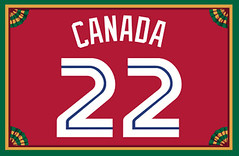
My continued thanks to everyone who’s made the membership program such a fun project over the past four years (including Trevor Banks, whose 1996 Blue Jays Canada Day treatment is shown above). Looking forward to more.
Spring cleaning: Guess what I found while poking around in the Uni Watch HQ basement yesterday: an extra box of T-shirts featuring a the commingling of a certain team name and a certain protein-based foodstuff. So if you wanna get in on that, get in touch.
ESPN reminder: In case you missed it yesterday, my latest ESPN column, about the White Sox’s 1981 uni-design contest, is available here.
Contest reminder: I’m currently sponsoring a design contest to create a logo for the Baseball Project. Full details here.
Uni Watch News Ticker: Yesterday I linked to this article, which mentions that Don Zimmer “was the first player to try on a Mets uniform.” Turns out the source for that claim was Zim’s bio on the Rays’ web site, which includes this: “Was the first player to try on a Mets uniform, modeling it at Huggins-Stengel Field in St. Petersburg before spring training opened in 1962.” Fascinating. I’ve arranged to talk with Zim about this later today, but I’d also like to see some independent confirmation, preferably in the form of an archival news clipping. ”¦ Here’s this year’s SEC helmet schedule. Check out what they used for Florida’s design (big thanks to Brig Slaughter). ”¦ Richard Lewis notes that Southern University (SU) in Baton Rouge, Louisiana baseball is using an unusual striped batting helmet. ”¦ Here’s a video debate about the All Blacks wearing a red fern to support the tsunami victims (with thanks to Caleb Borchers). ”¦ Here are the top-selling MLB jerseys from 2010 (with thanks to Ilana Hardesty). ”¦ While looking for something else, I came upon breathtaking color shots of a 1929 Boston Braves jersey. Don’t think I’ve seen color photos of this uniform before — magnificent! ”¦ How did a Columbus Blue Jackets sweatshirt end up with an NFL logo tag? Jason Hillyer spotted that at a Marshall’s in Phoenix. ”¦ Here’s something new: While watching yesterday’s Mets/Cards game, I noticed that the plate ump Gary Cederstrom’s hockey-style mask had a matte finish. Pretty sure I’ve never seen that before. Seems like a good thing — less glare = good for everyone, right? ”¦ Good article about Marquette’s bumblebee-era uniforms. ”¦ Some sports journalism students at Arizona State have been reporting a series of stories from Brewers camp. They’ve done one on the guy who cleans the team’s shoes, another on equipment, and now one on team laundry. Good stuff (big thanks to Jason Goede). ”¦ Kevin Garrett reports that Notre Dame QB Dayne Crist has been wearing a helmet-cam in spring practices. ”¦ A sports radio station in Oxford, Mississippi, that calls itself the Ox has adopted a logo that’s pretty much a straight knock-off of the Houston Texans logo. “I don’t even think it’s an ox, either,” says Jason Cimon. ”¦ Apparently most of the Mets don’t like the black uniforms. ”¦ While looking for something else, I came across this great Dave Niehaus tribute jersey. ”¦ “Pirelli is the new tire supplier for Formula 1 racing this year,” says Jeremy Brahm. “Here is a snapshot of the different colors on the sidewalls to show the fans which tire choice the drivers and teams have made.” … “Retiring numbers is almost never done in outdoor soccer,” says Kenn Tomasch, but Real Salt Lake is doing it for Jason Kreis anyway. … The NHL is now offering cycling jerseys (with thanks to Ben Gorbaty). ”¦ I neglected to mention yesterday that the Bobcats wore their NASCAR uniforms on Wednesday night (photos by Nick Phillips). ”¦ The Smithsonian has acquired a portrait of Pedro Martinez. Very odd uniform choice: It’s definitely a Bosox cap, but the Dominican flag on the sleeve suggests a World Baseball Classic jersey (presumably from 2006, since the 2009 Dominican jerseys had contrast-colored underarm panels). And the red pants piping brings us back to the Red Sox. But most importantly, as Richard Stover points out, the strategic placement of the glove makes it impossible to see any Pedro Porthole action!
Hubris always smacks of itself.
And it doesn’t really smack of hubris at all. It’s not like there’s any dispute about who won the most recent World Series. The Giants did. Since winning the World Series is the whole point of playing each season, acknowledging the fact of being the reigning champion isn’t hubris.
Personally, I wish this sort of thing would be the norm every year, and I say kudos to the Giants for going all in with the gold lettering, not just a little gold trim. Now if only we could persuade them, or the next team that wins the Series, to make some kind of reigning-champion decoration part of the uniform all season, home and road. Sleeve patch, gold letters, special hat, whatever. When the Giants come to Washington to play the Nats, a series I try to make most seasons because (A) I love the Giants unis and (B) no Phillies fans in attendance, I want them to look like the World Champions. More fun to root against them that way. If they beat the Nats, fine, they’re the champs and what do you expect. And if the Nats win, hey lookee “we” just took down the champs. Giving opposing fans that chance isn’t hubris, it’s generosity.
I think they’re terrible looking. A little gold trim around the outside of the logo- yes I am aware a discreet amount already exists- and a bit around the SF on the cap…and that’s it.
Normally the Giants are a first class organization, but this is just too much.
that is Southern University of Baton Rouge, not Southeastern Louisiana wearing the odd batting helmets.
thanks. now fixed
From the ASU student story on the Brewers’ equipment guys…”The easiest to clean are Nikes’ with metal hooks on the bottom. The hardest are Nikes’ with plastic hooks.”
What, the Brewers dangle their feet in the water and go fishin’?
—Ricko
Does make the idea of “hook slide” really nasty, though.
Come to think of it, does anyone if even KNOW what a hook slide is anymore?
I do. We used to practice it in high school to prepare for avoiding tags. That and the “Put and Take” where we’d pull back our inside arm and reach for the bag with the outside arm.
I don’t see any issue with baseball teams throwing gold trim on for one day. EPL teams wear special patches throughout the next season that are far gaudier.
link
link
Hockey teams did it a few times back in the 1920s as well… the old Ottawa Senators would add a shield following three of their titles in that decade (link), while the Montreal Canadiens link (Georges Vezina pictured).
Would be better if the Giants n’ all didn’t peddle the gold-trimmed jerseys and hats, letting there be some things you actually have to be a player to own.
But, I suppose some people just think that, by god, they should get to have their own “participation jersey”…even if they have to buy it.
—Ricko
“Would be better if the Giants n’ all didn’t peddle the gold-trimmed jerseys and hats, letter there be some things you actually have to be a player to own”
You mean like a ring?
So adding a one-day celebratory jersey to the list of things fans can’t just go out and buy is bad?
Poor, deprived fans. “But I participated, I WATCHED them win it all. Doesn’t that mean I get to have a special jersey, too?”
—Ricko
It’s standard procedure nowadays for pretty much everyone who’s connected with the team down to the receptionists, filing clerks, etc. to get a ring, no?
You could make the argument that ticket-buying, sponsor-supporting fans were every bit as important to the team as any of those folks, so why shouldn’t they be allowed to wear the jerseys?
Depends on the sport and the team, I think. I have known franchises who have given rings to the “main” people that were really top-drawer, slightly less-expensive rings to those below that level and allowed those below that to buy their own if they so desired. And I’m sure there are teams who still pony up for everybody from president to janitor to get rings, I don’t believe absolutely everybody in all organizations to get a top-of-the-line version of the ring.
Because the fans essentially are interchangeable.
Fans in seats are important, but it doesn’t matter exactly WHOSE butt is in the seat. If any person leaves, most any other fan can take his/her place. That’s because their input is, relatively speaking and in this context, indirect.
Conversely, players and others who work for the club have direct input.
Wakeup call to even the biggest of fans. No matter how hard you try, and no matter how much team-color blood you say you bleed, you ain’t part of the team, and you never will be.
Yes, taken en masse–as a group noun–players do see their Fans as “part of the team”. But not as individuals. They don’t know your name. Or need to. Sorry if that deflates anyone’s balloon, but it’s fact.
It would have little impact if, say, Phil went to a Mets game with a sign reading,
PLAY HARD, MEN; PHIL IS HERE.
“No, shit? Phil? Damn, we’d better hustle, Phil expects a lot from us.”
—Ricko
Personally, I’m eagerly awaiting the release of the Packers shareholders’ rings.
That is, once the CBA gets settled and the team can talk to the players, and the design process can resume.
KT, I know you’re right about football. I don’t have any recent examples, but in 1997, the Packers had (at least) three different Super Bowl XXXI rings:
link
link (in this case, member of the Board of Directors)
link (this one’s a woman’s ring, I don’t have any pictures of the man’s version)
I don’t know about the rest of you, but… the next time I go to a game, whether it be professional, college, hell, even Little League… I am taking a version of Ricko’s “PLAY HARD” sign. That’s awesome.
My dad was a NY Giants fan; brought me up to root for them even though they moved West. I rearranged a trip and bought tix for Game 1 so I be there when they raise the championship flag and get their rings.
But they are celebrating on Game 2 when I could have attended, but now cannot
Flag is going up before the home opener, ring ceremony is before game 2 of the season. You’ll see the flag go up.
(Home game 2)
“…start the season by wearing a gold-trimmed uniform.
This phenomenon began with the Red Sox in 2005. . ..”
Why am I not surprised.
When a team wins as rarely as the Giants do I think they’re entitled to a little gold trim. :)
Let us not forget the UNWORN 2006 White Sox gold-trimmed jerseys.
link
link
link
Replying to a post way up the page…
Dwayne said:
What? Obviously that’s a prototype, but was that just trotted out at Soxfest or something and they decided not to have them made up? Or did they actually have them made up for the team and then change their minds about wearing them?
Crap. I meant that as an all new post.
I think that was a prototype, but it never went into production.
The tag reads: WSX-HM-G-06
That’s pretty cool! I plan on sharing those pics with the forum that I frequent.
The New Zealand rugby fern is actually for the Christchurch earthquake not the tsunami.
red fern proposal is for the Christchurch earthquake
Interesting to note that the Top Ten-selling MLB teams are all “Original 16” clubs. Where are your beloved Metropolitans, Paul?
And they’re all teams with classic, traditional uniforms. No Rays here…
True, but the pessimist in me wants to know the home/road/alt(s) breakdown of those jerseys. Half the teams in the top ten have at least one dark alternate.
Well as three of the first few are Yankees that’s only Home/ Road maybe BP.
That’s why I said *half* of the top ten.
Also, I assumed Brian C was referring to the top-selling *teams*, since he said “no Rays here” and Evan Longoria was on the individual list.
There should be 3 awards given for that 1929 Boston Braves jersey –
– those who designed & made it
– the person who pristinely maintained it/photographed it
– the person who found the pic!
This proves not all things from Boston are total [transmission garbled].
As a current (Atlanta) Braves fan… that jersey is gorgeous. I wish they would throwback to it sometime. Though I’m afraid they’d take the portrait off the back and stick a name and number on there instead. Still, I agree with everything you said. Bravo (pun intended).
It sure is a beauty.
i say the giants should have reprised their 1906 duds…just like the phillies should have gone with Worlds Champions in 2009…or better yet, a certain phrase chase utley uttered at the end of the previous season
i mean, if you’re gonna go all gold and all…you may as well just say eff-you and have some fun with it
“fun” in a major league sport??? interesting…
The picture of Pedro Martinez from the Smithsonian IS in fact a Red Sox uniform. The 2006 Dominican WBC uni’s have double piping on the sides and sleeves (blue and red). The Domicanican Flag is most likely from the MLB/Japan All Star Series that used to occur prior to the WBC. Also, since Martinez was a member of the Mets starting in 2005, he would have never worn a Red Sox hat in 2006 with how he left Boston.
Note I’m having a near impossible time finding a website to confirm a roster for the All Star Series that he participated in.
If you read the article, it says that the portrait was painted in 2000. Obviously, this means the WBC was a non-factor. Could it be that the artist added the Dominican flag patch as a way to incorporate Pedro’s heritage?
“How did a Columbus Blue Jackets sweatshirt end up with an NFL logo tag? Jason Hillyer spotted that at a Marshall’s in Phoenix.”
You answered your own question. IT WAS AT MARSHALL’S.
I would have guessed Gabriel Brothers. You can find some great stuff there…right next to the occasional t-shirt that has NFL, NHL and MLB logos printed on the same shirt. My brother even has a UNLV back-to-back champions shirt, even though they only won one in a row. Guess that shirt missed the boat for the Third World.
Hmmm, someone should DIY shirts for teams who lose the big game. For instance, “Texas Rangers, 2010 Third World Champions.”
I like Gabriel Bros, too. A new adventure each visit.
Hey, that striped batting helmet pic is not Southeastern Louisiana, it’s Southern University in Baton Rouge. No biggy though, I only mention because SU is my alma mater.
So, wearing a gold trimmed uniform smacks of hubris, but wearing one that says ‘World’s Champions’ across the chest is perfectly humble?
Sure, but at least it has some historical precedent. And it’s sort of so in-your-face that it’s kind of funny. The whole gold thing is sort of stupid. Especially for one game. If you’re going to strut – go all the way!
I agree. I know we’ve lamented on here plenty of times about the lack of creativity in today’s uniforms, but this is just a perfect example. I’m willing to bet that the club would sell MORE of the 1906 throwbacks if they were to make them, than they ever will of these gold unis that they’ll probably put a price premium on vs. a standard jersey. It’s just utter and complete laziness, especially from a sports league that values tradition so much.
I’m sure they would sell more 1906 throwbacks, and I honestly think that’s what they should do, but I’m confused how the one is hubris but not the other.
Who’s saying it’s not hubris? The way I read it is basically, “if you’re going to pat yourself on the back, don’t half-ass it.”
Feels like the few times I’ve toured Busch Stadium, theyve shown their WORLD CHAMPIONS jerseys from way way back (with World Champions or Champs on the chest), and they said after those jerseys, the league passed a rule saying that it couldn’t say World Champions like that anymore, but that design elements could be altered (like the gold) or a patch on the sleeve. I could be wrong, but I swear they said it. It was from like the 20’s. Could’ve been the Gashouse Gang.
“This San Francisco Examiner article mentions that the gold lettering is “a privilege given only to reigning World Series champions.” Someone in the Giants’ PR office told me the same thing yesterday, which means some clown in marketing must have come up with it, and now everyone’s repeating it and the media’s swallowing it whole. Yeah, right, as if there’s some official rule about this.”
I think “privilege” is the right way to phrase it – do you think if the Orioles wanted to wear gold trimmed jerseys for one game only, that the league would OK it?
Imagine…if you will…the 201_ New York Mets winning the World Series….
Fast forward to Opening Day of the next year…
and the Mets wearing jerseys with the following:
Lettering with orange, trimmed in blue, drop shadowed by black, trimmed in gold…..
Welcome to…..The Twilight Zone.
Love the Feller patch, but the ten-year-old in me thinks that the number placement makes it look as if The Heater from Van Meter is, um, “dropping a nineteen.”
Very gratifying to see that Cleveland management came to its senses re Rapid Robert patch. Can mighty Uni Watch lobby take any credit? Let’s become the NRA of sports design!
Jorts! Bwahahahaha!
I’m willing to bet someone from Georgia made that SEC helmet schedule.
Damn right!
Gators wear JORTS!
Anyone else notice there is no orange on the Auburn helmet on the SEC helmet schedule??
I guess us northerners don’t get the jean shorts thing for the Florida games on the schedule. Anyone wanna share in the hilarity?
link
AH! I see why it is so damn funny now. F’n Classic!
I’m a Gator, and although the jorts thing is irritating and mostly unfounded…I did laugh.
LSU fans smell like corndogs though.
At least they’re not Daisy Dukes.
Also a Gator. Also chuckled.
On the Jordan/Barnes feud:
1. The team is sponsored by JB…they should be wearing Jordans. I guess that rule DOESN’T apply to schools and players at UCF.
2. Barnes isn’t even wearing the current Kobes…he’s wearing the V’s from last year:
link
3. I’d be curious to see if they were the most sought after of all Jordans…the revered Cool Gray XI’s:
link
And they’re silver!
All I can say about the UW NCAA brackets is, if I’m in 9th place out of 500, ignorance truly is bliss!!!
1) Since the Giants already have gold trim on their jerseys, they should have added silver trim, since the Commisioner’s Trophy is silver and gold.
2) link
“A sports radio station in Oxford, Mississippi, that calls itself the Ox has adopted a logo that’s pretty much a straight knock-off of the Houston Texans logo. “I don’t even think it’s an ox, either,” says Jason Cimon. ”
The logo originally looked that way because its host is former Ole Miss, Dolphin, Redskin, Jaguar and TEXAN RT Todd Wade. However, I think the NFL or the Texans made them change the logo. They don’t use it anymore, as you can see here:
link
No kidding, THE Todd Wade?
*sarcasm tag….*
Nice to see the Ditch the Black / TRUE METS = BLUE METS campaign extend beyond Uni Watch. But let’s not get our hopes up. Over the last 10 years we’ve seen sign after sign that the black might be going away, and every time we’ve been disappointed.
Although, to be fair, the Mets wore blue a lot more often at home last year than they have in any other year since ’97, including ’06 which was the only other time we saw the blue caps more than once every other homestand.
As I’ve said before, I could deal with retaining the black drop-shadow if the black caps, socks and undersleeves would go away; i.e., if the drop-shadow was the only black on the uniform. I could also deal with the all-whites being the home uniform and the off-white pinstripes being an occasional home alternate, just so long as both are only worn with blue caps. And I agree with one of the posters on the Mets Police page; keep selling the black jerseys and caps if you want to, just don’t wear them on the field.
The Mets need to go back to the 1995-97 uniforms. That’s the bottom line. Maybe Alderson et al. will Get Itâ„¢.
“The Mets need to go back to the 1995-97 uniforms. That’s the bottom line.”
link.
No….
Amen to link and link.
That’s a beautiful set. I remember being thrilled when they switched back to those, and I’m not even a Mets fan.
I prefer the 1965-73 set. In fact I like those years’ unis for just about every team that existed in the late sixties.
It’s the same uniform, except with modern fabrics, NOB and sans-serif numerals.
“…most of the guys in the clubhouse would love to ditch the black [uniforms and trim] and go with a blue alternate instead….we have a new clubhouse guy and he asked Dave [Howard] about it. Dave told him it was purely a marketing decision, that the black sells.”
And this is news how? Everyone knows the marketing wankers make the uniform decisions (grr…)
And I think the Mets should drop all the black, uniforms and trim, and go back to the classic look that made them a good looking team if not always a good team.
Just ditch the black from the game unis, but continue to sell black ones for the fans. I’m guessing most BFBS fans would still buy them.
It’s not like there’s link link link link, eh?
Oh wow, haven’t seen that Blues jersey since my wife bought one. And she paid a LOT less for it. At Marshall’s, I think.
I actually own the Red Wings one – well, the original Starter version, anyway. Got it for Christmas one year, and it’s the only BFBS item I own.
The Devils one looked good, compared to some of the other ones they did.
I remember some of the other Starter black jerseys. The Flyers, for instance, had one that had an orange collar, orange cuffs with black piping, and an orange hemline stripe. The Nike-introduced version worn on the ice had significantly less orange; a black collar, black cuffs with orange piping, and no hemline stripe.
god damn… those all look like total shit.
No, I like the Red Wings sweater. I admit, I’m an iconoclast.
The NFL BFBS jerseys were total garbage.
Sad thing is, the Lions went and wore a black jersey in games anyway. With blue numbers. And that’s terrible. (About as terrible as the team itself, considering this was the Millen era…)
We can’t overlook how team success is linked to uniform styles and colors, especially to the fan base of that particular franchise. The Mets certainly had a spike in merchandise sales in 2000 with the recently added black to the color scheme. In the years to follow, the Mets expected to continue that success, and the fan base had good memories of that uniform set. Not surprising to see more momentum now to a return with the traditional colors and uniform.
Nostalgia always plays a role, the 1983 White Sox uniforms are a great example. The fond memories of mostly White Sox fans of those uniforms are inevitably tied to that ’83 club. That was the first Chisox team since 1959 to reach the postseason, hence the fond memories looking back all these years later.
APB! Fan of the Redskins feather mohawk helmet? Well, check out this link
A clear shell ta boot.
I’ve been alerted to the fact that the Portland Timbers (when they were in USL-1, before MLS) retired Clive Charles’ #3, either right before or right after he passed away. But I can’t think of any other outdoor soccer teams in this country who’ve retired numbers. I’m sure there’s been some, I just can’t for the life of me come up with any. Most NASL teams weren’t around long enough to do it, and while many MLS teams have been around at least 10 years, if not the whole 16, it just hasn’t been done (to my knowledge) before now.
It’s happened a lot in indoor soccer, though: link
would the cosmos have retired #10, or wouldn’t he have played long enough?
I don’t know if any numbers were ever retired in the NASL, but if Pelé’s number wasn’t retired, it was probably just because it wasn’t done at all in that league.
If/when the revived New York Cosmos gets off the ground and starts fielding a team, they may opt to retire the number then. Pelé has already been made Honorary President of the new club.
#10 was retired during the festivities at his final game with the Cosmos (some accounts say at halftime, but I don’t know if that’s a Wikipedia creation).
The Cosmos will keep it retired, I’m sure.
There’s no real hard-and-fast rule about how long someone has to play for a team before he can have his number retired. Stone Johnson never played a regular season game, I don’t believe, but the Chiefs retired his number (special case, obviously, death is a different category).
The thing about soccer is the #10 is iconic and traditional, and it would be very rare for a club to take that out of service entirely. The honor of wearing the #10 is more something to be passed on than held out in honor of just one person.
All that said, no one actually wore #10 for the Cosmos after Pele (link), so perhaps they did. After all, that’s a tough act to follow. It’ll be interesting to see what they do if and when FC Page Views ever returns to the field in an actual league.
You mean the Dallas Sidekicks retired all those numbers, but not Tatu’s?? Inconceivable!
I think the team folded before they could get a chance to do it. He played for them up until 2003 (and was their player-coach from 1998 on) and the team only existed one more year. I am not sure he ever officially closed the door on playing (though he didn’t play in their last season), or perhaps he didn’t want them to retire it right away.
In any case, he would (obviously) have been deserving of the honor, as would David Doyle.
The reason soccer teams have not retired too many numbers is because for a very long time, players did not have assigned squad numbers. The numbers related to the position being played and were assigned from game to game. In recent years, leagues in Europe began adopting the “squad number” concept, where each player was assigned a number to wear throughout the season (with his name on the back as well). Since then, a number of teams have retired numbers (AC Milan has retired 6 for Francisco Baresi and 3 for Paolo Maldini, for example).
That’s one reason. Another reason it’s not done is the concept itself is fairly American (Gehrig was the first one, I do believe).
And RSL’s GM went off on a bit of a jingoistic rant when asked about the whole kerfuffle.
link
That’s the second time I’ve heard jingoistic this week, and the first time was in an American Literature discussion. Nicely done.
I just read the article, and to call it a “bit” jingoistic is like calling us Uni-Watchers a “bit” obsessed!
Anyone remember Wally George? THAT guy was jingoistic.
Anyway, apparently lots of numbers have been retired around the world in soccer, but it seems many of the honorees weren’t around to enjoy it:
link
Just a trivial fact. The Cardinals wore their gold trimmed jerseys for the entire first series of the 2007 season (3 games). That series was against the Mets, a rematch of the NLCS.
I remember because I was worried that if they made the change for the entire season they would lose and not make the playoffs. Well, the Cards were swept in that series and they didn’t make the playoffs that year either.
Don’t forget they haven’t won a playoff game since! Very un-St. Louis-like.
At least the Giants aren’t going full out and doing something really stupid like adopting the Padres Sand/Gold color uniform and using that for the day in place of their absolutely fabulous cream home unis.
Apparently Nike has come out with a new Soccer kit for Team USA. They relied on suggestions from Twitter. I wonder if they “relied” on Twitter or just put the idea out there on Twitter to seem cool…..
link
And as I tweeted myself, I know the shirt was “fan-inspired” because it’s whine-colored.
The headline is a little misleading – the Twitter suggestions were link to be emblazoned on the shirt. Not the actual design.
Yeah, I noticed that and that’s what made me think that it was pretty much a “using Twitter” marketing farce.
1. I like the gold and wouldn’t mind seeing this be an unwritten tradition. It’s subtle and for just a finite number of games. I’m cool with it. (Love that SF hat too).
2. That being said, World’s Champions revision would have been BOSS.
3. Hubris, I don’t know. It’s not like the Yankees are asking to put 27 time world series champs on their hats on a permanent basis, or the Steelers want to put six time super bowl champs on their jerseys for every season. Plus there is precedent as not only the Giants, but more recently, the Philadelphia Flyers had small Stanley Cup patches on their jerseys following their wins in ’74 and ’75.
4. That ump must be hanging with Jonas Hiller….best goalie mask in hockey.
5. That Braves pic, GORGEOUS.
I’m also a fan of the gold. A nice way to celebrate without going over the top for me. I wouldn’t mind seeing it in a lot of games, either. Maybe even the first half of the season, then back to the original after the All-Star break.
As a baseball fan in general, I can’t tell you how happy I’d be if the Yankees put “27 time world series champs” on their hats on a permanent basis.
yeah, um…
no
I think he meant, “They never win another one.”
—Ricko
You ARE kidding, right???
If not, you should be. That is ridiculous.
On second thought, maybe the Cardinals can put “10 time World Series Champs”.
-OR-
The Marlins can put “2 time World Series Champs”.
I don’t even think a Steinbrenner would pull that stunt.
Seconded, Jim.
Then again, my team could put “2 time champs” and it would be good for over a century. And counting.
the saints wore a patch the first game, or first couple games after winning the super big game bowl, right?
and c’mon kek, “best goalie mask in hockey”, puh-lease!!!
(my to favs this season, ryan miller & tim thomas)
Just a note on the F1 tire colors.
For years now Formula One has been trying to generate more passing, to try and help this (and also to mandate pit stops when they did away with in-race refueling starting last season) 2 different tire compounds are used in a race weekend. Bridgestone solved this problem buy putting a green ring around the outside of the softer compound. Pirelli has decided to have the lettering on each compound be different. It will be interesting if they use the hardest two compounds in the same weekend, as the are colored white and silver.
If they hold to previous season’s guidelines the tires are always two grades apart. Thus the hard and medium would never be used together.
The one exception I recall is that they allowed Bridgestone to bring the soft and super soft to Monaco. Given that those two grades (red and yellow) are easily distinguished I suspect that is the plan again.
F1 isn’t the first racing series to differentiate between different types of tires. I believe IndyCar has done it for a couple years. The regular tires are fully black while the alternates have red sidewalls.
link
Is this the guy:
link
everyone pays honor to every April 15th?
Butch only pays tribute to himself on April 15th each year.
So the Washington Nationals wearing gold trim on their uniforms from 2005 – 2010 was to indicate that they were champions of … what exactly?
Or the Brewers, who have never won a World Series, having gold as part of their normal uniform color.
Hey, my Brew-has are just planning ahead. ;)
Leaving Montreal.
The Nats gold beveling took up about 1/3 of their lettering. So I think it’s safe to say that it stood for the proportion of games they expected to win each season.
That portrait kinda displays
That’s not what your mom said
That portrait kinda displays a sub-porthole…
The Golden Gate Bridge is much more red than orange.
link
No, it’s not. And thank you, JTH.
If someone showed up at a party wearing a shirt that color anyone would be hard-pressed to call it “red”.
Oh, it’s got a shitload of red IN it, but a lotta yellow, too…and that gets you to orange.
—Ricko
The Jeff says it’s yellow.
I think it’s more green than red, yellow or orange:
link
Well, sure, for St. Patrick’s Day.
To be really pedantic about it, the Golden Gate Bridge is named after the Golden Gate: the two peninsulas with the strait in between. It was called the Golden Gate long before the orange bridge was built in 1938.
link
Absolutely. The color of the bridge, truly, has nothing whatsoever to do with “Golden Gate.”
It’s the bridge across the Golden Gate.
Not the golden bridge across the Gate.
—Ricko
Kind of like Madison Square Garden is (or was) the Garden at Madison Square, not the square garden of Madison.
The arena’s round…they should call it Madison *Round* Garden.
That’s gold, Jerry! Gold!
lots of nice “new” sports t-shirts here today.
link
Those shirts are probably only new to the site, but it’s uni-related, so I had to post.
Regarding the ump’s matte finish mask, Jonas Hiller’s plain black mask this year (Anaheim Ducks) has at least a semi-matte finish, especially noticeable when compared to the ultra high-gloss finish of other NHL masks.
About Zim and the first Mets uniform, I started poking around on this yesterday, when it first came up.
According to link of April 13, 1962, the first uniform went to the Perfessor.
“THE first uniform the New York Mets had made was tailored for Charles Dillon Stengel and shipped posthaste to the manager at his Glendale (Calif.) estate for promotional pictures. Casey was as delighted with it as a small boy who had just received a cowboy suit for Christmas. He wouldn’t take it off.”
At the very least, it does appear that Zimmer was among the first to wear a uniform, though. He was the first regular fielder to report to 1962’s Spring Training in St. Petersburg (he lived there), and was link on or before February 12th. This was barely three weeks after Casey Stengel showed off the prototype uniform drawing to the New York press.
Great work, CM.
Checking the St. Petersburg Times of Feb 12, 1962, it shows Zim and Bob Miller modeling the new Mets uniforms. The caption states that they both are St. Pete residents and the new uniforms arrived “yesterday” which would be Feb 11th.
It is on page 20 if the link doesn’t work correctly.
link
I wanted to post this amazing story that many of my friends are sending me about WVU, and West Virginia in general. It’s a very good representation of how we Mountaineers feel about sports in our state and also how we hate it that so many people don’t understand that we’re not from “western Virginia”. It counts as uni-related because it mentions Huggie-Bear’s track suit.
link
we hate it that so many people don’t understand that we’re not from “western Virginia”
~~~
you say that like it’s a bad thing
I’m not saying being from western Virginia is a bad thing. The part we hate is that they don’t understand we are our own state. It’s almost as though schools aren’t teaching US History/geography any longer.
As a former GIS/geography major in college, I can pretty much say… they aren’t. There’s a lot of ignorant people when it comes to geography.
I once read that something like 70 percent of Americans can’t locate Chicago on a blank U.S. map.
—Ricko
And, no, I don’t know how many of them were from Chicago.
Not knowing where Chicago is located is almost acceptable to me compared to not knowing that an entire state exists.
Neither of your points surprise me either. So sad.
I’m not saying being from western Virginia is a bad thing
~~~
i know that…that was kinda my point
Ha!
Anyone else notice the suttle change made to the Buffalo Bills logo that was just released for the 2011 NFL Draft? There’s a “zig-zag” line now across the top of the buffalo. Not exactly sure with that’s just the design of the hat or why the Bills would add that. Guess we will see.
link
Looks like the NY Giants are adding silver around their “NY” logo to make it look raised from the background…kinda nice.
link
Wonder if that’s just for the hats.
—Ricko
I think we’re all reading way too much into bad Photoshop “embroidery” attempts.
Agree. I just thought that Giants one wouldn’t look half-bad on the helmets.
—Ricko
As a decal, of course.
I think that’s just a design in the 3-D embroidery. I’ve seen hats like that in the past.
That is not the change to the logo anyone wanted,
this is. link
I don’t understand the fascination with flipping the red and the blue. Looks like something you’d find at Marshall’s.
I do it because the old red buffalo works better but the new blue buffalo looks less dated than the standing one.
I love the cycling jerseys – LOVE THEM.
I love that a bunch of teams have their main logo on the front and their secondary logos on the back. The Leafs and rangers are particularly nice.
And I love the arm warmers.
I think the Visa is going to take a hit for some Flames gear today.
In regards to the Pedro painting. The cleats are the same ones I wore my senior year of high school in 1998.
I am pretty sure that Oregon has used the helmet cam for ~2 years.
Sorry, posted early.
Oregon has used it for ~2+ years and I think were the first to use it. Their camera supplier had them try out a very early beta version
The WLAF used it back in the early 90s.
link
That’s right, that WLAF helmet cam was amazing, it usually lasted only a half before the collisions destroyed the picture. The on field audio from that cam blew away even what we hear today. Since some of the language was foul, we usually heard it only on the USA telecasts. The helmet cam was rotated each week to a different position on the field.
With today’s technology one would think the durability of the helmet cam would be good enough to last the whole game and deliver incredible video.
When I was at the NFL Hall of Fame in the late 90s, they had one of those old WLAF camera equipped helmets on display.
link players during the first season of what was then the WLAF in 1991:
1 – Orlando QB Kerwin Bell
2 – San Antonio QB Lee Saltz
3 – Montreal LB Tracy Simien
4 – London QB Stan Gelbaugh
5 – NY/NJ QB Jeff Graham and LB Ron Sancho
6 – Birmingham LB Paul McGowan and QB Brent Pease
7 – San Antonio LB David Bailey and RB Ricky Blake
8 – London NT Roy Hart
9 – Montreal CB Richard Shelton
10 – London LB Danny Lockett
11 – Birmingham QB Eric Jones and LB Paul McGowan
12 – San Antonio S Anthony Cooney
13 – Montreal FB Broderick Sargeant and LB Tracy Simien
14 – Barcelona TE Demetrius Davis and Birmingham QB Eric Jones
Replying to a post way up the page…
Dwayne said:
What? Obviously that’s a prototype, but was that just trotted out at Soxfest or something and they decided not to have them made up? Or did they actually have them made up for the team and then change their minds about wearing them?
I had not seen those Chisox prototypes before. Interesting. Anyone know more about them?
As an aside, the Red Sox experimented with SILVER outlining before going with gold:
link
That’s a Majestic prototype.
I never heard about those prototypes, either. It’s a damn shame those didn’t see the field.
Damn… I’m a huge White Sox fan, went to most of the home post-season games in 2005, went to the ring ceremony game… and even I never heard about them.
I’ll ask around on the White Sox board I frequent…
That’s not even the right Army helmet. They only had the helmet numbers in 2008.
Well, at least they got the jorts right.
Can anyone tell if that kid from UNC is wearing his Jordan’s tonight?
I’m watching the Richmond / Kansas game = this should be exhibit A – as to why regionals should be played in proper basketball/hockey areans – esthetically the back drop is awful – the place looks relatively empty.
Marquette’s performance tonight must be payback for the awful decision to abandon the Warriors nickname. Marquette could have easily kept the Warriors nickname while substituting the indian connection.
Marquette’s performance tonight must be payback for the awful decision to abandon the Warriors nickname.
~~~
yes, clearly that’s the reason
WHAT IN SAM F*** is at the top of this image?
link
Is that a ladder and a person? Was this game a ladder match? Any explanation?
Haha, I remember seeing this somewhere before. Sadly I have no explanation. I can’t remember why the heck those are hanging from the rafters!
yeah…i’ve seen it before too…undoubtedly on Uni Watch
can’t remember what the explanation was — perhaps the mothervilker will know
You got me. Never saw that before in my life. Hope that’s not a real guy!
Hope that’s not a real guy!
~~~
im sure the pre-game lynching was a part of the early ABA…really packed them in
/putz
And now, for the dumbest comment of the week…
Well, it’s Indiana. Perhaps a stunt by a young David Ladderman?
(I’ll go sit in the corner now).
—Ricko
Mannn , could David Tompson jump.
OK it’s the stupidest comment of the week.
Man, that’s just as creepy as the munchkin you can see hanging himself as the Scarecrow, Tin Man and Dorothy start down the Yellow Brick Road.
And who could ever forget the ghost boy in the corner with the shotgun in “Three Men and a Baby”?
Ahhhh, the good old days.
Definitely Market Square Arena, Billy Knight against Bobby Jones. Potentially the 1975 ABA Finals between the Pacers and Nuggets? I’ll ask around.
No mention, but I’m assuming it’s from this series, which had plenty of weird things going on:
link
West finals, sorry.
Hey, look what I found:
link
Wish I could find one in higher res.
Here’s another nice rarity: link.
How is it with all the C&D letters that high schools receive from colleges and CLC, they are still able to order uniforms with some of these logos? Found this site.
link
Lotta glimpses of a lotta CFL unis, both old and new, in this…
link
…including the Als Pepsi unis and the Ti-Cats multi-striped sleeves.
—Ricko
Here’s a pretty decent catch…and in the Alouettes throwback unis, too.
link
More great catches. Some throwback unis, too…
link
Want a good look at the Alouettes Pepsi unis, road version?
link
Fantastic unis.
First Grey Cup I remember, 1981. When JC Watts and company *almost* beat mighty Edmonton.
link
Loved the simple R on the Rough Riders’ helmets.
More great old CFL unis (some pretty amazing), QBs wearing numbers in the 80s, and I’ll bet you can’t guess who Bud Grnat says is the greatest football player he’s ever been associated with…
link
Would have guessed Joe Kapp, but then again they weren’t together until they came to Minnesota. Seen some of this on other videos, but the production on this one is simply awesome.
who was the guy who died within the past year? wore like 93 or something?
Sam “The Rifle” Etcheverry. #92.
link