
The Wizards are having quite a winter. First they sent Mustafa Shakur onto the court in that K-Mart jersey. Then Kevin Seraphin wore his shorts backwards. And last night, as you can see at right, Andray Blatche’s NOB was spelled “Baltche.”
That makes three uni mishaps in 33 days — not bad. Well, at least they’re playing really well on the cou”¦ uh, never mind.
Toss in Ladell Betts and the Natinals and it becomes clear that DC isn’t just our nation’s capital — it’s also become the capital of uniform snafus. As if to reinforce that point, look what reappeared the other day on the Nats’ web site.
As for Blatche, I haven’t been able to find a rear-view photo from any of his recent road games, but his name was presumably spelled correctly in those instances, since my in-box didn’t blow up with three dozen “Wizards uni fail!” e-mails like it did last night. So he must have had a new jersey for last night’s game. And now he’ll probably have another one tomorrow night in Miami.
And hey, as long as we’re talking about the NBA:
• I spoke yesterday with an Adidas rep, who give me the final rundown on the compression jerseys in the all-star game: Chris Paul, Kevin Durant, and Russell Westbrook wore the snug-fit tops during pregame warm-ups, and exactly one player went snug-fit during the game: Dwight Howard, and only during the second half (although I’ve been unable to find a photo of this, and Adidas doesn’t have one either). Classic case of going from sizzle to fizzle.
• Pretty weird that Carmelo Anthony’s first game as a Knick was a color-on-color game.
• And in a related item, reader Matt Harris notes that the Knicks roster on Yahoo Sports last night listed incorrect uni numbers for Anthony, Brewer, and Billups.

Lightning strikes twice: Barely three weeks after unveiling their new uniforms, the Lightning have revised them (here’s the new road version). The small changes are generally positive — restoring a bit of black trim to the color palette, bringing back the lightning bolts on the pants — but the real story here is the approach the team has taken. The original unveiling was clearly intended as a soft launch, giving the team a chance to gauge fan response. In the three weeks between then and now, I know of at least two fans who wrote e-mails to the team about the new uniforms and were then invited to come down and speak directly with team officials. One of those fans is a Uni Watch reader and has asked me not to discuss particulars of his visit to the team offices; the other fan described her visit in the second entry of this discussion thread.
As you can see from that one fan’s account, team officials were interested and engaged with responding to fan concerns, at least up to a point. And now, sure enough, they’ve addressed some of those concerns with the revised design. This two-step process — soft launch followed by design revisions — strikes me as an extremely enlightened approach to uni-based fan relations. It’ll be interesting to see if other teams start doing this.
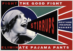
Uni Watch Stirrup Club Update: Just as our brothers and sisters in the great state of Wisconsin are rallying to the cause of social justice, so too are we rallying for the even grander cause of proper sports hosiery! Let others send pizza to Wisconsin — we know the higher truth: Give a man a pizza, and you feed him for a day; give him stirrups, and you feed his soul for a lifetime.
And with that I surrender the floor to Comrade Robert Marshall, who continues to be an inspiration to us all. Here’s his latest dispatch from the front lines of the hosiery wars:
Comrades,
First, let’s attend to some old business: No order would not be complete without a Twin City Knitting delay. In our last order, the factory ran out of the dark royal thread for the “Wolverines”-style design. But those stirrups have finally arrived and been shipped.
One reason for the delays, according to the factory, is that they are sold out of all of their premade single-color stirrups and are working Saturdays to catch up. Apparently their stirrup business is blowing up due to a resurgence of revolutionaries with the right proper diamond aesthetic. I don’t think it’s hyperbole to attribute this in large part to Paul’s influence here at Uni Watch. All revolutionaries owe him thanks.
Given the backlog, keep in mind that if you’re looking to order stirrups for a full team, expect it to take four weeks. So get your order in the queue as soon as possible, especially if your design is even remotely funky. I may have TCK’s ear more then most reps, and I will actually be consulting with them for some throwback looks (woo-hoo!), but that doesn’t mean I can make hosed monkeys fly out of their pantaloons at the drop of a chapeau.
Now then, with spring training in full swing and the snow melting, it’s time for another batch of new offerings. As you can see at the top of that page, we’re starting off this time around with the Super Bowl champions. As everyone knows, football players used to wear stirrups, but with a crew sock on the outside instead of a sani on the inside.
Our other offerings this month are 1960s Pirates, 1941 Pirates, and Minnesota Gophers hockey (but with a maroon background instead of white).
Full ordering instrux for these new offerings, and for remaining stock of old ones, can be found here.
That’s all for this month, feel free to contact me if you have any suggestions or special requests. Lastly, I promise to keep up on the Facebook group — I miss seeing the consistent stirrup Friday/wedding images, which always lift the spirits.
From each according his stirrvp,
to each according his strype.
Uni Watch News Ticker: I just about flipped yesterday when I saw a 1960 photo of an amazing Dallas-area neon sign with some unfortunate spelling. I showed it to my friend Jon Hammer, who promptly made a key Photoshop adjustment. ”¦ A rare 1919 World Series pin is going up for auction. ”¦ The Wild wore camo warm-up jerseys two nights ago. Here’s a video clip of them putting on the jerseys in the locker room (thanks, Phil). ”¦ Ichiro is designing his own clothes (thanks, Brinke). ”¦ Here’s something we don’t see very often: The men’s and women’s hoops teams at Southern Illinois Edwardsville both have a circle-R trademark symbol next to their chest logos. The Cubs also do this, of course. Leaving aside examples that involve corporate sponsorships, anyone else? (Big thanks to Scott Slarks and photographer Bill Brinson.) ”¦ Rochester Amerks goalie Tyler Plante is wearing an old-style waffle-print blocker, although it’s white. “The first goaltender who regularly wears old-style brown leather pads and gloves will be my new favorite,” says Doug Brei. ”¦ Here’s a good story on the 2011 MLS jerseys (with thanks to Lars Johnson). ”¦ Jason Terry’s new sneakers are modeled after fighter jets (with thanks to Stu Taylor). ”¦ Here’s the latest on the crazy electronics-equipped compression shirts that a few dozen prospects will be wearing at the NFL Combine (with thanks to Josh Neisler). ”¦ Interesting stirrups being worn by Arizona State. “One of our players was seriously injured during a game,” says Randy Policar, so starting this weekend we will be adding his #34 to the stirrups.” ”¦ Good to see Barry Zito is still wearing the striped hose in Giants camp (thanks, Brinke). ”¦ Speaking of the Giants, a few days ago I mentioned that Tim Lincecum appeared to have changed his footwear from Reebok to Mizuno, but yesterday Matt Paver spotted him wearing the mark of the beast, so maybe he’s just between contracts or something. ”¦ And speaking of our friends from Beaverton, notice anything odd about this golf leader board? Even better (read: worse), each swoosh is actually an interactive ad — mouse over one of them and see for yourself, but have a bucket handy in case you feel nauseous (blame Tom Griffith). ”¦ As color-on-color games go, red vs. purple is pretty out there. That’s Seattle vs. Washington from two nights ago (with thanks to Dave Sizer). ”¦ New uni set for Maryland baseball. “It’s early in the season, so they haven’t run everything out yet,” says Eric Garment, “but so far they’ve worn a classic home uni with NNOB and Northwestern-striped stirrups and a black jersey with an unusual number font.” ”¦ It’s now been a year and a half since Uni Watch got the A’s to change their helmet decals, yet Coco Crisp is still wearing the wrong logo. ” I’m guessing it’s his helmet from last season, since he had the wrong logo then too,” says Brandon Davis. ”¦ Michael Koch reports that newly acquired Penguin James Neal is wearing No. 18, while Chris Conner, who had been wearing that number, has switched to No. 16.
The numeral font on Maryland’s black jerseys is called “Tiffany” and made by Stahls. link
It’s been around for years. I used that style back in 1994 on a set of girls basketball uniforms.
Hey Paulie- I’d be careful about changing that restaurant sign Are you sure that is isn’t for “LUCA’S” as in Luca Brassi, Don Corleone’s “most valued friend?” I wouldn’t want to find a bull’s head in my bed.
I see someone else caught the Godfather last night on AMC.
isn’t the godfather on every night on amc? or does it just seem that way
Yeah i guess it is really.
rocky has a good chunk of that lineup too…
ba da beep, ba da boop.
watched it like 5 times in the last month, and part III tonight.
My advice, Paul: stay away from link.
it’s not personal, Sonny! It’s business!
-Tom Hagen
“… I wouldn’t want to find a bull’s head in my bed.”
Like so?
link
Hmm, initially I was thinking that Steve Yzerman was the first hockey executive to lose a little bit of public respect over his uniform waffling. But after reading the above, maybe I was wrong.
Yzerman from a hockey standpoint is off to a stellar start, so may it should not be surprised he took a unique and creative approach to uniform design, it also distances himeself, from the accusation he was creating a blue version of the Detroit Red Wing uni
Weren’t the original Los Angeles Kings uniforms merely Purple & Gold clones of the Detroit Red Wings? Did anyone complain in 1967?
The difference there is that they were introducing a color that hadn’t yet been seen in the NHL. Plus, they combined it with a something other than white.
And maybe people did complain. Can we check the archives of Twitter and Facebook posts from 1967?
IMO that sucks the Lightning brought BFBS back into new uniforms (and you know they’ll introduce a black jersey at some point) & they looked fine the way they were even if they had Maple Leaf tendencies. One color + white looks are very bold and clean.
Black is part of their history. They were born in Black. They won a Stanley Cup in Black. Not BFBS IMHO.
Seconded. While the lightning stripe on the pants is a huge upgrade, the black trim is an even bigger downgrade. For one thing, the absence of black from the crest gives the whole thing a muddled look; it’s now not that far, aesthetically, from the old Nats unis with the block lettering and script cap logo. And for another thing, the black is being used as a border or accent color between blocks of light and dark colors. That’s a basic, amateurs-don’t-usually-even-get-this-wrong, no-no. If the team’s colors were blue and black, then you’d want to add a third, lighter color, like white, to provide accents and borders to give the competing dark colors more distinction. But if the colors are blue and white, the addition of black creates visual muddle, not clarity. So this isn’t even really a matter of taste: from a reasonably objective standpoint, the addition of black here is a bad move.
Plus, and perhaps the weather is just really different in Florida, but I come from the Midwest, so I think I know a little something about thunderstorms and lightning. The one thing lightning isn’t, the one color out of all the colors in the world that least communicates the concept of “lightning-ness,” is black. If you start with black, you can build a reasonable “lightning” identity by adding other colors; any color will do, since any color other than black is, by definition, more lightning-esque than black. But if black isn’t the very first color in your scheme, then adding black to that color scheme will, by definition, make that color scheme less lightning-y. If the team wants to take a blue and white color scheme and add black, great. Just find a name other than “lightning.”
(And I say this as someone who’s actually a fan of black-and-blue color schemes. There are any number of good ways to use those colors together. This isn’t one of them.)
This wasn’t a case of BFBS. When I saw the original draft of the uni, I thought it needed black trim, in the same way the standard Flyers and Blackhawks unis have black stripes or trim (never mind their BFBS alternates).
However, the Lightning pulled a big fail by only putting black trim on the numbers! Just a thin stripe framing the elbow and waist stripes would have made a big difference.
Oh well…
-Jet
BFBS alternates? No. Both the Flyers and Blackhawks have featured black as a prominent part of their color schemes since their inceptions — long before black became trendy.
Just because a black jersey is ugly does not make it BFBS. And both teams have retired their ugly black alts.
Agreed, it’s good to hear those black jerseys have been eliminated. While black has been a part of the color schemes of both clubs, it has played a secondary role in terms of jersey color. San Jose, Dallas, and LA also need to ditch black jerseys. At least Washington did so several years ago.
“While black has been a part of the color schemes of both clubs, it has played a secondary role in terms of jersey color.”
Not really. On the Hawks’ white jerseys, the ratio of black to red is about 3-to-1. And that doesn’t even take the numbers, captaincy designations and NOBs into account. If you take those into account and the red has maybe 10% of the presence that black does.
But even just looking at the standard home unis, black is not just a trim color. Both teams have ALWAYS worn black pants, except for a very brief period where the Hawks wore tan ones (but their jerseys were black at the time). And the helmets worn with the dark jerseys have always been black.
Is blue a “trim color” for Montreal?
Fourthed. I think TB actually ought to add a little more black to the jerseys. Just some extra trim, it doesn’t have to take over the jersey. But it needs to be featured a little more given their history.
Look at the right of this picture and you will see Ichiro’s logo.
link
Am I nuts or does that look like the logo of new age church?
Or the symbol for the artist formerly known as Prince, that is just now known as Prince.
Was there any explanation for why the Knicks were wearing blue? Was it some kind of throwback jersey?
It was the Knicks’ throwback.
Perhaps Milwaukee was in the midst of a big road trip, and thus didn’t bring their whites to avoid a color-on-color matchup. Then again, it’s not like hockey, where bringing a second set of uniforms means bringing a second set of matching helmets, and requires more storage space.
Nope, no long road trip. They were at home the night before and their next game is also a home game.
I think that is a throwback uniform. I don’t see any black trim on it.
In any case, it shouldn’t really matter anyway. There’s really no reason that NBA games shouldn’t be color vs color. Lakers games have been color vs color for decades, the rest of the league should be able to do that too.
As long is it doesn’t result in the Knicks coming out with an orange or a black jersey, I’m fine with that. I actually like the Knicks’ white jerseys, though.
Ah, man. I just got an image of the Rockets wearing yellow jerseys. That’s bad juju, there. Hearkens back to the Mavs’ silver.
Nothing wrong with color-vs.-color in the NBA, but blue vs. green is not the way to go. The Bucks should have worn their red unis.
Yesterday was Knicks Legends Night, so the Knicks wore their throwbacks.
Thanks for the info.
I love that Knicks road uniform and it needs to return asap, but on Legends Night at MSG you wear the iconic home uniform…..
link
Absolutely!
“Jason Terry’s new sneakers are modeled after fighter jets”……and are lame.
I find it even more amazing that Jason Terry has his own shoe.
Jason Terry doesnt have his own shoe. As an endorser of Reebok, wearing it’s Zig-Tech line, he has input on what colorways he’ll wear. Terry has his this unique colorway, not shoe. Plus, if you want a guy who HAD his own shoe modeled after a fighter jet, look no further than the Air Jordan V.
The shark nose paint really is more evocative of a prop fighter, like the P-51, than jet fighters. The only jet I can think of where the shark nose is fairly prevalent is the A-10, which is really slow for a jet. I like the design, but it’s not really a “jet” design.
If you go to street view on Google maps the Lucas sign is still there, in front of a Papadeaux’s resturant. Not sure if it still lights up.
I work on Oak Lawn in Dallas, a block from that sign. It is in front of a Pappadeaux’s and Dallas Wine Shop. Pappadeaux’s still lights the sign every night, I guess they couldn’t bear to tear it down.
don’t these guys have a guide to proper stirrup wearing posted in the locker room?
hey moose — THAT is what your next poster needs to detail…low side in front
Low side in front – back in the little league days of ribbon rups, late 70’s, early 80’s for me, that was one thing we always did….high side in front and pulled up until they dug into your foot enough to make it hurt. Didn’t want to show any of the top on the front. Only got one pair and it was always a 5″ at the most and had to do something to try to look like a pro. Looked dumpy (in my mind at the time) if it sagged and showed *egad* stripes.
i was taught you wear it like a team pixture. in other words, the little guys are in the front. hm, that subject would make a good poster idea, good idea phil. does this mean you have exhausted your good ideas for the month? heeeeeeeey…zing…wacka-wacka…boy-oi-oi-oing.
The “circle-R trademark symbol” is more properly called the “registered trademark symbol.” As suggested by its name, the symbol means that the trademark has been registered with the US government.
signs of the apocalypse?
Hmmm…I’m not a Lightning fan, but I did my own critique of the new Lightning uniforms after the release. I would’ve sent it to the team had I known I could have possibly met with Steve Yzerman over the deal. Being a Red Wings fan, it wouldn’t have gotten any cooler than that.
Please tell me that I’m not the only person who sees those Southern Illinois Edwardsville unis and thinks “SOOOOO-EEEEEYYYY!!!”
No, you’re not. Clever handle, by the way.
Thanks to Ricko’s help, the Dootie Bubble found a tackle twill patch for what he wants to be an old school Marlins hoodie. The Dootie Bubble can sew but doesn’t have a sewing machine so he wants to take the patch to a seamstress to have it affixed. I understand MLB doesn’t want the Dootie Bubble to do this but let’s say I can find a seamstress who can overlook silly rules. What do I ask the seamstress to do?
The logo is this one (link) and is three layers of tackle twill with an embroidered Marlin. The layers are not stitched together. Do I just have them stitch the outer white layer down or should they stitch the teal to the black, the black to the white, and the white to the hoodie? What kind of stitching should I ask for? I don’t mind paying a fair price for the work I just don’t want to go into a store and have the seamstress tell me (s)he knows what he is doing only to find out after the fact that they’ve screwed my patch up.
Glad I could help.
A thought (if it hasn’t already occured to you):
Whatever garment your choose, be sure it’s been washed—and therefore shrunk as much as it’s going to shrink—before the lettering is attached.
If not, Dootie Bubble could end up looking like he’s wearing a hoody for the Florida Fighting PuckerFish.
Elsewise plan on it possibly being “Dry Clean Only”.
—Ricko
Maryland has also worn Road Grays link and a Red jersey link
So in 5 games they’ve worn 4 completely different sets of hats/jerseys/pants.
The only one that isn’t a complete trainwreck is the throwback white uniform. The stripe across the back, the arm pit spikes, and the leg stripe are atrocious on those greys.
The red uniforms look like they are from a giveaway night that would have a local sponsor on the back instead of a number.
Hopefully, the Lightning will be more attentive when adding the actual shoulder patches and be sure they’re not upside down.
link link – thankfully, it’s just on the front view (note the back view has the correct alignment).
Can we presume that they’ll also correct the shoulder numbers and not sew the “1” on backwards? ;)
I would certainly hope so!
Hey, Paul, has anyone ever requested that Stirrups graphic of yours for their membership card? As interesting as the cards are on their own, I’d think that’d be even more of a conversation piece.
And one of these days, I’ll send in my $15 to get one of my own, but my problem is I can’t decide on what jersey style I want – Red Wings white, 1991-92 Red Wings throwback, 1988-92 Penguins white or black. Or, possibly even a treatment of that Pens jersey’s gold upper sleeves … or the Red Wings’ red-sleeves-on-white treatment… see? I’m coming up with even more options instead of less!
I love that graphic (which was designed by Robert Marshall, not by me), but I’m not sure it belongs on a membership card.
Yeah, yeah, I know — you just need to decide on a design for your card. If I had a nickel (or a $15 membership fee) for every time I’d heard that one….
Maybe Mr. Marshall could envision it as a sort of business card-type job? Or not… just spit-ballin’ here.
I think I’ve decided on what I want on my membership card, but I don’t know if it’ll be allowed. I suppose I’ll get that sent in soon. Plus, I need to throw some money Bethany’s way to get the Eephus stuff going.
In the meantime, I’ve made my decision.
actually, i am working on some new kc letterhead, and my business card just says “THE stirrup king and bobble baron of chicago”, no numbers, no name or other info, just that text. i shouldn’t have bought 30 gross before i link. just kidding, it doesn’t say “the”.
memberships: every one of us who read every day, or comment everyday, should buy a new card EVERY year, it’s like an annual pbs donation, but you get a card instead of a tote. there really is no none zero excuse for anyone who is a regular not to have at least one card. in my horchata it is reprehensible not to contribute, and say thanks for the entertainment every freaking day, especially since the fed is going to pull essential uni watch funding.
That’s actually a good idea.*
Lessee… the membership program was introduced in like mid-2007, right?
That means I should have three cards by now and I’ll be due for another one shortly.
So, essentially, I’m three behind. I’ve got a pretty good idea what I want for my second and third cards, but I’m having a tough time deciding on that fourth. Maybe a standard Uni Watch treatment since hardly anyone does that anymore…
* does this mean you have exhausted your good ideas for the month? heeeeeeeey…zing…wacka-wacka…boy-oi-oi-oing.
jimbad~
i’m just saying a replacement card every so often wouldn’t be such a bad idea, i know i’m due. if i have i have a banner month with the stirrup offerings, and i dig through the couch for fallen nickels, i might be able to get 15 bucks together. but for sure everyone who reads every day should have one, no excuse not to. you disagree?
re:* no, exhausted for the year in my case.
No, I don’t disagree.
And I have been thinking about getting a second card for quite a while now. Maybe I’ll finally pull the trigger on that.
Paul, is it possible you could posters of cards? Say, for example, all of the hockey cards on one poster? I think it would be cool to see all the designs and fonts used by people.
Thoughts?
How about a poster of the cards in formations according to their sport? For example,
link
Replace those player positions with membership cards, and do the same on the other side of the rink.
Or,
link
Put little card pictures in these spots.
And so on.
The “cards in a playing field” idea just made me think of a game I had back when I was a kid… link
Seriously, I wish I still had that board game. Then again, I wish I still had a lot of the toys I had when I was a kid… old Star Wars, G.I. Joe, Transformers, and Lego… even my first computer, the Atari 1200XL… good times, man. Good times.
someone out there please make the Uni Watch membership card gallery into an INFOGRAPHIC!!! how cool would that be?!?! sport, color, league, city, odd, even, etc…
***ALL UWers WITH A HOCKEY JERSEY CARD***
Please go in and comment on your card as to what the team is and from what era. I am working on a graphic with all the hockey cards, and I’m done guessing at what the cards might be. I’ve identified 122 individual cards, but there are probably 100 more that I skimmed by simply because they weren’t immediately recognizable.
For everyone else, get in there and comment on your cards as well so I can grab the other sports after making the first graphic.
LI Phil’s beloved isles have the “circle-R” on their logo
Not on their jersey:
link
yeah…that’s always a good sign when you see one goalie skating in to replace another…
link appears to have been an anomaly, as the mark hasn’t appeared on the uni during any regular-season games, at least that I’ve been able to notice (I don’t exactly follow the Isles that intensely, being a Wings fan first and a Pens fan second).
huh… IN-TRES-TING! didn’t realize that
For YEARS i didn’t realize that orange blob on the middle was actually Long Island. That IS what it is……right?
yeah boinke…that’s what it is
Technically, it’s a representation of the region considered “Long Island”, as opposed to the entire physical island itself, as it does not include the area corresponding to Brooklyn or Queens.
Bearing that in mind, the point in the “I” is a close approximation of the location of Nassau Veterans Memorial Coliseum. Now that’s a clever logo element!
… it took me 15 minutes to get that reply in? Wow. But yeah, it’s basically Nassau and Suffolk Counties, as Brooklyn (Kings County) and Queens are part of the City of New York (and thus, nominally represented by the Rangers).
Be fun to see what the Isles do with their crest if they move to either Queens or Brooklyn, as has been discussed.
My first reaction was “that jersey could be from Okposo’s rookie year”, but it can’t be since he wasn’t teammates with McAmmond his rookie year. Oh, and the royal blue jersey didn’t exist during the 07-08 season.
The only explanation could eb that KO was recalled that year (08-09) and they mistakenly grapped a replica for him on short notice.
new super bowl logo is revealed
shockingly, it looks a lot like the old super bowl logo
count me as one who is not a fan
That was their plan…
What the crap are they going to do when they get to Super Bowl L, though? That “L” is gonna look mighty ridiculous all by itself if they’re still using this style in 2016.
oh…i know…and they have a long range plan for the continuity of the logo (those outer years still haven’t been approved…yet, but im sure it’s a mere formality)
perhaps, as some have suggested, they’ll eschew the roman numerals for L and use “50”
Or maybe they’ll go with XXXXX because fuck everyone.
They could use XLX or LC, right?
I kinda hope they do go with 50 instead of L. There’s just something weird about “Super Bowl L”
They could use XLX or LC, right?
~~~
if you’re going to make comments like that, you really need to buy a membership card
“In Landor’s proposed system, the trophy symbol remains the unchanging graphic each year”.
Interesting statement, since the third trophy’s shading appears different in the third logo represented there. At the same time the block containing “SUPER BOWL” appears the same.
I still attest that the graphic most likely began life as a proposal for Dallas’ game, and someone high up liked it so much they committed to it for long term. Bold. Silver. Ultra-modern. Will that logo ever look as appropriate as it does with the House That Jerry Built incorporated into it?
I’ve “heard” that Zito is still wearing striped socks, too, however I don’t think that photo is evidence of that. It looks like it was taken during the World Series (you can almost make out a patch on the left side of the hat).
Plus, the bill of the cap is black–Giants have only worn orange-billed caps in camp thus far.
Finally, the picture seems to be taken at night–see the shadow being cast by Zito’s foot. Looks like it was made by stadium lighting, not the sun. I don’t think there have been any night workouts this Spring.
link
And the nail in the coffin:
Giants’ BP jerseys feature an orange side panel this year.
link
Here’s a current photo:
link
this is the link I sent..taken in camp this week.
link
Brewers’ LaTroy Hawkins wearing high socks during Spring Training.
Pic in this article: link
Asked him on Twitter if it was a permanent change and he said he was still deciding.
Remember, his socks can do what your socks can do, but your socks can’t do what his socks can do.
Thanks for a link to the 2011 MLS kits write up… finally, someone (other than those on this site of course) who critiques uniforms and actually knows what he is talking about, and is familiar with the league, teams and history.
Very entertaining!
Some of the jerseys shown are authentics, others are replicas. The easiest way to tell the difference is that the replicas do not have the appropriate national flag on the left sleeve. The authentics have more detailed collar treatments, a team logo, slogan, or wordmark on the back near the neck, and other things. For example, Chicago’s white jersey has a Chicago flag-design on the lower left-hand side panel of the shirt.
Agreed with what you said, Lee.
I was sad reading the Ichiro article and there were no pictures. I am now picturing him dressed like John Daly.
Also, “Jason Terry’s new sneakers are modeled after fighter jets.” is one of the best sentences I have read all week.
Here’s my idea for the Kings someone asked for.
link
Thanks
Yes!
link
Too many blue teams in the NBA, so (and I know this won’t win me points with Paul) I like the purple. The light blue as a trim is great.
Actually, the purple looks like plum on my monitor, which made me think…if you tweaked the color to claret or burgundy you could get a Loyola Marymount vibe going on there.
link
Great stuff, Tim
“I like the purple.”
Congrats, you are now on The List.
tim, those are some really good ideas. i like!
i was a HUGE bobby jackson fan, so the kings will always have a soft spot in my heart. lol.
ever think of somehow incorporating the number in the crown, sans wordmark, on the front of the jersey? kinda like G.S. does? might make for a unique 3rd jersey, no?
I don’t know about that but you just gave me a baller idea, let me mock it up real quick
How about this
link
Or this
link
I like your first “this,” Tim.
How about this – remove the side stripes on the jersey and wrap the diamonds all the way around, like my all-time favorite jersey.
link
Of course, a single-digit player would have his number off to the right (his left) instead of centered, but I could most easily live with that.
Just one row of big diamonds, though.
I like the first one a lot. The numbers are way too small on the second, but the quasi-argyle thing on the first one is nice.
On the back, of course, you could put the numbers over the diamonds,
link
so even single digits could be centered.
Hows about dis:
link
I’d wear that!
Can you reverse the colors for comparison?
I think these are all the permutations you may need…
link
link
link
F***, on the white with the blue striping i’m missing the blue stripes on the pants but you get the picture…
I like the other white one better anyway. Awesome.
I don’t get what’s wrong with Coco Crisp’s decal. I’ve also Googled high and low and can’t find anything about Uniwatch getting the A’s to change their helmet decals. Can someone explain?
Look at the difference between these two logos:
link
The distinctions are subtle but real. The cap version is correct; the helmet version is no longer an official A’s mark.
Until recently, all of Oakland’s helmets had the wrong version, but equipment manager Steve Vucinich changed them after a Uni Watch investigation. Apparently he missed Crisp’s helmet, however.
The guy got his nickname from a cereal box. Who knows what’s going through his head?
Here’s the full entry that addressed this topic:
link
no picture yet. but Arizona state plans to put the #34 on their stirrups, and hats. as well as wear wristbands with the #34. 34 is for freshman outfielder/pitcher cory hahn who suffered a neck injury, that required surgery, in the opening series last weekend agaisnt the university of new mexico.
Yet another company trying to ride the Tampa Bay Lightning’s new-logo coattails: link.
Apple improves on the color scheme with its version of the Lightning logo: Blue, white, and silver. No BFBS.
Firewire was better than USB and it struck out. Do they really think they’re going to do better with another proprietary transfer technology? I just hope they don’t put it on all the new iphone/ipod/ipad cords instead of USB.
Struck out? FireWire was great for video – USB can’t handle streaming from tape.
Struck out meaning it’s gone, not that it wasn’t as good.
That Lucas sign is 2 blocks from my old house! The restaurant is long gone, and yes there is a Pappadeaux there now.
Whataburger! The Wichita Wings seem to be back: link
Does that mean the Force and the Spirit are next?
Wonder if the old Wonder Woman / WWF logo will reappear.
link
We can only hope. I hope their last logo is harder to resurrect than the team was link
I was a huge fan of the MISL as a kid in the 80’s. The KC Comets recently returned also, but watch out, these teams fold up as quickly as they reappear. The St. Louis Steamers popped back up a couple years ago just to disband again after 2 seasons.
That’s OK. The more that pop up, the more that have a chance to stick around. I’d like to see the Steamers make another go, as well as the Stars and the Sockers.
The Sockers came back about a year and a half ago, but they are in a small league and no longer play in the Sports Arena.
link
Saw on that web site that they played Tacoma. Are the Stars wearing those unis full-time, or was that a retro night?
link
Here’s a picture of Dwight Howard’s compression jersey, it doesn’t look that tight, but you can tell it’s a compression from the ridiculous Adidas ribbing on the sides.
link
It’s tight at the top, from his shoulders to his pecs, compared to Kobe’s jersey.
Speaking of the comparisons – Dwight’s number looks about half the size of Kobe’s area-wise, and the star on the shoulder is much smaller as well. Even accounting for Kobe being in front of Dwight, the “East” and “West” and respective Adidas logos are in relative proportion for that perspective. By comparison, the player in the background, who’s about two-thirds the size of the guys in the foreground, has a star that looks bigger than Dwight’s!
Here’s another picture which shows Howard’s compression jersey and prominently displays the different number and lettering sizes.
link
Shrinky-Dinks!
Cross-dressing alert! World no. 1 Caroline Wozniacki played her quarterfinals match in the Qatar Open against Flavia Pennetta yesterday while wearing a link. What’s more, the jersey had been autographed by the Reds’ captain. Pics link and link.
That’s pretty cool!
Wozzy is Adidas’s flagship tennis player. If it was a Nike jersey, she wouldn’t have it on, betcha.
“Just as our brothers and sisters in the great state of Wisconsin are rallying to the cause of social justice, so too are we rallying for…”
am i the only one who’s becoming less interested in visiting the uniwatch site, the more that political news comes a part of the site?
yes.
You’re not alone, Christopher. This site is about uniforms–nothing more. I log on, in fact, as a respite from the crap going on in the world. I certainly don’t need a lecture from Paul (or anyone else) about taxpayer-subsidized unions paying nothing for their healthcare “fighting” for social justice.
Yeah, I really gave you a “lecture.”
Happy trails, guys.
Jimmy V.(the living one),
ask and you shall receive [link]http://www.timeobrien.com/home/2011/2/24/tidbits-and-nuggets.html[/link]
link
whoops
Oh man, you practically read my mind…especially with the gold uni:
link
A team named the Nuggets should have gold gold instead of yellow gold.
By the way, I’m pretty sure that David Thompson pic shows a royal blue uni. But yeah, eliminating the red works anyway.
I was also thinking, “Well, if he gave the Kings those wraparound diamonds he probably won’t do his take on my favorite uni,” but you came through with that flag-inspired uni. Inspired work, indeed.
Thanks!
Thank you Jim
I love – LOVE – doing this type of stuff and have ever since I was a kid.
With my current employment status being ‘unemployed’, my college degree (journo) unemployable and my current residence my parents’ basement, If I could find a way to make some money doing this type of stuff, I would be a very happy young man haha.
You’re welcome. And thank *you.*
Fixed link (hopefully)
link
hey tim…check your email
Checked and responded, Thanks Phil!
oh and…don’t encourage the mothervilker
Do I smell the aroma of a collaboratory wafting nearby???
Tim, be careful with that little Phil character. I wouldn’t want him to corrupt you into making everything identically boring, because the stuff you have on your website is fantastic. That gold Nuggets concept is niiiice.
Trax, I have no idea what you’re talking about. Phil was just talking to me about the positives of beige and gray…
Beige and gray. Um hum. Resist, I tell you, resist!
attn JTH: here’s the Google laptop. Free.
link
click ‘apply now.’
here’s mine;
link
Dang:
Thanks anyway.
Celtics call-up Chris Johnson wearing #86 for the green tonight in Denver. His name lettering is incorrect…looks closer to a generic athletic block (or even ITC Machine) than the taller standard NBA lettering. Maybe a quick rush job by the local tailor?
looks like he is wearing a semih erden jersey that they put a nameplate on for johnson to wear tonight
That explains the number. I haven’t seen a closeup yet that confirms the nameplate, but it would make sense.
Here you go:
link
Couldn’t resist Googling for retro goalie pads — found a few links:
link
link
link
Great blog! Check out mine at link