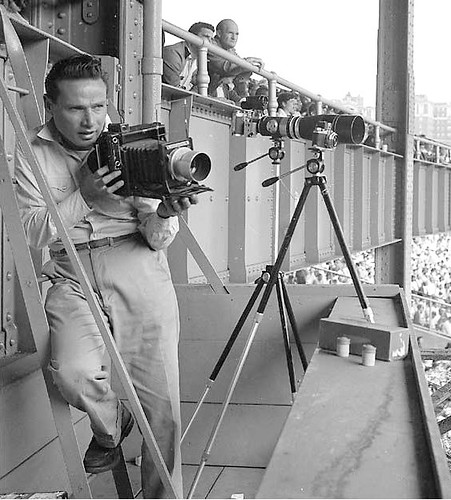
Ever hear of Hy Peskin? You may not know his name, but you almost certainly know his work. He was Sports Illustrated’s first staff photographer, and one of the greatest sports shutterbugs who ever lived. You’ve probably seen many of his iconic photos without even knowing they were his.
Peskin died in 2005, and now his estate is selling museum-quality prints of his work via a new web site. The photos are astonishingly good, with those deeply saturated colors found in so much mid-century photography. It’s tempting to showcase almost all of them, but I’ll stick to the uni-notable ones. Today we’ll start with baseball photos; in subsequent entries, we’ll look at other sports.
Okay? Here we go:
• Here’s one of the best shots you’ll ever see of the Reds’ 1956 uniform.
• The flocking on this helmet looks so textured, it’s tempting to reach out and touch it.
• Holy moly, the Phillies sure had some gigantic uni numbers.
• When I was a kid, if a catcher was on deck with two outs, he routinely wore his shinguards in the on deck circle. When did that go out of fashion, and why? Is it because commercial breaks between half-innings got longer, allowing more time for the catcher to strap on his gear if the third out was made?
• Speaking of on deck protocol, this pose used to be so iconic, I actually used to practice it myself when I was a kid — sometimes in front of a mirror (embarrassing but true). It was one of those “Hey, I look like a big leaguer” postures. When you thinking about it, though, it’s kinda lazy, no? Isn’t it better to be swinging the bat, timing the pitcher’s delivery, etc.? Maybe that’s why it fell out of vogue.
• Here’s an unusually good view of the Indians’ mid-’50s C-Wahoo cap logo. And one more for good measure.
• Speaking of the Tribe, I don’t care for these mis-matched undersleeves. Probably a spring training game, but still.
• I’ve always hated mandals, even when worn with stirrups.
• Hard to believe that the outfield wall at Candlestick (and other ballparks) was nothing more than a chain-link fence. Aside from looking ridiculously rinky-dink, it was dangerous: If Willie’s spike had gotten snagged in the fence there, that could have been the end of his career.
• Hmmm — an early bullpen buggy?
That’s enough for today. More great Peskin imagery coming soon.
(Big thanks to Tom Shieber for bringing this new Peskin site to my attention.)
Stiff upper lip: Remember those MLB facial hair T-shirts that surfaced last week? Reader Matt Robinson points out that Nike cribbed the concept for those tees from a Ron Washington shirt that was a big hit in Texas until the lawyers ruined everything.
Now, maaaayyybe the Ron Washington guys got some sort of compensation for their concept. Or maybe MLB and Nike just cherry-picked someone else’s great idea. I’m trying to find out. Stay tuned.
Research query: Did you know that the Cricket World Cup gets underway later this month? Neither did I! But sure enough, it’s true. ESPN.com is going to be providing a lot of coverage, including a piece by a certain uniform columnist.

Just one problem: I don’t know jack about cricket uniforms (or about cricket in general, actually). Anyone want to give me a crash course? I’m looking to learn about cricket uni history and also the uniforms that will be worn in the Cup. If you have expertise in this area, don’t be shy. Thanks.
Collector’s Corner, by Brinke Guthrie
The NFL season may be over, but it’s always football season on eBay (plus it’s always baseball season, always basketball season, and so on). Here’s our latest round of cool collectables:
• I’ve got a pretty good memory about 70’S NFL stuff, and I don’t recall IHOP doing these NFL magnets.
• Pete Rose, a real-life role model.
• Love the cover on this 1971 Detroit Tigers scorebook.
• Gas stations used to be the best source of NFL collectables: beverage glasses, those great stamp albums, and this poster.
• Brady Phelps pointed out this great set of Padres patches
• And here’s a query: Dean Patterson is looking for a 1939 Bruins Victory Dinner menu. If you have any leads, contact him here.
Seen something on eBay that you think would make good Collector’s Corner fodder? Send your submissions here.
Uni Watch News Ticker: Teams have graphics standards manuals (i.e., a guide showing the specs for how logos and colors can be used), and so do corporations, governments, militaries, and so on. For a long time, the holy grail in the design community has been to find the graphics standards manual used by the Nazis. And now design historian Steve Heller has finally found one. Fascinating stuff. ”¦ Here’s a really good article about the design process for the new Lightning uniforms. ”¦ Love this Dolly Madison Dairies basketball jersey. ”¦ Here’s something I hadn’t known about: After a shooting on the Iowa campus in 1991, Hayden Fry had the football team go without helmet decals, creating a solid-black memorial helmet. ”¦ New baseball uniforms for Arkansas (with thanks to Justin Bates). ”¦ Here’s a great story about a guy with a Milwaukee Braves stock certificate (with thanks to Jonathon Binet). ”¦ Vanderbilt hoops wore gold uniforms back on Saturday. ”¦ Dante Cunningham of the Blazers was wearing a very strange facemask during shootaround before Monday night’s Blazers/Bulls game. “He needed a facemask after getting elbowed in the eye against the Cavs,” says Malcolm Byers. “The strange thing is that the mask seems to have dark-colored lenses, which look much darker then the goggles Dwayne Wade was not allowed to wear last week. Unfortunately, Cunningham never got into the game.” ”¦ Remember the nine-year-old girl who was killed in the Tucson shootings? She was a Little League player, and now lots of Little League teams around the country are planning to wear a memorial patch for her (with thanks to Alex Benezra). ”¦ Dusty McGowan notes that one of the linesmen in this NHL fight video clip has a different zebra jersey than the other members of the officiating crew. Anyone know why? ”¦ Some pink rinks look pinker than others. “That’s from the San Antonio Rampage (AHL) Pink in the Rink game on Jan. 28,” says Gordie Taylor. ”¦ New sweatbacks for K-State (with thanks to Grant Goldman). ”¦ Somehow hadn’t noticed that Jordy Nelson tore one of his socks in the Super Bowl until O.J. De Castro sent me this shot. ”¦ Check out the big uni numbers on Matt Cooke’s skates (as spotted by Ryan Connelly). ”¦ This 1965 Bills/Raiders shot shows the Bills with an unusually chunky NOB font (good spot by Bill Kellick). ”¦ Britt Jackson has found a line of cycling jerseys based on MLB, NBA, and NHL designs. ”¦ Good observation from David Browning, who writes: “It has come to my attention that the confetti that rained from the roof of Cowboys Stadium on Sunday night was shaped like the Lombardi Trophy.” Interesting. I have a bit of confetti from Super Bowl XLII (Joe Skiba sent it to me after the game), and you can see that it was not Lombardi-shaped. ”¦ The Packers got to keep their Super Bowl jerseys, which occasioned some amusing hyperbole from player and writer alike. Start at the fifth graf and try not to laugh when you get to Brandon Jackson’s quotes (with thanks to Michael Drivas). ”¦ Sam Lam has custom-painted himself another A’s-themed Peanuts bobblehead.
nike needs to do a shirt for late 70’s Eddie Murray with the chops & cartoon bird. Or maybe I will and wait to get sued.
I’d be the first in line for that shirt. Eddie was my favorite as a kid.
The number on Matt Cooke’s skate is so it’ll be easier to identify him when they call him for tripping
Used to be that one of the two leagues had a rule that catchers COULDN’T wear their shinguards in the on-deck circle and one league didn’t have such a rule, but I can’t remember which way it went. Or if they eventually changed it as some things (like baseballs and umpires) became standardized between the two leagues.
And I’m going to buy one of those patches, for sure.
I also dig those huge numbers the Phillies used to wear. As a nearsighted person who usually sits in the upper deck, I enjoy being able to read the players’ numbers. Make them bigger and dump the NOB, which becomes just a smudge at that distance!
(Bigger in size, of course, not in magnitude. Jersey numbers over 50 are for football!)
Agree wholeheartedly with the first paragraph, but I enjoy Lastings Milledge’s #85 and other quirky numbers. I hope they never have a numbering system like the No Fun League.
I have a Rich Ashburn 1948 throwback from Mitchell & Ness (so it’s historically accurate), and the 1s on those uniforms had no serifs. So it’s like there’s just an enormous vertical line on the back of the jersey.
Jeez, am I old. I recognized every one of the players in those Hy Peskin photos before looking at the IDs. Even A’s infielder Milt Graf, who is sittng behind Mickey McDermott in the “I hate mandals” photo.
Owe it all to Topps, of course.
Long time ago, I posted a SPORT Magazine cover photo of Bob Lemon wearing that red undershirt with the Indians in spring training. Good bet it was a Hy Peskin photo, too. Probably taken the same day.
Also, though Chief Wahoo gats bashed around, that hat with him inside the red wishbone “C” is one of my all-time MLB favorites.
—Ricko
And, please, don’t someone look at this photo…
link
…and ask, “When did the A’s wear orange?”
It’s just a reproduction anomaly.
—Ricko
But when DID the A’s wear orange?
:D Just kidding. Thanks for answering that before I could ask
Shinguards on catchers in the on-deck circle are still seen routinely in most college and high school games, where they don’t have commercial breaks and want players on hustle in and out. Can’t speak to the minors, the MLB rules may apply.
Catching’s tough enough. No sense taking those shinguards off and putting them on again if you don’t need to.
—Ricko
I’m fairly sure catchers were wearing their shin guards at the last Indianapolis Indians game I went to. When the season starts back up again (second week of April. . .can’t get here soon enough) I’ll make sure to bring a camera to a game.
No, the minor leagues don’t allow catchers to wear shin guards in the on-deck circles, either.
Great rule in our local Police Activities League: If the catcher is on base and the second out in an inning is made, a pinch runner replaces the catcher.
This gives the catcher time to get his equipment on thereby keeping the game moving.
In USSSA youth baseball, you may use a courtesy runner for your catcher at any time. With time limits, it helps keep the game moving. The pinch-runner is any eligible player not currently in the game. Or if you are batting your entire roster, it is the player who made the last batted out.
Same goes in softball – they now have a courtesy runner for the C AND P. Has to be someone fresh off the bench, though, and separate CRs for the P and C..
That purple LSU football jersey posted yesterday/Monday seems to be an updated Nike version of the pre-1956 LSU jerseys worn prior to their adopting the UCLA Striping. While not exactly like the jerseys of that era, it is relatively (Nike – speaking) true to that era, less the updates and license taken by Nike to gimmickize the jersey.
Nike too similar license with the White jerseys/White pants uni (never worn by LSU, ever) in 2009 vs Arkansas.
It would not surprise me to see this jersey worn vs. Arkansas this year n the regular season finale.
I don’t believe link is legit.
Highlighting the “flywire technology” was something Nike did for the link link of link. I don’t believe they link this link in link.
My guess is it’s either a) an unused prototype or b)a jersey for another college, or even a high school.
Re: link
I always wondered what a Rockies jersey would look like with the pinstripes running down the shoulder rather than meeting at the top since they link always link.
I had never thought about it, but I do like the concept of the shoulder pinstripes going all the way up to the collar a lot more than the mismatched pinstripes.
Awesome stuff by Mr. Peskin. I did not know Miami wore Kelly Green and Gold (or was that an anomaly as well).
On another subject, Vanderbilt wears Gold uniforms for hoops quite often. I wish they would bring back the scripted and underlined name popularized in the 70’s. Then they wore Whites at home and Gold on the road. I do not recall a Black set during the Skinner years.
No anomaly, Miami did wear kelly and gold.
link
—Ricko
Miami wore Kelly and gold throwbacks a few years ago:
link
Also while searching, I found the orange shoulder abominations:
link
Spotted at last nights Caps-Sharks game….
link
It fails the GOOD or STUPID test. Horribly.
Why waste all that money when $4 for some poster paper and a Sharpie will do the same trick?
Verizon center is the latest bastion of vanity jerseys. Some of the DUMBEST fouls are found there. This is pretty pedestrian in comparison to the average.
Do you think there’s a correlation, since Virginia also seems to be the bastion of vanity license plates? From personal experience, the majority of VA cars I see in other states have vanity plates on them. My wife and I used to point them out as a driving game, but now we keep track of VA cars we see that don’t have vanity plates.
Living in Virginia (and having 1 car with a vanity plate and one without), they seem to be very prolific because of three reasons. First, there are a whole bunch of alternate plate styles due to the bar being set pretty low on what it takes to get a new plate style added, and if you’re getting a alternate plate style, why not go ahead and personalize it. Second, it isn’t much more expensive to get a personalized plate than a standard random one. Third, there aren’t as many restrictions on what can be on a personalized plate. For example, when I lived in Illinois, you could either get a cheaper personalized plate that was letters followed by digits (or trucks were digits followed by letters) or pay about 3 times more to get a fully customizable plate. In Virginia a personalized plate is just a little bit more than the standard.
Virginia and Illinois both have a high precentage of vanity plates, primarily because they’re cheap.
Always wondered about that. Thanks.
Christina Taylor-Green ?
No, Christina-Taylor Green.
I wasn’t aware that she was Dallas Green’s grandaughter.
I had never seen those Ron Washington shirts. I understand that Washington, MLB and the Rangers want to protect what is thiers, BUT they then turn around and copy it! What a load of crap!
Did the designers get credit? Money? I realize it is a business and face-holders (for lack of term) have every right to do what they want with the likeness, but they should do the right thing.
How can the person who made the Washington t-shirts get sued by MLB? There are no team logos or the MLB logo on the shirt.
When did the A’s wear orange?
All kidding aside, there’s a pretty nice shot of the link on there.
Another of his photos from that game was used in SI’s 1962 Pro Football Preview issue.
Was the first game-action AFL color photo I’d ever seen.
Had played two seasons and no color action photos. And I’d looked for them…as best I could (hey, I was barely 14 and living in Minnesota when the AFL began play; wasn’t a ton of stuff available to me).
—Ricko
Speaking of the Bills, it just came over the local news that the Bills will have new uniforms for the 2011 season. They’ll be unveiled later.
link
Wow, that’s a great photo!
This is where someone usually says, “Are you sure than isn’t the Raiders?”
—Ricko
No, they’re the Bills. The Raiders wore Black and Old Gold. Blue and Silver were the original AAFC Bills’ colors plus Ralph Wilson was a former minority owner of the Detroit Lions. Blue and Silver were a natural for the AFL Bills. Lou Saban changed to the Blue, White and Red when he took over for 1962. Lou’s first Buffalo jerseys had UCLA inserts. They went to the “Utah striping” (that’s what manufacturer Rawlings called it) in 1964.
Boy do I love link of Willie Mays.
Indeed. What a graceful, good-looking athlete.
I for one loved the chain-link fences at Candlestick and Atlanta Fulton County Stadium. There was something oddly satisfying about seeing a home run ball bounce around between the inner and outer walls.
At Candlestick, I was fascinated to see the jungle-gym like scaffolds, girders and stairways attached to the moveable ‘football seats’ in right field, and it was VERY cool to watch the kids scramble to snag a home run ball to left field.
Same for the first few add-ons at Met Stadium.
When the Miller first played there in ’56 (and later, even), could see cows grazing in the distance behind left field fence.
Mall of America parking and light trail trackage in those pastures now, of course.
—Ricko
Yeah, that one was chain-link heaven, too!
Wasn’t it built with major-league expansion in mind? I’ve seen photos of it from the 50s and it almost looked comical with an enormous 3 or 4-deck grandstand reaching only from 3rd base to 1st.
Good shot of Mays, I agree. But the prices aren’t good. The lowest is $295 for a 16X20, without the frame, and it isn’t even autographed.
Thanks for the Peskin Photos, Paul. Excellent!
my god this is a gorgeous shot…the beautiful gray flannel, the black cleats … i know it’s asking too much, but why can’t someone in majestic figure out how UA makes those throwback unis and just apply that to some MLB team(s)
also, when did the a’s use orange in their color scheme?
you’re kidding right? that’s red.
it would be fantastic to get that olde flannel look into the uni’s agreed. just like it would be nice to see a bit more cream too depending on the design.
I don’t know if it’s really a matter of figuring it out. It’s just sublimated polyester. I think it’s more of a ‘no teams have asked for it, so we’re not going to invest in it’ type of thing.
In the NHL officials clip, I would only assume that the one official’s jersey (luggage) didn’t make it. No. 66 is a veteran linesman, but his jersey is also missing his numbers on the sleeve. Looks like they probably made one up on the fly and with the game in Phoenix, I’m sure the options were limited.
I’m 99.9% sure that this is the case.
Luggage for officials routinely misses flights despite the officials being as careful as possible. Because of flight regulations, they cannot carry their skates on-board any longer, so I’m thinking Darren Gibbs (#66) grabbed a pair of skates and some pads from either the Coyotes or one of the other officials. Pants and jersey would have been brought in by the Coyotes on an emergency basis.
Gibbs is a veteran official, having worked 800+ games since 1997. Missing luggage happens to everyone at some point. :o)
The new design’s only been in use since 2009, so it’s not surprising that a team would still have the older blanks on hand.
Don’t MLB teams keep a stash of umpire uniforms on hand for just that eventuality?
Beautiful pictures in the lede, Paul. Thanks for sharing.
Indeed. Such beautiful compositions. And I love that saturated color!
I know I used to wear my shinguards in the on-deck circle. Most of the time it was only one shinguard and of course only with two outs. Purely a time saving measure.
Watch the NY Times video clip about the Lightning redesign and you may notice that the SME design guy mentions that they wanted the new jerseys to look “original sixish.” He then mentions the original six teams…Boston Bruins, New York Rangers, Detroit Red Wings, Chicago Blackhawks and the Montreal Canadiens. Hmmm, that looks like the original five to me. Wonder why he failed to mention the Toronto Maple Leafs? Maybe because the Lightning jerseys are a little too close for comfort to the Leafs?
It’s admirable that they were going for a classic look but in doing so they were short-sighted in dropping the black from their uniform.
The Lightning had black from their inception (not BFBS) and to their credit, even though they changed the uniform design several times, they at least retained their black/blue/white color scheme. There was at least a continuity where you associate those colors with the team – UNLIKE teams that are continually adding colors, dropping colors or completely changing their colors (San Jose, Phoenix, Vancouver, etc.)
So there’s no reason they couldn’t have retained some black trim around some of the jersey stripes on the redesign – would have still looked classy while keeping the visual continuity of their original color scheme. Now you will just confuse them with the Leafs from a distance.
-Jet
Only until April, when you won’t confuse the Lightning with the Leafs because the Lightning will be in the playoffs. :)
Very funny. Not!
I’m just happy to see a uniform that looks like it wasn’t designed by a Marketing Committee or a 12 year old on drugs. More and more teams seem to be rebelling against the clown outfits foisted on them by the marketing wankers and returning to a more traditional look.
I remember those IHOP NFL magnets! I had some when I was little. I remember having the Cowboys, Lions, Jets, and Bears, and maybe a few more. I bet I still have them in a box somewhere.
The manufacturer also had a license from MLB, the NBA, and the NHL. No more, alas…
Hy Peskin. Wow. Someday — not now, don’t worry — I’ll tell you about what it was like to grow up when the two most important cultural influences were the sudden (seeming) explosions called rock’n’roll and Sports Illustrated… Influential in very different ways, but powerhouses both.
On a no-Wi-Fi train outside Bridgeport CT. Ain’t so good atthis thumb stuff on the iPhone…See ya.
Another outstanding post today, Mr. Lukas. I’ll spend my evening poring through that Peskin website. Thanks for sharing.
Regarding those K-State sweatbacks: Is the gray the new home standard. Ewwww.
I will never grow tired of these old photographs…they at least figuratively help in melting some of the snow blanketing my area.
Other points: Ricko, the 1919 pinstriped “Black” Sox cap and 1954 Wishbone C/Wahoo caps were the first throwbacks that I ever owned back in middle school. I loved them so much that I have since re-purchased them.
As for Jordy Nelson’s socks: I was too busy watching him NOT catch footballs to notice them. He’s probably the happiest man in Green Bay that they won. Had they lost, everyone would be pointing at him and his ridiculous drops as a main reason.
A few notable uniform tidbits from an unlikely source, the New York Daily News:
1. Dodgers throwbacks:
link
2. Mr. Met heading South:
link
3. New York Sports By the Number:
link
Awesome pics.
The link to the Nike shop turns up no results – the product is listed under “Cooperstown Hair-itage” instead of “heritage”: link
I still wear my shinguards in the on-deck circle when there are two outs. Big time saver especially when you are trying to fit three games in on a Sunday afternoon.
Beautiful photos by Peskin but those prints are way out of my price range. Damn.
-Jet
Hell, I’d do an original 18 x 24 one-of-a-kind painting for $500 or so. Maybe less til I get my chops fully back.
Shipping’d be a little pricey, though, cuz it couldn’t be rolled into a tube.
—Ricko
lol. More like $200-$300, actually.
Chops probably pretty bad right now.
—Ricko
re: Nazi handbook
Saw one of those (perhaps that one) on Auction Kings on the Discovery Channel.
re: goggles
That looks to me like a regular clear molded shield with the removable lens piece from a pair of multi-lens shooter-style sunglasses (Oakleys? Gargoyles?)underneath.. a definite two-shield operation..
I think its nonsense to tie in 9-11 to the memorial patch for the girl who was killed in Tuscon. It was a complete coincidence the her birthday was 9-11-01 and has absolutely NOTHING to do with her death.
It’s nonsense to even have a patch for her. Yes, her death was sad. But isn’t every freak/accidental child death sad? They don’t go making memorial patches every time some random little league playing kid dies in a car accident, do they? What makes her more special than any other kid?
/yes, I know. I’m a horrible person. Whatever.
Because it wasn’t a freak accident.
And she WAS a Little Leaguer.
As I said, decent notion, bad patch.
Trying too hard to be “extra poignant.”
A black disc with her initials and the dates would have spoken far more eloquently and tastefully.
—Ricko
If you’re horrible then I’m worse. I consider makeshift memorials of any kind to be ostentatious grieving. I think stoicism is overdue for a comeback.
I could go for a little more stoicism as well, but if it happens, it happens.
May be strange to have a “national” patch, but I’ve seen plenty of youth sport memorial patches at a team/local league level.
Yeah. Nice notion, but design is…trying wayyyyy too hard.
Saddest thing in it are the dates.
Not quite used to seeing birth-and-death dates where the birth is 01.
—Ricko
It was a complete coincidence the her birthday was 9-11-01 and has absolutely NOTHING to do with her death.
She aspired to public service precisely because she was born on 9/11/01. And the reason she was at the mall in the first place was because it was an opportunity to meet her congresswoman.
I have nothing with the 9-11. It’s her birthday. I think the Twin Towers are a little over the top though. It’s almost ignoring the Tucson shooting in favor of invoking 9-11 sympathy.
re: timing pitchers on deck
maybe times have changed in the bigs, but it used to be that if you stood in the on deck circle, and literally tried to time a pitcher it was considered bush, and you might take one in the ear. besides, even knelt or standing he can still focus on release points n such without swinging the worth like a little leaguer. do ball players do this now, try to time a pitcher as they swing in the circle?
by the way, i practiced on deck stances too. well that and baseball card posses.
I would also take baseball cards for players I had doubles and triples of and practice signing my name on them. You know, because I would need to know how to fit my signature on a baseball card once I became a big leaguer.
I practiced signing the standard portrait (vertical) orientation and also practiced on landscape (horizontal) cards, because hey, ya never know which orientation Topps is gonna give ya!
I used to take particular pleasure in signing over Ron Hodges’s face, which I knew damn well never belonged on a baseball card to begin with…
I used to take particular pleasure in signing over Ron Hodges’s face, which I knew damn well never belonged on a baseball card to begin with…
~~~
+1
while i did try my hand at water colours on cards to try to make my own airbrush cards, i never practiced my signature on a card. signature attempts were saved for many a ratty retired ball, but that was useless because the overly scuffed pill was impossible to write on. most of my big league training was link link link, i had to be ready for link.
No need to be embarrassed about posing in front of the mirror. When I got my first little league uniform I did the same thing and so did all my buddies. Never thought of signing baseball cards though but had dozens of ugly ones like Mike De la Hoz and Barry Latman that I should have practiced on.
You diss Ron Hodges but I had the pleasure of seeing one of his two lifetime triples, at Shea. So there…
-Jet
Nike should be paying for some IP rights:
link
Thanks for mentioning my A’s bobblehead in the ticker!
Another hazard for the chain-link fencing is getting one’s arm caught on the top of the fence. Although it looks like there is a plastic/rubber coating on the fence in the pic, it is still a danger. When I was a kid a friend of mine tried to climb over a tall chain-link fence, he lost his grip, slipped down and the top of the fence sliced his arm open from his armpit to elbow. Poor guy looked like Frankenstein after he got a gazillion stitches.
I wear an basketball-style elbow pad on my glove arm. Not to be “Bondsian”, but because that’s what seems to hit the chain link fences first, and I was tired of my elbow being all skunned up.
Wrist has gotten all gnarly a couple times from scraping the top of those fences, too.
—Ricko
“The flocking on this helmet looks so textured, it’s tempting to reach out and touch it.”
I don’t know…kinda looks like foam rubber, which always gives me goose bumps (and not in a good way) when I touch it…or even think about touching it. Brrr…next photo, please.
*******
“Holy moly, the Phillies sure had some gigantic uni numbers.”
Now *that’s* how the back of a jersey should look! Big numbers and NNOB. Beautiful.
Johnny Bench never wore shinguards in the on-deck circle, because if he did it was saying to the batter that he expected him to make the third out. He wanted to show confidence in the hitter. Maybe other catchers picked up on that idea.
Bobby Valentine’s career was not ended, but severely damaged when he broke his leg when his spikes caught in a chain link fence in Anaheim.
Never heard that about Bench. If true, it’s a great story.
Bobby V then showed up later in the game with a fake leg.
/snare
/hi-hat
I can’t help but laugh to myself when thinking about the Bobby V. disguise incident.
Unrelated to anything in today’s post, but last night I was one of probably 4 or 5 people tuned in to the Timberwolves radio pregame show. Wayne Ellington was being interviewed, and one topic of conversation was the black alt jerseys the Wolves wore during Monday night’s road win at New Orleans.
Apparently, the players have been lobbying the equipment manager to let them wear the black alts more often because they like the look, and because the team was 4-4 in the blacks (5-4 after wearing them again for last night’s win at Houston), and 8-35 in all other unis.
The interviewer and Ellington talked about the possibility of making them the full-time roadies, although I’m assuming this was just talk, not based on anything that is actually in the works. Regardless, based on this 2-game road winning streak in the black unis, I bet we’ll be seeing a lot more of them over the rest of the season.
Love the article on the Packers getting their SB uniforms!
I just received a Buffalo Bills text that stated they will be introducing new uniforms for the 2011 NFL Season.
So did I – from WGR I presume? Dig Paul, dig!
Already dug. Details tomorrow.
What 2011 season?
The UFL is still playing, right?
I was planning on becoming a Tusker fan.
But they moved.
Shoulda moved to Lincoln.
Huskers and Tuskers
(and Bears, oh, my?)
Or better, Tuscaloosa, I suppose.
—Ricko
The Florida Tuskers are now the “Virginia Destroyers”, btw (interesting logo)
The team’s page at the UFL website has nothing about players on the club, etc., but they ARE holding cheerleader tryouts…
link
—Ricko
“Some pink rinks look pinker than others. ‘That’s from the San Antonio Rampage (AHL) Pink in the Rink game on Jan. 28,’ says Gordie Taylor.”
From the looks of it, I think the main lights were turned off for the player intros. Normally the ancillary lights ringing the arena wouldn’t reflect that much, right? Plus, the on-ice graphics look washed out…probably an indication that it was dark.
Article about Buffalo Bills uniform change was just posted.
link
forgot url.
“The new uniforms will incorporate the team’s storied history while keeping the team’s signature charging buffalo logo.”
_____
What the hell does that even mean? The 2002 change was supposed to incorporate their history too. That’s where the stupid “nickel” trim came from, and why they kept the royal blue numbers/trim even though it looked stupid as hell. So, basically this tells us nothing. They could be using the 60’s throwback with the charging buffalo stuck on the helmet (making it a 70’s throwback instead), or they could be doing some weird hybrid thing with the current colors… or… anything.
You have just explained the supposed craftiness behind a “tease.”
Say much, heavy with lofy portent, but reveal nothing.
—Ricko
Honestly, does it really matter what the changes are? ANYTHING would be better.
Buffalo Bills RB Fred Jackson has been tweeting up a storm after the news about the new Unis. My favorite of the lot was this one:
‘I can honestly say this. In the 5 yrs I’ve been in Buff, there hasn’t been a guy (including myself) that liked the current Uni’s!!’
Would like to see a return to the OJ Simpson era unis, IMO the best ever in Buffalo:
link
And people think there are lots of Bills tweaks in Phil’s weekend posts now? This’ll probably open the floodgates.
I welcome the change along with everyone else, and have high hopes for it, but link has always been one of my guilty pleasures.
Agreed, the white-over-white is not really that bad.
Even the navy-over-white is okay, and they should have work it far more often because…
it’s that mono-navy oil-stained Valvoline Oil Change Guy in red hunting socks monstrosity that’s unsightly.
(Of course, in this century Valvoline guys may have been doing better with chicks in Buffalo than the Bills, so possibly it was the look they were after).
—Ricko
I like the white-over-white, too. But that’s it.
Liking the Bills unis is almost as disturbing and disappointing as this:
link
Regarding the Daunte Cunningham Facemask;
I think the facemask and glasses are two different pieces. Im from the Portland area and had herd rumors that Nike had developed a type of glasses that restricted what the shooter sees in order to focus his vision. Basically a type of training aid to help him shoot better.
Does anyone have photo of the Sonics Seattle Center Coliseum court, circa 1991-94? Even better if someone had a drawing of the old court similar to: link that would be awesome This was before Key Arena and before the cartoony Sonics logo of 1995-2001. I am looking to do a DIY project with this. Thanks for any and all help.
I was there in 1990. Close enough?
I could have been a huge help to you…I used to have a rug like this, link only it was for the Sonics. As far as I know it was an exact replica of the floor. But…I traded it for some other sports memorabilia. Sorry. The photo I have is dark and from high up in the seats, but it should give you enough to do your project.
I had a friend who had the exact rug you are talking about. I always thought it was awesome since it was exactly like the Seattle Center Coliseum court and not a generic court with team logo on it.
If anyone knows where to find this rug or has pics of the early 90’s, even late 80’s Sonics’ court, it would be much appreciated.
If nothing else, you could grab some screen shots from this video:
link
headline of the year?
Like the old story about a horse named “Harass” being dropped from a race.
This, of course, required a P.A announcement instructing patrons to “Scratch Harass.”
—Ricko
well at least they didn’t ride Harass.
I once played a rec league team of older gentlemen. The team was called ‘Dragon Arassis.’
As a college student, you hear all kinds of humorous intramural team names. “Off Constantly,” for instance.
“Hey, how’d you guys do in your game last night?”
“Oh, great. We beat Off Constantly.”
“…”
link
Anyone else think the guy getting out of the car looks a helluva lot like a young Robert DeNiro?
He does. And the kid opening the car door looks like a young Matt Damon.
that a studebaker, rick?
It sure isn’t the “Thunderbolt Grease Slapper”.
(Tom Slick’s racer; see: George of the Jungle, also featuring Superchicken).
—Ricko
so that’s a no or a yes? (im serious)
Oh, man, I am not even remotely a car guy. I’m sure someone here will know. Do hope it’s a DeSoto, though. That would perfect.
—Ricko
55 Plymouth.
hey, “pushbotton”, we had a ’57 Plymouth with a gearshifter named after you.
—Ricko
link
thanks, pb
I found this picture from the 1991 Iowa vs Ohio State game…
link they kept the numbers on the back of the helmets.
link
Nice Pic! That’s when TOSU wore the bright red Pony cleats.
Steve Tovar:
link
Row 3 far right…I can’t access it at school for some reason.
link
“We’re not trying to reinvent the wheel here,” Yzerman said. “We’re just going back to the basics of what a hockey uniform is.”
best quote EVER
Wish more people thought that way. A lot of designers treat a uniform as a blank canvas, forgetting that at its root, it still has to serve a function.
Of course it’s function is merely to identify the team and player. So, aside from certain rules regarding number placement and size, it really is a blank canvas.
Good, you didn’t identify “move product” as one of the functions.
—Ricko
I’m sure someone already posted this: CONFIRMED! The BILLS are unvailing NEW UNIS for next season!!!
As a die-hard fan, I couldn’t be happier. I hope they include a white helmet and the striped throwback hose pattern.
the c/c belt has arrived james, kate is going to try to get a pixture at work this afternoon as per your instructions before she heads to nyc tonight, otherwise it will have to wait until monday. awesome job on the centre.
Excellent.
I actually forgot to take a photo of the finished product.
she wore it around the house during her lunch hour and has a spot picked out for it. i’m not allowed to touch it.
she wore it around the house during her lunch hour and has a spot picked out for it. i’m not allowed to touch it.
~~~
you are talking aboot the belt, right?
no
The Ron Washington beard shirt was not the first ever. Tree and leaf clothing has had a variation of this James Harden shirt for well over a year.
link
Lets not all blame NIKE for everything here. However, MLB cracking down on the shirts last year was super lame and I doubt strongly that NIKE had anything to do with it.
“Let’s not all blame Nike…”
Is anyone blaming Nike?
I don’t think even Paul is… yet.
Tom Shieber and Paul, thanks so much for the Hy Peskin collection article today. Seeing such wonderful pictures from that era is one of my favorite things.
The Peskin photos are all beautiful. I was disappointed not to find any Nats among them, though there were several players pre- or post- their stints in Washington.
I’m surprised there are no comments yet on link which is probably some kind of period warmup shirt but to me looks a lot like a Barbour jacket.
Syracuse Nats in 1957 good enough?
link
Love photos from that era, the NBA as I first knew it…
Boston Celtics, New York Knickerbockers,
Syracuse Nationals, Rochester Royals,
Philadelphia Warriors, Fort Wayne Pistons,
Minneapolis Lakers, St. Louis Hawks (new from Milwaukee)
Three teams in New York.
Imagine if Jimmy Chitwood had gone on to play for the Pistons, they might still be in Fort Wayne.
(Yes, I know there’s a reality issue with that last bit of wistfulness, thank you very much)
—Ricko
The ur-Sixers, I guess I’ll take it.
There’s a great pic of link to whom, in my youth, I was often compared, favorably and unfavorably. Kid of an awkward, tentative batting stance he has in that photo.
Oops, that should read “Kind of an…” and I now realize that he was traded to the Nats from the White Sox not too long after that photo was taken. Should’ve thought before I posted.
That almost looks to me like one of the heavy rubber (or whatever material it was) suits that we talked about a while back on here that was supposed to help players sweat away the pounds.
Let me add my kudos to the others about today’s post: absolutely great find and material, Mr. Lukas … though you should have added your “and you can forget about getting work done today” warning. Nearly every one of Peskin’s sports photos is a masterpiece, imho.
The lack of dates on many of the photos bothered me at first — but of course this only made me want to find out (based on the unis, natch). Like this gorgeous Rams/Niners shot, for example. I think the last year the Rams wore yellow (in the ’60s) was ’65 … but those sure look like later facemasks on the linemen.
Sorry, link.
And for anyone else searching his site, get creative. They’re not indexed terribly well. (I found this under “49ers”, not “Rams” for example.)
Probably that’s 1957.
Pretty sure the 49ers wore those high white socks only that season, or whenever the first season of white jerseys was.
Also, the Rams blue jerseys with the white border on the front and back numbers weren’t around long, either. That’s their new blue jersey (to counterpoint the required white jersey) as the light gold jerseys were phased out under the new rules.
—Ricko
Rams’ #85 to extreme right is Lamar Lundy, who did a bit of playing both ways back then as a tight end (well, that wasn’t really in the nomenclature yet; sometimes was called the “closed end”)…before becoming far better known as a member of the Rams’ version of the “Fearsome Foursome” (Deacon Jones, of course, was the other DE).
—Ricko
One more thing. The really wide red “stripe” on the 49ers socks is the contrasting wide top band of the white crew socks (like hunting socks, sorta). Remember, gang, crews over stirrups. This was lonnnnnng before one-piece socks.
—Ricko
Wow — that early?
Thanks, Ricko. Those facemasks really threw me.
The chiefs were wearing one-piece socks by the early 70s, so not that long before.
Also, I never realized the Niners wore sleeve/sock stripes like that: a red band sandwiched between two gold bands.
This was the era when the 49ers seemed to be in search of an identity. They went through silver helmets, red helmets, white helmets, gold helmets back to silver helmets, before finally settling on gold helmets for good in 1964.
Plus – while the red jerseys were relatively stable – the white jerseys had these gold and red sleeve stripes on the white jersey in 1957, then a thick shoulder loop in ’58, then a Colts style double red shoulder loop from ’59-c.’63, before settling down with the triple red stripes.
“Let’s not all blame Nike…”
Is anyone blaming Nike?
~~~
surely we can find someone
Re: Why shinguards don’t need to be worn in the on-deck circle any more:
One word: VELCRO.
Seven words: Catcher’s shin guards aren’t fastened with velcro.
Biggest DIY ever?
link
Brazil trotting out some really interesting number font on their new jerseys. The #3 really stands out, with the middle prong all pushed up to the top and a serif on the bottom prong (but not the top).
link
And yes, we can blame Nike for this.
The Big Lead ran an entry today on how much sports leagues are leaving on the table by not using jersey sponsorships. I get that sports are a business, but some things just shouldn’t be “sold out.”
link
Not sure if someone has brought this up, but the new Lightning logo looks a lot like this company’s brand.
link
As an owner of several Electric products, the first thing I thought was that this is suspiciously similar to the Electric logo.
I was going to post the exact same link, but saw this one first.
Lots of baseball items on the Peskin site but sadly, not a lot of hockey ones.
Under college football, I bet Paul is a big fan of Royce Flippin:
link
Hmmm – who didn’t see this one coming a mile away…
link
*raises hand
why does anyone have a problem with a franchise throwing back to its roots?
seriously…who else should wear brooklyn dodgers throwbacks BUT the dodgers? certainly not the mets
marty really needs to get over it…
Now Phil, you don’t agree (because you are in NY, yes, uh-huh) and that is fine. But there is validity to the argument – and you know it. It is a team representing a city while wearing a uniform of another city which also has a competing team. That does raise an eyebrow reguardless of your feelings. This goes back to the Chiefs wearing the state of Texas on their helmets. To disagree is one thing, but to say “get over it” is too much. The subject is worthy of a legitimate discussion without being condescending.
gusto, why have you taken over ben’s account and what have you done with him?
link
Paul, I know you said you’re over the pink stuff, but thought I’d share anyway. Cal women’s basketball is having their pink day this weekend.
So many great pictures in the Hy Peskin collection. I am still going through them. I really like the Rams and Jon Arnett vs the 49ers.
Here is some better photos of the new Arkansas Baseball Jersey with some additional photos of the away and alt. design. Missing is an alt. that’s creme with an A on the chest that Adidas had for them last year.
link
The Peskin photos are great, and Paul’s comment about chain link outfield fences jogged my memory. Didn’t Bobby Valentine’s career end when his spikes DID get caught in the Angel Stadium chain link? I think theirs was a dark green fabric covering chain link, and he climbed the fence to make a catch and ended up snapping his tibia and fibula. I think it was Bobby Valentine…
Swooshes were peeling up on several Missouri State unis tonight vs. Bradley. Didn’t see any completely off but the corners were flying. Sorry, no grabs.
Fear the Beard shirts were big in Manhattan, KS last year.
link
link
While we’re on the topic of outfield fences, last summer I had a chance to walk around the outfield warning track at AT&T Park in San Francisco. The thing that stood out the most to me most was that the Chevron advertisement on the left field wall was held together in places with duct tape. Looked horrible up close, but probably not noticeable on TV.
Good article, I will continue to pay attention! link