The Padres had an unveiling of sorts yesterday, so let’s take a look at what’s new for them in the coming season:
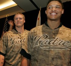
• The new Sunday camouflage uniform: The new camo features an up-to-date digital pattern, plus they’ve added the American flag to the left sleeve — you know, just in case you didn’t catch the patriotic vibe — changed the cap color, and added a matching belt. I liked the old design better (because I like green), although I can see how the new one is more Padres-ish (because of the team’s long history with brown tones). And the new jerseys definitely look more like military fatigues, maybe because the chest insignia doesn’t contrast as much with the background tone (which is great if you want your uniform to look like fatigues but maybe not so great if you want it to look like a baseball uni). There’s also some question as to whether the new camo pattern might actually be too effective. But whatever — I think camo sports uniforms are always a bad idea, so any before/after analysis here is pretty much moot. Is it good or is it stupid? As stupid as it’s always been.
• The new road uniform: I thought they were going to unveil this yesterday, but they didn’t. Word on the street is that it’ll be revealed tonight, but at this point it’s pretty much an open secret that they’re keeping everything about the existing road design except the “sand”-colored fabric. I count this as a plus. They can call it sand all they want, but it always looked to me like the whole team had pissed their pants, so the move to gray is an upgrade. Of course, now the various sand-colored trim elements (the “SD” logo on the road cap, the MLB logo on the back of the jersey, etc.) have nothing to coordinate with, but that seems like a small price to pay, at least until they wise up and fix them. Good enough.
The new logo hierarchy: The Pads are removing the city name from their primary logo. Looks cleaner, I suppose, although I generally prefer team logos to have geographic locators. In any event, it may not matter, because the team apparently prefers its secondary logo. Now, if you want people to use something else instead of your primary logo, hasn’t the something else become the de facto primary, with the primary becoming the de facto afterthought? The MLB Style Guide hasn’t carried such an unmistakable sign of a dysfunctional marketing department since 2000, when the Mets designated their black alt jerseys as “club preferred,” even though white and gray were still their “primary” uniforms. Mind-numbingly stupid.
Bottom line: The Padres will still look like a middlebrow team with a somewhat squishy sense of identity. I mean, think about it: The most defining thing they’ve got is the camo. That speaks to a really weak design program. Throw in the logo confusion and you have a team that’s due for an overhaul — yet again.
Giveaway reminder: I’m raffling off an official Super Bowl XLV football. Details here.
Uni Watch News Ticker: Who’s that in the Indians jacket? It’s actor Michael Douglas, circa 1980. Not sure what Whitey and Mickey were doing there, or why only one of them had a memorial armband. Spring training? Celebrity softball match? Whatever it is, it’s a good find by Bruce Menard. ”¦ Here’s a good shot of Tigers equipment manager John Hand organizing the team’s uniforms in 1961 (with thanks to Doug Mooney). ”¦ Greg Stamps notes that Josh Hamilton has worn this cap several times during public appearances. “It’s from Broken Arrow High School, just outside of Tulsa,” says Greg. “Turns out one of the Rangers’ minor league hitting instructors is from Broken Arrow and has arranged for Hamilton to meet up with the team on several occasions. So I guess they gave him a cap and he actually wears it.” ”¦ Reprinted from yesterday’s comments: A car salesman in Chicago was fired on Monday for wearing a Packers necktie. ”¦ Yesterday’s Ticker included a mention of Kathleen and Kristen Nash, who play women’s hoops for Texas. As you’ll recall, they have inconsistent NOB protocols. An explanation for that has now been provided by Mike Barnes: “Kathleen used to have a ‘KA.’ on her back last season, while Kristen had the ‘KR.’ Kristen quit the team after graduating last year but came back at Christmas because of team injuries (she still had one year of eligibility). Since Kathleen was the only Nash on the team when the season started in the fall, she dropped the ‘KA’ from her NOB, and they’ve kept it that way even after Kristen rejoined the team.” ”¦ Here’s a rare sight: LSU wearing gold jerseys and white helmets in the 1997 Independence Bowl (with thanks to Larry Huber Jr.). ”¦ Kim Clijsters has been wearing a green outfit in the Aussie Open that’s based on an old Evonne Goolagong outfit (with thanks to Jonee Eisen). ”¦ Speaking of the Aussie Open, you don’t often see tennis players wearing eye black, but Bethanie Mattek-Sands wore it on the court yesterday, along with a rugby-striped top (thanks, Brinke). ”¦New indoor soccer team for Norfolk. “I give it about a season and a half to survive,” says Tris Wykes. ”¦ Kansas State debuted a set of really unappealing gray sweatbacks on Monday night. ”¦ Back in the day, if a team had its team name or city name printed on its jersey placket, then the jersey usually had a cadet collar, which would be buttoned to the top. Makes sense, because if you combine placket lettering with a conventional collar, you end up with something like this (great find by Chris Castellani). ”¦ Ladies and gentlemen, your Tucson Padres. ”¦ New lacrosse gloves for Syracuse and Ohio State (with thanks to Connor Wilson). ”¦ New scoreboard at Miller Park. ”¦ Chad Bengal is changing his NOB yet again. ”¦ Donovan Moore’s ColorWerx site is now featuring a detailed look at the Lightning. ”¦ Attendees at the State of the Union address last night wore black-and-white ribbons in support of Rep. Gabrielle Giffords and the other victims of the Tucson shootings. ”¦ The NFL announced yesterday that the Cowboys Stadium roof will be closed for the Super Bowl. ”¦ Justine DeCotis recently completed three Red Sox DIY projects. “I used felt for everything,” she says. “The shirts and sweatshirts I got at Wal-Mart or Target and I bought the sleeve patch on eBay. I sewed everything on by hand except for the patch — used the machine for that. Spent probably about $30-$40 for all three.” ”¦ We’ve all seen the football centennial logo on college football helmets from 1969. It’s much less common to see it used as a sleeve patch (good finds by Susan Freeman).
I can see why the Pads prefer the secondary logo to the primary: removing the town name from the primary logo makes that look even more like a label for cut-rate laundry detergent than it already did.
Love the Broken Arrow cap!
Most people think of the “secondary” logo first anyway, because it’s typically the hat logo.
That sport has a rather odd way of looking at primary logos compared to everyone else. Think about it, the Yankees primary logo is the thing with the hat on it, but how often do you see that instead of the NY?
Y’know, I’ve always wondered why MLB never ever marketed the cap as a logo of some sort the way the NFL did and – in some ways – still does its teams’ helmets.
True, many teams have multiple cap designs/colors, but they could have always marketed the home cap as the defacto cap logo.
The NFL can do that because they don’t allow the teams to have different helmets for home and road games and alternate helmets (except for throwback games). They are able to base the teams’ identity on the helmet. Some baseball teams have too many hats to do that with.
Horrible idea. A traditional big league baseball cap is supposed to have the city initial on the front. A rare exception or two is OK, I suppose, such as in the case of the Orioles. But I’ve never particularly cared for the Astros’ caps since they dropped the “H” from the front. Don’t even most of the NFL teams with sideline caps use letters on the front and not the team logo? I know the Patriots have had an “NE” on the front of theirs instead of Flying Elvis.
I’m pretty sure the Colts hats have the horseshoe almost without fail.
Yes! The Padres logo is indeed better suited to a brand of soap:
link
Bring back the Swingin’ Friar!
“Kim Clijsters has been wearing a green outfit in the that’s based on an old Evonne Goolagong outfit (with thanks to Jonee Eisen). … Speaking of the along with a rugby-striped top (thanks, Brinke). …”
Fix these links
Done. Thanks.
Do you forget that Evonne Goolagong had a clothing line at Sears in the early 1980s?
link
Yeah I remember that Sears logo. It wasn’t for on-court tho, I don’t think. She had her big success in Fila, tho she wasn’t always with them. Like many players of that era, the hot Italian lines like Ellesse (Evert) and Tacchini (Martina) emerged when the women were already wearing plain, non-logoed and non descript traditional tennis dresses. Once they came onto the scene, players migrated towards them. Navratilova alone was with Tacchini, then Kim Top Line, then Puma.
The football player wearing the Centennial decal on his helmet is tackle Joe Ehrmann of Syracuse University. Big Joe went on to play 10 years in the NFL with the Colts and Lions.
The Michael Douglas picture is from a scene of an old timers game in the movie “It’s My Turn” where he plays a retired ballplayer
Good call Bob!
I found this at the Talking Moviezzz blog:
“…also works as a look at turn of the decade New York. There is a lengthy scene set in the hotel game room. This is a fascinating time capsule of an arcade pre-Pac Man that I loved to see again. There is another trip to an Old Timers game at Yankee Stadium where former baseball greats Mickey Mantle, Roger Maris, Whitey Ford and more are shown playing the game.”
link
I’ve always wished Chad LookAtMeCinco would be traded to a team that already had a #85 who would refuse to give up the number. Maybe Chad knows his days of wearing ANY number a limited and is just looking to stay ahead of the curve.
I thought the funniest line in the article was “Johnson originally gave himself the Ocho moniker.”
Say what you will, but he keeps the No Fun League interesting. He’s fun to follow on Twitter, and yes, he does some idiotic things, but at heart he seems to love playing the game.
He lives in a modest home in a Cincinnati suburb and drives a Mercury Marauder. He’s certainly no Pac Man Jones.
He’s still an #1 or #2 receiver at best (ranked 31st in yards this season, and there’s 32 teams.) but plays in a truly dysfunctional system in Cincinnati.
Someone really needs to remind the Padres that putting a flag patch on the sleeve of a jersey is a form of flag desecration. For almost a century, the U.S. Flag Code has been the universally accepted standard of flag etiquette and respect for the flag; putting a flag patch on a jersey explicitly violates one clause and implicitly violates at least two other clauses of the Flag Code. Here are the relevant sections of the U.S. Flag Code:
UNITED STATES CODE
TITLE 36
CHAPTER 10
§176. Respect for flag
(b) The flag should never touch anything beneath it, such as the ground, the floor, water, or merchandise.
(e) The flag should never be fastened, displayed, used, or stored in such a manner as to permit it to be easily torn, soiled, or damaged in any way.
(j) No part of the flag should ever be used as a costume or athletic uniform.
Is there any chance that a player’s sleeve will touch the ground during a game? Is there any chance that a players’ sleeve will be torn, soiled, or damaged in any way during a game? Is a player’s sleeve part of an athletic uniform? If you can answer “yes” to any of these questions, then attaching a flag patch to that sleeve is flag desecration. I don’t care what your intentions are; desecrating the American flag is not a patriotic thing to do, and it does not show honor or respect for the men and women in uniform.
Is it a flag or is it a depiction of a flag on a patch?
Bingo. I don’t like flag patches, but let’s not pretend that flag patches are actual flags. That’s like saying the ‘Countries of the World’ laminated placemat I had as a kid qualifies as flag desecration. If you cut up an actual flag to make TV numbers for a football jersey, now we’re talking.
I have that placemat! Also have “Our Solar System,” “The Human Skeleton,” and several others. Makes for much more enjoyable dinner parties.
I can’t read the phrase “Our Solar System” without hearing it in Ben Stein’s voice. Thanks for that.
As for the Padres’ new look: Removing the city name from the logo creates the suspicion that the franchise could be moved. In San Diego, where the Chargers are constantly rumored to be moing to Los Angeles, I’m not sure that’s a good idea. I never had a problem with the tan “sand” roads; if you’ve changed enough diapers you know that’s not the color of pissed pants. If they wanted to remove all doubt just make the roads gold as they were in 1972-73.
I must admit a small soft spot for the Fathers as I played on a little league “expansion team” by that name in 1969-70. No fancy unis – just brown t-shirts with “PADRES” and our sponsor’s name on them – but I did get a kids’ sized replica of the solid brown cap with gold interlocking “SD.” Nostalgia for that prompted me to go out and buy a Cooperstown replica of that lid recently (adult sized of course).
The code says that any depiction of a flag is to be considered a flag, so it doesn’t matter that you can’t hoist a flag patch up a pole. It’s also unlawful, rather than illegal, so you can’t actually be punished for it. Outside tort law, the difference there is basically a matter of cognitive dissonance for lawmakers, so don’t ask for an explanation other than “unlawful means it’s not allowed but you can’t be punished for it.” This is something that’s been discussed many times and will come up many times again after this.
Flag Code also specifies that military and other patriotic uniforms are exempt from the rule against putting flags on clothing.
e) The flag should never be fastened, displayed, used, or stored in such a manner as to permit it to be easily torn, soiled, or damaged in any way.
___
By that logic, it shouldn’t even be on our own military uniforms. As much as I don’t like the flags being on sports uniforms whether in patch or sticker format, flag code isn’t the issue. It’s a patch, not a flag.
How’s this for flag desecration …
link
?
Took that a couple of years ago in SD.
I don’t know, I think that uniform is clearly in distress.
Maybe it wants to secede?
I don’t understand the logic behind the “but it’s a flag patch, not a flag” argument. For one thing, anything that you attach to a piece of clothing becomes a patch, so this is an argument that is obviously self-negating on its face. For another thing, what exactly do people think a flag is? A flag is just a symbol. So when you create a drawing or an embroidered patch that sufficiently resembles a flag such that an observer would know what your drawing or your patch refers to, you have not created a symbolic representation of the symbol of the flag. You’ve created a flag. Arguing that a flag patch is not a flag, and therefore it’s OK to stomp it into the mud to demonstrate your patriotism, makes exactly as much sense as arguing that typing the letters “flag” doesn’t really make the word “flag,” it just makes a symbolic representation of the word “flag.”
When you make a symbol of a symbol, all you’ve done is make another version of the original symbol. If the original symbol is a flag, the secondary representation of it is … a flag.
Paul, I’m pretty sure you have written about LSU wearing gold jerseys against Notre Dame before. Interesting that they were the road team in that game, though.
gold?
aren’t they yellow…
I’m not going there today.
Me, either.
Because, as everyone knows, all reds and blues are the same, too.
And sometimes navy blue is black.
—Ricko
Looking at the standard game-view, they look like Tennessee. It’s not until you see a close up can you really tell that it’s someone else, at least in 1997 lo-def.
I thought the same thing- looks like Tennessee. Kind of like when Florida dressed up in their pro combat costumes and looked kinda like Georgia on certain TVs.
My thoughts as well
I got it!
Say yellow and orange are neighbors, and there’s a fence between their houses. On one side of that fence is athletic gold, and on the other side of that fence is Tennessee orange, two colors that are both ‘redder’ than yellow, and ‘yellower’ than orange.
link
Precisely.
Just as Air Force Blue lives between Royal and Powder/Columbia Blue.
And Burgundy, Crimson and Cardinal live on the block between Scarlet(Red) and Maroon somewhere.
—Ricko
That’s exactly why I hate seeing the metallic shades referred to with the same name. Vegas gold isn’t even on the same street. Even the non-metallic equivalent is more of a light brown, it’s not in the same range as the yellow-orange-red group.
/so much for me not going there today
And that’s why I say that here, of all places, we might as well go with something close to what catalogs call them (and have called them).
Not so much because we have to precisely describe the color, but to communicate back and forth. It doesn’t take a ton of effort type “Vegas Gold” or “Old Gold” or “Yellow Gold”. We are nit-pickers by nature, marveling at minutiae, getting chest deep in it. How hard is it to say, “LSU in their light golds”? and recognize that gold is a school color, instead of insisting that they somehow screwed up and are wearing yellow.
Don’t know that it’s our job to re-define catalog descpriptions that, if we’ve studied things, we know have been around literally for decades.
There’s a “cavlier”ness when defining colors that “rookies” use (calling Ath. Gold “mustard” just because its paired with brown, for example).
We here are, supposedly, the ones who know better.
—Ricko
I’m all for redefining the catalog descriptions if we have the collective power to do that. It was a stupid name then and it’s still stupid now. :P
Honestly I don’t really have a problem with calling the color the by catalog description, it’s just the short name that bothers me. If it’s athletic gold, it’s athletic gold. It’s silly, but that’s the name. Fair enough. Referring to it simply as gold is what drives me mad.
It wouldn’t have killed Paul to have written “LSU wearing ath.gold jerseys”, would it?
I remember watching that game and thinking they looked like Tennessee. Love the gold jerseys, but it’s just not LSU.
As for the Padres, I always wondered why they didn’t just go with navy blue and gold as a take-off on the Navy, which is so prevalent in San Diego, and the Chargers. Maybe throw some scarlet in to honor the Marine Corps. Many Navy and Marine Corps ribbons are blue, gold, and scarlet, one color representing each service and the third color (gold) being shared by the two services.
link
Let’s add to the confusion:
VMI’s school colors are red, white, and yellow.
Here’s the football team:
link
See last page on VMI colors:
link
Ah, nice. Is that the first example of GFGS?
it does show how teams have constantly moved from 5-crayon gold to jewelry gold and back again as if they were the same colour throughout the years.
Speaking of the Padres, and the link for the new Tuscon Padres logo in the ticker… isn’t there something fundamentally wrong with your franchise when one of your minor league teams, using the same team nickname, has a better logo than the parent club? I DO like the fact that they are using one of the old “Padres” scripts. I think more farm teams that have the same name as their parent club should do that. I just think that in this particular case, San Diego should be using the better logo design, not Tuscon.
I guess Tuscon’s uniforms haven’t been revealed yet, but something tells me they will also look better than San Diego’s. Of course, at this point, that wouldn’t be difficult to do.
Remember, “better” is subjective.
I don’t think either logo looks very good, honestly. They’re both attempts at being regional and neither one really has anything to do with the team’s name. You could literally put any name you wanted there and it wouldn’t really look any better. I guess it’s fine if that’s what you like, but it really isn’t my cup of tea.
Well obviously I like it. Sure, it’s subjective. I do like your point that they are more regional than actually bringing out the fun of the nickname. The swinging Padre? That was fun. It’s sort of like colleges (or even pro teams) that resort to a sterile letter to act as their primary logo. And hey, my college team is one of the offenders, I admit. But as we’ve lamented plenty of times on here, we are continuing to sacrifice creativity and personality in these logos, so all teams can have this certain standardized, “modern” look (I really hate the term modern).
Not to mention that the Padres likely will have a camo set forever.
How, exactly, do they ever stop wearing them without there being some sort of PR flap?
—Ricko
A complete and total redesign?
How about “We’ve come to realize that the camouflage jerseys look like complete and utter crap, so we’re going to stop wearing them. We will, however, continue to support our military with special promotions throughout the season and a percentage of our merchandise sales….blah blah blah…”
How, exactly, do they ever stop wearing them without there being some sort of PR flap?
Exactly the same way they stopped wearing their tan uniforms, which were themselves a tribute to the U.S. Navy. All they have to do is simply stop doing it, and the less they say about the decision, the better.
But the camo jerseys clearly sell well, and that, not fear of some kind of fictitious PR disaster, is what will keep the Friars in camo forever.
Yeah, you’re probably right. One team could just stop.
Isn’t quite the same as abandoning the MLB-wide patriotic headgear on Indepedence Day, et al.
—Ricko
Question.
I thought the “sand” unis were part of the Surf & Sand look of the new logo, and Surf & Sand certainly is appropriate to San Diego. As has been noted here before, sometimes uni colors are about geography/climate, not the nickname. Original Seahawks and Bucs, to name two.
Did they say it was tribute to the Navy?
Cuz, y’know, the Navy Blue probably was already enough.
—Ricko
Let’s remember that the Tucson Padres are a temporary team, owned by the parent club, with a limited time span of just 2 years before they will move to Northern SD County in 2013. I am guessing the jerseys will be very similar to the parent club or just plain in general because, unfortunately for the good people of Tucson, that team will not be around.
I also invite Paul out to SD sometime to a Sunday Padres game to see the uni’s in action, to see the Marine recruits and their DI’s in the stands, and a few other unique SD aspects. I will even treat for the fish tacos…We may make a convert out of you yet.
The big club’s uniforms drive me nuts. Glad they got rid of the sand, but overall, I don’t like them, or the camo. As for the Tucson Padres, I think it’s brilliant for them to bring back the 1984 script using the current teams colors. I suspect the Padres might be using the Tuscon club as a test case for eventually switching the big league club logo. If they’re not going to go back to the brown, orange, and gold that everybody loves… using the current colors and the old script is next best thing. If the Tuscon logo is a success, which I think it will be, I don’t think it’ll be long before the Padres change their look yet again.
Brady, you touch on an interesting point. While Paul talks about an iconic look, I think most of us most associate the Ray Krok-era brown, yellow & white McUniforms with the team, regardless of all the tinkering since then.
So I say, you want recognition? Do this:
link
I still miss the Portland Beavers.
If Norfolk’s indoor soccer team lasts a season and a half, that will likely be longer than Virginia Beach’s UFL team will last…
Sorry if this was already covered, but it looks to me like the Padres are using a slightly darker shade of blue as well.
I actually liked the sand colored unis though. It somehow worked because it was San Diego and that lead me to think of warm weather and beaches.
The shade of blue is unchanged — still the same Pantone number. Any variation that you see is just a computer thing.
Any idea when we can expect a picture of the new Pads hat? Is it brown? A brown hat back in the big leagues seems even more noteworthy to me than another camo uni.
If the Padres were going to redesign the camos, why not add the “grey” US flag, like the troops have?
link
link
Actually, it’s foliage green, not grey, and it is only worn in the field. They wear full color flag patches the rest of the time. The field patch also has infrared properties designed into it, it essentially “shines” when subjected to IR light, as an IFF (identification friend or foe) feature.
so…it’s kinda like a bullseye, then?
If you have to have it for IFF purposes, I suppose it’s better to put a target on your shoulder than your head or your heart.
Today’s post is a great reminder of what a colossal mess the Padres visual identity has become. At this point they couldn’t possibly look more minor league, from the laundry detergent logo to the crappy wordmarks to the blah uniforms.
It’s funny that the NL West has two of the very best uni’s in the game coupled with two of the absolute worst.
Hell, THREE of the worst! I completely forgot about the Rockies.
Yeah – having the Padres and the Dodgers uniforms in the same division makes it the worst uniform division in baseball.
i think he was talking about the giants
Can’t be the Giants, they have those cool striped socks, remember?
It’s the *other* Giants who have the bad uniform.
“they have those cool striped socks”
If only.
mother of corn jeffers, do you like anything?! seriously, you bag everything except colour on colour(which i like), and perfect sterile symmetry(which works often, but not universally). does your world have chirping birds and women in sun dresses or is your life completely filled with kicked puppies and hemorrhoid cream? did someone get all link on your eyeballs? the tuscon’s are a turd sandwich because it is regional? what the heck does that mean? then we have a sarcastic it couldn’t be the sf-giants because of stripes, so stripes are out too evidently in the jeffer world. i could go on for days. is there a jeffers template we can use for design for now on? and you said i am unbending and frustrating(on ONE topic mind you) so what is a good uniform or logo or even catsup bottle design in the world of jeffers? we know what you hate, and that is everything. so what do you like man? what. do. you. like?
Note: My previous post regarding the Giants was not sarcasm.
Also, just because I tend to excessively point out the small flaws in things doesn’t mean that I hate those things.
…and it’s spelled ketchup, and I prefer squeeze bottles rather than the glass ones that take forever to pour.
Amen on the squeeze bottles. Especially the ones with the new cap designs that use capillary action to prevent overflow.
although it is spelled ketchup, there is nothing wrong with the glass bottles — you just need to know how to tap the bottle properly* and the stuff comes out just fine
*tap the bottle lightly and repeatedly on the NECK, not the bottom
Nope. You tap the bottle right on the embossed “57.” That creates an air bubble, which releases the ketchup.
Seriously — it’s designed to work that way.
And you look darned cool doing it, to boot.
“Catsup” is still proper, I believe, though contemporary labels have obviously gone over to “ketchup.” Certainly the bottles said “catsup” during my childhood (Russo-Japanese War). Any Brits out there to tell us how the product is spelled in Blighty?
I like Jeff’s chronic pickiness and I also like Robert’s exasperated broadside.
jeffers~
yeah, there is nothing better then that gunk on the top of the squeeze bottle at the diner because the guy who was there before you is a pig. if you hit the (glass)57’s, or keep it at room temp it comes out easy, but whatever, it’s catsup, i buy a bottle every three years, so who cares. but speaking of catsup, it is acceptable to be spelled both ways clown. you choose to fribble it K style, and that is fine, i don’t. how peeeerfect that you you chose to latch on to that, and crit.
i knew you were not being sarcastic, but i chose to give you the out because i am a sweetheart.
“just because I tend to excessively point out the small flaws in things doesn’t mean that I hate those things.”-yes, we should always accentuate the negative because that is most important. it is so ironic for someone who likes to bag the old man faction/traditional/olde school for being close minded. you are the grumpiest i got coal in my stocking and not rainbows in my cereal guy ever. what do you like man, put your stamp on anything jeffers.
your damn right! glass bottle ketchup is the best ketchup, well besides mushroom ketchup.
here’s where i tap…
is that not the neck?
you can also tap “higher” on the neck depending upon the amount of ketchup leftin the bottle and the angle…but for a “fresh” bottle, that’s the spot
*NEVER* tap the bottom of the bottle
In my world it’s neither “catsup” nor “ketchup”, but rather “tabasco”. Easy to pour too.
One time I was shopping in a different grocery store, and looking for ketchup. Luckily, the shopping cart had a little aisle guide/list on the child seat, so I searched for ketchup. Since ketchup is a very common product and the list was in alphabetical order, I figured it would be a 2 second search. But after a minute, I realized “ketchup” was nowhere to be found on the list. However, “catsup” was listed right there in the C section! I know that’s a cute nickname for it as a kid, but never did I expect it to be formally listed that way. One could search for “mustard”, and hope the ketchup is in that aisle, faster than figuring out one needed to search for “catsup” on that list.
I order my hot dog with ketchup already on it, so I don’t need to worry about tapping the bottle.
/cue the Clint Eastwood youtube, Phil…
I do like a squeeze bottle, though, for when I get the big fries at Whitey’s in Richfield. There used to be a co-worker of mine who pick up a fry, squirt a line of ketchup on it, eat it, then repeat. Now any time I go there I end up doing the same thing.
“I order my hot dog with ketchup”
BLASPHEMER!!!!!
Well, these days the first choice is stadium mustard, but the 2nd dog gets ketchup.
colorado G~ i was just conversating with the island on how i use catsup when i have it but never buy it, but i do go through better then a bottle of tabasco a week. soup has nary met a better friend.
skinned tiger~ you a smart man, catsup has many forms, and tomato was the last to take hold in the states, too exotic for late 19C palates, shroom was the most popular. i swear i just saw some burt wolf BS on this subject, and i never watch that troll.
broadway blue~ true enough, we need all of our cartooned selves to make this an interesting conversation, which is why i gave the cat a pass for the longest. i just hit a snapping point after complaining about yellow, stripes, and regional design. it’s the same way people give me crap, sometimes this battleship needs it to make sure the rudder is right.
You are elite, thirty-three-and-a-third, and indispensable (around here, at least). By the way, your fabulous custom bobblehead still dispenses grace from the top of the armoire, and the girls still ask for “the guy” so they can ask him Magic-8-Ball style questions….
i am as dispensable as they come, but thanks. i was at an artist friend’s last night, and he cares nothing, less than nothing, for sport, but like most of my friends like that, he is fascinated by the bobbles. anyway, i showed him some of the more off centre videos, which of course made him laugh. but then i told him that they are not all that nuts, it depends on the patron and what their reason was for wanting one, so i showed him the “oh my papa” to articulate the more sentimental angle. and i love that they magic 8-ball the thing, maybe i should instal magic 8 ball answer thingies in the base. that would be super swell.
You’re not the only who was on the snapping verge, especially after a certain argument put forth yesterday that gold is yellow because a box of crayons says so. I guess the 49ers wear “flesh-colored” pants then, which would be news to some of their players.
what in the hell are you talking about? i am pretty sure i said something about how we don’t have a 5 crayon box when we are talking about uniforms, so only saying yellow because your little squirrel sized pea-brain hasn’t gotten past the 5 crayon box of colour definition is ridiculous. but why quote me accurately when you can take a pot shot, right? i am pretty sure i didn’t say we call it whatever shade because crayola told me so G-money.
then again, i am not sure what side of the yellow is gold, gold isn’t yellow spectrum you are on G, so the whole accurate thing is a little pot and kettle here on my part.
You misread the post; I’m on your side. I was quoting The Jeff from yesterday and trying to take a shot at him, not you. Here’s what I meant to say:
THE said yesterday that any five-year-old with a crayon box could tell that “gold” is really yellow. My point was, if the crayon box rules, then the 49ers must be wearing flesh-colored pants. Remember the crayon color called “flesh”?
Oh, and I think LSU and USC wears gold. As do the Fighting Irish, UCLA, and the 49ers.
sorry i was working on something else, and should have seen the “yellow for gold”. i kind of knew that i was making a mistake as i typed, which is why i pot-kettled there. i had a feeling i was battleshipping a tug boat and not an enemy sub, i owe you one.
Really liked your post at 1:18, by the way.
But I don’t like the tug boat analogy. Prefer to be a DDG or CG.
ha! i didn’t necessarily like the analogy either, but as long as you are not on one of link, any ship is good. alright, i’ll stop annoying everyone and get some work done.
I’d rather be a tugboat.
link
Best show ever.
nice pixture vilker. i refuse to address your frankfurter issues, but even though i am a swensens or hamburger station guy, i’ll give you props on whiteys, that’s pretty darn good eatin’.
Ever try the Coliseum Fries? Whitey’s chili and melted cheese on top. Mmmm.
I was on that boat, by the way, when it made a stop in Sandusky.
I just noticed this morning that the negative space between the hypercycloids in the Steelers logo looks like footballs. In the limited research I did this morning I saw no mention of it being intentional, so it’s probably just coincidence, but I though it was worth mentioning.
Especially because that logo was the logo for, I believe, Republic Steel, which the Steelers sort of “borrowed” originally for a game or two (I still don’t believe we’ve ever have heard the real story on that, btw). The first version just said, “Steel” as it did in the coporate logo.
“ers” was added later.
—Ricko
Crap. This should be here.
Scroll down a bit…
link
and here…
link
wasn’t it U.S. Steel, Rick?
Actually was neither, apparently. Was a logo for the steel industry, but Republic co-owned it (according to the first Wiki link, anyway).
—Ricko
isn’t “hypercycloid” a GREAT word?
Scroll down a bit…
link
Check out this Buffalo Bills jacket (and laugh at the guy while you’re at it)
link
Considering the picture shows Lofton burning Deion Sanders, if I were him I’d be happy to sign that jacket, no matter how crazy the guy inside it was.
Paul said: “Bottom line: The Padres will still look like a middlebrow team with a somewhat squishy sense of identity.”
Bingo. I was a Pads fan from day one because of their colors and pretty much liked most of their brown/gold iterations (okay, the all-mustard tops/pants combo was garish), so its no mystery that my rooting interest in the Padres ended when they abandoned those colors.
-Jet
The brown/gold (wait, is it yellow?) combo is probably not considered by many to be a great color combination, in and of itself. But, it was unique, and that was something the Padres had going for them. With a little creativity it can work. Now, they are just another team using a shade of blue. Blue (and red) is so tired in baseball, and this is coming from a Braves fan. I just wish they hadn’t shat on their history to reflect “marketing trends” or whatever nonsense.
I think brown and gold is a stunning color combination. One of my favorites. Shame that it’s not being used in pro sports.
Right on. Brown can be good. Besides widely acclaimed brown-and-orange, brown-and-green can look great, and the mighty Jumbos of Tufts do a pretty good job with brown-and-more-or-less-light blue.
By the way, the SD brown originates in the color of he cassocks of the Franciscan priests who founded and ran the great chain of California missions. Francis of Assisi chose brown, but for reasons I can’t remember. To look “dirt poor”?
The 21 missions along El Camino Real (the “royal road” or “king’s highway” or however it specifically translates)
Don’t know if it’s still there, but in the “museum” at San Francisco’s Cliff House (I think it is) there are(were) dioramas with scale models (a bit smaller than HO gauge, I’d say; more like TT) of all 21 one of them. Some, like San Juan Capistrano, were rather large; some quite tiny (San Luis Obispo for one, maybe?). I like that kind of thing, so for me it was fascinating. Especially to think that some many sprawling California cites sprang from those adobe structures.
Plus, I was a kid, so I imagined Zorro riding around at the time.
—Ricko
Connie – the Franciscan habit isn’t always brown, it can be grey or even off-white (unless you’re talking about my buds in the O.F.M.Cap., in which case cappucino brown is mandatory). Franciscans wanted to emphasize simplicity in their attire.
What’s funny is that Giovanni Bernardone got the nickname Francesco (anglicized to Francis) because of his pre-conversion love of fancy clothes from Paris. The name is really “Saint Frenchy”.
Good stuff!
Additionally, I’ll have to disagree with Paul about the sand road unis. They were different, and I liked that. I’m not a hater of road grays by any means, but I appreciated the Pads trying something out of the box, even if the constant color changing was a bit stupid. Now they only have the camo to set them apart, and as others have iterated… barf.
Also, the tan roadies did not even remotely look like urine or pee. Seriously, if you think that color of tan looks like your urine, even a little bit, you need to get yourself to the emergency room, stat. You are probably very, very sick. And it’s almost funny to hear people diss the tan roadies as urine-colored in one sentence and then wax nostalgic for the brown-and-yellow unis in the next. We’ve all actually seen a toilet before, right?
The shame of it is that the new brown alt cap, if I’m seeing that image correctly, would have looked great with the tan roadies, and that basic color scheme – dominant brown with secondary blue – would have been a terrific, unique color scheme for the Friars.
Also, the tan road pants would look a lot better than either white or gray with the camo alt jerseys. Just look at how much better the jersey looks on Matt Latos on the unveil on account of the tan pants he’s wearing.
Isn’t there a petition somewhere to bring back the taco caps that specifically mentions that they’re great because of how ugly they are?
I want the taco caps back!
I agree brown and (yellow)gold is a good combination. It’s classy on a UPS truck/uniform, and it was classy with the Padres. Throw in the orange trim and it was even better.
link
That being said, I liked the use of “sand” for the recent unis. But I don’t like anything else about them. The font and the “SanDiegO” look are annoying. Just do the interlocking SD on the side.
Hmm, wonder what the ’84 unis would look like in sand instead of brown?
I do agree with the title of today’s piece. Bring back the friar. If they’re trying to distance themselves from him, then they might as well change the name while they’re at it. I hope they don’t, but why use a wave for your logo instead of the friar?
Mmmm – meat/oat filling taco caps!
A few ways to go about the script & trim:
link
Tho I think any rule for future Padres uniforms:
-brown as the primary color (pair it with white trim, gold, Metallic Gold, Athletic Gold, orange or sand; whatever)
-swinging friar
-interlocking SD
-no Dodger-esque scripts, colors or mannerisms
-no BFBS ’cause brown is close enough to black
Everything else is good to go from there, otherwise they’ll look like some generic team with no sense of real team history.
sweet job, mark!
btw…check your email
Good stuff – especially the one on the right.
The question about the interlocking SD is whether the S and D should be colored the same or differently. I thought the use of different colors for the two letters was a pretty good look.
BTW link has some hilarious comments about the great “conference family portraits” that were on this site last week.
Those are great!
Although…I always thought that jersey was best as a pullover. That d gets broken up on a button-down. Still better than what they have now, though!
/and if they add oats, that makes me like the Bell even more…
Agree with Jet: I’m a long-time Padre fan (living north of the border, no less – no it wasn’t easy getting Padre news in the early 80’s but I digress…).
Anyhoo, as a uni-lover, I was drawn to the uniqueness of the brown uniforms. I lost a little bit of my fandom when they switched to navy/orange and although the navy/sand was a little better, they simply need to get back to brown.
I’m sure they went away from the brown because of its lack of marketability, but I look at it more from the angle that it would make them stand out more. I understand the new logo echoing the ‘feel’ of SD with the sand/sky blue, but the brown just says ‘Padres.’
I liked the brown/orange pinstripe uni’s of the mid-80’s – simple and the colours weren’t as garish as the earlier McDonald’s jerseys from 1984. Also – and I think this is what they were trying to do with the ‘sand’ road uni’s – the grey road uni’s with the brown pinstripes gave the impression of sand uni’s without actually being sand coloured – I liked that. The other cool thing was that they had a Padre wordmark on the home jerseys and used the SD insignia (which is good) on the roads. If they’re so hung up now on using the SD, they should use it on their jerseys, preferably the roads because they’ve never had a good-looking San Diego wordmark…
Even better than the brown/orange/pinstripes however, would be these uni’s:
link
I would LOVE to see them go with these and change their logo back to the original friar (the new one is kinda lame). Their look would be unique and distinctive – be proud of the brown colour scheme, kinda like the Cleveland Browns… right?
Memo to the Padres: grow a set and get back to brown already! Geez.
Have to disagree. The brown was discontinued for a reason, it looked terrible. It went out of style with pillbox caps and disco. Frankly I also disagree with the concept that the Pads don’t have an identity. Their current “sand and sea” concept is very representative of the city (which is why I’m sorry to see the sand lessened by the loss of the sand aways). Not to mention all versions of their uniform look sharp even the new grays. The camo in particular are a very fitting tribute to the team of the military.
Now don’t lump disco in with those pillbox hats…
They do have an identity crisis. The name is “Padres,” but they dress like sailors…especially when they go camo. Maybe they should be called the Chaplains. When they wore brown, they identified with their name.
The Astros are another team with an identity crisis. If you want trains in the outfield, change your name to the Engineers. Better yet, keep the Astros name and go back to your old unis.
I don’t really remember the Padres in the old brown and mustard, but do remember the pinstripes that Gwynn used to wear. That said, I don’t mind the current Padres navy blue and sand combination. Sand was a unique road color that fits the city name, and the home plate logo is ok too. Joining the road grey crowd doesn’t help them though, so I’d rather they kept the unique sand road uniforms.
The brown/gold pinstripe unis, the last ones they wore in those colors, were classy. And I will add that I do like the new interlocking SD logo a whole lot. I would just like it more in brown and gold!
-Jet
Always liked those brown and orange unis, with the malted milk ball beige roads…and the brown cleats. Unique, they were.
Never quite understood why they were so horrible the club felt they needed to switch to PCL Padres navy and orange.
—Ricko
although i consider myself a traditionalist with uniforms, i really liked the sand look (only for 1 team). i also would like to see them go back to the brown look too, but im sure fans would rather buy navy merch then brown.
I don’t think there’s any mystery about it – brown wasn’t a very fashionable color in the late 1980s and early 1990s. Navy blue was in for merchandise, brown was out.
Pretty simple, really. Team history and identity lost out to merchandising.
and NIKE must’ve been involved somewhere.
Just saw two interesting points at the bottom of this blog. Dont know if its true or not. Does anyone know anything about this? link
Well, the potential pro combat uniform got a mention on the ticker here a couple days ago. We don’t really know if it’s legit or just a fan concept though.
I don’t know anything about the basketball uniform.
Of course the roof to Cowboys Stadium will be closed for the Super Bowl. It’s ALWAYS closed for games. No matter how nice the weather is, it’s never nice enough for the game to be outdoors. Temps for the Cotton Bowl were about 60 degrees–and it was closed.
Geez.
It was extremely nice weather (maybe 75 or 80) when the Super Bowl was in Houston – and the roof was closed. We were supposed to have sky divers as a part of our (I say “our” because I was in it) pre-game show and they had to jump dive from the rafters. This is an NFL control thing!
What a waste. Why even bother with a retractable roof then?
ctually, it was open all day until just before we pulled the pregame show stages in…. And I can say the Houston roof is open quite a bit – just not for a Super Bowl.
I think the MLB pulled similar shenanigans for our World Series. We wanted it open – and Astros fans felt like it took away our home field advantage (not remembering exactly what because a home field noise advantage doesn’t really make sense for baseball…) and made us do the opposite. Oh, quick googling tells me we had a better record with the roof closed. We all thought it was a blimp thing…
i thought it was roidger who demanded it be closed
prolly cuz he was sick of seeing his heaters sail over the choochoo
It came directly from Selig… it was exactly then I signed the petition!
Oh…. ha ha. The Rocket is dead to me!
Well to be fair, it’s probably going to be a bit cold to have the roof open, especially for an evening game. Temperatures here in Dallas are running 50’s for highs and 30’s for lows, so there’s a good chance game temperatures would be in the 40’s unless we get a warm front (which is certainly possible). The sun will be down by the middle of the first quarter, anyway.
They played the Sun Bowl in 36-degree weather and no one called for a retractable dome…
40s aren’t cold…they’re cool. 30s are brisk, 20s are chilly and teens and below are cold.
Jim, I understand that 40’s aren’t what a lot of people would consider cold. What I’m saying is that there’s no way the NFL is going to leave the roof open with temperatures in the 40’s.
Don’t get me wrong, I’d love it if they left the roof open and let a bit of weather element factor in.
I’m with you. I was directing that more at the NFL than at you.
Some of my favorite Super Bowls were the ones played in the south where the weather didn’t exactly cooperate.
Can’t charge those kind of dollars and have the spectators uncomfortbale and not cushy…. that is directed to teh NFL.
Funny, I was researching 1969 newspaper on microfilm last night regarding the College Centennial and they were commenting how tickets prices were so high in comparrison with that first college football game. If they only had known…
Well then they better get busy building a roof over that stadium in New Jersey.
Man…how are they going to get to roof to close on on the Meadowloands for XLVIII?
wow…can’t spell today…”The Meadowlands”
Anesthetize us from wind and rain and snow and sun and clouds big and small, protect us from birds and planes and starlight and meteors, fresh air, and the angels above who may peer down on our spectacle and curse us with hurricanes, tornadoes and floods.
Indeed. Let us practically feel the controller in our hands as we face our TVs. Make our thumbs twitch, craving the action of the far more exciting antiseptic world of Madden, where such antiquated factors as natural elements and human error have been eliminated in the quest for true gaming perfection.
—Ricko
quote of the day
Hey Justine, loving the Sox away hoodie! Great job.
Yankees signed Bartolo Colon to a minor league deal. Might he have more pinstripes than Sabbathia?
Doubtful, unless Bartolo’s REALLY out of shape. BTW, with the signing of Colon and Mark Prior, the Yankees are shaping up to have a pretty decent rotation . . . IF IT WAS 2003!!!!!!
Bartolo is listed as 245lbs on the ESPN website. While he weighs considerably less than CC, he is also considerably shorter in height. He’s got a chance…
Bartolo is listed as 245lbs on the ESPN website
~~~
how about an actual scale?
1. These license plates are BORING!
2. It seems unclear … what are they for again? The Cubs? The CHICAGO CUBS? CC … is that on there as a subtle reminder these plates are to support the Chicago Cubs, by any chance?
link
the Kennesaw State Owls wore light blue uniforms last night against ‘rival’ Mercer. For Prostate Cancer Awareness.
Here’s the link to the announcement:
link
and here’s the link to the photo gallery for the game:
link
Kim Clijsters doesn’t look very pregnant in those pictures.
– Todd Woodbridge
As a Padres fan, I would love them to sell the camo jerseys as a souvenir jersey and give the profits to a military charity, but not have the team actually wear them.
Uni Watch…come for the uniform talk, stay for the catsup/ketchup debate.
Is it just me, or does the Padres new road “grey” look a bit blue?
link
It’s curious that Paul’s style-guide picture shows the gold SD on the navy cap carrying over to the gray uniforms, while this picture does NOT.
To take Ricko’s Denver Bronco hypothesis out of context, “If the [Padres] went through the trouble to remove all the [sand] from their uniforms, why on earth would they keep one little bit of it when that could have been changed too?” I’m siding with the picture.
Arizona unveiled their new uni’s. Even though the design floated around, here is an actual photo.
link
I know it’s important to protect logos, etc. However, Donald Driver of the Packers is raffling off a pair of tickets to the Super Bo..(er…Big Game)via the Celebrities for Charity website.
Is it imperative that they alter the picture of Donald Driver – covering up the logo on his helmet? I guess I’m really just wondering if the Packers or the NFL would be that litigious to worry about this one image shown on a charity site.
Maybe I’m naive, maybe I’m just crabby, but it irritated me.
link
what the hell year is that photo from? da bears in monochrome bla…er, midnight blue? 2006?
Had to be from Chris Harris’ previous term with the Bears. The white/white, blue/blue look is bad for the Bears….Especially the white/white.
Enough already!
The new Padres cammies are actually replicated from the current USMC digital camo (MARPAT) pattern used in the current campaign in Afghanistan. The Padres actually got the rights to use the pattern from the Marine Corps, as per an article in today’s San Diego Union Tribune.
It’s rather obvious you never lived in a place like San Diego County, Mr. Lukas. We have both Marine and Navy bases and personnel who call our county home, and this is the Padres way of saluting them.
My father was a Hospital Corpsman in the Navy for twenty-four years (1959-1983). He did time in ‘Nam; served at NAS Imperial Beach (long since closed), Oakland Naval Hospital, Bremerton Naval Hospital, Balboa (San Diego) Naval Hospital, and Camp Pendenton Naval Hospital (plus overseas and at sea); and retired as the Command Master Chief of Lemoore Naval Hospital. Every year, he asks about any changes in the cammies…he thinks they are rather cool.
The cammies, to me, remind us that life is not all fun-and-games, even as we gather to watch “grown men play a child’s game.” Better the cammies than having somebody trying to sing our national anthem in a cat-like screech that could sterilize toads at two hundred yards!
FYI:
If there is a uni of the Pads that I detested, it was the road uniforms from 1987-2002. I care not for grey uniforms, as they are boring. Some teams (like the Yankees, BoSox, and Detroit) look good in grey. Other teams, not so much.
In fact, it was said the reason the Pads switched to navy blue from brown was to change the away unis to grey from the brown ones they were wearing since 1983 (light brown unis with brown/orance pinstriping and an intertwined “SD” on the left chest. I thought that looked pretty cool).
And now, the Padres want to ditch the sand road unis for GREY? Talk about a wrong-way “Back To The Future!”
Even though we disagree about the camis, I still enjoy your column. Keep on writing!
–RKJ
>It’s rather obvious you never lived in a place like San
> Diego County, Mr. Lukas. We have both Marine and Navy bases
>and personnel who call our county home, and this is the
>Padres way of saluting them.
And it’s obvious that you’ve never lived in New York City, which has several military bases of its own (including one in Brooklyn, where I live).
Yes, duh, the Padres are saluting the military. Thanks for explaining that. Nobody needed to have that clarified. The question is whether camo uniforms for sports teams are appropriate. Some folks think they are; I don’t.
Every city has its industry. Detroit was built on the auto industry, but the Tigers didn’t dress as car salesmen, or mechanics, or auto assembly line workers. Milwaukee was built on beer, but the Brewers don’t dress as bartenders.
As I’ve said before and will keep saying, if baseball wants to honor the military, the best way to do it is with throwbacks based on the military baseball teams back in WWII. That way, you’re not just telling a military story — you’re also telling a BASEBALL story, a story that tells people about the sacrifices made by ballplayers who gave up their careers (or portions thereof) to fight for their country.
More educational, more appropriate, less jingoistic. Done and done.
For more info, see this column I wrote in ’09:
link
The attached link contains old Boston College football pictures. The first picture is from a game versus Penn State in 1965. I never new that the Nittany Lions once had stripes on their pants:
[url]http://eagleoutsider.com/phpbb/viewtopic.php?f=4&t=8272[\url]
Here is another thread with some old BC hockey pictures:
[url]http://eagleoutsider.com/phpbb/viewtopic.php?f=7&t=8271[\url]
The Padres’ “sand” unis always looked as if they were urine-stained to me, as well. I will find the nearest emergency room and check myself in.
I just wanted to put in my two cents on the new Padres “Sunday Specials”. I’m in the Army and I’ve always thought the camo unis from the start were quite tacky. First, the initial version (link) were fad-ish at the time. When they switched to desert, I don’t understand why they mixed green logos, lettering and numbering with it. It clashes horribly. I think it would better suited going back to “woodland” camo (link) since they do play a field. Perhaps it is MLB uni regulation but the caps would better fit the unis if they were camo, and the insignia was dark (like the Marine’s is). Change the script outline to black/dark tan as well. The flag seems like an obligatory touch (aren’t those patriotic caps being worn 20 times a year enough?) but flags aren’t actually on Marine unis (they are on the Army’s) and when they are on a military uniform, they are on the right shoulder and facing the opposite direction (traditional reasons). If you’re going to do something wrong, might as well do it as right as possible.
The whole “will you be able to actually see the players” crisis is greatly overblown. First, like I already mentioned, they are desert and they play primaily on grass. Sure, if you were a fan in the upper deck of Petco, you may have a slight issue with the dirt but on field-level the ground won’t have much of an effect. My second point is: they are wearing WHITE pants for crying out loud! It should be camo just like the rest of it. I can’t even think of a team that has worn dark colored pants in some time (’79 Phillies is the only recent one I can think of) so perhaps it is another MLB regulation. Fine, change it to a “sand” type color just like their old aways. Sand… desert… makes some sense to me. Thin piping just doesn’t cut it.
Ugh, I just don’t like them but it’s what Marines and kids like so fine by the Padres to roll with them. I hate camo unis but I personally think (especially with white pants) they should’ve gone a much better route of honoring the Marines by following a scheme that matches their “Blue-White” dress uniforms. They are not only the most iconic feature of the Marines, but in my opinion, the classiest of all service uniforms. The only question I have is whether or not the Padres also have actual donation boxes set up at the ballpark during Sunday games (better yet, donating a portion of ticket sales) or they only advertise it with jersey purchases. If it’s the latter, then I really hate this jerseys.
How often do players get introduced with their new team in the softball alternates like Vernon Wells did yesterday?
link
74-77…my favorite.
78-84, but take the 85 roads as an alt uni…only instead of pinstripes, make it a sand-colored alt.
72-73
so bad they were good
Uh oh. I was hoping Paul would be warming up to Aaron Rodgers and the Packer. But after this…
Press: What’s the deal with those shoes? Do you want to get a plug in?
Rodgers: They’re just real comfortable. I’m a Nike guy. I have been my entire career. And these shoes that they ‑‑ I’m sure they make them for everybody, but I’ve decided to wear them. I’ve really worn them my entire career. They’re just really comfortable. Anytime I can, I like to wear them.
… probably not.
(kidding of course)
Really interesting blog post. Your article is really interesting. I liked this blog post. This article is wonderful! I have to say that after continually reading terrible as in, same old information, little quality content, etc. blog posts on other sites, it’s nice to actually read something that has some thought put into it. It’s a pleasure to read good article posts, especially after continually seeing rehashed %$!# that writers and bloggers are putting out nowadays. It’s always nice when I come across content that actually has value, I’ve been seeing a ton of subpar writing attempts recently. Anyhow, thanks again and I’ll check back often to see what else you have to offer. I’ll check back in the future to see what else you have up your sleeve. Keep up the fantastic work! BTW, I like your site design, but your header image was only loading half way for me. P.S. Your header is messed up a bit in IE. The problem could be on my end but I thought you might want to look into that.