[Editor’s Note: Yesterday I raised the question of whether Auburn’s pants striping needs to match the helmet and sleeve striping. Many readers weighed in on this, but none more extensively than Casey Hart, who provided a minor manifesto on the subject. I’m running it today as a guest-written entry. Enjoy, discuss, etc. — PL]
By Casey Hart
I don’t think stripes always have to match. But if there is an opportunity to make them match, then they must, or it looks second-rate, like whoever’s in charge of ordering pays no attention to detail. You can’t have the stripes be that close to matching but not match. Florida has made great strides, matching all three main uni elements despite each having a different main color. The road unis use the same concept, even though the orange stripe on the pants is a little too thick.
A different thing that I find frustrating is when a team nails the concept on its home uniform but blows it on the road uni. Key examples: Ohio State (home [again, outside pant stripe is a little thick], away [I’d actually prefer to keep the gray on the jerseys with a stripe outside the black stripe on both the home and away models]) and the Packers (home, away). Keep in mind that these are clearly intentional flip-flopping of the home and road striping. They’re huge missed opportunities (especially in the case of Ohio State, which significantly changed its jersey striping in recent years), but not as bad as the Auburn uni, which just looks like a massive oversight.
What’s even worse is when stripe concepts don’t match. This mostly occurs when a team has new-age piping and color panels on the pants and jersey and traditional striping on the helmet, like South Carolina [whose stripes used to match — PL], Clemson, and Missouri. These teams have clearly decided that their helmet striping is too iconic to change. My opinion is if you’re willing to dress your players in one-color spacesuits, removing or changing the helmet stripes in order to match the rest of the uniform isn’t that big of a final step.
Perhaps the most disappointing example is at my alma mater, UNC, where they have found a cool, new way to match helmet and jersey striping — a small bit of vertical striping on the back of the neck — but have matched it up with pants that go against every concept established on the top half of the body.
Another really bad one is the Redskins. I’ve always hated the fact that they’ve gone with symmetrical striping on the helmet and asymmetrical striping on the pants. They had the opportunity to match things up with the introduction of the gold pants, which has created an awesome and coordinated bottom-half combo but has done nothing for the overall mish-mash. (I’d love it if they just switched the helmet stripes to match the new pants and socks.)
What I can live with when stripes don’t match but they’ve done that for seemingly forever, like the Blackhawks’ red uniform. (This could also apply to the Redskins, but their unis are so ugly that it’s hard to give them a pass.) The Blackhawks, incidentally, get it right on their white jersey combo and on the black alternate uni from a few years back.
Speaking of hockey, another example of a team that aims to have all its striping match is the Canucks. I love this, but they could make it perfect by widening the green stripe on the pants to better match both jerseys. The Bruins, meanwhile, are frustratingly close. When they came out with the awesome home jerseys a couple years back, they could have flip-flopped their home sock striping to match them, like their socks from back in the day, but they didn’t. And their road jersey/sock combo pulls an Auburn.
– – – – –
Paul here. First foremost, big thanks to Casey for his excellent treatment of this topic. Good food for thought and discussion.
While there’s one set of matching stripes that I continue to be obsessed with, and while I agree that some non-matching stripes are rather confounding (the Blackhawks example that Casey cites is a good example), I find myself relatively untroubled by most of these inconsistencies. Personally, I think hockey stripes should always match, at least on “traditional” hockey uniforms, because they all have stripes in the same three places: sleeves, jersey hemline, socks. But in football, it’s a mixed bag — some helmets have stripes, some don’t. Same with sleeves, pants, and socks. Since the basic template varies so much, I don’t expect or need as much consistency.
But that’s just my take. I’ll be curious to see how people weigh in on this subject in today’s comments.
Finally, there’s this: I have confirmed that Auburn will definitely have new pants striping next season (plus they’ll also have “War Eagle” printed on the back of the pants — ugh). I don’t know if the new striping will match what we saw in that Under Armour commercial, but that seems like a pretty safe bet. I also don’t know if the new striping will appear in Monday’s game against Oregon, but it wouldn’t surprise me.
An American factory that still makes things, imagine that: Earlier this week, someone asked me, “Do you think Wilson has already made the footballs that’ll be used in the Super Bowl?” I said, “Probably. Seems like something they’d take care of way in advance, right?”
But on a whim, I put a call in to Wilson, where a PR rep reminded me of something I’d forgotten: The names of the two Super Bowl teams are stamped into the ball’s leather, so the Wilson factory in Ada, Ohio, won’t start making the balls until after the conference championship games on Jan. 23.
“Oh,” I said, “so I guess that factory will be jumping on Monday the 24th.”
Actually, as the PR person explained to me, the place will be jumping almost immediately after the final gun sounds on Sunday. A bunch of workers will come in to work that evening and watch the AFC championship game right there at the factory. They’ll have pizza and other food on hand, so they can have a little TV party. As soon as the game ends, which should be around 10pm, they’ll start making footballs. They’ll keep working until 6am, when another crew will come in to take over for them.
The TV party and the overnight shift are a Wilson tradition that’s been going on for years. They better order an extra pizza this time, though, because they’re going to have a guest: me.
Ada is sort of in the middle of nowhere, so I’ll fly to Columbus and drive nearly two hours from there. The result of all this will be an ESPN story that will run at some point during the run-up to the Super Bowl. I’ll probably have a video crew with me, although I’m not sure about that yet. Also not sure if I’ll be able to stay awake all the way until 6am, but we’ll see. Either way, should be fun. And if anyone at Wilson is reading this, I’m big on pepperoni and sun-dried tomatoes.
Contest reminder: Grey Flannel Auctions is giving away two gift certificates to the Uni Watch readers who come up with the best oddball-uni photos. Details here.
Yinzer Watch rained out: Doug Keklak reports that this weekend’s Yinzer Watch gathering has been cancelled. No makeup date has yet been announced.
Uni Watch News Ticker: Miami U. wore throwback helmets — with TV numbers on one side! — for last night’s Web-Hosting Services Bowl (with thanks to Adam Hainsfurther). ”¦ Oooh, check out this awesome bicycle typogram. Click on the image for a larger version (great find by Ryan Connelly). ”¦ This Dan Patrick interview with Pats defensive lineman Vince Wilfork includes a fairly extensive discussion of how Wilfork keeps his jersey tucked in (with thanks to Brett Crane). … Since they’re sold out, I guess you can all be forgiven for not getting me these socks for Xmas (you’re such a tease, Kirsten). ”¦ Dwayne Roloson, who was still wearing his Islanders mask on Tuesday, had switched to a plain white Lightning mask on Wednesday. He presumably has a new custom mask in the works. ”¦ “Just saw some preview pictures for the Rangers 2010-11 yearbook,” says A.J. Frey. “Seems like Brian Boyle was wearing Michael DelZotto’s gloves for his pics.” ”¦ Matt Powers notes that the current issue of SI includes two NFL playoff graphics that incorrectly show a Colts helmet with a white facemask, which the team hasn’t worn since 1994. ”¦ Did you know there’s a blog devoted to football concussions? There is — and the guy who runs it is asking for help in identifying the helmets worn by each NFL player who’s sustained a concussion this season (big thanks to David Highhill). ”¦ What’s with the blue headbands? It’s part of NBA Fit Week. ”¦ A minor league hockey goalie has a mask that’s a tribute to Johnny Cash (with thanks to Matthew Newman). ”¦ Jamel McLean of Xavier wears glasses on the court. “I saw him at the foul line with glasses on the top of his head, so maybe he takes them ‘off’ when he’s at the line,” says Matthew Dowell. ”¦ A writer for The Oregonian interviewed me yesterday afternoon. Here’s the transcript. ”¦ Oh wow, check out these Rawlings keychains (nice find by Ed Lafayette. … Here’s a fairly rudimentary piece on college football pride decals. ”¦ “I was watching The Mentalist last night,” says Aaron McHargue. “One character was wearing a track suit whose chest logo appeared to have gotten a haircut. The funny part is the iconic sleeve stripes give it away.” ”¦ I’m meeting my friend Mr. Finewine for breakfast this morning at the venerable Barney Greengrass in Manhattan — and look, there’s even a uni-related tie-in. That’s from their 100th-anniversary celebration in the summer of ’08 (thanks, Kirsten).
Ada is a great place. I’ve never had the chance to visit the Wilson factory, but I hope you have a great time.
Ada in late January? There’s a reason they call it the frozen tundra and not just b/c ONU is the polar bears.
What a great story. And good on you, Paul, for jumping at the chance to get to Ada.
Btw, how many other place-names are palindromes?
My sister in-law works at the factory. I think she does the stitching on the footballs.
Mismatched stripes tend to bug the hell out of me. There’s exceptions, but generally speaking MAKE THE DAMN THINGS MATCH!!
Agree! My thought is, if the don’t match, leave it stripeless (ala Alabama’s jersey).
By that reckoning, unis such as the Steelers, Giants’ whites, Dolphins, Browns–even the Colts—and many, many others (in college, too) are simply walking disasters. Visual nightmares.
I mean, there’s mismatched striping all over the place out there.
Correct?
—Ricko
I did say there’s exceptions.
But the Giants road uniforms ARE a disaster.
It doesn’t always mean visual nightmare either, you’re being extreme. It’s just an annoyance. It’s like having a cigarette burn on a seat in your new car. It’s still a great car, but damn that’s annoying.
“I did say there’s exceptions.”
And who decides which ones are the exceptions?
We’re trying to drop an objective template onto something that’s entirely subjective.
I could say that Amanda Righetti (the redhead on “The Mentalist”) has the most beautiful smile currently seen on a TV series, but I’d have a helluva time telling you there are rules to determine that.
—Ricko
Considering the original comment was “tend to bug the hell out of me” I think I get to decide what the exceptions are. :)
The Blackhawks’ SWEATERS (NOT jerseys)are ugly? Casey, stop looking at the stripes and look at the general picture, their sweaters are amazing! Who gives a flying fig about stripes? How about TRADITION?
In a comment written in the misty past, Paul allowed as how a form-follows-function esthetic sensibility (to which he generally subscribes), would say that the basic contemporary football body covering should be a synthetic-material unitard with the stretchability to accommodate extra padding in strategic places. After all, what’s the logic of separate items called shirts, pants, and socks? Aesthetic preferences should — according to this Bauhaus logic — be framed in terms of what looks good on the unitard demanded by logic and the availability of materials unknown to Pop Warner.
Paul went on to say (again, I’m relying on memory only) that though he appreciated the logic of the unitard, he simply preferred thinking about football uni esthetics in the traditional forms of helmet, jersey, knickers, etc. It’s just more fun dealing with the aesthetics of the outfit as it is.
Agreed. I’d go a little further (and at last touch on the theme of stripes and stripe consistency). I don’t like stripes down the pant leg. Period. I much prefer unis with solid-color pants, and the duller the color, the better. Why? Basically, because that’s the way it was until… until… until when exactly? Late 1940s?
As an aesthetic matter — a little different from sentimentalist / traditionalist notions — I would also argue that dull-colored pants call attention to the most welcome striped frolicking on jerseys and socks. Phil’s colorization feature on weekends provides ample evidence of the ways in which dull pants (and dull helmets, for that matter) showcase the jazzy stuff on shirts and socks.
You will not be surprised to learn that I represent a tiny minority on this question. Even the schools that have eschewed pant stripes (Notre Dame, for example, where my father was a bench-riding offensive lineman under Knute Rockne) tend to go in for flashy gold fabric and the like. Harvard removed their pant stripes a few seasons ago, but even the Johns can’t resist that shiny look. I am not deterred. Yet.
The mismatch that drove me crazy was the Vikes’ use of Northwestern stripes on the home jersey with shoulder loops for the roadie. But either of those is better than the current get-up.
Again, depends on where you were when, and what wasn’t uncommon.
49ers and Rams, for a number of seasons, had sleeve stripes on their dark jerseys and shoulder loops on their whites.
Redskins had a single loop on their whites, nothing but sleeve TVs (if that) at home.
Cardinals had multiple stripes on sleeves of whites, plain cardinal homes (St. Louis years, especially).
1960 era Eagles has sleeve stripes on whites, no stripes on home (see opening day, 2010).
Just saying, Giants and Vikings weren’t doing anything all that unusual in the late ’50s and beyond.
Was typical, actually, for teams to add a bit more to their white jerseys. The idea was to give them more color, more “pizzazz”.
—Ricko
I’m glad you wrote about stripe consistency. In football, I’ve always felt that if your helmet and pants are the same color, they should have the same stripes (the Packers are a great example — it doesn’t really bother me that their jersey stripes aren’t consistent). It drives me nuts that the Saints have the black-white-black on their helmet but just the thick black stripe on their gold pants.
I’ve always wondered how the Saints’ helmets would look with just a single black stripe…matching the helmet to the single black stripe pants instead of adding a white stripe to the pants to match the helmet. Too much like the Raiders…?
With the yucky-ass thugnificent superhero all-black look that they wear from time to time, I am so greatful when the Saints choose to look like a football team by wearing their gold pants, that the big black stripe (while it could be improved) is a non-issue to me.
However… I (at the risk of looking like I’m trying to wave my work in other people’s faces, which is not my intention) took the liberty of fixing that striping problem months ago.
link
re: the NBA “fit” headbands, I also noticed at least one team wearing “fit” warm-up tops. not sure if this is league wide or not
what team was it?
because, surely they must hate america
not sure – saw it on the mothership this AM
I went to the Mavericks-Trailblazers game Tuesday, and both teams were wearing the blue “fit” warm-up tops.
The Bucks also were wearing the NBA Fit tops against the Heat on Tuesday.
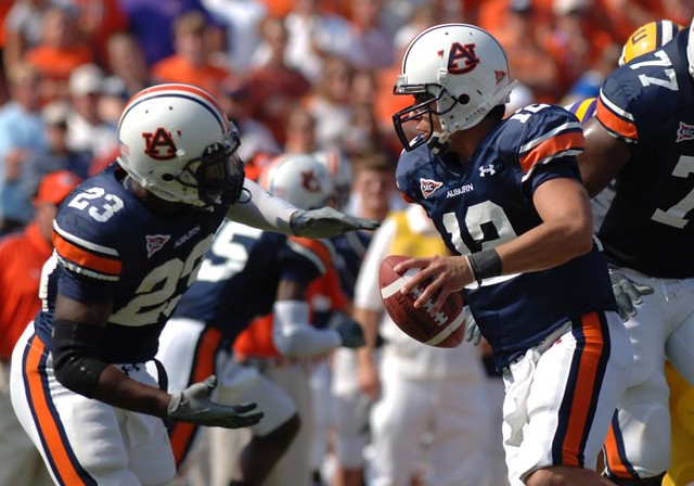
LSU’s inconsistent pants’ stripe pattern should also be noted. As originally designed, LSU’s pants’ stripes (purple/white/purple) matched their helmet stripes. Then, back in the nineties, I believe, when Nike began supplying LSU’s uniforms. the purple/white/purple pants’ stripes were separated by two thin gold stripes, as they remain today. (See the photo of Cam Newton above showing Auburn’s pants’ stripes.)
The changes of the shade of purple should also be noted. When Bill Arnsparger coached the Tigers the shade of purple in LSU’s uniforms was darked significantly. Now, LSU has gone back to the original, lighter shade of purple in its uniform…except for the helemt striping and logo, which remain a dark, blackish purple.
Should read “darkened”…sorry for the typos.
BTW, I still can’t understand why some teams use darker helmet stripes and trim instead of matching the shade on their jerseys or pants. I once read that it had something to do with enhancing the contrast for television and thereby increasing the visibility of the team’s identifying logos.
Thanks for ruining my Friday, Paul. : )
“War Eagle” on the back of the pants? That’s awful. How’s that gonna look on some 350-pound tackle.
Auburn DOES NOT need to have the pants stripes match the jersey stripes. Why? Because the variation in striping IS their tradition. It’s been that way forever. That was the uniform during the ’57 national championship. That was the uniform for “Punt, Bama, Punt” in 1972. And that was the uniform worn by 3 Heisman winners.
It’s gonna look like overkill.
And I guarantee it’s not going to go over well with the fans. Auburn fans have been very adamant that the uniform remain unchanged. Fans hated the orange drop shadow in the mid-90s, and they hated those rumored all-blue jerseys from earlier this season.
Once news of this change goes viral across Alabama, the backlash will force them to call it off. Mark it down.
Good to hear. Leave the darn things alone. Some people have too much time on their hands.
link
UCLA is another example of mismatched stripes. It was iconic until Adidas messed it up this year.
Auburn should not mess with one of the best uniforms in football.
UCLA is another iconic example of mismatched stripes.
link
Sorry, here’s a better pic.
link
“Fans hated the orange drop shadow in the mid-90s, and they hated those rumored all-blue UNIFORMS from earlier this season.”
/fixed
Sorry, but I can’t stand it when people (not trying to demean you, of course) refer to an entire uniform as just a jersey.
When one commenter on here about a month ago said (just paraphrasing here) “The Orlando Magic wore their new black jerseys last night.”, James T. Heuning (sp?) IIRC replied saying (again, paraphrasing) “Apparently they wore black shorts, too.”
Too many times have I seen a TBTC game on FSN Whatever Region with my friends (who are in the 16-19-year age range) and heard them say “How ’bout those throwback jerseys so-and-so is wearing, Terry?”. If one of my friends calls an excellent thowback uni “hideous”, but in turn says “Those are the ugliest UNIFORMS I’ve ever seen.”, as opposed to saying “Those are the ugliest JERSEYS I’ve ever seen.”, I would be greatful, because even though he’s/she’s bashing an awesome uniform IMHO, at least they’re taking the whole uniform into account, instead of just looking at it as just a jersey.
It’s even worse when actual athletes IN THEIR OWN SPORT refer to their entire uniform as a jersey. I was watching the YouTube video on how the Oregon players helped to design the Diamondplate get-ups, and when the Ducks made a trip to play Fresno State, a Bulldog player (from the Duck player’s paraphrased quote) said “Hey, can you get Nike to hook us up? Where did you guys get those JERSEYS?” Ugh… -_-
I know this has been brought on by merchandising and the fact that teams in the business world (at the lowest, D-1 college) want to sell product, jerseys specifically, but still…
“James T. Heuning (sp?)”
Close enough. I’m pretty sure I’d misspell your name if I were to do it from memory, too.
For future reference, how IS your last name spelled?
Huening: hue (like the property of color) + ning (like the uh… river in China).
You just transposed the U and the E.
Gotcha
Here’s the corresponding video:
link
Fast forward to the 1:05 mark.
“War Eagle” on the back of the pants? That’s awful. How’s that gonna look on some 350-pound tackle.
W A R E A G L E
Designers’ terribly obvious pre-occupation with the players’ butts continues.
Unabated, apparently.
Seriously, does Jack McFarlane work for these people, still sitting there giggling every time someone says, “tight end”?
—Ricko
Are you saying the designers have unimpeded access to the player’s backfield?
@Aaron: No. He’s saying that the designers want to make sure that as a team, the players have each other’s “backs”. The obsession with this among athletes:
link
link
doesn’t help, either.
Any chance of a Columbus get-together while you’re in the Buckeye State?
I second this.
Be careful what you wish for, I live in Columbus too.
(insert diabolical laughter here)
Be afraid. Be very afraid.
Put me down for a Columbus gathering….Hopefully my new Buckeye stirrups will have arrived by then
Craig D
Well done on the stripe essay! I too would like consistency, especially with the Bruins. Their socks would look much better with a little white.
Also, the Miami U helmets last night were kind of wacky. Did you see the pregame talk by the coach? He explained all the different elements. The tv numbers were from the 60’s, the large M from the teams of the 70’s and the double stripe down the middle was from the 80’s. First time ever (per him) all 3 elements were used on their helmet at the same time.
Here’s the link: link
If by “wacky”, you mean “awesome”, then yes ;)
Paul- Did you ever imagine you would one day be a co-worker of Duff McKagan?
I am a cycling fan, and it is an interesting sport from a uni perspective. The team uniforms are often ads for sponsors, and there is not the same standard of league-wide rules.
This year there seems to be alot of white uniforms in the peloton, but I find the similarities between three teams very striking. I think it will make for tough spotting by broadcasters.
Take the examples of Team Sky (link), Garmin-Cervelo (link), and Team Leopard-Trek (link).
For some reason (and it might just be me), it seems easier to pick out the teams with the white kits because the other colors seem to pop out better.
It looks like Leopard-Trek is keeping the big area in front available for a big sponsor name (if/when they get one)
The Pro Tour really has gone too far in terms of BFBS. I’m cringing at the thought of Rabobank, Euskatel, or FDJ suddenly going to a black uni.
Nice to see the US-based Pro Conti team UHC p/b Maxxis getting their first nice kit since they were HealthNet.
also, there’s the whole host of champions’ jerseys – national champions, world champion Rainbow Jerseys, plus ones for each discipline. Not to mention the leaders’ jerseys in races :D
makes the sport all nice and colourful though
I think the Bills throwbacks are mismatched PERFECTION. In fact, the varying stripe patterns are one of the things I like most about them.
link
link
I think most of us will agree that this should be their full-time set. It would be a shame if they were to do an “updated” version, which retains the general look but coordinates all the stripes.
Speaking of Buffalo and link…
Isn’t there something to be said for a team simply not caring about such niggling details? ‘We’re here to kick your ass, not stage a fashion show’ kinda thing?
Same reason I like grey facemasks. A face cage with the look of forged steel just looks– if I may use a word popular when I was a kid — “tough”.
Put me in the “hobgoblin” camp.
There certainly is something to be said for that mindset; however, a site such as this, dedicated to the obsessive study of athletic aesthetics, is precisely the place to care about and discuss such details.
No one said such things shouldn’t be noticed and discussed.
What some of us don’t get is the back-of-hand-to-forehead, fingers-thrust-upward angst the mismatches appear to create for others.
—Ricko
Zactly.
There used to be—and certainly still are—some guys who simply MUST wear a pocket silk that matches their necktie selection for the day.
Great. A terrific look.
Doesn’t mean everyone should think like that.
Or that they’re wrong if they don’t.
—Ricko
Xavier’s Jamel McLean wears the glasses to protect a broken eye orbital he suffered early this year. He hates them so anytime the protection isn’t needed, (timeouts, free-throws, etc.) he moves them to the top of his head.
Paul, Ada is also home to Ohio Northern University. Didn’t you have a jacket from there?
Oh, and you’ll also be a stone’s throw from Marion (my hometown), the smallest community to ever have an NFL franchise – link
Good memory:
link
It’ll probably be too cold for me to wear that, though.
And just south of Marion is Waldo, home the G&R Tavern. The G&R just happens to have the best fried bologna sandwich in the world.
You’ll pass all this as you sshould be heading up US 23.
Anybody who would pass on fried bologna loses quite a bit of respect in my book.
Aaron? YOU SIR are my new best friend!!!!!! And we’ve never met!
Ahh yes, Waldo – the little village with as many bars as residents. A lot of good friends from Waldo, being an RV grad myself.
Way ahead of ya, kids — already on my itinerary!
One other point about Auburn is that the current pants match the white-navy-big orange-navy-white on the home jerseys, so they’d have to change at least two elements to get all their striping consistent (helmet and road jersey or pants and home jersey). The question for them is whether they’ve established too much tradition in the non-matching designs. Apparently, they think not if they’re going to put “War Eagle” on the butt.
Great call on the Bills’ epic throwbacks. The stripes don’t all match, but they complement each other well with two sets of matching stripes (a better looking version of the Red Wings away concept). It’s probably the right way to go if you’re going to have that much striping.
And really great call on LSU.
If only the Bills actually did have 2 sets of matching stripes. The sleeve stripes have red trim on them that isn’t on the socks. The pant stripes ought to be a little bit wider too.
So, yeah… perfectly mismatched indeed.
Honestly, 2 matching sets satisfies my tastes as well as having all of them match. It is kinda the only way to go if you intend to use a stripe pattern with more than 3 stripes on it.
The white Bills throwbacks would be great by just doubling up the helmet/pant stripe on the sleeves like link when sleeve striping tended to be wider.
And, YES on the Saints. That might be the most egregious example of helmet/pant mis-matching. I think a black-white-black stripe set on the pants or a single, thin stripe on both would be the ticket.
New playoffs logo applied to Seattle’s field. link
i was expecting it to say “one and done”
That hurts man,lol. Hoping for a ‘Miracle at Quest’ tomorrow.
Should the ‘Hawks t-shirts say “Biggest Loser” instead of “Division Champions”?
/might have had a winning record if they wore the green jerseys
Also, a correction of the main entry: There was a bit lost in translation about the Blackhawks’ first black alt from a few years back. My point was that the opposite striping on jerseys and pants of the same color are a case of getting it wrong with striping. That was before teams were willing to add an alternate pant (or pant shell). I think the right move would have been to base the black alt on the red jersey, rather than the white.
The right move is the one they made last year: shitcan it.
On last night’s Jimmy Fallon show,there was a video tribute to the Oregon football team and Jimmy wore an all green Ducks uniform with the
black wings on the shouder. Unfortunately,he was also carrying a brown NFL football.
NHL SHIELD PATCH INCONSISTENCY
Have some have been “altered” by the equipment manager?
link…n/photostream/
link…7451/lightbox/
This is the road Set 2 jersey. See what I mean? It seems DB and Richards have a different style shield patch than on other jerseys. Compare:
link…n/photostream/
Sorry. Links will work at original post here:
link
PAUL…
Can you reach out to Rbk or the Philadelphia Flyers (equipment manager is Derrick Settlemyer) and find out what is going on with this?
Thanks,
Puckboy
Whenever I see mismatched stripes my initial reaction is: why didn’t the designer align them “correctly”…then, I am glad, for it’s the inaccuracies, the flaws, the inconsistencies and eccentricities that is the very lifeblood of our obsession.
Meanwhile, The Sturgeon King portion of this sign…
link
…is about the greatest thing in the world.
reminds me of this:
link
Besides the Colts helmet having a white facemask, it also shows an old Saints helmet. I expect better work from SI.
I really wish I’d have kept the little ad I got from them a few months ago with the NFL helmet stickers to select my free gift (if I’d actually wanted the magazine). It had a few incorrect helmets on it. I specifically remember the Colts with a blue facemask and the previous version of the 49ers, and I think there was one or two other mistakes.
Sure is easy to tell who wasn’t around to watch much football in either the ’50s, ’60s, ’70s or even ’80s.
No frame of reference for…
a) how unis once were obtained (different elements from different manufacturers)
b) how they were designed and garment patterns created (pre-computer)
c) the general evolution—and history of—many teams’ unis.
Not saying anyone is right or wrong, just the perspective is clearly identifiable almost always.
There isn’t any right or wrong, neither are there “Rules”. The only existing “rule” is that most times one of the teams is required to wear a light (generally accepted as meaning white) jersey.
To think otherwise is…ludicrous, and begs the question, “What color is the sky in your world?”
—Ricko
And that history is what makes certain uniforms so special and iconic.
By the way, Auburn: You are 13-0 in that uniform. Why would you change it for the biggest game of the year?
As the young guy with no perspective, I’d just like to point out that understanding why the old uniforms didn’t always match and *liking* it are two entirely different things. I have no doubt that quite a few of the teams in that era would have matched if they could.
…and my sky happens to be gray right now, thank you very much
Well, you are missing the point. When you understand the history fully, you can appreciate it, or like it if you prefer to use that term. We are a product of our past, like it or not, aware of it or not.
“…have no doubt that quite a few of the teams in that era would have matched if they could.”
But they couldn’t, and they’ve chosen to retain some of those elements. That automatically make those unis bad?
I’m sure that in this day and age all the Yankee “NY”s would match. But maybe some don’t see streamlining and modernizing a design as automatically better. Not every design needs to look like the first time it was seen on paper was coming out of a desktop printer.
Something to be said for the fact that there’s a certain charm to things that have endured. Plus, there’s a lot to be said for things that don’t feel machine made.
Just sayin’, a mix of modern and longstanding is a really good thing.
And there are no Rules. Only our opinions of what we like and don’t like, what we think looks good and what doesn’t.
—Ricko
nevertheless…they probably would have matched them in the past if they could
does that mean they need to now? no, no it doesnt
gotta agree with THE here…i highly doubt they wouldn’t have made all the colors, styles and logos match if they had the ability to do so
i know the current (new york football) giants road jersey bugs the everloving shit out of me, despite knowing its history…
“gotta agree with THE here…”
Oh, Phil. Phil. . . .
You’re right Ricko. I have been around since the ’50s watching sports. And I’ve been selling all types of uniforms since 1967. Old time uniforms were limited to the manufacturing capabilities of the maker. That’s why a design feature such as the Chargers’ lightning bolt sleeve insert and pant striping was so ingenious.
When those uniforms were created for the then-Los Angeles Chargers in 1960 by Spanjian Sportswear, the maker took a jersey with a plain UCLA insert, cut out a piece of tackle twill in the shape of a lightning bolt and sewed it onto the insert using a heavy swiss stitch. The same thing was done to make the pant stripes.
Remember, this was 1960. There were no computers, no water-jet cutters, no automatic stitching machines, no dye sublimation. No, it was all done by innovative people that had enough smarts and pride in their craft to do things that should not have been possible. And yes, at times thing didn’t match. Again it was what was available to work with at the time. But whatever came out of those factories it did the job. Them ol’ dogs could sure hunt, if you get my drift!
So the bottom line is that some innovations or striping patterns became so associated with a particular team that they became iconic. From the Maple Leafs mismatched sleeve and sock stripes to Buffalo’s mismatched sleeve and hem stripes on their White sweaters. Hey, those esthetic faux pas have become a much-loved part of a team’s identity. Who cares? As someone said some of you have too much time on your hands.
Thank you, Terry. That was great (and not because you quoted me in the last line).
Terry or Ricko — Any idea why UCLA’s basketball uniforms have inconsistent striping? Years ago I thought the stripes should match, but I have totally bought into the inconsistencies. They’re beautiful.
Sorry for the late reply but I had other things to do today. The iconic UCLA hoops uniform that is now forever ensconced as their identity came about when the Bruins switched from Rawlings to Sand-Knit for 1966-67 which just happened to be Ferdinand Lewis Alcindor Jrs. first year with the varsity.
The Woodenmen went from the old St. Louis Hawks style with the pro-shaded (not drop-shadow. There’s a difference) numbers and letters and changed from I believe Royal and Gold to the lighter Victory Blue (SGMA color name) and Gold. The uniform design was a basic off-the-rack Sand-Knit jersey with two-color neck and arm trim while the pants were an all-Stretch Nylon boxer style with a striped knit waistband, and basic color-color-color three-stripe trim down the sides, around the v-notch & bottom.
Anyone ever note that the home unis used one-color tackle twill while the road suits have two-color lettering?
The whole package including warm-ups was very plain and basic, but with seven straight championships it has become a virtual untouchable. I don’t think the Bruins will ever wear an “SOD.”
No, the basic design was right off the rack. Simple. Blue-collar functional. Elegant. Kind of reflected Coach Wooden’s philosophy. ‘Nuf ced.
Agreed. Let’s for argument’s sake say that inconsistent striping was the sloppiest thing in the Uni-Verse. This would be my personal favorite hot mess of the decade:
link
Ah, yes, the Packers Wannabe look.
“Hey, Vince Lombardi coached HERE, too, y’know.”
Judged on its own merits, a nice uni.
In the context of its time, a really transparent, unoriginal copycat.
—Ricko
Correct me if I’m wrong, but wasn’t that uniform Vince’s idea? Kinda like how Paul Brown decided to put the Bengals in uniforms that were rather, um, reminiscent of Cleveland’s?
agreed, that looks great. so do the browns who have the best uni in football by a slim margin over the pack. and i have to say the giant roads are among my favourite roadies, i know too much apple-red for a team called “big blue”, but as a non-giants fan, i think they look swell. saints, love the think pitty pant stripe, and helmet nfl stripe together. horchata
we sure are a tap 3 times bunch. sure in generalfootball teams look better when helmets and pants match, and hockey teams when jerseys and socks match, but it is in no way a mandatory rule. sometimes the mismatch is what makes teams look distinct, or iconic. while sometimes matching just to do so makes it all sterile. horchata.
That makes it right, a good and unique design?
Or does it make Vince, uni-wise, a one-trick pony?
Original Bengals unis were similar to, and mindful of, the Browns.
Redskins unis under Lombardi were identical to Packers. Just swapped the burgundy and forest green (yeah, except helmet had a single stripe for his second season).
There’s suggesting something, and there’s flat-out doing it over again. Not the same thing.
—Ricko
thanks for freeing me phil, and i didn’t even say anything funky. oh well.
as a side note, it sort of pertains to todays topic, and it’s effect on our individual ocd. i always thought the tony orlando song knock three times(was horrible) would be the perfect theme for this sight if it was a radio program and it needed joiner from commercial since it is about communicating with ticks rather then words.linkis an abreviated version for those unfamilar.
the browns who have the best uni in football by a slim margin over the pack
~~~
yeah, um…no
just because you like brown and orange, doesn’t make it the best uni in football
i should have left you in moderation ;)
i like orange, yes, and i think brown is a bold choice that suits cleveland perfectly. but the reason i like the browns uni is that it is all about the stripes. the helmet is great in it’s simplicity, but the jersey striping pattern of 5, yes 5 stripes is in perfect symmetry with myyyyyy ocd taps, but i just love the pattern to boot. and they have always kept their stripes, more or less, on their socks. they are striped pigskins gods they are so perfect. no logo, just lots of stripes, and the orange doen’t hurt.
Correct me if I’m wrong, but the Browns haven’t worn the striped socks with their regular (non-throwback) brown jerseys in years, have they?
I believe the Browns come in at a close second to the Bears in my book!
What I found most jarring today was a mustache-less Tony Orlando on that “Knock Three Times” video. Inconsistent striping, not so much.
jth~
they have come and gone over the years, not sure what they have done this year with the brown, but i am pretty sure they still wear them with the white which is what they should wear at home anyway. but i said “more or less” just in case this was an off year.
I wouldn’t call the Browns’ all-white the best football uni EVER, but IMO, it’s the best ROAD uni ever.
link
To me, striping inconsistency depends upon the team. San Francisco used to drive me daffy with its w-i-d-e Montana-era pants stripes and its relatively skinny sleeve and sock stripes. Yet the double Saints helmet stripe and wide pants stripe doesn’t bother me. Go figure. (Now those mismatched golds, that’s another thing.)
I appreciate Casey’s take on the discrepancy on Green Bay’s home and away stripes. That bothers me, too.
As much as I dislike Mizzou and South Carolina’s uniforms, when I watch them I take comfort that they haven’t touched the helmets. Leave well enough alone.
I know there’s a lot of love for the New York Giants uniform set, but I’ve never understood the striping thought process there.
As for Auburn. Tigers should leave well enough alone. The “War Eagle” butt print is an impeachable offense.
“I know there’s a lot of love for the New York Giants uniform set, but I’ve never understood the striping thought process there.”
Look at some old photos and you’ll get it. The Giants unis are a largely accurate throwback, an updated version of their unis from the late ’50 and early ’60s. They’re a bit of an amalgam, yes, but there is overall a clear and defined design plaftorm there. In that case, the era they replicate determines the colors and striping.
You don’t have to agree with it, but it doesn’t come out of nowhere, and it does include a certain self-imposed adherence to that design paradigm.
—Ricko
Exactly…which is why I cringe every time I see suggested changes to the Giants’ uniforms here. The uniform is perfect the way it is…leave it alone.
As for LSU’s uniforms, which I mentioned above, they didn’t get any better than when they were first introduced in the Jim Taylor/Billy Cannon era. Even minor changes don’t look right to some of us who have been watching for a long time.
Or, maybe we’re just dinosaurs…I dunno. ;>)
I know the history to it, that doesn’t mean it makes sense.
Rawlings gives out keychains that are similar to the ones in the ticker when you buy one of their high-end baseball gloves. The keychain I have is black leather and stamped with the Heart of the Hide logo, but it’s the same size.
Looking at that white Colts’ face mask for SI’s NFL bracket, they used the wrong Saints’ helmet too. Their current one has a more white outline on the logo. The one they used barely has any.
This probably already made to the site, but SI also screwed up with an illustration in another recent issue (Dec. 27, p. 18). They had a Blackhawks player wearing #88 and a Patrick Kane haircut but with a C on his jersey.
Mike Princip and I should be ALL over the concussion blog.
btw…in the lede, clemson doesn’t look like this anymore…
they dumped the stupid skinny striping and have returned to normalcy, or at least, their version of it
Nice! Sorry I missed that. A great improvement, but I still don’t love the inconsistent stripes, and I hate the orange-purple combo.
it’s their school colours casey, it might be somewhat jarring, but they should own them all they can. maybe they should have chosen crimson like 25% of the ncaa? and how is it still inconsistant? when they sport the orange pants it matches the helmet just like you want, and when they sport white(or sigh purple) pants the field colour is different, so it is impossible to match them better. how do you propose they “fix” that without a total overhaul? or do you have one of those rules about helmets and pants always matching? there are more then 100 D1 teams, if we don’t allow them to break your rules it will look like there are 12 D1 teams. clemson looks just fine.
I can’t really explain why, but it is jarring when the helmet matches the shirt instead of the pants. But, I actually agree with rpm here. It’s unique in a market that many times has some trouble being unique. Thumbs up to Clemson, even if my eye doesn’t quite like it.
well said, i’m not saying purple and orange is going to be everybody’s cup’a(sic), but it IS clemson.
I disagree…I LOVE the combo.
Same here. Now, depending on the opponent, it could lead to a huge mess of a matchup,
link
or a rather nice combo.
link
Credit for improving Clemson’s stripes should go to Coach Dabo Swinney (an Alabama grad, which may have had something to do with it). Did he not go to Nike to demand the more traditional look, and getting rid of all those skinny stripes running every which way?
Casey, not to say you didn’t do a great job with your statement, but I think you could hardly say South Carolina has “iconic” helmet striping. A quick glance at a site like the Helmet Project shows that they change all aspects of their helmets, not just colors, but stripes and facemasks as well, seemingly as often as Oregon does. At Clemson, we’ve only been consistent with our stripes since the late 70’s, but that is also when the Tiger Paw logo was created. Since then, we haven’t changed a thing on the helmet, although every year rumors/suggestions pop up that Nike wants us to use purple and/or white helmets as well as orange.
Sometime pre-Super Bowl I look forward to a blog analysis regarding Super Bowl logos, uniforms, and other quirks. Please make it happen guys.
Is the South Carolina link not working for anyone else?
yeah…that stupid website won’t allow hotlinking
here’s the shot paul referenced
Much appreciated
Casey pretty much nailed it. I believe in universal truths with uniforms. I feel validated.
Here’s how I “fixed” the Redskins stripe inconsistencies as described above. I honestly think it makes it worse.
link
Here’s how they should dress and get it over with.
link
and for those lineman and they’re non-sleeves, go with this treatment.
link
With that second link, I noticed the sleeve stripe is just the helmet stripe with an added yellow on either side, like this;
link
So really, they “match” but its just portions of the same stripe.
Not worth the extra work.
You’re trying too hard. All they need to do is take the stripes from the socks and put them on the sleeves, then switch the order of the helmet stripes so that the yellow is on the outside.
Here’s my intake on the Redskins:
link
Helmet and pants match, but color swapped. Jersey cuffs and collars match on both jerseys (again, color swaps), with awesome socks.
I know it has been said already, but here it is anyway.
“What I can live with when stripes don’t match but they’ve done that for seemingly forever…”
link
The stripes are fine.
Fair enough.
i was all geared up for the game monday…until i read the depressing footnote from paul that “war eagle” would soon be appearing on the backs of future pants.
change the stripes (or don’t)…but don’t put words on the pants please.
Miami U. also went NOB last night for the game. They have been NNOB since they switched to Adidas a few years ago.
Thanks, Marty.
In response to Ricko and the older generation, I think most of us younger guys (not sure if I count–just turned 30!) recognize that there may have been reasons for inconsistencies that have lasted from the old days. It’s up to each team to decide for itself whether to make changes for the sake of consistency, modernity or whatever or to keep something that feels iconic or essentially important to the identity of the team. It’s up to us to decide what we like (or would like if it changed). Some things are good because they stand the test of time; others stand the test of time despite not being so great.
I think the real crime against the uni gods is when teams make a change but miss the opportunity to get it right (Ohio State jersey striping) and/or match your history (Bruins home socks).
As for the Giants’ current set, I like the unis on the whole (and consider them one of the great uni upgrades of all time) and appreciate the historic reference they’re making. I also think you’re less bound to exactly matching an old design when you’re reviving an old set than when you’re continuing it (though you should definitely consider it). I’m not sure what I would have done with the stripes if I were in charge of their redesign.
Certainly agree with everything you said.
My point on the Giants is that what they decided to do is obvious…and they stayed true to it. We do all realize that the red numbers and striping on the white jersey–when a white jersey was mandated—worn with the red socks, was a carryover from when the Giants had a red jersy and royal jersey, so as to differ themselves from teams who wore those colors, right? I mean, they didn’t pull the red out of thin air. It was a way of holding onto a version of their previous “alternate” look.
I’ll say again. If they’d made the road numbers, etc., blue someone’d be bitching about them screwing up (or screwing with) a throwback.
—Ricko
i’m not so sure that this is a generational thing, although it seems to be breaking down on those lines more or less. while 30 isn’t old, marty isn’t a kid, and i am closer to you then master ricko. that being said, when it comes to sport, i have always loved tradition, and have been something of a throwback. but whatever, i really think it comes down to our particular obsessive natures. are you orderly? does it bother you when the toothpaste cap is left off the tube? do you fold your underros? then you might be the type of person that needs to see everything in perfect order in your uni’s. what i am saying, and have been saying is i think this is a function of the variants of out nature, and the need for control. marty for instance, corn love him, is one of the most obsessive control freaks i have ever met, it does not shock me in the least that he would need perfect order in his uni’s, if the slightest thing is off his mind explodes. my rigidity on the ncaa debate not withstanding, while i am a fairly ordered person as my work bench will attest, i like a little chaos(see pineapple) and asymmetry. i’m just sayin’ that’s my horchata, but we can continue to argue the merits of both order and chaos in uniforms.
The people who cry out for making everything “perfect” and having matching stripes probably prefer every town in America to look alike too. You go into a sterile Applebee’s in one section of the country and it’s the same as 1,500 miles away, right? Every town has a strip mall, and everything else is just so. And it’s just grand! Some of us like the fact that you can go to a certain ribs joint in Tuscaloosa, Ala., though, and nowhere else. And that’s the way it should be.
The rest of you can stay in your sterile little cubes and play video games or watch football games played in domed stadiums and on artificial turf where the players never get dirty, because we want uniform surfaces and weather conditions, right? Baseball was like this way in the 1970s when all the stadiums seemed to look alike (the Vet, Three Rivers, et. al.). Then someone realized that maybe a factory wall behind the outfield fence might add a little character.
I got a good vibe from that comment, Geeman.
I got a really shitty vibe from that comment.
If what you say is true… then I am an enigma.
Obsessive? Yes.
Control Freak? Not too much.
I do like order in regards to uniform stripes. Otherwise, I’m pretty scattered. Like, really scattered.
Oopsies.
Forgot my name.
And since someone mentioned the Leafs’ traditional mis-matching, I’ll include this paragraph that I initially sent Paul but he omitted because it’s only, at best, tangentially relevant to the original conversation:
It’s also notable that three of the other Original Six teams (Rangers, Canadiens, Leafs) pull off the complementary-stripes/doing-it-for-a-long-time thing fairly well, while the Red Wings do matching stripes, two sets of stripes on the road and one at home.
And another NFL team with inconsistent striping: Chicago. The home set has probably been around too long to mess with, but surely the blue road pants (or maybe even the road jersey) could be a candidate for updating in our fantasy world.
Do not fuck with the white jerseys. They have had that striping pattern for longer than the dark jerseys have had their orange featheredge stripes.
And you’re wrong. The Bears are consistent. Horizontal stripes (socks/sleeves) are one pattern, vertical stripes (pants) are a different pattern.
+1
If I might say one thing about the Bears that bugs me…
The sock stripes haven’t been the same thickness as the sleeve ones – the sleeve ones now are noticeably thinner since roughly 1991-92:
link
…and before this the sleeve stripes were obviously thicker than the sock stripes.
I have always preferred the stripes on the white jersey. I wish the the home jersey had something similar.
Sit down for my next statement. Robertmarshall wasn’t happy with it a year and a half ago.
The Bears have always been a stripeless pants candidate for me.
Anybody know why Roloson switched numbers between Tuesday and Wednesday?
According to this post link Roloson was supposed to wear 31 until they arrived back in Tampa, so the change to 35 was sooner than expected. My guess is that the Bolts were on the road and needed a quick jersey, and that he wanted 35 because he wore it in the past with Edmonton. There’s also some info about his new pads needing to be approved by the league, so he’s still wearing his NYI pads.
Clemson actually fixed their pant striping this year. the photo used in the colum was from previous years.
Small item at the bottom of this page indicates that the Saints will be wearing all-white for tomorrow’s game in Seattle:
link
I’m not sure whether to believe this (since when do the Saints even have white pants in their wardrobe?). If it’s true, though, two thoughts come to mind:
1) This would be the Saints’ first solid-white appearance since 1975:
link
2) Since the Seahawks will presumably be wearing solid-scuba, this will certainly be a high-contrast game.
I really hope not. The white pants would probably have yet another shade of gold on them.
Very interesting. I wonder if the writer just meant that they won’t be wearing the black pants (*not black* being analogous to white in his mind).
perhaps the gold pants are so light he actually thinks they are white?
The article cited has now been updated/corrected to indicate that the Saints will wear black pants, white jerseys against the Seahawks.
They’ve since updated this item.
The Saints will wear white jerseys, black pants.
Lee
too bad, that white 75 set was awesome! slap gold numbers with a black stroke on em, and you have near perfection.
It’s a good look, but it would have been wasted matched up with Seattle’s suicide blue unis.
Now if the ‘Hawks went with the green over navy, and the Saints wore the ’75 kit? That’s Top 5 material!
If you’re gonna put the Saints in a ’75 kit, better give ’em the ’75 era helmet decals too!
Black pants?!?!?! For the Super Saints??? Crap…
A photo from Packers.com link adding the captain’s patches to the jerseys for Sunday (and beyond?) The Packers as many of you know don’t wear them during the regular season as they have different captains every week.
That’s one of the really cool little rituals, sort of like the Red Wings using straight, block-letter NOBs in preseason or the Steelers not using helmet numbers in preseason. The Packers don’t have “C” patches in the regular season but add them for the postseason — nice.
Well, as cool as anything involving those asinine cookie-cutter captaincy patches can be…
Those captain patches suck. Total clutter eyesore.
that goes without saying mister soon to be eating bananas and swing from trees.
sir 78~um, that was an insider for jth.
Have I ever mentioned how much I hate bananas?
Oh, and I have a rotator cuff issue going on as well, so this impending tree-swinging lifestyle does not bode well for me.
College football sucks.
well…who’s to say, when all is said and done, someone won’t be swinging from trees and eating pineapple, rather than banana
i’ll ignore skips comment and say spank, you better see a doctor and get that checked, and you better learn to love bananas ’cause a&m and kentucky are winning mr. basketball school. i say chimp should have to use “chimp” in his name here all year. doesn’t that sound like a good idea long island skipper?
oh…absolutely
link
AP article about donors in College Football, specifically Phil Knight and Bobby Lowder, who is an Auburn donor and on the board of trustees.
Skimmed the comments to see if anyone else had posted it yet and didnt see it, but if it has been, forgive me.
On the stripes, I have two reactions. My gut reaction is that all stripes must be identical in pattern. Bugs the hell out of me when the same uniform uses different basic patterns of stripe. I don’t care if the colors are inconsistent, but dammit the pattern – mainly, relative widths – must be the same. But then again, I have an odd mental tic about symmetry, to the point that as a kid the Millennium Falcon’s lopsided cockpit literally gave me the creepy shivers.
But I can set aside my own private bugaboos about symmetry at least far enough to embrace mismatched stripes in theory. And here is where I would apply the basic rule of men’s fashion: When combining multiple instances of the same basic element (stripes, plaids, checks, whatever), they must either be identical or they must offer significant contrast. Close-but-not-quite is what makes for ugly clashing. I’d hold up the throwback Bills as a prime example of using high contrast to make mismatching stripes work, and by and large the teams whose mismatched stripes don’t bother me are those that have the greatest contrast in pattern. Whereas the teams that have a greater degree of similarity among the stripe patterns make me want to scream.
On that shot of Wilson’s Super Bowl football from last year, it was marked with “South Florida” as the location. Don’t they usually mark the balls with the actual name of the city in which the game is played? Is this the first instance of a regional naming? South Florida could be about four different metropolitan areas.
Oh well, if they ever play in Anaheim, let’s just hope the ball doesn’t get stamped “Los Angeles…of Anaheim” (or Dallas…of Arlington, for that matter)
I don’t know of this “Dallas” of which you speak. This game is in North Texas.
I kind of shudder to think what they’re going to call the Indy Super Bowl.
Central Indiana, of course. As opposed to any Super Bowl in Kokomo, which would be North Central Indiana.
I have no clue what the first instance of regional naming was, but last year was definitely not it because it wasn’t even the first instance of link as the designation.
North Texas actually is a commonly used name for the DFW Metroplex. I live in Dallas, and you hear the term “North Texas” all the time here – especially on the local news. In this instance, the regional name is completely appropriate.
Did I miss something or was it already mentioned yesterday that Cincinnati wore throwbacks last night vs Xavier?
I didn’t hear anything about that, but…
link
thanks for bringing it to my attention. I’d wear that.
Check out Northwestern and Illinois going purple vs. orange:
link
Purple vs. orange? Wow, you don’t see that very often…
Except for every time that Northwestern plays in Champaign.
That’s conference season, so I’m usually watching Big East ball then. OK, it was new to me.
Really? I was just busting your balls. I thought you knew that it was common practice for the Illini to wear orange at home.
I’ve seen them in orange before, but I just don’t watch a lot of B1G TEN hoops…unless Michigan’s on or if Minnesota’s playing at Williams Arena.
This is really a lovely uniform…
link
…but take off that frickin t-shirt already!
Wow…. clicked on one of those ads to left and found my way link!
Paul – not sure if you have heard this, but the Portland Beavers are no more. They’re now the Tucson Padres, the MLB club’s Triple A affliate
OMG that sucks. An amazingly historical franchise gone. Too bad.
Amazingly historical franchise, but more importantly to our purposes, one of the best-uniformed teams in the history of professional baseball. The last generation of Beavers unis would easily have been among the top-5 in MLB right now. A huge uni-loss.
I think mismatched stripes on the pants is often a product of what the team’s uni company offers. Their striping may not have the gaps (or vice versa) and you just end up with a mismatch. Can anyone point me to the college football uni catalogue? I would like to do some intel on this.
I read the Oregonian article and really appreciated your take on Oregon. I always thought you disliked the Oregon unis but it was pretty clear in the interview that it is more about disliking Nike’s business practices. I agree that if the wings would have been used previously no one would make a fuss about them.
I didn’t read the whole New Orleans white pants article because when I linked to it the article read correction: white tops and black pants.
BYU uses a similar Northwestern stripe on their football jerseys and they have the same stripe pattern on their pants but not their helmets.
BTW – the South Carolina “jersey stripes used to match” link is broken
Rams fire 44-year veteran equipment manager Todd Hewitt
link
Yeah, but what has he done for them lately? :rolleyes:
mothersunbowlker said:
What I found most jarring today was a mustache-less Tony Orlando on that “Knock Three Times” video.
~~~
uh huh
i found that fact disturbing too, but i just cut off the three inch handlebar fooman-choo myself recently, so i understand his desire to have a couple months every year of being able to drink from a glass without 2 oz. of water being absorbed by the stache. i still can’t recognize myself in a mirror though.
This is the time of year to go clean-shaven. Nothing worse than beard dandruff on a dry wintry day.
bearded for life
I have read the whole stream now (as of 2:05 CST when I loaded it) – really hate that new replies get put up with the original comment – took me forever to read what I did, certainly could not read it all again…
I have read a lot of opinions today and lots of contrasting opinions even make perfect sense. Bottom Line: it is about the individual uni and can not be conclusive. Some look okay mismatched, some may look better with this or that. If they all matched, we would have nothing to talk about here!
My two cents… I am usually so excited to see ANY stripes instead of plain solid pants, or crappy piping, that I don’t really mind when they are mismatched.
Good post. I like the old way of reading comments too. I’m moving my last one to here:
The people who cry out for making everything “perfect” and having matching stripes probably prefer every town in America to look alike too. You go into a sterile Applebee’s in one section of the country and it’s the same as 1,500 miles away, right? Every town has a strip mall, and everything else is just so. And it’s just grand! Some of us like the fact that you can go to a certain ribs joint in Tuscaloosa, Ala., though, and nowhere else. And that’s the way it should be.
The rest of you can stay in your sterile little cubes and play video games or watch football games played in domed stadiums and on artificial turf where the players never get dirty, because we want uniform surfaces and weather conditions, right? Baseball was like this way in the 1970s when all the stadiums seemed to look alike (the Vet, Three Rivers, et. al.). Then someone realized that maybe a factory wall behind the outfield fence might add a little character.
You’ve hit the nail on the head. If you ask me the best NCAA football unis belong to UCLA, and the best ribs are obviously only found at Oklahoma Joe’s in KC- unless you ask anyone else, in which case you’ll get a different answer, different stripes and a different rib. Variety is the spice of life. Of course, idiosyncrasies are not always good. There are plenty of hideous unis no doubt designed in the name of “doing something a lil link“. And speaking of ballparks- Houston, we have a link.
the “diff’rent” link should have taken you to something like link.
Well, since you moved your comment, I’ll have to move my reply:
I got a good vibe from that comment, Geeman.
Still a shitty vibe for me.
As a huge Buckeye fan I can say I have not paid great attention to the thickness of the pants stripes. I do wish Ohio State would go back to the classic or traditional gray sleeve stripes.
They used that pattern back in the late 1940’s on the red jersey. Earle Bruce changed it in 1979 and Cooper changed them back. Why Tressel changed them back to the Bruce era style I have no idea. The Buckeyes already have that stripe pattern on the helmets and pants so why also on the sleeves? The gray stripes looked so much better.
i agree mostly, except with todays sleeveless jerseys, how about just nixing the stripes all together and making the numerals grey/silver. the pants have never matched the helmet in thickness, so like you, that does not bother me either.
I didn’t have time to thoroughly read all of the comments, so I apologize if this is redundant…
The Chicago Blackhawks jerseys did have matching sleeve and hem stripes, identical to the current hem stripes, when the red sweater and Indian Head crest were first introduced in 1955. A classic was born. (They had some pretty snazzy barber-poles before that.) The team wore the same stripe pattern for their Stanley Cup run in ’61 and didn’t change to the current pattern until the 1962-63 season. While the basic look of the jersey remained the same from ’55-62, a few things did change from year to year, such as the placement of the secondary C & crossed tomahawks emblem and the appearance/placement of the sleeve number. Usually one of these elements would at least partially overlap the sleeve stripes- which is almost never a good link, especially when the sleeve number is illegible as a link. The best example during this period is the 1961-62 permutation, which reduced the size of the C and moved it to the shoulder, making room for the sleeve number above the link. Even so, the sleeve is crowded with elements, so the Hawks did the sensible thing for the following season and pared down the sleeve stripes- the resulting sweater has remained basically unchanged to this day. It doesn’t bother me that the sleeve and hem stripes are not identical, because it is obviously intentional and the colors, order, and widths are consistent. This is an example of stripes that “match” even though they aren’t exactly the same. Combine that with the best hose in sports and you have an iconic uni that should never ever link.
I’ve always preferred the Hawks’ white uni set to their red ones. The inconsistencies of the reds bugged me until about a year ago when I link with some possible link.
What I found out is that none of those tweaks look as good as link, even though the striping patterns are not perfectly matched.
(I still like the white ones better, though.)
at least you saw the error in your ways.that being said, the belly stripe matches the socks, just has some added white, it already matches.
I have to disagree with you there… Very few (if any) NHL teams look better in white. Same goes for football and basketball. The best white sets in the league- those worn by the Canadiens, Leafs, Flyers, and Red Wings- all pale (no pun intended) in comparison to their dark counterparts. The Hawks white set is just too plain for me. There is a reason only waiters and Jehova’s Witnesses wear black pants and white shirts without a jacket.
Blues fan here and their white looks much better than their blue. Can’t say its always been that way though.
Ya had me then ya lost me, Brian. Every single one of the teams you mentioned looks better in white.
In fact, it’s been scientifically proven that the Red Wings’ link looks approximately 17.3 trillion times better than the link.
much as it pains me, i gotta agree 100% with spanks
not only do all those teams look better with white jerseys, white should be worn at home in the NHL
Not sure if mentioned above. but in those 1st games for Roloson with Bolts, he wore #31 then #35!! he wore #30 with Isles, you can see the #30 on his leg pads!!
Two Things:
1) No screenshot but I’m 98% sure ESPN had a white facemasked Colts helmet sitting on the coffee table for FirstTake this morning
2) The NBA Fit thing reminded me of this interested sculpture for a similar program for the NFL… funny part? theyre encouraging healthy living with a half ton sculpture made of butter
link
They’ve had a white/gray facemask since 2004…Paul is incorrect on that one.
Let’s add some fuel to the Auburn fire:
link
That’s a shot of an Under Armour truck parked in Glendale down the street from Univ. of Phoenix Stadium. Those almost don’t look like the same pants from the commercial, but that might just be because of the brontosaurus model they put them on. Nevertheless, there they are.
Kinda’ rinky-dink if you ask me. It looks like a knock-off Auburn action figure. And I agree with a few previous posters: Now, seeing them as such, once the word about these gets out to the Alums and whatnot, get ready for a firestorm. Unfortunately, if they are wearing them, I don’t think most of those people will be informed until 7:30CT on Monday night when Erin Andrews or whoever tells them.
“War Eagle” across the ass? These are a people that WIGGED OUT when the helmet logo was made a third of an inch larger. Expect no less and much more.
I was about to post that same photo here.
Seems pretty apparent that that’s what they’ll be wearing on Monday.
Oh god just shoot me now. Learning that they are changing the pants is bad enough, the text on the back is an unbearable thought, and the the idea that we’re wearing a different uni than we’ve won with all season is gut wrenching.
If we lose I’m blaming it on Under Armor. I was so proud of the AU athletic department for standing their ground and refusing to change things, and then this happens.
Look, ma, a bowl game where nobody’s farting around with their unis.
—Ricko
Didn’t know AT&T had retroactive rights to past Cotton Bowls. When talking about games from decades ago, they’re still call them the “19– AT&T Cotton Bowl Classic”.
Does look nice, though. Loved the marching bands, and of course, hearing Pat Summerall in the pregame.
Too bad this isn’t in the actual Cotton Bowl…
…and on New Year’s Day…
Isn’t any game in the JerryDome tantamount to a national holiday?
In his world…
Meanwhile, the FCS championship is at halftime.
link
Yep.
Delaware (aka Michigan Lite) link
vs. Eastern Washington (those guys that play on the red turf). link
Game played at Pizza Hut Park in Frisco, TX…home of FC Dallas of Major League Soccer. Those all-black aren’t as good on the grass as they were on the red turf.
Congrats to Eastern Washington. Down 19-0, they come back to win 20-19.
link
Hey FOX Sports, there are still people who don’t have widescreen TVs. When they show the little scoreboard on the top left of the screen, I only get the right half of it.
It depends on if your local station broadcasts in widescreen or not. But this has been going on since at least the baseball postseason.
A M E N. And even on my widescreen. I’ve adjusted it every which way but loose and still can’t see the whole dad gum thing.
Two and a half minutes to go in the half and my station switched over to widescreen, so now I can see it.
Have I mentioned lately how the worst cable company in the world resides right here and is owned by our inglorious city government?????
On missed Texas A&M FG they showed a chubby guy behind goal posts waving no good. he had a purple LSU? helmet that the Tigers looked like they wore vs Wyoming bowl game. The filtered or whatever was done pictures.
Did not see what the decal looked like.
Um, Paul; the Colts have worn a white (or gray, depending on how you look at it) facemask since 2004. They wore blue until 2003… link
Um, Kyle: No matter how you look at it, gray and white are not the same thing.
I know, but I can never tell if a team has a white or gray facemask. The Colt’s facemask looks white to me, but Wikipedia says its gray…so I leave it up to the observer to decipher.
I don’t mean this to sound demeaning, but maybe you should get your eyes checked. I think the vast, vast majority of people who read this site — and even more casual football fans — would say there’s a big difference between white facemasks and gray.
Naw, you’re right, its gray. I was looking on a bad computer screen…
just wanted to say…for rpm’s benefit*
GEAUX tigers
A&M actually looks really good, despite their wearing the super stretchies…although their NOBs look like total shite and the way those things pull and don’t quite “snap” back is really annoying…
but any team with stripes or loops gets absolutely destroyed by wearing them
*not
Did anyone notice on 24/7 Penguins Capitals that there was a Steelers helmet left behind at Heinz field that was the current helmet with a grey facemask? Are the Steelers planning on going back to a grey facemask next season?
what do you think the chances are that wasn’t a *real* steelers helmet?
replica perhaps…
Looking up Ada, Ohio on a map…not too far from Findlay and US-30/Lincoln Highway. On my biannual trip to PGH this summer, I might have to drop in at the Wilson factory. Paul, do you know if they do tours to the general public or is this just a one-shot deal for you media types?
I don’t believe they do tours.
Missouri needs to change football uniforms. This from a MIZZOU guy. They look stupid. Oh – AND GET A CONSISTENT GOLD FOR THE LOVE OF FLIPPIN’ GOD!!!!! That is all.
I don’t get what your problem is with Mizzou
link
And the golds appear to match to me…
link
If they’d just wear the gold pants on a regular basis it would be a good start. And, of course, dump all the superfluous piping.
EXACTLY
Even though aTm pants piping is silly – the Cotton Bowl is nice to view b/c neither team looks “stupid”. btw – am i the only one who misses the plain ol’ “cotton” symbol at the 50-yard-line for at the Cotton Bowl for the Cotton Bowl?
You’re not alone.