There are good uniforms and bad uniforms, but what most of us like best are the oddball uniforms. The typos, the incorrect fonts, the nickNOBs. The inconsistencies in number style, number size, or insignia. The familiar players wearing unfamiliar numbers. For the serious uni-watcher, these are the type of images you live for, am I right?
Our friends at Grey Flannel Auctions recently approached me with an interesting proposition: They’re trying to compile an archive of as many of these photos as possible so we can have an archive of them all in one place. Anomalies, aberrations, oddities, flat-out errors — basically anything out of the ordinary. We’ve obviously run lots of those images here on the site over the years, and I’m sure there are more of them out there. The Grey Flannel folks would like your help in compiling them.
To make it worth your while, Grey Flannel has set up a contest: The person who submits the best photo will receive a $100 gift certificate that can be put toward any O.T. Auctions lot or the Grey Flannel web store. A second-place winner will receive a $50 gift certificate.
Here are the rules:
• All photos other than the ones already linked or shown in today’s entry are fair game. (I wouldn’t bother sending in any “Natinals” pics, either.)
• All photos should be submitted to Grey Flannel (not to Uni Watch, please) via this link. Please include your name and quick description of the aberration(s) in the photo(s) you’re submitting.
• You can submit as many entries as you like.
• If multiple people submit the same photo, the first one will take precedence.
• Judging will be completely subjective and will be done by Grey Flannel Auctions. Extra consideration will be given to photos featuring Hall of Famers, championship games, etc.
• All entries must be received by next Tuesday, Jan. 11, at 7pm Eastern. The winners will be announced shortly thereafter.
Okey-doke? Now get crackin’.
Research query: One of my ESPN editors, Matt Friedrichs, asks an interesting question: “Once a coach is fired, what happens to all the free apparel he wore to work and on the sidelines each day? You have to figure RichRod’s closet had enough Michigan gear to outfit a small country. Do any of these guys hold onto some of it for sentimental reasons?”
Hmmmm. I’ve put out some feelers on this. In the meantime, if anyone knows, kindly speak up.
SMU BFBS — WTF?: Yesterday I linked to a black SMU helmet, which I suspect will end up being worn next season with the BFBS jersey that the Mustangs wore in the Armed Forces Bowl. That prompted the following note from reader Jay Shelton:
The idea for a black SMU helmet originally came up during the coaching tenure of Mike Cavan (1997-2001), who was notorious with uniform tweaks and changes. He wanted to change the helmets to black but was met with resistance by then-equipment manager Ed Davidson (a friend of mine), who insisted that the Mustangs retain the blue and red as much as possible for a classic SMU look. They eventually went to a navy blue in Cavan’s fourth year (2000), a look that became prominent during the coaching tenure of Phil Bennet.
Upon the hiring of current coach June Jones, SMU returned to a royal blue and red color scheme and re-introduced the white helmets that had become so popular. Still, under Jones, SMU wears black socks and shoes at home and on the road, which is a travesty.

Collector’s Corner, by Brinke Guthrie
New year, new stuff on eBay. Let’s take a look:
• PL Alert: I like this 1930s baseball uniform with a Chevrolet logo patch. [Way ahead of ya, Brinke — I actually featured this in the Ticker a while ago. But it’s definitely worth another look. — PL]
• Reader David Friedman sent in this listing for a 1951 football photo featuring both teams in dark jerseys.
• Hey kid, wanna learn how to play the infield? And if you’re an outfielder, we’ve got you covered there, too.
• Check this out: a felt Dodgers logo from the 1950s, to apply on anything you want.
• The seller is calling this a football sweater, but it’s obviously a track and field item. Whatever — looks great. [Wow — I’d snap this up, but it’s too big for me. Grrrrr. — PL]
• I bet Kobe couldn’t dunk this this old lace-up Spalding basketball. At least he could afford it, though.
• I always liked this patch that all MLB teams wore in 1969. [It’s interesting that this is touted as an original patch, not a repro. If you compare it to the Jerry Dior-autographed repro patch that I raffled off last winter, you can see some definite differences in the stitching patterns. Of course, that doesn’t mean the eBay version is genuine, but it’s still interesting to see the differences. — PL]
• Reader Paul Ricciardi sent these in: home and road versions of the prototypes that the Nordiques supposedly would have worn if they hadn’t moved to Colorado in 1995. [I’ve seen mock-ups of this design before — it was included in my 2007 ESPN column on prototypes — but had never seen one of the actual jerseys until now. I strongly suspect these are reproductions, since the actual protos would no doubt sell for a lot more than $159. — PL]
Seen something on eBay that you think would make good Collector’s Corner fodder? Send your submissions here.
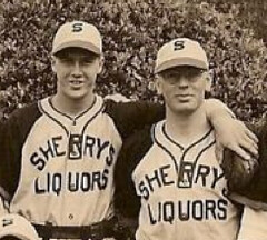
Too good for the Ticker: Wanna see a really great uniform? Check this out.
I found that photo on a site called Good Old Sandlot Days, which is devoted to an extremely arcane niche: old semi-pro baseball teams from northern California. As you can tell from that first shot, many of the teams were sponsored by, and/or comprised of employees from, local businesses, including bars, restaurants, liquor stores, olive oil producers, police departments, and my favorite, butchers.
There’s a lot more to the site than team photos — there are programs, newspaper clippings, box scores, and a lot more. The site’s navigation isn’t ideal, but it’s definitely worth exploring. To check out the photos, start here. Enjoy.
(Special thanks to reader Eric Sun, who first told me about this site more than two months ago.)
Uni Watch News Ticker: Dwayne Roloson was in goal for the Lightning last night but was still wearing his Islanders mask. And he shut out the Caps! … Scroll down to see the script chain-stitched NOB on this baseball jersey. ”¦ Regarding the Olympics logo plagiarism controversy, Brady Phelps points out that if Henri Matisse and his relatives don’t mind, neither should anyone else. ”¦ Patrick Woody found a 1981 issue of Pro! magazine in his parents’ attic and photographed a bunch of the pages for us. ”¦ Here’s the best view I’ve ever seen of the facemask that Charlie Manuel wore after breaking his jaw in Japan back in 1979 (great work by Ben Roth). ”¦ Reprinted from yesterday’s comments: Here’s Paul Henderson (1972 Maple Leafs/Team Canada) wearing a football facemask. ”¦ Here’s something you won’t see very often: Cooperalls vs. Cooperalls, and clear boards to boot! “That’s from the 1984 Minnesota State High School hockey tournament, Hill Murray vs. St. Paul Johnson,” says Brian Schulz. “It was played at the St. Paul Civic Center, which sported clear boards.” ”¦ Lots of good bits about cycling uniforms and gear in this Q&A piece (with thanks to Sean Clancy). ”¦ Joe DeAngelis spotted someone wearing a very odd Rangers/Flyers mash-up shirt. Why would anyone put those two teams, who’ve had a longtime rivalry, on the same garment? … Reminder for those of you in the Pittsburgh area: Doug Keklak is organizing a Yinzer Watch gathering this Saturday. Details here. ”¦ Who are these gun-toting chicks? They’re the U. of Maryland rifle team, one of many excellent sports photos to be found in the school’s photo archives (with thanks to Nate Stewart). ”¦ Japanese baseball note from Jeremy Brahm, who writes: “The Chiba Lotte Marines will be bringing back the pink uniforms for interleague and summer this season, to mark the 20th anniversary of the team moving across Tokyo Bay.” ”¦ “Got an email ad from the FansEdge on Tuesday morning, advertising NFL playoff gear,” writes Bob Dlotkowski. “The original ad image included a Rams sweatshirt to represent the NFC West. Someone obviously realized the error at some point in the afternoon and swapped it out for the correct ad image with a Seahawks sweatshirt.” ”¦ Here’s a fun site that lets you make your own personalized virtual Twins jersey (nice find by Chris Flinn). ”¦ “I have a minor collection of Oakland A’s bobbleheads but have always wished the A’s would do bobblehead promotions featuring the gang from Peanuts,” says Sam Lam. “The Giants have done it and it got me thinking about making my own.” So that’s what he did — first he took a Lucy bobble head from a Giants promotion and repainted it with a 1981 A’s uni. That inspired him to do a second bobble project, which is described here. ”¦ Here’s a new one: The Charles Drew High School basketball team, from Riverdale, Georgia, has “Defense” printed on their butts (good spot by Benn Wineka). ”¦ Also from Benn: a UNC hoops sneaker roundup. ”¦ With the Hall of Fame announcements slated for today, there have been several articles about Jack Morris, one of which featured this photo. I did a serious double-take when I saw that shot, because it seems so weird to see a button-front jersey paired with sansabelt pants. It’s one thing to have pullovers with belted pants — that was uncommon, but I think it looked fine. The Morris photo, however, looks utterly bizarre to me. The Tigers weren’t the only team to do this during the 1970s and ’80s, but it still strikes me as a very incongruous look.
Jack Morris’ pants probably had a real belt under the all-knit waistband. The giveaway is the extended flap with the offset snaps. The A’s, Red Sox and the Angels all wore this type of waist with their first knit unis which were all manufactured by Stall and Dean for Tim McAuliffe.
The Tigers used Wilson as their manufacturer but it was common for companies to “borrow” a feature from a competitor.
what’s the purpose of that?
i mean, i get they wanted the look of the sansabelt, but why have a belt as well? player comfort? the sansabelt teature didn’t work as well? seems like a belt and the sansabelt are superfluous … didn’t the sansabelt work as advertised?
I never figured out the reasoning the double-belts, either. Kinda like a baseball manager mandating striped stirrups AND pajama pants to be worn at the same time by all players, if that’s a fair comparison.
Not the same at all. The real belt under the elastic waist would prevent you from accidentally mooning the crowd as you rounded third with the winning run. You could wear your wife’s pantyhose under your PJ pants and it wouldn’t make any difference in your performance.
Any idea why the Tigers maintained the belts at home but abandoned them on the road?
Because the early elastic waistbands didn’t hold up with all of the daily use they received the conventional belts were worn. The real belts were for adjustment and allowed the pants to stay in place. The idea may appear to be geeky, but you have to realize that it did the job. What more could you want?
Know what else? Some players just like the feeling of a belt, being able to “cinch it up,” so to speak.
I know that was one of the things I disliked about self-belt baseball pants; oftentimes if they fit around my hips they were too big around the waist…and you’d end trying to figure out what the hell to do with the excees.
MLBers, of course, get stuff tailored…but it’s pretty hard to “take in” a one-piece elastic waistband, even for their tailors.
—Ricko
“…but it was common for companies to “borrow” a feature from a competitor.”
Like Adidas “borrowing” Nike’s SoD for basketball? Pardon me for sounding like a Swooshketeer (sp?), but Nike’s SoD is like Cliff Burton: always imitated, never duplicated.
…maybe that’s why Paul is always trying to throw Nike under the bus
/sorry :(
OUCH.
Late to the party here, but maybe that was an unfair comparison. I just said it because Nike SoD and Adidas REVO30 were the first things to pop in my mind on the subject of one manufactuer borrowing another manufactuer’s feature(s).
Good thing it’s never duplicated, because it looks like a sleeveless tee on top of a mid-calf length skirt.
adidas basketball uniforms are not cut like the System of Dress.
the Orioles wore the button-down jersey with sansabelt pants for almost 20 years (until the 1989 re-design). The pair of Orioles sansabelt pants I have (though from the 2003 TBTC games) include what looks like a shoestring inside the elastic waistbandto tie around the waist first, then snap the buttons on the elastic on top of it all.
But the orange alternate jersey was a pullover. Go figure.
Huh, weird timing with the contest, Paul. I was talking to a friend that supports Tottenham last night, and we were joking about the time that David Bentley’s NOB read “BETNLEY”.
I think it was back when he was with Blackburn Rovers. 2 years ago, maybe?
It was 2007/11/11. Here you go…
link
Roloson still had his orange-trimmed pads as well as his Isles mask : link
After all, it does take time for goalies to get new gear, especially custom masks. Although I seem to recall at least one time where an old logo was taped over as an interim measure – it’d be kind of hard to do on Dwayne’s mask, though, seeing as how the Isles logo dominates the top half.
To talk about this pic:
link
Notice that Joe Montana is wearing a jersey with tackle-twill numbers, and Jerry Rice is wearing a jersey with screenprinted numbers. So we can add inconsistent embellishments to this topic of oddball uniforms ^_^
“… Joe DeAngelis spotted someone wearing a very odd Rangers/Flyers mash-up shirt. Why would anyone put those two teams, who’ve had a longtime rivalry, on the same garment? …”
I remember looking up pictures of UCLA gear to see if I can find joke (haha) Bruins gear made from Nike, and instead stumbled upon a USC shirt… made from Nike… in UCLA colors!
link
ALSO: In finding the UCLA/USC mash-up shirt, I also found this:
link
If it’s already been mentioned on Uni Watch, I’m sorry.
I think the farther you go back in time, the more common those types of inconsistencies get. I kinda hope whoever wins the contest does it with something a bit more recent. In our modern era it’s a lot less likely for things like that to actually reach the field.
re: the Flyers/rangers “mash-up”
I have seen people at CBP (especially when the mets are in town) wearing a shirt with the Mets skyline circle logo with the text PHILS (Phillies) in it… same principal. I’ve seen this executed better at the stadium however.
link
The Good Old Sandlot Days website is an absolute find. GREAT old unis. Thank you to Eric Sun for bringing it to Paul’s attention.
If anyone is aware of any other links like it – highlighting cumualtive area baseball, please forward a link.
Frosty
Right on, Frosty. Good Old Sandlot Days is the bomb. Like Paul, I go nuts over the local merchant-sponsored outfits. Also the general jauntiness of the guys photographed. As an Irish chauvinist, of course, I was especially moved by the tavern-sponsored team with jerseys that said: O’SHEA’S in curved letters on top, a big shamrock right underneath, and then underneath the shamrock NORTH & CLEMENT, just in case you needed to know where to find a thirst-quencher during the seventh inning stretch.
Great find by Eric Sun.
I want to know who would wear a Seahawks Divisional Champs sweatshirt anyway. “Yeah! My team was less mediocre than the rest of the division!”.
I would. They won the division based on the rules in place. A teams record isn’t printed on the sweatshirt. They reached their goal of being in the playoffs. It doesn’t matter how they got their. They weren’t given any respect when they were 13-3 and went to the Super Bowl, so what’s new. Congrats to the team and I hope for a shocking win this Saturday.
“A teams record isn’t printed on the sweatshirt.”
Thankfully! heh heh
I would! Cuz, when I wear it in Morocco, sippin’ on a nice cold O’Douls at a seaside cafe, there like damn that’s a cool team logo, and they’re champions too, sweet asalama alaykum!
Those Nordiques jerseys are being sold by a notorious eBay seller of fake jerseys. I believe he’s changed his name on there several times.
I didn’t remember the accents being so teal. Talk about a dated 1990s craptacular turd that thankfully didn’t come about.
Well said. It’s a shame the Nordiques left Quebec City, but it stings a little less knowing that 75% of why I liked them, those gorgeous unis, would’ve ceased to be anyway.
Fugly
See that Wald moving ad in the pro magazine. Do you think they moved he Oilers to Tennessee?
Once again, you write what I’m thinking.
I have often though what happens to the sideline gear that NFL teams use during the season. In baseball, gear is usually filtered throught the farm systems, but the NFL gear is new every year. They have tons of all weather gear that must go somewhere when the season is over. Perhaps local shelters could benifit if the NFL donated the sideline jackets, hats, gloves, etc. to them once the season is over.
That reminds of one time back in the early 90s when my mom worked for the Cleveland Browns and my nephew and I were given a tour of their training facility given by none other than a just-getting-his-start-in-the-NFL Eric Mangini. They had a room jammed with all the jerseys, sideline jackets, sweatshirts (it was the Bill Belichick-era after all) and all other manner of clothing. I was amazed at how many styles and varieties of clothing the players and coaches had at their disposal.
It’s likely the quantities I saw then are dwarfed by what teams have available now, but I always wondered what they did with that kind of stuff when the regime changed, particularly stuff geared toward a particular coach’s preference.
There is never a shortage of debate about SMU uniforms on the fan message boards. Arguments about royal vs. navy as the shade of blue, red vs. white helmets, etc. Seriously – it is constant.
Obviously fans from the Doak Walker era and through the 50s and 60s want red jerseys and red helmets. Fans from the Pony Express era want royal blue jerseys and white helmets.
The switch to navy caused a lot of controversy – heightened by the fact the school’s official colors are Harvard Red and Yale Blue – which always leads to discussions about what Yale Blue really is and what it would have been around 1920 when SMU chose their colors.
However, I have NEVER seen as much negativity and anger as there currently is about the black jerseys.
In the Doak Walker, Kyle Rote, Pat Knight days at SMU, there was no blue in the uniforms. Merely red helmets and jerseys (at home), white jerseys on the road, and grey pants for all games.
the school’s official colors are Harvard Red and Yale Blue
~~~
seriously?
that’s either completely awesome or…really, really lame
Kansas’s colors were originally Harvard Crimson and Yale Blue. Over time, they’ve lightened both of them to the shades we see today.
Ole Miss is also officially Harvard Red and Yale Blue too – I guess it was the thing to do at one point.
Crimson is a tough color. Crimson is not red — what most people call red is probably closer to scarlet — but it is a lot more red than it is maroon, which unfortunately tends to take over uni coloration at Harvard and Alabama. A president of Harvard actually made an official inquiry into the nature of crimson, and his conclusion was that crimson is the color of “arterial blood.” Not anything easy to find on Pantone, sadly, and the drift-to-maroon has to fought every year in every sport.
As for Yale Blue, well, whatever.
Exactly. Harvard and Alabama have really done a disservice to the color crimson over the years.
And if you research Yale Blue it is all over the map, although “officially” it is not nearly as dark as most people tend to think.
And yet…for teams that are actually maroon (Texas A&M), it’s a constant fight to keep the uni’s from drifting toward red, lol.
To Broadway Connie, I have to respectfully disagree about Alabama’s uniforms. The definition of crimson, I won’t debate. But I don’t think Bama’s uniforms are anywhere close to maroon. When I think maroon I think of Texas A&M or Mississippi State – colors that have purplish hues. If anything, as a fan, I’ve noticed Bama’s uniforms have lightened over the years. Perhaps it is the material of the uniform, perhaps it’s on purpose, but the crimson in 1970 seemed to be darker than today.
I, for one, hate the (perhaps fake?) variations of Bama logos/jerseys/whatever that are a lot darker red/maroon. I prefer a brighter, vibrant red.
I stand corrected, Chris. It’s probably those cheesey variations that I was thinking about. If Bama itself is loyal to crimson, good on them. Harvard certainly can’t say the same.
Broadway Connie, if you’ve seen the crap they peddle at Walmart as merchandise, that can really throw off your perception of the Bama color scheme. I’m sure the same applies for most any school when it comes to cheap retail stores. The merchandise, while usually having the correct logos, will be several shades of different colors. I’ve seen everything from Georgia Red to Mississippi State maroon. It’s frustrating. Then again, just another reason not to go to Walmart.
As much as we like to criticize Nike, I think they do a decent job of keeping colors true across their merchandise lines. The crimson on a cap is the same as that on a shirt.
Actually, historically crimson is really poorly defined. Depending on who you asked, it could be anything from the brightest red on the planet, or a dark burnt red like burgundy.
But what about burgundy?
Well, some of the outcry might be because, as was noted here the day of SMU’s recent BFBS TV appearance…
“Finally getting back into the bowl picture again is no reason to proudly wear your school colors.”
—Ricko
I’m a regular reader of the site and I’m a huge fan of simple/classic unis. I agree that in most cases BFBS looks bad. Or very bad. But my question honest question is, why? For instance, let’s say a school has a blue/gold color scheme. Why is it automatically more palatable to us if they layer blue and gold on a white field rather than a black field? Black is a neutral background, just like white, no? It’s not really a color any more than white is a color.
No, black is not neutral other than as a fashion statement. It is not neutral as part of the game.
White is not netural, either, but rather universal, by rule, as part of the rule book of most team sports. That makes it a de facto color in everyone’s color scheme, should they opt to also include it on their unis for games where a white jersey is not required.
The same cannot be said of black.
Or any other color, for that matter.
—Ricko
HUH???????
Oh, think about it, for god’s sake.
I’m tired of making this distinction that is so bald-face obvious and valid.
If every team in a sport is required to wear a white (or light) jersey potentially half the time, and over 60 years or so that comes to be universally accepted as meaning “white”, then white is effectively part of everyone’s color scheme. By rule.
Many, if not most, teams choose to use it as an additional element on their dark uniforms.
Teams that do not, such as Michigan footall, are the exception.
Huge difference between “neutral” and “universal”, and I was hoping using the two terms would make the difference a bit clearer for those who were still fuzzy on it.
—Ricko
Conditioning. We’ve been seeing white (or gray in baseball) as normal for so long, that even though black is the same thing by definition, it looks wrong to most people.
The uniform design plays a part – if a team pulls out a black jersey with no black anywhere else it’s probably going to look worse than if the team has black trim elsewhere (think AZ Cardinals BFBS vs Tennessee Vols BFBS) but really it’s just because we aren’t used to it. If baseball were to start going white vs black next year and continue doing it, in 2050 it’ll look weird if a team wore gray.
I agree with you hoss. Why is there so much uproar because a team decided to wear a color that is not part of there “normal” color scheme? You have to realize that in this day and age that and I quote “Everything is Marketing”..Arnold Lenoris Davis, Junior. So I have no problem with anyone trying to market themselves.
Marketing shouldn’t need to involve wearing black, or any other non-team color. Hell I wish sports would stop with mandatory white jerseys too. Ricko’s right about black being more of a fashion statement, and not a very good one when damn near everyone seems to be doing it nowadays. The Seahawks wearing neon green is unique. That’s marketing yourself. Wearing black, like everyone else? What does that accomplish?
Thats their peference.
hey hoss,
just a quick question (and please don’t take this the wrong way, because i am actually genuinely curious)
how old are you?
im trying to determine the approximate demographic for those who feel black is all that … do you just like the color black, or do you have a particular reason for thinking everyone should be wearing it? do “good guys” wear white and you want to be a bad guy?
just want to know why it appeals to you
thanks!
There was a 10 to 15 year period when a whole lot of people thought powder blue tuxedos were really remarkable, too, and that the look would be around “forever.”
And I guarantee you the last guy who got married wearing one wasn’t nearly as original a thinker as the first guy who did.
Never wise to stand ass deep in something trendy and declare that your generation has introduced a concept that will be timeless, the style forever.
See a lot of bigass fins on automobiles these days, do we?
—Ricko
I’m a man I’m 40. I like black because its powerful. As a black man, thats the first color I see everyday. I have always been drawn to dark colors. I don’t buy into that good guy/bad guy stuff. That’s old 40’s westerns crap. I would like to see more football teams wear the color/color/color combinations. I love when the Ravens, Broncos, Deadskins, Bears, Eagles, Rams and Seahawks do it. Its a peference, just like everyone else who reads and posts to this website. I am a walking contridiction. I love the classic look of 50’s suits, solid color ties, 3 piece suits, but I never wear a tie with designs or wild colors on it.
fair enough, and thank you for your honesty (i assuming you’re not pulling my leg on any of that)
i think many of us on UW are *walking contradictions*…myself being one of them
We do realize the “good guy in the white hat” or riding the white horse wasn’t a value judgement? Was so early movies audiences (b&w film, remember) could keep track of the hero in the chase scenes, et al, make him stand out.
Pretty much same reason white jerseys were introduced for sports on early B&W TV…to cearly separate visual elements…in this case, teams.
If we buy the good/evil connotations that people attached to a pastore, then I guess we should analyze which leagues perceive visiting teams as evil and which see them as the good guys.
—Ricko
See a lot of bigass fins on automobiles these days, do we?
I wish.
Did somebody really start a serious sentence with “I’m a man. I’m 40?” Can we still do that after the Cowboy Blow Up?
Why the hell would any team want to come out wearing anything BUT their team colors; other than to be some lame trendy & flashy cop-out? Those of us in our 30’s & upward, are basically spinning on our heads when we see a team suddenly decides to say, “hey we’re a black/different color team today!”
I still have those “what the fuck” moments when I see NBA teams wearing green jerseys to be festival. I never thought I’d ever see the Knicks; of all NBA teams; wearing Kelly green. It’s stupid, more than anything. It’d be like the Red Sox introducing a new solid-navy cap with a white interlocking “RS”.
“Why the hell would any team want to come out wearing anything BUT their team colors”
That’s pretty much the entire reason behind my whole no-white/color-vs-color ideas… I thought you were one of the people who were against me on that… Or am I thinking of someone else?
The Rangers/Flyers t-shirt reminds me of the Twisted caps by New Era:
link
or the great t-shirts that have the Harvard seal with the phrase: “Because everyone can’t get into Yale” below.
or the green t with gold writing stating 4th and 9 referenceing this game:
or this great, yet tragic shirt:
link
link
Jeff, the point is if a team’s main colors are blue & red, they should wear blue & red – not black, not pink, not orange, not green, not glittering silver, not highlighter yellow, not computer gradients.
As for white jerseys, they need to exist, they look good, and they DO have [team] colors on them.
What’s the damn point of even designating home/road jerseys or specific colors if they’re just going to fart around on a whim’s end with alternates / one-timers? That’s what bothers me about the Oregon Ducks & BFBS more than anything.
Most BFBS jerseys also have team colors on them. The entire grayscale spectrum is, by definition, neutral colors. A properly done BFBS uniform is really no different than a gray or white uniform, other than the current trendyness of it – and with the recent rash of white helmets for no reason… ugh.
We both agree that Oregon should be wearing yellow & green, not black & carbon… but at least to my eyes, there’s really not much of a difference between a mono white uniform with yellow & green numbers/striping and a mono black uniform with the same.
Whatever… eye of the beholder and all that. I don’t feel like arguing any more today, I’ve already got rpm all pissed off at me, no need to make the entire place hate me.
One more time and not picking a fight with The Jeff (just making an important, legitimate distinction here between “neutral” and “universal”).
The rules of the game for all intents and purposes make white a possible element in everyone’s color scheme. In reality they ALL can say, “What the hell, we’re gonna wear a white jersey half the time, anyway.”
The gray scale, from total black to lighter and lighter grays, does NOT hold that same prescribed distinction.
Teams are stuck with, or allowed to wear, white. It’s policy. Written down an’ everything.
Absolutely no such circumstance regarding black.
—Ricko
Am I in an Abbott & Costello routine and nobody told me?? :O
Jeff, if you think slapping on regular team color wordmarks & numbers on a black jersey is the same as doing it on a white jersey, it is not the same thing. I think there is no such thing as a proper BFBS jersey or helmet, unless one of your main primary colors is black. Some teams like the Arizona Cardinals are playing fast & loose with their secondary color of black. The Mets in black is an idea gone terribly wrong.
Basically:
MLB: home – white/cream jersey and/or pants. road – light gray jersey and/or pants. Non-gray standard road set unacceptable (per rules / Padres sands were exception).
NFL: white & dark jerseys & pants interchangeable
NBA: home – white or yellow. road – color (most of the time)
NHL: **thinks hard** home – color jersey. road – white jersey (once again, both can be interchangeable).
I actually wish the NFL, NBA & NHL had some hard uni rules, but the alternate parts & promotions are really throwing a monkey wrench into things.
Oh and I meant “festive”, not “festival” **brain fart**
>>So I have no problem with anyone trying to market themselves.<< Right: Marketing is as marketing does, and it's all wonderful, wheee!! Um, no. As I've tried to explain here many times (and will keep explaining as long as it takes), "It's just marketing" is not a self-justifying explanation for anything. Yes, duh, we KNOW it's marketing. The question is whether it's good marketing, tasteful marketing, appropriate marketing.
Its a matter of perspective, whether its good or bad. We may not like what schools/leagues are doing, but it keeps their name in the public eye. To some folk, thats all that matters.
To some folk, thats all that matters.
~~~
you may want to try the niketalk board for that
Its a matter of perspective, whether its good or bad.
This is fundamentally tautological. All judgments of value are matters of perspective. So one either accepts that and makes judgments, and in so doing surrenders the right to ever object, “That’s just a matter of perspective,” or one takes seriously the implied rejection of subjective judgments and makes no judgments about anything ever.
I really hope someone unearths a screen grab of the early ’70s Tiger whose new-fangled double knit road uni, in the weeks following civil unrest in Detroit, and on a national Saturday afternoon telecast, included a jersey that read, “DETRIOT.”
Simply CANNOT remember who it was, though. Was a white guy, right-handed hitter, want to say had reddish-brown hair, maybe a mustache.
Honest. Was well back before VCR’s, but I had my wife take a look at it, too, to confirm I wasn’t seeing things. He wore it for at least two at-bats.
—Ricko
Wasn’t the “civil unrest” in Detroit in 1967, not the early ’70s?
Yep, 1967: link
Well, it definitely was an all caps serif “DETRIOT” in the navy and orange of the double knits, had the striped sleeve ends, and the game was in color. And it wasn’t following the major business of ’67 (that’s not specifically what I meant, and didn’t mean to make it sound as if it were), just there was something tense that had transpired fairly recently in Detroit, because I remember wondering if it really was just a mistake, or someone at the supplier’s idea of a comment/statement.
—Ricko
The broad street bullies t-shirt is from link, great site if you’re a Philly fan.
NSFPaP: (Not suitable for Paul and Phil):
link
Not a coach, but after Kansas Athletic Director Al Bohl was fired in 2003, he held a yard sale/press conference in his driveway to get rid of his KU gear.
Sadly, I do not remember if this event was the source of his classic statement about how Roy Williams was holding Bohl in his hands like a dove, and Williams could choose to crush Bohl or let him soar.
1. My favorite uni-oddity was on 2/14/1990 when Michael Jordan’s jersey was stolen in Orlando:
link
Or the Virginia Tech/Georgia Tech debacle from a few years ago:
link
link
BTW…check this out…Nike even makes cricket shoes:
link
link
Matt, you’d be the guy to ask.
Do they also make fencing and bowling shoes?
Or (oh, my lord) curling shoes?
—Ricko
I have no idea, but would be glad to get back to you about it!
Nike curling shoes for US team in Vancouver:
link
Couldn’t find a picture of the team actually wearing them, though…
Yes, Nike makes fencing shoes.
link
They might be retooling the line for the 2012 Olympics.
Must be fakes — no day-glo.
Wow, there’s a shoe that two years ago Paul never would have imagined he’d be thinking, “I’d never wear those.”
(That’s kinda scrambling Paul, Nike, curling and Vilk all into one goulash of a comment, init).
—Ricko
DayGlo® is a registered trademark. Nike is just using plain old bright colors.
ok…thanks…btw, i was eating some jello for lunch, and i cut my finger, so i wiped it with a kleenex, smeared some vasoline on it to heal it faster, and then put on a band aid
In all fairness, DayGlo does have “neon” properties to it, actually reflects light. It’s really a product/process more than a color.
Neon green may not necessarily do that. I know the lime green Seahawks baseball cap I’ve seen certainly didn’t. Yeah, it’s bright, but isn’t gonna show up in car headlights like the vest trim on a highway worker.
It’s worth mentioning because, for example, Hawaii’s green basketball unis almost DID have the “light enhancing” thing. The Atlanta Hawks unis of Pete Maravich days did not.
—Ricko
I had to take the photo of SMU’s black hat and made it my desktop wallpaper on my work PC and my iPhone.
Thanks for getting my Charlie Brown bobblehead story in the ticker.
The eBay version of the 1969 MLB 100th anniversary patch certainly LOOKS like it’s an original with more “uneven” stitching as machines were not as good as they are today, and certainly as compared to the more “modern” stitching of the autographed repro. In my collecting of commemorative MLB jersey patches this seems to be the norm, having an original ’69 version myself, and comparing it to the first Mitchell & Ness 100th anniversary reproductions from the late 1980s early 1990s. Even the actual licensed Liebe game jersey patches from the ’80s are far different in stitching and texture than National Emblem and the Emblem Source licensed versions in the 2000s.
fair enough, and thank you for your honesty (i assuming you’re not pulling my leg on any of that)
i think many of us on UW are *walking contradictions*…myself being one of them
@ LI Phil…You are welcome. I have no reason to pull your leg hoss.
Blyleven’s in the HOF.
Roberto Alomar, too.
Hope they elect to have Blyleven in a Twins hat.
You’d sure think they would.
—Ricko
I would think Blyleven in Twins hat, and Alomar in a Blue Jays cap?
blue jays…indians…aO’s…
all possibilities
one guarantee what it won’t be: mets
Those are the unis in the lead photos at mlb.com right now, too.
Twins and Jays, that is.
The mothership is leading with Twins and Softball Indians.
No question on the hats Blyleven and Alomar should wear, I remember Bert on the 1978-79 Pirates. NL hitters had a tough time with that curveball, and Blyleven won the pennant clinching game in ’79 along with a game in the world series.
Looking back, that postseason success in Pittsburgh must have helped Blyleven in his second postseason stint with his original team.
Oops, my bad. Blyleven did have a very brief two inning appearance as a 19 year old in the Twins losing ALCS playoff series against the O’s.
Any chance the Hall would put that sweet “I [heart] To Fart” shirt on Blyleven’s bust? Yeah, probably not.
Two stints with Twins (beginning and ending his playing career in Minnesota).
Was on the first World Series-winning Twins team.
Been color man on Twins telecasts for years now. Extremely popular, deservedly so.
Hosts an annual walk for Parkinson’s (which afflicted his dad) here in Twin Cities.
Has a home here.
Likely to be FAR more Twins fans at his induction than Pirates fans.
Pretty sure such things won’t go unnoticed by the “plaque-hat-picking” crew.
—Ricko
are you effing kidding me?
i know you’re a pittsburgh homer but seriously?
as yogi used to say, you can look it up
he played in 22 seasons…of which exactly THREE were spent with pittsburgh…he had 11 in minnesota, 5 in cleveland, 3 in california (angels) and 2 in texas
guys like winfield, rickey, even carter, fisk or dawson, you might have an argument over a couple teams
but rik aalbert, aka the frying dutchman, goes in as a twin
done and done
you want to argue alomar as an indian or blue jay (or even an oriole, but i wouldn’t), fine
but no way can the HOF even possibly consider blyleven as anything but a twin
Yes, but which Twins cap should he wear — “TC” or “M”?
Tyler Kepner has a strong opinion on the matter, and he uses Blyleven’s beard as the tiebreaker:
link
I guess there’s been some confusion about my last post on Bert Blyleven, the first sentence clearly indicates he should be wearing a Twins hat. Everyone knows he spent the vast majority with the Twins, so I don’t know how anyone could deduce from my post that I believe he should go in as a Pirate. Blyleven’s short time with the Pirates was significant as I pointed out, it helps paint the entire picture of Blyleven’s career. I’m all ears for highlights of Blyleven’s time with the Indians, Angels, and Rangers.
I’m certainly not a Pitsburgh homer, and I’ve been very objective and factual in my posts. I have been critical when appropriate, and accurate in my analysis. I will continue to do so, if I feel it advances the story. Blyleven’s time with the Pirates clearly does so.
the first sentence clearly indicates he should be wearing a Twins hat.
~~~
“No question on the hats Blyleven and Alomar should wear, I remember Bert on the 1978-79 Pirates.”
that’s your first sentence
how is that clear?
you then went on to reminisce on how great he was as a pirate
if anyone could infer anything from that it would be you believed he should go in as a pirate
and you surely are a pittsburgh homer
which is fine…lots of homers on here…but to deny it is futile
TC Cap. We should all try to forget the M cap exists.
But the question isn’t “Which Twins cap do we think looks prettier,” The question is, “Which Twins cap should represent Sir Bert in the Hall.” And there, Kepner is right. There’s just no question, Bert’s plaque should have the M cap and a beard. Especially since, if one opts for the TC logo, the cap would have to represent the red-cap, blue-bill Twins cap, and his collar would have to be the pullover V-neck style, which combination is widely regarded, even by the most ardent lovers of the TC logo, as the worst uni in Twins history.
he played in 22 seasons…of which exactly THREE were spent with pittsburgh
Slightly less than three. He walked out on the team for a little while in 1980 because he didn’t like the idea that Chuck Tanner would relieve him.
This will be my last post on the Blyleven matter, I still don’t know how anyone could infer I think he should go in as a Pirate. I made it crystal clear after the comma, I was recalling his two good seasons with Pittsburgh. Even casual baseball fans know Blyleven spent the majority of his career in Minnesota, and many know that’s where he earned most of his achievements.
In terms of being a Pittsburgh “homer”, one could say that about any fan who occasionally posts here about their team. If that means advancing a story involving a hall of fame player who made a significant contribution to the Pirates-I’m guilty as charged. A true “homer” would have ripped Blyleven for that 1980 walkout, but Blyleven has since apologized for that mistake. On the uniform side, I have also criticized Pittsburgh uniform choices over the years.
I wonder when Bob Howsam will be elected to the HoF?
6 Division Championships (6-CIN)
5 N.L. Pennants (1-STL & 4-CIN)
3 World Series Championships (1-STL & 2 CIN)
And he orchestrated The Big Red Machine.
The beard, yeah, yeah,…the ’87 World Series, sure, sure…..
To me, he will best be remember as the young, feisty, opinionated, very talented rookie…
link
When he came back briefly and stabilized the staff in ’87 it was certainly a great story. But the legend started with TC, and there it shall end.
Check out link Walt Frazier wore Tuesday night!
Another look. Described by @bandwagonknick on Twitter as “Clyde’s second ‘toned down’ ensemble of 2011. Whoa.” link
Looks like a white blazer that had a bad run-in with a flaming shitstorm.
Looks like he spilled some “Just For Men®” on a white blazer.
The OSU Buckeyes were the higher seed yet they wore white last night. Was this by choice? A little help.
My guess is the fact that there was an SEC team in the game and they got the home jerseys based on the bowl tie-in, even though it wasn’t the SEC champion.
This is kind of cool: link (It’s the third photo.)
Anyone know the history of the SMU logo? Specifically, it looks identical to the Calgary Stampeders’ logo and the Ford Mustang logo (to me, at least). Who was using it first?
Are there been any other examples (besides the Chicago Bears and Cincinnati Reds using the wishbone C) of two professional sports franchises using the same logo at the same time?
The Albany High (Ga.) Squaws used to have “defense” on their butts as well. They may still. I haven’t seen a game with them in a few years.
This is the best I have. Hopefully the links work. Picasa sometimes hates me.
link
link
Thank you for linking to my Paul Henderson video yesterday!
I will continue to help the great project that is UNIWATCH. I apologize for my 2008 comments.
I think I speak for everyone here when I say we accept your apology because we have no idea what you’re talking about.
LMAO
good enough for me.
Has this been posted?
link
Ahhhhh.
A Hus, you’re back.
I was wondering if you would ever show your face in these parts again.
I still have not forgotten 2008.
I’ll forgive, but I’ll never forget.
I’m probably opening up a can of worms but in my opinion the Arizona Cardinals alt unis should not be considered BFBS. Black is actually a part of their color scheme. The University of Washington and SMU should be considered BFBS. Oregon has had black as a part of their color scheme since at least the Joey Harrington era which pretty much makes it a defacto team color. Oregon’s traditional colors are green and yellow, but black, carbon are totally a part of their color scheme now.
yeah…you should prolly close that can back up and stick it somewhere
and the joey harrington era uni was actually a very dark green (i thought it was black myself for quite some time)
turns out they didn’t actually introduce true black until the bellotti numbers came into the scheme (2005 or 2006, if memory serves)
and yes, anytime you introduce a color, it’s “a part of their color scheme” but that doesn’t mean it’s a school color…oregon, and ONLY oregon, gets a pass on this however…they’ve been thumbing their nose at school colors for so long it’s actually BECOME their identity
the rest…just. stop. now.
on another note…
these UA high school unis just may be the worst thing i’ve ever seen…accidentally flipped on the mothership and good lord…am i ever sorry i did
You should have seen them last night in that skills contest. They look even worse without pads.
Since we’re talking about what constitutes a school’s “color scheme,” we’ve been over the definition of “Harvard Red,” and even broken down the definition of Crimson, thought I’d touch upon a Harvard “curiosity” and ask whether anyone can think of other examples.
Harvard’s colors are Crimson and Black. Just about every one of its athletic uniforms feature those colors and those colors alone (although reasonable minds can differ on whether the “Crimson” is actually crimson). However, the football team wears gold pants, which have been a part of Harvard’s “traditional” football uniforms for “time immemorial”. Gold is not a school color, per se, but it IS a Harvard Football color.
Any other examples of this phenomenon in the college ranks?
The link below shows a video promoting the Cavs’ Antawn Jamison Bobblehead night promotion. The weird thing is if you notice all of the bobbleheads that they are giving out this year are sporting the now retired dark blue 3rd jersey.
link
It is strange. Well, at least it’s historically accurate since he did wear that last year.
The jerseys that are being worn on the bobblehead is actually the new cavsfanatic jersey, which was just released earlier today.
link
I think everyone is assuming that Alomar goes in as a Blue Jay. Two world series, all his greatest moments including the HR against Eckersley in the ALCS.
My question – does he go in wearing the logo he wore or the disaster they wear today? I can’t think of another time when that issue has come up (that a team has changed logos after the HOF player left/retired).
Why would Alomar wear the current Jays cap? He never wore it when he played.
I think he would go in wearing the logo he wore, I know Paul Molitor wore the old ball in glove logo, not the M logo they had at the time.
I was thinking about the current cap because I’ve seen enough jersey retirements, tributes, etc. where the team presents a jersey, hangs a banner, etc., using the current logo rather than the logo the player wore.
Those damm red jerseys, we should always wear white.
Not sure if these are throwbacks for TCU or regular unis but they looked pretty good tonight
link
I am also a fan of those. They are old school looking but I am not sure if they are a throwback or not.
OK so Canada loses. Upsetting, yes, but not as bad as seeing the vertical stripes on those hideous Russian socks. Ugh…