When I was taking part in that Ping-Pong tournament last week, I ended up yakking a bit with a chick from Buffalo named Aimee. At one point she asked what I did for a living. When I told her, she said, “Really? Uniforms? Because let me tell you, coming from Buffalo, I have some issues.” To which which I responded, “I know, I know — you wish the Bills would wear their throwbacks full-time, right?” She said, “Yeah. How’d you know?”
Aimee said she was heading to Buffalo on Thanksgiving Day and coming back to Brooklyn on Sunday, which means she probably missed at least part of yesterday’s Bills game — a pity, since they were wearing those throwbacks she (and everyone else) likes so much. She also said she’d bring me back a beef on weck sandwich from Schwabl’s, but I’ll believe that when I see it.
In other NFL news from yesterday:
• Both of the sleeve patches on Falcons kicker Matt Bryant’s jersey were facing backwards. They must’ve gotten swapped at the Reebok factory. Some quick photo research reveals that Bryant has been wearing the wrong-facing patches for quite a while now: This shot is from September, and this one is from a preseason game way back on Aug. 19!
• Texans fullback Vonta Leach had some problems with a peeling helmet decal.
• The folks at Schutt can’t be happy that Jimmy Claussen is still wearing a Riddell chinstrap with a non-Riddell helmet.
• One additional point about the Bills’ throwbacks: I’m amazed that they continue to keep their throwback helmets completely blank on the back — no NFL logo, no American flag, no fine-print warning, no nothin’. They’ve been doing this for several years now and I’m pleasantly surprised that they’ve stuck with it. I like the clean look.
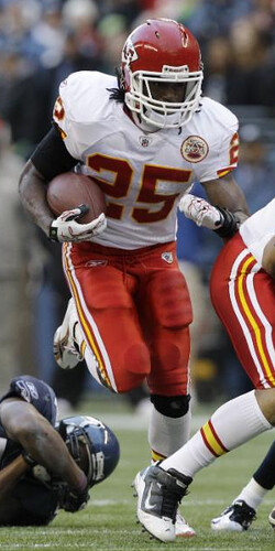
• The Chiefs dusted off their red pants, I believe for the first time this season. (As an aside, the four KC players in that photo have four different knee treatments. From left to right: red, bare, black, and white.)
• The Ravens wore their black alts. Have they paired them with white pants before?
• The Broncos really ought to know better.
• Turning now to Saturday’s college action, Ohio State wore their Amateur Games throwbacks. But they got flagged for excessive Nike-ness.
• See that orange crown on the back of the Virginia Tech helmet? The Hokies added that to celebrate their ACC Coastal Division championship.
• LSU usually goes bare-legged, but they wore purple hose against Arkansas.
• And here’s one last Thanksgiving leftover: When Brad Smith returned that kickoff for a TD against the Bengals, he did with with one shoe.

My thanks to all contributors, including Jamal Wilburg, Jeff Moulden, David Merrill, Jason Henke, and Ben Melancon.
Gift sourcing reminder: I’m working on my annual holiday gift guide column, which will appear later this week on ESPN. If you know of good uni-related gift ideas ”” or if you’re offering some product or service yourself that you think might be appropriate for this year’s rundown ”” please let me know. Thanks.
The Terry Proctor Files, cont’d: While poking around on eBay, I came across old copies of a trade magazine called Sporting Goods Dealer. I wasn’t familiar with this publication, so I asked Terry Proctor about it. Here’s his response:
Yes, we subscribed to Sporting Goods Dealer. The magazine was owned by The Sporting News — all you had to do in those days was to sign up for it and you received it free. Because it was a trade publication, the corporate advertisers paid for it. It had feature articles about new products or trends. Smaller companies that didn’t have a factory rep or a rep group pushing their wares used the magazine to get their name out there.
Once a year they’d publish a book they referred to as The Sporting Goods Dealer Bible. This small desk-reference manual listed all of the companies that were in the industry. It was like a sporting goods phone book. ”¦
Another publication that is still put out by the National Sporting Goods Association is Sporting Goods Business. It’s another trade publication containing inside info on new products and the like without the glitz. The tabloid-style magazine is where I first learned about nylon micro-mesh back in 1987. I know the date is correct because I sold Livonia High School a set of micro-mesh basketball uniforms for the 1987-88 season and we won the Section V Class A title that year. I was the team statistician, back-up scorekeeper, and PA announcer in those days.

Culinary Corner: I did some work outside in my back yard yesterday (cleaning up leaves, tearing out the dead tomato plants, picking up all the toys that the autistic kid next door habitually tosses over the fence, etc.). It was chilly outside — not, like, super-cold, but pleasantly nippy. Afterward, as I sat down on the couch to look at the Sunday paper and watch a little football, I thought to myself, “A chilly late-autumn day like this is perfect for a braise.”
I couldn’t decide if I wanted to braise some beef or some lamb, so I did what I usually do when I can’t decide between two good choices: I chose both. What you see there are two beef short ribs (about a pound each) and two lamb shanks (ditto). Although the cooking procedure I’m about to describe may look lengthy on the screen, it’s actually quite simple and takes very little time. Here’s how I did it:
1. I started by taking half a pound of bacon, cutting it into small-ish pieces (about an inch square), and cooking it over medium heat in my biggest Dutch oven.
2. While the bacon cooked, I cut a pound of onions and four large-ish shallots into medium-thin slices.
3. Once the bacon got crispy, I removed it from the pot and set it aside on a plate. I had hoped to end up with about two tablespoons of rendered bacon fat, but it didn’t look like I had enough, so I cut up another quarter-pound of bacon and cooked that too. While it was cooking, I seasoned the beef and lamb with salt and pepper.
4. When the second batch of bacon was done and removed from the pot, I definitely had enough rendered fat. So I put in the sliced onions and shallots, tossed them in the fat, and set them cooking over medium-high heat for 20 minutes, stirring them occasionally as they browned.
5. Meanwhile, I got out a heavy skillet, added two tablespoons of olive oil, and set it over high heat. When the onions had been cooking for about 10 minutes, I added the meat to the skillet and began browning the pieces on all sides for 10 minutes.
6. When the meat had been cooking for 10 minutes and the onions for 20, I removed the meat from the skillet, set it aside, and deglazed the pan by adding a cup of dry red wine. As soon as it came to a boil (which took only a few seconds), I poured it into the Dutch oven with the onions.
7. I added another cup and a half of wine to the onion pot, followed by 2.5 cups of beef broth (canned is fine), two tablespoons of tomato paste, two bay leaves, some dried rosemary, eight or nine new potatoes, and all of the cooked bacon. Then I added the browned meat (making sure it was fully submerged in the liquid), brought the whole thing to a boil, put the lid on the pot, reduced the heat to a low simmer, and went back to the living room to read more of the paper and watch more football. It was now exactly an hour after I’d started.
About an hour later, my friend Carrie came by with a nice loaf of crusty bread. We sat, talked, drank (wine for her, oatmeal stout for me), and nibbled a few pieces of the bread. After about an hour of that, the house was smelling really good and we were both getting hungry, so I took the lid off the Dutch oven and turned the heat up to high, to help thicken the sauce.
I should’ve left the pot on high heat for a half-hour, but we were both too impatient, so I only waited 10 minutes before bringing the pot to the table. We started by splitting a short rib — sensational. Also filling. We weren’t really hungry anymore, but we both wanted to try the lamb, so we had a few bites of that, and it was a bit of a revelation — such a different consistency and flavor than the beef (which I knew would be the case but it was still sort of amazing). All in all, a swell dinner.
Unfortunately, I forgot to take photos of the food on the plates, but here’s a shot of what was left in the Dutch oven after we were done. As you can see, I won’t have to cook again for the next several days.
Uni Watch News Ticker: Here’s a repeat of something from Saturday, because I initially messed up the link in the Ticker: If you look at this 1973 Indians team portrait, you’ll see that the coaches and skipper in the front row appear to have had piping on their caps. I hadn’t been aware of the Tribe using special headwear for their coaching staff, but that appears to have been the case. ”¦ And speaking of the Indians, what’s with this little right-sleeve patch? It’s from 1981-ish. ”¦ Here are the finalists for the fan-designed Toronto FC kit contest (with thanks to Michael Orr). ”¦ We often talk about multiple-letter situations at the point where chest logos are crossing the rubicon. But if you don’t double up on the letters, you can end up with something like this (screen shot courtesy of Ari Cohen). ”¦ Good rugby equipment video on this page — click on “Behind the scenes with All Blacks baggage man” (with thanks to Caleb Borchers). ”¦ Brady Ivie points out something I hadn’t noticed before: Nevada QB Colin Kaepernick wears his captaincy “C” on his thigh. Do other Nevada captains do this? Does any other team do this? ”¦ Sun Devil Stadium in Arizona is yet another facility using Dodgers-branded seats. Scott Friend took that photo while attending Friday’s ASU/UCLA game. ”¦ Here’s another article about the growing trend of college suing high schools for ripping off their logos. ”¦ Two college hoops teams honored their national championship squads on Saturday by wearing throwbacks UMass (evoking their 1995-96 team) and Cincinnati (1960-61) (with thanks to Joe Kling and Mark Fightmaster, respectively). ”¦ Two great eBay finds by Mike Hersh: a Canada Dry hockey jersey and a cool Junior Rose Bowl jacket. ”¦ Major, major find by Brinke: a magnificently hideous WFL coach’s polo. ”¦ Also from Brinke: an Expos radio and a Mr. Met cereal bowl. ”¦ The Cincinnati Reds: the headwear choice of New York street gangs (with thanks to Alan Tompas). ”¦ Purple and camo, two crummy tastes that taste even worse together. Those are the Texas Brahmas, who wore special uniforms to “honor” the troops (with thanks to Mark Graban). ”¦ I just landed these three uni catalogs. Further details when I receive them from the seller. ”¦ Another week, another round of EPL kit reviews from Michael Orr. ”¦ Former Flyers player John LeClair now runs a shipping company. Not sure about the quality of their shipping, but at the very least they should invest in a better Photoshop guy (nice find by Nick Hanson). ”¦ The Hornets have officially unveiled the yellow alternates that everyone’s already known about for the past month. ”¦ The Blue Jackets wore their new thirds for the first time last night. Lots of additional photos here. In case you missed it over the weekend, I gave my full assessment of this design and the new Anaheim thirds on Saturday. ”¦ Here’s what next year’s MLB All-Star Game logo will look like (with thanks to Justin Kerr). ”¦ Here’s a sensational article + photo about Dave Concepcion getting his captain’s “C” (great find by Daren Landers). ”¦ Also from Daren: The 2007 Reds yearbook included a little Reds uni-history pictorial. Some good bits in there (including a mention of Noodles Hahn, one of the all-time great baseball names), but also several factual errors (like saying that the 1976 sleeve patch was for America’s bicentennial, when it was actually for the National League’s centennial). ”¦ New BFBS alt uni, complete with silly sublimated pattern on the back, for Miami hoops (with thanks to Chris Groves). ”¦ Chad Bengal is currently being featured in a commercial for pistachios, in which he wears a very Bengals-ish jersey, but trimmed in green instead of orange (with thanks to Matt Cunningham). ”¦ Holy moly, look at this completely amazing roller derby jersey! ”¦ A bit pricy, but what a beautiful jacket.
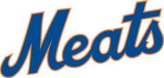
SALE!: For a “limited time” (read: as long as I feel like it), I’m knocking down the price on the white Meats tees to a mere $11. Grays still go for $13 (which, let’s face it, is still a bargain). Full details on ordering here.
re: Reds Uni History, don’t know which name I like better, “Noodles Hahn” or “Dummy Hoy”! There’s a “Rube” thrown in for good measure!
Dummy Hoy was a deaf man (hence the name “Dummy”). He graduated from the Ohio State School for the Deaf before going on to professional baseball. It is because of him that umpires started using hand signals for balls, strikes, safe and out. You can check out his life story, its pretty fascinating. link
CraigD
I thought the hand signals originated at Gallaudet University for the same reason?
You mean NO hand signal for balls – this way it differentiates it from a strike…. just getting technical!
The hand signals on baseball was not from Gallaudet, it was the football huddle which was started from Gallaudet back in the late 19th Century.
There is a red rectangle sticker just to the right of the American flag on the back of the Chiefs’ helmet. Anyone know why?
I believe you’re referring to the fine-print warning decal:
link
Ravens in black over white: Yes, they have done it (last year vs. Bears, year before vs. Redskins) because John Harbaugh is link.
The rest of the league should take note of the Bills throwback helmets and the complete lack of extra stickers. That’s what a football helmet should look like. There is absolutely no reason at all for the warning label or flag.
Maybe the Crips should start wearing Brooklyn Dodgers throwback hats to get the same effect.
…and that shouldn’t really have been a reply, but whatever.
I guess that’s what I get for thinking about commenting then changing my mind.
The warning label is a liability thing, although I also think it’s unnecessary. Everything else can definitely go. I’m surprised they don’t have numbers though. Did the Bills not have helmet numbers in 1960?
Those aren’t 1960 throwbacks. If they were, the Bills would be sporting solid silver helmets with probably blue or black numerals on the side.
The flag should not be on the helmet, and the warning label should be on the inside if it must be there.
I meant it’s materially unnecessary. The NFL has no obligation to inform its players of the ordinary dangers of playing football, because they’re assumed to know and accept those risks by playing.
I don’t remember what year the throwbacks are. What I was asking was whether they had helmet numbers in whatever year the uniforms were from.
Actually… I’m not sure. I’d say probably. The throwback is supposed to represent 1964, I think. The closest I can find is a picture of a 1966 helmet on Helmet Hut, which does have numbers.
That 2011 All-Star logo must be the patch that will be affixed to the caps or uniforms, since the logo that had originally been introduced featured the Diamondbacks’ “A” at the top.
Virginia tech helmet link is actually to an ad
Oops. Thanks. Now fixed.
Here’s the shot:
link
1996 UMass lost to Kentucky in final four, but the appearance is officially “vacated” due to NCAA violations. So they honored an acheivement that never happened according to the official records
link
Don’t tell that to UMass, since the banner recognizing the achievement still hangs at the Mullins Center.
That’s technically an NCAA violation. Pretty sure the NCAA went after Ohio State for hanging a Final Four banner for a vacated season a couple of years ago.
As if the NCAA can wipe our memories. :)
Regarding the Ravens and their black jerseys, they have worn them with white pants before. They wore the same set against the Redskins in their regular season matchup back in 2008.
Whoops, didn’t see JTH posted this already. Plus I forgot the Bears game. :P
Always felt the Ravens should have kept their circa 1996 look, they had the old helmet logo back then. I liked the purple jersey/black pant combo. The black pants had a big white stripe.
I hated that uniform. And so did they–they changed it after one season.
for your reference… link
The purple on black was a great look for them, it’s a shame they refuse to go back to something similar. I think the white stripe on the original was probably a bit too wide and kinda distracting, but that could have been fixed easily.
I have a longstanding beef with football uniforms in which the colored jersey is a lighter color than the pants. The Ravens were the first NFL team to break that rule in my memory, and in my opinion precipitated some of the worst uniform trends in football today. It is one of my major reservations about the color vs. color theory, which I principally support; the thought of Green Bay wearing a yellow jersey and green pants would cause me to wake in the middle of the night in cold sweats.
The old helmet logo had copyright infringement. I liked it too, but in my opinion it looks good on the shoulders of the jersey.
I agree with THE Jeff; the purple on black looks cool, especially with the white sock with the purple/black stripe.
I’m glad that the Chiefs wore the red pants with the white jerseys, it looks so much better than the white on white combination! That is one of the best road uniforms in the NFL. I would also say that the Chicago Bears navy blue pants and white jerseys is another excellent NFL road uniform.
I’m about to make no sense (BFS), but while that Chiefs road uni is among the all-time best ever, I’d rather see the Bears in white pants. Not consistent, I know, especially since my general tastes are “all-white unis only with light helmets.”
Same thing with the Vikes. The only palatable version of their current uni is the all-white one, which of course is blown out of the water by the Tarkenton-era all-whites.
Now when the Chargers had blue helmets, the blue pants looked much better with them than the white helmets. I would feel the same way if they still had them.
Erm, I liked the Vikes with purple pants away, but I would make changes to the socks and see if I can get the colors to match up more. White on white for the Vikes doesn’t do any good, as long as those uni’s look that way.
The return where Brad Smith lost his shoe was actually on a kick off, not a punt.
Thanks. Will fix.
The Blue Jackets alts are nice, but I had to chuckle at that Puck Drawn blog that shows they’re following a current alt jersey “formula.”
Hey, the alts have the traditional elements I like — contrasting shoulder bars, substantial sleeve and waist stripes…that alone is enough to elevate it above any of the cockamamie crazy modern design elements. Like those side panels on the Ducks alts.
-Jet
Kind of a tough one for me, since I completely agree with the Puck Drawn blog that the whole blue-alt-with-circle-logo-and-laces thing is more than played out. And yet the Blue Jackets third is by far the best of the lot, and also comes from a team for which blue is not only a team color, but the team name. I’m halfway tempted to pick one up to wear on the various Civil War battlefield trips I’m going to be making during the 2011-2015 sesquicentennial. So while the formal elements are indeed beyond cliche, the execution is so good that the lack of formal innovation doesn’t matter. Kind of the Peanuts of third jerseys.
Paul, the Jackets wore their alternates for the second time last night. They played a home-and-home against Detroit that featured the Jackets in their alternates both nights. The first time they wore them was on Friday evening.
And the jerseys are cookie-cutter in every sense of the word.
“Some quick photo research reveals that Bryant has been wearing the wrong-facing patches for quite a while now: This shot is from September, and this one is from a preseason game way back on Aug. 19!”
How many jerseys would a kicker be expected to go through in one year?
I’ll hazard a guess: None.
Well, Paul, at least one, unless he goes topless every game. ; )
three, actually…
Sorry, I meant how many times does he wear out the old one and need a new one: None.
So then why the surprise that his jersey from “way back on Aug 19” is the same one he is wearing now?
Because you’d think someone would have noticed it was wrong way back then and fixed it. If it was a misspelled NOB, it would have lasted for one game.
“When I was taking part in that Ping-Pong tournament last week …”
This is why married guys are jealous of non-married guys.
I don’t see why. There were several married guys there with their wives. You just need to find a Ping-Pong-playing spouse.
No doubt there were wives present. But how many of them also have closets full of vintage uniforms/outerwear, pencil sharpener collections, and get to attend uniform unveiling events?
It’s the total picture.
Then again, you have to put up with all of us, so it may be a wash.
Jeez, Jim. You make marriage sound like a death sentence. What’d your wife take away from you?
Nah … it was more of a grass is always greener kind of statement … 14 years (plus six days), as well as three rugrats later, I’m a pretty happy guy. But who says its against some “Supreme Rule” to covet thy neighbors stuff, anyway?
Jim, if this is your way of asking me to marry you, let me just say that I don’t fall for that bended-knee routine.
… stuff … as in jerseys … pencil sharpeners … not “stuff” (not that there’s anything wrong with that) …
In all seriousness, I honestly don’t see what being married vs. being single has to do with any of this. Your life can be as cool (however you define that) as you’re willing to make it, or as uncool as you allow it to be. Certain whims of fate notwithstanding (like if you get run over by a truck tomorrow, say), our choices are our own. So is the responsibility for them. If you don’t like your situation, change it! Simple as that.
Okay, maybe that’s easier said than done. But I truly do believe that’s the right mindset. I certainly know it works for me.
That one team can go from the worst uniform in the league one week
link
…to arguably the best the next week
link
is somewhat astonishing. That the Bills haven’t already switched to the throwbacks full time is mind boggling. Could there really be a decent, sane human being out there who prefers their current look?
What if normal people *do* like it, and we’re the insane ones?
I think some people can get a bit too excited about old-fashioned uniforms and throwbacks, many of which are just plain boring. That said, I do like the Bills throwbacks and do agree that they’re way better than the current disasters.
However, I think they should move to the uniforms they used slightly later, with the current Buffalo logo. I think the logo is great, and looks fabulous on a white helmet. I used to watch old clips of O.J. before clips of O.J. meant courtrooms and Ford Broncos and think that the Bills should go back to that, and this was in the Jim Kelly-Thurman Thomas days.
What is clear is that Buffalo should change its uniforms. I hate the shoulder yoke, I hate the color splotches, and while I originally liked the idea of darkening the blue the “double blue” concept looks awful on the jerseys. It would be a big improvement if they just ditched the monochrome and switched up the pants, but that’s asking too much.
Perhaps they can do something like San Diego, incorporating old throwback concepts with a new-ish design.
No, that would likely be a mess (and for the record I think the Chargers current uni’s are a bit of a mishmash mess). It’s not so much an issue of “old fashioned” vs. modern, but rather the issue is getting it right. What I mean is that most teams, at one time or another, had what is for them a fantastic (near perfect) uniform. They got it right. The Bills mid 60’s uniforms are timeless classics that look just as relevant today as they did when they were first worn.
It was so classic and timeless that it didn’t even last a full decade before they changed it.
One could make the argument that the Bills “got it right” in 1974 or 1987 just as easily as 1965.
Let’s not elevate the throwback to higher levels just because of how bad their regular uniform is.
Agreed, pflava. The Chargers tried to thicken up their look with too many trim colors to add weight. It’s just a bad mishmash of trying to modernize an old & better look. Everybody loses in a compromise.
Considering the Bills have been a disaster in the current uniforms (save for a decent year or so with Drew Bledsoe behind center), I wouldn’t be surprised if they eventually wind up ditching the current set sooner rather than later.
Also, I think the Bills current set would look MUCH better if they went with blue tops and white pants at home, and white tops and either the white pants or the blue pants on the road. I think they’ve worn the blue tops – white pants on the road at least once (at Miami if memory serves me correct) and it looks pretty sharp. Well, as sharp as he current uni set can look.
I would prefer it if they got the stripping on the pants to match the jersey. It bugs me to no end.
Well I think everybody would want to go with the old unis. And going back to the second helmet thing, I wouldn’t mind if they use their new helmet now as an alternate, but that’s just a thought. Maybe too much? I don’t know.
Not really uni-related, but TCU is moving from the Mountain West conference to the Big East after the 2011-2012 school year.
link
Weird, no? I mean it gives them a better chance of being seeded higher, I suppose, but still…
It moves them to an “automatic qualifier” BCS conference (Big East) from a “non-automatic qualifier” conference (MWC).
Regarding the Buckeyes’ glove penalty: The first time it was simply announced as an “unsportsmanlike conduct.” The announcers assumed that it was because Posey dove into the end zone, even though that was an attempt to squeeze between two defenders. The second penalty was announced as “unsportsmanlike conduct, gesturing to the crowd.” I’m not up on the NCAA rulebook, but apparently these refs knew something that the rest of us didn’t.
The bad part is why are so many other teams allowed to make the hand signals. Miami Fla, Alabama did it and others have.
None of them should be allowed. It’s the dumbest part of the whole concept. Nike’s encouraging the kids to show off and the officials finally realized it.
Show off? Hand gestures have been part of the way certain teams celebrate for years. Texas with the “hook ’em” sign, USC with “Fight On”, the “U” hand gesture Miami uses, Houston has the wounded paw hand gesture… I could go on. Just because the refs just started noticing, apparently, doesn’t mean it’s Nike’s fault.
You asked about the Ravens wearing white pants with black jerseys, seems someone else has been keeping track of these things too.
link
(3rd Paragraph)
Over the weekend, my son (age 8) & I played Hockey 2K9 on the Wii. We sometimes get creative with the games. One game we had the LA Kings (in’82 purple and gold) vs. Team Sweden (in yellow), another time we had the Caps (in black) vs Team Canada (in Red).. it is always fun to see the way his mind works..espically when I talk about color vs. color.
Paul, the Blue Jackets actually wore those thirds twice – first on Friday at home, and then last night at Joe Louis Arena in Detroit.
And I still hate the “vintage white”. It just looks bad against the crisp white uniforms of the Red Wings, and the white ice. Personally, I think they should’ve incorporated some elements of the 1976-77 Cleveland Barons (link). The logo could be modified to replace the blackletter “B” with the cannon, with the text changed; in any case, the numbers-on-state-outlines would be a really nice touch, and far better than those cinder blocks they put on their thirds.
I never saw this info before I posted above. My apologies, Rob!
It’s okay… I think the site ate the post for a while (might’ve been randomly queued for moderation, maybe?), because I didn’t see it when I initially submitted the post, leaving me scratching my head. Good thing I decided to let it be, though, instead of trying to double-post!
Are the candidates for the Toronto FC kit design contest the most boring designs ever or what?
Those templates are terrible.
What’s up with the central pattern, anyway?
Paul,
I just got a chance to watch the Top 10 uniforms on NFL Network (cleaning out my DVR today). Excellent job by you. Bad job by the NFL on adding cheerleader and pee wee jerseys. They did get number one right.
What was the number 1?
San Diego’s powder blues
YES. I have a Tomlinson powder blue throwback just for that reason.
Sounds good – always love the Culinary Corner.
Double thumbs up to that.
UMass never a won a national championship, ya dumb motherfucker.
Yeah, the fact that this is actually a throwback to UMass’s (vacated) Final Four squad’s uni was pointed out earlier in the comments, although with not nearly the eloquence of your post.
I don’t really know much about Paul’s relationship with his mother, but I’m not sure by what metric he qualifies as dumb.
Yes they have, lil buddy.
link
“The folks at Schutt can’t be happy that Jimmy Claussen is still wearing a Riddell chinstrap with a non-Riddell helmet.”
That would be “Jimmy Clausen”, not Claussen…
Those seats with the interlocking “LA” logo in DC and Arizona are not from Dodger Stadium. Dodger Stadium never had any seats with any type of logo on them until the last few years when they updated all of the seating. Besides, and more importantly, that’s NOT a Dodgers logo. The Dodgers “LA” logo has NEVER had a serif on top of the “A”. and was never that “squat”. link
Not uni-related, but…
As of yesterday, everybody’s favorite Yinzer, Doug Keklak, is now officially old enough to be president.
Happy belated birthday, ya dumb motherfucker.
/wants desperately to end every comment that way from now on
There’s an old rule that you can replace any given New Yorker cartoon’s caption with, “Christ, what an asshole,” and the result will always be at least as funny as the original. Running through my mental archive of cartoons, I think that adding “… ya dumb motherfucker” to the end of any given New Yorker cartoon works at least as well.
“I say it’s spinach and I say to hell with it, ya dumb motherfucker!”
This formula works particularly well for the NYer‘s weekly “Write your own caption for this cartoon” contest (whose winning entries are never even CLOSE to as funny as “Christ, what an asshole”).
Just like adding “in bed” after the fortune from a fortune cookie. always good for a few laughs.
I just spent half an hour looking at New Yorker cartoons laughing my ass off.
link
That’s even more entertaining than Garfield minus Garfield
That’s not really a bad idea, ya dumb motherfucker.
Didn’t see this mentioned (appologies if it was), but KU broke out the white helmets mentioned on Uniwatch earlier on Saturday in the Border War. They came out in all white, so they looked, and played like a Jr. High football team.
link
(sorry, not sure how to make that a link)
Some additional pics:
link
Hey Paul, I have a question for you.
I HATE the whole BFBS movement as much as the next guy, but What would you say, if Nebraska came out wearing black jerseys or helmets? I of course know that black is in no way part of the Cornhusker’s color scheme, but they do have a history of being called the “Blackshirts.”
link
So with this history in mind, would it be so out of bounds for Nebraska to wear Black jerseys, helmets, or pants, in any of their games?
I mean the Cornhusker basketball team already dabbles with black in their uniforms:
Basketball
link
Hockey
link
And they even sell BFBS jerseys on their team site (In the old style Addidas football jersey style mind you):
link
So I’m not saying I’m in favor of this jersey, I personally think it would look awkward and wrong for Nebraska, but I was just wondering on what you or others on here would think of the possibility of this happening in Lincoln.
Welp, that link failed horribly. Here is what I was intending to send:
link
My take on the matter is no, the football Huskers should not wade in the BFBS arena, unless they tried black sometime in the distant past. Since football is clearly the dominant sport at Nebraska, I think they should refrain from copying the basketball team. That said, I wouldn’t mind seeing the Huskers going monochrome occasionally.
Also, the “N” should either return to the sleeves, and the stripes should go. The “N” on the sleeves was used in the early 80s, before disappearing in ’84.
If the Huskers ever dabble in the Nike Pro Combat arena, I want to see a Boise style helmet, with an oversized “N” on the helmet.
A big ear of corn. That’s what should be on the helmet if they mess with it.
And since the blackshirts thing only applies to the defense, no I do not want to see a black jersey.
On second thought, the Huskers should not attempt a huge “N”. Maybe put that Cornhuskers guy with the corn on the helmet.
If Oklahoma ever went the Pro Combat route, they could put the boomer sooner wagon on the helmet.
For Michigan, just put a big blue “M” on a yellow helmet
For Oregon, the pro combat uniform should be ultra conservative, like old Penn State, with no logo and numbers on the helmet.
What exactly is wrong with Nebraska’s uniform that needs fixing?
it’s not black
/ya dumb motherfucker
Now that Nebraska is moving to the Big Ten (where they face a serious identity crisis playing alongside Wisconsin), it would be intriguing to see if the Huskers would entertain such a concept. As perfect as their unis are, a black alt would be an interesting idea for their games against Wisconsin (and them only).
No, I think the perfect answer would be monochrome, with each home team going all red.
Forgot to mention in the Nebraska-Wisconsin football game, the visiting team would have to be in all white uniforms.
Well Paul, absolutely nothing is wrong with Wiscon… er Nebraska’s uniform. They’re a classic that I agree doesn’t need any tweaking, but if they were to want to have one of these new fangled alternate uniforms. Its pretty much just a hypothetical, wondering if you would be against a once a year type jersey such as this?
Wisconsin-Nebraska will actually only happen one out of three years, since they’ll be in different divisions. And the Big Ten has handled Wisconsin-Ohio State in the traditional way, having the road team wear white.
my theory is this:
THE ONLY TEAMS THAT SHOULD WEAR BLACK ARE THE ONES WITH BLACK IN THEIR COLOR SCHEME OR THAT HAVE ALWAYS HAD BLACK!!!
for example,
the sf giants, the marlins maybe, the orioles, the chisox, dbacks, the rockies, and the pirates for baseball.
for football:
the raiders, the ravens, the steelers, the bengals, jaguars, the saints, falcons, and the panthers.
I don’t even want to list all of the college and NBA teams.
Those Blue Jackets thirds kinda looked like the old Cleveland Crusaders jerseys at first glance….
I’m not a good hockey photographer, but here’s a Dartmouth-Harvard men’s matchup: link
Don’t know if anyone saw this or posted it yet, but James Farrior had some helmet issues on Sunday. link That picture is from the Post-Gazette.
So Paul plays Table Tennis. I loved that game and got pretty decent at long ago. Actually one of my better sports that I played and loved.
Ping pong is fun, but more women play tennis, so that’s always important in the big picture.
It seems like I saw a Jaguar player (I didn’t catch the player, but he was lined up in the backfield) with a Jaguar logo on the back of his pants in Sunday. Did anyone see this?
Can you get a link?
Because I think I saw the same thing.
Wait when I was going through some pics, it was just a handwarmer on the opposite side
the ravens have worn the white pants with the black tops every time since 2008
the cards really have to stop going bfbs. theyre doin it tonite
Watching the pregame between the 49ers and the Arizona Blacks ;) Can someone tell me what is on Vernon Davis’ right arm??? It doesn’t look like a shoulder brace, more like that Kneiso (spell check?) Tape that some athletes wear (most notably gymnists, swimmers/divers, and last season’s Boston Celtics team. It’s red and black, but dosent look like it was applied on flat.
Those black Arizona Cardinals uniforms are disgusting, even if black is a minor color of the team. Same holds true of the Chiefs if they ever trotted out a yellow jersey, or the Steelers introduced blue pants.
In baseball, it would be awful if St. Louis used a yellow jersey, and it was a big mistake for the Pirates to try a red vest. The Phillies should never attempt a blue jersey.
The minor colors of a team should not be used in this way.
The really odd thing about yellow would be that I’ve never seen an actual cardinal with a yellow beak. Only red.
I think I like them better than the red uniforms. But it makes it really hard to tell it’s Arizona without glancing at the score I think it could use more noticeable red trim.
So I’m trying to look for the guy with the jaguars patch on the back of his pants, and I see that on some of the Jaguars players pants,the Jaguar logo is on different sides of pants. AND Maurice Jones-Drew’s switched during the game. Take a look:
link
link
The Jaguar logos are on both sides of the pants
Oh. Now I see. Didn’t notice it before. Thanks.
I think you’re right, Chris. This photo (link) shows the Jag logo on the hand warmer, and this one, (link) shows Maurice Jones-Drew with his hand warmer flipped around to the back. The pants themselves (link) do not have a logo on the back.
I still say cards need red helmets. (AND red jerseys.) But I don’t despise the black. I wonder why?
Agreed. But, what if, with the red helmets and the white helmets, they had yellow facemasks, because of the beaks? That would look better. They need to go back to the old ones when Emmitt Smith was on the team.
As in unis is what I meant. They should go back to those old unis.
Then they’ll look like they’re copying off of the Redskins helmet.
The Cards with a red helmet, to me, wouldn’t work. Normally, I like black, but the black uni for the Cards is unnecessary. Also, the monochrome red on red look isn’t good for them either. They should fix their jersey design. It’s wonky in my opinion.
Then maybe red facemasks? I’m getting tired of the GFFGFS (Gray Facemasks For Gray Facemasks Sake). Teams should go with their colors on their helmets, not gray. Unless they have gray or silver in their scheme, like the Raiders or the Cowboys.
It’s not really grey, it supposed to be white. I don’t know why some teams have white = grey.
I think a red facemask will work nicely, though.
I’ve posted this before, and it’s kinda quick & dirty, but I don’t think a red helmet looks that bad for them:
link
…but I would rather see them stick with white and use a red facemask, and I think that if they *must* have a black jersey for some reason, they should wear it with their red pants.
Kyle, it’s gray. There’s no “it’s supposed to be white” about it. If they’d wanted it to be white, they’d have used white.
Yeah, it should be white (or red), because that would make sense. But the team made a choice to stick with gray.
Except when the cameras show them relatively close, the helmets logos appear almost solid black on my TV. I guess it’s some kind of optical illusion caused by black jerseys making the black outline of the helmet logo more prominent.
PS
Crabtree has VERY glossy all black shoes—no logo. anyone know why?
heckuva catch.
they look pretty similar to the shoes he normally wears with a different upper material
I only got a quick look at them, but they look to be all-black with red outsoles and white laces.
This is the best picture I could find
link
Cards deserve to lose tonight, for the BFBS if nothing else.
Can someone explain why Mike Singletary is wearing sunglasses for a night game?
He is such pompous blowhard….
He’s so cool, the sun shines on him 24 hours of the day.
Maybe they are photochromic lenses, and the stadium lights are making them darken.
Those stadium lights to get pretty bright…
LaRusa?
Tore?
Remember when he played on the Bears, and they would always — ALWAYS — focus on his eyes and say how he looked all intense and shit. As if he was the only player on the fucking field with two eyeballs….
the fuck
Eye of the tiger?
To be honest, I wouldn’t want to be on the other side of him when he was on the Bears. He might be pompous, but he did have a pretty intense stare.
Oh, please. And I suppose all those other middle linebackers were just pussies, right?… Yes, he was a great player, but the “intense stare” thing was just a media invention.
I always thought it looked like he normally wore glasses and was re-adjusting to contacts.
LT was a wuss…we all know that…but singletary? he was badass
It’s a sad story, really.
All those times they zoomed in on him, did you ever see him blink?
No. Because he never did. NOT ONCE — from the opening kick to the final gun. And because of that, he no longer has any eyeballs.
So he’s doing it out of consideration for us.
That was the best comment I have seen all night. Bravo.
Thanks. I appreciate that, ya dumb motherfucker.
and we suffer ever week because of it.
To nobody’s surprise:
1) Colleges with registered trademarks (which are assets and have monetary value) are asking high schools to stop using them (and, possibly, reducing the value of those marks).
2) High schools throw their hands in the air.
What has always surprised me (ever since I learned of intellectual property) is why colleges didn’t do this a long time ago.
(Then again, it is something I preach until I am blue in the face to my clients about: Enforce your trademarks!)
More to the point (well, maybe not to Anthony, since he’s a trademark attorney): Don’t these high schools want their own visual identities? If my high school had copied a college or pro logo, I’d have been embarrassed by our lack of originality.
Little Leagues have gone this sad route as well. My son has been a National, an Indian and a Red in his three years playing tee-ball and coach pitch. He gets to wear a crappy t-shirt with baseball pants and an MLB hat. I bought him stirrups, naturally.
I was a Clark Fireman. We really didn’t have a team name, other than the Clark VFD sponsor. But we did have some sweet kelly green-themed Tequila Sunrise unis!
Not that it’s any of my business, but what was your high school?
Actually, I don’t think that’s besides the point.
You are an entity. Be it for-profit or not-for-profit. Do you want your identity to be someone else’s?
I can’t imagine you wouldn’t put the time into creating your own identity.
Oh, right. . .
Cardinals’ black > Cardinals’ piping scheme (ick)
(Hypothetically speaking,) I am a life-long NFL fan who has never, until tonight, seen the football Cardinals in action. I see the black jerseys. I’m shown video of the red jerseys in action.
I vote for the black jerseys, having no other (hypothetical) knowledge of the franchise.
hypothetically, ya dumb motherfucker…ahemit’s sad when most of the people who first see the cards BFBS unis all come to pretty much the same conclusion: they suck, but they’re better than their reds
that’s an indictment of the reds, not a statement in support of the BFBS…and that should tell the designers one thing
black sellsback to the drawing board, fellasI don’t disagree … in fact, how about a conspiracy theory?
What if the Arizona head honchos wanted black jerseys from the start with a new uniform identity, but were nixed by the board of trustees/NFL/fans because “the Cardinals should wear red!!!”
Pouting, the head honchos decide, “Fine! You want a red jersey?!?!?! We’ll GIVE you a red jersey!”
A couple years pass, and the black jerseys are introduced as an alternate. The red jerseys are so hideous, the fan base, their wallets, and not-so-coincidentally, the NFL powers that be, decide the black jerseys aren’t so bad after all.
In 2013, the black jerseys are named the primary jersey.
Mission accomplished.
Not sure if anyone has seen this yet, but check out this Chicago Bear’s haircut:
link
I wish we could try the BFBS people for treason to sports!
Not sure if this has been pointed out before – but the throwback Buffalo uni’s are nearly identical to what SMU is fielding these days.
I just made some braised lamb shanks as per your recipe… and they were fantastic. Thank you so much for the recipe.