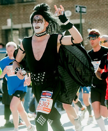
As is always the case on the first Sunday in November, the most notable athletic attire yesterday was at the New York City Marathon (lots of additional pics here and here). I live half a block from the Marathon route, so it’s easy for me to wake up and stumble outside to watch the spectacle of humanity jogging by. Saw a guy dressed as a banana, a guy dressed as a moose, lots of guys dressed as girls, and so on. Best sportswear day of the year.
Meanwhile, on the girdiron:
• The Bills had a “home” game in Toronto, so they wore that big-ass patch that they break out for such occasions.
• Have the Texans ever gone solid navy before? Not my favorite look for them (or, okay, for anyone).
• Remember those Colts throwbacks from the preseason? Indy broke them out again yesterday. I heard a lot of people wondering why anyone would wear a throwback on the road, but I don’t see anything wrong with it. No matter where you’re playing, the vast majority of your millions of fans are watching on the teevee, not in person at the game.
• Turning to the college ranks: Instead of wearing their usual powder blue jerseys on Saturday, the Citadel wore red with blue trim. “It was a tie-in with homecoming and the return of Big Red,” explains Chuck Fowler. Interestingly, as was pointed out in last night’s comments, the helmet had distinct Buccaneers overtones.
• I believe this was the first time Colorado State wore their gold jerseys.
• There were some additional noteworthy college football items from Saturday, but Phil already covered them yesterday. In case you missed it, look here.
• One thing about Utah’s Wounded Warrior uniforms that Phil didn’t mention: Is there anyone who truly believes our country and its flag our honored by these gloves?
Oh right, there was also this. Not much to say here, except that they’ve reached their, uh, full potential. Look, if you want to look like clowns, you deserve to look like clowns, simple as that.
Why didn’t I think of this sooner?: What’s even better than a Meats T-shirt? Take a look. For now they’re only available via that Zazzle page, but I may get them made in bulk and sell them myself if there’s enough interest. Anyway, this is the part where I say they make a great gift, that they’re as suitable for the back-yard grill as they are for the kitchen, and all that rot. Look, just buy a few dozen of ’em and we’ll both be happy.
Meanwhile, I just got a new shipment of Meats tees and am now fully restocked in all sizes. For ordering details, look here.
Uni Watch News Ticker: In case you missed it on Saturday, Phil put together a great piece on Oregon’s new court design. Personally, I kinda dig it. Yeah, there’s a chance that the finished product might end up looking like a court with a big bleach stain in the center, but think it’s a really innovative concept and an intriguing execution. I’m looking forward to seeing how it looks during a game. ”¦ Here’s a site featuring some excellent hockey T-shirts, including some tees that mimic jerseys (nice find by Colin Sherrod). ”¦ As we’ve been beating to death over the past week or so, the Browns’ orange-numbered jerseys made only one on-field appearance, and that was during a preseason game. But they were also used in another context: on the cover of the 1984 media guide (great find by Jesse Agler). ”¦ Dylan Buell reports that the Ball State women’s hoops team is wearing an inspirational message on the back of their sneakers. ”¦ Also from Dylan: “I was shooting a football game and spotted one official (or is he part of the lines crew?) whose sole job is to keep track of penalties. And at halftime, I saw this box in the break room.” ”¦ Matt Harris was looking for photos of Yankees prospect Jesus Montero and found this. Anyone know what’s going on there? ”¦ Been a while since I’ve mentioned all the amazing letterhead designs to be found on this site (thanks for reminding me, Chris Ashworth). ”¦ New hoops uniforms for Lipscomb (with thanks to Raleigh McCool). ”¦ A bit overpriced, but I couldn’t resist. More photos once I receive the item from the seller. ”¦ On Thursday I mentioned that a Phiten publicist had told me that the company’s necklaces would soon be worn by NBA players on the court. That was incorrect. The proper info, it turns out, is that Phiten bracelets are now approved for on-court use. ”¦ The Blue Jackets will unveil their third jersey on Nov. 24. ”¦ UTEP hoops will wear throwbacks for their home opener on Nov. 12 (with thanks to Nick Govea). ”¦ James Huening was at a Chilean restaurant called Rapa-Nui, whose menu features an intriguingly named sandwich. The thing is, I don’t really dig avocado. ”¦ Here’s the obligatory “What happens to all the Texas Rangers championship gear?” story (thanks, Brinke). ”¦ New hoops uni for UGA. ”¦ “I saw these wonderful slippers ad immediately thought of you,” writes Coleman Mullins. “The blue around the ankle doesn’t match UW colors but the rest is spot on!” ”¦ While looking for something else, I noticed a shot of a UCLA player with a diacritical mark in a very unusual place. ”¦ I was vintage-shopping the other day and stopped dead in my tracks when I saw a drum major’s jacket from my high school! It’s a little hard to see in those photos, but the jacket actually zips from top to bottom, instead of the standard way. Anyone know if that was (or still is) common for this type of garment? If so, why? ”¦ Good UFL observation from Kevin Mahon, who writes: “A number of UFL teams, Las Vegas and Florida in particular, seem to have tailored their color schemes to the stadiums where they play. The most blatant case is Las Vegas, which changed its colors to match UNLV’s colors to match the red seats (most of which are usually visible) and the red outline on the yardage number.” ”¦ Here’s another high school football team with mismatched helmet decals: Old Mill High in Maryland has Pat Patriot on one side and a TV number on the other (with thanks to Kevin Zdancewicz). ”¦ Is that a Bengals/Titans game? Nope, it’s a high school game from Washington state. Man, these derivative high school logos are really getting out of hand. ”¦ Caleb Borchers has noticed a growing trend in rugby: gray for gray’s sake. “The latest example would be England’s new national jersey (debuted this weekend), which traditionally is some version of red and white but now has gray. Why? Who knows. Various clubs in Europe and the southern hemisphere, as well as some national sides, have been doing this for the past four years. I sort of understand a club that wears black going to gray, but from yellow to gray?” ”¦ While looking for something else, I stumbled across this totally bizarro Dolphins shirt. ”¦ I asked Bill Jones if he’d ever made a gumball version of Willie Lanier’s exterior-padded helmet. He’d never thought of doing that, but he got right on it. He used adhesive foam for the padding. ”¦ This T-shirt is too small for me, but I’d love to see some Uni Watch reader end up with it. ”¦ New hoops uniforms for Providence (as noted by Michael Berlutti). … Notre Dame’s alternate hoops uni for the past few years has been black, but now it will apparently be gold (with thanks to Conor Levey). ”¦ As usual, the Leafs and their opponents — the Sabres this year — wore special patches for Hall of Fame Night. Let’s just say the patches looked a lot better on one team than they did on the other. ”¦ The Charlie Samuels situation keeps getting more interesting. ”¦ One of you Packers fanatics out there should snap up this old Pack-themed Rawlings ad. … Buncha good stuff from Jake Doyle, including a look at the Blues’ original prototypes; an awesome rip-snorting mask design for this Toronto Toros goalie; a fascinating rear-sweater design for the 1956 Soviet hockey team (it looks like a northwestern-striped harness!); and a cigarette ad that provides a rare partial glimpse of the Rangers’ one-year uni from 1946-47. … And so it has come to this: Over on the Chris Creamer board, some (presumably young) commenter recently wrote, “It’s good that so many [college basketball] teams are going to have the manufacturer logos on the jerseys this year. … I think it looks great. Every other sport has the manufacturer logo on the jerseys, why shouldn’t they. … I think without manufacturers logos, the jerseys look cheap.” I guess that kid hasn’t heard of the NBA, but whatever — the point is that there’s now a whole generation that thinks logo creep is not only acceptable but preferable, because it’s what they’re used to and, worst of all, because they think it confers some mantle of legitimacy. Which is precisely what Nike and Reebok have wanted all along. A major triumph for corporate douchebaggery. … In happier news, a big birthday shout-out to my pal, neighbor, and Scotland travel partner Amy Fritch. She and her friend Danielle threw themselves a joint birthday party yesterday, and Amy made this ridiculously amazing cake for the occasion. Plenty tasty, too!
Why exactly is the citadel honoring a military act which started the civil war?
“The idea behind the recovery of Big Red is to remind people of the deep devotion to duty, honor, and country possessed by Citadel alumni and The Citadel family,” said Alumni Association Director Mike Rogers.
Am I the only one who finds it really odd that a military university is honoring an act of war against the united states, and celebrating the return of the flag under which that act took place?
For some folks, that war has never ended.
It’s absurd on a couple of fronts, no doubt. That said, Charleston is still one of the great cities of the world.
I was about the post the same thing. They want to remind people how patriotic alumni of The Citadel are, by bringing back the flag of literally the least patriotic Citadel alums ever. Okay…
As for the red uni- it disappoints me anytime The Citadel leaves their definite article off their uniforms. Their “The” is legitimately part of their name in a way that no one else’s is. (looking at Ohio State on that one) Frankly, their name doesn’t make a lot of sense without it.
i bet i can think of someone else who’s diappointed the definite article was dropped…
The Cheat?
“The” is part of Ohio State’s name. It lost a copyright lawsuit to Ohio University over the use of “Ohio” and as a result had to append “The” onto its name. It is officially The Ohio State University as a result, same as The Citadel.
And yet, way less legitimate.
Ohio State’s “the”, no matter how official, is an exercise in pomposity, not necessity.
Well, do note he didn’t say which country.
Good catch there. Surprised they just didn’t go w/ General Cleburne’s South Carolina Brigades’ battleflags on the helmet.
(Insert Rebel Yell)
Three points, if I may:
1) Couldn’t agree more about the “The” thing, and I have never understood why the department of athletics has been so obtuse on this issue. It’s the name of the school. How hard can it be to put it on the uniform?
2) I wish original artwork had been used for the helmet design.
3) Big Red is a flag that is unique to The Citadel. It’s not the Confederate Battle Flag, Naval Jack, etc. I’m basically in the “the Civil War is so over” camp, but there isn’t anything wrong with Big Red — it doesn’t have the negative connotations associated with those other flags.
As for the “fighting against your own country” argument…well, back then I gather they thought they were fighting for their country, or what they thought their country was. That’s a discussion for another forum, I suspect.
Incidentally, whatever you think of the flag, the backstory behind its disappearance and rediscovery is interesting, and the flag itself is in remarkably good condition, which can be credited to the flagmaker (superb craftsmanship and high-quality materials) and whoever stored it at the Iowa Historical Society.
So did the Tampa Bay Buccaneers give The Citadel permission to repurpose that helmet design?
On Mike & Mike this morning, Greeny was trashing the Colts throwbacks, saying he hopes he never sees them again, and if they are 1955 throwbacks, then he was glad he was not alive 55 years ago to see them.
Harumph.
That guy is a prime-time badass.
I expect to read the same thing from Peter “I Am The” King who, IMO, has a low-uniform-IQ, too.
Colts throwback helmets look RIDICULOUS, period.
why did it look so ridiculous? Can to explain?
Only down side ( IMO) to the throwbacks was the combination of night game & that the crappy field turf (or whatever it’s called) makes everything look bad. Well, everything but the Philly fans. (they do NOT need anything else to make them look bad–clearly).
Um, Lincoln Financial Field has a grass playing surface.
Wow, DJ —
how does one defend the indefensible? :0
If the Colts are going to play like that in them (see vs. Green Bay in the preseason as well), I wouldn’t mind seeing them retired, either.
Maybe its a complete coincidence, but I believe these two games have been the only 2 games Peyton has thrown to receivers not wearing white helmets since who knows when. Indy wears white, Tennessee wore white, Newman High wore white… anything to this?
Does the NFL have different rules for “throwback” alts than for regular alts? With the exception of the AFL stuff last year, I thought teams weren’t allowed to wear alts on the road.
(I think they should be, but that’s another issue)
i think they’re allowed to wear them up to three times a year…regardless of where — but other than the colts throwback, and not counting the AFL throwbacks last year, did any teams actually have a road throwback?
because if you have a “home” throwback, how are you going to convince the “home” team to let you wear it in their stadium (i suppose this would work in dallas, however)? did road teams wear thanksgiving throwbacks in dallas or detroit?
it’s not like MLB, where if you’re having a throwback game, the other team pays for your unis, right?
good question THE
Good point, thanks to the whole mandatory white thing, there really isn’t such a thing as a road alt. The Redskins 1970 throwback from a couple years ago used white jerseys, but I’m pretty sure they still wore it at home anyway.
There were a few throwback Thanksgiving games where both teams did it (Pack/Lions, Bears/Cowboys), but it’s been awhile..in fact those may very well have been before the current alternate jersey rules started.
I can think of one team having a road throwback…
link
That’s from Thanksgiving 2004
>I thought teams weren’t allowed to wear alts on the road.
I have never heard of that rule.
My understanding of the rules: No more than once in the preseason and twice in the regular season.
Didn’t the Bills wear their throwbacks in Tampa a few years ago? I think they did and were upset at the league when they were told they could only wear the uniforms one more time all season.
I was in attendance at that game, and they did. The Bucs made the Bills wear their dark jerseys since it was September, and they decided to go with the throwbacks for the second straight week.
Am I the only one who sees bracelets as a terrible idea for basketball? Aren’t there a lot of defenders’ hands swiping at ballhandlers’ hands. I would be concerned that players fingers might inadvertently become caught in a bracelet. Then, when the ballhandler instinctively pulls his hand away from the steal attempt, boom. Broken finger(s).
It beats when they used to wear necklaces in the 70s (can’t believe no one didn’t choke), but yeah, I don’t think the bracelets are a great idea.
You mean the puka beads Phil Chenier (amongst others) wore? Those fell apart the minute someone’s hands touched them, no?
I was thinking of the regular chain necklaces. That was in the 80s too, with guys like Darryl Dawkins:
link
By the way, I don’t remember them doing throwbacks way back then:
link
Or maybe that was the 70s? That wasn’t their regular uni when Dawkins was with them, though.
Those “Bengals” High school jerseys look better than the actual Bengals Jersey.
Here’s a Sunday Tweet from Viking punter Chris Kluwe, as reported in Monday morning’s Minneapolis Star Tribune: “Glad we could get a win today. Still doesn’t change the fact all purple is absolutely heinous looking.”
(Being a Viking fan since 1961, I love purple but hate the current uniforms, especially yesterday’s look. I want something like this: link )
well hell!!!!
it’s only the uniform they wore from the mid sixties until what, 2000? The only true Vikings’ uniform. Only one thing missing from your link… it’s missing the extra space between the 1 and 1 like ol’ Joe Kapp wore it!
Sanity has returned to Notre Dame in the form of ditching black.
The Westwood One radio guys for the Colts/Eagles game kept mentioning that the Colts were wearing throwbacks, but they kept fawning over the Colts finally wearing white-on-white, and that it was a classic look.
Dude, they wear white-on-white all the time!
The never mentioned the most unique aspect of that uni – a blue helmet! Idiots.
I was at the game, the Eagles should’ve gone with their opening day throwbacks as well
and then, kept them forever
Have the Colts ever worn blue pants?
I remember when the Lions wore blue pants in ’98. It just looked all sorts of wrong, and I’m glad they had the sense to ditch them for ’99.
unfortunately
Now, now…
That’s right, I’d wear that.
But I wouldn’t get rid of the white pants.
Hated the Colts Blue Pants – pretty much looked like Jim McMahon -era BYU. Which is OK for BYU, but pretty much a trade down for an NFL team with a great uni and a great history.
Thank God it only went for one year. Ditto for the Lions ill-advised Blue Pants.
Wish we could say the same about the Saints Black Leotard atrocities!
Best thing about the throwbacks were those sweet jackets the coaches were wearing. I’D WEAR THAT!
link
Yep!
No problem – there’s nothing a coach wears on the sideline that you can’t buy for your own closet.
I also thought it was a bit of an insult that the coaching staff had these “retro” sweatshirts and jackets to match the ’55 jerseys, but they still had “Indianapolis” on them. Seems a bit revisionist.
Agreed. They should just have the team name on them in cases like this.
As a Baltimore fan, I was much happier seeing that than the alternative.
Why? Last year the throwback stuff worn by the Titans coaching staff said Houston Oilers.
Baltimore isn’t any better than Houston.
No one claimed that was in good taste either.
Baltimore has better seafood.
Better crab cakes at least….
You know, I thought I was the only one who didn’t like avocado – nor guacamole for that matter. I just don’t see what the big deal is.
Hey I’m from Dominican Republic, where although most folks think baseball is the national pastime, its really avocados ( aguacate ). I dont mean seasoned guacamole, but just straight up avocado.
I think I am the only person ever born on that island that can’t even stand the site of it!!!!!!!
Yeah, I’m not a big fan of them, either. I do like fresh guacamole in limited quantities, but the fruit itself? Not so much.
Suffice it to say that I didn’t order that Lukas sammich.
In Brasil, I’ve been told they eat avocados as fruit.
No seasoning, straight up, homie. It also gets blended into smoothies– now, I’m an avocado man to the core, but I draw the line on blending it into a smoothy, thou.
nasty.
Ricardo what part of DR are you from?
If I had to guess, it’s there to fit the green/yellow/red color scheme. Avocado for green, cheese for yellow, and ham for red.
That’s not the Toronto Toros goalie pictured. It’s Ernie Wakely, the Birmingham Bulls goaltender. The Bulls’ mesh sweaters were made by Russell Athletic and had imprinted stripes, numbers and crest. The Toros used Maska Nylon/Durene knit sweaters will twill and embroidered graphics.
Didn’t they also have a “TOROS” graphic on the sleeve stripes when they were in Toronto?
They sure did. One of hockey’s great sweaters. I saw them play three times at Maple Leaf Gardens in 1975 against San Diego, the Winnipeg Jets with Bobby Hull and against the Houston Aeros featuring the Howe family. The Toros were avering around 10,000 a night at MLG but Harold Ballard gave them such lousy lease conditions they couldn’t make any money. I think it was spite because the Toros had eight former Leafs in the line-up and were a more-entertaining team.
Ah, yes, Harold Ballard… the same man who gave us white-on-white and blue-on-blue NOBs because he didn’t want NOBs at all, fearing a drop in scorecard sales. (As if people who wanted to keep score at the game suddenly wouldn’t just because names were on the backs of the jerseys…)
Agree with Terry Proctor that that’s a Birmingham sweater. But while Wakely wore 35 in ’78-79, that masked man appears to be his predecessor, John Garrett. The style is consistent with the mask Garrett wore as a Vancouver Canuck:
link
You’re probably right. I figured Wakely because the first letter of the name on the back looked more like a “W” rather than a “G.”
That was my error. I sent it to Paul labeled as the Toronto team. I apologize. Thank you, Mr. Proctor, for all your contributions to the commUNIty.I absolutely love the old Amerks photos.
Pretty interesting photo of Arsenal’s Theo Walcott here:
link
I see a heart rate monitor there, but I’m not sure what the top is. Never really heard about players wearing HR monitors during games.
Random comment concerning the NWU stripes. I watched a few Buster Keaton movies this weekend including “Three Ages” (1923), which has Buster playing football. The opposition team wore solid jerseys with four stripes. I recalled that Harold Lloyd’s well known movie “The Freshman” (1925) had him in a football game and I wondered about their uniforms. The football scenes are on youtube: link. The interesting tidbit is that the the opposition, Union State, is wearing NWU striped socks, about three years before NWU claims to have introduced them to a football uniform, albeit on the sleeves. Look at the youtube clip above at the 4:11 minute. It would be interesting to know if these uniforms were a studio fabrication and whether those socks were readily available football attire back in 1925. This web site (link) claims that NWU is believed to be the first to bring this stripe pattern to football. Perhaps on the sleeves, but the movie raises suspicions the socks were around in football before 1928.
I loved “The Freshman” with Harold Lloyd. I look for old football movies on TCM. I was not aware of Buster Keaton “Three Ages” movie with football scene.
Seems like many movies of the early 30s or at least some use USC jerseys. “Horsefeathers” Marx brothers movie did.
And interesting about the NW socks on Union State
‘Signal! Hey diddle diddle, the cat in the fiddle, this time I think we go up the middle!’
That stuff cracked me up
Those hockey Ts would look about a thousand times better if they weren’t faux-aged. Especially since the white is still brand-new white, instead of “vintage white”.
I don’t want “pre-aged” wear! If my shirts show wear, it should be the wear generated from where they’ve been while on MY back!
Sure that vintage jersey may have been a little more than you needed to spend. But it looks like the kind you’d be kicking yourself in the butt, if you didn’t make the deal.
Good get.
Texans wear the blue over blue once a year. Been doing it for a few years now. I actually like it. More than the all-red look anyway.
The first time was when they beat IND for the first time (2007?), so they break out all-blue once a year now. They’ll usually go all-white and all-red once too.
C’mon Texans, wear the red jerseys with the blue pants…at least once.
In regards to the band jacket zipping from the top:
It’s not uncommon to have a top down zipper. Since most marching band pants are high riding, or the uniform features a waist element, such as a cumberbun, the zipper accidentally opening would hidden at the waist. If the zipper came to the top, and came unzipped, it would look sloppy. Alternatively, many jackets hook on the side, under an epaulet to prevent this.
Re: England kit – Not just grey, but a gradation of grey… makes me think of the L.A. Kings’ 1996 alternates, the so-called “Burger King” jerseys.
Zip-down zippers are really common in marching band jackets. It has to do with having a clean, tight,and precise collar. If the zipper opens up, its at the hemline, so one will notice. Plus, gravity and movement won’t effect collar area. What’s rare about that jacket, is you can SEE the zipper. Jackets with zippers in the front usually have an overlay. Since there’s lettering and stripes, there probably isn’t an overlay.
Jesus Montero is obviously wearing Alpha and Omega symbols, and by the looks of things, it was an all star event or something – maybe some event that wasn’t as “serious” that he could get away with just having the symbols
a play on Biblical references to Jesus as the Alpha & Omega- link
yeah, i got that, but no one had mentioned it yet. thought it was obvious.
Apparently it was a photoshop job. Here’s the original, which someone just e-mailed to me:
link
It’s great to see my name in today’s column! Thank you for that Mr. Lukas. Now maybe my wife will be okay with me getting those slippers, since they got me on the internet and all.
There is no rule that a visiting team can not wear their throwback uniforms on the road. The NY Jets wore their Titans retro uniforms at the Miami Dolphins in 2007. I wish the Colts wore their throwback uniforms last week at home against the Texans, which a Monday Night game and it was nationaly televised. Speaking of the Texans, I have nothing against them wearing their all blue uniforms, but I do not like them wearing blue socks with the white jerseys and blue pants because it does not look good. They should go back to wearing the red socks.
For the new Providence unis, I’m gonna guess the “old” and “new” are reversed. The horns on the jerseys are so 2005. ;)
That was my thought too. But those really are the new uniforms:
link
That’s the photo gallery from Saturday exhibition game.
Agree, I stand corrected. Another gallery from last season showed the team wearing the “Old” uniforms then (which I believe are a previous Michigan State template no longer in use by them but which several teams adopted last season, such as Iowa State and Saint Louis). Odd they’d go to an older design, guess they just liked it better.
Old, new…it doesn’t really matter. They’re both abysmal.
Wouldn’t wear either one.
Thank you for sharing Letterheady. The Alfred E. Neuman watermark is wonderful.
You bet — Letterheady is a goldmine. Thanks, Paul.
On the other hand, that “totally bizzaro Dolphins shirt” is among the ugliest things I have ever seen.
Re: Hockey Hall of Fame Game – Why, oh, why did the Sabres not use their currently blank shoulder space? Of course, it’d be better to just get rid of those stupid front numbers…
Re: 46-47 Rangers in that cigarette ad – All I have to say is, they forgot one part of that “T-Zone”: the trache ring!
Yes get rid of the number on the clavicle and that piping while you’re at it.
And they can dump navy and silver while they’re at it.
I can link of a link folks who just link be in that link.
The uniforms worn by Utah and Texas Tech this past Saturday were disgusting on all levels, with the possible exception of the good intentions of those that designed and outfitted those teams. Maybe up close the camo numerals and trim looked like military camo. However, from a distance – either in the stands or on TV – the “camo” trim and numerals looked more like sequins or glitter than camo. My first impression was that these would be uniforms that Madonna or Lady Gaga would have mocked-up to wear if they wanted to ape a “football look” onstage at a concert.
Kind of similar to the NCAA sweatshirts that Susie “glittered up” for sale on the “Curb Your Enthusiasm” show a couple of years back. They were so hideous that Larry David regifted his to a blind guy!!!
Man, those Tech/Utah unis were petty bad. I know, the designers and the schools had good intentions, but man, did they look pretty hideous.
Next time, just let the band play traditional marches amnd introduce the military alumnae.
I do like the team-military -themed NOB’s. That is cool and classy. The camo/sequined unis are best left to the Lady Gaga concerts.
Raiders/Chiefs: always the best uniform matchup of the year. two classics. and finally it meant something:
link
I would agree with you, IF the Chiefs had worn the red pants and not the baseball look.
nothing new of course, since they’re linking back to UW, but:
adidas continues to provide second rate crappy uniforms to ucla
…and the nfl of course, via their adopted son, rbk
the gauntlet has been thrown down, nike…you have the whole strike season of 2011 to turn those pro combats into real, good looking nfl unis for 2012…
As a Vikings fan, I have to ask, why in the world does the team pull out the purple pants at home (where it looks terible and makes the team look like a band of Barney’s running around), instead of on the road, where the purple pants are actually a good upgrade?
The worst part of the “new” Vikings uniforms is the pants design with those stupid comma looking stripes down the side. When they wear white with white, or purple with purple, you then get a block of color with the logo in just stuck in the middle, which actually makes it look even worse. Bletch.
Every time I see that stupid point coming up on the back of the Vikings unis’ shoulders, I want to give the whole set a proper viking funeral.
Here is the first photograph I have seen of the Oregon court. Yep, it looks like a bleach stain.
link
Another look: link
Word is they’ll be renaming it Bob Ross Court at Happy little Evergreen arena.
From the pictures, it looks like that’s going to be hell on the refs to spot the three-point line.
I know everyone loves the Colts throwbacks….but I put them in the same category as those Bears throwbacks.
The look like those commercials that where the players can’t wear the official team uniform and just wear some type of generic uni.
I know they are historically accurate and all, but they just look somewhat “less” to me…..
I put the Steelers in that same category.
And the Jets’ and Packers’ throwbacks are major downgrades as well. Although, their throwbacks are so different from what they normally wear that it doesn’t give you that generic effect.
That being said, I do like the fact that they will break them out on occasion. It’s a good reminder that there are actually a few teams who look better today than they did at some point in their pasts.
The Lions old throwbacks also fit in to that category
link
This picture reminds me of the old Topps Football cards from the mid seventies where they’d have to airbrush (invariably doing a poor job) the helmets as per contract. ugly, yes. but nostalgic as all heck
Brady goes UA
link
I was watching the exciting Las Vegas Locos/Sacramento Mountain Lions UFL tilt on Saturday night when I noticed another mismatching helmet design. Sacramento goes uniform number on the left side and Mountain Lion logo on the right.
link
link
link
Over the weekend I bought my 11 year old a nike hoodie sweatshirt……he doesn’t want to wear it because the Nike logo is on the label and not displayed on the garment. He says if the others kids can’t see that it’s Nike, then it’s no point. It might as well be some discount store brand ( or non-brand I guess ).
I know it’s annoying to some of us, but that is what years and years of in your face sports brand marketing has done….
Sadly that issue’s been building for a while now… remember the big fuss over Starter(tm) jackets in the 90’s?
That’s annoying, but it isn’t really the same thing. A Nike hoodie is (arguably) designed to promote the brand of Nike; a team jersey is supposed to represent the brand of the team.
The NFL Equipment and Reebok logos totally break up the simplistic beauty of the Raiders’ design, like a fleck of coal in a diamond.
Really hoping that Nike ditches the silly and pointless NFL EQUIPMENT patch.
Still can’t believe the NFL agreed to hide its logo that way.
wait…
you bought a nike garment and there’s no visible swoosh on it?
i find that hard to believe
I know it’s not the same thing, but it’s just an example of how kids nowadays seem to always need everything to “validated” I guess.
Yeah Phil, the swoosh is not visible. In fact when I pulled it off the rack, it didn’t even occur to me to check the brand. My wife said to buy him a grey hoodie, and I did.
Didn’t even think about a brand until my kid started turning it over looking for one!!
I’m only 26 and I go out of my way to avoid buying clothes with corporate logos on them. I don’t just mean athletic apparel either. I won’t buy polos anywhere other than Old Navy because everyone else puts something on the left breast. The only manufacturer’s logos I have on my clothes that I didn’t have to have are on my Levis.
I wonder how prevalent this is among people my age, who are in the transitional generation between logo as a maker’s mark and logo as a status symbol.
I’ve gotten to the same point of avoiding logos altogether when I buy clothes. I actually went to a couple of places looking for a simple black hoodie the other day and couldn’t find a single one without some sort of logo on the chest, sleeve or down by the pockets. I was most disappointed in Russell, who used to make good sweats with only a little tag showing the R logo. Now it’s sewn boldly into the fabric. Boo.
American Apparel. Made in the USA. No manufacturer’s logos.
H&M. Made in Sweden. Also no logos. I buy all my hoodies there. Usually around $20, too.
I like American Apparel, but I didn’t want to pay $40 for a hoodie. Ended up going with good old Hanes.
And H&M is good, but we don’t have those here just yet.
We have H&M. I like their clothes, but the quality of everything I own from there is pretty bad.
By the way, H&M clothes are not all made in Sweden. All the items I have are made in China or Bangladesh.
Not to question anyone’s parenting style, but isn’t the correct response to this to return the Nike hoodie, buy an actual discount store brand, and let the life lessons about not letting one’s sense of worth be defined by one’s possessions ensue?
A defining moment of my adolescence was the time my parents gave in to my eleven-year-old begging for a Coca-Cola rugby shirt, which was all the rage for like two months. Only being completely clueless about that sort of thing, mom got me a blue Coke shirt, not a red one. The wearing of which was actually uncooler than not wearing a Coke shirt at all. But the experience pretty well cured me of trying to chase fads, since it’s a race you can never win.
Oh crap!!!! I had one of those two! Was that 1982?
Nineteen and eighty-five, but this was in Minnesota, so it could well have taken three years for the fad to make its way from elsewhere to us.
Since when does Nike make anything that doesn’t have the swoosh on it?
my point exactly
It looks something like this:
link
And yes, I am considering returning it to the store as a life lesson….
Oakland A’s Pittsburgh Pirates Mashup
link
weird
I think Vilk would wear that.
Yep.
That jersey has nothing to do with the Oakland Athletics.
It’s from a high school in Pennsylvania.
Right…. just read the description down below… I think I’d fight Vilk for that awesome shirt.
I know it has nothing to do with the Oakland Athletics. However, its the same design scheme as the jerseys the A’s wore from 82-86 … except for the font and color … which is the Pirates.
It’s a pretty cool looking jersey.
I’m imagining that in Raiders colors. It’s a sweet, sweet dream.
Those Sabres pics show that they’ve gotten rid of the helmet logos with the buffalo that charges to the right in order to “face forward” on the player.
That backwards logo always irritated me.
don’t know if it has been mentioned, but michigan has new basketball unis…
link
Saginaw Valley looks better in that photo gallery.
I don’t know that I’d go that far, but I am loving those Saginaw Valley unis. I actually like the new Michigan uni, too. Unusual to see that level of restraint these days. Big demerit, though, on the numbering and script, where the balance between the blue body and yellow outline makes them look much too green.
Of course they do!
Whoop-de-frickin’-doo! Another team goes the practice uniform route. Shocking.
what?
you were hoping for this, terry?
And the track team also wore those.
So, we used to hate it because teams were going all design-crazy on us, and now we hate it because teams are going all design-understated on us? Man, it sure is tough to win as a uniform designer.
Just use Goldilocks as your guide: not too much in one direction, not too much in the other direction, but just right. Easy.
Its obvious.from the picture that Montero is in old Yankee Stadium @ the All Star game and we now what Alpha and Omega are but WTF is going on there? I need answers
The state of college basketball uniforms is really in the toilet. Every time a new one is linked in the ticker, I just accept that it will be a downgrade before I even click the link.
Amen.
Ditto.
Beauty in the eyes of the beholder…
But this? Oregon’s new court…
[IMG]http://img.photobucket.com/albums/v200/NozeNuggets/oregoncourt.jpg[/IMG]
Fix’d
link
This isn’t Proboards, James. Use HTML.
Bill Jones did nice job on KC gumball padded helmet.
Something interesting..
link
“the point is that there’s now a whole generation that thinks logo creep is not only acceptable but preferable, because it’s what they’re used to and, worst of all, because they think it confers some mantle of legitimacy.”
Same generation that leaves these stickers on their hats:
link
Like that hat, James?
Always reminded me of Minnie Pearl leaving the price tag on her hat:
link
I think there’s a correlation between that way of thinking and the multiple tattoos some people get branded with.
This crap goes way back to the 70s.
I remember getting grief from one of my classmates because my polo shirt didn’t have one of these: link
well…yeah
link?
But is it really any worse than link?
You two would look great at the game with those hats. Just take the sticker off yours.
We talked about it last week, but since today’s the anniversary, enjoy it again:
link
Dempsey for the win…and the record!
KTVT (Channel 11) is reporting that Dallas Cowboys head coach Wade Phillips has been fired and that offensive coordinator Jason Garrett will be the interim head coach. Details to come.
How BOUT dem Cowboys!
Interesting little note in Newsday column re: Knicks
* – Wilson Chandler switched from all orange Adidas in the first half to a pair of all-blue ones in the second half, but it wasn’t for reasons of aesthetics or promoting a new shoe. Chandler said the orange pair started wearing out and the support was lacking to the point where he almost rolled his ankle. Considering his history of ankle issues, Chandler didn’t want to take any chances, so he went to the newer, blue pair. This is newsworthy because I hate orange.
— Alan Hahn, Newsday
link
I would be willing to take the Oregon basketball floor designer to dinner if someone is able to find a silhouette of Tom Hanks hidden somewhere on that court.
new Tribe roads for next season: link
The block lettering nods back to yesteryear, but outlined letters keep me from falling asleep. I like.
I also like. Couple of quibbles:
1. These fauxback unis are a bit too plain. Not a critique of the lettering! But the jerseys themselves are a too unadorned. The road appears to at least have sleeve-edge piping; the home version needs the same. At least be consistent in plainness.
2. Someone in Cleveland needs to try looking up the word “uniform” in a dictionary. If the team wants to stop wearing thick modern script and bright white and Chief Wahoo on the caps, great: embrace the fauxbacks and make that their unis. But failure to commit one way or the other is an example of how going halfway is often just half-assed.
3. Seriously, nobody in the Indians organization has figured out yet how to take the feather from Chief Wahoo’s head and link for a cap logo?
Good thing, too, becavse that feather ‘C’ looks like death.
I’m not so keen on the red hat, but the other elements are first rate. At least an A- for this set, possibly an A.
I love the roads, no piping!
Florida’s jerseys look the same as last year except this year they’ve got four patches around the neckline (school, conference, NCAA, and Nike).
link
Did anyone catch this yesterday? It was during the Colts-Eagles game — 13-year-old Andy Reid (Andrew Ried) at a 1971 Punt, Pass & Kick contest at the LA Coliseum. He was wearing a #34 Les Josephson Rams jersey, and he definitely stood out from the rest of the other boys his age!
link
Looking closely, I can almost see a mustache on 13 yr old Andy Reid!! BTW, looks like they let him use Les Josephson’s real uni for the PPK!
Kind of odd that the STL Rams never seem to use the Blue & White Geo. Allen/Roman Gabriel unis for their throwback games. There’s a lotta memories of the Rams winning in those unis, coming from a Saints fan that watched us get beat way too many times by those guys in that era!
Yes, those old blue and white Rams uniforms from the George Allen era should be brought back. Time flies, the Rams have been in St. Louis roughly 15 years already. The old LA Rams discontinued wearing the blue/white uniforms in 1972, so I’m not sure how much local support or knowledge St. Louis fans have about the Rams in Los Angeles. I think when the team moved to St. Louis someone suggested a name change to the Archers.
On October 11, 1964 Vikes wear all grape, I’m a UW Husky and still know that is so very wrong.
Quotable quotes:
SI’s PETER KING:
“Does Oregon have uniforms? The definition of “uniform” has to have something of the concept of sameness. I’m not knocking the unis; I actually like them. I just wonder if they’ve ever worn the same uniforms two games in a row … or two home games in a row.”
PATRIOTS TOM BRADY:
“Under Armour’s everything I was looking for,” Brady said. “It’s cool. It’s fun. It’s what so many of the kids are wearing, and I like to try to stay cutting-edge. I like the company. I think we’ve got a lot in common. We both want to stay hungry, stay humble.”
—Good luck with that last part, three rings AND G.B.
Misspelled uniforms for Redskins cheerleaders
link
which of those four do you think noticed the mistake?
It’s not a typo. It’s a Raays/Philllies issue. They doubled up on the vertical stroke of the K, just to be safe, not realizing it would look like an extra letter.
wait…what?
are you sure about that????
I really think so, yeah. For starters, how often do you see the same typo on four different garments? So it was obviously an intentional part of sewing pattern. And the reason it was intentional is that they were worried about the K crossing the rubicon. But they outsmarted themselves.
Bleacher Report has a slide show on the “100 Coolest Sports Logos of all time”:
link
Well, apparently minor league hockey doesn’t exist despite the author straying into relatively unknown baseball, lacrosse, and rugby leagues.
There are seven NHL squads on the list, though, but one of the squads doesn’t even use the logo chosen.
Personally, there have been some excellent minor pro hockey teams that would knock a ton of those logos off the list.
There I was thinking the Vikings Barney impersonation was the worst look of the week. And then, Monday Night Football proved I was wrong.
I can not imagine who on the Cincinnati payroll, could possible think the horrid spectacle, that is now befouling Paul Brown Stadium, was a good idea.
Update on the new Columbus Blue Jackets alternates: they will feature a military theme (expect a cannon), and will be unveiled on November 23.
The Jackets are on Long Island that night. Phil or Paul, are you going to get a first-hand look? ;o)
they’re unveiling their alts on the road?
or, that’s just the night when they release them…
They’re unveiling at a local mall during the first period intermission. It’ll be carried live on the TV broadcast and, of course, sweaters will be available for purchase!
Watching MNF, and it appears as though Robert Geathers’ (#91 on the Bengals) NOB is about half the size of the other Cincinnati players. Screenshot to come if I can find one
While the love of logo creep is strong in my generation, it is not a rule that my generation likes it, if the company cares enough to have people know that they made a uniform they can make a distinctive template like the one used by the Puma team(except Italy) in the World Cup. I’m a teenager and I am anti-logocreep. I may be an exception, but it is not true that my whole generation has been plagued by such evils.