
Time for another round of sensational uni-centric wire shots. This batch was contributed by Bruce Menard, Paul Wiederecht, Mike Hersh, and Mako Mameli.
• Most of you have probably seen the famous shots of Big Klu’s typos on May 8, 1960. What you probably haven’t seen, though, is this follow-up shot that was taken after the game. Aside from the two typos and the piss-poor arching, take a look at that U. I think it was actually an O that was modified to look like a U. Similarly, I think the uni number started out as a zero! That’s a lot of uni interest on one jersey.
• I love love love this Wilson uniform display from 1947. The caption reads: “Opening Day observances were held at Wilson Sporting Goods too, with Wally Robb, Assistant to the President, and Fred Glahe, superintendent of the Knit and Clothing factories, holding an inspection of some of the uniforms they turned out for major league teams this season.”
• Look at the wonderful Rawlings tags on these jerseys.
• How often do you see a player wearing a T-shirt featuring one of his teammates? That’s Roger Maris in a Yogi Berra Yoo-Hoo tee.
• Okkonen shows the 1957 Cubs wearing blue stirrups with thin white stripes. But the stripes were actually variegated. As always, I’m not picking on Okkonen here — just pointing out that we should never take the template databases as gospel. (Also: The chest logo on the home version of that uni featured some very tasty-looking chain-stitching.)
• Just to reinforce that point: According to Okkonen, the Cubs wore their white-yoked undershirt at home but not on the road in 1941 and ’42. But it looks like they did indeed wear them on the road at least once. Whatever you think of the yoke (I love it with the home vest but agree that it doesn’t work with the road), those sleeve stripes totally rule.
• Knights Braves in white satin. That’s from May 11, 1946, the first night home game in Boston Braves history.
• Of course, the Braves weren’t the only team to wear satins. That’s Gil Hodges, who apparently ate his Wheaties.
• Always weird to see an old shot with no uni numbers. Also, note that the plate ump’s cap is backwards.
• I love Felipe Alou in this Expos-style Wichita cap.
• Ouch! That’s Oscar Robertson, wearing one of history’s most gruesome-looking mouthguards.
• Sure, Joe D looked slick in a Brewers uni, but what I really like is the kid on the right’s outfit. Now that’s a smooth-lookin’ fella!
• As most of you probably know, the Dodgers played a handful of home games in Jersey City in 1956 and ’57. Here’s Duke Snider wearing a Brooklyn/JC combo cap. Cute, but that was a major nail in the Brooklyn Dodgers’ coffin.
• Someone should try to figure out how many different uniforms — official, promotional, and otherwise — Babe Ruth wore in his lifetime. You’d have to include this basketball uni and, in a major find, this Esquire-sponsored design. According to the file name, that’s Ty Cobb at far right, at the Polo Grounds, 1945. Not sure of the circumstances.
• Here’s Cy Young wearing an old-timer’s uniform — literally. The other players, from left to right, are Joe Wood, Lefty Grove, and the Big Train. Not sure of the date or locale.
This installment would have been one photo longer, but the photo in question turned out to have such a rich storyline that it deserves its own main entry. I’ll have that in a day or two.
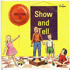
Major NYC Event: On Thursday, Nov. 18, I’ll be hosting and emceeing “Show and Tell at the City Reliquary,” the first installment of what we expect to be a monthly series. The concept is simple: Anyone and everyone is encouraged to bring one item of personal significance. You’ll have exactly three minutes to stand up at a podium with your object and explain why it’s special. Then it’s on to the next person. No video, no PowerPoint, no handouts — just you and your object for three minutes, the end. (If you’re not show/tell-ish and prefer to just come down and watch, that’s fine too.)
I’ll get things started with some showing and telling of my own and will preside over the ensuing festivities. I won’t be curating or pre-screening the participants, however — think of it as open-mic show and tell. Or a show and tell slam. Or something like that.
The Reliquary is at 370 Metropolitan in Brooklyn. Doors will open at 7pm (we’ll have a sign-up sheet available for those who want to participate), with presentations starting at 8pm. Suggested donation: $5. Beer and snacks will be available. Hope to see you there.
New sponsor shout-out: Those of you who play poker and darts — and I’m guessing that’s a lot of you — will be interested in our newest advertiser, who you may have noticed in the left sidebar: Card Parlour Darts. An excellent product for your game room, man cave, or what have you. Please check out their site.
And as long as we’re talking about our sponsors, Sports Propaganda screen-printer Chris Speakman is featuring special limited-edition Giants and Rangers prints on his site. As always, my thanks for supporting our advertisers.
Uni Watch News Ticker: Congrats to the Giants, who can now break out this uni for 2011. ”¦ Neglected to mention yesterday that Portland State, as promised, went with blank helmets (with thanks to Kristina Cruz). ”¦ Here’s an oddity: UCLA stripes on a baseball jersey. Even weirder, the stripes are truncated, just like on modern football jerseys. Strange. ”¦ Twol great finds from Bruce Menard: a Willie Mays syrup ad and an ribbon-style patch from a Yankees tour of Japan. “Makes me want to source stitching software,” says Bruce. ”¦ Here’s a really well-executed article on the Ravens’ uniform cop, Bruce Laird. Among other details, it turns out he (and presumably the league’s other uni cops) make $750 per game. Multiply that times eight home games and you’re talking six grand for showing up on Sundays and saying, “Yo, your knees are showing.” And people think I have a good gig (big thanks to William Yurasko). ”¦ Here’s another high school team with different logos on the two sides of the helmet: the Cedar Falls Tigers in Iowa (with thanks to Scott Mason). ”¦ Interesting uni number story from Jeff Hunter, who writes: “Back in high school (Hewitt-Trussville High in Birmingham, 1977ish), we had some sort of uni snafu and ended up wearing different numbers based on whether we were home or away. I wore 82 at home and 83 on the road. If I remember correctly, everyone wore one number higher in our white jerseys.” I vaguely recall someone telling me something similar several years ago — anyone..? ”¦ Gumbal helmet king Bill Jones is branching out into new sorts of projects: “My 16-year-old-son, Ryan, plays for a competitive hockey travel team called the Texas Junior Stars. So I found an old Starting Lineup figure of Mike Modano when he was a Dallas Star and hand-painted it to match Ryan’s uniform. Then, since the SLU figures all come with a player trading card, I made one for Ryan. Finally, I re-sealed the original container so it looks like it came straight from the store shelves.” ”¦ New superhero-style space suits in the works for NASA (with thanks to Robbie Biederman). ”¦ According to a note on this page, Utah’s helmets are so shiny because they use floor wax (with thanks to Jason Hillyer). ”¦ Donnie Gould was at a minor league hockey game the other night that featured Adrian Van de Mosselaer and Wes Vannieuwenhuizen. Those photos are from separate games, but they should give you an idea of the NOB overload Donnie was experiencing. ”¦ Damn, the ’46 Phillies looked my-t-fine (great find by Mike Hersh). ”¦ Also from mike: An excellent view of the Dodgers’ 1916 tatteralls and a great team portrait of the Houston Buffaloes. ”¦ Chris Mason, who was previously wearing this blue mask design, now has a white version (as noted by John Muir). ”¦ Check out the harlequin-style pattern on the goalie in this 1936 photo. ” I know some soccer goalies tend to be flamboyant with their jersey designs (see Jorge Campos from Mexico), but I didnt know those type of designs went that far back,” says Juan Pinillos. ”¦ New hoops uniforms for Siena (with thanks to John Dougherty). ”¦ Yesterday I mentioned that the Browns were originally slated to wear orange-numbered home jerseys in 1984, but they changed to white numerals when the orange ones proved to be too hard to make out from a distance. Now Sean Wilson has found a good example of the orange-numbered homes. “Plus I also found what looks like an orange-numbered road jersey,” he says. “The description says, ‘This was from a set of jerseys created in the preseason of 1984 and after one game was discontinued as being the only time the Browns ever wore orange numbers.’ While I have heard of the home jersey being scrapped, I have never heard of a matching road jersey also being designed and scrapped. Is this legit or a hoax?” Good question. Anyone know more? ”¦ Pretty great Expos tribute video here (with thanks to Andrew Harris). ”¦ Here are the proper images, with the proper conference patches, for the Utah and Texas Tech camo-patterned Wounded Warrior Project jerseys, which will be worn this weekend. ”¦ Someone came up with a really good Rangers T-shirt for the World Series, but of course MLB couldn’t allow that (with thanks to Jason Hillyer). ”¦ Bryan Stevens reports that Wyoming went with solid poo on Saturday. Ew. ”¦ Here’s Michael Orr‘s latest round of EPL uni news. ”¦ New hoops uniforms for Princeton (with thanks to David Barndollar). ”¦ New uniforms for the Japanese national women’s volleyball team (thanks, Jeremy). ”¦ There’s a new documentary about the Seattle Pilots. “It’s a bit dry but has some cool vintage Pilots footage,” says Steve Mandich. “One thumb up.” ”¦ Maryland goalie Matt Mitchell has a Maryland flag pattern on his leg pads (big thanks to Tyler Hull). ”¦ Another great old news clipping discovery by Jerry Wolper: Back in 1959, the Browns were flagged for wearing illegal cleats.
New hoops uniforms for Sienna (with thanks to John Dougherty).
Siena is spelled with 1 ‘n’
Thanks. Now fixed.
Man is that Yogi Berra Yoo-Hoo tee Maris is sporting gorgeous… Anyone out there interested in making a reporduction? Anyone?!
I’d wear that.
Notice that the kid next to the Babe has an upside down Esquire mascot patch.
In World War I, the Babe worked for Bethlehem Steel in Lebanon, Pennsylvania. His job description: baseball player for the company team.
About the different numbered uniforms… Years ago (at least into the 70s), basketball teams wore even numbers at home and odd on the road. so if you were 30 at home, you were 31 on the road. This made it easier for scorers (like me) to know right away which team committed the foul. When the ref gave an odd number, it was the road team. I know it was true for my school (Rollins College (Div 2)) and all the teams we played in the early to mid 70s.
If I recall correctly, the University of Houston did this during the “Phi Slamma Jamma” era. Akeem wore 34 at home and 35 on the road.
Yep.
The Cleveland Cavs did that in the early to mid 70s as well.
This was the case well into the 1980s in suburban Chicago as well, at least in district 214 (home of my Buffalo Grove H.S.).
I remember watching our high school basketball games as a kid (late 70’s to early 80’s, Western PA) and seeing the even/odd scheme for numbers.
Paul, this:
Here are the proper images, with the proper conference patches, for the Utah and Texas Tech camo-patterned Wounded Warrior Project jerseys, which will be worn this weekend. … Someone came up with a really good Rangers T-shirt for the World Series, but of course MLB couldn’t allow that (with thanks to Jason Hillyer). … Bryan Stevens reports that Wyoming went with solid shit on Saturday. Ew. … Here’s Michael Orr‘s latest round of EPL uni news. …
is repeated in the ticker.
Don’t know if that’s an oversight or a software/website glitch–thought you’d want to check.
Gracias. Now fixed.
I believe the road version of the Browns orange-numbered digs is legit.
For one, I’ve seen a Clay Matthews game-used one for sale recently.
For two, the Browns would most likely have ordered the white jerseys along with the brown jerseys. Yes, it’s possible they could have ordered the white jerseys with brown numerals on the first go-round, but based on the evidence we have, it seems they did order both jerseys with orange numerals, then made a new order with white and brown numerals on the home and road jerseys, respectively.
Side note: I’ve seen a ton of journalists over the past few seasons refer to the former USC and current Packers linebacker as ‘Clay Matthews, Jr.’ when, in fact, he is Clay Matthews III. His father, longtime Browns and Falcons LB, is Clay Matthews, Jr. Always bugged me. Still does, in fact, when someone happens to say it.
To elaborate, the Browns opened the preseason at Pittsburgh, then had three road contests, according to the Browns’ website. It would take a little while to make an entire set of jerseys, so if there were, in fact, orange-numbered road jerseys, there’s a good chance they were actually worn in a preseason game.
Andy,
I don’t the white Browns orange numbered white jersey ever saw game action.
The link is to a pic from the 8/14/1984 Albany Herald.
link
The game in Anaheim against the L.A. Rams. It is the first game after the Browns wore the orange numbered brown jerseys worn against the Steelers. Though they are cropped out of the shot, you can clearly see that the Browns are wearing brown numerals in the photo. Therefore, the orange numeraled white jerseys never saw game action.
Here’s a link to preseason/exhibition games on a team by team basis:
link
hope this helps.
Nice. So, they either had their new jerseys within the week (by the time that article in the ticker yesterday printed, which was 8-8-84, it sounded as if the new jerseys had already been ordered), or the white jerseys had brown numerals from the get go. I wonder if there’s anyone in the organization who might know for sure. There are 1984 road jerseys that pop up every now and then (like the one in the ticker today) that have orange numerals. Maybe they were the original team issued jerseys that later got replaced.
I guess since they were screen-printed, a week probably isn’t an unrealistic turnaround time for a professional football team. When you think about it, the jerseys were made before the season, and there had to be a stock of blank extras in the case of an in-season reorder for new players and/or damaged jerseys, so the whole process probably only involved taking a bunch of the blank jerseys (with the sleeve stripes already printed on them), and then printing the numbers in the opposite colors.
Not uniform related, but I had to laugh at the Radio Shack TS100. Actually used one of those – with its 8K memory. Wow, forgotten all about it.
Great Braves picture. Shows why they were sometimes called the “Back Bay Cardinals” after Southworth arrived. The pattern on the socks would be reversed the next year, by the way.
The plate umpire’s cap should be on backwards, just like the catcher’s cap, so the bill doesn’t interfere with the mask.
But that’s why plate umps wear short-brimmed caps — so the brim can be worn facing forward without interfering with the mask!
I don’t care what the Browns fans of 1984 said, those orange numbers were great. I really wish they’d have kept those…or at least the inverted version. I really don’t care much for plain white numbers on teams with more than “one color + white” for a color scheme.
___
Warning: typical The Jeff ranting below
___
I guarantee those are no harder to read than the light blue & white that the Houston Oilers used for most of their existence. (Or certain college teams using orange on navy, for that matter) Yeah, I’m sure they may have been a bit tough to read from the stands. Big deal. Most numbers are tough to read from the stands. It’s hard to make out numbers at a basketball game if you’re in the cheap seats, and you’re a lot closer there than you are at a football game. Hell, if you’re at the game, you’re there for the atmosphere and the overall experience – it’s fun. You’re not there to watch the game so closely that it matters if you can read numbers at a glance – you’re too damn far away and probably not in the best of viewing angles for most of the action anyway. You get a far better *watching* experience on TV than you’ll ever get from the stands.
As for the whole functionality thing that I’m sure Ricko will bring up – it matters on the field, not in the crowd. The referee needs to know which players are which for eligibility purposes. The teams need to know for their own personnel packages and coverage assignments. The guy in the crowd really doesn’t. The fan cares that his team just ran for 3 yards on a 4th & 2, it doesn’t matter which RB did it – and depending on where he’s sitting, he might not even be able to tell until the ref signals the first down.
___
Ok, I’m done now. I’ll go back to watching this movie now. Sorry.
If the numbers didn’t matter to the fans they wouldn’t have made them so big. They could be the size of a shirt pocket, if just the officials needed to see them. The fans (aka the paying customers) should be able to know who is running the ball if they want to know.
Not just the fans, the guys in the press box need to see the numbers. Scouts who sit in the stands need to see the numbers.
I’m all for adding a little more color to a uniform, but functionality comes first. That’s why small fonts are useless, that’s why Bellotti font is useless (“Is that a 24 or a 54 who committed that penalty?” said the mildly dyslexic ref) link and that’s why some colored numbers on colored jerseys are useless.
Get rid of NOB, make the numbers bigger, and if the colors contrast nicely, great, give them colored numbers. Otherwise, they should be white.
It might be tough for a referee to read a shirt pocket number from 40 yards away.
I’d hope that’s rare, as one of the seven officials should be closer than that most of the time. But just in case, I’ll amend it to say they could be the size of the Packers throwbacks.
link
link
Yeah, look at a few of the pics on this blog here and tell me they can read numbers from their seats.
Up close, the orange numbers look freakin cool. From a distance… you can’t read ’em anyway. Sure, the pure white stays legible from a little bit farther, but not enough to actually matter, especially while the play is in motion.
…and if a ref can’t tell a 2 from a 5, he shouldn’t be a ref
If they have binoculars. And that’s what the guys in the press box use, like the statisticians and the TV spotters. A color combo that close would still be an impediment to them.
I’m not saying you can’t wear one yourself. By all means, if you like that or this link knock yourself out and wear it in public. but during a game, hard-to-see numbers are even more useless than white-on-white NOB jerseys.
Statisticians have the added benefit of instant replay, as well, so it’s really not essential for them to be able to read the numeral from the box.
In the NFL, sure. What about certain college and high school games, though? Plus, who’s going to go, “Oh, can you run that play back so I can see who to give credit for that run?” Sure, let’s slow the game down even more.
I’m done. If you guys are that insistent on throwing functionality out the window for your desire to look freakin’ cool, then so be it. I’m not trying to convert you. But I hope you at least understand why your fashion demands probably won’t be met in the near future.
Remember this picture?
link
White numbers on a white jersey, and orange on green. What were we talking about again?
Phil said I’d wear that. I never did. In fact, that game was picked as my worst matchup that week. Same concept.
Scroll down to the 5&1 list from this article:
link
Nonetheless, it’s been done. Sure, you thought it looked bad, but obviously it was still playable. If white on white is NCAA approved, there’s absolutely no real argument against orange on brown.
Again, not trying to convert you, and if the NCAA allowed it, that’s their problem. But if they go back later and decide to amend their rules to make numbers more legible, don’t act all surprised.
Take over, Ricko…I’m tagging you in while I get some stuff done.
Man oh man, that link is awesome. Thanks for sharing! As Nationals fan, let me say that I think the video ought to be mandatory annual viewing for all Washington baseball fans. And aside from everything else, terrific uni-viewing in the video clips. I always liked the Expos racing-stripe unis, but their final uni set grows on me every year.
It really is tremendous. Highly, highly recommended viewing.
I’ll second the sentiment. No fan of rap, but that song and the images really work
The original Expos uniform was my favorite, but I couldn’t quarrel with the racing stripes. I, too, was disappointed when they went to the script, but have to admit it grew on me. The Nationals missed the boat when they didn’t incorporate either of those uni elements in their look.
Thanks for sharing.
Oh my goodness… I almost feel like crying. If it wasn’t for the rap, and if it had used actual music instead, I probably would already be in tears. I remember watching the first Expos game from Shea in ’69 on CBC, and was a fan forever after that. For the first 10 years I hung in there with some awful teams until they first surfaced as a contender in ’79. Once they did that, their games started getting carried on local radio here in Nova Scotia and it was like we had our own team.
I remember going on vacation with the folks to Jarry Park to see them play in ’70 and ’71, hearing the vendors in the stands yelling “Ice Cream! Creme Glacee!!” and just taking in the atmosphere, hearing Fern Lapierre playing this as people in the stands danced happily:
link
It was a very, very special time, place, and team.
Well. I like a lot of rap and hip hop and the thing had me almost in tears. How could anyone (at least from my generation; I was 9 when when the team debuted) not have loved the Expos?
That hat and that logo, for a kid in ’69, was just about the coolest thing in the world. Baseball in Canada, the French province, Gene Mauch–grandfatherly Gene Mauch!– in that cool, mod get up, Le Grand Orange, ,Jarry Park. Just the team name itself: Expos!
Their best uniform was their original but, hell, they won my heart simply by existing in MLB, so anything they wore was okay by me.
The Yankees patch is actually for Casey Stengel.
Jeremy, I assume you’re referring to this, right?
link
Can you translate the Japanese for us?
The Japanese is (forgive my butchering of the katagana) “Keishi Sutengeiruu” — a transliteration of “Casey Stengel”
The Maryland ice hockey goalie pads are pretty amazing considering the player probably bought them himself. The University of Maryland is a pay-to-play club team.
Also, I wonder if Ivy League basketball is going “retro” on Saturday nights when it has its teams wearing white on the road Saturday nights during the Ivy regular season?
Those might be the best goalie pads in the history of ever.
I totally agree with this statement.
The ticker item about the new Princeton jerseys appears twice.
I imagine after banning those T-shirts, Major League Baseball Properties then arrested Mini-Ron and locked him up
Not exactly uni-related, but did anybody else catch Fox last night saying the last time the Giants won the World Series there were no MLB teams west of the Mississippi? With two St. Louis guys in the booth?
They’d already gone home for the winter when the NY Giants were playing into October, I guess?
Thought the same thing. I was kinda-sorta rooting for the Rangers, so I was slightly disappointed by the outcome of the game, but I wasn’t actually upset or anything until the Fox crew repeated the old “no teams west of the Mississippi” saw. It’s a cliche; you hear it all the time from the savants of the conventional wisdom, but it was never true. St. Louis has always been west of the Mississippi River.
Now let’s tackle the problem of people who refer to “the 48 continental states,” when in fact there are 49 states on the continent.
I mean, it’s a bad enough mistake on it’s own, but with McCarver being a former Cardinal, and Joe Buck’s dad being St. Louis royalty, it just really blew my mind that they would make that mistake.
Since St. Louis can be described as being located ‘on’ or ‘astride’ the Mississipi River, saying that ‘there were no teams west of the Mississippi’ would be equivalent to saying that ‘there were no teams west of St. Louis’.
How about the argument that when taking Quincy, IL (and the location of the Mississippi River there) into account, St. Louis is to the east, so TECHNICALLY St. Louis is east of the Mississippi River.
Nah … I didn’t think that’d hold water, either …
The Texas Ranger/Ron Washington t-shirt that ended up being banned by MLB could be found at link
However, there’s another one still available from another vendor at link Same idea, different execution. I know the one that ended up getting banned was featured on many media outlets, so I’m sure that lead to MLB officials cracking down on it.
man, Gil Hodges had HUGE hands..which i presume was the purpose of the Wheaties boxes photo.
oh baby…
killer wire service pics today!
i sure wish i’d had this and this when i wrote this. just…wow
AND…
the first powder blue uni ever! that may be the finest picture of it i’ve ever seen…that just may be the next “colorize this” pic…awesome!
AND…
sweet mother of corn (still channeling marshall)…look at them rups! can TCK do up those? like, stat!
~~~~~~~~~~~
sorry, i don’t usually go ga-ga for the wire service photos (although i always love them) but today was a trifecta of awesomeness
/carry on
Incidentally, there was a coding error in the text of that Cubs graf, which I just fixed. Here’s how it should read:
– Okkonen shows the 1957 Cubs wearing link. But the stripes were actually link. As always, I’m not picking on Okkonen here — just pointing out that we should never take the template databases as gospel. (Also: The chest logo on the home version of that uni featured some link.)
Silly question here… how sure are we of the sleeves & socks being the same color blue as the hat?
I’m kinda playing around with colorizing that picture and it seems like there’s no way in hell that the hat is the same color as the rest of the blue on the uniform. Without any extra manipulating yet, the hat comes through as a nice royal color, but the sleeves are something resembling navy.
Seriously… do I need to make the sleeves lighter or does this look right?
(still in progress and shrunk 50% from original)
link
Love this shot, but I can’t help but wonder it’s reason for being. He’s standing on a chunk of turf and the backdrop seems to be some amorphous cloudy sky. Is it a candid, between-takes shot of a shoot for a baseball card or the like? Anyone know?
Almost certainly for a Wilson ad campaign.
Wow. A wonderful day at UniWatch. Those wire service photos were epic, and there was lots of other great stuff, not least the Willie Mays endorsement… Congrats, Paul.
That’s Oscar Robertson, 1972, wearing one of history’s most gruesome-looking mouthguards.
Oscar was traded to the Milwaukee Bucks in 1970.
Good catch. I robotically repeated the date I was given without thinking about it. Bad job on my part. I’ve now removed the date from the text.
link
Check out the team with the black jerseys. Their pants are orange on the front and black on the back. Never seen anything like that.
Those come up from time to time. Unusual but not unheard of.
Okay, lots of errands to run today — voting, haircut, flu shot, supermarket. Back later!
Forget the pants… watch that punt!
Are you trying to get yourself banned?
what punt?
That was awesome.
“COMEDICAL”? Really?
On paper, I hate the concept of those pants. In watching that video, I love them!!!
The concept could lead to “Blizzard” uniforms … white in the front, colored in the back, so they can’t see you coming in a winter storm, but your QB can see where you’re going!!!
link brings back memories of Ray Rayner.
Of course I can’t find a photo to illustrate what I’m talking about, but there’s an explanation in the second paragraph link.
Was I the only viewer juvenile enough last night to experience some Beavis and Butthead-style giggles over the outlined World Series trophy that appears on the back of the hats the champs were wearing?
link
Apparently not:
link
I’m pretty sure that Old Timers Game photo was taken in Fenway Park in the 1940s…
Hey, in link, do I see a satin Dodger jersey tucked between the white Dodger jersey and the jacket?
Yep. Sure looks like it.
one more bit of love for today’s lede:
this shot from 1925 … so much to like:
the dark monochrome of the sox (even with the pins, which look like shit on a gray road uni, but seem to work on a navy blue one — im guessing that was similar to what gabe paul had in mind for the yanks)…
the runner at the plate (who has already crossed) appears to be holding up his hand to tell the runner to stand up instead of sliding, but it almost appears he’s ready to give a “high five”
on-deck batter focusing on the play, but still swinging two pieces of lumber
bat boy looks to be in street clothes
just a guess, but i’d say that’s the nats/senators playing the sox
I think you’re right re: the Nats/Sens as the home club, Phil. I just checked “Dressed to the Nines” and the Nats/Sens have the hard horizontal line between white and navy on the stirrup while the Yanks’ navy goes all the way down to the curve of the stirrup opening.
Yeah! That picture is just exquisite.
This is a gorgeous shot… nice to see pins v. pins, especially when they look like a photo and it’s negative… assuming the home club is the Yanks. Always nice to see the Sox in white socks, which, btw, are those white (VERY low) ‘rups over white sanis?
link is a gorgeous shot… nice to see pins v. pins, especially when they look like a photo and it’s negative… assuming the home club is the Yanks. Always nice to see the Sox in white socks, which, btw, are those white (VERY low) ‘rups over white sanis?
“especially when they look like a photo and it’s negative”
Just to clarify… a black and white photo & negative.
that could be the yanks, but if you go by marcus okkonen, the yanks didn’t wear the rups that are being worn by the catcher (and the nats did) in 1925
LOL… I just seconded your guess of Nats/Sens. We’re answering each other’s posts at the same time.
If this is 1925 than I don’t believe its the Yankees. I don’t think Yankee stadium was ever “open” like that. You can see all the way to street and apparently to some houses in the background…
That’s clearly Griffith Stadium.
The Dodgers 1916 uni was actually a Window-Pane pattern. Not a Tattersall. But as I’ve never consciously seen a player in one, thanks for the usual good get.
so juke…that begs the question…
you’ve unconsciously seen a player wearing one?
Since the 1984 Cleveland Browns uniform was a one year experiment, I’m assuming the reaction in Cleveland was negative, since it broke from the traditional Browns style.
Another factor must have been the poor season on the field, and in the off season prior to 1985, the cocaine death of emerging star Don Rogers. He died soon after Len Bias, right before his wedding.
they um…never actually wore the orange numbers in any games that really mattered, so your theory that “poor performance in a good looking uni” led to the uni being scrapped holds no water
as has been hypothesized before, they probably scrapped it almost before they started it because the numbers weren’t the most legible…though i would debate that
although i do think your theory that “it broke from the traditional Browns style” probably did contribute to it’s being shitcanned
i wouldn’t mind seeing colored numbers on a colored jersey, but the orange and brown probably wasn’t the best idea — nor for that matter is orange on white…you need serious outlines around any orange numbers because orange is pretty much the exact midpoint in the color spectrum (black to white)…so they don’t look great on dark jerseys OR light jerseys
best color on color numbers are probably stuff like gold on maroon or navy on gold
stuff like white on orange?
not so much
Even if you decide that orange on brown with a white outline isn’t readable enough (which I find to be BS, but whatever) there’s no reason at all that they couldn’t have kept the white numbers with orange outlines that they did use in 1984 for the regular season. As for breaking from tradition… um, they’d just spent the previous 10 years wearing orange pants.
you say that like it’s a good thing
now…i will grant you that this is better than this
but neither of those even approaches the awesomeness that was this, this or this
I just say it as an example that, at the time, the “traditional look” had already been broken away from for quite a while. Ok, so it was 8 years, not 10, close enough.
…and it was a good thing. The ’75-’83 uniform is the best looking uniform the Browns have ever worn.
The Browns white pants have had the wrong damn striping pattern on them forever. The brown stripes should be on the outside, like they are on the helmet and jersey. You and your OCD should understand that. Therefore, the one uniform they wore that actually matched itself is superior.
that whole uni, stripes-wise, offends my ocd…helmet doesn’t match pants, doesn’t match sleeves…
but that all white, with the white socks (with sripes that at one time matched the sleeves) is freakin gorgeous
i can see why the browns never wore a brown helmet (thankfully)…but the orange has never made sense…and orange pants on a team called the browns?
um…no
They could take a lesson from Wyoming – white helmet, mono brown…just switch the yellow to orange…and no pink socks.
LI Phil said:
“i can see why the browns never wore a brown helmet (thankfully)…but the orange has never made sense…and orange pants on a team called the browns?
um…no”
They’re not named after a color, they are named after a person. The fact that brown is even one of their colors is incidental at best, as their origin come from a plumed hat Paul Brown once saw on a woman while the team held training camp at Bowling Green State University (whose colors are brown and orange).
LI Phil also said:
“they um…never actually wore the orange numbers in any games that really mattered, so your theory that “poor performance in a good looking uni” led to the uni being scrapped holds no water”
No, the orange numbers never made it into the regular season, but he’s talking about the uniform itself, which was worn the entire season, and only that season, probably at least partly due to the teams poor 5-11 performance. He’s not referring to just the orange numerals here.
color numbers on the coloer jersey look great when it is silver on black
link
What about white on gold?
link
loved seeing Barry Zito & his stirrups celebrating with the Giants last night link
and by stirrups I mean soccer style striped socks
Did we ever figure out why the Giants dumped the striped soccer socks? Well, except for Barry?
Seems like high-cuffers today shy away from stripes.
Only time his sorry a** got on the field the entire postseason, I am most happy to say.
GIANTS BASEBALL: TORTURE.
Last line of a mass e-mail I just received … I don’t know if there’s any truth to this, but I’m sure someone here does!!!
The first testicular guard, the “Cup,” was used in Hockey in 1874 and the first helmet was used in 1974. That means it only took 100 years for men to realize that their brain is also important.
If it was written in a mass e-mail, link.
Re: the Willie Mays syrup ad… uhh… is that ham sandwiched between those waffles? With syrup on them? Weird.
Re: the oranged-numbered white Browns jersey… the caption on that page reads “This jersey was to be worn by #87, tight end Martin Stracka.” Seems they confused football player Tim Stracka with hockey player Martin Straka (no C in his name).
Ever eaten a Sausage McGriddle?
is there ham in a sausage mcgriddle?
Pork, anyway! The concept is there. Salty meat between syrupy breakfast griddle creations.
Looks more like prosciutto or canadian bacon
In any case, it’s meat covered in syrup. Meh. And yeah, I tried the McGriddle once… ONCE! Personally, I’ll stick to the McMuffins, and keep the syrup confined to pancakes, waffles, and French toast.
Breakfast discussion in Uni Watch… it’s just so fun to watch the train roll right off the tracks! So, to bring it back… I do think it was good that the Browns never truly adopted those orange numerals. It just wouldn’t have looked right. I never felt the orange alts looked right, either.
I just want to dive into this picture and roll around in everything…
link
-Jet
Most people prefer piles of cash. Whatever turns you on.
By the way, Wyoming didn’t go “all-poo” Saturday…they wore pink socks.
link
So much to comment on in that photo. Like the cheerleader, for instance. Or the #12 shirts in the stands, which would make for a better jersey than what’s on the field.
Actually, lose the diamond-side piping and the all-brown look isn’t bad.
Now, The Jeff, yellow numbers on that brown jersey would be functional AND cool.
how in the HELL did that not qualify as the worst game of the week? no matter WHO they played? that’s the worst uniform EVER in the history of … ever
monochrome turd, with a white helmut and pink socks?
oh…i know why it didn’t make the list…you think that looks swell
Because 1) they played San Diego State, who doesn’t look bad, and 2) when this is the only photo I came across,
link
you don’t really notice the brown pants or pink socks, do you?
So, that one flew under the radar. I’ve picked on Wyoming enough anyway, and I still think it’s not as bad as UVa./Miami. But not by much.
you need to look harder…especially when wyoming plays
it’s worse than ANYTHING this year, and possibly worse than FAMU/TSU last year
SDS looks like shit too
Oh that’s right – you gave SD State a D in our grades. That was one of only two or three where we differed dramatically. Well, if you were picking, then I’d understand if that was your worst selection. But I gave the Aztecs a B.
You just don’t like poo, do you?
The pink socks aren’t even the worst of it. They actually work with that brown, or would work if there were not so much yellow on the jersey. The yellow and pink are the source of the clash here, not the pink and the brown. But those pink towels at the crotch: Oh, the humanity! Seriously, how does that not result in an FCC fine against any TV station that airs footage? I’m usually pretty slow on the uptake where double entendres and whatnot are concerned, but my first reaction to that photo involved doing a mental Beavis and Butthead “Heh heh” cackle.
They may not dress in all-black anymore, but the aroma of Jerry Glanville is still on those Portland State unis.
link
Bleah.
i say why not try the orange numbers on the brown jersey remember how everyone liked the bears throwback from this year those were not hard to read at all
As long as they were solid orange, and not the orange with brown and white outline version they wore in the ’84 preseason.
Best photo gallery ever?
Texas Longhorns baseball team practices on Halloween
link
SEVERE kudos to Keifer Nuncio for dedication to the costume.
now that looks like a fun practice. and way to go for the coach for letting them be college kids.
Pretty interesting article about my Alma Mater’s (Ohio University) football helmets and what they all go through on a yearly basis.
link
the mothervilker said:
not on a uniform i don’t
That’s a great photo of the Houston Buffaloes, with a young Dizzy Dean in the bottom row.
Brief addendum to the Browns cleat problems in their game in Washington in 1959: Kelly Miller, the Redskins’ long-time equipment manager, spotted the metal-tipped cleats and told an official to check them. The official agreed and the offending players were sent off to change their cleats. The rules stipulated a player wearing illegal equipment would be suspended plus a penalty loss of 5 yards for delay of game. Per the rule book – “The player may re-enter when legally equipped after one down.”
However, the Browns were not penalized, nor were any players kept out of the game. Redskin owner George Preston Marshall was incensed and said not only did Cleveland coach Paul Brown not know the rules, neither did the NFL officials. The referee (John Pace) told Marshall after the game, “I did what I thought was right.” The Back Judge, Sam Giangreco then told Marshall that he told Redskin co-captain Ralph Felton that a delay penalty was in order, but that Felton told him to “forget everything” and just let the game resume after the equipment change. Redskin head coach Mike Nixon denied that, and said in fact, Felton had asked if Washington could protest the game.
Miller, who started the whole thing, had the final word. Per the Washington Post: “It looks like I know my equipment better than the officials apparently know their rules,” he grinned.
[The Browns won the game, 31-17, with Bobby Mitchell running for 232 yards, including a 90-yard TD run early in the first quarter while wearing the “illegal” cleats. Presumably, the Browns also wore the offending gear three weeks earlier when they knocked off the Redskins, 34-7 in Cleveland without any cleat controversy.]
Third jersey for the Saskatoon Blades in honor of pro bull riding.
link
Is there anything better than pissing off a bull and trying to stay on top of it? The bulls love it!
More than just a t-shirt: link::st.%20louis%20cardinals::albert%20pujols/?supercat=home&cm=GLOBAL%20SEARCH:%20KEYWORD%20SEARCH
I would burn that.
I think it would be awesome if someone did a tcu tracker. Ive notice they are wearing this and last years pro combat unis, and are mixing they in.
TCM has The Winning Team on right now. About Grover Cleveland Alexander.
Old time baseball movie with old time uniforms
All..a little late posting, but link for PL’s eyes to handle – uniforms with THAT color, weird-ass pants ornamentation, and the de-evolution of the UCLA shoulder “stripes”…THE HORROR!! That’s Thornton Township HS in Harvey, IL
Wow — never seen shoulder “stripes” like that. Fascinating.
Fairly similar to those LSU shirts a few years back.
link
There had better been a flag on that play.
If Thornton Twp. committed a penalty, would the ref make quotation marks with his fingers when announcing the number?
Just a side note that those photos of the Cedar Falls Tigers were taken in the UNIDome. When I work at Saginaw Valley our softball team played a tournament in there.
4 words for now:
so far…so good
Interesting twitter feed
link
I know i’ve entered this conversation concerning the’84 Browns Jerseys w/orange numbers a bit too late, but… I own the Don Rogers #20 Brown w/Orange numbers jersey that was worn only once at Pittsburgh in pre-season’84. The jersey shows game wear and came from the local sporting goods store that at the time handled customizing & screen printing for Cleveland’s jerseys. The fans had nothing to do with the change to white numbers. Art Modell complained that night (it was a night game) that the numbers were unreadable from the press box/or suite at Three Rivers. The team immediately dumped orange numbers on the Brown jersey and the White w/orange numbers never saw the field.
The game was in Cleveland.
Purple shirts and ties all over the tv tonight.