We have sooooo many things to cover today, boys and girls, so let’s get right to it:
• The Rams wore their royal blue throwbacks yesterday. Like everyone else, I love the horns on the jersey shoulders, but I also love those pants. And hey, Steven Jackson got into the retro mood during pregame warm-ups by wearing Dickerson-style goggles. (Also prior to the game: They retired Isaac Bruce’s number. As an aside, did you realize Bruce donned a Cardinals jersey to throw out the first pitch at a ballgame in late September? I’d missed that one.)
• Throwbacks were also on tap in Foxboro, although the truncated shoulder stripes ruin a lot of the design’s beauty.
• The Niners and Broncos, who were playing in London, wore a rather plain jersey patch. And speaking of the Niners, it’s always a bit surprising to see a quarterback wearing No. 1, no?
• The Cardinals really need to stop wearing this set.
• Ryan Fitzpatrick continues to wear his wedding band on the field. He’s been doing this all season.
• You know things have gotten out of hand when we’re seeing placekickers’ armpits.
• That’s no way for a champion to dress. That game also marked the first appearance this season of the Steelers’ white jerseys.
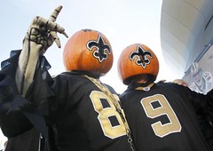
• Some fans showed up to the Steelers/Saints game dressed as blind zebras. Okay, I know they’re supposed to be blind, but they have the wrong stripe pattern on their jerseys, the wrong stripe pattern on their socks, the guy in black slacks is missing the white stripe, etc., etc. If you’re gonna denigrate NFL officials (and blind people), do it right!
• On Saturday, Notre Dame and Tulsa both wore a memorial decal for Notre Dame student Declan Sullivan, who died earlier this week. Interesting gesture for Tulsa to wear the decal along with the Irish.
• Oregon wore solid white with silver shoes. And while the jerseys appeared to be NNOB, closer inspection reveals that they actually had white-on-white NOBs. (My thanks to Joshua Brisco for the screen shot.)
• When Army unveiled this year’s uni set a few months back, nobody said anything about them wearing full-body camo. Phil wrote about this in yesterday’s entry. I gave my own thoughts on the matter in this comment thread.
• While I’m not a fan of Nike’s Amateur Tranquility program, I have no problem with Florida’s design. Definitely among the least offensive entries in this particular product line.
• It’s a little hard to tell from the game photos, but the NOBs on UCLA’s super-stretchies looked like total shite.
• All week long we heard the hubbub about Mississippi asking Auburn to wear navy on the road so the Rebels could wear something “special” at home. And then the special design turns out to be — wait for it — solid gray. Is that an anti-climax or what? Someone in yesterday’s comments speculated that the grays might be “a shout-out to the Confederacy after all the bru-ha-ha of doing away w/ colonel reb etc.” That’s a good conspiracy theory, but I’d like to think it’s no more than that.
Finally, it’s worth noting that today marks the first day of November, which means we’ve officially entered the post-pink portion of the calendar. Thank the lordy.
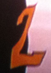
Peel session: Serious uni-numeric snafu in last night’s Jazz/Thunder game, as the 2 on Paul Millsap’s jersey was peeling off in the first half. Normally, this would just rate a quick mention in the Ticker, but in this case it raises some questions about the NBA’s new mesh-fabric uniform numbers. The league had originally told me that all numbers would be heat-sealed this season, but then they specifically told me they’d changed their plans and were having the numbers sewn on. Millsap’s peel-off numeral sure doesn’t look sewn, though.
So I sent a quick note to NBA apparel director Christopher Arena, who responded almost immediately: “Not the first and certainly not the last time a local team embellisher forgot to sew down a number.” Fair enough. (And my thanks to Leondrus Thornton for the screen shot.)
Head(band) games: As I mentioned in the Ticker last week, the NBA has banned upside-down headbands, a move that seems to have been aimed specifically at Rajon Rondo. Reader Robert McNamara has written an interesting defense of Rondo’s headband style, which I’ve decided to present here in its entirety and without further comment:
As a diehard Celtics fan I wanted to give a little perspective:
1. Rondo just doesn’t look right without the headband, especially from the upper deck. He’s been wearing one his entire career, and the upside-down thing was his look. Also, the headband helps minimize the Sam Cassel effect.
2. He doesn’t do it to spite the league. Unlike Rasheed Wallace who turned his headband inside out, Rondo wears his upside-down out of quirkiness. He had a good game, realized his was upside-down accidentally, and made that his thing.
3. Given Rondo plays with possibly the most superstitious player in sports, I’m concerned this could throw off the team.
4. Seriously, does anyone in the league use the headband for its functionality?
5. If revenue is the league’s goal here, they should embrace Rondo’s quirk because it brings attention to the brand. If I were to go as Lebron for halloween, I could use any generic headband; if I wanted to be Rondo, it has to be an NBA headband.

Zero Tolerance!: The latest Freakonomics podcast is devoted to a topic near and dear to our hearts: corporate advertising on sports uniforms. At first glance it seems like a relatively solid introduction to the topic — Uni Advertising 101 — but it’s actually a very superficial treatment. Instead of discussing the many potential arguments against uniform ads, the report simply boils all of them down to “tradition” (cue the Fiddler on the Roof music, which just further marginalizes the anti-advertising position), which means there’s no chance for a nuanced assessment of the subject. There’s no discussion of teams as civic entities with civic responsibilities, no mention of the endless encroachment of corporate messaging throughout our culture, no mention that fans went ballistic when MLB tried to put Spider-Man 2 ads on the bases, not even a simple recap of how ridiculous the revolving door of corporate stadium names has become, and how it’s made fans more cynical than ever.
One reason none of this is addressed is that, as is often the case with Freakonomics reports, the author (in this case it’s Stephen Dubner, the journalist half of the Freakonomics duo) is so eager to come up with a counterintuitive narrative that he’s trying to create an air of inevitability. If you listen to the podcast and read the accompanying text, it’s pretty obvious that Dubner’s premise here was, “Well, why not have ads on uniforms?” Treating that question as anything more than rhetorical (by, say, interviewing the only professional sportswriter working the uniform beat, hint-hint) would have ruined the construct he was setting up.
That sense of inevitability is precisely what must not be allowed to take hold in the discussion about uniform ads. Every time a report or article comes out with various team owners and branding brokers saying, “Oh, it’s bound to happen eventually, and maybe sooner than you think” with no counter-offensive, no push-back, that makes it more likely to happen. Of course, all the people saying, “It’s bound to happen” have a financial interest in having it happen.

Fuck all of them. Ads do NOT belong on pro sports uniforms, they are NOT inevitable, and I’ll keep saying so every time someone floats a trial balloon like the ones in this podcast. To paraphrase Edmond Burke, all that’s required for uni advertising to come to pass is for good men to do nothing.
Culinary Corner: My friends Jack and Ashley were in town a week ago, so I had them over for dinner and made this stuffed duck breast recipe. It came out a little dry, but that was my fault (Jack, if you’re reading this, I know you’re too polite to have said anything, but I apologize for overcooking the duck). It’s a good recipe, and I recommend it. But that’s not what today’s Culinary Corner is about.
One of the nice things about cooking duck — even when you overcook it — is that you end up with a bunch of rendered duck fat, which is good for all sorts of things. For example: As I was riding my bike in Prospect Park yesterday, I was trying to decide whether I should go see the Magnetic Fields documentary at Film Forum in the afternoon. And then I thought to myself, “Hey, I could use a bit of duck fat to pop some popcorn and bring that with me to the movies!” And that settled it. I biked home, showered, popped some corn, put it in a giant Tupperware thingie, and headed off to Manhattan.
Thanks to some unusually good subway luck, I got to Film Forum about 25 minutes before showtime. That presented a conundrum: I was dying to taste the popcorn, because I’d never made popcorn with duck fat before and was certain it’d be extra-yummy, but I have a rule about snacks at the movies, which is that I don’t start eating until the feature starts. I thought about breaking my rule — after all, duck fat popcorn was a special case, right? — but managed to hold out until the lights went down. (No coming-attractions previews at Film Forum, thankfully.)
Once the movie started, I opened the container and dug in. It tasted ”¦ like popcorn.
Was that really it? I ate some more. Yup, I thought, that’s definitely popcorn. It was good popcorn, mind you, but not particularly remarkable popcorn. Nothing special, nothing extra-scrumptious. If you’d told me it was cooked in corn oil, I would’ve believed you.
So the point of today’s Culinary Corner, dear hearts, is that sometimes there’s nothing special about duck fat. But don’t tell anyone I said that.
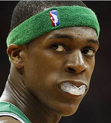
Uni Watch News Ticker: While looking for something else, I stumbled upon an Etsy seller who specializes in sports-themed model cars. ”¦ Also found on Etsy: three MLB mini-pennants; a gorgeous baseball-themed cowichan cardigan (I’d totally buy this myself, but it’s too small for me); a magnificent 1950s White Sox pennant; a great baseball wristwatch; a completely awesome Seattle Pilots placemat; a very nice cheerleader’s sweater; some wonderful football-patterned cotton fabric; and a Chargers blood-donor T-shirt. ”¦ Very interesting article about a football helmet graphics/painting company (big thanks to Dan Kaempff). ”¦ Did you know that it’s illegal for a pitcher to seal up a blister with super glue? It’s true! ”¦ Here’s a major find that I can’t believe I didn’t know about: When Gil Hodges managed the 1970 National League all-star team in Cincinnati, his uniform didn’t arrive in time for the N.L. workout the day before the game, so he ended up wearing Reds pitcher Jim Maloney’s uniform. I can’t link directly to the photo, because it’s a watermarked Getty shot, but I encourage you to go to the Getty home page and copy/paste 90117649 into the search field (great, great find by Steve Presser). ”¦ Terence Kearns is another reader who’s been playing around with Uni Watch varsity jacket concepts. ”¦ Very nice gallery of old goalie masks here. ”¦ Looks like LeBron was wearing one of those vampire mouthguards on Friday night. Hope that was just a Halloween thing (screen shot by Logan Light). ”¦ Anyone know why Alex Frolov of the Rangers insists on wearing his sock stripes so annoyingly low? (As noted by Chris Hernandez.) ”¦ Also from Chris: MSG had the Ducks logo reversed and upside-down the other night. ”¦ Here’s something interesting: North Marion High in Farmington, West Virginia, wears two different helmet logos — one for the right side and one for the left. We’ve seen teams with a logo on only one side (Steelers) and asymmetrical helmet designs (Boise State earlier this year), but I’m not sure I’ve ever seen two distinct logos on opposite sides of the lid. Anyone else..? (Very nice submission by Jamie Howell.) ”¦ Here’s a 1984 newspaper clipping explaining how the Browns had to modify their home uni numbers (rare non-Pittsburgh-centric contribution from Jerry Wolper). ”¦ Andrew Mocella reports that the Montreal Alouettes wore solid white for the first time ever on Friday night. ”¦ Nate Dion was at an Arizona Fall League game and spotted an NOB with an accent. ”¦ Pascal Dupuis’s lace-up collar didn’t have any laces on Saturday night (good spot by Jeff Camputaro). ”¦ Johnny Flanagan sent along this style guide spec sheet for Army sports (and whaddaya know, there’s no camouflage on it). ”¦ Some good vintage NHL shots from Scott Kneeskern, including a goalie’s pants with some very interesting stitching and a fascinating all-star jersey (those concentric loops on the shoulders and arms are like nothing I’ve ever seen before). ”¦ Oh baby, check out this great hockey varsity jacket. ”¦ While looking at varsity jackets like the one I just linked to, I came across a rather mediocre-looking jacket with a sensational tag design. ”¦ Holy moly! Larry Bodnovich says that’s a color original, not a colorized b&w shot. The team wearing gold/navy is Kansas State; the Technicolor guy is from the Fort Riley service team. Love the zebra jersey, too. ”¦ Dig this awesome Oregon State sign from the 1950s. “The initials on the sailor cap say ‘OSC’ because the school was called Oregon State College from 1937-61,” explains Phil Amaya. “The other feature I really like is the nail through the bat!” ”¦ The idea of a football coach wearing football pants seems silly today, but it didn’t look so bad back in the canvas pants era. That’s Loyola Academy High School coach Len Jardine in 1960 (with thanks to Mako Mameli). ”¦ Good thing this bowling shirt doesn’t fit me, or else I’d be sorely tempted. ”¦ Soccer note from Bernd Wilms, who writes: “In Sunday’s Galaxy/Sounders MLS playoff game, LA keeper Donovan Ricketts had his goalkeeper’s uni number 1 not just on the back of his jersey, but also on the front opposite the club crest [sorry for awful screencap]. This is standard for national team players, but it’s not usually done by club teams, and isn’t standard in MLS (or for Ricketts, for that matter).” ”¦ Back in 1978, the Broncos wore orange pants on the road, but only for that one season. Why didn’t they stick with them? Apparently because the pants were a fiasco from the start (great find by Jerry Wolper). … Bon voyage, RPM — travel safe.
Great start to the week Paul!
The only thing is, just wanted to let you know the link to the Steelers photo is broken.
Thanks. Now fixed.
Interesting gesture for Tulsa to wear the decal along with the Irish.
Not when you consider that Tulsa AD Lawrence “Bubba” Cunningham was a long-time Notre Dame athletic department employee.
Also a Notre Dame alumnus.
I think there is a certain amount of togetherness and/or solidarity when it comes to college football. I was at the Pitt/Rutgers game a few weeks back and it was the Scarlet Knights’ first game following Eric LeGrand’s paralysis. Pitt had people handing out stickers that read Pitt is Pulling for Eric and had the “R” logo on them as well as a large sign in the student section. I thought it was a nice gesture.
There is no better name for a newspaper than “Vindicator.” It just has weight behind it, like the reporters are gonna dig deep to find the truth.
Just because I have absolutely nothing better to do…
link
well…
as long as we’re tweaking throwbacks…
That. Is a great look. Would probably look good in Colonial Navy as well, instead of Royal blue.
Wow — great look. Can you swap the red and blue stripes on the pants and helmets? Now that the jersey is blue, I think the striping needs to be blue-red-blue.
I agree – although it’s probably a bit too Colt-like for them to ever use it now.
Tis a shame they couldn’t have started like that.
(yes Ricko, we know why)
That IS a great look. But I’d keep the pants and helmet stripes just as they are. Going the other way would be TOO MUCH blue. (Though blue socks w/ white-red-white stripes would be heavenly.
Nice. But it still creeps me out.
Royal Blue and… British Khaki? You forgot to fix the helmet color, too.
No actually I chose not to, but since you insist…
link
Honestly, changing a color that dark is really hard to do properly. Even this looks a bit weird if you really look at it.
I probably should have just made the jerseys darker instead.
And I’d agree with this look. The yellow was just too garish. What the Rams have now is OK, but looks a little collegiate. This says professional football.
I don’t think Ole Miss’ gray unis were a shout-out to the Confederacy, but it probably doesn’t help the PR guys when you go to all the trouble of changing the mascot (from Colonel Reb to a Black Bear) and prohibiting fans from waving Stars-and-Bars flags, but then trot the football team out in a solid gray uniform.
Uniform gimmicks don’t win games. Great players do (I’m looking at you, Oregon).
War Eagle!
Not saying it WAS – but it was my first thought when i saw them saturday. and as i said then – NO ONE is going to admit it – EVER.
Perfect example of why singular team names are garbage:
“I’ll be 30, I’ll be alright still, too,” James said before the Heat played the Nets at the Prudential Center. “I’m here. I’m a Heat, man. So we’ll see what happens.”
link
Why oh why couldn’t BUTWIN have become the apparel juggernaut that Nike became? “The NFL announced a major deal with Butwin today. Every NFL team will be sporting Butwin uniforms.” I just like saying Butwin.
other than preseason, isn’t that the first time they’ve worn that set?
Yeah. And they really need to stop!
They really needed to stop the day they unveiled them. Wearing them at the announcement was 1 time too many.
I actually like that look, I feel teams that normally wear red pull off BFBS better then most other teams.
[Re: different logos on opposite sides of helmet]
As a high school football official in Texas I have seen several examples of middle school teams that wear their own logo on one side and the logo of the high school they feed into on the other. It is always an interesting dichotomy to observe, but often looks awful when the two schools don’t even use the same color scheme.
Ha, that hockey jacket posted on ebay is my old high school in Clifton, NJ. I remember the hockey team made state my senior year.
Re: Oregon Ducks
The Oregon Ducks have had people scratching their heads with their football uniforms, but white NOB on white jerseys? WTF?
Well, considering NOBs aren’t actually required…
Just call it another Oregon quirk and don’t think about it much.
That’s more or less what USA basketball has- link
I just wonder if anyone on Oregon’s roster…or anyone with Nike for that matter…knows who originally wore silver shoes….
Here’s a hint…he was inducted into the College Football Hall of Fame in 2005…
I would venture to guess Larry Fitzgerald.
link
Bad guess!Oops.
Anthony Davis?
Oh, duh. I was looking at the list of inductees with names A thru K.
Gotta be link.
I think Oregon did it with their basketball uniforms last season, as well…but yep, a Nike/Oregon quirk.
I’m fairly certain that Oregon basketball did it with black names on black jerseys.
The white NOB looked aweseome!
I hope someday they take it to the next level and have the numbers match the jersey. That would look really cool.
Sigh…
Methinks there’s a bit of tongue-in-cheek here.
Probably, but we’ve already seen these,
link
and people on here have raved about them.
White NOBs on white… who’s running that program, the ghost of Harold Ballard?
DeAngelo Hall’s jersey didn’t quite cover his shoulder pads, but since both the jersey and the shoulder pads were both trimmed in yellow, it created the illusion of stripage. Kind of an accidental uni tweak.
I’m sure there’s a better picture out there, but I’m too depressed about the Redskins loss to keep searching:
link
Nail-through-a-board must’ve been a recurring theme back in the day: here’s a rather unofficial-looking version link There are a link link from days past there as well (the latter I’ve seen used by Yale as well as Georgetown).
No progress on the Frank Sinkwich helmet dating yet. Too depressed over the annual loss to Florida and no, I won’t attempt to connect your lead story on Sinkwich to some kind of jinx.
There’s no discussion of teams as civic entities with civic responsibilities, no mention of the endless encroachment of corporate messaging throughout our culture …
This is not a problem specific to either this podcast or to the Freakonomics team; it is a fundamental limitation to the field of economics. And it points to why economic thinking is so corrosive when it comes to dominate civic or cultural discourse, as it has in almost all aspects of American life. The issues Paul raises – teams as civic entities, or civic responsibility in general, or the change in social or cultural mores – cannot be assigned strictly material value. What is the dollar value of a team’s civic identity? There’s literally no way to establish an objectively defensible answer to that question. (Though some economist like to pretend otherwise.) It thus cannot figure in any rigorous economic analysis. If matters of civic responsibility or cultural values matter, then economics is the wrong tool for solving the problem.
Excellent point (and one that occurred to me after I wrote that screed but I never got around to going back and updating it).
Mmm, agreed. The question was about economics, specifically “Why does the NFL leave millions of dollars a year on the table?” I thought they addressed that question beautifully. As cool as it would have been to hear Paul interviewed for the piece, he really wouldn’t have been able to address that question. He would approach it from the point of aesthetics and civic entities, which doesn’t really answer the economics of the issue.
Plastering the players with ads would make them look like race cars. And that would mean the end of my limited watching of pro football. I’m sure others would do the same. So whatever money you are leaving on the table now, you’re keeping in the long run in other ways by not alienating your fan base. This is another point that money-changers in the temple always fail to realize — sometimes less is more.
Hey whats the deal with big ben’s hat? looks like the NFL made him update an hold hat
link
Regarding a high school team wearing two different helmet logos….
Once upon a time, I coached at Colcord (OK) High School…the mascot is the Hornets. The head coach (whom I coached long ago) decided to change things up when he was promoted.
We had used the Chicago Bears “C” (White on Navy helmet) for years…the new coach changed the color of the helmet (to a slightly more metallic “blue” hue with two different logos: The Chicago “C” on the left side, and a script “Hornets” on the right hand. It has been this way since 2002 or so. If I can get a few pics from him, I’ll send them your way.
Question about headbands/wristbands in the NBA:
Could players wear something that has no logo (or, for that matter, turn it inside out)? Or, do they HAVE to wear the NBA logoed apparel?
I don’t know for certain, but I would imagine that if Rondo took to the court with a headband without the logo…there would be recriminations…
The socks have the logo…so do the wristbands…and the uniforms…
They have to wear the NBA-branded headband.
But does the logo have to be visible?
Yes.
In pro tennis, you’re allowed to show 1 logo on the headband, but it can’t be a wordmark. (So what?) IE, you can’t have ‘adidas’ written out, but the stylized “A” is OK.
[Re: different logos on opposite sides of helmet]
Donegal High School in Mt. Joy, PA wore a script Indians on one side & the “Florida St spear” on the other side- they changed to plain white helmets this year. link
I always admired the way he played the game. And he looked good doing it.
RIP, Mr. Lucas.
link
link
jeebus jim…
RIP Mo…or RIP Mo Lucas
you skerred the sh!t out of me there
You’re a big Star Wars fan, are ya?
Dupuis never has laces on his third jersey.
“4. Seriously, does anyone in the league use the headband for its functionality?”
Does wearing a headband upside-down affect its functionality anyway? That’s a better question.
It’s all about respecting the NBA logo, right?
That’s what I figured the NBA was thinking. To them it must seem like flying your flag upside down.
If you have short/no hair, that headband is pretty functional. I wore one when I used to play pickup ball, and it keeps the sweat from rolling into your eyes.
Predicting here first: The Texases will wear alts tonight (you know, since home white are obviously cursed for World Series play … they just would never have known that before now).
Cliff Lee doesn’t do alts.
Question: Has the topic of the hypocycloids in the Steelers logo also creating two footballs out of negative space been mentioned on this site before?
Just askin’.
It’s just an incredible coincidence, seeing as how the logo (the “Steelmark”) originated with the American Iron and Steel Institute in 1960, and it first appeared (in its original “Steel” version) on the Steelers’ helmets in 1962.
Ok… i’m gonna say it and damn the torpedos. The Ducks looked awesome Saturday night–only quibble I have is that no one in white took a running chest kick to Lanie boy.
Unsportsmanlike conduct my a**. :)
I lean traditionalist but Oregon has grown on me.
They’re modern football’s answer to the ’70s Pirates, there’s room in the world for an oddball look here and there.
I understand your general point on the uniform front, but those 1970s Pirates were primarily known for winning, the uniform was always secondary. Oregon is known primarily for the uniforms, and the winning is secondary. Major difference.
I don’t know about that. I’m not saying the Pirates weren’t known as a winning team in that era, but they had one outstanding season, a few really good seasons, a few mediocre seasons and a few crappy seasons in those mix & match sets.
Since rolling out their own mix & match unis, the Ducks have become a national power. A top ten finish a couple years ago, the Rose Bowl last year, and they currently occupy the #1 spot in every poll that “matters”.
I stand by my statement, the Pirates only had two losing seasons in the 1977-84 era of those uniforms. Had the Pirates not been as successful during that time, those uniforms would not be remembered as well today.
Oregon actually went to the Rose Bowl in 1995, before the wild uniforms. I always refer to a top five team as a national power, and the Ducks are still better known for their uniforms than on field success.
My point exactly — 2 losing seasons out of a total of 8 and throw in the mediocre years I mentioned means that the Pirates were known more for those unis than for winning during a good chunk of their existence.
As for Oregon, nowadays, outside of this community, they are known for being the #1 team in the nation. And oh yeah, they happen to have a lot of different outfits.
Will they be remembered that way? only time will tell.
1984 Pittsburgh Pirates 75 87 .463 6th of 6
1983 Pittsburgh Pirates 84 78 .519 2nd of 6
1982 Pittsburgh Pirates 84 78 .519 4th of 6
1981 Pittsburgh Pirates 46 56 .451 4th of 6
1980 Pittsburgh Pirates 83 79 .512 3rd of 6
1979 Pittsburgh Pirates 98 64 .605 1st of 6 Won WS
1978 Pittsburgh Pirates 88 73 .547 2nd of 6
1977 Pittsburgh Pirates 96 66 .593 2nd of 6
~~~~~~~~~
one first place finish (and one very nice world series)
two losing seasons…never higher than 2nd place in any season other than 1979
i suppose “successful” is in the eye of the beholder
/not trying to dis the bucs or the unis (which, aside from the pins, which i will NEVER like, have grown on me)…but that’s not much success over an 8 year period, is it?
or is second place “successful”
(and please don’t bring the “big market/small market” argument into this, because that wasn’t the case back then)
I’d say the vast majority of teams in major league baseball would term an eight year run like that successful. Only two losing seasons, and three second place finishes to go with a world title is a nice track record. The 1977 club was excellent, and the ’78 team barely missed the playoffs. We also must remember there were only two playoff berths back then.
Oregon has a very good program, but when you say “Oregon”, the first image that pops into you brain are the wild uniforms. The Ducks don’t have a great record in BCS bowls, maybe this year will be different.
ok…
so one trip to the playoffs in eight years is successful
gotcha
In the “mediocre” seasons, as well as the better ones, they were in the race in September. And, yeah, looking back at it after all these years of being out of it by June, it looks even better.
I thought they looked good. What kept them from looking great was the green helmet logo, paired with the carbon-colored numbers and wings, along with the bright silver shoes. I think they should have coordinated all those items a little better I think the carbon helmet would have looked great with Saturday’s uniform.
The white jerseys they’ve worn previously had green numbers with a yellow outline, by the way (instead of the carbon numbers with the black? outline they wore Saturday).
since you’ve obviously not been following the duck tracker, it appears as though they have three white jerseys…and it wouldn’t surprise me to see a fourth down the road
Wait. When they wore the white jerseys with gray numbers/wings in the past, did they also have the white NOBs?
I don’t recall that (not saying it didn’t happen). So could that have been the fourth white jersey?
1) Green numbers & wings
2) gray numbers & wings (gray NOB?)
3) gray numbers/green wings
4?) gray numbers/wings (white NOB)
actually…it appears as though the duck tracker is wrong — if you click on the second white jersey — with the carbon numbers and green wings — and then click on the “action shot”…it appears they had carbon wings with that one, not green wings
and there was a white NOB on that (it’s even in mike’s graphic)
so maybe it’s just two different white jerseys (which i was aware of)
still, it wouldn’t surprise me if they have a new one for each road game
here
Why not just got for the whole “albino duck in a snowstorm” look and make everything white?
/eyes rolling into the back of my head
Also… if the Rebs… er… the Black Bears??? Wanted to throw a shout out at the sons of the confederacy…. wouldn’t they be better off donning some butternut kits?? Even better if none of the ‘uniforms’ matched.
That’d be worth seeing.
Watching the game, it never even crossed my mind that it could possibly have been a Confederate nod. When I saw it mentioned in the comments yesterday, I thought the same thing you did.
Some guys should have worn butternet, some powder blue, some red pants, some with gold striping, and even some in green!!
A shout-out to the Confederacy? Now, whose idea exactly was that? The school’s? The school just got rid of Col. Reb and long ago discarded the rebel flag. So, no. The players? Ah, no, for obvious reasons. The coach’s? Yeah, another great recruiting tool like the rebel flag. So that’s another no.
So clearly it wasn’t a shout-out to the Confeds. The real issue is why Ole Miss discarded their beautiful home jerseys — blue or red — for those dingy dishwater substitutes.
I am not sure why everyone keeps referring to us as the Black Bears, unless you’re going to start calling Stanford the Trees, Alabama the Elephants, Tennessee the Coon Dogs, Auburn the War Eagles, etc. There’s a difference in “mascot” and “nickname.”
Paul, I sold many Butwin jackets over the years. Butwin Sportswear was one of the best and most innovative jacket companies around. They were from St. Paul, MN and made the Minneapolis Lakers warm-up suits throughout the 1950s. Irv Butwin, the founder’s son, told me that his company was the first to make snap-off warm-up pants. I’ve seen several uniform catalogs from the 1950s and none show snap-off warm-up pants, so without any evidence to the contrary I’ll give Butwin credit for creating a feature that is now standard throughout the industry.
Irv, who I met at the New York Sporting Goods Show held at the New York Coliseum on Columbus Circle, said he called the pants feature “Easy-Don.” Butwin made the Lakers pants and jackets out of top-grade satin with a kasha lining in the ’50s and then switched to Nylon Fleece for the last years that the Lakers played in the Twin Cities. Butwin also made the first warm-up jackets for the Minnesota Twins in 1961. Those jackets had a script “Minnesota” on the front with a star dotting the “i.”
The original Butwin company was sold to Rennoc Jackets from Vineland, NJ in the 1990s. Rennoc discontinued the Butwin name a few years ago.
Awesome info, Terry. My thanks, as always, for sharing your expertise.
For those who don’t know what Terry’s referring to, he’s responding to this tag, which I linked to in the photo:
link
Alex Frolov and Brent Sopel must be related. I had to put up with Sopel’s exact same disaster-train sock wearing habit for the last few years. It should be a fineable offense.
That old “technicolor” football jersey photo –
link
Also note the two different uni tops on the officials! One has stripes that run the length of the arm, the other has stripes running the opposite way!! And the opposite guy has striped socks whereas the other official doesn’t!
-Jet
That Pittsburgh Penguins goalie is contact-lens-wearing
Les Binkley:
link
wearing that wicked first-year design.
You pointed out the stitching on the inner part of his pants. Back then when I was a young goalie myself, reading everything I could on the subject, I remember reading that goalies would modify their equipment by sewing extra padding into the pants and also onto the inner leg portion of the leg pads.
When I bought (or my dad bought, I should say) my first set of goalie equipment, special pants for goalies weren’t easily available, so I had a standard set of pants, and sewed the inserts from basketball knee pads into the inner thigh, just like Binkley, and also the into front of the hips!! Wonder if I can find an old pic at home that would show this…
-Jet
Man, I knew I’d heard Len Jardine’s name recently somewhere.
link.
RIP, Coach.
question for Terry Proctor:
is “Butwin” pronounced BOO-twin or BEW-twin … or “butt-win”?
butt-win
Thanks, Ricko.
RE: Florida’s Nike things: There was supposed to be an alligator-skin motif on the helmets, but I don’t think they pulled it off. Don’t know why.
Went to Cardinals/Bucs yesterday. Coolest jersey I saw was a Ron Lancaster Saskatchewan Roughriders throwback, which I’m guessing very few people understood. I told the guy it was righteous. Not something you see every day.
Although, now that I think of it, it is November here now and lots of Canadians come to Arizona. Still, it was cool to see.
Wait – am I missing something? Is Mr. Marshall going on walkabout for an undetermined amount of time?
In the process of moving. He’ll be back once he gets settled.
New logos for four leagues under the USL umbrella: link::72011+L3/Display+E+NDX+NDX+477672
Nothing surprising about seeing a QB wearing #1 when you are an old Houston Oilers fan.
Some athletes are known for asthetically pleasing actions that had nothing to do with their uniforms:
The skating stride of Scott Niedermayer. The Larry Bird fade-away. The swing of Wally Joyner. And Warren Moon’s spiral which looked perfect almost every single time.
a glaring error in that Freakonomics article:
“It’s the corporate logos that have pride of place on soccer jerseys; the club’s name, meanwhile, is usually relegated to a small patch.”
Unless “relegated” is being used to somehow mean “has always been like that, and in many early cases, wasn’t even on the jersey in the first place”.
You are correct. However, with the corporate logos now, it gives the club logo a sense of inferiority. And that’s just wrong.
I hate coporate logos, but if you’re going to do them, do them like Manchester City’s road unis:
link
At least the club logo is almost equal in size, unlike the home jersey:
link
Lose the corporate logo and I’d not only wear that alternate jersey, I’d be tempted to buy it.
nice article on Bruce Laird the Baltimore Ravens uniform inspector in today’s Baltimore Sun. link
At the NBA store in NYC the “authentic” jerseys with the new mesh numbers have the numbers and NOB sewn but have the team word mark heat-sealed. Is that because the originaly planned to heat seal every thing and then changed or is their a specific reason for it? If you look at the photo of Steve Nash from Paul’s ESPN story you can see the difference in the construction of the word SUNS and the number 13.
The plan was to go heat seal only, but the numbers for the on-court jerseys have been stitched down to avoid the Paul Millsap situation as outlined above. I would expect to see wuite a few missing logos or letters throughout the season.
“Back in 1978, the Broncos wore orange pants on the road, but only for that one season. Why didn’t they stick with them? Apparently because the pants were a fiasco from the start (great find by Jerry Wolper)”
The Broncos also wore orange pants with their white jerseys from 1968-71. In fact, they wore white over orange at home for the 1971 season. I always liked the orange pants, because without them the road set was just too dominated by blue for a team whose main color, ostensibly, was orange.
I’m pretty sure they wore them in 1979, too. I’m almost certain I’ve seen footage of their MNF game at Pittsburgh that year with the Broncos in orange pants and again at Houston in the wild-card game that sesaon.
Yep, go to the 0:16 mark of this YouTube video for the Broncos’ orange pants in 1979.
link
Loved that look. In fact, that color combo is the ONLY redeeming quality of another Broncos team:
link
here is a link to pics of the football team I coach.. Delcastle Tech. HS in Wilmington, Del. I designed the uniform from head to toe including the home and road-striped socks. the unique helmet design is borne from the head coach being a steeler fan and my love for old-style helmet numerals. the right side of our helmet is a cougar logo, the left is 3″ ncaa-style numbering. it is, without a doubt, the most unique helmet design in the state of delaware. for the record, we are also the only team in the state with full-team socks. navy blue with 3 grey stripes at home, white socks with 2 blue stripes on the road.
link
The search for non-Getty shots of Gil Hodges in Jim Maloney’s uniform brought me to this classic shot of Pete Rose crushing Ray Fosse in the 1970 All-Star Game:
link
Were Rose’s plastic cleats unusual for that time? Fosse’s wearing old-school metal spikes. You can see the metal type on Roberto Clemente in this shot from the early ’70s:
link.jpg
IIRC, 1970 was the Reds’ first year at Riverfront, which had artificial turf (the old kind), and so Rose’s shoes were the right kind. Also, IIRC, there were no artificial turf fields in the American League, so Fosse would have probably only had metal cleats.
According to link Riverfront opened June 30, 1970, and the All-Star game was played there two weeks later (July 14).
Comiskey Park had an link at that time but it had full dirt basepaths, not just sliding pits. So Fosse probably would have been able to get by with the metal spikes.
Ahhh…youare correct….looks like Comiskey had the artifical turf infield from 1969 to 1976. You’re right, though, probably no need for a catcher to have artificial turf cleats even in that setting. I wonder what the White Sox infielders wore, since the outfield was still grass?
That makes perfect sense! Thanks.
This is a weird sight: Joe DiMaggio in an A’s uniform:
link
There are some other good baseball shots at this site, including one of Bob Gibson in a Nehru suit.
DiMaggio was an A’s coach after they moved to Oakland. What I love about that shot is the A’s vest is a true vest and not the sleeveless models worn these days. The fabric is narrower from the neck to the shoulder.
And it’s back when the A’s sported the BoSox numeral font. I love it.
OK – I’ll say it. I’m normally anti BFBS, but I think the AZ Cardinals look better in black, even if they shouldn’t wear it. Sorry, it had to be said.
Except that they are the cardinals… and cardinals are red. not black. also, the black looks forced and unnatrual.
Excellent point. While we’re at it, how many green jets are there out in the world, anyway? Blue bears (and/or cubs)? Blue, orange and white broncos? Blue lions? Something has GOT to be done about those teams!
If we were talking about almost any other team but the Cardinals, I’d be right there with you on this point. But the name was taken link.
I knew that was coming. I’d actually thought of making that argument to support his POV … but what fun would THAT have been??? :^)
The sad truth is that dwight’s right. For some reason (and I don’t know why) the black jerseys do look better.
Maybe because that template is so horrible, the black just looks less offensive because the color doesn’t jump out at you the way the red does.
Glad it’s not just me – maybe it’s the contrast between the black & white? Again, not saying it SHOULD work, but for some reason it DOES work.
Just because it’s a good looking (or better looking) uni doesn’t mean it’s right for the team wearing it.
Two separate issues, there, actually.
—Ricko
I don’t think anybody in this thread is saying that they should be wearing it, Ricko. As far as I can tell, we’re all pretty much in agreement that they shouldn’t.
oh…c’mon now…there’s no way that this looks better than this
really, it’s a fairly simple solution…there was nothing wrong with this uniform
Nothing wrong indeed. And that includes the gray facemask, The Jeff. ;)
That goes for the city and stadium too!
pfft!
Confused. I find this one of the more classic looks: link
Not too far off from this: link
Both of which are filled with awesomeness.
sorry…i forgot the sarcasm tags
that oj anderson uni is drop dead gorgeous
(so is that earl campbell uni — so perrrrrrrfect on my OCD…every stripe perfectly matched…ahhhh)
Really? Sarcasm? That Otis Anderson uni….is outstanding.
Sometimes on some days I really need a sarcasm tag.
could not agree more
…with iLO’s comment, that is
RE the UCLA game photos, that’s a disgrace. UCLA’s home uniform is one of my favorites in sports, but I count 4 Bruins in that photo, and I can’t make out stripes on any of them. Unacceptable.
Funny how the (former L.A.) Rams can get the shoulder stripes right on their throwbacks but UCLA cannot.
Totally different jersey styles.
Agreed. One of them is functional as well as good looking, and the other one is UCLA’s.
Riverside Univ. H.S. in Milwaukee has two different helmet logos. When I went there, we didn’t have decals, just a plain black helmet with orange facemasks. Now they have a tiger logo with the word Tigers underneath on one side and an “ED” on the other. It was sometimes known as East Division but not since they became a university prep schoool in the 80’s.
link
chek out those sock stripes!
Looks like the swiped the Towson logo.
That Tremper team looks pretty good. The mud adds to the excitment =)
Two examples of teams with different helmet sides: Kings High School and Edgewood High outside of Cincinnati each have a letter on one side with a helmet number on the other.
link
link
link
Vikings cut Randy Moss today.
Changing subjects…
White on white NOB?
What basic assumption did someone miss on that?
Or what erroneous assumption DID they make?
Oh, yeah, that everything on a uni is decoration and has no practical purpose.
Back the drawing board, girls.
—Ricko
I like the no-vis N.O.B. Seems to be a subtle way to keep the N.O.B. on there, but move it more toward the cliche of, “I play for the name on the front, not the name on the back.”
Meh. It gives me this vibe: “It looks as if I’m playing for the name on the front, but those closest to me can see I’m playing for the name on the back.” It’s totally unnecessary, as are most of the 2,456 combinations of Ducks unis.
This isn’t Harold Ballard trying to protect his program sales, which was ridiculous, too. If it’s not going to be readable by spectators, why bother to put a name on the jersey?
After having tried to read Sacramento Kings numbers on road jerseys from way up high, I have to applaud the Browns for ditching the orange numbers when people couldn’t read them. They understood the purpose of putting these things on uniforms, which is a concept that seems to be lost now.
so ricko…is this uni (on the left) good or bad?
seems like they’ve been doing that for 70+ years or so…
Was in the context of Oregon’s white-on-white NOB.
Maybe the name is supposed to be, I dunno, legible?
You can do bad design, but if something has a purpose, it should show up…well, it OUGHT to show up.
After that, it can still look like shit, but you kinda do have an obligation to be sure some things serve their intended identification purpose.
—Ricko
is NOB required in the NCAA?
ok then, maybe it’s just oregon being oregon
I wouldn’t wear that…or the Ducks’ unis. I like the blue, gold and red, but that design is too much for me.
I absolutely love the Giants anncrs, Krukow and Kuiper- and Buck and McCarver are the pits. The worst. However, I can’t make it so the radio audio and the video match, you have to have an MIT degree. So here is my final Joe Buck-ism.
“And we’re set to go here in Arlington. Game 5, 2010 World Series. The World Series is brought to you by the new Harry Potter movie, opening everywhere November 19th. The first inning is brought to you by Budweiser©, official beer of the Thirst Inning©. Grab yourself some Buds©. Budweiser©, the official beer of Major League Baseball©. The Rangers Cliff Lee looks into his catcher Bengie Molina, and here we go, pitching to Giants centerfielder Andres Torres. The wind, and the pit- swung on, hit in the air to DEEP LEFT FIELD, and THAT.. is a home run. Oh, my- the Rangers fans, some of which haven’t yet reached their seats, are watching in stunned silence- Torres his a mammoth moonshot, echos of teammate Aubrey Huff’s blast the previous night. Nice aerial view of the homer run, brought to you by our DirectTV blimp overhead, call 1-800-Direct-TV. That one was halfway to Ft. Worth.”
“Indeed it was, Joe.”
And you have to wonder if the Giants are making their statement to end it right here, right now!
“Indeed you would, Joe!”
And Tim, a reminder that that long-distance Torres home run was brought to you by AT&T, your home for quality long-distance communications.
“Indeed they are, Joe!”
Priceless!
…this remark brought to you by MasterCard.
In Joe’s defense, it’s FOX who is doing all the plugging. Replacing the announcer wouldn’t change that. Even if I didn’t like him (sorry, I do), it’s just the way things are done in the booth these days. Of course it’s worse with Joe because he’s the desginated big-game announcer. Bigger games mean more attention, and unfortunately more ads.
The Niners and Broncos, who were playing in London, wore a rather plain jersey patch.
I guess it was understated. I was at the game, and even though I looked for it, I never saw it.
When I moved to the UK and heard talk of bringing a game to Wembley, I said it would never happen. Now there have been 4 annual games here, all sell-outs. Great atmosphere. I’ve never seen jerseys and gear from so many different teams worn in one place. I can count only 5 teams whose jersey I didn’t see in the crowd.
My only question: Why were the 49ers’ logos at both 25-yard lines?
link
I know the Niners were the designated home team, but if you’re going to paint one end zone in Broncos colors, why not put their logo at the 25?
I saw that you asked about that yesterday. Last year’s game had nothing on the 25’s. link
BTW, and not wanting to cause an international incident, but did anyone else notice that the US flag was hung incorrectly? When displayed vertically, the stars should be on the right.
oops, I meant LEFT
Was there a green Seahawks jersey in the crowd?
mmmm, NO!!!
I don’t follow the SF Giants, so when I saw some players wearing high-cuffs in the post-season and World Series, but none wearing the three-orange stripe socks (also ’54 Orioles, and as offered by RPM), I figured I missed some mid-season announcement that they were gone for good. But the striped socks apparently are still being worn by at least one player. Look at the SF players warming up in the background of Jim Caple’s ESPN page 2 video piece about Cliff Lee’s hat. At around 1:48, the closest player clearly is wearing the sripes. Cool.
Paul, you’re being way too hard on the blind referee Halloween costumes. It’s just a Halloween costume. My rule of thumb is, if people can tell what you are supposed to be, then it’s a good costume. Overall they put good effort into it. Less so with the guy on the left.
Sort of a weird variation of NFL-striping on the pants worn by Hardin Simmons University…
link
On the topic of different helmet logos, Bingham High in Utah has logo on one saide, and then uni number on the other.
link
To anyone who has purchased a shirt from Throwback Max…
How do they fit? Do they run big? No Mas shirts run a little small. I’m trying to decide if I need a med. or a lg.
With No Mas, I go large.
I ordered the next size up to keep the collar off my neck, and the rest of it is big on me. So if you don’t mind a crew neck, just order your normal size.
“With No Mas, I go large.”
go large or go home
Large Marge sent me.
I don’t think that Steven Jackson’s dreads are usually curly like that. I think that was also part of his getup.
And another thing… he was wearing a Dickerson face mask before the game, but he switched back at game time.
About advertising on uniforms. Well, the Steelers have been doing it on their helmets since 1962 (and the jerseys since 1997). People tend to forget that the team’s logo was borrowed from the steelmark logo. Republic Steel talked Art Rooney into using the steelmark logo as a form of product placement. In 1963 it became the team’s official logo after the AISI gave the Steelers permission to add “-ers” to the word “Steel” inside the steelmark logo. And the rest is history…
Good stuff today in the column and ticker. Sometimes I may not have a lot to say. But I try and check this site every single day and see all the great offerings and pictures.
The North Marion Huskies logos. The NM is the first logo of the school when the school was built in 1980. They won two state champs with it. In the 90’s the went raiders style and won again in 97. It is a show to both groups.
Also, North Marion is a consolidated school. One of the schools was Farmington High School. It was the high school of two NFL HOF’s. Grank Gatski, and Sam Huff.
From yesterday: Put me in the column that would like “Benchies” to return.
In reference to the helmet with two different logos, the Sacramento Mountain Lions (UFL) have number on one side and their logo on the the other:
link
link
The ref ones look like high school official’s unis. Obtaining NFL level stripes and pants is probably too difficult/expensive for a Halloween costume. And the NFL stripes don’t look to good either.
Good costume.
[Re: different logos on opposite sides of helmet]
US Merchant Marine Academy (a.k.a., Kings Point), NCAA Div. III, used to have an interlocking “KP” on one side and the American flag on the other side.
Recently, they’ve gone to just the flag on both sides of the helmet.
Regarding the high school with the two different helmet logos: I have seen another school do this. Southington High School in CT also has something like that. I saw it on a televised game on MSG Varsity.
No screen cap, but Mario Williams, André Johnson AND Matt Schaub are wearing the C patches on their left shoulders, which is opposite from what I am accustomed to seeing.
Watching Auburn’s AU Every Day channel on Youtube and found something uniform related that one might not see every…umm, day. Two different videos of two different players both telling their stories of why they BOTH picked the same jersey number #5. The first video is of the more televised Michael Dyer and the second is depth chart dweller linebacker Jack Holland. They are both freshmen and their stories are similar in that they both chose #5 to honor a brother due to turbulent times involving their parents.
link
and
link
Good story on Dyer, no doubt. Did Cam Newton pick #2 because it was an upside-down 5? No…. link.
Tortured no more.
=bang=
Congrats.
And……………..this one’s for Phil.
San Francisco 3, Texas 1 at Rangers Ballpark in Arlington
San Francisco Record: (4-1)
Texas Record: (1-4)
Winning pitcher – Tim Lincecum (2-0)
Losing pitcher – Cliff Lee (0-2)
SV – Brian Wilson (1)
=bang bang bang bang=
congrats brinke
=vamanos vamanos=
Or maybe it’s spelled link?
Good god! I’d buy one of those Uniwatch varsity jackets in a heartbeat.
I really wanted to purchase the Giants World Series screen print from SportsPropaganda.com, but there are 2 different Cody Rosses in it. There is one of him on the right celebrating with Rowand, and then there is another one of his back on the left of the print. Damn. That’s unfortunate.
Culinary Corner…good stuff again!
Just did duck fat fries last weekend and I can’t say that the flavor was overwhelming…tasted like fries to me but the house smelled a bit like roasted duck – It is also expensive to buy if you don’t happen to be browning duck breasts for Ducketta – Grandma always seemed to have duck fat around for cooking…bacon fat too
Way to go Lukas. Seriously how immature can you get? You obviously have no manners or class and were never taught even the bare basics of proper etiquette. You honestly think that shrieking and screeching and screaming ‘FUCK all of them !!!!!!’ in regards to people even semi-advocating ads on unis is a legitmate rebuttal/response.
It isn’t.
Attitudes like that and the people who have them are quickly marginalized and ignored, just like you have been.
Here’s something interesting: North Marion High in Farmington, West Virginia, wears two different helmet logos – one for the right side and one for the left. … Anyone else..?
Cedar Falls (Iowa)
They have a CF logo on one side and a Clemson-like tiger paw on the other side. They’ve had the two different for as long as I can remember. Can’t find one pic with both sides, but check out the two pictures below.
link
link
Cedar Falls (Iowa) High School has two different helmet logos. Check out the 2nd and 6th pictures on this page. link
Many thanks for your entry, seriously, can you become a topic writer for wikipedia because the current entries hosted there for our hobby is next to useless. I don’t agree exactly with it but I agree with it on the most part and I wholeheartedly applaud your effort in putting it so clearly.