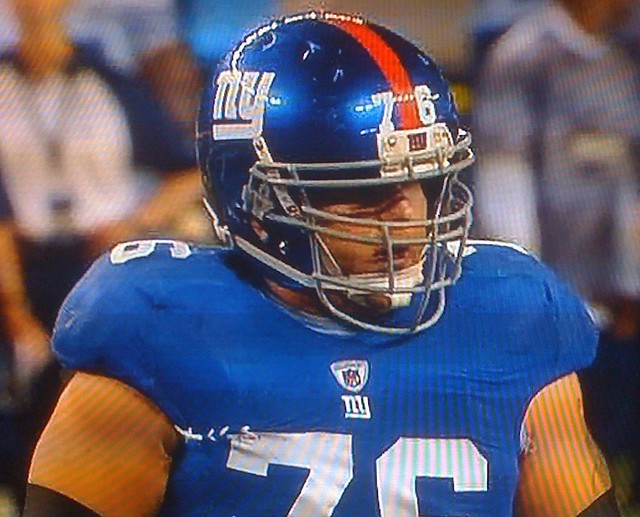
Giants equipment manager Joe Skiba is shaping up as the NFL’s seamstress tailor of the year. A few weeks ago he sewed up a gash in Ahmad Bradshaw’s pants, and then last night he performed some emergency surgery on Chris Snee’s jersey, as seen above. Of course, Snee probably wouldn’t have needed that repair job if his jersey had real sleeves, but that’s another story. (Special thanks to Jeff Czuba for the screen shot.)
Also: In keeping with a protocol Skiba established last season, the Giants wore their triple-striped road pants — the ones usually worn with the white road jerseys — with their blue jerseys last night in Dallas.
New ESPN column today — the annual NBA season-preview installment. Enjoy.
Uni Watch News Ticker: Reader Mako Mameli noticed something the rest of us all missed, namely that Chad Bengal was wearing palm-numbered gloves the other day. This isn’t the first time he’s gotten involved with the number 15 — as you may recall, late last season he wanted to wear that number in honor of Chris Henry. I’m assuming the gloves were some sort of Henry tribute as well. … Check out the Ohio State uniforms they’ve been using for a new TV series currently in production. A Nike jersey and Wilson pants? Sad (as spotted by Mark Zibrik). ”¦ Not sure I’ve ever seen a varsity sweater with this kind of shoulder yoke design. ”¦ More nice varsity/letterman sweaters here, here, and here, and some excellent varsity jackets here, here, and here. ”¦ The first-ever rules of basketball, as set down over a century ago by James Naismith, are being auctioned off. ”¦ Texas Southern wore some sweet throwbacks the other day. But yee-owch, that looks like one painful tackle (with thanks to Dwight Ternes). ”¦ Reprinted from yesterday’s comments: Some high school officiating crews in Seattle are in hot water for using pink whistles without permission. ”¦ The Holyoke, Mass., police dept. has a new patch celebrating the city’s status as the birthplace of volleyball (nice find by Jeremy Brahm). ”¦ Also from Jeremy: Robin Rostratter, the libero on Cal’s women’s volleyball team, has had some issues with concussions, so she wears padded headgear. ”¦ The Chargers are still using the old AFC logo in their stadium (with thanks to Blain Fowler). ”¦ Reader Chris Cruz was so upset about what’s happened to UCLA’s stripes that he sent a note to the school. He got the following response from Senior Associate Athletic Director Glenn Toth: “The decision to move forward with the uniform change was based on the players’ profound endorsement of the new material and cut. Like all changes, however, this one will be reviewed in full when the season concludes and a determination made as to function vs form. I am like you — a traditionalist — and have always revered the shoulder stripes as being one of the signature elements of our uniform. Don’t be surprised if there is an adjustment made in the future that takes both perspectives into consideration.” ”¦ Here’s a look at Arkansas’s helmet history (with thanks to Paul Watson). ”¦ New logo for the MISL. ”¦ Portland State will be wearing plain black helmets — no logo decals — this weekend. Kristina Cruz says coach Nigel Burton made the announcement at the alumni lunch yesterday afternoon: “Apparently he had told the team early in the season wearing the PSU logo is a privilege that they must earn, and now he is taking it away after two consecutive heartbreaking last-minute losses to conference rivals. So will some poor equipment manager have to scrape the Viking off of each helmet? Maybe black electrical tape?” ”¦ Rugby note from Eric Bangeman, who writes: “The latest French rugby club to bust out flamboyant kit is Perpignan, which is wearing special jerseys for its Heineken Cup campaign.” ”¦ Check out these cool Birmingham A’s usherettes! That shot’s from the 1960s (cool find by Paul Wiederecht). ”¦ Dan Cichalski found a sensational college basketball video clip: Notre Dame vs. Cincinnati, 1976. The Irish are wearing green, Cincy’s NOBs are positioned below the uni numbers, and Cincy’s coach is wearing a sportscoat that has to be seen to be believed. ”¦ I got this vintage jersey in the mail yesterday. It’s interesting because the base fabric is a stretch-knit polyester (not very pleasant to the touch, frankly), but the lettering is old-school felt. There’s a nice felt number on the back, and the black striping on the sleeves is actually double striping — very cool. Fits like a glove, too. ”¦
What’s the deal with the Giants wearing two different styles of grey pants last night? One had thin stripes close together, the other had wide stripes spaced farther apart.
I like that look. I think it goes better with the team colours. I think they should wear those for every game.
For the umpteenth time: Just as some NFL players are wearing super-stretchy jerseys, some Giants players are wearing super-stretchy seamless pants. The stripes end up looking distorted on the stretchies.
I do have a life outside of this blog, so sorry for not knowing that. Thanks for the response though.
What’s with the green dot on Eli’s helmet?
Every NFL player from Louisiana gets a Green Dot on their helmet. Kordell Stewart used to have one later in his career when they started that! So does Peyton Manning.
Hey, that reminds me, the Red Wings names weren’t right in the preseason!
“The decision to move forward with the uniform change was based on the players’ profound endorsement of the new material and cut. Like all changes, however, this one will be reviewed in full when the season concludes and a determination made as to function vs form. I am like you – a traditionalist – and have always revered the shoulder stripes as being one of the signature elements of our uniform. Don’t be surprised if there is an adjustment made in the future that takes both perspectives into consideration.”
The plot thickens.
On a side note, it’s really nice when people personally respond to the concerns of the public.
o rly?
begs the question: “if reedidas could have put ucla stripes on ucla jerseys the first time, why didn’t they?”
agree with andy tho…nice to see a response; but was that damage control 101 or genuine concern?
As with most businesses, they were trying to do as little as they could get away with.
Put their energy into the “performance” elements they know the consumer-athletes like and if there are complaints about the look, chances are good the complaints will be dismissed as the views of a handful of anal retentive cranks.
If I had to guess, they probably developed the jersey before they knew (or cared) who would be wearing it. Choosing to make one prototype vs. two is an easy business decision. Now that they know the players really like the material and the fit, they can get into customizing the technology for each team next season. Hopefully.
Gotta build the car before you can make it go. Also, you have to get your product out there as fast as possible, even if all the R&D isn’t done. :-)
right
who would have thought anyone would notice the ucla stripes were ucla nubs?
“Also, you have to get your product out there as fast as possible”
___
No, you don’t. Being first out doesn’t mean a damn thing if the product is garbage.
I beg to differ. Look at any new gadget (iphones especially) and there are always bugs. and even when people know there are bugs they still flock to buy it.
New Coke.
It was a joke. Personally, I think that’s a preposterous way to go about business, but in this day and age, yes, being first on the market absolutely does matter.
Look at Under Armour: because they were first on the market with compression undergarments, they lead that market. It doesn’t matter that their core product is exactly the same as Nike’s or Reebok’s compression undergarments. They were first, and for a while they had the ‘Kleenex’ deal, where no one actually referred to these products as ‘compression undergarments.’ They simply called them ‘Under Armours.’ The market has evened out a little bit as companies have made a big push in training apparel to try and compete, but Under Armour still leads that market largely because they were first.
Depends on the product at hand. If you’re doing something that no one else is doing, then, yeah, being first makes a bit of a difference in market share.
But we’re talking about football jerseys – not exactly a new item, regardless of whatever slight advances they’ve made.
I really don’t like the idea anyway. If they actually *are* better in a way that causes a noticeable change in player performance, then everyone should be using them, or it isn’t fair.
Is trying to give every team the same template the only fair way to go about things, then? Or is it acceptable to modify the jersey for visual purposes even though it wouldn’t be the same as the other teams?
The refs with the pink whistles get a pardon until the end of the season. Guess coming out against a good cause makes you rethink your position.
I totally agree, I think what that high school athletic board is doing is nothing short of disgusting and media attention grabbing. These refs were doing something for a great cause, and pink whistles hurt ANYTHING, how????
As I said yesterday, the author seemed to think that the monetary loss of not being assigned playoff games was the worst of the punishment.
Absolutely not!Playoff games are an honor. To lose them because of a good cause is ridiculous.
Then again… if they’d said nothing, we wouldn’t know about it, would we? By making a big issue out of it, they drew a lot more attention to that cause than if they’d have just ignored it. I mean, how many normal people are going to notice (or care) what color a high school ref’s whistle is?
The inventor of the Fox40 whistle used Pink Whistles this month for High School games in Canada. I doubt Mr. Foxcroft will see any trouble for his efforts.
link
About that Notre Dame video:
1. Notice how the celebration was, by today’s standards, subdued. I think teams go a lot crazier celebrating wins these days, in all sports. Maybe it’s the effect of TV and hype.
2. Notre Dame is wearing green, but the cheerleaders are in blue and gold. And the players have gold socks!
Gale Catlett was the U Cincinnati hoops coach with the hilarious sports jacket. YIKES.
I remember thinking, as a teen, that those gold socks looked pretty cool. Striking, yet subdued, you know. Also the court they’re playing on (Kansas?) looks to be one of those odd rubber surfaces you’d see occasionally in the ’70’s. My high school team played on that type of floor as well and, yes, I thought it was cool.
Definitely the old rubber floor. I played on one in both junior high and high school and seem to remember nearly all of our opponents having them as well.
Notre Dame’s home uniform with that set was gold. They were at the end of a four-year run of gold home uniforms, including the socks (right before this, when they ended UCLA’s 88-game winning streak, they wore jerseys with the large shamrock on the front). IIRC, the next year, when they got to the Final Four, they wore white at home.
The shot of the volleyball player looks like she’s competing on American Gladiators.
On a related note, my cousin has suffered a few concussions playing basketball and now wears a (slightly less obtrusive) padded headband when she plays.
link
When was the last Giants v Cowboys game which did not involve Giants wearing home blue and Cowboys wearing home white?
( Not counting the couple of games where the Giants wore the hideous red alts. )
I may be alone, but I have always loved the red alts!
link
More of the same:
link
I like the red jerseys on their own. But don’t like how it looks when worn with a blue helmet…..
I think they look great.
It was my dislike of the red jersey that first drove me to this blog…..so I guess it was good for something!!!!
It pains me to say this, but I agree with Matt. I love the Giants’ red jerseys but I think they look just a little better link.
I’m also a fan of the Bears, Dolphins, Browns and Broncos orange, so what does that tell you?
Of course, these should only be worn once in a while — except the Broncos. They should ditch their navy jerseys.
Considering what the Giants white jerseys look like, the red alts make a lot more sense than the normal blue jerseys.
I wish they’d stop worrying about historical accuracy and just add a bit of red to the blue jersey, and a bit of blue to the white one. What they have now is a mess. A historically accurate mess… but a mess nonetheless.
And now I’m link.
Aside from the “appalling” lack of historical accuracy, There was nothing wrong with link.
Well I kind of like the fact that the Giants home and road jerseys are different. They are one of the few teams that do not just “invert” the colors. Both looks are unique.
Again I like the red jersey by it self. I even went out and bought one. But when you were it with a blue helmet, something just looks “off”.
I would completely remove the stripe from the pants when playing at home.
No, please do NOT remove the stripes. Pro teams need stripes on the pants. Heck, ALL football teams should wear stripes on the pants unless they’re Notre Dame, Michigan, or Penn State.
Count me in as one of the people who like the current Giants uniforms. I liked the red alt as well. It might be mismatched, but it’s a classic look. My favorite uni in the NFL.
December,1981 cowboys at giants… G-men in white. Boys in blue…game went into OT and giants won on a Joe Danallo FG after missing about 3 fg’s during the game. That’s the last one i remember, maybe they did the same jersey colors later in the 80’s.
Interesting to look back at the floor in the Cincinnati/Notre Dame video. The tartan floor brings back memories for me, playing at Veterans Memorial Field House in Huntington, WV where Marshall University played before moving to their current on campus facility. The tartan floor was a rubbery surface that was tough on the legs. There were a lot of those surfaces in the late 70’s and early 80’s. Thank goodness everyone has went back to the traditional wood floors. I remember being upset that I didn’t get to play on the old wooden parquet floor that Memorial Field House had when I was watching the Herd as a kid back in the early 70’s with Carl Tacy as coach and a great Marshall team of Mike D’Antoni, Russell Lee, Tyrone Collins, Randy Knoll, Gary Orsini and Bill James. That team was ranked very highly before being beaten by Bo Lamar and the Rajun’ Cajuns of Southwestern Louisiana in the ’72 NCAA tournament.
Ah, yes, the tartan floor. Forgot to mention that before I rushed out my note this morning. Many teams had those in the 1970s and 1980s (South Carolina, Davidson, N.C. State are a few that I saw i person or shot hoops on). It was the artificial turf of its day and I am glad it went away.
My high school (built in 1980) had the rubberized floor.
My recollection was that it was supposed to be better because it was grippier than wood, it had a bit of give to it (easier on the knees), and didn’t require maintenance.
The basketball players didn’t mind it. I was a volleyball player and it was absolutely horrible – any play that required you to go to your knees or chest, you just absolutely stopped cold instead of sliding. Lots of scrapes, ripped jerseys, and busted plays. OTOH, it was a pretty good homecourt advantage against every other team in our area that hadn’t played or practiced on it.
When I played basketball in eighth grade, most opponents had wood floors, but one had carpet and one had tile – not linoleum, actual tile. Never heard of anywhere else doing that particular number on young peoples’ joints.
When we played grade-school basketball, every gym in a building at a lower level than middle school had tile floors.
Today’s ESPN column is up:
link
The Neckline Summary has an error. The Cavs’ jersey depicted is from last season.
Definitely agree that the structural changes to NBA unis has upgraded the Bulls overall.
Some teams can have a little bit of a shimmer to their jerseys, but the Bulls just do not look right in anything other than a matte jersey.
“Necessary Roughness” with the too-long sleeved Ohio State players were shooting quick on-field pickups during the game action at the Purdue/OSU game this past Saturday.
It was interesting to see them hustle out onto the field during time outs, grab some footage, and then hustle back to the sidelines.
Also interesting to shoot during a live game, as then you don’t need to hire extras to fill out the stands, and you get all of the bells and whistles, too.
I assumed it was a commercial shoot. Interesting to see it’s actually for a television production.
Conflicting reports about production for TV series (as posted here from the-ozone.net) versus production for a movie (see story from today’s Columbus Dispatch)…
link
Interesting. One USA television show (Necessary Roughness), one independent film (Touchback), both involving Ohio State football scenes and both featuring actor link. Potential for confusion is very high.
Weird. I just got home and checked the Dispatch – and saw the completely other report.
I would guess it’s Touchback, considering it’s in post-production, as opposed to Necessary Roughness, which is listed on IMDB in pre-production. The shots looked to be quick pick-ups.
The Dispatch article said they bought the jersey at a souvenir stand minutes before the shoot (nice pre-production work).
Presumably, they had to buy a 3XL to fit over the pads, which may explain the sleeves.
Love all the new NBA changes, especially the elimination of the super-shimmer on teams like DEN, MIA, and CHI. They look so much more professional.
Paul-Is there a manufacturer’s label in your new jersey? That style looks awfully familiar. It probably dates from the mid-1970s on.
Unfortunately, the tag was removed.
The base material definitely seems 1970s-ish. But it’s so odd that anyone was still using felt numbers/letters in the 1970s, no?
Not really. Local dealers often times weren’t up on the latest fabric changes. They had used felt forever and it had worked, so why change?
In the NBA preview, it is not mentioned that the Magic also have a new logo. Also, according to the people in the team store at the new arena, the logos (which used the old logo font) have been removed from the back of the shorts. They also have jerseys for sale there using the REV30 material.
You can see the new material here. link
You can see the lack of logo on the shorts here.
link
Even on this site, my Magic get no respect.
Thanks for reminding me about the logo (which I knew about) and informing me about the shorts (which I did not know about). I’ll adjust the text and have my editor insert the changes.
It looks to me like it’s actually been augmented. There are now two separate bands of black around the armholes and the black portion of the collar appears to be much wider.
Or is there less black in the side panels? It’s hard to tell in that pic.
I am a little confused about the new NBA uniforms. Three teams can’t have the new jerseys because pinstripes can’t be printed on them, but then the alleged Orlando Magic alternate has pinstripes and it definitely looks like it has the hole pattern like the new jerseys.
Or am I off on that?
The hole pattern still applies to the numbers (unless, of course, it’s the front twill number inside the GSW front). Just no micro-pores in the jerseys themselves for the teams clad in pinstripes.
Look at the pics!
The Magic are using a different mesh pattern, not the newfangled engineered mesh.
Ricardo Leonor said:
OK, I know we’ve done this before, but how many teams don’t just do a straight-up inversion of colors? Some are more pronounced than others, but off the top of my head, here’s what I’ve got:
Giants
Cowboys
Rams
Bears
Bengals
Cardinals
Bills
Others?
Raiders, Broncos, Panthers & Steelers, though all 4 are rather subtle and probably close enough to still generally be seen as an inverted jersey by most people.
I’d guess that if white jerseys weren’t mandatory, that all of them would probably just invert. The Raiders & Panthers would need silver jerseys in order to be properly inverted , and the Broncos orange jersey is an inversion of the blue one.
I’ll give you the Broncos, but I dunno about the other three. There are no major design element differences (striping patterns/yokes/contrasting-color sleeves, etc.) between the dark and white jerseys.
Maybe “inversion” isn’t the best word. Swap? Shift?
The Raiders qualify (if that’s the right word) because the road numbers have silver trim while the home unis don’t have any. Definitely subtle. I’d even bet a lot of people don’t know the Raiders’ road unis have silver trim.
I can see it with the Steelers. Normally, inverting the colors would mean that the letters on the nameplate of the road uniform would be black instead of gold. And I think the Northwestern stripes would have to be black.
The Panthers’ shoulder stripes on the road are black-blue-black. For true inversion, they’d have to be(guessing) either black-white/silver-black or blue-black-blue, I’m not sure which.
Yeah, YMMV, but when I say design element differences, numbers/letters (unless they’re completely different fonts or something) and the fact that the stripes/shoulder inserts are the same color don’t count. So what I’m talking about is this.
Giants: white jersey has striped sleeves, dark jersey does not
Cowboys: dark jersey has stars on sleeves and a wordmark below the collar, white jersey has neither of these, plus a completely different striping pattern
Rams: white jersey has contrasting-color sleeves, dark jersey does not
Bears: dark jersey has featheredge stripes all the same color, white jersey has plain stripes of alternating colors
Bengals, Cardinals, Bills: white jersey has contrasting-color yoke, dark jersey does not.
Broncos: single color side panel on dark jersey, two-color on white
The Browns are definitely a palette swap on the same template. I don’t know if that’s an inversion though.
Can someone get a screengrab of Osi Umenyiora/Jason Pierre-Paul sitting on the bench in the 2nd half? With their backs to the camera, they both had the TMA (Too Much Armpit) jerseys and the way they were sitting made the nameplates stretch even more. It looked ridiculous.
My Giants are in need of a serious uni upgrade next season (which just happens to be the 25th Anniversary of the ’86 champs).
I agree. I like the “NY” logo on the helmet, but the overall look of the uni is bland, especially with the new fabric in the jerseys, which tends to look less brilliant. So you have a really nice bright blue helmet paired with a “dingy” blue jersey.
I’d like to see elements of the Parcells-era uniforms paired with the current helmet. And it might be nice to see a throwback to the 1975 NY logo (but without the ridiculously wide stripes).
I hope they never ever even consider going back to the 1975 look!!! In fact those unis should be somehow erased from our collective memories!!
The Parcells, LT, Simms era unis were good, but I was never a fan of the white pants..it was a really bad look for them with the road whites, and usually white shoes…
I would like to see a 1986 home blue throwback…helmet and all….
well…you’ll (hopefully) get the uni upgrade in 2012
and they’ll be on strike/locked out next season…so
lets just hope the rest of the team doesn’t start wearing the stretchmosta pants from here on in
Ocho has been wearing the No. 15 gloves all year. This just happens to be one of the first times he has caught any balls with them.
Toronto FC are letting the fans design their next kit: link
They claim they’re the first to ever do this “We’re the first sports team to launch anything like this, so here’s your chance to help us make history.” Not quite sure where they’re getting their info. Haven’t there been many teams who’ve done this?
The White Sox come immediately to my mind. Info about three-quarters of the way down link.
Another thing about the ND-Cincy video: In addition to KU having a Tartan surface, does it also look like the keys don’t have the dashed line that made up the top half of the jump circle? This is long, long before the possession arrow, so were the officials expected to guess what the area was?
And it’s so odd now to see a court without a three-point line.
Regarding the NBA preview. The Suns seem to have more changes than just the different collar style. The collar itself used to have the orange stripe in the middle of the purple, now it has the orange stripe on the edge. Also, the numeral is outlined in white on the new uni.
Call me old fashioned if you will, but I think the only types of collars that should be worn are crew neck and the classic V-neck. The other types of colors strike me as being inspired by the WNBA.
Yes, Skycat! I’ve always associated these new collars with women’s basketball (not there’s anything wrong with women’s basketball, of course). Is there some reason the classic collars were ditched?
Also, the Knicks must get rid of ALL the black that has sullied that once beautiful uniform. A reduction doesn’t help. Total elimination is the only answer.
i see i am not the only one looking for a letterman sweater. please cease and desist with the posting, you are going to artificially inflate what i pay:)
4 days to kansas city
Rumor has it that everything’s up to date in Kansas City.
i am not going to miss chicago, but i will miss mexico.
look out k freaking c, there is a tornado a comin’.
Early welcome to Missouri! Even though it’s the wrong end of the state. Just in time for gigging season.
pffffffft. st louis sucks. kay~ceeeeeeeeee. royals-cards, we travel, you loose. it a date trax.
In the Notre Dame vs. Cincinnati video, the NBC logo is the awful “trapezoid N” thing that fortunately didn’t last too long. NBC, as I recall, briefly ditched the peacock for this thing and it went over like New Coke. If I recall correctly, it also soon became known that NBC’s extensively researched blue/red logo was the same shape as the Nebraska Public TV logo (which was all red) or something like that.
Correct!
Probably not “news” to anyone here, but unfortunately I’m not able to spend as much time at this site as I used to, so it’s hard for me to know what’s news and what isn’t.
Either way, figured I’d share this bit of uni-related news for the Washington Nationals…
link
Looking forward to those changes!
Too bad. The Nationals had distinctive lettering across their home white jerseys, and no doubt whatever they unveil will be more bland.
Nats ditching gold trim, going script at home. New unis to debut November 10th…
link
Please please please let them be making lots of tweaks to the existing road uni as well. And eliminating the blue stars-and-stripes alt. The Nats are two major changes and a ton of very minor tweaks from having an all-time great uniform identity. Conceptually, the team is already there; it’s only by dint of piss-poor execution that the Nats are the reigning Ugliest Team in Baseball.
* Major changes: Script “Nationals” or left-chest curly W on home white uni; eliminate all beveling. Minor tweaks needed: Eliminate white outline from road script; shift location of road script slightly so it breaks between letters; regularize trim piping between home, road, and red alt; fiddle with primary logo or sleeve patch to emphasize curly W; adopt consistent color approach between home and road (could be all red, or one red one blue, or red cap blue script at home, blue cap red script on the road, whatever, just so long as there’s an identifiable pattern in the use of red and blue).
Also, what of minor-league affiliates that have adopted block-and-bevel scripts, numbers, and/or cap logos to identify with the parent club? Syracuse, Harrisburg, and Potomac have all done so to one degree or another; will they now need to move toward a curly-W-inspired aesthetic? (As Harrisburg has done for its cap logo).
Beautiful link from the 1955 World Series.
Anybody have any good ideas for Halloween costumes? I have a huge party in Wrigleyville on Saturday. Thanks in Advance!!!
I don’t know…what does a 102-year drought look like?
I think it looks like this:
link
As a Washingtonian, I’d love to see the nats adopt a design incorporating the 3 star 2 bar of the DC flag on the arm.
This might help cure the immediate untucking of jerseys at the completion of a game: link
This picture is pic of Jackie Robinson is amazing!!!
link
How about this in color? Anyone?
link
Every Brooklynite should have this pic framed in the living room!!!!
link
“Apparently he had told the team early in the season wearing the PSU logo is a privilege that they must earn, and now he is taking it away after two consecutive heartbreaking last-minute losses to conference rivals.”
You mean having to wear a Portland State uni isn’t punishment enough?
link
link
The logo’s nothing to be proud of, and neither is that uni. At least they brought back some green, now that Jerry Glanville is gone, but the remaining black is not a school color.
Agreed. The privilege is NOT having to wear that crappy logo.
They have had the logo for 10 years. It is better than the Glanville spear.
link
Should we call it the Vikaslug?
Nats to unveil uniforms changes Nov. 10. link
Damn, don’t I feel redundant
bit of logo creep on steve smith’s “socks” monday night. link
haha! ‘chad bengal’!
nice.
I’m frankly torn on this Washington football officials story. One one hand, the athletic commission looks pretty stupid for slapping the hands of these guys for joining the fight against breast cancer, but on the other, I f___ing hate pink. I hate seeing it on the football field.
I’m all about the ladies and I certainly appreciate their breasts, but enough with the pink already!
I don’t think the NFL jerseys are stretchy enough.
link
So does that mean link will be the next Vikings uniform?
Nah, that’s too old-school. They’ll go with this one:
link
So that pretty much kills that argument in favor of the super stretchies.
i just made good trade…
for those of you familiar with the studio, i had an old working union 76 petrol light. it was pretty rad, BUT i just traded it for an old style bar sign complete with “cerveza fria” secondary shield. and for those of you familiar with what i speak, you know this thing is huuuuuuuge! kansas city bags stadium, shaping up.
and now it’s cleaned up, oh the possibilities, what a great last second chicago score. i think it moved. yes, yes it did, it definitely moved.
er…what moved?
See George getting a massage.
see zactly. i may be coming through the lou on sunday, crow-que?
yeah…that’s what i thought
Drop 2 1/2 hours south of the lou and we’ll gig a fish or 20.
In reference to your ESPN column…I am salivating at Golden St and the those Magic alts!! It might not count as BFBS but those are the best as were the 90s version at the time.
I love the current Giants uniforms as well (except for the stretchy pants with the distorted stripes). Never change them; they’re perfect!
Dammit, that Toronto FC design contest is only open to Ontario residents. Not cool.
the last screw is out of the last wall of the studio.
I’m gonna be shocked if Boise State/LA Tech isn’t Vilk’s worst uni matchup of the week. What an eyesore this game is.
oy vey…just popped this on…you knew BS would wear their camouflage, but doesn’t la wreck have any other pants besides blue? or are they trying to blend into the smurf turf as well
jesus…this is NOT a good matchup…and on the blue grass…it’s even worse
Turns out they do have white pants, but that would’ve made the matchup only slightly better
I didn’t even realize BSU’s players were on the field until they got in the endzone. Guess that’s what I get for not having an HDTV lol
What happened to the later evening commentors? If I remember, the hemogoblin used to be a regular overnighter…. Phi you don’t count.
Tulsa Oilers Halloween jersey confirmed link
Nats new 2011 jerseys? Looks great to me.
link
link
Really clean unis!!!!! I can’t understand where you got that pic from, but oh man, the Nationals are going to look sharp next season!
Actually found the pics on boards.sportslogos.net. A user said he got a hold of the prototype. Not sure if it’s definitely the one they’ll go with, but the striping is the same as the away, as is the script, so it all fits. Plus the patch on the bottom of the button up hem says “2011”. Not saying it’s in the bag, but it appears to be very likely!
how legit are those?
i mean, that’s been rumored for some time, but there haven’t even been any logo slicks leaked (to my knowledge)
can you send that (and the source) to paul?
To be honest, I have no idea as to the legitimacy. Here’s where I found them:
link
Post 217
Those look an awful lot like the tweaks somebody posted on here a while back
Vancouver Canucks wearing the special NNOB anniversary special jerseys again vs. Colorado.
“Copycat Logos are Pitting high schools and trademark turf war” link