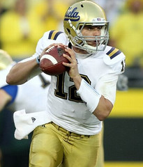
UCLA debuted their new super-stretchies last night, and it was a complete disaster. All the same problems we’ve seen with NFL stretchies were on display: teeny-tiny TV numbers; NOB lettering that looks like it was done at the mall; NOBs and other parts of the jersey being stretch-distorted; and so on.
But the saddest part was the team’s UCLA stripes, which were severely truncated and often distorted. I mean, come on, people — this is UCLA, the school that invented UCLA stripes, and you’re gonna leave them with this? That’s just pathetic.
These stripes do not deserve to be called UCLA stripes. What shall we call them — Ree-didas stripes? Ree-diculous stripes? The floor is open for other suggestions.
And if there are any teams out there wearing true UCLA stripes (or whatever the modern approximation might be, since genuine wraparounds are a thing of the past), those teams should no longer be stained with the now-disgraced term “UCLA.” So if there’s a school out there upholding the spirit of UCLA inserts, let’s rename the stripes for that school. Again, your nominations are welcome.
Meanwhile, here’s a really good video clip that shows just how stretchy these jerseys are.
Oh, and Oregon played too. But for once their uniforms were of secondary interest.
ESPN reminder: In case you missed it yesterday, my latest ESPN column is all about exposed armpits on the gridiron.

Collector’s Corner, by Brinke Guthrie
The second game I ever attended was the Boston Patriots at the Bengals, Dec. 20, 1970. This game included Patriots QB Joe Kapp, who was previously a star of the first NFL team I really dug, the Vikes. So when I saw this item, I thought, “Joe Kapp wore #22? Since when?” Maybe it’s a college shot, but he went to Cal, and that jersey is green. Weird.
In other eBay finds:
• This game program has been featured on Uni Watch before, but it’s worth taking another peek. Look at those helmets!
• Paul would no doubt love this steakhouse-sponsored baseball jerseys, which was submitted by reader Bo Baize.
• Ya know, you don’t usually see football helmets depicted facing this direction.
• Here’s a nifty 1969 Baseball Stars stamp album. Never seen that one before.
• In a similar vein, here’s a nice 1968 NFL autograph book.
• Nothing says 1970s NFL giveaways like IHOP. I’ve seen that mug before, but this game is new to me.
Finally, this has nothing to with eBay, but I’m looking for a 1440 x 900 version of this photo. If anyone can point me in the right direction, please get in touch.
Seen something on eBay that you think would make good Collector’s Corner fodder? Send your submissions here.
Uni Watch News Ticker: Derek Holland’s nickname is “Dutch Oven,” and he has it embroidered onto his glove. Further details here (with thanks to Mark Douglas). ”¦ The Wilkes-Barre/Scranton Penguins have unveiled some special sweaters to honor firefighters, cops, and the military (with thanks to Rob Ullman). ”¦ Hmmm, what did Wilson Alvarez have written under his brim? (As spotted by Andy Chalifour.) ”¦ No photo, but Jesse Weidaw says former Cowboys lineman Flozell Adams, now with the Steelers, had some Dallas-style tie-down action on his jersey last weekend. ”¦ New hoops uniforms for Georgia Tech, Wyoming, and Boston College. ”¦ In a related item, here’s an article with good background info on Maryland’s and BC’s new hoops uniforms (big thanks to Gabe Kleinfeld). ”¦ Bryce Harper, now toiling in the Arizona Fall League, has been cutting little slits in his pajama cuffs (with thanks to Jonathon Binet). ”¦ Yesterday I opined that the Mariners would be better off wearing a green-billed cap — instead of a solid navy cap — with their new green throwback jersey. That prompted a communiqué from M’s marketing VP Kevin Martinez: “We were torn on bringing back the caps with the navy crown and green bill. While we wore them along with the green jerseys on our Turn Back the Clock Day last year, the response on the caps wasn’t nearly as positive as it was for the jerseys. You might recall that in the mid-’90s we wore the green jersey at home and on the road. When we wore it on the road, it was worn with the navy cap. At the time, our fans strongly preferred the navy cap over the two-tone design. However, we will see how it plays this year. If there is a demand, we could add the two-tone cap as an alternate in 2012.” ”¦ Dean Gemmell, who gave curling lessons to me and Phil last winter, interviewed me earlier this week for his curling podcast. ”¦ New mask design for Marty Biron (with thanks to Alan Kreit). ”¦ We’ve all seen high school football teams that NCAA logos. Here’s an excellent article about that phenomenon. ”¦ In a related item, here’s a high school football team using the Atlanta Braves’ cap logo. That’s Abbeville High from south Alabama (good find by Kris McInnis). ”¦ “Louisiana Tech has one of the most storied programs in women’s college basketball,” says Chris Mycoskie. “Three national championships, iconic powder blue uniforms. Unfortunately, it appears they are now going the BFBS route.” ”¦ Have I mentioned the increasing overlap of sports and superheroes? Lots more illos from this series here. ”¦ Here’s another view of King Felix in the Mariners’ new green alt. ”¦ Eric Grgurich tipped me wise to an apparel brand called PondRocket, which has a T-shirt design based on the Miracle on Ice team’s pant trim, another tee with a center-ice motif, and a cap whose interior taping is made from skate laces. Interesting stuff. ”¦ Check out this old shot of the Kansas Jayhawks scoreboard, circa 1932. Man, was that really the best way they could think of to indicate the yards to go? (Nice find by Larry Bodnovich.) ”¦ Nick Swisher is doing the superstitious high-cuffed thing (with thanks to Brooks Simpson).
say what you will about oregon, but last night’s game…both in terms of look and fit of uni…shows team nike is now MILES ahead of “reedidas”
not to mention the quality of play
i, for one, am extremely pleased there will be a new uni supplier for the nfl in 2012…especially after the lockout
There is room on my bandwagon if anyone wants to jump on:
link
link
link
And lest I forget my Halloween costume last year:
link
link
lest anyone forget your “costume” the year before
Wow! God knows what else you have saved!
The Ducks looked and played great last night, although I severely miss this combination:
link
I hear ya Powers. I’d even love to see the link However, that throwback they wore against Cal. last year was nice.
We unleash beatdowns. It’s fun!
Also, the black-yellow-black is probably my favorite Oregon uniform combination. It just looks so sharp, and the yellow jerseys pop so much.
Also, UCLA looks like ass in person, too.
Carbon helmet and pants would pop even better as the helmet/pants would match the numerals, and the combo would would be unique to football period. Iknow, I know, it’s not their school colors, but that cat done ran out the door and across the street a very long time ago. If they gotta have a uni carnival, let’s see the ultimate in uniqueness Carbon/Yellow/Carbon.
Now that’s more Nike!
The carbon helmets don’t look as cool as they should. They just look like a gray mess from TV or from the stands. You have to be about two feet away to really appreciate them.
first off in video look at the old helmets in the back i saw old oregon state which are quite nice, a university of pacific dont play football anymore and a princeton helmet… awsome now on the bad those jerseys are a joke and was wishing for oregon to go green yellow green but who would have thunk that oregon would blow ucla out of the water on unis as well as on the scoreboard
Isn’t the “A” on the Abbeville high school team helmet also the same script A that Alabama uses? Never really thought about it until now but is the Alabama A and the Braves A the same?
thought the same at first, but they are similar, but different
I am not a fan of Pac-10 football, but I watched last night to check out the new uniforms of UCLA and whatever getup Oregon has on. They were both atrocious.
UCLA: The helmet looked putty rather than gold and did the blue on the script get darker? I know the economy is tough, but did they have to cut back the “stripes” on their jerseys so much? I really don’t know what the heck is wrong with Adidas. Love their soccer kits, hate their NCAA designs.
Oregon: Matte black helmets, yellow “O”, yellow jersey with the “wings”, silver letters, black pants. Seriously? I know multiple look are cool with the kids, but they looked like crap. I like their throwback unis and with they would pick one or two and go with it. Then again, maybe it’s a west coast thing my east coast bias doesn’t allow me to understand.
Can’t wait to watch ACC and SEC games this weekend! Hopefully all will be devoid of “pro-combat” gear. One can hope.
I don’t know that design is the problem here (visual design, that is). I mean if adidas is going to outfit its teams in a new jersey that they’ve been working on for 4 years, it’s really up to the team to tell them that they want a design that better suits the new uniform cut. Otherwise, adidas just has to shoehorn the current design onto the new jersey if that’s what the school wants. adidas’ job at this point really isn’t to figure out how to best translate UCLA’s look onto a new jersey. Because of the technological progress that other companies (like Nike) have introduced into the marketplace, adidas job has become to put their teams in the most technologically advanced jersey they can and to do it as inexpensively as possible (i.e., one jersey template) in order to avoid losing all that market share to Nike. In today’s world, universities aren’t going to come to adidas just because they can get their shoulder loops correct on a jersey that’s basically the same as the ones worn 10 years ago if Nike is across the river churning out something more advanced that performs better. Might there be a better way to make this TechFit jersey so that the shoulder loops maintain some sort of integrity? Maybe yes, and maybe no. There’s a lot of research and development that go into something like that, and we, as outsiders probably don’t take everything into account that the product designers do. There’s a large series of trade-offs in anything like this, and I’m afraid we’re only looking at it from a visual standpoint and making the decision that it has failed, but there may be other areas in which this jersey is succeeding, and those areas might be more important to the football team.
Good points Andy. I agree that the marketplace is driving teams and companies to design their jerseys in a particular manner.
I do not care if a particular jersey offers a team an “advantage”. Most of them seem dubious at best, fraudulent at worst. (Call me old fashioned but I doubt a jersey’s tech is going to influence the outcome of a game, its a gimmick.)
Regardless, I just look them as a fan from an aesthetic standpoint. Does it look good? Does it create an identify for the team? Is it well executed? I know technology plays a role, but design has to have one too. In this case, both UCLA and Oregon fail.
GREAT, GREAT, column on ESPN. If I wanted to watch fat men sweat in basketball jerseys, I’d go be a spectator at the Baptist church league on Tuesday nights.
The comments being posted to that column are hilarious.
wow, “I can’t believe I wasted 10 minutes… so I’ll waste 3 more by posting a comment about it.”
A whole lotta people who don’t “get it”!
UCLA looked like absolute horseshit last night. They, and adidas, should be fucking ashamed.
I’m tempted to say they should be called LSU stripes, but I think they’re slightly more identifiable by their helmets…
How about Louisiana Tech stripes?
link
When I think La Tech, I totally think about those shoulder stripes.
I think either LSU or La.Tech would be good choices. Or, since they’re both from the same state, maybe just Louisiana stripes..?
Back when I was on the equipment staff, we did move away from the UCLA stripes, but the fans hated the look…and some of us on the team did too, so the stripes returned. I don’t know what is the worse news today…UCLA castrating their own stripes or the Lady Techsters having BFBS unis!
Well, in that case, then it’s “UCLA Stripes”.
That’s what they were called when the Colts started wearing them.
(Ask Terry P., betcha he recalls that).
—Ricko
I can totally get on board with Louisiana stripes.
+1 for Louisiana Stripes!
I like “Love Boat” stripes.
(see Matt L’s comment further down)
—Ricko
Or “Stubing Stripes”.
That’s not bad, either.
We’re renaming the good ones, Ricko, not the bad ones. :)
Well, in that case, they’re “UCLA Stripes”.
That’s what they were called back when the Colts stared wearing them.
Ask Terry P.; betcha he remembers that.
—Ricko
Oh, wait, so now there are three different versions (sadly).
The original UCLA stripes.
The truncated style of LSU and others.
And this new shit from adidas and Reebok (“Quotation Marks” might be good)
Okay, gotcha.
—Ricko
“Louisiana” stripes sort of implies all or lots of schools in LA wear them.
I vote “LSU stripes”. I am in no way biased living in New Orleans and rooting for LSU from time to time.
:)
No…let’s not. There are more achools out there who would rather not wear LSU Stripes then would.
How about…
Normal,
Truncated
and
Stupid?
Man, as a UCLA fan, I am just embarrassed by both the team’s performance as well as those hideous new uniforms. Geez, the one thing we always had over USC was better uniforms (and USC’s are pretty good!), but even that’s not the case with these newfangled getups.
UCLA is the only adidas school in the Pac-10. It might be time to join the Nike bandwagon. If Nike was smart, they’d have some sample UCLA uniforms mocked up and sent to the UCLA athletic department stat!
Are the Mariners calling it green or are you, Paul? Back then it was teal. Still looks teal, to me…and I like it a lot.
Mariners are officially calling it “northwest green” (a silly term I won’t be using). I think it’s more green than teal, although I agree it isn’t a clear-cut kind of thing.
How about Greal? Teen? No….not teen. Greal it is.
Gotcha! These guys are going with teal, even though they reference your blog. link
PS: UCLA looks like garbage. Navy Blue and the Adidas stripe on their shoulders they are trying to play off as the UCLA Stripe, well it’s a joke, but not a funny one. I know people rag on Nike, but I doubt they would ever put a big swoosh on each shoulder of a uniform and try to disguise it as part of the look. Maybe on the pant leg…
What bothers me is the Mariners are playing fast and loose with their own color palette. Judging by yesterday’s main pic the new ‘throwback’ looks even more teal than its predecessor & like the throwbacks they wore against the Angels. The beloved teal brim caps always looked incorrect to me and reeked of the trendy 1990s teal, and I don’t know why the Mariners are bringing back that jersey other than perhaps to invoke 1995 memories. Why can’t they just match the correct shade of green?
The Mariners old green/teal brims, caps & jerseys seem to vary in shades in every photograph, ranging in many shades of green & blue.
Here’s a quick color job to a more green Mariners alternate version (thanks to Phil for the photo color editing tips!)
link
…and the better hat
link
Like ‘midnight green’ for the Eagles.
Northwest green?? Is that the same green the Seahawks use?
Did someone say Seahawk green?
link
/I really need to stop leaving paintshop running
Cooooool…
Ow, my eyes! The goggles do nothing!
I’m sure this has been addressed before, but I haven’t been keeping up with the inner-webs lately–what’s the deal with Lincecum and several other Giant’s cutting the Nike Swoosh of their under shirts? Seems like they chop the collar and the sleeves. Anyone bring me up to speed? My wife asked me about it last night and I realized I hadn’t looked at the Uniwatch for a while. Thanks!
Lincecum is sponsored by Reebok, as far as I know, and he is probably doing it out of respect for his sponsor.
he’s been doing it all year. sometimes he has a shirt on where you do see it..many starts, he wears the one where it’s chopped off. I’m surprised the uni police of MLB let him slide on it. But yeah he is a reebok dude.
Joe Kapp wore #22 when he played in the CFL prior to joining the Vikings. he played for Calgary and BC, but neither wore green. the number font on the Topps card sure looks like the Philadelphia Eagles style from that time frame.the mystery continues.
That’s a black and white photo hand tinted by someone who didn’t know what he was doing. Must have mixed up Calgary and Saskatchewan or something.
I have the photo at home in my files somewhere. Not certain, but I seem to recall it’s a publicity photo from his time at Cal. The pants are pretty dark, which would be athletic gold, not the silver gray of the Stampeders…and the uni, just in general, matches nothing the BC Lions wore at the time.
—Ricko
The black-and-white photo appears on Kapp’s 1961 Topps CFL card. There are usually link. Topps was pretty liberal about the colors they used when colorizing black-and-white photos. In 1961, they had most of the link!
And it’s a California photo. Pants too dark to Stampeder silver, and I’d bet good money that Calgary’s home numbers were white while Kapp was there. The BC Lions never wore a uni even close to that.
—ricko
“What shall we call them – Ree-didas stripes? Ree-diculous stripes? The floor is open for other suggestions.”
Welp … my first thought was Shoulder Boards, but that would be inaccurate, as Shoulder Boards slide over Epaulettes.
The new Army Class A Uniform has what’s called Shoulder Straps. They look like this …
link
Which looks a lot like the “Ree-didas” stripes.
I dunno, “Shoulder Straps” sound official, but it also sounds boring.
Shoulder straps also sounds about as close to an on the nose description of the dwarf UCLA stripes as I can imagine.
As for military uniforms- all I can say is they really need to bring back the Ike Jacket option.
Agreed olive-drab Ike Jackets and blouses with khaki trousers, shirts and ties is the best look for the Army.
Captain’s bars?
I want to take this opportunity to say how sorry I am that my alma mater, Louisiana Tech, went with the BFBS unis for the Lady Techsters. Truely a marketing move. Hell, when you are known for your shade of blue so much that UofTenn’s women’s basketball program added it out of respect for your program, you do not go and make your uniform black! I am not a happy formwr Bulldog right now…
At least our football unis look good!
link, eh?
a little too ironic
i really do think
It’s like RAAAAAAAAAAAAAAAAAAAIIIIIIIIIIiiiiiiiiiiiiiAAAAAAAAAAAIIIIIIiiiiiiiiiiiiiiiiiiiiinnnnnnnnnn…
Yikes, James. -1.
Yeah, I’ll give myself -1 for saying something thag would lead to that song being quoted…
No worries, JamesP; that was @ JTH. Today isn’t his birthday, so I couldn’t let it slide… ;)
I thought Tech had a school wide Nike contract? I know the Lady techsters have had Nike for decades, how are the new uniforms done by UA?
They are a Nike school, and I have no idea what this UA uniform spawned from…
Those were some really cool covers in The Mag this week. Very neat reworking of some of the most famous comic book covers Marvel ever produced.
I do have an issue with the main illustration though.
They depict Kobe as Iron Man and the five rings he has won.
While the artist had Rondo’s upside-down headband correct, (I don’t think he has worn one all preseason though.) he must have forgot the ring Rajon won two years ago.
Yeah, they were generally pretty cool, but some were off base and a bit of east/west coast bias– I can somewhat stomach “The Unamazing Cavaliers” and “King James No More”, as that is a reality, but the “Exit Melo” and “Chris Cross” covers (for the Nuggets and Hornets, respectively) are presumptious and weak.
The motif they are using for Kobe is not that of Iron Man. In fact, the motif is that of the Infinity Gauntlet:
link
Yeah. Plus, I’m pretty sure that’s supposed to be Iron Man’s gauntlet partially obscured by Captain America’s head
On the magazine cover, yes. Also, on the Lakers cover, Bryant is portrayed as Iron Man (in a cover drawn by current Iron Man artist Salvador Larroca). The art for the first page of the story depicts Bryant wearing the Infinity Gauntlet (with the different colored rings/gems) that is sought by all the other teams/superheros.
The Kings got punked…they deserve it,but still their cover and the Hornets were just weak
I’m trying to figure out how a designer could look at jerseys such as UCLA and Colts and reason that the unique feature is forward-facing stripes and not that the stripes form “loops” at the shoulder seam.
That’s like saying the defining feature of the Target logo is that it’s red, not that it’s round.
I mean, if the new jersey cut doesn’t accommodate the loops, then don’t throw a set of forward-facing stripes on the shoulders and say it’s the same thing. Figure out a new an unique design that make sense with the new cut, that follows its new lines. Sawing off the old look and calling it “modern” or “updated” is self-delusional.
—Ricko
But, that’s up to the team, not the outfitter.
Really?
Then why are they all truncated? I mean, on virtually every team?
Is there universal acceptance that that’s just a bitchin’ look?
And isn’t the whole point of today’s piece that that’s the way adidas is choosing to construct the garments?
Y’know, they COULD put matching stripes on the fabric for the lower portion of the jersey and assemble them so the stripes met. You think not? Think about it. Suit makers to it all the time with pinstripes.
But it would a helluva lot more expensive, both in time and material. As it is now, the lower portion can just roll through an assembly line, but cut anywhere. Matching also would require more time with humans to assure the proper alignment. Time is money.
—Ricko
No, I mean if adidas were to ‘figure out a new and unique design that makes sense with the new cut, that follows its new lines,’ it’s up to the team to say, “Yeah, we’ll wear that. It works better with these new jerseys.”
The teams aren’t doing that, however. When they’re presented designs by adidas, they’re saying, “Nope. We’ll stay with the traditional design on the new template, however it looks. Thanks anyway.”
And I’m saying that adidas is saying, “This is how we have to do it”…because doing a better job of recreating it would cost them more money.
And the teams are saying, “Oh, okay.”
—Ricko
“Bryce Harper, now toiling in the Arizona Fall League, has been cutting little slits in his pajama cuffs”
In the early days of players wearing their pants over their shoes (before the legs were cut wider to allow for that) a number of players cut that little inverted “V” in the bottom of their pants. Can’t produce any photos, but I recall seeing it on numerous occasions, and thinking it made sense in that context.
—Ricko
Absolutely, not a new or unique thing. Just interesting to see that Harper is doing it.
’tis true. Given the cut of today pants, it would seem unnecessary.
(Unless maybe he has really big feet).
—Ricko
A lot of players on my high school baseball team did that to pull the elastic out so they would fall down over the shoe easier. I always wore my socks the right way, so I never did this, but I think it was more about function than style.
Am I seeing things in that Nick Swisher photo, or is he wearing his pants down to his ankles with his socks just pulled up over them?
Eww — I think you’re right. Good spot. In this case, it truly is high socks, not high-cuffed.
Oh, great.
Now the Tucked-Untucked Debate expands into baseball pants and socks.
—Ricko
Well, from a distance it doesn’t really look any different. I don’t think think socks over pants would be the most comfortable way to go… but whatever.
My 10 year old son last night:
“Oregon’s yellow jerseys look awesome!”
I’m usually pretty hard on military/patriotic “tribute” jerseys, because most of the time they strike me as being a lot more about “look at me and buy this jersey!” than about “gosh, we sure do love our country/soldiers/cops/whatever.” But those SWB Penguins jerseys are pure class. Especially the fire & police unis; they’re exactly what I’d expect a team of actual firefighters or cops to wear in a rec league. The military one is maybe even a little too subtle, but given the alternative (camo! giant flags! twelve-inch yellow ribbon with eagle talons! etc.) I’m not complaining. Tastefully done all around, and in each case it looks like the team Gets It with regard to what should be the focus of the tribute.
King Felix is wearing a replica jersey (note the Majestic logo on the right sleeve…it’s the one used on replicas). I guess Majestic hasn’t manufactured “authentic” green/teal uniform tops for the Mariners yet?
Also, Paul, Business Week (I think it was them) reported that Nike does plan to bring the Pro Combat uniforms to the NFL.
Actually, the M’s wore them once this season in a turn-back-the-clock game, so the uniforms exist somewhere.
Yes, that’s because you used the horrible-looking version of the two-tone cap — the one with the link.
You got that right.
The navy home hat with the teal visor was just fine. Quite good looking, actually.
—Ricko
I’ll take both!
“UCLA hyphens.” That’s all that is left of the stripes.
1) I remember that IHOP game.
2) I don’t like the jerseys that Oregon wore last night. There is something about that neon yellow I don’t like.
The Washington Post article on high schools “borrowing” logos mentioned K-State’s program to license their logo to high schools for a $1 (+other rules if they want to sell it on t-shirts).
How is it U’s with other frequently used logos (Wisconsin, Florida State come to mind) don’t have similar programs. Take Wisconsin- their logo is readily identifiable to people who follow college sports. If _____ West HS uses the W, people will see it as the Wisconsin W. Just think of it as a way to spread the identity and build goodwill.
Actually, the K-State program would be interesting to learn more about.
My alma mater and local high school (and by local I mean four doors down) is nicknamed the Wolves. Remind you of anyone?
link
link
That looks more like Grambling that Georgia or Green Bay to me.
” Just think of it as a way to spread the identity and build goodwill.”
That, I have to tried to point out many times here, is exactly how teams once saw it.
The penetration of cable TV that brought increased exposure and the general increase in disposable income that made more expensive fan jerseys affordable turned “trademarking”, etc. into a significant concern. Because now it was about money.
Before that, it had been about public relations, good will and image building.
One again I point to the Redskins “lance” helmet, which predates Florida State’s version by at least a couple seasons.
—Ricko
That’s what makes the K-State approach so interesting. They could go the route of their peers and churn out cease and desist letters from the counsel’s office but have chosen a different path that is as close to win-win for everyone as there is.
How is it that Kansas State arrives at this but no one else does?
COLONEL REB STRIPES?
link
link
BAYOU STRIPES?
link
HOOSIER STRIPES
link
Those are “Black Bear” stripes now.
Those stripes (UCLA) were barely more than what Isaac wore on his shoulders on “The Love Boat.”
Ah, so we could call them “Love Boat Bartender Stripes.”
link
link
nice work Matt
let’s try that first link again
link
link
The Stirrup Revolution has reached Columbus. These babies (57 Reds) work really well when combining Stirrup Friday with Buckeye Friday
Thanks Comrade Marshall!
link Include the link dummy….
A bit off-topic, yes, but I walked into work this morning and saw link lying on the table in my cube farm and my first thought was “Holy shit! Donovan McNabb died?”
The state of journalism is in the terlet.
LOL! I love how they used a big black & white photo, too.
Wow!
Too bad Northwestern beat Paul to the 888 number of his dreams.
I was just watching the Super Bowl Highlights from 1972 and in one of the shots, it shows a Cowboy wearing Adidas Sambas. Was this common back then?
Pretty sure that would essentially be a turf-cleated version of the Samba, because such a shoe did exist (can’t remember what they called it, though).
So the answer is yes, on turf that shoe was very common.
—Ricko
Thanks Ricko.
There’s one Monday Night game in Philadelphia where the entire Packer team wears them in Athletic Gold with Forest stripes and, I believe, white laces.
—Ricko
if you look at the SBs from 71 and 72- it’s ALL adidas and puma. that’s when they took off in the NFL.
i don’t know about anyone else, but it almost seems foreign to me, as a mets fan, to have the mariners so responsive to fan suggestions about the uniform. imagine if the mets were this receptive to ditching the black? if only…
I think the Mets may very well be responsive to the tastes of link.
sadly…james is right
you see more black “alts” and fashion jerseys at a met game than anything else…well, that and the equally awful 86 racing stripes…but at least “we” won a world series wearing that
we need more fans wearing “ICIS” and “Meats” gear!
And that wasn’t meant as a knock on Mets fans. Whenever I see a shot of a fan wearing a jersey at a Mets home game, I’m surprised if I see anything but a black jersey.
Hell, I’m surprised if I see a fan wearing a blue and orange cap.
It’s a shame they can’t be responsive to good taste.
If you check out this report from the UCLA Youtube channel, you’ll see the original 2010 jerseys.
link
Of all the things the UCLA uniform is know, it is the shoulder stripes. I have no idea why they would tinker with that aspect of the uniform.
These stripes do not deserve to be called UCLA stripes. What shall we call them – Ree-didas stripes? Ree-diculous stripes? The floor is open for other suggestions.
a stripe tease?
This gets my vote. Stripe-tease. Love it.
Great ESPN article this week, Paul-what the hell is wrong with some of the commenters there, though? I mean I know its the unwashed masses over there, but still.
“It will be impossible for them to grab onto them.”
Seems to be alot of grabbing going on in these two pics…
link
perhaps we should call them “kryptonite”
Or crap. Crap is shorter and easier to spell.
And the little teeny tiny TV numbers are so cuuuuuute.
—Ricko
Apparently TV numbers are smaller since they assume everyone has a giant HDTV. Well, for those of us that don’t, how about normal-sized numbers?
HDTV??
What’s that?
When I saw how the guy from the Mariner’s responded to the article about the jerseys and hats, I began to wonder/ponder/hope. I’ve always thought the cash-cow that is the NFL (and Reebok until Nike takes over) have always been missing one key aspect to make some coin off of. Team pants. How many millions of dollars are spent on jerseys each year? How many of those fans (men and women) buying jerseys would also purchase a pair of dual-layer mesh shorts patterned just like those the team wears? On Sundays I put on either a home/navy Bears jersey or a road/white Bears jersey. Right now I’m limited to either a plain navy pair of shorts or a plain white pair of shorts. How cool would it be to have shorts with the exact striping down the outer legs? NFL Shop sells only monotone gym-shorts with a team logo down near the hem.
Who knows? Maybe this would eventually lead to…dare we dream…team socks?
link of link = link of “link.”
Not only is the Bucs hemet pictured “backwards”, Bucco Bruce is DEFINITELY backwards on that helmet. His luscious locks and plume are blowing forward. ??????
BUT, that Bucco Bruce is much better-looking, as a logo, than the one that they actually wore for years.
Since this is essentially what a footbally jersey is now
link
we can probably get used to seeing more little blocks on the shoulders instead of loops, like what UCLA wore last night. Honestly, when your “jersey” is a super stretched tanktop that covers pads (with a huge number on the front and back!), just forego striping altogether instead of bastardizing classic looks by trying to fit them onto this new template. As long as they’re going with these ultra-tight, stretched shells, I’d welcome a “jersey” with no design elements other than numbers.
At some point designers are going to have to realize they have no real estate to work with on football jerseys anymore, and hopefully the whole compression sleeve stripe thing will catch on.
I watch the video Paul posted in the article. I was to busy noticing all the helmets in the background that were not UCLA helmets to pay attention to the uniforms.
As a UCLA alumnus (Class of ’98) I was more ashamed of my school’s new uniforms than the outcome of the game. Dan Guerrero should be fired for allowing Adidas to do this to our uniforms.
Well stated!
Here’s what I don’t get. Paul gets a detailed explaination of why the Mariners are staying with a blue cap bill for now. Testing, fan response, input from the masses, all part of the reasoning. I haven’t heard anything about UCLA (or any other crappy truncation striped team) going through a process like this before last night’s desecration. The Colts come to mind….I bet they’d be sorely disappointed in hearing fan response. My god, how hard is it to figure out a solution to this awful problem! Any of us could do it for them in 10 damn minutes!!!!
Oh yeah, in my outrage I forgot to mention that I thought the Ducks looked OutFrickinStanding. Somewhere out there Phil Knight couldn’t get a smile off his face.
that’s the first thing you’ve said in a month that i agree with!
but they did…of course the ducks are my uni secret
He’s pimping a nearly year-and-a-half old post of his?
The man’s a menace.
He’s deranged. No reason to have “secrets” if you are right to begin with.
nope…not pimping an old article — establishing that im not, as powers earlier asserted, “on his bandwagon”
just because you picked UCLA last night, and i took the ducks…there’s no need to invoke judge smails on me
“I’m done with Thursday games” -LI Phil (7 days ago)
i couldn’t pass up a freebie like that one
“You’re as sick as your secrets.”
Heard someone say that once.
And now all have something to ponder all weekend.
—Ricko
OK, Mr. genius prognosticator, when I made that pick, here’s exactly what I said about it: “The Bruins suck, but do they suck at a rate of 24 points worse than the Ducks? Probably, but I’m picking them anyway.”
So don’t try to paint this like this is some kind of way for me to get back at you for outfoxing me on this one.
And when it comes to Oregon’s costumes, I was giving props years ago (like, when they link), so don’t try to play like you’re the OG on this whole thing. I’m talking to you as well, Powers.
true…true…and without having seen your pick, i said,”was gonna lay off thursday, but since it’s team nike, imo give it one more shot
OREGON (-24) v. ucla … the swoosh destroys the trefoil”
I wish the Mariners would throwback to this design. One of my favorite unis ever and definitely my favorite baseball cap design. Great colors. Simple and elegant in a 70’s way.
link
I believe Seattle did throwback once to that original design, the trident logo does stand out better for me. I like how the trident is used in the team nickname.
link.
My problem with that logo is that normally the staff of a trident would be a bit longer relative to its width, which means that hat logo always had something of the look of a plastic picnic fork…or maybe a lilttle girl’s barette.
I dunno, it just never quite worked for me, And the “perspective” angle on the star that followed wasn’t any better. Good move when they went to the yellow “S”. Was like, yes, quit trying so hard to make something work that isn’t wholly workable in a typically 2″x2″ square.
—Ricko
Chip On the Shoulders
COTS for those of you who are into the whole brevity thing.
I’m shocked about the Mariners’ decision not to use the two-tone hats. I grew up in Western Washington, and I always thought the teal-brimmed home hats were far better than the plain road ones. It seemed they sold better in the local sports place in the mall, but maybe that was just my perception. I just recall seeing a lot more of them on fans’ heads than the road hats.
Hey Paul – good grief, the comments on the ESPN site are not so… nice! How about this guy?
skptomyloo48 (10/21/2010 at 6:00 PM) “it’s amazing that someone so ugly is the judge of aesthetics”
Yeah, this column appears to have struck a nerve among the frat-boy set. Whatever. Doesn’t bother me, honestly. There’s always been a subset of readers who are angered by Uni Watch because it challenges their hierarchy of what is and isn’t important. And that’s fine — I don’t worry about everyone “getting” Uni Watch. I just want to make sure that I reach as many of the people who *do* get it as possible.
For those who want to rubberneck:
link
Get with the program… Dumb blog article man
I wish I could figure out what goes through the head of a guy that reads an article he doesnt like, then takes time to complain about having 10 minutes of his life wasted. Hello, Irony? Yes, you have a call on line DUHHHH.
I take that back. I dont want inside their head.
Keep up the good work Paul.
i just went back and read those, and all i can say is at least you were not called a sex-offender, i think that was my favourite one of mine this summer. what can you do, some people get it, some people don’t. luckily, even though we do not all agree here all the time, we mostly get it, espn is a different animal, and not everyone is going to be on board.
Thank goodness UCLA wore those high tech jerseys that are supposed to help the defense be more effective.
60-13 hahahaha I watched the video and I too checked out the helmets. But I laughed when I heard the guy say O lines could not hold now and the Bruins defense would be more effective. These newfangled jerseys and unis are not making any teams any better.
I have always liked UCLA’s home jerseys and the UCLA stripes that are no more.
These new stripes are about 2 inches away from players helmets.
Heck they may as well just use that pattern as a neck or collar stripe instead.
The UCLA new jerseys do look ridiculous.
so when the mariners bring back those corn awful teal brimmed hats, we’ll know who to be upset with paul? if anything the blue brim pops the subtile colour in the logo. i can almost accept the teal the way they are going to use it. teal brims…pft.
sowhatareyousayin’ robert?
this > this > this?
This is better than all of those:
link
phil, your greatst then hat is the exact hat i think they should wear, a simple chirping 2-d bird on an all black cap, i looove that. even though i hate the orange brim, dem (a)o’s, get a pass on using it because it is what they have mostly worn, but it is not a great look.
yes jim the cartoon bird is great, and the orange brim works with the white panels, but it is for sure a far back second choice(tied with the 66 bird) to what phil suggested. as for the mariners, if you mean “pops” as in wow that is rockin’ then fine, that can be your opinion, but i am using “pops” as in the colour is brought out in the logo. if you put a teal brim on that hat, the logo teal does not “pop” it recedes because of the ginormous teal beak on the players head. what makes the colour stand out or “pop” is the teal in the jersey. c’mon man. also, what? another blue team? it’s not like they are navy and red, did’ja see the teal jersey?
it’s my first day off in a couple months, but i need to go hang a piece at a patron’s before i leave this town. but i’ll be back in a bit mothervilker if you want to argue whether your brain~pan is merely a jello mold.
I know my brain pan is a jello mold, but that’s besides the point.
Let’s see, Mariners, Rays, Yankees, Sawx, Twins, Tigers, Brewers, Padres…yeah, just another of many all-navy hats…sometimes the Braves, Indians and Nats as well. Throw in other shades of blue and we have the Royals, Rangers, Mets and Cubs who wear all-blue lids at least part of the time. That’s half the majors. And that’s too much.
I’m all for a classic look, but 1) Seattle’s only been around since 1977 – hardly classic. 2) I watched the M’s play the Indians this summer and all I could think of was, “That’s a nice uni, but it just gets swallowed up in all that navy and gray.” The logo sure didn’t pop to me. Nothing popped. It was just another uni.
Give ’em teal brims. At least I’m not asking for the teal crowns with navy brims, which I’d most certainly wear. They could wear those with the navy or teal alts, though…
ha, you know i was only teasing, and sorry, that took longer then i thought mo-vi. i know what you are saying about the blue, but the worst is the blue-red combo. but i don’t like solid hats because of the classic nature, i just don’t like two tone hats, they are horrible. what we need is for more teams to go back to some colours in their past to brighten things up a bit.
“If there is a demand, we could add the two-tone cap as an alternate in 2012.”
I’m demanding it, so blame me, my friend. The teal brim makes the plain white and gray unis pop. Otherwise they’re just another navy blue team.
Hey Paul,
With all the bad uniform craftsmanship we’ve seen with Adidas, Reebok, and UnderArmor. You have to give it up to Nike for being the best in this arena. I know you do give them credit, however, it’s blatantly obvious Nike is miles beyond what any company has brought to uniform design.
Yeah, you’re not the first to mention that today.
Miles? I’d say inches, because this is a tallest midget contest if ever there was one.
And if we’re talking football only, then yes, Nike is the clear winner.
I gotta go with UA for baseball, if nothing else but for their faux flannels.
I’m not a fan of the SOD, so I give the nod to adidas for basketball. I kinda dig the new threads the NBA has started using this year.
Hockey? The jury’s still out. For as much bashing as the Reebok Edge gets because of its high visibility, is the Nike swift really a better option?
No one has mentioned the sorry state of college basketball uniforms. We see a new one or three introduced everyday and THEY ALL LOOK THE SAME!
There is no personality in these things. No sense of originality, fun. No sense for the geography or history of the school or region. They are all products of some dull template and they bore me. Big canvas with blocky letters and half stripes and swooshes. All. The. Same.
I have both of the IHOP NFL mugs. The blue one pictured above has the NFC teams and the AFC mug has an orange background. I guess those were IHOP colors back then pre-1976. Yet another of my thrift store finds, 99 cents each! I really should put together a flickr set of all my thrift treasures: Hanshin Tigers neckties (for Jeremy!), Hamilton Ti-Cats Mosca #68 jersey, Mobil NFL drinking glasses, NFL cocktail glasses (smoked glass, very 1970’s), Super Bowl XLI hoodie (with full UCLA stripes mind you).
purplevelvetsuitwithashawlcollar. purplevelvetsuitwithashawlcollar. purplevelvetsuitwithashawlcollar. purplevelvetsuitwithashawlcollar.
Craig Sager is NOT Don Cherry.
link
Rangers AL CHAMPS merch ready to roll in the Metroplex..
Either the Texas fans will celebrate their first ever pennant, or someone in a third world country will gain a free shirt.
Looking more like both at the moment.
…mirrors on the ceiling…
Without a strong play-by-play man to keep him in check, Ron Darling appears to be asking himself “What would Tim McCarver say here?” in just about every possible situation.
Better to have John Smoltz than Joe Buck though.
Somebody really needs to tell Ernie Johnson that you either make a spectacular/incredible/unbelievable/(insert superlative here) play or you don’t.
You can’t almost make one.
…
pink champagneginger ale on ice…almost there……
…pack your bags for frisco, texases…
…i hear the weather’s nice!
I hope the Rangers are smart enough to keep wearing nothing but home whites and road grays. I also hope I’m able to snag tickets for game 3 or 4.
If it does end up Rangers-Giants, would the universe collapse on itself?
The east coast would collapse on itself, so in their estimation, yes…
Congrats to the Rangers, it’s a good news for baseball, and they have a better shot than Tampa Bay did at contending long term.
On a different subject, the Golden State Warriors new uniforms must have the smallest wordmark in uniform history, it’s tiny. The older version of the circle logo had a much more legible wording.
White trim looks goofy. Would look better with only two colors.
Don’t get me started on that uniform. It is a mess.
No screen cap, but the Calgary Stampeders have their NICE throwbacks (Vilk would wear them, you betcha) tonight. So, why exactly did the Green Bay Packers “have” to scale down their sleeve stripes from 5 to 3?
Ooooooooohhhh…wish I had time to watch that.
If the Als and Stamps meet in the Grey Cup, they both need to wear the throwbacks.
link
link
link
Not sure if it shows well in the photos, but the pants are silver and the red is a deeper red than the usual colour.
Also, the jerseys were branded with the Reebok wordmark instead of the usual vector logo.
A great look that (as usual) reminds me of how bad the team usually looks.
I’m gonna throw out this one
Un-CLA stripes
Frank
I’d just like to take this opportunity to say…
Teal brims
link
link
link
how about a fresca?
You’re probably high already and link.
jimbobobsue~
you’re waisting away, which is accentuated by those giant beaks on your hats. by the way, i threw out my corn~durn back in a bad timing murphy law hanging that piece tonight(it weighed a lot)…so, so sad/pathetic. as long as i can go out and get carnitas one last time in a few hours for snacks to watch spank, skip and p’ap fall in champ or chimp, i’ll deal.
~bonzo
obviously way past bedtime, bonzo
Yeah, um, you do realize that the brims aren’t really actually oversized, it’s just the way I was holding the camera.
I fell in love with this hat when I was 12 or 13. Way to go, Rangers.
link
The claw and antlers made it to the link How great is that!!
I’m not looking forward to the day when football jerseys finally make their inevitable transformation into spandex tank-tops.
With these new jerseys and concussions–the game is going to hell in a hand-basket!