First, a quick programming note: My ESPN column on NHL goalie gear — originally slated for yesterday and then postponed until today — has now been bumped to tomorrow. Hopefully that’s the last time it gets rescheduled.
Now then … I don’t think of myself as a jersey collector. Two years ago I even wrote a blog entry about that. But as many readers have pointed out, I periodically mention acquiring old jerseys on eBay, so doesn’t that make me a jersey collector after all? Oh, I suppose — I just like vintage clothing, and some of that clothing includes old uniforms from high school teams, factory teams, softball leagues, etc.. I think that’s very different than collecting, say, dozens of NFL jerseys, but whatever — several of you have asked me to do an entry showcasing my collection, so here we are.
We’ll begin with my old wool flannel baseball jerseys, starting with this one:
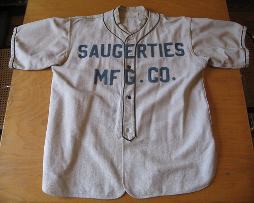
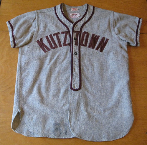
I bought that in May of 1999 — right around the time the first Uni Watch column was published in The Village Voice. Got it for $5 at a Binghamton discount store that had leased some space to a local thrift/vintage operation. I can distinctly remember walking in, seeing the jersey, and falling in love. I even loved the slightly moth-eaten uni number on the back — still do, in fact. It was the first time I’d bought a vintage jersey. (And for those who don’t know, Saugerties is a town in the Hudson Valley.)
Next up:
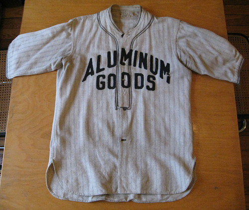
This is easily my favorite jersey. Bought it in a vintage shop just outside St. Nazianz, Wisconsin, in 2001. Wasn’t cheap — I think I paid $100, although that included the pants and the heavy woolen stirrups. It’s blank on the back, but I love the vertically arched lettering, the gorgeous ticking stripes (look at the slightly lighter/brighter threads in between the blue stripes), the Spalding tag — what a beauty! The “Aluminum Goods” insignia refers to the pots and pans company currently known as Mirro, which was formerly known as the Aluminum Goods Manufacturing Company. By coincidence, my Wisconsin photographer friends/heroes Julie and Johny used to take all the product photos for Mirro’s packaging (they had a little studio in the Mirro building where they’d take carefully staged shots of saucepans and such), so this jersey ties together a lot of my personal interests.
Next:
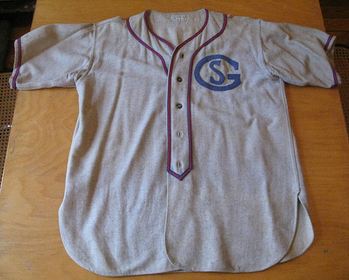
Got this one at a shop around the corner from my house about seven or eight years ago, I think for about $15. No idea what the “SG” stands for (or is it “GS”?), but sometimes I like to hypothesize: St. George? Gotham Scholastics? School for Girls? Whatever the team was, I also like to imagine that Dave Parker played for them.
Next:
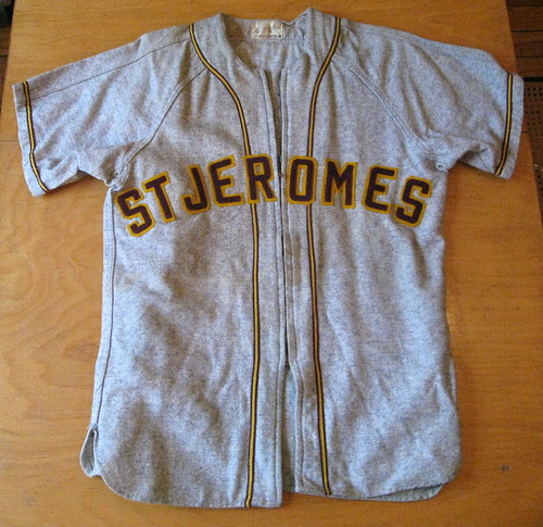
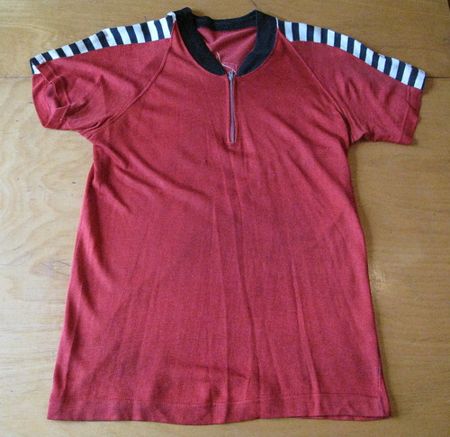
That’s an eBay find. Don’t recall what I paid, but it was probably in the $40ish range. Although it doesn’t quite come through in the photo, those colors are pure Redskins — burgundy and gold — and they go together beautifully. Kinda wish they’d included a period after the “St” and the apostrophe before the S, but whaddaya gonna do (at least they were consistent in omitting both of them). Very nice number on the back, too. This is the only zippered jersey I own, which is no small thing — on a button-front jersey, the two front shirttails overlap, but on a zippered jersey they just sort of hang there next to each other. Doesn’t matter if the jersey is tucked in, but if you wear it untucked, the shirttails flap outward a bit as you walk, and the effect sort of looks like a skirt. So I’m more apt to wear this one in situations where I know I’ll be spending most of my time sitting down.
Next:
Another eBay find, I think for $30ish. The lettering and trim are all one color, and it’s blank on the back, but that’s okay — fits like a glove. I’ve gotten interesting reactions while wearing this on at least two occasions: (1) A few years ago I was doing some hot dog research in eastern Pennsylvania and figured that was a good region for wearing a Kutztown jersey. But at one point I stopped at a bar in a town that apparently has a big rivalry with Kutztown (can’t recall the name of that town now, alas), and they thought I was fucking with them or looking for a fight or something. Kinda had to talk my way out of that one. (2) I wore this jersey to a New Year’s Day party this past winter, and someone at the party got all excited because she went to school at Kutztown. She got even more excited when she realized who I was, because she had been a big fan of my zine back in the 1990s. That someone was Amy Fritch, who’s now my good pal and ended up being my Scotland travel partner back in May. Might not have happened if I hadn’t worn the jersey to the party.
That’s it for my baseball flannels. We’ll now move to a different category: basketball warm-up tops. I’ve only recently discovered how much I like these (never occurred to me that a little fella like myself could fit into any kind of basketball gear, frankly), but I’ve acquired a few nice pieces. This was the first one I got:
When I got this on eBay, I didn’t even know which sport it was from — I just knew I liked it. Frankly, the use of “Telco” on the back still seems a bit fishy to me (Americans have never used that slang term, have we?), but in all other respects it seems like a classic mid-century hoops warm-up pullover. I love the way the Durene fabric drapes, love the number sign on the back, love the barber pole striping — a great find.
Here’s another great example of Durene-wear:
True story: I wore this warm-up top two years ago in Minneapolis for the first-ever performance of the Forewords. A few minutes before we were about to go onstage, my friend Claudia Gonson (who plays in the Magnetic Fields, the group we were opening for) took one look at me, smiled, and said, “Darling, you look like a fag.” She meant it as a compliment. Fag-y or not, it’s a great shirt. I totally dig the ribbed trim at the bottom, the simple lettering on the back (note to self: Must repair that serif on the 7), and the striping. The weird thing is that the sleeves are neither set-in nor raglan — they’re made from the same piece of cloth as the torso. Never seen tailoring like that before.
One more of these:
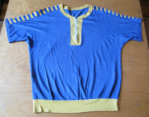
Just got this one back in July. It was part of an Etsy lot that included two jerseys, two sets of shorts, some socks, etc., but I convinced the seller to let me buy the warm-up top separately for $25. It’s a beauty, especially once you see the back — look at that great felt lettering! As for Marvin Geoglein, the insurance agent listed on the back, I tried Googling his name but came up empty. Dang.
Okay, one last category: Simple softball/baseball pullovers. We’ll start with my most recent acquisition:
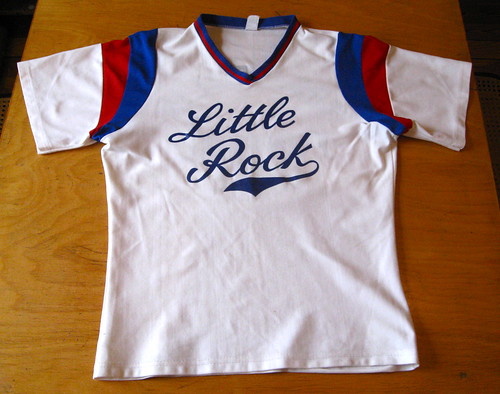
Just got that on eBay about six weeks ago for like 12 bucks. The listing said it was Durene, but it’s actually a miserable polyester that doesn’t breathe even a little bit (I wore it while bowling the day I got it and nearly suffocated). Still, I love how the colors pop, and it’s not every day you see a team sponsored by a funeral home. Interestingly, the company appears to be in Little Rock, Iowa, not Arkansas. I hadn’t even realized there was a Little Rock in Iowa. Just another example of how uniforms can be edumacational.
Next:
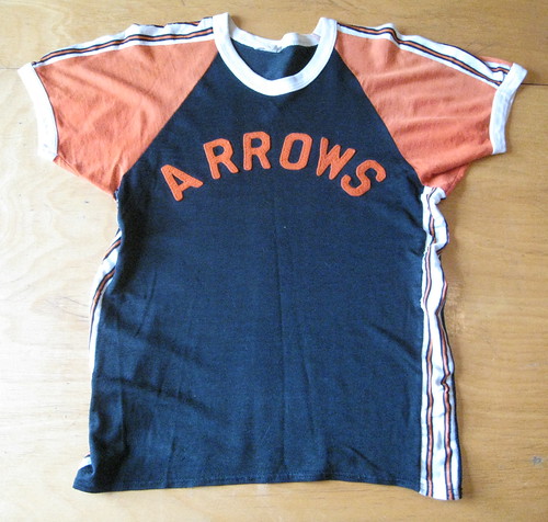
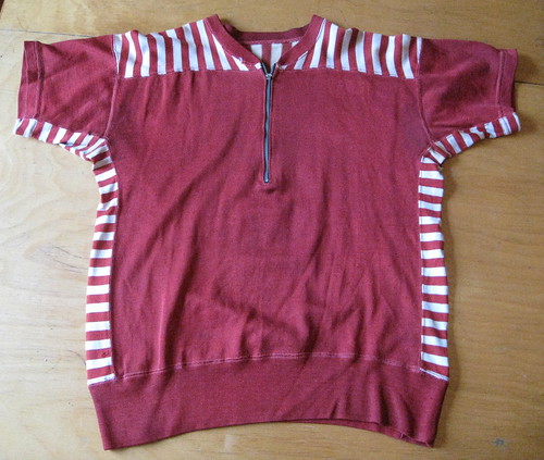
I don’t tend to wear much orange, but this great shirt is a happy exception. eBay again, two summers ago, very inexpensive. My graphic designer friends Shane and Fritz always hate when I wear this one, cuz the uneven kerning bugs the shit out of them, but I kinda find it endearing. Can’t even begin to express how much I love the stripes on the side and along the shoulders. Blank on the back but that’s fine with me.
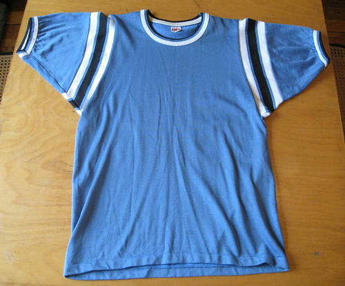
Yet another eBay score. I love the simplicity of this one. Totally plain both fore and aft, but the stripes are great and the Durene provides a really nice drape. This is what I wore while posing for my ESPN column mug shot.
And just one more:
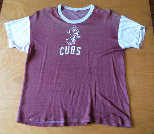
No idea if this was actually a uniform top or just a piece of Cubs merch, but there’s something really perfect about its various imperfections. The small holes and tears, the uneven arching on “Cubs,” the fact that maroon isn’t a Cubs color. Totally worth the $11ish I paid for it. Looks particularly good when paired with Uni Watch-patterned stirrups during a bags tourney.
I also have a bunch of old varsity jackets, bowling shirts, and one very special curling sweater that someone was nice enough to give me, but I’ll save those for another time. Thanks for letting me play show-and-tell today.
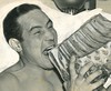
Too good for the Ticker: Aaron Rich sent me a wire service photo for the ages yesterday. That’s heavyweight boxer Max Baer getting down with some prime ribeye in 1937 (two years after he lost the title to James Braddock). As Aaron notes, Baer was Jewish, so it makes sense that he was chomping down on beef, not pork.
And there’s a great little prize waiting on the back of the photo. Check out the caption on the clipping at the top. Nice of them to put that “left” directional in there, just in case we didn’t know which was which.
Uni Watch News Ticker: Here are two of the new dugout jackets, along with a press release. ”¦ Icethetics is reporting a possible leak of L.A. Kings prototypes. Further coverage here. ”¦ New logo for the Gap. ”¦ New hoops uniforms for UCF. ”¦ Ramon Herhandez wears No. 55, so why do his knee-saver pads have “70” on them? And in case you’re wondering, there’s no No. 70 on the Cincy roster. ”¦ Wanna see something really beautiful? Look at this. It’s one of the many spectacular cycling illustrations in a 1984 book commemorating the end of the 6 Day Races at a French Velodrome. Plenty more if you click through this slideshow (wonderful find by Sean Clancy). ”¦ Jacob Pomrenke sent along one of the best Shorpy photos in a while — so much to like! Naturally, I’m partial to the striped undersleeves, but I’m intrigued by the guy standing third from the right — contrast-cuffed undersleeves. Never thought about that before, but I like it. ”¦ Check out this cool bowling shirt sample/catalog thingie I just won. Lots of photos to follow once it arrives in the mail. ”¦ Reprinted from yesterday’s comments: Why did that Ryder Cup raingear end up leaking? Because of the NOBs. ”¦ Also from yesterday: Here’s how the Mets fared this past season on a uni-by-uni basis. The big news is that they wore blue caps for 52 of their 80 home games (not counting the one where they had to wear the stars/stripes cap), which I’m sure is by far their highest blue-capped tally in many years. ”¦ According to the next-to-last graf of this page, Josh Hamilton has been wearing rib padding under his jersey (with thanks to Rachel Johnson). ”¦ The NBA has instituted a new dress code for coaches. For details, scroll down to the “Collar and All” section on this page. ”¦ When the Rangers wear their third jersey, they’ll pair it with this helmet (John Muir again). ”¦ David Brown tipped me off to a new site about collections. Scroll down to the Oct. 1 entry to see a good one: baseball cards featuring guys with big chaws in their cheeks. ”¦ As had been rumored, Washington is apparently boarding the BFBS train, and boy is it ugly. Not clear, at least to me, exactly when or even if this design will be worn on the field, however (with thanks to Jeremy Repanich). ”¦ Back in March I reported that Rawlings was planning to get back into the football helmet biz. As Rawlings exec Mike Thompson told me at the time, “Most likely we’re going to seed some to high school programs around the country in the latter part of this year, but we won’t have a comprehensive program until 2011.” I’d forgotten all about that until Jordan Pope sent me these photos of a new Rawlings helmet, which his coach recently procured. It’s supposedly one of only 250 such helmets that were distributed to high school programs. ”¦ Tom Brady may be signing a deal with Under Armour.
Thanks for the look into your collect- I mean, the vintage jerseys that just happen to be in your closet. Happily, the way today’s column displays in my browser, my first “down” scroll showed me the picture but not the text for the Aluminum Goods jersey. I saw that picture and said to myself, “Of all the jerseys ever made, surely that’s the Paul Lukasiest.” Of course that one is your favorite! It’s a pleasing thought that for all its faults, the world is so ordered that that jersey would find its way to Paul.
Me, I’m digging that “GS” jersey. I have a thing for interestingly typeset initials like that.
I don’t have good pix at the moment, and anyway they’re both polyester, so they’re not that vintage, but the cream of my collect- I mean, the jerseys that just happen to be in my closet are an old road gray jersey with maroon lettering outlined in black. The back is #19, and the front says “Farmers State” with the former word radially arched over the latter, which is straight horizontal. Saw it at Ragstock in uptown Minneapolis circa 1996 and, as a native Iowan, had to own it. If I recall, it cost $19, which matched the number, and was quite the splurge for me in my student days.
More recently, I was browsing a Northern Virginia Sports Authority, a location which has since closed, and found several racks filled with the complete home, road, and alternate uni sets for the Greeley West Spartans, a Colorado high school baseball team. The homes and alts were insanely expensive for used high school jerseys – between $70 and $90! – but the gray road vests were more like $20. Light blue piping all over the vest, with script in navy with light blue outlines reading “Greeley” and “West” in light-blue stitched onto the tail of the script. I’ve always had a soft spot for the journalist Horace Greeley, after whom the Colorado town (and thus the high school) is named, and when I saw that among the jerseys in my size was #4, I had to buy it.
Regarding the Gap’s new logo – Helvetica strikes!!!
Seriously, check out the documentary “Helvetica.” It’s really good and goes into the pros and cons of this ubiquitous font.
I’m just wondering if they’re going to stop making combo Gap/QuickTrip stores (that’s what my mind saw immediately when I saw the new logo).
Gaps new logo makes me nostalgic about the Giants last few years at Candlestick–note that only ads on the outfield walls and their placement: link
Old Busch Stadium used to have that, too. I remember asking my dad about those signs when I was little, which is how I found out that Gap was a store, not a target for the hitters.
I’ve heard and seen “telco” used, but I’ve known lots of link and they’ve been the ones to use the term.
Yep. If you work for a Telco, you call them Telcos.
Have worked in the telco industry for almost 20 years, never used / heard the term “bellhead”. Although it’s origin is obvious…..
I’ve heard the term “bellhead” before, but not in that context….IF ya know what I mean.
I’m from the Fort Wayne, IN area (where the Marvin Goeglein headstone is located) and I want to point out that the headstone (and local catering business for that matter) is Goeglein, while the warmup reads Geoglein. Could be a misspelled NOB or could just be two completely unrelated people.
Yikes. Major googling blunder on my part. Will revise the text now.
Doing my own research I found the original Etsy listing:
link
It says the uniform was made by Main Auto Supply Company, which is now the WOWO radio station, another Fort Wayne staple. I’m starting to think that the headstone in Fort Wayne may have been this Marvin Goeglein, and it’s a simple case of a misspelled NOB (not outlandish with a name like Goeglein)
Tom Brady’s Under Armour cleats from Monday night:
link
link
Wonder if Gisele had to OK those first? Not that there’s anything wrong with that.
Just wondering Paul, when you find one of the treasurers shown above do you care what size it is? Does it need to be something around your size? If you can’t wear it does it ever get displayed? Drycleaned and hang in a closet? Similar dilemmas at my house.
I only buy things that will fit me. Not buying these for display purposes (today’s entry notwithstanding); buying them so I can wear them. If a jersey — or any other piece of vintage clothing — doesn’t fit me, I won’t buy it, no matter how awesome I might think it is.
Hey, I live in Iowa and had never heard of Little Rock, Iowa, so don’t feel bad. Population 448. Saa-lute!
KUTZTOWN!!! Communication Design Graduate ’09. What a beautiful jersey! I wish the baseball team would wear something like that instead of the trash they’re wearing now…
link
I also wish you could remember the name of the rival town you were in.
It was slightly east of the Reading airport, but that’s all I remember for sure.
West Chester? Bloomsburg? East Stroudsburg?
Albright College would probably be the closest to the Reading Airport, but I don’t think they’re rivals with Kutztown.
Hey, I’m a CD grad too! Although, we were just learning Pagemaker when I graduated (’93), ha!
Paul, I’m super glad you wore that jersey to the party!
It’s okay if you can’t remember…I just don’t know of any real rivals of Kutztown.
Amy…that’s so great! KU is strong in the uni-watch community. (By the way, I’ve never even seen Pagemaker in use…it’s so crazy how the software evolves so quickly!)
Paul, those basketball shooting shirts and baseball/softball jerseys bring back memories of the 1950s and ’60s to me. Most jerseys of that era were lettered with felt and sewn with straight stitching. Imagine what a pain it was to lay out each letter and punctuation mark, press them down with a regular hand-held iron, and then sew around each one. In the late ’50s the average cost of a sewn-on 2″ letter was $.20 while a 3″ letter was $.30. That insurance agency jersey had around $6.00 in lettering on a shirt that cost around $7.50 plain for a total of $13.50.
The Carolina Blue jersey with the UCLA inserts was used mostly for men’s softball and many church-league basketball teams. The style came in a variety of popular color combinations. Does that label read “Mason” or “Venus Mason?” Just looks like their tag.
On that “Cubs” jersey. It’s probably from a Little League or rec. league team. Every manufacturer made this style in many color combinations and screenprinters offered generic faux MLB logos for this type of shirt. Why the Cubs had Maroon is explained very simply. The “Dodgers” would always have Royal, the “Cardinals” the Red and the “Yankees” Navy. So the “Cubs” got the Maroon as a contrast. Heck, in our Little League here in Livonia the Indians used Green.
And on that “crooked” lettering-It looks like it’s applied using the base ink for “flocked” lettering. Flock had a velvety feel from little fibres that were put onto the wet ink base and then dried in an oven. Some operators skipped the flocking process and left just the base. After many washings the paint-like ink combined with the cheap quality of the jersey would lead to the “crooked” appearance.
I don’t know if anyone reads or likes my ramblings on these subjects but hey, these types of jerseys are what I cut my teeth on in the sporting goods business. It’s like going back in time for me.
Terry, we all LOVE your commentary and recollections — please never stop sharing them.
Good call on the blue jersey manufacturer — Mason indeed!
Paul, if you can read the labels please let me know who the manufacturers were of the Arrows jersey, the White one with the UCLA inserts and the Cubs. If I know who made them I can probably give you some background on each one. Thanks.
Arrows:
link
White one with UCLA inserts:
link
Cubs:
link
And here’s the blue one, with the Mason tag:
link
Terry, you won’t be able to reply to this comment, but you can keep the thread going just by replying to your own previous comment.
The Arrows jersey was made by Empire of NYC. Empire was one of the cut-and-sew NYC-based companies along with Felco and Post. Empire’s biggest claim to fame was that they made all of the uniforms and jackets for the movie “The Natural.” Empire survived until the mid-1990s. What killed them was the fact that they still tried to sell 1950s-style uniforms in the ’90s. Unfortunately they stayed too long at the dance.
The White UCLA-style by Southern could actually be a Russell product. Southern Mfg. changed their name to Russell Southern in 1962 and to Russell Athletic around 1971.
The Cubs shirt is from the 1960s and if it was from the greater NYC area was probably lettered by Paul Rowan Assoc. of Palisades Park who was the Russell warehouse for the Northeast. Rowan’s was our Russell rep.
And Mason is still in business today as Venus Knitting Mills (they actually are a cut-and-sew house) and are located in Murray Hill, NJ. They sell to dealers only and carry in-stock uniforms, bats, field equipment and balls for all sports.
As a reader, let me second Paul’s statement.
Your information and insights are always valuable and fascinating.
That Saugerties jersey is awesome! Even better it was purchased in my home town of Binghamton.
The place were I bought it was the old Philadelphia Sales outlet on Clinton St. They were close to the end — drowning in debt, lots of empty shelves, etc. — and were leasing out space within the store to small operators, including a thrift vendor who had the Saugerties jersey.
That Philly Sales outlet was such an amazing store — a real throwback to the old days of dry goods retailers. I was very sad when they closed. Now the whole building is gone.
Ditto. Terry has a vast amount of knowledge on so much and he is a treasure to the UW community.
Keep ’em coming, sir. I’m glad you’ve started posting comments.
Back when you would send Paul follow-up info that he’d include in the next day’s post, I always wished you’d just post it in the comments so I could read it the same day.
JTH – Response to yesterday’s post:
JTH | October 7, 2010 at 12:24 am |
Which superpower would you rather have: flight or invisibility.
This is really a stupid debate. Both have their place.
New York pizza is meant to be eaten on the go. Chicago pizza is a sit-down meal with friends and family.
And do you live anywhere near Highland Park?
*************************************************
Agreed.
And I live in Naperville.
Naperville, eh? So I guess the place I suggested is a bit inconvenient for you.
awesome info, terry…as always
thanks for sharing
Paul- My mother used to take me to Philly Sales all the time when I was a kid. As I remember they had everything in that store. Unfortunately it has been gone for many years. Ahhh the good old days!!
let me jump in on this string too. obviously, your stuff is proctoriffic, and proctomatically excellent every time.
Question for Terry Proctor (or anyone else that cvan help),
What is the actual name for the heavy knitted, crew-necked sweatshirt/warm-ups popular in the 1960s and worn by coaches and players in pre-game? Lou Holtz at Notre Dame was one of the last high profile coaches to wear one.
I feel that there may be a certain item term to describe those particular tops and that I can not even begin to shop for them, or attempt to purchase one, without finding that specific term. I even considered having a set made – but I have not found any current manufacterer listing them in their catologues. If you know of anyone still manufactering them, I may get a set made.
Any help would be greatly appreciated.
Thanks, Nick Varrecchio
Paul,
Thanks for sharing your “Vintage Jerseys”…the nostalgia each garment represents, reflects a bygone era in our country…
And, not a single “BFBS” was seen!!!!
Thanks again…
As a proud Kutztown University telecommunications graduate (’94), I’m jealous of that KU jersey. It’s simply splendid!!
To echo the sentiments of RS Rogers….
There are beautiful vintage jerseys out there to be found, but nothing so exquisite as…
Aluminum Goods.
Perfect.
There seemed a be LOT fo Minny fans wearing this last night:
link
I didnt realize that it was so popular. There were also several shots of a navy blue with red block lettering jersey I had never seen before.
I’m not much into vintage clothing, but those sweaters in that Shorpy shot are awesome.
Well, the Twins wound up playing like the powder-blue-era Twinkies, so I guess it was appropriate. Hopefully, fans got the message and will not come to tonight’s game wearing the jerseys of the Losingest Era in Twins History.
Game-worn Burlington Bees jerseys from Class A Midwest League now are available for purchase link
link
I love your jersey collection, Paul. Seems that a few have off-center numbers on the back, but that adds to the charm.
-Jet
they lean a little to the left, eh? ;)
It’s easy to forget that, as recently as about 10 years ago, the Washington Huskies were still a very good looking team…
link
and then Nike turned them into a Division II school, aesthetically.
Their play was Div. II quality for a while there, too. But honestly, the past set that Nike did was a really nice, classic uniform.
Forgive my lack of NHL-knowledge, but who is the NNOB player Crosby is going up against on the ESPN.com lead illustration? Also, why is the center ice logo so small? (or is that not center ice?)
link
I have no idea who the player is, but that’s definitely not center ice. It’s one of the face-off circles outside the neutral zone.
Photoshop job? Penguins & Flyers didn’t play in the preseason.
Those faceoff dot is inside the blueline. The ones located outside of the blueline have no lines directing the centremen where to stand.
Umm… link?
They couldn’t get those banners any higher in the rafters??
I am assuming the Flyers player is NNOB because the focus is clearly supposed to be on Crosby…while the Flyers have some solid players, none of them would have anywhere near the stature of Crosby.
And no, that would not be centre ice. The would be a faceoff dot that would be located inside the blueline (which would not have a logo on it). Really, the whole picture is kind of odd.
Once again, as I said this past weekend, when is black part of the official colors of the UDub?
It bites, blows, stinks and sucka all at the same time!
hey Paul where is your ESPN column about the goalie equipment? i thought you said it was supposed to be up today
you didn’t, um…actually read today’s column did you?
no i scrolled down to the comments first sorry
James Shields with the biggest Pedro Porthole ever, as seen on SI.com.
link
Has Ricky Rubio always worn “Ricky” on the back of his jersey?
Joe Maddon wearing the plaid brim in batting practice today link
Anyone watching the game? I’m assuming he’s got the regualar cap on now?
Yes, they are wearing the standard navy caps in the game. The plaid will only be used during BP.
Boo to the Rays for wearing the alts today. So much for it changing their luck, if that was the intent.
i love that animated gif the bagarazzi made.
i am jealous of you guys who can fit into the old clothes, it can take me years to track down a decent 48. and i am still in search of a reasonably priced durene job, it has been maybe 10 years, still empty.
no chew card collection is complete without link brett. my old man used that as an example of future cancer patients when he caught my brother and i using the wild mint in the yard as fake chew in a wiffle ball game in 1981. i don’t know how reinforcing the image of baseball and chew helped, not to mention the hypocrisy that it came from a two pack a day smoker(he quit a few years later). so i have an association to it, but it is still a great chew card.
John Havliceck in a Browns uni- apparently he was drafted by the Browns and attended preseason camp one year link
Just picked up this hoop warm-up on the 2nd hand market:
link
link
link
Randy Moss back in 84 w/ Minnesota.
Question for Terry Proctor (or anyone else that cvan help),
What is the actual name for the heavy knitted, crew-necked sweatshirt/warm-ups popular in the 1960s and worn by coaches and players in pre-game? Lou Holtz at Notre Dame was one of the last high profile coaches to wear one.
I feel that there may be a certain item term to describe those particular tops and that I can not even begin to shop for them, or attempt to purchase one, without finding that specific term. I even considered having a set made — but I have not found any current manufacterer listing them in their catologues. If you know of anyone still manufactering them, I may get a set made.
Any help would be greatly appreciated.
Thanks, Nick Varrecchio
For everyone who thinks teams should never wear their alt uniforms in the postseason, take a look at the Twins right now. Hard to argue with those throwbacks, esp. in the late-afternoon daylight. Tasty!
The Phillies cream uniforms are also fine for the postseason. And I never minded the Marlins wearing their sleeveless jerseys in October. But the dark tops should stay off the field during the postseason.
just got in from a meeting, so haven’t seen any baseball (other than the yanks last night) and just put on the giants/braves
but there is a huge difference between “alts” and “softball tops” so (and not that you did) let’s not lump those into one big catchall
the cream alts the twins wear and the phillies wear (and the indians and the mets) as well as the giants as their regs, are gorgeous
softball tops, OTOH, are anathema to the game…especially in the playoffs
again, not saying you’re lumping a gorgeous fauxback in with a softball top, but when you say there are those of us who say “teams should never wear their alt uniforms in the postseason” that ONLY applies to the softball top
of course, for most teams, that IS their alt, but it’s not a actual uniform…just a alternate top
alternate uniforms are not only acceptable, in almost all cases, they’re better than what teams wear for their normal homes
Looks like Reebok is going with the wordmark instead of the vector for the front decals on NHL helmets.
In other news, the Maple Leafs look really good. They look proper. As if they’re dressed for an NHL game. But Dion Phaneuf just saw the opening puck drop puck get by him. There’s your omen!
Does anyone know if Penn State actually has the Nittany Lion logo on the top front part of their helmet above the bumper? If you look closely at this photo taken from PSU’s offical sports website, you can faintly see the round Nittany Lion logo. Do they actually where these on the field?
link
Doc Emrick just mentioned during the pen/flyers game that during the first period of the Leafs/Habs game kris Versteeg’s jersey said “Vertseeg” Does anyone have any pictures?
Anyone notice that C.J. Wilson uses a red glove when the Rangers wear their red tops, but a blue one otherwise?
Has the NFL’s pink-a-thon filtered down to the high school level?
link
Nope, she wears those shoes for every game. And she was voted homecoming queen, too.
link
The rest of the uni? I’d. Wear. That. That would be a nice alt for the Colts, eh?
Nice collection, Paul. The Carolina Panthers could use that jersey from your mug shot.
From the ticker, that cycling illustration link reminds me of the artwork from a 1985 music video:
link
Hey Ricko, a Ricky Rubio sighting!
link
Also a look at the future of the NBA – sponsor name on front, team name on back. Sigh.
Paul, I LOVE the Saugerties jersey, as that’s my hometown! American Legion ball is huge is Saugerties, maybe that is where the jersey came from? For such a small town, we have a big connection to MLB. Umpire Tom Hallion was born and raised here, and baseball writer John Thorn still lives here.