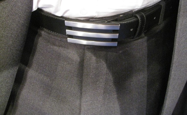
Shortly after I arrived at yesterday’s NBA media event, Adidas exec Travis Blasingame, who I’d met two months ago at an earlier NBA event (and who happens to be a really nice guy), walked over to say hi. We chatted a bit and at some point I caught a glimpse of his belt buckle. My first thought was, “Oooh, that’s pretty nice.” Then I had a flash of realization and asked him, “Wait a minute — is that a three-stripe Adidas belt buckle you’re wearing?” Sure enough, he said. Corporate logo or no, I really like it.
In case you missed it yesterday, I didn’t think much of the media event, mainly because I thought it didn’t do a good job of explaining how the new uniforms differ from the old ones (aside from the rote lighter-faster-drier claims). So I’ve broken down a bunch of those details myself today in a new ESPN column.
Meanwhile, a few additional notes regarding yesterday’s NBA unveiling event:
• They had a Pistons jersey on display, so I took a close-up shot of the Bill Davidson memorial collar patch.
• The NBA store had some cool textured tees for sale. Love those raised, sewn-on graphics.
• My media credential was misspelled. This has been happening my whole life, so I’m used to it by now — no biggie (and hey, at least they styled Uni Watch as two words with a space in between, which so many other folks get wrong). But I changed the “c” to a “k” anyway, because it just didn’t look like my name the way it was printed.
And here’s one last note: When I first met Blasingame (the belt buckle guy) back in July, he told me something really interesting. “New York is known as the toughest NBA city for visiting teams’ laundry,” he said. “They just cook the hell out of everything at the Garden — they’re known for that.”
That led to an additional point I hadn’t thought of. According to Blasingame, home jerseys tend to last a little longer than road jerseys, because the roads have to be washed, dried, and packed up for the next stop on the team’s road trip, while homes can often be hang-dried or sometimes even dry-cleaned (unless the team is about to head off on the road). Never knew that.

Extra-curricular activities: Okay, so “Big News!” might be a slight exaggeration, but I have a coupla things in the works that you might want to know about:
• Next Wednesday, September 29th, the excellent radio show Seven Second Delay (which is broadcast on the mighty WFMU, the best radio station in NYC and probably the universe) will be attempting to set a world record by interviewing 60 guests in 60 minutes. I will be one of those guests. The show will air at 6pm eastern and can be live-streamed on the WFMU web site, and those of you in the NYC area can also reserve tickets to attend the show, which will be broadcast live from the Upright Citizens Brigade Theater in Manhattan.
I have no idea where I will fall within the sequence of guests, nor do I know who any of the other guests will be. But I’m thinking it should be a very interesting scene in the green room.
• On October 11th, the very wonderful City Reliquary (which hosted the Candela Structures exhibit last summer) will hold its annual bi-annual occasional Collector’s Night event, a celebration of collections and the collectors who collect them. Or to put it another way, a bunch of endearing freaks will showcase their obsessively curated curiosities and stand there like animals in a zoo while guests walk by and inspect their collections. Plus there will be a screening of a documentary about collectors and hoarders, plus-plus my pal Harley “Inspector Collector” Spiller will talk about his father’s collection of newsstand paperweights, and more.
Trust me, Collector’s Night is a hoot (where else would you find someone who collects cans of mackeral or discarded umbrellas?), and this year I’ll be one of the featured collectors. Haven’t yet decided which collection to bring along, although it probably won’t be the pencil sharpeners, since it’d be a bit of a hassle to unscrew them all from the wall. The event will take place at the Knitting Factory (which is now in Brooklyn, in case you didn’t know — at the corner of Metropolitan of Havemeyer, right across the street from the Reliquary). Festivities will commence at 6pm and run for at least four hours. Admission is $10, with all proceeds going to the Reliquary.
Giveaway reminder: Today’s the last day for the Sports Propaganda print giveaway. Details here.
Uni Watch News Ticker: According to the fourth graf of this story, Francisco Rodriguez wore “ripped designer jeans” for a court appearance yesterday. Classy dude. ”¦ And if you believe that, I have a bridge to sell you (with thanks to Paul Hirsch). ”¦ More team-branded blazers: It’s hard to see, but that’s the Packers’ old QB-over-Wisconsin logo on Phil Bengtson’s jacket (big thanks to Jeff Ash, who compiles the vintage Packers photo gallerieson The Green Bay Press-Gazette‘s site). ”¦ Remember how Lance Armstrong and his team tried to pull a jersey switcheroo prior to the last stage of the Tour de France? That little stunt may now result in suspensions (with thanks to Sean Clancy). ”¦ If you want to see a field of blue, you don’t have to go to Boise State (with thanks to Andrew Hoenig). ”¦ Matt Newbery reports that a Thai noodle joint in Joplin, Missouri, is using the old Magic logo. ”¦ Not one of history’s better ideas. Those are the A’s and Chisox going black-vs.-black yesterday afternoon. ”¦ As promised, the Nats have managed to keep Bryce Harper war paint-free in the Instructional League (with thanks to Kevin Hastings). ”¦ Scroll down a bit to see the excellent little stylized logos for the individual sports in the Asian games (thanks, Jeremy). ”¦ Susan Freeman sent some pics of interesting Texas high school football uni designs, including West Brook (um, maybe a red helmet might be a good idea..?), Cy Falls (interesting side piping), and Dickinson Pine Drive (I like that bar with the team name). ”¦ Here’s a new one for our collection of team-themed airplane liveries: Air New Zealand’s All Blacks jet. ”¦ Freakish jersey malfunction in last night’s Blackhawks preseason game, as Jake Dowell’s jersey was pulled over his head during a fight and then the jersey tore and his head popped through his uni number. ”¦ Remember, Iowa will be wearing these excellent throwbacks this weekend. There’s a nice little video report on them here (with thanks to Tom Griffith). ”¦ New hoops uniforms — System of Dress, by the looks of them — for BYU (with thanks to Austin Taylor). ”¦ A little birdie tells me that the Penguins’ Winter Classic jersey will look like this: “Take the 1967 jersey (the diagonal Pittsburgh), flip the navy and powder blues, and put the circle logo with the ‘scarfed’ fatbody penguin on the front instead of the diagonal lettering. The numbers on the jersey will be rounded, as on the 1967 jerseys. It sounds like a hot mess, but in my opinion they’re very sharp.” ”¦ Want to make your own old-style boxing posters? Here’s a tutorial that shows you how to do it in Photoshop (awesome find by Jake Doyle). ”¦ Also from Jake: Looks like the Titans awarded a pro wrestling-style championship belt to their 2007 sack leader (or maybe to the entire defensive line, not sure).
That belt buckle looks like it belongs with a Starfleet uniform in one of the alternate universes.
link
What’s frightening is I knew exactly which alternate universes you were talking about. I’ll head back to my parents basement now.
So this guy from Addias is only a Commander. “Make it so Number-One…”
My first thought was superhero, but I can see Star Trek, too.
Unless stupid is an excuse, there isn’t one for the A’s v. ChiSox black on black crime. Hey! if they don’t care – I don’t (cough > Bullshit). You can get away with it in baseball as opposed to other team sports which involve multi-player plays involving exchanges of the ball. Unless of course, a runner dekes an OF throw to him & not the fielder while another scores. That would teach ’em.
The only bad part is the A’s wearing black when they should be using yellow or green jerseys. If it was green vs black it would be perfectly fine.
Green versus black would be equally bad. MLB really has to step in and stop this nonsense.
The bad part is- A’s shouldn’t wear black. Period.
Some things you can’t un-see…
-Jet
Agree heartily with all of these complaints. As someone who became an A’s fan as a kid because of my affection for their colorful cap design I totally loathe the black uniforms and shudder every time they show up on field. This matchup, obviously, made a bad situation exponentially more insufferable.
That being said, there definitely appears to be a light at the end of the tunnel. As Paul has reported, there’s been lots of talk on A’s telecasts about the possibility of yellow alternative jerseys for the 2011 season. I was, therefore, unspeakably thrilled when my friend in Oakland called me from the first game of the Chicago series to say that ALL black paraphernalia had been steeply discounted in the stadium store. Given that the black jerseys and cap seem to outsell the traditional merch, such a price adjustment can only prefigure the imminent righting of this horrible, horrible uni wrong.
If you wish to make the White-at-Home rule manditory, send you letters to:
This Bud’s Not For You Selig
Interim Commissioner of Major League Baseball for Life
Major League Baseball
350 Park Avenue
New York, NY 10022
Bah to your rules I say. Bah! Let them wear what they want, as long as it falls within their chosen team colors. The A’s in black is stupid. The A’s in yellow or green is not. The home team should have the right to choose whatever uniform they wish. The road team should then be required to wear a different color than what the home team has chosen. No need to force anyone to wear white.
Chub Feeney, former National league president, was a traditionalist. He insisted that the home team always wore white.
I’m not calling for the abolishment of all alternate uniforms, mind you. I just want the home teams to be required to wear white at home full time. Alternates? They should be worn for road games.
They’ve been talking about it on A’s broadcasts for months now – the black is confirmed gone next year, and it looks like the now seldom used green alt is as well, in favor of the gold throwback (jersey only) they wore earlier in the year. Looking like it’s white home, gray road (which I wish they’d ditch and keep a green with “Oakland” script instead) and yellow alternate for ’11.
I was wondering about the greens. I’ll be hugely disappointed if they are abandoned; totally my favorite jerseys they have.
The joke out here in Chicagoland is that MLB let the White Sox wear their black jerseys to commemorate their elimination from playoff contention.
Meanwhile the Cubs celebrate a hundred and two years without a World Series championship.
Time for hockey season…
link
I’m not liking the sound of that mash-up Penguins Winter Classic jersey. Hey, here’s a radical concept – why not just duplicate the ’67 jersey as is, with its powder blue, diagonal lettering and generous stripe-age?
-Jet
Like this…
link
-Jet
That mash-up Penguins jersey is a great idea, because the original logo never appeared on those early jerseys. It’s one of those rare cases where the mash-up will surpass the original jersey in quality. Another example of this is the sharp Steelers throwbacks, while not technically accurate, were a terrific idea.
What’s inaccurate about the Steelers’ throwbacks?
The helmet never had a black facemask, and the word “Steel” was used instead of “Steelers”
Off the top of my head, the word “Steelers” on the logo instead of just “Steel”, and the facemask is black instead of gray. (It does look FAR BETTER that way though) I think the size of the logo might be a bit off too. I think the original was larger than what they currently use, but I’m not entirely sure on that without looking it up.
Curse you Gusto!!!
Also, since it’s patterned on what was worn in the latter half of 1962, the Steelers need to add TV numbers to the sleeves.
They really should wear black cleats with that get up, too.
Indeed, the original logo was much larger:
link
But after leaving it out in the rain, it shrunk enough to where they could put it on a helmet:
link
Maybe whoever’s quarterbacking the throwback game should wear a clear facemask…
But, is that really a ‘mash-up’ akin to what the Pengins are doing by deliberately reversing the colors and placing a different logo on an old uniform? I’d be willing to bet that the facemask is black and the decal says ‘Steelers’ simply because the team did not want to order (and the equipment manager did not want to deal with) extra crap that could turn into a pain in the ass down the road. I can imagine a throwback ‘Steel’ decal ending up on someone’s regular helmet and it becoming Uni Watch chatter.
What I’m saying is that it seems more like it was done out of practicality.
Agreed, practicality was probably the major reason for the Steelers current throwbacks. Getting back to the Penguins, I think improving the original 1967 uniform will be the right move. That one year ’67 uniform was bland, especially compared to the other Expansion Six teams. No logo, and management likely realized this mistake the following year. The 1968 logo is essentially the same as the one the team uses today, but the 1967 logo should have been on that first uniform.
Also, since it’s patterned on what was worn in the latter half of 1962, the Steelers need to add TV numbers to the sleeves.
They’d have to add sleeves first.
Re: Bryce Harper
Man, will those helmets EVER not look totally stupid?
from the ticker:
“And if you believe that, I have a bridge to sell you “
why don’t AD’s just admit what we already know…kids don’t care about history, tradition and school colors; they just want to wear black and dress like comic book heroes and ninjas
then nike (and badidas, rbk, etc.) can just make the damn things without trying to sell us all a bill of goods
just give every team a set of monochrome black unis and be done with it
“As for the fans’ response, he said, “The only vote I’m concerned about is the players’.”
Right on! Who gives a shit about the fans? Or alumni? Or school tradition? None of that stuff is as important as the fashion whims of 20 year olds who want to look “more aggressive”.
Jim Harbaugh wins the STFU Award today.
Those adidas belts have been around for a few years at least. Many people on the PGA Tour who are sponsored by TaylorMade and adidas (same company)wear those belts all the time. Most notably, Dustin Johnson wears them almost every time he plays.
link
link
link
link
Just wanted to mention that the awesome Titans “sack championship” title belt appears to be based on the template of the 1980’s WWF Intercontinental Title. The dimensions of the center plate seem to have been modified to create a more compact, blocky appearance but the stylistic elements on both the center plate and side medallions are consistent with design features present on the aforementioned belt. A link showing the original belt is below:
link
Whoever designed/manufactured that belt did a nice job. The flaming thumbtack looks a lot better there than it does on the Titans’ helmets. I like the use of the secondary logo on the side plates as well.
Also, I don’t know if it was random or intentional, but I like how today’s post starts on a belt (buckle) and ends on another belt.
Since the Titans themselves were not the sack leaders in the NFL in 2007, it must have been for the sack leader on their team. That would have been Kyle Vandenbosch who had 12 sacks in 2007. This is all I can think of unless they got really detailed and determined that they had the most sacks coming from a D-Line (not Linebackers) and awarded themselves the Defensive Line sack champions. This would have been kind of cheap because it virtually eliminates teams that use the 3-4. Hopefully it’s KVB’s belt and is sitting in his trophy room.
While I see why you’re frustrated about the coverage (or lack thereof) of the details regarding the Revolution 30 and how it physically differs from the old uniforms, I can’t help but think that beyond the scope of those of us who Get Itâ„¢, the general public/media probably doesn’t care about such things. They probably are more concerned about the ‘stats’ of the new fabric, how it absorbs sweat 8x quicker and dries 2x faster, and how the mesh numbers save weight and add breathability.
I disagree. Any fan who hears “All 30 NBA teams this year will have new uniforms” will immediately want to know two things: (1) Will my favorite team look any different?, and (2) Does this mean the authentic jersey I bought last year will now look out of date?
You don’t have to Get Itâ„¢ to be concerned with those issues, which weren’t addressed at all. And if you’re gonna trumpet how much lighter the new jersey is, why not bring out a scale and actually SHOW how much lighter it is than the old jersey? Then turn the two jerseys inside-out and show how there’s less stitching on the new version because the numbers are heat-sealed. And so on… They missed a chance to show what they’re really doing.
I agree on that account, that they missed an opportunity to create a very engaging show, and I think they could have worded the headline differently (All 30 NBA teams will be incorporating new fabrics and revolutionary technology into their uniforms this season), but I still disagree that Johnny Fan cares about the fact that there’s less stitching on the inside of the jersey to chafe Dwight Howard’s nipples. I still maintain that you have to Get Itâ„¢ to care about these types of things, because let’s face it, a lot of people in this country (especially sports fans) are tuned into stats and other b.s. more than they are what goes into creating those stats. They want to hear that the jersey is 30% lighter, but don’t necessarily care how it was done. It looks the same, but the new fabric makes it 30% lighter. Get it, got it, good to go. End of conversation for a lot of people.
Here is a question, I don’t remember if they did or not, but what did MLB do with the Coolbase jerseys when they were introduced in 2006(?) (I realize that MLB was more of a progression and not everyone/team is on board) But who does the best job with presenting jersey changes individually & collectively, the NBA, NHL, MLB or NFL?
“I can’t help but think that beyond the scope of those of us who Get Itâ„¢, the general public/media probably doesn’t care about such things.”
well…yeah
isn’t that like the entire raison d’être for UW?
Amen, Brother Phil.
PS Glad to see that Paul loves WFMU: totally in character. You might even say that FMU is the aural equivalent of Paul’s interior decorating schemes.
PPS All praise to Jake Doyle for coming up with that spectacular site on DIY old-style boxing posters.
Don’t get me wrong: I love the extra stuff that Paul was itching for with that unveiling, I’m just pointing out that I can understand why they didn’t go into greater depth. They might not expect the average basketball fan to care. Maybe they don’t even care themselves. I mean, is the end game really to help the players with the technology, or is it to use the association with the NBA to sell the shit out of that technology at retail outlets?
This was probably pointed out before and I missed it, but the NHL officials look different. At first glance I noticed wider, unequal stripes and small numbers on the sleeves.
Paul I feel the last name misspelling thing. I have two capitals in my last name and my last name isn’t McDonald or some common one like that. I’ve worked at the same place for 7 years and they still spell it wrong on occassion.
I’m there, too. Namhob = Bohman (my actual last name). I’ve never seen anyone spell it right on the first try. No biggie, I accept my German roots. If only they wouldn’t butcher it so much when trying to pronounce it. It’s 2 syllables, quit trying to add letters: Bohamen, Bomamen, Bonnamen, etc.
As much as I try to be philosophical about it and shrug it off, the misspelling of my name irritates me. It happens all the time.
Yeah, I’m a big baby, I suppose. But your name is like your individual LOGO, you know?
And if it’s someone’s job to transcribe names onto something, then one would think that the proper spelling of those names would be a priority, if not essential. You check it, research it, ask, if there’s some doubt. Right?
add me to the chorus…
if i had a nickel for everytime my name became “Hecker” or “Hencken”…
i’d be a few nickels richer
ah well
You want to ask me how many times my name gets misspelled? Besides the “Ms. Brinke” I still get?
My favorite:
BONKE.
Made the mistake of telling my boss that, and from then on I was BONKE to him.
…and now you’re BONKE to us too
^_^
Looks like it’s time to rename Collector’s Corner.
Do you know how many ways you can misspell Heins? It is 5 letters! I have a friend with a last name of Stelmaszyk. EVERYONE gets it right (they just can’t pronounce it)…
Heuning, Hueing, Huning, Henning, Hunning…
Once, inexplicably, Hvening (at my first communion).
What really kills me are the mispronunciations. It’s really not that hard to say. Just pretend there’s a space or a dash between the E and the N. HUE is the first half and NING is the second.
Sometimes to fuck with people, I spell it the way it’s done in the Fatherland: Hüning.
You would think mine would be easy, but I get Bilk and Zilk all the time. One guy thought it was Philc. Apparently he had a Philco TV or something…
Of course this wouldn’t be a problem if my name was Wilk, the way it’s supposed to be, but that’s another long story for another time.
Ha!
I’ve had: Briala, Burla, Brilla, Brulio, Borila, Brula, Burlia, Brillo (yes, that’s right), and too many more to count. Since kindergarten.
Even better is when others try to pronounce it. I simply say, “it rhymes with ‘Julia’.” Almost instantly, they pronounce Brulia properly. If you’re wondering, Brulia is Croatian.
Honestly, I think if your name is not Smith or Jones, I bet your last name has been screwed up at least once.
as sad as it is to say, I’ve had King misspelled a few times.
“Even better is when others try to pronounce it. I simply say, “it rhymes with ‘Julia’.” Almost instantly, they pronounce Brulia properly. If you’re wondering, Brulia is Croatian.”
thanks timmy…now i can’t get that scene from the wedding singer out of my head
Spelling? That’s old-school. At least that’s what the Parkway and Rockwood, MO school districts think:
link
All together now, “Spell-check is a crutch!” Now go learn your spelling, everyone.
Well, that’s… something.
I don’t know. The English language has so many “rules” that certain words don’t follow – spelling tests were always nothing more than memorization. Perhaps, with text messages and twitter being as popular as they are, it’s time to start simplifying the language. It’s not like our current version of American English isn’t drastically different from the English of the 1700’s, or even the English used in Britain or Australia. In the grand scheme of things, does it really matter if “The boy laughed.” is morphed into “he lol’d”?
Or not. Just sayin’.
yes…lets make it less important than it already has become
we wouldn’t want the kids today to be traumatized by something like spelling or grammar
after all, how often do you need to know those things when you play madden?
Did you fail to read the “or not” at the end of my post?
I do like your complete lack of capitalization and proper punctuation while talking about spelling and grammar though.
i don’t consider comments on a blog to be worthy of the same consideration (and this is just the style i post comments in, always have, probably always will)
we’re talking about education of our students here, not textspeak/blog comments
you’ll notice (for the most part *cough*) my main articles are all written according to the AP stylebook, with proper spelling (spit) and grammar
im not saying your point is invalid — im questioning those who say it’s not necessary to know the proper way…
some of the kids in my office this past summer not only can’t properly spell (relying on spellcheck), they’ve never used a websters nor even KNOW how to use a typewriter…now, i can see how the typewriter is going to go the way of the buggywhip, but proper spelling and knowing HOW TO SPELL AND WHY should never be removed from the educational curriculum
I just remembered this one. I had a friend in grade school whose parents ran a business out of their house called Bobo’s Balloons. They’d subscribe to magazines and whatnot under the business name.
On one of the magazine subscription address labels, the name was BAHOS BALVOMS.
Bahos Balvoms would be a great fantasy football name, if one were so inclined.
One more: my mother-in-law’s name is Trudy, AKA “Turdy” or “Frudy.” And that’s all I’ve got to say about that.
I’m the reverse: my last IS Lucas, but it occasionally gets spelled “Lukas.”
Late to the party here, but I’m in the same boat. My last name is Duroncelet (French), but it’s been slaughtered to the point where only death can bring it back to life. It’s been pronounced Jeroncelet, Durrcolet, Durancelet, Duroncelot, Duroncolot, Sir Lancelot <—– -_-……. really? They've spelled it in multiple variations including the examples above, and when I was in 7th grade ('03-'04 academic year), yearbooks came out and my name was spelled "Curoncelet". As much as it urks (sp?) me, I don't blame people for getting my last name wrong, seeing as it is a rare last name. Still…
Jersey number news: Simon Gagné now has Ryan Malone’s #12 sweater for the Tampa Bay Lightning. Malone has gone down to #6.
Too bad that Ryan’s no longer wearing his father’s number, going back to the days when the Penguins actually wore dark blue.
Well, Ryan’s only half the player that Greg was…
INteresting to see that Harper is wearing a Rawlings jersey in instructionals. I thought they would have just passed down the old Majestic BP tops.
I haven’t found any really good pictures (unless you want to buy them from gettyimages) but the NBA D-League used the new jerseys last year sans the mesh numbers. They actually are a lot lighter and seem to breathe very well.
You can see a little bit of the ventilation on the rear of the jersey here:
link
Regarding the Thai restaraunt using the Magic logo, there’s a barbershop in Bromsgrove, England (just south of Birmingham) that uses the old San Diego Clippers wordmark as its logo. I’ll have to snap a picture next time I’m down there.
Check out the West Point Golf teams’ bags:
link
WFMU rules! Your 1-minute interview should be fun.
“The NBA store had some cool textured tees for sale. Love those raised, sewn-on graphics.”
Is that a brown and yellow shirt for the Nuggets?
link
Hmm, is there a uni change coming next year? You would think I’d like the current unis,
link
but I don’t. Maybe it’s the shiny material, but they seem so WNBA to me.
>Is that a brown and yellow shirt for the Nuggets?
No, just shitty lighting + my shitty camera. It’s a navy shirt.
shit
I do every day! ;)
too bad no Brown and Yellow for the Nuggets- I was hoping for some more back and forth from Jim and Phil about a brown & yellow uni- link
The NBA Store has the new jerseys for sale and the Nuggets and Bulls jerseys are no longer shiny!
link
link
link
Click on enahnced view to see, well, an enhanced view.
Yay!
250 bucks? Boo!
I kinda dig the collar on that Nuggets jersey. And the Cavaliers’ threads look even better in the new authentic cut.
Don’t forget about the HEAT.
Pass the Buckle: am I the only one who was half-expecting a Culinary Corner entry today?
Thank goodness the Nationals have made Bryce Harper ditch the warpaint.
Coaches/managers who allow the flat brims, pajama pants, warpaint, etc., are bigger douche bags than those that actually wear them.
Non-uni related, but I read this article and thought Paul would appreciate it.
link
Possible Penn State hockey sweaters:
link
That’s what Penn State’s ACHA team wears now. I doubt there’ll be any change with the NCAA team’s start
There are two rites of uni preseason that have occurred for at least the last 20 years and change once the real season starts:
1) The Steelers with no front helmet numbers in the preseason and then they appear in the regular season.
2) The Red Wings with a straight, serifed NOB on the jerseys in the preseason (last night in the braand new Pens building) and then the NOBs switch to a vertically arched sans serif NOB in the regular season.
I think that’s it, but you know of any other things like that, please post.
The Buccaneers open up training camp each year to a chorus of Uni Watchers asking, “Are they changing their numerals to that pirate font?” Alas that’s only used on the practice jerseys. Every year.
this is what the Penguins Winter Classic unis will look like, based on Paul’s description
link
Very nice, and a vast improvement over the original 1967 unis.
im sorry…but how is that an improvement over this again?
The Penguins logo belongs on that jersey, and I like how they kept the style of the stripes and lettering. Usually, I’m in favor of the exact original, but those original ’67 unis were just the pitts.
Horse from Ren and Stimpy just called.
“No sir. Don’t like ’em.”
South Carolina will wear a helmet sticker for the late Kenny McKinley.
link
Today’s ESPN column is up:
link
The “interesting side piping” for the Cy Falls football team is the Nike “Invincible Warrior” (I can’t even type that with a straight face) pattern. If you want to play with it, go to the Nike Team site (www.niketeam.com) into the Modified Football templates. In my opinion, it’s actually a pretty nifty effect.
Blackhawk Jake Dowell ruins his EDGE jersey:
link
In the ticker you have a pic of a would be Denver Bronco bearing down on LA Ram Vince Ferragamo. You corerectly note that the Bronco uni doesnt match.
link
A little deductive reasoning and photographic proof show it’s probabley not a Bronco but a Miami Dolphin, AJ Duhe perhaps, going for the sack.
Here’s why:
The game is a Ram home game
Ferragamo started as Ram QB in 79 and 80 and then left for the CFL.
The Rams played at home vs. the Dolphins in 1980, week 11 or thereabouts. They did not host the Broncos in that time frame.
They did host the Broncos in 82 and Ferragamo did return, that year, but didnt start for the Rams, but it is possible the pic is vs the Broncos.
However, to allay all doubts, consider this pic of the 82 Dolphins (same uniform as the 80 club and the pictured defender in the Ferragamo pic) and compare it above.
link
Sadly as a die hard Jet fan from Woodside, Queens, the picture that proves it was a Dolphin in the Ferragamo pic will now unleash long suppressed memories of that despicable mud bowl. oh well
Also because it a Dolphins uniform.
The Asian Games link is worth it not only because of the sports logos, but because of the wonderful translations of the history of each sports. Engrish Funny indeed.
it’s about time those nba jerseys used the silicone banded waistband to keep shirts tucked in properly. nicer cycling jerseys have had those for a while.
So the NBA is taking after ladies lingerie? Wrong UniWatch.
Does anyone have the pic where the on-the-field graphic was blurring out the Oregon football jersey/pant on the player?
A propos of nothing, really, I decided to take a few minutes to see if I could find a video of my childhood favorite Willie Montanez flipping his bat as he approached the plate or snapping his glove on a popup (movements burned in my brain that I would love to see one more time before I die), and I came across these gems instead:
Nice pants, civilians:
link
Is Willie wearing two shirts under his jersey, or is that a brown long-sleeve shirt with Padres’ yellow cuffs?
link
I’d forgotten about the Padres’ ode to Tequilla Sunrise:
link
the Washington Wizards in 2011-2012 will be changing colors back to the red whit and blue
link
Which begs the question, will they get rid of the asinine name?
Exactly, it was a big mistake to jettison the Bullets nickname.
because it hasn’t cut down on the murder rate in dc?
How about a nickname that represents true power in D.C. and environs?
The Washington Pharmaceutical Lobbyists.
—Ricko
How about just cutting it to “Lobbyists”, Ricko?
I watched some of the presentation on NBA network. It was horrid. It reminded me of a Jr High, science project demonstration. Nobody was prepared. The players, who were obviously not briefed about the event ahead of time, looked lost the entire time.
Seriously? Why bother holding a big event for a “big” product, but not even stage a simple walkthrough?
Even the Adidas people didn’t have their presentations in order. Paul, you are being too kind in your critique of the presentation.
I have seen Nike do a uniform presentation just for Oregon State football a couple years ago, (read: “local media”) and it was three times the presentation!
That being said, I am very interested in the silicone rubber band inside the waist of the shorts. Imagine a world were no team becomes untucked!!
Sneak peak at the Tulsa Oilers promo jersey. link
OOOOOOh Man,
Some incredible news…
link
how about that!
Fantastic news, that was a great game in addition to the memorable home run. It’s amazing the poor job the TV networks have done in failing to save classic games in all sports.
In 1960, videotape was entirely a professional medium, and nobody was thinking about how many ways they might be able to distribute a recording of a broadcast fifty years later. Even a rich entertainment industry guy like Bing had to pay someone to film the game.
Oh, man, can’t wait to see it.
Remember watching it live in 6th hour Phy Ed class (man, I’m glad those teachers let us watch).
Forbes Field.
Rocky Nelson and his goofy batting stance.
Those great Pirate unis.
The memorable Yankee players.
Maz’s home run, natch.
Of course, Clemente…and SO much more.
For those who’ve not seen a full telecast of an old game of that sort…you might catch yourself waiting for the replay…and it ain’t comin’.
Oh, also, btw, it’s in living black and white. ;)
The DVR most certainly WILL be cranking for that one.
—Ricko
Thank you, Bing.
Yes, thank you! It’s hard to find good gifts for my father, but I’m set this year.
When I lived in Sydney I once came across a pho restaurant using the Houston Texans logo but with a chicken silhouette replacing the star. This just predated my first camera phone and I never made it back to that neighborhood–one of my life’s bigger regrets. But now, thanks to the miracle of Google Street View:
link,,1,-12.69
Markice Pouncy has been altering his jersey in interesting ways all season. Kind of sloppy looking.
link
Chicks dig big guns.
Sorry, Ricko. Chicks dig the long ball…
You mean this guy isn’t the sex symbol he thinks he is?
link
I mean, golly, he apparently he even shaves his armpits. How sexy is THAT.
Chris the Cable Guy.
You can definitely see your enthusiasm in the work you write. The world hopes for more passionate writers like you who aren?¡¥t afraid to say how they believe. Always go after your heart.