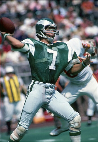
Pretty uni-notable photo, right? The see-thru jersey, the pants rolled up to expose those knee pads, the striped wristbands, the old Dungard facemask — good stuff.
That photo is from the archives of US Presswire, which is one of the wire-photo services, like Getty and the AP. I’ve featured their images in several previous posts, and now I’m happy to announce that Uni Watch and US Presswire have formed a partnership, which will make lots of their pre-1985 photos available to you without those annoying watermarks we’ve had to deal with until now.
Here’s the deal: If you look in the right sidebar, you’ll see “US Presswire.” Click on that and you’ll get a list of NFL teams; click on any team and you’ll be taken to a page of thumbnails. You can then click on the thumbnails to see larger images and captions, and you can refresh the page to see additional thumbnails.
Some of the photos, like the one shown above, are uni-relevant; others are just nice to look at. Either way, it’s a great resource for you to enjoy, and I encourage everyone to explore it. Other sports blogs may soon end up with similar interfaces, but Uni Watch is the first site US Presswire has chosen to partner with, and I’m proud to feature their material on the site.
We’ll be adding pages for the remaining NFL teams soon (well, except for the ones that didn’t exist prior to 1985), and then we’ll be expanding to include MLB, NHL, and NBA pages. Also, US Presswire is constantly acquiring new archival photos, and those images will be added to the photostreams as they’re acquired.
There may still be a few bugs in the system — duplicate images, a photo showing up on the wrong team’s page, etc. If you spot any problems, we want to know about it, so please feel free to speak up.
I want to thank webmaster John Ekdahl, who did all the heavy lifting at our end (I mainly just said, “Change this” and “Tweak that,” but he’s the one who had to do all the coding), and Nick Carter at US Presswire, who first approached me with this idea. Thanks, Nick — looking forward to more.
And in a nice bit of timing, all these newly available NFL photos coincide with my annual NFL season-preview column on ESPN, which is now up and running. Enjoy.
Guess what that logo means?: That’s right, boys and girls, still more FBS uni changes. Here’s the latest round:
• Maryland has changed its shoes and socks from black to white. And the socks are striped! (As an aside: Of the six FBS teams that have changed their shoe color this year, all have changed from black to white. Four of those teams have also changed their sock color from black to white. I’d say that qualifies as a pretty serious trend.)
• Wyoming has changed the message on its nose bumper from “Wyo” to “B.T.W.” (“Bring the wood”) and will also have a memorial decal with the initials of player Ruben Narcisse, who was killed in a car accident on Monday.
• Houston is now using captaincy designations.
• For this Saturday’s Oklahoma/FSU game, the Sooners will be test-driving a virtual I.D. bracelet embedded in their jerseys, designed to give critical information to first responders in case an athlete is injured. Details here.
• Yesterday I didn’t have a photo of Marshall’s coal miner memorial decal, but today I do.
My thanks to Bryan Stevens, Andy McNeel, Joseph Bias, Steve Hoyle, and Aaron Newman for bringing these to my attention. Greatly appreciated, as always.
Uni Watch News Ticker: Hey, look what’s getting a bit of media coverage. ”¦ Paul Bielewicz and Tyler Kepner have both noticed something odd about Rollie Fingers’s Hall of Fame plaque. Judging from the triangle shape on the cap, it looks like the artist used a photo from his Padres days and then changed to the logo to an A’s mark, resulting in a hybrid cap. Weird. ”¦ The Covington, Kentucky, police dept. is going back to its old badge design. “Turns out the company that made them still had the original die,” says Brandon Roberts. ”¦ The U.S. military is working on new uniforms for female soldiers (with thanks to Michael Hersh). ”¦ Remember Mark Penxa and his Stealing Signs illustrations? Mike Raymer liked them so much that he commissioned Mark to create these three illustrations. ”¦ Terry Bennett says he noticed that Andy Sonnanstine’s cap was sans squatchee the other nite. I did some quick photo research, and sure enough, Sonnanstine appears to eschew the button. ”¦ Schutt recently lost a copyright infringement case brought by Riddell, which has forced Schutt to seek bankruptcy protection. To soon to say what effect this will have, if any, on the company’s operations. ”¦ “I was struck today by the knee brace cover worn by a girls’ soccer player at Oxbow High in Bradford, Vt.,” writes Tris Wykes. “It’s a silky material with padding on the top and bottom. She said it’s to prevent her brace from cutting or otherwise injuring opponents. I’d never seen such a thing before.” ”¦ Ho. Lee. Shit. Is that completely magnificent or what? The player is Jim Bausch, from the 1932 Kansas squad. Anyone want to take a stab at colorizing him? (Big, big thanks to Warren Humphries.) ”¦ Reprinted from yesterday’s comments: New court design for UConn. ”¦ If you choose to believe the supposedly leaked images that began floating around the web yesterday afternoon, the Sabres’ road jersey will look like this (which is pretty much what everyone’s been expecting) and their alternate will look like this (which is a bit of a shocker, at least to me). No idea how legit these are, so your mileage may vary. Phil says he doesn’t like the alt, but I really dig it — hope it’s the real deal. … New mask for Kevin Poulin (with thanks to John Muir). ”¦ NHL.com is running a series in which they choose the best player by uni number (with thanks to Steve Johnston). ”¦ Non-FBS change: Youngstown State has switched from Russell to Under Armour, and has a much simpler uni as a result (as noted by John Daugherty). … Paul Wiederecht spotted a 1957 Cubs photo that shows the team wearing stirrups that don’t quite match up with Okkonen. Anyone know more? … Saw Shellac last night and thought, as I’ve been thinking for the past 20 years or so, that Todd Trainer is the coolest, most compelling dude on the whole damn planet. … Happy new year to all who’ll be celebrating at sundown.
Holy shit is right. That K design should be on the chest or helmet of every Kansas athlete, like yesterday. How does something that awesome get discarded?
Yeah, I thought the exact thing. What a logo. Bring it back!
I dunno, I’m thinking if that was designed today, it wouldn’t get a great response. It looks a tad busy to me.
Just took another look at it, and no, I wouldn’t wear that.
Happy New Year to you… it’s the best commute home all year!
Jaws looks sloppy in the lead photo.
Because it’s my name, I’ve been wanting a nice Jaworski throwback uniform, but this one sure doesn’t look so good. I’m glad they’ve improved the material since then.
link looks very nice though. Plus my birthday is coming up (in August)! :hint::hint:
I bought that exact jersey (or at least a fantastic Chinese knockoff of it) at the Farmer’s Market in Sydney, Australia for about $55 US when I was there 2 years ago. Even has the Mitchell & Ness tag on it. You never know when or where the uniform bug will strike.
It’s a little big (52) so I reserve it for the end of year games, with a couple sweatshirts underneath. Plus I didn’t wear it last year nor will I this year as I would rather have root canal than appear to be a Michael Vick fan.
I wanted the white Randall one (1988 ish) hanging next to it but the last name on the back was “HAM” instead of Cunningham!
I should’ve haggled for it…
Yes, Vick wearing #7 now is a definite drawback to wearing Jaws’ jersey. But this era will pass soon enough and order will be restored.
Regarding the Covington, KY Police badges, this you might find interesting.
The Chief of Police of the Covington Police, Chief Lee Russo, came from Baltimore, MD where he was a policeman there.
One of the additions to CPD’s navy LAPD/NYPD-style uniform that was added after Chief Russo arrived was…
…a Gold-Purple-Gold stripe to their pants.
Not a real good pic: link
I just find that odd. I wonder if the Chief is a Ravens fan?
In the lead photo of today’s Uniwatch, gotta love those Dunguards.
Love me some Buffalo.
French Connection illo – awesome
Sabres road jersey – stupid
Sabres alternate – just ok
They’ll probably be ruined with the front numbers.
Oh and Jaws is a Buffalo guy, of course!
Another Jaws connection today – photos of the new Youngstown State unis – Jaws played at YSU.
Thumbs up on both Sabres jerseys. I just love that wordmark, I would wear that on just about anything.
well for starters, the road jersey is stupid because it’s WHITE and not DARK, but that’s a whole ‘nother story…
-Jet
Re; SABRES Jersey:
Icethetics on Sabres Jersey: link
(surprised you didn’t mention the script Jersey
Not only is the Kansas logo interesting, the composition of the photo is as well. Bausch’s arms are positioned nearly parallel to the first two strokes of the “K”, and the roofline of the building behind him follows the third stroke almost exactly. Whether intentional or unintentional, this photo is very easy on the eyes.
link
i didn’t notice that the first time, that is pretty cool.
*********hey colourizeors*********
remember the rules about royal and red in black and white photos, they read counter intuitively. i bet dimes to doughnuts that it is actually a red jersey, and the stroke around the k is blue.
beautiful heder photo~
i was never a fan of the mesh jersey, and certainly not the concrete floor covered by a astroturf carpet…but there’s just so much to love there
lets see…actual sleeves, no manufacturers logos, almost full loops, jersey tucked in, no “look at me” affectations, no piping, striping or bumperstickers, even though the defender is out of focus and his uniform is partially obscured, you can tell in an instant it’s a member of the chiefs…
we’ve come a long way in terms of uniform materials and playing fields (glad the see thru [mesh] is gone and i think everyone is glad astroturf is no more)…but in terms of uniform design progression — i think we’ve gone backwards…
that photo is just exhibit A
oh…forgot to add:
no BFBS anywhere
Phil, the guy in the background is a Buccaneer, not a Chief. I see the top of a white helmet just barely sticking up over Jaws’ shoulder.
(..and the caption for the picture if you go through the photo service link says it’s the Bucs)
Also, the Chiefs used red pants from ’69 to ’88, while those Eagles uniforms lasted from ’74 to ’84.
/and you call yourself a uni watcher. hmph. ;)
FUCK
this is what i get when i don’t scroll back to the pic for “one last look”…
i didn’t even SEE the helmet behind jaws — just the uni numbers and sleeve stripe…and obviously i didn’t look for a caption
was thinking about the red pants thing — but i know the chiefs have gone on-again/off-again with them…
no excuses…just a bad fuckup on my part
LOL! I laughed when I read Phil’s comment re: the defender ’cause I knew in an instant he was a Buc too. Oh well… for all the hard work you put in for August, Phil, you were well overdue for a goof. No biggie!
You hit all the key points – sleeves, no piping/striping, no BFBS – Cool looking uni! I’m no Eagles fan, but I have to say they looked way better in those uni’s than the things they’ve been wearing for the last few years – odd shade of green, weird numerals, black alternate jerseys… Ugh.
Sorry if I’m late in the game mentioning this, but did anyone else notice Northwestern wear Northwestern stripes? They could be better, but at least they’re Northwestern stripes!
link
US Presswire Archives – Very Cool! When football players actually looked like football players. Girdles, knee pads, thigh pads, big shoulder pads. Now they all look like they’re trying to be Lance Armstrong with the bicycle shorts, ultra tight jerseys, and no pads. I blame Ed McCaffrey, as he was the 1st guy I remember who didn’t wear anything but shoulder pads and a helmet, all in the name of more speed. Is the game better now? I don’t think so.
Yes, I have a feeling the US Presswire feature is going to be like an oasis of sanity when I can’t take anymore of the modern uni eyesores, to harken back to a time when all was right with the world (the uni world, at least)…
-Jet
Indeed, very cool.
I hope to see some watermarkless action shots of Zorn circa 1978, such as these: link
Oh, and how about this awesome scrambling Zorn pic.:
link
Talk about amazing uniforms, the Seahawks 1978 set were just that.
Any pics from 1976 of Zorn? You’ll be able to tell right away becuase of the blank silver helmet!!
;)
I believe Largent and the GOP have those logoless 1976 pics under lock and key? So they tell me.
That UCon court is at the former Hartford Civic Center, right? Not the on-campus venue, if I’m not mistaken.
By the way, has Stanley Robinson made it to a single class yet? Just wondering.
Yes, that’s from the XL Center in Hartford. Gampel Pavilion (the Huskies’ on-campus home) doesn’t have a removable floor.
Today’s ESPN column is up:
link
I wasn’t aware the Dolphins orange jersey was still an option… so that’s good to know
I also don’t know how much weight I’d put behind that Redskins shirt with the yellow pants – it also has the yellow helmet, which was used as a throwback a couple seasons ago – link
I’d guess that it’s more likely the Redskins would be wearing that throwback again, rather than bringing out yellow pants with their regular uniform.
Re: ESPN column/Packers:
“Yeah, the brown helmets are kinda drab (if they were trying to mimic an old-fashioned leatherhead helmet, why not go with a matte finish?)”
Paul, I don’t know if you ever got the graphic I sent you back when UW featured these Packers retro unis, but I had an idea to alleviate the boredom of that dreadful brown helmet, and link.
Anyone record the Big Ten Film Vault program on the Big Ten Network last night? It was the 1971 Big Ten Yearbook, wilth looks of cheerleader, band, and yes, football shots. It was all in color.
A big happy new year to you too, Paul, and all on this site. May you find joy and success in all your endeavors for the coming year.
I know video games arent the most popular here but I’ve been playing Madden 11 online alot lately and there’s tons of cool things going on:
– Everyone seems to like their team’s home (color) jersey… More than half of my games have been color v. color
– The uni selection ranges from normal home/away, alts, and throwback for every team…. and you can mix and match elements as you wish (think, redskins gold pants, standard cowboys uni with white throwback helmet, green jets- helmet to sneakers, etc etc
– Correct sock selection (!!)… one of uniwatch’s (and my personal) pet peeves is whenravens go for the leotard look or jets go all white. I feel like gamers feel the same cause many opt for striped throwback counterparts or the correct (or better looking) sock combos
just some really good things going on there (I guess kindof hard to explain minus picture but i can get to it if anyone besides me is actually interested lol
I think it is a big miss having the Buccaneers wear their creamsicle unis against anyone other than an old NFC Central opponent.
The Lions visit the Bucs this year…anyone else think that this would be a welcome uni matchup?
link
I liked those blue pants the Lions used for only one year, I think it was 1997.
I think it was 97 and 98. I know they certainly used them in 98.
During a Yankee game the other day, Brett Gardner slid at home and his plants rolled up past his knees exposing his leg. I am not sure how long baseball pants are, but I would think that “standard” pants would be too long to roll up past the knee on a slide. Of course not referring to the obviously too long pajama pants..but the regular kind.
Anyone ever see that happen. Michael Kay says the believes Gardner wears some type of “shorts”, but that seems unlikely…
In any case when he got back to the dugout, the other players were giving him crap about it…
you must be talking about this
looks like compression shorts — a lot of guys wear those in lieu of a jock…i used to wear em for tennis…
Yes Phil that is the exact play I was referring too..
In understand about the compression shorts, but look how far up his leg the uni pant rolled. Is that “standard” length?
i didn’t see the play, so i don’t have a point of reference, but here’s what he was wearing when hitting a triple on the same day (a few innings later)…the play at the plate was in the second inning — i don’t know if he changed his pants in the nonce…but as you can see, he wears his pants pretty short (that’s from 8/31) anyway (8/20)…here’s how they looked on September 4
TMI, Phil ;)
That OU jersey design may not be as sexy as Nike seems to think combat is, but holy shit what a great idea! That should become the norm for all contact sports–what better way to expedite medical help?
I have lost track of a lot of holidays since relocating down south….
Shanah Tovah! Happy New Year 5771….May the apples be ripe and the honey on the challah sweet…. I miss NYC in moments like these..used to enjoy all the holidays….
Anyone know if the Saints are wearing black or white jerseys vs. the Vikes tomorrow night? I believe they have worn white for home openers recently.
I was sorta/kinda told they’ll probably be wearing white.
The Redskins would look tremendous in yellow pants! It’s a much more dynamic look than the whites, and really makes the yellow on the jersey and helmet pop.
The Chargers should do the same thing.
I wholeheartedly agree.
I wanted to point out that Arkansas AD Jeff Long Tweeted during the Boise St./Va Tech game that he thought both Pro Combat Uni’s were ugly but that the player probably loved them. It sparked a flood of responses. He promptly retweeted around 40 responses and noted that the trend was 70/30 in favor of the pro combat uni.
This is interesting in that…
1)An AD would criticize a uni of a company that his school just entered into a contract with.
2)An AD would enter into such a public discussion.
A local sportswriter makes a few guesses as to his motivation in link.
Is it possible that he felt free to criticize Nike now that they have the contract? If they were still with another company (I don’t know who they were with before), he might be afraid to sour negotiations with Nike or look like he was beholden to his equipment contractor.
They were with Adidas before. I honestly think that he was testing the water to see if the Ark. got a Pro Combat Uni what the local reaction would be.
That Ron Jaworski photo brings to mind the inconsistent striping pattern on the sleeves on those Eagle jerseys. That photo shows two stripes, but different players had three stripes. I saw a 1976 Eagle highlight video which showed this difference, but it would be interesting to see if more players went to the triple striping pattern sometime before that jersey style was retired in the mid 80s.
Oh sweet stripes!
link
The Eagles fishnet jerseys had the two stripes (the shoulder loops and the solid-color sleeve stripes) while the “regular” Sand-Knit mesh jerseys had the three stripe pattern (with the additional white/silver/white or green/silver/green stripes). The three-stripe jerseys were the original set for that uniform design (which also included pearl/metallic green helmets when it debuted in 1974, some 24 years or so ahead of its time; by 1976/77 they were back to plain kelly green shells).
When Dick Vermeil took over he brought in the fishnet jerseys (very popular in the NCAA at that time); most players wore the fishnets for all but the coldest games but a few players stuck with the Sand-Kint jerseys for all games.
“Saw Shellac last night and thought, as I’ve been thinking for the past 20 years or so, that Todd Trainer is the coolest, most compelling dude on the whole damn planet. …”
Yea, I hear ya, quite compelling dudes the Shellac lot. It’s bands like them, Big Black, and the Bad Brains that made me who I am today.
Some Tennessee players have an interesting take on Nike’s new uniforms. Explains why they’re not stopping (as if we didn’t already know this):
link
“Todd Trainer is the coolest, most compelling dude on the whole damn planet”
Long live mono-brow.
Hey, on this site we call it UNIbrow.
I thought we called this unibrow.
link
Great NFL column today Paul! Despite now home/road overhauls this year, all of the changes are extremely interesting. I hope the Redskins bring back the yellow/gold pants. I feel ready for the season to kick off!
Interesting that this is the first time in Paul’s 11+ years writing about uniforms that no team in an entire sport is overhauling their jerseys. I wonder when the last time that happened was?
As much as I love Baseball and how much of my life actually revolves around it…..there is just nothing like the excitement that builds up during the few days before your NFL team kicksoff!!!
Even better this year, Giants are kicking off against the Panthers ( I am a recent transplant to the Charlotte area )!
There is just something about getting up sunday morning and going to your local Walmart for game supplies..you and your kids wearing your home colors in “enemy territory”!!!!
Although that Jaworski period Eagle uni was cool, I also wasn’t a fan of the see-through mesh that let the shoulder pads show through. This is a little weird, but they reminded me of certain kinds of translucent diatoms, from the world of microbiology:
link
That article about loosening number rules kind of comes in a bit late. The rule about keeping your number when you change positions was always in place. It was why Todd Christensen got to keep No. 46 at tight end. Also, it said defensive linemen can wear 60-70 when I’m sure it meant 60-79. The rule didn’t have to be put into place for Devin Hester because it already existed. Another modern example would be Karl Mecklenberg who was allowed to keep 77 when he moved to linebacker.
If there’s a change, it’s just the acknowledgement that players are more versatile these days.
I don’t even think there were any changes. The NFL has pretty much always grandfathered in players who switched positions, like Terrell Suggs or Dallas Clark (who was a fullback on the roster for his first preseason). The only real change seems to be allowing centers to have linemen’s numbers, though most of them just got listed as generic OLs anyway to allow the higher numbers.
Bears will wear their throwbacks vs Pack9/27 & Vikes11/14 and Bears will wear white this Sun at home:
link
Sorry – I Shoulda read Paul’s column BEFORE I posted.
re:cvbs stirrvps
i have not checked the comments above, but when i did the research before i offered them last summer, i believe i found that those white based stirrups were the opening day hosiery.
This Topps Elmer Singleton card (photo likely was taken in 1957 spring training because it’s similar to his 1957 card, which WAS shot in camp that year to part of the Fifth Series) gives a glimpse at what have been a THIRD stirrup sock the Cubs experimented with before settling on the royal with nine (or more?) stripes: A royal sock with red stripes and stirrup.
link
link
—Ricko
Much brighter ’59 Singleton…
link
—Ricko
Or perhaps that was to be the road sock, with the white stirrup-ed version the homes…and they quickly bagged the idea and went with the blue for both.
link
—Ricko
or perhaps twin city was around in 1957, and had the same standards for following directions. i kid, they do a good job mostly.
coincidentally, i get some of those in this week
i believe.
also, i posted this above rick about the kansas jersey, do you agree?
“remember the rules about royal and red in black and white photos, they read counter intuitively. i bet dimes to doughnuts that it is actually a red jersey, and the stroke around the k is blue.”
That’s Kansas jersey’s a tough one (in the Ticker). Certainly if it were a color shot printed in black and white that might be the case.
There’s the whole “what sort of filter did the photo use?” issue, too.
And while Kansas has largely worn blue jerseys in the TV era, we know they HAVE worn red.
The colors that switch places most often are royal and red, not navy and red.
So my gut says it’s either red with royal trim…or navy with red trim.
Big help, huh.
—Ricko
i agree, the jersey is navy or red, the trim royal or red. i am still betting red though. why? because it does look so navy, and that is usually when i am fooled. i am going to try to find this out before i go change a couple slashed tires. no it wasn’t personal, just random stuff, been hearing a lot of gun shots lately too, the bangers must not be happy about going back to school
i am going to try to find this out before i go change a couple slashed tires
if (when) you find out — can you post your findings on here…i’d give that jersey a shot, but knowing the proper “colours” will help immensely
gun shots?
Re: Youngstown – good to see Under Armour start scaling back on a lot of unnecessary clutter on their football uniforms. I also noticed the cleaner look when checking out my old high school’s uniforms for this season (also happens to be the school Under Armour founder Kevin Plank attended, so they get the hook up)…
link
Pretty much the same simple jersey template that UA uses for Auburn…
link
Now Under Armour should clean up the Maryland unis!
I imagine this has been posted here before…but a fun site if you’re into logos, etc….
brandsoftheworld.com
—Ricko
I have the Steelers painting by David Boss. I picked it up at a yard sale when I was about 10. Do you know where I can find out more about the painting? This web site illustratednfl.talktalk.net/artists. shows the paintings done by Mr. Boss but gives no history as to when they were done or any other information. I would love to find out more about the painting and any help would be appreciated. Thanks.
Glenn
You’re not the first person who mentioned this. We have quite a few updates to the site that we need to get to, this being one of them.
Just a bit of information on those early NFL Boss paintings. There were quite a few of those paintings that were actually canvas transfer prints. So, what you have is most likely that. I’ve seen quite a few of them on ebay over the years.
That’s just my initial guess, yet I could be wrong. I’d have to see some pics and get some further info in order to confirm this.
I was looking at the painting last night and after doing some research as to what canvas transfer prints are, I think this is an actual painting. Their is raised paint through out the picture and you can feel the paint. Where would you like me to send some pictures of it? I am not looking to sale it, I just would like to know more about it.
Glenn
Trainer is a nut, but an amazing drummer.
Yes, tomorrow kicks off the NFL season.
But there’s this, too, for Mets fans…
“September 10, 1969 – The New York Mets sweep the Montreal Expos in a doubleheader at Shea Stadium, 3-2 (in 12 innings) and 7-1. The victories move the Mets into first place in the National League East for the first time ever.”
Also, it’s the birthday of Ted Kluszewski and Roger Maris.
So shorten those sleeves tomorrow. Show some guns. They both did.
—Ricko
A couple remarks on the NFL column:
– The Cardinals black alt, when taken out of context of the team wearing it, is pretty nice. The piping and side panels aren’t as obnoxious as they are on the red set. I could see that on a high school or college team that uses red/black prominently and say, “shit, that’s a pretty nice uniform.”
– The Cowboys really need to get their blues together. The fact that the 50th anniversary patch is navy with everything else on their white jersey being royal blue emphasizes this.
Kansas 1932 era unis
link
Frame grab?
I mean, IS that a frame grab?
Not, “Go find a frame grab.”
:)
—Ricko
sorta ya. I could say I painted it but no way could I do that.
so — are those colors correct then lar?
I would go with red for that Kansas uniform. I saw above Ricko or somebody was mentioning the blue or red for the Jayhawks.
So yes i assume red would be right. The teams that had the big letters in patterns on the front were so cool.
I’ll be damn! I never knew Fran Tarkenton was a NY Giant before becoming a Viking.
And he was a Viking before he became a NY Giant.
link
Now I see that Fran was a Viking, then a Giant, then a Viking again. Never knew that until the photos of him in a Giants uni. Cool stuff.
One easy way to tell when Tarkenton was with the Vikings first would be the video of him with purple pants during the 1960s. After his stint with New York, the 1970s video will not show Tarkenton with purple pants, since the Vikes stopped wearing them after the 60s ended.
Ironically, Tarkenton led the Giants over Minnesota 24-23 in the 1969 season opener. That Viking team would go on to lose only one more regular season game enroute to the NFL title.
The one exception being 1961, the Vikings’ first season and Tarkenton’s rookie year. Wore white pants on the road. Didn’t add the purple pants until ’62.
So if you see Tarkenton in white over white with NW stripes on the jersey, that’s ’61. Any other white-over-white will have the shoulder loops, because it’s from his second tour with Minnesota.
—Ricko
Great news about the U.S. Presswire deal. Plenty of great photos so far. I don’t know what it is about those old white Eagles helmets with the green jerseys, but they entrance me….and I’m far from being an Iggles fan.
Regarding the Nike Pro Combat controversey, I have to say I share Paul’s opinion regarding the marketing of anything athletic as “combat” during a period where American servicemen are fighting and dying abroad. It comes off really cheap in my opinion. This is obviously a topic where emotion comes out. I can’t say that those who criticize Paul for coming off a bit too angry are wrong, and I can’t place myself in the shoes of those who have served in combat situations, but Nike should be aware that with such a campaign, there will be backlash.
I did like Youngstown State’s new look. Not so much the black in the shoulder stripe. I hope they do away with the red and black look they used for a while. The school colors are red and white.
We shall see if they wear red and white or red and black at home.
YSU”s colors long ago were red and gold, I think it was gold.
Interesting game action of Nebraska vs Kansas in 1932. Guess who is wearing the big letter on the front of the jersey?
link
link
Well, it probably ain’t Ricko since he didn’t go to a Big Six school. ;-)
Even back then, though, that “N” stood of “Knowledge.”
(I know, I know, it’s old, but I love that joke…not as a dig on Nebraska, just that it’d be funny for any college/university that starts with “N”).
—Ricko
Here is Kansas vs Iowa State in 1932. So maybe that was Kansas away uniforms. But years ago there was no “home and away” unis.
link
or maybe it was because both nebraska and kansas wore red. pardon me while i blow on my finger nails and shine them on my shirt for calling the kansas red, not that it was a stretch, or even is necessarily correct.
yeah phil, i don’t know what bee is in the bonnets of the latin kings, and four corner this and that’s around here lately, but at least 4 times in the last couple weeks blap blap blap right outside the window. whatever, i’ll be in kansas city soon, maybe i will live in a better neighborhood. by the way, not only do i owe larry b since i struck out on the kansas unis, apparently 13-185 tires are unpossible to find in chicago. need 2, went to 6 places, found 1, but ran out of time because i had to come home to change before work, so i came away with none, and have to go through this BS thursday too. wtf?!
sucks roberto…
the “gunshot” (although in my reply i pluralized it) was actually a very obscure good will hunting reference, so n/m
that’s teh beauty of UW…even if you didn’t find the pic, larry did…but you knew they wuz red, and that’s the key
when the FBS lines come out?
i sent ’em out 5 minutes ago. if you save that link, you can get a head start from week to week. i usually send things out wednesdayish.
link
A few years ago I found a Kansas uniform history site. It maybe did not cover all the changes but from what I remember it was decent.
I did find this about crimson and blue for Kansas
And once again these are not my figures. I only saved the pictures when the guy had them for sale. He did this Kansas 1924 figure in red. I know this guy was not always 100% accurate. So take it for what it is worth.
link
Speaking of Ron Jaworski and Youngstown State unis today. He is a former Youngstown State Penguin.
Pirates are wearing throwback mustard colored hats today with there current unis
And they don’t have the MLB logo on the back either…
what are the Pirates wearing on their heads?
The first hat I ever owned. A hat I wish I had now. The hat they should have went back to after the 1976 season.
link
The black eyelets are wrong, of course.
Now if they only had an adjustable version…
Nice to see the Pirates got something right.
link
I think it has something to do with Roberto Clemente night or something of the sort. I actually really like the mustard color, I think the whole uniform would look nice in that shade.
The Pirates only wore that hat for 5 1/2 seasons, so it’s not surprising some younger fans don’t recognize it. The mustard hat and uniform were introduced midway through the 1970 season to coincide with the opening of Three Rivers Stadium.
Pirates wore old gold and black when Clemente first came up (the sleeved set with the solid black socks; the ones with which they wore batting helmts on defense, too). The vested unis, with three-striped socks, changed the old gold to something more like athletic gold.
Then, of course, the old gold/mustard returned with the first doubleknits in 1970.
—Ricko
this is fuckin sweet
No doubt, I believe this is the first time they’ve worn the mustard(non-pillbox) hats since 1975. Hopefully, next season they’ll bring them back again along with the uniform of that era to honor the 1971 world champions.
I have but one word:
link
Maybe next year on TBTC night…
Jim, you didn’t have the Kury Angle/Candace Michelle/Linda McMahon version to promote WrestleMaina 21?
Haven’t seen that one…
Great hat, great photography:
link
HAH!
the buccos would need to play defense with a ball that big to post a winning record
Noel Devine’s jersey got ripped on his TD run in the 4th quarter of tonight’s game.