
We all know I love stripes. So you can imagine my reaction when I saw this.
Those are the Duryea (Pennsylvania) High School Wildcats in the 1950s. Their uniforms were recently brought to my attention by football photo-archivist Robert Harvell, who came across the Wildcats on a web site devoted to Duryea history. It features a bewildering array of old photos, news clippings, yearbook pages, etc., including lots of photos of those amazing football uniforms.
As you can see from the last two photos in that set, Duryea’s colors were blue and white, so the stripes in all those photos were blue. Although it looks like the stripes in this shot were lighter than the base color, Robert has been in touch with the site’s administrator, Bernie Stiroh (basically Duryea’s self-appointed historian, and also the guy carrying the ball in the first photo of the set), who has confirmed that the school used only one shade of blue.
A few other notes from Robert’s interactions with Bernie:
• “According to Bernie, opponents were always in complete awe of Duryea’s dazzling uniforms, including the painstakingly hand-painted helmets and the high-top cleats that were spit-shined to a high gloss on game days. This was seen to by Duryea head coach Tom Kelly, who was one of the first to run single wing and split-T formations at the high school level.”
• “Bernie also says their football pants were unlike any he has ever seen before. He said that the inner thigh fabric was almost transparent, that you could see the players’ leg hairs, although it’s not evident in the photos.” Hmmm, maybe it’s better that we can’t see that.
• I had hoped that Bernie might still have an original helmet on hand, but Robert asked him about that and reports that no original helmets have survived. Too bad.
• If you go a few decades further back, Duryea had really interesting jerseys with the uni numbers inside a “D” logo.
As for the rest of the Bernie’s site, it’s a bit of a pain to navigate but there are tons of great photos lurking inside, including shots of Duryea’s striped basketball uniforms; pics from a clambake where at least one guy wore a baseball jersey and socks; some nice Little League imagery; and let’s not forget those ox-tail supper snapshots. I don’t want to over-romanticize it (good luck finding a single black person in mid-century Duryea, for example), but it’s still a pretty fascinating time capsule.
Meanwhile, it’s hard not to wonder how these uniforms looked in color. I mentioned that to Phil, who has gotten the ball rolling. Anyone else want to try their hand at colorizing some of the Duryea images?
“FBS” stands for “Damn, I sure missed a whole lotta changes”: The late-breaking college football uni changes continue to roll in. The latest batch:
• Oklahoma State has a “55” memorial decal for Bob Fenimore.
• Florida Atlantic has changed from Nike to Adidas, which has resulted in two small adjustments — a new uni number font and the “Owls” wordmark on the upper-left thigh has changed to the FAU logo
• No photo, but Marshall is apparently wearing a “29” helmet decal for the 29 miners who died in the Upper Big Branch mine disaster.
• UCLA has a “JRW” memorial decal for John Wooden.
• USF has changed from black shoes and socks to white.
My thanks to Mike Harris, Eric Yesner, Taylor McGillis, and George Lane for bringing these to my attention.
Uni Watch News Ticker: If you’re into marching band uniforms, you might wanna bid on these catalogs. ”¦ Found some sensational women’s bowling shirts on Etsy. Look here, here, here, and here. ”¦ Check out these great early-’60s shots of Cal wearing striped sleeves (big thanks to Larry Bodnovich). ”¦ Check it out: Sparky Anderson as a Toronto Maple Leaf (courtesy of Terry Proctor). ”¦ Hung out yesterday afternoon at the Sand Bar in Rockaway. The guy next to me was watching the Mets/Nats game on the teevee, and at one point his galpal says to him, “Look, they’re losing 12-3 in the 7th inning — it’s over!” ”¦ “I know this is a year early,” says Kevin Wilson, “but I was talking to a friend who plays football at Northwestern and he was saying how the team is getting black jerseys next year. I assume they will resemble the jerseys of the mid-’90s, because that is when head coach Pat Fitzgerald played at NU.” ”¦ Michael Princip has made some updates to his Bulwark football helmet site. “Just click on the thumbnails for larger versions,” he says. “In the coming weeks I’ll reveal some more technical renderings explaining the main components of the helmet.” I plan to do an ESPN feature on the Bulwark later this fall. ”¦ Andy Rawlings found some cool video clips showing behind-the-scenes details at the Pontiac Silverdome. Look here, here, and here. … Tony Bibler recently took part in a promotion that allowed him take some hacks of off former MLB pitcher Len Barker at Jacobs Field — and look what he wore for the occasion. … Gotta say, I don’t remember the Three Rivers end zone being plastered with hypocycloids, but it sure looks cool. That’s a screen shot from roughly the 0:45 mark of this video (with thanks to Bill Kellick).
The audacity of “Nope”: Saturday’s dust-up in the comments section, along with many of the e-mails I received that day, revealed that many Uni Watch readers are just as prone as the rest of the American public to become so emotionally invested in preconceived narratives that they disregard anything to the contrary, even when it’s right in front of them.
Judging from the e-mails I’ve been receiving, for example, three of the narratives some of you appear to take as gospel are as follows:
1) “Lukas hates anything connected to Nike.”
2) “Lukas hates anything connected to the military.”
3) “Lukas hates any uniform design that deviates from the traditional look.”
Most of the people who cling to these narratives presumably read my college football round-up column on ESPN last week. I wonder if they recall which uniform I went out of my way to single out as my favorite new design of the year.
That uniform is worn by Army.
It is a modern design that replaced a much more traditional, old-school design.
It is produced by Nike.
I realize some of you are already typing, “That’s just the exception that proves the rule!” I also realize it’s much easier to see things in black and white, so hey, have fun with that. Back here in the real world, though, there are lots of shades of gray.
With all the terrible changes that Nike made w/ the rivalry unis, IMHO – the best revision was the oversized Bronco on Boise State’s helmets (despite the stupid one-sided gimmick). I hated everything else on the field last night, but it would be cool if the put that oversized logo on BOTH sides of the helmet.
I gotta agree. Of all the “futuristic” looks, that one was easily the best. Most importantly, IMHO, it gives Boise State the trademark look they lack (aside from being known as “that smurf turf school”) that drops off the “Boise State” wordmark from their logo. I’ve always thought that their current logo makes them look like a second-tier program.
A large part of being successful is feeling successful, and being recognized without having to tell people who you are goes a long, long way towards that.
Nothing more stupid or unimaginative than including the name of a team or nickname in print on the side of a helmet. Simply YUK. Go ahead and find a logo. If you can’t, put one or two or three intials of the team or school in a cool font that has some type of style.
If you want a team name – go ahead and put it on the FRONT of the jersey, in a font size that can be read FROM THE PHOTOS OR TV, not in some stupid small font that can only be read by your teammates in the huddle. NO, you can not put the team name on the back of the “sports bra” strap on the BACK of the jersey. NEVER!
AND BY NO MEANS, do not put ANY NAMES on the pants. Not up the leg, Not down the leg, not on the ASS, not on the shins.
That’s it, THAT’S THE LIST!
I don’t want to over-romanticize it (good luck finding a single black person in mid-century Duryea, for example), but it’s still a pretty fascinating time capsule.
i was thinking the same thing when i was colorizing this — i only needed one shade of “skin” color; i don’t want to go so far as saying this was a “segregated” community, but certainly one that was very homogeneous
nevertheless, a nice snapshot of small town life in mid-fifties america
I was thinking the same thing when I started to see looking at the pics! Since this was PA there was no “segregation” in the towns, but the country was divided nonetheless.
Some think for the better, others for the worse, but it shows how much America and our perceptions of America have changed, that for the most part, we do not notice differences. If one of those players had been african american, hispanic or asian I probably would not have noticed Yet it stood out glaringly that every single kid on that team and in that town seemed to be white.
Either way….loved the stripes….
Thats still the case in a lot of small towns in the midwest. In my high school graduating class of 130 there was 1 minority, about 5 total in a school of about 500.
Back in the early 1950s my high school, Livonia Central High had two African-American brothers, Wally and George Ellis, who were outstanding multi-sport athletes. The high school had around 250 students in those days of which only around six or seven were black. Of the ten high schools in our entire county (Livingston) only Caledonia-Mumford and Avon had more black students. The other seven had none.
In 1950 the Livonia Bulldogs won the Section V Class B basketball championship in Rochester. The game write-up in the Rochester Democrat and Chronicle contained this sentence regarding our point guard. “Livonia’s crisp-passing floor attack was led by diminutive Negro guard Wallace Ellis.” Before anyone has apoplexy this is how sportswriters communicated in those days. No slight was intended either at his size or his race, even though Wally was around 5’9″ and a solid 180 pounds.
You had to have been alive in the 1950s to realize how different racial attitudes were then and today.
Just for perspective, there were barely any black players in the entire NFL until the early 1950s. The Redskins didn’t sign a single one until 1961.
Actually the Redskins didn’t integrate until 1962 when they traded the rights to Ernie Davis to the Browns for Bobby Mitchell. Secretary of the Interior Stuart Udall threatened to bar the ‘Skins from the new DC Stadium (now RFK) ubless they integrated.
Nothing about the game last night? Or are you saving your thoughts for a mothership column?
Didn’t watch it.
Since when do you only comment on games you watch?
What else is there to say? Two teams dressed up in video game costumes, whoop-de-damn-do. After a solid week of this silliness, I see no reason to further perpetuate the hype.
Hey Paul, here’s something to take your mind off of last night’s eye-gouger:
link
Plus it fits in with today’s post.
Spent about 2 1/2 – 3 hours last night doing this in MS Paint.
Ridiculous… So now two top ten teams play and Paul refuses to watch based on uniforms…. solid logic, true sports fan here folks…
settle down there chief…
paul happened to SEE the uniforms IN PERSON a week ago, why did he need to see them on tv?
i watched the game with the same interest as one who slowly rubbernecks past a fatal on the highway…with sirens and flashing lights and maybe a medivac or the jaws of life — because everyone likes a trainwreck…or a car crash…on some sick level, we HAVE To see
but paul didn’t have to see the unis…he didn’t need to watch the game, if he chose not to…for many of us, this was a first look, certainly a look at the unis that weren’t a staged photo
would i have liked him to write on the game today? absolutely, but we’ve already gotten his awesome report and slideshows on the deuce last week, coupled with an extra dose of nike-bashing on friday
some might say that’s enough
You could have at least thrown in a bad word or two. Why didn’t you call him a “C-word”? I thought true sports fans knew how to get after it.
true true… was actually most excited to see if anyone got any good screen shots of the vt military emblem on the helmets, I never got a good look
lol and no, no bad words, just pointing out that the reasoning for not watching a great game was solely based on the uniforms that were suppose to be worn
I supposed I forgot what site i was on for a minute there…. I eagerly await the next report on curling….
JohnJ, I can’t say much more than Phil did, but I believe that Paul’s PAYING job with ESPN is to write about the uniforms. He did this last week after the unveiling, and talked about them both on Page 2 and on here. This is the man’s personal website, on which he is kind enough to give us advance notice of many things the average sports fan did not know about (I for one know three Virginia Tech alumni who turned the game on last night and had no clue who was on the field). If he doesn’t want to take up personal time to watch a game he didn’t want to watch for whatever reason, just so we could see him restate his already stated opinions, then so be it. And for anyone else who reads this comment (not necessarily saying you, but lumping this in with this note), it’s our choice to come here and read what Paul has to say or not. It’s HIS site that he is in charge of, so that’s his prerogative. That is all.
Once again… was simply stating that he missed a good game for a silly reason
He does do a great job and I take nothing away from his previous reviews of the unis, my comment had nothing to do with that
Did you see that Boise State beat Oregon State last night? Or was that Oklahoma State?
It was Virginia Tech
Nawww. They team they played was definitely in black and orange. And more black. And a little bit of gray.
I think they beat the Bengals. Didn’t Jonathan Joseph have an interception?
Actually, with solid colr numerals, this would be a marked IMPROVEMENT to the Bengals’ current uni.
I have to say though there was a ton of crap on the field last night at the Boise St/Va Tech game, I agree with dwight that the Boise St helmets were ok. I actually enjoyed the one sided thing though. Can they just replace their current crowded helmets with those?
Don’t know how you feel about this:
I ran the Virginia Beach Rock and Roll 1/2 Marathon this week, and my finisher medal was hung on a ribbon with “Dodge” printed all over it…best pic I could find, but pretty crappy imho.
link
i think it’s a pretty good pic, actually…don’t be so hard on yourself
Thanks, I meant the “Dodge” was pretty crappy…I think Competitor is a straight money grab.
I’ve done a lot of road races and I’ve also been involved in the organization of a bunch.
Road racing for the masses is a pretty marginal sport, economically speaking. Its not like race organizers are being greedy. Things like bibs, shirts, medals, lanyards, race expos, racecourses plastered with sponsor logos are pretty standard. So are naming rights for races (i.e. the ING New York City Marathon).
If it weren’t for the sponsors I’d guess that 90% of races wouldn’t exist. Small price to pay IMO.
Rgr, I get that part of it as I am heavily involved in my running club and my Father in Law is on the Board of a major race….no problem with the sponsors, or branding, just not on the ribbon…it just looks cheap.
Even after watching a few mintues of Boise-VTech last night….I still think TCU wins the ugliest opening week uni award.
I will give VTech the WTF are you wearing award for being the school that drifted the furthest from its school colors to please Nike…
I don’t think Boise looked all that horrible on its own…but there was just something disturbing about it when you saw it on TV….can’t put my finger on it…but something just looked wrong on the field, was it the blue shoes…maybe…
VT drifted the farthest?
TCU’s colors are still purple & white, right?
Regarding the Sparky Anderson as a Toronto Maple Leaf photo I sent in for today- I saw Sparky and the Leafs play in Rochester many times from 1961-67 but don’t ever remember him wearing glasses. Sparky was player/manager of Toronto in 1964 but was replaced by Dick Williams in 1965. Williams won back-to-back league titles in ’65 and ’66.
One last thing. The cut of the Leafs’ vest-style jersey is how a vest should look. Today’s cut makes them look like they have a cap sleeve. Majestic, take note.
I would be shocked if Northwestern went back to the black jerseys. Coach Fitz has said repeatedly how much he hates black in the color palette for the Cats. That could be why they dressed in all white on Saturday night in Nashville. The AD’s can add black pants to the wardrobe, but that doesn’t mean the coach will pull them out. The purple is proud, and we don’t want to look like TCU.
Yes, but maybe you want to look like the Big Ten champions who went to the Rose Bowl in 1995.
Those FAU are reminiscent of some of the old USFL teams. I think it is the outlined block numbers and the multicolored stripes on the helmet.
No wonder I love it!
The outlined numbers are kinda Ariz. Outlaws-ish, aren’t they?
link
The Breakers did that look, too:
link
Sorry Mr. Vilk, but I can’t stand “mid-borders” that are the same colour as the jersey. It gives that awful screenprint-effect, and I hate screenprinted graphics on uniforms just as much as the Boston Relics, if not more. And that’s about as firey a passion as I can think of. At least the numbers on the new FAU unis are bona-fied (sp?) tackle twill.
“Ox-tail Supper, March 3, 1951” Bottom right photo… Perfect. Loaded with story.
Love the Sand Bar photos, too.
Lost in all the discussion of whether these new uniforms are good or bad style-wise (and I choose bad) is this point: By constantly changing up uniforms and colors, schools are losing their identity. Can anyone ever mistake the Alabama, Penn State, Notre Dame, USC, or UCLA teams when they take the field? When Oregon takes the field, I have no idea who they are just by looking at them, but one look and I always knew that’s ALABAMA! (as Keith Jackson would say).
Exactly. Any given new design may or may not look pretty, depending on personal taste. But an athletic uniform serves three purposes, in order of importance:
1. Appropriately clothing the athlete to compete in his sport, including necessary safety precautions;
2. Clearly identifying each player as a member of a particular team, distinct from any other team on the field of play;
3. Establishing a lasting, easily recognized identity for a team distinct from all other teams in its league or sport.
These are the functions that any sports uniform design must serve. To the extent that any design undermines any of these core functions, that design is, objectively, a bad design no matter how pretty any number of observers may feel it to be. If I design a football uniform such that it cannot be worn with shoulder pads, that is a failed design. If I design a uniform such that players on the same team do not look like one another, that is a failed design. And if I design a uniform that so breaks with a team’s established aesthetic that fans cannot tell at a glance the identity of the team, that also is a failed design.
I believe that most of the designers at the large athletics gear houses, Nike especially but Reebok and UnderArmour as well, simply have not thought through and could not articulate the functions that uni design must serve. Their designs therefore are exercises in pure aesthetics unmoored from any consideration of function. The best one can say about campaigns like the Pro Combat unis is that they represent art, not design.
If all teams followed your guidelines, no one would ever change uniforms.
I’m not saying that every team should be like the Oregon Ducks and wear a different uniform for every game – but I think you have to allow teams to experiment with their own identities from time to time. Just because a team has worn the same thing for a long time doesn’t mean that it should be untouchable.
On an amusing note…
hokie (comparable more hokie, superlative most hokie)
1. Something trite; not fashionable.
Virginia Tech sure fit that definition last night, did they not?
No one is saying you can’t change uniforms. But what are Virginia Tech’s colors again? Oregon’s? Oh, black? Right. Yeah, that makes them stand out and ties the alumni to the ol’ alma matter.
I know I’d sure prefer to play for the defending national champs than for the team that got beaten last night.
Of course teams could still change uniforms. For one thing, some teams will choose to completely rebrand themselves, in which case item 3 on my list doesn’t apply. If the client says he wants to switch team colors from red and blue to teal, British racing green, and metallic black mica, then continuity of identity will not be an important design concern.
But aside from that, item 3 will merely limit and shape design changes, not prohibit them. For example, if a team’s colors are, let’s just choose at random orange and burgundy, and that team has many years of tradition wearing burgundy helmets and either burgundy shirts and white pants or white shirts and burgundy pants with white or burgundy numbers and just a touch of orange trim, then a quality design for that team will not involve apparently black helmets over black shirts and black pants with dominant orange numbers. That is, simply and objectively, bad design, just the same as if the jerseys were designed without room for shoulder pads.
Art can just be pretty. But design must meet the demands of function, and sports uniforms have functional requirements the go well beyond the pure aesthetics of looking pretty.
I think to that end, Boise did manage to keep their aesthetic identity. It’s an away uniform, so it’s a white jersey. They had blue pants, blue and orange trim on the jerseys, and a blue helmet with an easily identifiable logo on the side. There were problems with the uniform, but nothing that would make Boise State unrecognizable the way the black Va Tech unis did.
I guess the ultimate test is, if I saw someone in that uniform walking down the street, would I recognize the uniform as Boise State. I think that uniform was able to convey that identity, even if it was a departure from their usual uniforms.
I believe that was a light greyish blue jersey Boise had on? In any case, I dug’em. Love the two tone blues, yet not too crazy about the blue epaulets. I agree, Boise looked pretty good in their part time digs, and VT looked sort of ridiculous in theirs. VT really need to accentuate the orange, there are so many cool things they could do with that color.
What to like from last nights visual melee?
FLAT BLACK – Looked cool, but not for a BFBS team like the Hokies. I can imagine a team with black in their repertoire testing out a flat black helmet. The Hokies just looked ridiculous in theirs. Army might look nice in flat black or flat grey.
BOISE STATE HELMET – Liked the bronco on the helmet. Hated the one-side version. Would like to see this morph into a 2-sided version full time.
What to hate?
Pretty much everything else. Each uniform was a chaotic mess that seemed to not have an overall design aesthetic working for it. The mismatched sleeve stripes and B on one knee, plus the silver-grey inserts on the Boise uniforms felt like the design team had no clue where to start and began by just cobbling together a bunch of visual cues without rhyme or reason. Nothing here says football/Idaho/Boise/or Bronco to me.
Tech = circuit boards. How 1990s of Nike to try to infuse the Hokies with ‘technology’ as if the uniform fit and material wasn’t considered technological enough. Hate the black with the maroon, the two-tone numbers and the lame circuit board pattern. Hokies would be best-suited to wear the throwbacks (which I believe they are moving to) every week – you know, the ones that actually represent the school more than circuitry.
I for one, am just glad it’s over. My retinas are recovering nicely, thank you.
I thought that was MARPAT or similar, since the Va Tech uniforms in particular were supposed to play up the relationship between the team and the school’s cadets. And as has been pointed out before, those jerseys were solid gray, but their construction leads to odd sweat stain patterns.
It appeared to me that in one of the photos a Duryea player was tackling a player who appeared to have colored skin. Not apologizing for their all-white town, but was it unusual for a town like Duryea to play a team with black players back in the 1950s?
Don’t know why it was germane to invoke race when presenting some old photos, but this is the pic being mentioned:
link
Note the opposing team also has striped shoulders, although not as awesome as Duryea.
Why would it be? I mean, even though the North was far from paradise when it comes to race relations (us Northerners and Midwesterners like to pretend that it was even though racism was just as alive here as in the South), it’s not like we’re talking about a team from Alabama here– this is Pennsylvania. I don’t think they would have gone so far as to not play black schools. Maybe they’re playing a Philly public school in a playoff-type situation here? I dunno.
I didn’t mean to imply that the town was racist because everyone in the pic was white. I do not know anything about this town, for all we know the Town Mayor may have been a minority….however unlikely for the 1950s though…
But really I wanted to make a point that up until the 1960s most sports / uni related photos are segregated. You would almost never see a minority on a highs school sports team…and I am not referring to the South..but even up in places like New York or Illinois.
But I think its a positive on our society that we see these old pics, we actually NOTICE the separation.
Duryea stiped jerseys look great.
The helmet, well ….. let’s just say that I love that someboby would do it, and I did not have to wear it or look at it even once in person.
As for Race breakdowns – what does it have to do with uniwatching?
Anyone disturbed by the fact that our history included places and times where there were not alot
of intergration AT THAT TIME should be comforted by the mission of our current federal government to intervene and insinuate itself into every community and school system to make sure there are no places where there is not sufficient integration. Be happy with the present if you are disturbed by the past.
Oh, I agree. Most shots you see are segregated from back in those days. I just was saying that I don’t think it was unusual for a team of all-white players to play a predominantly black team in states like PA or IL or NY or whatever. (Think Hoosiers).
Actually, I just moved to Central Illinois to cover high schools sports and when I was at the local library there was this book in the “sports” section devoted to the Original March Madness (the IHSA hoops tourney). It has team photos of each state champion from 1902 or whatever all the way up to like 75 (when it was published). It’s incredible to go through the book and watch as the teams gradually get more integrated.
One thing I noticed was that, shockingly, the first time I saw a black player, or even more than one black player, in a team photo, it wasn’t at a Chicago school. It was for one of the teams downstate. Kind of interesting.
I took that book back but I just might need to check it out again and scout for some awesome uniforms.
Something about that JRW decal just strikes me as disturbing, but I can’t place exactly what it is.
– James R. Walaitis
Don’t have any good pictures, but was it my imagination or was the back bumper on those Schutt helmets ENORMOUS, particularly on the TCU helmets? link
Gotta admit my initial reaction to the Horned Frog helmets was favorable. But I don’t have high-def television, and I got to see the sublimation in photos the next day. My enthusiasm was then dampened.
I tuned in late to the Boise State-VT game last night, and my initial reaction was these were costumed fools running around. When the emphasis shifts from substance to style, you get in trouble. The first thing I saw last night was the shiny shoes – probably just what Nike wanted. Then it was the uniforms. FInally it was the game itself. Not good. Not good at all.
On another note, it was encouraging to hear Pat Fitzgerald’s comments about getting the black out of the Northwestern uniforms.
I didn’t think the uniforms looked that bad last night. Just casually watching it at a bar, it just looked like VT had black jerseys and pants with orange numbers. Boise State looked like they had grey jerseys and blue pants. I did like their helmets as well. The oversized logo was nicely offset by the plain blue helmet look at times. Nothing to freak out over or pout about
The game itself was phenomenal.
Those jerseys were supposed to be white. The Pro Combat jerseys have a major sweat retention problem
No, they were gray.
link
My bad. Am I dumb, did Paul’s pictures make them look white, or was I just expecting them to be white so hard that that’s what I saw?
I also thought Boise State looked cool last night, but only from far away. The gray jerseys contrasted well with all of the blue (even the socks). When they zoomed in on them however you noticed all of the extra crap. However, VT was a train wreck from any angle.
DITTO! I agree that Boise looked pretty cool last night.
But what is deal with Nike adding Gray detail to to so many unis? Here, a Gray “Boise State” over Gray jersey, and a Gray numeral trim to Blue numerals on a Gray jersey.
Still it – Boise – looked good. And why not a Silver/Gray road jersey where the home team has a good, dark contrasting uni. The Pats and Eagles would be well-served doing the same – particularly where they insist on wearing dark pants with road jerseys.
Still, Nike seems to have taken a GFGS (Gray For Gray’s Sake) stand, where you too-often now see a Gray NOB for numerous Nike basketball unis, no matter the school colors or whether the jersey is White, dark or even Gray! Nike has added Gray in a significany way to Oregon’s unis where Nike has determined that the school’s Green, Yellow, Black and White are simply not enough of a choice without adding Gray (GFGS)!
Can’t look at a photo of that many stripes without this getting stuck in my head for several days:
link
I didn’t think Florida Atlantic could look any better, but they do this year!
As for Dureya High School, what can I say? Great stripes, AND they ran the single wing…where’s the nearest time machine? I’d love to see that in action.
I shudder to even think this but, do you think this Nike Pro Combat is a wave of the future of what College Football’s Uni landscape will look like.
Or is it going to be laughed at and ridiculed and fade into obscurity like Baseball’s Turn the Clock Uni’s in the 90’s?
link
On a side note, here’s an interesting Military vs. Pro Combat Pic.
link
It’s probably been pointed out before and I just ignored it, but I just noticed that the Padres TATC jersey really looks like a tuxedo t-shirt at first glance.
By the way, I found it funny that they painted the RFK…uh, Fed Ex Field end zones with the regular VT and BSU helmets. They knew ahead of time what unis would look like, so I’m surprised they didn’t paint the helmets that were actually worn.
Thanks for sharing the link, Larry and Paul, to those early ’60s Cal unis. I mentioned never having seen them in the comments a couple of days ago, and Ricko gave a link to an old regional Street & Smith’s cover. I dig the look, color scheme, stripes, number font and all. I’d love to see Cal bust them out as a throwback but, as I commented when Ricko posted the first link, I’m afraid that today’s sleeveless jersey fetish would resign the sleeve stripes to hashmarks a la Princeton.
Never understood why Cal hasn’t fully utilized the bear footprint logo similar to the way Clemson uses the tiger footprint design. Cal once had a helmet during the Joe Kapp era with a huge bear footprint and the script Cal inserted inside. It was a great design, but was abandoned for some reason.
Oops, meant to say the Joe Kapp “coaching” era
I do think those striped sleeves that Cal and Princeton wore were sweet. And as you said too bad it is the kind of jersey that will not be replicated with the current sleeve lengths.
Actually, Cal did wear these as a throwback about ten years ago to mark a 100th anniversary of a rivalry game – I believe with Stanford. Cal was the road team and wore a White jersey with the Blue sleeves, yellow Princeton stripes.
Good luck in finding ANY pictures of that game from anywhere on the net. I found out about the throwback game when one of the Cal players auctioned his jersey on EBAY. Even then, he did not post a picture with the auction, but after three days he finally e-mailed me a photo of the jersey. The attempt was pretty cool, but the execution was horrible because the jersey in question was a sleeveless lineman’s jersey style.
I looked far and wide for photos of that game on the net, and found none even within 1-2 years of the game being played.
I ended up not bidding on the jersey because if there is one thing more tragic than a sleveless football jersey, it is a sleeveless lineman’s jersey with a pitiful attempt to include Princton stripes on the jersey without an actual sleeve!
BLAHHHHHH!
Really Nick? What year was the game played? Around 2000?
Nick,
Here are 3 b&w pictures of that 100 year Anniversary of Cal Stanford
link
link
link
Larry B,
Thanks for the photos – I tried like the dickens back when and could not get them.
as you can see, these Call jerseys were great in concept, but unwearable off the field, so I passed on it. Thanks a bunch!
Thanks from me, too. You can already see in those pics that the sleeve stripes were being truncated.
After seeing Virginia Tech last night in HD, I think those might be the worst looking college football uniforms I’ve ever seen. The thing that pushes it over the top for me is the BFBS (unless VT changed their school colors to black and orange in the offseason. If so, my bad). Shame on VT for letting Nike take a dump on their visual identity in the name of marketing.
Still, the biggest uni-loser this season in college football is TCU. Pro Combat clown-suit aside, they seriously downgraded their regular uni from one that was already pretty awful to begin with. As someone who attends a couple of Frog games a year, I can sadly tell you that the black is immensely popular in the stands.
I’m not a fan of the Darth Hokies.
It goes beyond BFBS: flat black helmet, numbers with goofy graphic details and logos embedded, etc.
Herbstreit mentioned that the VT numbers looked “better on TV than in person.” What did they look like in person????
I will say that I liked the matte finish (not the color) of their helmets.
I agree and disagree about TCU’s Pro-Combat unis. I really like the frog print on the helmet and pants. I think if you were to change the jersey (and helmet decal) back to purple, you’d have a sharp uniform.
I watched the Boise State-Virginia Tech game last night and an XFL game broke out. What was missing was the NickNOBs.
BREAKING NEWS:
Schutt Sports has filed for Chapter 11 Bankruptcy Protection.
The company said its bankruptcy filing was largely triggered by losing a copyright infringement case last month involving Riddell Inc. That case is being appealed.
link
Big announcement. Well, semi-big.
For the past two months or so, Ek and I have been working with US Presswire (one of the photo wire services, like Getty and the AP) to create team-by-team pages featuring historical images for the four major leagues, all pre-1985, from the USP archives.
We’ve begun by setting up pages for some of the NFL teams. If you look in the right sidebar and click on “US Presswire Archives,” you’ll see several teams listed. Click on one of them and you’ll be taken to that team’s page of USP thumbnails; click on the thumbnails and you’ll get larger images and captions. If you refresh the page, you should get more images. It’s a nice trove of imagery — and unlike the photos on USP’s site, these pics don’t have the USP watermark.
We’ll be adding more NFL teams soon, and then additional pages for the other four major sports leagues. Meanwhile, there may still be a few bugs in the system, so feel free to let us know if you spot anything that doesn’t look right.
Consider this a “soft launch” for those of you who read the comments. A more official announcement will follow tomorrow.
Very cool; emphasis on very.
That photo of Wes Chandler w/ the Falcons is the epitome of perfect. Helmet is gorgeous, uniform is striking and everything is in proportion. And if you’re into this sort of thing, the shoe manufacturer is instantly recognizable but the identifying marks don’t detract from anything.
Wes Chandler with the Falcons? Any photo grab? Please post if ya can.
My bad, Wes Chesson.
Awesome.
So, if we spot bugs (like the duplicate pics on the Falcons page), do you prefer for us to e-mail you/Ek or post in the comments?
You can email me.
hey james, have you heard? mayor daley is so upset that i am moving that he isn’t running for another term.
Good move on his part. He knows with you gone, property values will plummet.
Who will his father vote for…twice?
When I click on a team I get an “Internet Explorer Can Not Open This Site” message.
I was getting the same thing this morning for the UniWatchBlog home page.
The green background loads up then that box pops up- not sure why that’s happening.
A HA!
i got that this morning as well…but i figured it was because it am a computertard
at least i am not alone (not accusing you of that, just saying i wasn’t the only one)…
i had installed an update to my flash player previous to that, and i hadn’t fully uploaded all the updates; once i did that, and rebooted, i was fine
I always figure it’s because The Man has finally figured out how much time I spend on Uniwatch.
Crazy helmets today on that Duryea team. So that is where the Bengals got the idea?
Or it sorta looks like Twilight Zone helmets.
And the guy running the ball looks like he is in his 30’s. I note that in finding old football pictures a lot of the college players look much older.
Good point, that’s also true in old photographs, life in general was tougher back then. Also, more people worked outside, and the long term exposure to the sun does age a person. More people smoked as well back in the day, and that played a role as well.
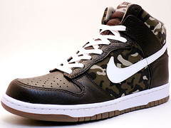
Boise would have looked badass sporting these kicks last night: link
Changing subject to basketball for a second, here’s the new UConn floor at the XL Center (Facebook link, so bear that in mind):
link
Crap, it borked the link. Little help?
Those Riddell cleats are “the coolest kicks in the cave”. Quoting “That ’70s Show”…..
Bosie State would look better with the horse on both sides of their dome.
[comment removed]
IP Blocked
What happened there? I’ve seen some pretty inflammatory stuff down here, so I assume that was a bot or something.
I mean in the past, not today obviously.
I hope this doesn’t get me banned for life here…but I actually thought there was a lot to like in the VT uniforms. Before you light the torches and break out the pitchforks, let me qualify by saying that black and orange are not VT’s color scheme and they should stick to their real colors. AND the circuit board pattern was completely ridiculous, AND I don’t know what the hell that stripe was on the helmet.
BUT…take all that stuff away and pretend the uniform was for Oregon State instead, I think that’s a pretty striking, and dare I say cool uniform. I love the orange shoulder stripes – it seems obvious but I’ve never seen that before. The black matte helmet has a great texture and makes the glossy logo really pop, and the number font would have been pretty cool if it was solid without the stupid pattern in it. The orange shoes tied everything together. Take the VT off the helmet, replace it with a Beaver logo or Bengal stripes, and you’ve got yourself a (good) uniform of the future. Just sayin…
It’s been a few hours so I’m surprised nobody mentioned that link about last night’s game, and it’s pretty good. Ricko is quoted.
My ESPN editor asked me to whip something up. So I did. But it was a busy afternoon on other fronts, so I forgot to mention it here on the site.
The Nationals are at it again. The “N” in Naya’s NOB is backwards. Anyone have a screenshot?
NickV | September 7, 2010 at 5:23 pm |
“Nothing more stupid or unimaginative than including the name of a team or nickname in print on the side of a helmet. Simply YUK. Go ahead and find a logo. If you can’t, put one or two or three intials of the team or school in a cool font that has some type of style.
If you want a team name — go ahead and put it on the FRONT of the jersey, in a font size that can be read FROM THE PHOTOS OR TV, not in some stupid small font that can only be read by your teammates in the huddle. NO, you can not put the team name on the back of the “sports bra” strap on the BACK of the jersey. NEVER!
AND BY NO MEANS, do not put ANY NAMES on the pants. Not up the leg, Not down the leg, not on the ASS, not on the shins.”
Amen on that last paragraph! Now the beginning of your post, that’s another story. I like a good name on a helmet sometimes. In fact, Phil recently whipped up a Patriots helmet tweak that I love:
link
If the Pats don’t go back to Pat the Patriot, they should go with this.
Speaking of red helmets, strange to see Washington as the lone representative in the entire NFC. Wonder if there has been any talk in Atlanta about reverting back to red helmets, heard the throwbacks were well received last season.
JV,
The Patriots prototype you have does not look bad, but to me I think that helmet logos should be icons that are tied to a team identity, and that multiple long words or names are too busy to be considered iconic.
For years a pretty historic franchise, the NY football Giants, could do no better than oput the word “GIANTS” on their helmet. What a cop out! And to think with all of the creative minds in the world, particularly NY, they could do no better. Thank heavens they went back to their pre-Meadowlands “NY” – which – Oh By The Way – is probably recognizable in countries without television as that of the NYG’s!
Logos and Initials, and combinations incorporating parts of of the two – that is what I believe is best. Is there any better team logo combination than the Atlanta Flames “A” with the flame incorporated into the “A”? Is their anything more to the point than the Saints’ fleur de lis, or the Falcons’ logo, or the Jets’ logo, or almost all of the others in the NFL?
Teams can do better, and should.
ONE CAVEAT! Helmet logos and icons should always be used, except that horrible 1980’s trend of hundreds of teams adopting the Clemson Tiger Paw logo for use for any team with ANY related mascot. Tigers, Lions, Wildcats, Wumpus Cats, on and on and on and on. Particularly in the South where I am. It is too much, too boring, and should be limited to the Clemson Tigers – where it looks pretty darn good, and then only the first 100 teams that stole it from them.
The other 2500 teams that stole the logo and used it on everything from helmet stickers to stationary to women’s hair bows should be banned from using it and made to wear Penn State/Cleveland Browns logo-less helmets until they can get an imagination and copy something only 1000 other teams have copied.
How is a lowercase “ny” any better or more creative than a capital “GIANTS”?
If anything, at least the capital letters made sense. How can you be “giant” with lowercase letters?
Guess it’s just one of those Oxymorons of sports, like the WHITE Sox utilizing BLACK Socks.
Yet another minor tweak to a cfb uni: Houston’s team captains are wearing a “C” patch this season.
link
The Buffalo Sabres new road jersey and alternate jersey, honoring the 40th Anniversary of the franchise have been leaked on Icethetics.
link
As a life long Sabres fan I am happy to say that the “slug” has finally been salted!
What are your guys opinions of the new third jersey?
this is the wordmark?
really?
can i get a “FAIL” from the congregation?
It’s honoring the Buffalo Bisons, the old AHL team pre-dating the Sabres from 1910-1970. The old Bison’s logo was a bottle cap logo with “Buffalo” written across in a classic script. Their owners, The Pastor Brothers, also owned the Pepsi Bottling Plant in Buffalo. Which is why it’s very similar to the Pepsi logo. The history of the team and logo can be read here: link
Which is funny, because link is the Sabres’ official soft drink, as of 2009-10 at least.
Unless they have a new beverage contract, it’ll be a pretty ironic tribute.
it’s still a fail…just because it’s honoring (and not very well) a past logo doesn’t mean it’s any good
the standalone (as in, not inside a depicted bottle cap logo), plus they ADDED a wavy line on the top, doesn’t work — wordmarks (with the exception of perhaps the iconic diagonal “R A N G E R S”) rarely look good on a jersey
is there anything wrong with simply having this as their
roadhome sweater?whatever, it’s gonna be worn what, 15 times a year?
/thank you for the historical perspective; but just because it’s a fauxback doesn’t mean it’s any good
My initial reaction is not positive.
Well, that wordmark a dozen or so times a year beats the hell out of the slug 70ish times a year.
OU Introduces Emergency Medical ID System. New ICEDOT to be unveiled in Sooner jerseys for Florida State game. link
Am I the only one that caught this, or did I misunderstand. Earlier today on ESPN their NFL reporter Adam Schefter teased a story prior to commercial stating that the Redskins were (fatigued, tired of, P.O’d with) their bonus baby Albert Haynesworth and that after the commercial he would tell us why they BOTH may be wearing different uniforms in the future.
Of course, I got distracted from it and missed this.
Anybody with any details on this, or have I got it wrong?
link
I like the JRW logo. Love the small touch of putting it in his “pyramid of success.” I wonder how many people caught that.