By John Ekdahl
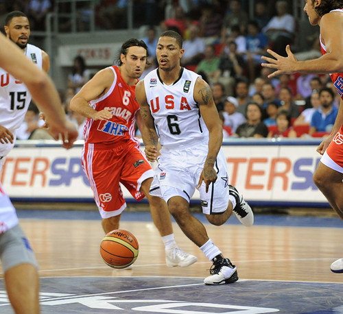
Team USA kicked off the 2010 FIBA World Championship with a comfortable 106-78 win over Croatia in their home whites. They’ll play their second game this morning in their away blues against Slovenia. The full schedule of the tournament is available here.
Update: USA 99 – Slovenia 77 (Final | Box)
Ek,
First link is bad. Was link what you wanted?
Thanks, JTH. Fixed.
The game is currently on ESPN2, by the way.
Perhaps beating Croatia is a poor indicator of a “strong start”. They almost lost the other night. Perhaps we Uni-Watchers should stick to watching the uniforms?
Tell it to the national media.
“It was an impressive start for a U.S. team that came to Turkey without any players who helped them win the gold medal in the 2008 Olympics. Instead of those superstars, the Americans are left with a young, undersized team that features Durant, the NBA’s leading scorer, as its centerpiece.”
– Associated Press
“Strong defense and potent perimeter offense lifted the U.S. to a comfortable victory and a promising start to their tournament. Croatia is a team that should advance to the medal rounds, and they were no match for the Americans.”
– NBA.com
There’s plenty more if you care enough to look around.
If they’d been held scoreless in the fourth quarter, the game would have gone into overtime and then anything could have happened.
In other words, David’s right. They almost lost.
Who would have thought that those fluky 28 points in the fourth would end up being the difference in the game? Then again, we’re just Uni-Watchers, which of course means we are incapable of understanding the complexities of the sports we watch. All those pretty colors are such a distraction.
Seeing as how the rest of the world is catching up to the US…when the “A” team is playing…this “B” team’s performance is nothing to sneeze about.
As for the unis, gotta say they don’t suck. They don’t make me want to get up and start singing the national anthem, but they’re nice.
They almost lost THE OTHER NIGHT…against Spain, I think.
Spain is currently ranked link in the world (not to mention they were our opponent in the gold medal game in China) and that game “the other night” was a scrimmage.
Silly me for not realizing that “Perhaps beating Croatia is a poor indicator of a ‘strong start’. They almost lost the other night.” meant the game against Spain nearly a week ago.
Needless to say, no douchepodiness on the USA unis.
I’m sure some…OK…one of you are eager for the college football 5&1 lists to begin. Well, as this Division II fan will remind you, the season has begun. So, for this week, it’s an all D-II 5&1.
5. Bemidji State at Minot: link – B! E! A! V! E! R! S! Beavers! Beavers! Beavers!
4. Minnseota State-Moorehead at Missouri Southern link – Nice Dragons helmet, but Southern has the nicer jersey.
3. Washburn at Colorado Mines link – Ichabods (love that name) in white tackled blue monochrome and won.
2. Shepherd at Shippenburg link – Lotsa blue pants, but fantastic above the waist.
1. Wingate at West Georgia link – West Georgia’s wonderful stripes and colors atone for losing the game.
And the non-winner: Central Missouri at Southwest Baptist link – If that pic isn’t bad enough, wait until you see what Central looks like from the back: link
Looking at Bemidji State’s uniforms, I have the urge to call them the “JetBeavers.” But only for my own personal amusement, because I’m imagining beavers going around on jet packs.
I must note, the Bemidji campus is really pretty. Sits right on the late. Was the site of original Vikings’ training camp. Have some slides I took at training camp there in ’62 around somewhere.
They moved to Mankato for three reasons…
1. Mankato made them a helluvan offer
2. It was closer to the Twin Cities, which was better for everyone, especially the media. That meant increased TV coverage of camp.
3. It really just wasn’t hot enough in Bemidji to get players into NFL shape.
—Ricko
The school’s web site has a great picture of the campus (let the slideshow at the top run for a few seconds and you’ll see it). Also, below that you can read about their neat homecoming tradition of jumping in the lake after a victory:
link
Or “BeaverJets”. Although I’m pretty sure those are part of a Jacuzzi.
—Ricko
How’s the new hockey arena coming along in Bemidji
Go, Dragons!
Daughter when to school at Moorhead State.
Have a fitted black baseball cap with the dragon in white and the fire, of course, in red.
Great-looking logo, great-looking hat.
link
—Ricko
Had no idea there were TWO More(moor)head States out there. link
One’s named after a guy (Phil Simms’ alma mater), the other after a town.
Moorhead, MN, was, not surprisingly, the moor head (like a trail head) for Fargo on the Red River.
Now, though, it’s Minnesota State Moorhead…but was “Moorhead State” for decades and decades.
—Ricko
Central Missouri and SW Baptist. The Mules and The Bearcats. Warrensburg MO and Boliver MO. It’s hard enough getting people to go to that game, and then to trot that garbahje out on the gridiron, yukola.
why no uni content today?
Well, there’s that thing one post above yours…
silly me, i was looking in today’s main post!
It was a stealth list. I decided on doing one at the last minute.
watching the yanks/pale hose and pondering…what was the last uniform adjustment made by the yanks (not including the variations of the interlocking ny)?
could it be the white outline on the team name and numbers on the road jersey? and possibly also the stripes on the roadie? seems like in the 60’s it was just a grey jersey with no stripes and plain blue numbers.
this season they changed the MLB logo on their caps and jerseys…it’s blue, white and silver now…it used to be blue, white, and red.
that’s the LAST uni adjustment they have made.
was that an adjustment made by the yankees or mlb?
and what i’m really after is a change made to colors, striping, details, etc. that are specific to the yankees…excluding mlb or majestic or equipment logos.
That would be it. With the coming of double knit, pretty much.
—Ricko
Yanks added white backdrop and blue-white-blue sleeve striping on road unis the start of the 1973 season… for 38 seasons an unnecessary addition.. imo… there was nothing wrong with the plain navy on grey..
Meh. Navy blue on gray doubleknit looks awful (Red Sox road unis). Until Majestic comes out with a faux flannel for the road unis, I say keep the white on them.
I just don’t like un-outlined numbers on grays. Whites, fine. Grays, it just looks weird. Yeah, yeah, tradition. But JTH is right about it looking weird on doubleknit. Obviously it looked amazing on flannels.
How many teams wear un-outlined numbers on grays? All I can think of are the Dodgers, Rays and Red Sox. Just doesn’t look right… kinda unfinished.
The Rays? link.
Ah, right. I was picturing the NOB in my head and transferring that to the number too. Yeah, so just Dodgers and Red Sox.
Un-outlined NOBs are okay. I like the contrast between an un-outlined NOB and an outlined number.
i wonder how controversial it was to add the outlining…i can’t imagine the yanks changing anything to their standard uni (with the exception of the memorial patches/bands) today.
Pretty much was no big deal. Just about everyone was “updating” one way or another with the advent of doubleknit.
I don’t recall reading anything about it one way or the other.
—Ricko
Last night’s Giants/Ravens game… Steve Smith had some major pant-striping issues.. looked as if the thin red-blue-red striping was stretched VERY wide. seemed like a very isolated incident as the rest of the team had normal thin striping.
Is he one of the few players (esp. wideouts) who actually still wear thigh pads, perhaps?
—Ricko
Here’s a site to buy solid color baseball stirrups…
link
—Ricko
For those keeping score at home: Ivan Nova’s jersey still bears the navy/red MLB logo present on Yankee jerseys from last season.
link
I guess the Yankees still have blank jerseys from last year that they are trying to use up.
Let’s see, big day for the White Sox…first they retire Frank Thomas’ number,
link
well, at least until someone comes along and asks to un-retire it…
then they get Manny Ramirez.
link
Also, the Jays honored Dave Steib’s 20th anniversary of his no-hitter by joining him in those great powder throwbacks:
link
Anyone else hate the black NOB on USA’s blue unis?
Yes.