By John Ekdahl
A couple other oddities from this week:
• Robinson Cano’s pink (some say sunburned, but I’m not buying it) logo made another appearance on Thursday.
• The Rams wore their white pants Sunday.
Tired of seeing annoying ads (like this one!) on Uni Watch? There’s a simple solution: Join Uni Watch Plus. You’ll get an ad-free site experience, plus exclusive access to our UW+ discussion forums, push notifications whenever a new blog post has been published, a special UW+ badge accompanying all your comments on the blog, and a 20% discount on our Teespring merchandise.
Already a member? Sign in here.
By John Ekdahl
A couple other oddities from this week:
• Robinson Cano’s pink (some say sunburned, but I’m not buying it) logo made another appearance on Thursday.
• The Rams wore their white pants Sunday.
With the current color scheme, I like the white pants on the Rams.
But I’d much rather prefer this:
link
much rather prefer?
The coffee’s just kicking in…
Rams are “harking back” to this look.
1957, afer the advent of white road jerseys forced them to abandon the athletic gold and go with navy homes.
link
—Ricko
link
HAPPY BIRTHDAY RICKO!
enjoy
You are SO on my list now, Hecken.
(Man, you send a guy an off-the-record “hair boy” shot of yourself…)
—Ricko
c’mon now ricko…you looked GOOD man…i WISH i could have ever sported a coif like that
unfortunately (or fortunately, because none seem to exist in cyberspace) my “younger” hairstyle was a mullet
then i had that bald phase…
and you still have all your hair!
*apologizes for what he thought was a great photo*
just giving you grief. :)
ha! good one phil. happy birthday ricko, enjoy the beautiful day.
Aw, NOW I know where I’ve seen Ricko before!
link
;)
Happy Birthday, Ricko!
Happy Birthday, Ricko!
Aberdeen Ironbirds minor league team wears gray caps on the road:
link
Don’t particularly like the look, though, because the logo sort of disappears against the gray backdrop.
Is that a smile I see on that logo? Didn’t think that was allowed in sports anymore. I like.
But yeah, good point about the logo blending into the hat. The outline helps, but maybe they could have went with a sky blue hat. That appears to be an accent color, right?
I think when the team originally began play in 2002, the road cap (or alt cap?) was sky blue, while the home cap was black. Incidentally, the team’s uniforms, which are manufactured by Under Armour, are pretty awful. The home whites have some sort of horn-like stripes near the shoulders, while the road blacks have even more weird stripes and patterns around the shoulders.
I like this better…
link
—Ricko
I like that, too. Of course, today a team would never pick a hunted bird as a mascot. Or is there such a thing as an angry predator pheasant?
I posted this before in a thread a week ago but I think it got lost in all the other discussion.
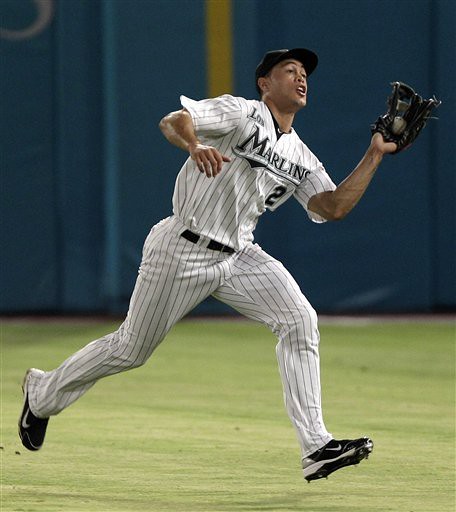
I think the MLB logos on Yankee uniforms appear pink because of the light (either sunlight or the stadium lighting at night) hitting it at a different angle.
Marcus Thames was shown to have a pink logo when this was talked about last week but I saw a highlight video on mlb.com that showed his jersey depicting the normal blue and grey MLB logo. It did “turn pink” once he partially stepped out onto the dugout steps, where the light was shining on his uniform at an angle.
Side-by-side comparison:
link
Happy Birthday Ricko. Today’s entry has to be the briefest in the history of Uniwatch.
Didn’t Bryan do some similarly terse ones back in the day?
And Happy Birthday, Ricko. I think the Pirates and Mets are doing Negro League unis tonight in your honor.
when paul did weekends (way back when) it was usually just a photo and a cap…vinny did a bit longer, and bry had some longer ones still, including my still all-time favorite non-paul entry
we still reference that years later
Classic.
Those entries used to really upset some people, and I really enjoyed it.
I wonder if the pink jerseys are lucky? When did the yankees last wear the pink jerseys and how did Cano do that day?
The A’s are going to be wearing Atléticos jerseys for the first time ever on Sunday as part of their Fiesta Day promotion. However, from what I’ve seen, it looks like the logo is done poorly, with the o looking more like an a. link
Also, the A’s batboy who snagged a date with a girl by giving her four foul balls has the old A’s helmet decal. link
In the words of Frank Barone, “Holy Crap!”
Somebody actually got somewhere using the line, “Wanna ball?”
–Ricko
Time to link to this headline again:
link
What irks me about the Rams’ uni is the extra Ram head they stick on the sleeves. That seems redundant given that the sleeve loops should represent ram horns – at least they used to.
I heard that to honor the USA while dining in Ixtapa with the Most Interesting Man in the World, el Presidente de Mexico ordered a “Two Equis”.
—Ricko
Yes, Giancarlo, one of my pet peeves: logos on the jersey. The redundancy, as far as I’m concerned, is as egregious as the nike swoosh pasted all over the place. Yeah, we get it: You’re the Rams. But lots of other teams are guilty, too.
If it’s a well designed uniform, the helmet–the brand, as it were– should be the centerpiece and be complemented by the jersey, pants and socks. There’s only one major pro football league and only one team in each city (well, except NY). There’s no one to compete with. So why is there the need to desperately promote yourself by sullying the uniform?
While I’m not thrilled with either, two reasons come to mind:
1) With the demise of sleeves, a logo in the arm area works better than stripes.
2) Now that jerseys are off-field fashion statements for so many people, the wordmark on the chest lets people who might not recognize what team the jersey belongs to know who the wearer roots for. It seems to be mandatory to add such a wordmark when a uni changes, and the Steelers seem to have decided to use their logo instead of a wordmark.
great point jerry, and while im not arguing with you, if the wearer truly wanted others to know their rooting interests, couldn’t they just wear, ya know, a t-shirt that says “RAMS” or something?
seems to me, especially authentics, which aint cheap, are more status symbols than “i root for my team” statements — “i’ve got an extry $275 burning a hole in my pocket, so i may as well let the world know i do”
this does not, of course, apply to anyone wearing any kind of jersey to a game…im talking about strictly wearing one of these jerseys in the fashion sense
/course, not too long ago i met a guy who, all he wore, it seemed, were NFL authentics and replicas — told me he thrifted them for like $5-$10 per…so in his case, good on him, i guess
to make an actual point — perhaps if all teams made a jersey that was recognizable as one of that particular team WITHOUT needing a wordmark…well, they wouldn’t need that wordmark
doesn’t need to be a crazy jersey either — i can spot a NYG jersey from 100 feet away, and there’s NOTHING on that jersey except numerals…one would think a rams jersey would be recognizable to anyone who even heard of the rams without needing to actually put “rams” on the front, right?
You’re right, of course, Burghfan, I suppose. No sleeves. Fashion wear.
I guess I grew up in a time when the only people wearing merchandise were kids like…well, us, uniform geeks. I proudly wore my Bengals replica to school. Only my friends would know, or care, what team I was representing. And there was no logo or wordmark on the jersey and it looked clean and complete.
link
But, alas, grandpa needs his nap now, so…..
Burghfan,
You do make a great point in #2. Something I hadn’t given a full thought to until now. However in #1, I disagree. I cannot stand those logos on the sleeves. I think if it is the exact same as the helmet logo it is superfluous. Four logos shoulder and above of the same thing on a player is too much. As for the Rams and some others, they are either too detailed or too tiny to actually get a good read as to what it really is. A good striping/color blocking would be a much stronger design.
Another area I don’t like is the tiny wordmark above the front numbers. Many colleges have gotten away from a good large name across the chest. That read A LOT better than the stylized wordmark you now find on the NFL team jerseys. Too small. Make it bigger and more readabel or it just becomes more jersey litter.
We’re all on the same page here. I have to ask, though, if you weren’t in Cincinnati, were you/would you have been bothered by people confusing your jersey with the Browns? (We’ll ignore the even more clueless people who would assume it was some other non-Ohio team, despite the color scheme.)
isn’t the bengals jersey black, and the browns jersey is … um … brown?
Yeah, team logos on jerseys, corporate logo creep, and putting patches everywhere on unis are all practices that derive from the same mentality… “look at all these things on my uni – can’t you see I’m the real deal, I’m certified authentic…”
Multiple patches are impressive if you’re a Cub Scout. For a pro athlete, they aren’t really.
Helmet graphics such as those of the Rams, Eagles, Colts were around a long, long time (a solid 15 years or more) before the NFL began officially using full helmets as defacto logos.
Therefore, in terms of the longstanding style of NFL uni designs, there often remains a legitimate distinction between a helmet graphic and the actual team logo.
The Vikings, for example: Horns on helmet, actual Viking head logo on sleeves, even back in Randy Moss days.
Total redundancy would be, say, the Falcons, where a couple different uni designs have had the logo on the helmet and the logo on the sleeves be identical. Or the recent 49ers, when they wandered away from the “Montana” look. Or when the Packers did it with the “G” for a few seasons.
Just sayin’, from a historical (and specific) standpoint what the Rams have chosen to do isn’t really a severe design misstep.
—Ricko
Wow, way to mail it in.
and this was necessary because…
…because this is Mike Haas.
link
Hass
One of my favorite posts.
Technically speaking the Marlins in Spanish should read: Las Agujas….
Oakland Atléticos: Awesome.
Los Marlins: Fail.
Really, the question should be how Mexican League teams display their names, and from what I can find, the answer isn’t good news for lazy “los”-adding American sports execs:
link
link
link
link
link
link
link
link
I see my favorite uniform company, Russell, has trotted out more crappy Little League World Series uniforms. The blame could go to the little league organization themselves. New to me is the LLWS patch, on helmets, caps, and jerseys. As usual, the patch is way too busyto be able to figure out what it says exactly. What a adult-run racket. Kid just hit a home run off the handle of the bat.
Happy birthday, Ricko!
Happy Birthday, Mr. Pearson, & continued props to Messrs. Hecken & Ekdahl for keeping the store open & the shelves stocked this month. By this time last year, I was in the throes of quite the UW-withdrawal (apparently, you print up three or four fliers filled with detailed critiques of the color schemes employed by the local youth soccer league, & they don’t let you back into the park any more — who knew?)
Hope its a grand weekend for the three of you, & for all other uni watchers out there!
Yep. Happy dyslexic 46th birthday Mr. Pearson.
link
I love it! I’ll say I’m 46 and if someone accuses me of lying, I can just say, “Well, I AM dyslexic, so…”
—Ricko
negro league throwbacks in pitty tonight…
mets again wearing their cubans outfit — but this is very interesting — when they played the “bears” (milwaukee), in cream city, they wore this outfit
tonight, they have a different cubans kit — it says “NEW YORK” (only) in RAL across the front
pirates look great as the craws, not all mets in socks some….(chris carter at least, haven’t seen the whole team) wearing pajamas
mets have “CUBANS” written vertically on their left sleeve
Wow, when someday they meet in interleague play, the Cubans should play the Tampa Smokers.
link
—Ricko
Miami FC is supposedly wearing Ft. Lauderdale Striker throwbacks tonight, but they’re really just crap t-shirts with the worst representation of the Strikers’ old bumblebee kits that I’ve ever seen.
And Rochester didn’t exactly go all out, either.
mets caps are different from the previous throwback too — this time they’re a black crown/red brim with an interlocking NY (very much like the giants)
mets appear to be wearing the 1944 roadies
pirates appear to be in the 1935 craws
This hat?
link
A better look (looks black in this one, maybe navy in the previous one)…
link
yeah, that’s it, but the NY is thicker than in the repro
this is pretty much the uni
and the cap looks like this only in black
here ya go, birthday boy
buccos
metsies
dang it! just got home and was going to post the ricko kid drawing football template i had made, but i can not seem to find it. sorry rick, hope you are having a good day.
more NY vs PITT observations — giants playing the stillers
giants jerseys look like absolute SHIT…this new rbk cut is just awful…even on a solid blue jersey…
also, stillers and giants are the only two teams in the NFL who wear front helmet numbers — but the stillers don’t have them during the preseason…
That to help rookies know if they’re coming or going?
i know you’re joking, but i believe it’s one of those things where you “gotta earn your numbers” or some such
Yep.
I’m guessing the numbers on that first NFL game check look pretty good to them, too.
—Ricko
N-NOB Cowboy rookie:
link
Wanna look like one of the refs in the UEFA Champions League? link.