As you’ve probably noticed via the ad just to the left of this text, our friends at Grey Flannel Auctions are running their annual Basketball Hall of Fame induction auction. I always look forward to this sale because, as I’ve been pointing out lately, basketball is by far the worst-documented of the major team sports, so any large grouping of NBA historical artifacts or photos is likely to have more surprises and revelations than a comparable batch of, say, MLB or NFL material. That’s certainly the case with this latest Grey Flannel sale, which is loaded with interesting items. Let’s take a look:
• Not sure what I like best about this jersey: the number font or the team name “Peoria Caterpillars.” Here’s the full auction listing.
• How sweet would it be to own this old Spirits of St. Louis jersey? (Full listing.)
• Coupla unusual things about the NOB on this mid-’70s Pacers jersey: It’s straight, and it’s on a nameplate (full listing).
• If only we could still have logos like the old Dallas Chaparrals mascot. One of my all-time faves (full listing).
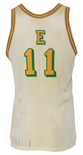
• Look at the crazy lettering the Eastern Conference used for the 1977 All-Star Game. Interesting patch on the shorts, too (full listing).
• Love the heavily block-shadowed typography on this late-’40s Warriors jersey (full listing).
• Here’s another Warriors jersey, this time from the late 1950s, with a really fascinating design. Never seen that horizontal stripe before, and the gold outlining on the type is an interesting touch (full listing).
• There’s something endearingly simple about the NBA patch on this 1960s referee’s jersey. Interesting white border on the hem too, although that would’ve been tucked in, natch (full listing).
• Here’s the greatest hoops jersey ever, in all its chain-stitched glory. Holy moly, look at that texture! (Full listing.)
• Speaking of texture, this old Syracuse Nats jersey is begging to be touched (full listing, including one of history’s most awkward-looking hoops photos).
• I’m not too proud to admit that I have exactly zero memory of the Nuggets wearing this design in 1976-77. Nameplated NOB, too (full listing).
• It doesn’t get much cooler than Elvin Hayes and his one-letter nickNOB (full listing).
• Gee, ya think the Pistons’ late-’60s uni numbers were big enough? (Full listing.)
• Hey, who knew the Hawks used that Pirates-style font back in the mid-1960s? Not me (full listing).
• We all know how awful the Raptors’ early uniforms were. But I’d forgotten about their ridiculous NOB style (full listing).
• Man, nothing says 1970s like this Sixers font (full listing).
Want to see more from this auction? Look here.
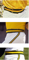
A stiff belt: Yesterday’s ESPN column prompted a note from A’s equipment manager Steve Vucinich, who told me something I didn’t know about the team’s 1970s pants. Those look beltless, right? But Steve says no: “We, and a few other teams, continued to wear belts. The belt would slide into the striped waistband, which by the way was NOT elastic — just looked like it might be. The waistband would completely cover the belt. I believe we didn’t go beltless until Wilson began making our unis in ’82. I will have to confirm this by checking my special historic closet when we return from this road trip.”

Looking back, I feel like I’ve heard this before — not about the A’s per se, but about seemingly beltless pants actually having hidden belts. In any case, the pants certainly lacked visible belts, so it’s sort of the same thing, at least from a visual standpoint. Plenty interesting nonetheless.
Collector’s Corner, by Brinke Guthrie
Lot of great finds as we wind up the month here at Collector’s Corner. Let’s take a look:
• Ouch, $400 for a 1961 Detroit Tigers bobble. Cute little guy, though.
• Staying with the same period, here’s a 1960 “Washington DC Souvenir Baseball Catcher” — with blinking Vari-Vue eyes!
• Here’s a great-looking 1950s Montreal Canadiens “antique felt” patch.
• Huge set of 1984 MLB “Fun Food Buttons,” right here.
• Maybe it’s just me, but that doesn’t look like a dolphin on this Dolphins pennant. [It’s a dolphin fish, rather than the mammal. — PL]
• Here’s a really nice 1960s Buffalo Bills bank.
• The Indians were doormats during the 1970s, so why not a set of 1970s Indians placemats?
• And for PL, ’til we meet again, here’s a 1965 Ed Kranepool heat transfer and — wait for it — a purple Mets jersey.
If Paul wasn’t already planning to take a vacation from the blog next month, that last item would probably have sent him in that direction. I’ll have one Collector’s Corner column per week while he’s gone, instead of the usual two.
Seen something on eBay that you think would make good Collector’s Corner fodder? Send your submissions here.
Uni Watch News Ticker: Sensational piece about UGA football helmet history was posted yesterday, including the surprising tidbit that the Bulldogs almost went with a white helmet back in the 1960s. ”¦ We all know that the three NYC baseball teams wore trylon/perisphere sleeve patches to promote the 1939 World’s Fair. Here’s a photo of that patch being unveiled, and here’s that same photo as part of a small news item. But the best use ever of that symbol would have to be here. All those photos were sent to me yesterday by Bruce Menard, who also sent along this shot of Joe D. and the Iron Horse at a baseball clinic. Love those “lefty” and “righty” shirts! ”¦ New college hockey jerseys on tap for Bowling Green (with thanks to Tom Konecny). ”¦ Reprinted from yesterday’s comments: The Ravens’ practice jerseys now have a National Guard sponsorship patch. ”¦ Hey, Steve Vucinich: One of your players is missing the dot on his “i”. ”¦ New jerseys for the Syracuse Crunch of the AHL, who are the Anaheim Ducks’ top affiliate. It’s hard to see, but that’s a “D” logo patch on the shoulder, which may give credence to the rumors that the Ducks will be switching from their jersey wordmark to a web-foot “D” crest (with thanks to John Muir). ”¦ While looking for something else, I found this great shot of Sal Bando. ”¦ The MLB schedule used to start on a Monday. And then they added the Sunday-night opener. And now next year’s schedule will begin on a Friday. ”¦ Chelsea’s third jersey has been leaked (with thanks to James Court). ”¦ Last item on this page indicates that the Steelers will be adding advertising patches to their practice jerseys (with thanks to Chris Hilf. ”¦ There was a glitch on the Broncos’ web site yesterday, as the team wordmark and background image were cross-pollinated with the Texans (Jhan Ganyen got the screen shot). ”¦ Cort McMurray‘s son is a big Manchester City fan, so they recently drove from Houston to Atlanta to see Man City play Club America. “Lots of interesting uni-related stuff,” says Cort. “First, striker Craig Bellamy does the Big Klu thing with his training shirt, the better to show off his extensive tattoos. Second, the Georgia Dome (a lovely stadium that the Atlanta Falcons are inexplicably trying to have replaced by a new venue) features a display of every high school football helmet in the state. What’s most remarkable is that there is so little imagination on display: lots and lots and lots of college and pro knock-offs. Finally, City’s practice togs look rather sharp, including the maroon and gray ensembles worn by the coaching staff.” ”¦ Dan Cichalski reports that the Trenton Thunder — the Yanks’ double-A affiliate — are wearing the Steinbrenner memorial patch. I haven’t been able to find recent photos of other Yankees farm teams — anyone know if they’re all wearing the patch? ”¦ Latest evidence of the baseball cap’s worldwide ubiquity: Eric Trager is in Egypt and spotted a rack of baseball caps for sale at a stall in Cairo. A closer look reveals lots of interesting knock-off designs. “The best part,” says Eric, “no Yankees caps in sight.”
FWHA! Update: New material over here. If you hear Wayne, y’know, being Wayne, feel free to let me know the details.
There is danger in the summer moon above: As most of you know by now, I’ll be taking the next month off from the site. Phil will handle weekdays, webmaster John Ekdahl will take care of the weekends, and you’ll all live happily ever after (or until September 1st, when I’ll reclaim the manager’s office from Phil). Although I’m taking a break from the site, I’ll still have at least two ESPN columns during August, and Phil will let you know when they’re up.
Speaking of ESPN, my annual college football season-preview column will be running on September 1st or 2nd. So if you spot new college gridiron uniforms being unveiled over the next few weeks, please let me know at this address. Thanks.
Try not to overwhelm Phil with too many Ticker submissions. Also, wish him luck in this weekend’s Clothesline Art Sale, where he’ll have several photographs for sale. Knock ’em dead on Saturday, buddy, and thanks a million for keeping the shop open in August — you’re the best.
If the Peoria Caterpillars existed today, I’m sure the jersey would have the corporate logo and lettering to better promote the company.
Note on the Peoria Caterpillar jersey – if you look at it, the “Caterpillar” on the front is singular, so it probably is from a “Caterpillar” company team. Whether it’s the tractor company or not, I don’t know.
Considering that the headquarters for Caterpillar, Inc. are in Peoria, I’d say it’s likely the same company.
From the link:
…or an angry snarling version of this:
link
…with a basketball behind it.
Okay, anyone besides me old enough to remember who “Mr. Mind” was, and inform the others?
Vilk maybe knows what/who I’m talking about.
SHAZAM!!!
(No, not Gomer Pyle, USMC nor back home in Mayberry, neither)
—Ricko
First thing I thought of was Mr Mind…
link
Took two years in the 1940s for Captain Marvel to learn Mister Mind was a worm.
Two years of nothing by an evil mastermind whose voice was heard over the radio.
People who didn’t live through that era have no idea how big comics, comic strips and radio were as mass media entertainment prior to TV…and how long stories could be sustained. Very much like baseball that way. Baseball could fill your entire summer…and then some.
—Ricko
You’re right, I remember Mr. Mind!
link
He wasn’t in any of the comics I had, but I was familiar with him. I was more familiar with another arch-foe, Black Adam: link
Proof that BFBS can be downright evil sometimes…
Captain Marvel had one great uni, but I think I’d give out an even bigger “I’d wear that” to Captain Marvel Jr.:
link
What do you think, who had the cooler uni:
DC’s Captain Marvel, or Marvel’s Captain Marvel?
link
Here’s an earlier look:
link
Kurt Schaffenberger, my favorite Captain Marvel artist, even moreso that C.C. Beck, the original. As a kid, loved Captain Marvel, Jr. and his outfit, even though it was pretty close Superman’s.
link
Of course, I read Captain Marvel when it a Fawcett publication, while DC’s lawsuit against Fawcett was ongoing….so it’s no contest: The original red and yellow duds (maybe that why I always was kinda partial to the Texans/Chiefs unis?
btw, to become Captain Marvel, Jr., crippled newsboy Freddie Freeman did NOT shout, “Shazam!” the way Billy Batson did. He shouted, “Captain Marvel!” on accounta that was his he-ro.
—Ricko
Even though DC got the rights to Captain Marvel in 1972, they created their own knockoff version in 1974 with Captain Thunder:
link
I have that issue, by the way.
Apparently they felt Cap was too “whimsical” to be matched up against Superman at first. Later they changed their minds at brought them together.
Forgot about Freddie having to shout part of his own alter-ego’s name. That was just weird. I’m sure the villians tried to use that to their advantage. “Before you apprehend me, I have to ask you – what is your name again?” :)
Yep. And he’d revert back to being a regular teenager when he was in his magical form. So he could never introduce himself because as soon as the first two words of his name came out of his mouth, he’d reveal his secret identity.
80 bizillion superheroes in comics and DC sues Fawcett saying Captain Marvel was a “steal”.
Well, natch, for a time titles with the Big Red Cheese were widely outselling Superman, Action, World’s Finest, etc.
And, yeah, Cap definitely was downright whimsical. Think it was Jim Steranko who called him, “the “Archie Andrews of superheroes.”
—Ricko
Re belts in beltless pants: I remember a Baseball Bunch episode from the early 80s where Ozzie Smith showed how he wore his pants. I don’t know if it was a true belt, but he definitely had something that connected ‘behind’ the waistband. The snaps, if anyone recalls on that era’s Cardinals pants were then offcenter on the waistband. If I could somehow find that clip on YouTube, I might have my first Ticker submission!
Paul, enjoy your month away!
I spoke with the GM of the Charleston Riverdogs, who are a single-A affiliate of the Yankees, and he told me they would be wearing patches for Steinbrenner just like the big league club. This was a day or so after he passed, and he said the patches would be in the following week. I’ve been looking for pics on the Riverdogs website, but haven’t found anything conclusive yet. Of course the photography for a Class A team is not the best, but I’ll be on the lookout.
Re those ballcaps in the Cairo souk (and it’s fascinating to wonder what it means to an Egyptian to wear a “St. Louis” ballcap), when I moved to Holland in early 2003, I was shocked by how ubiquitous Yankees caps were among younger Dutch men. I discovered quickly that I could at once blend in with the Dutch and not be taken for an American on sight simply by wearing a navy ballcap, and that if I made it a Red Sox cap instead of a Yankees cap, other American expats but not Dutch natives would instantly recognize me as an American.
But perhaps the oddest thing was that this was just before and during the invasion of Iraq. On weekends, you could go to the Museumplein and see 100,000 young Nederlanders staging “peace protests” outside the American consulate by wrecking property, burning cars, and trampling people, all while wearing then-fashionable camouflage pants and Yankees caps. It was like mental whiplash.
It’s funny you should mention that distinction regarding Yankee and Red Sox caps overseas….on a somewhat different, but related note…
I live in an area of North Carolina, where a very big percentage of the population is like myself, from up north. Since the state only requires license plates displayed in the back, most people use a decorative team plate in the from of the vehicle.
The three most popular are Yankees, Red Sox & Mets. But I have discovered is that most of the “Yankee Cars” are locals and not really fans, they just use the plate as a fashion statement. Red Sox and Met plates are fans…. so much like they did in Europe, you can tell if some is foreigner from the team logo they are displaying!!!!
Although it isnt 100%….I proudly have Yankee plates on all my cars!!
Also for some reason that I have yet to figure out, there are a lot of Steeler fans down here, I would dare say maybe even more Steeler than Panther fans…and I mean locals not just people that moved down here from Western PA. Not sure what the connection is….anyone?
I don’t know about the Steelers, but for some reason Eastern North Carolina is populated with a lot of natives who are Yankees fans.
I told Paul about the A’s waistband a year ago. The first A’s and Red Sox knit unis were made by Stall and Dean of Brockton, MA and sold by Tim McAuliffe Sports of Boston.
And the ’50s and ’70s Sixers jerseys were made by the former Coane Athletic of Phila and sold by Pearson’s. Most of the well-known big-city dealers (McAuliffe, Pearson’s, Gerry Cosby of NYC, Gunzo’s of Chicago, Olympia Sports of Detroit, et al) had their garments privately labeled by manufacturers such as Stall and Dean, Coane, General Athletic, Powers and Russell.
As to the big 10″ numbers on the Pistons jersey the New York Knicks used 8″ front numbers and 10″ back numbers and the Boston Celtics had 10″ back numbers in the 1950s. Today, because of NOB some NBA clubs use only 6″ or 7″ back numbers. Progress, I guess.
When you say they were privately labeled by manufacturers, do you mean link?
No, I mean the inside tags by the year, set and size tags. On that Gunzo’s Blackhawks sweater that looks like their number font. Gunzo’s number 1 has the flat top serif to it. Cosby also lettered the Rangers, Knicks, Jets and Giants for years. Cosby’s regular full-block numbers are very distinctive. All of his 2s have the diagonal center bar.
Ah, so more link, then.
(Both of those reference pics come from link of game-used Hawks sweaters.)
Hey JTH. I get the feeling that you’re a Blackhawks fan. So here’s a ‘Hawks trivia question for you. Are you aware that Bobby Hull wore three different sweater numbers during his tenure in Chicago? He started out with Number 16, changed to Number 7, and then settled in on Number 9. My question is who was the last Blackhawks player to wear Number 9 before Bobby Hull?
The answer is Bronco Horvath who wore the number in 1961-62. Bronco is a legend with the Rochester Americans with whom he played for 10 years on four different occasions from 1956-57 through 1969-70. He’s the greatest Amerk center I ever saw.
I’ve known for quite some time that he started out wearing #16. But I only found out very recently that he briefly wore #7 as well (I think YOU posted that tidbit in the comments not too long ago).
Found an interesting little piece of information in Sports Illustrated’s vault from December 1969.
Apparently, in order to make the team more competitive, the expansion Vancouver Canucks looked to import a number of players to fill out their roster so that they could compete with the Canadiens, Blackhawks, and other NHL teams.
Punch Imlach decided to offer the Soviet Union $300,000 to rent their national team from Sept. 15, 1970 to Sept. 15, 1971 in order to ice an extremely competitive team rather than building a team from spare parts and free agents.
Vancouver Russkies, anyone?
Helps if I include the link, I suppose.
link
OR
link
WRT the purple Mets jersey: For a while the NYC subway was promoting taking the #7 Flushing train (the one John Rocker made famous) to Shea. The symbol on the maps for the #7 was a purple circle (local)/diamond (express).
On my trip to the Left Coast last winter, I took a tour of Qwest Field.
link is of the Washington State High School Football display. Much more creative display than the Georgia one shown above, but much of the same in helmet lameness.
The blank shell brown and blue helmets are there as fillers, they don’t represent any schools in the state.
And link is an instruction guide on how to wear your uni. And the Baseball version (from Safeco) is link.
Frustrating that even when schools have creative student- or community-designed athletics logos, football coaches typically opt not to use them, often in favor of pro or collegiate ripoffs. My own alma mater, Eden Prairie High School in Minnesota, has two perfectly serviceable non-ripoff athletic logos:
link
link
And yet as long as I can remember, the Eagles football helmet has either been plain black or used ripoff Seahawks or Philly Eagles logos.
You do know I live in Eden Prairie, right?
We don’t need UW, we’ll could just have a beer and find out we’re actually really of quite similar thought on this whole throwback debate. ;)
—Ricko
Oh, and EP wears red helmets now.
Has the EP logo on the sides. Been that way as long as Mike Grant (Bud’s kid) has been the coach, anyway. Black jerseys, black pants.
Or are we talking about hockey?
(I hate it when I come to class late).
—Ricko
So I assume you grew and moved far, far away.
Yea it’s a shame.. My high school was the Osbourn Park Yellow Jackets in Manassas, VA. I’ll give you two guesses of what our logo looked like…
OPHS:
link
?????:
link
You do know I live just down the Prince William County Parkway from Manassas, right? Damn, man, I was just in the Carver/Chaska/Chan area two weeks ago for a big family reunion. I’da looked you up if I’d realized you were right there! If you’re ever in Northern Virginia, mi casa es su casa, and I’ll buy you that beer at the time and place of your choice.
Thanks for updating me on the Eagles helmets. Glad to know they use the EP logo. I thought they’d stayed with plain red, no logo, when Grant came to town. I graduated the year before they hired Coach Grant, and the Eagles won a total of 4 games my entire time in high school. I go out east to college, and within a year Eden Prairie is in the state tournament.
Correction: “plain red,” not black. It’s been red helmets, black shirts for the EPHS Eagles as far as I can remember.
They may not have the EP logo, have only seen them on TV highlights, and refelction can appear to be a logo. I’ll check it out.
—Ricko
I stand corrected. No logo. Plain red.
Against the school’s my kids attended, too…
link
—Ricko
You will notice, no mention whatsoever of socks or stirrups or the like anywhere…
link
—Ricko
Also notice that the Nike logo on the undershirts this year violates MLB’s own rule on such things.
link
—Ricko
If there were mention of socks, that “undue commercialization” would go against the Phiten socks as well. As long as it’s “not overly sized, and tastefully placed as well”
link
You don’t have to mention it when there’s a picture of them right there!
I was referring to the socks/stirrups policy. The very fact that they are on the player indicates to me that they are part of the uniform.
Anyway, I think this is an old picture. And teams violate the undershirt policy all the time. Some of the Cardinals were wearing dark blue undershirts in the Met game this week.
And I was saying that it’s interesting that socks aren’t mentioned in the verbal description of what consitutes the official game uniform.
Wasn’t arguing for or against stirrups, just noting that the absence of any mention is evidence of MLB’s “de-emphasizing” of them.
—Rcko
I’m not sure what helmet Tebow is wearing with the Broncos (Revo Speed? Edge? Paging Dr. Powers…), but something about its shape and contours really works with the logo. Here are a couple pics:
link
link
The cyber horse seems to fill the available space perfectly, and the angular nature of the back of it serves to frame the whole thing. I’ve never been much of a fan of this helmet design, but on this new shell, I like it.
That’s the Revo Speed helmet, and I agree Tebow’s helmet looks absolutely fantastic with the Bronco’s decal.
As far as I know, the Riddell Edge is strictly a youth version of the Revo Speed.
Ah, I think you’re right.
Holy Moly is right! I had no idea that those The City jerseys were link (or if I did, I’d forgotten).
But I’ve got to say that I’m a bit disappointed the auction only consists of NBA/ABA stuff. I was expecting some college memorabilia. (Maybe a sport coat from the link?)
I had never heard that before. Was that only on the chenille jerseys?
Enjoy your August, Paul.
Meanwhile, that Sal Bando shot is just terrific. link What’s not to like?
Plain black shoes? Odd not seeing the signature white ones, but check. (Spring training game.)
Fantastic stirrups worn just right? Check.
Properly hitched pants? Check.
BoSox number font? Check.
True vest style? Check. (Looks like this is before Charlie added the apostrophe-s to the logo.
Yellow batting helmet? Check.
White coaches caps? Check.
I love it, I love it, I love it.
That 1960 Washington DC Souvenir Baseball Catcher BobbleHead looks like the Howdy Doody from Hell!
UGa., and the SEC in general, has some of the best football uniforms around. And I love the black jerseys at home with the red helmet and silver pants.
Geeman,
As a loyal Daawg alum (Class of 1993), I’m glad the school decided to make a game version of the black jersey. The “fashion” version was by far the biggest seller in the team store and most visible in the stands at Sanford Stadium.
I also am a member of a SEC message board and this AJC article has been the subject of spirited debate among the UGA fans. To synopsize our feelings about the UGA uniform history, we agree the black helmets from the Florida debacle last season should be buried forever (already done), most of us are fine with the black pants shown during the Outback Bowl against Wisconsin, red pants from the Herschel era are fine too.
The biggest complaint about the current uniform is that the iconic “silver britches” aren’t really silver. They look more gray due to the moisture wicking fabric.
We are all in agreement that we would like to see a “throwback” uni for Homecoming one year. The throwback would be a plain silver helmet (maybe modified with our current “G”), red jersey with plain white numbers (no colored outline around them), true silver britches, white socks, and black shoes.
I like that New York Giantish cap they sell in Egypt!
Those caps make me want to get a Slurpee from my local 7-978… or is it my local 7-1978?
…and I’d really like to know what “SLT” and JOZM” on the brim of the SF hat mean. Then again, maybe I don’t.
I was in Dick’s sporting goods yesterday, and they had a display of Yankee jerseys with NOB. Just for sh*ts and giggles, I asked the cashier if they had jerseys with NNOB and he says you have to go to the Yankee clubhouse store and pay more money for those.
Oy vey.
The thing that pisses me off the most about that is the NOB Yanks jerseys are still sold as “authentic”. I have 2 Yankees jerseys, a Randy Johnson one, which was a gift from my parents, so it’s NOB. The other one I have is a Jeter jersey from last year, that I bought. NNOB, New Stadium patch AND the World Series Patch.
I always say you call tell the real Yankees fans: They’re the ones wearing the special jerseys with Jeter’s name on the back.
I get that the replicas are a lot cheaper, and due to evil they come with NOB, but it’s like dude, with a $2 seam ripper and 20 minutes of your time, you could remove the NOB and nobody would ever know it had been there.
I’ve done that – looks like hell. The number sits way too low without the name.
Do people criticize Giants fans for buying replicas?
“Authentic team merchandise,” perhaps. But they’re selling them as replica jerseys, not authentics.
All link sell link with link. Not just the Yanks.
The only NOB Yankee attire you should ever wear are those cheap navy T-Shirts you can buy from the street guys on River Ave….they also come in pink for the girls….
link
Word.
Re: the Dolphins pennant in collector’s corner– yes, that’s definietely a dolphin fish, also know as mahi-mahi (or “wahoo”, ’round theses parts.
But I’ve got to wonder — what’s the story behind that? It is really bizarre… Was it made in the early period of name and logo development, and someone thought they would use the Dolphin fish rather than dolphin mammal?
I’d imagine if so it was done unlicensed… the aqua looks correct, but there is no orange…
Or is it a joke someone put together?
I’m surmising it was a cheap knockoff someone in Miami printed up for local sales soon after the team name (and perhaps colors) were announced, but prior to the logo and “official” merchandise coming out.
Any other ideas or thoughts?
To all NYY detractors – to the rest of unwashed & uninitiated of the world – all Americans are Yankees. . ..
Not to mention that stand in Cairo was probably sold out. Hence the phrase ” Yankees Souk!”
BEAT LA.
That is all.
Paul, those 1976-77 Nuggets unis are a holdover from the ABA – they wore the same unis their last 2 years in the league (after renaming from Rockets to Nuggets). They got a new set for the 1977-78 season (which lasted until the rainbow unis were introduced in ’82).
it’s also the same jersey that George Karl wore on the sideline for a game link
Looks like he’s not the only one wearing that jersey!
That’s my 2nd favorite Nuggets jersey, after the rainbow jersey. The one in between wasn’t too bad, either:
link
Note the jumping miner on the shorts.
Here’s a better shot:
link
Used to have that picture on my bedroom wall a long time ago.
Jumping minors’ll get you in trouble.
(see: Lawrence Taylor’s Adventures in Motel Land)
I always loved that Hawks uniform
link
Paul –
Enjoy your well deserved time away! Not that I ever want to see you go away for any amount of time, but you’ve planned this well. As soon as the warden releases us this afternoon, I’m Going to Disneyworld! Won’t be back myself until August 11, so at least I have a week and a half that I would probably have been away from the site anyway (no offense, Phil!).
You’re leaving the keys to this place in very capable hands. See you again very soon!
My favorite cap in the Egyptian stall is the “Dietz & Watson” cap (top left above NY cap). For those unfamiliar with the Giant Eagle grocery chain, D&W is a brand of (in their words) “Premium Meat Delicacies and Artisan Cheeses.”
“Chelsea’s third jersey has been leaked”
Awful shirt, awful club
Couldn’t agree more. That is the worst new shirt I’ve seen for this season.
I believe the uniform says “Caterpillar” as in Caterpillar equipment. Known as “Cat” bulldozers, etc. Maybe it was a company team jersey.
Am I the only one who actually read the auction listing?
“If only we could still have logos like the old Dallas Chaparrals mascot.”
Amen!
And Paul, next time you go on about BFBS (and rightfully so), just think of the PFPS Mets jersey and tell yourself that it could be worse.
no a’s hats in cairo?
Okay, Friday…
The All-Occupation Team (including nicknames; will be more fun),
Chris Carpenter.
Cecil Cooper.
Mike Farmer.
Doctor J.
Donald Driver.
Lawyer Tillman.
Okay…someday…take it. Your dice
—Ricko
Fair Hooker.
“Fair Hooker…. never met one.” – Don Meredith
two obscure browns players in one post (hooker & tillman). kudos!
“The Mailman” Karl Malone
lawyer milloy (sp?)
Mel Queen
Jeff King
Prince Fielder
Joker Phillips
Priest Holmes
John Outlaw
Bum Phillips
Leonard Pope
Joey Porter
Wny isn’t there a guy named Steve Adore when we need one?
Digger Phelps
Deacon Jones
Ronde and Tiki Barber
Sal ‘the Barber’ Magli ?
The Secretary of Defense, Dexter Manley?
London Fletcher
Ryan Miller
Judge Landis
you mean kenesaw mountain?
he was neither player nor was his nickname (it was his title however) “judge”
Okay, Judge Dickson, fullback, Minnesota’s ’60 an ’61 Rose Bowl teams.
Reggie White was the Minister of Defense.
Brian Cardinal, Marquez Pope, and Wally Pontiff (RIP).
Aaron Cook
Bill “Spaceman” Lee
Joe Thatcher
Jim Brewer
And because I almost became a lawyer:
Craig Counsel
My local single-A team, the Potomac Nationals, has both Randy Mower and Michael Taylor on the roster. Also in the minors somewhere is Lenny Dykstra’s son Cutter.
Curtis Painter.
Jade Butcher.
Dick Shiner (one who shines..something?)
dick trickle
if any part of “dick trickle” is an occupation, i want nothing to do with it.
Jerald Tinker
(phoenetically speaking…)
J.R. Ryder
Pie Traynor
Buddy Baker
Tris Speaker
“El Presidente” Dennis Martinez
Bob Usher (’50s outfielder)
Coach Morris Buttermaker
Joe Tinker
Hack (yes, that’s an occupation) Wilson
Buck Weaver
“Preacher” Roe
Dr. J
Jose Cardenal (posted this in the wrong place the first time)
Chipper Jones (okay, that’s a stretch, I admit it)
Billy Gardner.
Catfish Hunter (that’s counts a two. A hunter AND a catfish hunter)
Captain Lou Albano
Reggie Miller
Corey Brewer
Grayson “The Professor” Boucher
Red Barber
Harold Miner
Digger Phelps
Jeff Fisher
Those images from Grey Flannel Auctions remind me of why I loved pro basketball so much as a kid. Exquisite stuff. Yeah, the textures.
I must mention this uniform…
link
It holds a special place. Isn’t it weird? The whole Portland phenomenon of that time 76-77 was something surreal: Here comes Deadhead Bill Walton, the perpetually injured, surly mountain man, toiling in the outpost of little Portland, Oregon, now with his hair cropped short, running, sprinting down the court twirling his fingers high over his head, leaping, blocking shots, flipping hook shots, passing like nobody’s business, leading the sad little expansion team to a world championship over Dr. J’s Sixers. It was team basketball triumphing over showmanship. I was aghast and awed.
I was aghast and awed by that uniform. Where did it come from out of the blue like that, just like that amazing team. The vertical (!) wordmark, so small you could hardly read it, the too fussy side panel stripes…it was so weird. And so brief. Gone the next year. Unforgettable.
To be replaced by E, Chenier,Unselds’, Bobby Dandridges’ & wee kevin porter’s fantastic Bullets’ team. Resplendant in their ‘lifeguard’ unis. Good times for the NBA.
Re: the crazy dolphin on the pennant. I used to go to conventions at Disney World every year and always stayed at either the Disney Swan or Disney Dolphin hotel. When I went for about the 15th time, I brought my girlfriend. She looked up and said “Why does the Swan Hotel have a swan, but the Dolphin Hotel has a fish?” See link for the crazy “dolphin” on the top of the hotel. I had never noticed in all the times I had been there.
Jose Cardenal
David Justice
Willie Shoemaker
Dizzy & Paul Dean, Michael Dean Perry, Dean McAmmond, etc.
Don Drysdale, Don Meredith, Don Cherry, etc.
Elvin Hayes’ nickname NIKES…
link
Read an interesting thread on an Indiana message board about the blue uniforms IU wore in the late 50’s. Check the link below for full the story on how blue fits in with cream and crimson.
link
OMG, I had totally forgotten about the Dallas Chapparels mascot! I needed that laugh, thanks!
When the guy who would later be my business partner was involved with running the Dallas Chaparrals, one of the team’s draft choices was meeting in their offices. Team offered him 12-hundred dollar signing bonus.
He said no.
Eventually the offer got up to 15-hundred.
No deal.
So my friend was driving the kid back the airport.
“Why didn’t you take the offer?” he asked the kid. “Wasn’t 15-hundred enough?”
“I thought you guys’d offer me at least a thousand-dollar bonus.”
“Umm…15-hundred is one thousand, five hundred dollars.”
(pause)
“Turn the car around.”
So as not to embarrass anyone, I will NOT name the player.
—Ricko
it was bill walton, wasn’t it
That story is priceless.
The player in question probably thinks that means it’s free, huh?
It’s been 16 years …
And that Syracuse Crunch logo still sucks.
Unlike wine, suckiness does not improve with age, huh?
Will the Gators wear these this year? Pretty hot.
link
you didn’t like this?
Just saw this training camp photo on ESPN.com:
link
Put a TV number where that Reebok logo is, and there’s your uni, Cincy. The simple jersey makes that wonderful helmet really pop.
Are you sure Bellamy is “doing the Big Klu thing”, as opposed to “not wearing a t-shirt under the sleeveless training top like everyone else”?
Marquette will be getting new jerseys not this coming year, but the year after. 2011- 2012. Coincides with the switch from Converse to Brand Jordan, following Wade’s switch a few years back.
link
I probably won’t be believed again, then in a year it will be breaking news on this site.
Sorry for coming in late on this, but the Scranton/WB Yankees, while in the process of extorting a stadium, are also wearing a Steinbrenner memorial patch.
link