We’ve all seen MLBers wearing windbreakers under their jersey during spring training, usually with those telltale collar points peeking out over the jersey collar.
But there’s another kind of windbreaker that I’ve occasionally seen in photos. No collar points for this version — just an elasticized neckline. I’ve noticed a few instances of this design over the years but have never given it much thought except to say to myself, “Ew, it looks like his head’s coming out of a sphincter.”
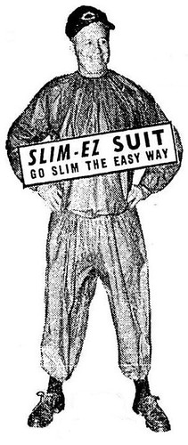
But now reader Richard Stover and used a variety of resources to piece together a larger story about these windbreakers. It began when he spotted this ad for a windbreaker-ish product called the Slim-Ez in the 2/1/64 issue of The Sporting News.
As you can see, the ad says the Slim-Ez was “developed by Ruby Williams of the Chattanooga Lookouts.” So Richard consulted this book on Lookouts history and found the following passage:
Ruby Williams, the concessions manager at Engel Stadium, also fashioned sweat suits for the players to wear during spring training in Winter Garden Florida. “She sewed rubber bands into the wrists and ankles of the suits,” [player Roy] Hawes said. “You’d pull those rubber bands open and water would literally pour out your sleeves.”
“The Lookouts AA Southern Association affiliate of the Washington Senators in the late 1950s,” says Richard. “Their roster included Harmon Killebrew and Bob Allison, both of whom endorsed the Slim-Ez. Chuck Dressen, another endorser of the suit, was the manager of the 1955-57 Senators. He must have crossed paths with Ruby Williams during spring trainings at Winter Garden.”
And it gets better: The Slim-Ez is still around today, only now it’s called the Trim-Ez. That’s not a knock-off or an immitation, though, as you can tell by looking at the company name: the R.B. Williams Co., which refers to Ruby B. Williams herself!
I called the R.B. Williams Co. yesterday and was disappointed to learn that Ruby died a few years ago at the age of 102. The company is now being run by one of her longtime associates, who told me that they no longer have any old catalogs or other archival materials. Too bad.
Meanwhile, let’s talk windbreakers: The Slim-Ez, obviously, was worn by players who were trying to lose weight. But was that also the case with the more conventional pointed-collar windbreakers? I always thought players wore those during spring training because sometimes it was still a little chilly down there in February and March, but maybe I was just being naïve. Anyone have any insights on this?
Today, of course, most baseball players stay in shape year-round (and I’m pretty sure the few who might need to drop a coupla pounds would try a more sensible approach than donning a rubber suit). But weight issues are still a big deal in football training camps. Wasn’t it just a few years ago that some NFLer passed out behind the wheel of his car because he’d put on a skin-tight rubber suit and then driven around with the heat on at full-blast? That story always cracked me up. Couldn’t he just have sat in the parked car with the heat on, instead of driving around?
Wilco Reminder: I’m currently giving away two pairs of tickets to see Wilco and Yo La Tengo in Indiana later this month. For details, look here.
Membership Update: Several new additions to the membership card gallery, including Rob Caplette’s card, based on Will Power’s Indy car, shown at right — only the second auto racing card we’ve ever done (here’s the first one, from three summers ago). As always, you can make the membership scene yourself by signing up here.
Uni Watch News Ticker: Laughably incompetent boob Wayne Hagin had this to say after Brandon Phillips flied out to center to end the top of the 3rd last night: “So, two straight fly balls to the centerfielder.” Only problem is that Phillips was actually the third straight Reds hitter to fly out to center that inning. Fire Wayne Hagin already! … Jason Hillyer and his wife spotted this soccer ball at their niece’s birthday party the other day, leading Jason’s wife to ask, “Why is that soccer ball covered in maxi-pads?” ”¦ Uniform theft in Scotland! But I had nothing to do with it, I swear (with thanks to David Pealing). ”¦ While looking for something else, I found this great shot of the Reds’ brain trust on St. Paddy’s Day, 1980. ”¦ Cycling note from Sean Clancy, who writes: “At the start of Tuesday’s Stage 3 of the Tour de France, Sylvain Chavanel of France held both the leader’s yellow jersey and the green points jersey. Italy’s Allessandro Petacchi wore the green, since Chavanel would have had difficulty wearing two jerseys at once, but Chavanel’s Belgian team, Quick Step, made sure his bike reflected his dual jersey status with a hastily done yellow and green paint scheme, while Chavanel’s teammate, Jerome Pineau, got the polka-dot treatment as the leader of the King of the Mountains category. Lots of photos here.” ”¦ Here’s another T-shirt featuring lots of uniforms, Cavs-style. “It’s a fan giveaway from a reunion weekend when the old Coliseum was being shut down,” explains Scott Cummings. “Note the date on the sleeve, and the wine and gold ‘Miracle of Richfield’ players on the back. These colors were unique for that era, as they wore the blue and orange embodied by Mark Price, Larry Nance, and Brad Daugherty. The wine and gold had not yet made its comeback, so that made this shirt even cooler.” ”¦ Souvenir helmet collector Andy Thoele has been working on some DIY helmets, including a Pirates pillbox version — check them out here. ”¦ Check out the block-D on this Broncos pennant. “I’ve had had that pennant since we lived in Denver in the late ’60s but haven’t seen that logo before or since,” says Kevin Clark. ”¦ Can’t recall if we’ve covered this before, but just in case: Way back in February, it was reported that Colorado football would likely wear 1990 throwbacks this season (see end of second graf). Now Matthew Robins notes that a video clip on the team’s web site provides a glimpse of the throwback uni. ”¦ The Erie SeaWolves, after going winless at home for the entire month of June, wore their road grays at home on Monday (with thanks to Timothy Fesmire). ”¦ “While unpacking after a recent move, I discovered a copy of a 1991 Houston Astros game program,” writes James Poisso. “It included articles on the story of the Astrodome scoreboard and the guy who repaired the team’s gloves.” ”¦ Brewers reliever David Riske reportedly has the names of his wife and kids written inside his cap (with thanks to Nicole Haase). ”¦ White whale follow-up: Bruce Marhsall says the Rangers’ sky blue/white combo was worn at least once at home in 1975: “It was an early-season NBC Saturday game of the Week when Oakland visited Arlington and emerged a 5-4 winner on April 12. Perhaps the Rangers donned that combo a few other times that season, but they surely did it for that NBC Game of the Week, which I believe was the first national telecast of that season.” ”¦ In a vaguely related item, Keith Jones reports that the Royals — or at least George Brett — wore power blue over white in a 1978 episode of Fantasy Island. Bonus points for using the wrong uni number. ”¦ Marc Viquez reports that the Holyoke Blue Sox — a team in the New England Collegiate Baseball League — wear their front uni numbers on the right side of the jersey. Last team I can recall using that configuration was the late-’90s Reds. ”¦ Hey, this is great: We’ve often talked about the different styles of old English “D” logos used by the Tigers, and now they’re all shown together on a banner (nice find by RJ Myers). ”¦ Kurt Esposito is reading Bill Madden’s new book on George Steinbrenner and says the 1976 Yankees were greeted with a notice in spring training that read “No beards. No beads. No mutton chops. No long hair. No long stirrups.” … Good article on jersey swaps.
More recent than the 1990s Reds, the Lexington Legends wore the uniform number on the right side of the jersey when Roger Clemens pitched for them:
link
link.
link.
Can we get some “I’m still calling it Canada Hockey Place” shirts made?
Actually, you’d have to get “I’m still calling it GM Place” shirts. That’s what it was called when it was under construction in 1994.
I don’t really get the douchbaggery going on here. If one of Paul’s advertisers chooses to go with a smaller ad lower on the page and he replaces their prime spot with another sponsor, does that make him eligible for a DB shout out? It’s business.
Don’t get me wrong, I’d be really sad to see Wrigley Field become Massengill Stadium, but I won’t be shocked when something similar happens (I give it no more than 5 years).
… one last thing, and I apologize in advance … the horrific images burned into memory has the commercials touting “disposable douch” … was there ever a variety where you held on to the stuff afterwards????
They could not call the building “GM Place” during the Olympics this past winter (me and over six feet of snow in Philly), so they called it “Canada Hockey Place.”
The Pirates have the uniform number on the right side of their black alternates:
link
That picture was taken at the unveiling of their new jerseys in January 2009, and oh by the way, none of those guys are on the team anymore.
Yeah, but that’s different — there’s just a logo on the other side. There are lots of examples of that.
I’m talking about a full-span insignia across the top, with the number on the right side below. That’s rare.
Ah. Gotcha.
I read a bio of Lou Gehrig and there was a picture of him at spring training and the caption said something to the effect of him wearing a rubber suit or shirt under his uniform in FLA to lose weight.
“Note the date on the sleeve, and the wine and gold ‘Miracle of Richfiel’ players on the back. These colors were unique for that era, as they wore the blue and gold embodied by Mark Price, Larry Nance, and Brad Daugherty. The wine and gold had not yet made its comeback, so that made this shirt even cooler.”
I think this should read ‘Miracle of Richfield’ and ‘they wore the blue and orange embodied by Mark Price…’
I want that shirt!
Interesting story about the Slim-Ez suit. Back in the 1970s Dave Ricketts, who was the bullpen coach for the St. Louis Cardinals, would come into our store and order three or four Slim-Ez tops in red. Dave, a former Rochester Red Wing, lived in the Flower City during the off-season. His annual visit to our store was a late-winter ritual and helped to signify that spring training was coming.
I work about two miles from Engel Stadium here in downtown Chattanooga. It’s pretty cool to hear a story about something that hits so close to home. Thanks for that, Paul.
BTW, for anybody interested in old minor league stadiums, Engel has a lot of history attached to it. Sadly the Lookouts have moved to AT&T Field on the riverfront, and the stadium is in a bit of limbo right now. The city and local university are currently trying to figure out just what to do with it. There are lots of photos and some interesting info on the old park at this link: link.
Engel’s still a great ballpark and every effort should be made to preserve the historic structure. Too bad the Lookouts aren’t still playing there, as it’s a far more interesting stadium than the one they now call home.
My first professional game was at Engle Stadium in I think 1979. I remember Woody Smith as the manager, Chris Bando catching and Joe Charbaneau as the star. There was a disastrous “Chicken Chase” promotion after the extra inning game around midnight in which all the chickens got trampled on the field. The fans were invited on the field and the PA announcer keept saying “Don’t GO until I say GO” but everyone would take off after the birds on the first “GO” – must have happend 4-5 times getting everyond lined up again. Ridiculous. People were picking up the dead chickens and petting them like they were alive to try and get a prize.
My mom grew up in Chattanooga and used to tell me about Angel and Andy Fleitas, the best two players in the Souther League. And how Gugie Gugliemo was the umpire everyone liked to boo. I’ve never looked any of them up before today and I found one GREAT Gugliemo story. link which fits exactly how she described him. And the Fleitas brothers were listed on Baseball-Reference.com around 1949. Engle Stadium – a great place! Thanks for taking me back!
And the maxi-pad soccer ball is an adidas Teamgeist replica. The Teamgeist was the official ball of the 2006 World cup and featured a unique 14-panel pattern featuring thermally-bonded panels shaped like, well, maxi-pads. Replicas were made from the traditional 26-panel pattern of pentagons and hexagons but had the maxi-pad panel design printed on.
White Sox have it there too
link
link
As we know now (see Saturday’s post), the Orioles never wore that orange-front helmet, but it sure is sweet looking. And, of course, the Pirates never wore that three-stripes helmet. Not sure about the Brewers.
Brewers definitely wore the yellow-front road batting helmet in the mid-1970s.
link link
They seem to have worn the all-blue home helmets in Spring Training, so most cards show that one.
link
Great customs!
The Boomer! Used to hit a lot of taters. One of the players that wore a helmet in the infield.
At some point the Brewers did like the Twins did — go with a home cap (all-blue), a road cap (gold front), and a completely different helmet for home and road (white front).
Chance,
Don’t shoot me on this, but I think this pre-78 helmet applied only to George Scott as he, like Richie Allen and John Olerud, wore a helmet while playing 1st base. So when the Brewers played on the road, he was the only one to wear the yellow front helmet. All the other Brewers wore the regular blue helmet in this time.
If you or anyone else can find any other Brewers in a yellow front helmet.
My new white whale…
Shoot you? I could kiss you! A new Brewers uniform mystery.
I hadn’t heard that before, but it makes sense. Can’t wait to start digging.
Paul Lukas said:
“Today, of course, most baseball players stay in shape year-round.”
link
link
link
link
link
Most! I said, “most”!
True, you did.
I still forgot some others, though:
link
link
link
link
they’re in better shape than you, herr vilk
and no picture of kung fu panda?
Been swimming and slimming this summer. I’d kick all their butts.
Dmitri Young is retired. So he doesn’t need to be in shape.
My favorite part of the Trim-EZ site is the other product they have under Post LIFE.
link
Body Bags?
For those who aren’t enjoying this year’s unique World Cup experience, you may not like Scottish Premier League soccer this fall, either:
link
There’s an IndyCar driver named Will Power? Awesome.
Sure beats the name of former nascar driver, Dick Trickle.
Wait a minute. George Brett — link?
Did you read what I wrote right after the photo link?
Uh… yeah. Just now.
Soccer’s post-match jersey trading pretty much has to be the coolest sportsmanship ritual out there.
It’s good, but I still like the NHL team handshakes at the conclusion of each playoff series better.
Andy Thoele–are you the Andy Thoele who teaches at a high school with the Pirates as its mascot?
That’s me. Cumberland High School. Who is this?
You can still buy products like the Slim-Ez, they’re mostly called “Sauna Suits”.
link;
My friends who live in cool places and run ultramarathons (like Badwater) wear them to try and get acclimatized to running in heat before the race.
Yeah, but that one doesn’t have the sphincter neckline. Not as good (read: not as awful-looking)!
badwater.arthur webb from santa rosa ca. running his 12th this year at age 67 or so. hero to my wife and me.
1) There is an indoor ‘antique mall’ over on the west side of Houston that has (or had) a booth which sells some of the original drawn panels for the Astrodome’s scoreboard animations. They are pretty cool but as I recall fairly pricey.
2) I attended some of Muhammad Ali’s open-to-the-public training sessions for his 1971(?) Jimmy Ellis fight. You got to sit around a practice ring and watch the fighters spar and workout. Ali wore one of those Slim-Eze suits and loved to flick open the top half’s waistband and spatter the crowd with sweat. :-(
Is that the one over by Hobby Airport?
No, it was the one on Old Katy Rd almost under the West Loop. My wife is over her “lets go look at antique end tables” phase so I don’t know if its even still there. Might have gotten eaten up by the freeway expansion.
I don’t know if you would count this as uni numbers on the right because it’s an alternate and doesn’t have a script but:
link
Also, the Nats blue alternates have the number on the right too.
As recently as the mid-90’s, those rubberized suits could be purchased at Oshman’s, a now-defunct Houston sporting goods shop. I always wanted one — who doesn’t want an E-Z way to lose weight — but when I went looking, they were gone.
I remember a story about members of the Baltimore Colts wearing them to try and earn training camp weight loss bonuses. Art Donovan tells a story about a teammate putting on the suit, turning the heat in his Cadillac to high, and driving around the countryside until he was ready to pass out. He’d get out of the car, pull back the elastic at the ankles, and the sweat would gush out.
As a resident of St. Petersburg, the self-proclaimed “Baseball capital of the World” and spring training capital through 1990, I can affirm that the nylon/rubber suits were routinely worn by players even on the hottest of days to sweat themselves into shape. Even thinner guys — Lou Brock, Willie McGee, Ozzie Smith, Mookie Wilson — would wear them. For the 1980’s Mets, they may have been sweating out last night’s poisons. But from my vantage point on the OF wall at Al Lang Field, it was commom to see the guys throw on the suits for the warning track running sessions.
I’m planning a multi-ballpark road trip in the fall, with one of the destinations being U.S. Cell…. Comiskey Park. Naturally, I’d love to wear an “I Still Call It Comiskey” shirt to the game. Here’s my dilemma: depending on the make of the shirt, I fall right between a medium and a large. Are there any other similarly situated fellows out there who could make a recommendation for my order?
Did you see link on the No Mas site?
Also, the folks at No Mas are pretty accommodating. If you contacted them, they’d probably be willing to give you the exact pit-to-pit and collar-to-hem measurements when the shirts are laid flat.
Uh, just buy a large? It’s just a t-shirt, not a fitted suit or uniform.
If it’s too small you can’t wear it. If it’s too big… hell, you’ll look just like everyone else.
I think I’m in a similar boat, Jeff S – too skinny for a large, too lanky for a medium. If you’re the other way around, this might not be any help… at any rate, I received a No Mas t-shirt for my birthday this year. A medium. It fits like a glove – but I would caution you to be careful with the dryer (if mine were to shrink, it’d probably be unwearable).
Maybe “like a glove” isn’t the best phrase – it fits me very well.
Paul, I was thinking about this last night watching the Cubs and D-Backs and I’m interested in your take. Arizona changed it’s colors to match the Coyotes, so they could emulate Pittsburgh and all their black & gold teams. Obviously the Suns didn’t join in, though red & black could definitely work for them (though it’d be similar to the Heat, that’s a different discussion). What’s your take on “city colors?” The Mariners and Seahawks have similar colors now (lime green nonwithstanding), and with the Sonics out of town, I suppose Seattle has “city colors” now. Couldn’t think of other cities that worked like that, though. Now, this wouldn’t work with NY, LA, or Chicago where they have multiple teams in the same sport, obviously, but would you support spreading this practice?
As a young’n, I thought it was cool that St. Louis had the two Cardinal teams in different sports (with close-enough-to-matching color schemes). It wasn’t until I was a teen that I learned the football organization moved from Chicago! I wish I’d lived here (St. Louis) during the two Cardinal days. I can only imagine the editorial headaches caused while writing headlines for the sports pages in September!
The football cardinals were always refered to as The Big Red. That term was not used for the baseball team. That and the term “football cardinals” was used. Don’t really remember hearing “baseball cardinals” though. Shows how the city has always been a baseball town.
Maybe it was just a reverse “New York Football Giants” kind of thing. Since the baseball team was there long before the football team was they got dibs on the name, sans the sport-specific qualification.
Are you pronouncing your first name “yok-ub”?
Today I am.
Or something like that, at least.
… forgot to include …
Also interesting in St. Louis, during the 90s when they traded one color match up – Cardinals/Cardinals – for another – Rams/Blues.
Actually, I didn’t realize the D-backs changes their colors in order to match the Coyotes.
I like municipal heritage, municipal flags, etc., so I’m generally in favor of things that reinforce that. But if a team has had an existing color scheme for many years, that’s its own heritage. I’ve never understood how a team can have colors a, b, and c on Monday and then switch to x, y, and z on Tuesday. So all of a sudden a, b, and c are in the trash??
Anyway, none of this will ever happen today unless the city’s official colors are currently in vogue with current fashions.
yeah, the Eagles/city flag color uniforms didn’t go over too well. link
link
Philadelphia Union’s supporters adopted the light blue/athletic gold although the Union decided to go with a different blue/gold scheme.
link
I heard the Union went with the colour scheme / design to emulate this look, more or less:
link
Anyone know the truth to that story?
SB
So the flag is made to emulate the shield, which is depicted on the flag, which is colored based on the shield, though the shield on the flag doesn’t contain the colors the flag is based on.
Heavy stuff.
“Now, this wouldn’t work with NY”
it works pretty well for the Knicks and Mets
OK but that wasn’t the point. It was more Mets/Yankees, Giants/Jets, Rangers/Islanders…
Because you could also say that it works in Chicago with the Blackhawks & Bulls (Or, once upon a time, the Black Hawks & White Sox or Cubs & Stags) and LA has the Dodgers and Clippers (and had the Kings & Lakers –> Raiders) using the same colors .
Could it be, that similar team colors for some teams that play or played in the same stadium (Bulls/Blackhawks, Lakers/1980s Kings, etc.) may have been an attempt to keep the color aesthetics of an arena working for both tennants?
Lakers and Kings colors (previous to the Gretzky/McNall era) are the product of both teams being owned by Jack Kent Cooke. I believe JKC wanted “regal” colors for the expansion Kings and may have at that time changed the Lakers from Blue/Light Blue to Purple/Gold.
I guess since my card is the featured card today, it couldn’t hurt to post the back story which lead to my decision on the number and design..
For starters, it was the racing, and the annual unveiling of new liveries that got me into Uni-watching. My favorite racing team has always been Team Penske, or more precisely the Open Wheel racing “leg” of the team, that until recently was known as Marlboro Team Penske. While this: link will always be a classic livery, the design doesn’t really lend itself to the Uni-Watch card really well. Since Penske and Marlboro have parted ways (thus the new look of the Team Penske cars this year: link ), the new design is more Uni-Watch card friendly.
As far as settling on the number 12.. Being a racing fan, I adopted the #3 after Dale Earnhardt Sr. passed on, mainly on video games, since by that time I wasn’t playing any sports where numbers were important (other than pick up games, which were sans numbers). Somewhere along the line, 12 was as close as I could get to the #3. From there, the number 12 has grown on me, and become my number, evidence by the custom soccer jerseys I own, all with my last name, and the number 12.
I’m not really sure when this is from. It’s just filed under Sweat Suit and the photographer is Bob Landry who isn’t a name I recognize. Possibly NSFW if you’re from the 50s.
link
“…never given it much thought except to say to myself, ‘Ew, it looks like his head’s coming out of a sphincter.'”
Thanks so much for loading me up with that “head coming out of a sphincter” mental image over breakfast… :)
Interesting pants on George Brett there. There appears to be a belt, but it just vanishes. Is it a fake belt, or just one long belt loop that hides most of it?
I’m guessing it is built into the pants, and just fastens. Otherwise how would you thread it through?
could be threaded through just like football players do with their belts.
I enjoy your blog because I am a uniform fan but your little hate obsessions get real annoying. Singling out Nike for hate when they are doing what all the other companies are doing and your hate for Hagin are two examples. Get over it.
Interesting that my comment got deleted, I guess Paul can’t take any criticism.
Your comment wasn’t deleted — it got caught in the spam filter.
Let’s see: I have a web site where I can write about whatever I choose; you have a life (more or less) where you can read whatever you choose. Which one of us needs to “get over it”?
SHAZAM!
I apologize, I thought it got deleted.
Of course your response proves that you can’t take criticism. Oh, well I guess when I read your blog I will have to continue to laugh at you acting like a child at times.
You can assert things all you like, but they’re still just assertions. I can take criticism fine, but you’re not offering criticism — you’re just being a pest. Criticism isn’t just whining about this or that; criticism is offering a well-reasoned critique of how something intersects with our lives. In short, criticism is what I do for a living. Dig?
As I have stated many times, I’m anti-Nike because they represent all the worst things about contemporary sports culture (and many of the worst things about contemporary corporate culture).
And as I have stated several times, I’m anti-Hagin because he makes my life worse on a nightly basis.
You like Nike? You like Hagin? Be my guest — we can agree to disagree. But don’t try telling me I have no basis for critiquing them.
New here, I take it.
The aforementioned Dave Ricketts and one of his red slim-EZs presumably purchased from Terry Proctor’s store:
link
And a blue slim-EZ from his Pirates days:
link
No neck sphincter = not authentic!
Sphincter or no sphincter, this might be the greatest looking baseball card ever!
link
Wow.
Aaron said:
Arizona changed it’s colors to match the Coyotes, so they could emulate Pittsburgh and all their black & gold teams. Obviously the Suns didn’t join in, though red & black could definitely work for them (though it’d be similar to the Heat, that’s a different discussion). What’s your take on “city colors?”
~~~~~~~~~~~
that’s the first i ever heard of that argument; while i won’t necessarily dispute it, i disagree with that
first of all, the yotes have changed color schemes at least once (if not twice — don’t really follow their uni machinations, other than i loved the trippy picasso-esque coyote)…so to say that the d-backs changed to “emulate” them is a bit of a reach…if the yotes change again tomorrow, will the d-backs?
secondly, this is the arizona flag…and this is the phoenix flag
the coyotes and d-backs do share that sorta brick red and cream, but i wouldnt’ say that the d-backs changed to match up with the yotes…although one could make that argument
now, as far as teams from the same city sharing the same colors, i kinda get it, and i spose in theory it works better than in practice; but most cities with long-established teams have had their own unique color scheme for so long it seems a little odd for them to align the way pittsburgh’s have…and how boring would it be if EVERY city did that?
once pittsburgh loses the ‘uniqueness’ of the black/gold color theme…then it kind of ruins it for everyone
let pittsburgh have it, i say
I heard that on a telecast once. I’ll do a little research and see if I can find a cite, but I promise I didn’t make it up! :)
A quick round of searching (although my work firewall is limiting, so maybe not the best search) found several places that note the color similarity, but nothing to confirm that Pheonix/Arizona teams sharing the red and black scheme as the reason.
As for the telecast I heard it on, I’m guessing it was probably a Cubs-DBacks game, though as to when I haven’t got a clue. And while I watch the Cubs the most, I watch a lot of baseball in general, so that’s no guarantee, either. So, I guess I’ll have to back away from that one, too.
Here’s some video from the George Brett Fantasy Island episode. Some great acting. Bonus appearances by Radar O’Reilly and Frand Drebin…. Police Squad!
link
Make that Frank Drebin…..
link
once pittsburgh loses the ‘uniqueness’ of the black/gold color theme…then it kind of ruins it for everyone
let pittsburgh have it, i say
I agree. It’s one of those rare things in the sports world that hasn’t resulted in a rush of “me too” copycatting. As of now, it’s sort of an endearing quirk; once everyone else does it, it’s just another trend.
Let Pittsburgh have it? Definitely. Too bad the Penguins don’t agree.
I hate the Vegas gold. It irritates me to no end that they decided to step away from Pittsburgh’s traditional black and gold. In line with what Paul said in comment number… er, up there, they started with the baby blue, so that’s their true heritage, but I loved it when all three of our teams (four if you count Vilk’s favorite Spirit) had the exact same color scheme. Black and Vegas gold doesn’t cut it.
The Pirates started with red and blue; the hockey Pirates of the ’20s were black and gold decades before the baseball team adopted it (and years before the football Pirates came into being).
Germany/Spain underway. Classic. Germany in white over black with white socks, Spain in red over royal with red socks. Hope the game is as good as it looks.
so how goes the game, herr vilk? or is it senor vilk…
Senor. Can only root for Germany when we have a common foe (Argentina, Italy, Mexico, and Protugal for as long as Mr. Ronal-doh plays for them).
Will be a senor in the final too, but as long as it’s a good game either team can win.
Schweinhund. I shall henceforth call you “neck sphincter.”
“senor”
~~~~
no soup for you
Deutschland 0- Espana 1!!
A first time World Champion come Sunday!!
I notice that at least one of the german players has a logo covering up the team crest on the uniform, any idea what’s up with that?
Paul, I love the digs on Wayne Hagin (former White Sox radio guy for a while- listened to him as a kid).
There’s nothing worse than announcers of his ilk (Tim McCarver being the patron saint of them all). Especially on the radio, where all you have is two guys and nothing else.
I don’t follow the Mets… keep ’em coming.
Speaking of which, Ron Santo was just starting out in the Cubs’ radio booth during Hagin’s stint with the Sox.
Random observation:
New comments format + Uni Watch viewed with “mobile theme” = some link.
Forgive my tech ignorance, but what is that?
I’ve just been using Safari on my iPad – is there a convenient app for UW?
At the bottom of the page, there’s a little on/off switch that lets you use the mobile theme (I’m not sure if it’s different with an iPad).
If you’re using the default view, the switch is only present if you go to the main Uni Watch page (not the individual posts with comments visible).
Oh, and it’s not a separate app. It’s built into the mobile version of Safari (I think).
Ha, I needed that. Thanks, James.
just watching the Spain-Germany match. I noticed immediately after Puyol’s goal for Spain, that one of the German defenders had what looked like the world cup patch stuck on over the national crest. Does anyone have a screengrab to confirm this? I am watching the match online at work.
I just commented above about seeing a German player with the same thing..
Here’s a pic- Toni Kroos link
Daily News baseball writer noted it too on his twitter page and knew the UniWatch community would be on it. link
Found a pic of it..
link
I’m currently in a weight loss contest and I’m happy to report that my Gold’s Gym brand plastic sauna suit has helped me shed some unneeded pounds. It is true, after you work out in the suit for forty minutes, you can pour the sweat right out of it. Disgusting, but immensely gratifying.
Yeah, but you’re just losing water, it won’t work long term, only while you stay dehydrated. It’s also dangerous, you risk hyperthermia (heat exhausion). These things are a total scam.
Anybody seen RPM?
link
(No, I swear, it’s not “Chelsea Dagger.” It’s something better. ;-) )
I forgot to mention some interesting news that I found out this past week. My wife and I were in St. Louis this past weekend for our one year wedding anniversary (and to take in a Brewers/Cards game) Anyways, we went to Pappy’s Smokehouse (link) for lunch (BEST RIBS EVER!) and the owners were talking to us while we were waiting in line. We were wearing our Brewer gear so he was giving us some good natured ribbing about that. He mentioned that Prince Fielder had eaten at Pappy’s before (he then showed us an autographed picture of him on the wall) and went on to say he is NOT a vegetarian at all. Just thought those Brewer fans out there would like to know his claim to be a vegetarian is indeed false.
I think that Martin Lawrence once passed out in his car while wearing one of those suits.
New HD scoreboard coming to Miller Park in 2011! I love how the barley sprigs on the bottom of the new Miller Park logo make it look like the baseball is flying!
link
Oh Ben… You beat me to it. The rumors were true, Miller park is installing a new HD, 5,940 sq. ft. scoreboard. As Ben said, the Miller Park logo is also getting a face lift. I uploaded some pics on photo bucket
New Miller Park Scoreboard:
link
New Miller Park Scoreboard 2:
link
Current Miller Park scoreboard for comparison:
link
Like Ben said… I LOVE the face lift on the Miller Park logo. Great job on this one Crew. Can’t wait to see it next year. I wonder if the new Miller park logo will be part of an anniversary celebration of 10 years of Miller Park.
Here is the official release from the Brewers:
link
Those 1980 Cincinnati St Paddy’s day unis are like the baseball version of the classic home Celtics uniforms. That’s a great look for any sport.
If you look on baseball-reference, you’ll see that the first jersey George Brett wore when he came to the Majors was #25. Somehow, I remembered this fact. With the wrong numbered NNOB jersey and white pants, did he supply his own uniform for a TV show? How odd is that?
One other thing. I was looking the other night on TESS for something totally unrelated to sports, and found link I’m thinking this is right around the Canadian expansion, but I thought it was supposed to be Canadian only from the get-go. Was the NBA just covering all bases just in case (ie KC being a backup plan) or were they seriously considered and I didn’t know it?
Ah the Sauna Suit. Brings back college wrestling memories. Find any college wrestler and ask them about it. Most wrestlers would wear one to quickly loose a few pounds before weighins. The NCAA outlawed them a few years back after a few wrestlers died wearing them. Turns out when you have to water in your body to sweat out, you can die.
Jakob T. Hüning | July 7, 2010 at 4:42 pm |
Schweinhund. I shall henceforth call you “neck sphincter.”
LI Phil | July 7, 2010 at 5:15 pm |
“senor”
~~~~
no soup for you
Well I am half Polish. Still smarting over that 1-nil loss in the ’06 Cup. I’m sure there’s another reason or two somewhere…
Oh, and unless they make a v-neck sphincter, I would not wear that.
Not sure if it’s been mentioned but Coco Crisp is wearing one of those hard plastic gloves while running the bases. He has a green one.
Makes sense since it was the Royals that started it and he was with them last year.
Whats up with Steinbrenners “No long stirrups” policy? Sorry but I do not know what this means.
Probably means that the Yankees had to wear their stirrups with a lot of navy blue showing, not pulled up to where it was just two ribbons.
The windbreakers were to fend off the chill; the rubber suits were to lose weight, especially in spring training.
Bob Friend wore one:
link
And Joe Nuxhall customized his to fit the Reds vest jersey:
link