
Well, this one didn’t take long.
As you may recall, last week Ricko mentioned that he’d seen the Texas Rangers wearing their powder blue road jerseys with their white home pants during a game at Tiger Stadium in 1975-ish. That case was officially cracked over the weekend by reader Bruce Genther — behold!
As you can see, Bruce added a credit line, but he got the book’s title wrong — it’s actually The Game & the Glory, not the other way around. The player in the photo is Toby Harrah. The image is definitely from 1975, since that’s the only year the Rangers wore that jersey design.
A few thoughts on this photo:
• I could be wrong, but that doesn’t look like Tiger Stadium to me. So assuming Ricko’s memory is correct, the Rangers apparently wore this combo multiple times.
• Okkonen doesn’t even show the Rangers wearing powder blues in ’75 — he’s got them wearing gray. (The blues are shown, however, in Henderson’s guide.) I don’t mean that as a dig at Okkonen, but it’s the latest reminder that we should never take online databases as gospel.
• And just to reinforce that point: If you look again at the Toby Harrah photo, you’ll see that striping on his waistband runs, from top to bottom, blue-white-red, but Okkonen has it the other way around. (A very odd footnote: From 1976 through 1982, Okkonen shows the team wearing blue-white-red waistband striping at home but the opposite sequence on the road. I haven’t yet done the photo research to verify this, but if it checks out, it sure seems like an odd choice.)
That’s pretty good mileage from one photo, no? And if you want a copy of the book it came from, it’s available from Amazon for a penny.
Bonus whale coverage!: Phil did some mighty fine whale hunting of his own back on Saturday, as he and reader Chris Geis confirmed that the Pirates had indeed worn their bumblebee-era white pinstripes at Shea Stadium against the Mets in the late 1970s, creating a rare match-up of white pins vs. white pins. If you missed that entry, I strongly urge you to check it out before going further.
If there’s one thing missing from Phil and Chris’s account, it’s a nice color photo showing a pin-clad Met and a pin-clad Pirate together in the same frame. This is the closest they came, but it isn’t completely satisfying — we want to see two white pinstriped jerseys competing against each other, right?
And now we have. Those are screen shots that Steve Presser sent me yesterday. The game in question took place on 9/10/78. The Mets hitter is Stormin’ Dan Norman, hitting the first of his 11 career homers. Note his low-cut stirrup openings, a remnant from his days in the Reds organization, where he spent the first several years of his career.
Kind of amazing that the Buccos got away with wearing white pins on the road, no? Very surprised the N.L. office green-lighted that.

Collector’s Corner, by Brinke Guthrie
I’ve finally run out of childhood photos, so from now on we’ll just use my membership card. Here’s my latest round of eBay finds:
• Here’s an awesome 1970s “Charger Power” T-shirt. Note that it’s made by Logo 7, which would become Logo Athletic.
• This 1979 Tampa Bay Rowdies jersey reminds me of family trips to Florida. Always saw the Rowdies logo in every McDonald’s we stopped in. (Sent in by Jason Bernard.)
• Absolutely love the font on this Twins pennant.
• Can’t say I’ve seen this New York baseball Giants logo before.
• Great NHL Rockies pennant. Using the Cowboys typeface, eh?
• Here’s just the thing to wear if/when the NFL players go on strike.
• This really old Niners pennant will cost you, but it’s so nice, it might be worth it.
• Here’s a unique item: a great pin set of defunct NHL teams.
• Some Jets fan out there absolutely must bid on this set of helmet headphones — with built-in AM radio!
• No Mets item for Lukas this time. Instead, let’s see if he’ll go for this G-Men iron-on. [I like, but not enough to bid. — PL]
Seen something on eBay that you think would make good Collector’s Corner fodder? Send your submissions here.
Baseball Rocks, 2010 edition: For the second straight summer, I’m very happy to be offering free tickets to see Wilco and Yo La Tengo playing in minor league baseball stadium. The show will take place on July 30th at Coveleski Stadium in South Bend, Indiana, home of the single-A South Bend Silverhawks. And thanks to the generosity of Wilco manager Tony Margherita, I have two pairs of tickets to give away.
I’d hope this part would be obvious, but I’ll say it anyway, just in case: Please don’t enter this giveaway unless you can actually get to South Bend and attend the show. There will be no physical tickets (if you win, your name will be on the guest list at the event, with ID required), so you won’t be able to flip the tix on StubHub or anything like that. It’s just a nice gesture by the Tony and the band, so please reciprocate by playing nice, OK? OK.
So: To enter, send an e-mail to the giveaway address by this Friday, July 9th, at 7pm eastern. Your e-mail should include your name and the answer to the following question: What other sports-related attraction — one that should be of significant interest to Uni Watch readers — is located less than a mile from Coveleski Stadium? One entry per person. I’ll announce the winner next Monday.
In a related item, Wilco is curating and headlining next month’s Solid Sound Festival at Mass MoCA. The lineup will include a band called the Baseball Project, featuring Steve Wynn (Dream Syndicate), Scott McCaughey (Minus 5, Young Fresh Fellows), and members of REM doing baseball-themed songs like “Ted Fucking Williams” and “Gratitude (for Curt Flood).” Pass the Cracker Jack!
Uni Watch News Ticker: Wayne’s Whoppers, continued: During the first inning of last night’s Mets/Reds tilt, embarrassingly clueless broadcaster Wayne Hagin said the Mets were getting “a good eye’s view” of Cincy starter Travis Wood’s pitches. Then he corrected himself and said, “A good bird eye’s view.” No, Wayner — the term is a bird’s eye view, and it refers to a view from overhead, not the view from the dugout. Fire Wayne Hagin already! ”¦ Hmmm, here are some words you don’t often see together (with thanks to Erik Morris). ”¦ Someone out there has figured out that maybe the world has too many baseball cap designs (with thanks to Gerry Dincher). ”¦ Excellent spot by Chris Jowdy, who notes that Yankees trainer Gene Monahan still has the team’s 2008 sleeve patches on his polo shirt. That’s the ’08 All-Star Game patch on his right sleeve, and the Yankee Stadium final-season patch on the left. ”¦ I’ve pretty much ignored developments in the UFL, because really, who gives a shit? But it’s impossible to ignore the practice jerseys — or maybe they were just tryout jerseys — being worn by the Sacramento Mountain Lions. Kinda reminds me of this (with thanks to Roarke Boes). ”¦ Mitchell & Ness is soliciting customer suggestions for which jerseys they should make (as reported by Dan Cichalski). ”¦ The A’s, who really ought to know better, are trying to revive the Braden/A-Rod feud with this T-shirt. Details here (thanks, Brinke). ”¦ Professional waste of space Wayne Hagin referred to the A’s GM as “Billy Dean” last night. Fire Wayne Hagin already! ”¦ “It is not unusual to see men’s lacrosse goalies wearing sweatpants,” says Blair Thompson. “But there have been a couple Syracuse men’s goalies who, on occasion, have worn football pants, such as John Galloway and Matt Palumb. Syracuse also has a women’s lacrosse goalie who wears football pants: Liz Hogan.” ”¦ “There was a Greatest American Hero marathon on TV on Sunday,” writes Jonee Eisen. “One of the baseball-centric episodes featured two of the worst uniforms I’ve ever seen.” ”¦ Cycling note from Jeremy Brahm, who writes: “At the end of Stage 1 in the Tour de France, five-time champion Eddy Merckx was presented a special jersey by the organizers — a yellow, white with red polka dots and a green design, signifying the title for each part of the race that he had won in his career: yellow (overall champion), polka dots (mountains), and green (most consistent rider).” ”¦ Utter moron Wayne Hagin had this to say when Alex Cora went from second to third on a balk last night: “One more balk and the Mets will take the lead.” Fire Wayne Hagin already!. ”¦ Also from Jeremy: The SK Wyverns went green over the weekend — literally. The chest insignia reads, “Let’s Go Green.” Also, note that the pant legs appear to have been pressed with a very crisp crease. ”¦ Reprinted from yesterday’s comments: The Patriots are having fans vote on Pat Patriot vs. Flying Elvis. ”¦ Alcides Escobar of the Brewers pulled up his pant leg in the dugout yesterday to reveal a Brewers-branded crew sock. Or is it an ankle brace..? Not sure what that is. ”¦ Here’s another awesome locker room photo from Warren Humphrey‘s collection, this time of Braves trainer Dave Pursley, circa 1962. Love the Lifesavers-esque stenciling on the trunk, too. ”¦ “I bought a Brooklyn Cyclones 10th Season patch over the weekend,” writes Terence Kearns. “Interestingly, it’s a combination of embroidered and printed, on twill. Never saw that before.” Me neither. Additional pics here. ”¦ Since the Rangers went to their current uni set last season, they’ve only worn their red caps with their red alternate jerseys. So it was odd last night to see them wearing the red caps — and also red sleeves and red socks — with their home whites (with thanks to Chris Mycoskie). ”¦ Insufferable bore Wayne Hagin offered this sage analysis last night: “That pitch caught all of the outside corner. All of it.” What does that even mean?! Fire Wayne Hagin already! ”¦ Jake Doyle tipped me wise to a site devoted to defunct independent baseball teams. “The site isn’t kept up to date, but it has some pretty interesting content, including logos,” he says. ”¦ Speaking of independent leagues, the Golden League has a new team in Maui this year, with some pretty rad uniforms (with thanks to Steve Krah). … Good info and video about the making of Lance Armstrong’s helmet (with thanks to Chad Todd). … René Zepeda and Justin Funderburk both note that Argentina’s front uni numbers have sometimes had a white outline and sometimes not. Ditto for the numbers on the back. Anyone know what’s up with that? ”¦ Charles Neiswender thinks Francisco Cervelli’s S100 helmet looks a bit more svelte. I wasn’t so sure about that, so I checked with my Rawlings contacts, who confirmed that this is indeed the long-promised revision to the S100. Further details soon. ”¦ Is there a term for a logo that’s shaped like the word it spells out? Matt English doodled those designs — not bad! ”¦ The NBA’s summer league is using initial-cap NOBs (as noted by Matthew Lesser). ”¦ Saw Winter’s Bone yesterday. Beautiful, bleak, devastating, superb — easily the best movie I’ve seen this year.
White pins vs. white pins has been here since it was posted among the comments Saturday (Pirates in tri-color pins at Atlanta in their red home pins)…
link
link
—Ricko
Paul — those new pics are nice, but the Pirates wore ALL-white-pinstripes (jersey AND pants) against the Mets at Shea and one of the photos posted on Saturday confirmed that.
The all-white-pins outfit is the strange one, since they had eight other combinations to choose from, but they apparently wore the all-pins enemble on the road several times, including against the Cubs, who also wore white uniforms with pinstripes. (Thanks to Jerry Reuss’ contribution Saturday, we know that.)
Ricko posted this after Jerry Reuss submitted this picture on Saturday. It shows the Pirates in all-white pinstripes in a game at Wrigley, but unfortunately the Cubs, who wore white pinstripe unis, are not in the frame.
link
Man, Tekulve’s legs look about a mile long in the white pins!
Re: Team Names shaped like the word it spell out
The classic “NY Jets” could be included
link
WOOT did a shirt contest a couple years ago where the idea was to design a shirt logo where the word was the shirt.
Here’s the page:
link
Does anyone remember those baseball team posters that you could send in for from Wheaties in the early 70s? They were actually drawings. I had the Pirates and the Twins. I wish I still had them.
link
I offer a HUGE scan for closer examination of same…
link
—Ricko
Wow, those are really freakin’ cool.
Arrgh, flickr evidently downsized it to fit their parameters.
Thanks for trying. If I knew then what I know now (FREE with 3 Proof of Purchase) I would have ate 3 boxes a day and would have got them all and kept them …
Anyone who wants that huge scan (from the back of a Wheaties box I stuffed into my files) can e-mail me at…
link
…and I’ll send it to you later today, okay?
—Ricko
Gorgeous. I had the Brewers verson on my wall as a kid – it actually incorporated local landmarks, felt like it was a more local product than the standard generic picture posters.
btw, Huge “Thank You” to Bruce Genther for finding that shot of the Rangers in powder over white.
And, yeah, the game I saw on TV definitely was in Detroit. Made a point of noting it so I could maybe find photos later, which I never was able to do.
Makes sense that it wouldn’t be a one-off. Why would a team drag their home pants along on a road trip if only intending to wear them once.
—Ricko
Ditto on the kudos to Bruce. Met up with him about a year ago. Awesome guy!
That picture of Toby Harrah looks like it’s in old Arlington Stadium.
It definitely looks like old Arlington Stadium. Here’s 2 scans of the 1976 Old Timers Game. The wall pattern definitely matches up:
link
link
Let’s try that 1st pic again:
link
I think that’s the first time I’ve ever seen a photo of Toby without a mustache!
Childhood Rangers fan who spent many a night at Arlington Stadium chiming in here. I have to agree that that looks suspiciously like Arlington Stadium.
As I mentioned in yesterday’s comments, I have a clear recollection of an NBC game of the week from Arlington in early 1975 in which the Rangers wore the light blue jersey with the white pants.
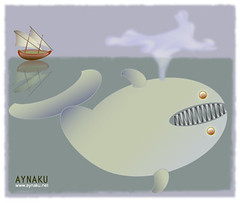
Powder blues and “the Whale” can only mean Rick Reuschel!
link
Here are the Maui Uniforms – Looks like 5 differnet jerseys and 12 different hats!
Here are the Maui Uniforms — Looks like 5 differnet jerseys and 12 different hats!
link
Those jerseys look like something from an energy drink can.
They announced those things back in early Feb. when my wife and I were there…I even saved the clipping from the paper!
Ah, Hawaii!
I’m pretty sure Paul mentioned these unis in a previous ticker. It was a while ago. Felt like 2009, but could have been February.
Is that Nike Antiques and Crafts in Effingham, IL? Kinda looks like the sign I grew up seeing driving through there on my way to my grandparents…
I was going to say the same thing. I was just down in Effingham two weeks ago for a friend’s wedding, and I could’ve sworn I saw that sign on Rt. 22/23 getting off of I-57.
The picture came from a friend’s facebook page who visited Illinois last week. I don’t know where exactly in Illinois it was though.
The Mitchell & Ness site doesn’t seem to be taking comments — I wanted to post this there:
Road jersey for anyone from the 1941-42 Cubs (#6 Stan Hack, #7 Augie Galan, #8 Bill “Swish” Nicholson, #17 Charlie Root, #44 Phil Cavarretta, etc.). It’s the jersey that’s so amazing — a powder blue vest, with the WWII “Health” patch added in ’42, that just looks fantastic. “CHICAGO” on the front and numbers on the back are in white with a dark blue border. This jersey was thirty years ahead of its time. I’d love to see it remade in M&N quality.
Here’s a photo (B&W, unfortunately) of Lou Novikoff wearing it:
link
And here are drawings of it in color:
link
link
I’d love to wear one of these beauties. With more and more people from the WWII generation leaving us each year, I’d prefer the ’42 variety with that great patch to keep those seasons in our memories.
I thought I remembered Ricko or somebody explaining why the Rangers mixed their road jerseys with home pants once and that it had to do with some fit by Billy Martin. Does anyone remember that discussion on this site before?
I don’t know that I mentioned it, but I do have a vague recollection of a Martin Meltdown in that game I was watching from Detroit.
That might be just the power of suggestion, though.
And if there WAS a Billy Blowup it likely wouldn’t have altered anything about the unis because, as I said earlier, why would the Rangers have brought their home pants on a road trip unless they fully intended, in advance, to wear them.
—Ricko
Paul said:
If you look again at the Toby Harrah photo, you’ll see that striping on his waistband runs, from top to bottom, blue-white-red, but Okkonen has it the other way around. (A very odd footnote: From 1976 through 1982, Okkonen shows the team wearing blue-white-red waistband striping at home but the opposite sequence on the road. I haven’t yet done the photo research to verify this, but if it checks out, it sure seems like an odd choice.)
~~~~~~~~~~~~~~~~~~~
in 1975…the rangers had red-white-blue bands on their sansabelts on the road…
and
red-white-blue at home
in 1976, on the road the waistband went red-white-blue
and in 1977, the waistband on the homes was blue-white-red
very hard to find any home shots (in baseball cards) for the rangers in those days — guess the topps guys didn’t travel to arlington
I know this will sound like heresy to some of us Yankee fans….but as bad as the red caps looked before…the white caps actually looked pretty good.
I think Yankee brass should consider that look…..
And the Pope will ponder a change to kelly green vestments. ;)
—Ricko
link
Your point?
Actually, green is the most commonly used color, for “ordinary time” (as in, not Advent, Christmas, Lent or Easter).
No BFBS for now, or the foreseeable future…
My bad. Should have said for “everyday wear.”
—Ricko
Brought back some memories when I saw that not 1, but 2 of the Defunct Indy Baseball teams on the list were local teams for me. The Allentown Ambassadors, and the Lehigh Valley Black Diamonds. I was in high school when the Black Diamonds owner ran out of money before the stadium was completed.
The Oakland Tribune article about the abundance of on-field caps being worn by MLB teams missed listing the White Sox as the 8th team with only one cap joining the Cubs, Dodgers, Marlins, Yankees, Mariners, Angels, and Rays.
Years ago, didn’t the Dodgers trot out a blue alternate jersey with an alternate hat? I think this was when Kevin Brown played for LA. The hat had a blue crown with a silver bill, if I’m not mistaken.
1999 game against the Angles, at Dodger Stadium in June. Saw it on TV when stationed in San Diego my first year there.
The Dodgers wore alternate blue jerseys in 1999 as part of the “Think Blue” campaign in which they also wore an alternate hat that had a silver brim, silver button on top and a silver border around the “LA” logo. They also wore a “Think Blue” patch on the sleeve, a patch I am fortunate to have in my MLB patch collection. (moved here from the separate comment below-sorry)
The hat article helped me narrow something down. I’ve been wondering which teams wear just two uniforms. The answer is the Dodgers and the Yankees.
Add two more – the Cards and the Tigers. Each briefly wore an alternate a few years back, but in the Tigers’ case they dropped it soon after, and in the Cardinals’ case it was a one-off.
The Cards wear blue hats on the road and I am pretty sure the Tigers’ road hat has an orange D.
Cardinals have “Sunday hat” at home, too.
Ah, I misunderstood your meaning. Sorry ’bout that.
not sure what i like more, the white whale stories or the wayne hagin bashing.
seriously, though, the white whale mysteries have become my favorite part of this site–fun stuff that only a bunch of people who read this blog would enjoy. nice work, guys!
Leave it to the Virginia Tech Bookstore to leak the 2010 football jerseys before they’ve been announced by the Athletic Department.
Its official, they’re going with the throwbacks full-time this year. They’re keeping the old-school VT logo on the collar, and the only real difference I see between this and what was worn at GT last year is the orange collar on the sleeves. But, based on the maroon collar on the whites, perhaps it was supposed to be there all along. Anyway, here they are:
link
I think that’s great news. I love the Va Tech throwbacks. The newer style was something I really didn’t care for
I can’t tell you how excited I am about this…
though…I am a bit disappointed that the V-neck doesn’t come to a point under the throwback logo like it does on the actual uniforms.
The Dodgers wore alternate blue jerseys in 1999 as part of the “Think Blue” campaign in which they also wore an alternate hat that had a silver brim, silver button on top and a silver border around the “LA” logo. They also wore a “Think Blue” patch on the sleeve, a patch I am fortunate to have in my MLB patch collection.
Re: Hagin bashing … my two cents: Give ANY person 2 hours of unscripted air time 5-6 days a week for six months, and they will say:
1) Lots of dumb things
2) Many cliches
3) Mixed cliches with dumb things included
I don’t care for Hagin either, but no doubt in my mind your concerns about him could be echoed for any broadcaster in professional sports.
There’s bad and there’s bad. Most of the time, the guys who are bad you almost feel sorry for because you can tell they’re trying. From the way Paul describes him, Hagin sounds like the kind of broadcaster that says stupid stuff but is so pompous about it, he doesn’t even realize it’s stupid nor does he care.
You want bad broadcasting? Try Gary Matthews on any Phillies telecast. He rambles on and on about nothing new that we want to hear.
Loved the Hagin treatment today, Paul. Funny stuff. I’ve never heard the guy, but I’m sure I’d be cursing his name if he was broadcasting my team.
I have another white whale for you, Phil and Paul, and you should be able to answer it since you are Mets fans. (I am, alas, a fallen-away Mets fan.)
In the 1980s the Mets had an alternate blue game jersey. I saw them wear it on the road, but never at home. The Henderson CD says they wore it at home. Is this true?
get your Amare Stoudemire Knicks jersey…. link
RE: The Rangers wearing white jerseys with the red hat/socks/sleeves. Last night was not the first time this was done. They did it several times last season, especially in April and May.
Here’s a picture from April 13, 2009.
link
Yeah, bad look. Makes the blue-with-red-outline wordmarks look purple.
We were on the Texases’ case early last season for clearly confusing their alternate cap with their home uniforms. ;-)
To be fair, the Rangers wordmark looks purple paired with either hat. But the red does make it look worse. It’s hard to screw up royal blue and red, but Texas does it phenomenally!
I like the red, and find it a refreshing break from the Tom Hicks look.
I’m hoping the Rangers go to only one alternate at home (red) and one on the road (blue), and that they wear them as alternates — as in less than half the time. It looks like they might have started doing that in June: road games were split evenly between grey and blue. Home games: 8 in red and 5 in white ( and thankfully, none in blue.) Last year they wore blue in 84 games. Enough blue already!
On Wayne Hagin:
I’d gladly trade Hawk Harrelson for the return of Wayne Hagin, if only because of 25 years of Hawk, I’ve run out of things to make fun of him with. Hagin did White Sox radio from 1989-91.
Condolences to Mets fans on being the latest loser in the Wayne Hagin sweepstakes. We had him here in Colorado for 10 excruciating years. Seems like a nice guy, but he does have a lot of cringe-inducing moments. The only broadcaster I’ve disliked more is Milo Hamilton, who’s in a class by himself.
Other than replacing Gene Elson is Houston, and not kissing Harry Carry’s ass, what did Milo do that was so bad?
James,
When Milo Hamilton was the Atlanta Braves announcer, he had it written into his contract that he would be the only person to call Hank Aaron’s at-bats. That is why you hear his voice during # 715.
Additionally, I have seen interviews with Pete Van Wieren (a legendary Braves announcer who recently retired) and he has nothing good to say about Hamilton. He says he big-timed everybody and actually got Larry Munson (legendary UGA radio voice) fired from his job as the Braves announcer.
Damn few of us in the Deep South have anything good to say about Milo Hamilton.
Your side of the Deep South that is. This Louisiana boy never heard anything bad about Milo except from those fellow Astros fans who liked Gene more. That was Astros management’s call and not Milo.
As for what happened in Atlanta, yeah, I knew about his contract saying he was to called all of Aaron’s ABs. That was a management call to allow that to be included in the contract.
Is Milo still calling games? He used to be the Pirates announcer during the Bumblebee unis era. He was paired with a young Lanny Frattare, who has already retired (and who I really miss, not that the current announcers are bad).
Yep, he is the Astros main radio voice, but he only does home games, and away games at stadiums he has never been to.
So Hagin is the Rachael Ray of baseball broadcasting.
I’m a long way from Coveleski Stadium and won’t enter the concert contest but Paul’s entry question got me poking around the team’s site and I found link featuring Stan Coveleski. There are some terrific vintage baseball pictures featured in the video. Well worth the 6 minutes.
Paul, when you notice something amiss with Okkonen’s site do you pass it along to him or do you know if he reads the blog? It doesn’t seem like he makes changes to the site even when we determine something is wrong.
I also find it odd that he shows, for example, all of the Pirates 70s uniforms, but doesn’t show alternates from the last 20 years. I realize it’s gotten a little out of control with multiple teams wearing multiple alternates, but you can’t argue it’s any worse than those Pirates’ years.
the images from 1900 to 1993 were originally part of marc okkonen’s book titled “Baseball Uniforms of the 20th Century”…some of these images, however, have been updated, altered, and/or corrected since the last edition of that book
the images from 1994 were made by okkonen, but were created after the final edition of his book…all images from 1995 to date were made by major league baseball properties
The Dressed to the Nines site features scans from a book. The book is/was published, so any edits would have to be reflected in a new edition of the source book. In the meantime, Okkonen is pretty good, but not infallible.
You’ll also notice the change in model. That’s a switch from Okkonen (the book ends some time) to MLB style guides. Okkonen shows everything the book shows; MLB style guides only show the standard homes and aways, no matter how infrequently the Houston Astros’ road uniforms are worn.
So what are the pre-1995 images from MLB style guides as well? If so, then it’s a strange inconsistency that MLB stopped covering alternate jerseys in them after a certain point?
Also, a new edition of the book doesn’t have to be released every time there is an update to the web site. That’s one of the major benefits of the Internet: quick, easy, and cheap to keep things updated and current.
no
the 1900-1994 images are from marcus okkonen, who was born in 1933 and had basically made the documentation of MLB unis his life’s work…
i don’t know if this is complete, but here’s some of that:
Baseball Uniforms of the 20th Century: The Official Major League Baseball Guide, 1991, 1993
Baseball Memories, (1900-1909), 1992
Baseball Memories (1930-1939): A Complete Pictorial History of the “Hall of Fame” Decade, 1994
Baseball Memories (1950-1959): An Illustrated Scrapbook of Baseball’s Fabulous 50’s: All the Players, Managers, Cities & Ballparks, 1993.
i believe after 1994 he basically hung up his spikes on the documentation aspects of his work, although he consulted on many other projects and i believe he still works with the HOF (dttn) and others
im pretty positive all his work was culled from a lifetime of gathering photos, visiting cities where archives are kept, newspaper accounts, etc.
the 1995 and beyond stuff is completely separate and those are taken from the style guides
Ah okay. Thanks for clearing that up.
The images from post-1995 are from the MLB Style Guide.
The white on the Argentina numbers is probably to ensure that they are more than 50% white. FIFA has been a stickler about the 50% color rule.
Croatia who is known for having red and white checkers has made the uniform a little more red or white just by blocking in the number area.
I thought that was to conform to legibility requirements? You see that a lot in domestic leagues link.
Combination of both.
Regarding the Texas Rangers powder blue over white:
I distinctly remember watching a Monday Night Baseball featured game of my White Sox at Texas early in the 1976 season where the Rangers wore their powder blues over white at home. This was the first year of the White Sox “softball” unis and it made for a strange looking match-up. The powder blues were also new for Texas and it seemed they wanted to show them off on national TV even if they were at home.
I checked baseball-reference.com and I am certain the game in question is May 10, 1976. I recall it was a wild game that went extras and the box score bears that out.
The Texas font in the photo does not match Okkonen and I believe Okkonen has it wrong. I think the font in your photo was used in 76 (they simply carried over the font from their 1975 grays) and the one Okkonen shows started in 1977. I saw the Rangers play at Chicago in 77 and I am pretty certain they wore the font shown by Okkonen then.
I have no photographic proof for any of this but I am pretty sure of what I remember.
okkonen has the 1975 rangers roads wrong
they were powder blue (and a one year dealio using the capital TEXAS font)–that baseball card is from 1976, but it’s the 1975 season
in 1976 they went to the upper-lower-upper font for “texas” which they kept for the duration of the powder blues
I wish MLB Network would show old This Week in Baseball shows, like ESPN Classic used to do. That way we could get some screen caps and see some of these white whales in action.
Regarding the link to the article about the excessive hats. The writer states Cap Anson managed the NY Giants in 1958…..Odd considering he died in 1922…
Didn’t have the interest to go check it out, but I’m glad someone else thought that didn’t sound right.
Those are the Mountain Lions practice jerseys, not just try out. They wore them for their mini camp also.
Paul – Made the bacon wrapped dates for a bbq this weekend. I followed your recipe exactly and got nothing but rave reviews. Thanks for the tip.
My “white whale”:
Sometime in the early-mid 1980s, the Dallas Cowboys slightly altered their white jerseys, changing from navy serif varsity numerals/sans-serif NOB lettering to thicker, lighter-blue, block numerals and serif NOB lettering. I distinctly remember offensive lineman Tom Rafferty wearing the former on the field while the rest of the team wore the latter, but I can’t find any evidence of it.
The year was 1982 when the Cowboys changed their whites, a year after overhauling the blue jerseys. I don’t have a pic, but I do recall the Tom Rafferty old style jersey, while all the others had switched to the revamped whites. But, the year was definitely ’82.
Lot of Wayne Hagin bashing today – by the way, do you know Todd Helton ‘was on the juice’ his rookie year?? Don’t let Todd hear that, he’ll either sue me or ‘take me out hunting’. I’m guessing this has been covered before, but in the rainbow jersey era (mid-late 70’s) the Astros wore the same get-ups both home and away, there was no road uniform…
Astros went through a kind of progression.
Tequila Sunrise (with orange hats) were the same, home and road, yes. White pants all the time. First year, black cleats with striped stirrups (though they rarely showed). Number on back was navy on a white disk. Starting the next season, white cleats with no stripes on stirrups, and number changed to navy with a white outline (white disk go bye-bye).
Sometime in the ’80s came the first set with the rainbow shoulders, which were gray because they were the road uni, and the Tequila Sunrise was still the home (but now with a navy hat). I’ve posted several photos of those road grays here before.
After awhile, they lost the rainbow bellies altogether with a home set that was either white or “adobe cream” with rainbow shoulders. Or maybe the homes were white and the roads were adobe cream. Honestly I never did know whether they ever had a set of true white. But the first ones with the shoulder yoke rainbows definitely were a gray road uni.
—Ricko
Well this pic undoubtedly is from 1980, the first year of shoulder Tequila Sunrise roads:
link
Ricko, I think those were more of a beige color than gray. I think that in the later years of that design, around 1990-1992 or so, they wire ice-white at home and off-white on the road.
Come to think of it, I’d love to see those Astros roads side-by-side with today’s Giants “cream” home uniforms, which are certainly perceived by the fans to be a shade of white. I wonder which one is darker.
That baseball hat article says the Twins wear 4 different hats. I only count three. Which am I missing?
link
link
link
Well, the Twins don’t wear the red crown one anymore, so if they’re counting it they’re in error.
Are they counting the Patriotic hats as “1” for everyone?
I’m not sure the Twins are wearing the “M” at all anymore, either.
But, then again, I’ve seen them so often and in so many variations, that they could still be wearing it with the blue roads alts, for example, and I might not even notice.
—Ricko
they’re probably including the S&S cap; last year they did have a red cap which they wore with the alt uni
Must be the red cap (mistakenly) because they said the Indians have 4 hats and they actually do without the S&S: Chief Wahoo navy, Chief Wahoo with red bill, cursive I, and old-time C. Also, they talk about teams wearing only one hat and don’t mention the S&S for any of the other teams discussed.
I’m not sure if anyone had asked before, so my apologies if it had. I was watching the Uruguay game last week (and I assume the same will be in the game today) and it seems like there were 3 or 4 different style jerseys worn by the team at once. One was the regular jersey with no collar, another was the same style but with a solid blue collar, and the last was the same jersey but with a blue and white striped collar, and then there was a long sleeve version.
Is there a reason for these different collars, like some kind of merit program, or is it just whatever the player chooses?
I think it’s just the style of the collar- there’s a blue on the front/blue-white striped collar that can be worn out or tucked in to the white v-neck. I think it’s just a personal preference, as are short sleeves v. long sleeves. link
I really don’t think the Astros ever had a gray uni during the rainbow sleeve years. Home white and road off-white is the way I remember it.
Here’s link. Off-white (“adobe cream”?), but not gray. I’m pretty sure link about 1980 being the first year for that uniform.
Oops. That was supposed to be a reply to Ricko’s post above.
*grumble, grumble… new comments format… grumble, grumble*
Yeah, they did. Wasn’t a typically dark gray, but definitely was gray. Because it originally was constituted as a road uni, it wasn’t likely to have been white (was same year they went back to the navy hat).
I’ve posted a scan of a full page photo of Jose Cruz here, but it isn’t in my flickr album at the moment. I’ll find it and post it when I get home. The roads may have very quickly become “adobe cream” (or whatever) but for that first year of shoulder rainbows they were gray.
Cream just does not photograph, nor print, this color. It has too much yellow and not enough blue to look like this…
link
Besides, I remember watching them live on TV when they were new. Had they been something other than gray I’m pretty sure I’d have noticed. I mean, the non-gray roads of the ’69 Padres didn’t get past me the first time I saw them.
And I did notice later when the rainbow shoulders WEREN’T gray anymore.
—Ricko
Two things I picked up from a Phillies DVD set commemorating their 1980 World Series win (purchased last year at the urging of my then-12-year-old son who enjoyed stories of what it was like for this long-suffering Phillies fan to see his team finally win it all back then)… In 1980, the Astros still wore orange hats and helmets at home, or at least they did in the deciding game five of the NLCS, and their road uniforms were indeed the rainbow-shoulder uniform with navy blue caps and navy blue batting helmets. I wouild describe the uniform color as a light gray, barely distinguishable from the white sanies and white shoes, but definitely looking greyish next to the white Phils. Tried to get some screen grabs but couldn’t figure out how to do it.
turned on the world cup game aaaaaaand I’m blind. head-to-toe orange for the Dutch today.
And yet I have to admit that I like that look better than the one with the black shorts. But only slightly – the Dutch kits this time around are an absolute eyesore.
Actually, my only problem with them has been the boxy numbers.
I was just wondering does anyone else remember the Colorado Avalanche wearing black helmets with their home white jerseys during their first home game in 1995 after the Nordiques moved to Denver? All this talk about white whales reminded me of that for some reason.
Sorry if this one’s been covered before.
Yep. I think they played the Red Wings, appropriately enough.
OK, I’m probably over-thinking this and it’s something completely obvious, but why does a white whale discussion involving black helmets against the Red Wings merit an “appropriately enough” comment?
so…like this maybe?
That looks right, nice find! I remember watching that game and thinking how awkward it looked to have the team in the white jerseys wearing black helmets.
Ricko said:
I’ve posted a scan of a full page photo of Jose Cruz here, but it isn’t in my flickr album at the moment. I’ll find it and post it when I get home. The roads may have very quickly become “adobe cream” (or whatever) but for that first year of shoulder rainbows they were gray.
~~~~~~~~~~~~
is this the one you’re talking about herr pearson?
Yup…you can’t photograph “cream” and have it look like that. Just can’t.
Not without some kind of “blue enhancing” filter, anyway (which under the lighting conditions of that Cruz photo wouldn’t have made much sense). There just simply is not enough natural blue in cream for it to track like that on film.
As I stipulated, it was a very, very light gray. Not at all typical of other grays in MLB.
The cream came later and photographs as such…with a whole lot more yellow tone and virtually NO blue compared to the first season of rainbow sleeves.
And it was NOT the cream of today’s Giants, Phillies and Indians, either. Was lighter than than that. Close, but a bit lighter.
I’m saying the differences were subtle. But they were there.
—Ricko
Y’know, not only did I see those uniforms on live TV, I also saw them live. Like, in-person 50 feet from the visitors’ bullpen at Wrigley Field, live. I distinctly recall being surprised that…
A) the Astros had *finally* gone to a separate road uni (because in my mind, they’d *always* worn the same thing both home and road)
B) They weren’t powder blue or gray. In fact, at first I thought they were actually white.
You can call that really light gray if you want, but that’s off-white if you ask me.
Here’s where it’ll get goofy.
A few years later, I did once see a game-worn Nolan Ryan jersey so close I could touch it…and it definitely was a light gray with the rainbow shoulders (like you, I can tell the difference between cream and light gray).
The truth is—and here’s where the answer actually may lie (as well as an explanation for the varying recollections)—they very well could have worn them both in the same season…first one, then the other.
Anyone here think MLB clubs go through a season with only one set of unis?
(Hey, we know the White Sox began 1976 with white road hats, and they sure didn’t last long)
After the Astros had ordered the first set in a more typical gray, someone may have said, “Hey, y’know what we COULD have done that would be really different?”
In 1980 MLB still wasn’t real strict about their merchandising, consistency, etc, etc. That didn’t really tighten up on that until the mid-80s with, as we’ve discussed, the penetration of cable TV and the resulting explosion in the sales of gear.
—Ricko
Because it is hard to call this “cream” or to imagine how in any way cream could photograph this color…
link
I’m definitely not calling it a cream color. I’m calling it off-white — much closer in color to a true white doubleknit than a true gray.
Really, it just looks like a dingy white to me.
That’s why there’s an “h” in dinghy.
Because even though it would be phonetically correct, nobody wants to go out on the lake in a “dingy”.
Of course, were it a dull gray dinghy, I suppose it would be a dingy dinghy.
But why isn’t something with fringe described as fringy?
Y’know, like the Caribou jerseys? Because people would think it rhymed with “dinghy,” probably.
Ah, well, life is full of mysteries, I guess.
Like uni white whales.
—Ricko
@ Gerry (from link):
How do the Tigers not qualify as the third team that only wears two uniforms? They don’t mix and match the caps (i.e. the white D is worn with the white jersey/pants and the orange D is worn with the gray shirt/trousers — period).
You are correct. I hadn’t thought along those lines.
Re: the difference in numbers on the Argentine jerseys – they could be made from different materials, one heavier than the other. They look pretty different around the armpits. Most likely there’s a complete set made for each game (players trade jerseys with the other side after most games), so maybe one was designed for a match that was expected to be in cooler weather. I don’t know how much the weather varies at the S.A. sites, but the coast might be humid, and inland it’s winter, at the moment. Whatever that is is S.A.
RE: The ticker item: “Is there a term for a logo that’s shaped like the word it spells out?”
We have “logocreep”; I think this is a case of “logospell”.
I don’t think Tiger Stadium ever had that style outfield wall. The left field wall and right field wall had some padding, but then a metal screen. It wasn’t solid all the way up the red line in the photo’s wall.
For the record, I don’t mind the Rangers wearing their red caps/sleeves/socks with their white jerseys.
If they start going red caps with blue sleeves and/or socks, then I think I’ll have a problem with it.
Agree. I like the red, and find it a refreshing break from the Tom Hicks look.
I’m hoping the Rangers go to only one alternate at home (red) and one on the road (blue), and that they wear them as alternates – as in less than half the time. It looks like they might have started doing that in June: road games were split evenly between grey and blue. Home games: 8 in red and 5 in white ( and thankfully, none in blue.) Last year they wore blue in 84 games. Enough blue already!
OMG just found another bad airbrush job. 1995 draftee with a pre 1983 uniform design? FAIL
link
imo have to go into the “if they were gray, they were the lightest damn gray i ever saw” camp…with the first year of the roads that is…
im damn near positive i saw at least one game at shea in 1980 with the stros playing the mets, and they sure looked white in 1980
Two kinds of grays: Warm grays and cool grays.
The first adds a bit of yellow (if we’re talking about pigment, which we are cuz these all are printed images) to the combination of black and white.
The second adds blue.
Astros’ WAS some kind of off-white, not saying it wasn’t. So we may be discussing whether it was a warm gray or a cool gray….and that can also can be influenced by the light hitting it and, frankly, by the vision of the viewer.
But it wasn’t Cream, not the Cream it was in subsequent seasons, THAT’s what I’m saying. Later version was decidedly, no-question-about-it, Cream. The first version was not.
I saw those same baseball cards earlier today, Didn’t use them because they’re all way over-exposed. Actually really poor quality for Topps to have used them at all.
Again, tough to get a white uni to photograph this universally gray compared to the white teeshirt we see next to it. Unless, of course, the teeshirt had its own source of light, or was especially reflective. Perhaps some kind of 3M highway sign material? ; )
link
—Ricko
that’s a tricky pic, tricky rick
most of the undershirt DOES appear whiter than the jersey (and it may indeed be) — but if you notice, the entire front of the jersey is in shadow (or shade) whereas the back of the pants and the shoulders behind the rainbow piping are in sun — and appear very white — conversely, there is a portion of the undershirt that is in shade which looks the same color as the jersey…
am i saying they’re the same color? absolutely not, but im also saying is the difference isn’t as stark as that photo suggests
throw out baseball cards (i agree) as too overexposed
but look at this photo from the 1980 playoffs
notice how much darker morgan’s uni appears underneath (also influenced no doubt by the dirt from the slide) but the top appears almost white — the same color as the phillies home whites…and the bag
again, im NOT saying they didn’t have a tinge of gray, but they were so light as to appear white
das all
But how you explain the way the tee and the uni look on his upper left arm and shoulder, where both are in approximately the same light?
Gray unis often look quite white on the side directly facing a bright sun or bright light source. That’s why is best to look for mid-tones.
Also the reason north-facing windows are considered best of artist studios. Don’t want intense direct sunlight. Ask rpm. Busted digit and all, I’m sure he’ll concur.
And why, Phil knows as a talented photographer, slightly overcast days are best for typical outdoor photo shoots. Too many harsh whites and intense darks (and shadows) on a bright, sunny day.
—Ricko
Just one quibble. As my 82-year-old father tells me, the New York Giants were *never* the “baseball” Giants — they were the actual Giants. The only distinction was for the New York (football) Giants.
Just as I continue to refer to the Los Angeles Angels at Anaheim as the California Angels, we only know the team that beat my beloved Patriots in Super Bowl XLII as the New York (football) Giants.
link
I’M CALLING IT GENERAL MOTORS PLACE CANADA HOCKEY PLACE
Crap. strikeout doesn’t work? Gah.
Meant to say “I’M CALLING IT CANADA HOCKEY PLACE.” Because that’s what I’m calling it.
Looks like only the catcher for Tampa is wearing the stirrups tonight.
Are they stirrups or tubes?
Over the weekend here in Minnesota many of the Rays had switched from stirrups and sanis to striped tubes.
—Ricko
Watching the Mets game and as Rod Barajas is getting ready to come up to bat… is it me or is the shade of blue on his batting helmet different than everybody’s else’s? It looks very light and non-metallic. Compare it to Ruben Tejada’s batting helmet (the batter after him)…
It looks like Barajas, Jason Bay and Jeff Francoeur are rocking the lighter blue/non-metallic helmets while the rest of the team has the “normal” metallic Cool-Flo fade helmets. Can’t be the lighting because the aforementioned three are the only ones who look different from the rest of the team (and Barajas’ has looked that way the whole season).
Anybody else notice it?
anybody else notice that andre is not “breathing ethier” in his new espn commercial?
link
A theory on the Argentina jerseys, which may also explain the Ghana differences as well: since it is tradition to swap jerseys after every game, a new set would have to be ready for each match. If one was superstitious, you wouldn’t presume to make the round of 16, hence those jerseys would be shipped in later, and possibly updated or modified.
I have that book – The Game and The Glory. Got it for Christmas in 1976. A pretty messy mish-mash of old school stories and pages devoted to the modern franchises – with color pics of players and stadiums. But the kind of book that seems to be a good place to find white whales.
Coffee County High School (Georgia) has a great logo with the team name spelled out. Found here: link
Just watched Twins beat the Blue Jays.
The thing about some uni designs isn’t so much whether I like them or don’t like them, it’s that I don’t understand them.
How does someone sit down to design unis for the Toronto Blue Jays and come up a uni design based primarily on black and gray?
In pro sports (unlike college sports where school colors and nicknames go SO far back), many times either the team nickname or the locale will lead the designer to the color palette, especially if either is associated with a specific, distinctive color or combination of colors. But black & gray doesn’t seem to spring from “Blue Jays,” and neither does it suggest “Toronto”, unless we’re supposed to think of the city as a dark shadow looming over a slug-colored Great Lake.
So, as I say, I don’t get it. Don’t understand the thinking. Can’t find the logic. Just watch them and shake my head.
Especially when they once HAD a uniform that DID so obviously have the Blue Jay itself as the inspiration for the design.
—Ricko
Preaching to the choir here.
Have you ever seen the ORIGINAL design for that uniform:
link
The road grays were going to be graphite instead of the usual road gray. With graphite hats to match.
The graphite jerseys never made it onto the field. When at the last minute they decided to go with the more traditional road gray, they just moved the logos (which had a graphite outline) over to the new jerseys.
link
That(with the graphite outline) lasted for a few years until they finally cleaned it up.
Just a disaster all around.
actually, i think if one or maybe two teams decided to go with a graphite (or just a really dark gray) instead of traditional gray, it might be a nice change of pace
remember two winters ago when a couple of us (myself included) saw a dark gray (charcoal almost) mets jersey on the shelves of the local sporting goods stores? turned out to be a fashion jersey…but what if that became the road uniform?
i was saving this for the (soon to be released) “Monochrome In Baseball Part 2”, but it’ll work here, as an example
dark gray road uni
i’d settle for that (especially if they could figure out how to make it in that under armour-esque ‘flannel’ type pattern) if they were to dump that black monstrosity
Have no problem with graphite. Just don’t get it for the Blue Jays. It needs to be up against a fairly bright color to work.
Was it U of Houston that wore it? It was someone who wears red, so it strikes me it might make an interesting look for the Phillies’ or Reds’ road (what color IS a “Phillie”, anyway). Or maybe the Rangers…call it “Gunmetal”…even though royal’s a bit muted to work with it (in a similar place on the “color value” scale).
One of that national traveling teams in 55+ softball called “Scrap Iron” (think they’re out of Denver) wears graphite jerseys with red/orange lettering edged in black. Looks really, really good.
—Ricko
Sorry – I might have been confusing.
I don’t mind the graphite either – I think it would have looked sharp with the right colour blue as well.
my point was that the process around the uniform redesign was a disaster. The road uniforms are graphite, then grey, and they end up with some graphite trim around their logo by accident. Who comes up with a design that way? Completely unprofessional.
As long as we’re talking about words/letters forming logos, it’d be an injustice to not mention this type of illustration’s poster-child:
link
Astros TV guys just highlighted the Bucs pitcher, Carrasco, who is wearing stirrups (w/ Bucs logo on the stirrup). Jim Deshaies called them “legit, not the two-in-one guys wore not long ago” and Bill Brown said they looked great.
Carrasco has high-cuffed pants that are showing a lot of the top of the stirrup.
Oh, and the stirrups are the 9″ ones. I wish I could take a picture of this.
Ricko said:
How does someone sit down to design unis for the Toronto Blue Jays and come up a uni design based primarily on black and gray?
how does someone come up with black for the mets? or the reds (hello…REDS)…or the royals (granted, the royals weren’t named for the color or even royalty, but the american royal rodeo…but still
and that’s just baseball…
it’s BFBS, rick, plain and simple…black must equal hip, trendy, what the kids & fans like, etc.
marketing 101
My point exactly.
Isn’t based on solid design.
Is based on driving sales.
So if we have a team called the “Lemonheads” we’ll put ’em in black so it will sell, but we’ll justify it by saying, “Well the copyright data on the box is black, so therefore it’s a team color.”
Rationalization is such fun, isn’t it. Allows us to do anything we want and no one can criticize us.
—Ricko
Chris Jericho is now the host of some kind of game show?
I wish M&N would concentrate more on getting the jerseys they’ve already released right before asking for new suggestions. I was down there a few weeks ago-their ’93 Phillies had the sleeves wrong, and don’t even get me started on the Flyers jerseys with what must have been 12 inch , poorly sewn numbers on the back. They were half price, I wonder why….
The dutch broke out link today. Their kit for the first link link link during this link.
had black shorts. Serves me right for rushing
And they almost broke some teeth, too:
link
As you’ll Notice, Uruguay was wearing Black shorts for this game. My Guess is that the Netherlands has the orange shorts so they avoid the Mix-and-Match messes that Argentina and Germany have done this World Cup.
IMO, The All-Orange Oranje looks better than This: link or This: link
Those are some creamy Astros.
Who wants a piece of Milwaukee Bucks history?
link
Thinking of white whales…about a year or two ago there was a pic on this site of a MLB All-Star team. One of those big group photos with all the players, except, well one guy didn’t belong. Various theories were bandied about but I don’t think it was uncovered who the mystery man was. Or maybe I missed that episode of Matlock. Did we ever come to terms with this?
i don’t think so
if you read the comments (i didn’t, doing this from memory), i think there were some theories bandied about but i don’t think this was ever solved
right now it’s a cold case file
asdfd
The official emblems for the 2010 Boy Scout National Jamboree are the combination twill/print variety. It’s quite strange up close.
link
When you look at the patch, the flag in the background of the center circle is printed. The official nomenclature is “sublimated,” but to me, it’s more like “Made in China crap.” Gotta love that all the patches and uniforms for one of America’s longstanding institutions now come from China and other third-world countries.