”¦ or are you just glad to see me?
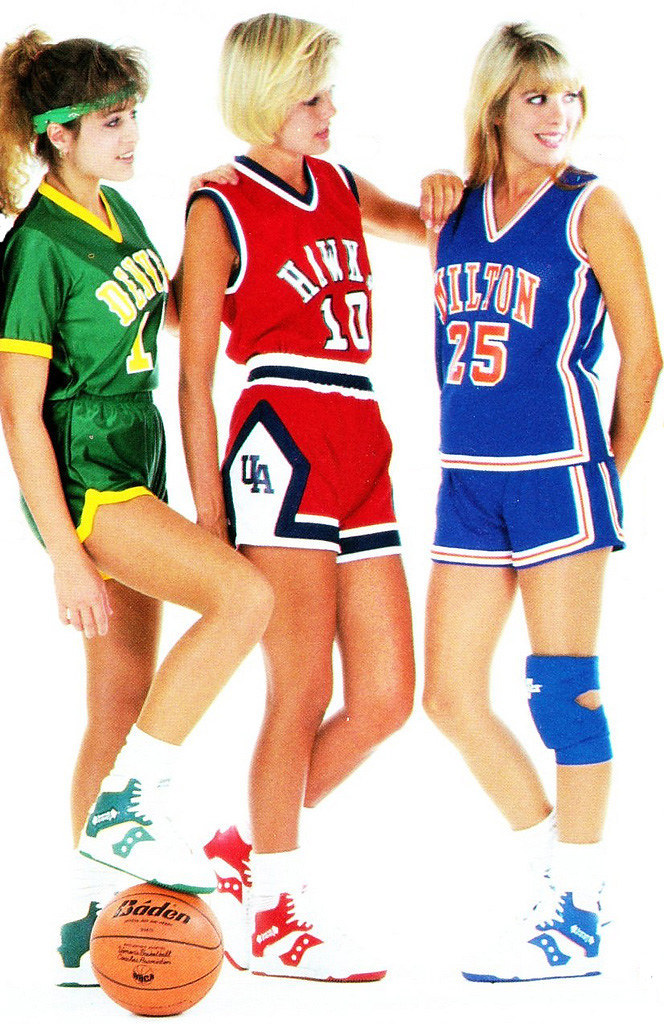
That image, surprisingly enough, is not from a tranny festival or a she-male convention. It’s from an old uniform catalog, one of several that were recently sent my way by sporting goods maven Terry Proctor (here’s the full page it appeared on). Unlike the mid-century catalogs I usually collect, the ones Terry sent me are from around 1990 and are from small, regional suppliers, all of which adds up to some hilariously bad hairstyles, amateur models, and photos like the one you see above. Some surprisingly interesting uniform styles, too. Let’s take a look.
We’ll start with a few pages from this catalog from Leader, an Ohio operation. There’s no date on the catalog, but the hairstyles seem very late-’80s. If you can get past that, however, there’s at least one very interesting design lurking here: this one. Never seen that chevron-based jacket style before, and I kinda like it (although for some reason it doesn’t work as well on this pullover). Something else I’ve never seen: a dugout-style jacket with a car coat-ish length.
Next up: this 1990 catalog from Betlin (whose art director really liked posing people with one hand behind their back or in their pocket). Lots to cover here, so let’s switch to the list format:
• Never seen an untucked hoops jersey on a kids’ uni before.
• Look at the guy in the center of this page Is that the weirdest-looking TV number ever or what? I love the striped jersey in the next photo to the right, natch.
• Another style I’d never seen — check out the third guy from the left. I guess that design concept never caught on.
• Amidst all the bad hair and goofy-looking poses, I love — love — the uni design at far left. The collar, the sleeve stripes, the chest design, even the side panels. Very cool. (Almost as good: the uni worn by the black model on this page.)
• As most of you know, I can never get enough of stripe template pages.
And our final catalog is this Speedline edition (the source of the tranny photo), which appears to be from the early ’90s. As you can see, their first problem was with the cover design — the combination of the super-low lighting and the term “Institutional Women’s Catalog” makes it seem like a collection of prisonwear. Among the highlights:
• An entire page of untucked hoops jerseys. The orange and yellow ones are quite nice, methinks. Also, check out the note regarding the yellow one — why would it not be up to state specs? The off-center number, perhaps?
• What’s better than an untucked jersey? An untucked jersey with sleeves.
• Can you imagine an entire team dressed up in the uni shown at far right?
• These jerseys are interesting — several of them provide the illusion of a halter top.
• Love these orange stirrups with the blue edging. Here’s another view.
• And here’s another striping guide.
Okay, that’s it. Thanks for sending these, Terry.
Sock Giveaway Reminder: Today’s the last day for the soccer sock giveaway. Details here.
Collector’s Corner, by Brinke Guthrie
Photo: Yes, I wore a banana costume. Cincinnati Reds offices, 1988.
Today’s eBay action:
• This first item is so cool it needs to go first — a complete set of NFL Big Signs from 1974. All 26 (at the time) teams. Ooooooooh!
• This Wiffle Ball has been approved by Major Leaguers!
• I remember this baseball card. I can’t tell if he’s more upset over the terrible airbrush job or that his eyebrows look like caterpillars.
• Here’s a big lot of 1970s NBA pennants.
• Amazingly enough, I do not recall this 1974 NFL book. How did I miss it?
• Here’s a very nice NHL puck display.
• How long did it take the Bears to create this cover design? Sixty seconds?
• Who knew WVU was big enough to have their own football game? (Submitted by Jason Bernard.)
• I’m not sure which is more overpriced, this Vikings figurine (for that much coin, shouldn’t you at least get a uni number?) or this Vikings pennant, but they’re both pretty cool. (Both submitted by Brandon Detzler.)
• Worth every penny: an SF Seals and Oakland Oaks scrapbook. (From Noel Amezquita.)
• Today’s Mets items for Lukas: Check out this bobblehead/bank. I promise you if you put a flashlight under its chin and turn out the lights, that’s one scary bobble. And a great pennant, too. [I had that on my bedroom wall when I was a kid. — PL]

Seen something on eBay that you think would make good Collector’s Corner fodder? Send your submissions here.
Culinary Corner: My buddy Matt came over for dinner last night, and I don’t mind saying that the soft-shell crab sandwiches I prepared were among the very best things I have ever cooked. Really simple, too. My only regret is that I didn’t photograph anything, but you can use your imagination. Here’s the deal:
1. Light a hot charcoal fire (or, if you’re a wuss, turn on your gas grill).
2. Put a couple of ears of fully shucked corn on the grill. No husk, no silk — just the naked corn. Turn the ears occasionally until they’re nicely browned, with a few charred kernels, about seven or eight minutes. At the same time, cut two lemons in half lengthwise and put them on the grill as well, cut side down.
3. While the corn and lemons are cooking, put a small saucepan on the edge of the grill and melt about three-quarters of a stick of butter in it. When the butter has melted, remove the lemon halves (they should be nicely browned) and set aside. When the corn is done, transfer the corn to a plate.
4. After setting the corn aside, the lemons should be cool enough to handle. Squeeze all their juice into the saucepan with the butter and then add a few tablespoons of capers. Keep the saucepan on the edge of the grill.
5. Once you’re done with that, the corn should be cool enough to handle. Use a knife to strip the kernels from the cobs, leaving you with a plate of cooked kernels.
6. Now, back at the grill, put four soft-shell crabs on the grill. Cook for about two minutes and then turn. After turning them, cut two Portuguese rolls lengthwise and put them on the grill to toast. Cook crabs and rolls about two minutes more (but keep an eye on the rolls to make sure they don’t burn — it depends on how hot your coals are) and then remove crabs, rolls, and saucepan to a platter.
7. Assemble two sandwiches thusly: bottom of roll, a bed corn kernels, a crab, a bit of lemon-butter-caper sauce, another crab, more sauce, top of roll.
You now have two perfect soft-shell crab sandwiches. Believe me when I say you and your dining companion will you not be disappointed. Well, unless you don’t like soft-shell crabs, but that just means you’re beyond help, you poor thing. My sympathies.
Uni Watch News Ticker: The Lake Erie Crushers wore their “Keep Lebron in Cleveland” jerseys yesterday. ”¦ Good round-up of NPB alternate baseball uniforms here. ”¦ Is it just me, or does Arsenal’s new home kit look like a safety vest? (With thanks to Denis Hurley.) ”¦ Mike Delia found some pics of the Bruins wearing the team’s 50th-anniversary patch (here’s a close-up of the patch) and the Massachusetts bicentennial patch (and here’s a close-up of that one). ”¦ Here’s a weird one: a high school team with what can only be described as a half-Wolverine helmet. Looks like they use the other side of the helmet for merit decals (with thanks to Greg Riffenburgh). ”¦ Bryan Justman‘s latest DIY jersey is an SF Seals design. ”¦ Here’s a much better version of that photo from the three-way Dodgers/Giants/Yanks war bonds game. Caption: “5th War Loan Drive. The ex-stars of three New York teams, the Yankees, Giants and Dodgers, met to show their patriotism. L-R: Zack Wheat, Larry Doyle, Herb Pennock, Bill Klem, Roger Bresnahan, George Wiltse (wearing 1905 uniform), Wally Schang, Otto Miller, Nap Rucker.” And here’s a good article on the game (you da man, Phil). ”¦ An Air Force refueling plane has been given a Diamondbacks livery (with thanks to David Vines). ”¦ Andrew Oliver still had an undotted “i” yesterday (as noted by Tom Marquand). ”¦ Food for thought from Alan Borock, who reports that the A’s broadcasters mentioned last night that “this is probably the last year for the black alternate and that they were going to have a gold alternate next year.” … Excellent spot by Marcus Ramsey, who noticed that Nelson Cruz has a stylized set of initlals on the end of his bat. ”¦ Great bit of arcana from Chris Marrs, who writes: “Back in the summer of 1997, the Brewers hosted the Cardinals for the first time since the ’82 World Series, and both teams wore throwbacks for the occasion. One curious fact from that game, however, was that a 38-year-old Willie McGee was back on the Cardinals that season and played in that game. I thought it then but had no way to prove it: I believe that he was the first MLB player to wear a throwback uniform honoring a team that he actually played on.” Hmmm, is that true? What say ye, people?
The Arsenal kit is a lift of their early 60’s-85 when they were winning everything.
The white sleeves on the Arsenal Home kit date back to the 1930’s. This has been a tradition long before the 60’s.
The “cannon” graphic first made its appearance in the 1960’s.
link
Small correction, Arsenal didn’t win anything in the 1960’s, they we mediocre at best for the entire decade.
Long before the 60s, and long after the 80s. Red shirt/white sleeves IS Arsenal. The last two years with the wide white stripes were the aberration. Thank heaven they’re going to look like Arsenal again.
Yeah – bite your tongue on the “safety vest” line, Paul. That is exactly how an Arsenal home shirt is supposed to be designed. Another look – link
And this guy is one for one on the home shirt
link
The 2010-2011 away shirt is yellow – but has red stripes
link
That A’s news may be the best thing I’ve read this year. The blacks are utterly appalling and home gold alternates make infinitely more sense.
LOVE the return to their traditional kit.
what A’s news? What did I miss?
never mind.
Hopefully it’ll be like the latter and not the former in my concept:
link
Still short of kelly green. But if they go kelly next year, they should have a matching batting helmet.
This…absolutely this.
The kelly is so infinitely better than the current shade…I wish the gray road would get a redesign somehow as well though
Besides the powder blues (that I don’t like overall, but that’s a different story), these are the only colored jerseys that I really don’t mind aesthetically when paired with white pants. Not sure how they’d look with grey, however …
I think you know it would look like shit:
link
Which would then lead to one of these ideas, more or less:
link
I can’t see the pics, but I assume you are talking about gold jerseys and grey pants. Interesting, but when LSU baseball wears gold jerseys, it never wears grey pants, even on the road; only white. They wear white or grey with the purple jerseys, though.
Couldn’t have said it better myself, Russell.
Get your head out of the gutter, Paul. Not trannies … typical, everyday American girls in the late 80s!
Seriously, Saucony basketball shoes!! (Or, are they from sister company Spot-Bilt?)
Nice!!
PS, The pea coat — or car coat — letter jacket (referred to here as “dugout jacket”) was reasonably popular back in the late 80s, early 90s.
At the sporting goods store where I worked, for every guy who purchased a typical letter jacket, maybe 10% got the pea coat (because it was their school’s defacto design).
Girls would get the pea coat probably 60% of the time, seemed to be their “it” style.
The pea coat must have been a regional thing. I graduated from HS in 1991 and never saw those jackets in my neck of the woods (south central PA). I do remember that the nylon pullovers were popular with girl’s teams.
South Central PA??? Whereabouts?
Harrisburg area, East Pennsboro Township to be exact.
Dang if you ain’t right in my back yard!!!
Contact LIPhil for my email.
Is that my imagination or does the model in the LSU uni look like Denise Austin?
link
I think it’s your imagination. She just looks like a blonde chick from the 80’s. A few of those chicks look a little like Kelly Bundy from Married With Children. haha
That’s funny…I thought the one in the Elias uni looked a little like *Lynne* Austin (Darren Daulton’s first wife). Speedline appears to be based in Tampa and she’s from nearby Plant City, but that would put the pic more in the early 80s range.
I own the Ebbets Field version of Bryan Justman’s DIY. And he did a pretty darn good job, I must say.
On the morning of July 1st 1994, I sat with my dad in his hospital room at Christ Hospital in Jersey City and we watched the sun come up over midtown manhattan. It would be my Dad’s last sun rise. Every July 1st since, I wake up before dawn and wait for the sun….and yes it still comes up……..and since my dad was a big sports fan, I think about what was going on that summer…
The Knicks had just made it to the finals and lost to the Rockets in 7 games ( because Jordan was playing right field for the Birmingham Barons ). One of the games had bee interupted because of OJ and his white Bronco…
My dad was a Devils fan..so we will not mention the Rangers… The World Cup was being played on American soil..
My dad’s favorite football player, Phil Simms had just retired…
His favorite baseball player Don Mattingly had one more year left, and would retire without a ring…
His two favorite baseball teams the Yankees and Expos were in 1st….of course a month later, the season would be over because of the strike…oh and yeah it was the first season of realigment..
Perfect.
Great tradition, Ricardo. Hope today brings great memories.
Arsenal kit is awesome.
are the Blue Jays going to be wearing their version of the stars and stripes cap for Canada Day today? also, why can’t the schedule makers give the only Canadian team a home game on Canada Day?
These catalogs are fucking KILLING me. I particularly like this shot:
link
They just look so pleased.
Speaking of throwbacks and what nots… does any one else remember the Yankees actually wearing throwbacks? I remember watching ONCE a game in May 1996 when they were at Detroit and it was a game of the week on Fox where the Yankees were actually wearing the Negro League BLACK Yankees Road Unis… and Kenny Rogers was on the mound. Anyone else remember this? Can Provide pix of it? I Googled it and cant find nothing!
I don’t know whether the model in the Elias uniform is Lynne Austin or not — but it is possible. Speedline is headquartered in Tampa and Ms. Austin still resides within the Tampa Bay area.
No mention of yesterday’s Double Duty Classic?
link
And a couple more pix here: link
Didn’t know about. Looks pretty swank!
In 1999, the Rangers wore throwbacks to honor Nolan Ryan’s induction into the Hall of Fame. Pudge Rodriguez, Juan Gonzalez, Rafael Palmeiro and possibly more would have worn those uniforms both times. Granted, they wore throwbacks from the early 90s so that may not really count.
so it’s not really a “throwback” so much as a “lob-back?”
Didn’t the Astros do a bunch of throwbacks at the end of Craig Biggio’s last season? I think they wore every uniform he had ever worn.
Yes they did. For the last Friday-Saturday-Sunday of the season, which was at home, the Astros wore:
Friday – 1989 throwbacks
Saturday – 1994 throwbacks
Sunday – current uniform with Biggio doing the catching for the first inning. So, he was in a “throwback position”.
“Look at the guy in the center of this page Is that the weirdest-looking TV number ever or what?”
I think it’s a panther
link
So is there a play icon I can click on to see what happens next between Ms Hawk girl and Ms Milton – I feel 16 again
You gotta keep Ms Denver in there too! The more the merrier, eh? 3>2
And what’s with the lone kneepad?
Great news about the Oakland A’s going to a gold alternate like days of yore! Green, gold, white, and grey — that’s all they need. Ditch the black.
I miss big hair…
Love the 80s unis. Not a fan of those chevron jackets, especially the lettering on them. Otherwise, great stuff today.
Put me down in the “I miss big hair” column.
Found this at the SportsLogo.net forum.
The five potential destinations of LeBron photoshopped
link
Put aside — if possible — thoughts of the team, the record, the (prior) management, and that Nets uni actually looks pretty good. Such a dorky name, though. When the franchise moves to Brooklyn…
A. Should the team refer to itself as 1) the Brooklyn Nets, 2) the New York Nets, 3) the Brooklyn Something-Elses, or 4) the New York Something Elses?
B. If you voted for 3 or 4, what should be the new nickname. [Personal preference: Brooklyn Accents.]
C. How about colors, logos, what have you?
No change in name. The Nets really do have a good history going back to the ABA days and Dr. J. The name is well-established and has that tradition of rhyming with the Mets, Jets and Sets (defunct Team tennis).
Of course you could get a bunch of 7-footers playing at the same time and call them the Brooklyn Heights.
Is a basketball equivalent of the Brooklyn Dodgers uniform/identity too much of a cop-out? If it’s not, any chance MLB would allow it?
Radical proposal: Upon the move, the team simply calls itself Brooklyn. No nickname. If a plural is required for grammar purposes, the Brooklyns or Brooklyners.
But back on Planet Things That Could Actually Happen, I’d be happy with the Brooklyn Nets. Though I’m not sure the team would be happy with a name that’s a homophone for “Brooklynettes.” It would be confusing, though, to have the New York Knicks and Nets, so it’s gotta be Brooklyn.
Or maybe, to counter the alliterative New York Knicks, the Nets could become the Brooklyn Bockers.
Think “Fuhgeddaboutits” would be hard to fit on an NBA jersey? :-)
Why would it be confusing any more than having two New York teams in the other sports? And remember, until the late 1970s, they were the New York Nets.
Try saying the words “Knicks” and “Nets” out loud. Try saying “Knicks not Nets” five times fast. They’re just very similar words. “New York Nets” and “New York Knicks” sound too darn much alike. They’re both highly alliterative, with monosyllabic nicknames starting with a pronounced “n” followed by a short vowel and a high-tongue consonant. It’d be like the Yankees changing their name to the New York Mitts. Sure, it’s not exactly the same word as Mets, but close enough to be a bad idea.
The Brooklyn WhatTheF**kYouLookinAt?s
I am a Net fan and thinks it will probably be Brooklyn Nets….but Brooklyn Heights sounds interesting….
Nothing wrong with the name, but the team is limiting its reach by confining its name to one borough. It’s why the Angels are no longer the Anaheim Angels, but instead adopted the name of the metro area (they’re not even in L.A. County). Heck, the Jets and Giants aren’t even in New York State. If the Nets keep the New York name, will they still be able to reach into Jersey? Not sure, but at least they can claim the five boroughs and the state of New York.
“I am a Net fan and thinks it will probably be Brooklyn Nets….but Brooklyn Heights sounds interesting….”
Kind of like the erstwhile London Towers
Interesting that all the Speedline models are wearing Spot-Bilts. I worked for Spot-Bilt in the late 1980’s, and am not aware of any affiliation. I’ve sent out an e-mail to some friends who were there into the 90’s and will report back on the relationship, if any.
Here’s a nice Hawaiian Winter League baseball hat for the Collector’s Corner. It’s the Honolulu Sharks.
link
Thanks.
Speaking of hats, if anyone finds the Broad Street Bullies hat on the left in a 7 1/4 or 7 1/8 let me know
link
Of all the Hawaiian League teams/hats, I liked the Sharks one the best. I’m not sure about the purple now, but I wanted one back in the day. A friend of mine had a Kona Navigators hat which was nice too.
The ‘Keep-Lebron-in-Cleveland’-themed blog link is selling these link.
link
Brilliant!
Um.. I think they were referring to Denise Austin, not Lynne…
Anyway I’m 99% sure given the Red and Blue “LIONS” on the dugout and the buildings in the background that the Softball pics were taken at King H.S. in Tampa. link
Adam said:
Speaking of throwbacks and what nots… does any one else remember the Yankees actually wearing throwbacks? I remember watching ONCE a game in May 1996 when they were at Detroit and it was a game of the week on Fox where the Yankees were actually wearing the Negro League BLACK Yankees Road Unis… and Kenny Rogers was on the mound. Anyone else remember this? Can Provide pix of it? I Googled it and cant find nothing!
~~~~~~~~
holy shit… i said the SAME EXACT THING three days ago…
so i WASN’T dreaming…
Wow. That is amazing. I mean, you’ve got some really useful links on that bookmarks toolbar of yours.
– Free Hotmail
– Internet Start
– Free AOL & Unlimited Internet
what are those things anyway?
they came with the computer
Well, in that case, you’d best leave them alone or the computer might break.
You can right click on them and delete them, if you want. Or right click and hide the bookmarks row. Or drag new web addresses to that row too, so you have your favorites just one click away.
I remember watching that game, too (here’s the link).
The Yanks wore this cap and link (sans piping, I think) with plain road gray pants. Detroit wore something similar to what they sported link, although I remember them wearing this link.
I’ve searched Getty, Corbis, SI, AP, & UPI for photos of the game and so far, bubkis…
Correction:
“The Yanks wore link…”
I have a better question about this. if they did wear them, why is it that there is NO proof of it happening? And more importantly why would they wear a Negro League Uni? I mean these were the BOSS’s Yankees, so why would he have agreed to do something like that?
The internet was still in diapers in 1996, so not everything shot or recorded was archived, let alone posted. Or perhaps the Steinbrenner-controlled media has erased all traces of those throwbacks ever existing. But I remember seeing them in action. In fact, it was one of the first Negro League tribute throwback games that I can recall…
Here ya go.
link
or
link
This is all i got
“You do not have access to view this page.
We’re sorry, but you do not have permission to view the page you requested Click here to go back to the previous page.”
I meant to say, I clicked on your tinypic link, and this is all I got… (The error message)
I’m working on fixing that.Give me a sec.
link
I think that fixed it.
Thanks. Looks like some proof to me…
I am not sure why I don’t remember the Yankees ever being involved in a “throwback game”…. are there any actual game pics…..
ok … perception is a wonderful thing … I was expecting a jersey of the darkest of darkest hues … It all makes sense, but still took a minute to register.
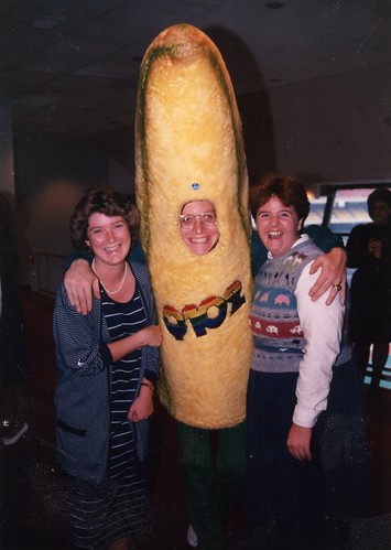
Wow! Never in my life did I think I would come to UniWatch and see the Q102/Chiquita Banana … I guess you should never say never. Brinke what sins did you commit that forced you to wear that costume?
Listen, I was bigger than the Beatles. The deal is; Every week I have 5K to give away. Send in a card, tell us where you’ll be at 4pm on Thursday. We pick your card secretly, show up at your place, if you’re there have you have a card with the logo on it and your radio on- I hand you 50 100 dollar bills..cash. I had people CHASING ME IN THEIR CARS.
PS and I was in the Reds Clubhouse and pitcher John Franco tackled me from behind yelling “It’s Condom Man!!!” True story.
Two things about that Massachusetts Bicentennial patch photo: The Bruins, Celtics and Red Sox all wore them in their own colors (I’ll try to get pictures of the others). The other is that that’s a rare photo of Bobby Orr and Brad Park playing together, sadly Orr wasn’t with the Bruins much longer after that.
“Here’s a weird one: a high school team with what can only be described as a half-Wolverine helmet. Looks like they use the other side of the helmet for merit decals”+
link
I may be running the risk of sounding stupid, but what does that picture have to do with Chris Henry? I see a bunch of white kids in that pic.
That’s the picture as-is from a SI.com article. The author asks, “In light of Chris Henry’s medically-confirmed, and probably football-induced, brain damage, do I want my kids playing tackle football?”
not to make light of a horrible tragedy, but is it possible that his brain damage was the result of a fall from the back of a pick up?
Almost positive the autopsy showed a chronic brain illness. Would have implied brain damage from earlier football playing, not just one fall/jump out of a pickup truck. But I’m no doctor.
Where is that story anyway? Link here.
link
That would be my first thought, unfortunately we live in an age where things like that are often overlooked. Personally, I wouldn’t mind seeing what the experts in the field say about it, before I start on with the “tackle football is bad” crap.
Just a note on the Airplane getting the “livery” wouldn’t that just be a decal? To me, the livery encompass the entire machine (such as a plane, or an race car)
For example: Livery : link or link
Where as a decal would be : the “team penske”, and the other sponsors on the car..
That’s just my thought though..
A while back Uni Watch linked to a photo that depicted NFL animal logos with helmets similar to the Dolphins’ “M” helmet. The link no longer works and I can’t seem to find it anywhere online. Here’s what it looks like as a thumbnail:
link
If anyone happened to save a copy of the image, please let me know. I’d love to see it again and put it online for good. The original was called logoswhelmets.png on the site it was on so you may have saved it under that name as well. Thanks!
I’m not quite sure about that new Golden State jersey. Having such a centralized logo looks kind of funny to me on a basketball jersey. It’s kind of reminding me of the 90’s Hawks and Rockets (but not nearly as bad). It’s also tantamount to the early Blue Jays. Part of me thinks save that shit for hockey.
Dumb question- do you eat the shell and all on a softshell crab? Isn’t the inside – goopy?
I’m from the midwest go easy on me!
actually “softshell” is a bit of a misnomer, since they are actually just molting (or having lost) their shell…they usually begin to grow one back in like 4-5 days, so the time of ‘harvesting’ is key; after a few days they begin to regrow a shell, which should be removed otherwise they can get a bit crunchy
but the inside is the same as on any crab — similar to a lobster
im not a ‘food fan’ but i do love me some soft shells (although i prefer them deep-fried to grilled)
As Phil notes above, they’re molting. The fishmonger removes the lungs (spongy, inedible) and cuts off a little portion of the face (not sure why, actually, but it’s the standard thing to do), but aside from that you do indeed eat the entire thing, goopy innards and all. But they’re less goopy once they’re cooked.
Here are a couple of better pictures of the new Michigan State football helmet:
link
I’m not a fan of that stripe, but I wish the Broncos and Panthers would consider something like it. It’s much better than what they are sporting.
Well, it could have been worse. Put me down as thinking Michigan State uniforms should be like their mascot: Spartan.
I’m not a crab fan (I guess there’s no hope for me) but I just wanted to say how much I enjoy reading culinary corner. Great stuff.
I must respectfully disagree with Brinke’s assessment of this:
link
I think the design is immaculate.
Yup. Less can definitely be more.
—Ricko
Also worth remembering that in 1974 media guides were not designed with the public in mind, because they rarely were made available to the public.
So something a bit utilitarian was not a bad thing.
—Ricko
On the topic of the Negro Leagues, here’ a feel-good story and effort from this morning’s NY Times, Giving Proper Gravestones to Negro Leagues Players link
Nice logo on marker
Back to comments about comments, specicially comments about comments about comments about comments –
With the new format, are there only three levels of replies allowed?
The 2011 All-Star Game could celebrate…
40 YEARS of DOUBLEKNIT!!!
Mustard hat Pirates (since they were the first)…All-red Indians…Sunrise Astros…A’s in White Pants with Kelly, Gold and White jerseys…Giants with orange sanis and white cleats (if allowed to wear their roads)…All-yellow Padres…powder Twins, Brewers and Royals…Red hat Red Sox (think Fisk, ’75 WS)…Powder blue White Sox with red cleats, etc…
National League at home in ’11 in Phoenix, so no powder Cards or Phillies, or Powder pins Cubs. Sorry. Mets in Strawberry should and pants stipes, though. And those memorable Big Red Machine stirrups…
Sounds great until you imagine them all in baggy unis…like the A’s all-gold the other night. Then kinda goes “oh yuck” real fast.
—Ricko
Expansion teams in “what would have beens”.
I’m gonna guess (and maybe it’s just me) that 40 YEARS OF DOUBLE KNIT is a whole lot bigger deal here at UW that it is throughout MLB. Or among all the Uni Muggles out there, for that matter (y’know, to borrow from Hagrid…”Non uni-folk”).
—Ricko
The Rays will wear Tampa Tarpons throwbacks against the Baltimore Orioles in their all-orange throwbacks (worn only twice, supposedly) on Aug. 13.
link
The press release includes a list of other Rays throwbacks worn.
Considering nicknames like ChiSox and BoSox it has always struck me that Tampa Tarpons was a terrible choice for a team name.
“Go, you Tarpa Tampons!!!
Anyone who yells that probably is a good example of why we shouldn’t drink too much at a ballgames.
Anyone have any advice or instructions on painting a previously unpainted batting helmet?
Seattle area Uniwatchers:
Scott M.X. Turner (Uniwatch designer extraordinaire)/ aka RebelMart, performs his music tonight at Skylark on Delridge Way, 9-10.
Regarding the comments conundrum: there used to be RSS feeds available for the comments on individual posts. I don’t see that option any more. Those would be helpful for finding the most-recently added comments.
~~~~~~~~~~~~~~~~~~~~~~~~~
I gotta say that I’m more than just a little peeved that I’m only now hearing about this link. Chicago sports radio/TV/papers have been all-LeBron-all-the-time lately.
Hell, I just checked today’s Sun-Times and I couldn’t find word one about the event.
~~~~~~~~~~~~~~~~~~~~~~~~
To those who miss link: my wife has never had the big hair but it still seems like it takes her two hours to get ready to go out. I can’t imagine what that would be like if she had some teased-out beehive perm type situation to deal with.
Which one is your wife?
I can’t wait to meet her.
Chaka Khan!
You didn’t read very far past the word “wife” in my post, did you?
did lebron sign with the bulls yet?
that’s your wife on the left, yes?
No duh.
I saw no mention of old bay in that description of a crab cake meal.
As a marylander, that makes me sad.
“Here’s a weird one: a high school team with what can only be described as a half-Wolverine helmet.”
I guess they run the single wing.
And people say our educational system isn’t left wing.
does the guy remind anyone of donnie most?
By the look on his face, it just might be!
(Five years ago I was ROCKIN’ IT in the diner with my buds … now Richie won’t return my calls, and Fonzie’s out jumping his BMX over any aquarium he can find …)
“Hallo, I am Jan Stenerud. I yust arrive in your county to be ski jumper. Maybe someday kick for team in Kansas City, Illinois. I am not sure yet.”
–Ricko
“ski yumper”
(sorry about that)
…and a little bit of Anson Williams.
More like Donnie Least.
This is only a link.
R.I.P. link.
test
Tranny, She-male? Really!?!? These terms are not appropriate to use. You wouldn’t use other derogatory words on this site like the “N’ word or fag, would you? Transgender people like myself are pretty much offended whenever we hear “she-male” and slightly less so, when we here Tranny. I’ll chaulk it up to you being uninformed, so I hope you’ll use less demeaning terms in the future. Trans people like sports and sports uniforms too you know.