Time for another batch of awesome football photos from Robert Harvell’s archives. Last time around we focused on helmets and facemasks, but this bunch is all over the the lot. Enjoy.
• Never would’ve guessed that the ushers in Tiger Stadium would wear so much green.
• That’s Paul Brown. Not sure of the photo date, but I think the “CB” refers to Cincinnati Bengals (not Cleveland Browns).
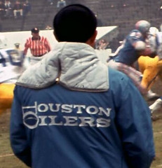
• That is one sweet Oilers jacket.
• Love the little Chargers dude in this Coke ad.
• I initially thought this was a black cheerleader (a rare sight back in the day), but then someone pointed out that it’s actually Flip Wilson — with Redd Foxx behind him!
• Here’s an excellent view of how the Jets’ jersey was supposed to look, back when jerseys had sleeves.
• With all the recent chatter about the Redskins possibly switching to gold pants next year, I’ve been thinking a lot about this gorgeous design.
• Blue lightning bolts! The Chargers wore that design in 1966.
• Vince Lombardi wasn’t the only famous Packers coach who later defected to the Redskins, as you can see in this shot of Curly Lambeau.
• Which came first: The width of the hashmark or the width of the paintbrush?
• I used to think this was the weirdest headwear Y.A. Tittle had ever worn, but that was before I saw this shot of him conferring with John Brodie.
• Eyewear on the gridiron: Joe Washington, Joe Lavender (“He was known to use several different types of glasses, depending on the weather,” says Robert), and Bob Griese.
• Speaking of Griese, it looks like the lower bar of his facemask was a bit warped.
That’s enough for today. More photos from Robert’s archive soon.
Collector’s Corner
By Brinke Guthrie (who apparently has an inexhaustible supply of sports-themed photos from his youth)
Photo location unknown, but probably Maine or Louisville. The sweatshirt says, “University of Louisville.”
Here’s our latest batch of eBay finds:
• You don’t often see a Kentucky Colonels warm-up jacket. (My favorite player? Louie Dampier.)
• Here’s a big lot of cool NFL stuff, circa 1978.
• Nothing says “Mariners” like that trident logo.
• Check the chain-stitching on this old Packers jacket.
• Why settle for an NFL sweater when you can have an NFL Alumni sweater?
• A rare 1976 Jim Rice glass from “Papa Gino’s.” Rare in that he’s actually smiling.
• Patches don’t get more generic than this. That’s really supposed to be Sweet Lou?
• Pretty cool patch from the 1979 MLB tour of Japan.
• I think this is a Uni Watch first: a Tom Terrific bubble gum comic.
• Never seen this 1977 MLB All-Star Game patch before. Those New Yorkers sure get a lot of mileage out of that “Big Apple” nickname, eh?
OK. Now for that Ticker thing.
Uni Watch News Ticker: If you think MLB’s stars/stripes caps were a bit much, check out the jerseys worn on Memorial Day by the Kane County Cougars (with thanks to Jacob Kubuske). ”¦ You know how NFL teams can only wear their alts or throwbacks for two regular season games per season? That rule is apparently no longer in effect, because the Ravens are planning to wear their black alts three times this fall. ”¦ Longtime GQ style writer Glenn O’Brien has put together a lengthy slideshow on baseball uniforms. It’s mostly predictable, boilerplate stuff, but I was intrigued by O’Brien’s caption on this photo of Vince Coleman, in which he says Coleman claims to have put a major nail in the stirrup’s coffin. I’d never heard that before. Anyone else? ”¦ Josh Weissman notes that Tomas Kopecky still has the old NHL logo on his pads. ”¦ What’s even creepier than a jersey with a swastika on it? A jersey with a swastika on the sleeve and the word “Swastika” down the placket (with thanks to Mike Hersh). ”¦ Mike also pointed me toward this old baseball catalog. I was particularly interested in this page scan — note the jackets shown with the sweater on the right-hand page. “Base Ball Uniforms are not complete without the Sweater Jackets or Base Ball Coats.” Hmmmm — never seen coats like that on a ballplayer. Anyone..? ”¦ The Vancouver Whitecaps have unveiled their new kits. “Pretty standard, but at least better than the neon Sounders,” says Steve May. ”¦ One of the better World Cup jersey surveys can be found here. ”¦ Speaking of the World Cup, look at this — a little World Cup sculpture carved into a crayon! Further details and lots of additional photos here (thanks, Kirsten). … Still more about the Cup: Here’s what the refs will be wearing. “Notice the cute matching wristbands,” writes Marty Byrne. “And the red whistle. Why not neon-yellow and cyan-blue?” ”¦ Now that the Toledo Mud Hens don’t have to go high-cuffed, lots of their players have been altering their pants, although that photo doesn’t really show very much. ”¦ Interesting move by theWashington Post, which honored DC’s top high school athletes with an old-school trading card motif (with thanks to BJ Lanier). ”¦ The Devils are moving their AHL affiliate from Lowell to Albany. Details and a preliminary new logo here (with thanks to Dave Plante). ”¦ Women’s clothing traditionally has buttons on the opposite side of the placket than on men’s clothing, so it makes sense that you’d see softball jerseys with the women’s format. Well, sometimes (good spot by Scott Martinho). ”¦ Interesting project from Larry Granillo, who writes: “I wanted to see if I could come up with a unique chess set using baseball greats, but I didn’t want it to be just another list of the 20 best players or whatever. The set I came up with, in fancy graphic form (including era-specific logos), has each piece matched up with a player with the same personality. So, the hard-nosed rook is represented by Roy Campanella, while the disruptive knight has Rickey Henderson, etc. Here’s the chart, and here’s the full explanation.” ”¦ New summer home uni for the Yokohama Bay Stars (thanks, Jeremy). ”¦ After last night’s Mets/Padres game, the Mets players were shown dropping their caps into a box on their way back to the clubhouse. As Phil has previously noted, they do this whenever wearing their black/blue caps for the final game of a homestand, because that is also their road cap, so that box with all the caps was then packed with all the other gear for the road team’s road trip (video grab courtesy of Jay Palmer). ”¦ Phil has compiled a bunch of old Padres photos. No, not the major league Padres — the old PCL Padres. ”¦ Reprinted from yesterday’s comments: What if we skipped the players and just had the World Cup uniforms play against each other? ”¦ What’s that hanging on the next to Teddy Ballgame? Looks like a flocked helmet, with a raised logo appliqué. “I don’t think I’ve seen a Red Sox flocked helmet before,” says Bruce Menard. Me neither. ”¦ Nike has come up with new uniforms for the 2010 World Basketball Championships. Full details in this promotional video (with thanks to Jed Herrera). ”¦ Nate Robinson has been wearing Livestrong-style wristbands with the MLB logo. ” It’s interesting that the NBA has allowed him to wear another league’s logo,” notes Kyle Mackie). ”¦ Bob Bellamy notes that Cardinals draftee Jordan Swagerty wears some pretty serious ’80s-style stirrups. In fact, it turns out that the whole ASU team wears that style. ”¦ What with the Blackhawks’ championship ring look like? For reference, here’s their ring design from 1961 (Bruce Menard again). ”¦ Speaking of the ’Hawks, Robert Marshall reports that the high-rise artwork on the Chicago skyline changed last night. “‘Let’s Go Hawks’ became ‘Hawks,’ or maybe ‘Hawks Win’ — tough to say. For sure there was a Chief Blackhawk outside where there was not before.”
I think your black cheerleader is Flip Wilson. Looks like Redd Foxx behind him.
I love the cabinet handle on the side of Y.A. Tittle’s helmet.
Also, I give a resounding hell yes to that Mariners all-star pin.
The Whitecaps jersey links aren’t showing up.
And lastly, what the hell am I doing up at 5 in the morning?
[quote comment=”393867″]I think your black cheerleader is Flip Wilson. Looks like Redd Foxx behind him.[/quote]
Good call. Text now adjusted.
[quote comment=”393868″]The Whitecaps jersey links aren’t showing up.[/quote]
Thanks. Now fixed.
Or maybe it was Flip Wilson’s sister/alter ego Geraldine.
From baltimoreravens.com:
“Every NFL team is permitted to wear its alternate or throwback jersey up to three times a year, but must choose one or the other. In other words, you can’t wear the throwbacks twice a year and alternates once.
It’s an easy decision for the Ravens since the franchise, established in 1996, doesn’t have throwbacks.”
link
Wasn’t Tiger Stadium’s color green until the mid to late ’70s, when the Tigers painted everything blue and orange? It makes sense that the ushers uniforms would be green to match the general appearance of the stadium.
[quote comment=”393871″]From baltimoreravens.com:
“Every NFL team is permitted to wear its alternate or throwback jersey up to three times a year, but must choose one or the other. In other words, you can’t wear the throwbacks twice a year and alternates once.
It’s an easy decision for the Ravens since the franchise, established in 1996, doesn’t have throwbacks.”
link
I always thought you were allowed to wear alts once in preseason and twice in the regular season, so this sounds like a change in policy to me. Am I the only one who remembers it being that way?
And everything they know about how to wear pants and stirrups they evidently learned from watching women’s softball…
link
Pants WAY to high (an baggy) for stirrups that high. For baseball, anyway.
—Ricko
Unless, of course, they WANT to look like doofuses.
Vince Coleman thinks the way he wore his stirrups changed something?
Get over yourself, Vince.
Maybe he’s trying to be remembered for a career sidelight other than being run over by a tarp.
—Ricko
Anybody notice in that San Diego team picture…
there’s a guy/kid in the middle, back row with what looks like “Hollywood” on his jersey (rather than San Diego)?!
Curious.
in regards to “- A rare 1976 Jim Rice glass from “Papa Gino’s.” Rare in that he’s actually smiling.” Papa Gino’s is a Boston area pizza chain
This morning’s Washington Post featured an article on Washington Capitals owner Ted Leonsis’ official introduction as the majority owner of the Washigton Wizards. Uni-related news here:
“Leonsis said he would not change the Wizards’ name, but the blue, white and gold uniforms that have long been a source of frustration for fans might see a return to the red, white and blue uniforms the team wore when it was known as the Bullets.
‘It’s no secret I am partial to red,’ Leonsis said. ‘We all saw the change in the Capitals’ uniform and how it was galvanizing.'”
Link: link
As a long-time Bullets fan (“I Still Call Them The Bullets” shirts, anyone?), I’d love the name re-change, but would settle for the red, white, and blue.
Looks like that ring says ‘BLACK HAWKS,’ doesn’t it?
[quote comment=”393873″][quote comment=”393871″]From baltimoreravens.com:
“Every NFL team is permitted to wear its alternate or throwback jersey up to three times a year, but must choose one or the other. In other words, you can’t wear the throwbacks twice a year and alternates once.
It’s an easy decision for the Ravens since the franchise, established in 1996, doesn’t have throwbacks.”
link
I always thought you were allowed to wear alts once in preseason and twice in the regular season, so this sounds like a change in policy to me. Am I the only one who remembers it being that way?[/quote]
And once in the postseason, as well — that’s the way I understood it. And, aside from special tributes like last year’s AFL anniversary, I can’t recall any team doing alts thrice during the regular season.
In regard to the Kopecky shoulder pads with old logo. It is very common for hockey players to spend their entire pro career with the same protective equipment. These shoulder pads were probably issued to him back when he was drafted in 2000 and he hasn’t felt a need to upgrade them. There’s a good chance that some of the other veteran Hawks (and Flyers) have the same shoulder pads.
[quote comment=”393880″]Looks like that ring says ‘BLACK HAWKS,’ doesn’t it?[/quote]
It was technically “Black Hawks” until 1986, when I believe the team found old paperwork showing it was only supposed to be one word. Since then, it has been “Blackhawks”.
The Albany Devils logo is terrible…they could have simply made a normal “A” and have the devil tail extend from there…would have been alot cleaner…but, still have hockey in Albany, so I am grateful for that!
The Griese facemask in question is a Dunguard DG105 and although there is a definite bend or dip on the lower bar that is how they were all made straight from the factory. Kudos to Mr. Harvell again for sharing his encyclopedic files on football.
[quote comment=”393884″]The Albany Devils logo is terrible…they could have simply made a normal “A” and have the devil tail extend from there…would have been alot cleaner…but, still have hockey in Albany, so I am grateful for that![/quote]
“preliminary”
Any idea why Steelers are wearing their yellow helmets in voluntary mini-camp? Or is the caption just wrong? Or are just the quarterbacks wearing the alternative (similar to the off-color jersey they wear for non contact)? Odd that a team would outfit everyone (since lots of players there are likely to be cut) with an alternative helmet.
link
– I used to think this was the weirdest headwear Y.A. Tittle had ever worn, but that was before I saw this shot of him conferring with John Brodie.
Maybe I am a DA, or not as cool as the rest of you, but I dont get the 2nd picture… what is this showing me? That Tittle is using that handle to hold his headgear? DONT see it
“Whitecaps FC players Martin Nash and Kara Long”
Is there a female on the team? I know soccer isn’t (yet) a “major” sport in the US, but if she’s on the team, shouldn’t that be pretty signifcant news in the grand scheme?
[quote comment=”393888″]- I used to think this was the weirdest headwear Y.A. Tittle had ever worn, but that was before I saw this shot of him conferring with John Brodie.
Maybe I am a DA, or not as cool as the rest of you, but I dont get the 2nd picture… what is this showing me? That Tittle is using that handle to hold his headgear? DONT see it[/quote]
Tittle is the one in the goofy white hat.
[quote comment=”393889″]”Whitecaps FC players Martin Nash and Kara Long”
Is there a female on the team? I know soccer isn’t (yet) a “major” sport in the US, but if she’s on the team, shouldn’t that be pretty signifcant news in the grand scheme?[/quote]
The Whitecaps have both men’s and women’s teams.
[quote comment=”393887″]Any idea why Steelers are wearing their yellow helmets in voluntary mini-camp? Or is the caption just wrong? Or are just the quarterbacks wearing the alternative (similar to the off-color jersey they wear for non contact)? Odd that a team would outfit everyone (since lots of players there are likely to be cut) with an alternative helmet.
link
Most likely because they want both sets of helmets “broken in”. No football player feels comfortable going into a game wearing a hat he isn’t comfortable with.
—Ricko
—Ricko
Chess set boy should know that layouts are presented with the white pieces on the bottom, in order for the rank-and-file system to read properly.
Check out the difference between the Redskins jersey numbers (in the gold pants referenced photo) and the helmet numbers….HUGE difference….
[quote comment=”393893″][quote comment=”393887″]Any idea why Steelers are wearing their yellow helmets in voluntary mini-camp? Or is the caption just wrong? Or are just the quarterbacks wearing the alternative (similar to the off-color jersey they wear for non contact)? Odd that a team would outfit everyone (since lots of players there are likely to be cut) with an alternative helmet.
link
Most likely because they want both sets of helmets “broken in”. No football player feels comfortable going into a game wearing a hat he isn’t comfortable with.
—Ricko
—Ricko[/quote]
that’s probably better than my “just for the hell of it” answer! lol. but it looks like everybody wore them:
link
[quote comment=”393896″][quote comment=”393893″][quote comment=”393887″]Any idea why Steelers are wearing their yellow helmets in voluntary mini-camp? Or is the caption just wrong? Or are just the quarterbacks wearing the alternative (similar to the off-color jersey they wear for non contact)? Odd that a team would outfit everyone (since lots of players there are likely to be cut) with an alternative helmet.
It’s kind of strange that they have the decals on them, too. Seems like a waste for minicamp as most teams tend to wait until real games happen before they apply decals to their helmets.
link
Most likely because they want both sets of helmets “broken in”. No football player feels comfortable going into a game wearing a hat he isn’t comfortable with.
—Ricko
—Ricko[/quote]
that’s probably better than my “just for the hell of it” answer! lol. but it looks like everybody wore them:
link
Whoops. It’s kind of strange that they have the decals on them, too. Seems like a waste for minicamp as most teams tend to wait until real games happen before they apply decals to their helmets.
Paul said “I was particularly interested in this page scan – note the jackets shown with the sweater on the right-hand page. “Base Ball Uniforms are not complete without the Sweater Jackets or Base Ball Coats.” Hmmmm – never seen coats like that on a ballplayer. Anyone..?”
Well… indeed I have! If you go to link (which I just came across a couple days ago and hadn’t remembered to forward along), scroll down about a quarter of the way and there’s a couple shots of Rube Waddell in the single-breasted jacket. If you scroll down a little further, there’s a great shot of Nap Lajoie and Honus Wagner. Hans is wearing the single-breasted jacket with some cool entwined letter embroidery which appears to be PBC (Pittsburgh Baseball Club, perhaps?)
Funny that both jackets were on the same page. Ask and ye shall receive, Mr. Lukas!
Man, so much to like in this installment of the Robert Harvell Files. So many great images, it’s tough to pick a favorite. The shot of Joe Lavender is killing me. I’m loving the Jets picture:
link
You can damn near feel that jersey, can’t you?
[quote comment=”393894″]Chess set boy should know that layouts are presented with the white pieces on the bottom, in order for the rank-and-file system to read properly.[/quote]
you noticed that, but you didn’t notice his name is Larry Granillo? or am i missing something?
either way, pretty cool project larry! the old pirates logo brought a smile to my face right away!
[quote comment=”393895″]Check out the difference between the Redskins jersey numbers (in the gold pants referenced photo) and the helmet numbers….HUGE difference….[/quote]
Been over this before.
a) Back then there were only two, maybe three, fonts available in number decals. And originally only in black or white.
b) Most times, the purpose was for players and equipment people to identify whose helmet was whose. Weren’t considered much a part of the design (still aren’t by most teams), and looked a heckuva lot better hand-numbered, which sometimes had been the case.
Essentially same story for numbered batting helmets in MLB.
Not everything has always been as it is today. The world was a lot different before computers came along to making matching things perfectly easy, and make SO many other things possible.
The raised style lettering on MLB hats, for example. That goes directly to precise computerized equipment that rarely fouls and can pound a bazillion stitches in no time. Used to be the cost of a particular design sometimes was determined by the number of stitches. Now that’s virtually irrelevant.
—Ricko
..better THAN hand-numbered, that should be.
(grumble, do miss an “Edit” function)
[quote comment=”393898″]Whoops. It’s kind of strange that they have the decals on them, too. Seems like a waste for minicamp as most teams tend to wait until real games happen before they apply decals to their helmets.[/quote]
nah, they do that for some reason (it always seemed odd to me too). it’s the helmet-number-decals they wait to hand out for the regular season
[quote comment=”393898″]Whoops. It’s kind of strange that they have the decals on them, too. Seems like a waste for minicamp as most teams tend to wait until real games happen before they apply decals to their helmets.[/quote]
Look at old-time practice photos sometime. Often look like choose up games at the park. NFL a whole lot more brand-conscious these days, and they know a whole more people are gonna see a whole lot more photos and video of their practices.
As to everyone wearing them…well, you may THINK certain guys will never wear them in a game…but you don’t KNOW.
—Ricko
[quote comment=”393871″]
It’s an easy decision for the Ravens since the franchise, established in 1996, doesn’t have throwbacks.”
[/quote]
Sadly, link.
[quote comment=”393899″]Paul said “I was particularly interested in this page scan – note the jackets shown with the sweater on the right-hand page. “Base Ball Uniforms are not complete without the Sweater Jackets or Base Ball Coats.” Hmmmm – never seen coats like that on a ballplayer. Anyone..?”
Well… indeed I have! If you go to link (which I just came across a couple days ago and hadn’t remembered to forward along), scroll down about a quarter of the way and there’s a couple shots of Rube Waddell in the single-breasted jacket. If you scroll down a little further, there’s a great shot of Nap Lajoie and Honus Wagner. Hans is wearing the single-breasted jacket with some cool entwined letter embroidery which appears to be PBC (Pittsburgh Baseball Club, perhaps?)
Funny that both jackets were on the same page. Ask and ye shall receive, Mr. Lukas![/quote]
Whoops… I meant Waddell was in the double-breasted jacket. A little further down from the Lajoie/Wagner shot is another of Honus in that jacket. I forgot to mention near the top is a great shot of Waddell with Christy Mathewson who’s wearing a great Giants shawl collar sweater.
Be sure to check out the other pages in that thread ’cause it’s a treasure trove of historic baseball photos.
I seriously LOVE that redskins uni… the helmet isn’t so important, but the stripes on the sleeve look awesome and the pants look even better. I really hope they go back to that soon.
[quote comment=”393908″]I seriously LOVE that redskins uni… the helmet isn’t so important, but the stripes on the sleeve look awesome and the pants look even better. I really hope they go back to that soon.[/quote]
Those unis look great in a vacuum and through the lens of time, but back then I much preferred their previous set. Granted, the burgundy stripeless jerseys with old gold was less colorful, but that new uni was such a painfully obvious attempt to “Green Bay-ize” the Redskins with the arrival of Lombardi that it was kind of irritating. Anytime you do something that transparent, that obvious, it becomes borderline silly, actually.
One thing for Iowa to knock off the Steelers, to emulate a team on a level above them.
Redskins were in the same league as the Packers. So those had a certain “idolatry” element that was kinda bush. Again, that’s in the context of their time.
—Ricko
[quote comment=”393909″][quote comment=”393908″]I seriously LOVE that redskins uni… the helmet isn’t so important, but the stripes on the sleeve look awesome and the pants look even better. I really hope they go back to that soon.[/quote]
Those unis look great in a vacuum and through the lens of time, but back then I much preferred their previous set. Granted, the burgundy stripeless jerseys with old gold was less colorful, but that new uni was such a painfully obvious attempt to “Green Bay-ize” the Redskins with the arrival of Lombardi that it was kind of irritating. Anytime you do something that transparent, that obvious, it becomes borderline silly, actually.
One thing for Iowa to knock off the Steelers, to emulate a team on a level above them.
Redskins were in the same league as the Packers. So those had a certain “idolatry” element that was kinda bush. Again, that’s in the context of their time.
—Ricko[/quote]
Thanks, Ricko, for the perspective. Similarly, was that the feeling when the Bengals first arrived in that they looked an awful lot like the Browns?
[quote comment=”393906″][quote comment=”393871″]
It’s an easy decision for the Ravens since the franchise, established in 1996, doesn’t have throwbacks.”
[/quote]
Sadly, link.[/quote]
Incorrect. Not the same franchise.
Ravens wearing Browns throwbacks would be just as silly as Bengals or Steelers wearing Browns throwbacks.
[quote comment=”393911″][quote comment=”393906″][quote comment=”393871″]
It’s an easy decision for the Ravens since the franchise, established in 1996, doesn’t have throwbacks.”
[/quote]
Sadly, link.[/quote]
Incorrect. Not the same franchise.
Ravens wearing Browns throwbacks would be just as silly as Bengals or Steelers wearing Browns throwbacks.[/quote]
“Not the same franchise!?!?” Was I not notified that the Ravens were an expansion team?
[quote comment=”393900″]Man, so much to like in this installment of the Robert Harvell Files. So many great images, it’s tough to pick a favorite. The shot of Joe Lavender is killing me. I’m loving the Jets picture:
link
You can damn near feel that jersey, can’t you?[/quote]
I meant to comment on this. Besides being a great looking jersey, a cut like this (3/4 sleeves) with the modern materials to give it a more compression fit would be ideal in terms of having nothing to grab onto as opposed to those gaping armholes that the new jerseys have. A defender looking to make a tackle or a lineman looking to block can just stick his hands inside the armholes and grab the chest of the shoulder pads, which totally defeats the purpose of eliminating the extra fabric that defenders use to bring down the ballcarrier. It’s much easier to grab a solid object (shoulder pad) and bring someone down than it is to bring them down by a shirttail.
friday ruppin’…
most noticeable is the stitchline appearing on the front of the rup…since the openings are only millimeters apart in height, next time i’ll just reverse them…kind of pisses me off tho
shouldn’t even BE workin’ fridays in the summer, but it’s the man keepin’ me down
who’s psyched for some interplague?
ok…howzaboot the world cup?
[quote comment=”393911″][quote comment=”393906″][quote comment=”393871″]
It’s an easy decision for the Ravens since the franchise, established in 1996, doesn’t have throwbacks.”
[/quote]
Sadly, link.[/quote]
Incorrect. Not the same franchise.
Ravens wearing Browns throwbacks would be just as silly as Bengals or Steelers wearing Browns throwbacks.[/quote]
What?! They did move from Cleveland to Baltimore. Even though all the records stayed in Cleveland, you cannot deny that the Ravens are the same franchise that played in Cleveland all those years.
[quote comment=”393877″]Anybody notice in that San Diego team picture…
there’s a guy/kid in the middle, back row with what looks like “Hollywood” on his jersey (rather than San Diego)?!
Curious.[/quote]
Great catch!
The Padres started out as the first incarnation of the Hollywood Stars. They moved to San Diego before the 1936 season, so obviously one of the kids hadn’t been issued his new jersey.
What’s really interesting is that, a la the Pilots/Brewers, the only uniform change after the move was swapping out the names.
[quote comment=”393910″][quote comment=”393909″][quote comment=”393908″]I seriously LOVE that redskins uni… the helmet isn’t so important, but the stripes on the sleeve look awesome and the pants look even better. I really hope they go back to that soon.[/quote]
Those unis look great in a vacuum and through the lens of time, but back then I much preferred their previous set. Granted, the burgundy stripeless jerseys with old gold was less colorful, but that new uni was such a painfully obvious attempt to “Green Bay-ize” the Redskins with the arrival of Lombardi that it was kind of irritating. Anytime you do something that transparent, that obvious, it becomes borderline silly, actually.
One thing for Iowa to knock off the Steelers, to emulate a team on a level above them.
Redskins were in the same league as the Packers. So those had a certain “idolatry” element that was kinda bush. Again, that’s in the context of their time.
—Ricko[/quote]
Thanks, Ricko, for the perspective. Similarly, was that the feeling when the Bengals first arrived in that they looked an awful lot like the Browns?[/quote]
Yeah, kinda. But at least the Bengals had stripeless helmets (as opposed the Brown logoless, I suppose) and the stripe pattern on jerseys and socks, while similar, was still distinctive enough to be different.
The yellow-gold helmet Redskins, though, with the exception of the single stripe on the helmet, were quite literally the Packers unis rendered with burgundy replacing forest green.
Much better when they switched to burgundy helmets the following season. At least then they had SOME identity of their own besides just a color swap with the Packers.
—Ricko
[quote comment=”393915″]
What?! They did move from Cleveland to Baltimore. Even though all the records stayed in Cleveland, you cannot deny that the Ravens are the same franchise that played in Cleveland all those years.[/quote]
You most certainly can.
The Cleveland Browns franchise is a certificate granting an organization the right to field a club in the National Football League.
When Modell moved his organization to Baltimore, he left behind the certificate, including all the records, colors and logos attached to it.
I know it’s an unusual situation, but clear enough. The personnel moved, but the franchise itself stayed in Cleveland.
Check the chain-stitching on this old Packers jacket.
Thank you very much.
It might be a bit small on me (I can wear a 2010 adult medium, not a 1970s adult medium), but a bargain for those patches alone.
[quote comment=”393914″]link…
most noticeable is the stitchline appearing on the front of the rup…since the openings are only millimeters apart in height, next time i’ll just reverse them…kind of pisses me off tho
shouldn’t even BE workin’ fridays in the summer, but it’s the man keepin’ me down
who’s psyched for some interplague?
ok…howzaboot the world cup?[/quote]
Interleague does have moments, though. For instance, with the Braves gone from TBS, at least I can get a good look at Jason Hayward this weekend.
Other than things like that, though, fooey on it.
I’d rather see the Twins play other AL teams more than what sometimes feels like a Globetrotters-Washington Generals relationship with the Royals (don’t mean one team always wins, just that seem to play one another all the time).
—Ricko
Make that “Heyward”.
Arrgh.
Mike also pointed me toward link. I was particularly interested in link – note the jackets shown with the sweater on the right-hand page. “Base Ball Uniforms are not complete without the Sweater Jackets or Base Ball Coats.” Hmmmm – never seen coats like that on a ballplayer. Anyone..?
Looks familiar – I think I might have a photo of a Milwaukee Brewer wearing a jacket similar to the one on the left (like a pea coat). Will have to check my files.
[quote comment=”393914″]link…
most noticeable is the stitchline appearing on the front of the rup…since the openings are only millimeters apart in height, next time i’ll just reverse them…kind of pisses me off tho
shouldn’t even BE workin’ fridays in the summer, but it’s the man keepin’ me down
who’s psyched for some interplague?
ok…howzaboot the world cup?[/quote]
all i know is, the leisure suit you’re probably wearing with those white shoes HAS to be SPECTACULAR!!! lite blue? orange? or… tan & tope??? hahahaa
;-)
[quote comment=”393923″][quote comment=”393914″]link…
most noticeable is the stitchline appearing on the front of the rup…since the openings are only millimeters apart in height, next time i’ll just reverse them…kind of pisses me off tho
shouldn’t even BE workin’ fridays in the summer, but it’s the man keepin’ me down
who’s psyched for some interplague?
ok…howzaboot the world cup?[/quote]
all i know is, the leisure suit you’re probably wearing with those white shoes HAS to be SPECTACULAR!!! lite blue? orange? or… tan & tope??? hahahaa
;-)[/quote]
yeah, they’re um white bucks
and im wearing off-white slacks & a red polo shirt
[quote comment=”393923″][quote comment=”393914″]link…
most noticeable is the stitchline appearing on the front of the rup…since the openings are only millimeters apart in height, next time i’ll just reverse them…kind of pisses me off tho
shouldn’t even BE workin’ fridays in the summer, but it’s the man keepin’ me down
who’s psyched for some interplague?
ok…howzaboot the world cup?[/quote]
all i know is, the leisure suit you’re probably wearing with those white shoes HAS to be SPECTACULAR!!! lite blue? orange? or… tan & tope??? hahahaa
;-)[/quote]
He should wear JTH’s red & white striped Indiana hoops warmups with those…and blouse ’em.
Would look kinda like Willie Wonka’s Vice President of Peppermint.
—Ricko
Cool. Like the Broncos.
link
—Ricko
[quote comment=”393883″][quote comment=”393880″]Looks like that ring says ‘BLACK HAWKS,’ doesn’t it?[/quote]
It was technically “Black Hawks” until 1986, when I believe the team found old paperwork showing it was only supposed to be one word. Since then, it has been “Blackhawks”.[/quote]
Thank you for explaining that. Next question: any idea what those green dots are that I’ve seen on NFL helmets lately?
[quote comment=”393927″][quote comment=”393883″][quote comment=”393880″]Looks like that ring says ‘BLACK HAWKS,’ doesn’t it?[/quote]
It was technically “Black Hawks” until 1986, when I believe the team found old paperwork showing it was only supposed to be one word. Since then, it has been “Blackhawks”.[/quote]
Thank you for explaining that. Next question: any idea what those green dots are that I’ve seen on NFL helmets lately?[/quote]
Means they’re in radio contact with Ooompa Loompas.
[quote comment=”393918″]
I know it’s an unusual situation, but clear enough. The personnel moved, but the franchise itself stayed in Cleveland.[/quote]
According to the NFL, sure. According to me, though, the Ravens have all the old Browns records and statistics. It’s just plain silly to consider the current Browns team anything other than an expansion team.
[quote comment=”393929″][quote comment=”393918″]
I know it’s an unusual situation, but clear enough. The personnel moved, but the franchise itself stayed in Cleveland.[/quote]
According to the NFL, sure. According to me, though, the Ravens have all the old Browns records and statistics. It’s just plain silly to consider the current Browns team anything other than an expansion team.[/quote]
So … how many players that moved from Cleveland to Baltimore in 1996 were impact players for both the old Browns and the new Ravens?
[quote comment=”393918″][quote comment=”393915″]
What?! They did move from Cleveland to Baltimore. Even though all the records stayed in Cleveland, you cannot deny that the Ravens are the same franchise that played in Cleveland all those years.[/quote]
You most certainly can.
The Cleveland Browns franchise is a certificate granting an organization the right to field a club in the National Football League.
When Modell moved his organization to Baltimore, he left behind the certificate, including all the records, colors and logos attached to it.
I know it’s an unusual situation, but clear enough. The personnel moved, but the franchise itself stayed in Cleveland.[/quote]
I understand your point, but we have to agree to disagree on this one. The Ravens were the Browns at one time and even though a certificate might claim otherwise, you cannot dispute it.
Paul, your blog is undoubtedly an invaluable compilation of retro sports attire – and I am always interested in logos and garb from years past.
Your comments always seem to ooze positivity: “That is one sweet Oilers jacket” – “Love the little Chargers dude in this Coke ad” – “I’ve been thinking a lot about this gorgeous design.”
Do you truly think these are great works of design, or are you more hesitant to offer criticisms of retro uniforms and logos? It seems strange to me that you are willing to slam plenty of designs in the current era, but seem to love everything from the past.
Are there any particular designs from the 50s or 60s that you are not fond of?
Do you, and do other visitors of this site, view work from today with a different eye than that of past generations?
phil~the stirrups accentuate the preppy look.
what the hell is with mexico in black on telemundo? pineapple is getting on my case because i am rooting against the neighborhood, but black mexico ain’t right. (time out) okay, i checked the pg2 world cup preview, and maybe i missed that day, or maybe i only clicked on the “home” kit, but this is their standard change? que horrible!
[quote comment=”393922″]Mike also pointed me toward link. I was particularly interested in link – note the jackets shown with the sweater on the right-hand page. “Base Ball Uniforms are not complete without the Sweater Jackets or Base Ball Coats.” Hmmmm – never seen coats like that on a ballplayer. Anyone..?
Looks familiar – I think I might have a photo of a Milwaukee Brewer wearing a jacket similar to the one on the left (like a pea coat). Will have to check my files.[/quote]
Check out post #33.
I remember meeting Oscar Gamble outside Yankee stadium when I was 10 years old, and thinking he was te coolest person on the planet……
I was not old enough to remember Doc Ellis, but he sure sounds like an interesting character. Wonder if a movie about his life has ever been made?
i imagine not, but does anybody remember the link to that really cool graphic that showed some writer’s predictions? it had all the wavy lines, perhaps overly complicated, but real visually stunning. it was real flip flop fly bally.
[quote comment=”393929″][quote comment=”393918″]
I know it’s an unusual situation, but clear enough. The personnel moved, but the franchise itself stayed in Cleveland.[/quote]
According to the NFL, sure. According to me, though, the Ravens have all the old Browns records and statistics. It’s just plain silly to consider the current Browns team anything other than an expansion team.[/quote]
Reality Check: The Browns franchise never left Cleveland.
Modell took his personnel and created a new organization in a new town.
It’s sorta like selling your company. You can move to a new state and start a new business, but the company history, et al, stays in the town you came from with the company that’s still there. They could shut their doors for a few years and reopen later, right?
It isn’t really THAT abstract a concept, is it?’
—Ricko
[quote comment=”393935″]I was not old enough to remember Doc Ellis, but he sure sounds like an interesting character. Wonder if a movie about his life has ever been made?[/quote]
not to my knowledge…but you might enjoy a dose of this
[quote comment=”393911″][quote comment=”393906″][quote comment=”393871″]
It’s an easy decision for the Ravens since the franchise, established in 1996, doesn’t have throwbacks.”
[/quote]
Sadly, link.[/quote]
Incorrect. Not the same franchise.
Ravens wearing Browns throwbacks would be just as silly as Bengals or Steelers wearing Browns throwbacks.[/quote]
Forgot to add: The Bengals or Steelers wearing Browns throwbacks would be ridiculous because they were not originally the Browns… like the Ravens. The Chiefs have worn Dallas Texans throwbacks. The Jets wore New York Titans throwbacks. The Tennessee Titans wore Houston Oiler throwbacks. The only thing silly about the Ravens wearing the colors of the team they used to be is the fact that the Browns are an existing team in the NFL.
[quote comment=”393931″][quote comment=”393918″][quote comment=”393915″]
What?! They did move from Cleveland to Baltimore. Even though all the records stayed in Cleveland, you cannot deny that the Ravens are the same franchise that played in Cleveland all those years.[/quote]
You most certainly can.
The Cleveland Browns franchise is a certificate granting an organization the right to field a club in the National Football League.
When Modell moved his organization to Baltimore, he left behind the certificate, including all the records, colors and logos attached to it.
I know it’s an unusual situation, but clear enough. The personnel moved, but the franchise itself stayed in Cleveland.[/quote]
I understand your point, but we have to agree to disagree on this one. The Ravens were the Browns at one time and even though a certificate might claim otherwise, you cannot dispute it.[/quote]
If you prefer, you can think of it as Baltimore getting awarded an expansion franchise, then proceeded to trade their expansion draft picks for Cleveland’s picks, players and front office staff. Then it’s just another bad trade.
[quote comment=”393937″][quote comment=”393929″][quote comment=”393918″]
I know it’s an unusual situation, but clear enough. The personnel moved, but the franchise itself stayed in Cleveland.[/quote]
According to the NFL, sure. According to me, though, the Ravens have all the old Browns records and statistics. It’s just plain silly to consider the current Browns team anything other than an expansion team.[/quote]
Reality Check: The Browns franchise never left Cleveland.
Modell took his personnel and created a new organization in a new town.
It’s sorta like selling your company. You can move to a new state and start a new business, but the company history, et al, stays in the town you came from with the company that’s still there. They could shut their doors for a few years and reopen later, right?
It isn’t really THAT abstract a concept, is it?’
—Ricko[/quote]
Ricko –
I usually agree with you, BUT …
If I took a group of my coworkers and left for to form a new corporation, I would very much consider “the team” to still be intact. Different name? Yep. Different stationary? You betya. New billing address? Sure thing. But if the people are the same, the old team just has a new identity.
What’s the official description for players like Derrick Alexander moving from Cleveland to Baltimore? Was he traded? Released by the Browns, signed by the Ravens? How did that happen if they’re two completely unrelated NFL entities?
[quote comment=”393941″][quote comment=”393937″][quote comment=”393929″][quote comment=”393918″]
I know it’s an unusual situation, but clear enough. The personnel moved, but the franchise itself stayed in Cleveland.[/quote]
According to the NFL, sure. According to me, though, the Ravens have all the old Browns records and statistics. It’s just plain silly to consider the current Browns team anything other than an expansion team.[/quote]
Reality Check: The Browns franchise never left Cleveland.
Modell took his personnel and created a new organization in a new town.
It’s sorta like selling your company. You can move to a new state and start a new business, but the company history, et al, stays in the town you came from with the company that’s still there. They could shut their doors for a few years and reopen later, right?
It isn’t really THAT abstract a concept, is it?’
—Ricko[/quote]
Ricko –
I usually agree with you, BUT …
If I took a group of my coworkers and left for to form a new corporation, I would very much consider “the team” to still be intact. Different name? Yep. Different stationary? You betya. New billing address? Sure thing. But if the people are the same, the old team just has a new identity.
What’s the official description for players like Derrick Alexander moving from Cleveland to Baltimore? Was he traded? Released by the Browns, signed by the Ravens? How did that happen if they’re two completely unrelated NFL entities?[/quote]
Doesn’t matter. Because it’s a “team” thing we get it all balled up, as if it’s different because it’s sports. Legally speaking, the Ravens are a new business.
Personnel is among a company’s assets, and dispersal/distribution often is deleted in a business deal.
Of course it’s quirky, but essentially that’s what happened.
And I wasn’t going for the perfect analogy, just trying to point out that corporations are, in fact, legal entities with their own identities and histories. Modell left certain things behind in Cleveland as part of the deal. He surrendered his claim to them.
As we’ve said many times, the Browns-Ravens arrangement is unique. And probably will stay that way, because seeing such a thing again is unlikely.
The Chiefs WERE the Texans, the Titans the Oilers, the Jets the Titans, etc. And still are.
The Ravens, in this odd instance, were not the Browns.
The players had played for them, employees had worked for them, but they were among the assets dispersed/assigned to the new company in the agreement.
—Ricko
Personnel is among a company’s assets, and dispersal/distribution often is DELINEATED in a business deal.
Damn.
[quote comment=”393932″]Paul, your blog is undoubtedly an invaluable compilation of retro sports attire – and I am always interested in logos and garb from years past.
Your comments always seem to ooze positivity: “That is one sweet Oilers jacket” – “Love the little Chargers dude in this Coke ad” – “I’ve been thinking a lot about this gorgeous design.”
Do you truly think these are great works of design, or are you more hesitant to offer criticisms of retro uniforms and logos? It seems strange to me that you are willing to slam plenty of designs in the current era, but seem to love everything from the past.
Are there any particular designs from the 50s or 60s that you are not fond of?
Do you, and do other visitors of this site, view work from today with a different eye than that of past generations?[/quote]
Valid questions. A few thoughts in response:
1) Aesthetically speaking, I am at heart a mid-centuryist, and not just in terms of uniforms. My aesthetic preferences tend to run toward design from the 1940s-60s.
2) Was all mid-century design good? Of course not — there was plenty of crap. But I don’t see much point in highlighting the crap from 60 years ago. It just isn’t newsworthy, unless there’s a larger point to be made. Highlighting GOOD stuff from 60 years ago — or from any era, for that matter — is always worthwhile. Something of high quality is newsworthy by definition, whatever its era.
3) What’s happening right now is always newsworthy as well. If it’s good, I say so; if it’s not, I say that too.
So does this mean that I showcase the past in a more sympathetic light that the present? I suppose that’s one way of looking at it, but it’s not the impression I’m trying to convey. I simply showcase what I think is interesting and worthy of notice.
Is the ratio of good stuff to crap different now than it was 60 years ago? Good question. Not sure. I will say this, though: 60 years ago, the only question being applied by the people who came up with uniform designs was “Will this look good on the field?” Now that question is way down on the list, after questions like “Will this sell to 24-year-olds?” and “What did the focus groups think?” You may have your own opinions regarding which is the better set of questions to apply; I certainly have mine.
[quote comment=”393938″][quote comment=”393935″]I was not old enough to remember Doc Ellis, but he sure sounds like an interesting character. Wonder if a movie about his life has ever been made?[/quote]
not to my knowledge…but you might link of this[/quote]
That was great. I can’t believe I’ve never seen that before….
Interesting picture, Richard Petty getting a #43 Buccaneers jersey with the “Mr. C” Hugh Culverhouse memorial on the sleeve.
link
[quote comment=”393914″]link…
most noticeable is the stitchline appearing on the front of the rup…since the openings are only millimeters apart in height, next time i’ll just reverse them…kind of pisses me off tho
shouldn’t even BE workin’ fridays in the summer, but it’s the man keepin’ me down
who’s psyched for some interplague?
ok…howzaboot the world cup?[/quote]
Phil and I are on the same wavelength today. I have the Reds ‘rups on as well (pictures to follow once my workday slows down a little).
Hey Phil,
I always like during college football season when you post the 5 best and 1 worst uni match-ups of the week. I think the World Cup will give you plenty of chances to make a soccer version of 5 best and 1 worst uni match-ups.
Just a thought, I hope to see it this weekend if you’re up for it.
[quote comment=”393948″]Hey Phil,
I always like during college football season when you post the 5 best and 1 worst uni match-ups of the week. I think the World Cup will give you plenty of chances to make a soccer version of 5 best and 1 worst uni match-ups.
Just a thought, I hope to see it this weekend if you’re up for it.[/quote]
i’ve actually planned on that and have MISL (and i guess real footy) fan & 5&1 man jim vilk on it…however, i rec’d a text earlier this week that his net is shot…which explains why we haven’t heard from him this week…
hopefully, that will be rectified shortly
[quote comment=”393945″][quote comment=”393938″][quote comment=”393935″]I was not old enough to remember Doc Ellis, but he sure sounds like an interesting character. Wonder if a movie about his life has ever been made?[/quote]
not to my knowledge…but you might link of this[/quote]
That was great. I can’t believe I’ve never seen that before….[/quote]
I was at that game–as a 10-year old. Great animated short–one quibbly with it, though: at the 1:44 mark, the drawing of San Diego Stadium (as it was known then) has the features of the current Qualcomm Stadium, i.e., an almost-completely closed center and right field.
In 1970, there was only a lower level from just left of center field to right field; in fact, there weren’t even any permanent seat on that lower level, just an embankment with ground cover on which temporary bleachers would be occasionally placed.
[quote comment=”393950″][quote comment=”393945″][quote comment=”393938″][quote comment=”393935″]I was not old enough to remember Doc Ellis, but he sure sounds like an interesting character. Wonder if a movie about his life has ever been made?[/quote]
not to my knowledge…but you might link of this[/quote]
That was great. I can’t believe I’ve never seen that before….[/quote]
I was at that game–as a 10-year old. Great animated short–one quibbly with it, though: at the 1:44 mark, the drawing of San Diego Stadium (as it was known then) has the features of the current Qualcomm Stadium, i.e., an almost-completely closed center and right field.
In 1970, there was only a lower level from just left of center field to right field; in fact, there weren’t even any permanent seat on that lower level, just an embankment with ground cover on which temporary bleachers would be occasionally placed.[/quote]
QUIBBLE, not quibbly…
[quote comment=”393944″][quote comment=”393932″]Paul, your blog is undoubtedly an invaluable compilation of retro sports attire – and I am always interested in logos and garb from years past.
Your comments always seem to ooze positivity: “That is one sweet Oilers jacket” – “Love the little Chargers dude in this Coke ad” – “I’ve been thinking a lot about this gorgeous design.”
Do you truly think these are great works of design, or are you more hesitant to offer criticisms of retro uniforms and logos? It seems strange to me that you are willing to slam plenty of designs in the current era, but seem to love everything from the past.
Are there any particular designs from the 50s or 60s that you are not fond of?
Do you, and do other visitors of this site, view work from today with a different eye than that of past generations?[/quote]
Valid questions. A few thoughts in response:
1) Aesthetically speaking, I am at heart a mid-centuryist, and not just in terms of uniforms. My aesthetic preferences tend to run toward design from the 1940s-60s.
2) Was all mid-century design good? Of course not — there was plenty of crap. But I don’t see much point in highlighting the crap from 60 years ago. It just isn’t newsworthy, unless there’s a larger point to be made. Highlighting GOOD stuff from 60 years ago — or from any era, for that matter — is always worthwhile. Something of high quality is newsworthy by definition, whatever its era.
3) What’s happening right now is always newsworthy as well. If it’s good, I say so; if it’s not, I say that too.
So does this mean that I showcase the past in a more sympathetic light that the present? I suppose that’s one way of looking at it, but it’s not the impression I’m trying to convey. I simply showcase what I think is interesting and worthy of notice.
Is the ratio of good stuff to crap different now than it was 60 years ago? Good question. Not sure. I will say this, though: 60 years ago, the only question being applied by the people who came up with uniform designs was “Will this look good on the field?” Now that question is way down on the list, after questions like “Will this sell to 24-year-olds?” and “What did the focus groups think?” You may have your own opinions regarding which is the better set of questions to apply; I certainly have mine.[/quote]
Interesting read. Since you do generally highlight the “good,” I had begun to assume you find all past designs good. Personally I am just as interested in the good designs of the past as the horrible ones. A lot of the designs I think are lame (Oilers, Redskins in this post) are celebrated by you… to each their own. I would still be curious to see what past designs you can’t stand, if you ever find yourself lacking content ideas!
[quote comment=”393947″][quote comment=”393914″]link…
most noticeable is the stitchline appearing on the front of the rup…since the openings are only millimeters apart in height, next time i’ll just reverse them…kind of pisses me off tho
shouldn’t even BE workin’ fridays in the summer, but it’s the man keepin’ me down
who’s psyched for some interplague?
ok…howzaboot the world cup?[/quote]
Phil and I are on the same wavelength today. I have the Reds ‘rups on as well (pictures to follow once my workday slows down a little).[/quote]
i will be going paczki stirrup for the second friday art walk tonight. and, by the by, kate and all her fellow mfa graduates are having a show across the street tonight too at a gallery, so everyone is welcome in pilsen tonight, should be a raucous time. well, for art fags like me.
——
and i have to concur i loooves me that mid century design, it was one of the things that hooked me here.
i’ll tell you one old tyme baseball look i hated (and paul loves)…1941-42 cubs
although i did like the powder blue roadie
@ rpm: paczki stirrup? jelly donut sock?
[quote comment=”393954″]i’ll tell you one old tyme baseball look i hated (and paul loves)…link
although i did like the link roadie[/quote]
Ooo… sorry, Phil. I gotta go with Paul on that one.
[quote comment=”393956″][quote comment=”393954″]i’ll tell you one old tyme baseball look i hated (and paul loves)…link
although i did like the link roadie[/quote]
Ooo… sorry, Phil. I gotta go with Paul on that one.[/quote]
Team Phil here.
What EXACTLY were they thinking? The look of wings? Football pads? Too cheap to buy all fabric in one color? Note they’ve never won the world series since they wore that … “thing”.
[quote comment=”393957″][quote comment=”393956″][quote comment=”393954″]i’ll tell you one old tyme baseball look i hated (and paul loves)…link
although i did like the link roadie[/quote]
Ooo… sorry, Phil. I gotta go with Paul on that one.[/quote]
Team Phil here.
What EXACTLY were they thinking? The look of wings? Football pads? Too cheap to buy all fabric in one color? Note they’ve never won the world series since they wore that … “thing”.[/quote]
3-2, for Phil, thanks to me.
(Hey Mr Ekdahl, how about giving the site a poll every once in a while?)
4-2. Intriguing. Unique. Yup.
But still looked like, “No, see, the dress shields go UNDER the arms.”
—Ricko
[quote comment=”393958″][quote comment=”393957″][quote comment=”393956″][quote comment=”393954″]i’ll tell you one old tyme baseball look i hated (and paul loves)…link
although i did like the link roadie[/quote]
Ooo… sorry, Phil. I gotta go with Paul on that one.[/quote]
Team Phil here.
What EXACTLY were they thinking? The look of wings? Football pads? Too cheap to buy all fabric in one color? Note they’ve never won the world series since they wore that … “thing”.[/quote]
3-2, for Phil, thanks to me.
(Hey Mr Ekdahl, how about giving the site a poll every once in a while?)[/quote]
I forgot to mention the piping combined with a vest (or at least vest look) to form a completely too busy look, as well as the non-matching Cs between the jersey and the cap. I like the wishbone C, and I’ve learned to live with the big C, little UBS logo, but they both shouldn’t be represented on the same uniform.
Don’t suppose anyone’s got the Cubs/Sox game on WGN right now.
link is dressed appropriately.
[quote comment=”393954″]i’ll tell you one old tyme baseball look i hated (and paul loves)…link
although i did like the link roadie[/quote]
dit to the toe
[quote comment=”393955″]@ rpm: paczki stirrup? jelly donut sock?[/quote]
where you been? it’s old gold on the top and bottom and has a jelly filling stripe in the middle.
[quote comment=”393963″][quote comment=”393955″]@ rpm: paczki stirrup? jelly donut sock?[/quote]
where you been? it’s old gold on the top and bottom and has a jelly filling stripe in the middle.[/quote]
I must not have been at that meeting. Good stuff. And now, I want a jelly donut, dammit.
Watching FIFA World Cup Uruguay-France on Univision (protesting ESPN not using American announcers) and I see Puma has cleaned up almost all of their imfamous pumashit with readable numbers, but still using lowercase lettering on NOBs
But they are capitalized withy the first letter.
“Any idea what those green dots are that I’ve seen on NFL helmets lately?”
Aw jeez, not this shit again.
[quote comment=”393957″][quote comment=”393956″][quote comment=”393954″]i’ll tell you one old tyme baseball look i hated (and paul loves)…link
although i did like the link roadie[/quote]
Ooo… sorry, Phil. I gotta go with Paul on that one.[/quote]
Team Phil here.
What EXACTLY were they thinking? The look of wings? Football pads? Too cheap to buy all fabric in one color? Note they’ve never won the world series since they wore that … “thing”.[/quote]
Sure, it’s nutty, but for some reason, I kinda dig it for it’s unique-ness.
They hadn’t won the WS for years before they wore it, so maybe they were trying to break the curse with it.
[quote comment=”393966″][quote comment=”393957″][quote comment=”393956″][quote comment=”393954″]i’ll tell you one old tyme baseball look i hated (and paul loves)…link
although i did like the link roadie[/quote]
Ooo… sorry, Phil. I gotta go with Paul on that one.[/quote]
Team Phil here.
What EXACTLY were they thinking? The look of wings? Football pads? Too cheap to buy all fabric in one color? Note they’ve never won the world series since they wore that … “thing”.[/quote]
Sure, it’s nutty, but for some reason, I kinda dig it for it’s unique-ness.
They hadn’t won the WS for years before they wore it, so maybe they were trying to break the curse with it.[/quote]
What curse is that? The goat curse started in 1945.
Hey, they at least played in a World Series three years after they retired the look, so maybe they need to bring it back, wear it for four years and then…
Yeah, I’ll stop now.
Re: World Cup refs jerseys.
We talked about this way back in March when the MLS season started.
Allright, nothing to see, move on!
[quote comment=”393961″]Don’t suppose anyone’s got the Cubs/Sox game on WGN right now.
link is dressed appropriately.[/quote]
even wearing the best uni in sports, hes still an awful announcer.
You might think that ESPN would have this whole interleague thing figured out by now and not list things like this on their Gamecast:
“Chicago (26-33) vs. Chicago (27-33)”
link
And before you go with “if you’re a fan, you know which is which”, then you should agree they shouldn’t bother putting that information on the screen at all.
[quote comment=”393970″]You might think that ESPN would have this whole interleague thing figured out by now and not list things like this on their Gamecast:
“Chicago (26-33) vs. Chicago (27-33)”
link
And before you go with “if you’re a fan, you know which is which”, then you should agree they shouldn’t bother putting that information on the screen at all.[/quote]
I’m a big White Sox fan, and *I* don’t know which team has one more win than the other.
I assume the second team listed is the home team Cubs? I agree- its dumb.
Also, side point… this crosstown series between these two dissasters of a team is being sponsored by…. BP!
(seriously)
[quote comment=”393971″][quote comment=”393970″]You might think that ESPN would have this whole interleague thing figured out by now and not list things like this on their Gamecast:
“Chicago (26-33) vs. Chicago (27-33)”
link
And before you go with “if you’re a fan, you know which is which”, then you should agree they shouldn’t bother putting that information on the screen at all.[/quote]
I’m a big White Sox fan, and *I* don’t know which team has one more win than the other.
I assume the second team listed is the home team Cubs? I agree- its dumb.
Also, side point… this crosstown series between these two dissasters of a team is being sponsored by…. BP!
(seriously)[/quote]
Nice thing about the BP trophy – it gives my Cubs an excuse to lose.
“We didn’t want to be associated with an organization responsible for endangering so many American lives, so we lost to avoid the trophy!”
… now just don’t ask me about that big ole sign that was erected over the LF bleachers yesterday, ok? …
link
[quote comment=”393967″]
What curse is that? The goat curse started in 1945.[/quote]
Oops… thought it was earlier. My mistake.
[quote comment=”393967″] they at least played in a World Series three years after they retired the look, so maybe they need to bring it back, wear it for four years and then…
Yeah, I’ll stop now.[/quote]
maybe they can retire the zambrano alt and use that instead?
[quote comment=”393936″]i imagine not, but does anybody remember the link to that really cool graphic that showed some writer’s predictions? it had all the wavy lines, perhaps overly complicated, but real visually stunning. it was real flip flop fly bally.[/quote]
rpm – I’m guessing you’re thinging of this:
link
it was origianlly published in Wired UK magazine
[quote comment=”393897″][quote comment=”393896″][quote comment=”393893″][quote comment=”393887″]Any idea why Steelers are wearing their yellow helmets in voluntary mini-camp? Or is the caption just wrong? Or are just the quarterbacks wearing the alternative (similar to the off-color jersey they wear for non contact)? Odd that a team would outfit everyone (since lots of players there are likely to be cut) with an alternative helmet.
It’s kind of strange that they have the decals on them, too. Seems like a waste for minicamp as most teams tend to wait until real games happen before they apply decals to their helmets.
link
Most likely because they want both sets of helmets “broken in”. No football player feels comfortable going into a game wearing a hat he isn’t comfortable with.
—Ricko
—Ricko[/quote]
that’s probably better than my “just for the hell of it” answer! lol. but it looks like everybody wore them:
link
I like the “break the helmets in” idea, but maybe the yellow helmets are cooler to wear than theBlack, and since they have both sets – as they will be presumably wearing both his year – why not wear the coller of the two?
[quote comment=”393910″][quote comment=”393909″][quote comment=”393908″]I seriously LOVE that redskins uni… the helmet isn’t so important, but the stripes on the sleeve look awesome and the pants look even better. I really hope they go back to that soon.[/quote]
Those unis look great in a vacuum and through the lens of time, but back then I much preferred their previous set. Granted, the burgundy stripeless jerseys with old gold was less colorful, but that new uni was such a painfully obvious attempt to “Green Bay-ize” the Redskins with the arrival of Lombardi that it was kind of irritating. Anytime you do something that transparent, that obvious, it becomes borderline silly, actually.
One thing for Iowa to knock off the Steelers, to emulate a team on a level above them.
Redskins were in the same league as the Packers. So those had a certain “idolatry” element that was kinda bush. Again, that’s in the context of their time.
—Ricko[/quote]
Thanks, Ricko, for the perspective. Similarly, was that the feeling when the Bengals first arrived in that they looked an awful lot like the Browns?[/quote]
NFL Films did a program on the expansion Bengals a while back, and it claimed Paul Brown wanted to make sure the Bengals looked like the Browns. He was still upset about his firing by Art Modell, and thought it was a good jab at his former team.
Regarding the Redskins, it would have been interesting to see what would have happened if Lombardi had lived and coached the team in the 1970s. He was improving that team quickly, and who knows if Washington would have made more than one super bowl appearance in the 70s.
[quote comment=”393974″][quote comment=”393967″] they at least played in a World Series three years after they retired the look, so maybe they need to bring it back, wear it for four years and then…
Yeah, I’ll stop now.[/quote]
maybe they can retire the zambrano alt and use that instead?[/quote]
I’m not so sure we can call those the link anymore.
[quote comment=”393965″]Watching FIFA World Cup Uruguay-France on Univision (protesting ESPN not using American announcers)…. [/quote]
I never watch soccer on tv (except a few World Cup/Olympic games), but am curious about your comment. Are there worthy American announcers that would be better? Dellacamera, someone else? I recall baseball guy Dave O’Brien was criticized last time, since he was new to soccer. As long as I can understand the guys, I don’t mind. But, I’m no soccer expert, so I don’t know good from bad.
Also, are the commentators live at the stadiums this time, or are these few guys doing every game from the broadcast center?
[quote comment=”393979″][quote comment=”393965″]Watching FIFA World Cup Uruguay-France on Univision (protesting ESPN not using American announcers)…. [/quote]
I never watch soccer on tv (except a few World Cup/Olympic games), but am curious about your comment. Are there worthy American announcers that would be better? Dellacamera, someone else? I recall baseball guy Dave O’Brien was criticized last time, since he was new to soccer. As long as I can understand the guys, I don’t mind. But, I’m no soccer expert, so I don’t know good from bad.
Also, are the commentators live at the stadiums this time, or are these few guys doing every game from the broadcast center?[/quote]
I’ll opt to idiocy, but what’s that constant droning in the background on most soccer telecasts? Sounds like a damn locust invasion. Gets annoying.
—Ricko
[quote comment=”393980″][quote comment=”393979″][quote comment=”393965″]Watching FIFA World Cup Uruguay-France on Univision (protesting ESPN not using American announcers)…. [/quote]
I never watch soccer on tv (except a few World Cup/Olympic games), but am curious about your comment. Are there worthy American announcers that would be better? Dellacamera, someone else? I recall baseball guy Dave O’Brien was criticized last time, since he was new to soccer. As long as I can understand the guys, I don’t mind. But, I’m no soccer expert, so I don’t know good from bad.
Also, are the commentators live at the stadiums this time, or are these few guys doing every game from the broadcast center?[/quote]
I’ll opt to idiocy, but what’s that constant droning in the background on most soccer telecasts? Sounds like a damn locust invasion. Gets annoying.
—Ricko[/quote]
link.
[quote comment=”393980″][quote comment=”393979″][quote comment=”393965″]Watching FIFA World Cup Uruguay-France on Univision (protesting ESPN not using American announcers)…. [/quote]
I never watch soccer on tv (except a few World Cup/Olympic games), but am curious about your comment. Are there worthy American announcers that would be better? Dellacamera, someone else? I recall baseball guy Dave O’Brien was criticized last time, since he was new to soccer. As long as I can understand the guys, I don’t mind. But, I’m no soccer expert, so I don’t know good from bad.
Also, are the commentators live at the stadiums this time, or are these few guys doing every game from the broadcast center?[/quote]
I’ll opt to idiocy, but what’s that constant droning in the background on most soccer telecasts? Sounds like a damn locust invasion. Gets annoying.
—Ricko[/quote]
soccer horns, the rage at big soccer events – very loud, especially when 80,000 strong…
link
I thought the Bengals used BLACK and orange while the Browns are BROWN and orange?
[quote comment=”393983″]I thought the Bengals used BLACK and orange while the Browns are BROWN and orange?[/quote]
Close enough for the guy in the stands :-)
[quote comment=”393980″][quote comment=”393979″][quote comment=”393965″]Watching FIFA World Cup Uruguay-France on Univision (protesting ESPN not using American announcers)…. [/quote]
I never watch soccer on tv (except a few World Cup/Olympic games), but am curious about your comment. Are there worthy American announcers that would be better? Dellacamera, someone else? I recall baseball guy Dave O’Brien was criticized last time, since he was new to soccer. As long as I can understand the guys, I don’t mind. But, I’m no soccer expert, so I don’t know good from bad.
Also, are the commentators live at the stadiums this time, or are these few guys doing every game from the broadcast center?[/quote]
I’ll opt to idiocy, but what’s that constant droning in the background on most soccer telecasts? Sounds like a damn locust invasion. Gets annoying.
—Ricko[/quote]
You can make your own noise too Ricko
link
I didn’t know that Bubbles…
link
…played for the Dolphins.
link
Notre Dame cancels its 2013 vs. Army in Yankee Stadium.
The timing is interesting, nonetheless
One advantage of being home recovering from surgery is getting to watch the cup games.
Mexico deserved to not win due to their silly BFBS kit. Is “El Tri” now “El Cuatro”?
Don’t like the French kit as a whole, but that collar treatment is sweet.
World Cup busses anyone? link
[quote comment=”393989″]World Cup busses anyone? link
Argentina gets my vote
Great stuff today Robert, I really like the Jets Matt Snell picture. The Redskins one is cool too.
Sweet.
[quote comment=”393979″]“I never watch soccer on tv (except a few World Cup/Olympic games), but am curious about your comment. Are there worthy American announcers that would be better? Dellacamera, someone else? I recall baseball guy Dave O’Brien was criticized last time, since he was new to soccer. As long as I can understand the guys, I don’t mind. But, I’m no soccer expert, so I don’t know good from bad. Also, are the commentators live at the stadiums this time, or are these few guys doing every game from the broadcast center?”</b"[/quote]
Answering the questions. First, the dumbells who run ESPN (read: Disney) are using British announcers. JP Dellacamera is being punished *(IMHO) by staying home here in the States and doing RADIO PxP after taking the Philadelphia Union TV PxP job. He's the best at what he does, for crimeny's sake, and this is soooooo many levels of FAIL to that. All the blithering idiots who run TWWLS read opinion polls and research to seek what the fans want, and oh God, this will implode in their faces. As for the other querstion, they only have four announce teams, and they're all in South Africa.
On another subject, TCU’s road unis are full of failure on many levels.
Toronto
BlueBlack Jays inspired lettering on the chest, gray unis with purple pinstripes (Colorado Rockies, Paul?), Waving Texas flag on left sleeve (ripped from the Texas Rangers) and Philadelphia Soul styled numbers on the back with no white trim. Such a fecking mess.[quote comment=”393975″][quote comment=”393936″]i imagine not, but does anybody remember the link to that really cool graphic that showed some writer’s predictions? it had all the wavy lines, perhaps overly complicated, but real visually stunning. it was real flip flop fly bally.[/quote]
rpm – I’m guessing you’re thinging of this:
link
it was origianlly published in Wired UK magazine[/quote]
YOU CAN PUT MY THANKS ON THIS BOOOOOOOARD YES! THANK YOU THANK YOU THANK YOU THANK YOU THANK YOU THANK YOU THANK YOU THANK YOU THANK YOU THANK YOU THANK YOU THANK YOU THANK YOU THANK YOU THANK YOU THANK YOU THANK YOU THANK YOU
[quote comment=”393964″][quote comment=”393963″][quote comment=”393955″]@ rpm: paczki stirrup? jelly donut sock?[/quote]
where you been? it’s old gold on the top and bottom and has a jelly filling stripe in the middle.[/quote]
I must not have been at that meeting. Good stuff. And now, I want a jelly donut, dammit.[/quote]
i was kidding. it was part of the last stirrup order we made, and it was very unpopular.
[quote comment=”393994″][quote comment=”393975″][quote comment=”393936″]i imagine not, but does anybody remember the link to that really cool graphic that showed some writer’s predictions? it had all the wavy lines, perhaps overly complicated, but real visually stunning. it was real flip flop fly bally.[/quote]
rpm – I’m guessing you’re thinging of this:
link
it was origianlly published in Wired UK magazine[/quote]
YOU CAN PUT MY THANKS ON THIS BOOOOOOOARD YES! THANK YOU THANK YOU THANK YOU THANK YOU THANK YOU THANK YOU THANK YOU THANK YOU THANK YOU THANK YOU THANK YOU THANK YOU THANK YOU THANK YOU THANK YOU THANK YOU THANK YOU THANK YOU[/quote]
Robert Marshall using capital letters…looks like I’m betting on a Maple Leafs’ Stanley Cup next season.
[quote comment=”393955″]@ rpm: paczki stirrup? jelly donut sock?[/quote]
i was thisclose to wearing my pÄ…czki rups today…but i lack the proper
purplejelly donut sanis…maybe next week
glad you guys are enjoying the “robert harvell files” – it’s great to be able to share these shots with such a savvy audience!
griese dungard mask: “osama” is correct, this particular dungard mask was manufactured with a “bent” look. however many dungards were bent also by equipment managers in order to fit different helmet sizes. although made of aluminum and pitched as easy to fit all sizes, they were a bear to bend!
“black cheerleader”: i thought paul was having a little fun with the group by saying the pictured nubian beauty was a “a rare sight back in the day”! it is of course the lovely geraldine (aka flip wilson) mixing it up with other stars at the l.a. coliseum (hence the “ram” sweater). if i remember correctly, that’s also slim whitman in the background who had just finished singing the national anthem.
houston oilers jacket: i agree, very cool. the “h” in houston is a goal post of that era (couldn’t make that jacket with today’s goal post!) while the “o” in oilers is a football. kinda clever, in a mid ’60s sort of way…
lombardi redskins uni: was never much of a fan of that particular redskins uniform… not because of the green bay connection but because it replaced, in stages, one of the nicest nfl uniforms of all time:
[IMG]http://i6.photobucket.com/albums/y238/aeneas1/wr1968.jpg[/IMG]
“which came first: the width of the hashmark or the width of the paintbrush?” – great stuff paul! :)
…
fixed link, i hope…
link
Phils@Sox on MLB Network. Sox not wearing alt cap w/red alt jersey. Have they stopped wearing alt cap?
Here’s a peek of that Kentucky warm jacket on my favorite Colonel, Artis Gilmore…
link
[quote comment=”393996″][quote comment=”393994″][quote comment=”393975″][quote comment=”393936″]i imagine not, but does anybody remember the link to that really cool graphic that showed some writer’s predictions? it had all the wavy lines, perhaps overly complicated, but real visually stunning. it was real flip flop fly bally.[/quote]
rpm – I’m guessing you’re thinging of this:
link
it was origianlly published in Wired UK magazine[/quote]
YOU CAN PUT MY THANKS ON THIS BOOOOOOOARD YES! THANK YOU THANK YOU THANK YOU THANK YOU THANK YOU THANK YOU THANK YOU THANK YOU THANK YOU THANK YOU THANK YOU THANK YOU THANK YOU THANK YOU THANK YOU THANK YOU THANK YOU THANK YOU[/quote]
Robert Marshall using capital letters…looks like I’m betting on a Maple Leafs’ Stanley Cup next season.[/quote]
so hot in the studio as people are walking through i am almost melting… anyway, that is just how thankful i was! and i would love a leaf cup.
[quote comment=”393997″][quote comment=”393955″]@ rpm: paczki stirrup? jelly donut sock?[/quote]
i was thisclose to wearing my pÄ…czki rups today…but i lack the proper
purplejelly donut sanis…maybe next week[/quote]
i thought of you when i said i would wear it tonight. how would you pull it off sans old gold or poiple?
[quote comment=”393999″]fixed link, i hope…
link
One of my favorite helmets. I bought a mini of that Redskins spear helmet
I have always thought that purple and gray go together nicely. Purple and gray, sans black. Yeah… corn dog.
link
Pirates at Tigers, PGH wearing black softball tops with misaligned numeral and P. Pitt on a 5-game losing skid, I was hoping they’d bring back the high-cuffed look to break it up. Oh well, tomorrow night is the Negro League tribute game. Let’s hope for uni-goodness!
[quote comment=”394003″][quote comment=”393997″][quote comment=”393955″]@ rpm: paczki stirrup? jelly donut sock?[/quote]
i was thisclose to wearing my pÄ…czki rups today…but i lack the proper
purplejelly donut sanis…maybe next week[/quote]
i thought of you when i said i would wear it tonight. how would you pull it off sans old gold or poiple?[/quote]
now…why would i want the sani to match the opening in the rup?
of coise it’d be poipul
[quote comment=”394004″][quote comment=”393999″]fixed link, i hope…
link
One of my favorite helmets. I bought a mini of that Redskins spear helmet[/quote]
It is a sharp helmet, but too late for the Skins to return to that look on a full time basis. The
FSU Seminoles are best known for that style, going on 35 years. Interesting to speculate if the Skins had kept the spear into the 70s, if Florida State would have tried something different in the mid 70s. I think FSU had a Seminole on their helmets in the early 70s.
Anyone looking for MLB patches?
link
—Ricko
[quote comment=”394002″][quote comment=”393996″][quote comment=”393994″][quote comment=”393975″][quote comment=”393936″]i imagine not, but does anybody remember the link to that really cool graphic that showed some writer’s predictions? it had all the wavy lines, perhaps overly complicated, but real visually stunning. it was real flip flop fly bally.[/quote]
rpm – I’m guessing you’re thinging of this:
link
it was origianlly published in Wired UK magazine[/quote]
YOU CAN PUT MY THANKS ON THIS BOOOOOOOARD YES! THANK YOU THANK YOU THANK YOU THANK YOU THANK YOU THANK YOU THANK YOU THANK YOU THANK YOU THANK YOU THANK YOU THANK YOU THANK YOU THANK YOU THANK YOU THANK YOU THANK YOU THANK YOU[/quote]
Robert Marshall using capital letters…looks like I’m betting on a Maple Leafs’ Stanley Cup next season.[/quote]
so hot in the studio as people are walking through i am almost melting… anyway, that is just how thankful i was! and i would love a leaf cup.[/quote]
I just assumed your caps lock key got stuck.
And a Leafs Cup? Don’t get link.
This is one sorry lookin’ cowboy hat.
link
rpm…
There MUST be something you could sew this onto…
link
Wow. Think of the way cool jersey someone could DIY with this.
(eyeroll)
link
If you buy this could DIY a jersey that said…
“EWOK”
link
Switch hitting Barrel Man…
link
link
RyCo, Vilk, BurgFan, check this out…
link
…or any of this Pirate stuff…
link
On Nate Robinson’s bracelet…it’s a Phiten MLB bracelet, and it’s either a Giants or Orioles one based on the color.
rpm…
You might like this better…
link
Quick, while they’re still “Florida”…
link
VINCE COLEMAN!
I grew up a Cardinal fan in the ’80s, and I thought that his stirrup style was the style of FAST players…with the more traditional style being for slow-footed fellows.
And Ricko, I beg to differ about Coleman’s notoriety; not only was he known for the tarp incident, but also having thrown a firecracker at a kid at a Mets game.
[quote comment=”394008″][quote comment=”394004″][quote comment=”393999″]fixed link, i hope…
link
One of my favorite helmets. I bought a mini of that Redskins spear helmet[/quote]
It is a sharp helmet, but too late for the Skins to return to that look on a full time basis. The
FSU Seminoles are best known for that style, going on 35 years. Interesting to speculate if the Skins had kept the spear into the 70s, if Florida State would have tried something different in the mid 70s. I think FSU had a Seminole on their helmets in the early 70s.[/quote]
Interesting thought about what would FSU have done.
night over in the studio, time for beer at the lark, so sick of talking out the backside about work, it is a lot like uw at times, but not now… don’t. know. where. to. comment. first…well yeah pluplie sani with the jelly doughnut. well yeah sox with a sock is great, and the oreo treatment, yes, hell yes. well yeah plorple and grey looks like crap, thanks for pointing that out stlmeatie. wait the last one, oh well, washington=good, ksu=bad. yaaaaaaaaaar-baaaaaaaaaar time. i won’t be on again tonight because i am gettin’ gassed, but if i am here again tonight, i assure you pineapple is beating me in the brain~pan with a bourbon bottle, and i will be even less coherent then when i am sober.
Friday Missive –
– Three leagues I simply CANNOT get enough of: ABA, WFL, WHA.
– Paczki unpopular? Welllllll……I own 25 different stirrup styles, and none are Paczki. Just not on my diet.
– By the skin of my teeth. Thursday post. link Wwwwwwaaaaaaahhhhhhhooooooooo!!!!!
– Colorado and Nebraska…..two down, ten to go. This purple Wildcat ain’t too peachy bout the whole damn thing neither.
– Two soccer games. Two goals. Two ties. When’s hockey season start?
– Guys getting traded just to immediately retire on a certain team…..thumbs down. If you retire, you are no longer on any team. If you want to retire in a certain place, simply have your agent call a pressy in that city. Trade? Silly.
– I don’t think there is ANY color on the Marlins jerseys. Those things are dreadful.
– Why would Izzo even think about it? Blows my mind.
– Did anyone actually see that Patrick Kane goal live and not instantaneously have some question in their mind as to what actually happened?
– My favorite baseball card of the day. link
– I’m buying this book as soon as I’m done with this post. link
– The ballpark I most want to play game 3 of the RPM battle. link
– Phil, sorry, time got away from me. We’ll try again next week.
[quote comment=”394024″]- Phil, sorry, time got away from me. We’ll try again next week.[/quote]
don’t worry…it’ll be in there
This might have been mentioned already (though probably no one will be reading comments two days later), but I think Arizona State only wears those old school stirrups with a 70’s or 80’s-style throwback set. Watching them play Arkansas right now and they are wearing regular socks with regular home whites.