Reader Roger Faso recently tipped me off to something really wonderful: a 1974 Canadian documentary called King of the Hill, which follows Ferguson Jenkins and the Chicago Cubs through the 1972 and ’73 seasons. It’s far from perfect — the voiceover script oversells many points and glosses over others, all in a failed attempt to sound literary, and there’s no narrative thread to speak of — but the film is a visual smorgasbord of early-’70s MLB visuals, plus it includes some tremendous on-field audio (including a priceless spring training bit that finds Joe Pepitone calling the first base ump “a sissy fag umpire,” among other things).
You can watch the entire one-hour film here, and I strongly recommend watching the whole thing. If you don’t have time for that right now, at least check out the trailer. Here are some uni-notable screen shots to wet your appetite:
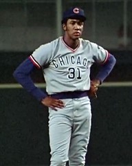
• I was really struck by the diagonal slant on the back edge of Ron Santo’s helmet. At first I thought it was just a Santo thing, but this Phillies player appears to be wearing the same design. I hadn’t recalled single-flap helmets looking like that in the early ’70s. (And as an aside, how about those massive Philly uni numbers!)
• Here’s an excellent shot of Bert Campaneris’s NickNOB.
• At one point in the film there’s a bizarre shot of Cubbie infielder Carmen Fanzone playing the national anthem on his trumpet while in uniform.
• There are several locker room scenes, including one that shows Jenkins running around in magenta boxers.
• The film provides several good views of the handwritten uni numbers that the Cubs used to wear inside their helmet logos.
• Love the font that was used for the distance markers on the Cubs’ spring training outfield wall.
• When It Rains, It Pours Dept.: Here’s yet another shot of the Astrodome’s space-suited grounds crew.
• Those 1972 Cubs road uniforms, with the centered uni numbers, looked so weird.
• Mmmm, orange-trimmed shooting-star uni. I’d forgotten that they’d switched to a zipper-front in 1972. Also, note the rather shabbily scribbled uni number on Jesus Alou’s helmet brim.
• Speaking of Magic Markered numbers on helmets, check out Clemente and Sanguillen. Plus you can really see the difference between Manny’s flocked helmet and Roberto’s shiny one.
• And speaking of Sanguillen, there’s a great sequence where he’s rounding third and his cap and helmet fall off separately.
• A little too much information from Cubbie coach Pete Reiser.
• Man, that original Expos uni was such a pretty little thing, no? I miss it.
• It’s not every baseball documentary that would go the extra mile to show its primary subject duck hunting and moose hunting. That’s Jenkins at far right, with Billy Williams alongside him.
• At the very end of the film, Jenkins gets traded to the Rangers, and there’s a quick shot of him and Don Stanhouse in the team’s early-’70s home uni. The Rangers were largely invisible to me during that period — they got very little media coverage, had no stars to speak of aside from Jeff Burroughs in his MVP season of 1974, and always seemed like a lower-echelon team. So I confess that when I saw Jenkins and Stanhouse, I didn’t know what to make of the little white spot at the base of the “R” on their jersey insignia. Had to look it up to find out the sad truth. Is that the worst-conceived design element ever or what?
Oh, and in case you couldn’t guess, there film is a total stirrup-fest. Enjoy.
The movie is hosted, by the way, by the National Film Board of Canada’s web site, which also features lots of hockey movies. One of them is Just Another Job, a 27-minute film about the Quebec Nordiques. Frankly, it’s pretty much a snooze, but at the 13:08 point there’s an interview with the guy who designed the team’s logo and uniforms, describing his creative process. I believe this sequence was once featured in the Ticker a long time ago, but whatever — worth checking out.
How come Vince never mentioned this?: Jason Whitt has found an inconsistency in the Indians’ identity program. The key is the “s” at the end of the team’s logo script. In the MLB style guide, the line of the script lettering ends with a little point inside the “s,”, and then the tail sort of emerges from the side of the letter out of nowhere. The style guide also shows that same interior point on the depiction of the jersey, and the point also appears on the team’s scoreboard. But the point isn’t shown on the actual jerseys worn on the field — instead, there’s a loop that then connects to the tail. Same thing on the navy alternate.
I haven’t yet gone back to check whether the jersey script used to include the point. Anyone know if it did? If so, when did it change?

Still more Houston stuff: Last week’s ESPN column about the uniforms at the Astrodome and Colt Stadium prompted a great contribution from Jon Helf (better known as the genius behind the Fleer Sticker Project), who sent me a buncha pics relating to Colt Stadium. Among the highlights: uni/costume designer Evelyn Norton Anderson making some last-second adjustments to a busboy and waitress at the stadium’s Fast Draw Club; color photos of many of the stadium staff uniforms; an additional color shot of a Triggerette; a shot of the suit worn by the team’s TV and radio broadcasters (plus it was also supposed to be worn by players when they were making personal appearances); and a dynamite 1962 newspaper article that covered the staff uniforms in considerable detail.
Incidentally, did you notice something about Colt Stadium in several of those photos? Its seating was mostly — maybe entirely? — folding chairs.
Most of the above-linked material comes from this site, which is a gold mine of Colts imagery — parking tickets, pocket schedules, the works.
Uni Watch News Ticker: Rays skipper Joe Maddon can no longer wear his hoodie in the dugout. ”¦ More about those khaki Indians caps from last weekend: According to an item on this page, “While the Indians got the hats from a distributor in Cincinnati, the hats were actually manufactured in China. With the giant carbon footprint created by the trip from China to Cleveland, the hats are green in color only” (thanks, Vince). ”¦ The 1935 Cubs had three different uniforms, but I don’t think I’d ever seen a photo of the one in the middle until now. Note that the bat boy is wearing the more common “Chicago” jersey (awesome find by Bruce Menard). ”¦ Also from Bruce: a bunch of sports-themed tobacco ads. ”¦ Reprinted from yesterday’s comments: The U.S. Presswire archives include some shots from Ted Turner’s one game as the Braves’ manager (additional images here, here, and here). ”¦ Rudy Gutierrez noticed something I hadn’t been aware of: The helmet depicted on the Raiders’ helmet logo used to have little glints of reflection, but not anymore. ”¦ Nice set of old basketball uniforms available here. ”¦ Dana Czerwinski sent some good photos showing how just how bad the Adidas “Power Web” straps look on Nebraska’s football pants. ”¦ Fairly comprehensive assessment of UVa’s new football uniforms here (with thanks to Justin Eller). ”¦ Yesterday I mentioned that I’d love to see what was inside tnis Shea Stadium dedication magazine, and Paul Wiederecht promptly obliged. Tons of great stuff in there — I suggest clicking through all of it. … In addition, Ed Ra sent along a different Shea dedication publication, plus he also sent along the program for Shea’s groundbreaking. I love that the music was provide by the Sanitation Department Band. ”¦ Lacrosse note from Nick Coppola, who writes: “Interesting uni match-up this past weekend, as Army and Navy battled in Baltimore — a neutral-field game — with both wearing their home colors, which turned out to be silver vs. gold.” ”¦ You know what’s really ridiculous? Doing the 42 thing all over again just because it’s your first home game since April 15th. ”¦ You know what’s even worse? The road team doing likewise. I’m on record as loving the one-day 42 routine on the 15th, and I can even live with it on the 16th for teams that didn’t play on the 15th, but that’s it — enough! It’s called Jackie Robinson Day because it’s one day! ”¦ Disappointing scene last night in San Diego, where Matt Cain went high-cuffed but wore solid black socks — no orange stripes. Boooo! (As noted by Alex Moggridge). ”¦ What’s up with the old-style uni diagrams in the header to this web site? Dan Cichalski explains: “The Pittsfield Colonials are an independent team in the Can-Am League. Used to be in Nashua, N.H., but now they’re moving to Pittsfield, Mass., and into 91-year-old Wahconah Park. And because of the town’s baseball history, they’re going to wear early-1900s unis, home and away, all season. I don’t know of any pics yet, other than that header. Can’t wait to see the real things!” ”¦ Here’s a weird one: Yogi Berra, Rickey Henderson, and others wearing old jerseys from the Barry Halper collection. For the full effect, be sure to scroll down to the photo links in the bullet list toward the end of the page (great stuff from Larry Granillo). ”¦ Larry Wiederecht says the Baseball Tonight chuckleheads were discussing Bobby Valentine’s 1970 beaning last night. Key quote from Bobby V.: “I wasn’t wearing a earflap back in 1970. They really didn’t have them yet” [emphasis added]. Uh, right. Also, as Larry points out, “the implication from his statement was that he would have worn one if they’d been available” — so how come all the photos of him from the 1970s show him going flapless? Ah, Bobby V. — I’ve missed your slippery ways. …
I may be in the minority here but I like those Cubbie uni’s with the number on the front and right in the middle opf the jersey.
“Interesting uni match-up this past weekend, as Army and Navy battled in Baltimore – a neutral-field game – with both wearing their home colors, which turned out to be silver vs. gold.”
Slight nit — I’d call it gray, not silver. They don’t call the Army Corps of Cadets “The Long Gray Line” for nothing.
Looking forward to seeing the Pittsfield Colonials uniforms. Supposedly they will be made by a Connecticut company that specializes in recreating old-time uniforms. The look should be far superior to the camouflage uniforms that the team wore while playing in Nashua last year.
Here’s a shot of Manny in and Indians Uni. Looks like it’s missing the point on the S as well…
link
How hot must it have been for the Colt Stadium crew to have to wear those costumes in mid July or August, in a very open air stadium in south Texas with no shade whatsoever? Holy crap! Hope for their sake there were a lot of night games.
Seeing those folding chairs reminded me of link picture of early Forbes Field from the Stadium Graveyard website.
[quote]Rudy Gutierrez noticed something I hadn’t been aware of: The helmet depicted on the Raiders’ helmet logo used to have little glints of reflection, but not anymore.[/quote]
So now there’s the fun task of figuring out when that change occurred. By fun, I main horribly painstaking, as you’re going to need fairly high resolution in-game pictures to know for sure. Official merchandise is no help at all, as I have a poster printed in 1995 with no glare depicted, and a mini helmet from ’98 or ’99 that does have it. Even Creamer’s sports logo site doesn’t actually show the logo with glare.
I am glad to hear that I am not the only one who thought another 42 game was silly and cheapens the whole idea… leave it to the MESS…
The Cubs jersey with a number in the center is very basketbally, and looks silly.
And finally the original idea of Shea actually makes it look nice…unlike the reality version that came out…
from yesterday’s comments:
[quote comment=”386541″]
By the way, the NNOB on the Cubs road unis tonight really emphasized how crappy they are. The red numbers have got to go. If they would switch to the red-trimmed blue numbers that they wear on the pinstripes, it would be a gigantic improvement.[/quote]
did a Q & D…but sans sans red outline…looks a little dodgers-esque w/out the outline, but looks much better than what they wore last night
Heat wasn’t the problem at Colt Stadium — it was the mosquitoes. The place was notorious for the swarms of them.
[quote comment=”386553″]Heat wasn’t the problem at Colt Stadium — it was the mosquitoes. The place was notorious for the swarms of them.[/quote]
There are swarms… and then there are swarms:
link
[quote comment=”386553″]Heat wasn’t the problem at Colt Stadium — it was the mosquitoes. The place was notorious for the swarms of them.[/quote]
heat & humidity were still awful, as were those texas-sized t-boomers that would roll through in the late afternoon, but yeah…mosquitoes were the worst…
plus, since it was designed to be a temporary stadium, it was the only single decked stadium in the bigs, and hence, had no shade
[quote]Here’s a weird one: Yogi Berra, Rickey Henderson, and others wearing old jerseys from the Barry Halper collection.[/quote]
Very cool! I had to laugh at the thought of Rickey wearing Cobbs uniform considering how Cobb was a racist.
Paul – I thought I had shown you that Colt .45 site before. Shame on me if I had not. Here are some other shots of the old Colt .45s including Miss Colt .45: link
Shots of the players in their cowboy suits, more folding chairs, and the bar at teh Fast Draw Club: link
And for good measure, here are shots from the first opening day for the Colt .45s: link
BTW, those folding chairs in teh box seats were orange: link
Seeing Robert Moses’ picture in the Shea dedication program should make Mets fans happy. Through Moses’ stubbornness in not giving Walter O’Malley access to the land at Flatbush and Atlantic Aves. he drove the Dodgers out of town to La-La Land.
If the Bums could have built their stadium as they wanted the baseball map would look very different today. There would have been no talk of the Continental League, the Giants would be in Minnesota, the original Senators would now be the L.A. Angels of Los Angeles there would have been no Amazin’ Mets.
All because Robert Moses was a stubborn SOB who thought he knew more than everyone else and always got his way.
[quote comment=”386554″][quote comment=”386553″]Heat wasn’t the problem at Colt Stadium — it was the mosquitoes. The place was notorious for the swarms of them.[/quote]
There are swarms… and then there are swarms:
link
One of the giveaways before the Astrodome was finished was mosquitoe spray.
Midges are nothing compaired to the Houston mosquiteo swarms in the late Summer/early Fall!
Looks like the Indians jackets kept the little point
link
link
Its hard to see in this picture, but Brooks Orpik is wearing NFL wristbands. You can see the logo on Orpik’s left hand. It is clearer during the video broadcasts.
link
Let’s Go Pens
new conference logos have been added to NFL.com this morning. some team websites have also been changed as well to reflect new design and new season.
[quote comment=”386556″][quote]Here’s a weird one: Yogi Berra, Rickey Henderson, and others wearing old jerseys from the Barry Halper collection.[/quote]
Very cool! I had to laugh at the thought of Rickey wearing Cobbs uniform considering how Cobb was a racist.
Paul – I thought I had shown you that Colt .45 site before. Shame on me if I had not. Here are some other shots of the old Colt .45s including Miss Colt .45: link
Shots of the players in their cowboy suits, more folding chairs, and the bar at teh Fast Draw Club: link
And for good measure, here are shots from the first opening day for the Colt .45s: link
BTW, those folding chairs in teh box seats were orange: link
Could pick up Colt .45 games here in Minnesota on radio station WWL in New Orleans. Listened to them a lot.
Sponsored by Pearl Beer.
(everybody…sing along now)
“Brewed with pure artesian water,
from the country of eleven-hundred springs.”
—Ricko
[quote comment=”386548″]Here’s a shot of Manny in and Indians Uni. Looks like it’s missing the point on the S as well…
link
Seems like Manny misses the point on a lotta stuff.
—Ricko
“plus, since it was designed to be a temporary stadium, it was the only single decked stadium in the bigs, and hence, had no shade”
Uhh . . . Fenway?
Often overlooked uni point.
The first double knit Phillies uni was worn with RED hats, trim, shoes, etc.
The burgundy didn’t come along until later.
link
Look through enough old photos and you’ll see it’s true. Back then, a good friend has scored a new Phillies game hat, with the new “P’ logo. The hat was most decidedly red, same color as the White Sox that year.
—Ricko
[quote comment=”386557″]Seeing Robert Moses’ picture in the Shea dedication program should make Mets fans happy. Through Moses’ stubbornness in not giving Walter O’Malley access to the land at Flatbush and Atlantic Aves. he drove the Dodgers out of town to La-La Land.
If the Bums could have built their stadium as they wanted the baseball map would look very different today. There would have been no talk of the Continental League, the Giants would be in Minnesota, the original Senators would now be the L.A. Angels of Los Angeles there would have been no Amazin’ Mets.
All because Robert Moses was a stubborn SOB who thought he knew more than everyone else and always got his way.[/quote]
I wouldn’t be so quick to lay all the blame at the feet of Moses. O’Malley is no hero – he’s the one who slunk out of town like a toddler in a temper tantrum because the city wouldn’t condemn other people’s businesses to give him free land.
link
pictures of unis in the header.
Brad Penny of the St. Louis Cardinals looked superb last night ….
link
stirrups and stripes!
[quote comment=”386566″][quote comment=”386557″]Seeing Robert Moses’ picture in the Shea dedication program should make Mets fans happy. Through Moses’ stubbornness in not giving Walter O’Malley access to the land at Flatbush and Atlantic Aves. he drove the Dodgers out of town to La-La Land.
If the Bums could have built their stadium as they wanted the baseball map would look very different today. There would have been no talk of the Continental League, the Giants would be in Minnesota, the original Senators would now be the L.A. Angels of Los Angeles there would have been no Amazin’ Mets.
All because Robert Moses was a stubborn SOB who thought he knew more than everyone else and always got his way.[/quote]
I wouldn’t be so quick to lay all the blame at the feet of Moses. O’Malley is no hero – he’s the one who slunk out of town like a toddler in a temper tantrum because the city wouldn’t condemn other people’s businesses to give him free land.[/quote]
Ever see the documentary that shows up on PBS every once in a while? Until I saw that, didn’t realize O’Malley was talking about building a domed stadium there in Brooklyn, right where the Long Island Railroad began. Was a brilliant idea. The location anyway, within an easy walk of the commuter terminal.
—Ricko
[quote comment=”386564″]”plus, since it was designed to be a temporary stadium, it was the only single decked stadium in the bigs, and hence, had no shade”
Uhh . . . Fenway?[/quote]
fenway … is that not two decks? does that not have shade?
Paul said:
I was really struck by the diagonal slant on the back edge of Ron Santo’s helmet.
Single flapped helmets were just coming in when I was in high school. They all had those slants, and I hated them. The helmet would NEVER sit straight on your head, it was always sliding down to the flap side. For the school team, I went flapless. The last summer team I played for didn’t have any flapless helmets, so I bought one of those toy batting helmets in our team colors (happenned to be the A’s that summer) and used it. I got some odd looks from some umpires, but nobody ever questioned it. Of course today, that would be outrageous.
Bob Sullivan
I liked the old Expos’ unis too. Then they went to powder blue road gear and shoulder stripes and so on, and lost me forever.
[quote comment=”386570″][quote comment=”386566″][quote comment=”386557″]Seeing Robert Moses’ picture in the Shea dedication program should make Mets fans happy. Through Moses’ stubbornness in not giving Walter O’Malley access to the land at Flatbush and Atlantic Aves. he drove the Dodgers out of town to La-La Land.
If the Bums could have built their stadium as they wanted the baseball map would look very different today. There would have been no talk of the Continental League, the Giants would be in Minnesota, the original Senators would now be the L.A. Angels of Los Angeles there would have been no Amazin’ Mets.
All because Robert Moses was a stubborn SOB who thought he knew more than everyone else and always got his way.[/quote]
I wouldn’t be so quick to lay all the blame at the feet of Moses. O’Malley is no hero – he’s the one who slunk out of town like a toddler in a temper tantrum because the city wouldn’t condemn other people’s businesses to give him free land.[/quote]
Ever see the documentary that shows up on PBS every once in a while? Until I saw that, didn’t realize O’Malley was talking about building a domed stadium there in Brooklyn, right where the Long Island Railroad began. Was a brilliant idea. The location anyway, within an easy walk of the commuter terminal.
—Ricko[/quote]
Oh what could have been…
link
[quote comment=”386555″][quote comment=”386553″]Heat wasn’t the problem at Colt Stadium — it was the mosquitoes. The place was notorious for the swarms of them.[/quote]
heat & humidity were still awful, as were those texas-sized t-boomers that would roll through in the late afternoon, but yeah…mosquitoes were the worst…
plus, since it was designed to be a temporary stadium, it was the only link in the bigs, and hence, had no shade[/quote]
Do you mean “of all time” or “at the time”?
Because Braves Field, Seals Stadium, Sicks Stadium, Baker Bowl, Hilltop Park, Roosevelt Park and Jerry Park all hosted MLB.
[quote comment=”386568″]Brad Penny of the St. Louis Cardinals looked superb last night ….
link
stirrups and stripes![/quote]
Watched him pitch earlier this year. On a big guy, which he is, too-tight pants look a little goofy with stirrups, etc. Looks like the guy so big the team couldn’t find pants to fit him. Baggy up those britches a little (like Granderson or Pierre), and that’s great, great look.
—Ricko
[quote comment=”386575″][quote comment=”386555″][quote comment=”386553″]Heat wasn’t the problem at Colt Stadium — it was the mosquitoes. The place was notorious for the swarms of them.[/quote]
heat & humidity were still awful, as were those texas-sized t-boomers that would roll through in the late afternoon, but yeah…mosquitoes were the worst…
plus, since it was designed to be a temporary stadium, it was the only link in the bigs, and hence, had no shade[/quote]
Do you mean “of all time” or “at the time”?
Because Braves Field, Seals Stadium, Sicks Stadium, Baker Bowl, Hilltop Park, Roosevelt Park and Jerry Park all hosted MLB.[/quote]
I forgot the LA Coliseum … biggest single decker of all time.
[quote comment=”386567″]http://www.pittsfieldcolonials.com/
pictures of unis in the header.[/quote]
I love this trend of Minor League and Simi-Pro League teams going for the old style unis!
[quote comment=”386576″][quote comment=”386568″]Brad Penny of the St. Louis Cardinals looked superb last night ….
link
stirrups and stripes![/quote]
Watched him pitch earlier this year. On a big guy, which he is, too-tight pants look a little goofy with stirrups, etc. Looks like the guy so big the team couldn’t find pants to fit him. Baggy up those britches a little (like Granderson or Pierre), and that’s great, great look.
—Ricko[/quote]
you might have a point but we see the stirrups and stripes so rarely that I just rejoice in a baseball player who is wearing the right look. plain and simple, I’ll take it!
[quote comment=”386573″]I liked the old Expos’ unis too. Then they went to powder blue road gear and shoulder stripes and so on, and lost me forever.[/quote]
The Expos had powder blue road uniforms right from the start of their inaugural season. The home whites, before the racing stripes were added, were a great look, though I also liked the pinstriped uniforms of the ’90s.
that Pittsfield Colonials wordmark/logo is awesome! i love how simple it is
[quote comment=”386552″]from yesterday’s comments:
[quote comment=”386541″]
By the way, the NNOB on the Cubs road unis tonight really emphasized how crappy they are. The red numbers have got to go. If they would switch to the red-trimmed blue numbers that they wear on the pinstripes, it would be a gigantic improvement.[/quote]
did a Q & D…but sans link…looks a little dodgers-esque w/out the outline, but looks much better than what they wore link[/quote]
Yep. That looks better. I could even live with them flip-flopping the colors (red NOB, blue numbers).
I don’t understand the emphasis on red with those uniforms. Well, at least the link are gone.
I noticed something different about Big Ben in this photo from yesterday, though I found that someone mentioned it in the comments yesterday afternoon without much follow-up…
[quote comment=”386479″]First step to clean up your image, start wearing a new goofy-ass helmet:
link
This pic
gives a little better side profile and even more look at the goofy facemask…wonder if he’ll stick with it?
Or maybe the Rooneys are forcing the switch and hope this helmet protects his brain and ultimately improves his off-field decision-making process.
link
My bad…I messed up the code.
[quote comment=”386579″][quote comment=”386576″][quote comment=”386568″]Brad Penny of the St. Louis Cardinals looked superb last night ….
link
stirrups and stripes![/quote]
Watched him pitch earlier this year. On a big guy, which he is, too-tight pants look a little goofy with stirrups, etc. Looks like the guy so big the team couldn’t find pants to fit him. Baggy up those britches a little (like Granderson or Pierre), and that’s great, great look.
—Ricko[/quote]
you might have a point but we see the stirrups and stripes so rarely that I just rejoice in a baseball player who is wearing the right look. plain and simple, I’ll take it![/quote]
Agreed. I was only saying, “Ooooo, he’s SO close to just nailing it.”
Like Granderson. Man, if he’d switch to stirrups (4 or 5 inchers, tops)… The guy really wears a uni well.
Speaking of such things, was catching highlights on 13-inch TV in bedroom this a.m. while getting ready for work…and had a helluva a time telling some teams apart. Stirrups would sure aid in that. Some solid, some striped, different patterns. Now all just dark tops and pajamas.
—Ricko
[quote comment=”386546″]“Interesting uni match-up this past weekend, as Army and Navy battled in Baltimore – a neutral-field game – with both wearing their home colors, which turned out to be silver vs. gold.”
Slight nit — I’d call it gray, not silver. They don’t call the Army Corps of Cadets “The Long Gray Line” for nothing.[/quote]
I don’t know, those unis are a bit light link
compared to the real gray
link
yeah, that’s the lacrosse team too.
Today’s post is killing me, by the way.
SOMEWHERE, I’ve got a great picture of me in all my early-80s dorkish glory standing with Fergie in the middle of Wrigley Field.
My dad had the photo blown up to poster size, hung it on the door of the family room and left it there for like 15 years.
looks like some of the Indians replicas have the point
link..jpg
[quote comment=”386580″][quote comment=”386573″]I liked the old Expos’ unis too. Then they went to powder blue road gear and shoulder stripes and so on, and lost me forever.[/quote]
The Expos had powder blue road uniforms right from the start of their inaugural season. The home whites, before the racing stripes were added, were a great look, though I also liked the pinstriped uniforms of the ’90s.[/quote]
Got me there! I had forgotten they had powder blues from the beginning. Guess I let my hatred of baby blanket blue pajama uniforms overcome me! Still like those original home duds, though.
Did you ever notice how shabby the fields look in the old photos? I wonder when MLB stadia started looking as manicured as they do now.
[quote comment=”386590″]Did you ever notice how shabby the fields look in the old photos? I wonder when MLB stadia started looking as manicured as they do now.[/quote]
Cable TV.
And the fact that artificial surfaces always looked perfect (and there were plenty of them), which sort of stimulated real-grass teams to dress up their presentations.
—Ricko
Love that “Dedication Shea Stadium” program, especially the cover. Shea looks so light, so airy, so green and filigreed. An excellent example of how architectural drawings are usually much better to visit than the architecture itself.
That 64-65 Worlds Fair logo still looks good, no? Makes a guy want to blab another hour or so about NYC blue-and-orange history.
[quote comment=”386590″]Did you ever notice how shabby the fields look in the old photos? I wonder when MLB stadia started looking as manicured as they do now.[/quote]
Watch Game 7 of the 1979 World Series sometime. The field at Memorial Stadium looks awful, with football lines all over the place and spots where clearly no grass is growing. Municipal Stadium in Cleveland had similar problems back in the day.
[quote comment=”386590″]Did you ever notice how shabby the fields look in the old photos? I wonder when MLB stadia started looking as manicured as they do now.[/quote]
good question as to “when,” but definitely over the past two-three decades, as technology and such have come into play…
years ago, there was a field…and aside from mother nature and sporadic waterings, that was about it…sure, you threw down some seed if there was a bare patch, but for the most part…that was it…
now there are complicated sprinkler systems, drainage systems, special dirt for the infield, plate/batters box/warning track and foul territory…they’ve developed special types of fertilizers…different grasses for different climes, and will sometimes resod entire fields when a team in on an extended road trip — spring gets one type of grass, summer gets a different…
pretty amazing stuff…even the way they cut the grass has improved over the past few decades
but no more will a “dry summer” have any effect on a playing field such that you’ll see dry, burned out spots…weather radar has also allowed for much better decision making as to when to cover a field
Speaking of shabbiness, check out all the link.
One thing I notice in that screen grab is that there is no link.
I’ve always wondered why they bothered putting the basket in center anyway. I figured it was because those seats were used for Bears games when they installed it. But the Bears were playing at Soldier Field when that documentary was filmed.
Anyone know when they extended the basket to cover center field as well?
There’s a short film about the Colt 45s over on YouTube. There are some brief shots of a Triggerette, a waitress and a parking lot attendee. Plus some song about a Team Born to Die.
It’s only about 5 minutes. Take a look link.
LI Phil said: “fenway … is that not two decks? does that not have shade?”
Yes. That is a current picture of Fenway.
Your point was 1962. In 1962, Fenway had some roof seating, but nothing like that shown in the picture. Fenway was a single deck park.
(Your “shade” statement does not impact whether it was single deck or not.)
[quote comment=”386594″][quote comment=”386590″]Did you ever notice how shabby the fields look in the old photos? I wonder when MLB stadia started looking as manicured as they do now.[/quote]
good question as to “when,” but definitely over the past two-three decades, as technology and such have come into play…
years ago, there was a field…and aside from mother nature and sporadic waterings, that was about it…sure, you threw down some seed if there was a bare patch, but for the most part…that was it…
now there are complicated sprinkler systems, drainage systems, special dirt for the infield, plate/batters box/warning track and foul territory…they’ve developed special types of fertilizers…different grasses for different climes, and will sometimes resod entire fields when a team in on an extended road trip — spring gets grass, summer another…
pretty amazing stuff…even the way they cut the grass has improved over the past few decades
but no more will a “dry summer” have any effect on a playing field such that you’ll see dry, burned out spots[/quote]
Say again, cable TV penetration. Early 80s they started looking better. Even Comiskey and Cleveland’s Municipal Stadium found ways to not look quite so threadbare.
Combination of both the additional exposure and the desire to look better, and the fact that cable TV is what began pushing revenues higher, if not in terms of individual team broadcast fees per se, then in terms of increased sales of team gear, etc., generated from the exposure from cable TV.
I’ll wager the initial explosion in gear sales could be tracked directly to cable TV being in more and more homes.
—Ricko
I noticed yesterday that Big Ben switched to the new Riddell helmet
link
Purple Haze !?!?!?!? link
[quote comment=”386598″][quote comment=”386594″][quote comment=”386590″]Did you ever notice how shabby the fields look in the old photos? I wonder when MLB stadia started looking as manicured as they do now.[/quote]
good question as to “when,” but definitely over the past two-three decades, as technology and such have come into play…
years ago, there was a field…and aside from mother nature and sporadic waterings, that was about it…sure, you threw down some seed if there was a bare patch, but for the most part…that was it…
now there are complicated sprinkler systems, drainage systems, special dirt for the infield, plate/batters box/warning track and foul territory…they’ve developed special types of fertilizers…different grasses for different climes, and will sometimes resod entire fields when a team in on an extended road trip — spring gets grass, summer another…
pretty amazing stuff…even the way they cut the grass has improved over the past few decades
but no more will a “dry summer” have any effect on a playing field such that you’ll see dry, burned out spots[/quote]
Say again, cable TV penetration. Early 80s they started looking better. Even Comiskey and Cleveland’s Municipal Stadium found ways to not look quite so threadbare.
Combination of both the additional exposure and the desire to look better, and the fact that cable TV is what began pushing revenues higher, if not in terms of individual team broadcast fees per se, then in terms of increased sales of team gear, etc., generated from the exposure from cable TV.
I’ll wager the initial explosion in gear sales could be tracked directly to cable TV being in more and more homes.
—Ricko[/quote]
Or maybe it’s all thanks to link.
Love this!!!!!!!!!!!!!
link
RPM III- can you bobble this image????
No doubt. My point was that the revenue to pay for increased and improved lawn care came from, indirectly or otherwise, the expanded coverage of cable TV.
They didn’t have to take it out of profit, so to speak, the way would have prior to that era.
—Ricko
Speaking of Houston and YouTube, take a look at this video called link.
I didn’t realize they had specific animation for opposing teams. I like the Mets as a Broadway dancer being given the hook.
The video also has some ads and footage of how the Astrodome was used. Football, rodeo, Eddie Arnold and soccer all get coverage. (Anyone recognize the soccer teams? Looks like West Ham United.)
It’s about 10 minutes and the sound goes out about halfway through. Probably spliced two separate sources together.
[quote comment=”386603″]Love this!!!!!!!!!!!!!
link
RPM III- can you bobble this image????[/quote]
Much as I loved the Pirates vests, and the bumblebee combos that came later, that was one fine looking uni.
Unusual color in the mustard (sometimes appearing almost greenish) gold, an unorthodox decision on how to use it on the hats, socks unlike pretty much anything before or since, all in this new beltless doubleknit business with stripes around the waist. Logoed cleats came in at the same time, too. Lotsa “new” going on.
And, of course, opened a stadium in them. Won a World Series in them. Clemente got his final (and 3,000th) hit in them. Just a memorable, memorable uniform.
—Ricko
[quote comment=”386603″]Love this!!!!!!!!!!!!!
link
RPM III- can you bobble this image????[/quote]
No to mention, in the same shot, one shiny helmet and one “suede” helmet.
[quote comment=”386595″]Speaking of shabbiness, check out all the link.[/quote]
And that shot is from Opening Day!
[quote comment=”386593″][quote comment=”386590″]Did you ever notice how shabby the fields look in the old photos? I wonder when MLB stadia started looking as manicured as they do now.[/quote]
Watch Game 7 of the 1979 World Series sometime. The field at Memorial Stadium looks awful, with football lines all over the place and spots where clearly no grass is growing. Municipal Stadium in Cleveland had similar problems back in the day.[/quote]
What you call “awful” I call charming. I don’t like the “everyone must have their own stadium and they all must be perfectly manicured” mentality. It’s a waste, especially in football where they’re used so little.
Some say those fields looked unprofessional. I say, as long as they were kept up enough to prevent major injuries, that’s professional enough.
Oh, and Ricko, even after cable in the 80s, I don’t think Municipal Stadium ever lost its “charm.” You’d still see lines during baseball season, and during football games they had to lay down sand and paint it green. Good times, good times.
Those early Expos’ uniforms were simple and perfect. So, too, the Cubs’ roadies 1969-72….powder blue with dark blue letters and numbers.
Less is more!
[quote comment=”386606″][quote comment=”386603″]Love this!!!!!!!!!!!!!
link
RPM III- can you bobble this image????[/quote]
Much as I loved the Pirates vests, and the bumblebee combos that came later, that was one fine looking uni.
Unusual color in the mustard (sometimes appearing almost greenish) gold, an unorthodox decision on how to use it on the hats, socks unlike pretty much anything before or since, all in this new beltless doubleknit business with stripes around the waist. Logoed cleats came in at the same time, too. Lotsa “new” going on.
And, of course, opened a stadium in them. Won a World Series in them. Clemente got his final (and 3,000th) hit in them. Just a memorable, memorable uniform.
—Ricko[/quote]
Someone a while ago tweaked those unis to change the pullovers to button-downs:
link
Daniel Chanelli did these, I believe.
I say, make that the everyday uni. I think the large number on the back helped make them look so great.
[quote comment=”386607″][quote comment=”386603″]Love this!!!!!!!!!!!!!
link
RPM III- can you bobble this image????[/quote]
No to mention, in the same shot, one shiny helmet and one “suede” helmet.[/quote]
from the main article:
– Speaking of Magic Markered numbers on helmets, check out Clemente and Sanguillen. Plus you can really see the difference between Manny’s flocked helmet and Roberto’s shiny one.
[quote comment=”386549″]How hot must it have been for the Colt Stadium crew to have to wear those costumes in mid July or August, in a very open air stadium in south Texas with no shade whatsoever? Holy crap! Hope for their sake there were a lot of night games.
Seeing those folding chairs reminded me of link picture of early Forbes Field from the Stadium Graveyard website.[/quote]
I think they had folding chairs at Colts Stadium, because it was easier to get rid of the folding chairs (in the 1960’s) then it was stadium seats. The stadium was built as a temporary home for the ballclub, so it was only going to last a couple of seasons at most, and when torn down, they could donate the chairs to schools and churches, etc…
[quote comment=”386565″]Often overlooked uni point.
The first double knit Phillies uni was worn with RED hats, trim, shoes, etc.
The burgundy didn’t come along until later.
link
Look through enough old photos and you’ll see it’s true. Back then, a good friend has scored a new Phillies game hat, with the new “P’ logo. The hat was most decidedly red, same color as the White Sox that year.
—Ricko[/quote]
If you or Paul hadn’t indicated this uni to belong to da’ Phils I’d say it could be the Chisox away uni 1971-75. (my fave Chisox uni, BTW)
[quote comment=”386609″][quote comment=”386593″][quote comment=”386590″]Did you ever notice how shabby the fields look in the old photos? I wonder when MLB stadia started looking as manicured as they do now.[/quote]
Watch Game 7 of the 1979 World Series sometime. The field at Memorial Stadium looks awful, with football lines all over the place and spots where clearly no grass is growing. Municipal Stadium in Cleveland had similar problems back in the day.[/quote]
What you call “awful” I call charming. I don’t like the “everyone must have their own stadium and they all must be perfectly manicured” mentality. It’s a waste, especially in football where they’re used so little.
Some say those fields looked unprofessional. I say, as long as they were kept up enough to prevent major injuries, that’s professional enough.
Oh, and Ricko, even after cable in the 80s, I don’t think Municipal Stadium ever lost its “charm.” You’d still see lines during baseball season, and during football games they had to lay down sand and paint it green. Good times, good times.[/quote]
No doubt about that, that things weren’t always easy. I only know that the bare spots and crap started to go away during 80s, or at least that was when you’d start to notice in old photos how lousy fields used to be, you became really aware of the difference, of what used to be the norm, because you weren’t seeing it all these games on TV.
I went to a couple games at Municipal Stadium in August of ’93 and, while I have no idea how the turf was to play on, I don’t recall any shabbiness about it, or any noticeably worn spots, or any “uncrisp” places were grass met dirt. Cosmetically anyway, it looked great.
—Ricko
[quote comment=”386584″]http://beta.images.theglobeandmail.com/archive/00597/football-roethli_597401gm-a.jpg
My bad…I messed up the code.[/quote]
Hey…. what’s wrong with that helmet???? There’s NO Stillers logo!!!!!
[quote comment=”386612″][quote comment=”386607″][quote comment=”386603″]Love this!!!!!!!!!!!!!
link
RPM III- can you bobble this image????[/quote]
No to mention, in the same shot, one shiny helmet and one “suede” helmet.[/quote]
from the main article:
– Speaking of Magic Markered numbers on helmets, check out link. Plus you can really see the difference between Manny’s flocked helmet and Roberto’s shiny one.[/quote]
Well, shoot, skipped that graf somehow. Didn’t realize photo was from today.
Okay, then…”never mind”.
(thank you, Emily)
—Ricko
[quote comment=”386616″][quote comment=”386584″]http://beta.images.theglobeandmail.com/archive/00597/football-roethli_597401gm-a.jpg
My bad…I messed up the code.[/quote]
Hey…. what’s wrong with that helmet???? There’s NO Stillers logo!!!!![/quote]
A-ha! There’s the problem. Big Ben looks at the helmets and figures, “I get it, I only have to be a Steeler half the time.”
[quote comment=”386562″]Could pick up Colt .45 games here in Minnesota on radio station WWL in New Orleans. Listened to them a lot.
Sponsored by Pearl Beer.
(everybody…sing along now)
“Brewed with pure artesian water,
from the country of eleven-hundred springs.”
—Ricko[/quote]
I can get WWL (AM 870) clearly in NE Ohio as well in the evenings. Sometimes even better than the NY and Chicago stations. And a lot better than trying to get Pittsburgh, Balt./Wash. or St. Louis.
Used to love staying up on a clear night to listen to out-of-town ballgames. Don’t get to do that as much now.
[quote comment=”386608″][quote comment=”386595″]Speaking of shabbiness, check out all the link.[/quote]
And that shot is from Opening Day![/quote]
I don’t know about that. The ivy looks a little bit too grown in for April.
[quote comment=”386606″][quote comment=”386603″]Love this!!!!!!!!!!!!!
link
RPM III- can you bobble this image????[/quote]
Much as I loved the Pirates vests, and the bumblebee combos that came later, that was one fine looking uni.
Unusual color in the mustard (sometimes appearing almost greenish) gold, an unorthodox decision on how to use it on the hats, socks unlike pretty much anything before or since, all in this new beltless doubleknit business with stripes around the waist. Logoed cleats came in at the same time, too. Lotsa “new” going on.
And, of course, opened a stadium in them. Won a World Series in them. Clemente got his final (and 3,000th) hit in them. Just a memorable, memorable uniform.
—Ricko[/quote]
Agreed on all points, Ricko. Loooooooove that uni. I’ll pin up a pic of RPMIII ‘s latest bobble creation when it arrives in the USPost…. it’ll knock your stirrups off. :)
[quote comment=”386615″]I went to a couple games at Municipal Stadium in August of ’93 and, while I have no idea how the turf was to play on, I don’t recall any shabbiness about it, or any noticeably worn spots, or any “uncrisp” places were grass met dirt. Cosmetically anyway, it looked great.[/quote]
That was the best time to see a pristine-ish field. The grass had months to grow and it was probably just before the Browns exhibition games.
It’s always a good night to honor Roger McDowell and it’s great that the Cubs did it, too.
great baseball movie. thanks. i remember the nords movie from a while back. good stuff. re: when did poor condition of baseball fields start improving. think advent of single use baseball parks…
I noticed that in the trailer for “King of the Hill” the negative was flipped during the scene where there is meeting at the mound. Now I have to watch the whole movie to see if that is in there.
Interesting note about the Texas star being in the Rangers logo. I always that that hole was as a result of a gunshot.
Anyone looking for more great color and black& white photos of the Houston Colt .45s should check out this book:
link
One little gem I learned from the book: The seat colors corresponded with the color of the ticket (chartreuse, turquoise, burnt orange or flamingo).
[quote comment=”386581″]that Pittsfield Colonials wordmark/logo is awesome! i love how simple it is[/quote]
[quote comment=”386580″][quote comment=”386573″]I liked the old Expos’ unis too. Then they went to powder blue road gear and shoulder stripes and so on, and lost me forever.[/quote]
The pinstriped Expos unis from the 90’s and early 00’s was one of my favorites of all time. The orginal ‘Spos unis was also one of my favs as well.
The Expos had powder blue road uniforms right from the start of their inaugural season. The home whites, before the racing stripes were added, were a great look, though I also liked the pinstriped uniforms of the ’90s.[/quote]
[quote comment=”386580″][quote comment=”386573″]I liked the old Expos’ unis too. Then they went to powder blue road gear and shoulder stripes and so on, and lost me forever.[/quote]
The Expos had powder blue road uniforms right from the start of their inaugural season. The home whites, before the racing stripes were added, were a great look, though I also liked the pinstriped uniforms of the ’90s.[/quote]
“Those 1972 Cubs road uniforms, with the centered uni numbers, looked so weird.”
link
I’ve gotten used to it over the years:
link
link
Would prefer to see that last one in team colors, but the design’s OK with me.
R.I.P. Guru.
I never really cared for his off-colored Yankee caps, but I always loved the voice.
[quote comment=”386628″][quote comment=”386581″]that Pittsfield Colonials wordmark/logo is awesome! i love how simple it is[/quote]
[quote comment=”386580″][quote comment=”386573″]I liked the old Expos’ unis too. Then they went to powder blue road gear and shoulder stripes and so on, and lost me forever.[/quote]
The pinstriped Expos unis from the 90’s and early 00’s was one of my favorites of all time. The orginal ‘Spos unis was also one of my favs as well.
The Expos had powder blue road uniforms right from the start of their inaugural season. The home whites, before the racing stripes were added, were a great look, though I also liked the pinstriped uniforms of the ’90s.[/quote]
[quote comment=”386580″][quote comment=”386573″]I liked the old Expos’ unis too. Then they went to powder blue road gear and shoulder stripes and so on, and lost me forever.[/quote]
The Expos had powder blue road uniforms right from the start of their inaugural season. The home whites, before the racing stripes were added, were a great look, though I also liked the pinstriped uniforms of the ’90s.[/quote][/quote]
The Expos pinstriped uniforms on the 90’s and 00’s were one of my favorites of all time. I also like the ‘Spos original unis as well
[quote comment=”386619″][quote comment=”386562″]Could pick up Colt .45 games here in Minnesota on radio station WWL in New Orleans. Listened to them a lot.
Sponsored by Pearl Beer.
(everybody…sing along now)
“Brewed with pure artesian water,
from the country of eleven-hundred springs.”
—Ricko[/quote]
I can get WWL (AM 870) clearly in NE Ohio as well in the evenings. Sometimes even better than the NY and Chicago stations. And a lot better than trying to get Pittsburgh, Balt./Wash. or St. Louis.
Used to love staying up on a clear night to listen to out-of-town ballgames. Don’t get to do that as much now.[/quote]
Reception was better on car radios. Larger antenna, I suppose. Remember coming home from grandma’s house listening to Braves on a station from Wadena, MN. Harvey Haddix was pitching for the Pirates against them. Parents went inside, and I sat in that big white ’57 Chrysler in the driveway and listened until it was over. Certainly one of baseball’s all-time memorable games.
Hard for people today to identify with a time when, if you lived in a town without a major league team, you saw one MLB game a week on TV. One. Saturday afternoon. That was it. And in black and white, too.
That’s not a “walked five miles to school” thing. That just a “man, how different things were” thing.
—Ricko
[quote comment=”386620″][quote comment=”386608″][quote comment=”386595″]Speaking of shabbiness, check out all the link.[/quote]
And that shot is from Opening Day![/quote]
I don’t know about that. The ivy looks a little bit too grown in for April.[/quote]
Could it be the White Sox, and their annual mid-season exhibition game that the Cubs and Sox played before inter-league play??
[quote comment=”386632″]
Hard for people today to identify with a time when, if you lived in a town without a major league team, you saw one MLB game a week on TV. One. Saturday afternoon. That was it. And in black and white, too.
[/quote]
is that why there were no color vs. color games? ya know…because of black and white tvs?
[quote comment=”386632″][quote comment=”386619″][quote comment=”386562″]Could pick up Colt .45 games here in Minnesota on radio station WWL in New Orleans. Listened to them a lot.
Sponsored by Pearl Beer.
(everybody…sing along now)
“Brewed with pure artesian water,
from the country of eleven-hundred springs.”
—Ricko[/quote]
I can get WWL (AM 870) clearly in NE Ohio as well in the evenings. Sometimes even better than the NY and Chicago stations. And a lot better than trying to get Pittsburgh, Balt./Wash. or St. Louis.
Used to love staying up on a clear night to listen to out-of-town ballgames. Don’t get to do that as much now.[/quote]
Reception was better on car radios. Larger antenna, I suppose. Remember coming home from grandma’s house listening to Braves on a station from Wadena, MN. Harvey Haddix was pitching for the Pirates against them. Parents went inside, and I sat in that big white ’57 Chrysler in the driveway and listened until it was over. Certainly one of baseball’s all-time memorable games.
Hard for people today to identify with a time when, if you lived in a town without a major league team, you saw one MLB game a week on TV. One. Saturday afternoon. That was it. And in black and white, too.
That’s not a “walked five miles to school” thing. That just a “man, how different things were” thing.
—Ricko[/quote]
What about Monday Night Baseball on ABC?? When I was younger it was the NBC Game of the Week and Monday Night Baseball, plus the Tigers on local TV
[quote comment=”386633″][quote comment=”386620″][quote comment=”386608″][quote comment=”386595″]Speaking of shabbiness, check out all the link.[/quote]
And that shot is from Opening Day![/quote]
I don’t know about that. The ivy looks a little bit too grown in for April.[/quote]
Could it be the White Sox, and their annual mid-season exhibition game that the Cubs and Sox played before inter-league play??[/quote]
Nah, it’s the Phillies. That’s their “racing stripe” on the pants.
The striping on the White Sox unis was much, much narrower, and was white inside red. Also, most of the white “circled sock” logo on the stirrups would be showing on that player if it were the White Sox.
—Ricko
I loved the old Expos uniforms. My little brother bought a satin Expos warm-up jacket when we visited Jarry Park in 1974 or ’75. He used to wear it to Veterans Stadium and catch hell, although no fat drunk kid ever threw up on him. I wish our Mom held onto that jacket (as well as his official KISS Army jacket).
Good call on Bobby Valentine’s idiotic earflap comment last night. I caught that too!
The slope at the back of Santo’s helmet was a surprise. I can’t remember, now, if this was the norm.
The Phillies player with the giant #17 is Terry Harmon. I can’t remember how long they wore those oversized numbers, but I associate them with my first year getting into baseball, the 1971 season, when I collected a set of big, glossies of Phils players sponsored by Arco.
Speaking of the Phils’ ’70s maroon double-knits, UniWatchers are surely aware of this horrible, short-lived alternate uniform:
link
For some reason this shot of pitcher Larry Christenson is often used in Phillies’ promotional materials and scoreboard shots, such as when there’s a trivia question involving him. It’s probably the only time the guy wore that stinking uniform. Here’s Pete Rose, looking ready for bedtime: link
The all-maroon uni should never come back. The Indians had a similar uniform in the late-70s, right?
[quote comment=”386635″][quote comment=”386632″][quote comment=”386619″][quote comment=”386562″]Could pick up Colt .45 games here in Minnesota on radio station WWL in New Orleans. Listened to them a lot.
Sponsored by Pearl Beer.
(everybody…sing along now)
“Brewed with pure artesian water,
from the country of eleven-hundred springs.”
—Ricko[/quote]
I can get WWL (AM 870) clearly in NE Ohio as well in the evenings. Sometimes even better than the NY and Chicago stations. And a lot better than trying to get Pittsburgh, Balt./Wash. or St. Louis.
Used to love staying up on a clear night to listen to out-of-town ballgames. Don’t get to do that as much now.[/quote]
Reception was better on car radios. Larger antenna, I suppose. Remember coming home from grandma’s house listening to Braves on a station from Wadena, MN. Harvey Haddix was pitching for the Pirates against them. Parents went inside, and I sat in that big white ’57 Chrysler in the driveway and listened until it was over. Certainly one of baseball’s all-time memorable games.
Hard for people today to identify with a time when, if you lived in a town without a major league team, you saw one MLB game a week on TV. One. Saturday afternoon. That was it. And in black and white, too.
That’s not a “walked five miles to school” thing. That just a “man, how different things were” thing.
—Ricko[/quote]
What about Monday Night Baseball on ABC?? When I was younger it was the NBC Game of the Week and Monday Night Baseball, plus the Tigers on local TV[/quote]
I said, “in a town without a major league team.”
And I’m talking about the ’50s. Black and white and pee between innings so you don’t miss anything.
You’re talking about the ’70s. Color. Instant replay.
That’s what I meant about people not identifying with it. You couldn’t, apparently, even believe such a thing was possible…because you begged to differ, as if I had somehow overlooked Monday Night Baseball. ;)
—Ricko
[quote comment=”386636″][quote comment=”386633″][quote comment=”386620″][quote comment=”386608″][quote comment=”386595″]Speaking of shabbiness, check out all the link.[/quote]
And that shot is from Opening Day![/quote]
I don’t know about that. The ivy looks a little bit too grown in for April.[/quote]
Could it be the White Sox, and their annual mid-season exhibition game that the Cubs and Sox played before inter-league play??[/quote]
Nah, it’s the Phillies. That’s their “racing stripe” on the pants.
The striping on the White Sox unis was much, much narrower, and was white inside red. Also, most of the white “circled sock” logo on the stirrups would be showing on that player if it were the White Sox.
—Ricko[/quote]
Sox used standard link, too.
[quote comment=”386619″][quote comment=”386562″]Could pick up Colt .45 games here in Minnesota on radio station WWL in New Orleans. Listened to them a lot.
Sponsored by Pearl Beer.
(everybody…sing along now)
“Brewed with pure artesian water,
from the country of eleven-hundred springs.”
—Ricko[/quote]
I can get WWL (AM 870) clearly in NE Ohio as well in the evenings. Sometimes even better than the NY and Chicago stations. And a lot better than trying to get Pittsburgh, Balt./Wash. or St. Louis.
Used to love staying up on a clear night to listen to out-of-town ballgames. Don’t get to do that as much now.[/quote]
Having grown up in Louisiana, WWL was always on the radio when we would be driving at night so we could hear the Buddy D show. He would always have a caller from Iceland or Greenland.
The “Voice of the Gulf South” and the Saints benifit from WWL’s position to the Equator and it’s wattage.
in the picture of Fergie Jenkins in his underwear notice Cubs equipment manager Yosh in the background. The one in the bucket hat
pineapple’s pops must have told me about the fanzone trumpet thing on at least 5 consecutive occasions a few years ago. he was on a hell of a streak
[quote comment=”386609″]
What you call “awful” I call charming. I don’t like the “everyone must have their own stadium and they all must be perfectly manicured” mentality. It’s a waste, especially in football where they’re used so little.
Some say those fields looked unprofessional. I say, as long as they were kept up enough to prevent major injuries, that’s professional enough. [/quote]
Sure, an argument can be made that the rough playing fields of the day made baseball more interesting – just as I still prefer seeing football games played on grass and in mud, rather than on artificial turf. Give me Heinz Field over Paul Brown Stadium any day. But I find the look of today’s baseball diamonds far more aesthetically pleasing. There is something special bout the perfect green grass that grows in big league parks.
[quote comment=”386632″]
Hard for people today to identify with a time when, if you lived in a town without a major league team, you saw one MLB game a week on TV. One. Saturday afternoon. That was it. And in black and white, too.
—Ricko[/quote]
I remember well when Monday Night Baseball, the Saturday game, and the 30-minute This Week In Baseball with Mel Allen were the only sources for out-of-town games.
The Rox will likely be adding some kind of memorial to the uni shortly following the link. McGregor had been with the club since its second season. He had been a heck of a tight end on some bad Colorado State teams and had a brief NFL career.
Ed Bouchette and Gerry Dulac mentions some Steelers number changes in the Post-Gazette pay site (sorry, no links)
Limas Sweed changes from 14 to 80
Dennis Dixon changes from 2 to 10
#26 was given away already after Deshea Townsend wore it for the past 12 seasons but they did not say to who.
[quote comment=”386632″][quote comment=”386619″][quote comment=”386562″]Could pick up Colt .45 games here in Minnesota on radio station WWL in New Orleans. Listened to them a lot.
Sponsored by Pearl Beer.
(everybody…sing along now)
“Brewed with pure artesian water,
from the country of eleven-hundred springs.”
—Ricko[/quote]
I can get WWL (AM 870) clearly in NE Ohio as well in the evenings. Sometimes even better than the NY and Chicago stations. And a lot better than trying to get Pittsburgh, Balt./Wash. or St. Louis.
Used to love staying up on a clear night to listen to out-of-town ballgames. Don’t get to do that as much now.[/quote]
Reception was better on car radios. Larger antenna, I suppose. Remember coming home from grandma’s house listening to Braves on a station from Wadena, MN. Harvey Haddix was pitching for the Pirates against them. Parents went inside, and I sat in that big white ’57 Chrysler in the driveway and listened until it was over. Certainly one of baseball’s all-time memorable games.
Hard for people today to identify with a time when, if you lived in a town without a major league team, you saw one MLB game a week on TV. One. Saturday afternoon. That was it. And in black and white, too.
That’s not a “walked five miles to school” thing. That just a “man, how different things were” thing.
—Ricko[/quote]
but it’s an example of how less is always more. I mean; wouldn’t your memory be less acute if the game was as overexposed as it is today?
[quote comment=”386637″]I loved the old Expos uniforms. My little brother bought a satin Expos warm-up jacket when we visited Jarry Park in 1974 or ’75. He used to wear it to Veterans Stadium and catch hell, although no fat drunk kid ever threw up on him. I wish our Mom held onto that jacket (as well as his official KISS Army jacket).
Good call on Bobby Valentine’s idiotic earflap comment last night. I caught that too!
The slope at the back of Santo’s helmet was a surprise. I can’t remember, now, if this was the norm.
The Phillies player with the giant #17 is Terry Harmon. I can’t remember how long they wore those oversized numbers, but I associate them with my first year getting into baseball, the 1971 season, when I collected a set of big, glossies of Phils players sponsored by Arco.
Speaking of the Phils’ ’70s maroon double-knits, UniWatchers are surely aware of this horrible, short-lived alternate uniform:
link
For some reason this shot of pitcher Larry Christenson is often used in Phillies’ promotional materials and scoreboard shots, such as when there’s a trivia question involving him. It’s probably the only time the guy wore that stinking uniform. Here’s Pete Rose, looking ready for bedtime: link
The all-maroon uni should never come back. The Indians had a similar uniform in the late-70s, right?[/quote]
those phils all maroons look more post ’77 whereas the Indians had them up to a coupla seasons earlier, IMO. link
[quote comment=”386647″][quote comment=”386632″][quote comment=”386619″][quote comment=”386562″]Could pick up Colt .45 games here in Minnesota on radio station WWL in New Orleans. Listened to them a lot.
Sponsored by Pearl Beer.
(everybody…sing along now)
“Brewed with pure artesian water,
from the country of eleven-hundred springs.”
—Ricko[/quote]
I can get WWL (AM 870) clearly in NE Ohio as well in the evenings. Sometimes even better than the NY and Chicago stations. And a lot better than trying to get Pittsburgh, Balt./Wash. or St. Louis.
Used to love staying up on a clear night to listen to out-of-town ballgames. Don’t get to do that as much now.[/quote]
Reception was better on car radios. Larger antenna, I suppose. Remember coming home from grandma’s house listening to Braves on a station from Wadena, MN. Harvey Haddix was pitching for the Pirates against them. Parents went inside, and I sat in that big white ’57 Chrysler in the driveway and listened until it was over. Certainly one of baseball’s all-time memorable games.
Hard for people today to identify with a time when, if you lived in a town without a major league team, you saw one MLB game a week on TV. One. Saturday afternoon. That was it. And in black and white, too.
That’s not a “walked five miles to school” thing. That just a “man, how different things were” thing.
—Ricko[/quote]
but it’s an example of how less is always more. I mean; wouldn’t your memory be less acute if the game was as overexposed as it is today?[/quote]
Hey, I don’t even TRY to keep track of player movement anymore. That used to be some of the most fun, to see someone who spent a lot of years one place in a totally different uniform, like Luis Aparicio playing SS for the Red Sox. Or Willie McCovey in Padres’ yellow-gold.
Now I just look at opening day lineups and see who’s where (such as Red Sox’ “shortstop du anum”, for example). It’s like watching kids trade baseball cards (oh, swell, no I suppose I’m gonna have to explain trading baseball cards to people, too).
—Ricko
The Ferguson Jenkins movie is unbelievable! Thank you! One of my sister’s is a big Cubs fan and I’ll send her the link, as soon as I receive permission from the rest of the family to resume contact with her.
Regarding the Cubs team pic- the Sox and Cubs played a “city series” before the beginning of each season, though it may have been just one game. Being the last exhibition game before the regular season, the teams roster have been finalized, and it’s a good time to take the team pic.
Now, here’s the thing- whichever team hosted the “city series” game agreed to be the road team for the game, and wore their road uni’s. Thus there are many photo’s of the White Sox in home uni’s, taken at Wrigley, and vice versa. So, this team photo was probably taken at that game, so the Cub’s were dressed as the road team. Since the batboy probably didn’t travel with the team, he’s probably wearing a borrowed road uni from the other set. That’s three “probably’s” in the last two sentence’s, so take it with a grain of salt…
[quote comment=”386650″]The Ferguson Jenkins movie is unbelievable! Thank you! One of my sister’s is a big Cubs fan and I’ll send her the link, as soon as I receive permission from the rest of the family to resume contact with her.
Regarding the Cubs team pic- the Sox and Cubs played a “city series” before the beginning of each season, though it may have been just one game. Being the last exhibition game before the regular season, the teams roster have been finalized, and it’s a good time to take the team pic.
Now, here’s the thing- whichever team hosted the “city series” game agreed to be the road team for the game, and wore their road uni’s. Thus there are many photo’s of the White Sox in home uni’s, taken at Wrigley, and vice versa. So, this team photo was probably taken at that game, so the Cub’s were dressed as the road team. Since the batboy probably didn’t travel with the team, he’s probably wearing a borrowed road uni from the other set. That’s three “probably’s” in the last two sentence’s, so take it with a grain of salt…[/quote]
Or you’ll probably get a headache!!!! ;)
You’re right, Bob. I think the Phils all-maroon unis were rolled out briefly in ’79. Pete Rose joined the team that year. You’re right about the Indians going with that look earlier. You’d think the Phils would have learned from their mistake.
Do young people even use the term “maroon” anymore? It was such a popular color in the ’70s.
[quote comment=”386648″][quote comment=”386637″]I loved the old Expos uniforms. My little brother bought a satin Expos warm-up jacket when we visited Jarry Park in 1974 or ’75. He used to wear it to Veterans Stadium and catch hell, although no fat drunk kid ever threw up on him. I wish our Mom held onto that jacket (as well as his official KISS Army jacket).
Good call on Bobby Valentine’s idiotic earflap comment last night. I caught that too!
The slope at the back of Santo’s helmet was a surprise. I can’t remember, now, if this was the norm.
The Phillies player with the giant #17 is Terry Harmon. I can’t remember how long they wore those oversized numbers, but I associate them with my first year getting into baseball, the 1971 season, when I collected a set of big, glossies of Phils players sponsored by Arco.
Speaking of the Phils’ ’70s maroon double-knits, UniWatchers are surely aware of this horrible, short-lived alternate uniform:
link
For some reason this shot of pitcher Larry Christenson is often used in Phillies’ promotional materials and scoreboard shots, such as when there’s a trivia question involving him. It’s probably the only time the guy wore that stinking uniform. Here’s Pete Rose, looking ready for bedtime: link
The all-maroon uni should never come back. The Indians had a similar uniform in the late-70s, right?[/quote]
those phils all maroons look more post ’77 whereas the Indians had them up to a coupla seasons earlier, IMO. link
Does anyone else think that solid color, i.e. non white or grey, uniforms look better than when the color top is paired with white or grey bottoms?
Id like to point out that last night Alex Gordon went high cuffed in the game against Toronto.
Unfortunately I have no video proof of said transaction.
[quote comment=”386652″]You’re right, Bob. I think the Phils all-maroon unis were rolled out briefly in ’79. Pete Rose joined the team that year. You’re right about the Indians going with that look earlier. You’d think the Phils would have learned from their mistake.
Do young people even use the term “maroon” anymore? It was such a popular color in the ’70s.[/quote]
the “saturday night specials” were a “one and done” (and yes it was 1979)…someone wrote about it a few years back…scroll down to “1979”
there’s also a section on wiki (scroll down to “controversial uniform changes”)
and i’ve scoured the interwebs for years looking for pics of that uni — the pete rose and larry christensen seem to be the only two that are on there…although i think a few years ago i did find one other but neglected to upload it, and never found it again
if anyone does have pics, please post them
I can’t believe I never noticed that little star on the R of those old Texas Rangers unis. Bad design, absolutely.
But thankfully there was a shot of those sweet shooting star Astros unis. Damn, I can’t get enough of that.
-Jet
[quote comment=”386655″][quote comment=”386652″]You’re right, Bob. I think the Phils all-maroon unis were rolled out briefly in ’79. Pete Rose joined the team that year. You’re right about the Indians going with that look earlier. You’d think the Phils would have learned from their mistake.
Do young people even use the term “maroon” anymore? It was such a popular color in the ’70s.[/quote]
the “saturday night specials” were a “one and done” (and yes it was 1979)…someone link a few years back…scroll down to “1979”
there’s also a section link (scroll down to “controversial uniform changes”)
and i’ve scoured the interwebs for years looking for pics of that uni — the pete rose and larry christensen seem to be the only two that are on there…although i think a few years ago i did find one other but neglected to upload it, and never found it again
if anyone does have pics, please post them[/quote]
Check the SI Vault. I believe you’ll find a color shot of Rose in all-burgundy (they look maroon because it was a night game) during pre-game warmups or something. Don’t recall if there are other photos in the same story.
—Ricko
[quote comment=”386652″]You’re right, Bob. I think the Phils all-maroon unis were rolled out briefly in ’79. Pete Rose joined the team that year. You’re right about the Indians going with that look earlier. You’d think the Phils would have learned from their mistake.
Do young people even use the term “maroon” anymore? It was such a popular color in the ’70s.[/quote]
This was my favorite baseball card of that era. No idea why I loved that team….. Alan Ashby/Ray Fosse sharing the catching, eck, Larry Andersen, Don Hood,Gaylord, wife swapping Fritz Petersen, Blue Moon Odom & Rick Waits slinging it, boog @ 1st, Dwayne Kuiper @ 2b and Buddy @ 3rd…. this should have been a better team!
(or not) ;)
[quote comment=”386588″]looks like some of the Indians replicas have the point
link..jpg[/quote]
That’s an old alternate, back when silver was a team color. 2002-2007. The link don’t have the point.
Could that be when they changed the script? 2008? Would explain why the Jacobs Field scoreboard has the old one.
[quote comment=”386653″]
Does anyone else think that solid color, i.e. non white or grey, uniforms look better than when the color top is paired with white or grey bottoms?[/quote]
Yes. With link and link.
link for good luck.
[quote comment=”386658″][quote comment=”386652″]You’re right, Bob. I think the Phils all-maroon unis were rolled out briefly in ’79. Pete Rose joined the team that year. You’re right about the Indians going with that look earlier. You’d think the Phils would have learned from their mistake.
Do young people even use the term “maroon” anymore? It was such a popular color in the ’70s.[/quote]
This was my favorite baseball card of that era. No idea why I loved that team….. Alan Ashby/Ray Fosse sharing the catching, eck, Larry Andersen, Don Hood,Gaylord, wife swapping Fritz Petersen, Blue Moon Odom & Rick Waits slinging it, boog @ 1st, Dwayne Kuiper @ 2b and Buddy @ 3rd…. this should have been a better team!
(or not) ;)[/quote]
link
ugh.
And link looks much better than link or link
No love for these?
link
link
The white crown hats didn’t last much past the first week or two of the season as I recall.
—Ricko
[quote comment=”386653″]
Does anyone else think that solid color, i.e. non white or grey, uniforms look better than when the color top is paired with white or grey bottoms?[/quote]
no
those would be batting practice outfits
and as ben has so aptly pointed out, any monochrome will NOT SUCCEED without stirrups…and the stirrups should be of a contrasting color
same principle as football…if you’re wearing dark pants, don’t have the dreated leotard effect
[quote comment=”386664″]No love for these?
link
link
The white crown hats didn’t last much past the first week or two of the season as I recall.
—Ricko[/quote]
Okay, ebay, be like that.
link
link
It whet, not wet, your appetite.
So, then, this uni was a blot on the MLB landscape?
link
[quote comment=”386667″]It whet, not wet, your appetite.[/quote]
Thank you, Miss Glendenning.
Ooops, I’m sorry, thought my 7th grade English teacher was in the room.
[quote comment=”386658″][quote comment=”386652″]You’re right, Bob. I think the Phils all-maroon unis were rolled out briefly in ’79. Pete Rose joined the team that year. You’re right about the Indians going with that look earlier. You’d think the Phils would have learned from their mistake.
Do young people even use the term “maroon” anymore? It was such a popular color in the ’70s.[/quote]
This was my favorite baseball card of that era. No idea why I loved that team….. Alan Ashby/Ray Fosse sharing the catching, eck, Larry Andersen, Don Hood,Gaylord, wife swapping Fritz Petersen, Blue Moon Odom & Rick Waits slinging it, boog @ 1st, Dwayne Kuiper @ 2b and Buddy @ 3rd…. this should have been a better team!
(or not) ;)[/quote]
Best line EVER about the Fritz Peterson-Mike Kekich wife swap. When it was learned that they’d been summoned to the Commissioner’s office to discuss the issue, Jim Bouton said, “He’s probably going to warn them never to do it again.”
—Ricko
[quote comment=”386666″][quote comment=”386664″]No love for these?
link
link
The white crown hats didn’t last much past the first week or two of the season as I recall.
—Ricko[/quote]
Okay, ebay, be like that.
link
link
Except for the pinstripes on the brim of the cap, I really like the way link looks.
Same with the link the year before.
[quote comment=”386671″][quote comment=”386666″][quote comment=”386664″]No love for these?
link
link
The white crown hats didn’t last much past the first week or two of the season as I recall.
—Ricko[/quote]
Okay, ebay, be like that.
link
link
Except for the pinstripes on the brim of the cap, I really like the way link looks.
Same with the link the year before.[/quote]
Damn, those’d be hot on a 95 degree day in August, I’d bet.
Not as hot as the flannels would have been, but hot.
Although, with all the wicking fabric available, who knows.
—Ricko
Boog Powell had a baseball card in that hideous Indians maroon uniform, didn’t he? He should have paid the batboy to pose for that shot.
I forgot about those White Sox uniforms. I hated the white hats but the ones that were all the dark color (dark gray? heather???) were pretty cool in a neo-Dead Ball-era way.
I, too, have never seen a Phillies player photographed in the Saturday Night Special uni beside LC and Rose. I hope Luzinski was on the DL the night they had to wear those things. At least there’s not a shot of him floating around to join his infamous photo in the White Sox shorts.
I wonder what player had the misfortune to be pictured on baseball cards with the most teams in horrible uniforms? Maybe a well-traveled guy from the late-’70s and ’80s, like Dave Winfield?
[quote comment=”386668″]So, then, this uni was a blot on the MLB landscape?
link
while i wouldn’t call it a “blot” i’d will say i prefer them in the all whites
and for the roads they could wear this
but you, who are so fond of pointing out (and rightly so)…when one team does something out of the ordinary, it’s kind of a cool quirk…when EVERYONE (or several) do it, it’s neither original nor particularly endearing…sort of ruining it for everyone
take the twins road pins, perfect example–when they were the ONLY team with them, i could kind of accept it and say…well…that’s the twins for ya…but when the rox and marlins and whomever else added them…neither unique nor appealing anymore
had the a’s been (and remain) the ONLY team to go with the kelly green tops, or yellow tops and mix and match…then i’d kinda say…well, ok — that’s the A’s for ya…when half the teams in baseball do it … then no, it’s not a good look…which is what we have now
do i want to see the a’s wearing this every road game…uh…no
that’s why monochrome is baseball is such a touchy thing…it’s very difficult to get the look “just right”…but could it be pulled off? i think it could
since last summer, i’ve been gathering pics and info on this, and one of these days, there will be a full blown post or posts on it …
but that time is not yet here
There’s a link up at Mental Floss. It’s by Dave Jamieson who wrote Mint Condition: How Baseball Cards Became an American Obsession.
Check it out.
Well this Phillies 1970s red thing is driving me crazy. That helmet is clearly red but the rest of the uniform is so dark:
link
[quote comment=”386621″][quote comment=”386606″][quote comment=”386603″]Love this!!!!!!!!!!!!!
link
RPM III- can you bobble this image????[/quote]
Much as I loved the Pirates vests, and the bumblebee combos that came later, that was one fine looking uni.
Unusual color in the mustard (sometimes appearing almost greenish) gold, an unorthodox decision on how to use it on the hats, socks unlike pretty much anything before or since, all in this new beltless doubleknit business with stripes around the waist. Logoed cleats came in at the same time, too. Lotsa “new” going on.
And, of course, opened a stadium in them. Won a World Series in them. Clemente got his final (and 3,000th) hit in them. Just a memorable, memorable uniform.
—Ricko[/quote]
Agreed on all points, Ricko. Loooooooove that uni. I’ll pin up a pic of RPMIII ‘s latest bobble creation when it arrives in the USPost…. it’ll knock your stirrups off. :)[/quote]
it goes in the mail in the morning.
Imagine the outcome of Game 6, if this guy was at third …
link
Boggs was on first and Buckner was on the bench.
[quote comment=”386673″]Boog Powell had a baseball card in that hideous Indians maroon uniform, didn’t he? He should have paid the batboy to pose for that shot.
[/quote]
if you go to steve’s baseball pages, (that’s teh banner) somewhere in there (don’t have time to search now), is boog in blod clot — as in the banner
[quote comment=”386673″]I hope Luzinski was on the DL the night they had to wear those things. At least there’s not a shot of him floating around to join his infamous photo in the White Sox shorts.[/quote]
You thinking of link? He wasn’t around for the shorts. He was on the South Side from 1981 thru 84, so he missed out on that. It does mean he had to endure link for three seasons, though.
Packers players taking on locals in basketball as the “Green Machine”
link
There is a Tuscon Toros jersey auction on eBay that advertises the uniform as “game used.” Perhaps it is, but not by the Tuscon Toros baseball club … the back of their jerseys were blue, not yellow.
link
The new Sounders jersey…
link
Looks like the Oregon Ducks…
[quote comment=”386657″][quote comment=”386655″][quote comment=”386652″]You’re right, Bob. I think the Phils all-maroon unis were rolled out briefly in ’79. Pete Rose joined the team that year. You’re right about the Indians going with that look earlier. You’d think the Phils would have learned from their mistake.
Do young people even use the term “maroon” anymore? It was such a popular color in the ’70s.[/quote]
the “saturday night specials” were a “one and done” (and yes it was 1979)…someone link a few years back…scroll down to “1979”
there’s also a section link (scroll down to “controversial uniform changes”)
and i’ve scoured the interwebs for years looking for pics of that uni — the pete rose and larry christensen seem to be the only two that are on there…although i think a few years ago i did find one other but neglected to upload it, and never found it again
if anyone does have pics, please post them[/quote]
Check the SI Vault. I believe you’ll find a color shot of Rose in all-burgundy (they look maroon because it was a night game) during pre-game warmups or something. Don’t recall if there are other photos in the same story.
—Ricko[/quote]
Ah-HA!!!
From SI, May 28, 1979.
Pete Rose and Micheal Jack Schmidt.
link
—Ricko
And I post this because…
Well, just because I have always loved this photo.
link
Love just…everything about it.
Hmmm, I may have to have it scanned and a huge print made.
Jim Bunning, photo from SPORT Magazine.
—Ricko
if MLB has fashion police, then why do 99 % of players wear pajama pants?
[quote comment=”386685″]And I post this because…
Well, just because I have always loved this photo.
link
Love just…everything about it.
Hmmm, I may have to have it scanned and a huge print made.
Jim Bunning, photo from SPORT Magazine.
—Ricko[/quote]
Shoulda sent that to Phil for Guess the Scoreboard, shouldn’t I.
[quote comment=”386686″]if MLB has fashion police, then why do 99 % of players wear pajama pants?[/quote]
Cuz hey aren’t in violation. Apparently current MLB rules say only that the pants shall extend to under the heel of the cleats. Or something like that.
—Ricko
[quote comment=”386688″][quote comment=”386686″]if MLB has fashion police, then why do 99 % of players wear pajama pants?[/quote]
Cuz hey aren’t in violation. Apparently current MLB rules say only that the pants shall extend to under the heel of the cleats. Or something like that.
—Ricko[/quote]
…shall NOT extend…
New Bears Throwbacks unveiled link
#26 was given away already after Deshea Townsend wore it for the past 12 seasons but they did not say to who.
Will Allen.
A couple notes about this Forbes Field photo: there’s no clock on top of the scoreboard, and the War Bonds ad is the only one that ever appeared at the ballpark.
Let’s try this again:
#26 was given away already after Deshea Townsend wore it for the past 12 seasons but they did not say to who.
Will Allen.
A couple notes about link: there’s no clock on top of the scoreboard, and the War Bonds ad is the only one that ever appeared at the ballpark.
Watching the show “The Daily Line” on Versus right now – there’s an “I Still Call It Mile High” shirt hanging on a rack on the back wall of the set(w/ some other shirts/jerseys). You know Versus – that’s the channel that’s easy to find if you have cable and aren’t an idiot.
[quote comment=”386646″]Ed Bouchette and Gerry Dulac mentions some Steelers number changes in the Post-Gazette pay site (sorry, no links)
Limas Sweed changes from 14 to 80
Dennis Dixon changes from 2 to 10
#26 was given away already after Deshea Townsend wore it for the past 12 seasons but they did not say to who.[/quote]
Shoot. A number change is probably an indication that Sweed isn’t going anywhere.
Regardless of how the whole Ben thing plays out, I want to see a lot of Dennis Dixon this year. Wonder why he wanted
Santonio’s Kordell’sRoy Gerela’s number.Oh yeah, he wore that for the Nike Ducks:
link
[quote comment=”386694″][quote comment=”386646″]Ed Bouchette and Gerry Dulac mentions some Steelers number changes in the Post-Gazette pay site (sorry, no links)
Limas Sweed changes from 14 to 80
Dennis Dixon changes from 2 to 10
#26 was given away already after Deshea Townsend wore it for the past 12 seasons but they did not say to who.[/quote]
Shoot. A number change is probably an indication that Sweed isn’t going anywhere.
Regardless of how the whole Ben thing plays out, I want to see a lot of Dennis Dixon this year. Wonder why he wanted
Santonio’s Kordell’sRoy Gerela’s number.
Oh yeah, he wore that for the Nike Ducks:
link
Miss that old preview window…
[quote comment=”386683″]The new Sounders jersey…
link
Looks like the Oregon Ducks…[/quote]
Radioactive Ducks, maybe.
Man, that’s bright. Lose the shirt sponsor, though, and I’d wear that.
Spent some time with Tony Twist (former hockey enforcer, not the comic book character) the other night. We are not of the same ilk, but I was pleasantly surprised by his uni thoughtfulness.
I initially asked him about his thoughts on wearing the “diagonal red” Blues jerseys of the mid nineties.
He went off. Her said it was an embarrassment, and that all of the players hated it. I was pleased with his assessment.
We then discussed hockey uniforms for a good twenty minutes.
He not “Her”.
[quote comment=”386690″]New Bears Throwbacks unveiled link[/quote]
More of that insidious adidas logo creep eh, Ricko?
[quote comment=”386570″][quote comment=”386566″][quote comment=”386557″]Seeing Robert Moses’ picture in the Shea dedication program should make Mets fans happy. Through Moses’ stubbornness in not giving Walter O’Malley access to the land at Flatbush and Atlantic Aves. he drove the Dodgers out of town to La-La Land.
If the Bums could have built their stadium as they wanted the baseball map would look very different today. There would have been no talk of the Continental League, the Giants would be in Minnesota, the original Senators would now be the L.A. Angels of Los Angeles there would have been no Amazin’ Mets.
All because Robert Moses was a stubborn SOB who thought he knew more than everyone else and always got his way.[/quote]
I wouldn’t be so quick to lay all the blame at the feet of Moses. O’Malley is no hero – he’s the one who slunk out of town like a toddler in a temper tantrum because the city wouldn’t condemn other people’s businesses to give him free land.[/quote]
Ever see the documentary that shows up on PBS every once in a while? Until I saw that, didn’t realize O’Malley was talking about building a domed stadium there in Brooklyn, right where the Long Island Railroad began. Was a brilliant idea. The location anyway, within an easy walk of the commuter terminal.
—Ricko[/quote]
I have read way too many books and articles analysing the Dodgers’ move out of Brooklyn. One good discussion – in the 20th or 25th anniversary publication of Esquire Magazine traces the beginning of American cynicism to the Dodgers’ abandonment of Brooklyn.
In one book, there is a bit of discussion about a large scale model of the proposed Flatbush Dome being made and present at the Dodgers’ Brooklyn offices over a long period of time. At the end f the book – it is a mystery as to what ever became of the model …. it was theorized by some interviewed that maybe one of the employees or interns thoroughly disgusted with the announced move to L.A. took it away and destroyed it out of frustration.
What do you believe such an original item would fetch if it were to appear on EBAY?
[quote comment=”386682″]There is a Tuscon Toros jersey auction on eBay that advertises the uniform as “game used.” Perhaps it is, but not by the Tuscon Toros baseball club … the back of their jerseys were blue, not yellow.
link
I dunno. It could be the real deal. If the link is to be believed, that could be the second generation of that uni.
In 1980 the Toros began a long association with the Houston Astros. Following the lead of the parent club (which was widely criticized for its 1980s uniforms), the Toros introduced what some consider the ugliest uniform in the history of organized baseball: orange pants with yellow and red stripes, and a jersey with a turquoise back, yellow raglan sleeves, and a front resplendent in yellow, avocado, red, orange, and lime green stripes of various widths. The look in 1981, an all-orange uniform with red and yellow trim, was similarly ill-received.
The link look to be link as what’s in that eBay auction.
Just swap out the link for orange and the lime green & turquoise ones for yellow and I think that’s what it might be.
It’s a damn shame the stirrups aren’t included.
According to yahoo sports, hoodie gate is over. Joe Maddon can wear the hoodie. My apologies for no link, not that savy.
Oops. There shouldn’t be a link on the word “pants” in that last one.
link is out.
Uh, to keep this uni-related, now that the entire NFC North will presumably be wearing throwbacks at some point this year, it’d be kinda cool if the NFL let them be worn three times this year so that every intra-divisional game could feature the home team in a throwback.
[quote comment=”386583″]I noticed something different about Big Ben in this photo from yesterday, though I found that someone mentioned it in the comments yesterday afternoon without much follow-up…
[quote comment=”386479″]First step to clean up your image, start wearing a new goofy-ass helmet:
link
This pic
gives a little better side profile and even more look at the goofy facemask…wonder if he’ll stick with it?
Or maybe the Rooneys are forcing the switch and hope this helmet protects his brain and ultimately improves his off-field decision-making process.[/quote]
The helmets that add the protection do not look bad, but the facemasks look like a high-tech mess. Why not the new helmets with a more traditional facemask?
Speaking of new helmets and facemasks – I know that technology is supposed to help us, and I know that tacklers are not supposed to grab helmets or facemasks. But tackers are human and I suspect a coming problen because of the newer helmet designs.
Over the past ten years, with the advent of the “Revolution Helmet” and its successors, the earholes and ridges and facemasks on helmets have evolved to include very sharp angles and triangles, angled to a point where I suspect that one day a tackler will have his finger caught in an earhole or facemask angle on a helmet, and in a full speed play have the tackler’s finger cut off or severely cut. Trust me, it is coming.
Additionally, the ridges on the surfaces of the helmets are getting more and more pronounced, what is also coming is a helmet-to-helmet collision where the two helmets lock for a split second, causng a catastrophic neck injury. Remember, we got rid of padded surfaced helmets because of studies showing that for all of the concussions the padding prevented, that the neck injuries were much worse because of the helmet padding “locking” the helmets on impact, even for a split second, causing more serious injury to the players.
I do not wish it on anyone, but I see it coming.
[quote comment=”386652″]You’re right, Bob. I think the Phils all-maroon unis were rolled out briefly in ’79. Pete Rose joined the team that year. You’re right about the Indians going with that look earlier. You’d think the Phils would have learned from their mistake.
Do young people even use the term “maroon” anymore? It was such a popular color in the ’70s.[/quote]
I know that the Indians wore all-Red on Opening Day when Frank Robinson managed the Indians hs first year. If I asm not mistaken, he hit a game winner to end the game – Indians Win!
[quote comment=”386705″]Speaking of new helmets and facemasks – I know that technology is supposed to help us, and I know that tacklers are not supposed to grab helmets or facemasks. But tackers are human and I suspect a coming problen because of the newer helmet designs.
Over the past ten years, with the advent of the “Revolution Helmet” and its successors, the earholes and ridges and facemasks on helmets have evolved to include very sharp angles and triangles, angled to a point where I suspect that one day a tackler will have his finger caught in an earhole or facemask angle on a helmet, and in a full speed play have the tackler’s finger cut off or severely cut. Trust me, it is coming.
Additionally, the ridges on the surfaces of the helmets are getting more and more pronounced, what is also coming is a helmet-to-helmet collision where the two helmets lock for a split second, causng a catastrophic neck injury. Remember, we got rid of padded surfaced helmets because of studies showing that for all of the concussions the padding prevented, that the neck injuries were much worse because of the helmet padding “locking” the helmets on impact, even for a split second, causing more serious injury to the players.
I do not wish it on anyone, but I see it coming.[/quote]
So do I. Technology is indeed supposed to help, and sometimes it does. Others times it just makes more troubles.
The players are getting too big and strong to where something drastic may have to happen…something like this:
link
Now how is that going to work, going backwards technlogy-wise? Well, although there were some pretty rough plays in that video, studies have shown that the Aussies have less concussions. More bumps, bruises and breaks, but less major/bordering on life-threatening injuries.
[quote comment=”386670″][quote comment=”386658″][quote comment=”386652″]You’re right, Bob. I think the Phils all-maroon unis were rolled out briefly in ’79. Pete Rose joined the team that year. You’re right about the Indians going with that look earlier. You’d think the Phils would have learned from their mistake.
Do young people even use the term “maroon” anymore? It was such a popular color in the ’70s.[/quote]
This was my favorite baseball card of that era. No idea why I loved that team….. Alan Ashby/Ray Fosse sharing the catching, eck, Larry Andersen, Don Hood,Gaylord, wife swapping Fritz Petersen, Blue Moon Odom & Rick Waits slinging it, boog @ 1st, Dwayne Kuiper @ 2b and Buddy @ 3rd…. this should have been a better team!
(or not) ;)[/quote]
Best line EVER about the Fritz Peterson-Mike Kekich wife swap. When it was learned that they’d been summoned to the Commissioner’s office to discuss the issue, Jim Bouton said, “He’s probably going to warn them never to do it again.”
—Ricko[/quote]
Not to repeat anybody else’s news, but I hear that there is going to be a major sudio motion picture on the Yankee pitchers’ wife swap. i think Matt Damon is supposed to play one of ’em.
[quote comment=”386704″]link is out.
Uh, to keep this uni-related, now that the entire NFC North will presumably be wearing throwbacks at some point this year, it’d be kinda cool if the NFL let them be worn three times this year so that every intra-divisional game could feature the home team in a throwback.[/quote]
Ugh, no. I’m getting about tired of the throwbacks for no reason. If they’re going to do throwback games, they should at least have both teams involved, like they did with last year’s AFL games. Do you really want to see the Vikings current uniforms vs the Bears throwbacks?
[quote comment=”386708″]I hear that there is going to be a major sudio motion picture on the Yankee pitchers’ wife swap. i think Matt Damon is supposed to play one of ’em.[/quote]
whose wife is he going to play?
[quote comment=”386709″]Do you really want to see the Vikings current uniforms
vs the Bears throwbacks?ever?[/quote](fixed)
[quote comment=”386709″][quote comment=”386704″]link is out.
Uh, to keep this uni-related, now that the entire NFC North will presumably be wearing throwbacks at some point this year, it’d be kinda cool if the NFL let them be worn three times this year so that every intra-divisional game could feature the home team in a throwback.[/quote]
Ugh, no. I’m getting about tired of the throwbacks for no reason. If they’re going to do throwback games, they should at least have both teams involved, like they did with last year’s AFL games. Do you really want to see the Vikings current uniforms vs the Bears throwbacks?[/quote]
I don’t want to see the Vikings’ current uniforms vs. anyone’s uniform of any kind.
Note to self: always hit F5 before posting a comment.
[quote comment=”386699″][quote comment=”386690″]New Bears Throwbacks unveiled link[/quote]
More of that insidious adidas logo creep eh, Ricko?[/quote]
Little known how tight George Halas and Adi Dassler actually were.
“Herr Halas, can I uss da Bears’ stripen on mein new bootzen?”
“No probelm, Adi. And can we use ‘da Bears’?”
“Yah. Is like we have made a free enterprise trade.”
Lotta people don’t know that story.
—Ricko
Spent some time with Tony Twist (former hockey enforcer, not the comic book character) the other night. We are not of the same ilk, but I was pleasantly surprised by his uni thoughtfulness.
I initially asked him about his thoughts on wearing the “diagonal red” Blues jerseys of the mid nineties.
He went off. He said it was an embarrassment, and that all of the players hated it. I was pleased with his assessment.
We then discussed hockey uniforms for a good twenty minutes.
Nice note. Thanks for posting it.
[quote comment=”386712″][quote comment=”386709″][quote comment=”386704″]link is out.
Uh, to keep this uni-related, now that the entire NFC North will presumably be wearing throwbacks at some point this year, it’d be kinda cool if the NFL let them be worn three times this year so that every intra-divisional game could feature the home team in a throwback.[/quote]
Ugh, no. I’m getting about tired of the throwbacks for no reason. If they’re going to do throwback games, they should at least have both teams involved, like they did with last year’s AFL games. Do you really want to see the Vikings current uniforms vs the Bears throwbacks?[/quote]
I don’t want to see the Vikings’ current uniforms vs. anyone’s uniform of any kind.[/quote]
Oh please, you’d wear it if it was blue and neon green instead of purple & gold.
[quote comment=”386710″][quote comment=”386708″]I hear that there is going to be a major sudio motion picture on the Yankee pitchers’ wife swap. i think Matt Damon is supposed to play one of ’em.[/quote]
whose wife is he going to play?[/quote]
These are, I believe…
The original Mrs. Kekich.
Mike Kekich.
The original Mrs. Peterson.
Fritz Peterson.
link
—Ricko
[quote comment=”386717″]Oh please, you’d wear it if it was blue and neon green instead of purple & gold.[/quote]
while mr. vilk wouldn’t be offended by that statement, im pretty sure jth might take umbrage
[quote comment=”386719″][quote comment=”386717″]Oh please, you’d wear it if it was blue and neon green instead of purple & gold.[/quote]
while mr. vilk wouldn’t be offended by that statement, im pretty sure jth might take umbrage[/quote]
Ack! Sorry about that. I read way too quickly I guess.
[quote comment=”386673″]Boog Powell had a baseball card in that hideous Indians maroon uniform, didn’t he? He should have paid the batboy to pose for that shot.
I forgot about those White Sox uniforms. I hated the white hats but the ones that were all the dark color (dark gray? heather???) were pretty cool in a neo-Dead Ball-era way.
I, too, have never seen a Phillies player photographed in the Saturday Night Special uni beside LC and Rose. I hope Luzinski was on the DL the night they had to wear those things. At least there’s not a shot of him floating around to join his infamous photo in the White Sox shorts.
I wonder what player had the misfortune to be pictured on baseball cards with the most teams in horrible uniforms? Maybe a well-traveled guy from the late-’70s and ’80s, like Dave Winfield?[/quote]
the best part of Boog in that maroon uni is that you couldn’t tell the difference where the neck ended and the uniform began. He was a red, hot sweaty mess. :)
[quote comment=”386720″][quote comment=”386719″][quote comment=”386717″]Oh please, you’d wear it if it was blue and neon green instead of purple & gold.[/quote]
while mr. vilk wouldn’t be offended by that statement, im pretty sure jth might take umbrage[/quote]
Ack! Sorry about that. I read way too quickly I guess.[/quote]
Don’t sweat it, The.
[quote comment=”386718″][quote comment=”386710″][quote comment=”386708″]I hear that there is going to be a major sudio motion picture on the Yankee pitchers’ wife swap. i think Matt Damon is supposed to play one of ’em.[/quote]
whose wife is he going to play?[/quote]
These are, I believe…
The original Mrs. Kekich.
Mike Kekich.
The original Mrs. Peterson.
Fritz Peterson.
link
—Ricko[/quote]
The one on the far left looks like Mary Carillo….. eh????
Here’s what the 1981 jersey looks like:
link
Anyone know which stadium model is in the background of this photo? Since it was the Colt Stadium Fast Draw Club, am I correct in assuming it was a mockup of a new Houston domeless stadium? Probably something made up between Colt Stadium and the Astrodome.
link
[quote comment=”386683″]The new Sounders jersey…
link
Looks like the Oregon Ducks…[/quote]
That’s in the Timbers’ colors. That’s like the Yankees wearing red socks.
[quote comment=”386726″][quote comment=”386683″]The new Sounders jersey…
link
Looks like the Oregon Ducks…[/quote]
That’s in the Timbers’ colors. That’s like the Yankees wearing red socks.[/quote]
Really? You’re being sarcastic, right?
I mean, I’m as tired of THE RIVALRY being shoved down our throats as the next guy, but really?
[quote comment=”386727″][quote comment=”386726″][quote comment=”386683″]The new Sounders jersey…
link
Looks like the Oregon Ducks…[/quote]
That’s in the Timbers’ colors. That’s like the Yankees wearing red socks.[/quote]
Really? You’re being sarcastic, right?
I mean, I’m as tired of THE RIVALRY being shoved down our throats as the next guy, but really?[/quote]
It was the most iconic no-no I could think of at 2:30 a.m. It’d be like the New York Giants wearing green?
About the point at the end of the Indians script, I have a replica home jersey from 1996 and it DOES NOT have the point. I had never really noticed. Interesting.