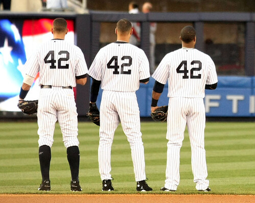
As usual, the best part of Jackie Robinson Day was hearing all the broadcasters going out of their minds because they couldn’t tell the players apart (“The Rockies have a left-hander up in the bullpen, and I couldn’t tell you who he is, but he’s wearing No. 42”). Such pleasures notwithstanding, there were some uni-notable developments that had nothing to do with the number on everyone’s back. Por ejemplo:
• If you look at that Yankees photo above, you’ll see that A-Rod now has logos on his socks — something I hadn’t noticed before. A quick check reveals that he’s been wearing this mark on his hose throughout the young season, although he didn’t have it in spring training. Does anyone recognize the logo? Looks vaguely Umbro-ish, no? Whatever it is, it sure looks like shite.
• Speaking of logo-branded socks, Orlando Hudson came up with a brilliant way of tributing Jackie Robinson: by wearing Phiten socks and white cleats. The cleats were apparently MLB-approved for use yesterday, complete with Jackie’s number on the back, although it’s not clear to me what white cleats have to do with Jackie. Anyone..? (Thanks to Casey Common for the screen shots.)
• At least one other player was white-shod yesterday: Ryan Braun. He cleats presumably had the little 42 on the back, just like Hudson’s, but there was no way to tell for sure.
• Several Dodgers honored Jackie by wearing stirrups: Russell Martin, Matt Kemp, and James Loney (or maybe they were just honoring former teammate Juan Pierre). Loney also went the extra mile with a 42 wristband. (Screen shots courtesy of Alex Higley.)
• The Padres and Braves wore throwbacks, which added a weird twist to all the 42-based activities. Nice to see that San Diego included the Ray Kroc sleeve memorial. Too bad about all the pajama pants, although a few players took a different approach.
And now back to your regularly scheduled season.
(Thanks to Phil for the headline.)
’Stros Update: It’s been a very Houston-centric week here at Uni Watch HQ. For starters, in case you missed it yesterday, I wrote an ESPN column about the original Astrodome staff uniforms. Here are some follow-ups on that:
• I neglected to mention in the column that several of the linked photos came from Trevor Williams, who attended last Saturday’s throwback game. You can see his full slate of photos here.
• One of Trevor’s photos provides a good view of the orange star on the throwback stirrups. Astros authentication manager Mike Acosta, who oversaw the throwback uniforms, told me the stars were supposed to be a tad larger, but he was still happy with them. They were woven in, not printed.
• I didn’t realize this until yesterday, but apparently the throwback game also featured throwback ushers’ blazers and a throwback lineup card in the dugout. I got those photo links from David Stagg, who also pointed me toward this shot of infielder Tommy Manzella picking up his stirrups for the game.
• John Weghorst sent me a bunch of early Houston baseball photos. Among the highlights (use the zoom bar on each page for a better view): an interesting vertical placket insignia (note how the button breaks the word into “Hou” and “Ston”); an early stadium shot with a white scoreboard; a Mexican team with what looks to have been an amazing jersey (again, use the zoom bar to get the full effect); a company team with a very odd “Levy’s” insignia; the minor league Houston Buffalos wearing shorts (which we’ve seen before, but it’s always fun to see more); and a great Colt .45s fan club membership card.
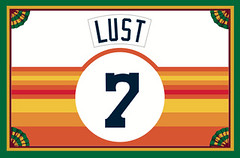
• Whether by coincidence or design, two new Membership Program enrollees have just requested tequila sunrise treatments (including Clayton Lust, whose card is shown at right). As always, you can sign up to get your own card here.
• And in a quasi-Astros-related item, Frank Mercogliano sent me this photo of Preston (Idaho) High School wearing the tequila sunrise motif.
• Even more quasi-related: I’ve mentioned several times that the new playing surface in Toronto has an AstroTurf logo printed on it in foul territory, and here at last is the visual evidence. Not good, MLB, not good.
Uni Watch News Ticker: Tremendous old NFL poster available on eBay. This really belongs in the home of a Uni Watch reader — someone snap it up now (great find by Brinke Guthrie). ”¦ The Indians are giving away caps made from plastic bottles (with thanks to Marc Swanson). ”¦ Two contributions from Matt Beahan: First, he made himself a DIY Nets Dr. J-ersey. ” It’s just a basic cotton tank top with felt twill numbers, letters and stripes, heat-pressed on (the stripes are also sewn along the top and bottom edge). Total cost was under £10, and it took less than three days from start to finish. The front numbers are slightly crooked, and the blue stripe could be neater, but it was really only for practice before I attempt my next project.” Plus Matt found some footage from the 1977 Slam Dunk Contest, which features Alex English wearing this uniform. I don’t think the Bucks ever wore that design in a regular game, did they? Anyone know more? ”¦ As had previously been rumored, the NCAA is banning messages on eye black, among other rule changes (with thanks to Al Stone). ”¦ Oh baby, check out this awesome curling patch (tremendous find by Chris Kralis). ”¦ Gio Gonzalez had “VM” written on his cap on Wednesday night. Why? His girlfriend was in a car accident (with thanks to Brandon Davis). ”¦ Also from Brandon: Andre Ethier isn’t the only one who likes to take the scissors to his undershirt collar, as you can see in this shot of Dallas Braden. But that doesn’t appear to be a Nike shirt like Ethier’s (and yes, I’ll announce the winner of yesterday’s Either-related contest soon — still looking through the literally hundreds of submissions that came in). ”¦ I’ve always said I couldn’t never get a tattoo on my foot — just seems like too sensitive an area. And that goes double for what this idiot got (blame Kyle Hanks). ”¦ Really nice throwbacks on tap for Iowa football. There’s video of the unveiling on this page, and here’s a huge-ass photo. ”¦ Tricia Bradley spotted this Capitals-esque cap at a Sheetz in Frostburg, Maryland. “Have the Capitals ever used this logo even as an alternate?” she asks. “Maybe this is a prototype? I wish they’d used this as their main logo.” ”¦ The Jazz retired No. 9 for late owner Larry Miller (it was his softball number) and renamed their court for him (with thanks to Brett Crane). ”¦ I love the color-block simplicity of these striped stirrups. That’s Gustine High in California (big thanks to Bryan Justman). ”¦ Scott M.X. Turner tipped me wise to a new blog devoted to Oakland’s baseball history. In addition to that uni-delicious banner at the top of the page, there are some excellent photos, including this Negro Leagues shot — note the uni numbers being bisected by the pants piping! ”¦ It makes sense that a school called Stetson University would have a jersey logo based on a hat, right? (Great find by Stetson alum Paul Gloersen.) ”¦ Reprinted from yesterday’s comments: Love the pinned-on uni numbers in this amazing 1908 Pitt football shot. … Kevin Wright attended Monday’s home opener in St. Looey and was surprised to see that the giveaway magnetic schedule was formatted to look like a 1980s pullover road jersey. Weird. ”¦ Good spot by Josh Fisher, who noticed Brandon Marshall wearing a shirt with the old NFL logo at yesterday’s presser. ”¦ Ben Isaacs notes that Jay Cutler was wearing a serious throwback cap the other day. Here, take a closer look.
wow that is a big girl in the astro turf photo.
I wasn’t at the Cardinals’ opener but watched on TV (including the pre-game festivities). They honored the 1985 NL Champs – my first thought was that the pullover jersey magnet was tied to that.
On that Caps logo with the eagle and hockey stick: that has been floating around for years. I would say I first saw it at least five years ago…never knew why that never was used as an alternate or on the away jerseys.
McNabb in his full Redskins gear…… link
I guess the Skins are going to go back and wear the full socks again? That’s a much better look than the solid burgundy.
This was the 1st #42 day at Yankee Stadium. The Yankees were on the road the past 2 4/15s. I’m still upset that the Yankees gave 1 day notice in 08 about the number retirement ceremony for Jackie Robinson. It was on a Tuesday, and the final # to be retired in the original stadium, albiet a decade after the rest of MLB did it…
Ray Kroc’s initials were way too big on the Padres sleeves. Don’t they look at old pictures before they make these retro jerseys?
Torii Hunter was also wearing the white cleats honoring Jackie Robinson last night.
Kyle Blanks was one of the Padres wearing serious stirrups. Except that he had them on high in the field when Brian McCann doubled and he was originally charged an error. Then Blanks batted with the socks down. Late in the game, he had them back up while fielding.
Still, the jerseys inspired Chip Caray and Joe Simpson to briefly talk about the infamous 1984 fight between the two teams.
link
That caps hat was part of Zephyr Hats “X-Line” produced a few years ago…I have a Penguins hat like that.
wow… didn’t think i’d ever see a decatur staley’s hat. very cool. i think i want a dayton triangles hat, or a canton bulldogs hat, and an oorang indians hat!
I can report that TC Bear does not wear 42 on Jackie Robinson day. This is a good thing.
Under what circumstances would a catcher be perpendicular to the place while catching a baseball?
My first thought is maybe he’s getting ready to throw to a base, but that still seems to be a very odd angle to catch from.
link
Even with pajama pants and ridiculously wrong high cuffs with super high stirrups those Taco Padres unis look odd without the white cleats.
—Ricko
P.S. White cleats have absolutely nothing whatsoever to do with Jackie Robinson. Although I suppose a lot of young fans will grow up thinking they do.
Hey, if it’s for marketing purposes, anything goes, right?
I love seeing number 42 back on the field.
And I really, really love seeing all these jerseys with only numbers, and no names, on the backs. Even teams that have nice classic uniforms that happen to have included names for a long time, like the Cardinals, find a way to look even better.
But there’s one link. Please, Majestic, I’m on my hands and knees begging here, learn how to center a number on a jersey!
The bottom of the number should not be digging into the guy’s pants while there’s a vast expanse of emptiness between the collar and the top of the number!
The top of the number should be four inches from the collar, IIRC.
If the player’s back link, it’s not so bad. But not every player is that big!
The link look decent enough, though it could still move up about an inch or so; link.
link redeemed themselves after being one of the big offenders in a previous Robinson Day. The fact that their numbers are shorter than most helps a bit.
At least the link have never forgotten how to arrange a jersey. link
You’d think that Iowa would match the jersey number to the TV number on the helmet for the marketing images of the new throw-back uniforms.
The jersey featured 12 and the helmet featured 45.
Maybe everyone will wear 45 on their helmet to honor Emlen Tunnell?
Orlando Hudson came up with a brilliant way of tributing Jackie Robinson: by wearing Phiten socks and white cleats. The cleats were apparently MLB-approved for use yesterday, complete with Jackie’s number on the back, although it’s not clear to me what white cleats have to do with Jackie. Anyone..? (Thanks to Casey Common for the screen shots.)
The Yankees’ announcers talked about this last night, although they were apparently unaware that it was an MLB-wide option (they seemed to think it was Torii Hunter’s idea).
The white cleats, trimmed in blue and with Jackie’s #42 on the back, are supposed to represent the colors of the Brooklyn Dodgers.
All game, I was really hoping that Hunter would get fined for them. The announcers were stumbling over MLB’s shoe regulations, mentioning that CC was required to change out of his gray shoes on opening day.
[quote comment=”385878″]Under what circumstances would a catcher be perpendicular to the place while catching a baseball?
My first thought is maybe he’s getting ready to throw to a base, but that still seems to be a very odd angle to catch from.
link
During the game the Twins’ broadcast crew mentioned repeatedly that Wakefield’s knuckler drops down and in on left-handed hitters (and most of the Twins’ switch hitters chose to back right because of that). Given the slower speed of a knuckleball, it isn’t unlikely that the catcher felt better setting up that way with a left-handed hitter at the plate.
—Ricko
The logo on A-Rod’s socks looks like SSK.
link
Hey Teebz, out of curiosity has ANYONE gotten all of the game results correct thus far?
This is turning out to be quite the playoffs.
I’m all for honoring Jackie Robinson but the “everyone wear 42 day” seems to be too much of a gimmick. To me, it takes away from honoring the struggles Jackie went through in his first few seasons.
Adam Jones had the white and blue cleats on as well. No photo evidence however, just trust me.
[quote comment=”385886″]I’m all for honoring Jackie Robinson but the “everyone wear 42 day” seems to be too much of a gimmick. To me, it takes away from honoring the struggles Jackie went through in his first few seasons.[/quote]
If Jackie Robinson Day means the Cubs wear pinstripes at home without names on the back, I declare EVERY Cubs home game be Jackie Robinson Day.
[quote comment=”385874″]That caps hat was part of Zephyr Hats “X-Line” produced a few years ago…I have a Penguins hat like that.[/quote]
good call!
and matt, great work on the Dr. J. jersey! can’t wait to see the next project!
[quote comment=”385880″]I love seeing number 42 back on the field.
And I really, really love seeing all these jerseys with only numbers, and no names, on the backs. Even teams that have nice classic uniforms that happen to have included names for a long time, like the Cardinals, find a way to look even better.
But there’s one link. Please, Majestic, I’m on my hands and knees begging here, learn how to center a number on a jersey!
The bottom of the number should not be digging into the guy’s pants while there’s a vast expanse of emptiness between the collar and the top of the number!
The top of the number should be four inches from the collar, IIRC.
If the player’s back link, it’s not so bad. But not every player is that big!
The link look decent enough, though it could still move up about an inch or so; link.
link redeemed themselves after being one of the big offenders in a previous Robinson Day. The fact that their numbers are shorter than most helps a bit.
At least the link have never forgotten how to arrange a jersey. link[/quote]
i’d be willing to bet a good number of those numbers ARE centered and would appear as such were they not sporting jerseys that are three sizes too big
but fair points, as always
I think his point is that numbers shouldn’t be centered, they should be placed at a set point measured down from the collar.
[quote comment=”385891″]I think his point is that numbers shouldn’t be centered, they should be placed at a set point measured down from the collar.[/quote]
no, i know…he means that teams with NNOB need to move their numbers up from the traditional spot…a la the yankees…my point is that if the jerseys weren’t 4XL’s the numbers would appear a bit higher than they do (some appear to be based just below the small of the back — WAAAAAYYYY too low)
but yes, they should be set at a certain distance from the base of the collar — and much higher than they were yesterday
[quote comment=”385890″][quote comment=”385880″]I love seeing number 42 back on the field.
And I really, really love seeing all these jerseys with only numbers, and no names, on the backs. Even teams that have nice classic uniforms that happen to have included names for a long time, like the Cardinals, find a way to look even better.
But there’s one link. Please, Majestic, I’m on my hands and knees begging here, learn how to center a number on a jersey!
The bottom of the number should not be digging into the guy’s pants while there’s a vast expanse of emptiness between the collar and the top of the number!
The top of the number should be four inches from the collar, IIRC.
If the player’s back link, it’s not so bad. But not every player is that big!
The link look decent enough, though it could still move up about an inch or so; link.
link redeemed themselves after being one of the big offenders in a previous Robinson Day. The fact that their numbers are shorter than most helps a bit.
At least the link have never forgotten how to arrange a jersey. link[/quote]
i’d be willing to bet a good number of those numbers ARE centered and would appear as such were they not sporting jerseys that are three sizes too big
but fair points, as always[/quote]
Nothing to do with size of the jersey. It’s the same problem as always in this situation. It doesn’t occur to them that the layout changes when no NOB. They just put the number in the position it would be for a NOB jersey. Don’t adjust for the visual difference. Too lazy, too cheap or too blind.
Just look at it. All you need to do is envision a NOB on that Braves jersey to see that’s the issue.
—Ricko
Chance, that’s right, and what I want to say is that that set point shoud be higher. Certainly not so low that you could fit a NOB in the empty space, with room to spare.
Check out link. The guy on the right only manages to look decent because he blouses his shirt out and lets it hang over his belt, and Lester Strode on the left looks terrible.
The gap between the bottom of the number and the top of the pants should be equal to or bigger than the gap between the collar and the top of the number.
Does that gap vary based on shirt size? I’m not sure. What I think often happens is that the jersey makers just have one setup whether there’s a NOB or not, and if there isn’t, they just leave all that blank space up there, which looks awful.
Here’s a good comparison:
link; looks great
link; not so great
[quote comment=”385891″]I think his point is that numbers shouldn’t be centered, they should be placed at a set point measured down from the collar.[/quote]
That’s how they’re done now, I suspect. The problem is that teams that normally have a NoB retain the space needed for the nameplate in that measurement when they have these jerseys made up.
Reagrding the link, I wonder if the link merchandise has any more link than the Packers’ “Acme Packers” catch-all for their throwback merchandise.
Hate the Bears, flat-out love their link logos. link of link.
[quote comment=”385895″][quote comment=”385891″]I think his point is that numbers shouldn’t be centered, they should be placed at a set point measured down from the collar.[/quote]
That’s how they’re done now, I suspect. The problem is that teams that normally have a NoB retain the space needed for the nameplate in that measurement when they have these jerseys made up.[/quote]
Exactly. That’s where the extra space comes from. But the Jackie Robinson jerseys should all have the numbers sewn on four inches below the collar (or whatever it is), regardless of where the numbers are usually sewn on when names are attached.
link
Everything about that uniform is great.
That high school gets it.
Well, except for the stupid corporate logo on the undershirt collar.
Damn. So close, though.
ricko, chance, mark…
we’re all arguing the same thing…i KNOW the damn numbers are sewn too low and I AGREE…what im saying is when today’s players wear them in 4XL instead of a more proper fit, they look EVEN WORSE
das all
[quote comment=”385895″][quote comment=”385891″]I think his point is that numbers shouldn’t be centered, they should be placed at a set point measured down from the collar.[/quote]
That’s how they’re done now, I suspect. The problem is that teams that normally have a NoB retain the space needed for the nameplate in that measurement when they have these jerseys made up.[/quote]
Okay, here’s the simple Tall & Short of it.
Before NOB came along, the vertical midpoint of the number generally was supposed to sit just high of a spot between the player’s shoulder blades.
Therefore, it would be positioned slightly lower on largest jerseys, assuming the players would be taller, and slightly higher on smaller ones.
The advent of NOB changed things. Now the position of the number was determined relative to the NOB. And it’s evolved so that now, evidently, that number position is seen as been ordained by Heaven or something. “Thou Shalt Not Move Numbers, No Matter What.”
In other words, no one’s bothering to figure out how it really was done.
—Ricko
[quote comment=”385894″]Chance, that’s right, and what I want to say is that that set point shoud be higher. Certainly not so low that you could fit a NOB in the empty space, with room to spare.
Check out link.
The guy on the right only manages to look decent because he blouses his shirt out and lets it hang over his belt, and Lester Strode on the left looks terrible.
The gap between the bottom of the number and the top of the pants should be equal to or bigger than the gap between the collar and the top of the number.
Does that gap vary based on shirt size? I’m not sure. What I think often happens is that the jersey makers just have one setup whether there’s a NOB or not, and if there isn’t, they just leave all that blank space up there, which looks awful.
Here’s a good comparison:
link; looks great
link; not so great[/quote]
The other thing that makes that throwback look like shit is the fact that it’s just a sleeveless version of a regular jersey, and not a real vest like the original. They might as well just tie bandanas around their heads and get it over with.
[quote comment=”385886″]I’m all for honoring Jackie Robinson but the “everyone wear 42 day” seems to be too much of a gimmick. To me, it takes away from honoring the struggles Jackie went through in his first few seasons.[/quote]
I don’t see how it takes away from Robinson’s legacy at all, but it does seem that other pioneer black ballplayers of the 1947 season now get short shrift, like Larry Doby, even though these others must have had the same types of struggles during those first few seasons. It was only Jackie playing big league ball on April 15, 1947. but within three months others had joined him in crossing the color line.
[quote comment=”385898″]http://media.mercedsunstar.com/smedia/2010/04/15/01/s7_griset2.standalone.prod_affiliate.111.JPG
Everything about that uniform is great.
That high school gets it.[/quote]
Absolutely. Great look.
[quote comment=”385904″][quote comment=”385898″]http://media.mercedsunstar.com/smedia/2010/04/15/01/s7_griset2.standalone.prod_affiliate.111.JPG
Everything about that uniform is great.
That high school gets it.[/quote]
Absolutely. Great look.[/quote]
except for the brim, of course
Hate to be a stickler, but Gale Sayers never wore a helmet with an orange “C” (from the ebay poster). He was a white “C” guy for his entire career (1965-1971). The Bears didn’t go with the orange until 1973.
Majestic should read Liebe’s tips for jersey lettering.
link
As Mark said, a standard 8 inch numeral should be 4 inches below the neck trim. Liebe doesn’t state there should be exceptions for different sized men’s jerseys.
[quote comment=”385901″][quote comment=”385895″][quote comment=”385891″]I think his point is that numbers shouldn’t be centered, they should be placed at a set point measured down from the collar.[/quote]
That’s how they’re done now, I suspect. The problem is that teams that normally have a NoB retain the space needed for the nameplate in that measurement when they have these jerseys made up.[/quote]
Okay, here’s the simple Tall & Short of it.
Before NOB came along, the vertical midpoint of the number generally was supposed to sit just high of a spot between the player’s shoulder blades.
Therefore, it would be positioned slightly lower on largest jerseys, assuming the players would be taller, and slightly higher on smaller ones.
The advent of NOB changed things. Now the position of the number was determined relative to the NOB. And it’s evolved so that now, evidently, that number position is seen as been ordained by Heaven or something. “Thou Shalt Not Move Numbers, No Matter What.”
In other words, no one’s bothering to figure out how it really was done.
—Ricko[/quote]
While the Yankees point and laugh as they pull a few jerseys off the rack in the team store.
link
I’ll defer to our Wisconsin contingent, but the Bucks did wear this uniform— just not in 1977-78. In my collection, I have a 74-75 Topps card of Forward George Thompson wearing this uniform.
Could it be that the equipment mgr. simply handed Alex, a lowly rookie participating in a newfangled event an old kit?
[quote comment=”385885″]Hey Teebz, out of curiosity has ANYONE gotten all of the game results correct thus far?
This is turning out to be quite the playoffs.[/quote]
Nope. With the majority of the road teams (aka underdogs) winning the first few games, there are still a few people who haven’t recorded a point yet.
You are correct, though: this is quite an interesting playoff year thus far. :o)
The logo on Arod’s sock looks like the Japanese company SSK link
[quote comment=”385907″]Majestic should read Liebe’s tips for jersey lettering.
link
As Mark said, a standard 8 inch numeral should be 4 inches below the neck trim. Liebe doesn’t state there should be exceptions for different sized men’s jerseys.[/quote]
As I was saying that in MLB sometimes they’d move ’em up or down a bit based on the size of the players, because it WAS the Majors, and the could. Otherwise, yeah, pretty much fixed position relative to the top of the jersey. But the idea is for it end up where I said it should end up, in a spot relative to the shoulder blades. That’s why Liebe says to position larger numbers higher.
Damn, why doesn’t anyone believe what I say. I’ve only been watching this stuff for almost 55 years.
I’m trying to pass info along before I croak and all I get is “Oh, what do you know, old man.”
Fuck.
—Ricko
Question regarding number 48: It came to my attention that only one player in the histories of the NBA and the ABA wore the number 48. Drum roll . . . Walt Gilmore of the expansion 1970-71 Portland Trail Blazers, playing in just 27 games in his single pro year.
A friend of mine speculated the following: “I think I remember hearing that basketball numbers used to be given out to make it easier for refs to use hand signals to identify players when calling fouls . . .so single digits and no second digits higher than five were preferred (or maybe even mandated). Obviously that went out the window long ago.”
#25 has been worn almost 5x more than #26. More than twice as many wore #15 compared to those who wore #16.
Although this doesn’t explain why #48 was only worn in 27 games, can anyone shed some light on the possibility, in early basketball history, of discouraging the use of some basketball uni numbers for this reason – at least at some level (high school, college)?
Plus Matt found some footage from the 1977 Slam Dunk Contest, which features Alex English wearing this uniform. I don’t think the Bucks ever wore that design in a regular game, did they? Anyone know more?
That is the Bucks’ mid-’70s road uni. I offer proof:
link
[quote comment=”385912″][quote comment=”385907″]Majestic should read Liebe’s tips for jersey lettering.
link
As Mark said, a standard 8 inch numeral should be 4 inches below the neck trim. Liebe doesn’t state there should be exceptions for different sized men’s jerseys.[/quote]
As I was saying that in MLB sometimes they’d move ’em up or down a bit based on the size of the players, because it WAS the Majors, and the could. Otherwise, yeah, pretty much fixed position relative to the top of the jersey. But the idea is for it end up where I said it should end up, in a spot relative to the shoulder blades. That’s why Liebe says to position larger numbers higher.
Damn, why doesn’t anyone believe what I say. I’ve only been watching this stuff for almost 55 years.
I’m trying to pass info along before I croak and all I get is “Oh, what do you know, old man.”
Fuck.
—Ricko[/quote]
There, there, old fellow.
[quote comment=”385903″][quote comment=”385886″]I’m all for honoring Jackie Robinson but the “everyone wear 42 day” seems to be too much of a gimmick. To me, it takes away from honoring the struggles Jackie went through in his first few seasons.[/quote]
I don’t see how it takes away from Robinson’s legacy at all, but it does seem that other pioneer black ballplayers of the 1947 season now get short shrift, like Larry Doby, even though these others must have had the same types of struggles during those first few seasons. It was only Jackie playing big league ball on April 15, 1947. but within three months others had joined him in crossing the color line.[/quote]
I don’t think that it diminishes the struggles, but I have always hated “everyone’s 42!” day. It irks me because the Dodgers already retired his number, but now no one else can honor Jackie’s memory by wearing his number; I never liked Mo Vaugh, but I liked that he consciously work Robinson’s number.
Additionally, “everyone’s 42!” day seems more crass than class. In the same way that marble and gold fixtures doesn’t make Donald Trump’s buildings classy (but shifts them the other way),
retiring 42 throughout baseball and then having everyone wear it one day a year seems to be an overly grand gesture meant to cover over all of the crappy things that baseball has become.
$2,500 box seats? No problem! Destroying some of the most culturally significant buildings in the United States? What, me worry? Mangling history for the sake of marketing? You big whiners! We’re saluting Jackie Robinson! If you don’t like that, go back to whatever commie bunker you crawled out of!
Just seems inauthentic to me, ya know?
[quote comment=”385869″]McNabb in his full Redskins gear…… link
I guess the Skins are going to go back and wear the full socks again? That’s a much better look than the solid burgundy.[/quote]
as I giants’ fan I ‘m sure i’m in the minority when I wish Donovan have an MVP season and twice rip the Eagles/Reid a new rectum this fall.
Also:
No matter how hard (or NOT) Iowa tries they cannot help mirroring the Stiller look, eh?
[quote comment=”385889″][quote comment=”385874″]That caps hat was part of Zephyr Hats “X-Line” produced a few years ago…I have a Penguins hat like that.[/quote]
good call!
and matt, great work on the Dr. J. jersey! can’t wait to see the next project![/quote]
Agreed! Althou i’m partial to the blue away jersey. I’d love the current miserables to don those jerseys again!
Oh yeah, it was Jackie Robinson day. Here I thought everyone was honoring my favorite band:
link
I like bass player Mark King’s old Seahawks jersey with the band’s name on the front and back.
Next time, why don’t you just chuck a battery instead, OK?
link
[quote comment=”385917″][quote comment=”385869″]McNabb in his full Redskins gear…… link
I guess the Skins are going to go back and wear the full socks again? That’s a much better look than the solid burgundy.[/quote]
as I giants’ fan I ‘m sure i’m in the minority when I wish Donovan have an MVP season and twice rip the Eagles/Reid a new rectum this fall.
Also:
No matter how hard (or NOT) Iowa tries they cannot help mirroring the Stiller look, eh?[/quote]
A common look of the ’50s.
Steelers wore essentially this look, as did Iowa, the Packers and Minnesota Gophers (Paul Giel, #10, second photo), among others. Yeah, Gophers’ narrow stripes were white, but the same template. Oklahoma, for one, wore it in red and white.
link
—Ricko
[quote comment=”385874″]That caps hat was part of Zephyr Hats “X-Line” produced a few years ago…I have a Penguins hat like that.[/quote]
Tricia, or anyone else for that matter, if you happen to head past that Sheetz again, I’ll take a 7 5/8, please. And I absolutely hate the Capitals. LOL
Contact me through my name above if you can obtain one. I’m serious.
xmas in april?
[quote comment=”385923″]link?[/quote]
Well, there IS that school of thought that says Christ actually may have been born in April, so…
[quote comment=”385907″]Majestic should read Liebe’s tips for jersey lettering.
link
As Mark said, a standard 8 inch numeral should be 4 inches below the neck trim. Liebe doesn’t state there should be exceptions for different sized men’s jerseys.[/quote]
For what it’s worth:
1965 Home (No NOB, naturally) Red Sox McAuliffe 7.25 inch numerals, 5 3/4″ from collar.
1999 Home (No NOB) Red Sox Russell 7 7/8″ numerals, 6 3.4″ from collar.
Not sure what “neck trim” means but the ’99 is 4 1/2″ below the red piping. The older ’60s flannel is 3 1/2″ below the piping.
[quote comment=”385915″][quote comment=”385912″][quote comment=”385907″]Majestic should read Liebe’s tips for jersey lettering.
link
As Mark said, a standard 8 inch numeral should be 4 inches below the neck trim. Liebe doesn’t state there should be exceptions for different sized men’s jerseys.[/quote]
As I was saying that in MLB sometimes they’d move ’em up or down a bit based on the size of the players, because it WAS the Majors, and the could. Otherwise, yeah, pretty much fixed position relative to the top of the jersey. But the idea is for it end up where I said it should end up, in a spot relative to the shoulder blades. That’s why Liebe says to position larger numbers higher.
Damn, why doesn’t anyone believe what I say. I’ve only been watching this stuff for almost 55 years.
I’m trying to pass info along before I croak and all I get is “Oh, what do you know, old man.”
Fuck.
—Ricko[/quote]
There, there, old fellow.[/quote]
BC,
I think ricko is in full ‘rope-a-dope’ mode in light of his discussions w/ The Jeff and KT the past few days.
*Eddie Haskell MODE : on*
I for one love and cherish ricko’s ruminations!
*Eddie Haskell MODE : off*
;)
#42 day…
just take my approach and think of it as:
“Hitchhikers Guide to the Galaxy” day!
lol. kidding
[quote comment=”385919″]Oh yeah, it was Jackie Robinson day. Here I thought everyone was honoring my favorite band:
link
I like bass player Mark King’s old Seahawks jersey with the band’s name on the front and back.[/quote]
By the way, I almost had that made for my membership card. Almost had the Alex English treatment done as well. Good to see someone else used it:
link
The road version’s been part of the UW ranks for a while:
link
[quote comment=”385912″]I’m trying to pass info along before I croak and all I get is “Oh, what do you know, old man.”
Fuck.
—Ricko[/quote]
LOL
Was disappointed to find out that the Astros team store at Minute Maid Park not only did not sell the hats for the throwback unis, they were not planning to sell them in the future. I wear a size 8, and the ballpark’s usually the only place I can get such, having bought many throwbacks at Dodger Stadium, but apparently not at Minute Maid.
[quote comment=”385919″]Oh yeah, it was Jackie Robinson day. Here I thought everyone was honoring my favorite band:
link
I like bass player Mark King’s old Seahawks jersey with the band’s name on the front and back.[/quote]
Jim, I’m loving that that’s your favorite band. And “Something About You” is a quintessentially 80s classic.
While I’m all for annually honoring great American hero Jackie Robinson, the practice of having all players wear #42 is moronic. If they’re going to go with everybody wearing the same number, the least they could do is put the players’ names on their jersies’ backs. Its terrible when you can’t tell who the players are even with a scorecard!
[quote comment=”385921″][quote comment=”385917″][quote comment=”385869″]McNabb in his full Redskins gear…… link
I guess the Skins are going to go back and wear the full socks again? That’s a much better look than the solid burgundy.[/quote]
as I giants’ fan I ‘m sure i’m in the minority when I wish Donovan have an MVP season and twice rip the Eagles/Reid a new rectum this fall.
Also:
No matter how hard (or NOT) Iowa tries they cannot help mirroring the Stiller look, eh?[/quote]
A common look of the ’50s.
Steelers wore essentially this look, as did Iowa, the Packers and Minnesota Gophers (Paul Giel, #10, second photo), among others. Yeah, Gophers’ narrow stripes were white, but the same template. Oklahoma, for one, wore it in red and white.
link
—Ricko[/quote]
yes, a very common look for the 50’s as worn by my SU Orangemen
link Ernie w/ the off centered number on helmet
link
link
jim brown w/o numbers on helmet…
Here is an interesting series on the uniforms and logos of the Rochester Red Wings:
link
[quote comment=”385920″]Next time, why don’t you just chuck a battery instead, OK?
link
I thought that stuff just happened at Eagles games. They ought make that clown clean all the bathrooms after every game. Without cleaning tools.
[quote comment=”385906″]Hate to be a stickler, but Gale Sayers never wore a helmet with an orange “C” (from the ebay poster). He was a white “C” guy for his entire career (1965-1971). The Bears didn’t go with the orange until 1973.[/quote]
Embrace the stickler Mase, embrace it… that’s why we’re here!
[quote comment=”385922″][quote comment=”385874″]That caps hat was part of Zephyr Hats “X-Line” produced a few years ago…I have a Penguins hat like that.[/quote]
Tricia, or anyone else for that matter, if you happen to head past that Sheetz again, I’ll take a 7 5/8, please. And I absolutely hate the Capitals. LOL
The “X-Line” and ost Zephyr Hats have that spongy inner brim for stretch fits…the hats were actually really nice in some cases, but they were very regional and very hard to get. I worked at a “national retail hat store” that I refuse to mention by name, and we had the Rangers (A hockey glove holding the liberty torch) Devils (the Letter D with a devil tail), Kings (the lion crest) Penguins (a 3/4 view of a very pissed off penguin) and St. Louis Blues (A “stylized B with the Blues wings stretching from the back).
Contact me through my name above if you can obtain one. I’m serious.[/quote]
[quote comment=”385931″][quote comment=”385919″]Oh yeah, it was Jackie Robinson day. Here I thought everyone was honoring my favorite band:
link
I like bass player Mark King’s old Seahawks jersey with the band’s name on the front and back.[/quote]
Jim, I’m loving that that’s your favorite band. And “Something About You” is a quintessentially 80s classic.[/quote]
It is, but in reality it’s not even their best song. Far from it. They have lots of great stuff that never made it to US radio. Like this:
link
Their best songs:
link
link
They even had a reunion tour four years ago, with a new album.
link
I’m all for honoring Jackie Robinson, but would it be difficult to have the player’s actual number somewhere on the uniform (like maybe the sleeve for example)?
It would make watching the game a little better without detracting from the sentiment of highlighting No. 42.
[quote comment=”385929″][quote comment=”385912″]I’m trying to pass info along before I croak and all I get is “Oh, what do you know, old man.”
Fuck.
—Ricko[/quote]
LOL[/quote]
Just getting to “enough”, that’s all.
[quote comment=”385939″]I’m all for honoring Jackie Robinson, but would it be difficult to have the player’s actual number somewhere on the uniform (like maybe the sleeve for example)?
It would make watching the game a little better without detracting from the sentiment of highlighting No. 42.[/quote]
Gotta add my two cents.
I HATE the over-42-ization of the last two years. Just can’t watch baseball on this day. Too many 42’s, and it’s impossible to tell people apart. Not to mention, on the scoreboard showing other games, every pitcher is wearing #42! Madness in the name of beating a tribute to death and having more game worn 42 stuff to sell on auction. Honestly, enough.
I say, give EVERY team a Jackie Robinson sleeve patch (which will probably have a 42 in the middle of the design), and let every coach wear #42 so that all first-base and third-base coaches will have theirs visible while working. Go beyond that, and you have players wearing a retired number. To me, it totally dilutes Jackie’s #42.
[quote comment=”385905″][quote comment=”385904″][quote comment=”385898″]http://media.mercedsunstar.com/smedia/2010/04/15/01/s7_griset2.standalone.prod_affiliate.111.JPG
Everything about that uniform is great.
That high school gets it.[/quote]
thank you Phil … that was the first thing I noticed, even worse than the corporate logo. I don’t “get” the flat brim thing; perhaps it is my age or perhaps it is because I was the wedge breaker on my college’s kickoff team (a position that will now be eliminated).
Absolutely. Great look.[/quote]
except for the brim, of course[/quote]
[quote comment=”385942″][quote comment=”385905″][quote comment=”385904″][quote comment=”385898″]http://media.mercedsunstar.com/smedia/2010/04/15/01/s7_griset2.standalone.prod_affiliate.111.JPG
Everything about that uniform is great.
That high school gets it.[/quote]
thank you Phil … that was the first thing I noticed, even worse than the corporate logo. I don’t “get” the flat brim thing; perhaps it is my age or perhaps it is because I was the wedge breaker on my college’s kickoff team (a position that will now be eliminated).
Absolutely. Great look.[/quote]
except for the brim, of course[/quote][/quote]
Yup. Them are some properly knit baseball socks.
—Ricko
[quote comment=\”385942\”][quote comment=\”385905\”][quote comment=\”385904\”][quote comment=\”385898\”]http://media.mercedsunstar.com/smedia/2010/04/15/01/s7_griset2.standalone.prod_affiliate.111.JPG
Everything about that uniform is great.
That high school gets it.[/quote]
Absolutely. Great look.[/quote]
except for the brim, of course[/quote][/quote]
not sure what happened there, here is my 2 cents:
thank you Phil … that was the first thing I noticed, even worse than the corporate logo. I don’t “get” the flat brim thing; perhaps it is my age or perhaps it is because I was the wedge breaker on my college’s kickoff team (a position that will now be eliminated).
[quote comment=”385941″][quote comment=”385939″]I’m all for honoring Jackie Robinson, but would it be difficult to have the player’s actual number somewhere on the uniform (like maybe the sleeve for example)?
It would make watching the game a little better without detracting from the sentiment of highlighting No. 42.[/quote]
Gotta add my two cents.
I HATE the over-42-ization of the last two years. Just can’t watch baseball on this day. Too many 42’s, and it’s impossible to tell people apart. Not to mention, on the scoreboard showing other games, every pitcher is wearing #42! Madness in the name of beating a tribute to death and having more game worn 42 stuff to sell on auction. Honestly, enough.
I say, give EVERY team a Jackie Robinson sleeve patch (which will probably have a 42 in the middle of the design), and let every coach wear #42 so that all first-base and third-base coaches will have theirs visible while working. Go beyond that, and you have players wearing a retired number. To me, it totally dilutes Jackie’s #42.[/quote]
I’m kinda with you on that. Especially with NNOB teams it’s a pain seeing nine 42s.
[quote comment=”385914″]Plus Matt found some footage from the 1977 Slam Dunk Contest, which features Alex English wearing this uniform. I don’t think the Bucks ever wore that design in a regular game, did they? Anyone know more?
That is the Bucks’ mid-’70s road uni. I offer proof:
link
Looks like you’re right. From searching on Getty Images it appears that the Bucks only wore this particular uniform in 1976-77 (they had an earlier version with white lettering).
[quote comment=”385913″]Question regarding number 48: It came to my attention that only one player in the histories of the NBA and the ABA wore the number 48. Drum roll . . . Walt Gilmore of the expansion 1970-71 Portland Trail Blazers, playing in just 27 games in his single pro year.
A friend of mine speculated the following: “I think I remember hearing that basketball numbers used to be given out to make it easier for refs to use hand signals to identify players when calling fouls . . .so single digits and no second digits higher than five were preferred (or maybe even mandated). Obviously that went out the window long ago.”
#25 has been worn almost 5x more than #26. More than twice as many wore #15 compared to those who wore #16.
Although this doesn’t explain why #48 was only worn in 27 games, can anyone shed some light on the possibility, in early basketball history, of discouraging the use of some basketball uni numbers for this reason – at least at some level (high school, college)?[/quote]
I believe high school and college still have the restriction for single-digit and second-digit numbers, but I don’t think the NBA ever did:
link
link
link
[quote comment=”385944″]not sure what happened there, here is my 2 cents:
thank you Phil … that was the first thing I noticed, even worse than the corporate logo. I don’t “get” the flat brim thing; perhaps it is my age or perhaps it is because I was the wedge breaker on my college’s kickoff team (a position that will now be eliminated).[/quote]
i got ya mark ;)
i know it’s the *style* favored by the *kids today* but that is bordering on sacriledge, that flat brim shit
he may has well have left the sticker and price tag on it, with that lack of curvature
now if you’ll excuse me, there are some small children gathering near ricko’s lanai who must be asked to leave
[quote comment=”385948″][quote comment=”385944″]not sure what happened there, here is my 2 cents:
thank you Phil … that was the first thing I noticed, even worse than the corporate logo. I don’t “get” the flat brim thing; perhaps it is my age or perhaps it is because I was the wedge breaker on my college’s kickoff team (a position that will now be eliminated).[/quote]
i got ya mark ;)
i know it’s the *style* favored by the *kids today* but that is bordering on sacriledge, that flat brim shit
he may has well have left the sticker and price tag on it, with that lack of curvature
now if you’ll excuse me, there are some small children gathering near ricko’s lanai who must be asked to leave[/quote]
I resent that Florida joke there, buster!
Can anyone tell me why a person would WANT a message on their eye black? Isn’t the purpose of eye black that its all black? And wouldn’t the message then present some glare- exactly what you want to get rid of?
[quote comment=”385930″]Was disappointed to find out that the Astros team store at Minute Maid Park not only did not sell the hats for the throwback unis, they were not planning to sell them in the future. I wear a size 8, and the ballpark’s usually the only place I can get such, having bought many throwbacks at Dodger Stadium, but apparently not at Minute Maid.[/quote]
google mickey’s place in cooperstown ny, and should be able to find what you are looking for.
[quote comment=”385947″][quote comment=”385913″]Question regarding number 48: It came to my attention that only one player in the histories of the NBA and the ABA wore the number 48. Drum roll . . . Walt Gilmore of the expansion 1970-71 Portland Trail Blazers, playing in just 27 games in his single pro year.
A friend of mine speculated the following: “I think I remember hearing that basketball numbers used to be given out to make it easier for refs to use hand signals to identify players when calling fouls . . .so single digits and no second digits higher than five were preferred (or maybe even mandated). Obviously that went out the window long ago.”
#25 has been worn almost 5x more than #26. More than twice as many wore #15 compared to those who wore #16.
Although this doesn’t explain why #48 was only worn in 27 games, can anyone shed some light on the possibility, in early basketball history, of discouraging the use of some basketball uni numbers for this reason – at least at some level (high school, college)?[/quote]
I believe high school and college still have the restriction for single-digit and second-digit numbers, but I don’t think the NBA ever did:
link
link
link
I’d find that easy to believe. Mikan and Russell had “uncommon” numbers since the beginning. But as for why 15 and 25 are so much more common than 16 and 26, I’d “blame” that on the HS and NCAA numbering rules outlawing digits 6-9. Clearly, players grow to identify with a certain number, and by the time they get to the NBA, #17 looks kind of wrong.
[quote comment=”385950″]Can anyone tell me why a person would WANT a message on their eye black? Isn’t the purpose of eye black that its all black? And wouldn’t the message then present some glare- exactly what you want to get rid of?[/quote]
The messages are generally on eye-black stickers, which have been proven wholly ineffective in glare reduction. (Real eye black, however, does work.) The stickers are nothing but fashion statements and canvases for silver Sharpies.
[quote comment=”385934″]Here is an interesting series on the uniforms and logos of the Rochester Red Wings:
link[/quote]
Thanks for the link. It’d be great to see that sort of detailed research for other minor league teams.
[quote comment=”385951″][quote comment=”385930″]Was disappointed to find out that the Astros team store at Minute Maid Park not only did not sell the hats for the throwback unis, they were not planning to sell them in the future. I wear a size 8, and the ballpark’s usually the only place I can get such, having bought many throwbacks at Dodger Stadium, but apparently not at Minute Maid.[/quote]
google mickey’s place in cooperstown ny, and should be able to find what you are looking for.[/quote]
link
While not uni-related, I think this is something you all would enjoy. Color photography of New York City from 1941:
link
[quote comment=”385948″][quote comment=”385944″]not sure what happened there, here is my 2 cents:
thank you Phil … that was the first thing I noticed, even worse than the corporate logo. I don’t “get” the flat brim thing; perhaps it is my age or perhaps it is because I was the wedge breaker on my college’s kickoff team (a position that will now be eliminated).[/quote]
i got ya mark ;)
i know it’s the *style* favored by the *kids today* but that is bordering on sacriledge, that flat brim shit
he may has well have left the sticker and price tag on it, with that lack of curvature
now if you’ll excuse me, there are some small children gathering near ricko’s lanai who must be asked to leave[/quote]
Isn’t the small ones.
—Ricko
[quote comment=”385945″][quote comment=”385941″][quote comment=”385939″]I’m all for honoring Jackie Robinson, but would it be difficult to have the player’s actual number somewhere on the uniform (like maybe the sleeve for example)?
It would make watching the game a little better without detracting from the sentiment of highlighting No. 42.[/quote]
Gotta add my two cents.
I HATE the over-42-ization of the last two years. Just can’t watch baseball on this day. Too many 42’s, and it’s impossible to tell people apart. Not to mention, on the scoreboard showing other games, every pitcher is wearing #42! Madness in the name of beating a tribute to death and having more game worn 42 stuff to sell on auction. Honestly, enough.
I say, give EVERY team a Jackie Robinson sleeve patch (which will probably have a 42 in the middle of the design), and let every coach wear #42 so that all first-base and third-base coaches will have theirs visible while working. Go beyond that, and you have players wearing a retired number. To me, it totally dilutes Jackie’s #42.[/quote]
I’m kinda with you on that. Especially with NNOB teams it’s a pain seeing nine 42s.[/quote]
I agree…I “woke up” from a half asleep watching sportcenter last night while laying in bed because I saw something like 6 straight highlights of a number 42 for Atlanta ripping the ball all over the field and had to know who it was.
[quote comment=”385924″][quote comment=”385923″]link?[/quote]
Well, there IS that school of thought that says Christ actually may have been born in April, so…[/quote]
link?
[quote comment=”385958″][quote comment=”385924″][quote comment=”385923″]link?[/quote]
Well, there IS that school of thought that says Christ actually may have been born in April, so…[/quote]
link?[/quote]
Reminds me of a guy I once worked with.
Last name was Raveling, like the former Iowa hoops coach.
Of course we nicknamed him, “Un.”
Weird kinda guy, too, sorta lived in his own world, so “Un” was perfect.
–Ricko
When Iowa hired George Raveling, was a great joke going around.
Q: Why did Iowa hire a black basketball coach?
A: Because they couldn’t find a gold one.
(ba dum bum)
[quote comment=\”385872\”]Torii Hunter was also wearing the white cleats honoring Jackie Robinson last night.[/quote]
Tori, Braun and Hudson are all part of \”team swingman\” along with Adam Jones, Carl Crawford and there may be some more who wear Ken Griffey Jr\’s signature shoe. They Had a Jackie Robinson tribute show last year too… link
Heheh Preston Idaho makes me think of Napoleon Dynamite. Also, that Caps logo is pretty bad-ass. Might have made a cool 3rd jersey after they retired the old blue/copper one
[quote comment=”385955″]While not uni-related, I think this is something you all would enjoy. Color photography of New York City from 1941:
link
weird… a friend sent me this same link this morning. good stuff!
pineapple’s MFA thesis show is in a gallery outside of st. louis on saturday, if you want to have a drink, and check out her work, meet me at…
edwardsville art center, 310 hillsboro ave., opening reception is 7~10 saturday.
As a longtime Padres fan, unless they can truly recreate the throwbacks, just give it up already. How hard can it be to look at the actual original uniforms, or at worst video/photos these days? As others have pointed out above, the “RAK” letters were way too big, the “padres” lettering in front was a tad smaller than 1984, no white shoes, and ’84 caps had the MLB logo on the back meaning they are likely to be for sale in the team shop. The Braves had no MLB logo on their throwback royal blue caps in Thursday’s game. Tracking Padre uniforms this year, they’ve already worn five different jerseys in their first nine games heading into tonight vs. Arizona. So much for consistency.
[quote comment=”385950″]Can anyone tell me why a person would WANT a message on their eye black? Isn’t the purpose of eye black that its all black? And wouldn’t the message then present some glare- exactly what you want to get rid of?[/quote]
Because it’s another way for these clowns to scream “LOOK AT ME! NOBODY’S PAID ATTENTION TO ME FOR FIVE WHOLE MINUTES!
[quote comment=”385960″]When Iowa hired George Raveling, was a great joke going around.
Q: Why did Iowa hire a black basketball coach?
A: Because they couldn’t find a gold one.
(ba dum bum)[/quote]
Can I borrow that to use for Mike Tomlin of the Steelers? Hey, Iowa borrows Steelers stuff all the time…
[quote comment=”385955″]While not uni-related, I think this is something you all would enjoy. Color photography of New York City from 1941:
link
Looks like a nice place to visit.
I have a feeling Mr. Lukas loves the texture on those socks:
link
These guys models?
link
Even from a distance you can tell those are expensive suits.
I love diners, so this shot of their predecessor warms my heart a bit:
link
I like “life the universe and everything” day and I did enjoy seeing the phillies just about perfect their day duds by removing the NOB. But I’ve always been sorta against 42’s universal retirement. I’m sure generations of kids have picked that number as their own for the same reasons they are forbidden to in the show.
as a compromise, I would love to see one player on each team be designated #42 and proudly wear it for a year.
I think syracuse does the same thing with #44.
anyway that’s my modest proposal.
[quote comment=”385965″]As a longtime Padres fan, unless they can truly recreate the throwbacks, just give it up already. How hard can it be to look at the actual original uniforms, or at worst video/photos these days? As others have pointed out above, the “RAK” letters were way too big, the “padres” lettering in front was a tad smaller than 1984, no white shoes, and ’84 caps had the MLB logo on the back meaning they are likely to be for sale in the team shop. The Braves had no MLB logo on their throwback royal blue caps in Thursday’s game. Tracking Padre uniforms this year, they’ve already worn five different jerseys in their first nine games heading into tonight vs. Arizona. So much for consistency.[/quote]
They still haven’t correctly replicated any of the 1970s or early 80s caps. They use the wrong SD logos, or the button or eyelets are the wrong color, the yellow front panel doesn’t curve correctly. There is just no quality control in MLB anymore. They just don’t care. Don’t these teams have archives of photographs, film, memorabilia & documents with uni specifics stored that we would all kill to see??
[quote comment=”385911″]The logo on Arod’s sock looks like the Japanese company SSK link
Bingo.
That is zactly what it is- I recognized it straight off but couldn’t place it.
[quote comment=”385967″][quote comment=”385960″]When Iowa hired George Raveling, was a great joke going around.
Q: Why did Iowa hire a black basketball coach?
A: Because they couldn’t find a gold one.
(ba dum bum)[/quote]
Can I borrow that to use for Mike Tomlin of the Steelers? Hey, Iowa borrows Steelers stuff all the time…[/quote]
Feel free.
—Ricko
BTW, that NFL poster link shows G.Sayers wearing the Bears helmet with the wishbone C colored in- they didn’t use that while he was playing. Wasn’t unti la few years later. Fail.
[quote comment=”385969″]I like “life the universe and everything” day and I did enjoy seeing the phillies just about perfect their day duds by removing the NOB. But I’ve always been sorta against 42’s universal retirement. I’m sure generations of kids have picked that number as their own for the same reasons they are forbidden to in the show.
as a compromise, I would love to see one player on each team be designated #42 and proudly wear it for a year.
I think syracuse does the same thing with #44.
anyway that’s my modest proposal.[/quote]
i like that…pretty swift
Great to see those Iowa throwbacks. Iowa does throwbacks the right way.
Nice to see the Braves memorialize the late Rick “Junk” Mahler last night.
“Tremendous old NFL poster available on eBay. This really belongs in the home of a Uni Watch reader…..”
Shit, I have this somewhere? I’ve got to scan it and put it up on the site.
Tonight is the first Friday home game of the season for the Red Sox, so unless sanity prevails we’ll see the red alts for the first time tonight.
So far the road grays lead record-wise with a 3-2 mark (3-1 not counting the Robinson version yesterday). Home whites are 1-2, with the blue alt a loser in its only appearance thus far.
We’ve got Patriot’s Day (which I will be attending), and Earth Day next week…so there’s a chance we could see alts those two days. But that’s a slim chance at that.
Sanity not prevailing – red alts for the Sox tonight.
[quote comment=”385873″]Kyle Blanks was one of the Padres wearing serious stirrups. Except that he had them on high in the field when Brian McCann doubled and he was originally charged an error. Then Blanks batted with the socks down. Late in the game, he had them back up while fielding.
Still, the jerseys inspired Chip Caray and Joe Simpson to briefly talk about the infamous 1984 fight between the two teams.
link
Holy Cow! I had never seen that before. That’s when pitchers had BALLS!
That Perez looked like a D-Bag, but at least he got up to the dish knowing what was coming!
[quote comment=”385974″][quote comment=”385969″]I like “life the universe and everything” day and I did enjoy seeing the phillies just about perfect their day duds by removing the NOB. But I’ve always been sorta against 42’s universal retirement. I’m sure generations of kids have picked that number as their own for the same reasons they are forbidden to in the show.
as a compromise, I would love to see one player on each team be designated #42 and proudly wear it for a year.
I think syracuse does the same thing with #44.
anyway that’s my modest proposal.[/quote]
i like that…pretty swift[/quote]
Pretty good topic for a post:
Teams and their honorary numbers:
Cuse’ Football=44
Cuse’ Lacrosse=22
ND Football=3
A&M FB=12
[quote comment=”385970″][quote comment=”385965″]As a longtime Padres fan, unless they can truly recreate the throwbacks, just give it up already. How hard can it be to look at the actual original uniforms, or at worst video/photos these days? As others have pointed out above, the “RAK” letters were way too big, the “padres” lettering in front was a tad smaller than 1984, no white shoes, and ’84 caps had the MLB logo on the back meaning they are likely to be for sale in the team shop. The Braves had no MLB logo on their throwback royal blue caps in Thursday’s game. Tracking Padre uniforms this year, they’ve already worn five different jerseys in their first nine games heading into tonight vs. Arizona. So much for consistency.[/quote]
They still haven’t correctly replicated any of the 1970s or early 80s caps. They use the wrong SD logos, or the button or eyelets are the wrong color, the yellow front panel doesn’t curve correctly.
There is just no quality control in MLB anymore. They just don’t care. Don’t these teams have archives of photographs, film, memorabilia & documents with uni specifics stored that we would all kill to see??[/quote]
Unfortunately, we are the only humans who truly care about this.
The Rays are all wearing 42 tonight against the Sox.
Rays also doing the 42 thing tonight – yesterday was an off-day for them.
[quote comment=”385968″][quote comment=”385955″]While not uni-related, I think this is something you all would enjoy. Color photography of New York City from 1941:
link
Looks like a nice place to visit.
I have a feeling Mr. Lukas loves the texture on those socks:
link
These guys models?
link
Even from a distance you can tell those are expensive suits.
I love diners, so this shot of their predecessor warms my heart a bit:
link
Those pics are freaking priceless!
Notice how put together all of the men in their suits and caps looked.
We are pathetic!
Crap. Scott beat me to it.
Also noticed: some of the Rays are rocking the Fudd caps (it’s 43 degrees at game time but feels like 34 with the wind).
[quote comment=”385980″][quote comment=”385873″]Kyle Blanks was one of the Padres wearing serious stirrups. Except that he had them on high in the field when Brian McCann doubled and he was originally charged an error. Then Blanks batted with the socks down. Late in the game, he had them back up while fielding.
Still, the jerseys inspired Chip Caray and Joe Simpson to briefly talk about the infamous 1984 fight between the two teams.
link
Holy Cow! I had never seen that before. That’s when pitchers had BALLS!
That Perez looked like a D-Bag, but at least he got up to the dish knowing what was coming![/quote]
i didn’t even look at the clip, but i’ve seen that brawl enough times to know what was on it — that POS perez started wielding the stick like a mace, right? it was in retaliation for perez hitting the first batter, yes?
you throw at one of our guys, expect one high and tight…perez was a chickenshit … he didn’t have balls…what he did with that little maneuver was to basically insight what followed
now guys don’t like it when they get thrown at (or near) so they charge the mound? WTF? shut your pie hole, take your base and STFU…the only exception is if a pitcher (im looking at clemens here) starts throwing at guys’ heads — then all bets are off
but if the pitcher plunks you in the back in retaliation…that’s baseball
you want fights…watch hockey…oh wait…they don’t really fight in hockey anymore…so there’s nothing worth watching there
Nationals were off yesterday, it appears that only #2 hitter Willie Harris is wearing the #42…
“insight what followed”?
jeebus…INCITE
/hasn’t been a good week
I am a huge fan of this blog and am going to join as soon as I can focus for long enough to mail a check to Paul. Here’s my contribution.
link
Christopher Cross, singing ‘Sailing’, circa 1980. Why post it, you may ask? It’s because he’s wearing a baby blue Houston Oilers Earl Campbell jersey. Don’t think I’d have seen that coming in a million years.
Enjoy.
[quote comment=”385969″]I like “life the universe and everything” day and I did enjoy seeing the phillies just about perfect their day duds by removing the NOB. But I’ve always been sorta against 42’s universal retirement. I’m sure generations of kids have picked that number as their own for the same reasons they are forbidden to in the show.
as a compromise, I would love to see one player on each team be designated #42 and proudly wear it for a year.
I think syracuse does the same thing with #44.
anyway that’s my modest proposal.[/quote]
Funny, I was looking up info on Syracuse’s #44 earlier today. Just bought a ‘Cuse t-shirt jersey with 44 on the front, back and sleeves for only $2.99.
The number has been retired:
link
I knew Brown and Davis wore it, thought Csonka did (that was Floyd Little instead), thought it might have been Brown’s lacrosse number (nope, 56). Sort of remember Rob Konrad (the last one) wearing it.
[quote comment=”385955″]While not uni-related, I think this is something you all would enjoy. Color photography of New York City from 1941:
link
Fantastic. Thanks for the link.
[quote comment=”385990″]I am a huge fan of this blog and am going to join as soon as I can focus for long enough to mail a check to Paul. Here’s my contribution.
link
Christopher Cross, singing ‘Sailing’, circa 1980. Why post it, you may ask? It’s because he’s wearing a baby blue Houston Oilers Earl Campbell jersey. Don’t think I’d have seen that coming in a million years.
Enjoy.[/quote]
Somebody posted that about a month ago, no stone is un-turned here. And then there was former Wisconsin running back link who represented the Columbia blue #34 well at a Madison street party, resulting in link and link…
I know I’m not the only Uni-nerd who noticed that Bevacqua missed that big belt tunnel on the side with his belt. Of all things to notice in that video. Looks like he was louning in the clubhouse and hastily threw his uni on to participate in the main event.
DirecTV channel 374:
BYU’s baseball team is hosting TCU. Cougars are wearing nice pinstripes. The pitcher and a few others are stirruped.
The Frogs are wearing black BP-like jerseys and purple matte helmets. At least one guy has purple stirrups.
Doesn’t look TOO bad. What’s worse is the ping of the bat.
correction: lounging
Hey Brew Crew, get a clue. Why do you have a blue alt with Milwaukee on it but your road grays say Brewers? Go Nats.
[quote comment=”385995″]
The Frogs are wearing black BP-like jerseys and purple matte helmets. At least one guy has purple stirrups.
Doesn’t look TOO bad.[/quote]
and coming from a guy with your fashion sense, that means a lot
[quote comment=”385995″]DirecTV channel 374:
BYU’s baseball team is hosting TCU. Cougars are wearing nice pinstripes. The pitcher and a few others are stirruped.
The Frogs are wearing black BP-like jerseys and purple matte helmets. At least one guy has purple stirrups.
Doesn’t look TOO bad. What’s worse is the ping of the bat.[/quote]
Wow, the TCU catcher is wearing a plain white helmet with the purple mask. That looks a tad stranger than when Pudge wore the red Nats helmet while his teammates wore the blue hats.
[quote comment=”385945″][quote comment=”385941″][quote comment=”385939″]I’m all for honoring Jackie Robinson, but would it be difficult to have the player’s actual number somewhere on the uniform (like maybe the sleeve for example)?
It would make watching the game a little better without detracting from the sentiment of highlighting No. 42.[/quote]
Gotta add my two cents.
I HATE the over-42-ization of the last two years. Just can’t watch baseball on this day. Too many 42’s, and it’s impossible to tell people apart. Not to mention, on the scoreboard showing other games, every pitcher is wearing #42! Madness in the name of beating a tribute to death and having more game worn 42 stuff to sell on auction. Honestly, enough.
I say, give EVERY team a Jackie Robinson sleeve patch (which will probably have a 42 in the middle of the design), and let every coach wear #42 so that all first-base and third-base coaches will have theirs visible while working. Go beyond that, and you have players wearing a retired number. To me, it totally dilutes Jackie’s #42.[/quote]
I’m kinda with you on that. Especially with NNOB teams it’s a pain seeing nine 42s.[/quote]
I *love* all the 42s. I even love that it’s hard to tell the players apart — reinforces the notion that it’s a team sport, not about individuals. An odd look on the field? Yup. And for one day a year, I think that’s fine.
There was an extended discussion on YES during Yankees game about high pants. Nick Swisher went high pants, and Michael Kay and John Flaherty were discussing. Basically, Flaherty said whenever he saw a high-cuffed player he thought they were trying to slump bust. They went on to talk about Flaherty’s style as a player, and one Rays manager who made everyone go high cuffed. Interesting discussing if someone DVR’d the game and can transcribe.
[quote comment=”386001″]There was an extended discussion on YES during Yankees game about high pants. Nick Swisher went high pants, and Michael Kay and John Flaherty were discussing. Basically, Flaherty said whenever he saw a high-cuffed player he thought they were trying to slump bust. They went on to talk about Flaherty’s style as a player, and one Rays manager who made everyone go high cuffed. Interesting discussing if someone DVR’d the game and can transcribe.[/quote]
i saw that…have flipped over to the mets now (so no dvr, no transcription)…but flaherty was talking about hal mcrae
i remember a a certain scribe writing about that back in 2002
[quote comment=”385988″]Nationals were off yesterday, it appears that only #2 hitter Willie Harris is wearing the #42…[/quote]
Nats were NOT off yesterday. They were on the road and did indeed wear 42:
link
Tonight they’re wearing their red alts at home. And yes, Willie Harris is wearing 42:
link
Not sure why he gets to do that. Because they’re home and had a pregame ceremony of some sort, perhaps..? The Mets are doing a pregame Jackie tribute next week, when they get home from their current road trip. Maybe one Met will get to wear 42 for that game..? Hmmmmmm. THAT’s overkill, at least to me.
[quote comment=”386000″]I *love* all the 42s. I even love that it’s hard to tell the players apart — reinforces the notion that it’s a team sport, not about individuals. An odd look on the field? Yup. And for one day a year, I think that’s fine.[/quote]
Maybe it’s the former announcer in me. It looks fun, but it reminds me of when I had to call a preseason indoor soccer game. Both teams wore practice jerseys with no numbers, so I had to get very vague and/or very creative when making the call. I didn’t save the tape of that game – wasn’t worth it.
I know that wouldn’t be as big of a problem announcing baseball, especially at the major league level. Still…
Ah, it could be worse. At least they don’t make every team wear Brooklyn Dodgers unis that day.
Apparently a good number of Cubs players are at the Blackhawks’ playoff game tonight. They just showed some wearing Hawks sweaters. Kosuke Fukudome is wearing one with “FUKY” as the NOB; Ryan Theriot’s just has “RIOT”.
Hopefully someone can get a screenshot of this.
Via link: Soriano’s sweater says “SORI”.
Giants and LA in all-42 tonight- I guess teams that were off yesterday do it tonight.
I thought the first year was fine for all-42.
Now it’s just a gimmick.
Yes!!!! Padres in brown!!
[quote comment=”386006″]Via link: Soriano’s sweater says “SORI”.[/quote]
He shouldn’t be … but Jim Hendry should.
Looks like they could give away a 42 in use tonight in Pittsburgh to every fan in attendance, and have a few left over for the grounds crew to take home.
I know all of MLB’s love is going to Jackie and the 42s, but I really think the Indians should make it a tradition to wear Larry Doby’s 14 on July 5th. They wore it once (in August because they were on the road on 7/5) but I think it’s a tradition that should continue as long as they break out the 42s.
The Uni Watch community weighed in on the first occasion…
link
[quote comment=”386008″]Yes!!!! Padres in brown!![/quote]
Any pics? I am lost without Cox cable.
[quote comment=”386012″][quote comment=”386008″]Yes!!!! Padres in brown!![/quote]
Any pics? I am lost without Cox cable.[/quote]
Go link and check out the fifth bullet point.
[quote comment=”386013″][quote comment=”386012″][quote comment=”386008″]Yes!!!! Padres in brown!![/quote]
Any pics? I am lost without Cox cable.[/quote]
Go link and check out the fifth bullet point.[/quote]
Oooooh, looking at the time of that message I thought they were in brown tonight as well and I was missing something, thanks.
Great posting on the Astros’ unis.
Some day, you should examine the odd history of the Tucson Toros uniforms of the early- to mid-1970s. I was a young Albuquerque Dukes fan at the time, and the AAA Pacific Coast League represented “the bigs” in my mind. During that era, if memory serves me, the Toros changed affiliation from the colorful Astros to the colorful A’s.
They had one particular uniform that is etched in my brain as the definition of the obnoxious excesses in the UniWatch sense. It was a patchwork of brown and orange — like a hastily-put-together quilt.
First thing that came to mind for me on A-Rod’s socks was Official Sports
link
But it’s a soccer referee company, so not sure what the synergy there is at all.