
The wire service photo archives appear to be a near-bottomless source of notable imagery. Here’s the latest haul:
• Looks like we may have to revise the earflap timeline yet again. That shot is from 1959. Temple batted right-handed, so that must have been a double-flapped helmet he was trying on there. Appears to be a spring training photo, so it’s not clear if that helmet was ever worn in a game. Hmmmmm. (Update: Reader Paul Wiederecht just sent me this shot. Same kind of helmet as in the Temple shot. No date, alas, but that’s Gil McDougald wearing the lid — his last year with the Yankees was 1960, so the photo can’t be any later than that. Curiouser and curiouser.)
• We all know Marquette has had some great basketball uniforms. But check out this spectacular track and field outfit, as worn by Ralph Metcalfe in 1936. Oh, and the guy next to him is Jesee Owens.
• Speaking of Owens, this has to be one of the most amazing photos ever to appear on Uni Watch. I had no idea Owens once worked for the Mets. Are there any old yearbook photos that show him in full uniform during spring training? Meanwhile, check out the guy in the background — that’s Howard Cosell, no?
• Mets fans will forever associate No. 14 with Gil Hodges. So it’s a little startling to see it being showcased by Ken Boyer. At the time of this photo, Boyer was only one year removed from having won the MVP award with the Cards. His star fell very far, very fast.
• An extremely volatile mix: Billy Martin and firearms.
• Oh man, could Bart Starr look any nerdier in this shot? Pull those shorts up a little higher, Bart! Cute kid, though.
• Speaking of cute kids, check out this shot of Kooz and son. The photo is dated 1970, but there’s bunting on the railing, so I’m assuming this was Opening Day (someone can check the game match-ups listed on the scoreboard to see if that’s right, yes?). Meanwhile, the little tyke has no clue that Daddy is gonna end up in jail as a tax cheat.
• Holy jeepers, check out the size of the banner in this bowling shot. Note the little rows of of fringe hanging from overhead, too. Great shot.
• As you’ve heard me say again and again, I love uniforms with a sense of texture, and I’m not sure I’ve ever seen more texture than in this photo. That’s Chester Beard, from the 1933 Michigan football team. My god, look at those seams, the reinforced elbows, the felt numbers, the ribbed socks. Magnificent!
• Jack Dempsey was looking pretty damn suave in this 1920 shot. Love the star-clad belt. And he was still looking like a tough motherfucker eight years later. Totally digging that old Everlast logo.
• Hey, Bob Feller, lower your fanny and do your push-ups the right way!
• You don’t often see women’s field hockey in the wire service archives. That shot is from 1966. Note that one team is wearing skirts and the other is wearing shorts.
• Also unusual: an awesome rugby shot from 1939. Interesting facemask on the ball carrier.
• I’ve always loved photos with superimposed home run flight tracks. I know, I know, they’re always inaccurate, but they’re still so cool-looking.
• Gorgeous shot of the minor league version of the Orioles, circa 1950. Love the uniforms, but note that the coach is the only one with a cap logo.
• Shouldn’t Tommie Agee have been brandishing his own bat, instead of Art Shamsky’s?
• I’d totally forgotten that Juan Marichal had finished up his career with the Dodgers — until I saw this shot.
• Line ’em up, sock ’em outta there. Not the most efficient practice method (shouldn’t at least some of those gals be tossing a ball around?), but it makes for a great photo.
• Finally, although it’s not sports-related, I love this photo of the flying wing. Here’s the caption.
(Special thanks to Larry Wiederecht, who found several of the photos shown in this batch.)
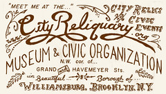
IMPORTANT!: The City Reliquary — the small Brooklyn museum that hosts and sponsors so many wonderful projects (including my Candela Structures exhibit last summer) is in trouble. Big bills, low funds. If they don’t raise a large pile of cash soon, there’s a strong possibility that they will have to close their doors.
A series of fundraisers is being staged to help save the Reliquary, including one that I’m involved in: “Meals and Spiels,” a multi-course dinner party being held at the Brooklyn Kitchen (100 Frost St., Williamsburg) on Tuesday, April 27th, 7pm.
Each course of the meal will be accompanied by a local expert giving a presentation about that food or drink’s history and heritage in New York City. For example, the entrée will be sliced “man steak” (a huge sirloin, enough to feed five to seven people). As people chow down on that, I’ll be giving a short lecture on the New York beefsteak tradition. When coffee is served at the end of the meal, my partner in the Forewords, Liz Clayton (who’s a serious java journalist), will talk about NYC coffee history. And so on.
“Meals and Spiels” isn’t cheap — tickets are $150. But you’ll have a unique dining experience, get to hang out with some groovy people, and, most importantly, have the satisfaction of helping to save a very special place that’s extremely dear to me. For additional info and to buy tickets, look here.
Uni Watch News Ticker: UVA will unveil their new football uniforms this afternoon. ”¦ Corporate douchebaggery alert: Tony Griggsby checked out the Masters leaderboard on golf.com and discovered that the Nike players are listed with swooshes. ”¦ More douchebaggery: Major League Roller Hockey jerseys don’t just have McDonald’s logo patches, but a background pattern full of arches (horrifying find by Justin Funderburk. ”¦ Paul Hornstein attends W.C. Bryant High in Queens, where they’ve added this sleeve patch. Very nice, even if it’s obviously modeled on the Giants’ patch. ”¦ New kit for Liverpool. “The new sponsor, a London-based bank called Standard Chartered, replaces Carlsberg, who had been the Liverpool sponsor for 17 years,” says Micahel Orr. ”¦ New throwbacks for Vanderbilt baseball (with thanks to Bryan Barnes). ”¦ Batting helmet scholar Larry Granillo sent along this one-sheet document, which was apparently created by a SABR member some years ago. The photos are the bottom are intriguing, esp. the Bresnahan shot. ”¦ Almost nobody ever gets the story right regarding the White Sox shorts from 1976. Many fans think they were worn for an entire season; others think they were worn only once (I used to think that myself). Now Mike Steiner — who actually owns Goose Gossage’s game-used shorts — has finally put together a fairly complete story of this misunderstood chapter in baseball history. Check it out here. ”¦ A little birdie tells me that the NBA has given the green light to D-League teams who want to strike jersey-sponsorship deals, just like the WNBA. It’s tempting to get riled up about this, but really, it’s the D-League, so who really gives a shit? ”¦ That odd sleeve-piping fraying has reappeared on the Angels’ jerseys (good spot by Jonathon Binet). ”¦ How wonderful that the Mets have already decided that they’ll be keeping the black jersey next season. Idiots. ”¦ A museum in Toronto is currently featuring an exhibition about socks. ”¦ Sports Illustrated totally ripped off one of my old ESPN columns to create a slideshow of MLB uni typos. But it’s worth it, since they came up with an “Angees” photo I hadn’t seen before. ”¦ Interesting bit about Ryne Sandberg wearing his own retired number at the very end of this story (good find by Kenn Tomasch). ”¦ Rawlings is being sued by a minor league player whose career was ended by a beanball (with thanks to Bill Erdek). ”¦ The Pirates apparently have a camera guy who goes by “Camera Guy.” He’s easy to spot because he wears a jersey with a “Camera Guy” NOB. Wait, what? Very odd (as noted by Grant Ramey). ”¦ Ohio State coaches and players will wear pink gear for the annual spring scrimmage in honor of Stefanie Speilman. ”¦ The Syracuse Chiefs are celebrating the 50th anniversary of community ownership by wearing very nice throwbacks for Thursday home games (with thanks to Tony DiRubbo). ”¦ Two things about the Braves/Cubs screen shot: First, check out how it looks like the ump is wearing an Indian headdress. Also, note what’s printed on the steps behind home plate — is that the first in-stadium Facebook ad? (With thanks to Josh Exline.) ”¦ The Penguins marked the last home game of the regular season by holding their annual “Shirts Off Our Backs” promotion. When they removed their jerseys, they were wearing these T-shirts underneath — nice (as noted by Doug Keklak). ”¦ RIP, Malcolm.
“Betting” helmet?
Those Syracuse Chiefs uniforms look great.
Love the Vandy throwback. This might be the one instance when pinstripes DO belong on a road uniform.
Great show last night at the “closing” of Mellon Arena. The Post-Gazette blogger got photos of a lot of retro Penguins attire in the crowd, but this jersey might trump them all:
link
link
Full article here:
link
[quote comment=”384850″]Those Syracuse Chiefs uniforms look great.[/quote]
They sure do.
And — as always — the wire service stuff is terrific. That Jesee Owens picture! [And, yeah, it sure looks like Cosell back there.] Plus the apotheosis of bowling, Dempsey, etc, etc.
[quote comment=”384851″]Love the Vandy throwback. This might be the one instance when pinstripes DO belong on a road uniform.[/quote]
Agreed. Has a look similar to this:
link
link
link
Sports Illustrated totally ripped off one of my old ESPN columns to create a slideshow of MLB uni typos. But it’s worth it, since they came up with an “Angees” photo I hadn’t seen before.
So the Big Ego tells us SI RIPS off his idea and then becomes mortal by saying he has never seen the ANGEES…Humbling…
Corporate douchebaggery alert: Tony Griggsby checkedd out the Masters leaderboard on golf.com and discovered that the Nike players are listed with swooshes.
the golf channel has always shown those who play titelist
so that is corporate douchebaggery as well, yes? (and i THINK, but im not positive, espn used to show the titlist players as well…)
oh…and so does the pga leaderboard
is it only douchebaggery when nike has their ball shown?
Wow, I used to live a few blocks for W.C Bryant HS, that’s a blast from the past
The opener for our Myrtle Beach Pelicans last night featured our home town birds in their normal hosery as well as the fantastic wear of the Wilmington Blue Rocks…who the hell do I root for?
link
Frosty
[quote comment=”384849″]”Betting” helmet?[/quote]
it is what you wear to go home and explain to you wife how you dropped your pay check at the local OTB
[quote comment=”384857″]Is it only douchebaggery when Nike has their ball shown?[/quote]
Probably, but that’s just the world we live in. We don’t have to like the Corporate World and its practices, but we should probably treat all it’s members the same.
[quote comment=”384858″]… RIP, Malcolm.[/quote]
thats a swindle…
RE: Angels Piping
Just another day in Majestic paradise. I hate them so much, I am irrationally angry that they continue to make MLB jerseys.
[quote comment=”384862″][quote comment=”384858″]… RIP, Malcolm.[/quote]
thats a swindle…[/quote]
bullocks
That Vandy throwback is primo. Now somebody get that kid his own cap & give that one back to his big brother. Like to bust a cap in the ass of the p.a.b. started that bullshit look. Last & only time it was OK, was in the Our Gang series in the 1930’s. Now it’s strictly bush league.
[quote comment=”384864″][quote comment=”384862″][quote comment=”384858″]… RIP, Malcolm.[/quote]
thats a swindle…[/quote]
bullocks[/quote]
Sorry, Phil, what does a de-sexed bovine cart-puller have to do with the Pistols?
[quote comment=”384866″][quote comment=”384864″][quote comment=”384862″][quote comment=”384858″]… RIP, Malcolm.[/quote]
thats a swindle…[/quote]
bullocks[/quote]
Sorry, Phil, what does a de-sexed bovine cart-puller have to do with the Pistols?[/quote]
never mind
[quote comment=”384857″]Corporate douchebaggery alert: Tony Griggsby checkedd out the Masters leaderboard on golf.com and discovered that the Nike players link.
the golf channel has always shown those who link
so that is corporate douchebaggery as well, yes? (and i THINK, but im not positive, espn used to show the titlist players as well…)
oh…and so does link
is it only douchebaggery when nike has their ball shown?[/quote]
I’d argue that the use of the Nike swoosh is less corporate douchebaggery than the Titleist logo. If you click on the swoosh, it tells you exactly what clubs are in that golfer’s bag. If you click on the Titleist logo, it sends you to Titleist’s website.
link
Holy copying the Milwaukee Admirals, kinda sorta, Batman!
So has there been any leak or anything of the new UVa unis? I’m gonna be at work at 3:30 and wont be able to check.
Ohio State coaches and players will wear pink gear for the annual spring scrimmage link.
The blog post in that link says the players will wear “pink-accented jerseys.”
Just wanted to add that I heard on the radio yesterday, all the jerseys in the game will have pink-outlined numbers.
@Mark in Shiga:
Marla Collins
was firedand Cubs management came to a mutual decision that it was in everyone’s best interest for them to part ways in ’86, so your memory’s right on about the time period for the replacement ball girl wearing #72.Also, I’m pretty sure there was at least one other during her tenure (Blonde hair — #72 had dark hair, right?), but I really don’t remember seeing her very often
And don’t take my statement about Marla’s jersey number corresponding to the year as gospel. That’s just the way I remember it (but I’m pretty sure that was the case.)
[quote comment=”384856″]Sports Illustrated totally ripped off one of my old ESPN columns to create a slideshow of MLB uni typos. But it’s worth it, since they came up with an “Angees” photo I hadn’t seen before.
So the Big Ego tells us SI RIPS off his idea and then becomes mortal by saying he has never seen the ANGEES…Humbling…[/quote]
Why don’t you actually read what was written instead of just copying, pasting and spouting?
[quote comment=”384869″]http://pl.b5z.net/i/u/10080284/i/pdir/446/i/1-img_814maudib5.jpg?ab=12
Holy copying the Milwaukee Admirals, kinda sorta, Batman![/quote]
Oh, you beat me to it.
Where do you suppose those South Carolina Buccaneers got their link from?
New Liverpool kit is horrible, but I’m not a fan of most Adidas kits nowadays. I hate that they went away from Carlsberg, it was a simple, attractive sponsor logo and I also like that they had the longest-standing sponsorship in the Premiership, there’s something to be said for loyalty. The Standard Chartered logo is boring and cheap looking. This is consistent with the pics that were leaked a while ago, however, not sure if I saw them here or somewhere else. If these are the other new kits, I’ll go for the white away kit, the pinstripes actually work.
link
link
link
Re 1959 flap helmets … Sure looks to me like both helmets pictured were made about 3 sizes too small for the men wearing them.
Re SF Giants logo … in red, white, and blue, and being in NY, could that have been meant as more of a shout out to the NY Giants than the SF Giants? I know, same team, but it’s like the modern logo (knockoff) in old-time colors.
The Owens and Metcalfe picture is great. Track and Field jerseys limit the canvas, forcing the designer to simplify and get it right. Beautiful.
Meanwhile another disturbing image from the Billy Martin-era Twins archives. First, Dave Boswell in aviator sunglasses hiding his black eye courtesy of Billy. And now Billy in full regalia cocked and ready with his 22.
I can’t wait for the next chapter. :)
Meanwhile, check out the guy in the background – that’s Howard Cosell, no?
It is Cosell.
So when the Twins wear vintage-inspired pins on their road grays it sucks, but otherwise the look is cool? Okay, got it.
Every time I look up at the TV the past few nights my involuntary reaction is that I’m watching the Indians or White Sox from years past.
I have to check Okkonen/DressedNines, but I think this might be the first time in the history of the franchise (D.C. and Minnesota) that the team has regularly worn multi-colored trim at neck, on sleeves and pantlegs on a traditional gray uniform, the first year of sansabelt doubleknits being something of an exception. That season they wore gray, but went to powder blue the following year. Certainly is during the TV era, of that I’m positive.
Guess maybe that’s why it takes some adjusting. Grays with button-front jerseys and belted pants and all that (in this case) Bumper Sticker trim on a Senators-Twins uni? Just doesn’t want to compute. Not yet, anyway.
Plus, something’s haywire with the “Minnesota” script. Maybe could have condensed it a little so it could have been deeper? Just looks like it’s a bit too “airy”. Not sure what it, but just a little off? Too much space better letters and tail, maybe? Don’t know.
I guess I’ll become accustomed to them sooner or later. Just don’t get the rationale that a new ballpark is occasion for new ROAD unis. Seems assbackwards.
—Ricko
I like the design of the Vandy uniform, but it looks like a deflated sumo wrestler outfit on that kid. That could be why the star logo looks tiny.
Also, no screenshot, but the Braves bat boy has a “bat boy” nameplate but no number. The Cubs bat boy has a blank back.
SI.com is running a “Dream Matchups” series. The most recent is college basketball themed: 1964 UCLA vs. 1996 Kentucky. Click on “Game Results” to see a couple great images where players from both teams appear to be playing one another.
link
Kentucky’s unis in ’96 had that faux-velvet/denim look to them –
link
link
Really strange, but an upgrade from the giant cat scratches they’d worn just before that.
link
UCLA’s ’64 unis were great. They’re often an afterthought considering the Bruins have stuck with their current jerseys since the late 60’s.
link
link
re: SI’s Gallery of misspellings…
Best thing about it is the last photo of Big Klu in gray flannel.
Also, someday someone’s gonna come up with a screen grab from the early- to-mid ’70’s of the Tiger player with “DETRIOT” in block letters on his road jersey.
—Ricko
When Ken Boyer came to the Mets he took #14 from a young outfielder who Mets fans remember much better in #4 – Ron Swoboda
[quote comment=”384879″]So when the Twins wear vintage-inspired pins on their road grays it sucks, but otherwise the look is cool? Okay, got it.
Every time I look up at the TV the past few nights my involuntary reaction is that I’m watching the Indians or White Sox from years past.
Plus, something’s haywire with the “Minnesota” script. Maybe could have condensed it a little so it could have been deeper? Just looks like it’s a bit too “airy”. Not sure what it, but just a little off? Too much space better letters and tail, maybe? Don’t know.
I guess I’ll become accustomed to them sooner or later. Just don’t get the rationale that a new ballpark is occasion for new ROAD unis. Seems assbackwards.
—Ricko[/quote]
That’s what I’ve been saying, Ricko. I think the word Minnesota, in cursive, at least in this case, just doesn’t fit, doesn’t look natural. Right?
[quote comment=”384879″]So when the Twins wear vintage-inspired pins on their road grays it sucks, but otherwise the look is cool? Okay, got it.
Every time I look up at the TV the past few nights my involuntary reaction is that I’m watching the Indians or White Sox from years past.
I have to check Okkonen/DressedNines, but I think this might be the first time in the history of the franchise (D.C. and Minnesota) that the team has regularly worn multi-colored trim at neck, on sleeves and pantlegs on a traditional gray uniform, the first year of sansabelt doubleknits being something of an exception. That season they wore gray, but went to powder blue the following year. Certainly is during the TV era, of that I’m positive.
Guess maybe that’s why it takes some adjusting. Grays with button-front jerseys and belted pants and all that (in this case) Bumper Sticker trim on a Senators-Twins uni? Just doesn’t want to compute. Not yet, anyway.
Plus, something’s haywire with the “Minnesota” script. Maybe could have condensed it a little so it could have been deeper? Just looks like it’s a bit too “airy”. Not sure what it, but just a little off? Too much space better letters and tail, maybe? Don’t know.
I guess I’ll become accustomed to them sooner or later. Just don’t get the rationale that a new ballpark is occasion for new ROAD unis. Seems assbackwards.
—Ricko[/quote]
I know this will sound weird, Ricko, but I actually think the “Minnesota” on the road uniform is too small. This photo really convinced that it needed to be bigger:
link
It just looks too little-league. Regardless of what people think of the road-pins, at least the previous iteration of “Minnesota” was larger:
link
Oh, re: Bat Boy numbers, etc.
Late in Twins-Angels game last night a beach ball was thrown onto the field (how original). One of the Angel bat boys took care of it and Burt Blyleven said so, noting that “He has ‘BB’ on his back.” Dick Bremer said, “Is THAT what that means? I thought it was for ‘Beach Ball’. That his job was to get beach balls thrown onto the field.”
Not particularly hilarious, just banter…but it certainly did remind me of the Bat Boy “To Number or Not to Number” discussion here the past couple days.
—Ricko
[quote comment=”384859″]The opener for our Myrtle Beach Pelicans last night featured our home town birds in their normal hosery as well as the fantastic wear of the Wilmington Blue Rocks…who the hell do I root for?
link
Frosty[/quote]
Everyone except for Alex Gordon.
Maybe it’s just the small tail that’s making it look “off.”
link
Either way, it’s “something.”
Regarding the field hockey photo: was there a cutline/caption for this? It looks like a club team against a team with a large shield — the U.S. national side?
Speaking of misspellings, it’s Jesse Owens, not Jesee.
I think a longer tail would help “Minnesota”:
link
link
[quote comment=”384891″]I think a longer tail would help “Minnesota”:
link
link
Or, and this flies in the face of conventional wisdom, lose the “tail” altogether and (as if in Photoshop or MS paint) stretch the script vertically 120 or 130% (maybe more?). Same width, of course, but making it deeper would give it more visual weight.
Hey, just TOL (thinking out loud).
I mean, it isn’t LAW that script has to have a tail or an underline, right?
—Ricko
Actually could be as much as 160 to 170%.
Wish I was home so I could mess with it.
[quote comment=”384891″]I think a longer tail would help “Minnesota”:
link
link
A longer tail would help, perhaps. But the particular cursive font is the problem, I think. Particularly the capital M. It needs to be bolder, more distinct, more fanciful, from the rest of the word.
Or maybe, like I’v said, the word Minnesota, in cursive, just doesn’t lend itself to a sports jersey. (I think it looks bad on the Wild, too.)
Since you brought it up, I keep hoping that they add more photos of the link to the Life archives. (I think that’s the XB-35.)
At the moment, the best photos are of some guy who built a Flying Wing link, but he does pose with it link.
[quote comment=”384893″]I mean, it isn’t LAW that script has to have a tail or an underline, right?[/quote]
link…. Let me link about link for a link.
Oops. I link.
I want one of those Syracuse Chiefs jerseys. Very well done.
Syracuse Chiefs, good.
Fighting Sioux, gone.
link
—Ricko
[quote comment=”384898″]Oops. I link.[/quote]
Sort of:
link
link
[quote comment=”384900″]Fighting Sioux, gone.
link
[/quote]
Actually, they’re not going to retire the mascot. They’re just going to gradually push him farther and farther west.
[quote comment=”384901″][quote comment=”384898″]Oops. I link.[/quote]
Sort of:
link
link
Uh, yeah. Thanks, but I was specifically showing examples of current script wordmarks that are sans tail/underline. You could also dig up examples of the Cards, Phils and Sox with script wordmarks that had tails. (I don’t think that’s true for the Tigers, though.)
~~~~~~~~~~~~~~
It’s a shame that Meals and Spiels thing doesn’t have a damn thing on the menu that my wife would eat or I’d seriously consider attending. We could catch Cubs/Mets the Thursday before, too.
Hell, could make it an extended stay and stick around for White Sox/Yankees the Friday after.
Let’s just hope North Dakota doesn’t become the…
“Green Prairie Blaze” or something.
I don’t suppose “Fighting Slot Machine Owners” would work, either, huh?
Personally, I still like “Fighting Sued” best.
—Rico
[quote comment=”384903″][quote comment=”384901″][quote comment=”384898″]Oops. I link.[/quote]
Sort of:
link
link
Uh, yeah. Thanks, but I was specifically showing examples of current script wordmarks that are sans tail/underline. You could also dig up examples of the Cards, Phils and Sox with script wordmarks that had tails. (I don’t think that’s true for the Tigers, though.)
~~~~~~~~~~~~~~
It’s a shame that Meals and Spiels thing doesn’t have a damn thing on the menu that my wife would eat or I’d seriously consider attending. We could catch Cubs/Mets the Thursday before, too.
Hell, could make it an extended stay and stick around for White Sox/Yankees the Friday after.[/quote]
I know that. I just like to throw those pics out there b/c they tweak Phil and some other Mets fans.
WE GOT IT!
Art Director and I solved North Dakota’s dilemma.
North Dakota Flood.
Logo is a guy sitting fishing from a small boat (with his hound dog).
Boat is tied to his chimney.
–Ricko
[quote comment=”384904″]Let’s just hope North Dakota doesn’t become the…
“Green Prairie Blaze” or something.
I don’t suppose “Fighting Slot Machine Owners” would work, either, huh?
Personally, I still like “Fighting Sued” best.
—Rico[/quote]
Has anybody ever wondered why there has never been an uproar about Notre Dame and the use of the “Fighting Irish” as a nickname?
[quote comment=”384905″]I just like to throw those pics out there b/c they tweak Phil and some other Mets fans.[/quote]
Oh, I see. link as link as link had a link reason link…
[quote comment=”384908″][quote comment=”384905″]I just like to throw those pics out there b/c they tweak Phil and some other Mets fans.[/quote]
Oh, I see. link as link as link had a link reason link…[/quote]
Ahhh, yes, the days when there was a lot more tail under the Mets.
best version of paul anka’s my way by malcom’s lads. correct. i’m goofy sliding cause a’s are 3-1.
[quote comment=”384896″]Since you brought it up, I keep hoping that they add more photos of the link to the Life archives. (I think that’s the XB-35.)
At the moment, the best photos are of some guy who built a Flying Wing link, but he does pose with it link.[/quote]
At the Smithsonian’s Udvar-Hazy Center (the extension of the Air & Space Museum at Dulles Airport) we have Northrop’s N-1M (the testing body for the XB-35 ~ Flying Wing) the plane I’ve also have Technical Drawings of the XB-35.
[quote comment=”384859″]The opener for our Myrtle Beach Pelicans last night featured our home town birds in their normal hosery as well as the fantastic wear of the Wilmington Blue Rocks…who the hell do I root for?
link
Frosty[/quote]
I think I would root for Wilmington, since their socks have stripes!
hey i have a question, i asked paul and he suggested posting it as a comment instead, so any help will be awesome.
i saw this link picture from 1992 online, and the first thing i noticed is how boxy glavines hat is compared to smoltz or avery. i looked for some older pictures, and i found this link 1990 baseball card typo and you can see the difference in glavine’s hat. now, of course, glavine is used very often to show why the 59fifty hats suck link. now i know firsthand that these hats do cause box head, but why would it be worse on him?
Forgot to add the link to the plane’s webpage and the Air & Space Museum:
link
[quote comment=”384900″]Syracuse Chiefs, good.
Fighting Sioux, gone.
link
—Ricko[/quote]
[quote comment=”384900″]Syracuse Chiefs, good.
Fighting Sioux, gone.
link
—Ricko[/quote]
I posted this last night.
No more Sioux a girls name cheers at Badger Hockey game.
With a link to the article from the Wisconsin State Journal
[quote comment=”384875″]New Liverpool kit is horrible, but I’m not a fan of most Adidas kits nowadays. I hate that they went away from Carlsberg, it was a simple, attractive sponsor logo and I also like that they had the longest-standing sponsorship in the Premiership, there’s something to be said for loyalty. The Standard Chartered logo is boring and cheap looking. This is consistent with the pics that were leaked a while ago, however, not sure if I saw them here or somewhere else. If these are the other new kits, I’ll go for the white away kit, the pinstripes actually work.
link
link
link
Personally, the only reason they look bad is there isn’t Carlsberg on it anymore. I feel like Liverpool should have stuck with them, just as how Newcastle United should have stuck with Brown Ale because they have such a good blend for the clubs, and frankly they’d been sponsors for awhile on both ends. Still, it’s hard to like a kit when it has a corny law firm looking dealio on it. You could have an amazing kit like the Argentina national team, but if you smack this bad boy on the front:
link
It’ll make people puke.
While searching and taking notes on every single year of Sports Illustrated, I have come across some amazing old pictures. I just thought I would share some with you today:
In the January 20, 1969 issue of SI, there is a great picture of the Purdue basketball uniforms (complete with belt, and Rick Mount looking sweet) on page 28, and some sweet helmet action for Boston College’s hockey team on page 44 (Tim Sheehy lookin good in this pic). SI Vault will not let me link directly to the page. But it take all of 15 seconds. here is the link to some 1969 SI’s:
link
Go to the issue with Broadway Joe on the cover (Jan. 20) and click “view issue”. Then just scroll virtually through the magazine and enjoy.
Cool picture of Jesse Owens. It would be interesting to know how much George Weiss paid him to coach during spring training. I am guessing as little as possible.
[quote comment=”384906″]WE GOT IT!
Art Director and I solved North Dakota’s dilemma.
North Dakota Flood.
Logo is a guy sitting fishing from a small boat (with his hound dog).
Boat is tied to his chimney.
He’s got to be wearing waders
[quote comment=”384850″]Those Syracuse Chiefs uniforms look great.[/quote]
My best friend Nick still lives in the Syracuse area and texted me that he was at the game yesterday. I sent him back a text this morning saying “why didn’t you tell me the Chiefs wore sweet throwbacks yesterday?”
His response “I didn’t know they did . . . thought they were just dirty jerseys.”
Needless to say, Nick is not a member of the UniWatch.
link
~~~~~~~~~~~
(Phil has no web access at the moment so he’ll have to wait to see those fantastic mid-90s Mets photos.)
Nobody’s mentioned that a couple of link failed to follow link when taping up their stirrups. 2nd and 3rd players on the left, and 2nd on the right didn’t blouse their pants low enough, sock tape is showing.
Or maybe those are the military style rubber bands that had been mentioned in the comments section.
(btw: I always liked the Mets away jersey with the tail. Home I could do without.)
[quote comment=”384922″]Nobody’s mentioned that a couple of link failed to follow link when taping up their stirrups. 2nd and 3rd players on the left, and 2nd on the right didn’t blouse their pants low enough, sock tape is showing.
Or maybe those are the military style rubber bands that had been mentioned in the comments section.
(btw: I always liked the Mets away jersey with the tail. Home I could do without.)[/quote]
First thing I noticed about those stirrups. I’ve been waiting for Ricko to say something.
And with the Mets 93/94 jerseys, I’m the opposite. I didn’t particularly dislike the home jerseys, but I thought the road script looked turrible, just turrible with the tail, uh, penetrating the loop on the bottom of the Y.
[quote comment=”384907″][quote comment=”384904″]Let’s just hope North Dakota doesn’t become the…
“Green Prairie Blaze” or something.
I don’t suppose “Fighting Slot Machine Owners” would work, either, huh?
Personally, I still like “Fighting Sued” best.
—Rico[/quote]
Has anybody ever wondered why there has never been an uproar about Notre Dame and the use of the “Fighting Irish” as a nickname?[/quote]
Or the Atlanta Crackers.
[quote comment=”384886″]Oh, re: Bat Boy numbers, etc.
Late in Twins-Angels game last night a beach ball was thrown onto the field (how original). One of the Angel bat boys took care of it and Burt Blyleven said so, noting that “He has ‘BB’ on his back.” Dick Bremer said, “Is THAT what that means? I thought it was for ‘Beach Ball’. That his job was to get beach balls thrown onto the field.”
Not particularly hilarious, just banter…but it certainly did remind me of the Bat Boy “To Number or Not to Number” discussion here the past couple days.
—Ricko[/quote]
I was watching Game 6 of the 1995 World Series yesterday and noticed the Indians’ bat boy was wearing 99.
Also, who was asking for some photoshoppery?
link
Verdict?
[quote comment=”384923″][quote comment=”384922″]Nobody’s mentioned that a couple of link failed to follow link when taping up their stirrups. 2nd and 3rd players on the left, and 2nd on the right didn’t blouse their pants low enough, sock tape is showing.
Or maybe those are the military style rubber bands that had been mentioned in the comments section.
(btw: I always liked the Mets away jersey with the tail. Home I could do without.)[/quote]
First thing I noticed about those stirrups. I’ve been waiting for Ricko to say something.
And with the Mets 93/94 jerseys, I’m the opposite. I didn’t particularly dislike the home jerseys, but I thought the road script looked turrible, just turrible with the tail, uh, penetrating the loop on the bottom of the Y.[/quote]
I liked the road jersey, for one. And those are the Mets jerseys that tend to fetch the highest prices on eBay, oddly.
[quote comment=”384923″][quote comment=”384922″]Nobody’s mentioned that a couple of link failed to follow link when taping up their stirrups. 2nd and 3rd players on the left, and 2nd on the right didn’t blouse their pants low enough, sock tape is showing.
Or maybe those are the military style rubber bands that had been mentioned in the comments section.
(btw: I always liked the Mets away jersey with the tail. Home I could do without.)[/quote]
First thing I noticed about those stirrups. I’ve been waiting for Ricko to say something.
And with the Mets 93/94 jerseys, I’m the opposite. I didn’t particularly dislike the home jerseys, but I thought the road script looked turrible, just turrible with the tail, uh, penetrating the loop on the bottom of the Y.[/quote]
re: Chiefs….
Yeah, the “OMG, my little brother’s pants are too short for me!” look never quite works (although I’m sure someone will be tempted to post a photo of Shoeless Joe, who kinda wore his knickers that way…but those aren’t 1917 Chiefs throwbacks, so don’t bother, ’tis a different era).
Those unis are SO good-looking, we all can easily live with a little pants “shortage”, I imagine.
Is that what’s holding UP the socks, or a manufacturer’s ID of some sort ON the socks?
—Ricko
[quote comment=”384926″]Also, who was asking for some photoshoppery?
link
Verdict?[/quote]
Much better. Anything that helps take away “Snellgren’s Hardware” Little League look.
I think if players simply wore the correct size shirt, the wordmark would be closer to the correct size.
[quote comment=”384927″][quote comment=”384923″][quote comment=”384922″]Nobody’s mentioned that a couple of link failed to follow link when taping up their stirrups. 2nd and 3rd players on the left, and 2nd on the right didn’t blouse their pants low enough, sock tape is showing.
Or maybe those are the military style rubber bands that had been mentioned in the comments section.
(btw: I always liked the Mets away jersey with the tail. Home I could do without.)[/quote]
First thing I noticed about those stirrups. I’ve been waiting for Ricko to say something.
And with the Mets 93/94 jerseys, I’m the opposite. I didn’t particularly dislike the home jerseys, but I thought the road script looked turrible, just turrible with the tail, uh, penetrating the loop on the bottom of the Y.[/quote]
I liked the road jersey, for one. And those are the Mets jerseys that tend to fetch the highest prices on eBay, oddly.[/quote]
I kind of liked the ’93-94 “New York” script too. Better than the ’87 script, anyway, and certainly better than the plain block lettering, with no front numeral, that they used from 1988-92. Not as good as the ultimate Mets jersey, the 1995-97 road grey.
You know, I could totally deal with the black jersey if (a) they wouldn’t wear it too often; (b) they’d wear it with the blue caps (or, alternatively, get rid of both black caps altogether); (c) they’d remove the black drop-shadow from all of the other jerseys; and (d) get rid of the black skyline logo and put the regular blue skyline logo on the sleeve, like they had in ’98.
I could totally deal with the plain whites being the main home uniform too, under the same conditions, and as long as they keep the blue placket piping.
[quote comment=”384868″][quote comment=”384857″]Corporate douchebaggery alert: Tony Griggsby checkedd out the Masters leaderboard on golf.com and discovered that the Nike players link.
the golf channel has always shown those who link
so that is corporate douchebaggery as well, yes? (and i THINK, but im not positive, espn used to show the titlist players as well…)
oh…and so does link
is it only douchebaggery when nike has their ball shown?[/quote]
I’d argue that the use of the Nike swoosh is less corporate douchebaggery than the Titleist logo. If you click on the swoosh, it tells you exactly what clubs are in that golfer’s bag. If you click on the Titleist logo, it sends you to Titleist’s website.[/quote]
Agreed, and agreed. I noticed the swooshes yesterday, and kind of liked that they showed the clubs used, driving distance, driving accuracy, etc.
I just think some people automatically cringe when they see the Nike logo. Are they really different than the other companies? I dont think so. I actually think Under Armour’s ‘creep’ is the worst of them all…but it still doesn’t bother me that much since having the logo show is a main part of their business. Thus, so be it.
[quote comment=”384925″][quote comment=”384886″]Oh, re: Bat Boy numbers, etc.
Late in Twins-Angels game last night a beach ball was thrown onto the field (how original). One of the Angel bat boys took care of it and Burt Blyleven said so, noting that “He has ‘BB’ on his back.” Dick Bremer said, “Is THAT what that means? I thought it was for ‘Beach Ball’. That his job was to get beach balls thrown onto the field.”
Not particularly hilarious, just banter…but it certainly did remind me of the Bat Boy “To Number or Not to Number” discussion here the past couple days.
—Ricko[/quote]
I was watching Game 6 of the 1995 World Series yesterday and noticed the Indians’ bat boy was wearing 99.[/quote]
probably a shout-out to Rick Vaughn and his “Eliminator.”
link
[quote comment=”384926″]Also, who was asking for some photoshoppery?
link
Verdict?[/quote]
much better.
[quote comment=”384933″][quote comment=”384925″][quote comment=”384886″]Oh, re: Bat Boy numbers, etc.
Late in Twins-Angels game last night a beach ball was thrown onto the field (how original). One of the Angel bat boys took care of it and Burt Blyleven said so, noting that “He has ‘BB’ on his back.” Dick Bremer said, “Is THAT what that means? I thought it was for ‘Beach Ball’. That his job was to get beach balls thrown onto the field.”
Not particularly hilarious, just banter…but it certainly did remind me of the Bat Boy “To Number or Not to Number” discussion here the past couple days.
—Ricko[/quote]
I was watching Game 6 of the 1995 World Series yesterday and noticed the Indians’ bat boy was wearing 99.[/quote]
probably a shout-out to Rick Vaughn and his “Eliminator.”
link
And evidently the inspiration for the Twins’ new roads (personally, I think we got hosed on that one).
—Ricko
[quote comment=”384934″][quote comment=”384926″]Also, who was asking for some photoshoppery?
link
Verdict?[/quote]
much better.[/quote]
I agree. Greatly improved.
Unfortunately, Minnesota is just too dang long to put in cursive on a uniform like that. I’m a HUGE fan of script like that on a jersey as a general rule, and increasing the size and finishing off the tale help, but I still don’t think I’d be able to read the name from beyond the 3rd row.
And before anyone argues “shouldn’t you know who your team is playing when you’re at the ballpark?” – yes, I suppose you’re right. Let’s just go to shirts and skins for all sporting events then.
[quote comment=”384919″][quote comment=”384906″]WE GOT IT!
Art Director and I solved North Dakota’s dilemma.
North Dakota Flood.
Logo is a guy sitting fishing from a small boat (with his hound dog).
Boat is tied to his chimney.
He’s got to be wearing waders[/quote]
I’m from ND and that made me laugh out loud.
[quote comment=”384924″][quote comment=”384907″][quote comment=”384904″]Let’s just hope North Dakota doesn’t become the…
“Green Prairie Blaze” or something.
I don’t suppose “Fighting Slot Machine Owners” would work, either, huh?
Personally, I still like “Fighting Sued” best.
—Rico[/quote]
Has anybody ever wondered why there has never been an uproar about Notre Dame and the use of the “Fighting Irish” as a nickname?[/quote]
Or the Atlanta Crackers.[/quote]
My guess is because Irish people (who are white) love it, whereas with the Indian nicknames and logos it wasn’t necessarily so. You don’t have the same history with Irish immigrants in this country as you do with Native Americans either.
Geez, look at the arms on the batter and catcher in that women’s softball pic!
link
Betcha I’d lose an arm wrestling match to either of ’em…
-Jet
[quote comment=”384936″]
Unfortunately, Minnesota is just too dang long to put in cursive on a uniform like that. I’m a HUGE fan of script like that on a jersey as a general rule, and increasing the size and finishing off the tale help, but I still don’t think I’d be able to read the name from beyond the 3rd row.[/quote]
So, do you feel the same way about the Orioles’, Indians’, Dodgers’ and Royals’ road jerseys?
All of them have city names that are at least as long or longer than Minnesota.
Shit, the Natinals roads, too. And the Cardinals (home and road). Both are cursive script wordmarks with at least 9 letters.
[quote comment=”384925″]I was watching Game 6 of the 1995 World Series yesterday and noticed the Indians’ bat boy was wearing 99.[/quote]
Quite the Wild Thing.
[quote comment=”384940″][quote comment=”384936″]
Unfortunately, Minnesota is just too dang long to put in cursive on a uniform like that. I’m a HUGE fan of script like that on a jersey as a general rule, and increasing the size and finishing off the tale help, but I still don’t think I’d be able to read the name from beyond the 3rd row.[/quote]
So, do you feel the same way about the Orioles’, Indians’, Dodgers’ and Royals’ road jerseys?
All of them have city names that are at least as long or longer than Minnesota.[/quote]
To be honest – yes, yes I do. I think that’s been discussed about Baltimore from the start when it came back. For some reason, I think Los Angelos and Kansas City are more legible from an abstract point of view. IMO, since the L&A and K&C stand out more from a distance, and your eyes have an easier time assuming everything else that follows.
In other news, Florida’s link is this weekend. It’s the Orange and Blue Debut, officially, although nobody is going to wear orange, and, in fact, the offense for both teams will wear blue and the defense for both teams will wear white. Okay, then.
[quote comment=”384941″]Shit, the Natinals roads, too. And the Cardinals (home and road). Both are cursive script wordmarks with at least 9 letters.[/quote]
Excellent point made here. OK, who’s got a couple minutes of Google and Photoshop time? Let’s see all those logos together Brady Bunch style and see why it seems to work for some teams and not for others.
You’re making me rethink my take on this. Do we just accept the ones the have been that way for a long time because we’re used to it, and reject anything new because it’s different?
(I don’t pretend to think that EVERYONE feels this way … but it seems like anytime a long name appears on the front of a jersey, we go through something like this)
[quote comment=”384944″]In other news, Florida’s link is this weekend. It’s the Orange and Blue Debut, officially, although nobody is going to wear orange, and, in fact, the offense for both teams will wear blue and the defense for both teams will wear white. Okay, then.[/quote]
[quote comment=”384946″][quote comment=”384944″]In other news, Florida’s link is this weekend. It’s the Orange and Blue Debut, officially, although nobody is going to wear orange, and, in fact, the offense for both teams will wear blue and the defense for both teams will wear white. Okay, then.[/quote][/quote]
Which is a shame, because you would think a school from Florida would wear orange once in a while if it was a school color. Don’t think Florida has worn orange jerseys in football since 1989.
Hoe can I access/browse these wire service photos at flickr? I’ve tried this URL address (farm5.static.flickr.com), but to no avail. Help?
[quote comment=”384943″][quote comment=”384940″][quote comment=”384936″]
Unfortunately, Minnesota is just too dang long to put in cursive on a uniform like that. I’m a HUGE fan of script like that on a jersey as a general rule, and increasing the size and finishing off the tale help, but I still don’t think I’d be able to read the name from beyond the 3rd row.[/quote]
So, do you feel the same way about the Orioles’, Indians’, Dodgers’ and Royals’ road jerseys?
All of them have city names that are at least as long or longer than Minnesota.[/quote]
To be honest – yes, yes I do. I think that’s been discussed about Baltimore from the start when it came back. For some reason, I think Los Angelos and Kansas City are more legible from an abstract point of view. IMO, since the L&A and K&C stand out more from a distance, and your eyes have an easier time assuming everything else that follows.[/quote]
“Milwaukee” also has nine letters, and it looks link in script across a player’s link.
[quote comment=”384950″][quote comment=”384943″][quote comment=”384940″][quote comment=”384936″]
Unfortunately, Minnesota is just too dang long to put in cursive on a uniform like that. I’m a HUGE fan of script like that on a jersey as a general rule, and increasing the size and finishing off the tale help, but I still don’t think I’d be able to read the name from beyond the 3rd row.[/quote]
So, do you feel the same way about the Orioles’, Indians’, Dodgers’ and Royals’ road jerseys?
All of them have city names that are at least as long or longer than Minnesota.[/quote]
To be honest – yes, yes I do. I think that’s been discussed about Baltimore from the start when it came back. For some reason, I think Los Angelos and Kansas City are more legible from an abstract point of view. IMO, since the L&A and K&C stand out more from a distance, and your eyes have an easier time assuming everything else that follows.[/quote]
“Milwaukee” also has nine letters, and it looks link in script across a player’s link.[/quote]
Some words look better than others because caps/lower case words have their own shape because of ascenders and descenders.
Except for the “t” (which also is off to one end), Minnesota has no such animals to make it visually interesting or recognizable.
Not like Los Angeles, Kansas City or Milwaukee.
Even Baltimore has and “l” AND a “t”. And at least the “d” in Indians is in the middle of the word.
—Ricko
[quote comment=”384951″][quote comment=”384950″][quote comment=”384943″][quote comment=”384940″][quote comment=”384936″]
Unfortunately, Minnesota is just too dang long to put in cursive on a uniform like that. I’m a HUGE fan of script like that on a jersey as a general rule, and increasing the size and finishing off the tale help, but I still don’t think I’d be able to read the name from beyond the 3rd row.[/quote]
So, do you feel the same way about the Orioles’, Indians’, Dodgers’ and Royals’ road jerseys?
All of them have city names that are at least as long or longer than Minnesota.[/quote]
To be honest – yes, yes I do. I think that’s been discussed about Baltimore from the start when it came back. For some reason, I think Los Angelos and Kansas City are more legible from an abstract point of view. IMO, since the L&A and K&C stand out more from a distance, and your eyes have an easier time assuming everything else that follows.[/quote]
“Milwaukee” also has nine letters, and it looks link in script across a player’s link.[/quote]
Some words look better than others because caps/lower case words have their own shape because of ascenders and descenders.
Except for the “t” (which also is off to one end), Minnesota has no such animals to make it visually interesting or recognizable.
Not like Los Angeles, Kansas City or Milwaukee.
Even Baltimore has and “l” AND a “t”. And at least the “d” in Indians is in the middle of the word.
—Ricko[/quote]
Hmmm…. interesting thought. There is also the dot over the i in Minnesota, but like the t, it’s off to one end.
And I was referring to the Cleveland road script, which is 9 letters, not the Indians home script. But that also has the l in the middle of the word.
link
Here are crappy pics of the new UVA uniforms….pretty tame honestly. link
ah….much better UVA pics. Still tame…
link
Can anyone tell if the helmet is different? Sounded like it was going to change, but it looks the same to me. Maybe the two orange center stripes are gone?
Yeah, I think they just removed the ‘goat horns’. I was at least hoping for a white helmet. Orange helmet would have been interesting too…
[quote comment=”384955″]ah….much better UVA pics. Still tame…
link
Whew. Could have been much worse. Can’t say I like the orange on blue. Orange works only on white. And sad to say the stripes go. But all in all, disaster averted.
[quote comment=”384958″][quote comment=”384955″]ah….much better UVA pics. Still tame…
link
Whew. Could have been much worse. Can’t say I like the orange on blue. Orange works only on white. And sad to say the stripes go. But all in all, disaster averted.[/quote]
Well, along with the truncated helmet stripes, they also took away pretty much everything else about that uniform that made it distinctive.
I miss the socks already.
[quote comment=”384959″][quote comment=”384958″][quote comment=”384955″]ah….much better UVA pics. Still tame…
link
Whew. Could have been much worse. Can’t say I like the orange on blue. Orange works only on white. And sad to say the stripes go. But all in all, disaster averted.[/quote]
Well, along with the truncated helmet stripes, they also took away pretty much everything else about that uniform that made it distinctive.
I miss the socks already.[/quote]
I suppose you mean those cool white socks with blue stripes. Yeah…those were cool. Never a fan of the stripes on the helmet. A white helmet option would have been really cool, and a throwback to boot. I prefer the TV numbers on the side of the shoulder instead of the top. I prefer the V and sabres under the neck instead of ‘Cavaliers’. I also prefer the new numbers – much smaller and the outlining, while subtle, is nice.
they hype up uva new unis like oregons and come out with that. hope they didn’t pay too much for the rebranding. dont know how i feel about only one helmet liked the two stipe plain white. overall without them hyping it up they aren’t too bad. hid that horrid shoulder stiching (procombat last year). and dont have random stripes for the sake of having stripes. so just dont hype the hell out of it u r uva afterall
[quote comment=”384960″][quote comment=”384959″][quote comment=”384958″][quote comment=”384955″]ah….much better UVA pics. Still tame…
link
Whew. Could have been much worse. Can’t say I like the orange on blue. Orange works only on white. And sad to say the stripes go. But all in all, disaster averted.[/quote]
Well, along with the truncated helmet stripes, they also took away pretty much everything else about that uniform that made it distinctive.
I miss the socks already.[/quote]
I suppose you mean those cool white socks with blue stripes. Yeah…those were cool. Never a fan of the stripes on the helmet. A white helmet option would have been really cool, and a throwback to boot. I prefer the TV numbers on the side of the shoulder instead of the top. I prefer the V and sabres under the neck instead of ‘Cavaliers’. I also prefer the new numbers – much smaller and the outlining, while subtle, is nice.[/quote]
I miss the pant stripes, which are classic, though I did like the all-white-pants look they previously sported.
They’re brining back orange, which is good. And back to my point above: Why doesn’t Florida wear some orange?
[quote comment=”384960″][quote comment=”384959″][quote comment=”384958″][quote comment=”384955″]ah….much better UVA pics. Still tame…
link
Whew. Could have been much worse. Can’t say I like the orange on blue. Orange works only on white. And sad to say the stripes go. But all in all, disaster averted.[/quote]
Well, along with the truncated helmet stripes, they also took away pretty much everything else about that uniform that made it distinctive.
I miss the socks already.[/quote]
I suppose you mean those cool white socks with blue stripes. Yeah…those were cool. Never a fan of the stripes on the helmet. A white helmet option would have been really cool, and a throwback to boot. I prefer the TV numbers on the side of the shoulder instead of the top. I prefer the V and sabres under the neck instead of ‘Cavaliers’. I also prefer the new numbers – much smaller and the outlining, while subtle, is nice.[/quote]
Yeah, the striped socks. But the blue socks they wore with the white pants were OK, too.
I liked the logos on the sleeves and the pants stripes. The wordmark below the neck was fairly innocuous.
Removing the helmet stripes was a good move, though.
[quote comment=”384955″]ah….much better UVA pics. Still tame…
link
Yeah, I’m all for understated and classic, but these are pretty boring. When I heard they were going to be the “Oregon of the East”, I was hoping for something distinctive like UO’s duck wing shoulder treatment (which I love). I mean, it’s not as if they don’t have colorful imagery to draw from:
link
I wonder if there are stripes (or anything) on the ass of the pants. Wouldn’t surprise me.
UVa… talk about bland and boring. The only thing that makes that a UVa jersey is the logo on the collar. Other than that, they look like a generic run of the mill jersey you can order from a Nike catalog. Boring.
You would think that a clear second-rate football program in its own state would try a more distinctive look to at least get their name out there. I mean, would it have killed them to add a shoulder logo or a stripe on the sleeve or collar? Guess so…
[quote comment=”384965″][quote comment=”384955″]ah….much better UVA pics. Still tame…
link
Yeah, I’m all for understated and classic, but these are pretty boring. When I heard they were going to be the “Oregon of the East”, I was hoping for something distinctive like UO’s duck wing shoulder treatment (which I love). I mean, it’s not as if they don’t have colorful imagery to draw from:
link
I wonder if there are stripes (or anything) on the ass of the pants. Wouldn’t surprise me.[/quote]
A bit closer to “Boise State” of east.
Kinda.
Sorta.
Anyway, nothing special, that’s for darn sure.
Honestly, by today’s “fashions” they are less distinctive than what they’ve been wearing, which was a sort of traditional version of the “swooshified” Broncos…Denver variety, not Boise State.
—Ricko
The previous unis were better, but these could have been so much worse.
Guess they’ll have nine possible combinations with the white, blue, and orange uniform sets.
The AP is reporting that the University of Wisconsin is cutting ties with Nike over concerns about the treatment of workers in Honduras. Here’s a link to the link.
UVA remind me of link era link – but at least broke the monotony with a couple of unique features
*they* broke the monotony
[quote comment=”384968″]The previous unis were better, but these could have been so much worse.
Guess they’ll have nine possible combinations with the white, blue, and orange uniform sets.[/quote]
No, they’re not bad (at least from the front). They’re just nondescript.
Ok mixed feelings about the UVA uniforms. Can’t say I really like the orange jersey, but I especially don’t like the orange pants. But it’s a lot more subdued than I thought it might be so that’s a relief. I liked the V sabres logo on the shoulders so I’m sad to see that go. Helmet is fine – I could take or leave the old stripes. I like that the numbers have an outline – much better than the boring blocks on the last set.
On the old blue pants I liked that they had stripes but something was off – I think they were too widely spaced apart – so I’m ok with the new pants, but I will miss the stripes on the white socks.
I do like that they put the v sabres logo below the collar instead of the basic virginia wordmark.
Overall I’m ok with the changes. I’d prefer we not have any orange pants, and I think the Orange jersey should be paired with white pants so as not to look like Clemson. I agree with those above that a white helmet would be cool especially if it was a throwback (with the UVa logo, not v-sabres). But I am relieved – I thought they would be full of bumperstickers and they’re not, so, good.
[quote comment=”384969″]The AP is reporting that the University of Wisconsin is cutting ties with Nike over concerns about the treatment of workers in Honduras. Here’s a link to the link.[/quote]
I seem to recall that’s been in the works for a while. Not the greatest impact, since Adidas outfits the teams, but still noteworthy.
[quote comment=”384963″]And back to my point above: Why doesn’t Florida wear some orange?[/quote]
Florida’s teams routinely wore blue for many years. Steve Spurrier won the Heisman playing in blue.
In 1979, to try to shake things up in the midst of an 0-10-1 season, the Gators tried the Notre Dame thing and warmed up in blue, but came back out to play Florida State in Orange. Didn’t help, they lost anyway. But they wore orange primarily from then until Steve Spurrier took over and returned them to the blue that he had worn. The football team has been blue-jerseyed since then (I do not believe they’ve worn an orange jersey once, though I wish they’d break it out for one game).
When I was in school there, most teams had a primary orange uniform. The baseball team had a lot of mix-and-match, orange, gray, white, blue, lots of combos.
The basketball team has worn blue for a while, I do believe. I don’t think they’ve worn orange in a while. Soccer had an orange kit for a bit, don’t know if they still do.
I don’t know why there aren’t more orange jerseys. Maybe most teams take their lead from football, I don’t know.
But it would be nice to see this make a comeback, even if only for a game.
And by “this,” I mean, of course, this:
link
We were talking about the Twins’ “Minnesota” earlier.
This is what I was thinking: Lose the underline and don’t attempt a tail (generally, “a” or an “o” just don’t work well as letters from which to extend a tail, and many teams have chosen not to do it) and condense the font. The “Minnesota” on the right is same width as the left, just deeper so it has more visual weight. 180% the depth of the original, in fact.
Better? Yeah, I kinda think so. Perfect, no. But something to think about.
link
—Ricko
Hey Paul, TIME Mag has a big feature on meat this week, DIY butchering to be specific:
link
FSN South broadcasters just said that new outfielder’s Jersey was spelled correctly. Of course, the Giants are playing at home, so I’m assuming it’s just a road fail
[quote comment=”384877″]The Owens and Metcalfe picture is great. Track and Field jerseys limit the canvas, forcing the designer to simplify and get it right. Beautiful.
Meanwhile another disturbing image from the Billy Martin-era Twins archives. First, Dave Boswell in aviator sunglasses hiding his black eye courtesy of Billy. And now Billy in full regalia cocked and ready with his 22.
I can’t wait for the next chapter. :)[/quote]
That Billy Martin is so awesome on so many levels. Reminds me of an 2009 SNL sketch where Steve Martin is a gun touting retro-era football player. I nearly collapsed my lungs watching that sketch.
[quote comment=”384853″]Great show last night at the “closing” of Mellon Arena. The Post-Gazette blogger got photos of a lot of retro Penguins attire in the crowd, but this jersey might trump them all:
link
link
Full article here:
link
I LOVE that hockey jersey
[quote comment=”384902″][quote comment=”384900″]Fighting Sioux, gone.
link
[/quote]
Actually, they’re not going to retire the mascot. They’re just going to gradually push him farther and farther west.[/quote]
Comment of the day!
I wondered about the colors of that Chester Beard Michigan early 30’s uniform. Dark blue and light blue? What about the felt numbers color?
It is a cool uniform
[quote comment=”384977″]We were talking about the Twins’ “Minnesota” earlier.
This is what I was thinking: Lose the underline and don’t attempt a tail (generally, “a” or an “o” just don’t work well as letters from which to extend a tail, and many teams have chosen not to do it) and condense the font. The “Minnesota” on the right is same width as the left, just deeper so it has more visual weight. 180% the depth of the original, in fact.
Better? Yeah, I kinda think so. Perfect, no. But something to think about.
link
—Ricko[/quote]
That’s it, Ricko! Much, much better.
And I still think the M should have a flourish of some kind.
fucking internet…
anyway…i HATED those 93-94 mets unis…
UVA…meh
fighting
siouxpea sea…mehtwins script…looks better larger, and prolly doesn’t need no stinkin tail…but aside from the script…that uni is spot on gorgeous…1000x better without the pins
friday rups…another view
oh…and man…
i wish i could wear jeans & kicks
on friday’sever to worknice salmon bellies tho
More corporate on deck circle douchebaggery at The Phone Booth.
Both sponsored by Majestic Athyletic.
Dorks.
oh…and after three straight blue cap/sleeve/sock days?
mets go full on ac/dc tonight
fuckers
link my the manufacturer for the “San Francicso” jersey.
Red Sox in the road blues and alt caps for the first time this season.
(yes, I know it’s their first road game, but still.)
[quote comment=”384988″]oh…and after three straight blue cap/sleeve/sock days?
mets go full on ac/dc tonight
fuckers[/quote]
wishin’ the Nats would get rid of that white outline and just go straight navy and red
So I was looking for something else, but came across link on the Creamer boards.
I think I have a new worst uniform ever.
[quote comment=”384993″]So I was looking for something else, but came across link on the Creamer boards.
I think I have a new worst uniform ever.[/quote]
It was my vote for worst ever in this contest:
link
Can’t believe it lost to the Caribous.
“Oh man, could Bart Starr look any nerdier in this shot?”
link
Except for the lack of high socks, what’s wrong with that? ;)
At least I don’t wear my shorts this short:
link
[quote comment=”384985″]fucking internet…
anyway…i HATED those 93-94 mets unis…
UVA…meh
fighting
siouxpea sea…mehtwins script…looks better larger, and prolly doesn’t need no stinkin tail…but aside from the script…that uni is spot on gorgeous…1000x better without the pins
link[/quote]
Well, if Roger Dorn plays 3B for your team, then yes.
—Ricko
[quote comment=”384995″]
At least I don’t wear my shorts this short:
link
i beg to differ
[quote comment=”384994″][quote comment=”384993″]So I was looking for something else, but came across link on the Creamer boards.
I think I have a new worst uniform ever.[/quote]
It was my vote for worst ever in this contest:
link
Can’t believe it lost to the Caribous.[/quote]
Contest? There was a contest?
link.
~~~~~~
Can’t believe I forgot to post my own damn stirrup Friday pic here. Thanks, Long Island Philip (Phillip?).
[quote comment=”384938″]My guess is because Irish people (who are white) love it, whereas with the Indian nicknames and logos it wasn’t necessarily so.[/quote]
Huh? What does being white have to do with it? Stereotyping is stereotyping no matter what color.
Not trying to suggest a ND name change, now. If the Irish don’t have a problem with it, neither do I.
[quote comment=”384990″]Red Sox in the road blues and alt caps for the first time this season.[/quote]
Has the team at least been consistent in wearing those jerseys only in Friday road games when the opponent isn’t also wearing a dark jersey?
[quote comment=”384997″][quote comment=”384995″]
At least I don’t wear my shorts this short:
link
i link[/quote]
Those look higher because I’m sitting.
They’re more like this length:
link
Come to think of it, that might be the same pair…
wow, can’t believe I missed the worst uni contest… I was unplugged that week
[quote comment=”385002″]wow, can’t believe I missed the worst uni contest… I was unplugged that week[/quote]
it went on for like…five weeks…or at least it seemed that way
even got picked up on SI.com…scroll just past the seagals…(and im pretty sure jim vilk would wear the uniform that the one on the right is wearing)
~~~~~~
jimbo: one “l”
[quote comment=”385003″]even got picked up on link…scroll just past the seagals…(and im pretty sure jim vilk would wear the uniform that the one on the right is wearing)[/quote]
I’m partial to a one-piece…
[quote comment=”385001″][quote comment=”384997″][quote comment=”384995″]
At least I don’t wear my shorts this short:
link
i link[/quote]
Those look higher because I’m sitting.
They’re more like this length:
link
Come to think of it, that might be the same pair…[/quote]
any shorter and those would be a skirt
and thank god you didn’t go free riding, or we’d have to label it NSFW
Yeah… that was right in the middle of some drama with the job and the womenfolk. Unis weren’t on the radar most of November.
But I digress… Watching the Mets in black tonight, I think I\’ve figured out why I always liked the black away more than the home (relatively speaking). It’s the white pants! Terrible combo for any team.
So I thought \’What would they look like with some black pants?’ somewhat like the link uni that was the inspiration for the faux-back last year.
So I present my own link tweak. Never thought the black/blue combo worked, and I went with more of a burnt orange vintage color.
Really wish they’d use the Metropolitan moniker more…
[quote comment=”385006″]Yeah… that was right in the middle of some drama with the job and the womenfolk. Unis weren’t on the radar most of November.
But I digress… Watching the Mets in black tonight, I think I\’ve figured out why I always liked the black away more than the home (relatively speaking). It’s the white pants! Terrible combo for any team.
So I thought \’What would they look like with some black pants?’ somewhat like the link uni that was the inspiration for the faux-back last year.
So I present my own link tweak. Never thought the black/blue combo worked, and I went with more of a burnt orange vintage color.
Really wish they’d use the Metropolitan moniker more…[/quote]
Black pants with orange high socks always looks like a Halloween costume to me.
“Metropolitan” was part of the team’s original corporate name. Never has been the nickname (was a discussion about that here in the past couple weeks). Owner Grace Payson wanted to call them the “Meadowlarks”, likely because they eventually were going to play in the new stadium in Flushing Meadows. Good thing her “cleverness” didn’t carry the day, huh.
—Ricko
[quote comment=”384989″]link my the manufacturer for the “San Francicso” jersey.[/quote]
It was addressed, “Dear Mr. Lurry…”
Yeah, was following the ‘Metropolitan’ discussions. Just wish they embraced it, like how the NY Giants refer to themselves as “The New York Football Giants”
[quote comment=”385007″][quote comment=”385006″]Yeah… that was right in the middle of some drama with the job and the womenfolk. Unis weren’t on the radar most of November.
But I digress… Watching the Mets in black tonight, I think I\’ve figured out why I always liked the black away more than the home (relatively speaking). It’s the white pants! Terrible combo for any team.
So I thought \’What would they look like with some black pants?’ somewhat like the link uni that was the inspiration for the faux-back last year.
So I present my own link tweak. Never thought the black/blue combo worked, and I went with more of a burnt orange vintage color.
Really wish they’d use the Metropolitan moniker more…[/quote]
Black pants with orange high socks always looks like a Halloween costume to me.
“Metropolitan” was part of the team’s original corporate name. Never has been the nickname (was a discussion about that here in the past couple weeks). Owner Grace Payson wanted to call them the “Meadowlarks”, likely because they eventually were going to play in the new stadium in Flushing Meadows. Good thing her “cleverness” didn’t carry the day, huh.
—Ricko[/quote]
The reverse – orange unis with high black socks – would remind me more of Halloween. More pumpkin-ish (especially if Prince Fielder was wearing it).
Speaking of black unis, the Pirates are wearing theirs tonight. link
Don’t like the use of the Pirate font for the numbers. Jeff Clement wears #6, but the font makes it look like #8 from a distance. Only room for one #8 in the ‘burgh:
link
[quote comment=”385006″]Watching the Mets in black tonight, I think I\’ve figured out why I always liked the black away more than the home (relatively speaking). It’s the white pants! Terrible combo for any team.[/quote]
yeah…awful
just really bad
i mean…c’mon…
no…those are not horrible (although i hate any alternates)…the problem, especially with the mets, a’s, jays and royals…among others…is the BFBS that looks like shit
for the most part (except oakland), they’ve simply swapped out the black for the white…leaving the deeper darker color ON THE JERSEY…at least oakland had the good sense NOT to use forest green, as it would have been unreadable against the black
the o’s, sox and giants look OK (again, don’t like any alts) because the black is a legitimate part of the color scheme
For those of you who don’t like the softball tops, how about when you have two teams with the same color scheme?
Exhibit A, yesterday’s Phillies/Nationals game:
link
Even if I didn’t really like the red Nats jersey, I’d think it works well here, because otherwise you’d have two teams with red lids, numbers and trim. That would almost (I said almost) be as bad as this: link
[quote comment=”385004″][quote comment=”385003″]even got picked up on link…scroll just past the seagals…(and im pretty sure jim vilk would wear the uniform that the one on the right is wearing)[/quote]
I’m partial to a one-piece…[/quote]
Of course you do.
Wow. Brutal. Let me try that again. Damn, I miss that preview feature…
[quote comment=”385013″][quote comment=”385004″][quote comment=”385003″]even got picked up on link…scroll just past the seagals…(and im pretty sure jim vilk would wear the uniform that the one on the right is wearing)[/quote]
I’m partial to a one-piece…[/quote]
link.[/quote]
So, it is retro Friday in Cream City tonight, and Gregg Zaun REALLY looks a lot like Robin Yount in that uni. He is even sporting stirrups, facial hair, and flowing locks.
I guess that was slightly better.
Angels in their softball tops tonight link against the Athletics.
Why oh why would the A’s ever go BFBS when they have the only green in the majors, and it looks so good? link
[quote comment=”385014″]Wow. Brutal. Let me try that again. Damn, I miss that preview feature…
[quote comment=”385013″][quote comment=”385004″][quote comment=”385003″]even got picked up on link…scroll just past the seagals…(and im pretty sure jim vilk would wear the uniform that the one on the right is wearing)[/quote]
I’m partial to a one-piece…[/quote]
link.[/quote][/quote]
Now THAT was brutal. Must. Purge. That. Image. From. My. Mind…
[quote comment=”385012″]For those of you who don’t like the softball tops, how about when you have two teams with the same color scheme?
Exhibit A, yesterday’s Phillies/Nationals game:
link
Even if I didn’t really like the red Nats jersey, I’d think it works well here, because otherwise you’d have two teams with red lids, numbers and trim. That would almost (I said almost) be as bad as this: link
White uniforms and gray uniforms are distinct enough for everyone to tell the teams apart. If it worked well for decades, I don’t see why it wouldn’t continue to work well today.
[quote comment=”385015″]So, it is retro Friday in Cream City tonight, and Gregg Zaun REALLY looks a lot like Robin Yount in that uni. He is even sporting stirrups, facial hair, and flowing locks.[/quote]
And Rickie Weeks is a dead ringer for Ted Simmons:
link
Well, almost…
Hey, Ricko:
link?
~~~~~~~~
Watching Twins-White Sox (who are wearing their t-ball jerseys — again) right now and it occurs to me that this is the 20th season for the Sox in this uni set. Crazy.
Cubs and Bulls also wore their crappy alts today. I can’t even fully enjoy the Hawks game because Colorado’s wearing the ridiculous blue sweaters.
…20th *full* season…
Retro manana for El Astros. The 1965 duds will be worn by both teams.
[quote comment=”385017″]Angels in their softball tops tonight link against the Athletics.
Why oh why would the A’s ever go BFBS when they have the only green in the majors, and it looks so good? link
Former A’s pitcher Blue Moon Odom is at the game, wearing the BFBS hat and jacket.
[quote comment=”385014″]Wow. Brutal. Let me try that again. Damn, I miss that preview feature…
[quote comment=”385013″][quote comment=”385004″][quote comment=”385003″]even got picked up on link…scroll just past the seagals…(and im pretty sure jim vilk would wear the uniform that the one on the right is wearing)[/quote]
I’m partial to a one-piece…[/quote]
link.[/quote][/quote]
better?
[quote comment=”385025″][quote comment=”385014″]Wow. Brutal. Let me try that again. Damn, I miss that preview feature…
[quote comment=”385013″][quote comment=”385004″][quote comment=”385003″]even got picked up on link…scroll just past the seagals…(and im pretty sure jim vilk would wear the uniform that the one on the right is wearing)[/quote]
I’m partial to a one-piece…[/quote]
link.[/quote][/quote]
link?[/quote]
Most un-better.
Almost as shocking as seeing Marichal with a Dodgers’ jersey are the pants he’s wearing in that shot!
[quote comment=”385027″]Almost as shocking as seeing Marichal with a Dodgers’ jersey are the pants he’s wearing in that shot![/quote]
I think they were called Juan Daly pants.
(ba dum bum)
—Ricko
[quote comment=”385026″][quote comment=”385025″][quote comment=”385014″]Wow. Brutal. Let me try that again. Damn, I miss that preview feature…
[quote comment=”385013″][quote comment=”385004″][quote comment=”385003″]even got picked up on link…scroll just past the seagals…(and im pretty sure jim vilk would wear the uniform that the one on the right is wearing)[/quote]
I’m partial to a one-piece…[/quote]
link.[/quote][/quote]
link?[/quote]
Most un-better.[/quote]
Brown shoes with a Santa hat?
Puh-leeze.
[quote comment=”385024″][quote comment=”385017″]Angels in their softball tops tonight link against the Athletics.
Why oh why would the A’s ever go BFBS when they have the only green in the majors, and it looks so good? link
Former A’s pitcher Blue Moon Odom is at the game, wearing the BFBS hat and jacket.[/quote]
Ah, Black and Blue Moon Odom.
Okay, that’s it, I’m outta here.
86’ed from UW.
Three straight groaners’ll get ya that.
—Ricko
[quote comment=”385009″]Yeah, was following the ‘Metropolitan’ discussions. Just wish they embraced it, like how the NY Giants refer to themselves as “The New York Football Giants”[/quote]
To be fair, I think the team refers to itself that way far less in a year than Berman does in one episode of ESPN NFL Countdown.
But that’s just going from memory. I couldn’t watch that show if my dad was on it.
anyone else concerned that the bowling picture, with large banner, bears the logo of the nazis!?!
link
Do people just like to complain for the sake of complaining? A school will come out with new trendy wild uniforms and that’s wrong…then someone comes out with uniforms like Virginia today, and what is the complaint? That it’s too bland and boring, why would someone redo their uniforms to come out with that, they’re plain, etc. Well, what do people want then?
So basically people want a uniform that is not unique, new and change for the sake of change which is also not old, boring, and bland. Great, and I want a flying unicorn that doesn’t have a horn or the ability to fly!