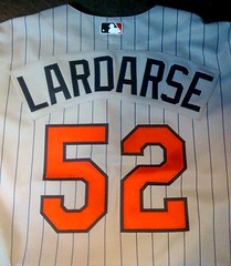
Got a note the other day from a reader calling himself Navy Bean, who’s embarked on an interesting project: “I recently launched my own blog called Naughty Jerseys, which I’ve created to show off my large collection of authentic customized jerseys with PG-13- to NC-17-rated NOBs that I’ve managed to slip past the quality control people. It’s an expensive hobby, but I get much joy out of it.”
Okay, so we’re talking about roughly a seventh grade level of humor here. But I like that Navy Bean calls his jerseys “naughty” (as opposed to, say, “dirty” or “nasty”), which suggests more of a playful sense of mischief than a serious intent to offend. I also like that he’s doing something that no doubt annoys the league censors. How did he get started down this road? He explains:
It began with some words/names that were inside jokes among my friends and innocuous to those outside the social circle. Then I became embiggened and started to push the envelope a bit. I order maybe one new jersey a month.
I have about 170 authentic jerseys (MLB, NFL, NHL, NBA), about 90 or so of which I’d rank as “naughty.” The rest are either NNOB, throwbacks, or my last name, so the blog definitely has a new content lifespan.
Andy at the old Distant Replays was a good sport and used to try and muscle a name through the MLB censors if it got rejected. First time I ordered at Distant Replays and it got rejected, I tried to convince Andy that my Dutch grandmother’s maiden name was VON RIMJOBST.
I usually wait for a manufacturer switch so I can get a decent price. And I always try to get the old uniform of a team if it’s about to switch to new uniforms. For example, the Marlins’ old (2009) road jersey with FLORIDA is on my priority list to buy if it wasn’t so expensive.
Navy Bean also produces an assortment of comic strips on the web, many of them rather belligerent and all done under various pseudonyms. “Yes, I am a coward for taking anonymous shots at people,” he says. “But I can’t risk losing my gig because I have a jersey habit that I can’t quit.” At least the dude has his uniform priorities straight.
Meanwhile, here’s a random thought: Wouldn’t it be nice if today’s comments didn’t devolve into an endless stream of toilet-humor NOB suggestions? Yes, it would. Thanks.
Quick question: There’s one college baseball team that’s often unofficially credited with using the long-pants look on a team-wide basis, but I can’t recall which team that is. Little help? Never mind, several people just reminded me that it’s Clemson. Thanks!
Uni Watch News Ticker: Good story here about why Kevin Durant wears No. 35 (with thanks to Dan Bewley). ”¦ USF baseball is wearing some brutual uniforms. Are all Under Armour teams wearing those pants cut-outs? (As noted by Jim Lighthall). ”¦ Here’s a time-lapse video of the court being prepped for the Sweet 16 in Utah (with thanks to Brett Crane). ”¦ The Astros will wear shooting-star throwbacks on April 10th against the Phils, who’ll wear 1965 road throwbacks for the occasion (with thanks to Paul Wiederecht and Mario Carr, respectively). ”¦ Here’s something really cool: a soccer-themed manhole cover from Shimizu, Japan. Additional examples here and here (great stuff from Jeremy Brahm). ”¦ Current slate of NHL uni changes for next season, most of which you already know about, summed up here. ”¦ Yesterday’s Ticker mention of those NHL-themed baseball jerseys prompted James Huening to send me this photo. “I’ve had it for probably 20 years and I’m sure it’s been at least 15 since I’ve worn it. I’m thinking about removing all the patches and using it as a base for a DIY jersey,” he says. Don’t do it, Jimbo — it’s priceless! ”¦ Also from Jimbo: “Have you ever noticed a resemblance between the wishbone C and the Ichthys symbol (Jesus fish)? No, you probably haven’t. But I have, so I created these DIY T-shirts (total cost to me of about $8). I used inkjet printer iron-ons, so I wasn’t expecting much, but I was pretty happy with how they turned out.” ”¦ Here’s something I have noticed: The Jesus fish, which is frequently seen on the back of cars, is exactly the same shape as the other symbol most frequently seen on the back of cars — the yellow ribbon. Look! ”¦ Interesting discovery by Kristopher Hunt, who writes: “I was looking at soccer jerseys at the Nike store and noticed that each one has a cool flag-based detail on the inside of the jersey collar.” ”¦ Jason Hillyer recently came across this old SI cover and is wondering about the logo-less helmet stacked above the Browns helmet. Did they do that just to avoid having a logo interfere with the type? ”¦ I’ve run this photo before, but it’s been a few years, so it’s worth sharing again: Wow. That’s the Texas Tech football team, circa 1938 (with thanks to Elvin Brownlee). ”¦ Spaceman, indeed (with thanks to Brinke Guthrie). ”¦ Attention DIYers: Stewart & Strauss is running a sale on chenille letters and numbers. You can get 6″ letters here and 3″ numbers here. And if you really want to shoot the works, they also offer custom scripts. Now get crackin’ (and when you finish your DIY jacket, remember to send a thank you note to Terence Kearns). ”¦ Dan Cichalski notes that baseball-reference.com has added uni numbers to its player pages. Further details here. ”¦ Another college baseball team with striped stirrups: Mercer (with thanks to Lindsay Resnick). ”¦ Remember when the Pistons were blaming Nike sneakers for their ankle injuries? Now there are similar rumblings coming out of Michigan State — see the third-to-last graf of that page (as noted by Scott Novosel). ”¦ The Reno Aces are holding a T-shirt design contest (if you win the $500 prize, be sure to buy a round for Robert Slaby). ”¦ Marc Dumas, who’s the baseball coach for the Perspectives Charter Schools-Calumet baseball team, designed the cap and stirrups that the team is wearing this season.
Ironic that a “naughty” name post would occur today, because yesterday link posted their annual “Name of the Year” bracket… Real ridiculous names paired up in a 64 “team” tourney and voted down to find the Name of the Year.
I’m taking Dick Smallberries, Jr. to bring home the title.
“USF baseball is wearing some brutual uniforms.”
Has Under Armour made a sports uniform that wasn’t brutal?
on the sports illustrated cover i think the logo-less helmet is that feathered redskins job.
[quote comment=”382801″]
Has Under Armour made a sports uniform that wasn’t brutal?[/quote]
i can only think of one
but im sure that’s more due to AU than UA…they’d ruin that if given the chance
[quote comment=”382802″]on the sports illustrated cover i think the logo-less helmet is that feathered redskins job.[/quote]
You’d be right. That there is one minor mystery, because a) it’s burgundy and b) a bit of the bottom of the white feather clearly can be seen at the back of the helmet.
—Ricko
The inside-collar decoration on soccer jerseys is pretty standard. As an example of a more extravagant design, I have link.
Strictly to perhaps save someone some dough, I post that Ebbets Field Flannels has some interesting jerseys on sale for $99, including a collared 1907 NY Metropolitans and 1919 Flatbush (Phil? Paul?)…
ebbets.com
Nine new authentic flannels at great introductory price of $99. Something for everyone, with teams from New York, the West Coast, South and Negro leagues. Introductory, limited time price. These great historic uniform shirts are normally $185.
New York Mammoths 1972 Home
From the movie “Bang The Drum Slowly”, which starred a very young Robert DeNiro as catcher Bruce Pearson. The Mammoths cast wore the last set of Yankee flannel uniforms, with the home emblem changed. Filmed in Yankee Stadium.
San Diego Padres 1949 Home.
The Padres adopted a black-and-orange color scheme for a couple of years in 1949, when they broke the PCL color line by signing Luke Easter and Artie Wilson.
San Francisco Seals 1949 Road.
This simple style was adopted by several Coast League teams in the decade after the War, and was also worn on the Seals’ wildly successful tour of Japan.
Los Angeles Angels 1951 Road.
This elegantly simple road shirt comes with a sleeve patch commemorating the 50th Anniversary of minor league baseball.
New York Metropolitans 1907 Road.
The “Mets” started out as one of the top clubs of the major league American Association. By the early 1900s they were an independent team. Great byron collar style jersey.
Flatbush Baseball Club 1913
Semi-pro ball thrived in the borough of Brooklyn in the early decades of the 20th Century with teams like the Bushwicks, Bay Parkways and Flatbush Greys.
Dublin Green Sox 1952 Home
The Dublin, Ga. club went all-out to take advantage of its Irish namesake with kelly and orange lettering and a big shamrock on the sleeve.
Kansas City Monarchs 1924 Road and Hilldale Daisies 1925 home.
The Negro National League Monarchs met the Eastern Colored League Hilldale club of Philadelphia in the first two Negro League World Series contests in 1924 and 1925.
(Really, I’m not shilling for them. Just that I’ve been so pleased with my 1951 Millers road…which I bought during one of these sales)
—Ricko
Just a question for anyone to jump in on: Why are so many people against MLB unis that are not white home / grey road, when most of us as kids played on teams that used colored jerseys, as do most high schools? The pic from the Perspectives Charter Schools-Calumet baseball team in the ticker made me think of this.
[quote comment=”382804″][quote comment=”382801″]
Has Under Armour made a sports uniform that wasn’t brutal?[/quote]
i can only think link
but im sure that’s more due to AU than UA…they’d ruin that if given the chance[/quote]
The only other one I can think of is the East Dillon Lions on “Friday Night Lights.” But they’re, y’know, fictional.
Think link (with numbers on helmets).
[quote comment=”382808″] most of us as kids played on teams that used colored jerseys, as do most high schools[/quote]
I think you answered your own question.
[quote comment=”382808″]Just a question for anyone to jump in on: Why are so many people against MLB unis that are not white home / grey road, when most of us as kids played on teams that used colored jerseys, as do most high schools? The pic from the Perspectives Charter Schools-Calumet baseball team in the ticker made me think of this.[/quote]
I sure as hell don’t speak for everyone, but my only real problem with them is when two teams are so braindead that they wear them to play against each other. “Okay, you wear your navy and we’ll wear our black.” Who in their right mind thinks that’s a good idea?
—Ricko
What does “Spaceman” have hand-written on his stirrups?
[quote comment=”382810″][quote comment=”382808″] most of us as kids played on teams that used colored jerseys, as do most high schools[/quote]
I think you answered your own question.[/quote]
Well, my point is that no one besmirches a little league or school team just because they wear colors. Is it beacuse non-professionals can only afford one uni, so colors make more sense, or are people just more sensitive because of the tradition of MLB?
I used to coach 8th grade girls in ultimate frisbee. It’s a treacherous age for a (male) coach because while most of the girls are still little kids, some have discovered their, um, womanliness and almost always see the coach (me) as an acceptable test subject for all their new tricks.
Anyhow, when it came time to order jerseys, the two worst offenders on the team requested that the back of their team hoodies read (in the NOB place) “SIXTY” and “NINE”. Real subtle. I prevented parental disaster, however, when I accidentally entered in the requests as “NINETY” and “SIX”. Whoops!
[quote comment=”382808″]Just a question for anyone to jump in on: Why are so many people against MLB unis that are not white home / grey road, when most of us as kids played on teams that used colored jerseys, as do most high schools? The pic from the Perspectives Charter Schools-Calumet baseball team in the ticker made me think of this.[/quote]
It’s generally an oldguy tradition thing.
(I said generally, don’t start with me Ricko)
Personally I’d like to see a lot more color and a lot less gray or white. I think it’s boring as hell for most games to be white vs gray.
[quote comment=”382808″] Why are so many people against MLB unis that are not white home / grey road.[/quote]
for 100 years, give or take, and with relatively few exceptions, teams wore UNIFORM uniforms — that is, the tops and bottoms matched…to me, and i speak only for myself, a mismatched top and bottom looks like your team was too poor or deemed not worthy to have matching tops/bottoms (or, like when i was a kid, 35-40 years ago, in texas and pacific league, we ONLY got a solid color t-shirt…no pants; but when we reached the ‘majors’ we got the real, full uni, just like the pros)
im not opposed to teams wearing something other than gray; while not a particular fan of the colors the pads wear (sand? urine?), i also grew up when about 1/3 of the teams wore powder blue on the road…but dammit the top and bottom matched!
i didn’t even think the phils saturday night specials, indians blood reds, white sox 1976-81 dark blue…the rare a’s all kelly or all yellow…and a few others…were all that ‘out of the ordinary’ … didn’t say they looked good, because for the most part, full solid is never a good look
i might feel differently now if teams paired a decent color top with REAL STIRRUPS that matched the shirt and had matching stripes — i wouldn’t want to see this every day, but it looks 1,000 times better than pajama bottoms and night shirts
so, to sum…home white, road…matching tops and bottoms, preferably a shade of gray, but not mandatory
batting practice tops (aka “alts”) look like bush league/high school/llbb
Naughty name nominee:
Dick Butkus
[quote comment=”382805″][quote comment=”382802″]on the sports illustrated cover i think the logo-less helmet is that feathered redskins job.[/quote]
You’d be right. That there is one minor mystery, because a) it’s burgundy and b) a bit of the bottom of the white feather clearly can be seen at the back of the helmet.
also of note, maybe, is that all helmets are single bar face mask except the Bears
link
one more thing… “Pro Football’s” Pete Rozelle and not the NFL’s Pete Rozelle? Weren’t their 2 leagues competing for players and viewers at the time?
—Ricko[/quote]
[quote comment=”382815″]
It’s generally an oldguy tradition thing.
(I said generally, don’t start with me Ricko)
Personally I’d like to see a lot more color and a lot less gray or white. I think it’s boring as hell for most games to be white vs gray.[/quote]
an old guy tradition thing? yes, like 100 plus years of tradition
and if you’re ONLY watching the games for the uniforms and not the play, then maybe you should go back to madden
im not trying to be a wiseass, but while obviously the unis are important, there’s a LOT more to baseball … if you’re bored because the uniforms aren’t colorful…then seriously, watch the nba or something that requires a five minute attention span
and with proper USE of color, a white uni doesn’t have to be boring…it also doesn’t need to look like a football uni either
that’s why the apparent return of stirrups gives so much hope — such an integral and important piece of uni that can give all the wonderful color you need, is being revealed again
seriously…here’s a white uniform that’s FAR from boring
what’s wrong with that?
Naughty name…Wilma Fingadu
Huge applause to Marc Dumas – that ball cap has classic all over it. Logo is a tad busy – though I grasp why – the solution is elegant. Has a nod to the Negro League too. If I had any money – I’d buy me one! BTW: What is the team nickname?
AS for old guy tastes – I like a lot of variations. A white/cream or grey base is NOT the problem. MLB is way too much blue & red dominant.
Real name that comes in third behind Dick Smallberries Jr. and Pat Angerer…..Ivana Smallwood. Not kidding.
“Wouldn’t it be nice if today’s comments didn’t devolve into an endless stream of toilet-humor NOB suggestions? Yes, it would. Thanks.”
could this go for “real” names too, please? thanks
Worst naughty name I’ve run across…
A men’s softball team named “Off Constantly”. They weren’t very good, and were afraid people would brag about their wins against them… So their theory? Make them say, “We beat Off Constantly last night.”
I wish I’d made this up.
“A noble spirit embiggens the smallest man”
– Jebediah Springfield
[quote comment=”382815″][quote comment=”382808″]Just a question for anyone to jump in on: Why are so many people against MLB unis that are not white home / grey road, when most of us as kids played on teams that used colored jerseys, as do most high schools? The pic from the Perspectives Charter Schools-Calumet baseball team in the ticker made me think of this.[/quote]
It’s generally an oldguy tradition thing.
(I said generally, don’t start with me Ricko)
Personally I’d like to see a lot more color and a lot less gray or white. I think it’s boring as hell for most games to be white vs gray.[/quote]
Why make it into an “old guy” thing? There are plenty of young people who appreciate the traditional aspects of things, and plenty of old guys who like the new stuff,too. Or do you just figure that couldn’t be possible, that every UW discussion breaks down into young guys over here and older guys over there?
Change that improves things is good. That’s why I have no problem with the dark MLB jerseys. But when teams go dark vs. dark, that’s just a variation on gray vs. white, isn’t it? So therefore it isn’t necesarily an improvement. A lateral move may help with someone’s boredom factor, but that doesn’t mean it’s inherently better.
—Ricko
Naughty name? I once worked with a woman named Anita Cherry.
[quote comment=”382809″][quote comment=”382804″][quote comment=”382801″]
Has Under Armour made a sports uniform that wasn’t brutal?[/quote]
i can only think link
but im sure that’s more due to AU than UA…they’d ruin that if given the chance[/quote]
The only other one I can think of is the East Dillon Lions on “Friday Night Lights.” But they’re, y’know, fictional.
Think link (with numbers on helmets).[/quote]
…And link a few link of the link.
[quote comment=”382823″]”Wouldn’t it be nice if today’s comments didn’t devolve into an endless stream of toilet-humor NOB suggestions? Yes, it would. Thanks.”
could this go for “real” names too, please? thanks[/quote]
Nicky Butt
Dean Windass
(both from English soccer)
[quote comment=”382808″]Just a question for anyone to jump in on: Why are so many people against MLB unis that are not white home / grey road, when most of us as kids played on teams that used colored jerseys, as do most high schools? The pic from the Perspectives Charter Schools-Calumet baseball team in the ticker made me think of this.[/quote]
Because white and gray uniforms look so much better than softball tops. I think it’s more aesthetically pleasing to watch a baseball game when the colors of the jerseys and pants match.
So do you support having NBA teams wearing, say, red jerseys and white shorts? I think that would look rather silly. Same goes for when the Reds/ Red Sox/ Nationals etc. wear their alt tops over white pants.
[quote comment=”382824″]Worst naughty name I’ve run across…
A men’s softball team named “Off Constantly”. They weren’t very good, and were afraid people would brag about their wins against them… So their theory? Make them say, “We beat Off Constantly last night.”
I wish I’d made this up.[/quote]
our team never had naughty names, but ours were names like “link” “byggstyxx (our nod to both air metal and juvenile humor),” or “two-headed larry (link and link combined).” it was always fun to hear the umps say stuff like “ok, two-headed larry, run ’em out!” we sucked too, so we needed something to keep us coming out week after week.
[quote comment=”382830″][quote comment=”382808″]Just a question for anyone to jump in on: Why are so many people against MLB unis that are not white home / grey road, when most of us as kids played on teams that used colored jerseys, as do most high schools? The pic from the Perspectives Charter Schools-Calumet baseball team in the ticker made me think of this.[/quote]
Because white and gray uniforms look so much better than softball tops. I think it’s more aesthetically pleasing to watch a baseball game when the colors of the jerseys and pants match.
So do you support having NBA teams wearing, say, red jerseys and white shorts? I think that would look rather silly. Same goes for when the Reds/ Red Sox/ Nationals etc. wear their alt tops over white pants.[/quote]
Exactly – each sport develops its own aesthetic.
[quote comment=”382804″][quote comment=”382801″]
Has Under Armour made a sports uniform that wasn’t brutal?[/quote]
i can only think link
but im sure that’s more due to AU than UA…they’d ruin that if given the chance[/quote]
Correct. Auburn only agreed to the deal with Under Armour b/c there would be no changes to the classic look of the football team.
Under Armour uses its creative license for the other sports, however. I don’t know if Auburn’s baseball team wears pants similar to USF’s, but they are definitely different.
link
If there’s a mesh panel above the knee, it’s not a contrasting color.
link
[quote comment=”382826″]
Why make it into an “old guy” thing? There are plenty of young people who appreciate the traditional aspects of things, and plenty of old guys who like the new stuff,too. Or do you just figure that couldn’t be possible, that every UW discussion breaks down into young guys over here and older guys over there?[/quote]
Age has nothing to do with it. As a kid, I hated the fact that neither Chicago team wore button-front jerseys (although I kind of liked the Sox’ collared jerseys because of their uniqueness and I liked the Cubs’ powder blue road unis) so I appreciated teams like the Dodgers and Yankees who stuck with their traditional looks.
I was thrilled when both teams finally back to the button-ups (especially the Cubs — I absolutely despised the road unis they wore through link) even though link was decidedly link.
Nowadays, I don’t necessarily mind when teams have dark alts. I just can’t stand it when they wear them too often. Take the Astros for example. Which road jersey is really their alt? Is it the link that they almost always wear or is it the link that only makes the occasional appearance?
There was widespread outcry when Terry Bowden changed the football uniform from this:
link
to this in the mid 90s:
link
link
link
NOBODY liked the dropshadow numbers and “Tiger Eyes” logo on the pants. Their removal was one of Tuberville’s first orders of business when hired in 1999.
Texas Tech is fitted by UA and they are fairly classic when compared to other UA schools.
link
The layouts show some weird lines, other than the pinstripes, on the pants but they do not actually show on the uniform.
UA even designed a throwback uniform, that with the exception of the logo creep looks pretty sweet.
Did anyone see the pants that Norway women’s curling was wearing in the Women’s World Curling Championship?
link
Reminds me of bubblegum!! Or halftone patterns.
[quote comment=”382837″]Did anyone see the pants that Norway women’s curling was wearing in the Women’s World Curling Championship?
link
Reminds me of bubblegum!! Or halftone patterns.[/quote]
Let’s play Twister!!!
Speaking of ridiculous uniforms, check out the Sacred Heart University hockey jerseys (too ugly to earn the honor to be called “sweaters”):
link
The striping, down the body and down the arms, is so unappealing. Unis courtesy of Adidas.
They got whupped by my RIT Tigers last weekend, which gave the Tigers their 1st NCAA hockey tournament appearance!
link
1938?
With the exception of the striped socks, those look like they could fit into today’s NFL uniform designs.
Only….somehow… cooler.
[quote comment=”382839″]too ugly to earn the honor to be called “sweaters”[/quote]
I’m pretty sure that’s link.
[quote comment=”382839″]Speaking of ridiculous uniforms, check out the Sacred Heart University hockey jerseys (too ugly to earn the honor to be called “sweaters”):
link
The striping, down the body and down the arms, is so unappealing. Unis courtesy of Adidas.
link
[quote comment=”382837″]Did anyone see the pants that Norway women’s curling was wearing in the Women’s World Curling Championship?
link
Reminds me of bubblegum!! Or halftone patterns.[/quote]
The women have been doing a bang-up job of continuing Norway’s tradition of pants at major curling events.
Honestly, I would prefer if TSN carried went with a small picture-in-picture of the Norway games just to check out their fashion choices.
Oh, and GO CANADA! :o)
[quote comment=”382843″][quote comment=”382837″]Did anyone see the pants that Norway women’s curling was wearing in the Women’s World Curling Championship?
link
Reminds me of bubblegum!! Or halftone patterns.[/quote]
The women have been doing a bang-up job of continuing Norway’s tradition of pants at major curling events.
Honestly, I would prefer if TSN carried/went with a small picture-in-picture of the Norway games just to check out their fashion choices.
Oh, and GO CANADA! :o)[/quote]
Slashes are optional, apparently. LOL
Some of the UConn baseball team also wears striped stirrups
link
That picture is from last season, I believe they are wearing ones with 3 stripes of the same size now, but I couldnt find a picture of that I could link
[quote comment=”382843″][quote comment=”382837″]Did anyone see the pants that Norway women’s curling was wearing in the Women’s World Curling Championship?
link
Reminds me of bubblegum!! Or halftone patterns.[/quote]
The women have been doing a bang-up job of continuing Norway’s tradition of pants at major curling events.
Honestly, I would prefer if TSN carried went with a small picture-in-picture of the Norway games just to check out their fashion choices.
Oh, and GO CANADA! :o)[/quote]
Canada needs red-and-white Zubaz-esque maple-leaf pattern pants.
It is to die for.
—Ricko
[quote comment=”382846″]
Canada needs red-and-white Zubaz-esque maple-leaf pattern pants.
It is to die for.
—Ricko[/quote]
The Z-company need not apply. I’ll stick with Loudmouth Golf. :o)
[quote comment=”382819″][quote comment=”382815″]
It’s generally an oldguy tradition thing.
(I said generally, don’t start with me Ricko)
Personally I’d like to see a lot more color and a lot less gray or white. I think it’s boring as hell for most games to be white vs gray.[/quote]
an old guy tradition thing? yes, like 100 plus years of tradition
and if you’re ONLY watching the games for the uniforms and not the play, then maybe you should go back to madden
im not trying to be a wiseass, but while obviously the unis are important, there’s a LOT more to baseball … if you’re bored because the uniforms aren’t colorful…then seriously, watch the nba or something that requires a five minute attention span
and with proper USE of color, a white uni doesn’t have to be boring…it also doesn’t need to look like a football uni either
that’s why the apparent return of stirrups gives so much hope — such an integral and important piece of uni that can give all the wonderful color you need, is being revealed again
seriously…link that’s FAR from boring
what’s wrong with that?[/quote]
NOTHING! Especially since it’s a photo of Stan “The Man” Musial! Current Cardinals manager Tony La Russa link as detailed by Post-Dispatch writer Derrick Gould…
And that “white” uni link…
How one of the young players on the PGA tour could become instantly iconic (sort of):
Wear those Loud Pants…
link
But wear them with a solid color snap-brim hat, shirt and kneehigh socks in a complementary color. Then blouse those pants.
“This is the Payne Stewart look on the golf course.”
“This is the Payne Stewart look on the golf course on acid.”
(and The Jeff thinks I don’t like new stuff)
—Ricko
Nice story about Kevin Durant today.
Also, the ’38 Texas Tech football team proves the “one more bumpersticker” look is not an invention of modern designers.
link
Decent socks, though.
[quote comment=”382847″][quote comment=”382846″]
Canada needs red-and-white Zubaz-esque maple-leaf pattern pants.
It is to die for.
—Ricko[/quote]
The Z-company need not apply. I’ll stick with Loudmouth Golf. :o)[/quote]
Did say, “Zubaz-esque”. Was referring to the pastiche look of maple leaf design that Zubaz might have created, and that Loudmouth would do well to create for the Canadian curlers…which WOULD simply be to die for.
Not necessarily to the specific manufacturer of said trousers. :)
—Ricko
So. Anybody going to do a compare-and-contrast uni critique of the NCAA Sweet Sixteen? Or is it just that nothing looks either great or awful?
I love those crazy Norwegian girls. Yeah, Ricko, totally Twister.
Go Big Red.
[quote comment=”382801″]”USF baseball is wearing some brutual uniforms.”
Has Under Armour made a sports uniform that wasn’t brutal?[/quote]
OMG, those are the worst of all time! I dont think Nike has done anything that bad before…just leave the pants alone!
[quote comment=”382818″]
also of note, maybe, is that all helmets are single bar face mask except the Bears
link
[/quote]
Yeah, it’s the facemask link (and some others) wore at times. I never liked the way that looked because it reminds me of a gumball helmet facemask.
Speaking of gumball helmet facemasks, the other day I was sitting on a conference call so I randomly switched around the facemasks on a bunch of my NFL mini-helmets and then I got the idea to test my coworkers to see if they could identify which ones were switched and which ones I left alone. (In other words, which ones have the “proper” facemask and which ones are “mismatched”).
I put 24 out there and the best anyone did was 12 identified correctly (including a woman from Nigeria who pays almost no attention to the NFL).
Everyone got the Lions helmet wrong.
link
link
link
Child’s play, right?
[quote comment=”382850″]Nice story about Kevin Durant today.
Also, the ’38 Texas Tech football team proves the “one more bumpersticker” look is not an invention of modern designers.
link
Decent socks, though.[/quote]
I believe that was their “Pro Combat” set.
[quote comment=”382854″][quote comment=”382818″]
also of note, maybe, is that all helmets are single bar face mask except the Bears
link
[/quote]
Yeah, it’s the facemask link (and some others) wore at times. I never liked the way that looked because it reminds me of a gumball helmet facemask.
Speaking of gumball helmet facemasks, the other day I was sitting on a conference call so I randomly switched around the facemasks on a bunch of my NFL mini-helmets and then I got the idea to test my coworkers to see if they could identify which ones were switched and which ones I left alone. (In other words, which ones have the “proper” facemask and which ones are “mismatched”).
I put 24 out there and the best anyone did was 12 identified correctly (including a woman from Nigeria who pays almost no attention to the NFL).
Everyone got the Lions helmet wrong.
link
link
link
Child’s play, right?[/quote]
I didn’t think they still made that style mini helmet. I haven’t been able to find those anywhere.
..and despite being wrong, the Cardinals and Giants look much better that way.
[quote comment=”382853″][quote comment=”382801″]”USF baseball is wearing some brutual uniforms.”
Has Under Armour made a sports uniform that wasn’t brutal?[/quote]
OMG, those are the worst of all time! I dont think Nike has done anything that bad before…just leave the pants alone![/quote]
Well, those pants do eliminate the ol’ “Where’d I leave my lucky garters?” problem.
Still have to focus on breathing through your eyelids, though.
—Ricko
[quote comment=”382855″][quote comment=”382850″]Nice story about Kevin Durant today.
Also, the ’38 Texas Tech football team proves the “one more bumpersticker” look is not an invention of modern designers.
link
Decent socks, though.[/quote]
I believe that was their “Pro Combat” set.[/quote]
1938? More like Pre-Combat.
Cuz, y’know, WWII was, like, for-real war.
[quote comment=”382848″][quote comment=”382819″]seriously…link that’s FAR from boring
what’s wrong with that?[/quote]
NOTHING! Especially since it’s a photo of Stan “The Man” Musial! Current Cardinals manager Tony La Russa link as detailed by Post-Dispatch writer Derrick Gould…
And that “white” uni link…[/quote]
great article
it’s funny, when i wanted to post a “great white uni that’s not boring” … i simply googled “stan musial”
too bad more of the kids don’t really know about him
[quote comment=”382856″]
I didn’t think they still made that style mini helmet. I haven’t been able to find those anywhere.
[/quote]
They definitely still make them. NFL, NCAA, MLB, maybe others.
I think the official name is “Riddell pocket pro.”
Some observations about Navy Bean.
1. Good story if true.
2. Mad Photoshop skills?
3. Whatever trips your trigger.
[quote comment=”382860″][quote comment=”382856″]
I didn’t think they still made that style mini helmet. I haven’t been able to find those anywhere.
[/quote]
They definitely still make them. NFL, NCAA, MLB, maybe others.
I think the official name is “Riddell pocket pro.”[/quote]
Nope…. those aren’t Pocket Pros. The Pocket Pros have white padding on the inside and Riddell on the front bumpers. What you’ve got look like the last version of the gumball machine variety, which are a little bit smaller.
Toilet humor can be funny, but it can get old. But I do dig the “naughty uniform” project, as it requires some creativity to get past censors (who are actually pretty good), yet still has to be understandable.
[quote comment=”382840″]http://assets.sbnation.com/assets/42790/ttech1938.jpg
1938?
With the exception of the striped socks, those look like they could fit into today’s NFL uniform designs.
Only….somehow… cooler.[/quote]
Oddly, knowing that innovative designs like these have a place in football history makes me like some newer designs more. Emphasis on some. I don’t like tapered stripes, but these colored panels could be really neat on a modern uniform.
Oddly, now playing with his brother Aaron on the roster, instead of going with the expected and customary “N. Broten” to differentiate the brothers, they both wore their full names on the back of their jerseys despite their first names starting with different letters.
link
Neal Broten would be named the first winner of the Hobey Baker Award at the conclusion of the season in which he wore today’s featured jersey.
I don’t have an issue with alternate, colored uniforms. But if they are alternate, use them sparingly!
I hate that my White Sox have gone to wearing the black uniform all the freaking time. Its a beautiful uniform… when used every now and then.
Wearing your standard white/grey most of the time adds a “pop” to the alternate on the rarer times you wear it.
[quote comment=”382862″][quote comment=”382860″][quote comment=”382856″]
I didn’t think they still made that style mini helmet. I haven’t been able to find those anywhere.
[/quote]
They definitely still make them. NFL, NCAA, MLB, maybe others.
I think the official name is “Riddell pocket pro.”[/quote]
Nope…. those aren’t Pocket Pros. The Pocket Pros have white padding on the inside and Riddell on the front bumpers. What you’ve got look like the last version of the gumball machine variety, which are a little bit smaller.[/quote]
Well, whatever the fuck they’re called, link.
[quote comment=”382867″][quote comment=”382862″][quote comment=”382860″][quote comment=”382856″]
I didn’t think they still made that style mini helmet. I haven’t been able to find those anywhere.
[/quote]
They definitely still make them. NFL, NCAA, MLB, maybe others.
I think the official name is “Riddell pocket pro.”[/quote]
Nope…. those aren’t Pocket Pros. The Pocket Pros have white padding on the inside and Riddell on the front bumpers. What you’ve got look like the last version of the gumball machine variety, which are a little bit smaller.[/quote]
Well, whatever the fuck they’re called, link.[/quote]
I’m really not trying to be an ass… but they’re two different things:
link
On the right is a Pocket Pro, on the left is what I think you’ve got.
I have the full league and some throwbacks of Pocket Pros.. I’ve got like 13 of the other style and wouldn’t mind getting the rest if I could find them.
[quote comment=”382868″]I’m really not trying to be an ass.[/quote]
Oh, we all know that it just comes naturally for you.
I dunno if they sell them individually. Maybe if you track them down on eBay or something. Otherwise, you know link….
I may be WAAAAAAY late on this, but just saw this site linked from CNNSI:
link
Is this like a uni-watch site in an alternate universe I was unaware of?
[quote comment=”382872″]I may be WAAAAAAY late on this, but just saw this site linked from CNNSI:
link
Is this like a uni-watch site in an alternate universe I was unaware of?[/quote]
Whoa. Run by a female Yankees fan who lives in Manhattan? link.
I don’t know if anyone mentioned, but that is not a logoless helmet in the Sports Illustrated cover shot of Rozelle. If anyone paid attention to the date of the issue (1964), you would have realized that the helmet above the Browns is the Redskins helmet from the 1964 season (the one with the feather running on the top).
[quote comment=”382873″][quote comment=”382872″]I may be WAAAAAAY late on this, but just saw this site linked from CNNSI:
link
Is this like a uni-watch site in an alternate universe I was unaware of?[/quote]
Whoa. Run by a female Yankees fan who lives in Manhattan? link.[/quote]
Wonder if anyone’s ever bought her a curling sweater, though.
Or Twister pants, for that matter.
—Ricko
“USF baseball is wearing some brutual uniforms.”
Not only that, but those jerseys w/ the contrast underarm ought to be banned, IMO. There is nothing specific in NCAA’s rule book against it, but that contrasting flash upon a pitcher’s release of the ball, however brief, is surely distracting to the hitter.
[quote comment=”382873″][quote comment=”382872″]I may be WAAAAAAY late on this, but just saw this site linked from CNNSI:
link
Is this like a uni-watch site in an alternate universe I was unaware of?[/quote]
Whoa. Run by a female Yankees fan who lives in Manhattan? link.[/quote]
Yeah, but Wisconsin is their common ground.
And in this alternate universe, goatees signify the good guy. ;)
[quote comment=”382876″]”USF baseball is wearing some brutual uniforms.”
Not only that, but those jerseys w/ the contrast underarm ought to be banned, IMO. There is nothing specific in NCAA’s rule book against it, but that contrasting flash upon a pitcher’s release of the ball, however brief, is surely distracting to the hitter.[/quote]
Good point. As difficult as a light background might be to hit against, the sort of “strobing effect” of dark-light-dark-light as the pitcher goes through his motion might be a real bitch for picking up the ball.
Or maybe not. If it were, somebody would have complained by now, I guess.
—Ricko
[quote comment=”382875″]
Wonder if anyone’s ever bought her a curling sweater, though.[/quote]
wait…WHAT?
[quote comment=”382877″][quote comment=”382873″][quote comment=”382872″]I may be WAAAAAAY late on this, but just saw this site linked from CNNSI:
link
Is this like a uni-watch site in an alternate universe I was unaware of?[/quote]
Whoa. Run by a female Yankees fan who lives in Manhattan? link.[/quote]
Yeah, but Wisconsin is their common ground.
And in this alternate universe, goatees signify the good guy. ;)[/quote]
“Oh, Mephistopheles, you’re so HOT.”
(Something like that?)
This may seem like a totally random question, but I do sign-painting in my free time. And baseball having the wonderful past that it does used to rife with it.
I am working on some projects that are baseball-centric right now and I just want to get a litmus on some of the ideas.
Pricecards for famous ballpark foods. Despite the fact that mega-parks are ruining this (i.e. sushi) but certain stadiums had their certain perks.
Think: Fenway Monster Sausage with a price. Like you’d find at a ballpark in the 50s.
K counters customised for appropriate team colors and style.
Does this sound like something ya’ll would be interested in seeing?
A few years ago a woman tried to have a Patriots jersey lettered for her son with his favorite player’s name on it. Her order was rejected. His favorite player? Randall Gay.
A true story.
[quote comment=”382808″]Just a question for anyone to jump in on: Why are so many people against MLB unis that are not white home / grey road, when most of us as kids played on teams that used colored jerseys, as do most high schools? The pic from the Perspectives Charter Schools-Calumet baseball team in the ticker made me think of this.[/quote]
I’m that coach – i wanted to get white home/road grey ( he design i came up with was awesome) but they already had the maroon ones when I got here. Next year I’ll probably get a set of whites.
[quote comment=”382882″]A few years ago a woman tried to have a Patriots jersey lettered for her son with his favorite player’s name on it. Her order was rejected. His favorite player? Randall Gay.
A true story.[/quote]
Rejected by the NFL shop? Hard time believing that.
[quote comment=”382821″]Huge applause to Marc Dumas – that ball cap has classic all over it. Logo is a tad busy – though I grasp why – the solution is elegant. Has a nod to the Negro League too. If I had any money – I’d buy me one! BTW: What is the team nickname?
AS for old guy tastes – I like a lot of variations. A white/cream or grey base is NOT the problem. MLB is way too much blue & red dominant.[/quote]
We are the Warriors. If you’re familiar with Chicago, we’re housed in the old Calumet High School (home of Kirby Puckett) and they were the indians, but the PC folks made it the Warriors.
hats are $20 – the Logo does 2 things – It’s PCS and also the Blue C reminds of Calumet
RE: baseball-reference.com. adding jersey numbers to player bio/stats page…
Wonder what the record is for most different numbers/most number changes with the same franchise?
link
—Ricko
[quote comment=”382886″]RE: baseball-reference.com. adding jersey numbers to player bio/stats page…
Wonder what the record is for most different numbers/most number changes with the same franchise?
link
—Ricko[/quote]
[quote comment=”382886″]RE: baseball-reference.com. adding jersey numbers to player bio/stats page…
Wonder what the record is for most different numbers/most number changes with the same franchise?
link
—Ricko[/quote]
We counting coaches? Depends how long Don Zimmer stays with any one team.
[quote comment=”382885″][quote comment=”382821″]Huge applause to Marc Dumas – that ball cap has classic all over it. Logo is a tad busy – though I grasp why – the solution is elegant. Has a nod to the Negro League too. If I had any money – I’d buy me one! BTW: What is the team nickname?
AS for old guy tastes – I like a lot of variations. A white/cream or grey base is NOT the problem. MLB is way too much blue & red dominant.[/quote]
We are the Warriors. If you’re familiar with Chicago, we’re housed in the old Calumet High School (home of Kirby Puckett) and they were the indians, but the PC folks made it the Warriors.
hats are $20 – the Logo does 2 things – It’s PCS and also the Blue C reminds of Calumet[/quote]
I dig the cap. It’ll look great with the white jerseys if and when you do get them.
The socks are fantastic. What do the players think of them?
Star Wars hoops:
link
link
Wow so that’s the end of the Buffaslug? Good!
[quote comment=”382889″][quote comment=”382885″][quote comment=”382821″]Huge applause to Marc Dumas – that ball cap has classic all over it. Logo is a tad busy – though I grasp why – the solution is elegant. Has a nod to the Negro League too. If I had any money – I’d buy me one! BTW: What is the team nickname?
AS for old guy tastes – I like a lot of variations. A white/cream or grey base is NOT the problem. MLB is way too much blue & red dominant.[/quote]
We are the Warriors. If you’re familiar with Chicago, we’re housed in the old Calumet High School (home of Kirby Puckett) and they were the indians, but the PC folks made it the Warriors.
hats are $20 – the Logo does 2 things – It’s PCS and also the Blue C reminds of Calumet[/quote]
I dig the cap. It’ll look great with the white jerseys if and when you do get them.
The socks are fantastic. What do the players think of them?[/quote]
i agree james, the hat is fantastic! i don’t even mind the colour jerseys on high school teams, bugets and all. and i love the stirrup too, same colours the link played with last year. which leads me to… you are a chicago guy, and a uw regular, and i didn’t hear from you about your teams rups? did i call you out at some point on some subject? i’m hurt:)
[quote comment=”382889″]The socks are fantastic. What do the players think of them?[/quote]
agreed…but they do know the pants go OVER the rup right? (and the smaller rup goes in front?)
unfortunately, many kids today have probably never seen a properly hosied player, so they may not even realize the proper way to wear them
*and by “smaller rup” i am of course meaning the lower side of the stirrup loop
[quote comment=”382881″]This may seem like a totally random question, but I do sign-painting in my free time. And baseball having the wonderful past that it does used to rife with it.
I am working on some projects that are baseball-centric right now and I just want to get a litmus on some of the ideas.
Pricecards for famous ballpark foods. Despite the fact that mega-parks are ruining this (i.e. sushi) but certain stadiums had their certain perks.
Think: Fenway Monster Sausage with a price. Like you’d find at a ballpark in the 50s.
K counters customised for appropriate team colors and style.
Does this sound like something ya’ll would be interested in seeing?[/quote]
I would love to see something like that, would be very cool.
[quote comment=”382892″]i don’t even mind the colour jerseys on high school teams, bugets and all.[/quote]
To be clear, I wasn’t ripping the dark jersey. I just meant that I imagine the hat/white jersey/stirrups combo will be a great look.
And Phil: baby steps.
i know james, i know
believe me…i know
[quote comment=”382896″][quote comment=”382892″]i don’t even mind the colour jerseys on high school teams, bugets and all.[/quote]
To be clear, I wasn’t ripping the dark jersey. I just meant that I imagine the hat/white jersey/stirrups combo will be a great look.
And Phil: baby steps.[/quote]
oh shit! i forgot to take off the flebus, i was wound tight earlier about something, but used restraint, and forgot to go back in the phonebooth.
anyway, i know you were not doggin’ ’em, just sayin’ you were looking forward to w/g. “softball” uni issues do not apply to high school, especially if they have proper hosiery, and a darn fine chapeau to go with them.
[quote comment=”382893″][quote comment=”382889″]The socks are fantastic. What do the players think of them?[/quote]
agreed…but they do know the link right? (and the smaller rup goes in front?)
unfortunately, many kids today have probably never seen a properly hosied player, so they may not even realize the proper way to wear them[/quote]
Yup, looks like a brief tutorial on the wearing of stirrups and pants thereover is in order (could also let ’em know that a bit of training tape under the arch perpendicular to the stirrup will hold it against the sani and keep said stirrup from working its way out above the heel).
—Ricko
I’m done with the blaming the shoes for ankle injuries. Players wore Chuck Taylor’s for years. Kobe and Nash both wear low tops. It’s not the shoes!!
link. and i need a sewing machine that can chain stitch, so i don’t have to do it like link(video) anymore. gon’a have the best suit ever man! need to do my research early so i can save my pennies, and have the time to get er dun. i even have some of the design mapped out in my head, like the flames of hell that will lick up my legs that i am theoretically being saved from. a link is another possibility. perhaps calamity jane will make an appearance. and of course we all know the <a href="link the jacket will be themed on. ha ha ahaha hahhha ha ha ha, must. get. project. out. of head. does anyone have a rhinestone guy?
link why you should proofread robert, that’s why you should proofread.
[quote comment=”382900″]I’m done with the blaming the shoes for ankle injuries. Players wore Chuck Taylor’s for years. Kobe and Nash both wear low tops. It’s not the shoes!![/quote]
Actually, modern shoes are responsible for a lot of injuries. It’s not support issues though- it’s all the padding that’s in ’em. All that padding makes it much harder for your foot’s natural ability to balance your body to work. You can’t sense where you need to apply pressure to maintain balance or stabilize yourself. Not to mention that the heel padding really screws up your technique. If you’re running naturally, you body adapts to run in a manner where you’re not slamming your heel down and sending the force up into the knee. Instead, you use the ball of your foot, and the force is absorbed by the muscle.
In short, wearing stuff like chucks is much BETTER for your feet and joints, at least in terms of running.
[quote comment=”382901″]link. and i need a sewing machine that can chain stitch, so i don’t have to do it like link(video) anymore. gon’a have the best suit ever man! need to do my research early so i can save my pennies, and have the time to get er dun. i even have some of the design mapped out in my head, like the flames of hell that will lick up my legs that i am theoretically being saved from. a link is another possibility. perhaps calamity jane will make an appearance. and of course we all know the <a href="link the jacket will be themed on. ha ha ahaha hahhha ha ha ha, must. get. project. out. of head. does anyone have a rhinestone guy?[/quote]
It takes several years of training to be able to make a suit jacket well in the first place. Real show suits cost several thousands of dollars due to the time and skill required.
Project out of mind yet?
Now, if you wanted to buy an old suit at a thrift store and apply said rhinestones…
i’m not insane, just a touch off. i’ll get the suit from somewhere, but not a thrift. i’m just going to detail it.
example
[quote comment=”382902″]link why you should proofread robert, that’s why you should proofread.[/quote]
a smile can hide all the pain
[quote comment=”382908″][quote comment=”382902″]link why you should proofread robert, that’s why you should proofread.[/quote]
a smile can hide all the pain[/quote]
maybe it’s a metaphor for what life will be like with me, or maybe it’s just a video.
[quote comment=”382909″][quote comment=”382908″][quote comment=”382902″]link why you should proofread robert, that’s why you should proofread.[/quote]
a smile can hide all the pain[/quote]
maybe it’s a metaphor for what life will be like with me, or maybe it’s just a video.[/quote]
dammit…i was too cryptic
i should have gotten that phil, i was cooking dinner while i responded.
my neighbor, a painter/former scUM football player asked me to look out for his cats while he is out of town for a week, need to give one of them shots and everything. should he have trust a THE? maybe i should hide all his jerseys in the trash.
Wow. ~170 authentic jerseys means he’s probably spent at least $25,000 on his hobby.
[quote comment=”382894″]*and by “smaller rup” i am of course meaning the link[/quote]
What’s the logic behind the lower rup going in front? Or having a lower and higher rup in the first place?
[quote comment=”382850″]Nice story about Kevin Durant today.
Also, the ’38 Texas Tech football team proves the “one more bumpersticker” look is not an invention of modern designers.
link
Decent socks, though.[/quote]
That is a wow picture. I have seen a few Texas Tech pictures from the 1930’s. They seem to have had some of the wildest unis of the 30’s in football.
that is an outstanding question charlie, and i have no idea why they are different. but it for sure looks better with the high end in the back.
What? No color NFL pictures from Chance or the Milwaukee paper?
Chance better get on the ball. I got spoiled by that page the other day.
Did someone say both link?
[quote comment=”382913″][quote comment=”382894″]*and by “smaller rup” i am of course meaning the link[/quote]
What’s the logic behind the lower rup going in front? Or having a lower and higher rup in the first place?[/quote]
In the very early days of stirrups–when they were really low—the back stirrup was knit higher to be sure it cleared the heel of the shoe, not cutting across the Achilles anywhere near or (worse) inside the heel of the shoe, an extremely likely location for a blister to form.
Didn’t want dye in a blister, and salty sweat sucks dye like a leech (dyes were NOT color-fast back then). That was whole purpose of the white sani/stirrup combination (in football and basketball, of course, it was a white crew sock/stirrup combination): prevent infection.
—Ricko
Washington Huskies’ black unis are for shit. Regradless of anyone’s personal prejudices against purple, Noethern Iowa gets it right, and washington fails by going BFSB or BFBS or whatever the acronym is. And the goofy shaped purple numbers on the black jerseys – pathetic.
My only comment on the Beavis & Butthead jersey collection would be to say that, given the climate around here over the past few years…
FUKUDOME
on a Twins jersey would have been just too, too perfect.
—Ricko
[quote comment=”382913″][quote comment=”382894″]*and by “smaller rup” i am of course meaning the link[/quote]
What’s the logic behind the lower rup going in front? Or having a lower and higher rup in the first place?[/quote]
check back sunday
you’ll have an answer then…that i can promise (i have an answer now, but i need to do some more fact checkin’)
[quote comment=”382921″][quote comment=”382913″][quote comment=”382894″]*and by “smaller rup” i am of course meaning the link[/quote]
What’s the logic behind the lower rup going in front? Or having a lower and higher rup in the first place?[/quote]
check back sunday
you’ll have an answer then…that i can promise (i have an answer now, but i need to do some more fact checkin’)[/quote]
and i see mr. pearson has already addressed that above…
but there’s more to the story…although that is definitely the “short answer”
squid~o~matic:perfect as usual
ricko:that makes perfect sense. knew it had to be something simple like that.
how’s your pool lookin’ phil?
Here’s what my bracket’s telling me.
……………………./´¯/)
………………….,/¯..//
…………………/…./ /
…………./´¯/’…’/´¯¯`·¸
………./’/…/…./……./¨¯\
……..(‘(…´(..´……,~/’…’)
………\……………..\/…./
……….”…\………._.·´
…………\…………..(
…………..\………….\
[quote comment=”382925″]Here’s what my bracket’s telling me.
……………………./´¯/)
………………….,/¯..//
…………………/…./ /
…………./´¯/’…’/´¯¯`·¸
………./’/…/…./……./¨¯\
……..(‘(…´(..´……,~/’…’)
………\……………..\/…./
……….”…\………._.·´
…………\…………..(
…………..\………….\[/quote]
good one kid. i forgot the tourney started back up. hopefully the dogs keep winning, and knock out duke-tucky-cuse, and west vir-kan-hio statelor
The anti-spam word right now is “toast.”
What the link
Awesome, link
Awesome, NASA-like 2011 Final Four logo…
or, link (which I guess is NASA inspired)
About the patch on the K-State uniform: link
[quote comment=”382928″]What the link[/quote]
Color scheme’s similar, I guess, but nothing wrong with that.
I flat-out love the Union’s name, logo and color scheme. A patriotic theme, infused with American imagery everywhere you look but no RedWhiteNBlue. Inspired.
The helmet to which you were referring was the Redskins. It had the arrowhead running down the middle, so there was no side logo.
[quote comment=\”382892\”][quote comment=\”382889\”][quote comment=\”382885\”][quote comment=\”382821\”]Huge applause to Marc Dumas – that ball cap has classic all over it. Logo is a tad busy – though I grasp why – the solution is elegant. Has a nod to the Negro League too. If I had any money – I\’d buy me one! BTW: What is the team nickname?
AS for old guy tastes – I like a lot of variations. A white/cream or grey base is NOT the problem. MLB is way too much blue & red dominant.[/quote]
We are the Warriors. If you\’re familiar with Chicago, we\’re housed in the old Calumet High School (home of Kirby Puckett) and they were the indians, but the PC folks made it the Warriors.
hats are $20 – the Logo does 2 things – It\’s PCS and also the Blue C reminds of Calumet[/quote]
I dig the cap. It\’ll look great with the white jerseys if and when you do get them.
The socks are fantastic. What do the players think of them?[/quote]
i agree james, the hat is fantastic! i don\’t even mind the colour jerseys on high school teams, bugets and all. and i love the stirrup too, same colours the link played with last year. which leads me to… you are a chicago guy, and a uw regular, and i didn\’t hear from you about your teams rups? did i call you out at some point on some subject? i\’m hurt:)[/quote]
no i just haven\’t posted here before – we just got our stirrups this week and as soon as we did, i posted them.
I\’vde given a class or 2 on how to wear – the kids are not big fans, they want to wear their pants down low. I won\’t let them. Especially since we were playing a team who wore black jerseys/pants and they hung on them like pajamas. Ugh. If anyone would like a pair email me at masdumas at gmail dot com and we can talk. thanks for the kind words
I colorized a Texas Tech from 1938 photo a few years back, sent it to UW, and got a nice mention. Looks like this one link might be the same, or maybe another person colorized the original B&W pictures Paul posted (even in an old version of Photoshop, colorizing isn’t very difficult.)
If it is the one I colorized — and I think it might be because I tried using Photoshop’s rubber stamp tool to get rid of the logo/watermark before giving up, as you can see — cool that it made it around and back on the internets.
Oh — I’m not trying to claim any kind of ownership. The original is watermarked and I guess Texas Tech claims it. Just interesting that it’s still around.
And if I remember right, when Paul posted the B&W shots (there were three) he mentioned something about how cool they’d look in color…
So, a few people have mentioned that the mystery helmet at the top is the 1964 Redskins helmet, but what about the little bit of yellow helmet peeking out from over Pete’s shoulder? Counting the yellow one, there are 14 helmets, which is good because there were 14 teams in the NFL in 1963-1964. So the missing one is the LA Rams. Theoretically then, the helmet behind his shoulder must be the Rams, but the Rams helmet of 1963-1964 had a white horn, not a yellow one. Check out this graphic from the 1964 season: link
Oops, never mind. A little more research shows that the LA Rams had the yellow horns through the 1963 season, and switched to the white horns for the 1964 season. link
[quote comment=”383013″]So, a few people have mentioned that the mystery helmet at the top is the 1964 Redskins helmet, but what about the little bit of yellow helmet peeking out from over Pete’s shoulder? Counting the yellow one, there are 14 helmets, which is good because there were 14 teams in the NFL in 1963-1964. So the missing one is the LA Rams. Theoretically then, the helmet behind his shoulder must be the Rams, but the Rams helmet of 1963-1964 had a white horn, not a yellow one. Check out this graphic from the 1964 season: link
Thanks a bunch, Paul. I’m just trying to raise awareness on my affliction, not justify it.
FWIW, my post schedule is Mondays and Thursday if anyone is interested.
My old intramural hockey team from University had a fearsome line of Russians. Twistov, Lhikmeeov and Phukov.