[Editor’s Note: Today we have a guest entry from Ryan Connelly, who’s bringing us up to date on his latest DIY projects. Enjoy. — PL]
By Ryan Connelly
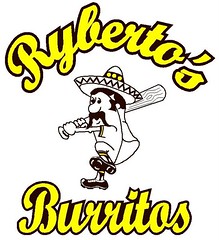
There was a “Taco Shop League” contest over on Plan B’s blog last year. I joined in and created this little guy for the occasion. Ryberto’s Burritos was my idea for hole-in-the wall taco stand that you might find somewhere in your city at 2am, and the logo character was designed to have an old-school/throwback feel based on the Swinging Friar and Chief Wahoo, with the brown/yellow color scheme adopted from my Invaders jersey and the Padres.
I immediately fell in love with the logo, and wanted more. Time to DIY a baseball jersey (or two)!
The first step, with the help of Joe Hilseberg, was finding material that would work best to avoid another DIY disaster (for the full story behind that one, look here). Joe turned me on to a poly twill with an adhesive backing that works much like a sticker. I ordered brown and yellow material. Next step was ordering baseball jerseys online. I ordered one gray vest and one sleeved yellow “home throwback” jersey.
For the vest: I wanted this vest to be an “over the top,” heavily sponsored, softball/adult league-like jersey. I started with the wordmark on the front. I wanted “Ryberto’s” to be a two-toned baseball-type script. So I drew it up in AutoCAD, sized it to the jersey front, printed it out to scale, and made a template.
This is where I found my first problem, namely that the front seam of a baseball jersey doesn’t run directly down the center — it’s offset for the buttons. So I had to divide the word “Ryberto’s” in a way that wouldn’t entail cutting through a letter or leave me with an odd “Philllies” effect, all the while keeping it centered.
Here’s how I did it. I cut the script as close to the left of the “b” as I could, spaced the “y” and “b” far enough apart so that the “y” wouldn’t be buried behind the button seam, and resized the “R” to give the whole wordmark some balance on the jersey, similar to how the Indians, Brewers, and several other teams handle their scripts.
Then I made two different templates: one for the inside yellow letters and one for the outside outline. I traced it onto the the poly-twill, cut it, stuck it together with the adhesive backing, and sewed it together. Then I took that piece, centered it onto the jersey, affixed it the jersey with glue that will hold up in the wash, and sewed.
I used Arsenal’s numbering kit, which I found here on the blog a while back, and two-toned it.
The back of the jersey is where I wanted to go overboard. I wanted it to look big, bold, and kind of cheesy so that you knew exactly what team you were playing, and their sponsor! The No. 8 is my second-favorite number, and it creates a “Ryberto’s Ate Burritos” effect. Not bad!
For the home jersey: I based this design off of the Indians’ retro alternate, except that none of my letters or numbers are two-toned. At first I was going to add a gray outline but didn’t like how professional it looked. I was really trying to capture an old feel for this! Since it’s the home jersey, I decided to drop “Ryberto’s” altogether created an alternate logo to the whole Ryberto’s identity.
I wanted to use a single letter, much like the tigers. I went back and forth with assorted “R” variations but wasn’t really happy with them. Then one night I met up with some family at a bar, and saw this on a beer ad mirror. That was it, done! I added a ribbon on the sleeve but something still didn’t seem quite right. So I decided to make the character logo into a patch! Got a really great deal from the same company here in Pittsburgh that works with the Steelers and Panthers (had 20 of them made!). So I added that to the other sleeve and couldn’t be more happy with the result: front and back.
I wanted to use the “R” logo again, and use another one of those 20 patches. Instead of making another baseball jersey, I put them on a sweatshirt, complete with a uni number.
Also, found my original sketch in a pile of papers had it framed along with a patch. A good way to wrap up the project.
Invaders jersey update: Earlier I mentioned my Invaders DIY disaster. Deep down, I wasn’t happy with the result, so I used the old templates on the new material Joe hooked me up with and made a new version of the front crest/logo. I glued it over the existing screen-printed logo and covered it up perfectly. The back still has the basic block numbers screened on, so there was no way to avoid that to go back to the Invaders font that I had originally drawn up. So I measured and offset the numbers in AutoCAD, made them two-toned, and glued them onto the back of a (number 14) jersey. The numbers were my favorite element of the original jersey, so I resized them and added them to the shoulder as TV numbers.
Back when I was first designing the logo I was playing around with alt logos, so to balance out the shoulders I made my favorite alt logo into a shoulder patch. Now the team has some sort of regional identity. Totally happy with the result!
That’s all for now, hope you enjoyed reading about them as much as I enjoyed making them.
Ancient History: Paul here. So the Packers unveiled their alternate uniform, like, nine million years ago (okay, actually on Friday, but it’s pretty much the same thing in today’s short-attention-span media world), which means most of you have already moved on to the next thing. But in case you want to revisit this long-ago episode, here are my thoughts:
• I love the jersey. Unlike Phil, who thinks to the uni numbers are too big, I prefer the gold circle at this size — the 1929 version was too small for my tastes. And the actual numerals are still much smaller than on the typical NFL jersey.
• No TV numbers on the jersey. Are they gonna get away with that on the field? Hope so.
• Pants are fine. Pretty similar the Pack’s Thanksgiving throwbacks.
• But ugh, that helmet — bad news. The brown tone doesn’t fit. If it was supposed to simulate an old leatherhead helmet, they should have gone with a lighter tone, and made it matte to boot.
• As Phil has already noted, they better wear some white oversocks with those navy stockings.
All in all, good or stupid? Let’s say good enough. And if this starts a trend of football teams wearing their uni numbers in a circular/bulls-eye format, we should all chip in and send the Packers execs a muffin basket or something.
Incidentally, the new uni reminds reader Nate Wohl of a certain Seussian duo. That’s the best analysis of the uniform I’ve seen so far.
Meanwhile, the same anonymous tipster who accurately pegged Green Bay’s throwbacks last month now tells me this: “I think the 1960 Eagles throwbacks are for real, but I don’t know if it’s going to be the standard green version, or the beautifully simple white version. Also, I’ve seen an image of a plain navy jersey with solid orange block numbers for the Bears, but I don’t know anything about it, what it’s for, if it’s real, anything, but I thought I’d put it out there just in case.”

Duluth Update: I got a very light response to last Friday’s suggestion that we choose a day and time slot for Uni Watch readers to convene at the House of Hearts Bonspiel in Duluth, which I’ll be participating in later this week. So, one more time: The prime viewing periods will be on Friday (3pm to 9pm) and Saturday (11am to 8pm). Of course, anyone can attend at any time, but it would be nice for local Uni Watch readers to gather together at the club, yes? If this interests you, send me a note with your preferred day and time period (“Saturday, mid-afternoon,” or whatever). I’ll post the most popular choice in a day or two.
And I’ll keep on making this ’spiel appeal: The House of Hearts is a charity event to benefit the St. Luke’s medical foundation. Many of you have already contributed small amounts to help sponsor me in the bonspiel — the fund is currently up to $165. If anyone else would like to contribute ($5 is fine, although larger amounts are also welcome, of course), go to Amazon Payments and either log in to your existing Amazon account or, if you don’t have one, create a new Amazon account. Once you’re logged in, click on “Personal” and then on “Send Money,” and send whatever amount you deem appropriate to plukas64 at gmail dot com. Put “House of Hearts” in the memo line. Thanks.
Uni Watch News Ticker: There’s a good Baseball Prospectus radio interview with the CEO of XProtex (the manufacturer of those new padded/armored batting gloves). You can find it on this page (with thanks to Brian Hansen). ”¦ The Brazilian soccer team is the latest squad to go BFBS (with thanks to Jeremy Richardson). ”¦ Eric Skaugset reports that Washington State is going with a rather unusual baseball jersey design. ”¦ Cool video about some adjustments to the baseball scoreboard in KC. ”¦ Here are some bases for the upcoming MLB series in Taiwan, complete with the MLB/Taiwan logo (with thanks to Jim McCue). ”¦ A few years ago I wrote this column about MLB All-Star Game uni anomalies, but Alan Tompas was watching the 1975 ASG the other day and noticed something not covered in the column: Thurman Munson was wearing Brewers catching gear. ”¦ New mask for Alex Auld. Here’s the other side (with thanks to Mario Morgado). ”¦ Intriguing discovery by Brian Schulz, who writes: “I was digging through my 10 year old son’s hockey gear and stumbled across this patch. It’s clearly not from 1926 (it’s in immaculate condition), but still pretty cool nonetheless. It’s commemorating the first St. Paul Saints game played in the American Hockey Association in 1926, a thrilling 0-0 tie against the Minneapolis Millers. I have no idea where he got it and he doesn’t remember — very bizarre. I think I see the beginnings of a DIY project.” ”¦ Several pieces of pure gold from screen-shot stalward Steve K.: a double-accented NOB (that’s Denis Dupéré from the 1977-78 Colorado Rockies of the NHL), Elvin Hayes and Wes Unseld with FiNOB, and Earl the Pearl wearing No. 21 and NNOB, because his usual No. 15 jersey was lost in transit. ”¦ Fun if somewhat predictable video segment of former MLBers discussing unusual uniforms they’ve worn here (with thanks to Ben Fortney). ”¦ “I was watching an old episode of Full House last night,” writes Aaron McHargue. “Joey was participating in a charity hockey game, and on a close-up shot you could see his helmet’s CCM logo was altered to say ‘COM.’ I found this humorous since the Upper Deck logo was a huge patch on the right shoulder.” ”¦ Bit of a nameplate malfunction the other night Buffalo (with thanks to Andy Evans). ”¦ Marty Brodeur will be wearing a throwback mask, plus Dan Drutis hears that Brodeur will also being using a throwback stick, matching his 1992 equipment. ”¦ So much to like in this old lacrosse photo — the headgear, the quilted shorts, the shoes, and the evident texture in the long-sleeved jersey (great find by Robert Andrews). ”¦ Yes, it’s true: The Johnstown Chiefs have a player named Bear Trapp (with thanks to Doug Keklak). ”¦ “I went to the Ducks/Avs game on March 3rd in Anaheim,” says Bill Mitchell. “The Ducks made a big deal about the team having the most medalists in the recent Vancouver Olympics, as well as the previous NHL-attended Olympics. They had a display of the seven medalists’ jerseys, along with non-medalist Jonas Hiller’s Switzerland jersey. It was a madhouse around the two display cases, with security constantly yelling at everyone to move along, but I managed to take these three photos.” ”¦ Not sure what was more disappointing regarding Manny Pacquiao’s trunks on Saturday night: the giant swoosh on his ass or the Head and Shoulders ad on his hip. ”¦ Pacquiao also had an intresting mouthpiece, which I assume had something to do with the Philippino flag. ”¦ Jeremy Brahm sent along this cool two-page NBA merch spread from a 1985 issue of Hoop magazine. ”¦ Also from Jeremy: “During the 1994 NHL lockout, during the summer lockout, some of the Russian players kept in shape with an NHL Russian All-Star tour. The weird thing is that I found a supposedly game-worn Pavel Bure jersey that was sold at an auction last year, but the angle of the red striping toward the bottom of the jersey doesn’t match up.” What, a “game-used” jersey that wasn’t actually game-used? What a, uh, stunner. ”¦ Mike Brethauer spotted this guy at a local store. ”¦ According to this story, the Nashville Sounds will wearing 1980s throwbacks for Thursday home games this season (with thanks to Lee Wilds). ”¦ Several interesting D3 baseball observations from Ben Gutzler, including some killer stirrups for Lewis & Clark; a L&C player who’s Sikh, so he wears a visor over his turban instead of a cap; and a Williamette player with a jaw-protection extension on his helmet. ”¦ Those Norwegian curling pants have inspired a DIY ski cap (with thanks to Justin Rectenwald). ”¦ White House spokesman Robert Gibbs paid off a bet the other day by wearing a Canadian Olympic hockey jersey, which just proves yet again that the Obama administration is full of socialist fairies who want to sell out American sovereignty to the New World Order (or, worse, to the Canadians). ”¦ Green St. Paddy’s Day caps upcoming for the Rays (with thanks to Cork Gaines). ”¦ Some absolutely spectacular photos of old typewriters available here (big thanks to Chad Todd). ”¦ Lubbock Estacado’s boys’ basketball team has a really interesting jersey design: nothing on the front but a uni number and an E (fascinating contribution from Jesse Tow). ”¦ Still more from Jeremy Brahm, who notes that yesterday’s Indycar race in Sao Paulo featured a green/white checkered flag, instead of the usual black/white. And speaking of checkered, dig this awesome armband. … Reprinted from yesterday’s comments: Second item on this page indicates that the Blue Jackets’ third jersey next season will feature a cannon-based logo. ”¦ Kyle Speicher attended a celebrity baseball game in Florida yesterday and filed the following report: “Since the game was presented in conjunction with the military, Doug Flutie wore a camo uni, complete with matching batting helmet. Other active servicemen wore camo as well. Mark Whiten wore a red Cardinals pullover. He was still ripped and banged two doubles off the wall. Perhaps the quirkiest: Dante Bichette playing 1B and wearing the Rockies’ ‘Turn Ahead the Clock’ jersey. Assuming every player was responsible for his own uni, it boggles my mind to think that that’s the one Bichette chose.” ”¦ Mike Engle notes the following uni-numerical oddity: “If Nick Johnson’s sticks with No. 26 when the regular season starts, he will be the first Yankees 26 in three-plus years NOT to serve as a backup catcher (Sal Fasano, Aug/Sept 2006; Wil Nieves, early 2007; Jose Molina, 2007-09). ”¦ Very cool Leroy Neiman artwork of Joe Namath, including some drawings that show Broadway Joe in football stirrups (thanks, Ricko). ”¦ Also from Ricko: an old NFL equipment breakdown. Interesting that they included shinguards, which most players never wore. And man, look at those prices! ”¦ Sean Spitzer reports that the Melbourne Heart, an Aussie soccer team, has a logo that basically uses the same visual trick as the Hartford Whalers logo. ”¦ Yesterday, Phil mentioned that some L.A. Kings fans were planning a “Burger King jersey appreciation day” event. Sure enough, the event took place. Here’s a very informative report on the proceedings. ”¦ Heroic work by Zach Brady, who’s assembled all the NCAA tourney match-ups by uni and logo. … And speaking of March Madness, Vince will check in with his annual contest in the next day or so. ”¦ Several good finds by Jon Helf: First, check out this awesome set of old Cardinals photos. Then lookie here: a UPI wire service report on the unveiling of the Expos’ logo in January of 1969. And then dig this early Pilots logo with lots of orange and Royals logo with the “KC” in gold, neither of which actually came to pass. Full details on all this stuff here. … The other day I mentioned that Francisco Cervelli would be wearing the S100. And yup, he is (with thanks to Jonathon Binet).
Can’t say I’ve ever seen an ampersand on a baseball hat before. Pretty interesting.
link
Texas A&M has sported an ampersand on their jerseys, but not their hat:
link
link
link
And is the Sikh player’s headwear a visor, or is it a hat that they just cut the top off of?
nice stuff ryco!
god i hope that green eagles jersey (full uni?) becomes the
throwfauxback/alt…gorgeousPretty cool if the Eagles indeed wear the 1960 throwbacks to commemorate “50 years without a championship” this year.
Beats the black (HIDEOUS) and the powder blue by a mile.
I’m still not sold on the inaccuracy of the Packers’ throwback helmet. When taken out of the warm, artificial indoor lighting and placed under the crisp autumn sky, I think the helmet color will end up looking somewhere in the range of link or link, similar to the dark brown of the link. which I find perfect acceptable for replicating a leather helmet (see links above).
Also, a leather football helmet is not really matte, It’s got a shine to it. Not a gloss, but a shine, so I don’t mind the look of the helmet, either, even though it is a little too shiny. The gloss on a helmet is a safety feature as well as an aesthetic one.
Actually, looking more closely at the photo, the Packers’ helmet looks much lighter and more saddle colored than the Broncos’ helmet I linked to.
I see no reason why the Packers wouldn’t get away with no TV numbers on the field. The Steelers throwbacks don’t have the TV numbers either, and they’ve worn them for 3 years now.
INCONSISTENT FONTS
New York Rangers blue/home jerseys….no serif on tv numbers for # 2
The link to the kid and the shoe is broken.
[quote comment=”381758″]I’m still not sold on the inaccuracy of the Packers’ throwback helmet. When taken out of the warm, artificial indoor lighting and placed under the crisp autumn sky, I think the helmet color will end up looking somewhere in the range of link or link, similar to the dark brown of the link. which I find perfect acceptable for replicating a leather helmet (see links above).
Also, a leather football helmet is not really matte, It’s got a shine to it. Not a gloss, but a shine, so I don’t mind the look of the helmet, either, even though it is a little too shiny. The gloss on a helmet is a safety feature as well as an aesthetic one.[/quote]
late on saturday, mike engle suggested something that i quickly p-shopped…and which may be the answer to all of concerns paul & i expressed:
how about this?
you can make it with the “safety” gloss and it will still replicate (better anyway) the leatherhead look they need
Also, the link were TV number-less, so I think the NFL makes exceptions for throwbacks. The Browns’ throwbacks are sans TV numbers as well, although they have them on the helmets.
Just you know Paul, the numbers on the Rybertos Burritos jersey are not the Arsenal numbers. They are the numbers from AC Milan.
First, I’m always glad to see sports bend some of their norms to allow room for players to continue to follow the laws and practices of their religions, such as the L&C player getting to wear a visor.
Ryan C., great work! There is so much to like about everything you have going on there. Excellent job of planning and excution, especially those little extras you have going on(Invaders tv numbers and alt logo – love the simplicity and symbolism in that – that R for the Ryberto “home throwback”)
My favorite part of the baseball jerseys are the colors….they do a perfect job of conveying a southwest feel before one even notices anything else about the jerseys, which absolutely sells a viewer on the theme of the uniform!
I have often looked into getting patches made and to hear you got a great deal for ordering 20 makes me happy, since so many places weren’t willing to work with me.
[quote comment=”381763″][quote comment=”381758″]I’m still not sold on the inaccuracy of the Packers’ throwback helmet. When taken out of the warm, artificial indoor lighting and placed under the crisp autumn sky, I think the helmet color will end up looking somewhere in the range of link or link, similar to the dark brown of the link. which I find perfect acceptable for replicating a leather helmet (see links above).
Also, a leather football helmet is not really matte, It’s got a shine to it. Not a gloss, but a shine, so I don’t mind the look of the helmet, either, even though it is a little too shiny. The gloss on a helmet is a safety feature as well as an aesthetic one.[/quote]
late on saturday, mike engle suggested something that i quickly p-shopped…and which may be the answer to all of concerns paul & i expressed:
link?
you can make it with the “safety” gloss and it will still replicate (better anyway) the leatherhead look they need[/quote]
Love it, as long as the team wore that particular style of leather lid. Either way, I think the principle can be applied to replicate any type of leather helmet fairly accurately.
The Eagles\’ 1933 throwbacks were sans TV numerals, and The Browns\’ 1957 jerseys don\’t have them, but their helmets do.
[quote comment=”381767″]Love it, as long as the team wore that particular style of leather lid. Either way, I think the principle can be applied to replicate any type of leather helmet fairly accurately.[/quote]
exactly — he suggested the michigan/delaware/princeton wing — but it’s the concept we liked
but if the pattern is this or this or even this…whatever they may wish to use as their model…
it’s the concept of emulating a leather helmet as opposed to just a plain brown lid, like we saw at the presser
Terrific effort Ryan!
The always sunny Phil Mushnick (from the NY Post) on black uniforms:
“Friday and Saturday, Miami, school colors orange, green and white, wore its all black uniforms for its ACC Tournament games on ESPN. Saturday, Kansas State, school colors purple and white, wore its all black uniforms in the Big 12 final on ESPN. The sneaker/apparel companies that give the orders to schools know exactly what they’re doing; they know what it takes to have their stuff appear in perp walks and on ‘Cops.’ ”
link
The pictures do a good job of showing you what Ryco’s jerseys look like, but I wish everyone could see and feel them in person. His attention to detail and high level of craftsmanship are evident in the construction (original Invaders fail notwithstanding – haha), and they look and feel as complete as anything you’d find in a legitimate sporting goods store. Connelly is a DIY giant!
[quote comment=”381769″][quote comment=”381767″]Love it, as long as the team wore that particular style of leather lid. Either way, I think the principle can be applied to replicate any type of leather helmet fairly accurately.[/quote]
exactly — he suggested the michigan/delaware/princeton wing — but it’s the concept we liked
but if the pattern is link or link or even link…whatever they may wish to use as their model…
it’s the concept of emulating a leather helmet as opposed to just a plain brown lid, like we saw at the presser[/quote]
I certainly hope they’re planning on drilling some some extra holes in the helmets for those games. A full plastic shell? C’mon, how accurate is that.
Folks, it ain’t around “recreating” anything. Can’t turn Now into Then. Not completely. Too many changes in rules, equipment, etc. And they still have to play 2010 football in the unis and gear.
Want a more authentic 1920s look? Rent LEATHERHEADS. Plus, after a few minutes you’ll find it’ll help you get to sleep, too.
Teams today CAN, however, show how Now would look using the colors and design styles of Then. I just don’t think the early Packers (based on available photos) appear to have worn the really dark brown helmet. So, in this case, I thought opting for standard uni Brown was a “well just do something brown” move.
Bottom line, though, is that it ain’t the helmets they’re planning on offering at the Team Shop. And that’s why the amount of thought, time, effort and money put into the headgear is minimal.
—Ricko
Hate to be picky- but the link to the logo/uniform match-ups for the NCAA Tourney shows the Badgers jersey from two years ago, and features a picture of Devin Harris who’s last season with the Badgers was ’03-’04. Weakness…
So, uh, how much for a Ryburto’s Burritos t-shirt?
Flutie’s uniform in that celebrity baseball game is identical to the uniforms worn by the American Defenders of New Hampshire last season, an independent team based in Nashua. The team was dressed in camo uniforms from head to toe both at home and on the road. The uniforms were also worn by the summer collegiate Defenders team based in Pittsfield, Mass. Both teams, owned by Dan Duquette, are now defunct.
Inspired work, Ryan Connelly. Truly.
To see a rare photo of my favorite uniform of all time…
link
…well, it’s like Christmas in March.
RyCo is the man!!
He and I have the same sickness, and we’ve had a chance to chat a few times – an awesone dude.
On the minimum # of patches note: I am moving forward along with Chance Michaels in getting some of the Brewers “barrelman” patches made. If interested in acquiring one, with shipping, I think they’ll end up being around $7.00 per patch. We would probably do it “Rob Marshall-style” with a PayPal payment. If interested, shoot me an e-mail direct at link. I’ll put those on a dist. list and keep you informed.
Frosty
Super job as always, Ryan.
—Ricko
Hey, was gonna say, between Ryco and Frosty, we can always expect winners…
and Frosty shows up.
—Ricko
I noticed yesterday that, buried in the Marquette history lesson, was the elusive throwback link..
I don’t often get to visit on the weekends – I missed a doozy, right up my freaking alley.
Still working on my own review of the Packers’ throwbacks, but I don’t see that they absolutely need to add white socks to replicate the 1929 look.
Sure, the Packers often wore low whites (really low, like rolled down as far as they could go) with that uniform. But not link.
[quote comment=”381776″]Flutie’s uniform in that celebrity baseball game is identical to the uniforms worn by the American Defenders of New Hampshire last season, an independent team based in Nashua. The team was dressed in camo uniforms from head to toe both at home and on the road. The uniforms were also worn by the summer collegiate Defenders team based in Pittsfield, Mass. Both teams, owned by Dan Duquette, are now defunct.[/quote]
And the sport’s æsthetics are the better for it.
I think the Pack should have just used plain yellow helmets, like they did on all their previous throwback uniforms. I think it’s a perfectly acceptable option, given that true accuracy can’t be achieved, and it would look better.
The link for this story “the kid’s shoe coming off or that weird decal on his helmet ” is broken.
Also, how much for a Swinging Burrito guy patch?! Absolutely good job on both of those jerseys, RyCo! I loved your original Invaders jersey too, even if it did fall apart in the wash.
[quote comment=”381784″]I think the Pack should have just used plain yellow helmets, like they did on all their previous throwback uniforms. I think it’s a perfectly acceptable option, given that true accuracy can’t be achieved, and it would look better.[/quote]
I agree. Pale yellow would work fine.
[quote comment=\”381772\”] Connelly is a DIY giant![/quote]
Hear, hear!!!!
Terence M.K.
[quote comment=”381782″]I don’t often get to visit on the weekends – I missed a doozy, right up my freaking alley.
Still working on my own review of the Packers’ throwbacks, but I don’t see that they absolutely need to add white socks to replicate the 1929 look.
Sure, the Packers often wore low whites (really low, like rolled down as far as they could go) with that uniform. But not link.[/quote]
God, I hate to beat this to death, but nobody seems to accept the reality of it.
Johnny Blood’s high tops are just covering the white socks worn with dark colored stirrup socks.
Fact is, teams absolutely did NOT issue full socks for their colored socks back then. Nobody was foolish enough to wear colored socks against their feet for athletics. Too much risk of dyes bleeding into blisters, etc.
Hell, that was still true when I started playing ball in the 1950s. Wasn’t until synthetic materials came along in well into the 70s, or even the early 80’s, that color socks were considered risk free.
So, for today’s players in high cuts, no problem. But low cuts probably ought to show some white sock…because they would have in 1929.
Know what I mean?
—Ricko
Of course I know what you mean, but the visual effect of his high shoes is that you couldn’t always see the low whites.
Therefore, white socks are not absolutely mandatory for recreating a 1929 visual style with 2010 materials. That was my point.
While I’m not necessarily a fan of green jerseys for St Patrick’s Day, I love the Rays’ green hat. I wish they would go back to that old color scheme. Definitely underrated.
“Hell, that was still true when I started playing ball in the 1950s. Wasn’t until synthetic materials came along in well into the 70s, or even the early 80’s, that color socks were considered risk free.”
See 1970 painting of Joe Namath in today’s Ticker…
link
[quote comment=”381784″]I think the Pack should have just used plain yellow helmets, like they did on all their previous throwback uniforms. I think it’s a perfectly acceptable option, given that true accuracy can’t be achieved, and it would look better.[/quote]
the other option, of course, would have been to wear a helmet that was the same color as the pants
i still think mike engle’s idea is the best — create a modern helmet that best approximates a leather helmet of the day
either that or don’t bother
im sorry, the current brown tootsie roll, which imho doesn’t emulate the leatherhead look in the least, was, like ricko says “well just do something brown”
[quote comment=”381786″][quote comment=”381784″]I think the Pack should have just used plain yellow helmets, like they did on all their previous throwback uniforms. I think it’s a perfectly acceptable option, given that true accuracy can’t be achieved, and it would look better.[/quote]
I agree. Pale yellow would work fine.[/quote]
I’m not sure I agree. The Packers didn’t paint their helmets gold for almost a decade after this.
I’d rather see the helmets lighted to better match the tan of the pants, which could serve both the look of a link and the helmet/pants symmetry we’re used to.
[quote comment=”381772″]The pictures do a good job of showing you what Ryco’s jerseys look like, but I wish everyone could see and feel them in person. His attention to detail and high level of craftsmanship are evident in the construction (original Invaders fail notwithstanding – haha), and they look and feel as complete as anything you’d find in a legitimate sporting goods store. Connelly is a DIY giant![/quote]
Very well said…I second that!
[quote comment=”381789″]Of course I know what you mean, but the visual effect of his high shoes is that you couldn’t always see the low whites.
Therefore, white socks are not absolutely mandatory for recreating a 1929 visual style with 2010 materials. That was my point.[/quote]
Wasn’t aimed at you, Chance, just at the common misconception that full, colored socks are historic and therefore accurate, when they’re neither.
Other side of your point (which I will certainly concede), is that in 1929 nobody’s legs were navy all the way to below their ankle bones, either. So that looks a little odd, and make players’ legs look really skinny compared to the old photos with everyone in high tops..
Ah, well, six of one…except for the fallacy about equipment that it creates. Full dark socks will low cuts is truly only traditional if someone thinks “history and tradition” start in the 1980s.
—Ricko
[quote comment=”381793″]
I’m not sure I agree. The Packers didn’t paint their helmets gold for almost a decade after this.
I’d rather see the helmets lighted to better match the tan of the pants, which could serve both the look of a link and the helmet/pants symmetry we’re used to.[/quote]
Matching the pants would look better than the dark brown they used, I agree – but I think the yellow would make more sense in the “modern interpretation of old look” category. In 1929, helmets weren’t even mandatory, let alone held to any team standards. They were safety equipment. Much like the gray facemasks of the 60’s, when something is only available in one color, that’s what you used. Once it became plausible to have standard team colored helmets, brown disappeared rather quickly.
[quote comment=”381795″][quote comment=”381789″]Of course I know what you mean, but the visual effect of his high shoes is that you couldn’t always see the low whites.
Therefore, white socks are not absolutely mandatory for recreating a 1929 visual style with 2010 materials. That was my point.[/quote]
Wasn’t aimed at you, Chance, just at the common misconception that full, colored socks are historic and therefore accurate, when they’re neither.
Other side of your point (which I will certainly concede), is that in 1929 nobody’s legs were navy all the way to below their ankle bones, either. So that looks a little odd, and make players’ legs look really skinny compared to the old photos with everyone in high tops..
Ah, well, six of one…except for the fallacy about equipment that it creates. Full dark socks will low cuts is truly only traditional if someone thinks “history and tradition” start in the 1980s.
—Ricko[/quote]
So, for the sake of matching the “look”, shouldn’t be talking about wearing low, bunched BLACK socks to simulate the old high topped shoes?
Love the Burritos logo & brown and Athletic Gold color scheme!
This is gonna sound WAY too simple…
The issue with the helmet, beyond the Chocolate Easter Bunny color, is that it doesn’t offer any texture, or seams, or layers…all of which leather had.
That’s why the Princeton/Michigan/Delaware wing is interesting, because that’s the effect it creates. Unfortunately, the Packers never wore that helmet, and it’s a pretty distinctive one.
Actually, all they had to do for 2010 was “suggest” that such things were present on the helmet.
Could have been as simple as going with a more saddle brown or tan helmet with a single darker brown stripe (Raider-style). Perfect, no. Accurate, not really. But in use, in motion, would have created the illusion of texture and layers.
Just a thought.
—Ricko
My new favorite team are the Ryberos Burritos… seriously, I need one of those Burrito’s hoodies!
[quote comment=”381797″][quote comment=”381795″][quote comment=”381789″]Of course I know what you mean, but the visual effect of his high shoes is that you couldn’t always see the low whites.
Therefore, white socks are not absolutely mandatory for recreating a 1929 visual style with 2010 materials. That was my point.[/quote]
Wasn’t aimed at you, Chance, just at the common misconception that full, colored socks are historic and therefore accurate, when they’re neither.
Other side of your point (which I will certainly concede), is that in 1929 nobody’s legs were navy all the way to below their ankle bones, either. So that looks a little odd, and make players’ legs look really skinny compared to the old photos with everyone in high tops..
Ah, well, six of one…except for the fallacy about equipment that it creates. Full dark socks will low cuts is truly only traditional if someone thinks “history and tradition” start in the 1980s.
—Ricko[/quote]
So, for the sake of matching the “look”, shouldn’t be talking about wearing low, bunched BLACK socks to simulate the old high topped shoes?[/quote]
Good point. But they didn’t wear floppy black socks. Players were issued white socks…and that’s what would have shown with low cuts (and did with some high cuts, depending on player preference) back then.
Again, it doesn’t make a tinker’s damn of practical difference, of course, so it’s just a “thing” of mine, I guess, but full dark socks are NOT traditional for athletics. So it bugs me when someone says they are. Or makes it look as if they were.
“Oh, teams have ALWAYS worn full dark socks, even from the beginning” just plain isn’t accurate. MIght has well say dark colored sanis are traditional in baseball.
—Ricko
The patch that Brian Schulz found in his son’s bag is a patch the Wild gave out against that Avalanche on Dec. 21st. I know this because I was there and received one, just didn’t find time to submit it.
The hockey patch in question is one in a series of patches the Minnesota Wild gave away this season to commemorate milestones in Minnesota hockey. Here is another in the series:
link
[quote comment=”381799″]This is gonna sound WAY too simple…
The issue with the helmet, beyond the Chocolate Easter Bunny color, is that it doesn’t offer any texture, or seams, or layers…all of which leather had.
That’s why the Princeton/Michigan/Delaware wing is interesting, because that’s the effect it creates. Unfortunately, the Packers never wore that helmet, and it’s a pretty distinctive one.
[/quote]
I’m not sure that they didn’t wear it. Or at least that some players didn’t wear it.
In 1929, players wore whatever helmets they felt like. Or didn’t.
The intriquite helmet worn by Curly himself might have been a good start. Or they could just go with slightly darker vertical bands, replicate a generic textured look rather than any one specific construction.
This site has some good link, including some that would appear to match the Packers’ dark brown.
[quote comment=”381796″][quote comment=”381793″]
I’m not sure I agree. The Packers didn’t paint their helmets gold for almost a decade after this.
I’d rather see the helmets lighted to better match the tan of the pants, which could serve both the look of a link and the helmet/pants symmetry we’re used to.[/quote]
Matching the pants would look better than the dark brown they used, I agree – but I think the yellow would make more sense in the “modern interpretation of old look” category. In 1929, helmets weren’t even mandatory, let alone held to any team standards. They were safety equipment. Much like the gray facemasks of the 60’s, when something is only available in one color, that’s what you used. Once it became plausible to have standard team colored helmets, brown disappeared rather quickly.[/quote]
I’m not sure I agree with you on the “plausibility.” The technology to paint leather helmets in team colors was there all along. It took an evolution in the aesthetics of the sport to become popular.
On the contrary, the Packers appear to have experimented with painted green facemasks in the late 1950s, but abandoned the experiment until the technology caught up with them.
[quote comment=”381804″][quote comment=”381799″]This is gonna sound WAY too simple…
The issue with the helmet, beyond the Chocolate Easter Bunny color, is that it doesn’t offer any texture, or seams, or layers…all of which leather had.
That’s why the Princeton/Michigan/Delaware wing is interesting, because that’s the effect it creates. Unfortunately, the Packers never wore that helmet, and it’s a pretty distinctive one.
[/quote]
I’m not sure that they didn’t wear it. Or at least that some players didn’t wear it.
In 1929, players wore whatever helmets they felt like. Or didn’t.
The intriquite helmet worn by Curly himself might have been a good start. Or they could just go with slightly darker vertical bands, replicate a generic textured look rather than any one specific construction.
This site has some good link, including some that would appear to match the Packers’ dark brown.[/quote]
Exactly. We’re harmonizing, not singing different tunes.
The issue with the Packer helmets unveiled Friday is they look like U.S. Army helmet liners compared to those wonderful sort of pith helmets of the Bengal Lancers.
And I was suggesting (as are you and the Wing proponents) that they could have accomplished the “illusion” of something old simply by using a couple different shades of brown, even in a relatively straightforward manner…with no particular helmet design in mind, just a nod to the period.
Sort of like how the Vikings gave their helmet horn a bit of comic book-style “pen & ink” line work. It does add a little perspective and depth (not discussing whether that was a good idea or not, just about using technique for effect).
—Ricko
[quote comment=”381804″][quote comment=”381799″]This is gonna sound WAY too simple…
The issue with the helmet, beyond the Chocolate Easter Bunny color, is that it doesn’t offer any texture, or seams, or layers…all of which leather had.
That’s why the Princeton/Michigan/Delaware wing is interesting, because that’s the effect it creates. Unfortunately, the Packers never wore that helmet, and it’s a pretty distinctive one.
[/quote]
I’m not sure that they didn’t wear it. Or at least that some players didn’t wear it.
In 1929, players wore whatever helmets they felt like. Or didn’t.
The intriquite helmet worn by Curly himself might have been a good start. Or they could just go with slightly darker vertical bands, replicate a generic textured look rather than any one specific construction.
This site has some good link, including some that would appear to match the Packers’ dark brown.[/quote]
Lambeau’s helmet looks, I think, most like the 1920’s Wilson Rockne…which is pretty straight up saddle brown (or, if we’re going with food descriptions, light Kraft caramel as opposed to dark Kraft caramel).
—Ricko
International packaging + Pringles + sausage = fun for the whole Unifamily (see #39 particularly):
link
re: PACKER THROWBACK helmet.
Can someone render this?
Remember the Missouri combat helmet?
Okay, take Packer helmet of today….everything painted gold or white is matte saddle brown (ala Missouri’s flat black/gray)…everything forest (G of logo and two of the pro stripes) is shiny (patent leather) saddle brown. Same color, different finishes.
The rationale? If they’d had a helmet logo in ’29 and wanted to be really flashy they have had it stitched on.
Again, is it accurate, not at all. Would it give the illusion of layers and texture when hit by light and when in motion, you bet.
Probably sell a shitload of mini helmets, too.
—Ricko
“And speaking of March Madness, Vince will check in with his annal contest in the next day or so”
This either has an extra ‘n’ or is missing a ‘u’. I hope it’s the latter.
Or the helmet could be shiny saddle brown with the G and stripes shiny darker brown.
Going for same effect. Might be achieved even better that way.
—Ricko
Awesome jersey’s. Everything was great right up until the sweatshirt. The 40 on the sleeve is great, but you ruined em with the gigantic 40 on the back. Too much number. Either go plain on the back or logo.
I’d love to see the pants. Maybe a patch on the front of the hip on the away pants?
[quote comment=”381811″]Or the helmet could be shiny saddle brown with the G and stripes shiny darker brown.
Going for same effect. Might be achieved even better that way.
—Ricko[/quote]
Kinda like this in two different shades of saddle brown.
//www.wisconsinmade.com/assets/item/regular/2028-green-bay-packers-helmet-intarsia-wood-wall-hanging-L.jpg
trying again…
link
[quote comment=”381814″]trying again…
link
I appreciate the look everyone is trying to suggest, but I can’t help but think the final product would be forever linked to this:
link
Phil,
I like that my photobucket account was used in your post (it is the link when you talk about the helmet). I am not a member but I read the blog everyday. I am glad that I could contribute, even though I didn’t know it was going to be used. I am not upset in any way and I hope that I can post more pictures for you to use in the future.
Sincerely,
Donny “Bigcoyotes” Helnore
[quote comment=”381815″][quote comment=”381814″]trying again…
link
I appreciate the look everyone is trying to suggest, but I can’t help but think the final product would be forever linked to this:
link
Not if done shades of saddle brown, which is far lighter with much more vibrant highlights because strong elements of yellow and gold introduced.
Scroll down to 1920 Wilson Rockne. Vastly different color than a Hershey Bar…
link
Hell, almost looks like the metallic copper of the Arizona Rattlers or Wranglers. Almost.
Why, nobody ever oiled their baseball glove and saw how shiny it got?
Maybe not, nobody even plays catch anymore. And when a glove gets old for oil, just tell your parents its old and you need a new one. That’s easier.
—Ricko
[quote comment=”381816″]Phil,
I like that my photobucket account was used in your post (it is the link when you talk about the helmet). I am not a member but I read the blog everyday. I am glad that I could contribute, even though I didn’t know it was going to be used. I am not upset in any way and I hope that I can post more pictures for you to use in the future.
Sincerely,
Donny “Bigcoyotes” Helnore[/quote]
not sure which one you’re referring to…i sent you and email to clarify
thanks
[quote comment=”381809″]re: PACKER THROWBACK helmet.
Can someone render this?
Remember the Missouri combat helmet?
Okay, take Packer helmet of today….everything painted gold or white is matte saddle brown (ala Missouri’s flat black/gray)…everything forest (G of logo and two of the pro stripes) is shiny (patent leather) saddle brown. Same color, different finishes.
The rationale? If they’d had a helmet logo in ’29 and wanted to be really flashy they have had it stitched on.
Again, is it accurate, not at all. Would it give the illusion of layers and texture when hit by light and when in motion, you bet.
Probably sell a shitload of mini helmets, too.
—Ricko[/quote]
Like this?
link
(don’t have the patience to make the jersey blue)
[quote comment=”381819″][quote comment=”381809″]re: PACKER THROWBACK helmet.
Can someone render this?
Remember the Missouri combat helmet?
Okay, take Packer helmet of today….everything painted gold or white is matte saddle brown (ala Missouri’s flat black/gray)…everything forest (G of logo and two of the pro stripes) is shiny (patent leather) saddle brown. Same color, different finishes.
The rationale? If they’d had a helmet logo in ’29 and wanted to be really flashy they have had it stitched on.
Again, is it accurate, not at all. Would it give the illusion of layers and texture when hit by light and when in motion, you bet.
Probably sell a shitload of mini helmets, too.
—Ricko[/quote]
Like this?
link
(don’t have the patience to make the jersey blue)[/quote]
Generally, yeah. Maybe a bit more saddle brown, but yes. Would be interesting to see that with natural sun highlights, the hot spots and shadows.
Not suggesting you take to the time to DO any of that (god, no) just trying to imagine it. Friday’s helmet needs something to take away the brown “SpaceBalls/Milk Duds” look. Frankly, their ’94 throwbacks had the same problem: Yellow SpaceBalls/LemonHeads.
link
In baseball helmet terms…Great Gazoo like.
—Ricko
[quote comment=”381818″][quote comment=”381816″]Phil,
I like that my photobucket account was used in your post (it is the link when you talk about the helmet). I am not a member but I read the blog everyday. I am glad that I could contribute, even though I didn’t know it was going to be used. I am not upset in any way and I hope that I can post more pictures for you to use in the future.
Sincerely,
Donny “Bigcoyotes” Helnore[/quote]
not sure which one you’re referring to…i sent you and email to clarify
thanks[/quote]
Hey I emailed you back with an explination.
[quote comment=”381809″]re: PACKER THROWBACK helmet.
Can someone render this?
Remember the Missouri combat helmet?
Okay, take Packer helmet of today….everything painted gold or white is matte saddle brown (ala Missouri’s flat black/gray)…everything forest (G of logo and two of the pro stripes) is shiny (patent leather) saddle brown. Same color, different finishes.
The rationale? If they’d had a helmet logo in ’29 and wanted to be really flashy they have had it stitched on.
Again, is it accurate, not at all. Would it give the illusion of layers and texture when hit by light and when in motion, you bet.
Probably sell a shitload of mini helmets, too.
—Ricko[/quote]
This an insanely good idea. I’d slap the old interlocking GB on the leather-colored helmet in just a slightly darker (or lighter) tonal color so it’s barely visible. Or I’d place strips of decal tape on the helmets to replicate the cross or spider-like designs that decorated the tops of many leather helmets of the era. there were also some that had a front panel design (like the Michigan helmet) that was rounded. The Giants wore this type of helmet in the 1930s.
As far as going with a yellow helmet here, it probably would have looked better, but as many have already stated, it’s pretty well assumed that the actual uniforms featured plain leather lids, and some players wore none at all.
The socks? I like the choice of going all blue. I know the players wore low whites and sometimes they were hidden by the high tops, but I still think this is pretty true to the general look of the time, since there was no ‘standard.’
I have a pair of both the home and road versions of the Broncos’ vertically striped socks from last season. The foot of the sock is white, while the stripes are knitted from the ankle to the termination of the sock above the knee. This white portion of the sock is visible when I wear cleats (which are low-cut). It’s an even better approximation of this look. The Packers’ socks don’t seem to have white feet, and neither did the Lions old full blues they wore on Thanksgivings past.
Truth be told, though, I prefer the old-style 20s-30s football sock that has no white above the ankle area (or thereabouts) and that has the stripes in the baseball position. link when I think of my preferred layout for a football sock. I’ve never been a huge fan of half the calf (link during the high whites heydey of the 80s) being white.
[quote comment=”381795″]Full dark socks will low cuts is truly only traditional if someone thinks “history and tradition” start in the 1980s.
—Ricko[/quote]
Carifying to my last link there, I don’t think I ever saw a full dark sock until maybe this past decade. Seemed like whites were at their highest in the 1980s. Care to elaborate.
[quote comment=”381822″]The socks? I like the choice of going all blue. I know the players wore low whites and sometimes they were hidden by the high tops, but I still think this is pretty true to the general look of the time, since there was no ‘standard.'[/quote]
that may be true (no standard), but as i and rick have pointed out, back in 1929 the high socks the packers wore were not full socks but stirrups…they WOULD have worn white wool (even if rolled down or not visible with high tops)
and the stirrup of the day would have looked sort of like this, not the modern baseball stirrup we now think of
the would have looked like what scott turner is wearing (only with solid blue just above the white)
but they still wore white socks over the rup
that being said, i realize the “look” is a personal preference — just realize that what the eagles wore (either black spat or a low black sock) or the lions wore (no short oversock at all) isn’t really historically correct…not because they didn’t WANT to have them look that way back then, but because, to quote ricko from post #34:
“Fact is, teams absolutely did NOT issue full socks for their colored socks back then. Nobody was foolish enough to wear colored socks against their feet for athletics. Too much risk of dyes bleeding into blisters, etc.”
[quote comment=”381823″][quote comment=”381795″]Full dark socks will low cuts is truly only traditional if someone thinks “history and tradition” start in the 1980s.
—Ricko[/quote]
Clarifying to my last link there, I don’t think I ever saw a full dark sock until maybe this past decade. Seemed like whites were at their highest in the 1980s. Care to elaborate.[/quote]
Ah, so you’re saying is ever FEWER years since all-dark came along. Thanks for helping make my point. “Since the 1990s” is hardly “traditional”.
LOL
You’re right, though, I guess it was late as the 90s before full dark socks were totally considered risk-free. There were some baseball and hoops players (and teams) who went to all-dark in the late ’80s, I believe. Maybe I thought of them and went with the ’80s so I wouldn’t be called out for overstating my case.
—Ricko
[quote comment=”381816″]Phil,
I like that my photobucket account was used in your post (it is the link when you talk about the helmet). I am not a member but I read the blog everyday. I am glad that I could contribute, even though I didn’t know it was going to be used. I am not upset in any way and I hope that I can post more pictures for you to use in the future.
Sincerely,
Donny “Bigcoyotes” Helnore[/quote]
This was directed to Paul, not Phil. I typed the wrong name. I read Paul, typed Phil. My mistake
BIG thanks everybody!!!
i thought about “the site/community” the whole time while making and designing them!
it’s cool that a few of you want something with the patch on it, or the patch itself. i’m really flattered! needless to say, i have a few laying around (not sure exactly how many are left), and some extra material. contact me if you’re serious though, maybe we could work something out
is anyone setting up an ESPN Tournament Madness Group for Uni-Watch Fans?
1929 Packers Team Photo…
link
In the font row alone, six players are showing some white crew sock, even above their high tops.
—Ricko
[quote comment=”381824″][quote comment=”381822″]The socks? I like the choice of going all blue. I know the players wore low whites and sometimes they were hidden by the high tops, but I still think this is pretty true to the general look of the time, since there was no ‘standard.'[/quote]
that may be true (no standard), but as i and rick have pointed out, back in 1929 the high socks the packers wore were not full socks but stirrups…they WOULD have worn white wool (even if rolled down or not visible with high tops)
and the stirrup of the day would have looked link, not the link we now think of
the would have looked like what link is wearing (only with solid blue just above the white)
but they still wore white socks over the rup
that being said, i realize the “look” is a personal preference — just realize that what the eagles wore (either black spat or a low black sock) or the lions wore (no short oversock at all) isn’t really historically correct…not because they didn’t WANT to have them look that way back then, but because, to quote ricko from post #34:
“Fact is, teams absolutely did NOT issue full socks for their colored socks back then. Nobody was foolish enough to wear colored socks against their feet for athletics. Too much risk of dyes bleeding into blisters, etc.”[/quote]
I realize that what the players wore was a white sock over a low stirrup. But, where I’m coming from, is that the players no longer wear their socks like that, so the look itself must be approximated using modern equipment.
The predominant looks were as follows: the white sock rolled down, usually over the ankle portion of the high top, to form that 1.5 to 2 inch visible white band around the ankle area, or the socks were rolled or cut so that they were completely covered by the high tops.
The full blue socks the Packers are wearing accomplish the look of the latter quite well, if you ask me.
My preferred, best-of-all-time football sock fashion, though, is one where the ankle area maintains that tiny band of white sock, imitating the rolled crew of the 1920s and 1930s, while keeping the vast majority of the leg covered in team color and placing the stripes in the center of the shin.
The Eagles, with their 1933 set, had some players who ended up looking pretty good with a small portion of white showing at the ankle. Others went for the high top covering the crew look and either had full blue socks all the way to the shoetop, or spatted it up with black tape, which sort of imitated the look of the black high-tops.
The Eagles photo I referenced, though, was mainly aiming to present a visual of the team color going all the way to the ankle, at which point we either see the white crew or we see the shoetop/tape, depending on how the player is preparing his ankles. It also serves as a great example of where I like to see the stripes: in the baseball position around the center of the shin.
I was a little vague before, but that should clarify everything.
[quote comment=”381829″]1929 Packers Team Photo…
link
In the font row alone, six players are showing some white crew sock, even above their high tops.
—Ricko[/quote]
5 and a half. That one guy near the left has white showing out the top of his socks, near his knees, which is a whole different animal than showing it out the top of the shoes. But my point is this means that there are also 5.5 people showing no white, too, which the Packers represented quite well in their throwback unveiling. Based on the front row, it was a 50/50 split between the white showers and the nots.
[quote comment=”381774″]Hate to be picky- but the link to the logo/uniform match-ups for the NCAA Tourney shows the Badgers jersey from two years ago, and features a picture of Devin Harris who’s last season with the Badgers was ’03-’04. Weakness…[/quote]
I noticed that the Texas A&M picture was from last year with the crazy stripes as apposed to this years ‘barber poles’.
[quote comment=”381831″][quote comment=”381829″]1929 Packers Team Photo…
link
In the font row alone, six players are showing some white crew sock, even above their high tops.
—Ricko[/quote]
5 and a half. That one guy near the left has white showing out the top of his socks, near his knees, which is a whole different animal than showing it out the top of the shoes. But my point is this means that there are also 5.5 people showing no white, too, which the Packers represented quite well in their throwback unveiling. Based on the front row, it was a 50/50 split between the white showers and the nots.[/quote]
Zoom in and look again.
Eleven players in front row. From left, 1, 4, 5, 6, 7 and 10 show white sock above their shoe tops.
3 and 9 may have opted for wearing a baseball style sani under the stirrup, which makes the white sock show at the top. Very common in baseball to roll the sani over the colored sock.
—Ricko
Speaking of the LA Kings “Burger King” jersey, it just struck me how much the king looks like he could be one of the square-jawed pixelated characters from the 90’s video game “Wolfenstein 3D”…
link
-Jet
those old St. Louis Cardinals photos – magnificent!!
-Jet
Wait a sec., if players were spilt (let’s say) 50/50 over showing or not showing white socks, that means not showing was the dominant look?
Packers could have simply made typical white-bottom socks such as the regular Packer unis, and player preference would have taken care of it…left them to “some yes, some no”…and that would have been representative of the long ago era, too. Better that than leading people to think the “in” look of today has some kind of widespread historical precedent…when it just plain doesn’t.
And, of course, as I’ve said, doesn’t matter a wit do the rest of world, be we here are geeky about such things.
btw. Look closely. No Packer at the unveiling was wearing white crews. The ones who appear to be are not. It’s the white top of their two-tone cleats.
—Ricko
when it comes to jerseys, ryco isn’t a giant, he is the king. and yes the revolution will have a ryberto’s burritos stirrup complete with yellow sani. y’all should have seen his original post to that taco stand league contest thingy, it was brilliant.
count me in on a barrel man frosty.
jd(c#20): really? the kid spends all that time putting that together, and all you can say because he gets one uni wrong is “weakness”. THAT is weak. i personally would like to thank zach brady for putting this together since i have not watched 2 seconds of basketball this year, and didn’t even know my alma mater won the big 10 until midnight last night. it is still as important/exciting to me as the tiddlywinks championship bracket, but now i can pick my teams based on uniforms with little effort, and be like the gals all you experts hate in the office pools. i still won’t watch the tourney passed the round of 32 if at all, but now i can fill out a bracket.
Anyone want to play Guess the Teams in a Black and White Photo?
This is from a 1939 Life story about a coed going on a football weekend. Here’s the link.
Guesses? The answer is link.
[quote comment=”381837″]
Look closely. No Packer at the unveiling was wearing white crews. The ones who appear to be are not. It’s the white top of their two-tone cleats.
[/quote]
Which, ironically, gives us a pretty good approximation of the original 1929 look.
Different materials, same visual appearance. Just like all the other NFL throwbacks.
[quote comment=”381839″]Anyone want to play Guess the Teams in a Black and White Photo?
This is from a 1939 Life story about a coed going on a football weekend. Here’s the link.
Guesses? The answer is link.[/quote]
Judging from the student section in the middle there, I’m guessing it’s a Pitt home game.
[quote]“I was watching an old episode of Full House last night,” writes Aaron McHargue. “Joey was participating in a charity hockey game, and on a close-up shot you could see his helmet’s CCM logo link I found this humorous since the Upper Deck logo was a huge patch on the right shoulder.” [/quote]
Incomplete Greeking is worse than no Greeking at all….
[quote comment=”381841″][quote comment=”381839″]Anyone want to play Guess the Teams in a Black and White Photo?
This is from a 1939 Life story about a coed going on a football weekend. Here’s the link.
Guesses? The answer is link.[/quote]
Judging from the student section in the middle there, I’m guessing it’s a Pitt home game.[/quote]
That’s just the Q section. No one wants to sit there. Too many explosions.
[quote comment=”381841″][quote comment=”381839″]Anyone want to play Guess the Teams in a Black and White Photo?
This is from a 1939 Life story about a coed going on a football weekend. Here’s the link.
Guesses? The answer is link.[/quote]
Judging from the student section in the middle there, I’m guessing it’s a Pitt home game.[/quote]
One team looks like gold over gold(?).
Who was using that at the time? Marquette, Georgia Tech, who else?
Ryan,
I don’t want your great design to get lost in all the Packer helmet talk. It’s outstanding work.
Mascot logos rock. Yours as well.
[quote comment=”381827″]BIG thanks everybody!!!
i thought about “the site/community” the whole time while making and designing them![/quote]
Can you please post names or links for your materials sources? Particularly the blank jerseys.
great job on the new invaders and burritos jerseys. makes me want to make some jerseys for myself. now what would i have to do to get my hands on one of those patches?
I hope no one minds my reposting an idea I had late Saturday, I figure most folks missed it. It fits in with today’s discussion concerning the Packer’s throwback link
[quote comment=”381845″]Ryan,
I don’t want your great design to get lost in all the Packer helmet talk. It’s outstanding work.
Mascot logos rock. Yours as well.[/quote]
Among the best stuff ever, Ryan.
Zach! Dionte Christmas is no longer a Temple Owl…c’mon bro, let’s get a Juan Fernandez up there!
number 12 of the detroit pistons blue side piping is falling of his untucked jersey
Is there any chance, Ryan, that you’d be up for selling a Ryberto sweatshirt? Amazing stuff that.
Ryan – what can I say that hasn’t been said?
Just those three little words…
I’d wear that!
The Tulsa Drillers (Rockies AA affiliate) unveiled their new uniforms today.
link
[quote comment=”381854″]The Tulsa Drillers (Rockies AA affiliate) unveiled their new uniforms today.
link
I really like the Drillers’ “T” logo, so I’m happy to see that they didn’t mess with that. The changes the team made are pretty good – they stuck with a fine logo and have arguably improved the color scheme.
Full Devils’ greenbacks
link
thanks so much guys, love the comments!
i just got in from hockey, but i’ll try to contact you guys with questions tomorrow. or you can just e-mail me. either way thanks, i really appreciate all the great feedback!!!
link
[quote comment=”381856″]Full Devils’ greenbacks
link
Better we have these throwbacks than a BFBS.
Sorry to rain on this parade, but here’s another anti-uni secret. (Refer to my previous diatribe against the original-turned-current Philly Flyers uniforms.)
It’s not a red-and-green problem, because I like the Habs’ red-and-green throwbacks, and I greatly prefer the white edition of the Devils’ red-and-greens. These jerseys are just a bit too fussy IMO. One too many white stripes. Makes the red stripe look like it’s outlined, even though the jersey is red. Don’t need it, don’t like it.
By contrast, the white is cleaner. Plus, it really looks like the Italian flag, and Italy->Mafia->The Sopranos->New Jersey. Works for me.
There. I said it. I accuse the red “Xmas Elves” NJ Devils of having stripe overkill on the sleeves and hem. But congrats on getting the throwback either right on, or damn close to it.
[quote comment=”381837″]Wait a sec., if players were spilt (let’s say) 50/50 over showing or not showing white socks, that means not showing was the dominant look?
Packers could have simply made typical white-bottom socks such as the regular Packer unis, and player preference would have taken care of it…left them to “some yes, some no”…and that would have been representative of the long ago era, too. Better that than leading people to think the “in” look of today has some kind of widespread historical precedent…when it just plain doesn’t.
And, of course, as I’ve said, doesn’t matter a wit do the rest of world, be we here are geeky about such things.
btw. Look closely. No Packer at the unveiling was wearing white crews. The ones who appear to be are not. It’s the white top of their two-tone cleats.
—Ricko[/quote]
I didn’t say not showing white was the dominant look. I said it was about 50/50. I did say that the Packers’ new uniforms do a fine job at depicting that sans white look, and that it’s valid because roughly half the players wore their shoes/socks like that. I’m not stating that one should be worn over the other. I’m stating that they are both valid interpretations of the hosiery styles of the era, and the Packers did a good job at depicting the one they felt was most representative (or easiest, or whatever the motive was).
They could have issued white-bottom socks, sure, but would you rather do that, knowing that some players are going to alter the look for fashion purposes, or would you rather take that part of it out of the players hands and issue a full blue sock to achieve a more uniform look?
Personally, I’d do whatever it takes to take a fashion decision out of the players hands, within reason. For example, while the Broncos’ throwback sock looked good and mostly uniform (except for the swirly sock clowns), they should have had white-bottom socks because everyone wore mid-calf crews in the 60s. I think the low whites made the vertical stripe socks look better, but they weren’t remotely accurate, which would not have been my preference.
Anyone know what’s up with this black Syracuse jersey that was on the CBS morning show this morning?
link
Positive it’s black or could it be navy?
[quote comment=”381860″]Anyone know what’s up with this black Syracuse jersey that was on the CBS morning show this morning?
link
I think it’s navy, not black. It’s really dark, but there’s a bluish hue to it.
I so want to buy one of those burrito patches!!!