The great thing about being the best player on a top-ranked team is that Nike is always making a fuss over you, coming up with new designs for your team, and so on. Sometimes they’ll ask you to be part of a photo shoot for a new uni design. And sometimes they’ll even spell the name of your school correctly.
But not yesterday.
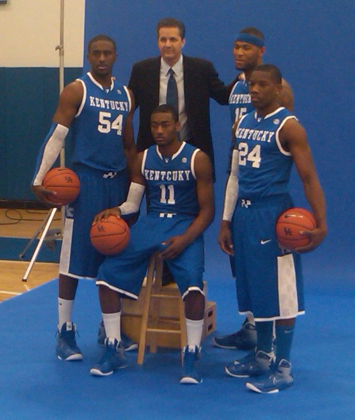
(And no, that’s not a Photoshop job — it went out over John Calipari’s Twitter feed yesterday.)
New ESPN column today — look here.
Giveaway reminder: I’m currently in the process of giving away 10 game-used NFL footballs. Details here.
Uni Watch News Ticker: If I had a list of sports figures whose shirtless torsos I’d least like to see, Rex Ryan would rank fairly high. If you agree, don’t look here. Okay, I know you looked, so you may as well look at this video analysis too. ”¦ Latest college hoops teams to get new uniforms with sublimated designs on the back: UConn and Syracuse (video coverage here). Both uniforms made their on-court debuts last night, as the two teams played each other. ”¦ The bathroom signage at the Cavs’ arena shows the familiar little figures holding a basketball (great find by Jason Hillyer). ”¦ Here, finally, is our first look at the Devils’ throwbacks (with thanks to Matt Harris). ”¦ Weird item here: Alex Ramirez of the Yomiuri Giants tried kendo (that’s Japanese stick fighting) while wearing his giants uni (with thanks to, of course, Jeremy Brahm). ”¦ Always interesting to see Lou Brock as a Cub, Satch as a Brave, Joe Morgan as a Phillie, Roger Maris as an A, Glenn Hall reading fan mail, or Andy Messersmith playing with a yo-yo. Those images come from a great collection of MLB, NFL, and NBA slides and negatives, all being sold by this guy (good find by Trevor Williams). ”¦ Good article about the Olympic hockey jerseys (with thanks to Jerry Duke). ”¦ Stephen Wongnotes that those pinhole dots on Nike’s new college hoops uniforms are also showing up on World Cup soccer designs. And speaking of the World Cup, here’s England’s road kit, along with their goalie design. ”¦ New masks for Marc-Andre Fleury, Craig Anderson, and Christobal Huet (that’s Tony Esposito depicted on one side of his mask and Murray Bannerman on the other). ”¦ Bradley did the blackout thing on Tuesday, wearing black at home and forcing Illinois State to wear white on the road (with thanks to Joel Hackler). ”¦ The Orix Buffaloes have been doing that thing where they hang the deceased player’s jersey in the dugout. In this case, the deceased player committed suicide, so it’s extra-poignant (as noted by Jeremy Brahm). ”¦ “Puma has been sponsoring many of the African national soccer teams leading up to the World Cup,” writes Justin Funderburk. “In one campaign, they’ve developed a ‘Unity Kit’ for the national teams of Angola, Ghana, and Cameroon to wear during a practice together. The only problem with this kit is that it looks like shit, literally.” I’m not sure I’d go quite that far, but I do recommend watching this video to get the full effect. ”¦ New logo for Central Arkansas (with thanks to Chris Buttgen). ”¦ “I don’t know what scarier,” says Mike Hersh, “this catalog‘s title or the images.” ”¦ There’s a really good thread on the Chris Creamer board right now about 1990s NFL prototypes. Among the highlights (some of which I’d seen before, but it’s still nice to see this all in one place): (1) If the St. Louis Stallions had come into existence in 1995, their proposed uniform would have looked like this. (2) Similarly, the Baltimore Bombers would have looked like this (yes, the guy who took those photos could really use some art-direction, but he owns what may be the only Bombers prototype in existence, so we’ll cut him some slack). (3) We all know the Jags were originally going to go with the leaping jaguar concept until a certain car company threatened legal action. What you might not know — although I guess it isn’t so surprising — is that they made caps based on that design. ”¦ Did you know there was such a thing as Wiffle Ball trading cards? I didn’t, until I saw this. … Here are the masks and backplates for USA Olympic goalies Jonathan Quick and Tim Thomas (with thanks to Tyler Hull).
I think that Bombers uniform might be worse than the Bills current look. It definitely suffers from the too-many-colors syndrome.
I was living near Savannah when Jacksonville was awarded the Jaguars. Local stores not only carried the caps with the leaping Jags logo, but t-shirts and, if I remember correctly, replica jerseys as well…
“We all know the Jags were originally going to go with the leaping jaguar concept until a certain car company threatened legal action. What you might not know – although I guess it isn’t so surprising – is that they made caps based on that design”
I lived in Mid-MO at the time, and my dad bought me a t-shirt with the leaping jaguar logo when they unveiled the team – hindsight being what it is I wish I still had it.
Paul, you mispelled Bluegrass in the title today.
/shhhh
If those are the Brazil kits for the World Cup, they are easily the ugliest ones I’ve ever seen for Brazil. They are hideous.
The plain yellow and plain blue are iconic in the football world. Two-tone? Just awful…
I don’t think that Fluery mask is new. I’m pretty certain he has worn that all season. Also, those USA goalie masks are great! I’m getting more and more jacked up for Olympic hockey everyday. Those USA sweaters are amazing, especially their, what looks like, alternate whites with the big shield patch on the chest.
The blue Brazil uniform is the second uniform, which you may see them wear one or two times in the tournament.
The Jags logo thing is very interesting… as a Jacksonvillian, I can tell you that today, now 17 years later there are STILL people who wear the old leaping Jag stuff…You need to look closely at people’s Jags stuff, the older stuff, b/c the colors are almost identical and they look similar to the actual on field design. That hat with the leaping jag in the “JJ” is new to me… interesting.
Seeing college ball players in those uniforms reminds me why I don’t love college basketball like I used to.
Speaking of Jaguars stuff with the original logo, they made much more than hats. This was all before the official jersey was unveiled, I believe, because I don\’t think I ever saw one of those, nor do I remember ever seeing it back then, and I was pretty obsessed with this new team (I was 10).
But, I definitely had a teal and black baseball-style cap that featured this logo and a two-tone foldover beanie (also in teal and black) with the old logo on it.
The real treasures, though, were as follows:
I had a generic-looking teal jersey featuring the original logo on each sleeve as well as black numerals (95) with a teal and white outline. I think it said \’JACKSONVILLE\’ on the nameplate.
The holy grail was my teal, white and gold Starter jacket (!) that had team name on the front pocket and original logo proudly embroidered on the back.
I wish, being that young, that I had realized later when they changed their logo that all that stuff might someday be sought after. I might still have some of the items, but I have no idea where they might be.
Those Devils jerseys look awesome- they’re so anti-reebok. Too bad the pics all cut off the sleeves and back hem- I’m sure there’s logos on there.
LOVE those Devils throwbacks! (I guess your little birdie was misinformed…)
LOL @ the ‘Kentcuky’ jersey.
That Baltimore Bombers uni looks like Dallas Cowboys meets Seattle Pilots meets Converse shoes.
Sorry if its been mentioned before, but North Carolina has got themselves some new Nike-fied link for the Chick Fil A Kickoff against LSU this year. And judging from how far up that mesh goes, they might have new jerseys as well…
Yes, that Brazil shirt is way ugly. I really like the new England kit, especially the sublimated star. Really nice. Wish I could see the Arsenal shirts.
Do you think there will be a matchup between Kentcuky and link
[quote comment=”377329″]Sorry if its been mentioned before, but North Carolina has got themselves some new Nike-fied link for the Chick Fil A Kickoff against LSU this year. And judging from how far up that mesh goes, they might have new jerseys as well…[/quote]
I never knew that dried mustard was a UNC color. Can 2010 get any worse for Tar Heels fans?
[quote comment=”377332″][quote comment=”377329″]Sorry if its been mentioned before, but North Carolina has got themselves some new Nike-fied link for the Chick Fil A Kickoff against LSU this year. And judging from how far up that mesh goes, they might have new jerseys as well…[/quote]
I never knew that dried mustard was a UNC color. Can 2010 get any worse for Tar Heels fans?[/quote]
they could lose to dook in BFBS @ home
I’m a little curious about the NJ Devils’ throwbacks, as they are tagged as CCM and not Reebok EDGE System. I wonder if the pictured jersey is really what we’re going to see on the ice.
[quote comment=”377321″]I don’t think that Fluery mask is new. I’m pretty certain he has worn that all season. Also, those USA goalie masks are great! I’m getting more and more jacked up for Olympic hockey everyday. Those USA sweaters are amazing, especially their, what looks like, alternate whites with the big shield patch on the chest.[/quote]
it’s new. the right side is the same as it usually is, but the left side is totally different. this might make 3 in his rotation now, i think?
[quote comment=”377333″][quote comment=”377332″][quote comment=”377329″]Sorry if its been mentioned before, but North Carolina has got themselves some new Nike-fied link for the Chick Fil A Kickoff against LSU this year. And judging from how far up that mesh goes, they might have new jerseys as well…[/quote]
I never knew that dried mustard was a UNC color. Can 2010 get any worse for Tar Heels fans?[/quote]
they could lose to dook in BFBS @ home[/quote]
Stop the madness, please, Nike. Carolins’s colors are Carolina blue and white. Dark blue trim is okay, maybe the ocassional dark blue jersey. But sheesh. I haven’t bought a Nike product in four years and this reinforces my position.
And if Nike would quit messing with Carolina’s uniforms, they would have one of the great college football uniforms, along with Alabama, Michigan, Ohio State, UCLA, etc.
Okie doke – Kaintuck is mispelt on that feller’s shirt an I guess thet’s why he looks like he swallied some Castor Awl. Wot’s they rest o’thar excuses? Not enuf blondes at thet skul?
@ Hot Rodd purty shore the spelling of Bluegrass was ironic
yeesh… those stallions unis are brutal. the bombers unis aren’t the worst (reminds me of link), but definitely not nfl caliber… more like xfl or arena.
Really dig Christobal Huet’s new mask with the old-time Indian head logo design.
I often look back with fondness to the sports styles of the late ’70’s, and then I’lI see something like the Swingster catalogue and harsh reality snaps me out of my reverie.
Does anyone know what the story is with the ?bear? on the left side of the Tim Thomas goalie mask? Is he from UMaine?
I sure as hell hope that isn’t Arsenal’s new shirt.
Some things are traditional. Liverpool wears red head to toe. Chelsea wears blue shirts, blue shorts, white socks. Man U wears red shirts, white shorts, black socks. Arsenal wears red shirts with white sleeves. What’s so hard about that to understand?
These color schemes tell us at a glance who’s playing. It’s a visual throwback to the days when players didn’t need to wear badges or sponsor logos to indicate their club.
That’ll be twice in a row that Arsenal goes away from its classic, unique color arrangement. Bad move.
i still have that jaguar logo on a sweatshirt… im wearing history… and its a much better logo
[quote comment=”377342″]Does anyone know what the story is with the ?bear? on the left side of the Tim Thomas goalie mask? Is he from UMaine?[/quote]
Thomas went to Vermont, but he plays for the Bruins (for now) so I can understand the bear . . .
[quote comment=”377339″]yeesh… those stallions unis are brutal. the bombers unis aren’t the worst (reminds me of link), but definitely not nfl caliber… more like xfl or arena.[/quote]
U have to remember that was the style of play and design in the mid-90s
Kendo is Japanese sword fighting, not stick fighting. The rattan stick he’s using is a bo-ken, a wooden sword used for practice and sparring. Rattan is pretty whippy, so those things still hurt when they hit you. They just don’t cut.
[quote comment=”377340″]Really dig Christobal Huet’s new mask with the old-time Indian head logo design.[/quote]
So, presumably he’ll only wear that when they wear the fauxback unis? Cuz I also like the link.
Too bad link (aesthetically speaking, of course) against the Stars the other day.
And not for nothin’, but it’s Cristobal, without an H.
[quote comment=”377349″][quote comment=”377340″]Really dig Christobal Huet’s new mask with the old-time Indian head logo design.[/quote]
So, presumably he’ll only wear that when they wear the fauxback unis? Cuz I also like the link.
Too bad link (aesthetically speaking, of course) against the Stars the other day.
And not for nothin’, but it’s Cristobal, without an H.[/quote]
Didn’t want to risk misspelling his name from scratch so I copy and pasted from the Ticker item. (Sorry to dime you out, Paul.)
[quote comment=”377327″]LOVE those Devils throwbacks! (I guess your little birdie was misinformed…)[/quote]
The little birdie was not misinformed. Devils management scrambled to do it right after word leaked that they were half-assing it.
[quote comment=”377346″][quote comment=”377342″]Does anyone know what the story is with the ?bear? on the left side of the Tim Thomas goalie mask? Is he from UMaine?[/quote]
Thomas went to Vermont, but he plays for the Bruins (for now) so I can understand the bear . . .[/quote]
That thing’s supposed to be a bear? Good Lord. It looks like a link or something.
Both of those masks are brutal.
[quote comment=”377338″]Okie doke – Kaintuck is mispelt on that feller’s shirt an I guess thet’s why he looks like he swallied some Castor Awl. Wot’s they rest o’thar excuses? Not enuf blondes at thet skul?
@ Hot Rodd purty shore the spelling of Bluegrass was ironic[/quote]
OHHH.. ok I get it now..
/shhhh
I LOVE the SOD look and CANNOT stand this new HyperLite line of unis.
On a different note, against Vanderbilt on 1.30, Kentucky wore special UK Nike Air Max Lebron VII kicks, with the king in attendance:
link
[quote comment=”377351″][quote comment=”377327″]LOVE those Devils throwbacks! (I guess your little birdie was misinformed…)[/quote]
The little birdie was not misinformed. Devils management scrambled to do it right after word leaked that they were half-assing it.[/quote]
So they’re selling these throwbacks in the Devils’ team store. Does that actually mean they’ll be wearing them? The pics in that blog post show CCM tagging on the jersey. No vector? Have the Devils announced that this is actually what they will wear? If so, why do the Canadiens and Flames have vectors on the throwbacks they’re wearing this year?
quote comment=\”377354\”]I LOVE the SOD look and CANNOT stand this new HyperLite line of unis.
On a different note, against Vanderbilt on 1.30, Kentucky wore special UK Nike Air Max Lebron VII kicks, with the king in attendance:
link
link
During the 1st quarter, the UK cheerleaders went out onto the floor and spelled K-E-N-T-U-C-K-Y with Lebron as the Y…Even they can spell it right, c\’mon Nike!
[quote comment=”377342″]Does anyone know what the story is with the ?bear? on the left side of the Tim Thomas goalie mask? Is he from UMaine?[/quote]
No, he played at Vermont, but he does play for the Bruins, aka Bears
[quote comment=”377355″][quote comment=”377351″][quote comment=”377327″]LOVE those Devils throwbacks! (I guess your little birdie was misinformed…)[/quote]
The little birdie was not misinformed. Devils management scrambled to do it right after word leaked that they were half-assing it.[/quote]
So they’re selling these throwbacks in the Devils’ team store. Does that actually mean they’ll be wearing them? The pics in that blog post show CCM tagging on the jersey. No vector? Have the Devils announced that this is actually what they will wear? If so, why do the Canadiens and Flames have vectors on the throwbacks they’re wearing this year?[/quote]
The on-ice jerseys will be scooped-hem, Reebok EDGE jerseys.
[quote comment=”377358″]
The on-ice jerseys will be scooped-hem, Reebok EDGE jerseys.[/quote]
so … wait
they’re selling CCM merch in the team store, but not rbk? but the sweaters will be rbk edge?
something doesn’t smell right
[quote comment=”377358″][quote comment=”377355″][quote comment=”377351″][quote comment=”377327″]LOVE those Devils throwbacks! (I guess your little birdie was misinformed…)[/quote]
The little birdie was not misinformed. Devils management scrambled to do it right after word leaked that they were half-assing it.[/quote]
So they’re selling these throwbacks in the Devils’ team store. Does that actually mean they’ll be wearing them? The pics in that blog post show CCM tagging on the jersey. No vector? Have the Devils announced that this is actually what they will wear? If so, why do the Canadiens and Flames have vectors on the throwbacks they’re wearing this year?[/quote]
The on-ice jerseys will be scooped-hem, Reebok EDGE jerseys.[/quote]
the pictures are of CCM jerseys and Mitchell & Ness hats (obviously)… so, as far as i’m concerned we still have yet to see the devils throwbacks
[quote comment=”377359″][quote comment=”377358″]
The on-ice jerseys will be scooped-hem, Reebok EDGE jerseys.[/quote]
so … wait
they’re selling CCM merch in the team store, but not rbk? but the sweaters will be rbk edge?
something doesn’t smell right[/quote]
yeah, but isn’t that just what Jersey smells like normally?
[quote comment=”377359″][quote comment=”377358″]
The on-ice jerseys will be scooped-hem, Reebok EDGE jerseys.[/quote]
so … wait
they’re selling CCM merch in the team store, but not rbk? but the sweaters will be rbk edge?
something doesn’t smell right[/quote]
Apparently CCM has become the ‘vintage’ arm of the Reebok empire. I think that’s dumb too.
Re: Team USA Goalie masks. I’m a little disappointed they went with the eagle imagery on both. Isn’t that a little played out? I know, I know, national symbol and all that, but it just seems to lack creativity.
On an unrelated note EyeCandyAir’s font sucks. I thought the URL was eyecandyair.coh. And I thought, “it can’t possible be .coh. Yep, that’s an h for sure. I know what h’s look like and that’s one.” I was *this* close to typing it into my browser when I saw Tih Thohas at the bottom and realized it is indeed an M. Stupid.
[quote comment=”377359″][quote comment=”377358″]
The on-ice jerseys will be scooped-hem, Reebok EDGE jerseys.[/quote]
so … wait
they’re selling CCM merch in the team store, but not rbk? but the sweaters will be rbk edge?
something doesn’t smell right[/quote]
[quote comment=”377360″]
the pictures are of CCM jerseys and Mitchell & Ness hats (obviously)… so, as far as i’m concerned we still have yet to see the devils throwbacks[/quote]
Exactly. If they really are wearing Edge versions of their original design, why not sell those?
NCAA football helmet quiz:
link
[quote comment=”377349″][quote comment=”377340″]Really dig Christobal Huet’s new mask with the old-time Indian head logo design.[/quote]
So, presumably he’ll only wear that when they wear the fauxback unis? Cuz I also like the link.
Too bad link (aesthetically speaking, of course) against the Stars the other day.
And not for nothin’, but it’s Cristobal, without an H.[/quote]
They brought up Huet’s new mask on the telecast on Tuesday night against the Stars. Said he wore it in practice that morning. It was also Tony Esposito heritage night on Tuesday at the United Center, so it would have been a fitting tribute. But yes, Niemi got the start that night instead.
[quote comment=”377366″][quote comment=”377349″][quote comment=”377340″]Really dig Christobal Huet’s new mask with the old-time Indian head logo design.[/quote]
So, presumably he’ll only wear that when they wear the fauxback unis? Cuz I also like the link.
Too bad link (aesthetically speaking, of course) against the Stars the other day.
And not for nothin’, but it’s Cristobal, without an H.[/quote]
They brought up Huet’s new mask on the telecast on Tuesday night against the Stars. Said he wore it in practice that morning. It was also Tony Esposito heritage night on Tuesday at the United Center, so it would have been a fitting tribute. But yes, Niemi got the start that night instead.[/quote]
link.
Best part? I didn’t get a chance to get a screen grab, but the granddaughter being held up in the background was wearing what I think may have been a truly vintage jersey with link.
Stumbled upon this:
link
Forgive me if it has already been posted.
I remember the Wiffle ball cards well:
link
You could never have too many Wiffle balls in the neighborhood. :)
[quote comment=”377354″]I LOVE the SOD look and CANNOT stand this new HyperLite line of unis.
On a different note, against Vanderbilt on 1.30, Kentucky wore special UK Nike Air Max Lebron VII kicks, with the king in attendance:
link
Truck Bryant from WVU wore Air Max LeBron VII 2010 Mid-Season Classics against Villanova on Monday (for some reason).
link
link
Hey … why not?
[quote comment=”377371″]http://www.chicagonow.com/blogs/league-of-her-own/assets_c/2009/07/zcatcher-thumb-246×425-8380.jpg
Hey … why not?[/quote]
Fine … be that way …
link
“…Here are the masks and backplates for USA Olympic goalies Jonathan Quick and Tim Thomas (with thanks to Tyler Hull)….
***
[quote comment=”377321″]I don’t think that Fluery mask is new. I’m pretty certain he has worn that all season. Also, those USA goalie masks are great![/quote]
[quote comment=”377352″][quote comment=”377346″][quote comment=”377342”]Does anyone know what the story is with the ?bear? on the left side of the Tim Thomas goalie mask? Is he from UMaine?[/quote]
Thomas went to Vermont, but he plays for the Bruins (for now) so I can understand the bear . . .[/quote]
That thing’s supposed to be a bear? Good Lord. It looks like a link or something.
Both of those masks are brutal.[/quote]
[quote comment=”377363″]Re: Team USA Goalie masks. I’m a little disappointed they went with the eagle imagery on both. Isn’t that a little played out? I know, I know, national symbol and all that, but it just seems to lack creativity.[/quote]
“Brutal” is right. Just terrible. Hasn’t Colbert driven a stake through all that screaming-eagle hyper-patriot stuff?
“During the 1st quarter, the UK cheerleaders went out onto the floor and spelled K-E-N-T-U-C-K-Y with Lebron as the Y…Even they can spell it right, c\’mon Nike!”
One would have expected one of the female cheerleaders to appear in that role.
The Miller and Quick masks are horrible and are using the old logo. Now Ryan Miller’s on the other hand.
link
Golden!
[quote comment=”377372″][quote comment=”377371″]http://www.chicagonow.com/blogs/league-of-her-own/assets_c/2009/07/zcatcher-thumb-246×425-8380.jpg
Hey … why not?[/quote]
Fine … be that way …
link
Well, Geo lost something like 40 pounds in the off-season. (No more munchies?)
So maybe Zambrano is the only one who can fit into the old gear. I guess he’s still got some work to do on that weight-loss program.
Today’s ESPN column is up:
link
[quote comment=”377373″]”…Here are the masks and backplates for USA Olympic goalies Jonathan Quick and Tim Thomas (with thanks to Tyler Hull)….
***
[quote comment=”377321″]I don’t think that Fluery mask is new. I’m pretty certain he has worn that all season. Also, those USA goalie masks are great![/quote]
[quote comment=”377352″][quote comment=”377346″][quote comment=”377342″]Does anyone know what the story is with the ?bear? on the left side of the Tim Thomas goalie mask? Is he from UMaine?[/quote]
Thomas went to Vermont, but he plays for the Bruins (for now) so I can understand the bear . . .[/quote]
That thing’s supposed to be a bear? Good Lord. It looks like a link or something.
Both of those masks are brutal.[/quote]
[quote comment=”377363″]Re: Team USA Goalie masks. I’m a little disappointed they went with the eagle imagery on both. Isn’t that a little played out? I know, I know, national symbol and all that, but it just seems to lack creativity.[/quote]
“Brutal” is right. Just terrible. Hasn’t Colbert driven a stake through all that screaming-eagle hyper-patriot stuff?[/quote]
Absolutely not.
link
[quote comment=”377377″]Today’s ESPN column is up:
link
There seem to be quite a few random differences between the two jerseys:
1. For the east, the dark blue of the collar ends before it gets to the bottom, where “2010” is. The dark red appears to continue all the way around.
2. The blue collar also seems to end much lower, and be straighter than the red collar.
3. The placement of EAST and WEST – pretty different. Also causes the placement of the “NBA ALL-STAR” logo (is that new?) to differ.
4. Gold trim for the West, silver for the East? Foreshadowing the end result of the game?
5. Tags at the bottom – is one an official jersey and the other a replica?
6. At least by my view, the stars on the jerseys would NOT meet in the middle to make one star, as stated in the article. Maybe if they overlap just right. Otherwise it’d be like a button down MLB uni with too many letters thanks to the seem.
My two cents. Take it for what it’s worth.
This weeks New Era sign that the Apoacalypse is upon us:
link
My sign is that the spell check function on my PC IS BROKEN!
[quote comment=”377378″][quote comment=”377373″]”…Here are the masks and backplates for USA Olympic goalies Jonathan Quick and Tim Thomas (with thanks to Tyler Hull)….
***
[quote comment=”377321″]I don’t think that Fluery mask is new. I’m pretty certain he has worn that all season. Also, those USA goalie masks are great![/quote]
[quote comment=”377352″][quote comment=”377346″][quote comment=”377342″]Does anyone know what the story is with the ?bear? on the left side of the Tim Thomas goalie mask? Is he from UMaine?[/quote]
Thomas went to Vermont, but he plays for the Bruins (for now) so I can understand the bear . . .[/quote]
That thing’s supposed to be a bear? Good Lord. It looks like a link or something.
Both of those masks are brutal.[/quote]
[quote comment=”377363″]Re: Team USA Goalie masks. I’m a little disappointed they went with the eagle imagery on both. Isn’t that a little played out? I know, I know, national symbol and all that, but it just seems to lack creativity.[/quote]
“Brutal” is right. Just terrible. Hasn’t Colbert driven a stake through all that screaming-eagle hyper-patriot stuff?[/quote]
Absolutely not.
link
That’s great!
[quote comment=”377337″]And if Nike would quit messing with Carolina’s uniforms, they would have one of the great college football uniforms, along with Alabama, Michigan, Ohio State, UCLA, etc.[/quote]
Agreed. Their hoops unis are iconic, but their football unis don’t measure up.
[quote comment=”377382″][quote comment=”377378″]
Absolutely not.
link
That’s great![/quote]
Fuck yeah
Those leaping Jaguars caps… I actually own one of those.
Paul –
Great Huet mask! But there is no “h” is Cristobal.
[quote comment=”377377″]Today’s ESPN column is up:
link
Great column, but I’m not sure the Packers’ helmet facemask is white in that picture. I seem to recall that it was light gray, maybe not discernable in that screen grab.
The Packers continued to use that single-bar helmet logo, with accompanying gray face mask, for years after switching to green masks. You can just make it out in this photo from 1992, twelve years after the gray facemask was retired.
[quote comment=”377387″][quote comment=”377377″]Today’s ESPN column is up:
link
Great column, but I’m not sure the Packers’ helmet facemask is white in that picture. I seem to recall that it was light gray, maybe not discernable in that screen grab.
The Packers continued to use that single-bar helmet logo, with accompanying gray face mask, for years after switching to green masks. You can just make it out in this photo from 1992, twelve years after the gray facemask was retired.[/quote]
Sorry – screwed up the HTML (darn you, no preview!).
I meant link.
[quote comment=”377387″][quote comment=”377377″]Today’s ESPN column is up:
link
Great column, but I’m not sure the Packers’ helmet facemask is white in that picture. I seem to recall that it was light gray, maybe not discernable in that screen grab.
The Packers continued to use that single-bar helmet logo, with accompanying gray face mask, for years after switching to green masks. You can just make it out in this photo from 1992, twelve years after the gray facemask was retired.[/quote]
As for the Saints’ gray facemasks on their field (while wearing black ones, obviously), I’ll guess that black facemasks don’t show up well in black endzones, and that consistency is a good thing, hence the gray.
[quote comment=”377388″][quote comment=”377387″][quote comment=”377377″]Today’s ESPN column is up:
link
Great column, but I’m not sure the Packers’ helmet facemask is white in that picture. I seem to recall that it was light gray, maybe not discernable in that screen grab.
The Packers continued to use that single-bar helmet logo, with accompanying gray face mask, for years after switching to green masks. You can just make it out in this photo from 1992, twelve years after the gray facemask was retired.[/quote]
Sorry – screwed up the HTML (darn you, no preview!).
I meant link.[/quote]
Or even link
new Cuse uni link feedback
let’s try that again – link
[quote comment=”377377″]Today’s ESPN column is up:
link
“Adidas is also claiming that each star symbol “is divided into five pieces joining as one, representing five players on each team coming together,” which can only mean that nobody at adidas has ever seen an All-Star game.”
My favorite line of the article.
Also liked that look at wrong-colored facemasks on football fields. Good stuff.
Strike one:
link
Strike two:
link
Strike three:
link
Can we call Kentcuky the Natinals of college basketball? Or are the Natinals the Wildcats of baseball?
Paul, I hate to do this, but I know you’d want to know…the Bears actually started using navy facemasks in 1982…McMahon’s rookie year.
Supporting video…link
Toby Keith must have designed Team USA’s goalie masks while tripping on acid. Nothing says USA like a red, white and blue bald eagle with a bottle rocket sticking out of it’s ass.
[quote comment=”377396″]Toby Keith must have designed Team USA’s goalie masks while tripping on acid. Nothing says USA like a red, white and blue bald eagle with a bottle rocket sticking out of it’s ass.[/quote]
All brought to you, courtesy of the red white and blue.
Paul Lukas said:
“Here’s something else quantum physics has conclusively determined: Spelling out a word down a shirt’s sleeve is always — always — a bad idea.”
I don’t know, I got a Tampa Bay Bandits version of this:
link
except it was only printed on the left sleeve. I can only wear it as an undershirt now, as the torso has faded so much you can see through it.
[quote comment=”377398″]Paul Lukas said:
“Here’s something else quantum physics has conclusively determined: Spelling out a word down a shirt’s sleeve is always — always — a bad idea.”
I don’t know, I got a Tampa Bay Bandits version of this:
link
except it was only printed on the left sleeve. I can only wear it as an undershirt now, as the torso has faded so much you can see through it.[/quote]
OK, I’ve got a shirt like link except that it’s white with a full-size red & black logo. link.
Oooh… wait. Let me check something.
Yep. Here’s a pic of me link.
Can you guess the year and/or location that photo was taken?
On the whole, I’m not sure if I’d wear those St. Louis Stallions unis, link but I am intrigued by the sleeves. I’d like to see a side view.
Anyone else ever see numbers inside of sleeve stripes like that?
Oops. link.
[quote comment=”377399″][quote comment=”377398″]Paul Lukas said:
“Here’s something else quantum physics has conclusively determined: Spelling out a word down a shirt’s sleeve is always — always — a bad idea.”
I don’t know, I got a Tampa Bay Bandits version of this:
link
except it was only printed on the left sleeve. I can only wear it as an undershirt now, as the torso has faded so much you can see through it.[/quote]
OK, I’ve got a shirt like link except that it’s white with a full-size red & black logo. link.
Oooh… wait. Let me check something.
Yep. Here’s a pic of me link.
Can you guess the year and/or location that photo was taken?[/quote]
I’m getting a blank page…or did you wear that during the blizzard of ’99?
[quote comment=”377401″]Oops. link.[/quote]
It needs stripes…
Confused…the new UNC helmet shown in the picture is made by Riddell, but everyone is angry at Nike?
So how from one picture do we know it’s Nike’s fault?
was on craig’s list and saw this beauty. I kind of remember MLB doing this.
link
ok…i’m sure I’ll take heat for this, but putting guns and war imagery on the Goalie Masks for the Olympics is in really bad taste. It’s the Olympics.
I get the message, and I am not discounting the intention behind it, but I think it could have been done in a more tasteful manner. I also agree with Schmeltzer above.
[quote comment=”377363″]Re: Team USA Goalie masks. I’m a little disappointed they went with the eagle imagery on both. Isn’t that a little played out? I know, I know, national symbol and all that, but it just seems to lack creativity.
[/quote]
I’m not all that familiar with Hockey goalie masks and how it works, but why didn’t Nike design those as well? I think it would be more consistent that way. Two cents.
[quote comment=”377399″][quote comment=”377398″]Paul Lukas said:
“Here’s something else quantum physics has conclusively determined: Spelling out a word down a shirt’s sleeve is always — always — a bad idea.”
I don’t know, I got a Tampa Bay Bandits version of this:
link
except it was only printed on the left sleeve. I can only wear it as an undershirt now, as the torso has faded so much you can see through it.[/quote]
OK, I’ve got a shirt like link except that it’s white with a full-size red & black logo. link.
Oooh… wait. Let me check something.
Yep. Here’s a pic of me link.
Can you guess the year and/or location that photo was taken?[/quote]
I’m going with 1996, Jamaica.
[quote comment=”377404″]Confused…the new UNC helmet shown in the picture is made by Riddell, but everyone is angry at Nike?
So how from one picture do we know it’s Nike’s fault?[/quote]
Yes, the helmet is a Riddell Revolution Speed. However, if it were not for Nike’s redesigning of the entire uniform, then it would not have changed.
I actually like it.
[quote comment=”377407″][quote comment=”377399″][quote comment=”377398″]Paul Lukas said:
“Here’s something else quantum physics has conclusively determined: Spelling out a word down a shirt’s sleeve is always — always — a bad idea.”
I don’t know, I got a Tampa Bay Bandits version of this:
link
except it was only printed on the left sleeve. I can only wear it as an undershirt now, as the torso has faded so much you can see through it.[/quote]
OK, I’ve got a shirt like link except that it’s white with a full-size red & black logo. link.
Oooh… wait. Let me check something.
Yep. Here’s a pic of me link.
Can you guess the year and/or location that photo was taken?[/quote]
I’m going with 1996, Jamaica.[/quote]
No, it’s on the set of Clueless.
[quote comment=”377398″]Paul Lukas said:
“Here’s something else quantum physics has conclusively determined: Spelling out a word down a shirt’s sleeve is always — always — a bad idea.”
I don’t know, I got a Tampa Bay Bandits version of this:
link
except it was only printed on the left sleeve. I can only wear it as an undershirt now, as the torso has faded so much you can see through it.[/quote]
couldn’t you wear an udershirt under it to hide the offending area?
[quote comment=”377406″]
I’m not all that familiar with Hockey goalie masks and how it works, but why didn’t Nike design those as well? I think it would be more consistent that way. Two cents.[/quote]
Nike only has the jersey agreement with the IIHF. Equipment does not fall under those guidelines as equipment is a personal choice as well as having some players bound to endorsement contracts. Because the IIHF is managing the tournament for the Olympics, their rules come into play.
[quote comment=”377409″]
No, it’s on the set of Clueless.[/quote]
Well played.
A) The band was in the movie and B) I fucked up the link.
Although some here might say that I’m giving you too much credit for putting 2 and 2 together on this one.
[quote comment=”377405″]was on craig’s list and saw this beauty. I kind of remember MLB doing this.
link[/quote]
ahhh! pre-BFBS!
The NBA All-Stars going color on color just gives me another reason to not watch the game.
[quote comment=”377405″]was on craig’s list and saw this beauty. I kind of remember MLB doing this.
link[/quote]
did they ever make one for the colts?
[quote comment=”377415″][quote comment=”377405″]was on craig’s list and saw this beauty. I kind of remember MLB doing this.
link[/quote]
did they ever make one for the colts?[/quote]
yes they did… :( link
[quote comment=”377415″][quote comment=”377405″]was on craig’s list and saw this beauty. I kind of remember MLB doing this.
link[/quote]
did they ever make one for the colts?[/quote]
link they link and maybe they link
4. Gold trim for the West, silver for the East? Foreshadowing the end result of the game?
No. IIRC, they’ve used the same color combinations for the past two seasons.
[quote comment=”377356″]quote comment=\”377354\”]During the 1st quarter, the UK cheerleaders went out onto the floor and spelled K-E-N-T-U-C-K-Y with Lebron as the Y…Even they can spell it right, c\’mon Nike![/quote]
how common is the cheerleaders spelling out the school name with their bodies thing in basketball? At the ten minute mark of the second half of every game, Rice does four sketches to the Blues Brothers version of “Time is Tight,” lying on the floor to spell the letters out after each one, but I’ve never seen it anywhere else.
The best sketch was always E where they would set up to look like a kegstand and the two cheerleaders who were “drinking” would stumble around and fall down to become the top and bottom legs of the E, but they’re not allowed to be so obvious about it anymore.
[quote comment=”377410″][quote comment=”377398″]Paul Lukas said:
“Here’s something else quantum physics has conclusively determined: Spelling out a word down a shirt’s sleeve is always — always — a bad idea.”
I don’t know, I got a Tampa Bay Bandits version of this:
link
except it was only printed on the left sleeve. I can only wear it as an undershirt now, as the torso has faded so much you can see through it.[/quote]
couldn’t you wear an udershirt under it to hide the offending area?[/quote]
It’s also a little tight now. Must have shrunk in the laundry or something…
The old Jaguars logo topic brought up today is a funny coincidence because yesterday I received a tee-shirt that I bought off eBay with that logo. I bought partly because I like the old logo and partly because all the Reebok Jaguars tees they produce are absolute shite.
Here’s a look at the tee:
link
[quote comment=”377420″][quote comment=”377410″][quote comment=”377398″]Paul Lukas said:
“Here’s something else quantum physics has conclusively determined: Spelling out a word down a shirt’s sleeve is always — always — a bad idea.”
I don’t know, I got a Tampa Bay Bandits version of this:
link
except it was only printed on the left sleeve. I can only wear it as an undershirt now, as the torso has faded so much you can see through it.[/quote]
couldn’t you wear an udershirt under it to hide the offending area?[/quote]
It’s also a little tight now. Must have shrunk in the laundry or something…[/quote]
So no room for an undershirt. Maybe you should just wear pasties.
[quote comment=”377422″][quote comment=”377420″][quote comment=”377410″][quote comment=”377398″]Paul Lukas said:
“Here’s something else quantum physics has conclusively determined: Spelling out a word down a shirt’s sleeve is always — always — a bad idea.”
I don’t know, I got a Tampa Bay Bandits version of this:
link
except it was only printed on the left sleeve. I can only wear it as an undershirt now, as the torso has faded so much you can see through it.[/quote]
couldn’t you wear an udershirt under it to hide the offending area?[/quote]
It’s also a little tight now. Must have shrunk in the laundry or something…[/quote]
So no room for an undershirt. Maybe you should just wear pasties.[/quote]
At least you didn’t suggest a bro.
Worn under a generic football jersey (or one of my USFL t-shirts that are sized more appropriately) it serves its purpose well. Besides, if I expose the whole shirt to daylight it might fall apart faster.
[quote comment=”377412″][quote comment=”377409″]
No, it’s on the set of Clueless.[/quote]
Well played.
A) The band was in the movie and B) I fucked up the link.
Although some here might say that I’m giving you too much credit for putting 2 and 2 together on this one.[/quote]
giving powers too much credit for being clueless-savvy?
Re: “those familiar little figures” ,the unisex figures found on restroom doors-they were originaly designed for Expo 67, the worlds fair held in Montreal in 1967. french was not the official language of quebec for another ten years, so they came up with an international symbol that would be understood by french, english, and all the other languages from around the world that would be attending the fair.
[quote comment=”377424″][quote comment=”377412″][quote comment=”377409″]
No, it’s on the set of Clueless.[/quote]
Well played.
A) The band was in the movie and B) I fucked up the link.
Although some here might say that I’m giving you too much credit for putting 2 and 2 together on this one.[/quote]
giving powers too much credit for being clueless-savvy?[/quote]
damn i’m confused
[quote comment=”377424″][quote comment=”377412″][quote comment=”377409″]
No, it’s on the set of Clueless.[/quote]
Well played.
A) The band was in the movie and B) I fucked up the link.
Although some here might say that I’m giving you too much credit for putting 2 and 2 together on this one.[/quote]
giving powers too much credit for being clueless-savvy?[/quote]
For being anything-savvy.
[quote comment=”377324″]Seeing college ball players in those uniforms reminds me why I don’t love college basketball like I used to.[/quote]
Well said.
Forgive my laziness, but is this the first year in a while that the NBA All Star warm ups do not have the patches representing how many All Star games the player has been in? Or was that just a one or two time thing? Personally I like the patches, the stars are OK though.
Anyone grab a pic of the patch-happy warm ups from either last year or the year before?
____________
While searching for something else, I found this:
link
How do you get a cap on that ‘fro? Oh well, love it anyways.
I don’t care how hot those Canes girls are; if they hand me a black Hurricanes alternate, I’m handing it right back to them. I like their standard jerseys, though.
Oh, and that Devils jersey looks way cool. Ahhh, the days of Steve Tambellini, Tapio Levo and Chico Resch…
-Jet
[quote comment=”377429″]Forgive my laziness, but is this the first year in a while that the NBA All Star warm ups do not have the patches representing how many All Star games the player has been in? Or was that just a one or two time thing? Personally I like the patches, the stars are OK though.
Anyone grab a pic of the patch-happy warm ups from either last year or the year before?
____________
While searching for something else, I found this:
link
How do you get a cap on that ‘fro? Oh well, love it anyways.[/quote]
begin the application from the back side of the head
Am I wrong or does it look like we need to have a Jacksonville Uni Watch drinkup? :-)
Go ahead and schedule it…I can’t attend, but I’ll pray it doesn’t get blacked out.
[quote comment=”377432″]Am I wrong or does it look like we need to have a Jacksonville Uni Watch drinkup? :-)[/quote]
Go ahead and schedule it…I can’t attend, but I’ll pray it doesn’t get blacked out.
(Forgot to quote the last time.)
[quote comment=”377434″][quote comment=”377432″]Am I wrong or does it look like we need to have a Jacksonville Uni Watch drinkup? :-)[/quote]
Go ahead and schedule it…I can’t attend, but I’ll pray it doesn’t get blacked out.
(Forgot to quote the last time.)[/quote]
Or pray it doesn’t get moved to LA…
Regarding to the ESPN column’s NFL field graphics references… It jogged my memory on something that I had forgotten about. In the infamous 1986 AFC Championship game (AKA – The Drive), I seem to remember one of the endzones being painted with a Broncos helmet and generic, block lettered wordmark, similar (or identical) to the Browns’ font of the time. This was odd since the game was played in Cleveland… I can’t ever recall seeing a non neutral site game where both teams were represented by the field graphics… Or I could be “mis-remembering” the whole thing as I was 9 years old at the time. Can anyone back me up on this… or have years of being a Browns fan (and realizing that that day — I was 9!!! — was the closest I’ve ever been to a Super Bowl) warped my brain?
Watching Sharks at Red Wings tonight…they seem to have virtual ads on the glass behind each goal. Different ads for each period so far, it’s really distracting.
Includes the above Kentcuky fail. But a little compilation of the uni/spelling fails from the last year. Fun to see together.
link
[quote comment=”377436″]Regarding to the ESPN column’s NFL field graphics references… It jogged my memory on something that I had forgotten about. In the infamous 1986 AFC Championship game (AKA – The Drive), I seem to remember one of the endzones being painted with a Broncos helmet and generic, block lettered wordmark, similar (or identical) to the Browns’ font of the time. This was odd since the game was played in Cleveland… I can’t ever recall seeing a non neutral site game where both teams were represented by the field graphics… Or I could be “mis-remembering” the whole thing as I was 9 years old at the time. Can anyone back me up on this… or have years of being a Browns fan (and realizing that that day — I was 9!!! — was the closest I’ve ever been to a Super Bowl) warped my brain?[/quote]
I’ll back you up. The Browns did paint one endzone for the Broncos – NFL logo on the left, Broncos name in the middle and a blue helmet with an orange D on the right.
link
They weren’t the only ones to do that, either. I always thought it was a nice touch for a conference championship game. And I’ll tell you what – I’m not a fan of either team but that was a NICE looking game…unis, field, weather, etc.
Back in the late 60s/early 70s, the Chiefs used to paint their helmet AND the opponent’s helmet at midfield for every game, regular season and playoffs. That was cool.
My apologies if someone already contributed this, but the pix of the customized Devils throwbacks on newjerseydevils.com feature the current Devils font. The old CCM jerseys did not use this unique numbering set, but rather a more traditional look. I’m hesitant to buy a “throwback” that has the incorrect numbering/lettering.
[quote comment=”377437″]Watching Sharks at Red Wings tonight…they seem to have virtual ads on the glass behind each goal. Different ads for each period so far, it’s really distracting.[/quote]
Yeah, those suck. They do it for Blackhawks games, too. I’m pretty sure it’s just on the glass behind the other team’s goal. They don’t do it on both ends. I’ve gotten used to it and I don’t notice it any more than I do the ads on the boards.
The regular ads, I mean. Because those link are godawful.
[quote comment=”377441″]those link are godawful.[/quote]
notice where that is taking place…lots of fans dressed as empty seats
*sighs*
there used to be an NHL team playing there…
[quote comment=”377439″][quote comment=”377436″]Regarding to the ESPN column’s NFL field graphics references… It jogged my memory on something that I had forgotten about. In the infamous 1986 AFC Championship game (AKA – The Drive), I seem to remember one of the endzones being painted with a Broncos helmet and generic, block lettered wordmark, similar (or identical) to the Browns’ font of the time. This was odd since the game was played in Cleveland… I can’t ever recall seeing a non neutral site game where both teams were represented by the field graphics… Or I could be “mis-remembering” the whole thing as I was 9 years old at the time. Can anyone back me up on this… or have years of being a Browns fan (and realizing that that day — I was 9!!! — was the closest I’ve ever been to a Super Bowl) warped my brain?[/quote]
I’ll back you up. The Browns did paint one endzone for the Broncos – NFL logo on the left, Broncos name in the middle and a blue helmet with an orange D on the right.
link
They weren’t the only ones to do that, either. I always thought it was a nice touch for a conference championship game. And I’ll tell you what – I’m not a fan of either team but that was a NICE looking game…unis, field, weather, etc.
Back in the late 60s/early 70s, the Chiefs used to paint their helmet AND the opponent’s helmet at midfield for every game, regular season and playoffs. That was cool.[/quote]
The first few plays of this clip show the whole endzone better:
link
gonzaga is in their new white uniforms tonight
[quote comment=”377442″][quote comment=”377441″]those link are godawful.[/quote]
notice where that is taking place…lots of link
*sighs*
there used to be an NHL team playing there…[/quote]
They used to play major league sports there, too. ;)
link
[quote comment=”377405″]was on craig’s list and saw this beauty. I kind of remember MLB doing this.
link[/quote]
Noted this ad is from Bethesda MD…. I would imagine the Colts’ transportation truck is the crown of that collection, uh?
[quote comment=”377431″][quote comment=”377429″]Forgive my laziness, but is this the first year in a while that the NBA All Star warm ups do not have the patches representing how many All Star games the player has been in? Or was that just a one or two time thing? Personally I like the patches, the stars are OK though.
Anyone grab a pic of the patch-happy warm ups from either last year or the year before?
____________
While searching for something else, I found this:
link
How do you get a cap on that ‘fro? Oh well, love it anyways.[/quote]
begin the application from the back side of the head[/quote]
That Afro is baby shit compared to the granddaddy of them all…. link
HEY? When are the “NFL tweaks” coming out???
Seeing Lou Brock in a Cubs uni must make all of Chicago think of Ernie Broglio. Who is that behind Joe Morgan ??? Is it a slim Country Joe West ?