With bowl season upon us, Christopher Wheeler pointed me toward this Orange Bowl history page, which turns out to be chock-full of uni-notable photos. Here’s a chronological rundown:
1937 (Duquesne vs. Mississippi State): Love the pre-zebra-era officials. They must have had quite a time figuring out which team was which in this dark-vs.-dark contest. The teams were Duquesne and Mississippi State, although I don’t know which is which in the photo.
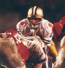
1938 (Auburn vs. Michigan State): What’s going on with this runner? Like, is that a ribcage protector, or a girdle, or what?
1942 (Georgia vs. TCU): By now the officials were wearing zebra stripes, but they were button-fronts, not pullovers. Again with the dark vs. dark, too.
1943 (Alabama vs. Boston College): Now that’s a set of zebra stripes! Never seen anything like that before. Anyone know more about that design?
1945 (Tulsa vs. Georgia Tech): Love the front “T” logo. Does it stand for “Tulsa” or “Tech”? I have no idea which team is which.
1949 (Texas vs. Georgia): Whoa, look at that football/globe thingie on the scoreboard. Sort of a worldwide “manifest football destiny” icon.
1952 (Georgia Tech vs. Baylor): Sorry to keep harping on the officials, but that cap patch/logo thingie looks interesting.
1953 (Alabama vs. Syracuse): Look along the lower-left edge of this photo. Did they cut that sideline yard marker out of construction paper or what?
1957 (Colorada vs. Clemson): Colorado came up with that horned helmet design specifically for this game. Further details here.
1962 (Colorado vs. LSU): Another unique Colorado helmet design (further details here). I believe this was the last game in which this design was worn.
1967 (Florida vs. Georgia Tech): This appears to have been a very good-looking game. Both teams could do a lot worse than to revive these designs as throwbacks.
1974 (Penn State vs. LSU): We’re so used to seeing Penn State wearing blank helmets that it’s hard to process the sight of them with TV numbers up there. According to the Helmet Project, they wore that style “during at least two periods: 1961 (and possibly earlier), and again from 1967 to 1974.”
1976 (Oklahoma vs. Michigan): Wow, looks almost heretical to see the upper portion of those Wolverine facemasks defiling the winged helmet design.
1978 (Arkansas vs. Oklahoma): Someone recently wrote to me and complained that I seem to think striped socks are the solution to every problem. And look — they are!
1982 (Clemson vs. Nebraska): You know how today’s linemen like their jerseys to be super-tight? That wasn’t the case in ’82.
1984 (Miami vs. Nebraska): Note that both teams have added shoulder logos for the occasion. I believe this was the first time that happened in the Orange Bowl.
1985 (Washington vs. Oklahoma): More shoulder artwork.
1998 (Nebraska vs. Tennessee): Adidas’s three-stripe logo creep doesn’t look so bad compared to this.
Thanks to Christopher for pointing me toward this great material.
Uni Watch News Ticker: Strat-O-Matic baseball is incorporating Negro Leaguers into its player sets. ”¦ Barcelona wore their orange jerseys while winning the Club World Cup on Saturday but donned their primary striped jerseys for the trophy presentation and photos. “You can still see the orange peeking out at the waists, and the orange socks too,” says Matt Brukman. “They pulled the same stunt after winning the European championship in 1992.” ”¦ I was intrigued by this 1949 World Series photo, which ran in Sunday’s New York Times. Pretty interesting that an usher would greet Tommy Henrich before he reach home plate. Looks like another usher is about to join the party, too. ”¦ Now that’s a hat (great find by Nate Morris). ”¦ Absolutely spectacular graphic slideshow detailing how Fenway Park is being prepared for the Winter Classic here (big thanks to Jay Sullivan). ”¦ Meanwhile, two boarding school hockey teams got to play at Fenway the other day. Lots more photos here, and additional info here (with thanks to Matthew Robins). ”¦ Okay, so we all know the Lakers’ jerseys and shorts used to have different shades of purple, but this is ridiculous (with thanks to Michael Cooperman). ”¦ The U.S. Olympic bobsled uniforms will look like this (with thanks to Jeremy Brahm). ”¦ Also from Jeremy: Here’s the logo for the 2010 FIVB World Congress and this year’s Japanese basketball all-star uniforms. ”¦ Lots of really interesting info about Arizona’s equipment staff prepping for the Holiday Bowl here and here (very nice find by Eric Sing). ”¦ If you have an 8mm movie projector, you might be interested in these 1960s high school football home movies (as found by Tris Wykes). ”¦ Awesome analysis of the differences in the early-’70s A’s uniforms here (big thanks to Dave Grob). ”¦ The Tulsa Oilers will be wearing an Xmas-themed jersey this Friday (with thanks to Ryan Atkinson). ”¦ FNOB alert. That’s from the 1991 Cotton Bowl (screen shot by Doug McConnell). ”¦ Injury report from Doug Keklak, who writes: “Jordan Staal took a puck (or stick) off the nose. Came back later with a full face guard like you see in youth hockey.” ”¦ Great slideshow of some of Umbro’s more questionable jerseys (with thanks to Terence Kearns). ”¦ “I got a chance to hang out with a buddy who’s in the Army over the holidays,” says Jake Sorg. “He showed me the current generation of boots they are wearing. It appears that swooshification isn’t limited to athletic uniforms.” Wow — Nike Pro Combat, for real! ”¦ The Wizards are wearing that “Abe” patch for Abe Pollin, which looks really odd on DeShawn Stevenson, because he has an Abe Lincoln tattoo on his throat (as noted by Stephen Boyd). ”¦ More stuff from Jeremy: Japanese basketball refs have a whistle illustration on their jerseys, and the people at the scorer’s table have their own uniforms. ”¦ And still more from Jeremy: The Japanese World Cup jerseys have a crow’s feather pattern knit into the fabric. ”¦ Joshua Jedwab, disgusted by the Blues’ alternate jersey design (“Barely a practice jersey,” he sniffs), has come up with some concepts of his own. ”¦ Yesterday’s entry about Tommy Kelly losing his pants reminded Paddy Fleming of a 2006 incident in which rugby player Donncha O’Callaghan went without his shorts. … Uh, no. Just no.
Washington looked like high-schoolers last night with their burgundy on burgundy look. Fitting, since they played like high-schoolers.
That Navy photo looks more like an old school tape job for a knee rather than a sock design. If you’ll notice you can still see hair on the player on the left and there are two players in the background that you can see the back of their legs and they do not have that.
Also, from the Michigan game…white pants. Well before my time.
“Everything’s coming up Milhouse!”
Bert Jones Full NOB
link
Skins got what they deserved after deciding to wear those blood clot nightmares. Stick with tradition, go with white top maroon pants.
[quote comment=”368029″]Washington looked like high-schoolers last night with their burgundy on burgundy look. Fitting, since they played like high-schoolers.[/quote]
I was thinking the same thing. My high school had roughly the same colors (maroon, gold and white) as the Redskins (theirs is burgundy). I guess this just proves that old saying that if you look good, you’ll play good. If you don’t look good, well…
Good lord, the Colorado player (#20) in the pic from the 1957 Orange Bowl looks absolutely TERRIFYING.
I was shocked with the Washingtons’ sartorial choice last night. Home? Maroon? WTF?
On another note, I’m with Thomas Clark. Tape job and mid-calf socks. First thing I saw when I looked at the pic; I was digging for something on the socks so hard that tt took me a few moments to realise that that’s what you were referring to.
Definite tape job.
SB
I’m not sure when the Orange Bowl started using those large yard-line numbers, but they used them through at least 1968 (Super Bowl II) and I’m sure somebody could find a Super Bowl III photo to see if they were still in use. I think they were gone by Supe V in 1971.
RE: Staal wearing a Face Sheild…
Tim Gleason of the Hurricanes has been wearing different versions of that shield and a visor (he typically wears nothing) up through the first period of their game last night. He caught an Ovie slap-shot in the face a few weeks ago and had to have 30 stitches.. Came back later on in that game to score a short handed goal wearing his I-Tech shield
“The
U.S. Olympic bobsled uniformsproposed 2012 Nike pro (combat) bowl uniforms will look like this”(fixed)
“1949 (Texas vs. Georgia): Whoa, look at that football/globe thingie on the scoreboard. Sort of a worldwide “manifest football destiny” icon.”
How ’bout 78 looking like a 45-year-old “non-traditional” student? Did they have age limits back then?
Looks like Don Knotts officiated the ’42 game.
I’m lovin’ the striped action on those Taft school jerseys (Fenway Park exhibition) but there’s not one pic showing what the front of the jersey looks like!!
[quote comment=”368036″]I was shocked with the Washingtons’ sartorial choice last night. Home? Maroon? WTF?
On another note, I’m with Thomas Clark. Tape job and mid-calf socks. First thing I saw when I looked at the pic; I was digging for something on the socks so hard that tt took me a few moments to realise that that’s what you were referring to.
Definite tape job.
SB[/quote]
Yup. First clue? Only on one leg.
—Ricko
[quote comment=”368030″]That Navy photo looks more like an old school tape job for a knee rather than a sock design. If you’ll notice you can still see hair on the player on the left and there are two players in the background that you can see the back of their legs and they do not have that…[/quote]
Yep: looks like tape. Great feature, by the way. To my (old fart) way of thinking, the photos illustrate and reinforce the proposition that the late 50s and early 60s constituted the Golden Age of football unis…
And, sure, I agree with anyone who hates that Redskins outfit from last night. But I’d also be interested to hear from any of you who like the dark-color-jersey/dark-color-pants motif applied to any other team. Are there good examples? I’m still gagging over what happened on Sunday to my two old AFL faves, the Jets and the Bills.
The Skins have done this for the past couple years now under Zorn. First 4 home games they wear white jerseys, last 4 home games they wear maroon jerseys. The pants and socks vary from game to game, however.
link
Notice the beautiful color of Washington’s pants. After that teams moved to the more drab version of gold pants (Notre Dame, Georgia Tech, Washington, et. al.). It’s a shame.
Dave Grob’s Oakland A’s jersey study is incredible!!!
“1945 (Tulsa vs. Georgia Tech): Love the front “T” logo. Does it stand for “Tulsa” or “Tech”? I have no idea which team is which.”
link
Believe it to be Tulsa, as evidenced by the first image in this self-serving video. (Player, BTW, is Glenn Dobbs, pretty good baller in his day).
link
As one of the older fellas that post here, I honestly don’t mind the dark-dark combo in NFL. Not at all.
[quote comment=”368039″]”The
U.S. Olympic bobsled uniformsproposed 2012 Nike pro (combat) bowl uniforms will look like this”(fixed)[/quote]
actually, i just looked closer at that pic
does it say “under armour” on the left thigh? aren’t these olympic unis supposed to be sans advertising (even small logos?)
[quote comment=”368044″][quote comment=”368030″]That Navy photo looks more like an old school tape job for a knee rather than a sock design. If you’ll notice you can still see hair on the player on the left and there are two players in the background that you can see the back of their legs and they do not have that…[/quote]
Yep: looks like tape. Great feature, by the way. To my (old fart) way of thinking, the photos illustrate and reinforce the proposition that the late 50s and early 60s constituted the Golden Age of football unis…
And, sure, I agree with anyone who hates that Redskins outfit from last night. But I’d also be interested to hear from any of you who like the dark-color-jersey/dark-color-pants motif applied to any other team. Are there good examples? I’m still gagging over what happened on Sunday to my two old AFL faves, the Jets and the Bills.[/quote]
There’s no good example if you’ve already decided you don’t like the look.
I think it works just fine as long as the colors match and the pants have striping of some sort.
Re: Navy’s socks
I think you’re seeing the players’ calves and the raggedy ends of longjohns under the pants.
[quote comment=”368050″][quote comment=”368039″]”The
U.S. Olympic bobsled uniformsproposed 2012 Nike pro (combat) bowl uniforms will look like link”(fixed)[/quote]
actually, i just looked closer at that pic
does it say “under armour” on the left thigh? aren’t these olympic unis supposed to be sans advertising (even small logos?)[/quote]
Sounds right, but I do know that Canada tends to have Roots all over their apparel at every olympiad in recent memory.
Could be a menagerie of logos according to this slide-show.
link
and I don’t have a bizjournals acct but here is teh article to that picture
link
[quote comment=”368050″]
does it say “under armour” on the left thigh? aren’t these olympic unis supposed to be sans advertising (even small logos?)[/quote]
I think manufactures are allowed one logo or name placement on any garment they make.
The photo that accompanies the 1983 LSU-Nebraska Orange Bowl is NOT from that game. LSU wore purple jerseys in the 1983 Orange Bowl — I’m an LSU fan and I watched that game on TV.
link
[quote comment=”368056″]The photo that accompanies the 1983 LSU-Nebraska Orange Bowl is NOT from that game. LSU wore purple jerseys in the 1983 Orange Bowl — I’m an LSU fan and I watched that game on TV.
link
You’re right. I remember that game because that was the first time I had ever seen LSU’s purple jerseys. I thought it was strange that Nebraska was the home team in that game, since they were the Big 8 champion and host of the Orange Bowl. They wore the home unis every other year, including 1984, when they were “host” to Miami in one of the greatest games ever.
I wonder if the Giants set a record last night with four players with the same last name in one game.
Numbers 20,25,29 and 33 were all named Johnson and none had a initial on the nob.
On the second attachment regarding the Arizona equipment staff, a blogger asked when he could see Arizona’s white helmets…have I missed something?
[quote comment=”368045″]The Skins have done this for the past couple years now under Zorn. First 4 home games they wear white jerseys, last 4 home games they wear maroon jerseys. The pants and socks vary from game to game, however.[/quote]
Burgundy pants should never be worn by anyone. anywhere. ever. …not in a boat. …not with a goat.
[quote comment=”368037″]I’m not sure when the Orange Bowl started using those large yard-line numbers, but they used them through at least 1968 (Super Bowl II) and I’m sure somebody could find a Super Bowl III photo to see if they were still in use. I think they were gone by Supe V in 1971.[/quote]
And in looking at the site, the earliest I can see those numbers is in the 1944 game.
The Redskins did look bad last night, but the Giants didn’t look much better.
Those new jerseys just have to be outlawed. The Giants looked like total crap. It makes the game almost unwatchable.
How can they turn such a classic uniform (Giants road) into such a travesty.
I’ve had enough.
Here is a picture from last night’s Oklahoma State vs. LaSalle game which featured color on color
link
Josh Cribbs admits to using the Browns stripy socks on his forearms to help catch punts. link He forgot to mention how stripes are good for the soul.
Logos in the Olympics are allowed
According to the Olympic Charter.
Rule 51
Advertising, Demonstrations, Propaganda
Bye-law to Rule 51
1.1 The identification of the manufacturer shall not appear more than once per item of clothing and equipment.
1.2 Equipment: any manufacturer’s identification that is greater than 10% of the surface area of the equipment that is exposed during competition shall be deemed to be marked conspicuously. However, there shall be no manufacturer’s identification greater than 60 sq cm.
1.3 Headgear (e.g. hats, helmets, sunglasses, goggles) and gloves: any manufacturer’s
identification over 6 sq cm shall be deemed to be marked conspicuously.
1.4 Clothing (e.g. T-shirts, shorts, sweat tops and sweat pants): any manufacturer’s identification which is greater than 20 sq cm shall be deemed to be marked conspicuously.
1.5 Shoes: it is acceptable that there appear the normal distinctive design pattern of the manufacturer. The manufacturer’s name and/or logo may also appear, up to a maximum of 6 sq cm, either as part of the normal distinctive design pattern or independent of the normal distinctive design pattern.
1.6 In case of special rules adopted by an International Sports Federation, exceptions
to the rules mentioned above may be approved by the IOC Executive Board.
Skipping Individual Games logos
6. The uniforms of the competitors and of all persons holding an official position may include
the flag or Olympic emblem of their NOC or, with the consent of the OCOG, the OCOG Olympic emblem. The IF (individual federations) officials may wear the uniform and the emblem of their federations.
7. The identification on all technical gear, installations and other apparatus, which are neither worn nor used by athletes or other participants at the Olympic Games, including timing equipment and scoreboards, may on no account be larger than 1/10th of the height of
the equipment, installation or apparatus in question, and shall not be greater than
10 cm high.
8. The word “identification” means the normal display of the name, designation, trademark,
logo or any other distinctive sign of the manufacturer of the item, appearing not more
than once per item.
[quote comment=”368063″]Here is a picture from last night’s Oklahoma State vs. LaSalle game which featured color on color
link
Color on color has a long tradition in basketball with gold and silver uniforms (Lakers and U. of Minn. being prime examples). It’s only in the last 10-15 years that orange (or red) has made its debut as an alternate home uniform. Not sure that I like that progression to darker hues.
“He showed me the current generation of boots they are wearing. It appears that swooshification isn’t limited to athletic uniforms.” Wow – Nike Pro Combat, for real!
It took me about 2 minutes to find the swoosh. And it’s on the instep. It’s one thing when a logo is actually becoming obtrusive, but how is this an issue? Something this minor makes me care less about about the logo creep issue.
[quote comment=”368062″]The Redskins did look bad last night, but the Giants didn’t look much better.
Those new jerseys just have to be outlawed. The Giants looked like total crap. It makes the game almost unwatchable.
How can they turn such a classic uniform (Giants road) into such a travesty.
I’ve had enough.[/quote]
Honestly, it was the Giants’ roads that led me to that whole “stripes on compression sleeves” notion from a while back. Figured it couldn’t look worse. Almost nothing could. On many players the stripes have become “arches” on their “sleeves”. Maybe Chiefs should go that route and sell the space to McDonald’s? Golden arches on red. Perfect.
—Ricko
[quote comment=”368068″][quote comment=”368062″]The Redskins did look bad last night, but the Giants didn’t look much better.
Those new jerseys just have to be outlawed. The Giants looked like total crap. It makes the game almost unwatchable.
How can they turn such a classic uniform (Giants road) into such a travesty.
I’ve had enough.[/quote]
Honestly, it was the Giants’ roads that led me to that whole “stripes on compression sleeves” notion from a while back. Figured it couldn’t look worse. Almost nothing could. On many players the stripes have become “arches” on their “sleeves”. Maybe Chiefs should go that route and sell the space to McDonald’s? Golden arches on red. Perfect.
—Ricko[/quote]
Yes. The stretchy numbers and names annoy me, but the stupid “stripes” are what send me over the edge.
They look like crap. That piece of S Joe Addai is wearing for the Colts and the piece of S Jermichael Finley is wearing for the Packers are just as bad.
How can the team officials/equipment managers let these guys out of the locker room? Don’t they realize they have a brand/image to protect?
Now I’m all worked up just in time for the holidays. Damn.
[quote comment=”368062″]The Redskins did look bad last night, but the Giants didn’t look much better.
Those new jerseys just have to be outlawed. The Giants looked like total crap. It makes the game almost unwatchable.
How can they turn such a classic uniform (Giants road) into such a travesty.
I’ve had enough.[/quote]
The Giants uniforms were screaming for Rickos “comp sleeves” link
but, at least they all looked like they were wearing the say jerseys. Something I don’t think the Jags have accomplished all year
[quote comment=\”368067\”]“He showed me the current generation of boots they are wearing. It appears that swooshification isn’t limited to athletic uniforms.” Wow – Nike Pro Combat, for real!
It took me about 2 minutes to find the swoosh. And it\’s on the instep. It\’s one thing when a logo is actually becoming obtrusive, but how is this an issue? Something this minor makes me care less about about the logo creep issue.[/quote]
I agree. Barely noticable. Those are some pretty badass looking boots though and is a little bit of history behind why they were created (Inspired by Nike founder and Oregon Track & Field Coach Bill Bowerman’s time in the 10th Mountain Division of the US Army..). Even more interesting is that they are utilizing the NikeFree technology.
[quote comment=”368040″]”1949 (Texas vs. Georgia): Whoa, look at that football/globe thingie on the scoreboard. Sort of a worldwide “manifest football destiny” icon.”
How ’bout 78 looking like a 45-year-old “non-traditional” student? Did they have age limits back then?[/quote]
I don’t know, but in ’49 there were quite a few WW2 vets going to school on the GI bill. Probably quite a number of older guys playing college ball.
That 1967 Georgia Tech-Florida photo has Steve Spurrier (#11) handing the ball off for the Gators. It was also the last time the Yellow Jackets played in the Orange Bowl, until January 5.
[quote comment=”368073″]That 1967 Georgia Tech-Florida photo has Steve Spurrier (#11) handing the ball off for the Gators.[/quote]
The Buccaneer’s Quarterback? Wowza!
link
Interesting the Japanese use NBA style lanes as opposed to the international lane.
re: Bert Jones and Kerry Cash FNOB.
The both had brothers on the their respective teams, if I remember correctly.
LSU had Dub Jones and Ben Jones.
Texas had Keith Cash (think it was Keith, anyway).
All of them also had FNOB.
—Ricko
—Ricko
Count me in as another that doesn’t have a problem with the “leotard” look, or whatever you call it. Just doesn’t bother me. It might look a little college-y, but I actually like it on some teams. The pants match the shirts in baseball, hockey (on the dark jerseys, usually), and basketball, so I guess I don’t see what all the fuss is about. Oh well!
In other news, sometimes I start to complain about how bad super-tight uniforms look, and then I’m reminded of the baggy half-jerseys we were subjected to in the 80’s and early 90’s. At least we don’t see midriff on every play anymore. It could be worse!
As for the Umbro questionable jersey piece, I actually have that Scotland away jersey. Hasn’t been worn since the ’90’s (reason obvious). Not shown was the hideous Celtic 2nd strip of the late ’80’s-early ’90 = navy blue w/ green candy stripes! Hideous (and yet I bought it)…….
I’m never critical of people putting their artwork out there because it takes some balls to put one’s self out there. However, I do have one issue today.
The Blues’ alternate jerseys look like practice jerseys? Really?
Sorry, Josh, but link is 1000x better than link. And infinitely better than link. That design has “beer league” written all over it.
re: Unis for people working at scorer’s table in basketball.
Wish I could find a photo, but I believe that idea originated in the ABA during its first season.
ABA also initiated keeping many of the stats kept today. One writer (think is was someone from the NY Times, Leonard Koppet, maybe?) later wrote that the ABA wasn’t major league, but it forced the NBA to become major league, especially in it’s stat-keeping.
–Ricko
[quote comment=”368078″]As for the Umbro questionable jersey piece, I actually have that Scotland away jersey. Hasn’t been worn since the ’90’s (reason obvious). Not shown was the hideous Celtic 2nd strip of the late ’80’s-early ’90 = navy blue w/ green candy stripes! Hideous (and yet I bought it)…….[/quote]
I like the fact that the people at Umbro at least seem to have a sense of humor about those jerseys.
Umbro in the mid-nineties…WOOF.
[quote comment=”368075″]http://blog.beams.co.jp/uniform_circus/img/08092501.jpg
Interesting the Japanese use NBA style lanes as opposed to the international lane.[/quote]
The BJ-League uses the NBA lane, but with the shorter 3-point line. 21 ft 7 in in the corner, 22 ft 1 in at the arch.
The JBL uses the FIBA trapezoid.
link
[quote comment=”368067″]“He showed me the current generation of boots they are wearing. It appears that swooshification isn’t limited to athletic uniforms.” Wow – Nike Pro Combat, for real!
It took me about 2 minutes to find the swoosh. And it’s on the instep. It’s one thing when a logo is actually becoming obtrusive, but how is this an issue? Something this minor makes me care less about about the logo creep issue.[/quote]
Slippery slope. How long before we see maker’s marks every part of the uniform?
And where’s the instep swoosh? The ones I see are on the ones link and on the link.
~~~~~~~~~~~~~~~~~~~~~~~~~~~~~~
Please hold the “sold their soles” puns.
[quote comment=”368077″]Count me in as another that doesn’t have a problem with the “leotard” look, or whatever you call it. Just doesn’t bother me. It might look a little college-y, but I actually like it on some teams. The pants match the shirts in baseball, hockey (on the dark jerseys, usually), and basketball, so I guess I don’t see what all the fuss is about. Oh well!
In other news, sometimes I start to complain about how bad super-tight uniforms look, and then I’m reminded of the baggy half-jerseys we were subjected to in the 80’s and early 90’s. At least we don’t see midriff on every play anymore. It could be worse![/quote]
I don’t like high white socks or stripes on dark pants. Everyone has their peculiar preferences. But most of us can agree that we hate the baggy uniforms in basketball and the super-tight uniforms in football! (Those trends are going in opposite directions.)
That tattoo on DeShawn Stevenson’s neck isn’t just Abe Lincoln, it happens to be a 5 dollar bill. Don’t ask me why he would want that on his neck, but it’s there.
[quote comment=”368084″][quote comment=”368067″]“He showed me the current generation of boots they are wearing. It appears that swooshification isn’t limited to athletic uniforms.” Wow – Nike Pro Combat, for real!
It took me about 2 minutes to find the swoosh. And it’s on the instep. It’s one thing when a logo is actually becoming obtrusive, but how is this an issue? Something this minor makes me care less about about the logo creep issue.[/quote]
Slippery slope. How long before we see maker’s marks every part of the uniform?
And where’s the instep swoosh? The ones I see are on the ones link and on the link.
~~~~~~~~~~~~~~~~~~~~~~~~~~~~~~
Please hold the “sold their soles” puns.[/quote]
So if Nike (or Under Armour, Reebok, etc.) took on the military would we eventually have a line of military throwbacks and fauxbacks too?
[quote comment=”368079″]I’m never critical of people putting their artwork out there because it takes some balls to put one’s self out there. However, I do have one issue today.
The Blues’ alternate jerseys look like practice jerseys? Really?
Sorry, Josh, but link is 1000x better than link. And infinitely better than link. That design has “beer league” written all over it.[/quote]
Gotta agree with Teebz here. Except I’d say that concept is more “If the NHL did ‘Turn Ahead The Clock’ instead of MLB” than “beer league”.
[quote comment=”368072″][quote comment=”368040″]”1949 (Texas vs. Georgia): Whoa, look at that football/globe thingie on the scoreboard. Sort of a worldwide “manifest football destiny” icon.”
How ’bout 78 looking like a 45-year-old “non-traditional” student? Did they have age limits back then?[/quote]
I don’t know, but in ’49 there were quite a few WW2 vets going to school on the GI bill. Probably quite a number of older guys playing college ball.[/quote]
Thanks for pointing that out, Perry.
But sad that it was necessary.
Just so hard for many to put a photo into its historical context sometimes.
Easier, I guess, to point and giggle, “That guy looks OLD” than think, “Hmm, wonder why those guys seem to look older than today’s players? 1949? Oh, yeah…bet a lot of veterans went to college–or back to college–after WWII.”
That assumes they know when WWII took place, of course.
—Ricko
[quote comment=”368071″][quote comment=\”368067\”]“He showed me the current generation of boots they are wearing. It appears that swooshification isn’t limited to athletic uniforms.” Wow – Nike Pro Combat, for real!
It took me about 2 minutes to find the swoosh. And it\’s on the instep. It\’s one thing when a logo is actually becoming obtrusive, but how is this an issue? Something this minor makes me care less about about the logo creep issue.[/quote]
I agree. Barely noticable. Those are some pretty badass looking boots though and is a little bit of history behind why they were created (Inspired by Nike founder and Oregon Track & Field Coach Bill Bowerman’s time in the 10th Mountain Division of the US Army..). Even more interesting is that they are utilizing the NikeFree technology.[/quote]
I really love my NikeFree 5.0 running shoes but I think it’s really odd to have the design in a military boot. The flexibility of the sole might be nice on rocky uneven terrain until a couple of pebbles get into the groves on the sole. Even when I run on the road a piece of gravel here and an acorn there can really alter the shoes feel and my performance such that I’ll stop to fish whatever it is out.
What number did Javy Vazquez wear for the Yanks? Is it still available? Cuz he’s comin’ back, Yankees fans.
This might have been posted already, but Colorado wore those silver horn helmets as a throwback this year vs. Wyoming. Here are some images from a quick Google search:
link
link
link
[quote comment=”368088″][quote comment=”368079″]I’m never critical of people putting their artwork out there because it takes some balls to put one’s self out there. However, I do have one issue today.
The Blues’ alternate jerseys look like practice jerseys? Really?
Sorry, Josh, but link is 1000x better than link. And infinitely better than link. That design has “beer league” written all over it.[/quote]
Gotta agree with Teebz here. Except I’d say that concept is more “If the NHL did ‘Turn Ahead The Clock’ instead of MLB” than “beer league”.[/quote]
I kinda like link. A few tweaks (stick with team colors, for starters) and I’d say you’ve got a winner.
[quote comment=”368091″]What number did Javy Vazquez wear for the Yanks? Is it still available? Cuz he’s comin’ back, Yankees fans.[/quote]
link, which was worn by link last year.
[quote comment=”368093″][quote comment=”368088″][quote comment=”368079″]I’m never critical of people putting their artwork out there because it takes some balls to put one’s self out there. However, I do have one issue today.
The Blues’ alternate jerseys look like practice jerseys? Really?
Sorry, Josh, but link is 1000x better than link. And infinitely better than link. That design has “beer league” written all over it.[/quote]
Gotta agree with Teebz here. Except I’d say that concept is more “If the NHL did ‘Turn Ahead The Clock’ instead of MLB” than “beer league”.[/quote]
I kinda like link. A few tweaks (stick with team colors, for starters) and I’d say you’ve got a winner.[/quote]
What’s that big arch thing?
Looks like the stripes on the Giants’ white jerseys.
—Ricko
(I swear, if someone takes that seriously my head’s gonna spin and I’ll spit up pea soup all over ’em; y’know, like in that holiday classic, THE EXORCIST, “Every time someone spits up pea soup, a little devil get his tail”. No, wait, I’m thinking of something else…).
[quote comment=”368039″]”The
U.S. Olympic bobsled uniformsproposed 2012 Nike pro (combat) bowl uniforms will look like link”(fixed)[/quote]
I call shenanigans. Who on earth would put sleeves on a football uniform in 2012?
[quote comment=”368089″][quote comment=”368072″][quote comment=”368040″]”1949 (Texas vs. Georgia): Whoa, look at that football/globe thingie on the scoreboard. Sort of a worldwide “manifest football destiny” icon.”
How ’bout 78 looking like a 45-year-old “non-traditional” student? Did they have age limits back then?[/quote]
I don’t know, but in ’49 there were quite a few WW2 vets going to school on the GI bill. Probably quite a number of older guys playing college ball.[/quote]
Thanks for pointing that out, Perry.
But sad that it was necessary.
Just so hard for many to put a photo into its historical context sometimes.
Easier, I guess, to point and giggle, “That guy looks OLD” than think, “Hmm, wonder why those guys seem to look older than today’s players? 1949? Oh, yeah…bet a lot of veterans went to college–or back to college–after WWII.”
That assumes they know when WWII took place, of course.
—Ricko[/quote]
Like, duh, after WWI.
[quote comment=”368086″]That tattoo on DeShawn Stevenson’s neck isn’t just Abe Lincoln, it happens to be a 5 dollar bill. Don’t ask me why he would want that on his neck, but it’s there.[/quote]
I’m thinking there’s a Subway-related joke here, but I’m not going to go there.
[quote comment=\”368087\”][quote comment=\”368084\”][quote comment=\”368067\”]“He showed me the current generation of boots they are wearing. It appears that swooshification isn’t limited to athletic uniforms.” Wow – Nike Pro Combat, for real!
It took me about 2 minutes to find the swoosh. And it\’s on the instep. It\’s one thing when a logo is actually becoming obtrusive, but how is this an issue? Something this minor makes me care less about about the logo creep issue.[/quote]
Slippery slope. How long before we see maker\’s marks every part of the uniform?
And where\’s the instep swoosh? The ones I see are on the ones link and on the link.
~~~~~~~~~~~~~~~~~~~~~~~~~~~~~~
Please hold the \”sold their soles\” puns.[/quote]
So if Nike (or Under Armour, Reebok, etc.) took on the military would we eventually have a line of military throwbacks and fauxbacks too?[/quote]
I guess \”instep\” might not be the right word; the first pic you linked is what I was referring to. I certainly understand the slippery slope argument, I just respectfully disagree here. It\’s not even a contrasting color. I was expecting much worse when I read the line in the ticker. When it is something so minor, I don\’t see it as any different than there being a manufacturer tag on a shirt.
[quote comment=”368091″]What number did Javy Vazquez wear for the Yanks? Is it still available? Cuz he’s comin’ back, Yankees fans.[/quote]
and conveniently with melky gone, a hole opens in the outfield for bay and/or holliday…
guess those #’s are out when the yanks sign ’em…maybe bay will return to this #…but holliday is is SOL on his old # too
Heh. Sorry about all the “JoeS said:” stuff above. I don’t know what happened there.
The ’42 Georgia/TCU color-on-color shouldn’t have caused too much confusion. Georgia’s red was much lighter than TCU’s purple. Georgia was also wearing silver (gray) pants in those days which should’ve made them stand out as well.
[quote comment=”368096″][quote comment=”368039″]”The
U.S. Olympic bobsled uniformsproposed 2012 Nike pro (combat) bowl uniforms will look like link”(fixed)[/quote]
I call shenanigans. Who on earth would put sleeves on a football uniform in 2012?[/quote]
An unfortunate possible extension of the “stripes on compression sleeves” concept.
It’s Captain Swoosh, secret identity of marketing executive Bob Sledd, who fights a never-ending battle for truth, justice and a little logo creep here and there!”
—Ricko
[quote comment=”368077″]Count me in as another that doesn’t have a problem with the “leotard” look, or whatever you call it. Just doesn’t bother me. It might look a little college-y, but I actually like it on some teams. The pants match the shirts in baseball, hockey (on the dark jerseys, usually), and basketball, so I guess I don’t see what all the fuss is about. Oh well!
In other news, sometimes I start to complain about how bad super-tight uniforms look, and then I’m reminded of the baggy half-jerseys we were subjected to in the 80’s and early 90’s. At least we don’t see midriff on every play anymore. It could be worse![/quote]
In general, I’m not a fan of the leotard look, but on some teams it kinda works (Ravens, yes – Saints, no).
I never liked it when “college-y” was used as a put-down. Makes the NFL sound even snootier. I, too, don’t mind a little college-y look every now and then.
And yeah, I don’t miss the half-jersey look, but I do miss the mesh jerseys. And the wishbone offense. That reminds me, loved those Orange Bowl photos!
[quote comment=”368093″][quote comment=”368088″][quote comment=”368079″]I’m never critical of people putting their artwork out there because it takes some balls to put one’s self out there. However, I do have one issue today.
The Blues’ alternate jerseys look like practice jerseys? Really?
Sorry, Josh, but link is 1000x better than link. And infinitely better than link. That design has “beer league” written all over it.[/quote]
Gotta agree with Teebz here. Except I’d say that concept is more “If the NHL did ‘Turn Ahead The Clock’ instead of MLB” than “beer league”.[/quote]
I kinda like link. A few tweaks (stick with team colors, for starters) and I’d say you’ve got a winner.[/quote]
That one isn’t bad, but the BLUES should never wear BLACK. Ever.
[quote comment=”368094″][quote comment=”368091″]What number did Javy Vazquez wear for the Yanks? Is it still available? Cuz he’s comin’ back, Yankees fans.[/quote]
link, which was worn by link last year.[/quote]
I wonder if Vazquez will pay to get it back?
He wore it in Chicago:
link
and Atlanta:
link
But he wore #23 in Montreal:
link
and Arizona:
link
23 is, of course, retired by the Yanks for Don Mattingly. This probably led Vazquez to 33 in the first place.
I guess he could go up to 43, but that’s taken by Damaso Marte. Next up, 53 . . . and that was just vacated by Melky Cabrera, who got traded to Atlanta
[quote comment=”368093″][quote comment=”368088″][quote comment=”368079″]I’m never critical of people putting their artwork out there because it takes some balls to put one’s self out there. However, I do have one issue today.
The Blues’ alternate jerseys look like practice jerseys? Really?
Sorry, Josh, but link is 1000x better than link. And infinitely better than link. That design has “beer league” written all over it.[/quote]
Gotta agree with Teebz here. Except I’d say that concept is more “If the NHL did ‘Turn Ahead The Clock’ instead of MLB” than “beer league”.[/quote]
I kinda like link. A few tweaks (stick with team colors, for starters) and I’d say you’ve got a winner.[/quote]
Nope. That arch looks suspiciously like link to me.
[quote comment=”368107″][quote comment=”368093″][quote comment=”368088″][quote comment=”368079″]I’m never critical of people putting their artwork out there because it takes some balls to put one’s self out there. However, I do have one issue today.
The Blues’ alternate jerseys look like practice jerseys? Really?
Sorry, Josh, but link is 1000x better than link. And infinitely better than link. That design has “beer league” written all over it.[/quote]
Gotta agree with Teebz here. Except I’d say that concept is more “If the NHL did ‘Turn Ahead The Clock’ instead of MLB” than “beer league”.[/quote]
I kinda like link. A few tweaks (stick with team colors, for starters) and I’d say you’ve got a winner.[/quote]
Nope. That arch looks suspiciously like link to me.[/quote]
Looks even more like this…
link
[quote comment=”368097″][quote comment=”368089″][quote comment=”368072″][quote comment=”368040″]”1949 (Texas vs. Georgia): Whoa, look at that football/globe thingie on the scoreboard. Sort of a worldwide “manifest football destiny” icon.”
How ’bout 78 looking like a 45-year-old “non-traditional” student? Did they have age limits back then?[/quote]
I don’t know, but in ’49 there were quite a few WW2 vets going to school on the GI bill. Probably quite a number of older guys playing college ball.[/quote]
Thanks for pointing that out, Perry.
But sad that it was necessary.
Just so hard for many to put a photo into its historical context sometimes.
Easier, I guess, to point and giggle, “That guy looks OLD” than think, “Hmm, wonder why those guys seem to look older than today’s players? 1949? Oh, yeah…bet a lot of veterans went to college–or back to college–after WWII.”
That assumes they know when WWII took place, of course.
—Ricko[/quote]
Like, duh, after WWI.[/quote]
Nah, man, they fought WWII first. WWI was one of those prequels, like Star Wars’ “The Phantom Menace”…
[quote comment=”368100″][quote comment=”368091″]What number did Javy Vazquez wear for the Yanks? Is it still available? Cuz he’s comin’ back, Yankees fans.[/quote]
and conveniently with melky gone, a hole opens in the outfield for link and/or link…
guess those #’s are out when the yanks sign ’em…maybe bay will return to link…but holliday is link on his old # too[/quote]
I fail to see what any of this has to do with anything relevant.
[quote comment=”368108″][quote comment=”368107″][quote comment=”368093″][quote comment=”368088″][quote comment=”368079″]I’m never critical of people putting their artwork out there because it takes some balls to put one’s self out there. However, I do have one issue today.
The Blues’ alternate jerseys look like practice jerseys? Really?
Sorry, Josh, but link is 1000x better than link. And infinitely better than link. That design has “beer league” written all over it.[/quote]
Gotta agree with Teebz here. Except I’d say that concept is more “If the NHL did ‘Turn Ahead The Clock’ instead of MLB” than “beer league”.[/quote]
I kinda like link. A few tweaks (stick with team colors, for starters) and I’d say you’ve got a winner.[/quote]
Nope. That arch looks suspiciously like link to me.[/quote]
Looks even more like this…
link
or this
[quote comment=”368109″][quote comment=”368097″][quote comment=”368089″][quote comment=”368072″][quote comment=”368040″]”1949 (Texas vs. Georgia): Whoa, look at that football/globe thingie on the scoreboard. Sort of a worldwide “manifest football destiny” icon.”
How ’bout 78 looking like a 45-year-old “non-traditional” student? Did they have age limits back then?[/quote]
I don’t know, but in ’49 there were quite a few WW2 vets going to school on the GI bill. Probably quite a number of older guys playing college ball.[/quote]
Thanks for pointing that out, Perry.
But sad that it was necessary.
Just so hard for many to put a photo into its historical context sometimes.
Easier, I guess, to point and giggle, “That guy looks OLD” than think, “Hmm, wonder why those guys seem to look older than today’s players? 1949? Oh, yeah…bet a lot of veterans went to college–or back to college–after WWII.”
That assumes they know when WWII took place, of course.
—Ricko[/quote]
Like, duh, after WWI.[/quote]
Nah, man, they fought WWII first. WWI was one of those prequels, like Star Wars’ “The Phantom Menace”…[/quote]
Oh yeah i remember now. We learned about that in World History of the United States class.
[quote comment=”368108″][quote comment=”368107″][quote comment=”368093″][quote comment=”368088″][quote comment=”368079″]I’m never critical of people putting their artwork out there because it takes some balls to put one’s self out there. However, I do have one issue today.
The Blues’ alternate jerseys look like practice jerseys? Really?
Sorry, Josh, but link is 1000x better than link. And infinitely better than link. That design has “beer league” written all over it.[/quote]
Gotta agree with Teebz here. Except I’d say that concept is more “If the NHL did ‘Turn Ahead The Clock’ instead of MLB” than “beer league”.[/quote]
I kinda like link. A few tweaks (stick with team colors, for starters) and I’d say you’ve got a winner.[/quote]
Nope. That arch looks suspiciously like link to me.[/quote]
Looks even more like this…
link
Apparently Captain Obvious had to call in sick today and Ricko is covering…
[quote comment=”368111″][quote comment=”368108″][quote comment=”368107″][quote comment=”368093″][quote comment=”368088″][quote comment=”368079″]I’m never critical of people putting their artwork out there because it takes some balls to put one’s self out there. However, I do have one issue today.
The Blues’ alternate jerseys look like practice jerseys? Really?
Sorry, Josh, but link is 1000x better than link. And infinitely better than link. That design has “beer league” written all over it.[/quote]
Gotta agree with Teebz here. Except I’d say that concept is more “If the NHL did ‘Turn Ahead The Clock’ instead of MLB” than “beer league”.[/quote]
I kinda like link. A few tweaks (stick with team colors, for starters) and I’d say you’ve got a winner.[/quote]
Nope. That arch looks suspiciously like link to me.[/quote]
Looks even more like this…
link
or link[/quote]
Rare photo of the Michelin Man when he was still only a safety spare.
—Ricko
[quote comment=”368110″][quote comment=”368100″][quote comment=”368091″]What number did Javy Vazquez wear for the Yanks? Is it still available? Cuz he’s comin’ back, Yankees fans.[/quote]
and conveniently with melky gone, a hole opens in the outfield for link and/or link…
guess those #’s are out when the yanks sign ’em…maybe bay will return to link…but holliday is link on his old # too[/quote]
I fail to see what any of this has to do with anything relevant.[/quote]
assuming you were NOT joking…here are the dots to connect:
” Pitcher Javy Vazquez has been traded back to the New York Yankees by Atlanta in a swap that sent Melky Cabrera to the Braves, people familiar with the trade told The Associated Press on Tuesday. New York also gets left-hander Boone Logan as part of the deal, and the Braves obtain lefty pitching prospect Mike Dunn and about $500,000.
The trade leaves New York with an opening in left field, allowing the Yankees to perhaps pursue Mark DeRosa or going after free agents Matt Holliday and Jason Bay.
[quote comment=”368111″][quote comment=”368108″][quote comment=”368107″][quote comment=”368093″][quote comment=”368088″][quote comment=”368079″]I’m never critical of people putting their artwork out there because it takes some balls to put one’s self out there. However, I do have one issue today.
The Blues’ alternate jerseys look like practice jerseys? Really?
Sorry, Josh, but link is 1000x better than link. And infinitely better than link. That design has “beer league” written all over it.[/quote]
Gotta agree with Teebz here. Except I’d say that concept is more “If the NHL did ‘Turn Ahead The Clock’ instead of MLB” than “beer league”.[/quote]
I kinda like link. A few tweaks (stick with team colors, for starters) and I’d say you’ve got a winner.[/quote]
Nope. That arch looks suspiciously like link to me.[/quote]
Looks even more like this…
link
or link[/quote]
Ouch. In so many ways…
“Slippery slope. How long before we see maker’s marks every part of the uniform?”
A quick check of Dick Cheney’s stock portfolio should be revealing.
[quote comment=”368113″][quote comment=”368108″][quote comment=”368107″][quote comment=”368093″][quote comment=”368088″][quote comment=”368079″]I’m never critical of people putting their artwork out there because it takes some balls to put one’s self out there. However, I do have one issue today.
The Blues’ alternate jerseys look like practice jerseys? Really?
Sorry, Josh, but link is 1000x better than link. And infinitely better than link. That design has “beer league” written all over it.[/quote]
Gotta agree with Teebz here. Except I’d say that concept is more “If the NHL did ‘Turn Ahead The Clock’ instead of MLB” than “beer league”.[/quote]
I kinda like link. A few tweaks (stick with team colors, for starters) and I’d say you’ve got a winner.[/quote]
Nope. That arch looks suspiciously like link to me.[/quote]
Looks even more like this…
link
Apparently Captain Obvious had to call in sick today and Ricko is covering…[/quote]
Hey, I was just trying to figure out how someone would think of that Kings thing upon seeing that Blues thing.
(and if you scroll up a ways, you’ll see I’m the one who STARTED the feigned dorkiness about it. Jeez.)
I was watching last night’s Redskins game at a friend’s house when I made a comment about how awful the Skins looked in the all burgundy unis. He then told me that when he was younger, his family had one of those ginormous projection televisions. Whenever the Skins would wear all burgundy the tv’s colors would get all distorted and they would have to bring in the tv repair guy to fix it the next day. Has anybody else ever heard of something like this?
[quote comment=”368048″]”1945 (Tulsa vs. Georgia Tech): Love the front “T” logo. Does it stand for “Tulsa” or “Tech”? I have no idea which team is which.”
link
Believe it to be Tulsa, as evidenced by the first image in this self-serving video. (Player, BTW, is Glenn Dobbs, pretty good baller in his day).
link
The team with the “T” helmet is definitely Tulsa. There have been so few teams to be proud of in Tulsa’s football history that the truly great ones stand out. They finished 3rd in the final AP poll for the highest ranking in school history.
[quote comment=”368119″]I was watching last night’s Redskins game at a friend’s house when I made a comment about how awful the Skins looked in the all burgundy unis. He then told me that when he was younger, his family had one of those ginormous projection televisions. Whenever the Skins would wear all burgundy the tv’s colors would get all distorted and they would have to bring in the tv repair guy to fix it the next day. Has anybody else ever heard of something like this?[/quote]
Likely not, since last year was the first time the team ever wore all burgundy.
—Ricko
[quote comment=”368115″][quote comment=”368110″][quote comment=”368100″][quote comment=”368091″]What number did Javy Vazquez wear for the Yanks? Is it still available? Cuz he’s comin’ back, Yankees fans.[/quote]
and conveniently with melky gone, a hole opens in the outfield for link and/or link…
guess those #’s are out when the yanks sign ’em…maybe bay will return to link…but holliday is link on his old # too[/quote]
I fail to see what any of this has to do with anything relevant.[/quote]
assuming you were NOT joking…here are the dots to connect:
” Pitcher Javy Vazquez has been traded back to the New York Yankees by Atlanta in a swap that sent Melky Cabrera to the Braves, people familiar with the trade told The Associated Press on Tuesday. New York also gets left-hander Boone Logan as part of the deal, and the Braves obtain lefty pitching prospect Mike Dunn and about $500,000.
The trade leaves New York with an opening in left field, allowing the Yankees to perhaps pursue Mark DeRosa or going after free agents Matt Holliday and Jason Bay.[/quote]
linklink
/and i hope i did the code right :-p
[quote comment=”368121″][quote comment=”368119″]I was watching last night’s Redskins game at a friend’s house when I made a comment about how awful the Skins looked in the all burgundy unis. He then told me that when he was younger, his family had one of those ginormous projection televisions. Whenever the Skins would wear all burgundy the tv’s colors would get all distorted and they would have to bring in the tv repair guy to fix it the next day. Has anybody else ever heard of something like this?[/quote]
Likely not, since last year was the first time the team ever wore all burgundy.
—Ricko[/quote]
Oh, damn, I’m sorry. Obviously I was being Captain Obvious again.
RE: The link look
I fail to see how this could possibly be a good look for any football team — under any circumstance.
[quote comment=”368118″][quote comment=”368113″][quote comment=”368108″][quote comment=”368107″][quote comment=”368093″][quote comment=”368088″][quote comment=”368079″]I’m never critical of people putting their artwork out there because it takes some balls to put one’s self out there. However, I do have one issue today.
The Blues’ alternate jerseys look like practice jerseys? Really?
Sorry, Josh, but link is 1000x better than link. And infinitely better than link. That design has “beer league” written all over it.[/quote]
Gotta agree with Teebz here. Except I’d say that concept is more “If the NHL did ‘Turn Ahead The Clock’ instead of MLB” than “beer league”.[/quote]
I kinda like link. A few tweaks (stick with team colors, for starters) and I’d say you’ve got a winner.[/quote]
Nope. That arch looks suspiciously like link to me.[/quote]
Looks even more like this…
link
Apparently Captain Obvious had to call in sick today and Ricko is covering…[/quote]
Hey, I was just trying to figure out how someone would think of that Kings thing upon seeing that Blues thing.
(and if you scroll up a ways, you’ll see I’m the one who STARTED the feigned dorkiness about it. Jeez.)[/quote]
When I see a big swath of fading color running in a curve across a jersey… yep. Kings alt.
[quote comment=”368119″]I was watching last night’s Redskins game at a friend’s house when I made a comment about how awful the Skins looked in the all burgundy unis. He then told me that when he was younger, his family had one of those ginormous projection televisions. Whenever the Skins would wear all burgundy the tv’s colors would get all distorted and they would have to bring in the tv repair guy to fix it the next day. Has anybody else ever heard of something like this?[/quote]
Yeah, that doesn’t happen.
[quote comment=”368087″][quote comment=”368084″][quote comment=”368067″]“He showed me the current generation of boots they are wearing. It appears that swooshification isn’t limited to athletic uniforms.” Wow – Nike Pro Combat, for real!
It took me about 2 minutes to find the swoosh. And it’s on the instep. It’s one thing when a logo is actually becoming obtrusive, but how is this an issue? Something this minor makes me care less about about the logo creep issue.[/quote]
Slippery slope. How long before we see maker’s marks every part of the uniform?
And where’s the instep swoosh? The ones I see are on the ones link and on the link.
~~~~~~~~~~~~~~~~~~~~~~~~~~~~~~
Please hold the “sold their soles” puns.[/quote]
So if Nike (or Under Armour, Reebok, etc.) took on the military would we eventually have a line of military throwbacks and fauxbacks too?[/quote]
It could be fun to see them in revolutionary war unis in Afghanistan, and civil war unis in iraq. You could even have the units from southern states wear gray and the northern ones wear blue!
No?
[quote comment=”368086″]That tattoo on DeShawn Stevenson’s neck isn’t just Abe Lincoln, it happens to be a 5 dollar bill. Don’t ask me why he would want that on his neck, but it’s there.[/quote]
I don’t even want a crew neck or a top button on my neck and this guy gets a tattoo there?
/shudders
[quote comment=”368124″]RE: The link look
I fail to see how this could possibly be a good look for any football team — under any circumstance.[/quote]
Lingerie Football League?
[quote comment=”368127″][quote comment=”368087″][quote comment=”368084″][quote comment=”368067″]“He showed me the current generation of boots they are wearing. It appears that swooshification isn’t limited to athletic uniforms.” Wow – Nike Pro Combat, for real!
It took me about 2 minutes to find the swoosh. And it’s on the instep. It’s one thing when a logo is actually becoming obtrusive, but how is this an issue? Something this minor makes me care less about about the logo creep issue.[/quote]
Slippery slope. How long before we see maker’s marks every part of the uniform?
And where’s the instep swoosh? The ones I see are on the ones link and on the link.
~~~~~~~~~~~~~~~~~~~~~~~~~~~~~~
Please hold the “sold their soles” puns.[/quote]
So if Nike (or Under Armour, Reebok, etc.) took on the military would we eventually have a line of military throwbacks and fauxbacks too?[/quote]
It could be fun to see them in revolutionary war unis in Afghanistan, and civil war unis in iraq. You could even have the units from southern states wear gray and the northern ones wear blue!
No?[/quote]
And special Hawaiian shirt unis with a new Camaro parked on the base and a banner saying, “Prepare For Weekends”
Nah, that would be kinda inappropriate.
[quote comment=”368130″][quote comment=”368124″]RE: The link look
I fail to see how this could possibly be a good look for any football team — under any circumstance.[/quote]
Lingerie Football League?[/quote]
Touché.
[quote comment=”368090″]
I really love my NikeFree 5.0 running shoes but I think it’s really odd to have the design in a military boot. The flexibility of the sole might be nice on rocky uneven terrain until a couple of pebbles get into the groves on the sole. Even when I run on the road a piece of gravel here and an acorn there can really alter the shoes feel and my performance such that I’ll stop to fish whatever it is out.[/quote]
The Frees (I have 3.0) are so flexible and the grooves are so deep they do grab a lot of gravel, but these boots don’t look the same. I bet the reference to Free technology is to the more barefoot, minimal fit rather than the deep grooves.
[quote comment=”368121″][quote comment=”368119″]I was watching last night’s Redskins game at a friend’s house when I made a comment about how awful the Skins looked in the all burgundy unis. He then told me that when he was younger, his family had one of those ginormous projection televisions. Whenever the Skins would wear all burgundy the tv’s colors would get all distorted and they would have to bring in the tv repair guy to fix it the next day. Has anybody else ever heard of something like this?[/quote]
Likely not, since last year was the first time the team ever wore all burgundy.
—Ricko[/quote]
Ok. That is what I thought. I didn’t want to call him out on it, though, given that he was hosting the shindig. Also, I knew that people on here (ricko) would know for sure whether or not the Skins had ever worn those abominations before last season.
I’ve found a kindred spirit for Paul: link.
The last paragraph talks about his hatred for apostrophes in the wrong place, and how it affected his last movie.
I thought the ‘Skins looked good last night…
**Ducks incoming snowballs from angry UW mob**
Normally, I am 100% anti on the unitard look, but for the players who had a reasonable amount of white in their socks last night, I thought the look worked. Leaving aside the color-or-whit-at-home stuff for a sec, I think the burgundy itself is a great color, and I liked it…
Sorry, we had a technical glitch that I could only solve by deleting several comments. My apologies to those whose posts had to be sacrificed for the greater good.
[quote comment=”368120″][quote comment=”368048″]”1945 (Tulsa vs. Georgia Tech): Love the front “T” logo. Does it stand for “Tulsa” or “Tech”? I have no idea which team is which.”
link
Believe it to be Tulsa, as evidenced by the first image in this self-serving video. (Player, BTW, is Glenn Dobbs, pretty good baller in his day).
link
The team with the “T” helmet is definitely Tulsa. There have been so few teams to be proud of in Tulsa’s football history that the truly great ones stand out. They finished 3rd in the final AP poll for the highest ranking in school history.[/quote]
Not bad for the school with the lowest enrollment in DI.
[quote comment=”368086″]That tattoo on DeShawn Stevenson’s neck isn’t just Abe Lincoln, it happens to be a 5 dollar bill. Don’t ask me why he would want that on his neck, but it’s there.[/quote]
Apparently, the Abe Lincoln/$5 bill tattoo is gang-related. The number 5 is a Blood gang symbol. More info here:
Regardless, I think the throat is about as hardcore a place for a tattoo as you can find.
Sorry, here’s the url:
link
Just caught a few glimpses of the game last night, but I do have one question: Did the Redskins move back to a matte material on their uniform pants? Because it didn’t look like the burgundy pants they were using last night had that satin-y sheen to them like they have the last few years…
Great… that glitch took out the comment with the link to the Redskins concepts.
[quote comment=”368150″]Great… that glitch took out the comment with the link to the Redskins concepts.[/quote]
Hmmm… maybe the links caused the problem, like the way that the Skins monocrhome burgundy would “break the TV.”
The Japanese referee logo is design perfection.
link
[quote comment=”368150″]Great… that glitch took out the comment with the link to the Redskins concepts.[/quote]
Maybe the concepts WERE the problem. ;-)
[quote comment=”368080″]re: Unis for people working at scorer’s table in basketball.
Wish I could find a photo, but I believe that idea originated in the ABA during its first season.
ABA also initiated keeping many of the stats kept today. One writer (think is was someone from the NY Times, Leonard Koppet, maybe?) later wrote that the ABA wasn’t major league, but it forced the NBA to become major league, especially in it’s stat-keeping.
–Ricko[/quote]
I know at the NCAA level the scorekeeper is suppose to wear an official shirt so he/she is easily located by the officials.
[quote comment=”368147″][quote comment=”368086″]That tattoo on DeShawn Stevenson’s neck isn’t just Abe Lincoln, it happens to be a 5 dollar bill. Don’t ask me why he would want that on his neck, but it’s there.[/quote]
Apparently, the Abe Lincoln/$5 bill tattoo is gang-related. The number 5 is a Blood gang symbol. More info here:
Regardless, I think the throat is about as hardcore a place for a tattoo as you can find.[/quote]
Yup, no thug element in the NBA. None at all.
Make huge money.
Impregnate women.
Avoid being shot.
Be broke at 40.
Every kid’s dream, isn’t it?
—Ricko
[quote comment=”368149″]Just caught a few glimpses of the game last night, but I do have one question: Did the Redskins move back to a matte material on their uniform pants? Because it didn’t look like the burgundy pants they were using last night had that satin-y sheen to them like they have the last few years…[/quote]
no…they were pretty satin-y…
just so many redskins spent so much time on the sloppy track that they lost much of their sheen
course the best uniforms of the evening weren’t being worn by the players
[quote comment=”368151″][quote comment=”368150″]Great… that glitch took out the comment with the link to the Redskins concepts.[/quote]
Hmmm… maybe the links caused the problem, like the way that the Skins monocrhome burgundy would “break the TV.”[/quote]
Indeed…
Well, here’s the link again…let’s see if it breaks something again.
link
(If we aren’t supposed to know about this yet, they shouldn’t have it on a publicly viewable site)
[quote comment=”368050″][quote comment=”368039″]”The
U.S. Olympic bobsled uniformsproposed 2012 Nike pro (combat) bowl uniforms will look like link”(fixed)[/quote]
actually, i just looked closer at that pic
does it say “under armour” on the left thigh? aren’t these olympic unis supposed to be sans advertising (even small logos?)[/quote]
It’s integrated into the striping, so maybe that was for the introduction and for the games it will be a solid line.
[quote comment=”368079″]I’m never critical of people putting their artwork out there because it takes some balls to put one’s self out there. However, I do have one issue today.
The Blues’ alternate jerseys look like practice jerseys? Really?
Sorry, Josh, but link is 1000x better than link. And infinitely better than link. That design has “beer league” written all over it.[/quote]
My issue with the Blues alternates is the same issue I have with most of the new crop of alternates these days: They’re boring. They’re corporate. They have none of the sense of playfulness and fun that the first generation of alts had.
I’m not saying that some alternate jerseys aren’t, in and of themselves, nice jerseys; (the Blues alt actually makes a pretty nice primary home jersey), but there’s very little alt in today’s alternates.
Like ’em or hate ’em, the Canucks, Pens, Kings, Rangers, Coyotes, Ducks and Stars USED to have alternates. Now, most of them, (along with the Blues), have 3rd jerseys that are so safe, so unimaginative, so similar to their regular unis, that they barely make for decent warm-up jerseys, much less true alternates.
Yeah, the new Blues alts are slightly darker than their current home jerseys, yeah they’re simple and uncluttered, but is that all we want from our alts? Really? Don’t they look like they were created by the same cookie-cutter process that gave us the Wild’s old red alts and the Panther’s new alts? Don’t they look like some guy simply swapped out the Blues logo for the Wild’s logo or Panther’s logo and shoe-horned the Gateway arch because his boss said, “Hey, don’t forget to stick the Arch in there somewhere.” Given how predictable, derivative and unimaginative they are, I don’t think the Blues alts don’t even rise to the level of practice jerseys.
To me, the Blues missed an opportunity to celebrate the iconic status and graphic potential of the Gateway Arch. The Blues also could have played up the musical potential inherent in the St. Louis Blues name, (which they used to do when they incorporated the 5-striped musical staff on the slanty-numbered unis of the mid-to-late 1990’s). Now THAT was a fun jersey.
The Blues alt is as predictable and boring as a warehouse full of Yankees road jerseys. All I’m suggesting is that alts should be to jerseys what Alternative Rock was to Celine Dion and Michael Bolton.
Admittedly, I’m one of those people who have no sentimentality about “classic” looks. To me, the word “classic” is most often code for “old is better than new because it’s older than new.” Yes, I’m one of “those” people who love the Isles fisherman, the ‘Stros tequila sunrise, and the Nets tie-dyes. (Hell, I put my money where my mouth is — my UniWatch Membership Card got the Canucks flying V treatment.)
Bottom Line: I agree Teebz’s assessment of my concepts. Although I know it was meant as a polite thumbs down, I don’t see it that way at all. That’s because for me, given the choice between safe corporate stodginess and risky beer-league fun, I’ll take the beer-league fun any day.
Josh
[quote comment=”368159″][quote comment=”368079″]I’m never critical of people putting their artwork out there because it takes some balls to put one’s self out there. However, I do have one issue today.
The Blues’ alternate jerseys look like practice jerseys? Really?
Sorry, Josh, but link is 1000x better than link. And infinitely better than link. That design has “beer league” written all over it.[/quote]
My issue with the Blues alternates is the same issue I have with most of the new crop of alternates these days: They’re boring. They’re corporate. They have none of the sense of playfulness and fun that the first generation of alts had.
I’m not saying that some alternate jerseys aren’t, in and of themselves, nice jerseys; (the Blues alt actually makes a pretty nice primary home jersey), but there’s very little alt in today’s alternates.
Like ’em or hate ’em, the Canucks, Pens, Kings, Rangers, Coyotes, Ducks and Stars USED to have alternates. Now, most of them, (along with the Blues), have 3rd jerseys that are so safe, so unimaginative, so similar to their regular unis, that they barely make for decent warm-up jerseys, much less true alternates.
Yeah, the new Blues alts are slightly darker than their current home jerseys, yeah they’re simple and uncluttered, but is that all we want from our alts? Really? Don’t they look like they were created by the same cookie-cutter process that gave us the Wild’s old red alts and the Panther’s new alts? Don’t they look like some guy simply swapped out the Blues logo for the Wild’s logo or Panther’s logo and shoe-horned the Gateway arch because his boss said, “Hey, don’t forget to stick the Arch in there somewhere.” Given how predictable, derivative and unimaginative they are, I don’t think the Blues alts don’t even rise to the level of practice jerseys.
To me, the Blues missed an opportunity to celebrate the iconic status and graphic potential of the Gateway Arch. The Blues also could have played up the musical potential inherent in the St. Louis Blues name, (which they used to do when they incorporated the 5-striped musical staff on the slanty-numbered unis of the mid-to-late 1990’s). Now THAT was a fun jersey.
The Blues alt is as predictable and boring as a warehouse full of Yankees road jerseys. All I’m suggesting is that alts should be to jerseys what Alternative Rock was to Celine Dion and Michael Bolton.
Admittedly, I’m one of those people who have no sentimentality about “classic” looks. To me, the word “classic” is most often code for “old is better than new because it’s older than new.” Yes, I’m one of “those” people who love the Isles fisherman, the ‘Stros tequila sunrise, and the Nets tie-dyes. (Hell, I put my money where my mouth is — my UniWatch Membership Card got the Canucks flying V treatment.)
Bottom Line: I agree Teebz’s assessment of my concepts. Although I know it was meant as a polite thumbs down, I don’t see it that way at all. That’s because for me, given the choice between safe corporate stodginess and risky beer-league fun, I’ll take the beer-league fun any day.
Josh[/quote]
Great response, Josh. I now see where your complaint is based, and I officially retract my complaint with your designs. I understand what you are trying to do, and it makes sense now.
No offense intended, sir, I assure you!
[quote comment=”368159″][quote comment=”368079″]I’m never critical of people putting their artwork out there because it takes some balls to put one’s self out there. However, I do have one issue today.
The Blues’ alternate jerseys look like practice jerseys? Really?
Sorry, Josh, but link is 1000x better than link. And infinitely better than link. That design has “beer league” written all over it.[/quote]
My issue with the Blues alternates is the same issue I have with most of the new crop of alternates these days: They’re boring. They’re corporate. They have none of the sense of playfulness and fun that the first generation of alts had.
I’m not saying that some alternate jerseys aren’t, in and of themselves, nice jerseys; (the Blues alt actually makes a pretty nice primary home jersey), but there’s very little alt in today’s alternates.
Like ’em or hate ’em, the Canucks, Pens, Kings, Rangers, Coyotes, Ducks and Stars USED to have alternates. Now, most of them, (along with the Blues), have 3rd jerseys that are so safe, so unimaginative, so similar to their regular unis, that they barely make for decent warm-up jerseys, much less true alternates.
Yeah, the new Blues alts are slightly darker than their current home jerseys, yeah they’re simple and uncluttered, but is that all we want from our alts? Really? Don’t they look like they were created by the same cookie-cutter process that gave us the Wild’s old red alts and the Panther’s new alts? Don’t they look like some guy simply swapped out the Blues logo for the Wild’s logo or Panther’s logo and shoe-horned the Gateway arch because his boss said, “Hey, don’t forget to stick the Arch in there somewhere.” Given how predictable, derivative and unimaginative they are, I don’t think the Blues alts don’t even rise to the level of practice jerseys.
To me, the Blues missed an opportunity to celebrate the iconic status and graphic potential of the Gateway Arch. The Blues also could have played up the musical potential inherent in the St. Louis Blues name, (which they used to do when they incorporated the 5-striped musical staff on the slanty-numbered unis of the mid-to-late 1990’s). Now THAT was a fun jersey.
The Blues alt is as predictable and boring as a warehouse full of Yankees road jerseys. All I’m suggesting is that alts should be to jerseys what Alternative Rock was to Celine Dion and Michael Bolton.
Admittedly, I’m one of those people who have no sentimentality about “classic” looks. To me, the word “classic” is most often code for “old is better than new because it’s older than new.” Yes, I’m one of “those” people who love the Isles fisherman, the ‘Stros tequila sunrise, and the Nets tie-dyes. (Hell, I put my money where my mouth is — my UniWatch Membership Card got the Canucks flying V treatment.)
Bottom Line: I agree Teebz’s assessment of my concepts. Although I know it was meant as a polite thumbs down, I don’t see it that way at all. That’s because for me, given the choice between safe corporate stodginess and risky beer-league fun, I’ll take the beer-league fun any day.
Josh[/quote]
Beer League fun belongs in beer league, not the NHL, if you ask me. Look, I’m all for ‘distinctive’ as opposed to ‘derivative’, ie, each team should look like itself, rather than each other BUT there’s a really fine line between ‘fun’ and ‘silly’. The Wild Wing Ducks and Burger King jerseys are evidence of that and most teams would be better served by not even flirting with that line.
[quote comment=”368047″]Dave Grob’s Oakland A’s jersey study is incredible!!![/quote]
Yes it is interesting. Since it was the early 70s nobody probably paid attention to the subtle difference between either the 1-serif batting helmet logo-jersey or the 2-serif cap logo-jersey. Weird they had rounded numbers on the front but block on the back. “Inconsistency is our consistency!”
[quote comment=”368160″][quote comment=”368159″][quote comment=”368079″]I’m never critical of people putting their artwork out there because it takes some balls to put one’s self out there. However, I do have one issue today.
The Blues’ alternate jerseys look like practice jerseys? Really?
Sorry, Josh, but link is 1000x better than link. And infinitely better than link. That design has “beer league” written all over it.[/quote]
My issue with the Blues alternates is the same issue I have with most of the new crop of alternates these days: They’re boring. They’re corporate. They have none of the sense of playfulness and fun that the first generation of alts had.
I’m not saying that some alternate jerseys aren’t, in and of themselves, nice jerseys; (the Blues alt actually makes a pretty nice primary home jersey), but there’s very little alt in today’s alternates.
Like ’em or hate ’em, the Canucks, Pens, Kings, Rangers, Coyotes, Ducks and Stars USED to have alternates. Now, most of them, (along with the Blues), have 3rd jerseys that are so safe, so unimaginative, so similar to their regular unis, that they barely make for decent warm-up jerseys, much less true alternates.
Yeah, the new Blues alts are slightly darker than their current home jerseys, yeah they’re simple and uncluttered, but is that all we want from our alts? Really? Don’t they look like they were created by the same cookie-cutter process that gave us the Wild’s old red alts and the Panther’s new alts? Don’t they look like some guy simply swapped out the Blues logo for the Wild’s logo or Panther’s logo and shoe-horned the Gateway arch because his boss said, “Hey, don’t forget to stick the Arch in there somewhere.” Given how predictable, derivative and unimaginative they are, I don’t think the Blues alts don’t even rise to the level of practice jerseys.
To me, the Blues missed an opportunity to celebrate the iconic status and graphic potential of the Gateway Arch. The Blues also could have played up the musical potential inherent in the St. Louis Blues name, (which they used to do when they incorporated the 5-striped musical staff on the slanty-numbered unis of the mid-to-late 1990’s). Now THAT was a fun jersey.
The Blues alt is as predictable and boring as a warehouse full of Yankees road jerseys. All I’m suggesting is that alts should be to jerseys what Alternative Rock was to Celine Dion and Michael Bolton.
Admittedly, I’m one of those people who have no sentimentality about “classic” looks. To me, the word “classic” is most often code for “old is better than new because it’s older than new.” Yes, I’m one of “those” people who love the Isles fisherman, the ‘Stros tequila sunrise, and the Nets tie-dyes. (Hell, I put my money where my mouth is — my UniWatch Membership Card got the Canucks flying V treatment.)
Bottom Line: I agree Teebz’s assessment of my concepts. Although I know it was meant as a polite thumbs down, I don’t see it that way at all. That’s because for me, given the choice between safe corporate stodginess and risky beer-league fun, I’ll take the beer-league fun any day.
Josh[/quote]
Great response, Josh. I now see where your complaint is based, and I officially retract my complaint with your designs. I understand what you are trying to do, and it makes sense now.
No offense intended, sir, I assure you![/quote]
Not even the slightest hint of offense taken. I truly appreciate when anyone sees fit to take the time to comment on a jersey concept. I know these things are ultimately a matter of taste and there’s room for all tastes: From pinstripes to fountain-fills; from silver/black to teal/purple and from Oregon to Penn State.
[quote comment=”368154″][quote comment=”368080″]re: Unis for people working at scorer’s table in basketball.
Wish I could find a photo, but I believe that idea originated in the ABA during its first season.
ABA also initiated keeping many of the stats kept today. One writer (think is was someone from the NY Times, Leonard Koppet, maybe?) later wrote that the ABA wasn’t major league, but it forced the NBA to become major league, especially in it’s stat-keeping.
–Ricko[/quote]
I know at the NCAA level the scorekeeper is suppose to wear an official shirt so he/she is easily located by the officials.[/quote]
You’re absolutely right.
I was talking about everyone at the table who was keeping any kind of stats having matching shirts or sweaters or something identifying them as part of the stats crew. That’s what the ABA originated, I believe.
—Ricko
Very happy to open today’s column and see old football pictures from past Orange Bowls.
[quote comment=”368163″][quote comment=”368160″][quote comment=”368159″][quote comment=”368079″]I’m never critical of people putting their artwork out there because it takes some balls to put one’s self out there. However, I do have one issue today.
The Blues’ alternate jerseys look like practice jerseys? Really?
Sorry, Josh, but link is 1000x better than link. And infinitely better than link. That design has “beer league” written all over it.[/quote]
My issue with the Blues alternates is the same issue I have with most of the new crop of alternates these days: They’re boring. They’re corporate. They have none of the sense of playfulness and fun that the first generation of alts had.
I’m not saying that some alternate jerseys aren’t, in and of themselves, nice jerseys; (the Blues alt actually makes a pretty nice primary home jersey), but there’s very little alt in today’s alternates.
Like ’em or hate ’em, the Canucks, Pens, Kings, Rangers, Coyotes, Ducks and Stars USED to have alternates. Now, most of them, (along with the Blues), have 3rd jerseys that are so safe, so unimaginative, so similar to their regular unis, that they barely make for decent warm-up jerseys, much less true alternates.
Yeah, the new Blues alts are slightly darker than their current home jerseys, yeah they’re simple and uncluttered, but is that all we want from our alts? Really? Don’t they look like they were created by the same cookie-cutter process that gave us the Wild’s old red alts and the Panther’s new alts? Don’t they look like some guy simply swapped out the Blues logo for the Wild’s logo or Panther’s logo and shoe-horned the Gateway arch because his boss said, “Hey, don’t forget to stick the Arch in there somewhere.” Given how predictable, derivative and unimaginative they are, I don’t think the Blues alts don’t even rise to the level of practice jerseys.
To me, the Blues missed an opportunity to celebrate the iconic status and graphic potential of the Gateway Arch. The Blues also could have played up the musical potential inherent in the St. Louis Blues name, (which they used to do when they incorporated the 5-striped musical staff on the slanty-numbered unis of the mid-to-late 1990’s). Now THAT was a fun jersey.
The Blues alt is as predictable and boring as a warehouse full of Yankees road jerseys. All I’m suggesting is that alts should be to jerseys what Alternative Rock was to Celine Dion and Michael Bolton.
Admittedly, I’m one of those people who have no sentimentality about “classic” looks. To me, the word “classic” is most often code for “old is better than new because it’s older than new.” Yes, I’m one of “those” people who love the Isles fisherman, the ‘Stros tequila sunrise, and the Nets tie-dyes. (Hell, I put my money where my mouth is — my UniWatch Membership Card got the Canucks flying V treatment.)
Bottom Line: I agree Teebz’s assessment of my concepts. Although I know it was meant as a polite thumbs down, I don’t see it that way at all. That’s because for me, given the choice between safe corporate stodginess and risky beer-league fun, I’ll take the beer-league fun any day.
Josh[/quote]
Great response, Josh. I now see where your complaint is based, and I officially retract my complaint with your designs. I understand what you are trying to do, and it makes sense now.
No offense intended, sir, I assure you![/quote]
Not even the slightest hint of offense taken. I truly appreciate when anyone sees fit to take the time to comment on a jersey concept. I know these things are ultimately a matter of taste and there’s room for all tastes: From pinstripes to fountain-fills; from silver/black to teal/purple and from Oregon to Penn State.[/quote]
Very well put, my friend.
[quote comment=”368060″][quote comment=”368045″]The Skins have done this for the past couple years now under Zorn. First 4 home games they wear white jerseys, last 4 home games they wear maroon jerseys. The pants and socks vary from game to game, however.[/quote]
Burgundy pants should never be worn by anyone. anywhere. ever. …not in a boat. …not with a goat.[/quote]
Right you are, Sonny. They only look right on Ron Burgundy.
[quote comment=”368159″]
My issue with the Blues alternates is the same issue I have with most of the new crop of alternates these days: They’re boring. They’re corporate. They have none of the sense of playfulness and fun that the first generation of alts had.
Like ’em or hate ’em, the Canucks, Pens, Kings, Rangers, Coyotes, Ducks and Stars USED to have alternates. [/quote]
Those 1990s NHL alternates were some of the craziest, offensive-to-the-senses caffeine-overdose-insanity ever created. Even back then when I was a New School-gulible teenager they offended me. I may have known very little about sports uniforms, but I knew gradients & large computer graphics didn’t belong on a uniform. It was too much, too radical, too off the wall, too trendy (and the unreleased Blues version was one of the worst):
link
Now THAT mascot is total cheesy corporate.
I wouldn’t exactly call those Nike boots swooshification. Obviously, there isn’t a concrete Webster’s definition of swooshification, but to me I envision blatant swooshes, swooshes for the sake of swooshes, or oversized can’t miss swooshes. Having to look around, scan over the whole boot just to find one tiny swoosh, to me at least, isn’t swooshification.
[quote comment=”368169″]I wouldn’t exactly call those Nike boots swooshification. Obviously, there isn’t a concrete Webster’s definition of swooshification, but to me I envision blatant swooshes, swooshes for the sake of swooshes, or oversized can’t miss swooshes. Having to look around, scan over the whole boot just to find one tiny swoosh, to me at least, isn’t swooshification.[/quote]
this might qualify as “overswooshification”
ONE MONTH FROM TODAY!!!!!!!!
Day One,
UNI WATCH WINTER, um…SOMETHING COMICALLY APROPOS
(fifth definition of “classic”).
Ponder the possibilities (pun intended).
—Ricko
[quote comment=”368117″]”Slippery slope. How long before we see maker’s marks every part of the uniform?”
A quick check of Dick Cheney’s stock portfolio should be revealing.[/quote]
Post of the day!
[quote comment=”368170″][quote comment=”368169″]I wouldn’t exactly call those Nike boots swooshification. Obviously, there isn’t a concrete Webster’s definition of swooshification, but to me I envision blatant swooshes, swooshes for the sake of swooshes, or oversized can’t miss swooshes. Having to look around, scan over the whole boot just to find one tiny swoosh, to me at least, isn’t swooshification.[/quote]
link might qualify as “overswooshification”[/quote]
Powers completes his DIY Snuggie just in time to watch IT’S A WONDERFUL LIFE the evening of Christmas Day.
“Every time you see a swoosh, Phil Knight makes another dollar.”
(He always tears up at that part).
—Ricko
I looks like the referee in the 1978 Ark v. Ok game is wearing stirrups. Was that common?
[quote comment=”368174″]I looks like the referee in the 1978 Ark v. Ok game is wearing stirrups. Was that common?[/quote]
yup
nfl ref’s used to wear ’em too
[quote comment=”368174″]I looks like the referee in the 1978 Ark v. Ok game is wearing stirrups. Was that common?[/quote]
Yes, all officials did back then. The one-piece sock didn’t appear, and catch on, until in the ’80s sometime.
But…some conferences/leagues had officials wear the crew socks on the outside, football style. Other wore them baseball style. That’s what makes it appear that some wore stirrups and others didn’t.
Not certain, but CFL officials may still wear them baseball style…or did until recently, anyway.
—Ricko
[quote comment=”368175″][quote comment=”368174″]I looks like the referee in the 1978 Ark v. Ok game is wearing stirrups. Was that common?[/quote]
yup
nfl ref’s used to wear ’em too[/quote]
hmmm…might help if i actually showed an nfl game
I always find it interesting to think of the Pittsburgh area and college football long ago. Such as the 1930’s. Pitt, Duquesne and Carnegie Tech all had some good teams and played in major bowls at some point.
[quote comment=”368157″][quote comment=”368151″][quote comment=”368150″]Great… that glitch took out the comment with the link to the Redskins concepts.[/quote]
Hmmm… maybe the links caused the problem, like the way that the Skins monocrhome burgundy would “break the TV.”[/quote]
Indeed…
Well, here’s the link again…let’s see if it breaks something again.
link
(If we aren’t supposed to know about this yet, they shouldn’t have it on a publicly viewable site)[/quote]
Please tell me these concepts are a joke?!!!
“long time reader first time commenting…”
-i really think some have issues with things that are trivial. the new uniform material (and as a result the cut) of some teams (packers, giants, jags, etc) is nothing more then the game evolving. i understand it is not the same game most grew up with, however the way it is played and the skills of those playing isnt the same. i would want form and function to become one. however in some cases that is not possible…yet. the tight jerseys have a place in the game. they are said to be more comfortable, also they hold the pads in place better. an example of this at an function level is this; my older brother played high school football and also in college early to mid 90’s and he has on more then one occasion mentioned injuries he sustained where his pads moved or were not super snug that resulted on bone bruises and such on his shoulders and the like. also he said that he hated nothing more then recieving the ball getting ready to break away and being grabbed by the jersey and thrown down. now he does not represent everyones thoughts but just two examples of where the new jerseys would help even if in small ways. yes it’s changing the way sports look but by and large things always change even if in small ways from time to time. now so as to not be yelled at i’m not saying there isnt a better way it can be done i would think there is but as it stands there is a need for these jerseys and uniforms.
-as far as the combat boots i understand anything nike or “logo creep” in any form bothers a vast majority of those on here. having said that its a small swoosh on the inside of the boot in the same color as the sole…also my dad served in the air force for 20+ years and he went through so many diffrent kinds of boots and insole combos to get a pair comfortable. so i’d think any step to make the feet of our soliders dryer, and more comfortable would be welcomed by and large by just about everyone (even if it requires 2 tiny swoosh’s on the inside of the said boots). also i’m joining the air force and heading to bootcamp in 2-5 months and even if i have to “sell my soul to the devil” i’m wearing the boots that hurts my feet less.
-happy holidays all…
According to this blog, Nats tweaking away uniform look for 2010:
link
-please excuse the typo’s, grammatical error’s. wrote too fast and i’m tired from working too many hours at work (retail and holiday season is a horrible combo for a place of employment).
I think this will make the Nats very Cardinals-like with their away look – blue hat, but red undershirt and red socks:
link
carries over a tradition they’ve had since 2005 spring training – pairing the red shirts and socks even when wearing the gray road pants.
link
[quote comment=”368184″]carries over a tradition they’ve had since 2005 spring training – pairing the red shirts and socks even when wearing the gray road pants.
link
perhaps my monitor is off, but that shirt appears blue–did you mean undersleeves?
[quote comment=”368185″][quote comment=”368184″]carries over a tradition they’ve had since 2005 spring training – pairing the red shirts and socks even when wearing the gray road pants.
link
perhaps my monitor is off, but that shirt appears blue–did you mean undersleeves?[/quote]
yes, the “shirt” means undershirt. sorry, phil.
[quote comment=”368181″]According to this blog, Nats tweaking away uniform look for 2010:
link
Yes, but will one of the tweaks be having everything on the uniform spelled correctly?
[quote comment=”368187″][quote comment=”368181″]According to this blog, Nats tweaking away uniform look for 2010:
link
Yes, but will one of the tweaks be having everything on the uniform spelled correctly?[/quote]
I said they appear to be tweaking the road uniform. They’ve never screwed up the spelling of “Washington.” The snafu was with the home uniform.
just take this Senators throwback look worn by the Rangers and change the helmet color to navy.
link
[quote comment=”368186″]
yes, the “shirt” means undershirt. sorry, phil.[/quote]
no, i apologize, i wasn’t trying to bust your chops jonathon…since the player didn’t have any undersleeves i thought maybe you were talking about the red alt
[quote comment=”368188″][quote comment=”368187″][quote comment=”368181″]According to this blog, Nats tweaking away uniform look for 2010:
link
Yes, but will one of the tweaks be having everything on the uniform spelled correctly?[/quote]
I said they appear to be tweaking the road uniform. They’ve never screwed up the spelling of “Washington.” The snafu was with the home uniform.[/quote]
Give them time. Give them time.
[quote comment=”368190″][quote comment=”368186″]
yes, the “shirt” means undershirt. sorry, phil.[/quote]
no, i apologize, i wasn’t trying to bust your chops jonathon…since the player didn’t have any undersleeves i thought maybe you were talking about the link[/quote]
tough to find a pic of the nats wearing the gray pants in spring training and the player is showing red undersleeves AND red socks.
link
[quote comment=”368183″]I think this will make the Nats very Cardinals-like with their away look – blue hat, but red undershirt and red socks:
link
But it will differ from the Cards b/c no red shoes, obviously. Nats wear black cleats.
[quote comment=”368076″]re: Bert Jones and Kerry Cash FNOB.
The both had brothers on the their respective teams, if I remember correctly.
LSU had Dub Jones and Ben Jones.
Texas had Keith Cash (think it was Keith, anyway).
All of them also had FNOB.
—Ricko
—Ricko[/quote]
Yes Keith and Kerry Cash are twins.
[quote comment=”368172″][quote comment=”368117″]”Slippery slope. How long before we see maker’s marks every part of the uniform?”
A quick check of Dick Cheney’s stock portfolio should be revealing.[/quote]
Post of the day![/quote]
Holy crap. The first time around, I read that as link for some reason.
Looks like I picked the wrong week to quit sniffing glue.
[quote comment=”368195″][quote comment=”368172″][quote comment=”368117″]”Slippery slope. How long before we see maker’s marks every part of the uniform?”
A quick check of Dick Cheney’s stock portfolio should be revealing.[/quote]
Post of the day![/quote]
Holy crap. The first time around, I read that as link for some reason.
Looks like I picked the wrong week to quit sniffing glue.[/quote]
And with the holidays coming up
[quote comment=”368180″]”long time reader first time commenting…”
-i really think some have issues with things that are trivial. the new uniform material (and as a result the cut) of some teams (packers, giants, jags, etc) is nothing more then the game evolving. i understand it is not the same game most grew up with, however the way it is played and the skills of those playing isnt the same. i would want form and function to become one. however in some cases that is not possible…yet. the tight jerseys have a place in the game. they are said to be more comfortable, also they hold the pads in place better. an example of this at an function level is this; my older brother played high school football and also in college early to mid 90’s and he has on more then one occasion mentioned injuries he sustained where his pads moved or were not super snug that resulted on bone bruises and such on his shoulders and the like. also he said that he hated nothing more then recieving the ball getting ready to break away and being grabbed by the jersey and thrown down. now he does not represent everyones thoughts but just two examples of where the new jerseys would help even if in small ways. yes it’s changing the way sports look but by and large things always change even if in small ways from time to time. now so as to not be yelled at i’m not saying there isnt a better way it can be done i would think there is but as it stands there is a need for these jerseys and uniforms.
-as far as the combat boots i understand anything nike or “logo creep” in any form bothers a vast majority of those on here. having said that its a small swoosh on the inside of the boot in the same color as the sole…also my dad served in the air force for 20+ years and he went through so many diffrent kinds of boots and insole combos to get a pair comfortable. so i’d think any step to make the feet of our soliders dryer, and more comfortable would be welcomed by and large by just about everyone (even if it requires 2 tiny swoosh’s on the inside of the said boots). also i’m joining the air force and heading to bootcamp in 2-5 months and even if i have to “sell my soul to the devil” i’m wearing the boots that hurts my feet less.
-happy holidays all…[/quote]
Swooshes on the link: not a problem.
Swooshes on the link: with that, I have a problem.
I really don’t have nearly as big a problem with logo creep on sports uniforms as some here do, but I feel that there is absolutely no place for advertising on military uniforms. Call it what you like, but that tiny swoosh is nothing but an advertisement. And, as has been pointed out, the fact that it’s “barely noticeable?” Check out link.
[quote comment=”368191″][quote comment=”368188″][quote comment=”368187″][quote comment=”368181″]According to this blog, Nats tweaking away uniform look for 2010:
link
Yes, but will one of the tweaks be having everything on the uniform spelled correctly?[/quote]
I said they appear to be tweaking the road uniform. They’ve never screwed up the spelling of “Washington.” The snafu was with the home uniform.[/quote]
Give them time. Give them time.[/quote]
Intact scripts? Not really a chance other than missing dotted I’s. Individual letters? Oh yeah.
[quote comment=”368196″][quote comment=”368195″]
Looks like I picked the wrong week to quit sniffing glue.[/quote]
And with the holidays coming up[/quote]
Oh, but it made that shopping sooooooo much easier.
[quote comment=”368195″]
Looks like I picked the wrong week to quit sniffing glue.[/quote]
that’s how you end up putting maroon pants on the washington football team
[quote comment=”368200″][quote comment=”368195″]
Looks like I picked the wrong week to quit sniffing glue.[/quote]
that’s how you end up putting maroon pants on the washington football team[/quote]
I expect more from you
Stumbled upon a good site which shows the history of Nebraska football uniforms from the late 1950s to the present.
link
[quote comment=”368189″]just take this Senators throwback look worn by the Rangers and change the helmet color to navy.
link
so…like this then…only not so quick & dirty
rainbow has a moustache came out with a christmas album? got turmtables? send me your addy if you dare.
[quote comment=”368204″]rainbow has a moustache came out with a christmas album? got turmtables? send me your addy if you dare.[/quote]
SWLABR
[quote comment=”368202″]Stumbled upon a good site which shows the history of Nebraska football uniforms from the late 1950s to the present.
link
Always glad when somebody finds and posts sites like those.
Thank you
[quote comment=”368168″][quote comment=”368159″]
My issue with the Blues alternates is the same issue I have with most of the new crop of alternates these days: They’re boring. They’re corporate. They have none of the sense of playfulness and fun that the first generation of alts had.
Like ’em or hate ’em, the Canucks, Pens, Kings, Rangers, Coyotes, Ducks and Stars USED to have alternates. [/quote]
Those 1990s NHL alternates were some of the craziest, offensive-to-the-senses caffeine-overdose-insanity ever created. Even back then when I was a New School-gulible teenager they offended me. I may have known very little about sports uniforms, but I knew gradients & large computer graphics didn’t belong on a uniform. It was too much, too radical, too off the wall, too trendy (and the unreleased Blues version was one of the worst):
link
Now THAT mascot is total cheesy corporate.[/quote]
WHEW! If that mascot was total cheesy corporate, then they really dodged a bullet when the introduced “Louie” last year …
link
I don’t think I’ve ever seen that picture of the ’76 Orange Bowl before. Gotta love the white pants for Michigan, only worn in ’74 and ’75.
Hey Mike 2,
The Boston Bruins trim on their winter classic is dark brown , not black. I must admit visibly in pictures it looks black, but after looking closely at the sweater hanging in the H of F store and reading a few articles , it’s dark brown
From Yahoo Sports
Boston will wear a sweater that is brown and gold, the original colors worn by the club from 1924 until 1934 – including the year the Bruins won their first Stanley Cup in 1929. The crest featured on the sweater is a variation on the club’s “original'” spoked-B that debuted as part of the organization’s 25th Anniversary season in 1949. The new NHL Winter Classic uniform also features other elements from historic Bruins eras – including gold socks first worn in the 1930s and laces on the jersey, worn during the glory days of the Big Bad Bruins of the 1970s.
link
There are 2 pictures on todays blog entry that people claim are glimpses of the white helmets (in duffle bags). I’ll believe it when I see them on the field.
link
link
[quote comment=”368059″]On the second attachment regarding the Arizona equipment staff, a blogger asked when he could see Arizona’s white helmets…have I missed something?[/quote]
Just saw a glimp on the tv and it looks like the Beavers are wearin some Pro-Combat tonight. It looked to be the same font and the shield behind the neck logo.
[quote comment=”368192″][quote comment=”368190″][quote comment=”368186″]
yes, the “shirt” means undershirt. sorry, phil.[/quote]
no, i apologize, i wasn’t trying to bust your chops jonathon…since the player didn’t have any undersleeves i thought maybe you were talking about the link[/quote]
tough to find a pic of the nats wearing the gray pants in spring training and the player is showing red undersleeves AND red socks.
link
agreed…you can kinda sorta see it on nick johnson
I don’t see white helmets in the Arizona duffle bags
[quote comment=”368211″]Just saw a glimp on the tv and it looks like the Beavers are wearin some Pro-Combat tonight. It looked to be the same font and the shield behind the neck logo.[/quote]
None of what Oregon St. is wearing is Pro-Combat. That’s exactly what they’ve been wearing all year. I don’t know what you are watching but there is no shield on the neck logo…just the same ‘OS’ as always.
Is it just me or does BYU have a brighter shade of blue than the usual tonight?
I’m watching the Las Vegas Bowl and is it just me or did BYU change their color blue to a lighter blue?
There’s a great song out there called Spanish Fly, by a great group, Sabbo, who produced this fantastic video with old-school soccer kits (and check out these socks!): link.
[quote comment=”368207″][quote comment=”368168″][quote comment=”368159″]
My issue with the Blues alternates is the same issue I have with most of the new crop of alternates these days: They’re boring. They’re corporate. They have none of the sense of playfulness and fun that the first generation of alts had.
Like ’em or hate ’em, the Canucks, Pens, Kings, Rangers, Coyotes, Ducks and Stars USED to have alternates. [/quote]
Those 1990s NHL alternates were some of the craziest, offensive-to-the-senses caffeine-overdose-insanity ever created. Even back then when I was a New School-gulible teenager they offended me. I may have known very little about sports uniforms, but I knew gradients & large computer graphics didn’t belong on a uniform. It was too much, too radical, too off the wall, too trendy (and the unreleased Blues version was one of the worst):
link
Now THAT mascot is total cheesy corporate.[/quote]
WHEW! If that mascot was total cheesy corporate, then they really dodged a bullet when the introduced “Louie” last year …
link
Sarcasm is a Bozo no-no on the Internet. That mascot is the same damn cheesy corporate mascot version. I highly doubt some fan designed & created Louie.
The lighter blue for BYU is the old style ‘throwback’ blue. I think they wore it the last game of the season too.
yeah I thought I saw BYU wear that color blue before but are they keeping it for next year or are they going back to the darker
[quote comment=”368209″]Hey Mike 2,
The Boston Bruins trim on their winter classic is dark brown , not black. I must admit visibly in pictures it looks black, but after looking closely at the sweater hanging in the H of F store and reading a few articles , it’s dark brown
From Yahoo Sports
Boston will wear a sweater that is brown and gold, the original colors worn by the club from 1924 until 1934 – including the year the Bruins won their first Stanley Cup in 1929. The crest featured on the sweater is a variation on the club’s “original'” spoked-B that debuted as part of the organization’s 25th Anniversary season in 1949. The new NHL Winter Classic uniform also features other elements from historic Bruins eras – including gold socks first worn in the 1930s and laces on the jersey, worn during the glory days of the Big Bad Bruins of the 1970s.
link
I’ll defer to you on this. On the jersey I saw in the store last night the shoulders looked black and the crest brown. On the photo we both linked to, the crest is noticeably lighter than the shoulders but I can’t tell if its black or brown.
[quote comment=”368216″]I’m watching the Las Vegas Bowl and is it just me or did BYU change their color blue to a lighter blue?[/quote]
Yeah, they’re throwbacks to the royal, except original pants had two stripes like the helmet.
link
—Ricko
It’s funny: I logged onto here tonight to comment on BYU’s uniform color. I swore they are more royal than they have been previously throughout the year. Personally, I prefer the dark ones they wore against Oklahoma.
Surprising result tonight, IMO.
In other news, I’ve heard that Pitt is wearing throwbacks that Nike developed for them for their game against UNC. They were not ready for the game against WVU this year, so Pitt is going to wear them in the bowl game. Anyone else hear this?
[quote comment=”368219″]The lighter blue for BYU is the old style ‘throwback’ blue. I think they wore it the last game of the season too.[/quote]
Considering that both BYU and OSU have sported some of the ugliest unis of the past decade – tonight’s Sin City Bowl is very easy on the eyes. The Cougars are working their good looks of decades past, while the Beavers are sporting a clean, slick look -not nearly as wild and unkempt as in the past.
Hee.
[quote comment=”368114″][quote comment=”368111″][quote comment=”368108″][quote comment=”368107″][quote comment=”368093″][quote comment=”368088″][quote comment=”368079″]I’m never critical of people putting their artwork out there because it takes some balls to put one’s self out there. However, I do have one issue today.
The Blues’ alternate jerseys look like practice jerseys? Really?
Sorry, Josh, but link is 1000x better than link. And infinitely better than link. That design has “beer league” written all over it.[/quote]
Gotta agree with Teebz here. Except I’d say that concept is more “If the NHL did ‘Turn Ahead The Clock’ instead of MLB” than “beer league”.[/quote]
I kinda like link. A few tweaks (stick with team colors, for starters) and I’d say you’ve got a winner.[/quote]
Nope. That arch looks suspiciously like link to me.[/quote]
Looks even more like this…
link
or link[/quote]
Rare photo of the Michelin Man when he was still only a safety spare.
—Ricko[/quote]
No doubt.
Interesting pic… how many of us knew that Bibendum had a (ahem) “little” brother?
This is very interesting. I love the sport but realized I know so little about its background. Thanks for this
[quote comment=”368223″]It’s funny: I logged onto here tonight to comment on BYU’s uniform color. I swore they are more royal than they have been previously throughout the year. Personally, I prefer the dark ones they wore against Oklahoma.
Surprising result tonight, IMO.
In other news, I’ve heard that Pitt is wearing throwbacks that Nike developed for them for their game against UNC. They were not ready for the game against WVU this year, so Pitt is going to wear them in the bowl game. Anyone else hear this?[/quote]
BYU only went to navy in the past few years (when Nike shifted them to those goofy “huge peephole” things). Prior to that, their athletic teams spend decades in royal & white. Most of their best football years were in the royal & white worn by those great passing teams with QBs like Schiede, McMahon, Nielson, Wilson, Young, the Detmers (Ty & Coy) and others.
Not to say this year’s navy & white were bad-looking, just that they have a bunch of succesful history in royal & white.
—Ricko
[quote comment=”368213″]I don’t see white helmets in the Arizona duffle bags[/quote]
hmmmm
BYU did the royal and gray in their hoops heyday…
link
Koy Detmer went to Colorado…
Of course so many brother combos at that school, I swear that for the last ten years the kicker’s last name has been Payne and they’ve had a DE named Denney…
in my opinion i think BYU should go back to royal and white
I read the Steelers article on ESPN.com yesterday, and it had this line:
[T]he Steelers are the only team Uni Watch can think of whose logo is based on a design from a completely different industry.
May I introduce Uni Watch to link.
The
cleaning-solventenergy-drink company bought the NY/NJ MetroStars in 2006 and “re-branded”.[quote comment=”368230″]Koy Detmer went to Colorado…[/quote]
He certainly. Hey, I was just about asleep when I typed that.
Robbie Bosco! Damn, that’s the other one I couldn’t remember last night. In my heavy-lidded state, I screwed up, sorry.