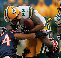
Okay, it’s official: Something needs to be done about the new NFL jerseys that some teams and players are wearing, because it’s getting seriously ridiculous out there. Case in point: Packers tight end Jermichael Finley, who looked like he was wearing a cheap replica jersey yesterday. His front uni number and NFL shield were too low, his TV numbers were comically small, his NOB looked nothing like those of his teammates (thanks to Paul Mazzarella for that screen shot), his sleeve stripes were warped — it was a freakin’ horror show.
It’s bad enough that the entire Giants and Jags teams are wearing these jerseys. But it’s arguably worse when they’re worn by just a handful of players on a given team, because it really sticks out. Have you seen Joseph Addai lately?
These jerseys look like shit. But they also hint at a bigger issue, which is this: Football uniforms are headed toward some sort of reckoning or shakeout, because they don’t really work anymore. Consider: For the better part of a century the football uni has consisted of a shirt, a pair of knickers, and a pair of socks. But the shirt isn’t really a shirt anymore (it doesn’t have sleeves, and the current tailoring patterns and seam arrangements are unlike any conventional shirts, which is why so many of the classic stripe patterns and graphics don’t work anymore), the knickers are no longer knickers (most players now wear biker shorts), and the socks are no longer socks (most players wear tights). Some of this is fashion, but most of it is actually based on the players’ needs on the field. If you believe in form following function — which I do — then something’s gotta give.
That’s what the new jerseys are trying to do — they’re an attempt to come up with a new paradigm for the shirt. But I think something more radical is probably called for, like a unitard, with a whole new set of graphics. Would it look horrible? Probably. But it would also be more functional that the current format, which increasingly feels like an outdated attempt to shoehorn today’s athletes and technology into yesterday’s design concept.
A few other notes from the weekend:
• Doug Keklak and Jarden Camden both took note of Montana RB Thomas Brooks-Fletcher’s very unusual NOB format. As more and more married couples opt for hyphenated surnames, we may see more of this in the years to come.
• Okay, so we all know that Army and Navy players wore military patches on their jerseys on Saturday. But why did one of the Navy players have a Seahawks patch? Is there a Naval unit that uses that logo? (Screen shot taken by Jason Greenstein.)
• Looks like Ryan Grant had a bar of soap taped to his elbow yesterday. In all seriousness, I’ve seen guys wear elbow pads and I’ve seen guys wear tape, but I don’t think I’ve ever seen anyone wear a taped-on elbow pad.
• Eric Stangel notes that Chargers WR Vincent Jackson began the game wearing the team’s 50th-anniversary paty, but the patch was missing later in the game. What happened? In the 4th quarter he tore his jersey and had to put on a new one, which didn’t have the patch.
• Have I mentioned that today’s NFL jerseys seem a bit too stretchy?
• I miss the Rams’ gold pants — so much better than their white-on-white look.
Wait, did I just argue in favor of an NFL unitard a few paragraphs ago?
The Jeremy Files: I receive at least one Ticker submission from Jeremy Brahm almost every day. But he really outdid himself over the weekend, when he sent me six separate e-mails with loads of interesting tidbits. Instead of putting them in today’s Ticker, I’ve gathered them all here:
• As you can imagine, I really like the Brazilian basketball uniforms from the 1980 Olympics.
• Here’s the new ball for the Italian Volleyball League.
• Speaking of volleyball, Jeremy has come across a guy named Gunter Pilz, who runs a site devoted to volleyball-related stamps and postal cancellations (you can see some of the site’s greatest hits, so to speak, in this excellent PDF). Man, that’s so specific, it makes Uni Watch seem like CNN! Turns out it’s a subset of the larger sports philately community.
• This is the 1920 French Olympic field hockey team. Love that little rooster patch!
• Here’s the French hockey team from the 1924 Olympics. Man, do those guys look skinny or what? No padding at all.
• While looking for Lake Placid luge photos, Jeremy came across a site specializing in bobsled photos from Saranac Lake. Among the many highlights: helmets that look like modified football helmets (plus I dig that sleeve patch); the New York State Conservation Dept. team; some awesome sweaters (here’s another view); and some interesting jackets (the embroidery is nice, but I’m actually more interested in the odd tailoring along the lower portion of the jacket).
And there you have it — a weekend in the life of my in-box, Jeremy-style.
Membership Update: Several excellent new designs have been added to the membership card gallery, including Roarke Boes’s Cleveland Barons TV number treatment, shown at right (an awesome request, no?). As always, you can get in on the membership scene by signing up here.
By the way: All Naming Wrongs tees are now eligible for a 10% discount. Just enter “UNIWATCH” in the appropriate field at checkout.
And now a quick word from Phil: Anyone who’d like to participate in the Uni Watch NCAA Bowl Game Pool, please go to Pooltracker.com and “Join Pool” at the top of the page. Then select “UW Bowl Game Tracker.” The password is “UniWatch.” Make all your picks by Thursday — that’s when the picks are locked in. First up is the New Mexico Bowl. Huge thanks go to Andrew Zimmerman for setting this up. Good luck!
Uni Watch News Ticker: If you’re gonna take a spill, you may as well be wearing great stripes while doing so (with thanks to Evan Meister). ”¦ Wish I’d known about this when I was writing my holiday gift guide column: soap shaped like a hockey puck! (Great find by Tris Wykes.) ”¦ The University of Oregon was founded by Phil Knight, right? Wrong! Michael Nachreiner found that Adidas/Oregon jacket at a thrift store in Minneapolis. ”¦ What’s even better than a hat trick? A teddy bear goal. Explanation here (with thanks to Larry Brunt). ”¦ Good catch by Kurtiss Dilley, who was watching an old Pats game and spotted Michael Timpson wearing Flying Elvis facing the wrong way. ”¦ Doug Keklak notes that Pascal Dupuis’s lace-up collar was laceless on Saturday night. Ditto for Evgini Malkin. ”¦ The poor Nationals can’t do anything right. They introduced Pudge Rodriguez to the media the other day, but they gave him an old jersey with the wrong sleeve patch. The patch is this one (great catch by Eric Arnold). ”¦ Uni typo for Will Creekmore of Missouri State on Saturday. Also interesting to see that they have a player wearing double-zero (big thanks to Zach Brady). ”¦ At first glance, this is just a shot of a young Ted Williams. But there’s more to it than that, as Bruce Menard explains: “The Red Sox only wore that road jersey in 1936 and ’37, and Ted didn’t appear with the Red Sox until 1939. I’d guess the photo is from either spring training 1937 or 1938.” ”¦ Cool logo find by Michael Kramer, who notes that Twinspires.com — an off-track betting operation — has transformed the shape of Illinois into a horse’s head. “Really ingenious, and instantly one of my favorite logos,” he says. ”¦ Tremendous footage of the 1950 British F.A. Cup final between Arsenal and Liverpool — both wearing awesome striped socks — here (big thanks to Coachie Ballgames). ”¦ Loyola-Chicago wore mid-1980s throwbacks on Saturday. “These uniforms were worn to honor Loyola’s 1984-85 NCAA Sweet 16 team,” says Bob Stokas. ”¦ Uni-centric movie review from Aaron Rich, who writes: “I just saw Invictus, which is about the 1995 Rugby World Cup. I didn’t love the film (Clint Eastwood doesn’t know how to direct a good rugby match on film), but one thing I did love was that both teams wore colored jerseys in the final match (New Zealand wore black, of course, and South Africa wore green). I wonder if anyone watched this rugby match on a b&w television and couldn’t tell one team from another — even in color it’s hard to keep track. What’s better is that neither team had any manufacturers’ logos on their shorts or jerseys — totally clean and beautiful. Also, both teams had gigantic numbers on their backs and big ones on their shorts, a totally great look. This is the guy Matt Damon plays, Francois Pienaar, getting the trohpy from Nelson Mandela.” ”¦ Maks Skuz spotted this woman on a train in Portland the other day. “I love football and it’s really sad i don’t remember the NFL being on TNT! [Frankly, neither do I. — PL] I asked her where she got it, and she said her sister-in-law worked for Nike and gave her the jacket.” ”¦ Patrick Walsh was watching a recap of the 2006 NLCS and spotted a fan at Shea wearing a Mets hockey jersey. ”¦ Love the American Legion sleeve patch on this old baseball uni. ”¦ Yikes! That’s Stonewall Jackson High School in Manassas, Virginia (with thanks to BJ Lanier). ”¦ Andrew Ladd applied white tape to his shins in just the right spots to create a serious barber pole effect yesterday (as spotted by Russ Chibe).
I’m just thankful that Ladd’s tape makes up for the fact that he’s still wearing his socks too low.
TNT shared the Sunday night cable games with ESPN for the first few years they were done in the late 80s. Eventually, ESPN bought the entire Sunday package. TNT did the first half of the season with one Thursday game to avoid going on Sunday against the World Series. They did an at-the-stadium pregame show, somewhat like what NBC does now with Bob Costas.
I don’t know where else this could go:
link
I wonder if anyone watched this rugby match on a b&w television and couldn’t tell one team from another – even in color it’s hard to keep track.
The shorts. New Zealand wore black ones (of course), South Africa white.
Maybe the NFL should ban the new kit much like tear away jerseys were. I’d mention tail wagging the dog, but we knew all about that already.
Ray beat me to the TNT point.
Sorry, but the Pooltracker link is wonky.
“… – This is the 1920 French Olympic field hockey team. Love that little rooster patch!
– Here’s the French hockey team from the 1924 Olympics. Man, do those guys look skinny or what? No padding at all…”
***
It’s getting a little old, this saluting of the genius that is Brahm, but God knows the man delivers. I mean, that Italian volleyball?!
The rooster that Paul likes so much — le coq gaulois — still appears on some contemporary French national unis, eg, the World Cup soccer team, but never so prominently nor so beautifully as it did in the 1920s, when the French figured they had triumphed once and for all over the hated Germans and couldn’t get enough of the crowing coq. In 1918, in the middle of Paris, the government had made a huge pile of captured German helmets, rifles, machine guns, etc and at the top of the pile stood, of course, a golden rooster in full cry.
The hockey uniform, on the other hand, features a chamois, the Alpine mountain-goaty animal with skin so soft you used it to dry the tender surface of your automobile. Use the shammy, goddammit, my father would scream…
All this time I thought the NFL had a policy on the correct way to wear a uniform. Then why can certain members of a team wear a different style jersey than the others? How can o-linemen get away with all the “sleves” cut-off? Why does the NFL allow players to even wear some of the crap that Nike and RBK make?
But let some schmoe wear his socks too low, or a towel in the wrong spot then here comes the letter fining the guy.
Wow, that Barons’ TV number card is sweet. I had no idea those unis got that treatment. Well done!
That Illinois betting parlor’s logo is terrific. link Ya gotta hand it to graphic artists with that kind of creativity and cleverness.
[quote comment=”366681″]I don’t know where else this could go:
link
Must be a Philly thing. He’s starting to dress like a Cosby Kid.
link
Wiki says…
“In 1990, it obtained partial rights to the National Football League, which it retained until 1997. The package consisted of three or four preseason games annually and of regular-season telecasts of the first half of each season.”
So it must be true.
[quote comment=”366684″]Sorry, but the Pooltracker link is wonky.[/quote]
Thanks. Now fixed.
“It” being “TNT”, of course.
I haven’t seen this mentioned, but Michael Vick’s Eagle patch on his jersey is much smaller than the rest of the teams.
link
Sponsors aren’t allowed on jersey’s during the Rugby World Cup. They have the RWC logo, though.
Paul: Ryan Grant has knee pads taped to his elbow. As a former equipment manager, I have actually had to help a trainer do this for a player who needed an elbow pad, but there wasn’t one available. With the growing trend in the NFL where knee pads are not being worn by some of the “faster” guys, at least they are still being used…
The Seahawk patch on the Navy players uniform is likely for a helicopter squadron or flight detachment that that fly the SH-60 Seahawk. Most of these patches are locally designed and purchased.
The Nats have NEVER worn that patch on their home uniforms. Weird.
That patch was only worn for 1 season, 2005, and only on the road uniform.
The home uniform patch in ’05:
link
The home uniform patch from ’06-’08:
link
The home uniform patch for ’09:
link
The road uniform had this patch in 2005, which is what’s on Pudge’s jersey:
link
From ’06-’08, the road uniform patch was the same as the home uniform patch:
link
And the ’08 road uniform patch is the same as the ’09 home uniform patch:
link
I don’t know who or where to contact someone about this, so maybe one of you head honchos here can help out with this:
In the Bears/Packers game, Adewale Ogunleye didn’t follow the team standard with his helmet. Every other player with a Riddell helmet wears those bumper stickers that cover the issue red lettering, and the sticker lettering is orange outlined in what appears to be navy.
Wale’s bumper was like that of the Giants’ – raised lettering, and it also appeared to be navy outlined in orange. Does anyone know if the equipment staff was tinkering with new lettering or something?
I just got that NFL on TNT music out of my head like last week.
And now it’s back.
Thanks.
Just saw the weekend post and it’s an honor to be in the top 5 for Uni Design for the contest!
Coach Walls – If it will help my chances I can make you up an actual game jersey and send it to you! ;)
-Joe
I learn new things here every day. Who knew that the British Empire had mastered moving picture technology in 1050AD?
I meant the ’09 road uni patch is the same as the ’09 home uni patch.
Did anyone notice in last night’s NY/Philly game that Donovan McNabb has something above his helmet warning label?
[quote comment=”366703″]Did anyone notice in last night’s NY/Philly game that Donovan McNabb has something above his helmet warning label?[/quote]
heh…our new green dot
paul covered it in the fourth item here
just substitute “mcnabb” for “garcia” (for some reason the mcnabb shot isn’t coming up in a google search)
here’s the small version of mcnabb’s helmet sticker
[quote comment=”366686″]All this time I thought the NFL had a policy on the correct way to wear a uniform. Then why can certain members of a team wear a different style jersey than the others? How can o-linemen get away with all the “sleves” cut-off? Why does the NFL allow players to even wear some of the crap that Nike and RBK make?
But let some schmoe wear his socks too low, or a towel in the wrong spot then here comes the letter fining the guy.[/quote]
The NFL supposedly has an agent/designee on the sidelines of each NFL game, called the “uniform police” to monitor how players wear their uniforms and to issue fines to “violators”. In New Orleans, former USFL safety Gary Barbaro is usually that guy.
As I understand it, they really watch for players with untucked jerseys. Apparently those guidelines and “violations” do not extend to the ugliness of the (lack of., with tatoos and tramp stamps)sleeves or especially to players’ socks, as the Saints Black/White/sometimes leotard effect are in 20 different standards and styles for 53 players. From the knees down most of the Saints look like ragamuffin SH#T !!!, each in their own unique tyle. The White starts and the Black ends differently on almost every player.
The Saints got rid of their pretty bland Black socks with a single solid Gold stripe in 1995. They ballyhooed the “getting to basics” in their doing so, desriing to have a “less complicted” sock style (?).
It’s a friggin’ mess, right up there with the Athletic Gold collars on the Black jerseys, and he one-and-done Vegas Gold jerseys ten shades lighter than any of the other five shades of Vegas Gold worn on the Saints uniform.
The Saints have worn Old Gold or Vegas Gold for 44 years and still ave no desire to “get it right” by matching the colors. The Rams went back to Old Gold 10 years ago and were able to properly match the shades imediately.
Go figure. I guess my Saints are just more serious about the “real” aspects of football because they will not be made to waste time or energy being made to think about their uniforms …..
[quote comment=”366704″][quote comment=”366703″]Did anyone notice in last night’s NY/Philly game that Donovan McNabb has something above his helmet warning label?[/quote]
heh…our new green dot
paul covered it link
just substitute link (for some reason the mcnabb shot isn’t coming up in a google search)[/quote]
Thank you
Figured this open source print color project might be of interest to some of you all. I’ve heard Pantone thrown around a bit anyway.
link
Tremendous footage of the 1050 British F.A. Cup final
Paul, while it is the oldest team-sport trophy, it’s not that old. ;-)
Okay, it’s official: Something needs to be done about the new NFL jerseys that some teams and players are wearing, because it’s getting seriously ridiculous out there. Case in point: Packers tight end Jermichael Finley, who looked like he was wearing a cheap replica jersey yesterday. His front uni number and NFL shield were too low, his TV numbers were comically small, his NOB looked nothing like those of his teammates (thanks to Paul Mazzarella for that screen shot), his sleeve stripes were warped – it was a freakin’ horror show.
It’s bad enough that the entire Giants and Jags teams are wearing these jerseys. But it’s arguably worse when they’re worn by just a handful of players on a given team, because it really sticks out. Have you seen Joseph Addai lately?
ADD MICHAEL VICK and his “mini Eagle” sleeve logos to the bunch.
I would hate to see that Italian volleyball on a spinning jump serve. Might get sick form the spinning colors.
[quote comment=”366709″]Tremendous footage of the 1050 British F.A. Cup final
Paul, while it is the oldest team-sport trophy, it’s not that old. ;-)[/quote]
Thanks. Now fixed.
“As more and more married couples opt for hyphenated surnames, we may see more of this in the years to come.”
Perhaps, but what was a hip trend in the 1980s and 1990s seems to be coming to an end, with people now returning to the more conventional use of just one last name.
I wonder if fans would like wearing football jerseys without sleeves?
Peyton, Eli, and Cooper Manning were on The Simpsons last night wearing a Colts jersey, a Giants jersey, and a Isadore Newman High School jersey, respectively:
link
Cooper played WR at Newman. Looks like they got all the stripes right, including the Newman H.S. ones:
link
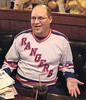
I think it’s funny that you post all these observations about ridiculous looking NFL jerseys, and then show a picture of a contributor who appears to be wearing a painted-on NHL jersey.
Regarding the Navy player with the Seahawks patch, that appears to be associated with link. They fly the E-2C. You can see the Seahawk in their website banner.
[quote comment=”366681″]I don’t know where else this could go:
link
That’s a mighty fine hat there.
According to THE REPOSITORY OF ALL HUMAN KNOWLEDGE, TNT had the first nine weeks of SNF from 1990-1997.
I can’t help but think that ‘twinspires.com’ should be a Minnesota fan site.
[quote comment=”366719″][quote comment=”366681″]I don’t know where else this could go:
link
That’s a mighty fine hat there.
According to THE REPOSITORY OF ALL HUMAN KNOWLEDGE, TNT had the first nine weeks of SNF from 1990-1997.
I can’t help but think that ‘twinspires.com’ should be a Minnesota fan site.[/quote]
Sorry, here’s the Wikipedia link:
link
[quote comment=”366712″][quote comment=”366709″]Tremendous footage of the 1050 British F.A. Cup final
Paul, while it is the oldest team-sport trophy, it’s not that old. ;-)[/quote]
Thanks. Now fixed.[/quote]
Also, it is the English FA Cup final & not British.
[quote comment=”366717″]I think it’s funny that you post all these observations about ridiculous looking NFL jerseys, and then show a picture of a contributor who appears to be wearing a painted-on NHL jersey.[/quote]
And your point is..? Exactly how does what a fan chooses to wear have any bearing on anything, compared to what NFL players wear? Please be specific. Thanks.
[quote comment=”366718″]Regarding the Navy player with the Seahawks patch, that appears to be associated with link. They fly the E-2C. You can see the Seahawk in their website banner.[/quote]
Shouldn’t they be flying V-22s or SH-60s?
link
[quote comment=”366722″][quote comment=”366717″]I think it’s funny that you post all these observations about ridiculous looking NFL jerseys, and then show a picture of a contributor who appears to be wearing a painted-on NHL jersey.[/quote]
And your point is..? Exactly how does what a fan chooses to wear have any bearing on anything, compared to what NFL players wear? Please be specific. Thanks.[/quote]
I don’t know if that was snark. It may have just been an observation. His jersey is pretty tight in that shot. Of course, fan jerseys often are, since you usually get a size smaller to compensate for a lack of pads.
[quote comment=”366724″][quote comment=”366722″][quote comment=”366717″]I think it’s funny that you post all these observations about ridiculous looking NFL jerseys, and then show a picture of a contributor who appears to be wearing a painted-on NHL jersey.[/quote]
And your point is..? Exactly how does what a fan chooses to wear have any bearing on anything, compared to what NFL players wear? Please be specific. Thanks.[/quote]
I don’t know if that was snark. It may have just been an observation. His jersey is pretty tight in that shot. Of course, fan jerseys often are, since you usually get a size smaller to compensate for a lack of pads.[/quote]
And sometimes maybe you find a great deal on an interesting jersey that might be a tad small…so you either wear something not quite big enough, or you pass on it. Collectors rarely have a rack of varying sizes to choose from.
—Ricko
Sponsors aren’t allowed on jersey’s during the Rugby World Cup.
They do allow manufacturers’ logos now.
link“>
Not sure if they actually made the shirt or not, but it was showing Nebraska vs. USC in the Holiday Bowl (the match-up prior to the USC loss). Interesting. If they actually made it, seems a little premature, right?
link
link
[quote comment=”366722″]And your point is..? Exactly how does what a fan chooses to wear have any bearing on anything, compared to what NFL players wear? Please be specific. Thanks.[/quote]
It is hypocritical to wear a jersey that is clearly many sizes too small, when you focus on every minute detail of a player’s jersey.
re: NFL Aberrations over the weekend.
Yeah, I swear, this happens late in the season every year.
High socks, low socks, new color shoes, weird pads, super high biker shorts, mismatched tights and socks.
This year, though, the “entirely new and different jerseys” phenomenon makes makes it even more apparent.
I truly think it’s that the NFL Uni Cops get less picky in cold weather, and the players know it. Maybe it’s that as late season playoff pressure mounts players don’t care about the uni regs; they just want to do what they like. And, knowing of the that pressure, the Uni Cops lighten up.
Whatever the reason, the result is what I always think of it (in my mind, anyway) as “Going Tobogganing Season” in the NFL. Happens every December. Like clockwork.
—Ricko
Paul Lukas said:
I miss the Rams’ gold pants – so much better than their white-on-white look.
Hell, I miss the link
[quote comment=”366717″]I think it’s funny that you post all these observations about ridiculous looking NFL jerseys, and then show a picture of a contributor who appears to be wearing a painted-on NHL jersey.[/quote]
perhaps if you knew the story behind why jeremy wore that “painted on” jersey, you might not have asked that question
jeremy “wore the Rangers jersey as a welcoming gesture to his NYC guest” (paul) …
pretty damn nice gesture…
oh…
and there’s no need for anyone else to join the NCAA Pool contest
since i just made my picks and will be taking the championship ;)
[quote comment=”366729″][quote comment=”366722″]And your point is..? Exactly how does what a fan chooses to wear have any bearing on anything, compared to what NFL players wear? Please be specific. Thanks.[/quote]
It is hypocritical to wear a jersey that is clearly many sizes too small, when you focus on every minute detail of a player’s jersey.[/quote]
By that reckoning, jerseys should only be sold in the exact size the player wears. Or at least UW readers should BUY only that precise size.
And any women UniWatch readers who wear the overly huge authentic jersey of their favorite NFL team as a nightshirt are hypocrites?
–Ricko
The current state of NFL uniforms is a travestry, it’s true.
They ought to just change over to those speed skater one-piece outfits and get it over with.
travesty
[quote comment=”366685″]”… – This is the 1920 French Olympic field hockey team. Love that little rooster patch!
– Here’s the French hockey team from the 1924 Olympics. Man, do those guys look skinny or what? No padding at all…”
***
It’s getting a little old, this saluting of the genius that is Brahm, but God knows the man delivers. I mean, that Italian volleyball?!
The rooster that Paul likes so much — le coq gaulois — still appears on some contemporary French national unis, eg, the World Cup soccer team, but never so prominently nor so beautifully as it did in the 1920s, when the French figured they had triumphed once and for all over the hated Germans and couldn’t get enough of the crowing coq. In 1918, in the middle of Paris, the government had made a huge pile of captured German helmets, rifles, machine guns, etc and at the top of the pile stood, of course, a golden rooster in full cry.
The hockey uniform, on the other hand, features a chamois, the Alpine mountain-goaty animal with skin so soft you used it to dry the tender surface of your automobile. Use the shammy, goddammit, my father would scream…[/quote]
Connie, nowadays, the best place to see that coq gaulois might be on tennis shirts or football kits made by le coq sportif.
[quote comment=”366734″]By that reckoning, jerseys should only be sold in the exact size the player wears. Or at least UW readers should BUY only that precise size.[/quote]
Nonsensical. It looks like the Rangers jersey is blank, anyway.
“What’s even better than a hat trick? A teddy bear goal. Explanation here (with thanks to Larry Brunt)”
not only Spokane did that, the Portland Winterhawks did too: link
[quote comment=”366729″][quote comment=”366722″]And your point is..? Exactly how does what a fan chooses to wear have any bearing on anything, compared to what NFL players wear? Please be specific. Thanks.[/quote]
It is hypocritical to wear a jersey that is clearly many sizes too small, when you focus on every minute detail of a player’s jersey.[/quote]
First of all, I almost never wear jerseys. Secondly, I think Jeremy’s jersey looks fine (I’m old enough to remember when hockey jerseys weren’t billowy and oversized). Thidly, please explain exactly how running this photo was “hypocritical.” Please be specific.
I have the Yankees version of the hockey jersey. They seem to have been available for only 1 season – like 5-6 years ago. I get stopped all the time when I wear it asking where I got it. I’ve also seen the Boston one being worn.
[quote comment=”366738″][quote comment=”366734″]By that reckoning, jerseys should only be sold in the exact size the player wears. Or at least UW readers should BUY only that precise size.[/quote]
Nonsensical. It looks like the Rangers jersey is blank, anyway.[/quote]
Well, you’re the who claimed something was “hypocritical”. Just trying to get a handle on it. You meant we should only buy jerseys that fit, or only jerseys in player’s actual size?
And, seriously, if it’s the former, then a woman buying a huge jersey for sleep wear would be guilty of the same hypocrisy, wouldn’t she?
I mean, if too small is wrong, then too big must be, too.
—Ricko
[quote comment=”366706″][quote comment=”366686″]All this time I thought the NFL had a policy on the correct way to wear a uniform. Then why can certain members of a team wear a different style jersey than the others? How can o-linemen get away with all the “sleves” cut-off? Why does the NFL allow players to even wear some of the crap that Nike and RBK make?
But let some schmoe wear his socks too low, or a towel in the wrong spot then here comes the letter fining the guy.[/quote]
The NFL supposedly has an agent/designee on the sidelines of each NFL game, called the “uniform police” to monitor how players wear their uniforms and to issue fines to “violators”. In New Orleans, former USFL safety Gary Barbaro is usually that guy.
As I understand it, they really watch for players with untucked jerseys. Apparently those guidelines and “violations” do not extend to the ugliness of the (lack of., with tatoos and tramp stamps)sleeves or especially to players’ socks, as the Saints Black/White/sometimes leotard effect are in 20 different standards and styles for 53 players. From the knees down most of the Saints look like ragamuffin SH#T !!!, each in their own unique tyle. The White starts and the Black ends differently on almost every player.
The Saints got rid of their pretty bland Black socks with a single solid Gold stripe in 1995. They ballyhooed the “getting to basics” in their doing so, desriing to have a “less complicted” sock style (?).
It’s a friggin’ mess, right up there with the Athletic Gold collars on the Black jerseys, and he one-and-done Vegas Gold jerseys ten shades lighter than any of the other five shades of Vegas Gold worn on the Saints uniform.
The Saints have worn Old Gold or Vegas Gold for 44 years and still ave no desire to “get it right” by matching the colors. The Rams went back to Old Gold 10 years ago and were able to properly match the shades imediately.
Go figure. I guess my Saints are just more serious about the “real” aspects of football because they will not be made to waste time or energy being made to think about their uniforms …..[/quote]
hey there… i can understand all Saints fans are a bit giddy these days. But you gotta know your history, Gary Barbaro may have the USFL in his resume, but the guy had a All Pro career w/ the KC Chiefs.
As much as I love the Saints and their 13-0 start, remember that Tom Benson still owns them. That could be a good explanation for the lack of attention to detail with uniforms, marketing, etc.
[quote comment=”366729″][quote comment=”366722″]And your point is..? Exactly how does what a fan chooses to wear have any bearing on anything, compared to what NFL players wear? Please be specific. Thanks.[/quote]
It is hypocritical to wear a jersey that is clearly many sizes too small, when you focus on every minute detail of a player’s jersey.[/quote]
It’s not hyposcrisy, because the complaint is that the players don’t look uniform on the field. Fans aren’t constrained by dress standards, so they can dress according to personal style. If that style includes an absurdly tight jersey (which this really isn’t), that’s his business. He doesn’t play for the Rangers, so he can modify the uniform in any way he sees fit.
Have you ever worn a team jersey without pads or without full uniform regalia? If you saw someone at a baseball game wearing knickers and spikes, would that seem normal? Because that would be the only way not to be hypocritical under your logic.
[quote comment=”366717″]I think it’s funny that you post all these observations about ridiculous looking NFL jerseys, and then show a picture of a contributor who appears to be wearing a painted-on NHL jersey.[/quote]
It would be ridiculous were he an active NHL player, perhaps, but the site is generally about what the athletes wear, not what the spectators wear. Some DIY projects and collections get away from that a bit, but the main focus is still on what is, was or could be worn on field or on ice.
OMG, look at all these ill-fitting jerseys!!!
Such blatant uni hypocrisy.
I certainly hope nobody like this ever attempts to take an interest in UniWatch. We would definitely have to shun them.
link
[quote comment=”366747″]OMG, look at all these ill-fitting jerseys!!!
Such blatant uni hypocrisy.
I certainly hope nobody like this ever attempts to take an interest in UniWatch. We would definitely have to shun them.
link
might be a lil NSFW
ok…this is an example of an acceptable use of eyeblack
I still have the replica Rangers jersey, it is not a painted on uniform. It is tight fitting. It was looser when I was younger of course, but it was given to me as a gift. It is a Maska Air Knit, size Large from like 1990.
[quote comment=”366747″]OMG, look at all these ill-fitting jerseys!!!
Such blatant uni hypocrisy.
I certainly hope nobody like this ever attempts to take an interest in UniWatch. We would definitely have to shun them.
link
Do they have one for the Browns?
[quote comment=”366718″]Regarding the Navy player with the Seahawks patch, that appears to be associated with link. They fly the E-2C. You can see the Seahawk in their website banner.[/quote]
Nice find, helped me find this:
link
I turned the Giants-Eagles game off last night because the Giants uniforms looked like such crap. Totally disgusting, and a shame as well.
The Calgary Hitmen had their annual Teddy Bear game yesterday as well – 16,751 fans threw a total of 14,655 bears on the ice.
Making uniform news, the Hitmen wore their “Christmas” uniforms, with red in place of the usual and with (I LOVE THIS) red santa hats on the hitman on the crest and snow on top of the uniform numbers.
link
link
I would love the Irony of the Bucs have won only 1 game this year & it came wearing the creamcicles!
The unit in question at the Army/Navy game is the Marine Corps aviation squadron VMAQ-4, nicknamed the “Seahawks.” They use the team’s logo on the tail of their planes.
link
Nifty, eh?
It’s not even that the new Reebok material clashes with classic uniform designs. It’s also screwed up the Jaguars new jerseys, and those were unveiled this year. How could they not figure out a way to marry the new material and the new design?
The stripes are continuous (unveiling):
link
The stripes are effed up (2009 season):
link
Great column. The new NFL jerseys should not have been implemented this year because there obviously have been too many flaws with them.
another complaint about the new jerseys
with the shiny helmets, the blue isn’t even close to matching (more apparent on tv than in stills)…it’s particularly noticeable on those teams who use matte finish jerseys and pants
if the g-men continue to wear this jersey, then perhaps they should consider going to a matte finish on the helmets
skeebs? any chance of this happening next season?
UEFA 2012 tournament logo, co hosted by Poland and Ukraine.
link
Paul says that most of this new NFL ugliness is “based on the players’ needs on the field.” This implies that players have needs that they didn’t have, say, 20 years ago. I don’t know about that – aren’t the basic physical demands in football the same as the were? Also, doesn’t every advantage you give a player carry a corresponding disadvantage to his opponent? The high-tech unitard makes more sense in swimming, where you’re trying to break personal times in addition to racing against an opponent. I do strongly agree with the tenor of Paul’s argument, though… something has to give; the sport doesn’t need to be so painful to watch.
re: the Navy player with the Seahawk logo. VAW-126, a carrier early airborne warning squadron, is named the Seahawks.
How long has that Navy “Seahawk” unit been in existence?
I wonder if they’ve been called that long enough to have possibly used the old version of the Seahawks logo, and whether or not they did.
[quote comment=”366762″]re: the Navy player with the Seahawk logo. VAW-126, a carrier early airborne warning squadron, is named the Seahawks.[/quote]
Or VMAQ-4, also the Seahawks
link
heh…looks like THE jeff was unwittingly answered by the former dirt dart
/i love it when a plan comes together
[quote comment=”366763″]How long has that Navy “Seahawk” unit been in existence?
I wonder if they’ve been called that long enough to have possibly used the old version of the Seahawks logo, and whether or not they did.[/quote]
VMAQ-4, apparently an older patch
link
[quote comment=”366749″]I still have the replica Rangers jersey, it is not a painted on uniform. It is tight fitting. It was looser when I was younger of course, but it was given to me as a gift. It is a Maska Air Knit, size Large from like 1990.[/quote]
Now I have a name to go with those sexy curves on display in the picture. I wonder if Rob Ullman can make me a picture of you in the form-fitting rangers jersey, a red thong with jingle bells, and some pink socks with green and white stripes. Grrrrrrrrrrrrrrrrrrrrrrrrr…..
[quote comment=”366750″][quote comment=”366747″]OMG, look at all these ill-fitting jerseys!!!
Such blatant uni hypocrisy.
I certainly hope nobody like this ever attempts to take an interest in UniWatch. We would definitely have to shun them.
link
Do they have one for the Browns?[/quote]
Hey we should stick to our advertisers
link
The changing NFL uniform basically boils down to the ever-shrinking jersey, as has been discussed here before. And the term “jersey” might not even be appropriate anymore. Today’s football “jersey” is just a tight, outer shell that covers padding. To think of it as a shirt would be, at least IMO, incorrect. Given the stretchy, super-tight direction the NFL is heading, we might need to accept that there is simply no room for design on such a garment. Hell, getting numbers to look right on these things is a challenge.
[quote comment=”366763″]How long has that Navy “Seahawk” unit been in existence?
I wonder if they’ve been called that long enough to have possibly used the old version of the Seahawks logo, and whether or not they did.[/quote]
[quote comment=”366718″]Regarding the Navy player with the Seahawks patch, that appears to be associated with link. They fly the E-2C. You can see the Seahawk in their website banner.[/quote]
“VAW-126 was commissioned in Norfolk, VA April 1st, 1969.” If you look at their history page it doesn’t start calling them the Seahawks until 1979. “The SEAHAWKS joined USS JOHN F. KENNEDY (CV 67) and CVW-1 upon returning to the East coast in 1979. ” So possibly they used the old version.
[quote comment=”366769″]The changing NFL uniform basically boils down to the ever-shrinking jersey, as has been discussed here before. And the term “jersey” might not even be appropriate anymore. Today’s football “jersey” is just a tight, outer shell that covers padding. To think of it as a shirt would be, at least IMO, incorrect. Given the stretchy, super-tight direction the NFL is heading, we might need to accept that there is simply no room for design on such a garment. Hell, getting numbers to look right on these things is a challenge.[/quote]
Ideally you want the jersey to be super tight (as tight as possible without restricting breathing or movement) but also not stretchy at all. Basically you want no fabric for anyone to hang onto. This is why I don’t understand the RBK NFL jerseys. Not having tried one on in pads personally, my guess is that they feel tight without being restricting but give opponents more than a handful which kind of defeats the purpose of being tight in the first place unless it was all just about looks after all.
The s-t-r-e-t-c-h-y stuff still looks better than the mid-riff tearways of the ’70s.
That said, if uniform fabrics would be uniform, who’d have the advantage? Go back to the jersey fabrics of substance of the ’60s. It’d be a win-win: Sleeves would be sleeves again. (Even long uns.) Stripes would have meaning. Charger bolts would go up and down, stead of sideways. Shoulder loops could go – gasp – all the way around AND fans who buy jerseys would get a quality product.
The bicycle shorts should be banned. Besides the Look-At-Me factor, they look dopey.
If players want to go w/o thigh pads, etc. That’s there choice. But bring back the old jerseys.
[quote comment=”366720″][quote comment=”366719″][quote comment=”366681″]I don’t know where else this could go:
link
That’s a mighty fine hat there.
According to THE REPOSITORY OF ALL HUMAN KNOWLEDGE, TNT had the first nine weeks of SNF from 1990-1997.
I can’t help but think that ‘twinspires.com’ should be a Minnesota fan site.[/quote]
Sorry, here’s the Wikipedia link:
link
Another characteristic of the TNT SNF package was when they began in 1990, the NFL wanted every team in the league to have a prime-time appearance. Since ABC was not going to be saddled with a Falcons-Bengals tilt, TNT became the red-headed stepchild to the schedule maker (apologies to any RHSC out there today).
Just a reminder, football uniforms are constructed to support the game, and develop an advantage within the game. A better appearance would be nice, and welcome, but, the uniform supports the game, not the other way around.
The Giants looked like hell last night. Those name plates aren’t lettered well; the tracking is too close together. Even in HD, you can barely make out each individual letter…
You may know somebody has a similar uniform grievance, or you may be in a similar situation, and if your in a situation like that there’s only one thing you can do and that’s walk into the shrink wherever you are just walk in say “Shrink, You can get anything you want, at UniWatch.”
And walk out. You know, if person, just one person does it they may think he’s really sick and they won’t take him.
And if two people, two people do it, in harmony, they may think they’re both unstable and they won’t take either of them.
And three people do it, three, can you imagine, three people walking in singin a bar of UniWatcher blather and walking out. They may think it’s an organization.
And can you, can you imagine fifty people a day, I said 50 people a day walking in singin and walking out. And friends they may thinks it’s a movement.
What da ya think? (Apologies to Arlo Guthrie). Nah, Ditch the Black had no effect.
[quote comment=”366774″]Just a reminder, football uniforms are constructed to support the game, and develop an advantage within the game. A better appearance would be nice, and welcome, but, the uniform supports the game, not the other way around.[/quote]
Hypothetically.
Seeing how any advantage is quickly adapted by everyone, it doesn’t really work that way. They keep “improving” the uniforms, while never actually providing any advantage to anyone.
[quote comment=”366778″] They keep “improving” the uniforms, while never actually providing any advantage to anyone.[/quote]
Plus, why SHOULD an advantage be provided to anyone (any individual, that is).
[quote comment=”366778″]
Seeing how any advantage is quickly adapted by everyone, it doesn’t really work that way. They keep “improving” the uniforms, while never actually providing any advantage to anyone.[/quote]
if the uniform improvements were really that good (as the hype would lead us to believe), shouldn’t every team outfitted in nike’s superior riflery uniforms have soundly defeated their opponenents in their (obviously inferior) non-pro-combat duds?
seriously…much of this “improvement” bullshit is just that…hype
not saying that incremental improvements aren’t occurring but overall, they’re really just reinventing the wheel here
and selling more crap to willing sheep
[quote comment=”366774″]Just a reminder, football uniforms are constructed to support the game, and develop an advantage within the game. A better appearance would be nice, and welcome, but, the uniform supports the game, not the other way around.[/quote]
I think the gripe here is that in all that progress and development, manufacturers don’t seem to make more than a token effort to incorporate teams’ traditional looks.
Of course, in their minds, to keep, say, the Colts’ long-standing loops-look would be dumb.
“If it looks like the old equipment, how will people know it’s our new equipment?”
While I don’t like that very much, it’s hard to disagree…when viewed from their vantage point, that is.
—Ricko
Speaking of Michael Timpson: What do Saddam Hussein and former Boston Herald reporter Lisa Olson have in common?
They’ve both seen Patriot Missile at close range.
[quote comment=”366782″]Speaking of Michael Timpson: What do Saddam Hussein and former Boston Herald reporter Lisa Olson have in common?
They’ve both seen Patriot Missile at close range.[/quote]
link
link
link
flickr
VAW-126 link
VMAQ-4 link
[quote comment=”366715″]I wonder if fans would like wearing football jerseys without sleeves?[/quote]
Not this fan.
[quote comment=”366747″]OMG, look at all these ill-fitting jerseys!!!
Such blatant uni hypocrisy.
I certainly hope nobody like this ever attempts to take an interest in UniWatch. We would definitely have to shun them.
link
Rob Ullman does better work. Wouldn’t shun his subjects either….
Maybe I’m in the minority here, but I think there’s a fine line that the NFL is walking, and some atr doing it nicely and many are doing it terribly.
This whole thing of the super-stretchy material being painted on the players is ridiculous, and needs to change. I mean, it just looks stupid. However, I do not mind everything being tight. The NFL needs to mandate a uniform that conforms to the body instead of saran-wraps it. If there is a little bagginess, whatever, at least EVERYONE has to deal with it. The WORST team in this regard is the Giants. Watching their games is rough because the players just look like crap. And judging from their current 3rd place in the NFC East, its obvious their painted on unis are a gigantic advantage…..
Not only do the Giants look like a complete disaster, see how well the jersey material worked when Manning was grabbed from behind then coughed up the ball.
To me, the material needs to be LESS stretchy.
[quote comment=”366734″][quote comment=”366729″][quote comment=”366722″]And your point is..? Exactly how does what a fan chooses to wear have any bearing on anything, compared to what NFL players wear? Please be specific. Thanks.[/quote]
It is hypocritical to wear a jersey that is clearly many sizes too small, when you focus on every minute detail of a player’s jersey.[/quote]
By that reckoning, jerseys should only be sold in the exact size the player wears. Or at least UW readers should BUY only that precise size.
And any women UniWatch readers who wear the overly huge authentic jersey of their favorite NFL team as a nightshirt are hypocrites?
–Ricko[/quote]
I don’t agree that you have to have a jersey that fits exactly, but if that WERE true, it’s good to know I’m covered…
link
[quote comment=”366786″][quote comment=”366715″]I wonder if fans would like wearing football jerseys without sleeves?[/quote]
Not this fan.[/quote]
LOL…yeah, most of us would look like this guy…
link
Either that or Meat Loaf.
—Ricko
Would another possible solution be to incorporate the pads in the jerseys? If jerseys were affixed to the pads from within, they could be sufficiently tight to prevent grabbability and be proportioned to not look so dang goofy. It would be an engineering challenge (Joe Skiba and his peers would need bigger crews working for them), but it would maintain better aesthetics.
If players are already wearng tights, why not just make tights that abruptly change color at the knee to keep a good vestige of the knicker/sock look?
[quote comment=”366787″][quote comment=”366747″]OMG, look at all these ill-fitting jerseys!!!
Such blatant uni hypocrisy.
I certainly hope nobody like this ever attempts to take an interest in UniWatch. We would definitely have to shun them.
link
Rob Ullman does better work. Wouldn’t shun his subjects either….[/quote]
Well, I selected that link because those jerseys are so hypocritically too small. That was the subject as originally introduced.
Ullman’s work (with which hopefully we all are familiar) involves jerseys that are hyprocritically too large.
I just thought we should be a equal-opportunity hypocrite-appreciators ’round here, that’s all.
—Ricko
[quote comment=”366792″]Would another possible solution be to incorporate the pads in the jerseys? If jerseys were affixed to the pads from within, they could be sufficiently tight to prevent grabbability and be proportioned to not look so dang goofy. It would be an engineering challenge (Joe Skiba and his peers would need bigger crews working for them), but it would maintain better aesthetics.
If players are already wearng tights, why not just make tights that abruptly change color at the knee to keep a good vestige of the knicker/sock look?[/quote]
Or striped tights in team colors?
link
Hey Phil, you should check your email.
Now, if you don’t mind, I have to go to the post office and send off my Christmas presents before the freezing rain and the snow hit tonight.
Wish me luck.
For Teebz:
When the the Grand Rapids Griffins (AHL) change uniforms? Or did they just debut an alternate the other night? (Im referring to the shield like emblem & Red Wings Colors) I rarely get to see them considering I usually get either Albany or Hartford Games
I have that same Mets hockey jersey mentioned in the ticker.
[quote comment=”366796″]For Teebz:
When the the Grand Rapids Griffins (AHL) change uniforms? Or did they just debut an alternate the other night? (Im referring to the shield like emblem & Red Wings Colors) I rarely get to see them considering I usually get either Albany or Hartford Games[/quote]
I’m not sure, but I like! link
[quote comment=”366795″]Hey Phil, you should check your email.
Now, if you don’t mind, I have to go to the post office and send off my Christmas presents before the freezing rain and the snow hit tonight.
Wish me luck.[/quote]
got it…i’ll check it over later today
thanks !
Little snippet from Milwaukee Journal Sentinel regarding Jermichael Finley (and Brandon Chillar’s) uniform choices:
“Tight end Jermichael Finley and Chillar were both trying out a new uniform being tested around the league. While the numbers looked much smaller than on the regular jerseys, Finley said he “loved” wearing it.”
[quote comment=”366798″][quote comment=”366796″]For Teebz:
When the the Grand Rapids Griffins (AHL) change uniforms? Or did they just debut an alternate the other night? (Im referring to the shield like emblem & Red Wings Colors) I rarely get to see them considering I usually get either Albany or Hartford Games[/quote]
I’m not sure, but I like! link
I think it was this season, but don’t quote me on it. I know the changed colors when they became the Wings farm club.
Totally unrelated to today’s topics, but as an aspiring referee, I just realized that the jersey I’d really like to get my hands on would be an official NFL Official’s jersey, especially if it was numbered with an actual NFL officials number (or game-worn, swoon!)
I know they trademarked the striping pattern, so I think that would be a really unique shirt to own. Anyone know if these are available for sale anywhere like player jerseys?
[quote comment=”366792″]Would another possible solution be to incorporate the pads in the jerseys? If jerseys were affixed to the pads from within, they could be sufficiently tight to prevent grabbability and be proportioned to not look so dang goofy. It would be an engineering challenge (Joe Skiba and his peers would need bigger crews working for them), but it would maintain better aesthetics.
If players are already wearng tights, why not just make tights that abruptly change color at the knee to keep a good vestige of the knicker/sock look?[/quote]
Football pads are basically plate armor. Back before hard shell pads, football jerseys were basically sweaters with leather reinforcement and maybe some hardened leather pads underneath. With the advent of thermoplastics in the 1950s, they were able to make dual-density, hard shell pads that protect the players much better than hardened leather, but they can’t be sewn into the jerseys, because plate armor has to use clamshell articulation in order to move fluidly and still cover the joints. Sewing the pads in would restrict the movement of the clamshell joints too much, so you either give up mobility or protection.
Thanks for the kind words, all. Yeah, I’d be nowhere without overly huge jerseys.
As to that other gentleman’s work…I get what he’s going for, and while it’s accomplished enough from a technical standpoint, he really made a bad choice in giving them all dead porn-eyes. I hope my stuff doesn’t come across as so creepy.
Plus, he’s making and selling stickers of his work? Wow, and with all the fretting I do over copyright, etc…
[quote comment=”366796″]For Teebz:
When the the Grand Rapids Griffins (AHL) change uniforms? Or did they just debut an alternate the other night? (Im referring to the shield like emblem & Red Wings Colors) I rarely get to see them considering I usually get either Albany or Hartford Games[/quote]
They have been doing it for a few seasons now as far as I can recall. The logo on the chest changes, but the Griffins honour “Detroit hockey” by wearing the Red Wings-inspired alternates.
Here’s link in their Detroit alternates.
UNI WATCH BOWL POOL
128 signed up so far. Awesome.
Looks like Ryan Grant has some company in the “bar of soap on the arm category”…
This is Jonny Flynn while playing for Syracuse last year.
link
[quote comment=”366714″]”As more and more married couples opt for hyphenated surnames, we may see more of this in the years to come.”
Perhaps, but what was a hip trend in the 1980s and 1990s seems to be coming to an end, with people now returning to the more conventional use of just one last name.[/quote]
tell that to my wife Mrs. Sullivan-Powers1634
[quote comment=”366750″][quote comment=”366747″]OMG, look at all these ill-fitting jerseys!!!
Such blatant uni hypocrisy.
I certainly hope nobody like this ever attempts to take an interest in UniWatch. We would definitely have to shun them.
link
Do they have one for the Browns?[/quote]
I think this post has given many UWers the urge to DIY…………………………………..
a jersey.
get yiur minds out of the gutter. C’mon now!
[quote comment=”366804″]Thanks for the kind words, all. Yeah, I’d be nowhere without overly huge jerseys.
As to that other gentleman’s work…I get what he’s going for, and while it’s accomplished enough from a technical standpoint, he really made a bad choice in giving them all dead porn-eyes. I hope my stuff doesn’t come across as so creepy.
Plus, he’s making and selling stickers of his work? Wow, and with all the fretting I do over copyright, etc…[/quote]
I was searching for a word to describe the difference. I think you hit the nail on the head when describing the eyes. His women look a little vacuous, while your women have some life in their eyes.
link
Great Cleveland Barons picture
With respect to the biker short look, Rod Woodson was wearing his pants without knee or thigh pads since back in his days with Pittsburgh.
link
I understand it’s not the exact same as the biker short look of today, but I think it morphed from guys opting not to wear pads in the pants to the pants becoming less and less substantial.
I posted two sets of picks @ pooltracker. One (DenverGregg)was real picks, the other (with e-mail addy) was based on which team has the better looking uni.
[quote comment=”366812″]With respect to the biker short look, Rod Woodson was wearing his pants without knee or thigh pads since back in his days with Pittsburgh.
link
I understand it’s not the exact same as the biker short look of today, but I think it morphed from guys opting not to wear pads in the pants to the pants becoming less and less substantial.[/quote]
Agreed. Once the players start valuing speed over protection, that’s when they’d just as soon wear shorts (or probably boxer briefs) instead of knickers. That’s what I meant when I said this had as much to do with the players’ needs as with fashion. The players don’t want the pads — they want to be unemcumbered.
Paul,
The scoop on the Naval Cadet’s Seahawks patch refers to VAW-126. They’re an E2-C squadron (the one with the big disk on top and the propellers on the front). I got to see their logo every day when I was in the Navy as a member of their neighboring squadron, VAW-121. They’re a great group of men and women, but boy were they unhappy when my favorite team beat their namesakes in Super Bowl XL!! LOL Go Navy!
Respectfully (and Merry Christmas),
Eli
dead porn-eyes?
[quote comment=”366816″]dead porn-eyes?[/quote]
Some of ’em have just kind of a blank stare, slightly open mouth…they look a little too “Gallery Magazine” to my eyes.
[quote comment=”366814″][quote comment=”366812″]With respect to the biker short look, Rod Woodson was wearing his pants without knee or thigh pads since back in his days with Pittsburgh.
link
I understand it’s not the exact same as the biker short look of today, but I think it morphed from guys opting not to wear pads in the pants to the pants becoming less and less substantial.[/quote]
Agreed. Once the players start valuing speed over protection, that’s when they’d just as soon wear shorts (or probably boxer briefs) instead of knickers. That’s what I meant when I said this had as much to do with the players’ needs as with fashion. The players don’t want the pads — they want to be unemcumbered.[/quote]
Further than that. Check out Fred Biletnikoff. No girdle pads, no thigh pads, pant slit and rolled above the knee.
link
—Ricko
So THAT’s what Fred Biletnikoff looks like. Every other time someone showed me a picture of him all I saw was 2 shoes and the top of a helmet poking out from behind a giant glob of stickum.
/(I don’t suppose Mr. Ullman would like to try his hand at drawing that…)
[quote comment=”366818″][quote comment=”366814″][quote comment=”366812″]With respect to the biker short look, Rod Woodson was wearing his pants without knee or thigh pads since back in his days with Pittsburgh.
link
I understand it’s not the exact same as the biker short look of today, but I think it morphed from guys opting not to wear pads in the pants to the pants becoming less and less substantial.[/quote]
Agreed. Once the players start valuing speed over protection, that’s when they’d just as soon wear shorts (or probably boxer briefs) instead of knickers. That’s what I meant when I said this had as much to do with the players’ needs as with fashion. The players don’t want the pads — they want to be unemcumbered.[/quote]
Further than that. Check out Fred Biletnikoff. No girdle pads, no thigh pads, pant slit and rolled above the knee.
link
—Ricko[/quote]
Boy, even by today’s standards Fred looks ridiculous.
[quote comment=”366811″]http://farm3.static.flickr.com/2675/4151500768_2ca86b6f60_o.jpg
Great Cleveland Barons picture[/quote]
Great shot. I was going to look up some pictures of the Barons, but you saved me the trouble.
I think that might be my favorite Cleveland sports uni of all time.
[quote comment=”366818″]
Further than that. Check out Fred Biletnikoff. No girdle pads, no thigh pads, pant slit and rolled above the knee.
link
he is, however, wearing a cup
Interesting look at the texture on Larry Fitzgerald’s gloves:
link
Go Cards.
[quote comment=”366820″][quote comment=”366818″][quote comment=”366814″][quote comment=”366812″]With respect to the biker short look, Rod Woodson was wearing his pants without knee or thigh pads since back in his days with Pittsburgh.
link
I understand it’s not the exact same as the biker short look of today, but I think it morphed from guys opting not to wear pads in the pants to the pants becoming less and less substantial.[/quote]
Agreed. Once the players start valuing speed over protection, that’s when they’d just as soon wear shorts (or probably boxer briefs) instead of knickers. That’s what I meant when I said this had as much to do with the players’ needs as with fashion. The players don’t want the pads — they want to be unemcumbered.[/quote]
Further than that. Check out Fred Biletnikoff. No girdle pads, no thigh pads, pant slit and rolled above the knee.
link
—Ricko[/quote]
Boy, even by today’s standards Fred looks ridiculous.[/quote]
Was a much more free-form era. No league or team shoes deals or sock-height regs, white tape on black shoes was okay, players on same team often wore different color shoes (no league rules for standardization of same; teams made their own rules about cleat color). Those Raiders team easily were the most loosey-goosey of the time, especially under Madden. He didn’t give a crap about such things.
For example, Biletnikoff wore black Riddells taped in white. The other WR, Cliff Branch, wore white puma with white knee highs. Ken Stabler wore black Spot Bilt or Wilson. And TE Raymond Chester, while with the Raiders, wore silver adidas once in a while.
Although Fred did get fined all the time for his pants and slit sleeves, etc. Had it in his contract that the team paid his uni-violation fines.
One coach at the time said, “Characters win more pro football games than character.” To this day, I’m not certain he wasn’t right.
—Ricko
Anyone check out Frank Gore on MNF? Ive never seen anyone wear such short pants in a game. It looks like he is actually wearing shorts. Wouldn’t someone on the 9ers think its not good to have knees just covered by socks?
In defense of Biletnikoff, Branch, Lester Hayes and other stickum-laden Raiders…it was completely legal at the time.
As far back as Lennie Moore, players often kept a bit on their socks for a ready supply (well, in Moore’s case, on his taped spats)…
link
—Ricko
[quote comment=”366821″][quote comment=”366811″]http://farm3.static.flickr.com/2675/4151500768_2ca86b6f60_o.jpg
Great Cleveland Barons picture[/quote]
Great shot. I was going to look up some pictures of the Barons, but you saved me the trouble.
I think that might be my favorite Cleveland sports uni of all time.[/quote]
You can dress the Dallas Stars as the Cleveland Barons in NHL09. They look sharp!
What? No mention of the TNT patch’s link?
[quote comment=”366825″]Anyone check out Frank Gore on MNF? Ive never seen anyone wear such short pants in a game. It looks like he is actually wearing shorts. Wouldn’t someone on the 9ers think its not good to have knees just covered by socks?[/quote]
Man, you ain’t kidding:
link
Dre Bly isn’t much better:
link
Does the whole secondary wear them like that?
link
[quote comment=”366829″][quote comment=”366825″]Anyone check out Frank Gore on MNF? Ive never seen anyone wear such short pants in a game. It looks like he is actually wearing shorts. Wouldn’t someone on the 9ers think its not good to have knees just covered by socks?[/quote]
Man, you ain’t kidding:
link
Dre Bly isn’t much better:
link
Does the whole secondary wear them like that?
link
Tonight’s biggest offender might be the Cardinals DB (Rashad Johnson, maybe?) who appears to be wearing black tights and no socks at all.
[quote comment=”366830″][quote comment=”366829″][quote comment=”366825″]Anyone check out Frank Gore on MNF? Ive never seen anyone wear such short pants in a game. It looks like he is actually wearing shorts. Wouldn’t someone on the 9ers think its not good to have knees just covered by socks?[/quote]
Man, you ain’t kidding:
link
Dre Bly isn’t much better:
link
Does the whole secondary wear them like that?
link
Tonight’s biggest offender might be the Cardinals DB (Rashad Johnson, maybe?) who appears to be wearing black tights and no socks at all.[/quote]
Bly wasn’t wearing any socks, either.
Those are just their red tights, same as they always wear, just not wearing the regular socks.
Or any white crews.
—Ricko
Watching tonight’s game and thinking about today’s topic. As much as I like that the niners have gone back to their classic look, the shoulder stripes just don’t work.
You can pick on the Packers or the Bears for trying to keep their classic look on the newfangled jerseys (or shrinkwraps or whatever they are) but the Niners get a special dishonourable mention for going back to this look and putting the stripes back on the sleevless jerseys without apparently considering how they were going to (not) work.
That said, the Niners still look a hundred times better than the Cardinals.
[quote comment=”366831″][quote comment=”366830″][quote comment=”366829″][quote comment=”366825″]Anyone check out Frank Gore on MNF? Ive never seen anyone wear such short pants in a game. It looks like he is actually wearing shorts. Wouldn’t someone on the 9ers think its not good to have knees just covered by socks?[/quote]
Man, you ain’t kidding:
link
Dre Bly isn’t much better:
link
Does the whole secondary wear them like that?
link
Tonight’s biggest offender might be the Cardinals DB (Rashad Johnson, maybe?) who appears to be wearing black tights and no socks at all.[/quote]
Bly wasn’t wearing any socks, either.
Those are just their red tights, same as they always wear, just not wearing the regular socks.
Or any white crews.
—Ricko[/quote]
At least Bly’s tights are the right color.
Bikers ride Harleys…Cyclist(s) is the term for those that ride a Trek, De Rosa or a Colnago etc. so biker shorts is not an accurate description.
We designed new uni’s for our collegiate cycling club (SMU) and the trend is towards tighter cut fabrics that don’t ripple in the wind, both for aerodynamics and legibility of graphics. Different panels might be made of a highly breathable material, while the front panel has better graphics. Nike’s work with Lance and project One really pushed this to the forefront. In football they are obviously trying to push the envelope here also, and why not? Get over your obsession with stripes. They can be discarded since they are no longer a viable part of unis.