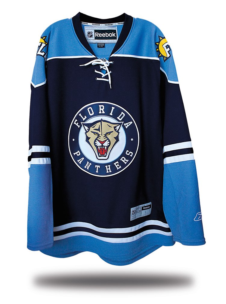
So here’s the new Panthers alternate. The base color looks black in that photo, but it’s actually navy. Hmmm, remind you of anyone else’s recent alternate design? Let’s see, one thing at a time:
• The new color scheme: Idiotic. You’ve got one of the more distinctive color combos in the league — a combo that does not include light blue — so why go with this mood-indigo treatment? And where’s the red? Where the gold? Nice way to chuck the franchise’s chromatic history out the window. So is it good or is it stupid? Stupid.
• The new chest logo: It’s actually just a modified version of the head on the primary logo, but with muted colors (why??) and — get this — no whiskers! C’mon, whoever heard of a cat without whiskers? More to the point, the team’s original logo, much like its original color scheme, was unique; any idiot can design a circular logo. Looks like what the team’s AHL affiliate should be wearing. Stupid.
• The new shoulder logo: You’re kidding, right? You’re all fearsome and snarling on the chest logo but then you’re all morning in America on the shoulders. Not a bad logo for the local tourism bureau, but it doesn’t work for this uniform. Stupid.
• The new typeface: All the numbering and lettering on this design is rendered in a font I’ve never seen before. You can get a good sense of it here — the serif on the 9 is really odd, no? Could work, though. Need to see more. Too soon to tell.
Overall, there’s a lot to like here — matching stripe patterns on the socks, sleeves, and hemline, old-school shoulder yoke, no Bettman stripes, no Ree-box. But it doesn’t feel like the Panthers. This is a new-school team in a new-school city (at least by NHL standards), and trying to fit them into a traditionalist box doesn’t work. Not a bad design, just the wrong one for this franchise.
As a diehard Panthers fan, I just hate these new jerseys. Getting away from their link is just not smart. Especially since they have added powder blue for no real reason; unless copying other teams is a reason. I’ve never liked baby blue on a uniform, and these are not a good choice for this team.
The chest logo is the best part of the jersey, but the colors are not. Bring back the reds please.
I can see a diehard like mtjaws not liking it, but it is a REALLY nice sweater! Maybe they could have added some red to it, but the powder blue and the navy looks really sharp.That is one of the nicest sweaters in the league already.
these uniforms are ugly!!! I hate all the muted colors!
Pretty gross. The colors make NO sense…though I guess I now know why they chose to debut them against the Pens, whose historic/alternate color scheme they pretty much pilfered wholesale. That crest just flat-out looks unfinished. Don’t mind the shoulder logo as much….that being said, it doesn’t really work on a hockey sweater.
Yeah.. I don’t like this.. The Panthers should not be wearing blue.. Then again, it looks like this might be a trend.. The Blues and Penguins have ones like this, so..
What a terrible change for the Panthers. They’ve completely given up on red it seems and now they’ve gone the way of the Tampa Bay Rays with the color scheme on this one. That would work if the Panthers played in Tampa, but they’re in Miami. I’m a sucker for circular logos but Paul’s right, anyone can do them and now everyone is. The shoulder logos are moronic and I am not a fan of the shortened city/state/location things teams do (like the Suns in the NBA with “PHX”). This jersey is frankly boring. I can understand why Florida didn’t really overhype folks about this one.
I don’t hate this jersey but I think they could have done better. It would have been interesting to see this jersey with yellow as the main color with red.
really?
colors are actually nice, but ya know, isn’t this NAPBFNAPBS?
seriously
Hmmmm Kinda reminds me of the Penguins baby blue throwbacks. This doesn’t really work for the Panthers but could the scheme could be good for a team like the Islanders.
It only makes sense if they intend to switch to these as the primaries, and adopt this as the color scheme. Then again, the Oilers had those Todd MacFarlane monstrosities for a couple of years and were able to dump them without too much lasting damage to the brand.
the jersey would look good…
as the Kansas City Panthers
i dont know whats worse. the panthers in baby blue or the pathetic empty stadium.
If the Blues’ third jersey and Penguins’ third jersey mated, it would produce this.
It worked for the Pens because they had previous experience with the usage of colors, but for the Panthers, this change came totally out of the blue (No pun intended). Very cruddy end to the release of thirds for this year.
I think this is a great looking jersey, but I agree that it doesn’t work for Florida. Aside from that, it just looks all too familiar as an NHL third jersey. Also agree that the lack of whiskers looks stupid.
[quote comment=”362818″]the jersey would look good…
as the Kansas City Panthers
i dont know whats worse. the panthers in baby blue or the pathetic empty stadium.[/quote]
No, the HAMILTON PANTHERS!
Had I never seen the Florida Panthers before, I’d probably like this.
Why can’t teams just accept and keep the identies that they have already created for themselves?
I was all on board with this until Paul and everyone nitpicked it apart. Now I’m blah.
I like the navy/powder combo in general. I didn’t like it when the Panthers went to navy jerseys from the red. Too many navy/blue with red teams in sports, the red with blue stood out (since most red teams pair with black, not blue).
A neat logo that played with one’s depth perception now looks like an advert for the Mercury Cougar. They forgot to put the smiley face and sunglases on the Fla thingie, also. I guess the prospect of skin damage due to UV is meant to menace one’s opponents.
I agree with Paul that the jerseys themselves are pretty decent looking overall, but they don’t feel like the Panthers. Watching the game, it’s hard to get into because they look too different; I don’t feel like I’m watching my team.
And the lack of whiskers thing is just too weird. Is it too late to add them?
The shoulder emblems look like they belong on a weather map (Sunny skies all day across the state, continuing into next week. Back to you Bob.)
Thye Panthers red scheme is a natural, just like the Blues blue uniforms suit their city and name. Would it make sense if the blues wore red uniforms?
Personally, I like them. I am judging these by, if a league was formed and all 20ish or 30ish teams wore these type of jerseys, what would I say? I would say, “all-in-all not too bad…”
I’ll take a classic looking regular not terrible weird piping and apron thingies with random other things affixed in the armpit with numerous vertical brown and lime green stripes and a really big off-centered displaced cartoonish logo.
Adam has a good point. Just make them red and you’ll have me convinced.
Do you think the shoulder emblem against the light blue is supposed to represent sunny skies?
Cool.
Although I’ve never heard of Panther Penguin.
Need to watch Animal Planet more often, I guess.
They probably have “Happy Claws”, huh?
—Ricko
here’s what they should have done
[quote comment=”362847″]link[/quote]
Plus whiskers.
[quote comment=”362841″]The shoulder emblems look like they belong on a weather map (Sunny skies all day across the state, continuing into next week. Back to you Bob.)
Thye Panthers red scheme is a natural, just like the Blues blue uniforms suit their city and name. Would it make sense if the blues wore red uniforms?[/quote]
The shoulder patch reminds me of the Bennett City Sonics’ logo. MS Word clip-artsy with clunky capital letters…no life. This is not a good thing.
[quote comment=”362809″]Pretty gross. The colors make NO sense…though I guess I now know why they chose to debut them against the Pens, whose historic/alternate color scheme they pretty much pilfered wholesale. That crest just flat-out looks unfinished. Don’t mind the shoulder logo as much….that being said, it doesn’t really work on a hockey sweater.[/quote]
You could not be more right on this Rob. Why copy the Pens, and then go ahead and debut against them?
Happy birthday by the way! You are a great talent, and I hope you had a wonderful day.
[quote comment=”362847″]link[/quote]
I’ll buy that for a dollar…
Paul,
The up to the minute good v. stupid reviews on the day the new unis come out is a great addition to the site. Even though everyone here loves to read about the small details from the previous days games and matches its nice to see a for lack of a better word “big” uni news get showcased and not at risk of being lost in the ticker.I hope the Mardi Gras and the Panthers are the first in a long line to come. Great work.
Looks ok, but bad for Florida. The reebok piping sucks as much ass as ever.
[quote comment=”362861″]Looks ok, but bad for Florida. The reebok piping sucks as much ass as ever.[/quote]
i had fixed the front hem on the first mock, but i agree…
sans piping
Wow I’ve never seen such a unique logo! I mean a circular crest with the old logo -whiskers in the center. This has never been done before! How original…God Bless the Flyers for not being like the Pens, Blues, Wild, Blackhawks and now the Panther. Who ever came up with this should be fired! Terrible! The patches are the stupidest thing i’ve ever seen! Really it looks like a team from Nintendo’s Blades of Steel…pass the puck, pass the puck, pass the puck!
[quote comment=”362869″]Wow I’ve never seen such a unique logo! I mean a circular crest with the old logo -whiskers in the center. This has never been done before! How original…God Bless the Flyers for not being like the Pens, Blues, Wild, Blackhawks and now the Panther.
The Blackhawks started with that in the 1920’s and the Pens over 40 years ago. I don’t blame them for going back to their history, as for the others..Yeah, get original guys. But I do like the Panthers’ sweater. I know the red isn’t there, but at least it’s a hockey sweater and not a 1990’s styled cartoon (like their normal logo).
[quote comment=”362865″][quote comment=”362861″]Looks ok, but bad for Florida. The reebok piping sucks as much ass as ever.[/quote]
i had fixed the front hem on the first mock, but i agree…
link[/quote]
Again, not to sound too emphatic, but I am just happy the piping isn’t yellow using the “if it is in the uniform, let’s make it a different color to stand out” rule
[quote comment=”362869″]Wow I’ve never seen such a unique logo! I mean a circular crest with the old logo -whiskers in the center. This has never been done before! How original…God Bless the Flyers for not being like the Pens, Blues, Wild, Blackhawks and now the Panther. Who ever came up with this should be fired! Terrible! The patches are the stupidest thing i’ve ever seen! Really it looks like a team from Nintendo’s Blades of Steel…pass the puck, pass the puck, pass the puck![/quote]
Hey! It’s “hit the pass” (link)
put me in the minority that likes this uniform
Now where have I link?
Yeah, so all-in-all, it’d make a nice alternate jersey for a Class A Midwest League team.
[quote comment=”362847″]link[/quote]
I dunno, I think that’s even a bit blah. I think they need to get rid of that dark blue altogether. I’d like to see an alternate in all red with the pal tree/ hockey stick logo on it (or have they already done that before?).
That is what the Thrashers should have done, instead of their red ones.
Actually I like circular logos, but now its overdone and predictable. It was a great look for the wild and the penguins and it worked and looked great and classic, but really, it’s simply predictable now.
Reminds me more of this than anything:
link
[quote comment=”362847″]link[/quote]
Now that red with navy looks wonderful, and I would actually consider buying that. Great combo of colors (You know, the teams actual colors!).
After thinking about it more, the “FLA” reminds me of those boring UFL logos with the initials.
Despite the new unis, the game was actually pretty good. Until the awful penalty called in OT, which led to that dang outcome too. And by the way, the stadium wasn’t that empty since thousands of Pens fans filled those seats. grrrrrr.
[quote comment=”362809″]Don’t mind the shoulder logo as much….that being said, it doesn’t really work on a hockey sweater.[/quote]
It looks like the logo of an early morning talk show. It should say “Good Morning FLA.” I can’t think of anything else that would have that 3/4 sunburst.
Color scheme “inspired” by thelink, a logo done by an alleged professional graphic designer, shoulder patches designed by a 3rd grader, what’s not to like?
For pete’s sake, they just should’ve made it their link, which were the sharpest of the 90’s expansion teams.
[quote comment=”362884″]Now where have I link?
Yeah, so all-in-all, it’d make a nice alternate jersey for a Class A Midwest League team.[/quote]
I don’t know. Where have you link
seconded Beats in Buffalo’s notion about the reveal features. It’s a great addition. Love it. Keep up the great work, Paul!
[quote comment=”362818″]the jersey would look good…
as the Kansas City Panthers[/quote]
oh please, please, please, please!
[quote comment=”362927″][quote comment=”362818″]the jersey would look good…
as the Kansas City Panthers[/quote]
oh please, please, please, please![/quote]
you can have my islanders instead
[quote comment=”362928″][quote comment=”362927″][quote comment=”362818″]the jersey would look good…
as the Kansas City Panthers[/quote]
oh please, please, please, please![/quote]
you can have my islanders instead[/quote]
trade you the royals?
What this uniform needed was a rat in the panther’s teeth or something. Makes it really unique.
[quote comment=”362932″]What this uniform needed was a rat in the panther’s teeth or something. Makes it really unique.[/quote]
that actually would have been cool
[quote comment=”362929″][quote comment=”362928″][quote comment=”362927″][quote comment=”362818″]the jersey would look good…
as the Kansas City Panthers[/quote]
oh please, please, please, please![/quote]
you can have my islanders instead[/quote]
trade you the royals?[/quote]
i already have a minor league team
I’ll go out and say I really like ’em. I’ve never liked florida’s color scheme, all three primary colors should never be together in any one scheme. Keeping the blue darker and the yellow minimal helped them not be as horrendous as the mid 90s blues, but it still looked bad to my eyes. The new color scheme (and I have very little doubt that this is leading to a full re-brand), is a great one and unused in th league as a primary scheme. Yeah, the pens have their alt, but the main color in that is different. The panthers used the navy, the pens used the powder (they did have a choice, they had another jersey they could have thrown back to with navy as the primary). Those jerseys are not equivalents. Montreal and the Rangers use the same color scheme, but they used different parts of it for the primary color. Those jerseys are nowhere close unless you’re watching in black and white.
They’re new and fresh. Original and well designed. Logos have several faults, yes, but their old leaping cat was no work of art. It was unbalanced and awkward.
I would say if the panthers switch to these full time they would go from an iffy rating to a solid good.
[quote comment=”362935″][quote comment=”362929″][quote comment=”362928″][quote comment=”362927″][quote comment=”362818″]the jersey would look good…
as the Kansas City Panthers[/quote]
oh please, please, please, please![/quote]
you can have my islanders instead[/quote]
trade you the royals?[/quote]
i already have a minor league team[/quote]
you really know how to hurt a guy
[quote comment=”362938″][quote comment=”362935″][quote comment=”362929″][quote comment=”362928″][quote comment=”362927″][quote comment=”362818″]the jersey would look good…
as the Kansas City Panthers[/quote]
oh please, please, please, please![/quote]
you can have my islanders instead[/quote]
trade you the royals?[/quote]
i already have a minor league team[/quote]
you really know how to hurt a guy[/quote]
yes but yours doesn’t have a $140M payroll
[quote comment=”362939″][quote comment=”362938″][quote comment=”362935″][quote comment=”362929″][quote comment=”362928″][quote comment=”362927″][quote comment=”362818″]the jersey would look good…
as the Kansas City Panthers[/quote]
oh please, please, please, please![/quote]
you can have my islanders instead[/quote]
trade you the royals?[/quote]
i already have a minor league team[/quote]
you really know how to hurt a guy[/quote]
yes but yours doesn’t have a link[/quote]
we’re kinda hoping to get to $75M. at least your payroll can be misconstrued as making an effort.
I don’t understand why everyone is talking about it not “feeling” like the Panthers. The Panthers don’t feel like anything. They have probably the smallest following in the league, miserable on-ice performance, and currently one of the worst jerseys.
They’re a disgrace to the league as it is, so changing their colors, logo, and design can only help people forget what team it is.
My first thought was “they recolored the wild’s sweater.”
I’d say not great, not horrible.
[quote comment=”362941″]I don’t understand why everyone is talking about it not “feeling” like the Panthers. The Panthers don’t feel like anything. They have probably the smallest following in the league, miserable on-ice performance, and currently one of the worst jerseys.
They’re a disgrace to the league as it is, so changing their colors, logo, and design can only help people forget what team it is.[/quote]
So what (hockey) team do you root for? And would you switch your loyalties to a new team outside your area?
This is the Panthers 16th season. They’ve had the same colors and logo since the start, and only changed uniforms when Reebok took over. Adding a trendy color now may get a few more fans to buy new merch, but doesn’t really contribute to the overall team identity. That identity has always been based on navy, red, and gold, just like in the link. I will admit that the current navy jersey, with the gold apron strings and odd sleeve stripes, is too busy and not my fave. But it is still made up of the teams official colors, and has the cool panther logo on the chest. I think the logo is fierce, and actually represents a unique part of the area. And guess what, the actual endangered link, which only lives in South Florida, is gold in color.
Sure three playoff appearances in 16 seasons doesn’t cut it. But unstable ownership leads to unstable management, which leads to constant roster turnover when philosophies change. I think it is finally stabilizing, and the team isn’t in the basement anymore. And winning brings more fans, just like every other sport. Miami is mostly a fair-weather fan town; look at the Heat, Marlins, and Dolphins and you’ll see they all struggle when they keep losing.
Yes, northern transplants make up a large part of the attendance, but they are established hockey fans who want to see their team (from the north). That’s a full generation of hockey fans. The Panthers have had about 17 years to get true/new Panther Fans, so of course they’d have less diehards. Since that first year, new rinks and leagues have popped up all over FL, and those young players grow up as Panther (or even Lightning) fans. As they get older, they’ll raise their kids as Panther fans, and the fanbase could be as large as any other team’s fanbase. It doesn’t happen overnight or in a decade or two either. This isn’t football, baseball, or basketball, which all do fine in all types of weather. This is hockey on ice in sunny Florida. It is foreign and unique, but intriguing and promising. And trust me, it won’t be forgotten.
Go Panthers!
The NHL! Uniforms available in every colour as long as they’re dark blue!
First of all, I dislike the traditional drawstring neck on 90s expansion teams. Why give a vintage look to a team who are only approaching their third decade of existence? The Sharks black number is the worst offender in this category. The colour contrasting string and the NHL neck logo make a cluttered mess. Hate ’em. Keep it sleek.
Both logos are poor. Circular logos for the win? Bored of them already. I would have liked to have seen something akin to the approach the Coyotes took. Have the panther, full body or snarling head in a different pose – don’t just slap it in a circle face on.
The FLA logo is weird. Where’s the rest of the sun? Don’t like the abbreviation. Cheap and lazy.
Can only echo the colour complaints. Just call yourself the St.Louis Snooze when sporting these, “FLA” and be done with it.
A poor year for thirds. Minnesota? Great colourway, messy neck and horrible font. Nashville? Non-offensive but dull. Add to that a fairly detestable effort by the Avs considering they had so much to work with and this year is a “meh”.
mt jaws, yesh, they have an identity. Good for them. It’s a crappy one. The color scheme is bad, the logo is poor. Just because it exists doesn’t mean they have to stick with it. As long as they don’t make changes a common event, I have no problem with it.
[quote comment=”362818″]the jersey would look good…
as the Kansas City Panthers
i dont know whats worse. the panthers in baby blue or the pathetic empty stadium.[/quote]
As a KC resident, I completely agree. (However I hope they would never be called the Panthers). And I love this jersey – but as long as they are the FLA Panthers, this just doesn’t work.
(…As I was logging on to see this I thought they may go the route of the Minnesota Wild for their third jersey. Wrong!)
LI Phil said:
here’s what they should have done
Plus whiskers.
And replace the white with athletic gold.
This looks like one of the WHA2 teams…I guess this is part of the “alienate every possible fan left” plan…
Having just watched the highlights, FLA’s new duds didn’t appear much better on ice.
The commentator remarked on how conspicuous Vokoun’s deep red pads were against the blue but they just served as a reminder of how the Panthers could have looked.
Naturally, an OT defeat followed – much to the delight of a fair whack of the audience in attendance.
Blechhh!!!! What a disaster. Bad enough their marketing dept thought this up, but harsher criticism deserves to be leveled on whomever approved it.
As much as everyone seems to disagree I’m rather fond of the shoulder logo. FLA is how the team is abbreviated on the scoreboard, unlike the BOLTS and SENS that just used a nickname. Plus it isn’t front and center, it takes a backseat. It also shows a firm touch to the host state, the sunshine state of Florida.
As for the rest of the jersey, I like the color scheme, just not for the Florida Panthers. I think it would look great with a Thrashers logo in the middle though.
I think I’ve got to back everyone though when I say, where the hell is the red?
Totally agree about the ‘neo-traditionalism.’ Its like saying “Hey, remember the good ol’ original twenty-six days.” This isn’t some franchise steeped in history and classic rivalries of decades past. There were no retired numbers of players with names like “Butch,” “Rocket,” “Tabacco Joe,” “Red,” or “Whitey!”
And speaking of colors – yeah, who’s color scheme is this? I could see a similar problem from a recent Calgary vs. Montreal game:
link
Many of the fans thought that Minnesota was in town:
link
Seems shockingly similar to the latest Pittsburgh Penguins retro jersey (actually FROM the days of yore!)http://shop.nhl.com/product/index.jsp?productId=3125310&clickid=body_rv_img
And the piping on the pants. It just doesn’t work for me. Much in the same way that this is not a team from the fun lovin’ 70s era. But also because they remind me of something very “unhockey-like”:
link
And YES, the shoulder logo makes me hungry for an egg mcmuffin and a cup of coffee (with “low-fat” creamer – as suggested by the light blue color scheme indicating a healthier option than the traditional dark blue
link )
Totally agree about the ‘neo-traditionalism.’ Its like saying “Hey, remember the good ol’ original twenty-six days.” This isn’t some franchise steeped in history and classic rivalries of decades past. There were no retired numbers of players with names like “Butch,” “Rocket,” “Tabacco Joe,” “Red,” or “Whitey!”
And speaking of colors – yeah, who’s color scheme is this? I could see a similar problem from a recent Calgary vs. Montreal game:
link
Many of the fans thought that Minnesota was in town:
Seems shockingly similar to the latest Pittsburgh Penguins retro jersey (actually FROM the days of yore!)
And the piping on the pants. It just doesn’t work for me. Much in the same way that this is not a team from the fun lovin’ 70s era. But also because they remind me of something very “unhockey-like”:
And YES, the shoulder logo makes me hungry for an egg mcmuffin and a cup of coffee (with “low-fat” creamer – as suggested by the light blue color scheme indicating a healthier option than the traditional dark blue
)
Its just blah. I’m not really a fan of the alt using the same color as the home. The Pantheres look great with red and bright are a great part of hockey. Heck just ask Dicky Dunn:
“To see the three Chiefs make a scoring rush, the bright colours of their jerseys… flashing against the milky ice, was to see a work of art in motion.”
[quote comment=”362819″]If the Blues’ third jersey and Penguins’ third jersey mated, it would produce this.[/quote]
I was thinking more along the line of “Chicago Winter Classic and Penguins WInter Classic”.
Either way, unoriginal and big fail. I would have liked to have seen the original jerseys.
I actually really dig the font.
So, uh navy is this era’s teal? Sigh. These duds remind me mostly of the Maine Black Bears hockey unis. To me, these alternates are a college hockey template with an AHL logo and NHL patches. Just a mess.
The Blackhawks started with that in the 1920’s and the Pens over 40 years ago. I don’t blame them for going back to their history, as for the others..Yeah, get original guys. But I do like the Panthers’ sweater. I know the red isn’t there, but at least it’s a hockey sweater and not a 1990’s styled cartoon (like their normal logo).
Even these folks ripped off the Blackhawks-
link
[quote comment=”362988″]So, uh navy is this era’s teal? Sigh. These duds remind me mostly of the Maine Black Bears hockey unis. To me, these alternates are a college hockey template with an AHL logo and NHL patches. Just a mess.[/quote]
It does have that AHL “Merrie Melodies” whiff about it. The more I look at it, the more I dislike it.
If the shoulder logo had been a little more refined, then the abbreviation wouldn’t have been so offensive. The Coyotes get away with the PHX quite nicely. Unfortunately, I just keeping think “juice carton” upon viewing that brazen FLA.
Such a missed opportunity for a team with one of the NHL’s most distinctive colour schemes. Heck, they’re one of only two teams that forces me to turn my TV contrast down when playing NHL 10.
Is it bad form to mention Chris Creamer’s site? Some nice tweak there of the new jersey. Even replacing the baby blue with red makes a big difference.
I liked these jerseys better when the Penguins wore them:
link
It’s not ugly or hideous, but the font is just another modern turd. I don’t dig the weird serifs. Yeah, the FLA logo is stupid. But the color scheme isn’t bad. 9 teams in the NHL sport red jerseys, and another 3 with maroon. I don’t know why South Florida has a hockey team, so I’m not really attached to anything about them.
As a Panthers fan, and probably the only one in Idaho, oh my hell am I embarrassed. I have nothing really to add except I will continue to wear my original red jersey with pride, because that one is sharp.
Frank
I’m not a fan of the new Panthers uniforms. So I decided to do a quick test. I listed all the NHL teams and wrote down the color or colors that come to mind when I think of the teams.
Here is the list: (Primary color is listed 1st)
Anaheim Ducks Brown & Green
Atlanta Thrashers light blue
Boston Bruins Black & Yellow
Buffalo Sabres Blue & Gold
Calgary Flames Red, Orange, yellow
Carolina Hurricanes Red & Black
Chicago Blackhawks Black & Red
Colorado Avalanche Purple & Blue
Columbus Blue Jackets Navy
Dallas Stars Green
Detroit Red Wings Red
Edmonton Oilers Blue and Orange
Florida Panthers Red Gold midnight blue
Los Angeles Kings Purple & Gold
Minnesota Wild Green, Brown & Red
Montreal Canadiens Red, Blue & White
Nashville Predators Dark blue & Gold
New Jersey Devils Red and Black
New York Islanders Navy and Orange
New York Rangers Blue, Red white
Ottawa Senators white & Gold
Philadelphia Flyers Orange & Black
Phoenix Coyotes Rust & White
Pittsburgh Penguins Blue & Yellow
San Jose Sharks Teal, Gray
St. Louis Blues Blue, Orange, yellow
Tampa Bay Lightning Black & Blue
Toronto Maple Leafs Blue & White
Vancouver Canucks blue and Green
Washington Capitals Red, white & Blue
I guess the uniforms I’m use to seeing the teams in have affected my color wheel. But I’m sure someteams could go out side the range. (But both Atlanta’s Red and Floridia’s Blue are not — maybe the two should switch.)
Another Panther fan here. Don’t necessarily hate the jersey, it is appealing. It is just wrong for the team. Would have loved to see a return of the red jersey, as mentioned by people above, and maybe even some gold highlights thrown in there. Don’t mind the logo redesign too much, not a fan of the muted colors in it; the FLA patch is horrible, would have rather seen the rat (at least there’s some tradition there) although I wouldn’t be a fan of that either
today’s interview was gold, GOLD. GOOOOOLD!
they remade the bad lieutenant? is that for real? that has got to be a lie. have we been reduced to this as a culture? i hate remakes anyway, but tbl? if this is the cannon we are going to pull from, let me announce here and now that i am remaking link. if you don’t have 4 minutes 5 seconds, start at the 2 minute mark, you will not be disappointed. let’s cast it, who plays knotts? lipS? really, the bad lieutenant?
The funniest part about this failed attempt is that when you read the press release, the guy from Reebok actually goes so far as to say that they wanted something “unique to the panthers.” Apparently he also wanted the same “unique” jersey when they designed St. Louis and Nashville earlier this year. Horrible. Simply Horrible. Way to make a bad team even less attractive.
Hey it actually looks like a hockey uniform. Like everyone else, i like this as a hockey design (good striping, yokes) but it just isnt the right colors for Florida.
Much better design than their horrendous edge primaries at least. It’s good to see the thirds that came out this year are heading back in the direction of traditional design and less reebok gimmick.
@ post #80 ken,
The ducks and wild have never worn brown.
The Blues and Flames have never worn orange.
I like that you chose purple and gold for the kings. That’s what they should be wearing.
[quote comment=”363118″]@ post #80 ken,
The ducks and wild have never worn brown.
The Blues and Flames have never worn orange.
I like that you chose purple and gold for the kings. That’s what they should be wearing.[/quote]
I would have sworn the Flames used orange as a trim in calgary.
And these were the colors that came to mind when I thought of the teams.
these jerseys are awful. when i first saw the game highlights i thought it was a penguins scrimmage or at least a game vs the wbs (baby) pens of the ahl or somehing. who comes up with these terrible ideas? reebok?
“The shoulder emblems look like they belong on a weather map (Sunny skies all day across the state, continuing into next week. Back to you Bob.)”
I was actually going to mention that first (a.k.a. laugh hysterically and picture Al Roker wearing this).
Thing is, it’s a nice sweater. If you take Florida out of it. I see this and I think St. Louis, Atlanta, Tampa Bay, or the Coyotes when they get moved and renamed. This would be like the Flyers releasing a red white and blue alt. Overall, it’s silly and it sucks.
Looks like they ripped off the mid 70’s Pens jerseys before they went black and gold.
I hate it but I like it. Like it because a new jersey will drop the price of the old ones still on the shelf, and I’ll be able to pick up a few of them before the new ones take over. I’ll never buy one of these new EXTREMELY BORING jerseys.
Just be glad it’s not patterned after the late 70’s-mid 80’s Flying “V” Canucks jersey. (Should’ve kept the Palm Tree alternate logo, though.) =)