As you may have noticed, Grey Flannel Auctions recently signed on as a sponsor — a nice partnership, since I’ve been reporting on their auction items for years. Here are some of the more interesting items from their current auction catalog:
• My favorite item in the entire action, hands down, is this awesome Babe Ruth Mutoscope. Further details in the auction listing.
• On second thought, maybe my favorite item is this old Schaefer ad (full listing).
• Totally digging these Indians pencil clips (full listing).
• Once upon a time, the Yankees gave away really cool trinkets for Mother’s Day (full listing).
• Man, remember when the Kentucky Colonels used this NOB font? (Full listing.)
• Speaking of NOB lettering, there’s soooo much to like here (full listing).
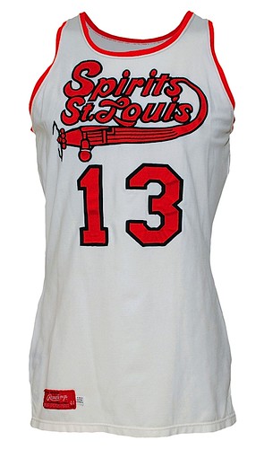
• I saw this gorgeous Spirits of St. Louis jersey at the Grey Flannel booth at the National Sports Collectors Convention last summer, and it was a sight to behold (full listing).
• Who did these amazing stirrups and shorts belong to? The All-American Redheads (full listing, plus you can learn more about the Redheads here).
• Several very cool Globetrotters lots here, here (love the globe on the back of the jersey), and here.
• It’s rare to see a zebra-striped NBA ref’s jersey, and even rarer to see one with this incredible chest patch. That gold trim looks chain-stitched, too (full listing).
• Granted, I’m not the biggest NBA fan, but I don’t think I’d ever seen this Spurs insignia before (full listing).
• Nice pair of sub-script NOBs here and here. The second one is particularly interesting because the NOB is on a nameplate, something you rarely see on a basketball uni.
• I’ve always said that the ugliest jerseys make the coolest Uni Watch membership card designs, so someone really ought to sign up and go with this motif. Or maybe this one.
• Okay, so we all know the Eagles used some unusual sleeve stripes in the early 1970s, but the striping somehow looks even weirder when the jersey is viewed all by itself (full listing).
• Old sideline capes are always cool, even if they’re from the NFL’s most annoying team.
If you want to check out additional items, the full auction catalog is here.
The Proctor Files, Continued: Yesterday I mentioned that the Rochester Lancers used different uni number fonts for the front and back of their jersey. That prompted the following note from sporting goods maven Terry Proctor:
I’m partially responsible for the Lancers using two different numeral fonts. We (Ruby’s Sporting Goods) sold the Lancers those striped jerseys in 1968 when they were still in the old American Soccer League. Dick Howard, the goalie at the time, came into our store to order the Lancers’ uniforms. Dick was from England and liked the Bukta jersey style with the stripes. So we contacted the U.S.A. distributor for Bukta, the Peter Green Co. Ltd of West Chester, Pennsylvania, and placed the order for the knit-in striped jerseys, royal blue nylon soccer shorts, and solid athletic gold soccer socks.
The special-order uniforms came in to us directly from England. We had them lettered in Rochester by the Holley-Messner Corp.. who did most of the screen-printing and tackle twill for the Rochester market. The Lancers, who were always a seat-of-the-pants organization, could only afford one-color numbers on the back and no logo for the ’68 season. It was my idea to have the numbers sewn on with black thread to give them a little contrast. H-M used Stahls Pro Block, which is basically plain block, for the back numbers.
When the Lancers joined the NASL in 1970, they decided to spruce up the old striped shirts with the logo patch and front numbers, instead of buying new jerseys. We ordered the embroidered logo patches from Voyager Emblems in Canada through their U.S. broker. Then we had Rose Yacuzzo, our own seamstress, add the front numbers. Rose used Stahls Varsity Block font as her stock style, and that’s the reason for the different fonts.
The Greatest Achievement in Human History, Update: Remember those 1956 Portland Beavers undersleeve stripes, which I was so excited about a few days ago? Dave Eskenazi, who provided me with those photos, has now come up with seven additional pics that show the sleeve stripes. Oh man, does that look awesome or what? And Dave says he probably has more photos buried in his archive, including some action shots. “Coming your way as I excavate them,” he says — can’t wait.
The funny thing about all this is that Dave has apparently known about the sleeve stripes for ages but never thought to mention them to me. The main reason he sent me those first two photos — the ones that formed the basis of my Wednesday post — is that they were in color. Color PCL photos from the 1940s and ’50s are rare, so he was excited to share them with me. He mentioned the sleeve stripes in his e-mail, but he was clearly jazzed about the color, not the stripes. Makes you wonder how many other amazing uni-related tidbits have fallen through the cracks because nobody thought they were noteworthy.
Meanwhile, as you may recall, Jerry Cohen of Ebbets Field Flannels said the striped shirts couldn’t be reproduced in small quantities. But I got a note last night from Bob Halfacre — formerly of AIS Sports and now running his own Bobcat Athletic operation — as follows:
I am pretty sure we can make these in smaller lots. Maybe 100 pieces? We use a local knitter that can knit the striped sleeve panels, it’s just a question of their minimum. I’ll ask, and in the next week or so I’ll try and figure out what these would cost to do.
It would be good to gauge the readership’s interest in a shirt like the one in the Beavers photos. Would you consider buying one for the right price? If so, let me know.
Uni Watch News Ticker: That new powder blue Royals cap, aka the worst-kept secret of the off-season, has now officially been unveiled. ”¦ What’s worse than unveiling a really ugly new rugby kit? Unveiling a really ugly new rugby kit and bragging about it. ”¦ Here’s a weird one: an old shirt collar with a little bats/ball logo and a “Red Sox” imprint. ”¦ Other good eBay finds: a gorgeous rawlings undershirt, an interesting baseball cap, a really nice 1960s baseball jersey (way overpriced, though), a seriously old wool jersey, an Ohio State baseball jersey, a really nice jersey script, a baseball jersey made by Everlast (!), a seriously garish 49ers tee, a simple but very classy cycling jersey, etc. ”¦ Jacoby Ellsbury is changing his uni number from 46 to 2. ”¦ Check out the awesome maple leaf sleeve patch worn by the 1915 Victoria Bees (typically awesome contribution from Dave Eskenazi). ”¦ The Florida Panthers will finally unveil their alternate jersey on Monday evening. I’ll have an insta-review here on the site, much like what I did for the Mardi Gras design on ESPN, at 7:30pm Monday. ”¦ Nice visual timeline of Virginia Tech helmet history here (with thanks to Mike Kennedy). ”¦ Alberto Rodriguez-Baez sent along some great photos from his mid-1980s youth football team in Monterrey, Mexico. I didn’t realize there was such a football youth culture in Mexico, but Alberto says, “The football tradition [in Monterrey] is h-u-g-e! Growing up in Mexico, my favorite sport wasn’t soccer, but football. Football is still my favorite sport by far.” ”¦ Reprinted from yesterday’s comments: Tremendous color footage from the 1957 NFL championship game (Browns vs. Lions) here and here. ”¦ UC-Irvine now wearing yellow at home (with thanks to Nick Fox). ”¦ DIY news from Joe DeAngelis, who writes: “I had an annoying vacant spot in my sports room that called for some décor. I didn’t want to place a generic poster or photo but wanted something unique to display. So, after a trip to the local arts and crafts store and spending approximately $25 on supplies, I created a piece I’m very proud of. Granted, it’s no Picasso, especially up-close, but it’s created directly from my eyes and hands, and it’s become a nice conversation piece.” ”¦ Oh Dear. Full details here (with thanks to Ethan Hagen). ”¦ Will DeFord‘s wife has been making Chargers-themed cupcakes. ”¦ That was some bright game last night at the Garden. ”¦
chain stitched globe?
link
KU looked good in Red:
link
link
Notice shorts are not down to ankles. See Cal, Cuse, and Ohio State from last night.
Also I liked Oklahoma State Football unis last night:
link
don’t sell yourself short DeAngelis! thats a really cool DIY, and a great idea!
[quote comment=”361806″]chain stitched globe?
link
errr… chain stitched countries. but you know what i meant ;-)
Not to mention vertically striped horizontally striped stirrups…
link
—Ricko
with pins. LOL
Being a Bills fan I LOVE those Decade of Failure shirts…AWESOME! I sent it to all my friends. Its more like a decade and a half since the Bills put a decent team on the field. What they need to do is go back to wearing their 90’s uniforms from the Jim Kelly era.
[quote comment=”361811″]with pins. LOL[/quote]
and grass!
US Skier Lindsey Vonn needs a new helmet design.
link
All-black uniforms are generally stupid, but somehow, someway, it worked for Okie State last night. Probably because black is already part of their color scheme, and because the white panels on the jersey and pants paired nicely with the white helmet. They changed the logo on the helmet from orange w/ black trim to black w/ orange trim, too:
link
link
I think the black helmet logo looks better, b/c it doesn’t have the beveling effect, which I’m not a fan of.
Ellsbury… Tool fan?
46 and 2.
Whoops…
link.
[quote comment=”361815″]All-black uniforms are generally stupid, but somehow, someway, it worked for Okie State last night. Probably because black is already part of their color scheme, and because the white panels on the jersey and pants paired nicely with the white helmet. They changed the logo on the helmet from orange w/ black trim to black w/ orange trim, too:
link
link
I think the black helmet logo looks better, b/c it doesn’t have the beveling effect, which I’m not a fan of.[/quote]
They would have been better with a little more orange (just like South Carolina’s all-blacks would look better with more garnet).
Other notes: KU did look good in red. And I love UC-Irvine’s home golds. Wish more teams did that. The beauty of gold is it can be worn home or away. Not sure that red or orange really should be, though some teams try (see KU last night).
I want to give some love to the Dolphins for wearing the striped white socks with their aqua pants last night. Sooooooo much better than wearing the aqua socks and creating the leotard effect.
link
This is only the 2nd game this year they’ve worn the aqua pants. They wore them Week 1, and also used the striped socks:
link
The wore their aqua jersey/white pants in San Diego and New York, and wore white jersey/white pants in New England.
Did you know that Kansas wore gold uniforms in 1987-88 for a few games? I was at one of them. That was the year they won the national championship with Danny Manning.
[quote comment=”361816″]Ellsbury… Tool fan?
46 and 2.[/quote]
hey you beat me to it!!
Correction: they wore the striped socks against New England this year, too:
link
Wonder what that Mexican youth football team’s name was? Those unis are reminiscent of some team…
Not gonna guess; might insult someone.
hey jonathan
have the fish ever worn aqua undersocks with their aqua pants? i thought they were one of those teams that never had the leotard look, but i could be wrong…just seems they always wear the white striped socks with the dark pants
Oh, Colorado Caribous?
Stade de France?
You have company.
In Scotland!
Chad Henne had a different helmet last night against Carolina.
old – link
new – link
Interesting given this latest article from the Sun-Sentinel –
link
From the Sun-Sentinel story:
“So, Chad, what do you say to our Sun Sentinel readers who are concerned about the tightness of your helmet?
“My fiancee said the same thing,” Henne began”
At least he didn’t reply with “that’s what she said”.
[quote comment=”361820″]Did you know that Kansas wore gold uniforms in 1987-88 for a few games? I was at one of them. That was the year they won the national championship with Danny Manning.[/quote]
KU actually wore Yellow football helmets for a few years back in the late 1950s-early 1960s. I believe Helmet Hut has a bit of a story on that in their NCAA section. Yellow/Gold must/may be an official KU color.
Anybody out there know the story?
[quote comment=”361815″]
I think the black helmet logo looks better, b/c it doesn’t have the beveling effect, which I’m not a fan of.[/quote]
Agree – didn’t love the all black w/ white lid, but really liked the black logo w/ orange outline.
[quote comment=”361818″][quote comment=”361815″]All-black uniforms are generally stupid, but somehow, someway, it worked for Okie State last night. Probably because black is already part of their color scheme, and because the white panels on the jersey and pants paired nicely with the white helmet. They changed the logo on the helmet from orange w/ black trim to black w/ orange trim, too:
link
link
I think the black helmet logo looks better, b/c it doesn’t have the beveling effect, which I’m not a fan of.[/quote]
They would have been better with a little more orange (just like South Carolina’s all-blacks would look better with more garnet).
Other notes: KU did look good in red. And I love UC-Irvine’s home golds. Wish more teams did that. The beauty of gold is it can be worn home or away. Not sure that red or orange really should be, though some teams try (see KU last night).[/quote]
I remember back in the ’60s, Wichita State (black and gold) reduced black to an accent color and moved to gold traveling jerseys. Kansas State was in the midst of its Purple Pride and Purple Power at the time and, politics being what they were, the thought was WSU wasn’t that keen on Black Pride and Black Power, hence the swap. True or not? Don’t know. At least that was the perception.
Have to admit the KU red looked sharp. Back in the day, red was a KU dominant color. They went blue cuz they were getting the crap beat out of them by Nebraska and Oklahoma. (But so was everybody else.)
And while we’re in the Big 8, er Big 12, Oklahoma A&M looked fine in all black. Glad they stuck with the white helmet cages. CU’s peculiar color of gold helmet was commented on last night. Somewhere along the line the Buffs have moved to that hue. Pretty ugly IMO.
[quote comment=”361824″]hey jonathan
have the fish ever worn aqua undersocks with their aqua pants? i thought they were one of those teams that never had the leotard look, but i could be wrong…just seems they always wear the white striped socks with the dark pants[/quote]
I think you’re right. I don’t know why I thought that. Maybe I’m confusing them with another team, like the Redskins, who’ve worn their solid socks with dark pants.
link
I don’t think the Dolphins, Patriots, Jets or Chiefs ever pair dark pants and dark socks. They also use white socks with stripes. The Jets (and the Redskins) have paired white pants with white socks, but never dark/dark.
Was wondering if Uniwatch saw this Wed night during the Wizards game but it looks like Miller and Jamison were wearing undershirts with one sleeve cut out.
link
[quote comment=”361807″]KU looked good in Red:
link
link
Notice shorts are not down to ankles. See Cal, Cuse, and Ohio State from last night.
Also I liked Oklahoma State Football unis last night:
link
I’m more interested in teh fact that UCA has Jordan Brand made uniforms!
In the past, only a handful of teams had this dubious distinction:
UNC
NC A&T
CAL
at one time, Cincinatti
at one time, St. Johns
[quote comment=”361826″]Chad Henne had a different helmet last night against Carolina.
old – link
new – link
Interesting given this latest article from the Sun-Sentinel –
link
He went from the original Riddell Revolution to the new Revolution Speed.
[quote comment=”361830″][quote comment=”361818″][quote comment=”361815″]All-black uniforms are generally stupid, but somehow, someway, it worked for Okie State last night. Probably because black is already part of their color scheme, and because the white panels on the jersey and pants paired nicely with the white helmet. They changed the logo on the helmet from orange w/ black trim to black w/ orange trim, too:
link
link
I think the black helmet logo looks better, b/c it doesn’t have the beveling effect, which I’m not a fan of.[/quote]
They would have been better with a little more orange (just like South Carolina’s all-blacks would look better with more garnet).
Other notes: KU did look good in red. And I love UC-Irvine’s home golds. Wish more teams did that. The beauty of gold is it can be worn home or away. Not sure that red or orange really should be, though some teams try (see KU last night).[/quote]
I remember back in the ’60s, Wichita State (black and gold) reduced black to an accent color and moved to gold traveling jerseys. Kansas State was in the midst of its Purple Pride and Purple Power at the time and, politics being what they were, the thought was WSU wasn’t that keen on Black Pride and Black Power, hence the swap. True or not? Don’t know. At least that was the perception.
Have to admit the KU red looked sharp. Back in the day, red was a KU dominant color. They went blue cuz they were getting the crap beat out of them by Nebraska and Oklahoma. (But so was everybody else.)
And while we’re in the Big 8, er Big 12, Oklahoma A&M looked fine in all black. Glad they stuck with the white helmet cages. CU’s peculiar color of gold helmet was commented on last night. Somewhere along the line the Buffs have moved to that hue. Pretty ugly IMO.[/quote]
Once upon a time, Colorado’s colors looked like this:
link
Oklahoma State’s unis weren’t bad, judged in a vacuum.
But they didn’t look much like Oklahoma State.
And “vacuum” is a good choice of words cuz , while I can’t speak for anyone else, this whole “black out” business is getting really cliched…which means it sucks.
Cmon, folks, having a “black out” or “white out” or whatever these days isn’t exactly original.
Monkey see…
Ho hum.
—Ricko
[quote comment=”361832″]Was wondering if Uniwatch saw this Wed night during the Wizards game but it looks like Miller and Jamison were wearing undershirts with one sleeve cut out.
link
Presumably, it has something to do with them both coming off shoulder injuries (also provided spots for LaBron to cry on.)
[quote comment=”361833″][quote comment=”361807″]KU looked good in Red:
link
link
Notice shorts are not down to ankles. See Cal, Cuse, and Ohio State from last night.
Also I liked Oklahoma State Football unis last night:
link
I’m more interested in teh fact that UCA has Jordan Brand made uniforms!
In the past, only a handful of teams had this dubious distinction:
UNC
NC A&T
CAL
at one time, Cincinatti
at one time, St. Johns[/quote]
I love that Roman Gabriel Eagles jersey. When it was introduced that in the ’70’s, I admit it kinda freaked me out. But it quickly grew on me.
It was its very wierdness, uniqueness, that made it so appealing. That, and the nice color combination (that shade of green–kelly?, the silver) and that amazing helmet, made it one of the NFL’s best. It was so startling you couldn’t look away. Yet, it wasn’t garish…just bold.
[quote comment=”361823″]Wonder what that Mexican youth football team’s name was? Those unis are reminiscent of some team…
Not gonna guess; might insult someone.[/quote]
Hello, Leon! Alberto, here. The name of my football team was the Redskins (Pieles Rojas). It doesnt exist anymore, though. Check here the other teams in the kids league in Monterrey: link
[quote comment=”361833″][quote comment=”361807″]KU looked good in Red:
link
link
Notice shorts are not down to ankles. See Cal, Cuse, and Ohio State from last night.
Also I liked Oklahoma State Football unis last night:
link
I’m more interested in teh fact that UCA has Jordan Brand made uniforms!
In the past, only a handful of teams had this dubious distinction:
UNC
NC A&T
CAL
at one time, Cincinatti
at one time, St. Johns[/quote]
Maybe it has something to do with the fact that’s where Scottie Pippen went to school.
link
I wonder what LeBron will do with his logo when he switches his uni number to 6. It seems like it would be a good challenge for some of you DIYers.
[quote comment=”361837″][quote comment=”361832″]Was wondering if Uniwatch saw this Wed night during the Wizards game but it looks like Miller and Jamison were wearing undershirts with one sleeve cut out.
link
Presumably, it has something to do with them both coming off shoulder injuries (also provided spots for LaBron to cry on.)[/quote]
Salute to Larry the Cable Guy?
—Ricko
Miikka Kiprusoff link in last night’s ass-kicking at the hands of the Blackhawks.
New Dubuque USHL Team is having a pretty cool name the team and color contest.
link
The 1972 Oakland A’s also had different number fonts on the front and back of the jersey.
The front had “Expos” numbers:
link
The back had standard block numerals:
link
The differing number font situation lasted only that one season (the A’s first in that beautiful uni set), as they removed the front number after 1972.
[quote comment=”361840″][quote comment=”361823″]Wonder what that Mexican youth football team’s name was? Those unis are reminiscent of some team…
Not gonna guess; might insult someone.[/quote]
Hello, Leon! Alberto, here. The name of my football team was the Redskins (Pieles Rojas). It doesnt exist anymore, though. Check here the other teams in the kids league in Monterrey: link
Thank you Alberto. I am curious: was the name “Pieles Rojas” considered offensive?
Hopefully, you beat the Cowboys (“Gauchos”?) regularly.
[quote comment=”361820″]Did you know that Kansas wore gold uniforms in 1987-88 for a few games? I was at one of them. That was the year they won the national championship with Danny Manning.[/quote]
The golds were only worn once by the varsity, for a game at Western Carolina (AT Western Carolina? Those were the days.) in 1987. KU won, but played badly, and the ever-superstitious Larry Brown banished those unis. They were worn by the JV team for a few years after that. The shorts from that set turn up in the Late Night skits just about every year.
There’s a clip of them in action about halfway down this page: link
Not an Eagles fan but I now live close to Philly so am inundated with their merchandise. I like the ’70s-80s unis – they remind me of Vermeil’s “lunch pail” teams. I always picture Wilbert Montgomery running all over the Cowboys in the NFC title game where the Eagles wore white at home to force Dallas into their “unlucky” blue jerseys.
When the Eagles changed their primary color to the current dark aqua, amped up the black and went with the cartoonish eagle head logo, they lost a little something that made them stand out. I’ve heard some people around here say they dropped the flying-eagle-with-football-in-talons logo beacuse it looked too much like the WWII Luftwaffe’s eagle, but I doubt that – more likely a marketing-driven thing.
[quote comment=”361849″]Not an Eagles fan but I now live close to Philly so am inundated with their merchandise. I like the ’70s-80s unis – they remind me of Vermeil’s “lunch pail” teams. I always picture Wilbert Montgomery running all over the Cowboys in the NFC title game where the Eagles wore white at home to force Dallas into their “unlucky” blue jerseys.
When the Eagles changed their primary color to the current dark aqua, amped up the black and went with the cartoonish eagle head logo, they lost a little something that made them stand out. I’ve heard some people around here say they dropped the flying-eagle-with-football-in-talons logo beacuse it looked too much like the WWII Luftwaffe’s eagle, but I doubt that – more likely a marketing-driven thing.[/quote]
Heard that green described as the same color as wet grass you clean out from under your lawnmower.
I, too, was a fan of that jersey.
[quote comment=”361849″]Not an Eagles fan but I now live close to Philly so am inundated with their merchandise. I like the ’70s-80s unis – they remind me of Vermeil’s “lunch pail” teams. I always picture Wilbert Montgomery running all over the Cowboys in the NFC title game where the Eagles wore white at home to force Dallas into their “unlucky” blue jerseys.
When the Eagles changed their primary color to the current dark aqua, amped up the black and went with the cartoonish eagle head logo, they lost a little something that made them stand out. I’ve heard some people around here say they dropped the flying-eagle-with-football-in-talons logo beacuse it looked too much like the WWII Luftwaffe’s eagle, but I doubt that – more likely a marketing-driven thing.[/quote]
Don’t you love those after-the-fact justifications for “It’s been around so long it must need changing”? Maybe the Yankees need a new logo cuz who the hell wears a tophat anymore.
—Ricko
“Heard that green described as the same color as wet grass you clean out from under your lawnmower.
That would be Clump Green, I believe.
—Ricko
Check out the matching suits and ties for the competitors in the ATP World Tour Finals in London
Link:
link
[quote comment=”361850″]Heard that green described as the same color as wet grass you clean out from under your lawnmower.[/quote]
you’re supposed to clean that out?
[quote comment=”361849″]Not an Eagles fan but I now live close to Philly so am inundated with their merchandise. I like the ’70s-80s unis – they remind me of Vermeil’s “lunch pail” teams. I always picture Wilbert Montgomery running all over the Cowboys in the NFC title game where the Eagles wore white at home to force Dallas into their “unlucky” blue jerseys.
When the Eagles changed their primary color to the current dark aqua, amped up the black and went with the cartoonish eagle head logo, they lost a little something that made them stand out. I’ve heard some people around here say they dropped the flying-eagle-with-football-in-talons logo beacuse it looked too much like the WWII Luftwaffe’s eagle, but I doubt that – more likely a marketing-driven thing.[/quote]
The current Midnight Green look is bad. The only colors should be Kelley Green/Silver/White. None of this phony, overdone black alts, etc.
When Lurie took over in 1994,any references to the past were all but erased. For years, until recently, they acted like the franchise was founded in 1994 and not 1933.
The franchise took the name Eagles, and the original flying eagle with football, as a tribute to the NRA (National Recovery Administration) that Franklin Roosevelt started in 1933. link
[quote comment=”361831″][quote comment=”361824″]hey jonathan
have the fish ever worn aqua undersocks with their aqua pants? i thought they were one of those teams that never had the leotard look, but i could be wrong…just seems they always wear the white striped socks with the dark pants[/quote]
I think you’re right. I don’t know why I thought that. Maybe I’m confusing them with another team, like the Redskins, who’ve worn their solid socks with dark pants.
link
I don’t think the Dolphins, Patriots, Jets or Chiefs ever pair dark pants and dark socks. They also use white socks with stripes. The Jets (and the Redskins) have paired white pants with white socks, but never dark/dark.[/quote]
That sounds about right. I can’t recall any of those teams going unitard with the dark pants.
Bears never do it, either. The one saving grace about the two times they’ve gone with the link is that they link.
Anyone else with dark pants/white stripèd socks? I can’t think of any.
Uni-related:
KISS played ARCO arena and were presented with Kings’ jerseys–
link
[quote comment=”361807″]KU looked good in Red:
link
link
Notice shorts are not down to ankles. See Cal, Cuse, and Ohio State from last night.
Also I liked Oklahoma State Football unis last night:
link
DudeBrotherMan,
First awesome name.
Second, thank you for pointing out the shorts issue. I’m a big ‘Cuse fan, and ever since they started wearing those SOD unis, its been hard for me to watch them. As my Uncle Terry says, are they long shorts, or short longs?
Disagree with you on the KU and OSU unis though. KU in red just looks odd to me. I thought OSU’s look was bad for many reasons.
[quote comment=”361840″][quote comment=”361823″]Wonder what that Mexican youth football team’s name was? Those unis are reminiscent of some team…
Not gonna guess; might insult someone.[/quote]
Hello, Leon! Alberto, here. The name of my football team was the Redskins (Pieles Rojas). It doesnt exist anymore, though. Check here the other teams in the kids league in Monterrey: link
I’d like to let you know that I’m quite envious of those unis, Alberto. I was on a team called the Redskins when I was a kid and the unis were pure crap. The burgundy jerseys were OK. At least they had the right striping pattern on the sleeves, but they had yellow numbers. Plus the pants were solid yellow and the helmets were solid white.
That Red Sox collar is only a 12 1/2. That a kid’s sized neck!!
Random observation about the Grey Flannel Auctions website: I love the way you can scroll through the images by using the wheel on your mouse.
~~~~~~~~~~~~~~~~~~~~~~~~~~~~~~~~~~~
And Terry Proctor: I reeeeeeeeeeeeeeeally wish you’d impart some of your knowledge via the comments section so we don’t have to wait until the next day’s post to read it.
I’m guessing you aren’t reading this, though.
[quote comment=”361848″][quote comment=”361820″]Did you know that Kansas wore gold uniforms in 1987-88 for a few games? I was at one of them. That was the year they won the national championship with Danny Manning.[/quote]
The golds were only worn once by the varsity, for a game at Western Carolina (AT Western Carolina? Those were the days.) in 1987. KU won, but played badly, and the ever-superstitious Larry Brown banished those unis. They were worn by the JV team for a few years after that. The shorts from that set turn up in the Late Night skits just about every year.
There’s a clip of them in action about halfway down this page: link
Dude, I was on the JV basketball team my freshman year at KU in 1992. Fort Scott CC somehow forgot their unis so they had to wear those gold ones. They were up in this closet in Allen Fieldhouse. I will try and get a screen grab this weekend. It looked so hilarious. A lot of the their players kept their shirts untucked because the shorts were so tight.
[quote comment=”361857″][quote comment=”361831″][quote comment=”361824″]hey jonathan
have the fish ever worn aqua undersocks with their aqua pants? i thought they were one of those teams that never had the leotard look, but i could be wrong…just seems they always wear the white striped socks with the dark pants[/quote]
I think you’re right. I don’t know why I thought that. Maybe I’m confusing them with another team, like the Redskins, who’ve worn their solid socks with dark pants.
link
I don’t think the Dolphins, Patriots, Jets or Chiefs ever pair dark pants and dark socks. They also use white socks with stripes. The Jets (and the Redskins) have paired white pants with white socks, but never dark/dark.[/quote]
That sounds about right. I can’t recall any of those teams going unitard with the dark pants.
Bears never do it, either. The one saving grace about the two times they’ve gone with the link is that they link.
Anyone else with dark pants/white stripèd socks? I can’t think of any.[/quote]
If we’re talking current uniforms, I think that’s the entire list. If you want to go back in time there’s a couple others.
[quote comment=”361859″][quote comment=”361807″]KU looked good in Red:
link
link
Notice shorts are not down to ankles. See Cal, Cuse, and Ohio State from last night.
Also I liked Oklahoma State Football unis last night:
link
DudeBrotherMan,
First awesome name.
Second, thank you for pointing out the shorts issue. I’m a big ‘Cuse fan, and ever since they started wearing those SOD unis, its been hard for me to watch them. As my Uncle Terry says, are they long shorts, or short longs?
Disagree with you on the KU and OSU unis though. KU in red just looks odd to me. I thought OSU’s look was bad for many reasons.[/quote]
I hear you so loud and clear about the shorts. Syracuse used to have the sickest nike unis back in the day.
I ended up walkin on the KU basketball team back in 94 – 95. We were converse shoes and champion unis. We all wanted so bad to be nike. Coach Williams finally went Nike. Then KU went totally Nike and I remember when they changed over to Adidas I was crushed.
But now I am thanking goodness that they are adidas. I don’t know if I could watch if they were nike SOD. Nike SOD has singlehandedly ruined bball uniforms of the past years.
Luckily I see light at the end of the tunnel. If you look at LEBRON. His shorts are above the knee. He is going to be the influence to bring back the shorts to a respectable length. College kids will fall in line.
[quote comment=\”361842\”]I wonder what LeBron will do with his logo when he switches his uni number to 6. It seems like it would be a good challenge for some of you DIYers.[/quote]
Got it covered…I sent this to our leader the other day:
link
[quote comment=”361848″][quote comment=”361820″]Did you know that Kansas wore gold uniforms in 1987-88 for a few games? I was at one of them. That was the year they won the national championship with Danny Manning.[/quote]
The golds were only worn once by the varsity, for a game at Western Carolina (AT Western Carolina? Those were the days.) in 1987. KU won, but played badly, and the ever-superstitious Larry Brown banished those unis. They were worn by the JV team for a few years after that. The shorts from that set turn up in the Late Night skits just about every year.
There’s a clip of them in action about halfway down this page: link
I was at that game. Western was down by 20 with a few minutes left but nearly pulled it out, losing 68-63. Kansas went on to the national title. Western tanked and didn’t even qualify for the conference tournament (ninth team in an eight-team league). I think someone told me they had worn the golds in other game. I asked Larry Brown about the unis and he said gold was an unofficial color of KU. I remember they had a lot of red and blue trim, and they wore the Nike Barkleys (red, white, and blue) with them.
I hear you so loud and clear about the shorts. Syracuse used to have the sickest nike unis back in the day.
I ended up walkin on the KU basketball team back in 94 – 95. We were converse shoes and champion unis. We all wanted so bad to be nike. Coach Williams finally went Nike. Then KU went totally Nike and I remember when they changed over to Adidas I was crushed.
But now I am thanking goodness that they are adidas. I don’t know if I could watch if they were nike SOD. Nike SOD has singlehandedly ruined bball uniforms of the past years.
Luckily I see light at the end of the tunnel. If you look at LEBRON. His shorts are above the knee. He is going to be the influence to bring back the shorts to a respectable length. College kids will fall in line.[/quote]
Great point, I hadn’t thought of that. Lebron does wear his shorts at an appropriate level, its probably why he can jump out of the building. Hopefully that does catch on.
One thing is for sure, if wearing long-sleved shirts becomes a trend in basketball, I’m not sure my eyeballs will be able to stand it.
“Luckily I see light at the end of the tunnel. If you look at LEBRON. His shorts are above the knee. He is going to be the influence to bring back the shorts to a respectable length. College kids will fall in line.” — Dudebrotherman
One can only hope, bro.
[quote comment=”361865″] If you look at LEBRON. His shorts are above the knee. He is going to be the influence to bring back the shorts to a respectable length. College kids will fall in line.[/quote]
i believe the NBA actually has a rule about the length of the shorts…they must be above the knee or something
not that i disagree with you — if the kids see their heroes wearing shorter (it’s all relative now) shorts, perhaps they will follow suit
i’m one of the few who actually likes the SODs, but they need to make the shorts more like football pants’ length, as well as fit…the bloomers they’re wearing are ridiculous (as most on here agree)…but this is the style now, and hopefully that will change just like bird & magic’s short shorts finally left the stage
[quote comment=”361812″]Being a Bills fan I LOVE those Decade of Failure shirts…AWESOME! I sent it to all my friends. Its more like a decade and a half since the Bills put a decent team on the field. What they need to do is go back to wearing their 90’s uniforms from the Jim Kelly era.[/quote]
A generation of people in the Congo disagree. They think that Jim Kelly was the greatest quarterback since Fran Tarkenton.
That powder blur cap is just ugly, just like their current powder blue jersey? Why can’t the
Royal employ the use of powder blue properly? link
[quote comment=”361836″]Oklahoma State’s unis weren’t bad, judged in a vacuum.
But they didn’t look much like Oklahoma State.
And “vacuum” is a good choice of words cuz , while I can’t speak for anyone else, this whole “black out” business is getting really cliched…which means it sucks.
Cmon, folks, having a “black out” or “white out” or whatever these days isn’t exactly original.
Monkey see…
Ho hum.
—Ricko[/quote]
Agreed, as is wearing black unis when it’s not your school color (Florida State three years ago; Mississippi State last weekend; et. al.). It seems to me that teams that wear black for the first time or as a special event usually lose in black, last night and Tennessee on Halloween night being the exceptions.
Have to say, though, that UGa.’s black jerseys are nice, but black is a school color.
That powder blur cap is just plain ugly, just like their current powder blue jerseys… Why can’t the Royals employ the use of powder blue properly? link
Absolutely lovin’ these new auction sponsors. This site just keeps getting better everyday.
[quote comment=”361870″][quote comment=”361865″] If you look at LEBRON. His shorts are above the knee. He is going to be the influence to bring back the shorts to a respectable length. College kids will fall in line.[/quote]
i believe the NBA actually has a rule about the length of the shorts…they must be above the knee or something
not that i disagree with you — if the kids see their heroes wearing shorter (it’s all relative now) shorts, perhaps they will follow suit
i’m one of the few who actually likes the SODs, but they need to make the shorts more like link length, as well as fit…the bloomers they’re wearing are ridiculous (as most on here agree)…but this is the style now, and hopefully that will change just like link short shorts finally left the stage[/quote]
I don’t see the shorts trend reversing any time soon. As long as the kids on NCAA hoops teams “want so bad to be Nike” and Nike keeps churning out the SODs, then I think the gaucho pants are here for the foreseeable future.
[quote comment=”361868″]I hear you so loud and clear about the shorts. Syracuse used to have the sickest nike unis back in the day.
I ended up walkin on the KU basketball team back in 94 – 95. We were converse shoes and champion unis. We all wanted so bad to be nike. Coach Williams finally went Nike. Then KU went totally Nike and I remember when they changed over to Adidas I was crushed.
But now I am thanking goodness that they are adidas. I don’t know if I could watch if they were nike SOD. Nike SOD has singlehandedly ruined bball uniforms of the past years.
Luckily I see light at the end of the tunnel. If you look at LEBRON. His shorts are above the knee. He is going to be the influence to bring back the shorts to a respectable length. College kids will fall in line.[/quote]
Great point, I hadn’t thought of that. Lebron does wear his shorts at an appropriate level, its probably why he can jump out of the building. Hopefully that does catch on.
One thing is for sure, if wearing long-sleved shirts becomes a trend in basketball, I’m not sure my eyeballs will be able to stand it.[/quote]
I disagree. I LOVE the SOD style of unis. Granted, some of the shorts are ridiculously long, however the overall design of the lions share of them are clean and neat.
The Keith Langford/Aaron Miles era unis are some of my favorite.
link
BTW, TRAJAN SUCKS!
As for the trend going in reverse: all it takes is one leader to start the fad.
[quote comment=”361874″]That powder blur cap is just plain ugly, just like their current powder blue jerseys… Why can’t the Royals employ the use of powder blue properly? link[/quote]
Here here.
link
link
Does anyone know why Nike or Adidas can put two logos on football uniforms in college but only one on basketball uniforms? The basketball pants are longer these days than the football pants, so there’s more fabric to plaster with logos.
[quote comment=”361833″][quote comment=”361807″]KU looked good in Red:
link
link
Notice shorts are not down to ankles. See Cal, Cuse, and Ohio State from last night.
Also I liked Oklahoma State Football unis last night:
link
I’m more interested in teh fact that UCA has Jordan Brand made uniforms!
In the past, only a handful of teams had this dubious distinction:
UNC
NC A&T
CAL
at one time, Cincinatti
at one time, St. Johns[/quote]
Maybe Brand Jordan is putting out uni templates and teams can just apply names & numbers to them. Xavier has Brand Jordan warm-ups with their “X” logo poorly sewn on.
SOMEBODY made the pants for the old-timer game, so why can’t they get the real team to wear them, too?
link
[quote comment=”361879″]Does anyone know why Nike or Adidas can put two logos on football uniforms in college but only one on basketball uniforms? The basketball pants are longer these days than the football pants, so there’s more fabric to plaster with logos.[/quote]
pretty sure paul has covered this, but im also sure someone on here can give the full story…for whatever reason, NCAA hoops unis can only have the logo on the shorts, not the tops…NC2A football can have them on tops and bottoms
why? i do not know…but that’s the rule (i think)
[quote comment=”361880″][quote comment=”361833″][quote comment=”361807″]KU looked good in Red:
link
link
Notice shorts are not down to ankles. See Cal, Cuse, and Ohio State from last night.
Also I liked Oklahoma State Football unis last night:
link
I’m more interested in teh fact that UCA has Jordan Brand made uniforms!
In the past, only a handful of teams had this dubious distinction:
UNC
NC A&T
CAL
at one time, Cincinatti
at one time, St. Johns[/quote]
Maybe Brand Jordan is putting out uni templates and teams can just apply names & numbers to them. Xavier has Brand Jordan warm-ups with their “X” logo poorly sewn on.[/quote]
Actually, you are right. eastbay sells them.
I may be a biased Dolphins fan, but I love the stripes they wear on the socks with the aqua pants. Actually, when it comes to classic teams who “modernized” their look, the Dolphins have done the best job. Kept it simple and similar to their classic look, yet its “modern”.
[quote comment=”361847″][quote comment=”361840″][quote comment=”361823″]Wonder what that Mexican youth football team’s name was? Those unis are reminiscent of some team…
Not gonna guess; might insult someone.[/quote]
Hello, Leon! Alberto, here. The name of my football team was the Redskins (Pieles Rojas). It doesnt exist anymore, though. Check here the other teams in the kids league in Monterrey: link
Thank you Alberto. I am curious: was the name “Pieles Rojas” considered offensive?
Hopefully, you beat the Cowboys (“Gauchos”?) regularly.[/quote]
Leon,
no, the name wasn’t (and isn’t) offensive at all. Regarding the Cowboys, the translation is Vaqueros. Man, we played them only once in my entire “football career”, and we lost! I wasnt happy.
Interestingly, when i moved to the US i had to relearn all the names of the NFL teams because i knew them in Spanish (that’s how they call them in the broadcasts in Mexico):
Resdskins (Pieles Rojas)
Cowboys (Vaqueros)
Broncos (Broncos)
Bills (Bills or Bufalos)
Dolphins (Delfines)
Patriots (Patriotas)
Jets (Jets)
Ravens (Cuervos)
Bengals (Bengalies)
Browns (Cafes)
Steelers (Acereros)
Texans (Tejanos)
Colts (Potros)
Jaguars (Jaguares)
Titans (Titanes)
Chiefs (Jefes)
Raiders (Raiders or Malosos)
Chargers (Cargadores)
Giants (Gigantes)
Eagles (Aguilas)
Bears (Osos)
Lions (Leones)
Packers (Empacadores)
Vikings (Vikingos)
Falcons (Halcones)
Panthers (Panteras)
Saints (Santos)
Buccaneers (Bucaneros)
Cardinals (Cardenales)
Rams (Carneros)
49ers (Cuarentainueves)
Seahawks (Halcones Marinos)
And the you ad “de” and the City/Sate name (Halcones Marinos de Seattle), and voila, you are broadcasting in Spanish.
Regardless of the language, football is the greatest sport ever invented!
[quote comment=”361855″][quote comment=”361850″]Heard that green described as the same color as wet grass you clean out from under your lawnmower.[/quote]
you’re supposed to clean that out?[/quote]
Not while the mower is running, Phil. The instruction manual was pre-1990, so they may have not realized we got dumber as a species over the last 20 years. LOL
[quote comment=\”361841\”][quote comment=\”361833\”][quote comment=\”361807\”]KU looked good in Red:
link
link
Notice shorts are not down to ankles. See Cal, Cuse, and Ohio State from last night.
Also I liked Oklahoma State Football unis last night:
link
I\’m more interested in teh fact that UCA has Jordan Brand made uniforms!
In the past, only a handful of teams had this dubious distinction:
UNC
NC A&T
CAL
at one time, Cincinatti
at one time, St. Johns[/quote]
Maybe it has something to do with the fact that\’s where Scottie Pippen went to school.
link
In the Scottie Pippen picture, who is the team in the yellow? And am I really seeing the Expos logo on their shorts?
Not that anyone cares…
But I have a feeling the NFL is marching in place, waiting for better economic times and the next round of new gazillionaires (ala the dot.com boom) from “Green” industry and techology or whatever.
Then the next expansion will be into L.A. and Mexico City.
Just a gut feeling I have. Don’t ask for logic or proof. Just 50+ years of watching and being around the game, in various capacities.
—Ricko
Depending on how many of us are still around after December 2012, of course.
[quote comment=”361857″][quote comment=”361831″][quote comment=”361824″]hey jonathan
have the fish ever worn aqua undersocks with their aqua pants? i thought they were one of those teams that never had the leotard look, but i could be wrong…just seems they always wear the white striped socks with the dark pants[/quote]
I think you’re right. I don’t know why I thought that. Maybe I’m confusing them with another team, like the Redskins, who’ve worn their solid socks with dark pants.
link
I don’t think the Dolphins, Patriots, Jets or Chiefs ever pair dark pants and dark socks. They also use white socks with stripes. The Jets (and the Redskins) have paired white pants with white socks, but never dark/dark.[/quote]
That sounds about right. I can’t recall any of those teams going unitard with the dark pants.
Bears never do it, either. The one saving grace about the two times they’ve gone with the link is that they link.
Anyone else with dark pants/white stripèd socks? I can’t think of any.[/quote]
The Cardinals used to do it back in the 90s. White helmet/jersey, red pants, white socks. One of my favorite NFL jerseys ever
[quote comment=”361849″]Not an Eagles fan but I now live close to Philly so am inundated with their merchandise. I like the ’70s-80s unis – they remind me of Vermeil’s “lunch pail” teams. I always picture Wilbert Montgomery running all over the Cowboys in the NFC title game where the Eagles wore white at home to force Dallas into their “unlucky” blue jerseys.
When the Eagles changed their primary color to the current dark aqua, amped up the black and went with the cartoonish eagle head logo, they lost a little something that made them stand out. I’ve heard some people around here say they dropped the flying-eagle-with-football-in-talons logo beacuse it looked too much like the WWII Luftwaffe’s eagle, but I doubt that – more likely a marketing-driven thing.[/quote]
The Luftwaffe eagle idea is completely reasonable see: link & link
[quote comment=”361888″]Not that anyone cares…
But I have a feeling the NFL is marching in place, waiting for better economic times and the next round of new gazillionaires (ala the dot.com boom) from “Green” industry and techology or whatever.
Then the next expansion will be into L.A. and Mexico City.
Just a gut feeling I have. Don’t ask for logic or proof. Just 50+ years of watching and being around the game, in various capacities.
—Ricko[/quote]
Funny, I would guess a Canadian city(Toronto) before Mexico City?
[quote comment=”361892″]
Funny, I would guess a Canadian city(Toronto) before Mexico City?[/quote]
well, buffalo will relocate there, so that’s covered…i think ricko means new teams
*which would also not count if we get the LA vikes or the LA jags
[quote comment=”361891″][quote comment=”361849″]Not an Eagles fan but I now live close to Philly so am inundated with their merchandise. I like the ’70s-80s unis – they remind me of Vermeil’s “lunch pail” teams. I always picture Wilbert Montgomery running all over the Cowboys in the NFC title game where the Eagles wore white at home to force Dallas into their “unlucky” blue jerseys.
When the Eagles changed their primary color to the current dark aqua, amped up the black and went with the cartoonish eagle head logo, they lost a little something that made them stand out. I’ve heard some people around here say they dropped the flying-eagle-with-football-in-talons logo beacuse it looked too much like the WWII Luftwaffe’s eagle, but I doubt that – more likely a marketing-driven thing.[/quote]
The Luftwaffe eagle idea is completely reasonable see: link & link[/quote]
Reasonable? link!
…because that first link was blocked by the filter here.
[quote comment=”361892″][quote comment=”361888″]Not that anyone cares…
But I have a feeling the NFL is marching in place, waiting for better economic times and the next round of new gazillionaires (ala the dot.com boom) from “Green” industry and techology or whatever.
Then the next expansion will be into L.A. and Mexico City.
Just a gut feeling I have. Don’t ask for logic or proof. Just 50+ years of watching and being around the game, in various capacities.
—Ricko[/quote]
Funny, I would guess a Canadian city(Toronto) before Mexico City?[/quote]
I just don’t think that, unless somehow forced into it, the NFL particularly has a goal of destroying the CFL in mind.
Can’t believe it’s a monster priority for them. CFL represents no real threat. And Mexico? Oh, man, how could they turn down “owning” a entire nation for marketing and broadcasting rights fees purposes?
Seriously, beyond the expansion fee, where do they make more “new” money…with a team in Toronto or team in Mexico City?
—Ricko
[quote comment=”361894″][quote comment=”361891″][quote comment=”361849″]Not an Eagles fan but I now live close to Philly so am inundated with their merchandise. I like the ’70s-80s unis – they remind me of Vermeil’s “lunch pail” teams. I always picture Wilbert Montgomery running all over the Cowboys in the NFC title game where the Eagles wore white at home to force Dallas into their “unlucky” blue jerseys.
When the Eagles changed their primary color to the current dark aqua, amped up the black and went with the cartoonish eagle head logo, they lost a little something that made them stand out. I’ve heard some people around here say they dropped the flying-eagle-with-football-in-talons logo beacuse it looked too much like the WWII Luftwaffe’s eagle, but I doubt that – more likely a marketing-driven thing.[/quote]
The Luftwaffe eagle idea is completely reasonable see: link & link[/quote]
Reasonable? link!
…because that first link was blocked by the filter here.[/quote]
Other than the several hundred photos and paintings I’ve seen over the years of a eagles having just snatched a fish out of the water, I’d say that’s an obvious ripoff of the Luftwaffe. Someone call the authorities.
(eye roll)
—Ricko
Devils message boards are onto us.
link
Can anyone tell me where Paul gets his socks/stirrups? I’ve been reading the blog for a little more than a year, and I seem to remember a mention of where to order them, but I can’t seem to remember. Any help?
[quote comment=”361885″][quote comment=”361847″][quote comment=”361840″][quote comment=”361823″]Wonder what that Mexican youth football team’s name was? Those unis are reminiscent of some team…
Not gonna guess; might insult someone.[/quote]
Hello, Leon! Alberto, here. The name of my football team was the Redskins (Pieles Rojas). It doesnt exist anymore, though. Check here the other teams in the kids league in Monterrey: link
Thank you Alberto. I am curious: was the name “Pieles Rojas” considered offensive?
Hopefully, you beat the Cowboys (“Gauchos”?) regularly.[/quote]
Leon,
no, the name wasn’t (and isn’t) offensive at all. Regarding the Cowboys, the translation is Vaqueros. Man, we played them only once in my entire “football career”, and we lost! I wasnt happy.
Interestingly, when i moved to the US i had to relearn all the names of the NFL teams because i knew them in Spanish (that’s how they call them in the broadcasts in Mexico):
Resdskins (Pieles Rojas)
Cowboys (Vaqueros)
Broncos (Broncos)
Bills (Bills or Bufalos)
Dolphins (Delfines)
Patriots (Patriotas)
Jets (Jets)
Ravens (Cuervos)
Bengals (Bengalies)
Browns (Cafes)
Steelers (Acereros)
Texans (Tejanos)
Colts (Potros)
Jaguars (Jaguares)
Titans (Titanes)
Chiefs (Jefes)
Raiders (Raiders or Malosos)
Chargers (Cargadores)
Giants (Gigantes)
Eagles (Aguilas)
Bears (Osos)
Lions (Leones)
Packers (Empacadores)
Vikings (Vikingos)
Falcons (Halcones)
Panthers (Panteras)
Saints (Santos)
Buccaneers (Bucaneros)
Cardinals (Cardenales)
Rams (Carneros)
49ers (Cuarentainueves)
Seahawks (Halcones Marinos)
And the you ad “de” and the City/Sate name (Halcones Marinos de Seattle), and voila, you are broadcasting in Spanish.
Regardless of the language, football is the greatest sport ever invented![/quote]
FINALLY!!! Proof that spanish broadcasters don’t just put “Los” infront of team names.
Hmmm…
Never really looked at the numbers before, but….
Canada has a population of 33 million, and the NFL likely has whatever fan base it’s gonna have there fairly well established.
Mexico City 55% of that in one market, with a population of 18 million.
Mexico has a total population of 111 million. In there somewhere is a HUGE leap in the size of the total TV viewing audience for NFL football.
And ask this, if owning “America’s Team” is lucrative, what would owning “Mexico’s Team” be worth…with no other team in the country to share allegiance? And what would the league’s piece of the action be worth?
—Ricko
[quote comment=”361870″][quote comment=”361865″] If you look at LEBRON. His shorts are above the knee. He is going to be the influence to bring back the shorts to a respectable length. College kids will fall in line.[/quote]
i believe the NBA actually has a rule about the length of the shorts…they must be above the knee or something
not that i disagree with you — if the kids see their heroes wearing shorter (it’s all relative now) shorts, perhaps they will follow suit
i’m one of the few who actually likes the SODs, but they need to make the shorts more like link length, as well as fit…the bloomers they’re wearing are ridiculous (as most on here agree)…but this is the style now, and hopefully that will change just like link short shorts finally left the stage[/quote]
Jordan started the whole baggy look and it then it was taken to crazy levels. He wore baggy shorts because he wore his unc practice shorts underneath.
But, for the case of smaller shorts coming back. I don’t know how many of us uniwatchblog readers are hipsters wearing japanese selvedge denim, but the trend is totally going back to skinny jeans. Even hip hop stars are wearing fitted clothing, similar to the 80s.
So looking throughout the 20th century look how styles are cyclical….
I’m gonna go all Nostradamus this beautiful Friday and announce that fitted shorts will make a comeback. Oh Ya!
Close up of Florida combat jersey. Helmet can be seen on one of the t shirts below.
link
Helmet
link
[quote comment=”361810″]Not to mention vertically striped horizontally striped stirrups…
link
—Ricko[/quote]
Someone help me before I lose my mind (though my wife would claim otherwise). The patch referenced in that pic reminds me of a minor league hockey team that last year (or the year before) wore a special “victory” or “honor” or some dang jersey that paid homage to World War 1 vets (I think). I want to say it was a cream jersey with a maroon or brown leaf with a “V” or “H” letter in the center.
Am I just having some younger years bad flashback? Anyone recall what I am thinking about and have a link to that jersey, before I break Google trying to find the fricking thing.
[quote comment=”361901″][quote comment=”361870″][quote comment=”361865″] If you look at LEBRON. His shorts are above the knee. He is going to be the influence to bring back the shorts to a respectable length. College kids will fall in line.[/quote]
i believe the NBA actually has a rule about the length of the shorts…they must be above the knee or something
not that i disagree with you — if the kids see their heroes wearing shorter (it’s all relative now) shorts, perhaps they will follow suit
i’m one of the few who actually likes the SODs, but they need to make the shorts more like link length, as well as fit…the bloomers they’re wearing are ridiculous (as most on here agree)…but this is the style now, and hopefully that will change just like link short shorts finally left the stage[/quote]
Jordan started the whole baggy look and it then it was taken to crazy levels. He wore baggy shorts because he wore his unc practice shorts underneath.[/quote]
Jordan started the trend, but these fellas PERPETUATED it:
link
[quote comment=”361901″]
Jordan started the whole baggy look and it then it was taken to crazy levels. He wore baggy shorts because he wore his unc practice shorts underneath.[/quote]
nice pull…was actually gonna mention that, but glad you pointed it out
i once heard that MJ was also responsible for the popularity of the bald look…even though other nba stars (kareem for example) sported the shaved heads before, it took jordan’s doing it to really popularize it
we certainly can’t blame king james for the popularity of ink…but i see that ‘fashion statement’ lasting a looooooooooooong time now
[quote comment=”361886″][quote comment=”361855″][quote comment=”361850″]Heard that green described as the same color as wet grass you clean out from under your lawnmower.[/quote]
you’re supposed to clean that out?[/quote]
Not while the mower is running, Phil. The instruction manual was pre-1990, so they may have not realized we got dumber as a species over the last 20 years. LOL[/quote]
You want proof, watch “Idiocracy”.
Hey Alberto RB
I won’t quote your post with all the names but I’m loving me alot of them: especially “Cuervos”, and for some reason, “Leones” :)
Pedro touched on it earlier, but the NBA could take a lesson.
Have you hailed your Skins today?
BTW, did you play running back (RB)?
The next trend in baseball pants?
link
[quote comment=”361908″]Hey Alberto RB
I won’t quote your post with all the names but I’m loving me alot of them: especially “Cuervos”, and for some reason, “Leones” :)
Pedro touched on it earlier, but the NBA could take a lesson.
Have you hailed your Skins today?
BTW, did you play running back (RB)?[/quote]
Kinda like “Jefes”. Made me think of El Guapo in THREE AMIGOS.
—Ricko
[quote comment=”361906″][quote comment=”361901″]
Jordan started the whole baggy look and it then it was taken to crazy levels. He wore baggy shorts because he wore his unc practice shorts underneath.[/quote]
nice pull…was actually gonna mention that, but glad you pointed it out
i once heard that MJ was also responsible for the popularity of the bald look…even though other nba stars (kareem for example) sported the shaved heads before, it took jordan’s doing it to really popularize it
we certainly can’t blame link for the popularity of ink…but i see that ‘fashion statement’ lasting a looooooooooooong time now[/quote]
Ya, you really feel sorry for all these kids with the tats. Maybe Paul should do a story on that. Why everybody wants one. What the NBA thinks about it. When it all started….Have you ever tried watching a Denver Nuggets game? Its actually difficult.
[quote comment=”361899″]
Ravens (Cuervos)
[/quote]
A buddy of mine always called José Cuervo, Joe Crow. It’s interesting to know that it also translates to Joe Raven.
Cleveland turns down Pro COmbat advertisement because of douchebagery:
link
[quote comment=”361911″][quote comment=”361906″][quote comment=”361901″]
Jordan started the whole baggy look and it then it was taken to crazy levels. He wore baggy shorts because he wore his unc practice shorts underneath.[/quote]
nice pull…was actually gonna mention that, but glad you pointed it out
i once heard that MJ was also responsible for the popularity of the bald look…even though other nba stars (kareem for example) sported the shaved heads before, it took jordan’s doing it to really popularize it
we certainly can’t blame link for the popularity of ink…but i see that ‘fashion statement’ lasting a looooooooooooong time now[/quote]
Ya, you really feel sorry for all these kids with the tats. Maybe Paul should do a story on that. Why everybody wants one. What the NBA thinks about it. When it all started….Have you ever tried watching a Denver Nuggets game? Its actually difficult.[/quote]
I love all the young girls with “tramp stamps” of an eagle or something on their, um…lower back.
In forty years, time and gravity will turn it into , “Mommy, why does Grandma have a watermelon drawn across her butt?”
Think ahead a little, folks.
—Ricko
[quote comment=”361914″][quote comment=”361911″][quote comment=”361906″][quote comment=”361901″]
Jordan started the whole baggy look and it then it was taken to crazy levels. He wore baggy shorts because he wore his unc practice shorts underneath.[/quote]
nice pull…was actually gonna mention that, but glad you pointed it out
i once heard that MJ was also responsible for the popularity of the bald look…even though other nba stars (kareem for example) sported the shaved heads before, it took jordan’s doing it to really popularize it
we certainly can’t blame link for the popularity of ink…but i see that ‘fashion statement’ lasting a looooooooooooong time now[/quote]
Ya, you really feel sorry for all these kids with the tats. Maybe Paul should do a story on that. Why everybody wants one. What the NBA thinks about it. When it all started….Have you ever tried watching a Denver Nuggets game? Its actually difficult.[/quote]
I love all the young girls with “tramp stamps” of an eagle or something on their, um…lower back.
In forty years, time and gravity will turn it into , “Mommy, why does Grandma have a watermelon drawn across her butt?”
Think ahead a little, folks.
—Ricko[/quote]
I am literally LOL’ing!!!
[quote comment=”361870″][quote comment=”361865″] If you look at LEBRON. His shorts are above the knee. He is going to be the influence to bring back the shorts to a respectable length. College kids will fall in line.[/quote]
i believe the NBA actually has a rule about the length of the shorts…they must be above the knee or something
not that i disagree with you — if the kids see their heroes wearing shorter (it’s all relative now) shorts, perhaps they will follow suit
i’m one of the few who actually likes the SODs, but they need to make the shorts more like link length, as well as fit…the bloomers they’re wearing are ridiculous (as most on here agree)…but this is the style now, and hopefully that will change just like link short shorts finally left the stage[/quote]
I’ll take short shorts over the SOD any day, but I’ll most definitely settle for this: link
Good job, KU.
[quote comment=”361910″]Kinda like “Jefes”.
[/quote]
THE jefes?
[quote comment=”361917″][quote comment=”361910″]Kinda like “Jefes”.
[/quote]
THE jefes?[/quote]
Si.
When they want to salute Americans, that is. Let us know how they appreciate our culture and all.
—Ricko
[quote comment=”361917″][quote comment=”361910″]Kinda like “Jefes”.
[/quote]
THE jefes?[/quote]
Or En-Rico?
[quote comment=”361844″]Miikka Kiprusoff link in last night’s ass-kicking at the hands of the Blackhawks.[/quote]
Bet that’s the last time we see that mask! Wonder if Miikka will go back to the link or go all the way back to link of previous years…
[quote comment=”361919″][quote comment=”361917″][quote comment=”361910″]Kinda like “Jefes”.
[/quote]
THE jefes?[/quote]
Or En-Rico?[/quote]
That’s okay, too. As long as it’s not patronizing and superficial.
—Ricko
Reno Bighorns of the D-League:
link
[quote comment=”361910″][quote comment=”361908″]Hey Alberto RB
I won’t quote your post with all the names but I’m loving me alot of them: especially “Cuervos”, and for some reason, “Leones” :)
Pedro touched on it earlier, but the NBA could take a lesson.
Have you hailed your Skins today?
BTW, did you play running back (RB)?[/quote]
Kinda like “Jefes”. Made me think of El Guapo in THREE AMIGOS.
—Ricko[/quote]
My favorite always was “Petroleros” (Oilers). It always made me think Oil in spanish is aceite, but they never called the Oilers “Aceiteros”. It was always “Petrolers” which comes from Petroleo, which is the word for petroleum. So I guess “Petroleros” would translate to “Petroleumers??”
[quote comment=”361904″][quote comment=”361810″]Not to mention vertically striped horizontally striped stirrups…
link
—Ricko[/quote]
Someone help me before I lose my mind (though my wife would claim otherwise). The patch referenced in that pic reminds me of a minor league hockey team that last year (or the year before) wore a special “victory” or “honor” or some dang jersey that paid homage to World War 1 vets (I think). I want to say it was a cream jersey with a maroon or brown leaf with a “V” or “H” letter in the center.
Am I just having some younger years bad flashback? Anyone recall what I am thinking about and have a link to that jersey, before I break Google trying to find the fricking thing.[/quote]
Redwings wore a link patch
[quote comment=”361923″][quote comment=”361910″][quote comment=”361908″]Hey Alberto RB
I won’t quote your post with all the names but I’m loving me alot of them: especially “Cuervos”, and for some reason, “Leones” :)
Pedro touched on it earlier, but the NBA could take a lesson.
Have you hailed your Skins today?
BTW, did you play running back (RB)?[/quote]
Kinda like “Jefes”. Made me think of El Guapo in THREE AMIGOS.
—Ricko[/quote]
My favorite always was “Petroleros” (Oilers). It always made me think Oil in spanish is aceite, but they never called the Oilers “Aceiteros”. It was always “Petrolers” which comes from Petroleo, which is the word for petroleum. So I guess “Petroleros” would translate to “Petroleumers??”[/quote]
Heck, it was confusing even in Texas, where all, awl and oil
…are prounced “awl”.
“Hey, would y’awl hand me the awl?”
(hand him the awl).
“No, not the awl! Ah din’t mean no TOOL. Ah meant the awl. In awl can, Dummy.”
–Ricko
[quote comment=”361924″][quote comment=”361904″][quote comment=”361810″]Not to mention vertically striped horizontally striped stirrups…
link
—Ricko[/quote]
Someone help me before I lose my mind (though my wife would claim otherwise). The patch referenced in that pic reminds me of a minor league hockey team that last year (or the year before) wore a special “victory” or “honor” or some dang jersey that paid homage to World War 1 vets (I think). I want to say it was a cream jersey with a maroon or brown leaf with a “V” or “H” letter in the center.
Am I just having some younger years bad flashback? Anyone recall what I am thinking about and have a link to that jersey, before I break Google trying to find the fricking thing.[/quote]
Redwings wore a link patch[/quote]
[quote comment=\”361924\”][quote comment=\”361904\”][quote comment=\”361810\”]Not to mention vertically striped horizontally striped stirrups…
link
—Ricko[/quote]
Someone help me before I lose my mind (though my wife would claim otherwise). The patch referenced in that pic reminds me of a minor league hockey team that last year (or the year before) wore a special \”victory\” or \”honor\” or some dang jersey that paid homage to World War 1 vets (I think). I want to say it was a cream jersey with a maroon or brown leaf with a \”V\” or \”H\” letter in the center.
Am I just having some younger years bad flashback? Anyone recall what I am thinking about and have a link to that jersey, before I break Google trying to find the fricking thing.[/quote]
Redwings wore a link patch[/quote]
Thanks, but that I found. I just distinctly remember some ticker entry hear within the last year or two that talked of a AHL, ECL or some league team wearing special jerseys. I thought it was some Ranger-affiliated team, but again, I\’m brain dead on the whole thing.
[quote comment=”361902″]Close up of Florida combat jersey. Helmet can be seen on one of the t shirts below.
link
Of course the damn sleeve stripes don’t go all the way around. And the whole different fabrics does not make it look any better.
I still wonder if FSU will wear their garnets in the game too, even though they are supposed to wear them tomorrow.
The wild New Orleans Hornets uni we just discussed here has that butt trumpet, which is sort of like a tramp stamp. Perhaps that’s a further homage to Mardi Gras.
[quote comment=”361928″]The wild New Orleans Hornets uni we just discussed here has that butt trumpet, which is sort of like a tramp stamp. Perhaps that’s a further homage to Mardi Gras.[/quote]
??butt trumpet??
Side note:
link
Gorgeous. Why just one with the black memorial armband? And the shorter sleeves on the left?
[quote comment=”361929″]
??butt trumpet??[/quote]
the little trumpet logo on the rear of the shorts
[quote comment=”361930″]Side note:
link
Gorgeous. Why just one with the black memorial armband? And the shorter sleeves on the left?[/quote]
On road trips, the guy on the right was the team’s official chicken thief.
On account of he had the most experience.
—Rico
[quote comment=”361927″]
I still wonder if FSU will wear their garnets in the game too, even though they are supposed to wear them tomorrow.[/quote]
you know my theory on those unis…
if they’re SO GREAT and the technology is SO SUPERIOR as to cause the teams who wear them to become true live action comic book heroes…
why would they ever wear their regular unis again?
/semi-serious question there
//cuz, if the unis are as good as the hype, nike teams should defeat all of their non-nike rivals
///otherwise, it’s just great marketing by nike…and everyone who fawns over this flywire and superstrong lightweight technospeak is playing right into their hands like sheep
[quote comment=”361931″][quote comment=”361929″]
??butt trumpet??[/quote]
the little trumpet logo on the rear of the shorts[/quote]
Ah, blow it out…
Nevermind.
[quote comment=”361905″]Jordan started the trend, but these fellas PERPETUATED it:
link
Maybe. But they were just following the lead of the link. Tame by today’s standards? Yes, but check out the disparity in shorts length between them and every other team in that video.
[quote comment=”361933″][quote comment=”361927″]
I still wonder if FSU will wear their garnets in the game too, even though they are supposed to wear them tomorrow.[/quote]
you know my theory on those unis…
if they’re SO GREAT and the technology is SO SUPERIOR as to cause the teams who wear them to become true live action comic book heroes…
why would they ever wear their regular unis again?
/semi-serious question there
//cuz, if the unis are as good as the hype, nike teams should defeat all of their non-nike rivals
///otherwise, it’s just great marketing by nike…and everyone who fawns over this flywire and superstrong lightweight technospeak is playing right into their hands like sheep[/quote]
Better question.
What not just make up the pants in, say, gold for Florida State?
This new technology only works in certain colors?
Oh, wait, that COULD be an attention-getting device for Nike, couldn’t it. Hmmm…
—Ricko
FINALLY!
link
That’s what that Victoria Bees patch drove me nuts about today.
Nice to see the Kings’ name-on-bottom jerseys today. Any NCAA teams do that now?
Also nice to see that 70s Eagles jersey. Their best look ever.
I could go for some Chargers cupcakes. Not my favorite team, but I love blue icing. The only way I’d eat a Steelers cupcake is if Miss Dot used yellow icing (by the way, shouldn’t it be Mrs. Dot?).
Quick poll: what’s worse – Nike’s Pro Combat unis, or the SOD unis? I’d pick the SOD. Not by much, mind you, but still…
[quote comment=”361938″]by the way, shouldn’t it be Mrs. Dot?[/quote]
Nope. She’s not married to Mr. Dot, is she?
[quote comment=”361939″][quote comment=”361938″]by the way, shouldn’t it be Mrs. Dot?[/quote]
Nope. She’s not married to Mr. Dot, is she?[/quote]
No, but she is married. Maybe Ms. Dot?
Oh, you have all just GOT to check out the Adidas Star Wars collection:
link
[quote comment=”361941″]Oh, you have all just GOT to check out the Adidas Star Wars collection:
link
did you just turn jth to the dark side?
i could see him pickin up a pair of yoda’s tho
[quote comment=”361941″]Oh, you have all just GOT to check out the Adidas Star Wars collection:
link
Want that, my son does…
oh…man
this is just wrong
on sooooooo many levels
/it almost works
[quote comment=”361942″][quote comment=”361941″]Oh, you have all just GOT to check out the Adidas Star Wars collection:
link
did you just turn jth to the dark side?
i could see him pickin up a pair of yoda’s tho[/quote]
Yodas? I dunno. From those pics, they look a bit too much like link.
The Skywalkers might be more up my alley.
[quote comment=”361944″]oh…man
this is just wrong
on sooooooo many levels
/it almost works[/quote]
sonsabitches
i’ll host it myself
[quote comment=”361944″]oh…man
link
on sooooooo many levels
/it almost works[/quote]
link.
At least they’re going with the trefoil logo.
[quote comment=”361946″][quote comment=”361944″]oh…man
link
on sooooooo many levels
/it almost works[/quote]
sonsabitches
link[/quote]
MWAHHAHAHAHAH Score 10,000 to 1!
That stormtrooper is definitely a logo-creep!
[quote comment=”361945″][quote comment=”361942″][quote comment=”361941″]Oh, you have all just GOT to check out the Adidas Star Wars collection:
link
did you just turn jth to the dark side?
i could see him pickin up a pair of yoda’s tho[/quote]
Yodas? I dunno. From those pics, they look a bit too much like link.
The Skywalkers might be more up my alley.[/quote]
I’m digging those Skywalkers, too. I’d buy some…as long as Puma doesnt’ come out with an original Battlestar Galactica collection…
My favorite is the Vader hoodie with trefoils for eyes.
Hannover 96 of the German Bundesliga is going to be wearing a black number 1 on the front of their jerseys to memorialize keeper Robert Enke who committed suicide last week. Theres a video and a picture here
link
[quote comment=”361947″][quote comment=”361944″]oh…man
link
on sooooooo many levels
/it almost works[/quote]
link.
At least they’re going with the trefoil logo.[/quote]
I think the Swoosh says ‘Evil Empire’ better than the Leaf…
[quote comment=”361952″][quote comment=”361947″][quote comment=”361944″]oh…man
link
on sooooooo many levels
/it almost works[/quote]
link.
At least they’re going with the trefoil logo.[/quote]
I think the Swoosh says ‘Evil Empire’ better than the Leaf…[/quote]
tossup
[quote comment=”361940″][quote comment=”361939″][quote comment=”361938″]by the way, shouldn’t it be Mrs. Dot?[/quote]
Nope. She’s not married to Mr. Dot, is she?[/quote]
No, but she is married. Maybe Ms. Dot?[/quote]
She only assumed the name Dot in deference to the blogosphere. Real name: Period
Close up of Mizzou combat jersey. Helmet is on the shirts below.
link
link
[quote comment=”361812″]Being a Bills fan I LOVE those Decade of Failure shirts…AWESOME! I sent it to all my friends. Its more like a decade and a half since the Bills put a decent team on the field. What they need to do is go back to wearing their 90’s uniforms from the Jim Kelly era.[/quote]
Too bad they don’t actually say “Decade of Failure”. I hate this “FAIL” stuff.
[quote comment=”361945″][quote comment=”361942″][quote comment=”361941″]Oh, you have all just GOT to check out the Adidas Star Wars collection:
link
did you just turn jth to the dark side?
i could see him pickin up a pair of yoda’s tho[/quote]
Yodas? I dunno. From those pics, they look a bit too much like link.
The Skywalkers might be more up my alley.[/quote]
I’m with JTH on the Skywalkers. I’m interested to see what the Storm Troopers look like though. I’m not sure I’d ever rock them, but as adidas head and Star Wars fan, I’m sure one of these models is going to end up in my closet.
PS – Powers: Congratulations on today’s hotlink success rate!
[quote comment=”361956″]
Too bad they don’t actually say “Decade of Failure”. I hate this “FAIL” stuff.[/quote]
Well, also… the Bills never had a Decade of Failure when they sported the standing buffalo logo.
[quote comment=”361954″]
She only assumed the name Dot in deference to the blogosphere. Real name: Period[/quote]
so…like a defective typewriter, then
” Maybe. But they were just following the lead of the Flyin’ Illini. Tame by today’s standards? Yes, but check out the disparity in shorts length between them and every other team in that video. ”
I love the Flyin’ Illini mention. I will always remember them for starting the long shorts trend on a whole team basis. JTH… are you from IL?
[quote comment=”361941″]Oh, you have all just GOT to check out the Adidas Star Wars collection:
link
In quest to restart the franchise revenue stream, jumping the shark we are.
—-Ricko
[quote comment=”361960″]” Maybe. But they were just following the lead of the Flyin’ Illini. Tame by today’s standards? Yes, but check out the disparity in shorts length between them and every other team in that video. ”
I love the Flyin’ Illini mention. I will always remember them for starting the long shorts trend on a whole team basis.
JTH… are you from IL?[/quote]
Yeah, but I’m not an Illini fan. I went to IU and I grew up a DePaul fan.
I did like that team, though.
[quote comment=”361959″][quote comment=”361954″]
She only assumed the name Dot in deference to the blogosphere. Real name: Period[/quote]
so…like a defective typewriter, then[/quote]
Only to a certain point.
For once, Mr. Jordan says something where I agree: If you’re going to retire his number, then Magic’s, Bird’s and Russell’s should be retired too.
link
But since that’s a lot of numbers, let’s just leave it up to the teams.
[quote comment=”361846″]The 1972 Oakland A’s also had different number fonts on the front and back of the jersey.
The front had “Expos” numbers:
link
The back had standard block numerals:
link
The differing number font situation lasted only that one season (the A’s first in that beautiful uni set), as they removed the front number after 1972.[/quote]
Ah, the days when players’ uniforms actually fit …
[quote comment=”361966″][quote comment=”361846″]The 1972 Oakland A’s also had different number fonts on the front and back of the jersey.
The front had “Expos” numbers:
link
The back had standard block numerals:
link
The differing number font situation lasted only that one season (the A’s first in that beautiful uni set), as they removed the front number after 1972.[/quote]
Ah, the days when players’ uniforms actually fit …[/quote]
Always figured that was an attempt to somewhat match the old style “A” on the front. Not saying agree or disagree, just that seemed to be the thinking.
—Ricko
[quote comment=”361967″][quote comment=”361966″][quote comment=”361846″]The 1972 Oakland A’s also had different number fonts on the front and back of the jersey.
The front had “Expos” numbers:
link
The back had standard block numerals:
link
The differing number font situation lasted only that one season (the A’s first in that beautiful uni set), as they removed the front number after 1972.[/quote]
Ah, the days when players’ uniforms actually fit …[/quote]
Always figured that was an attempt to somewhat match the old style “A” on the front. Not saying agree or disagree, just that seemed to be the thinking.
—Ricko[/quote]
As lovely as those Swingin’ A’s unis were, I like the old ones that had the Red Sox number font. link
[quote comment=”361826″]Chad Henne had a different helmet last night against Carolina.
old – link
new – link
Interesting given this latest article from the Sun-Sentinel –
link
The old helmet is a standard Riddell Revolution and the new one is a Revo Speed, basically an updated version of the Revolution. He’s wearing the same facemask (ONJO) in both, but the different shape of the cheek flaps makes it look different as well.
It’s the annual White vs Gold battle on gopherhole.com. The battle lines are set. There is a group that hate the white uniforms and a group that like both the gold & white uniforms. Every year since the whites were introduced about 5 years ago, this thread pops up.
link
[quote comment=”361808″]don’t sell yourself short DeAngelis! thats a really cool DIY, and a great idea![/quote]
Thanks…glad you liked it.
[quote comment=”361970″]It’s the annual White vs Gold battle on gopherhole.com. The battle lines are set. There is a group that hate the white uniforms and a group that like both the gold & white uniforms. Every year since the whites were introduced about 5 years ago, this thread pops up.
link
Good bet that most of those who hate the whites have only been following football for about five years.
Ten at the most.
Anyone who’s been around longer than that knows all white has been around a lonnnnnnnng time.
In all fairness, though, not for the Gophers since the late 50s. And never with a maroon helmet until the current set.
—Ricko
[quote comment=”361972″][quote comment=”361970″]It’s the annual White vs Gold battle on gopherhole.com. The battle lines are set. There is a group that hate the white uniforms and a group that like both the gold & white uniforms. Every year since the whites were introduced about 5 years ago, this thread pops up.
link
Good bet that most of those who hate the whites have only been following football for about five years.
Ten at the most.
Anyone who’s been around longer than that knows all white has been around a lonnnnnnnng time.
In all fairness, though, not for the Gophers since the late 50s. And never with a maroon helmet until the current set.
—Ricko[/quote]
Ah, my bad. Is basketball. There I like the whites as a changeup. The way the Lakers use them.
(Maybe they should be reminded that guys like Lou Hudson and Archie Clark wore all whites at Minnesota.)
—Ricko
[quote comment=”361908″]Hey Alberto RB
I won’t quote your post with all the names but I’m loving me alot of them: especially “Cuervos”, and for some reason, “Leones” :)
Pedro touched on it earlier, but the NBA could take a lesson.
Have you hailed your Skins today?
BTW, did you play running back (RB)?[/quote]
Leon, i played running back some times, but my de facto position was linebacker. RB is for my last name: Rodriguez-Baez.
Eventually i became a Broncos fan (i lived in Colorado for a while).
Unusual photo of pitcher Ron Villone on the Washington Nationals site today:
link
It appears there’s an “h” on both halves of the jersey where the buttons meet — and his pitch is causing them to spread apart, revealing two h’s…
-Jet
I’m pretty sure I’m going to hate the KC Royals powder blues jerseys but damn, that powder blue hat looks sweeeeeeet….
Jet
[quote comment=”361976″]I’m pretty sure I’m going to hate the KC Royals powder blues jerseys but damn, that powder blue hat looks sweeeeeeet….
Jet[/quote]
I agree…I don’t know if I can wait for Santa to bring me one.
Lots of chatter about the lovely Eagles jersey, but no mention that Gabriel wore number 5 for the first several years he played for the Eagles. He wore 18 for year with the Rams (& NC State). Can anyone find a picture of Roman actually PLAYING for the Eagles in a number 18? He was wearing five in that famous cold picture, wearing white stuff on his face. Anyone?
Old news, but I just happened to catch link.
Jalen Rose as #5? Really? I honestly thought he was the worst of the Fab Five. Other than that, I can’t really argue with the list. Well, really my 1-2-3 would have gone Jimmy Jackson, Calbert Cheaney and Glenn Robinson, but that’s just a minor quibble.
Hey Paul, I’m doing this on my PS3, so I can’t get to your email, but I have a nominee for that quirky uniform thing that you did with the Cowboys, Cubs, and Chisox: the New York Football Giants…
[quote comment=”361978″]Lots of chatter about the lovely Eagles jersey, but no mention that Gabriel wore number 5 for the first several years he played for the Eagles. He wore 18 for year with the Rams (& NC State). Can anyone find a picture of Roman actually PLAYING for the Eagles in a number 18? He was wearing five in that famous cold picture, wearing white stuff on his face. Anyone?[/quote]
Haven’t found a picture yet, but according to the Eagles’ all-time roster he wore both numbers.
link
Thanks, JimV. Roman played in Philly back in the days of gas rationing. He once went in for a fill-up, and the attendant asked if he was odd or even. “Odd”, he replied, thinking of his number five. Lucky for him, that happened to be an odd day. I think I read that in Sports Illustrated, a long time ago.
[quote comment=”361840″][quote comment=”361823″]Wonder what that Mexican youth football team’s name was? Those unis are reminiscent of some team…
Not gonna guess; might insult someone.[/quote]
Hello, Leon! Alberto, here. The name of my football team was the Redskins (Pieles Rojas). It doesnt exist anymore, though. Check here the other teams in the kids league in Monterrey: link
alberto…
love the pilfered manchester united club crest used in the assn.’s 40th. logo. and the motto:
Winners are forged at infancy. very cool
While unsuccessfully looking for pics of Roman Gabriel wearing #18 for the Eagles, I came across this nice set of posters: link
A couple of the poses made me think of Ricko’s kid cards.
Overall, I like them, but I noticed a couple of mistakes. Kicker Jan Stenerud looks as if he’s kicking the ball straight-on style instead of soccer-style, and right-footed punter David Lee looks like a left-footed placekicker.
As a kid, it used to bug me when the sports card and poster makers had to genericize the NFL unis, but now I find it kind of quaint.
Love me that Spirits Of St. Louis logo, I do.
[quote comment=”361984″]While unsuccessfully looking for pics of Roman Gabriel wearing #18 for the Eagles, I came across this nice set of posters: link
A couple of the poses made me think of Ricko’s kid cards.
Overall, I like them, but I noticed a couple of mistakes. Kicker Jan Stenerud looks as if he’s kicking the ball straight-on style instead of soccer-style, and right-footed punter David Lee looks like a left-footed placekicker.
As a kid, it used to bug me when the sports card and poster makers had to genericize the NFL unis, but now I find it kind of quaint.[/quote]
HA! Look at those! I have never seen those before. And 1970 NFL posters woulda been in my sweet spot. Well, maybe juuuusst a bit early. That’s when I started to follow the pros. Really cool.
[quote comment=”361986″][quote comment=”361984″]While unsuccessfully looking for pics of Roman Gabriel wearing #18 for the Eagles, I came across this nice set of posters: link
A couple of the poses made me think of Ricko’s kid cards.
Overall, I like them, but I noticed a couple of mistakes. Kicker Jan Stenerud looks as if he’s kicking the ball straight-on style instead of soccer-style, and right-footed punter David Lee looks like a left-footed placekicker.
As a kid, it used to bug me when the sports card and poster makers had to genericize the NFL unis, but now I find it kind of quaint.[/quote]
HA! Look at those! I have never seen those before. And 1970 NFL posters woulda been in my sweet spot. Well, maybe juuuusst a bit early. That’s when I started to follow the pros. Really cool.[/quote]
Why the hell are the Butkus and Sayers posters so much more expensive than all the others (especially Butkus)? It’s not like they’re the only two Hall of Famers and the rest are no-names.
[quote comment=”361910″][quote comment=”361908″]Hey Alberto RB
I won’t quote your post with all the names but I’m loving me alot of them: especially “Cuervos”, and for some reason, “Leones” :)
Pedro touched on it earlier, but the NBA could take a lesson.
Have you hailed your Skins today?
BTW, did you play running back (RB)?[/quote]
Kinda like “Jefes”. Made me think of El Guapo in THREE AMIGOS.
—Ricko[/quote]
Rioh Garces????
[quote comment=”361860″][quote comment=”361840″][quote comment=”361823″]Wonder what that Mexican youth football team’s name was? Those unis are reminiscent of some team…
Not gonna guess; might insult someone.[/quote]
Hello, Leon! Alberto, here. The name of my football team was the Redskins (Pieles Rojas). It doesnt exist anymore, though. Check here the other teams in the kids league in Monterrey: link
I’d like to let you know that I’m quite envious of those unis, Alberto. I was on a team called the Redskins when I was a kid and the unis were pure crap. The burgundy jerseys were OK. At least they had the right striping pattern on the sleeves, but they had yellow numbers. Plus the pants were solid yellow and the helmets were solid white.[/quote]
JTH,
yeah, i liked those unis a lot because they looked like the real team’s. Two seasons later, the team went with a monochrome look (burgundy pants and burgundy jersey). A season later we went back to the white jerseys, but this time they were college style (short jerseys, short enough to be untucked all the time). My dad allowed me to wear only white shoes, which i loved! I though it was a pretty rocking look.
[quote comment=”361987″][quote comment=”361986″][quote comment=”361984″]While unsuccessfully looking for pics of Roman Gabriel wearing #18 for the Eagles, I came across this nice set of posters: link
A couple of the poses made me think of Ricko’s kid cards.
Overall, I like them, but I noticed a couple of mistakes. Kicker Jan Stenerud looks as if he’s kicking the ball straight-on style instead of soccer-style, and right-footed punter David Lee looks like a left-footed placekicker.
As a kid, it used to bug me when the sports card and poster makers had to genericize the NFL unis, but now I find it kind of quaint.[/quote]
HA! Look at those! I have never seen those before. And 1970 NFL posters woulda been in my sweet spot. Well, maybe juuuusst a bit early. That’s when I started to follow the pros. Really cool.[/quote]
Why the hell are the Butkus and Sayers posters so much more expensive than all the others (especially Butkus)? It’s not like they’re the only two Hall of Famers and the rest are no-names.[/quote]
There’s definitely a bit of weirdity in those.
A couple of them show color vs color, one of them shows white vs white. The Bengals are shown with orange jerseys and numbers on the side of the helmets… and of course the complete lack of any logos due to the licensing issues of the time.
[quote comment=”361990″][quote comment=”361987″][quote comment=”361986″][quote comment=”361984″]While unsuccessfully looking for pics of Roman Gabriel wearing #18 for the Eagles, I came across this nice set of posters: link
A couple of the poses made me think of Ricko’s kid cards.
Overall, I like them, but I noticed a couple of mistakes. Kicker Jan Stenerud looks as if he’s kicking the ball straight-on style instead of soccer-style, and right-footed punter David Lee looks like a left-footed placekicker.
As a kid, it used to bug me when the sports card and poster makers had to genericize the NFL unis, but now I find it kind of quaint.[/quote]
HA! Look at those! I have never seen those before. And 1970 NFL posters woulda been in my sweet spot. Well, maybe juuuusst a bit early. That’s when I started to follow the pros. Really cool.[/quote]
Why the hell are the Butkus and Sayers posters so much more expensive than all the others (especially Butkus)? It’s not like they’re the only two Hall of Famers and the rest are no-names.[/quote]
There’s definitely a bit of weirdity in those.
A couple of them show color vs color, one of them shows white vs white. The Bengals are shown with orange jerseys and numbers on the side of the helmets… and of course the complete lack of any logos due to the licensing issues of the time.[/quote]
Ha! I didn’t even notice the white vs. white, but now that I look at it, the poster appears to depict link. And it’s also one of the more expensive ones ($8).
[quote comment=\”361933\”][quote comment=\”361927\”]
I still wonder if FSU will wear their garnets in the game too, even though they are supposed to wear them tomorrow.[/quote]
you know my theory on those unis…
if they\’re SO GREAT and the technology is SO SUPERIOR as to cause the teams who wear them to become true live action comic book heroes…
why would they ever wear their regular unis again?
/semi-serious question there
//cuz, if the unis are as good as the hype, nike teams should defeat all of their non-nike rivals
///otherwise, it\’s just great marketing by nike…and everyone who fawns over this flywire and superstrong lightweight technospeak is playing right into their hands like sheep[/quote]
The Pro Combat Uniform is going to be implemented next year for all nike teams. The whole point of these one-off special-debut unis is to introduce them as well collect data and suggestions before the wide-release next season. As for this \”techno-speak\”, the flywire design, despite it\’s somewhat bizarre appearance, is pretty awesome. I own both a running shoe and basketball shoe that use the system, and they are by far the lightest, best shoes ive worn. I\’m a 4-year letterman in XC and T&F, so I\’ve pretty much run the gauntlet in terms of training shoes.
Also, I believe that most of the teams that are debuting these jerseys are going to go back to the original designs with pro combat technology, so florida state will wear its gold pants again next year.