The stream of info on Nike’s “rivalry uniforms” program, which was supposed to be all hush-hush, went from a trickle to a full-on projectile vomit yesterday, as Florida State caught everyone (or at least me) off-guard by unveiling the superhero costume they’ll be wearing on November 21st. There’s a very thorough and illustrative photo gallery here, so take a minute to click though it before we go any further.
A few thoughts:
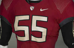
• The thread pattern on the shoulders looks like the experimental Oregon State design that first surfaced back in August. Reminds me of Spirograph art, which would normally be a good thing, except Spirograph art doesn’t really belong on a football uniform.
• If we go back to that Ohio State jersey photo that was making the rounds a few days ago, we can now see the same thread pattern on the shoulders of that jersey. I didn’t initially recognize it as such — thought it was just some sort of textured surface. But now it’s looking like Nike is going to give some of the same design elements to all of the rivalry uniforms. Which means, once again, they’re subsuming the individual team identities into the larger Team Nike concept. Fuckers.
• Interesting to see that the jersey in that FSU slideshow and the one in the Ohio State photo are both No. 55. Anyone know of any underlying significance there?
• The patterned undersleeves are exactly what Phil and Ricko have been proposing lately — a way to restore sleeve graphics to a uniform that no longer has sleeves. It’d be nice if the graphics in this case were something other than a giant feather, but whaddaya gonna do. At least it’s a team-based graphic instead of some sort of Nike branding graphic.
• The way the gloves fit together like a puzzle is cool — except that football players rarely have their hands together, and the individual glove designs don’t look so hot on their own.
• A black helmet? Sure, why not, whatever, knock yourselves out.
• My favorite three words in the promo package: “padded belt loop.”
• High-tech fabric, greater ventilation, lighter weight, higher breathability, moisture wicking Nobody cares.
• You know people are getting tired of Nike’s antics when a mainstream newspaper like The Orlando Sentinel responds to the new uniform by publishing something like this. Sample line: “There’s this thing down the side of the pants. You’ll see. Kind of looks like a horse tail.” Read the whole thing and then get me the writer’s phone number so I can ask him to fill in for me a few times a week.
And so on. Personally, I find it difficult to take this stuff very seriously — it’s not the worst uniform in the world, but I’m here to watch a football game, not the Batman. More importantly, FSU already has one of the best uniforms in the game — why mess with that? Oh, right: Because you can.
And here’s a scary thought to ponder: Buried within this promo sheet are the words “system of dress for football.” Grreeeeeaaaaaat.
Raffle Reminder: I’m currently raffling off three cool posters. Details here
Uni Watch News Ticker: Check out Babe Ruth wearing a special uniform from a 1934 tour of Japan. Further info here (with thanks to Jeremy Brahm). ”¦ Here’s a cool sheet running down all the Penguins’ skate details (with thanks to Dane Drutis). ”¦ I can’t believe it took a federal court case to determine that it’s OK to making paintings of football players. ”¦ Totally ingenious art project, which ties into issues of value, authentic-vs.-copy, etc., described here. ”¦ Awesome photo of Dean Meminger and Gary Brell wearing Marquette’s 1970-71 striped warm-ups. And the patch is for Apollo 11! ”¦ The Phils may have lost the Series, but they definitely have a more interesting assortment of facial hair than the Yanks will ever have (nice find by Nathan Haas). ”¦ We’ve all seen plenty of photos from old-style “base ball” games played by 19th-century rules. But Justin Lafferty recently attended one that had an extra twist, because the participants included Jeff Kent, Steve Finley (dig the botto end of the bat!), Blue Moon Odom, Spaceman Lee, Vida Blue, Gaylord Perry, and Rollie Fingers. You can see the rest of his photos from the game here. ”¦ UCLA will be wearing throwbacks tomorrow. ”¦ Good question from Cliff Murphy, who asks: Which team or league was the first to have its players wear championship T-shirts, caps, etc.? Or to put it another way, who’s to blame for this idiotic tradition? ”¦ Look, soccer without sponsors! “Normally Liverpool is sponsored by Carlsburg beer and Lyon by an online gambling site,” explains Coachie Ballgames. “However, French law bans alcohol ads and online gambling, so the net result was soccer played the way it should look, without ads.” ”¦ The Blazers will be wearing their Rip City alternates tonight. ”¦ And the Bucs will be wearing their creamsicles on Sunday. … The Rockets’ red alternate uni will make its debut tonight. That uniform and other Houston alternates are discussed in this article. ”¦ According to Greg Riffenburgh, this photo shows Michael Vick wearing the Air Zoom Vick II cleat from 2004. “That means he either has some left over, or Nike revived them for him (I’ll be they’re stockpiled),” says Greg. “Vick’s signature shoes haven’t been seen on the field in years (obviously) so I’m curious to see if he’ll be wearing any other versions of his old signature shoes in the near future.”
Re: Supernole unis
This really doesn’t help the whole “Free Shoes University” image now, does it?
Holy shit! Hustler costs $11.90 now?
Oh, and what’s in link? Can of snuff?
RE: Phillies Facial Hair…
Um, Chan Ho Park isnt on there… and with talent like that, we wonder why the unemployment % is so high…hmm
I’m wondering where Brell’s right hand is in that pic…
The Penguins Skate Details is actually for sharpening purposes. The “Hollow” is actually the arch that is cut into the blade giving it the correc amount of sharp edge a player likes.
Why the hell can’t my local skate shop have this option?
I kinda like the undershirt with the school-based graphics on them. But will it take Nike winning the NFL contract before we see Ricko/Phil’s idea on pro football uniforms? Reebok never pushes the envelope on uni design.
[quote comment=”358473″]Holy shit! Hustler costs $11.90 now?[/quote]
That was my first reaction when I read that item too!
[quote comment=”358477″]I kinda like the undershirt with the school-based graphics on them. But will it take Nike winning the NFL contract before we see Ricko/Phil’s idea on pro football uniforms? Reebok never pushes the envelope on uni design.[/quote]
Yeah the Bengals and Bills have real old-school uniforms.
My favorite line from that Orlando Sentinel article: “High-tenacity yarn.” :)
My admittedly faulty memory tells me that the New York Rangers in 1994 were the first team to wear ‘commemorative’ apparel on the ice when they wore link idiotic hats.
Last week I had on-field passes to the UFL game held at Tropicana Field. Here are some of the sights:
link
The link to the Spirograph art in the first bullet gives me a 403-Forbidden
[quote comment=”358478″][quote comment=”358473″]Holy shit! Hustler costs $11.90 now?[/quote]
That was my first reaction when I read that item too![/quote]
Yeah, but the articles are AMAZING!
[quote comment=”358479″][quote comment=”358477″]I kinda like the undershirt with the school-based graphics on them. But will it take Nike winning the NFL contract before we see Ricko/Phil’s idea on pro football uniforms? Reebok never pushes the envelope on uni design.[/quote]
Yeah the Bengals and Bills have real old-school uniforms.[/quote]
ok, the bengals are definitely outside the box, but the bills uni isn’t all that fashion-forward, it just uses too many colors if you took the bills uni and reduced it to just 2 colors (pick any 2 you like), i’d say it would look somewhat retro-ish. the shoulder seam striping isn’t a modern concept.
Second everything Paul and the Orlando Sentinel writer said about Florida State’s uniforms. Is Nike going to change the Yankees’ uniforms next? And yes, football is not combat. And black is not a Florida State color. And why have a rule about how many maker’s logos you can have uniforms if you can just get around that with swooshes on socks, gloves, etc.? And on and on.
[quote comment=”358473″]Holy shit! Hustler costs $11.90 now?
Oh, and what’s in link? Can of snuff?[/quote]
It looks like an electronic ankle monitor. Has he been in trouble with the law, recently?
[quote comment=”358486″]Second everything Paul and the Orlando Sentinel writer said about Florida State’s uniforms. Is Nike going to change the Yankees’ uniforms next? And yes, football is not combat. And black is not a Florida State color. And why have a rule about how many maker’s logos you can have uniforms if you can just get around that with swooshes on socks, gloves, etc.? And on and on.[/quote]
To me, this is an even trade-off for those stupid “UNCONQUERED” Black FSU unis from the past couple years.
RE” “Soccer without Sponsors” – You forgot the adidas and Umbro marks on the Liverpool and Lyon unis….
[quote comment=”358482″]Last week I had on-field passes to the UFL game held at Tropicana Field. Here are some of the sights:
link
Wow there was a game and no one showed up in Tampa…Shocking
More importantly, I have always wondered and wanted to know, how do they PAINT the lines on that Field Turf? I ask b/c the day after the Vikes/Pack game in the Metrodome, you could still see the VIKINGS end zone on the 1B line in the Play In Game for the AL Central
[quote comment=”358483″]The link to the Spirograph art in the first bullet gives me a 403-Forbidden[/quote]
Thanks. Now fixed.
Is Vida Blue wearing an ankle bracelet?
link
Article from the SF Gate.com website from 2005
link
[quote comment=”358476″]The Penguins Skate Details is actually for sharpening purposes. The “Hollow” is actually the arch that is cut into the blade giving it the correc amount of sharp edge a player likes.
Why the hell can’t my local skate shop have this option?[/quote]
just ask for it. most shops dont openly offer it, but if you ask for a certain cut, they should do it for you
[quote]- The patterned undersleeves are exactly what Phil and Ricko have been proposing lately[/quote]
for the record…that’s ricko’s idea (but ricko promised me a free comp shirt when the NFL pays him a gazillion bucks for it)
Powers is gonna kill me, but how have I not heard about this “Fly Wire Nike Technology” until now?
link
I friggin’ love the FSU gloves where the image becomes one when the hands are put together. I think Nike is trying to make it so when a receiver goes up to snag a ball he puts his hands together and a photographer usually snaps a photo. Nevertheless, I love them, and every team should wear them.
I really like these unis… but Paul is right. They already have a great uni set, and these unis are looking more and more “super heroish”. But, it could be worse.
[quote comment=”358481″]My admittedly faulty memory tells me that the New York Rangers in 1994 were the first team to wear ‘commemorative’ apparel on the ice when they wore link idiotic hats.[/quote]
Nope. Gotta be at least as far back as link.
No way will Ohio State fans let that uniform ever get on the field. They have way too much class to let Nike dress them up like clowns.
FSU on the other hand is probably used to it.
Eh…whatever takes the attention away from Bobby Bowden.
The thread pattern on the shoulders looks like the experimental Oregon State design that first surfaced back in August. Reminds me of Spirograph art
The thread pattern shows up in the shoes as well. I recall reading an article about it in Wired magazine. It said that using that wire to construct the shoe made the manufacturing process cheaper and might lead to Nike bringing back the shoemaking process from Southeast Asia to the USA. That’s as maybe.
The number font on the FSU jerseys resembles the letter font they seem to have adopted. Gold with black trim. Not bad. The rest of the uniform, I could live without.
[quote comment=”358491″]Is Vida Blue wearing an ankle bracelet?
link
Article from the SF Gate.com website from 2005
link
Then it’s an ankle flask?
does anyone know the list of schools that will be wearing these rivalry looks?
i have a feeling alabama will not be participating. and we know texas is already going retro for the game vs. A&M.
some rivalry games involving notable nike programs:
virginia tech/virginia
georgia/ga tech
usc/ucla
colorado/nebraska
oregon/oregon state
washington/wazzu
stanford/cal
arizona/az state
carolina/duke
clemson/s carolina
mizzou/kansas
and is florida gonna join fsu in wearing a special uni?
[quote comment=\”358493\”][quote]- The patterned undersleeves are exactly what Phil and Ricko have been proposing lately[/quote]
for the record…that\’s ricko\’s idea (but ricko promised me a free comp shirt when the NFL pays him a gazillion bucks for it)[/quote]
just a reminder that shirt goes on UNDER a larger, less revealing, leave more to the imagination shirt =)
[quote comment=”358495″][quote comment=”358481″]My admittedly faulty memory tells me that the New York Rangers in 1994 were the first team to wear ‘commemorative’ apparel on the ice when they wore link idiotic hats.[/quote]
Nope. Gotta be at least as far back as link.[/quote]
Wow… not only is that hat older… it’s actually uglier.
[quote comment=”358500″]does anyone know the list of schools that will be wearing these rivalry looks?
i have a feeling alabama will not be participating. and we know texas is already going retro for the game vs. A&M.
some rivalry games involving notable nike programs:
virginia tech/virginia
georgia/ga tech
usc/ucla
colorado/nebraska
oregon/oregon state
washington/wazzu
stanford/cal
arizona/az state
carolina/duke
clemson/s carolina
mizzou/kansas
and is florida gonna join fsu in wearing a special uni?[/quote]
Dont forget Georgia auburn on the 14th
[quote comment=”358474″]RE: Phillies Facial Hair…
Um, Chan Ho Park isnt on there… and with talent like that, we wonder why the unemployment % is so high…hmm[/quote]
That print was made in June.
[quote comment=”358487″][quote comment=”358473″]Holy shit! Hustler costs $11.90 now?
Oh, and what’s in link? Can of snuff?[/quote]
It looks like an electronic ankle monitor. Has he been in trouble with the law, recently?[/quote]
That’s what I thought at first, but according to link, he makes his home in Costa Rica so I figured that if there was some recent legal troubles, he wouldn’t be traveling internationally.
Could it be that Wikipedia has let me down?
So I went with “snuff” for the olde-tyme base ball connotation.
Why did East Carolina have their logo inside of the outline of North Carolina last night?
Shouldn’t they have it in the outline of their own state?
Nike Pro *Combat* Uniform??? Sheesh, as if the military didn’t have enough problems already. Can we leave the martial metaphors to the people who are actually fighting for our country?
The FSU SOD uni looks great on the skinny guy(s). I wonder what these unis and stretchy materials are going to look like on the 300 pound linemen?
link
[quote comment=”358506″]Why did East Carolina have their logo inside of the outline of North Carolina last night?
Shouldn’t they have it in the outline of their own state?[/quote]
ECU is in North Carolina……..
[quote comment=”358503″][quote comment=”358500″]does anyone know the list of schools that will be wearing these rivalry looks?
i have a feeling alabama will not be participating. and we know texas is already going retro for the game vs. A&M.
some rivalry games involving notable nike programs:
virginia tech/virginia
georgia/ga tech
usc/ucla
colorado/nebraska
oregon/oregon state
washington/wazzu
stanford/cal
arizona/az state
carolina/duke
clemson/s carolina
mizzou/kansas
and is florida gonna join fsu in wearing a special uni?[/quote]
Dont forget Georgia auburn on the 14th[/quote]
virginia tech/virginia=Both Nike
georgia/ga tech=Nike and Russell
usc/ucla=Nike and Adidas
colorado/nebraska=Nike and Adidas
oregon/oregon state=Both Nike
washington/wazzu=Both Nike
stanford/cal=Both Nike
arizona/az state=Both Nike
carolina/duke=Both Nike
clemson/s carolina=Nike and Under Armour
mizzou/kansas=Nike and Adidas
Kill me, but I kind of like them.
[quote comment=\”358510\”][quote comment=\”358503\”][quote comment=\”358500\”]does anyone know the list of schools that will be wearing these rivalry looks?
i have a feeling alabama will not be participating. and we know texas is already going retro for the game vs. A&M.
some rivalry games involving notable nike programs:
virginia tech/virginia
georgia/ga tech
usc/ucla
colorado/nebraska
oregon/oregon state
washington/wazzu
stanford/cal
arizona/az state
carolina/duke
clemson/s carolina
mizzou/kansas
and is florida gonna join fsu in wearing a special uni?[/quote]
Dont forget Georgia auburn on the 14th[/quote]
virginia tech/virginia=Both Nike
georgia/ga tech=Nike and Russell
usc/ucla=Nike and Adidas
colorado/nebraska=Nike and Adidas
oregon/oregon state=Both Nike
washington/wazzu=Both Nike
stanford/cal=Both Nike
arizona/az state=Both Nike
carolina/duke=Both Nike
clemson/s carolina=Nike and Under Armour
mizzou/kansas=Nike and Adidas
Kill me, but I kind of like them.[/quote]
carolina is UA
[quote comment=”358507″]Nike Pro *Combat* Uniform??? Sheesh, as if the military didn’t have enough problems already. Can we leave the martial metaphors to the people who are actually fighting for our country?[/quote]
All part of the comic book-ization of sports uniforms.
Whomever did the Phillies facial hair thing forgot Chan Ho Park’s General Zod Tribute Beard..
As for Vick wearing his old signature cleats:
The ticker states that they have not been seen on the field in years:
ERRONEOUS!
This year both Tyrod Taylor of VaTech and Terelle Pryor of TOSU have been wearing versions.
Taylor:
link
Pryor:
link
link
And the last player to wear Vick’s cleats on the field before that…ironically, Plaxico:
link
[quote comment=”358493″][quote]- The patterned undersleeves are exactly what Phil and Ricko have been proposing lately[/quote]
for the record…that’s ricko’s idea (but ricko promised me a free comp shirt when the NFL pays him a gazillion bucks for it)[/quote]
We also are paying no attention to the man behind the curtain.
—Ricko
[quote comment=\”358514\”]
And the last player to wear Vick\’s cleats on the field before that…ironically, Plaxico:
link
BTW, is that Marshall Faulk and Prime Time on the sidelines?
I wonder what Deion would have to say about the Horse tail thing at FSU.
Don’t get too hung up on the rivalry thing. I’m sure if you take a pole of Semi-hole fans you’d find very few people who would list Maryland as their biggest rival.
I dont hate the fsu uni’s as much as the writer. I was expecting much much worse. I will tell you that the gloves are freaking cool. It gives the kids a reason to make crazy ass hand jestures to the camera, crowd, and the opponent.
I couldn’t tell if Paul was being sarcastic, but I thought the writer from the Orlando Sentinel (I think) was hilarious and spot on…
[quote comment=”358506″]Why did East Carolina have their logo inside of the outline of North Carolina last night?
Shouldn’t they have it in the outline of their own state?[/quote]
They were throwing back to the old days, before the wall came down. (Western Carolina expected to do the same).
Driving into work this morning, I saw Willie Colon (RT, Steelers) driving a giant blue Dodge Ram with an all-over Gucci-style Yankees NY logo design in white. It was… uh… bold. At least he’s from the Bronx.
[quote comment=”358516″][quote comment=\”358514\”]
And the last player to wear Vick\’s cleats on the field before that…ironically, Plaxico:
link
BTW, is that Marshall Faulk and Prime Time on the sidelines?
I wonder what Deion would have to say about the Horse tail thing at FSU.[/quote]
Prime Time would probably try to sell you a copy of “Power, Money, and Sex”, tell you all about the Deion Sanders Hot Dog Express link
and get you suspended from work for talking to him. All while one of his child theives stole your wallet.
Your note about Lyon and Liverpool playing in Champions League got me thinking about another game I watched this. AZ Alkmaar (NL) played at Arsenal without a sponsor on their jersey. I assumed they had some \”illegal\” sponsor when I watched (of course, they were playing in ad friendly England so my thoughts were not so smart).
So I decided to Google the issue. AZ Alkmaar are sponsored by DSB (a bank). So why were they playing sponsor free this week? Well, it turns out to be a tad complicated. Their sponsor went bankrupt this week. As DSB is paid in full for the whole season and they are likely to emerge in some form from bankruptcy (if nothing else they continue to exist while they are in bankruptcy court) and precedent is to keep the sponsor on the shirt.
However, DSB and AZ Alkmaar are more intimitely linked than just a shirt sponsor. They play in DSB Stadion and most importantly the team was owned by DSB\’s founder who has invested $100 million in the club (why is it that bad business people always want to own/sponsor sports teams/stadia?). Anyway, they did not wear a sponsor on the jersey to help raise awareness of the clubs related financial trouble to DSB. DSB would benefit from cash infusions to the club and what to get that at a decent price. They already have serious shirt sponsorship and club/stadion ownership interest as a result.
Sometimes NOT wearing a sponsor is a revenue move!
Also, DSB was the sponsor of the US Speed Skating team that is not sponsored by the Colbert Nation. They had paid some of this year\’s money but not in full like AZ Alkmaar.
I apologize for all my typo\’s above. I have no excuse.
[quote comment=”358482″]Last week I had on-field passes to the UFL game held at Tropicana Field. Here are some of the sights:
link
Wow! It looks like they could have let anyone on the field. Plus, it appears that there are plenty of good seats still available. Glad to see this new league is working out so well.
[quote comment=”358511″][quote comment=”358510″][quote comment=”358503″][quote comment=”358500″]does anyone know the list of schools that will be wearing these rivalry looks?
i have a feeling alabama will not be participating. and we know texas is already going retro for the game vs. A&M.
some rivalry games involving notable nike programs:
virginia tech/virginia
georgia/ga tech
usc/ucla
colorado/nebraska
oregon/oregon state
washington/wazzu
stanford/cal
arizona/az state
carolina/duke
clemson/s carolina
mizzou/kansas
and is florida gonna join fsu in wearing a special uni?[/quote]
Dont forget Georgia auburn on the 14th[/quote]
virginia tech/virginia=Both Nike
georgia/ga tech=Nike and Russell
usc/ucla=Nike and Adidas
colorado/nebraska=Nike and Adidas
oregon/oregon state=Both Nike
washington/wazzu=Both Nike
stanford/cal=Both Nike
arizona/az state=Both Nike
carolina/duke=Both Nike
clemson/s carolina=Nike and Under Armour
mizzou/kansas=Nike and Adidas
Kill me, but I kind of like them.[/quote]
carolina is UA[/quote]
Right, which stands for Under Armour — as Matt pointed out.
Don’t forget Ohio State.
Oh, and Purdue fighting for the Old Oaken Bucket. (HA!)
There’s nothing wrong with military terminology and football.
link
As for Florida State, I think Nike went too far with what could be a decent concept. The sleeves are ok, the feather on the pants is a good idea, but I don’t like how it’s cut off. The gloves, shoes and black helmet are completely unnecessary.
[quote comment=”358511″]carolina is UA[/quote]
ARe you referring to UNC? Because S Carolina was already listed as an UA school. UNC is obviously a
Rumor has it UF will be a part of the program, as wear all whites including helmets.
Fuuuuuuuuuuuuuuuuuuck… I see orange and maroon sleeve stripes next to the Ohio State jersey. Dammit, I was hoping my Hokies wouldn’t be sucked into it…
:-( Shit
[quote comment=”358528″][quote comment=”358511″]carolina is UA[/quote]
ARe you referring to UNC? Because S Carolina was already listed as an UA school. UNC is obviously a link school.
I was looking at the schedule for the 21st of November. FSU plays Maryland, Ohio State plays Michigan (duh) and Virginia Tech, which is the only other school I’m pretty sure is doing this, they play NC State. You know what’s interesting about that? These are games with three teams in Nike (FSU, OSU, VT) playing one UnderArmor (Maryland) and two Adidas (Michigan and NCSU), respectively. It’s a stretch, and some of these Nov. 21st games pit two Nike teams against each other. But it feels like an “anything you can do, I can do better” thing from Nike. If that’s true, shame on Nike. But I hope it works for FSU because I’d be very sad if my alma mater lost.
And mark me down as actually liking the set overall. i’m not a fan of the black helmets (but they look better than I thought they would). I really like the number font and the sleeve graphics. The leg graphics are ok, I can live with those.
But don’t trust me, I also like purple in athletic uniforms.
Just to fuel the hatred of purple even more on here, I give you the link. This is a private, Catholic, all-boys school in New Orleans known mainly for “The Marching 100” band.
[quote comment=”358527″]There’s nothing wrong with military terminology and football.
link
As for Florida State, I think Nike went too far with what could be a decent concept. The sleeves are ok, the feather on the pants is a good idea, but I don’t like how it’s cut off. The gloves, shoes and black helmet are completely unnecessary.[/quote]
It’s all totally unnecessary.
– High-tech fabric, greater ventilation, lighter weight, higher breathability, moisture wicking NOBODY CARES
Exactly.
On the comp sleeve designs, they sure look good on players with some serious guns. But on those with skinny arms like me (kickers, punters, QBs, etc.) it might look a bit odd, no?
What drives me nuts about the new uniforms is the “lighter” aspect. With FSU’s new digs, Nike is bosting that the D-rings are now made of titanium and now “66% lighter”. Well, just how heavy would the D-rings be in the first place? A couple of ounces? You are not going to improve the performance of a football player by making his beltbuckle an ounce lighter. It’s all just junk science mumbo jumbo to make the unis seem more high tech. This shouldn’t irk me so, but it does.
Is it me, or does that FSU font on the rivalry jersey look a lot like the number font on the Oregon State jerseys?
link
[quote comment=”358497″]Eh…whatever takes the attention away from Bobby Bowden.[/quote]
That made me laugh.
I gotta say that if black WAS an FSU color those helmets would be very cool. I think they look sharp.
I’ll go ahead and mail back my membership card now.
[quote comment=”358534″]Just to fuel the hatred of purple even more on here, I give you the link. This is a private, Catholic, all-boys school in New Orleans known mainly for “The Marching 100” band.[/quote]
Kerry, I’ll join in on that one. The University I work at has recently ditched their home whites in BBall for gold (Pantone 7502, to be exact) with purple numbering/accents. link
“The ________, _______ and ________ helmets are completely unnecessary.”
Pretty much the touchstone of most of today’s football uni designers, isn’t it.
—Ricko
The close-up of the jersey shows the same patchwork of fabrics that the University of Washington unis have – the ones that link. Wonder what color those areas will change into during the FSU game…
Paul,
I have to come to the defense on championship shirts and hats. So I think all us UniWatchers can agree that we’re realists in that we know merchandise is a huge money maker for teams. What I think we resent is when obvious merchandising ploys make their way onto the field and into our team’s favorite looks (i.e. the Mets black). I’m confused at what the harm is in taking a very profitable avenue and sewing it into the fabric of postgame celebration when it really doesn’t effect the overall aesthetic. I would even argue that celebrations without championship gear look strange to me. When I see the old Tom Seaver, “it’s the greatest feeling in the world” line from ’69, it always disarms me that he’s not in a 1969 world champions t-shirt (I’m 25, so I don’t really know of a world without them). I guess in short, I know that if/when my teams win a title, buying the gear is going to be one of the highlights.
[quote comment=”358540″][quote comment=”358534″]Just to fuel the hatred of purple even more on here, I give you the link. This is a private, Catholic, all-boys school in New Orleans known mainly for “The Marching 100” band.[/quote]
Kerry, I’ll join in on that one. The University I work at has recently ditched their home whites in BBall for gold (Pantone 7502, to be exact) with purple numbering/accents. link
Clarksville High, you watching?
[quote comment=”358478″][quote comment=”358473″]Holy shit! Hustler costs $11.90 now?[/quote]
That was my first reaction when I read that item too![/quote]
Well, until I can come up with a means of acquiring pornography for free, I guess I’m stuck paying $11.90.
And have any of you design types ever seen this? Our director of Marketing handed out pens with a retractable scroll that has our graphic standards on it. link
[quote comment=”358536″]- High-tech fabric, greater ventilation, lighter weight, higher breathability, moisture wicking NOBODY CARES
Exactly.
On the comp sleeve designs, they sure look good on players with some serious guns. But on those with skinny arms like me (kickers, punters, QBs, etc.) it might look a bit odd, no?[/quote]
Nah, just check out everyone on THAT 70’S SHOW. Looks great.
Trick would be to NOT wear them tight, lest our arms look like designer pipe cleaners. In which case the sleeves would look like…well, sleeves.
—Ricko
It’s the 55th year anniversary of Ohio State winning a national title and Rose Bowl. I’m not sure why FSU is #55 as well.
[quote comment=”358541″]”The ________, _______ and ________ helmets are completely unnecessary.”
Pretty much the touchstone of most of today’s football uni designers, isn’t it.
—Ricko[/quote]
pads, numbers & plastic?
(sorry)
Michigan is rumored to have throwbacks as well for the game, even though they are Adidas.
[quote comment=\”358544\”][quote comment=\”358540\”][quote comment=\”358534\”]Just to fuel the hatred of purple even more on here, I give you the link. This is a private, Catholic, all-boys school in New Orleans known mainly for \”The Marching 100\” band.[/quote]
Kerry, I\’ll join in on that one. The University I work at has recently ditched their home whites in BBall for gold (Pantone 7502, to be exact) with purple numbering/accents. link
Clarksville High, you watching?[/quote]
Can I plug our baseball uniforms, in that case?
link
[quote comment=”358527″]There’s nothing wrong with military terminology and football.
[/quote]
nothing wrong with terminology…EVERYTHING wrong with dressing the players up and having them act as if they’re fuckin soldiers
no…you’re a football player
/not a soldier…not a soldier…a football player
I only have one thing to post about the new Nike uniforms: Starship Troopers (the bad movie).
link
ed
[quote comment=”358543″]Paul,
I have to come to the defense on championship shirts and hats. So I think all us UniWatchers can agree that we’re realists in that we know merchandise is a huge money maker for teams. What I think we resent is when obvious merchandising ploys make their way onto the field and into our team’s favorite looks (i.e. the Mets black). I’m confused at what the harm is in taking a very profitable avenue and sewing it into the fabric of postgame celebration when it really doesn’t effect the overall aesthetic. I would even argue that celebrations without championship gear look strange to me. When I see the old Tom Seaver, “it’s the greatest feeling in the world” line from ’69, it always disarms me that he’s not in a 1969 world champions t-shirt (I’m 25, so I don’t really know of a world without them). I guess in short, I know that if/when my teams win a title, buying the gear is going to be one of the highlights.[/quote]
Wow. No reflection on you, but this is a sad commentary on the commericialization of our society over the last 15 years.
[quote comment=”358549″][quote comment=”358541″]”The ________, _______ and ________ helmets are completely unnecessary.”
Pretty much the touchstone of most of today’s football uni designers, isn’t it.
—Ricko[/quote]
pads, numbers & plastic?
(sorry)[/quote]
Yeah, because I think lack for restraint in design is a weakness it means I don’t like any uni after 1952.
Y’know, The Jeff, there’s a reason there’s currently a wildly successful video game and cds regarding the Beatles and nothing on “Yummy Yummy Yummy I Got Love in My Tummy.”
If you pay attention, you know I don’t think only old is good.
But you need to learn that new and change aren’t automatically better. Sometimes it’s just plain crap that’s doesn’t last.
If you stay open minded and aren’t afraid to be analytical, you’ll learn to tell the difference.
And we’re done talking, you and I.
—Ricko
[quote comment=”358552″][quote comment=”358527″]There’s nothing wrong with military terminology and football.
[/quote]
nothing wrong with terminology…EVERYTHING wrong with dressing the players up and having them act as if they’re link
no…you’re a football player
/not a soldier…not a soldier…a football player[/quote]
Kellen Winslow disagrees
Look, soccer without sponsors! “Normally Liverpool is sponsored by Carlsburg beer and Lyon by an online gambling site,” explains Coachie Ballgames. “However, French law bans alcohol ads and online gambling, so the net result was soccer played the way it should look, without ads.” …
So Lyon, a French team is wearing a sponsor that is illegal in France. That doesn’t add up.
We’ve all seen plenty of photos from old-style “base ball” games played by 19th-century rules. But Justin Lafferty recently attended one that had an extra twist, because the participants included Jeff Kent, Steve Finley (dig the botto end of the bat!), Blue Moon Odom, Spaceman Lee, Vida Blue, Gaylord Perry, and Rollie Fingers. You can see the rest of his photos from the game here.
But most importantly, BRADY ANDERSON! Sideburns and all.
[quote comment=”358555″][quote comment=”358549″][quote comment=”358541″]”The ________, _______ and ________ helmets are completely unnecessary.”
Pretty much the touchstone of most of today’s football uni designers, isn’t it.
—Ricko[/quote]
pads, numbers & plastic?
(sorry)[/quote]
Yeah, because I think lack for restraint in design is a weakness it means I don’t like any uni after 1952.
Y’know, The Jeff, there’s a reason there’s currently a wildly successful video game and cds regarding the Beatles and nothing on “Yummy Yummy Yummy I Got Love in My Tummy.”
If you pay attention, you know I don’t think only old is good.
But you need to learn that new and change aren’t automatically better. Sometimes it’s just plain crap that’s doesn’t last.
If you stay open minded and aren’t afraid to be analytical, you’ll learn to tell the difference.
And we’re done talking, you and I.
—Ricko[/quote]
Sorry, I forgot to put in the “lame attempt at humor” tag. It wasn’t a personal attack.
[quote comment=”358553″]I only have one thing to post about the new Nike uniforms: Starship Troopers (the bad movie).
link
ed[/quote]
Oddly enough, there’s an Adidas logo on those things.
To The Jeff — that’s the best attempt at being respectful to Ricko that you have managed in the last week. Remember that sometimes, no matter the merits of what you say, you can lose people with your tone. Everyone is entitled to respect, and none more so on this site than Ricko.
[quote comment=”358553″]I only have one thing to post about the new Nike uniforms: Starship Troopers (the bad movie).
link
ed[/quote]
oh. my. god.
that looked like the NF-XF-UFL merger in 2012 game between the bengals and the locomotives
Thanks, Justin, for sharing those UFL shots — that was awesome (and terrible at the same time).
Judging by the empty seats, did everyone have field passes. lol
Oh, and on today’s topic: How I despise monochrome uniforms in football. When did this sneak back into trendy? It’s so very … 2002.
Oh, for the days of the cut-off, loose-knit:
link
Ok, I gotta say that first of all I am a total fan of traditional no nonsense simple, sharp, and classic unis. Huge fan! My friends give me so much sh!t because any time I sit down to watch a game I start talking about how the team could go to a grey facemask and simplify/retro the uni to look way better.
I also gotta say that I am almost offended by what Nike has done to college basketball uniforms with their SOD. It actually makes the game hard to watch with the skin tight tops and bloomers for bottoms needless to say void of multicolor piping and thick different color waistbands.
I could go on about that but I also gotta mention the Chicago Bulls unis after watching them last night. Dude, what the f is goin on with that satin look??? Its a traveshamockery! Can we please bring back the double mesh? Can someone get me in touch with the guy behind ‘ditch the black’? I wanna start up a ‘double fun double mesh’ campaign!
Ok, all this being said…. I like what Nike is doing with college football uniforms. I have to say that the Oregon uniforms have rocked this year. Between the weeks of the matte black helmet, the gray pants, and the retro unis, they have me tunin into games just to look at the unis.
Almost as much as a Tennessee v. New England game in the snow…or any of the other AFC retro games this year. Grey Facemasks people!!
Back to Nike…. I like what they have done with Miami and Boise State this year. I like these new Florida State uniforms. I’m excited to see these rivalry games!!
Disclosure: I have no loyalty to any shoe company or clothing manufacture… although I have spent some hard earned cash on a retro Woolrich Woolen Mills flannel shirt and slick jacket and some camouflage nike air force 1’s.
Peace out brothermen!
What is the target demographic of UNIWATCH? Age 90-100?
Do you need to be a part of the i-am-extremely-old-and-out-of-touch-with-the-modern-world-so-i-hate-all-that-is-new demographic?
Well, at least Nike can’t fug-up Penn State’s ‘vanilla’ unis. Or can they?
[quote comment=”358507″]Nike Pro *Combat* Uniform??? Sheesh, as if the military didn’t have enough problems already. Can we leave the martial metaphors to the people who are actually fighting for our country?[/quote]
i totally agree! i hate when players say things like “we won the war” or “we shocked the world”… no ya didn’t… and… no ya didn’t
[quote comment=”358565″]What is the target demographic of UNIWATCH? Age 90-100?
Do you need to be a part of the i-am-extremely-old-and-out-of-touch-with-the-modern-world-so-i-hate-all-that-is-new demographic?[/quote]
Ah, but somewhere along the line you come to realize that the “modern” world isn’t always in touch with the real world. Yes, sometimes it’s definitely remarkable and new and exhilarating, but sometimes it’s just making noise to make today seem interesting.
Nothing wrong with trying to tell the difference. Doesn’t mean you’re old, just means you know better than to blindly buy “New! Improved! Modern! Leading Edge!”
Some people spent a lot of money on 8-Tracks and BetaMax, you know.
—Ricko
[quote comment=”358518″]I dont hate the fsu uni’s as much as the writer. I was expecting much much worse. I will tell you that the gloves are freaking cool. It gives the kids a reason to make crazy ass hand jestures to the camera, crowd, and the opponent.[/quote]
Maybe it’ll teach receivers to catch the ball properly, too.
holy crap when did uniwatch get a twitter?
[quote comment=”358500″]does anyone know the list of schools that will be wearing these rivalry looks?
i have a feeling alabama will not be participating. and we know texas is already going retro for the game vs. A&M.
some rivalry games involving notable nike programs:
virginia tech/virginia
georgia/ga tech
usc/ucla
colorado/nebraska
oregon/oregon state
washington/wazzu
stanford/cal
arizona/az state
carolina/duke
clemson/s carolina
mizzou/kansas
and is florida gonna join fsu in wearing a special uni?[/quote]
if you look at the right of the OSU jersey, it kinda looks like a VTech jersey…I assume they will def be in the “new nike pro combat” jersey school set
[quote comment=”358568″]Some people spent a lot of money on 8-Tracks and BetaMax, you know.[/quote]
rick, that reminds me…i just parambulated down to western union to return this tape to you…assuming the horses are fresh, you should be receiving it by post 3-5 days hence
[quote comment=”358567″][quote comment=”358507″]Nike Pro *Combat* Uniform??? Sheesh, as if the military didn’t have enough problems already. Can we leave the martial metaphors to the people who are actually fighting for our country?[/quote]
i totally agree! i hate when players say things like “we won the war” or “we shocked the world”… no ya didn’t… and… no ya didn’t[/quote]
Given the choice of “we won the war” vs “I’d like to thank God for our victory” I’d prefer the war comments.
[quote comment=”358545″][quote comment=”358478″][quote comment=”358473″]Holy shit! Hustler costs $11.90 now?[/quote]
That was my first reaction when I read that item too![/quote]
Well, until I can come up with a means of acquiring pornography for free, I guess I’m stuck paying $11.90.[/quote]
Uhmmmm, ever here of a little thing called the internets? Al Gore invented it just for the free porn.
Looks like Virginia Tech Will be unveiling their Combat uni set on monday, according to the university.
link
“Don’t miss the on-campus celebration on Monday, November 9, 2009 when Nike reveals a new rivalry game day football uniform to be worn for Virginia Tech v. Maryland on November 14, 2009. Bill Roth, voice of the Hokies and master of ceremony for this event, will be joined by Hokie athletes, cheerleaders, athletic director Jim Weaver, and head coach Frank Beamer. Professional athletes who played for the Hokies will join us for the fun and sign autographs. A local DJ will spin tunes before and after the presentation on the Squires Plaza between the University Bookstore and Newman Library. Limited replica jerseys and rivalry game day t-shirts will be available for purchase at the University Bookstore and the mobile Nike retail center.”
[quote comment=”358565″]What is the target demographic of UNIWATCH? Age 90-100?
Do you need to be a part of the i-am-extremely-old-and-out-of-touch-with-the-modern-world-so-i-hate-all-that-is-new demographic?[/quote]
I’m 25 and male, right in the middle of the most powerful marketing demographic. I don’t always agree with Paul or the other posters/editors, but they’re definitely right about a lot of stuff.
A good design is memorable through the use of simple, but unique elements and a good color palette. This is something that a lot of modern designs forget in favor throwing as many elements at the template as possible and keeping what sticks.
Interesting tidbit from “Ask Vic” on jaguars.com:
Chad from Orange Beach, AL
Why is tradition so much better in the NCAA than in the NFL? Is it just because we live in SEC country?
Vic: Yes, it’s because you live in SEC country, where college football tradition is much greater than that of the pro teams in the area, largely because the pro teams have significantly less history. In the northeast and upper Midwest, pro football is king and its teams have magnificent traditions. One of my all-time favorite traditions involves the numbers on the front of the Steelers helmets. They’re not there in the preseason; only the numbers on the back of the helmet appear during the preseason. The numbers aren’t put on the front until the final roster cut has been made. On that day, when a player walks into the locker room and sees the numbers on the front of his helmet, he knows he’s made the team.
and he’s right – no numbers on the front:
link
link
link
That FSU video presentation seems to get off track a little when the narrator starts talking about drinking black tea…
[quote comment=”358572″][quote comment=”358568″]Some people spent a lot of money on 8-Tracks and BetaMax, you know.[/quote]
rick, that reminds me…i just parambulated down to western union to return link to you…assuming the horses are fresh, you should be receiving it by post 3-5 days hence[/quote]
When am I gonna get my wax cylinders back, motherfucker?
[quote comment=”358568″][quote comment=”358565″]What is the target demographic of UNIWATCH? Age 90-100?
Do you need to be a part of the i-am-extremely-old-and-out-of-touch-with-the-modern-world-so-i-hate-all-that-is-new demographic?[/quote]
Ah, but somewhere along the line you come to realize that the “modern” world isn’t always in touch with the real world. Yes, sometimes it’s definitely remarkable and new and exhilarating, but sometimes it’s just making noise to make today seem interesting.
Nothing wrong with trying to tell the difference. Doesn’t mean you’re old, just means you know better than to blindly buy “New! Improved! Modern! Leading Edge!”
Some people spent a lot of money on 8-Tracks and BetaMax, you know.
—Ricko[/quote]
John Wooden said, “never confuse ‘activity’ with ‘achievement'” and I think this can be applied to uniforms. Just because something has been updated, redesigned, recreated, revised, etc does not mean it’s been improved.
[quote comment=”358477″]I kinda like the undershirt with the school-based graphics on them. But will it take Nike winning the NFL contract before we see Ricko/Phil’s idea on pro football uniforms? Reebok never pushes the envelope on uni design.[/quote]
Well, they definitely OVERSTUFFED the envelope on those damn hockey jerseys….
[quote comment=”358537″]What drives me nuts about the new uniforms is the “lighter” aspect. With FSU’s new digs, Nike is bosting that the D-rings are now made of titanium and now “66% lighter”. Well, just how heavy would the D-rings be in the first place? A couple of ounces? You are not going to improve the performance of a football player by making his beltbuckle an ounce lighter. It’s all just junk science mumbo jumbo to make the unis seem more high tech. This shouldn’t irk me so, but it does.[/quote]
I couldn’t agree more. obviously, newer fabrics beat the old wool unis of the early 1900s BUT NOBODY IS WEARING WOOL ANY MORE!! Nike’s new uni for the Buckeyes is 13 ounces lighter than the old uni. 13 whole ounces for kids who put on six extra sweatbands and wrap their feet in four rolls of tape. think it really makes a difference? 13 ounces? wow oh wow – I expect most of our players will need to be roped together so they don’t float off in the huddle!
[quote comment=”358481″]My admittedly faulty memory tells me that the New York Rangers in 1994 were the first team to wear ‘commemorative’ apparel on the ice when they wore link idiotic hats.[/quote]
Looks just like the Rockets hats from around the same time. Dallas Cowboys came first though… That was the first time I remember they had satellite stores at hotels to go buy the championship gear.
[quote comment=”358572″][quote comment=”358568″]Some people spent a lot of money on 8-Tracks and BetaMax, you know.[/quote]
rick, that reminds me…i just parambulated down to western union to return link to you…assuming the horses are fresh, you should be receiving it by post 3-5 days hence[/quote]
This post is excellent on so many levels.
[quote comment=”358508″]The FSU SOD uni looks great on the skinny guy(s). I wonder what these unis and stretchy materials are going to look like on the 300 pound linemen?
link
Oh, that is just wrong….. you need to wait a little later in the day to post that shit!
Nothing wrong with Nikes unis, I love em, why not change things? Things get old after awhile. BTW, Reebok and there new side line apparell? Awful…have dark half light….HORRIBLE
link
[quote comment=”358584″][quote comment=”358481″]My admittedly faulty memory tells me that the New York Rangers in 1994 were the first team to wear ‘commemorative’ apparel on the ice when they wore link idiotic hats.[/quote]
Looks just like the Rockets hats from around the same time. Dallas Cowboys came first though… That was the first time I remember they had satellite stores at hotels to go buy the championship gear.[/quote]
When? In the 70s? That means it’s even worse than I thought.
[quote comment=”358546″]And have any of you design types ever seen this? Our director of Marketing handed out pens with a retractable scroll that has our graphic standards on it. link
I have one from Russia… has the metro map on it! Would have thought I would see that in Japan first!
[quote comment=”358557″]Look, soccer without sponsors! “Normally Liverpool is sponsored by Carlsburg beer and Lyon by an online gambling site,” explains Coachie Ballgames. “However, French law bans alcohol ads and online gambling, so the net result was soccer played the way it should look, without ads.” …
So Lyon, a French team is wearing a sponsor that is illegal in France. That doesn’t add up.[/quote]
That’s what I thought. According to wikipedia they signed a deal with BetClic this past summer, but they were threatened with having points taken away if they wore them in league games. So far they have only worn them while playing out of the country. Seems like someone should have done a little research before signing the deal.
[quote comment=”358587″]Reebok and there new side line apparell? Awful…have dark half light….HORRIBLE
link
nothing wrong with rbks sideline “apparell,” i love em, why not change things? things get old after awhile.
[quote comment=”358587″]Nothing wrong with Nikes unis, I love em, why not change things? Things get old after awhile. BTW, Reebok and there new side line apparell? Awful…have dark half light….HORRIBLE
link
If you think that’s bad, you should see the hats.
link
[quote comment=”358593″][quote comment=”358587″]Reebok and there new side line apparell? Awful…have dark half light….HORRIBLE
link
nothing wrong with rbks sideline “apparell,” i love em, why not change things? things get old after awhile.[/quote]
Why not have them wear the watch caps they give the coaches then? These look good.
link
[quote comment=”358594″][quote comment=”358587″]Nothing wrong with Nikes unis, I love em, why not change things? Things get old after awhile. BTW, Reebok and there new side line apparell? Awful…have dark half light….HORRIBLE
link
If you think that’s bad, you should see the hats.
link
taken from an asphalt worker’s floor boards.
[quote comment=”358553″]I only have one thing to post about the new Nike uniforms: Starship Troopers (the bad movie).
link
ed[/quote]
Hey… there is a chick playing WITH the guys, like it!
now this isnt bad….
[quote comment=”358596″][quote comment=”358594″][quote comment=”358587″]Nothing wrong with Nikes unis, I love em, why not change things? Things get old after awhile. BTW, Reebok and there new side line apparell? Awful…have dark half light….HORRIBLE
link
If you think that’s bad, you should see the hats.
link
taken from an asphalt worker’s floor boards.[/quote]
This isnt bad
link
RE: The championship t-shirts…
I remember the Bulls had them for their championships in the ’90s.
As well, I don’t remember anyone having them in the mid-1980s.
So I’m guessing somewhere in that timeframe.
[quote comment=”358592″][quote comment=”358557″]Look, soccer without sponsors! “Normally Liverpool is sponsored by Carlsburg beer and Lyon by an online gambling site,” explains Coachie Ballgames. “However, French law bans alcohol ads and online gambling, so the net result was soccer played the way it should look, without ads.” …
So Lyon, a French team is wearing a sponsor that is illegal in France. That doesn’t add up.[/quote]
That’s what I thought. According to wikipedia they signed a deal with BetClic this past summer, but they were threatened with having points taken away if they wore them in league games. So far they have only worn them while playing out of the country. Seems like someone should have done a little research before signing the deal.[/quote]
Good deal for the team. They get paid and they don’t have to be walking billboards – and the sponsor still gets some attention because of the fuss about the team not wearing it. It’s brilliant.
[quote comment=”358588″][quote comment=”358584″][quote comment=”358481″]My admittedly faulty memory tells me that the New York Rangers in 1994 were the first team to wear ‘commemorative’ apparel on the ice when they wore link idiotic hats.[/quote]
Looks just like the Rockets hats from around the same time. Dallas Cowboys came first though… That was the first time I remember they had satellite stores at hotels to go buy the championship gear.[/quote]
When? In the 70s? That means it’s even worse than I thought.[/quote]
Um, no…. we won back-to-back in 94 and 95 I think. anyone comment “when Michael Jordon took a break” and I will go office linebacker on your ass!
Just waiting for the first player to make a big play while wearing the gloves and then throw his hands together to make the school logo for the camera.
[quote comment=”358526″][quote comment=”358511″][quote comment=”358510″][quote comment=”358503″][quote comment=”358500″]does anyone know the list of schools that will be wearing these rivalry looks?
i have a feeling alabama will not be participating. and we know texas is already going retro for the game vs. A&M.
some rivalry games involving notable nike programs:
virginia tech/virginia
georgia/ga tech
usc/ucla
colorado/nebraska
oregon/oregon state
washington/wazzu
stanford/cal
arizona/az state
carolina/duke
clemson/s carolina
mizzou/kansas
and is florida gonna join fsu in wearing a special uni?[/quote]
Dont forget Georgia auburn on the 14th[/quote]
virginia tech/virginia=Both Nike
georgia/ga tech=Nike and Russell
usc/ucla=Nike and Adidas
colorado/nebraska=Nike and Adidas
oregon/oregon state=Both Nike
washington/wazzu=Both Nike
stanford/cal=Both Nike
arizona/az state=Both Nike
carolina/duke=Both Nike
clemson/s carolina=Nike and Under Armour
mizzou/kansas=Nike and Adidas
Kill me, but I kind of like them.[/quote]
carolina is UA[/quote]
Right, which stands for Under Armour — as Matt pointed out.
Don’t forget Ohio State.
Oh, and Purdue fighting for the Old Oaken Bucket. (HA!)[/quote]
simple reading error, i saw carolina and just jumped on it… didnt see scarolina. me stupid!
[quote comment=”358600″][quote comment=”358592″][quote comment=”358557″]
Good deal for the team. They get paid and they don’t have to be walking billboards – and the sponsor still gets some attention because of the fuss about the team not wearing it. It’s brilliant.[/quote]
Unlike this mess link
[quote comment=”358492″][quote comment=”358476″]The Penguins Skate Details is actually for sharpening purposes. The “Hollow” is actually the arch that is cut into the blade giving it the correc amount of sharp edge a player likes.
Why the hell can’t my local skate shop have this option?[/quote]
just ask for it. most shops dont openly offer it, but if you ask for a certain cut, they should do it for you[/quote]
I think it says volumes that I would never trust these guys to even attempt to do anything other than throw and edge on my blades. Besides, I doubt I would notice any difference in my Over Thirty Beer League Performance.
[quote comment=”358601″][quote comment=”358588″][quote comment=”358584″][quote comment=”358481″]My admittedly faulty memory tells me that the New York Rangers in 1994 were the first team to wear ‘commemorative’ apparel on the ice when they wore link idiotic hats.[/quote]
Looks just like the Rockets hats from around the same time. Dallas Cowboys came first though… That was the first time I remember they had satellite stores at hotels to go buy the championship gear.[/quote]
When? In the 70s? That means it’s even worse than I thought.[/quote]
Um, no…. we won back-to-back in 94 and 95 I think. anyone comment “when Michael Jordon took a break” and I will go office linebacker on your ass![/quote]
I’m talking about the Cowboys. We’ve already determined that the Bulls had championship gear in 1991 (y’know, before Jordan took his break).
@Cavendish, Seven and The Jeff on Olympique Lyon
The Jeff is pretty much right on. However, the space is not going unused and certainly not for long. This weekend I believe their betting sponsor is renting the space out to Universal Music to promote a new Kool Shen release.
Also, the deal was for the whole season and a law to overturn the ban was already passed in France but does not take effect until Jan 1 where you will be seeing a Bet-Clic ad on Lyons shirt. Each week until then you might see different ads, who know.
Not sure if anyone has pointed this out yet, but the picture of the OSU superhero jersey has a jersey just to the right of it with the checkboard effect that was talked about some time ago.
What about the Chiefs switching to Black Shoes and Grey facemasks, just like what they did for the AFL Legacy games?
link
Nobody mentioned ECU’s helmet midfield logo during last night’s game. Both were really cool.
[quote comment=”358583″][quote comment=”358537″]What drives me nuts about the new uniforms is the “lighter” aspect. With FSU’s new digs, Nike is bosting that the D-rings are now made of titanium and now “66% lighter”. Well, just how heavy would the D-rings be in the first place? A couple of ounces? You are not going to improve the performance of a football player by making his beltbuckle an ounce lighter. It’s all just junk science mumbo jumbo to make the unis seem more high tech. This shouldn’t irk me so, but it does.[/quote]
I couldn’t agree more. obviously, newer fabrics beat the old wool unis of the early 1900s BUT NOBODY IS WEARING WOOL ANY MORE!! Nike’s new uni for the Buckeyes is 13 ounces lighter than the old uni. 13 whole ounces for kids who put on six extra sweatbands and wrap their feet in four rolls of tape. think it really makes a difference? 13 ounces? wow oh wow – I expect most of our players will need to be roped together so they don’t float off in the huddle![/quote]
The Kentucky cheerleaders had a similar problem: link
Reminder: Anyone who hasn’t voted in round 1 of the the Worst. Uni. Ever. survey, please take a moment to do so. The NHL category is going down to the wire. Only 17 votes separate first and second place.
link.
If you want to review the nominees and see pictures of them all, you can take a look at link.
Thanks.
[quote comment=”358609″]What about the Chiefs switching to Black Shoes and Grey facemasks, just like what they did for the AFL Legacy games?
link
Or they can continue using the white mask, which looks better and has been in use longer.
Seriously, what is the appeal of the gray mask? I don’t get it. I’m not being a smartass this time, I seriously do not understand what’s so great about a facemask in a color that isn’t used anywhere else on a team’s uniform. The gray masks of the 60’s were not a choice, they were the only option.
adds to the throwback effect I guess…sorry it was just a question
[quote comment=\”358613\”][quote comment=\”358609\”]What about the Chiefs switching to Black Shoes and Grey facemasks, just like what they did for the AFL Legacy games?
link
Or they can continue using the white mask, which looks better and has been in use longer.
Seriously, what is the appeal of the gray mask? I don\’t get it. I\’m not being a smartass this time, I seriously do not understand what\’s so great about a facemask in a color that isn\’t used anywhere else on a team\’s uniform. The gray masks of the 60\’s were not a choice, they were the only option.[/quote]
[quote comment=”358614″]adds to the throwback effect I guess…sorry it was just a question
[quote comment=\”358613\”][quote comment=\”358609\”]What about the Chiefs switching to Black Shoes and Grey facemasks, just like what they did for the AFL Legacy games?
link
Or they can continue using the white mask, which looks better and has been in use longer.
Seriously, what is the appeal of the gray mask? I don\’t get it. I\’m not being a smartass this time, I seriously do not understand what\’s so great about a facemask in a color that isn\’t used anywhere else on a team\’s uniform. The gray masks of the 60\’s were not a choice, they were the only option.[/quote][/quote]
It works for throwbacks, I don’t have a complaint there. But I really do not want to see any more teams switching back to them (like the damn Browns) just because they can.
[quote comment=\”358511\”]
carolina is UA[/quote]
WAIT? WHAT?!!! How could you make this mistake?
Anywho, I\’m not surprised to see Vick wearing the ZV2. I\’ve seen the Zoom Vick 3 in the past couple of weeks in both college and NFL games.
[quote comment=”358565″]What is the target demographic of UNIWATCH? Age 90-100?
Do you need to be a part of the i-am-extremely-old-and-out-of-touch-with-the-modern-world-so-i-hate-all-that-is-new demographic?[/quote]
We don’t hate everything that is new, sonny. Now pull your jeans up to your waistline and get off my lawn!
Seriously, there are some new designs I like and there are some old designs I’m glad are gone. I believe most of us here, no matter what our age, think new designs are fine IF you can improve on the old ones. To take a great uni and change it for the sake of change, though, is what bugs us.
I’d like to see a good mix of classic unis and modern ones, not all new or all classic.
Just curious, if you do the fashionable pants halfway down the hips thing, is that really comfortable or functional for you? I’m guessing no.
re: championship gear-
the 49ers wore hats on the sidelines after winning Super Bowl 24 (in both black and white) and were wearing them in the locker room after Super Bowl 23 (very plain white hats) but I think it all started with the Lakers when they went back to back in ’87 and ’88.
[quote comment=\\\”358606\\\”][quote comment=\\\”358601\\\”][quote comment=\\\”358588\\\”][quote comment=\\\”358584\\\”][quote comment=\\\”358481\\\”]My admittedly faulty memory tells me that the New York Rangers in 1994 were the first team to wear \\\’commemorative\\\’ apparel on the ice when they wore these idiotic hats.[/quote]
Looks just like the Rockets hats from around the same time. Dallas Cowboys came first though… That was the first time I remember they had satellite stores at hotels to go buy the championship gear.[/quote]
When? In the 70s? That means it\\\’s even worse than I thought.[/quote]
Um, no…. we won back-to-back in 94 and 95 I think. anyone comment \\\”when Michael Jordon took a break\\\” and I will go office linebacker on your ass![/quote]
I\\\’m talking about the Cowboys. We\\\’ve already determined that the Bulls had championship gear in 1991 (y\\\’know, before Jordan took his break).[/quote]
Oh sorry, I commented before I saw the Bulls comment.
Looks like they had hats in link… it was about the same time we started having special logos for the Finals, huh?
[quote comment=”358613″]Seriously, what is the appeal of the gray mask? I don’t get it. I’m not being a smartass this time, I seriously do not understand what’s so great about a facemask in a color that isn’t used anywhere else on a team’s uniform. The gray masks of the 60’s were not a choice, they were the only option.[/quote]
i will give you that there is no rationale for the gray face mask (personally i like it), but i can see why it offends you
some teams don’t look bad with a colored mask, (although i see nothing wrong this look either) … while (IMHO) it looks like shit on some teams (which is why they went back to this)…
the more “modern” the uni, the “more age appropriate” the facemask, i guess…although depending on the team, one could argue the colored facemask is fine
that being said…this mask is better with the throwback, whereas, this mask probably works with the modern uni
/guess all im saying, is there’s nothing wrong with teams who want to keep the gray facemask, but there is also no need to keep it gray other than tradition
[quote comment=”358526″][quote comment=”358511″][quote comment=”358510″][quote comment=”358503″][quote comment=”358500″]does anyone know the list of schools that will be wearing these rivalry looks?
i have a feeling alabama will not be participating. and we know texas is already going retro for the game vs. A&M.
some rivalry games involving notable nike programs:
virginia tech/virginia
georgia/ga tech
usc/ucla
colorado/nebraska
oregon/oregon state
washington/wazzu
stanford/cal
arizona/az state
carolina/duke
clemson/s carolina
mizzou/kansas
and is florida gonna join fsu in wearing a special uni?[/quote]
Dont forget Georgia auburn on the 14th[/quote]
virginia tech/virginia=Both Nike
georgia/ga tech=Nike and Russell
usc/ucla=Nike and Adidas
colorado/nebraska=Nike and Adidas
oregon/oregon state=Both Nike
washington/wazzu=Both Nike
stanford/cal=Both Nike
arizona/az state=Both Nike
carolina/duke=Both Nike
clemson/s carolina=Nike and Under Armour
mizzou/kansas=Nike and Adidas
Kill me, but I kind of like them.[/quote]
carolina is UA[/quote]
Right, which stands for Under Armour — as Matt pointed out.
Don’t forget Ohio State.
Oh, and Purdue fighting for the Old Oaken Bucket. (HA!)[/quote]
Y’all are forgetting the 2nd best rivalry of all, the Backyard Brawl between Pitt and WVU. Pitt and Penn State was the best – I miss those games.
I’m super excited! Josh Freeman’s first ever NFL start and he’s going to be in the Creamsicle!!!
[quote comment=”358619″]
Looks like they had hats in link… it was about the same time we started having special logos for the Finals, huh?[/quote]
Funny. I just found that pic as well.
I’m not sure how much I like the Seminole pant design, but I’m really excited about the idea of it. While I’m not huge on the crazy designs we’ve seen in recent years I’m quite happy to see this step at least being attempted. If the world were nothing but simple stripes down the leg, the world would get pretty boring eventually. Hopefully it doesn’t become commonplace but hopefully we find a few teams that can pull it off.
[quote comment=”358618″]re: championship gear-
the 49ers wore hats on the sidelines after winning Super Bowl 24 (in both black and white) and were wearing them in the locker room after Super Bowl 23 (very plain white hats) but I think it all started with the Lakers when they went back to back in ’87 and ’88.[/quote]
Looks like 1996 was the first NBA Finals logo…
link
link
[quote comment=”358624″]I’m not sure how much I like the Seminole pant design, but I’m really excited about the idea of it. While I’m not huge on the crazy designs we’ve seen in recent years I’m quite happy to see this step at least being attempted. If the world were nothing but simple stripes down the leg, the world would get pretty boring eventually. Hopefully it doesn’t become commonplace but hopefully we find a few teams that can pull it off.[/quote]
the feather down the pants is nothing new for fsu
in fact, i’d wager the hoops “shorts” are longer than the football “pants”
this is one “modern” design i can actually get behind — it serves somewhat of a purpose, as opposed to just being some amorphous shape some bored designer added to a template
Here’s a photo that shows the 1988 hats for the Laker’s back-to-back titles:
link
No T-shirt though?
Also: I now vaguely remember a friend who had a Pistons back-to-back shirt… I guess that would be 1990?
[quote comment=”358625″][quote comment=”358618″]re: championship gear-
the 49ers wore hats on the sidelines after winning Super Bowl 24 (in both black and white) and were wearing them in the locker room after Super Bowl 23 (very plain white hats) but I think it all started with the Lakers when they went back to back in ’87 and ’88.[/quote]
Looks like 1996 was the first NBA Finals logo…
link
link[/quote]
I meant 1986…. fucking no preview!
[quote comment=”358620″][quote comment=”358613″]Seriously, what is the appeal of the gray mask? I don’t get it. I’m not being a smartass this time, I seriously do not understand what’s so great about a facemask in a color that isn’t used anywhere else on a team’s uniform. The gray masks of the 60’s were not a choice, they were the only option.[/quote]
i will give you that there is no rationale for the gray face mask (personally i like it), but i can see why it offends you
some teams don’t look bad with a link, (although i see nothing wrong link either) … while (IMHO) it looks link on link (which is why they went back link)…
the more “modern” the uni, the “more age appropriate” the facemask, i guess…although depending on link, one could argue the colored facemask is fine
that being said…link is better with the throwback, whereas, link probably works with the modern uni
/guess all im saying, is there’s nothing wrong with teams who want to keep the gray facemask, but there is also no need to keep it gray other than tradition[/quote]
My “rules” for facemask color:
White masks always look bad with anything but a white shell.
Dark shell (black, navy, etc) helmets look best with matching facemasks.
Light shell (royal, yellow, white, silver, gold) look best with gray.
Facemask brighter color than the shell (e.g. Patriots) always looks bad.
this is being floated as a possible pic of the Buckeyes “throwback” uni…
given what we saw with FSU, it could be worse…
sorry – here’s the link
link
Oh, here’s a locker room photo of the Pistons 1990 Back-to-back t-shirts:
link
found this over on another board, apparently texas will be wearing the pro combat uniforms also
link
[quote comment=”358626″][quote comment=”358624″]I’m not sure how much I like the Seminole pant design, but I’m really excited about the idea of it. While I’m not huge on the crazy designs we’ve seen in recent years I’m quite happy to see this step at least being attempted. If the world were nothing but simple stripes down the leg, the world would get pretty boring eventually. Hopefully it doesn’t become commonplace but hopefully we find a few teams that can pull it off.[/quote]
the link is nothing new for fsu
in fact, i’d wager the hoops “shorts” are longer than the football “pants”
this is one “modern” design i can actually get behind — it serves somewhat of a purpose, as opposed to just being some amorphous shape some bored designer added to a template[/quote]
Yeah, it’s not that bad, although it reminds me of a simplified modified Falcons uni. The feather on the comp sleeve especially makes me think of the Falcons wing. Shoulda stuck with school colors…or is that just an outdated idea that only us 90-100 year-olds like?
[quote comment=”358628″][quote comment=”358625″][quote comment=”358618″]re: championship gear-
the 49ers wore hats on the sidelines after winning Super Bowl 24 (in both black and white) and were wearing them in the locker room after Super Bowl 23 (very plain white hats) but I think it all started with the Lakers when they went back to back in ’87 and ’88.[/quote]
Looks like 1996 was the first NBA Finals logo…
link
link[/quote]
I meant 1986…. fucking no preview![/quote]
Ooops… link
[quote comment=”358634″][quote comment=”358626″][quote comment=”358624″]I’m not sure how much I like the Seminole pant design, but I’m really excited about the idea of it. While I’m not huge on the crazy designs we’ve seen in recent years I’m quite happy to see this step at least being attempted. If the world were nothing but simple stripes down the leg, the world would get pretty boring eventually. Hopefully it doesn’t become commonplace but hopefully we find a few teams that can pull it off.[/quote]
the link is nothing new for fsu
in fact, i’d wager the hoops “shorts” are longer than the football “pants”
this is one “modern” design i can actually get behind — it serves somewhat of a purpose, as opposed to just being some amorphous shape some bored designer added to a template[/quote]
Yeah, it’s not that bad, although it reminds me of a simplified modified Falcons uni. The feather on the comp sleeve especially makes me think of the Falcons wing. Shoulda stuck with school colors…or is that just an outdated idea that only us 90-100 year-olds like?[/quote]
Sticking with school colors? What a concept.
I can see this is gonna be one of those days with discussions of “breaking up the routine” etc., so I’ll just post this now, so as not to aim at anyone in particular…
I’ll save a lot of you some time right here, right now. Learn this Rule of Thumb now as opposed to taking years to realize it:
“The Lower the Boredom Threshold, the Younger the Age and/or Intellect.”
I have four children who grew up not being allowed to use the “B” word.
Why? Because only boring people are bored.
—Ricko
[quote comment=”358543″]Paul,
I have to come to the defense on championship shirts and hats. So I think all us UniWatchers can agree that we’re realists in that we know merchandise is a huge money maker for teams. What I think we resent is when obvious merchandising ploys make their way onto the field and into our team’s favorite looks (i.e. the Mets black). I’m confused at what the harm is in taking a very profitable avenue and sewing it into the fabric of postgame celebration when it really doesn’t effect the overall aesthetic. I would even argue that celebrations without championship gear look strange to me. When I see the old Tom Seaver, “it’s the greatest feeling in the world” line from ’69, it always disarms me that he’s not in a 1969 world champions t-shirt (I’m 25, so I don’t really know of a world without them). I guess in short, I know that if/when my teams win a title, buying the gear is going to be one of the highlights.[/quote]
Actually it’s not the championship gear that bothers me. It’s a revenue generating opportunity for the team and I’m a proud owner of such garb. What does bother me is the excess that the teams/media have elevated said garb to. I hate the fact that the stuff starts showing up on the sidelines/courtside/dugouts before the finals are even over. Oh and the fact that they ship off the invalid stuff to 3rd world countries. I can’t count the number of ’90 Bills Super Bowl or ’95 Indians WS Champ shirt/hat/sweatshirt in Guatemala, etc.
I understand the appreciation for modern looks. When I was a kid, I loved the new double-knit uniforms (the A’s were my favorite). But as I got older I realized how beautiful the New York Yankees baseball or Alabama football uniforms were. I loved Kool Aid as a kid and now I prefer Guinness. As you age, your tastes develop and you appreciate things more. Some day the youngsters will appreciate this, slap their heads, and go darn, now I know what they were talking about.
That said, I still love the colored face masks over the grey. Can’t tell you why, I just do.
[quote comment=”358634″][quote comment=”358626″][quote comment=”358624″]I’m not sure how much I like the Seminole pant design, but I’m really excited about the idea of it. While I’m not huge on the crazy designs we’ve seen in recent years I’m quite happy to see this step at least being attempted. If the world were nothing but simple stripes down the leg, the world would get pretty boring eventually. Hopefully it doesn’t become commonplace but hopefully we find a few teams that can pull it off.[/quote]
the link is nothing new for fsu
in fact, i’d wager the hoops “shorts” are longer than the football “pants”
this is one “modern” design i can actually get behind — it serves somewhat of a purpose, as opposed to just being some amorphous shape some bored designer added to a template[/quote]
Yeah, it’s not that bad, although it reminds me of a simplified modified Falcons uni. The feather on the comp sleeve especially makes me think of the Falcons wing. Shoulda stuck with school colors…or is that just an outdated idea that only us 90-100 year-olds like?[/quote]
I like the concept of the feather, but I think it’s poorly executed with it being truncated to fit into that mesh area.
I like the full feather design on those basketball bloomers much better.
[quote comment=”358636″][quote comment=”358634″][quote comment=”358626″][quote comment=”358624″]I’m not sure how much I like the Seminole pant design, but I’m really excited about the idea of it. While I’m not huge on the crazy designs we’ve seen in recent years I’m quite happy to see this step at least being attempted. If the world were nothing but simple stripes down the leg, the world would get pretty boring eventually. Hopefully it doesn’t become commonplace but hopefully we find a few teams that can pull it off.[/quote]
the link is nothing new for fsu
in fact, i’d wager the hoops “shorts” are longer than the football “pants”
this is one “modern” design i can actually get behind — it serves somewhat of a purpose, as opposed to just being some amorphous shape some bored designer added to a template[/quote]
Yeah, it’s not that bad, although it reminds me of a simplified modified Falcons uni. The feather on the comp sleeve especially makes me think of the Falcons wing. Shoulda stuck with school colors…or is that just an outdated idea that only us 90-100 year-olds like?[/quote]
Sticking with school colors? What a concept.
I can see this is gonna be one of those days with discussions of “breaking up the routine” etc., so I’ll just post this now, so as not to aim at anyone in particular…
I’ll save a lot of you some time right here, right now. Learn this Rule of Thumb now as opposed to taking years to realize it:
“The Lower the Boredom Threshold, the Younger the Age and/or Intellect.”
I have four children who grew up not being allowed to use the “B” word.
Why? Because only boring people are bored.
—Ricko[/quote]
“Ricko doesn’t always drink beer, but when he does, he prefers Dos Equis.”
:)
link
makes me sick… absolutely classless…
Somebody explain how FSU wearing a black helmet honors Osceola?
I laughed when I saw that tidbit.
[quote comment=”358629″]White masks always look bad with anything but a white shell.
Dark shell (black, navy, etc) helmets look best with matching facemasks.
Light shell (royal, yellow, white, silver, gold) look best with gray.
Facemask brighter color than the shell (e.g. Patriots) always looks bad.[/quote]
Wait. I guess gray is actually brighter than black/navy, so I’ll say non-gray facemask brighter color than shell always looks bad because gray facemasks look good with any color shell.
[quote comment=”358630″]this is being floated as a possible pic of the Buckeyes “throwback” uni…
given what we saw with FSU, it could be worse…[/quote]
If that’s what OSU is gonna wear agains Michigan, all hell’s gonna break loose in Columbus. That is NOT a throwback in any way, shape, or form. If that is what theyre gonna wear, then OSU and Nike are calling them throwbacks to ease the pain a little bit. I’m sure they remember the backlash when they made the sligh adjustments a few years back.
The way Texas is gonna do it is the best way to go, a uniform based on a old one w/ modern cuts and materials. How hard is that?
BTW, Im 29 and have always (evan as a kid) liked simple and traditional unis for the most part. Of course there are always exceptions. But I agree with a previous post that OUR problem is change for the sake of change. I hate when companies change uniforms that have been around for a long time just because they can ie. Arizona basketball when they went SOD a few years back.
[quote comment=”358637″][quote comment=”358543″]Paul,
I have to come to the defense on championship shirts and hats. So I think all us UniWatchers can agree that we’re realists in that we know merchandise is a huge money maker for teams. What I think we resent is when obvious merchandising ploys make their way onto the field and into our team’s favorite looks (i.e. the Mets black). I’m confused at what the harm is in taking a very profitable avenue and sewing it into the fabric of postgame celebration when it really doesn’t effect the overall aesthetic. I would even argue that celebrations without championship gear look strange to me. When I see the old Tom Seaver, “it’s the greatest feeling in the world” line from ’69, it always disarms me that he’s not in a 1969 world champions t-shirt (I’m 25, so I don’t really know of a world without them). I guess in short, I know that if/when my teams win a title, buying the gear is going to be one of the highlights.[/quote]
Actually it’s not the championship gear that bothers me. It’s a revenue generating opportunity for the team and I’m a proud owner of such garb. What does bother me is the excess that the teams/media have elevated said garb to. I hate the fact that the stuff starts showing up on the sidelines/courtside/dugouts before the finals are even over. Oh and the fact that they ship off the invalid stuff to 3rd world countries. I can’t count the number of ’90 Bills Super Bowl or ’95 Indians WS Champ shirt/hat/sweatshirt in Guatemala, etc.[/quote]
At least they’re donating the clothes instead of destroying them.
I only have one problem with championship apparel: can you PLEASE let the players revel in the joy of winning for a few moments? I can’t stand it when they guys are still jumping up and down, or the coach or manager is accepting congratulations from the opponent, while some lackey is plopping a hat on their heads or draping a shirt over their shoulders. Save it for the locker room.
[quote comment=”358642″]Somebody explain how FSU wearing a black helmet honors Osceola?
I laughed when I saw that tidbit.[/quote]
IIRC, he drove a black Trans Am.
[quote comment=”358644″][quote comment=”358630″]this is being floated as a possible pic of the Buckeyes “throwback” uni…
given what we saw with FSU, it could be worse…[/quote]
If that’s what OSU is gonna wear agains Michigan, all hell’s gonna break loose in Columbus. That is NOT a throwback in any way, shape, or form. If that is what theyre gonna wear, then OSU and Nike are calling them throwbacks to ease the pain a little bit. I’m sure they remember the backlash when they made the sligh adjustments a few years back.
The way Texas is gonna do it is the best way to go, a uniform based on a old one w/ modern cuts and materials. How hard is that?
BTW, Im 29 and have always (evan as a kid) liked simple and traditional unis for the most part. Of course there are always exceptions. But I agree with a previous post that OUR problem is change for the sake of change. I hate when companies change uniforms that have been around for a long time just because they can ie. Arizona basketball when they went SOD a few years back.[/quote]
I agree. Why call it a throwback if it is not a throwback.
[quote comment=”358642″]Somebody explain how FSU wearing a black helmet honors Osceola?
I laughed when I saw that tidbit.[/quote]
Perhaps this is the reason: “The word Osceola is a corrupted English pronunciation of the Seminole name for Black Drink Singer. During purification rites, a Seminole warrior drinks a black liquid brewed from the leaves of holly bushes. The word “Assin-ye-o-la” is the long, drawn-out cry that accompanied the ceremonial drinking.” From link
a quiz most of us on this site can master in record timing:
link
[quote comment=”358622″]I’m super excited! Josh Freeman’s first ever NFL start and he’s going to be in the Creamsicle!!![/quote]
From Kansas State purple to Tampa Bay creamsicle! Wonder what he wore in high school. Pink and green?
[quote comment=”358648″][quote comment=”358644″][quote comment=”358630″]this is being floated as a possible pic of the Buckeyes “throwback” uni…
given what we saw with FSU, it could be worse…[/quote]
If that’s what OSU is gonna wear agains Michigan, all hell’s gonna break loose in Columbus. That is NOT a throwback in any way, shape, or form. If that is what theyre gonna wear, then OSU and Nike are calling them throwbacks to ease the pain a little bit. I’m sure they remember the backlash when they made the sligh adjustments a few years back.
The way Texas is gonna do it is the best way to go, a uniform based on a old one w/ modern cuts and materials. How hard is that?
BTW, Im 29 and have always (evan as a kid) liked simple and traditional unis for the most part. Of course there are always exceptions. But I agree with a previous post that OUR problem is change for the sake of change. I hate when companies change uniforms that have been around for a long time just because they can ie. Arizona basketball when they went SOD a few years back.[/quote]
I agree. Why call it a throwback if it is not a throwback.[/quote]
I don’t think they are calling it a throwback. The stuff I remember reading used some nebulous terms like “evoking memories” or “paying homage” or some such.
LarryB is right. I think “throwback” was something that got bantered around the interwebs but was never official. the official statement on the tOSU website says t pays homage to the 54 Natl Championship team. I don’t think even Nike is dumb enough to imagine the spider webs on the shoulders are old school.
and if RichRod & Crew somehow beat the Bucks on Nov 21 Nike will have LOTS of excess inventory….
and despite what some say about it not being a throwback in any way, shape or form a white helmet with numbers on it is a throwback to the 50’s for the Bucks.
get rid of the spider webs and I think you’d have a pretty sweet setup there.
I don’t think there’s anything wrong with gray facemasks, but I like color facemasks, too. If your team has a tradition of of wearing gray, and it looks good with the overall uni, then wear gray. There’s nothing wrong with using the facemask to add some color to the uniform, however.
When everyone wore gray, Auburn had this, and it was fine:
link
But when color became popular at the college level, Auburn sported these facemasks, and there are a lot of people who want to see them make a comeback:
link
link
Today’s Tigers wear the more “modern” navy:
link
I think the look has become too dark, with black shoes, black socks, etc. An orange facemask might help balance out the two school colors (orange, navy).
[quote comment=”358654″]and despite what some say about it not being a throwback in any way, shape or form a white helmet with numbers on it is a throwback to the 50’s for the Bucks.
get rid of the spider webs and I think you’d have a pretty sweet setup there.[/quote]
OK I’ll give you the helmet. But the point is that I find it funny that OSU and Nike arent just calling it an alternate. They feel the need to butter it up as “evoking memories” or what not. They know that can’t just throw an alternate out there because OSU fans tend to care about tradition. Don’t you BuckeyeMark? I’m an SC fan and I would be pissed if the Trojans came out the tunnel in something like what OSU and FSU are gonna wear. Again, the Buckeye uniforms are some of the best out there, why mess with it?
[quote comment=”358654″]and despite what some say about it not being a throwback in any way, shape or form a white helmet with numbers on it is a throwback to the 50’s for the Bucks.
get rid of the spider webs and I think you’d have a pretty sweet setup there.[/quote]
We’ve had this discussion before, and its still confounds many of us that Nike and others can’t simply a call a uni that has an old-time feel “vintage-inspired” or something. That, we could live with.
That would leave “throwback” for the times when a team really tries to replicate and recreate a particular uniform, being as historically accurate as they can, given the changes in uni design, et al.
It’s isn’t like there’s a right on wrong answer, it just seems that by now some commonly accepted teams would have/should have emerged.
—Ricko
[quote comment=”358656″]the Buckeye uniforms are some of the best out there, why mess with it?[/quote]
i think we all know the answer to that
because they can
…and i’d say there are probably 50% on this board who would “welcome” something new and snazzy, 50% who like traditional and classic, and teh other 90% who just like uniforms
/i’m not real good with math, btw
Fortunately, there’s very little Nike can do when it comes to USC and Alabama. They just haven’t done much to their unis over the years.
USC’s had, what, 2 uniforms, period:
link
Bama’s look has remained virtually untouched. The ONLY thing they could play with would be bringing back the white helmet, but there’s nothing you can do to the uni that doesn’t already scream “memory evoking.” And besides, the white helmet was used to contrast with other schools who wore dark helmets. Auburn wears a white helmet, so you wouldn’t see Bama in a white lid for that rivalry game.
link
link
[quote comment=”358658″][quote comment=”358656″]the Buckeye uniforms are some of the best out there, why mess with it?[/quote]
i think we all know the answer to that
because they can
…and i’d say there are probably 50% on this board who would “welcome” something new and snazzy, 50% who like traditional and classic, and teh other 90% who just like uniforms
/i’m not real good with math, btw[/quote]
No, you’re completely right. I guess I’m more trying to get an understanding of how a fan of a team with a classic uniform could possibly like and extreme change (even if only for one game)? It’s not necessarily that I agree or disagree, I respect everyone different views on things. I really just dont understand it.
[quote comment=”358660″][quote comment=”358658″][quote comment=”358656″]the Buckeye uniforms are some of the best out there, why mess with it?[/quote]
i think we all know the answer to that
because they can
…and i’d say there are probably 50% on this board who would “welcome” something new and snazzy, 50% who like traditional and classic, and teh other 90% who just like uniforms
/i’m not real good with math, btw[/quote]
No, you’re completely right. I guess I’m more trying to get an understanding of how a fan of a team with a classic uniform could possibly like and extreme change (even if only for one game)? It’s not necessarily that I agree or disagree, I respect everyone different views on things. I really just dont understand it.[/quote]
Because boring people get bored easily.
[quote comment=\”358660\”][quote comment=\”358658\”][quote comment=\”358656\”]the Buckeye uniforms are some of the best out there, why mess with it?[/quote]
i think we all know the answer to that
because they can
…and i’d say there are probably 50% on this board who would “welcome” something new and snazzy, 50% who like traditional and classic, and teh other 90% who just like uniforms
/i\’m not real good with math, btw[/quote]
No, you’re completely right. I guess I’m more trying to get an understanding of how a fan of a team with a classic uniform could possibly like and extreme change (even if only for one game)? It’s not necessarily that I agree or disagree, I respect everyone different views on things. I really just don’t understand it.[/quote]
I think we’re seeing all sides of Nike’s plan here. There’s three official uniforms leaked or announced; Texas, Ohio State and Florida State. Nike is demonstrating the flexibility of their new uniform cut/design; They can completely mimic a traditional look (Texas), create a modern look with a variety of silk-screening or embroidery options (FSU), or something in-between (Ohio State).
IF Pitt is part of this (as they’ve been rumored to be), I’m naturally hoping for the Texas-style treatment, but an Ohio State option isn’t terrible, as long as we get mustard/royal with script helmets.
Ohio State throwbacks leaked
Like the pants just not the jersey
link
[quote comment=”358656″][quote comment=”358654″]and despite what some say about it not being a throwback in any way, shape or form a white helmet with numbers on it is a throwback to the 50’s for the Bucks.
get rid of the spider webs and I think you’d have a pretty sweet setup there.[/quote]
OK I’ll give you the helmet. But the point is that I find it funny that OSU and Nike arent just calling it an alternate. They feel the need to butter it up as “evoking memories” or what not. They know that can’t just throw an alternate out there because OSU fans tend to care about tradition. Don’t you BuckeyeMark? I’m an SC fan and I would be pissed if the Trojans came out the tunnel in something like what OSU and FSU are gonna wear. Again, the Buckeye uniforms are some of the best out there, why mess with it?[/quote]
it’s rough to see them change them up, that’s for sure. it makes you wonder what’s around the corner, do we do this once a year, then twice a year…
I love our tradition (even though the Bucks have actually worn quite a number of different unis/helmets through the years). I think most people recognize the scarlet jersey and silver helmet with the Buckeye leaves on it as us. as such I don’t care for anybody tinkering with it.
if they went with a true throwback, as accurate as possible I could live with that. this hybrid of past and future is hard.
the other tough part is that (1) you can’t do anything about it because (2) kids love it and we’d like to recruit kids who can run and tackle to come play ball for us – kids don’t care about tradition at all it seems – and (3) it makes money and big time college athletics is all about the money.
so nike gets to play with our uni design. I don’t like it but am trying to keep from being too exercised by it. what matters most is what the boys IN those unis do. if we pound that Team Up North for the sixth time in a row I suspect most Buckeye fans will find the new unis very appealing.
[quote comment=”358507″]Nike Pro *Combat* Uniform??? Sheesh, as if the military didn’t have enough problems already. Can we leave the martial metaphors to the people who are actually fighting for our country?[/quote]
My thoughts exactly. Casually using ther term “combat” shows incredible insensitivity to the men, women, and families of our armed forces, who are all under enormous strain.
Actually FSU claiming the black helmet is a tribute to Osceola makes more sense to me than Ohio State claiming this is an homage to the 1954 National Champions.
Sheesh. Just call it an alternate.
TCU will be participating in the “rivalry week” promo as well. Here are what the gloves will look like:
link…EYWORD%20SEARCH
And here’s a pic of the helmet:
link
The red is supposed to mimic the horned frog’s ability to squirt blood from a gland near its eyes when it is threatend.
[quote comment=”358666″][quote comment=”358507″]Nike Pro *Combat* Uniform??? Sheesh, as if the military didn’t have enough problems already. Can we leave the martial metaphors to the people who are actually fighting for our country?[/quote]
My thoughts exactly. Casually using ther term “combat” shows incredible insensitivity to the men, women, and families of our armed forces, who are all under enormous strain.[/quote]
Someone earlier said they’d rather hear military analogies that praising Jesus.
There’s another option. Something like, oh, say…
“Yeah, we played really well today. Everyone really busted their butt.”
Would it really be so hard to think—and speak—about it on that level? It’s not war, and God doesn’t care who wins or loses. It’s just a football game.
—Ricko
Believe me, as a football player, this space age fabric is welcomed by everyone who gets to wear it. The Nike “Rivalry” uniforms seem to be their best attempt to combine their new fabric with the identity of the team as opposed to their own brand. Paul wrote that FSU’s rivalry uni “isn’t the worst uniform”, but I think that it is a few details away from great. Pair the new jersey with their conventional gold pants and you have a very respectable design.
[quote comment=”358615″][quote comment=”358614″]adds to the throwback effect I guess…sorry it was just a question
[quote comment=\”358613\”][quote comment=\”358609\”]What about the Chiefs switching to Black Shoes and Grey facemasks, just like what they did for the AFL Legacy games?
link
Or they can continue using the white mask, which looks better and has been in use longer.
Seriously, what is the appeal of the gray mask? I don\’t get it. I\’m not being a smartass this time, I seriously do not understand what\’s so great about a facemask in a color that isn\’t used anywhere else on a team\’s uniform. The gray masks of the 60\’s were not a choice, they were the only option.[/quote][/quote]
It works for throwbacks, I don’t have a complaint there. But I really do not want to see any more teams switching back to them (like the damn Browns) just because they can.[/quote]
Do you by any chance have season tickets in the upper deck, on the southeast side near the 30 yard line? There’s someone in my dad’s section who wears a jersey with ‘The Jeff’ on it.
Is it just me or does it appear that stadium design seems to be following the same path as uniform design?
link
While there is something quite intriguing about the design….is it not falling back on the likes of the late 60’s spaceships like the Vet, Three Rivers, Riverfront, Busch? Buildings with no relation to their surroundings? I’m just asking questions before forming a complete opinion.
I didn’t even notice someone using the same name as me for those questions about the gray facemasks. I’m going to start using a less generic screen name from now on: jdreyfuss.
I did ask the question about The Jeff’s season tickets, though.
[quote comment=”358663″]Ohio State throwbacks leaked
Like the pants just not the jersey
link
Thanks for posting that…it actually looks a little better than I was prepared for. The “O” on the pants isn’t really necessary, it makes them look like link (just placed differently). The gray on the sides of the shoulders wasn’t noticeable to me in the link, so this pic of the full uniform looks a little better. I still could’ve done without the spider-webbing and something more like link (or link) atop the shoulders. The helmet looks good, since only for one game…
[quote comment=”358671″]Do you by any chance have season tickets in the upper deck, on the southeast side near the 30 yard line? There’s someone in my dad’s section who wears a jersey with ‘The Jeff’ on it.[/quote]
could there actually be more than one “THE” jeff?
[quote comment=”358672″]Is it just me or does it appear that stadium design seems to be following the same path as uniform design?
link
While there is something quite intriguing about the design….is it not falling back on the likes of the late 60’s spaceships like the Vet, Three Rivers, Riverfront, Busch? Buildings with no relation to their surroundings? I’m just asking questions before forming a complete opinion.[/quote]
The first design HOK/Populous did like that was U of P stadium in Phoenix, which was designed to fit in with its surroundings. It was designed to look like a barrel cactus. My guess is that other clients liked the organic design and asked for something similar.
Remember also that building design in general has been moving toward organic shapes in the last twenty years after poured concrete and precast aluminum became light and strong enough to be used on a large scale.
[quote comment=”358644″][quote comment=”358630″]this is being floated as a possible pic of the Buckeyes “throwback” uni…
given what we saw with FSU, it could be worse…[/quote]
If that’s what OSU is gonna wear agains Michigan, all hell’s gonna break loose in Columbus. That is NOT a throwback in any way, shape, or form. If that is what theyre gonna wear, then OSU and Nike are calling them throwbacks to ease the pain a little bit. I’m sure they remember the backlash when they made the sligh adjustments a few years back.
The way Texas is gonna do it is the best way to go, a uniform based on a old one w/ modern cuts and materials. How hard is that?
BTW, Im 29 and have always (evan as a kid) liked simple and traditional unis for the most part. Of course there are always exceptions. But I agree with a previous post that OUR problem is change for the sake of change. I hate when companies change uniforms that have been around for a long time just because they can ie. Arizona basketball when they went SOD a few years back.[/quote]
And more importantly change a team’s unis to incorporate more self-serving branding recognition. How could Nike NOT KNOW that panel of a different fabric would discolor with sweat… reallY????? Hmmm, maybe they really ARE stupid douche bags!
[quote comment=”358676″][quote comment=”358672″]Is it just me or does it appear that stadium design seems to be following the same path as uniform design?
link
While there is something quite intriguing about the design….is it not falling back on the likes of the late 60’s spaceships like the Vet, Three Rivers, Riverfront, Busch? Buildings with no relation to their surroundings? I’m just asking questions before forming a complete opinion.[/quote]
The first design HOK/Populous did like that was U of P stadium in Phoenix, which was designed to fit in with its surroundings. It was designed to look like a barrel cactus. My guess is that other clients liked the organic design and asked for something similar.
Remember also that building design in general has been moving toward organic shapes in the last twenty years after poured concrete and precast aluminum became light and strong enough to be used on a large scale.[/quote]
The biggest proponent of the style is probably Frank Gehry, who designs deconstructionist buildings, like the Disney Concert Hall in LA or the Weatherhead building at Case Western Reserve University.
OMG, SWC Susan, I just took a look at your website and I need to know if you have any other versions of that old-school Rice logo with Sammy smirking.
[quote comment=”358679″]OMG, SWC Susan, I just took a look at your website and I need to know if you have any other versions of that old-school Rice logo with Sammy smirking.[/quote]
Have a few, not all are digital yet. Looking for something in particular?
Oh link better not be true….
Oh my God, so sad… (from the killerfrogs board): “But for a one time thing, it’s cool that Nike picked us. “
[quote comment=”358682″]Oh my God, so sad… (from the killerfrogs board): “But for a one time thing, it’s cool that Nike picked us. “[/quote]
one has to wonder if the frogs weren’t undefeated and possibly a BCS buster if nike would have been so “magnanimous”
is there any way of getting rid of this gold bird on the side of my screen?
as for these new uni’s, let’s see what they do with them. fsu, a team that needs no redesign, is the only one out there so far, and it looks silly granted, but it isn’t too far off either if they ditch the black helmet. still, the incorporation of a sleeve is exciting for its possibilities both good and bad. and f, on this topic, you are nuts. sure sometimes people are reactionary. i myself am guilty of hating almost universally truncated stripes on pants, but some new designs get it right like the u’s pants stripes in the shape of florida are killer diller.
the real shame here is that nike is choosing the rivalry games to unveil this, messing with the people’s aesthetic, and the university athletic departments are letting them. if ohio state wants to get all silly against the gophers or badgers fine, but not against the scUM. luckily i will be in the city of angels the third weekend of november and far from any tv’s.
[quote comment=”358680″][quote comment=”358679″]OMG, SWC Susan, I just took a look at your website and I need to know if you have any other versions of that old-school Rice logo with Sammy smirking.[/quote]
Have a few, not all are digital yet. Looking for something in particular?[/quote]
Just a full head/body and maybe a larger version. I know some other people at Rice would like a throwback logo to go with the old school Gothic ‘R’ branding we’re using now.
And sorry about that TCU helmet. The reasoning they’re giving for the red lines is laughable. I’ve never heard of an animal team coopting a non-combative defensive behavior to make themselves seem fierce.
Who’s Adan?
link
[quote comment=”358686″]Who’s Adan?
link
Dan’s evil twin. Whenever the Dolphins played an important game, Adan would secretly kidnap Dan and play in his place, guaranteeing the loss.
[quote comment=”358687″][quote comment=”358686″]Who’s Adan?
link
Dan’s evil twin. Whenever the Dolphins played an important game, Adan would secretly kidnap Dan and play in his place, guaranteeing the loss.[/quote]
He’s kind of like Brain Sipe or Disingenuous Byner.
“French law bans alcohol ads and online gambling”
Well, I think we now know why the French have been such sourpusses for the past decade or so…
[quote comment=”358676″][quote comment=”358672″]Is it just me or does it appear that stadium design seems to be following the same path as uniform design?
link
While there is something quite intriguing about the design….is it not falling back on the likes of the late 60’s spaceships like the Vet, Three Rivers, Riverfront, Busch? Buildings with no relation to their surroundings? I’m just asking questions before forming a complete opinion.[/quote]
The first design HOK/Populous did like that was U of P stadium in Phoenix, which was designed to fit in with its surroundings. It was designed to look like a barrel cactus. My guess is that other clients liked the organic design and asked for something similar.
Remember also that building design in general has been moving toward organic shapes in the last twenty years after poured concrete and precast aluminum became light and strong enough to be used on a large scale.[/quote]
I know the designers like to call it “organic”, but I find that to be a stretch. Sure it is somewhat the same form as a barrel cactus but it seems that is a justification for their form after it’s creation. When they say “its sweeping form responds to both it’s coastal location and mountainous backdrop” proves the point. Take an extruded rectangle, round the corners and find a local shape to claim inspiration. Then, puting a dragonfly (or birdsnest) pattern on the “translucent crystaline skin” I liken to NIKE’s spirograph uniforms. Like Paul said, spirograph is normally a good thing. So is the pattern of a butterfly wing. But there needs to be a qualified reason for doing so. Actually I’m drawn to that part of it, just seems like they need to publicize a much better explaination of the design. Two different schools of thought on complex design. Should the concept be able to be understood by the masses or should a bit (or a lot) of research be needed to fully understand the beauty/art? Probably a bit of both, depending on the circumstances, as we live in a gray world.
[quote comment=”358690″][quote comment=”358676″][quote comment=”358672″]Is it just me or does it appear that stadium design seems to be following the same path as uniform design?
link
While there is something quite intriguing about the design….is it not falling back on the likes of the late 60’s spaceships like the Vet, Three Rivers, Riverfront, Busch? Buildings with no relation to their surroundings? I’m just asking questions before forming a complete opinion.[/quote]
The first design HOK/Populous did like that was U of P stadium in Phoenix, which was designed to fit in with its surroundings. It was designed to look like a barrel cactus. My guess is that other clients liked the organic design and asked for something similar.
Remember also that building design in general has been moving toward organic shapes in the last twenty years after poured concrete and precast aluminum became light and strong enough to be used on a large scale.[/quote]
I know the designers like to call it “organic”, but I find that to be a stretch. Sure it is somewhat the same form as a barrel cactus but it seems that is a justification for their form after it’s creation. When they say “its sweeping form responds to both it’s coastal location and mountainous backdrop” proves the point. Take an extruded rectangle, round the corners and find a local shape to claim inspiration. Then, puting a dragonfly (or birdsnest) pattern on the “translucent crystaline skin” I liken to NIKE’s spirograph uniforms. Like Paul said, spirograph is normally a good thing. So is the pattern of a butterfly wing. But there needs to be a qualified reason for doing so. Actually I’m drawn to that part of it, just seems like they need to publicize a much better explaination of the design. Two different schools of thought on complex design. Should the concept be able to be understood by the masses or should a bit (or a lot) of research be needed to fully understand the beauty/art? Probably a bit of both, depending on the circumstances, as we live in a gray world.[/quote]
The official position is that the Sochi Stadium is designed to look like a Faberge egg, which is fitting for Russia in general, if not Sochi in particular.
[quote comment=”358658″][quote comment=”358656″]…and i’d say there are probably 50% on this board who would “welcome” something new and snazzy, 50% who like traditional and classic, and teh other 90% who just like uniforms
/i’m not real good with math, btw[/quote]
Are we going to have to start calling you Yogi?
[quote comment=”358685″][quote comment=”358680″][quote comment=”358679″]OMG, SWC Susan, I just took a look at your website and I need to know if you have any other versions of that old-school Rice logo with Sammy smirking.[/quote]
Have a few, not all are digital yet. Looking for something in particular?[/quote]
Just a full head/body and maybe a larger version. I know some other people at Rice would like a throwback logo to go with the old school Gothic ‘R’ branding we’re using now.
And sorry about that TCU helmet. The reasoning they’re giving for the red lines is laughable. I’ve never heard of an animal team coopting a non-combative defensive behavior to make themselves seem fierce.[/quote]
Not sure I have the smirking Sammy with a body. But keep watching, I am working to add all the older logos that you can not find anywhere else!
My main problem with the TCU helmet is the non-school color graphite carbon Oregon crap! The fact that they put red on there for spitting blood makes me hat Nike a nano-smidgen less…
Here’s the official explanation of the stadium’s design.
link
[quote comment=”358492″][quote comment=”358476″]The Penguins Skate Details is actually for sharpening purposes. The “Hollow” is actually the arch that is cut into the blade giving it the correc amount of sharp edge a player likes.
Why the hell can’t my local skate shop have this option?[/quote]
just ask for it. most shops dont openly offer it, but if you ask for a certain cut, they should do it for you[/quote]
I’m late on this I know, but where do you live where shops don’t openly offer different hollows? That’s pretty basic to skate sharpening.
The rink where I work at home has several options on the sharpening ticket we put on your skates when you get them sharpened. 3/8, 1/2, 5/8 and 3/4 IIRC. And there’s a checkbox and a line below for “other”.
Not letting you pick the hollow is a sign that they’re trying to save a few bucks by not going through as many wheels. That’s cutting corners, and if they’re cutting corners there they’re probably cutting them elsewhere. Be wary.
[quote comment=”358693″][quote comment=”358685″][quote comment=”358680″][quote comment=”358679″]OMG, SWC Susan, I just took a look at your website and I need to know if you have any other versions of that old-school Rice logo with Sammy smirking.[/quote]
Have a few, not all are digital yet. Looking for something in particular?[/quote]
Just a full head/body and maybe a larger version. I know some other people at Rice would like a throwback logo to go with the old school Gothic ‘R’ branding we’re using now.
And sorry about that TCU helmet. The reasoning they’re giving for the red lines is laughable. I’ve never heard of an animal team coopting a non-combative defensive behavior to make themselves seem fierce.[/quote]
Not sure I have the smirking Sammy with a body. But keep watching, I am working to add all the older logos that you can not find anywhere else!
My main problem with the TCU helmet is the non-school color graphite carbon Oregon crap! The fact that they put red on there for spitting blood makes me hat Nike a nano-smidgen less…[/quote]
I think technically, it would be projectile crying, since they squirt the blood out of their tear ducts. I feel like that reasoning would be like a team called the Geckos putting a tearaway seat on their pants because geckos can lose their tails as a defensive measure.
[quote comment=”358686″]Who’s Adan?
link
I always thought he was THEdan, not just Adan…
[quote comment=”358694″]Here’s the official explanation of the stadium’s design.
link
Thanks for the link. It is a fascinating shape. I hope the upper deck gets the view of the Black Sea like it says. The opening to the mountains sounds like it could be very nice. But the concept still seems forced. Two publicity statements stating it was based on three completely different things.
[quote comment=”358694″]Here’s the official explanation of the stadium’s design.
link
How about Nike puting out an official explanation of their spirograph design. Wouldn’t that be the biggest load of…….
Unlike the previous two or three weeks, there appear to be plenty of Top-5-worthy uni-matchups in the NCAA. Post your suggestions tomorrow, and if you have a photo, even better.
One matchup I’m eager to see is Rice/SMU, but I can’t always find SMU photos easily and in a timely fashion. Got a couple of other matchups in mind, but we’ll have to wait and see.
I just hope some of these teams don’t lose their traditions…even I do like the Florida State uni…
I just want the lightest weight jersey, with the lightest weight pants,with the lightest cleats with the lightest gloves with the lightest helmets and the lightest shoudler pads…oh and I want it to breathe too and most importantly: look good!!!! Sarcasm off…
[quote comment=”358702″]I just want the lightest weight jersey, with the lightest weight pants,with the lightest cleats with the lightest gloves with the lightest helmets and the lightest shoudler pads…oh and I want it to breathe too and most importantly: look good!!!! Sarcasm off…[/quote]
How are things going with those newfangled reebok Jerseys you guys are testing out anyways?
[quote comment=”358702″]I just want the lightest weight jersey, with the lightest weight pants,with the lightest cleats with the lightest gloves with the lightest helmets and the lightest shoudler pads…oh and I want it to breathe too and most importantly: look good!!!! Sarcasm off…[/quote]
that, and a win over the bolts sunday
[quote comment=”358700″]Unlike the previous two or three weeks, there appear to be plenty of Top-5-worthy uni-matchups in the NCAA. Post your suggestions tomorrow, and if you have a photo, even better.
One matchup I’m eager to see is Rice/SMU, but I can’t always find SMU photos easily and in a timely fashion. Got a couple of other matchups in mind, but we’ll have to wait and see.[/quote]
CSTV and riceowls.com usually have photos after every game.
You’re telling me Phil, I’m on the sidelines for it…the new batch of blues will be worn after the bye vs. Atlanta, sorry it looks like the ghosting vectors will be done with…
[quote comment=”358705″][quote comment=”358700″]Unlike the previous two or three weeks, there appear to be plenty of Top-5-worthy uni-matchups in the NCAA. Post your suggestions tomorrow, and if you have a photo, even better.
One matchup I’m eager to see is Rice/SMU, but I can’t always find SMU photos easily and in a timely fashion. Got a couple of other matchups in mind, but we’ll have to wait and see.[/quote]
CSTV and riceowls.com usually have photos after every game.[/quote]
Thanks!
[quote comment=”358668″]TCU will be participating in the “rivalry week” promo as well. Here are what the gloves will look like:
link…EYWORD%20SEARCH
And here’s a pic of the helmet:
link
The red is supposed to mimic the horned frog’s ability to squirt blood from a gland near its eyes when it is threatend.[/quote]
Wow, that really is a piece of shit.
Since Josh’s link for the TCU gloves isn’t working, here is another.
link
[quote comment=”358520″][quote comment=”358506″]Why did East Carolina have their logo inside of the outline of North Carolina last night?
Shouldn’t they have it in the outline of their own state?[/quote]
They were throwing back to the old days, before the wall came down. (Western Carolina expected to do the same).[/quote]
Wow, where can I buy a chunk of the link
the revolution stretched over the atlantic today, france to be exact. bon voyage le sirrups, bon voyage.
[quote comment=”358710″][quote comment=”358520″][quote comment=”358506″]Why did East Carolina have their logo inside of the outline of North Carolina last night?
Shouldn’t they have it in the outline of their own state?[/quote]
They were throwing back to the old days, before the wall came down. (Western Carolina expected to do the same).[/quote]
Wow, where can I buy a chunk of the link[/quote]
One might try link
They’re as common as you might expect from a miles long hunk of think reinforced concrete. Not particularly worth much, but a nice talisman for some.
Eastbay has all the new nike gloves up!
[quote comment=”358662″][quote comment=\”358660\”][quote comment=\”358658\”][quote comment=\”358656\”]the Buckeye uniforms are some of the best out there, why mess with it?[/quote]
i think we all know the answer to that
because they can
…and i’d say there are probably 50% on this board who would “welcome” something new and snazzy, 50% who like traditional and classic, and teh other 90% who just like uniforms
/i\’m not real good with math, btw[/quote]
No, you’re completely right. I guess I’m more trying to get an understanding of how a fan of a team with a classic uniform could possibly like and extreme change (even if only for one game)? It’s not necessarily that I agree or disagree, I respect everyone different views on things. I really just don’t understand it.[/quote]
I think we’re seeing all sides of Nike’s plan here. There’s three official uniforms leaked or announced; Texas, Ohio State and Florida State. Nike is demonstrating the flexibility of their new uniform cut/design; They can completely mimic a traditional look (Texas), create a modern look with a variety of silk-screening or embroidery options (FSU), or something in-between (Ohio State).
IF Pitt is part of this (as they’ve been rumored to be), I’m naturally hoping for the Texas-style treatment, but an Ohio State option isn’t terrible, as long as we get mustard/royal with script helmets.[/quote]
Interesting that when Pitt switched to Nike this year the minimalistic style is very system of dress like. That said if spirograph shows up on their jersey I’m gonna fucking puke! HTP!
[quote comment=”358712″][quote comment=”358710″][quote comment=”358520″][quote comment=”358506″]Why did East Carolina have their logo inside of the outline of North Carolina last night?
Shouldn’t they have it in the outline of their own state?[/quote]
They were throwing back to the old days, before the wall came down. (Western Carolina expected to do the same).[/quote]
Wow, where can I buy a chunk of the link[/quote]
One might try link
They’re as common as you might expect from a miles long hunk of think reinforced concrete. Not particularly worth much, but a nice talisman for some.[/quote]
I want a piece of the Carolina Wall!
What was the capital of East Carolina?
[quote comment=”358716″]What was the capital of East Carolina?[/quote]
East Raleigh.
[quote comment=”358717″][quote comment=”358716″]What was the capital of East Carolina?[/quote]
East Raleigh.[/quote]
Wouldn’t East Carolina be, like, in the Atlantic?
[quote comment=”358717″][quote comment=”358716″]What was the capital of East Carolina?[/quote]
East Raleigh.[/quote]
The capital of West Carolina was link
[quote comment=”358715″][quote comment=”358712″][quote comment=”358710″][quote comment=”358520″][quote comment=”358506″]Why did East Carolina have their logo inside of the outline of North Carolina last night?
Shouldn’t they have it in the outline of their own state?[/quote]
They were throwing back to the old days, before the wall came down. (Western Carolina expected to do the same).[/quote]
Wow, where can I buy a chunk of the link[/quote]
One might try link
They’re as common as you might expect from a miles long hunk of think reinforced concrete. Not particularly worth much, but a nice talisman for some.[/quote]
I want a piece of the Carolina Wall![/quote]
See, I learn something new every day. I always thought the Wall separated East and West Dakota…
[quote comment=”358719″]The capital of West Carolina was link[/quote]
boone? i anticipate a deeply religious experience…
Don’t ask me why, but the Sabres are wearing their road jerseys at home tonight.
[quote comment=”358633″]found this over on another board, apparently texas will be wearing the pro combat uniforms also
link
Those aren’t the new style Texas unis like Florida State, those are just throwbacks.
Radio Schack’s Holiday TV spots are built around lime and bright blue. You’re gonna see that UFL combo a lot here for awhile. Designers are in love with it.
Too bad it works so badly for a football league.
—Ricko
[quote comment=”358661″][quote comment=”358660″][quote comment=”358658″][quote comment=”358656″]the Buckeye uniforms are some of the best out there, why mess with it?[/quote]
i think we all know the answer to that
because they can
…and i’d say there are probably 50% on this board who would “welcome” something new and snazzy, 50% who like traditional and classic, and teh other 90% who just like uniforms
/i’m not real good with math, btw[/quote]
No, you’re completely right. I guess I’m more trying to get an understanding of how a fan of a team with a classic uniform could possibly like and extreme change (even if only for one game)? It’s not necessarily that I agree or disagree, I respect everyone different views on things. I really just dont understand it.[/quote]
Because boring people get bored easily.[/quote]
Most important thing any teacher has ever said to me: “If you are bored, you are boring.” — Ted Rupracht, 8th grade art class
La Tech looking spiffy against Boise on ESPN2. I just noticed the NOB nameplates overlap the truncated shoulder stripes, but the overall effect is still pretty nice.
[quote comment=”358671″][quote comment=”358615″][quote comment=”358614″]adds to the throwback effect I guess…sorry it was just a question
[quote comment=\”358613\”][quote comment=\”358609\”]What about the Chiefs switching to Black Shoes and Grey facemasks, just like what they did for the AFL Legacy games?
link
Or they can continue using the white mask, which looks better and has been in use longer.
Seriously, what is the appeal of the gray mask? I don\’t get it. I\’m not being a smartass this time, I seriously do not understand what\’s so great about a facemask in a color that isn\’t used anywhere else on a team\’s uniform. The gray masks of the 60\’s were not a choice, they were the only option.[/quote][/quote]
It works for throwbacks, I don’t have a complaint there. But I really do not want to see any more teams switching back to them (like the damn Browns) just because they can.[/quote]
Do you by any chance have season tickets in the upper deck, on the southeast side near the 30 yard line? There’s someone in my dad’s section who wears a jersey with ‘The Jeff’ on it.[/quote]
That would be a different The Jeff. We all just usually stay out of the same places to avoid confusion. Whenever multiple “The Jeff”s are in one place, we go by serial numbers.
[quote comment=”358727″]That would be a different The Jeff. We all just usually stay out of the same places to avoid confusion. Whenever multiple “The Jeff”s are in one place, we go by serial numbers.[/quote]
so are you 251137?
Josh Cribbs with socks as sleeves look. I think we’ve seen this before.
link
I actually owned a pair of the cleats Vick is pictured in, only in sneaker form. Damn fine shoes.
OK, I’m sure approximately 2 people reading this will get the reference.
~~~~~~~~~~~~~~~~~~~~~~~~~~~~~~~~~~~~
Who’s always givin’ Strong Bad a hand?
The Jeff! The Jeff!
Who’s always messin’ up
Homestar’sRicko’s plans?The Jeff! The Jeff!
Who’s gonna start a rock and roll band?
The Jeff! The Jeff!
Who’s Making – Out – With – Marzipan?
The Jeff! The Jeff!
The Jeff, The Jeff is in the house!
Who’s the man that looks like The Jeff?
The Jeff! The Jeff!
Who’s the one with the yellow feet?
The Jeff! The Jeff!
Who’s the dude that moves to the beat?
The Jeff! The Jeff!
Who’s the guy from 21 Jump Street?
Not The Jeff! Not The Jeff!
The Jeff!
The Jeff!
I actually owned a pair of the cleats Vick is pictured in, only in sneaker form. Damn fine shoes.
[quote comment=”358734″]OK, I’m sure approximately 2 people reading this will get the reference.
~~~~~~~~~~~~~~~~~~~~~~~~~~~~~~~~~~~~
Who’s always givin’ Strong Bad a hand?
The Jeff! The Jeff!
Who’s always messin’ up
Homestar’sRicko’s plans?The Jeff! The Jeff!
Who’s gonna start a rock and roll band?
The Jeff! The Jeff!
Who’s Making – Out – With – Marzipan?
The Jeff! The Jeff!
The Jeff, The Jeff is in the house!
Who’s the man that looks like The Jeff?
The Jeff! The Jeff!
Who’s the one with the yellow feet?
The Jeff! The Jeff!
Who’s the dude that moves to the beat?
The Jeff! The Jeff!
Who’s the guy from 21 Jump Street?
Not The Jeff! Not The Jeff!
The Jeff!
The Jeff![/quote]
the song was kinda catchy, but the visuals were…lacking
[quote comment=”358672″]Is it just me or does it appear that stadium design seems to be following the same path as uniform design?
link
While there is something quite intriguing about the design….is it not falling back on the likes of the late 60’s spaceships like the Vet, Three Rivers, Riverfront, Busch? Buildings with no relation to their surroundings? I’m just asking questions before forming a complete opinion.[/quote]
Can’t decide if it looks like a lampshade over a pool table (billiards), or one of the lamps one might see on Antiques Roadshow
[quote comment=”358734″]OK, I’m sure approximately 2 people reading this will get the reference.
~~~~~~~~~~~~~~~~~~~~~~~~~~~~~~~~~~~~
Who’s always givin’ Strong Bad a hand?
The Jeff! The Jeff!
Who’s always messin’ up
Homestar’sRicko’s plans?The Jeff! The Jeff!
Who’s gonna start a rock and roll band?
The Jeff! The Jeff!
Who’s Making – Out – With – Marzipan?
The Jeff! The Jeff!
The Jeff, The Jeff is in the house!
Who’s the man that looks like The Jeff?
The Jeff! The Jeff!
Who’s the one with the yellow feet?
The Jeff! The Jeff!
Who’s the dude that moves to the beat?
The Jeff! The Jeff!
Who’s the guy from 21 Jump Street?
Not The Jeff! Not The Jeff!
The Jeff!
The Jeff![/quote]
My first thought was the theme from Shaft, but I know that’s not it.
[quote comment=”358736″]the song was kinda catchy, but the visuals were…lacking[/quote]
…at best.
OK, so I guess the number is 3.
Why can’t I find the gloves on Eastbay??? Anyone have a link?
[quote comment=\”358693\”]
My main problem with the TCU helmet is the non-school color graphite carbon Oregon crap! The fact that they put red on there for spitting blood makes me hat Nike a nano-smidgen less…[/quote]
The drawing on the t-shirt does look similar to the Oregon carbon helmets. It looks, though, like it might partially inspired by the skin of an actual horned frog.
[quote comment=”358699″][quote comment=”358694″]Here’s the official explanation of the stadium’s design.
link
How about Nike puting out an official explanation of their spirograph design. Wouldn’t that be the biggest load of…….[/quote]
When Nike tested them at the Oregon State practices, the explanation was that the stitching/design was supposed to strengthen the shoulder areas (similar explanation for Oregon feathers).
Nike and the Beavs all said the design (unlike Oregon’s shoulders) had nothing to do with a mascot.
I suspect that a trade-off for the thinner, lighter, sleeker, sexier, more awesomer materials is that they must break down (rip, tear) easier?
What are the rubber band things some football players wear around their elbows? Are they useful or decoration?
[quote comment=”358742″][quote comment=”358699″][quote comment=”358694″]Here’s the official explanation of the stadium’s design.
link
How about Nike puting out an official explanation of their spirograph design. Wouldn’t that be the biggest load of…….[/quote]
When Nike tested them at the Oregon State practices, the explanation was that the stitching/design was supposed to strengthen the shoulder areas (similar explanation for Oregon feathers).
Nike and the Beavs all said the design (unlike Oregon’s shoulders) had nothing to do with a mascot.
I suspect that a trade-off for the thinner, lighter, sleeker, sexier, more awesomer materials is that they must break down (rip, tear) easier?[/quote]
That probably adds back that ounce they took off with their lighter, sleeker, sexier, more awesomer belt buckle.
I have driven by a place that had one of those old style baseball games being played. I forget where it was. Maybe Columbus. Anyhow those are so cool.
Too bad guys don’t get a old style football game or league going. Just imagine how cool that would be.
I forget if it was today’s comments and I am too lazy to now go through them all. Was there a mention of Yummy Yummy Yummy bu the Ohio Express?
Subconsciously that affected me and I was thinking of the song. I liked that song when I was a young teen.
[quote comment=”358722″]Don’t ask me why, but the Sabres are wearing their road jerseys at home tonight.[/quote]
Again, the Flyers are on a one-game road trip to Buffalo, meaning they only have to pack one set of jerseys.
The Sabres applied with the NHL before the start of the season to have a white-at-home game, and the NHL gave them tonight’s game as an option because of Philly’s one-game road trip.
[quote comment=”358746″]I forget if it was today’s comments and I am too lazy to now go through them all. Was there a mention of Yummy Yummy Yummy bu the Ohio Express?
Subconsciously that affected me and I was thinking of the song. I liked that song when I was a young teen.[/quote]
sure was larry,
check post #84
and a great post it was
[quote comment=”358734″]OK, I’m sure approximately 2 people reading this will get the reference.
~~~~~~~~~~~~~~~~~~~~~~~~~~~~~~~~~~~~
Who’s always givin’ Strong Bad a hand?
The Jeff! The Jeff!
Who’s always messin’ up
Homestar’sRicko’s plans?The Jeff! The Jeff!
Who’s gonna start a rock and roll band?
The Jeff! The Jeff!
Who’s Making – Out – With – Marzipan?
The Jeff! The Jeff!
The Jeff, The Jeff is in the house!
Who’s the man that looks like The Jeff?
The Jeff! The Jeff!
Who’s the one with the yellow feet?
The Jeff! The Jeff!
Who’s the dude that moves to the beat?
The Jeff! The Jeff!
Who’s the guy from 21 Jump Street?
Not The Jeff! Not The Jeff!
The Jeff!
The Jeff![/quote]
is it from link
i was right!!!!!!!!!!!!!
from homestar runner, i give you link
do i get props for this jth?!!!!!!!
one more reference to the home star runner site…
tooooooooooooooogdooooooooooooooooor!!!
I’m a giant nerd. I’m waiting up for Phil to post the Saturday Uni Watch blog. Somebody… please… entertain me… for a few… more… minutes…
Fifteen… more… minutes…
Almost… there…
[quote comment=”358750″]i was right!!!!!!!!!!!!!
from homestar runner, i give you link
do i get props for this jth?!!!!!!![/quote]
You get mad props.
And your studio will be spared from burnination.
thing is, all the clues were in the lyrics, but i didn’t read them, didn’t see homestar under the scratch, i just saw marzipan and reacted. i had come up with an internet catoon concept myself called the worker bee, i will find the illustrator work on that. which aaaaaaaaaaaaalso reminded me of my first ever flash cartoon, which by cowinky dink was about, wait for it, curling!i will find that too. i had totally forgotten about both of these things
[quote comment=”358745″]I have driven by a place that had one of those old style baseball games being played. I forget where it was. Maybe Columbus. Anyhow those are so cool.
Too bad guys don’t get a old style football game or league going. Just imagine how cool that would be.[/quote]
They do that – it’s called rugby.
[quote comment=”358734″]OK, I’m sure approximately 2 people reading this will get the reference.
~~~~~~~~~~~~~~~~~~~~~~~~~~~~~~~~~~~~
Who’s always givin’ Strong Bad a hand?
The Jeff! The Jeff!
Who’s always messin’ up
Homestar’sRicko’s plans?The Jeff! The Jeff!
Who’s gonna start a rock and roll band?
The Jeff! The Jeff!
Who’s Making – Out – With – Marzipan?
The Jeff! The Jeff!
The Jeff, The Jeff is in the house!
Who’s the man that looks like The Jeff?
The Jeff! The Jeff!
Who’s the one with the yellow feet?
The Jeff! The Jeff!
Who’s the dude that moves to the beat?
The Jeff! The Jeff!
Who’s the guy from 21 Jump Street?
Not The Jeff! Not The Jeff!
The Jeff!
The Jeff![/quote]
The Jeff! I did not install The Jeff level light switch so The Jeff could have light switch raves!
The more I read it, the more it impresses me. I don’t know how I ever worked without hilarious and funny things in our life, Life would be so much easier especially when there’s a jokes here and there. Being funny is nice because a lot of serious people are lacking with this kind of behavior that is why they are much look older. I would like to thank you for your outstanding blog post. Keep it up! Awesome!