Got a note the other day from reader Aaron Rich, who’s identified a troubling lack of NOB consistency in Ann Arbor. I’ll let him explain:
As you might know, Michigan football has a freshman QB, Tate Forcier. He’s the younger brother of Jason Forcier, who was once a third-string QB on the team (about five years ago or so) and then transferred to Stanford. When Tate started practicing in the spring, there was a thought that Jason would transfer back to Michigan and both brothers would be on the team at the same time. This never happened, but Tate still wears a ‘T. Forcier’ nameplate, as if Jason were on the team.
Meanwhile, we have Kevin Grady at FB and his brother Kelvin Grady at WR (who had been on the basketball team last year and then moved to football this summer). They’re both K. Grady — in fact, they’re both Ke. Grady — but they both wear just ‘Grady,’ even though they’re sometimes on the field at the same time. I sorta wish they did FNOB, which I love, or else ‘Kel. Grady’ and ‘Kev. Grady,’ but alas, they just wear their surname.
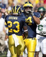
Finally, we have Stevie Brown at LB and Carlos Brown at RB. Carlos’s NOB is just ‘Brown,’ while Stevie wears ‘S. Brown’ — weird.
I’m surprised this would happen at Michigan, where they take the home uniforms so seriously.
I think we can all agree that if the Wolverines can’t maintain a consistent NOB protocol, they should be demoted to D-II (or else forced to go NNOB). Big thanks to Aaron for his eagle eye and helpful background info.
Follow-Up Roundup: In case you missed it yesterday, Uni Watch has a new e-mail address: uniwatching at gmail dot com. Please update everything that needs to be updated. Thanks.
Also, if you read yesterday’s blog entry prior to 1pm, you may have missed the link to some NFL uni news I posted yesterday on Page 2. Go here and scroll down to the lower-left corner.
Note for Discerning NYCers: Scott M.X. Turner’s band, RebelMart, is playing this Friday night at Freddy’s. Be a smart lad and show up, won’tcha?
Uni Watch News Ticker: Speaking of NOBs, I’ve been waiting for someone to provide a good screen shot of Pierre Garçon’s nameplate, complete with the cedilla, and Andrew Enright is the one who came through. It’s tough to be sure, but it looks to me like they took a regular “C,” positioned it at a slight superscript, and then sewed on an extra loop of fabric to form the cedilla. Major props to the Indy equipment staff for going the extra mile. ”¦ That noise you just heard was half the readership saying, “So maybe now they can sew some extra fabric on the shoulders to complete the truncated loops already?!” ”¦ Contribution of the day goes to Art Florio, who spotted this pair at Sunday’s Jets/Titans game. ”¦ Oooh, check out this awesome old Rawlings ad (with thanks to Jim Ransdell). ”¦ I don’t have Showtime, so I’ve been wondering what that AFL Full Color show looks like. Fortunately, Mako Mameli was nice enough to make a bunch of screen grabs. ”¦ Best minute and a half you’ll spend today: this short video showing the 11 worst helmets in Maple Leafs history. Don’t miss (big, big thanks to Jeff Barak). ”¦ Awesome Venn diagram here (with thanks to David Brown). ”¦ Third-to-last graf on this page includes some Nuggets uni number news (with thanks to Ryan Hess). ”¦ Late-breaking NFL uni change that we all missed: The Jags’ road captaincy patches are now teal (same as on the home jerseys). Last year they were black (good catch by Jonathon Binet). ”¦ Very cool home movie footage of the 1957 Michigan/Indiana game here (nice find by Ethan Crooks). ”¦ Good analysis on the difference between Umbro on-fields vs. retail authentics here (with thanks to Nolan Reagan). ”¦ The Blue Jackets will apparently have a new alternate jersey next year (thanks, Teebz). ”¦ Arkansas wears this road jersey these days, but Rudell Crim wore this design. “The Hogs wore both styles last year,” notes Lance Perrin. ”¦ An FNOB jersey I’d never seen before is available here (with thanks to Nick Hanson). ”¦ You know autumn has arrived when we have our first Mr. Met-O-Lantern sighting of the season (with thanks to Terence Kearns). ”¦ Reprinted from yesterday’s comments: Holy shit. That’s Florida, wearing the Confederate flag against Penn State in the 1962 Gator Bowl. Thoroughly depressing details here (screen shot courtesy of Larry Bodnovich). ”¦ Plan B Branding, which has done lots of uni design work over the years, has a blog called the Clink Room, where they discuss ideas, share concepts and failed experiments, and so on. Now they’ve unveiled a piece of Clink Room merch: a stupid-expensive cap. … Awesome-looking Campbell’s Kids baseball catalog here. ”¦ Speaking of catalogs, there are some killer uni catalogs up on eBay at the moment. Even if you don’t want to own them, the graphics shown on the auction pages are pure gold. Dig: Spalding 1913, Reach 1913, Spalding 1916, Rawlings 1929, Spalding 1939, Wilson 1940 (whoa, check out that color center spread!), Spalding 1961, Rawlings 1963, and Louisville Slugger 1972. … No more stadium patch for the Cowboys, so that was apparently just a one-game thing (as noted by Brinke Guthrie). ”¦ Nice look at the Pistons’ “Mr. D.” memorial tribute to Bill Davidson here. That will be a permanent memorial, by the way — the first such gesture in NBA history (with thanks to Jeff Cohen). … The 2010 Mets uni info buried in the middle of this report is accurate. The related but slightly different report that ran in yesterday’s N.Y. Post is NOT accurate.
As a Steeler fan, I don’t know how I feel about pink Terrible Towels…
link
[quote comment=”350811″]As a Steeler fan, I don’t know how I feel about pink Terrible Towels…
link
Would you feel better if they called them link?
Why is the San Diego Chargers player,who is next to Sid Gillman,wearing a red cross on the back of his white practice jersey? This is from the series of
AFL Full Color screen grabs.
Why is the San Diego Chargers player,who is next to Sid Gillman,wearing a red cross on the back of his white practice jersey?
Perhaps he’s injured?
[quote comment=”350813″]Why is the San Diego Chargers player,who is next to Sid Gillman,wearing a red cross on the back of his white practice jersey? This is from the series of
AFL Full Color screen grabs.[/quote]
I think he’s the QB, but I’m not sure
Talking about this , in the early 2000s there was 2 Johnsons in the Raiders roster,
and
“The Mets plan to go retro with their pinstriped home uniforms next season. Those uniforms will change to off-white, as they were in the 1960s, from their current bright white. That will also serve to differentiate the pinstriped uniforms from the solid home uniforms, which will remain the brighter white.”
OK…
This appears to be a step in the right direction. Can we assume also that the black drop-shadow will be removed from the pinstriped jerseys? If anyone recalls, in 1998 the pinstriped jerseys still lacked the black drop-shadow even though it had been added to the plain whites. I think this is a safe bet, if they truly intend to “go retro.”
This obviously begs further questions: Will they go NNOB? Will they go to serif numerals on the pinstripes? Will the black drop-shadow be removed from the plain whites as well? From the road greys? Will the 2-tone cap be dropped from the home rotation, if not entirely? If they’re not completely ditching the black in 2010, will they do it in 2011?
OK, let’s try again…
Teyo:
link
Tim:
link
That AFL sure was a colorful league.
don’t suppose there has been any 1962 preseason color footage of the broncos in that AFL showtime documentary?
[quote comment=”350811″]As a Steeler fan, I don’t know how I feel about pink Terrible Towels…
link
As long as money still goes to the Allegheny Valley School, I’m fine with it. Sales of the Towel have been such a big thing for them, and to me, that was Myron Cope’s lasting legacy.
That AFL documentary is worth the price of Showtime for me if I watch nothing but Inside the NFL and Boxing for the rest of the year. It is outstanding and I’m looking forward to a DVD release of it.
Hey everyone, long time no see. Hopefully all the things that made me stop coming here for a while are gone. Or at least not as bad. :)
Anyways, I flipped on Hulu last night and watched the pilot episode of “The Outer Limits” (entitled ‘The Galaxy Being’). Its a story about a gas-based alien transported to earth through a radio tower. Odd, I know, but link…link…link
Tell me that doesn’t look like a 1970’s era goalie mask!! Funny thing is that a mask like that didn’t premier for a long time, I’m pretty sure. Thought of you guys when I saw this.
Also, anyone else from UniWatch on twitter?
[quote comment=”350820″]don’t suppose there has been any 1962 preseason color footage of the broncos in that AFL showtime documentary?[/quote]
No, I’m sorry…
Are you looking for the brown pony?
[quote comment=”350823″][quote comment=”350820″]don’t suppose there has been any 1962 preseason color footage of the broncos in that AFL showtime documentary?[/quote]
No, I’m sorry…
Are you looking for the brown pony?[/quote]
well…im looking for a blue pony, but i’d settle for one in color, either way
Not sure what I liked most, the guy with the red cross jersey (AFL Full Color) or the neck roll on Brian Glennie (5th worst Maple Leaf head gear).
The AFL Full Color show is very well-done IMHO.
One of the screen grabs showing the all-star game brought back this episode:
link
According to the show, the NFL had a “quota” on black players (usually 2 or 4) and had an even number so they could room together. Some AFL teams had as many as 15 and Sid Gillman had the players room by position rather than race.
[quote comment=”350817″]Can we assume also that the black drop-shadow will be removed from the pinstriped jerseys?… Will they go NNOB? Will they go to serif numerals on the pinstripes? Will the black drop-shadow be removed from the plain whites as well? From the road greys? Will the 2-tone cap be dropped from the home rotation, if not entirely?[/quote]
No, no, no, no, no, and no.
In other words, they’re going with an old-school cream fabric for the pinstripes, but everything else about the pinstripes will remain new-school.
Yes, the Wilpons are total fucking idiots. But you knew that already.
link
Shouldn’t the Cardinals be included with the animals?
World Series of Poker tonight on ESPN!
In HI-DEF !!!!
An incredibly detailed look at guys sitting around wearing sunglasses indoors. Damn, can sports TV viewing ever possibly get any better than that?
—Ricko
More on the Mets.
link
I never knew that Barry had a B. on his nob.
link
[quote comment=”350829″]World Series of Poker tonight on ESPN!
In HI-DEF !!!!
An incredibly detailed look at guys sitting around wearing sunglasses indoors. Damn, can sports TV viewing ever possibly get any better than that?
—Ricko[/quote]
Have you watched any of the professional dart leagues? My local Comcast sports channel will broadcast it from time to time.
Oh, my! What thrills and chills. ZZZZZZZZZZZZZZZZZZZ
[quote]In other words, they’re going with an old-school cream fabric for the pinstripes, but everything else about the pinstripes will remain new-school.[/quote]
so…what we can look forward to is this, then
i’d say the wilpons are fucking idiots too, but that would be, ya know…
[quote comment=”350822″]Hey everyone, long time no see. Hopefully all the things that made me stop coming here for a while are gone. Or at least not as bad. :)
Anyways, I flipped on Hulu last night and watched the pilot episode of “The Outer Limits” (entitled ‘The Galaxy Being’). Its a story about a gas-based alien transported to earth through a radio tower. Odd, I know, but link…link…link
Tell me that doesn’t look like a 1970’s era goalie mask!! Funny thing is that a mask like that didn’t premier for a long time, I’m pretty sure. Thought of you guys when I saw this.
Also, anyone else from UniWatch on twitter?[/quote]
Yeah, I am. I wouldn’t say my feed is any type of entertaining.. mostly mundane blue horse poop that relates to me and my buddies, but you can find me @TheLargWhiteMan.
If people are having trouble identifying players with the same last names teams should start placing numbers on their jerseys.
[quote comment=”350835″]If people are having trouble identifying players with the same last names teams should start placing numbers on their jerseys.[/quote]
Brilliant!!
[quote comment=”350835″]If people are having trouble identifying players with the same last names teams should start placing numbers on their jerseys.[/quote]
ooh ooh, they could even put numbers on the sleeves or shoulders, so that the people in the top part of the stadium can see them too.
[quote comment=”350827″][quote comment=”350817″]Can we assume also that the black drop-shadow will be removed from the pinstriped jerseys?… Will they go NNOB? Will they go to serif numerals on the pinstripes? Will the black drop-shadow be removed from the plain whites as well? From the road greys? Will the 2-tone cap be dropped from the home rotation, if not entirely?[/quote]
No, no, no, no, no, and no.
In other words, they’re going with an old-school cream fabric for the pinstripes, but everything else about the pinstripes will remain new-school.
Yes, the Wilpons are total fucking idiots. But you knew that already.[/quote]
Ugh. Booooo.
You know, I can deal with the black drop-shadow on the jersey as long as it’s worn with blue caps, undersleeves and socks, in which case it’s much less noticeable. Yet every time we start to think they’ve come to their senses and are leaning toward wearing the blue at home all the time, or at least most of the time, they disappoint us.
And I really don’t care about the NNOB or the serif numerals. But Jeebus Crutches…stop wearing the road cap at home. Or at least stop designating it as the road cap.
link
Me and the Mets have been ‘separated’ since the end of April. I was hoping for a reconciliation, but now it looks like we may have to convert the separation into a divorce. (Is there a provision in the NYDRL for this?) Let’s see what they come up with.
[quote comment=”350824″][quote comment=”350823″][quote comment=”350820″]don’t suppose there has been any 1962 preseason color footage of the broncos in that AFL showtime documentary?[/quote]
No, I’m sorry…
Are you looking for the brown pony?[/quote]
well…im looking for a blue pony, but i’d settle for one in color, either way[/quote]
Blue? I’ve never heard of a blue version.
[quote comment=”350828″]http://www.flipflopflyin.com/flipflopflyball/info-teamnames.html
Shouldn’t the Cardinals be included with the animals?[/quote]
Scroll down and he talks about each team. According to his blurb, the Cardinals were named after the color first and then added the birds.
[quote comment=”350827″][quote comment=”350817″]Can we assume also that the black drop-shadow will be removed from the pinstriped jerseys?… Will they go NNOB? Will they go to serif numerals on the pinstripes? Will the black drop-shadow be removed from the plain whites as well? From the road greys? Will the 2-tone cap be dropped from the home rotation, if not entirely?[/quote]
No, no, no, no, no, and no.
In other words, they’re going with an old-school cream fabric for the pinstripes, but everything else about the pinstripes will remain new-school.
Yes, the Wilpons are total fucking idiots. But you knew that already.[/quote]
And BTW, does anyone else think this seems rather pointless? I mean, what’s the point of “going retro” if you’re not going to use the original design as it was?
This reminds me of the link and link lame attempts to re-create their retro helmets in ’94 using their current (at the time) shell colors. Different means, different reason, same result. If you’re going to go retro, go retro.
[quote comment=”350842″]
And BTW, does anyone else think this seems rather pointless? I mean, what’s the point of “going retro” if you’re not going to use the original design as it was?
This reminds me of the link and link lame attempts to re-create their retro helmets in ’94 using their current (at the time) shell colors. Different means, different reason, same result. If you’re going to go retro, go retro.[/quote]
I see nothing wrong with “retro inspired” as a new look. Look at the Jets current uniforms. The green is at least 2 or 3 shades darker than anything Namath ever wore.
I’m not much of a baseball person anyway so the Mets mean nothing to me… but just the idea in general of taking an old look and modernizing it doesn’t seem that bad to me.
link…
Thank you for making me learn the meaning of “tautology”.
BTW, are Tigers indigenous to Detroit,MI?
(I’m probably missing something.)
[quote comment=”350811″]As a Steeler fan, I don’t know how I feel about pink Terrible Towels…
link
As a Ravens fan I just assume they stay that way! ;)
[quote comment=”350840″][quote comment=”350828″]http://www.flipflopflyin.com/flipflopflyball/info-teamnames.html
Shouldn’t the Cardinals be included with the animals?[/quote]
Scroll down and he talks about each team. According to his blurb, the Cardinals were named after the color first and then added the birds.[/quote]
Well, in that case, the Cubs need to be removed from the animals category and placed solely in the self-referential category with the Pirates.
[quote comment=”350844″]http://www.flipflopf…
Thank you for making me learn the meaning of “tautology”.
BTW, are Tigers indigenous to Detroit,MI?
(I’m probably missing something.)[/quote]
“Named after the Detroit Light Guard military unit, known as ‘The Tigers.'”
[quote comment=”350847″][quote comment=”350844″]http://www.flipflopf…
Thank you for making me learn the meaning of “tautology”.
BTW, are Tigers indigenous to Detroit,MI?
(I’m probably missing something.)[/quote]
“Named after the Detroit Light Guard military unit, known as ‘The Tigers.'”[/quote]
so they aren’t actual tigers and it seems they would be treated in another category, as the others are actual animals.
(Again, I’m probably missing something).
[quote comment=”350843″][quote comment=”350842″]
And BTW, does anyone else think this seems rather pointless? I mean, what’s the point of “going retro” if you’re not going to use the original design as it was?
This reminds me of the link and link lame attempts to re-create their retro helmets in ’94 using their current (at the time) shell colors. Different means, different reason, same result. If you’re going to go retro, go retro.[/quote]
I see nothing wrong with “retro inspired” as a new look. Look at the Jets current uniforms. The green is at least 2 or 3 shades darker than anything Namath ever wore.
I’m not much of a baseball person anyway so the Mets mean nothing to me… but just the idea in general of taking an old look and modernizing it doesn’t seem that bad to me.[/quote]
Point taken. The football Giants’ current set is another example. But that’s not really what’s happening here. The Mets’ current pinstripes are already a “modernized” version of their original uniform. I don’t see the point in changing from white to off-white without removing the black drop-shadow.
BTW, not sure why the Jets went with a darker green in ’98, except that the green does look darker in a lot of old ’60s photos. Or maybe because they were removing the black from the color scheme and wanted a darker primary color. Also not sure why they went with serif NOB, as they had sans-serif in ’68 and Super Bowl III; they did use serif in the mid-70s before the ’78 changeover but those teams were terrible.
Regarding the Clink Room item with the Tulsa Drillers treatment. My old man worked for a drilling bit manufactuer back in West Texas. link is what a real bit looks like, not that spear looking thing. I’m surprised no one w/ the Drillers picked up on that.
Okay, that Clink Room Tulsa cap is stupid-expensive, but the idea of limited-edition alt logo caps is interesting.
If they ever create a BBM one for the Brewers, I’ll buy one or twelve.
I couldn’t find one Dallas Cowboy wearing one of those newer styled helmets the last two games.
I wonder if Jerry Jones doesn’t like the look or if the equipment manager thinks there not safe.
[quote comment=”350850″]Regarding the Clink Room item with the Tulsa Drillers treatment. My old man worked for a drilling bit manufactuer back in West Texas. link is what a real bit looks like, not that spear looking thing. I’m surprised no one w/ the Drillers picked up on that.[/quote]
The real thing would make a horrible logo though. The common person expects a drill to look like what’s on the logo.
link
(Yes, it’s made of Lego… which makes it a perfect example of being what people think)
I’m no Plan B Branding apologist, but a “stupid-expensive cap”? You do realize that standard 5950s are pushing $35, right?
I guess the $25 Naming Wrongs t-shirts are “stupid-expensive t-shirts”, right?
Anyone see the Great Mangini’s post game news conference?
He reminds me of the guy at the bar who know everything about pro football and never stops letting you know he does.
Getting a strong “Les Steckel” vibe.
—Ricko
[quote comment=”350843″][quote comment=”350842″]
And BTW, does anyone else think this seems rather pointless? I mean, what’s the point of “going retro” if you’re not going to use the original design as it was?
This reminds me of the link and link lame attempts to re-create their retro helmets in ’94 using their current (at the time) shell colors. Different means, different reason, same result. If you’re going to go retro, go retro.[/quote]
I see nothing wrong with “retro inspired” as a new look. Look at the Jets current uniforms. The green is at least 2 or 3 shades darker than anything Namath ever wore.
I’m not much of a baseball person anyway so the Mets mean nothing to me… but just the idea in general of taking an old look and modernizing it doesn’t seem that bad to me.[/quote]
RE: Jets Uni’s:
Wasn’t the whole idea of the ’94 season (75th NFL) to acknowledge the old merged with the new with uniform’s? (I personally hated that Jets Helmet, my 1st Jets game was when they wore that vs. the Patsies). Dear Woody Johnson: Please somehow get the “Futuristic Jets” logo out there again and a possible throwback next year…
RE: “Wilpon’s are fucking idiots”
Paul, and all the Mets fans, would you rather have the Ford Family or Wilpon’s?
[quote comment=”350843″][quote comment=”350842″]
And BTW, does anyone else think this seems rather pointless? I mean, what’s the point of “going retro” if you’re not going to use the original design as it was?
This reminds me of the link and link lame attempts to re-create their retro helmets in ’94 using their current (at the time) shell colors. Different means, different reason, same result. If you’re going to go retro, go retro.[/quote]
I see nothing wrong with “retro inspired” as a new look. Look at the Jets current uniforms. The green is at least 2 or 3 shades darker than anything Namath ever wore.
I’m not much of a baseball person anyway so the Mets mean nothing to me… but just the idea in general of taking an old look and modernizing it doesn’t seem that bad to me.[/quote]
Seems to me that they’re trying the “have your cake and eat it, too” approach with the unis. That’s usually not a good thing.
They’re keeping the black dropshadows to reach out to the people who prefer the modern look while creamifying the fabric in an attempt to appeal to the traditionalists.
I’ll reserve judgment until I see the real thing, but it just sounds like a bad design idea.
[quote comment=”350854″]I’m no Plan B Branding apologist, but a “stupid-expensive cap”? You do realize that standard 5950s are pushing $35, right?
I guess the $25 Naming Wrongs t-shirts are “stupid-expensive t-shirts”, right?[/quote]
And it’s a 150 piece limited edition. I would imagine the production costs would be higher on these than the incredibly mass-produced MLB caps.
[quote comment=”350856″]
RE: Jets Uni’s:
Wasn’t the whole idea of the ’94 season (75th NFL) to acknowledge the old merged with the new with uniform’s?[/quote]
I think it was supposed to be just a general celebration of the history by wearing the throwback uniforms. Unfortunately, a few teams half-assed it. Well, Buffalo kinda quarter-assed it.
The Bills basically just wore their regular uniforms with that screwy hybrid helmet. The Jets had the green helmet and the Raiders used a made up logo. The 49ers wore their normal helmets on top of a throwback uniform, and the Cowboys came up with entirely new uniforms based very very loosely on the early 60’s. The rest of the league was relatively accurate.
Honestly I think if the Jets had just used a white facemask on that helmet, it wouldn’t have bothered me anywhere near as much as it did. But no matter how you slice it, Buffalo was just lame.
[quote comment=”350855″]Anyone see the Great Mangini’s post game news conference?
He reminds me of the guy at the bar who know everything about pro football and never stops letting you know he does.
Getting a strong “Les Steckel” vibe.
—Ricko[/quote]
Yea, and on the opposite side, I’m getting a sort of Weeb Ewbank feel from Rex Ryan.
That’s true about the drills, but it’s just another one of those little things that doesn’t jive with the “real” thing. Kinda goes back to the basketballs in NBA logos needing to change if they stuck with the new designed bball… (I don’t think they’d need to, btw)
I know, that’s a whole can of worms I don’t want to open up: logos vs. real, artistic license and all that…
[quote comment=”350856″][quote comment=”350843″][quote comment=”350842″]
And BTW, does anyone else think this seems rather pointless? I mean, what’s the point of “going retro” if you’re not going to use the original design as it was?
This reminds me of the link and link lame attempts to re-create their retro helmets in ’94 using their current (at the time) shell colors. Different means, different reason, same result. If you’re going to go retro, go retro.[/quote]
I see nothing wrong with “retro inspired” as a new look. Look at the Jets current uniforms. The green is at least 2 or 3 shades darker than anything Namath ever wore.
I’m not much of a baseball person anyway so the Mets mean nothing to me… but just the idea in general of taking an old look and modernizing it doesn’t seem that bad to me.[/quote]
RE: Jets Uni’s:
Wasn’t the whole idea of the ’94 season (75th NFL) to acknowledge the old merged with the new with uniform’s? (I personally hated that Jets Helmet, my 1st Jets game was when they wore that vs. the Patsies). Dear Woody Johnson: Please somehow get the “Futuristic Jets” logo out there again and a possible throwback next year…
RE: “Wilpon’s are fucking idiots”
Paul, and all the Mets fans, would you rather have the Ford Family or Wilpon’s?[/quote]
Don’t know as there was anything “merged” (from a design standpoint) about the ’94 Jets throwbacks. They were Namath-era unis but with a green helmet…probably because of that old “everyone in the AFC East will end up wearing white helmets” hangup (afflicted the Bills, too, I’ll wager).
As to why the forest green instead of kelly when they returned to the Namath look, my guess is was the same attitude everyone else seems to have (Rams, BYU and others)…bright bad, must go to darker shade. be more intimidating.
Same school of thought that automatically makes Seahawks green jerseys awful, and made North Carolina change from powder football jerseys to navy (on occasion).
So predictable. And, frankly, kinda chicken shit. “Oh, god, how can we ever be expected to play well if our colors aren’t dark???”
I think we think they think too much. They don’t. Well, accept for checking what’s trendy, of course.
—Ricko
[quote comment=”350820″]don’t suppose there has been any 1962 preseason color footage of the broncos in that AFL showtime documentary?[/quote]
Ricko would have provided any such footage to Showtime, I’m sure…. :-)
Not to disagree with Paul, who always has great inside info…but I have to think if the Mets are going with the cream color uni next season on occasion, they’d drop the black for that particular jersey.
Discounting people’s dislike for black as a main color for the Mets (myself included), it’s more because they look like softball players and because it’s not part of their uni history…not that it looks “bad”
The black dropshadow on the CREAM jerseys isn’t just a “bad” idea, it looks like SHIT aesthetically.
That’s why I’m under the impression they still may change their minds on that if they CURRENTLY plan on keeping it.
[quote comment=”350824″]well…im looking for a blue pony, but i’d settle for one in color, either way[/quote]
There’s a Pink Pony in the Phoenix area.
[quote comment=”350860″][quote comment=”350855″]Anyone see the Great Mangini’s post game news conference?
He reminds me of the guy at the bar who know everything about pro football and never stops letting you know he does.
Getting a strong “Les Steckel” vibe.
—Ricko[/quote]
Yea, and on the opposite side, I’m getting a sort of Weeb Ewbank feel from Rex Ryan.[/quote]
No argument here. Funny how the owners can go from so wrong (Mangini) to—apparently—so right (Ryan), isn’t it.
Possibly the Wilpons should check to see what the Jets owners eat?
—Ricko
The “Contact” link on your top header is still linked to the earthlink address…
[quote comment=”350865″][quote comment=”350824″]well…im looking for a blue pony, but i’d settle for one in color, either way[/quote]
There’s a Pink Pony in the Phoenix area.[/quote]
Conversely, anyone produced anything visual that proves it was brown?
When you can’t find proof, look at the activity around the situation, often it will tell you something.
Any 1962 stories about Broncos “honoring” a color everyone hated?
Any 1962 stories about how, “Broncos can’t get anything right; still have brown helmet decals even after making a HUGE deal out of changing colors to orange and blue”?
Brown would have the aberration, even in ’62. Yet no one noticed?
Think about it. The absence of any notation of it all goes a long, long way to indicating there was nothing weird, unexpected or out of context about the colors on the new unis. No one said, “I thought you changed your colors to orange and BLUE”? No history of any such comments whatsoever.
—Ricko
[quote comment=”350856″][quote comment=”350843″][quote comment=”350842″]
And BTW, does anyone else think this seems rather pointless? I mean, what’s the point of “going retro” if you’re not going to use the original design as it was?
This reminds me of the link and link lame attempts to re-create their retro helmets in ’94 using their current (at the time) shell colors. Different means, different reason, same result. If you’re going to go retro, go retro.[/quote]
I see nothing wrong with “retro inspired” as a new look. Look at the Jets current uniforms. The green is at least 2 or 3 shades darker than anything Namath ever wore.
I’m not much of a baseball person anyway so the Mets mean nothing to me… but just the idea in general of taking an old look and modernizing it doesn’t seem that bad to me.[/quote]
RE: Jets Uni’s:
Wasn’t the whole idea of the ’94 season (75th NFL) to acknowledge the old merged with the new with uniform’s?[/quote]
Nope. Most teams who went retro went full retro. Chargers were the best example. Broncos, Oilers, Falcons were also very nice, and had different-colored helmet shells to boot. Giants, Saints, Rams, Patriots, Dolphins, Bengals all did a nice job; Eagles’ retros were ugly but accurate.
Teams that went super-retro, i.e. to uniforms predating plastic helmets, wore current helmets without stripes or decals. A couple of teams, e.g. Cowboys and 49ers, cheated by wearing current helmet with retro jersey & pants.
there is a link on the right side of this page to the 1994 NFL 75th Anniversary throwbacks
worth checking out if you haven’t already
[quote comment=”350868″]The “Contact” link on your top header is still linked to the earthlink address…[/quote]
Oh, thanks — forgot about that. Believe it or not, I can’t fix that myself, but I’ll get Ek to do it.
[quote comment=”350870″]
Nope. Most teams who went retro went full retro. Chargers were the best example. Broncos, Oilers, Falcons were also very nice, and had different-colored helmet shells to boot. Giants, Saints, Rams, Patriots, Dolphins, Bengals all did a nice job; Eagles’ retros were ugly but accurate.
Teams that went super-retro, i.e. to uniforms predating plastic helmets, wore current helmets without stripes or decals. A couple of teams, e.g. Cowboys and 49ers, cheated by wearing current helmet with retro jersey & pants.[/quote]
Kirk Lazarus: Everybody knows you never go full retro.
Tugg Speedman: What do you mean?
Kirk Lazarus: Check it out. Dustin Hoffman, ‘Rain Man,’ look retro, act retro, not retro. Counted toothpicks, cheated cards. Autistic, sho’. Not retro. You know Tom Hanks, ‘Forrest Gump.’ Slow, yes. Retro, maybe. Braces on his legs. But he charmed the pants off Nixon and won a ping-pong competition. That ain’t retro. Peter Sellers, “Being There.” Infantile, yes. Retro, no. You went full retro, man. Never go full retro. You don’t buy that? Ask Sean Penn, 2001, “I Am Sam.” Remember? Went full retro, went home empty handed…
Somehow I had to work that in. I couldn’t stop laughing at Graf’s “went full retro”. Totally set off that sound byte in my mind! LOL
[quote comment=”350871″]there is a link on the right side of this page to the link throwbacks
worth checking out if you haven’t already[/quote]
Tried linking to that before but it was down. Great site.
[quote comment=”350871″]there is a link on the right side of this page to the 1994 NFL 75th Anniversary throwbacks
worth checking out if you haven’t already[/quote]
I was about to say, “That’s a Geocities site — takes only a few hits to crash it,” but apparently that’s already happened. Wait a few hrs and try again….
[quote comment=”350874″][quote comment=”350871″]there is a link on the right side of this page to the link throwbacks
worth checking out if you haven’t already[/quote]
Tried linking to that before but it was down. Great site.[/quote]
and now it’s farked…damn geocities
[quote comment=”350871″]there is a link on the right side of this page to the link throwbacks
worth checking out if you haven’t already[/quote]
Nice source of photos, yes. But that’s also the site that repeatedly says NFL teams didn’t wear helmets in the 1930’s, Riiiiight. And back in 20’s Red Grange got his nickname from his red hear flowing the wind when he ran. All those old photos of him wearing a helmet? Pshaw. That was for riding his motorcycle. He just thought it would be funny if he wore for the PR photos.
—Ricko
[quote comment=”350869″][quote comment=”350865″][quote comment=”350824″]well…im looking for a blue pony, but i’d settle for one in color, either way[/quote]
There’s a Pink Pony in the Phoenix area.[/quote]
Conversely, anyone produced anything visual that proves it was brown?
When you can’t find proof, look at the activity around the situation, often it will tell you something.
Any 1962 stories about Broncos “honoring” a color everyone hated?
Any 1962 stories about how, “Broncos can’t get anything right; still have brown helmet decals even after making a HUGE deal out of changing colors to orange and blue”?
Brown would have the aberration, even in ’62. Yet no one noticed?
Think about it. The absence of any notation of it all goes a long, long way to indicating there was nothing weird, unexpected or out of context about the colors on the new unis. No one said, “I thought you changed your colors to orange and BLUE”? No history of any such comments whatsoever.
—Ricko[/quote]
You may be right. I know the brown never made any sense to me, but there is the possibility that the decals were ordered before the color change.
Was the AFL getting enough coverage in 1962 for anyone to even bother questioning it? It could be one of those things that just slipped through the cracks due to not enough people caring at the time. If it was blue, I don’t understand why they’d change it.
[quote comment=”350878″][quote comment=”350869″][quote comment=”350865″][quote comment=”350824″]well…im looking for a blue pony, but i’d settle for one in color, either way[/quote]
There’s a Pink Pony in the Phoenix area.[/quote]
Conversely, anyone produced anything visual that proves it was brown?
When you can’t find proof, look at the activity around the situation, often it will tell you something.
Any 1962 stories about Broncos “honoring” a color everyone hated?
Any 1962 stories about how, “Broncos can’t get anything right; still have brown helmet decals even after making a HUGE deal out of changing colors to orange and blue”?
Brown would have the aberration, even in ’62. Yet no one noticed?
Think about it. The absence of any notation of it all goes a long, long way to indicating there was nothing weird, unexpected or out of context about the colors on the new unis. No one said, “I thought you changed your colors to orange and BLUE”? No history of any such comments whatsoever.
—Ricko[/quote]
You may be right. I know the brown never made any sense to me, but there is the possibility that the decals were ordered before the color change.
Was the AFL getting enough coverage in 1962 for anyone to even bother questioning it? It could be one of those things that just slipped through the cracks due to not enough people caring at the time. If it was blue, I don’t understand why they’d change it.[/quote]
Anyone in the Denver area go to a library and check the microfilm of the Rocky Mountain News or Denver Post from that era? Might have mentioned something in a text article, e.g., reporting on the first ’62 preseason game or season opener.
[quote comment=”350877″][quote comment=”350871″]there is a link on the right side of this page to the link throwbacks
worth checking out if you haven’t already[/quote]
Nice source of photos, yes. But that’s also the site that repeatedly says NFL teams didn’t wear helmets in the 1930’s, Riiiiight. And back in 20’s Red Grange got his nickname from his red hear flowing the wind when he ran. All those old photos of him wearing a helmet? Pshaw. That was for riding his motorcycle. He just thought it would be funny if he wore for the PR photos.
—Ricko[/quote]
yeah, rick, the guy’s verbiage needs work, but the essential point is that they didn’t wear the plastic shell helmets the modern players wear…i agree, he should have said “they didn’t wear modern helmets” or “they wore predominantly leather helmets” instead of intimating people ran around with no headgear at all
if there’s a contact there, maybe you want to email it and let them know a correction should be made
link
It’s not a Venn diagram; it’s an Euler diagram.
[quote comment=”350873″][quote comment=”350870″]
Nope. Most teams who went retro went full retro. Chargers were the best example. Broncos, Oilers, Falcons were also very nice, and had different-colored helmet shells to boot. Giants, Saints, Rams, Patriots, Dolphins, Bengals all did a nice job; Eagles’ retros were ugly but accurate.
Teams that went super-retro, i.e. to uniforms predating plastic helmets, wore current helmets without stripes or decals. A couple of teams, e.g. Cowboys and 49ers, cheated by wearing current helmet with retro jersey & pants.[/quote]
Kirk Lazarus: Everybody knows you never go full retro.
Tugg Speedman: What do you mean?
Kirk Lazarus: Check it out. Dustin Hoffman, ‘Rain Man,’ look retro, act retro, not retro. Counted toothpicks, cheated cards. Autistic, sho’. Not retro. You know Tom Hanks, ‘Forrest Gump.’ Slow, yes. Retro, maybe. Braces on his legs. But he charmed the pants off Nixon and won a ping-pong competition. That ain’t retro. Peter Sellers, “Being There.” Infantile, yes. Retro, no. You went full retro, man. Never go full retro. You don’t buy that? Ask Sean Penn, 2001, “I Am Sam.” Remember? Went full retro, went home empty handed…
Somehow I had to work that in. I couldn’t stop laughing at Graf’s “went full retro”. Totally set off that sound byte in my mind! LOL[/quote]
great pull teebz
Loved that video of IU and Michigan from ’57, especially in the wake of that game at the big house this past weekend. I ended up on a 15-minute youtube rampage of old IU football videos.
By the way, since the vid isn’t entirely clear, link.
It’s too bad there was no success between ’59 and ’61, ’cause I’d dearly love to see link as a throwback, though with the proportions on the IU trident matching the proportions of the current logo.
[quote comment=”350866″]
Yea, and on the opposite side, I’m getting a sort of Weeb Ewbank feel from Rex Ryan.[/quote]
Somewhat related to today’s throwbacking theme: last Sunday I noticed that the Jets had their coaching staff in throwback-style apparel, but a lot of their other support people were wearing green and white circa 2009. Jarring visual.
Plus, I think the coaching staff’s throwback shirts included a nice manufacturer’s logo. :-( Not exactly accurate AFAIK.
[quote comment=”350881″]http://www.flipflopflyin.com/flipflopflyball/info-teamnames.html
It’s not a Venn diagram; it’s an Euler diagram.[/quote]
The catagory “bragging”: shouldn’t the Dodgers be in that one? Angels too? Maybe the Athletics (in a good year)??
I guess the Twins would be in “bragging” if the diagram was about the old All-American Women’s league.
[quote comment=”350837″][quote comment=”350835″]If people are having trouble identifying players with the same last names teams should start placing numbers on their jerseys.[/quote]
ooh ooh, they could even put numbers on the sleeves or shoulders, so that the people in the top part of the stadium can see them too.[/quote]
Fresno State: NNOB, 2 kickers – both number 35. The only way to tell the difference, one is a right footed kicker, the other a left…
[quote comment=”350878″][quote comment=”350869″][quote comment=”350865″][quote comment=”350824″]well…im looking for a blue pony, but i’d settle for one in color, either way[/quote]
There’s a Pink Pony in the Phoenix area.[/quote]
Conversely, anyone produced anything visual that proves it was brown?
When you can’t find proof, look at the activity around the situation, often it will tell you something.
Any 1962 stories about Broncos “honoring” a color everyone hated?
Any 1962 stories about how, “Broncos can’t get anything right; still have brown helmet decals even after making a HUGE deal out of changing colors to orange and blue”?
Brown would have the aberration, even in ’62. Yet no one noticed?
Think about it. The absence of any notation of it all goes a long, long way to indicating there was nothing weird, unexpected or out of context about the colors on the new unis. No one said, “I thought you changed your colors to orange and BLUE”? No history of any such comments whatsoever.
—Ricko[/quote]
You may be right. I know the brown never made any sense to me, but there is the possibility that the decals were ordered before the color change.
Was the AFL getting enough coverage in 1962 for anyone to even bother questioning it? It could be one of those things that just slipped through the cracks due to not enough people caring at the time. If it was blue, I don’t understand why they’d change it.[/quote]
Okay, here’s the deal. It never even occurred to me that they’d have been blue, so I never specifically asked about that. But, in 1971, I DID ask my then-partner—who had been sports editor of the Denver Post in 1962—why the Broncos changed the helmet decal to white He said that the first one, “looked like a big ink blot.” They went to white cuz could actually recognize what it was.
He was far from the biggest uni-geek on the planet, but I know this guy pretty well. If it had been brown, I’m pretty sure he would have come up with a much “shittier” description than “ink blot.”
Now, if he’s wrong, and they HAD been ordered in brown for some reason (which is another common attempt to retroactively create a back story), I simply ask this: Why go ahead and USE them? Did they WANT to look incompetent after all the “orange and blue” promotion? Why not just leave the helmets blank until the proper decals showed up? Who’d have noticed? Not like every team had helmet logos in 1962.
—Ricko
[quote comment=”350862″][quote comment=”350856″][quote comment=”350843″][quote comment=”350842″]Don’t know as there was anything “merged” (from a design standpoint) about the ’94 Jets throwbacks. They were Namath-era unis but with a green helmet…probably because of that old “everyone in the AFC East will end up wearing white helmets” hangup (afflicted the Bills, too, I’ll wager).
As to why the forest green instead of kelly when they returned to the Namath look, my guess is was the same attitude everyone else seems to have (Rams, BYU and others)…bright bad, must go to darker shade. be more intimidating.
Same school of thought that automatically makes Seahawks green jerseys awful, and made North Carolina change from powder football jerseys to navy (on occasion).
So predictable. And, frankly, kinda chicken shit. “Oh, god, how can we ever be expected to play well if our colors aren’t dark???”
I think we think they think too much. They don’t. Well, accept for checking what’s trendy, of course.
—Ricko[/quote]
Comment Of The Day candidate.
[quote comment=”350886″]Fresno State: NNOB, 2 kickers – both number 35. The only way to tell the difference, one is a right footed kicker, the other a left…[/quote]
Back when barefoot kickers were all the rage, this would have been perfect.
[quote comment=”350887″]
Okay, here’s the deal. It never even occurred to me that they’d have been blue, so I never specifically asked about that. But, in 1971, I DID ask my then-partner—who had been sports editor of the Denver Post in 1962—why the Broncos changed the helmet decal to white He said that the first one, “looked like a big ink blot.” They went to white cuz could actually recognize what it was.
He was far from the biggest uni-geek on the planet, but I know this guy pretty well. If it had been brown, I’m pretty sure he would have come up with a much “shittier” description than “ink blot.”
Now, if he’s wrong, and they HAD been ordered in brown for some reason (which is another common attempt to retroactively create a back story), I simply ask this: Why go ahead and USE them? Did they WANT to look incompetent after all the “orange and blue” promotion? Why not just leave the helmets blank until the proper decals showed up? Who’d have noticed? Not like every team had helmet logos in 1962.
—Ricko[/quote]
If they were blue, which would make sense and I’m honestly curious about now, where the heck did the idea of a brown version come from?
[quote comment=”350888″]
Comment Of The Day candidate.[/quote]Jim V, regarding your college top 5 bottom one: I was trying to recall where I saw that look for the bottom game-then I remembered it was in high school. :-)
[quote comment=”350887″][quote comment=”350878″][quote comment=”350869″][quote comment=”350865″][quote comment=”350824″]well…im looking for a blue pony, but i’d settle for one in color, either way[/quote]
There’s a Pink Pony in the Phoenix area.[/quote]
Conversely, anyone produced anything visual that proves it was brown?
When you can’t find proof, look at the activity around the situation, often it will tell you something.
Any 1962 stories about Broncos “honoring” a color everyone hated?
Any 1962 stories about how, “Broncos can’t get anything right; still have brown helmet decals even after making a HUGE deal out of changing colors to orange and blue”?
Brown would have the aberration, even in ’62. Yet no one noticed?
Think about it. The absence of any notation of it all goes a long, long way to indicating there was nothing weird, unexpected or out of context about the colors on the new unis. No one said, “I thought you changed your colors to orange and BLUE”? No history of any such comments whatsoever.
—Ricko[/quote]
You may be right. I know the brown never made any sense to me, but there is the possibility that the decals were ordered before the color change.
Was the AFL getting enough coverage in 1962 for anyone to even bother questioning it? It could be one of those things that just slipped through the cracks due to not enough people caring at the time. If it was blue, I don’t understand why they’d change it.[/quote]
Okay, here’s the deal. It never even occurred to me that they’d have been blue, so I never specifically asked about that. But, in 1971, I DID ask my then-partner—who had been sports editor of the Denver Post in 1962—why the Broncos changed the helmet decal to white He said that the first one, “looked like a big ink blot.” They went to white cuz could actually recognize what it was.
He was far from the biggest uni-geek on the planet, but I know this guy pretty well. If it had been brown, I’m pretty sure he would have come up with a much “shittier” description than “ink blot.”
Now, if he’s wrong, and they HAD been ordered in brown for some reason (which is another common attempt to retroactively create a back story), I simply ask this: Why go ahead and USE them? Did they WANT to look incompetent after all the “orange and blue” promotion? Why not just leave the helmets blank until the proper decals showed up? Who’d have noticed? Not like every team had helmet logos in 1962.
—Ricko[/quote]
So I just want to make sure I am clear on the whole story, because I have seen a lot about it but never really figured out what all is going on..
In 50 words or less, without trying to cause a huge uproar, what exactly is the debate here?
[quote comment=”350862″]Well, accept for checking what’s trendy, of course.
[/quote]Ricko, that’s spelled AX-cept.
[quote comment=”350889″][quote comment=”350886″]Fresno State: NNOB, 2 kickers – both number 35. The only way to tell the difference, one is a right footed kicker, the other a left…[/quote]
Back when barefoot kickers were all the rage, this would have been perfect.[/quote]
don’t most barefoot kickers still have one cleat on their plant foot?
[quote comment=”350892″]In 50 words or less, without trying to cause a huge uproar, what exactly is the debate here?[/quote]
I think (and I don’t know for sure) that there is an ongoing debate about whether or not the the Denver Broncos EVER had uniform colors of “Brown and Orange” instead of “Blue and Orange”.
In any case, it’s kind of popular around here to reference-mostly because it’s an ongoing debate. :-)
[quote comment=”350892″]
So I just want to make sure I am clear on the whole story, because I have seen a lot about it but never really figured out what all is going on..
In 50 words or less, without trying to cause a huge uproar, what exactly is the debate here?[/quote]
1962 Broncos – logo was dark to start the season, then switched to white. Helmet history sites claim brown logo, Ricko thinks it was blue. We want proof either way.
[quote comment=”350891″][quote comment=”350888″]
Comment Of The Day candidate.[/quote]Jim V, regarding your college top 5 bottom one: I was trying to recall where I saw that look for the bottom game-then I remembered it was in high school. :-)[/quote]
The TSU/FAMU game? link
Yeah, the only differences: in high school, you probably wouldn’t see any socks showing, and the pants would have been one color. Otherwise, I see what you mean.
[quote comment=”350883″]Loved that video of IU and Michigan from ’57, especially in the wake of that game at the big house this past weekend. I ended up on a 15-minute youtube rampage of old IU football videos.
By the way, since the vid isn’t entirely clear, link.
It’s too bad there was no success between ’59 and ’61, ’cause I’d dearly love to see link as a throwback, though with the proportions on the IU trident matching the proportions of the current logo.[/quote]
I’d love to see that as a throwback, too. This season would be the perfect time to do it, since they wore them for the first season in Memorial Stadium. It would tie in nicely with the opening of the renovated version of the stadium.
Or next year for the 50th anniversary, I suppose.
[quote comment=”350894″]
don’t most barefoot kickers still have one cleat on their plant foot?[/quote]
Sure, that’s the point: I would have wanted to see these guys standing side-by-side on the field, obviously sharing one pair of shoes. :-)
Re: The Dirty Sanchez Jets fans.
Yeah, that’s about right for the scum of the earth type that constitutes the Jets fanbase. The only question is how many dudes at that game shrieked and screamed at her to “Show us your tits, bitch!!” and then threw beer or spit on her when/if she refused, and how many times she’s had to call security to get to her car after the game.
[quote comment=”350894″][quote comment=”350889″][quote comment=”350886″]Fresno State: NNOB, 2 kickers – both number 35. The only way to tell the difference, one is a right footed kicker, the other a left…[/quote]
Back when barefoot kickers were all the rage, this would have been perfect.[/quote]
don’t most barefoot kickers still have one cleat on their plant foot?[/quote]
Don’t remind me of those guys. I’ve spent my life sticking up for kickers and then they went and took flaky to a new level with the barefoot stuff. That’s one thing that’s better left in the past.
[quote comment=”350896″][quote comment=”350892″]
So I just want to make sure I am clear on the whole story, because I have seen a lot about it but never really figured out what all is going on..
In 50 words or less, without trying to cause a huge uproar, what exactly is the debate here?[/quote]
Couldn’t someone simply contact the Denver Broncos Directly?
I mean, it would seem to be THE source to get a definitive answer…Paul, who would we need to contact there?
That would put this to rest…
1962 Broncos – logo was dark to start the season, then switched to white. Helmet history sites claim brown logo, Ricko thinks it was blue. We want proof either way.[/quote]
[quote comment=”350897″]
The TSU/FAMU game? link
Yeah, the only differences: in high school, you probably wouldn’t see any socks showing, and the pants would have been one color. Otherwise, I see what you mean.[/quote]
If I can find an online pic, I’ll link it. I might not have been clear: I meant one a current HS game, not one when I was in HS.
But now that I see that picture again, good point about monochrome pants: those Florida A&M pants must have some weird design on the back!
BTW, the Florida A&M band is EVERYTHING they’re cracked up to be. Top speed, incredible showmanship: easily one of the best halftime bands I’ve witnessed.
In 50 words or less, without trying to cause a huge uproar, what exactly is the debate here?
link
[quote comment=”350900″]Re: The Dirty Sanchez Jets fans.
Yeah, that’s about right for the scum of the earth type that constitutes the Jets fanbase. The only question is how many dudes at that game shrieked and screamed at her to “Show us your tits, bitch!!” and then threw beer or spit on her when/if she refused, and how many times she’s had to call security to get to her car after the game.[/quote]
Don’t let a small sample of trash represent the majority of us…Raiders/Cowboys & Steelers fans have their fair share of trash too…
95% of Jets fans are good fans, not the element you so colorfully chose to be your sample pool..
[quote comment=”350904″]In 50 words or less, without trying to cause a huge uproar, what exactly is the debate here?
link
Hey now. We aren’t beating a dead horse, we’re trying to figure out what color it was before it died.
[quote comment=”350894″][quote comment=”350889″][quote comment=”350886″]Fresno State: NNOB, 2 kickers – both number 35. The only way to tell the difference, one is a right footed kicker, the other a left…[/quote]
Back when barefoot kickers were all the rage, this would have been perfect.[/quote]
don’t most barefoot kickers still have one cleat on their plant foot?[/quote]
Usually goes away a few years after they retire.
[quote comment=”350907″][quote comment=”350894″][quote comment=”350889″][quote comment=”350886″]Fresno State: NNOB, 2 kickers – both number 35. The only way to tell the difference, one is a right footed kicker, the other a left…[/quote]
Back when barefoot kickers were all the rage, this would have been perfect.[/quote]
don’t most barefoot kickers still have one cleat on their plant foot?[/quote]
Usually goes away a few years after they retire.[/quote]
And maybe one planter’s wart on their cleat foot?
[quote comment=”350905″][quote comment=”350900″]Re: The Dirty Sanchez Jets fans.
Yeah, that’s about right for the scum of the earth type that constitutes the Jets fanbase. The only question is how many dudes at that game shrieked and screamed at her to “Show us your tits, bitch!!” and then threw beer or spit on her when/if she refused, and how many times she’s had to call security to get to her car after the game.[/quote]
Don’t let a small sample of trash represent the majority of us…Raiders/Cowboys & Steelers fans have their fair share of trash too…
95% of Jets fans are good fans, not the element you so colorfully chose to be your sample pool..[/quote]
99%.9 of Jets fans are great fans. It sounds like Fappy McFapper is a never satisfied Giants/Yankees fan.
[quote]In 50 words or less, without trying to cause a huge uproar, what exactly is the debate here?[/quote]
we just want a color picture of the link preseason or link helmet the broncos wore
nothing more, nothing less
was the pony brown or blue?
[quote comment=”350859″][quote comment=”350856″]
RE: Jets Uni’s:
Wasn’t the whole idea of the ’94 season (75th NFL) to acknowledge the old merged with the new with uniform’s?[/quote]
I think it was supposed to be just a general celebration of the history by wearing the throwback uniforms. Unfortunately, a few teams half-assed it. Well, Buffalo kinda quarter-assed it.
The Bills basically just wore their regular uniforms with that screwy hybrid helmet. The Jets had the green helmet and the Raiders used a made up logo. The 49ers wore their normal helmets on top of a throwback uniform, and the [b]Cowboys came up with entirely new uniforms based very very loosely on the early 60’s.[/b] The rest of the league was relatively accurate.
[/quote]
The Cowboys did come up with the double-star jerseys that they’d wear at home in ’94 and on the road in ’95, but they also wore a throwback jersey in Week 3 on Monday Night Football vs. Detroit
link
The double-stars were more modern adaptations they debuted on thanksgiving ’94 against the Packers
link
They wore the white double stars in ’94, then switched to the navy double stars in ’95 and ’96. They wore the navy double stars again for Thanksgiving a few times earlier this decade, including ’01 vs. Denver (wearing Orange throwbacks) and ’02 vs. Washington (wearing Maroon throwbacks)http://www.sportsecyclopedia.com/nfl/dallas/gallowaydal_181x249.jpg
The brown/blue Broncos helmet logo debate is right up there in the list of unsolved football helmet mysteries with the question of whether or not the Seahawks had logos on their helmets during their first season.
[quote comment=”350889″][quote comment=”350886″]Fresno State: NNOB, 2 kickers – both number 35. The only way to tell the difference, one is a right footed kicker, the other a left…[/quote]
Back when barefoot kickers were all the rage, this would have been perfect.[/quote]
I miss that era – I used to be the kid kicking barefoot in the backyard football games. I miss the days of Tony Franklin:
link
Thank you Bourbon…I’m glad you see the positive much more than the negative…
It sucks that each team has it share of idiots, but to call out the entire fan base is just wrong…
Some fans (read: Philly) are tougher than others, but I have NEVER felt threatened or mis-treated (other than the expected ribbing by rivals) by visiting another teams stadium.
Anyone else think that some of the teams who originally wore striped socks with their current unis ought to consider going back to them?
49ers, Cowboys, Colts, Jets (on their green socks), Browns home, ‘Skins with burgundy pants, among others. All once has sock stripes that at least somewhat (or exactly) picked up elements of their jersey designs.
None of them have solid expanses of color without some kind of striping as a uni theme (opposite of Giants and Raiders, for example; or Rams or Falcons, too, who have lots of, um, graphic elements but not stripes, per se).
Really was aware of it watching ‘Niners Sunday.
And again last night watching Cowboys.
I know, I know…would be tough with the tights so many players wear these days.
—Ricko
groovy on the maple loafs headgear.
and ‘02 vs. Washington (wearing Maroon throwbacks)
burgundy, burgundy, burgundy!
:)
[quote comment=”350915″]Anyone else think that some of the teams who originally wore striped socks with their current unis ought to consider going back to them?
49ers, Cowboys, Colts, Jets (on their green socks), Browns home, ‘Skins with burgundy pants, among others. All once has sock stripes that at least somewhat (or exactly) picked up elements of their jersey designs.
None of them have solid expanses of color without some kind of striping as a uni theme (opposite of Giants and Raiders, for example; or Rams or Falcons, too, who have lots of, um, graphic elements but not stripes, per se).
Really was aware of it watching ‘Niners Sunday.
And again last night watching Cowboys.
I know, I know…would be tough with the tights so many players wear these days.
—Ricko[/quote]
Absolutely agree. Part of the reason that I love the Cowboys’ current throwback set (other than the amazing helmet) is the socks. I love that they wear the socks with the throwbacks and wish they would wear striped socks with the regular set as well.
The page for the 1994 throwbacks has crashed. I think that an influx of UW readers may be responsible…lol
[quote comment=”350915″]Anyone else think that some of the teams who originally wore striped socks with their current unis ought to consider going back to them?
49ers, Cowboys, Colts, Jets (on their green socks), Browns home, ‘Skins with burgundy pants, among others. All once has sock stripes that at least somewhat (or exactly) picked up elements of their jersey designs.
None of them have solid expanses of color without some kind of striping as a uni theme (opposite of Giants and Raiders, for example; or Rams or Falcons, too, who have lots of, um, graphic elements but not stripes, per se).
Really was aware of it watching ‘Niners Sunday.
And again last night watching Cowboys.
I know, I know…would be tough with the tights so many players wear these days.
—Ricko[/quote]
Packers would look a lot better if they took the stripes off their collars and moved them onto their socks.
[quote comment=”350917″]and ‘02 vs. Washington (wearing Maroon throwbacks)
burgundy, burgundy, burgundy!
:)[/quote]
Sangria sangria sangria
Absolutely agree with Ricko about the striped socks. The Cowboys would look tons better if the went back to their old socks.
While they are updating their uniforms, it wouldn’t hurt to try matching their blues.
I’m guessing this has been referenced previously in this debate:
link
[quote comment=”350920″][quote comment=”350915″]Anyone else think that some of the teams who originally wore striped socks with their current unis ought to consider going back to them?
49ers, Cowboys, Colts, Jets (on their green socks), Browns home, ‘Skins with burgundy pants, among others. All once has sock stripes that at least somewhat (or exactly) picked up elements of their jersey designs.
None of them have solid expanses of color without some kind of striping as a uni theme (opposite of Giants and Raiders, for example; or Rams or Falcons, too, who have lots of, um, graphic elements but not stripes, per se).
Really was aware of it watching ‘Niners Sunday.
And again last night watching Cowboys.
I know, I know…would be tough with the tights so many players wear these days.
—Ricko[/quote]
Packers would look a lot better if they took the stripes off their collars and moved them onto their socks.[/quote]
Only if they go with Ricko’s jersey: link
[quote comment=”350923″]I’m guessing this has been referenced previously in this debate:
link
I was looking at that page right after I asked about the debate lol. certainly leaves room for guessing
[quote comment=”350923″]I’m guessing this has been referenced previously in this debate:
link
yes
and that sound you just heard was ricko’s head
[quote comment=”350914″]Thank you Bourbon…I’m glad you see the positive much more than the negative…
It sucks that each team has it share of idiots, but to call out the entire fan base is just wrong…
Some fans (read: Philly) are tougher than others, but I have NEVER felt threatened or mis-treated (other than the expected ribbing by rivals) by visiting another teams stadium.[/quote]
My only story on that is about Raiders fans. My girlfriend at the time was in a wheelchair with a cast on her severely broken ankle. We had travelled to the Bay Area specifically to go a Raider game (Moss’ first year Raiders).
I was pushing her around on the way to our seats, and was absolutely appalled (and quietly furious, actually) at how rude the pre-game crowd was. Made no effort whatsoever to let us get through. She almost had a panic attack with all those people closing in around her. I remember thinking she must have felt like Karen Allen, surrounded by all those skeletons in RAIDERS OF THE LOST ARK. I actually had to keep her calm. But I understood. I honestly was afraid for her, that it would get to her. After all, she was stuck in that chair, in the middle of all that rowdy humanity.
Finally, one young woman all decked out in silver and black realized what was going on and sort of “blazed a trail” for us. I guess they only pay attention to someone they think is “one of them.”
And, of course, buying into that stupid “12th Man, I’m part of the team” bullshit, they stand the entire game. Guess where the wheelchair seating is. Right, flew all the way from Twin Cities to SF/Oak for the game (at her considerable expense), and she never saw one play.
So, while I won’t paint all Raider fans with the same brush, i will say that what I did see left me absolutely convinced of one thing. I will never again, under any circumstances, attend a Raider game.
—Ricko
[quote comment=”350911″][quote comment=”350859″][quote comment=”350856″]
RE: Jets Uni’s:
Wasn’t the whole idea of the ’94 season (75th NFL) to acknowledge the old merged with the new with uniform’s?[/quote]
I think it was supposed to be just a general celebration of the history by wearing the throwback uniforms. Unfortunately, a few teams half-assed it. Well, Buffalo kinda quarter-assed it.
The Bills basically just wore their regular uniforms with that screwy hybrid helmet. The Jets had the green helmet and the Raiders used a made up logo. The 49ers wore their normal helmets on top of a throwback uniform, and the [b]Cowboys came up with entirely new uniforms based very very loosely on the early 60’s.[/b] The rest of the league was relatively accurate.
[/quote]
The Cowboys did come up with the double-star jerseys that they’d wear at home in ’94 and on the road in ’95, but they also wore a throwback jersey in Week 3 on Monday Night Football vs. Detroit
link
The double-stars were more modern adaptations they debuted on thanksgiving ’94 against the Packers
link
They wore the white double stars in ’94, then switched to the navy double stars in ’95 and ’96. They wore the navy double stars again for Thanksgiving a few times earlier this decade, including ’01 vs. Denver (wearing Orange throwbacks) and ’02 vs. Washington (wearing Maroon throwbacks)http://www.sportsecyclopedia.com/nfl/dallas/gallowaydal_181x249.jpg[/quote]
I’m obviously not a Dallas Cowboys fan, but those double star jerseys were really sharp, and I wonder why they were abandoned. I think those jerseys would have been a classy update to the Cowboys uniform.
Regarding the 1994 San Francisco 49er throwback uniforms, they were originally intended to be worn for only a couple games like the rest of the teams that season. However, after a rough start early in the season, the Niners started winning again, and stuck with the throwbacks all the way through the Super Bowl.
[quote comment=”350926″][quote comment=”350923″]I’m guessing this has been referenced previously in this debate:
link
yes
and that sound you just heard was link[/quote]
Oh, damn. If it’s on the Internet it must be true.
I understand the whole broughaha with the confederate flag, but we are talking about the early sixties. I wouldn’t call it “depressing”, more like a sign of the (soon to be changing) times.
Are we any more “depressed” when we see images of the General Lee flying over Boss Hogg’s white Cadillac?
[quote comment=”350924″][quote comment=”350920″][quote comment=”350915″]Anyone else think that some of the teams who originally wore striped socks with their current unis ought to consider going back to them?
49ers, Cowboys, Colts, Jets (on their green socks), Browns home, ‘Skins with burgundy pants, among others. All once has sock stripes that at least somewhat (or exactly) picked up elements of their jersey designs.
None of them have solid expanses of color without some kind of striping as a uni theme (opposite of Giants and Raiders, for example; or Rams or Falcons, too, who have lots of, um, graphic elements but not stripes, per se).
Really was aware of it watching ‘Niners Sunday.
And again last night watching Cowboys.
I know, I know…would be tough with the tights so many players wear these days.
—Ricko[/quote]
Packers would look a lot better if they took the stripes off their collars and moved them onto their socks.[/quote]
Only if they go with Ricko’s jersey: link
LOL. To be clear (before someone ELSE’s head explodes), that was meant as a once-a-season, vintage-inspired “harkback” in a discussion about how Packers might employ the old logo on their jerseys. It’s neither a throwback that needs to be accurate, nor a regular jersey to be seen all the time.
—Ricko
Oh, damn. If it’s on the Internet it must be true.
In the interest of metaphysical certainty, what would constitute irrefutable evidence that there was a blue horse (that’s the one we’re looking for here, right?). Positively unretouched photo, statement made under oath? I only ask this as someone who really doesn’t care which color it is, but might spend a few moments trying to help solve the mystery. (First i’ve got to unravel this venn diagram vs. euler diagram argument).
[quote]Packers would look a lot better if they took the stripes off their collars and moved them onto their socks.[/quote]
like this?
[quote comment=”350924″][quote comment=”350920″][quote comment=”350915″]Anyone else think that some of the teams who originally wore striped socks with their current unis ought to consider going back to them?
49ers, Cowboys, Colts, Jets (on their green socks), Browns home, ‘Skins with burgundy pants, among others. All once has sock stripes that at least somewhat (or exactly) picked up elements of their jersey designs.
None of them have solid expanses of color without some kind of striping as a uni theme (opposite of Giants and Raiders, for example; or Rams or Falcons, too, who have lots of, um, graphic elements but not stripes, per se).
Really was aware of it watching ‘Niners Sunday.
And again last night watching Cowboys.
I know, I know…would be tough with the tights so many players wear these days.
—Ricko[/quote]
Packers would look a lot better if they took the stripes off their collars and moved them onto their socks.[/quote]
Only if they go with Ricko’s jersey: link
Actually, I like the stripes on the collar in that mock-up.
[quote comment=”350931″][quote comment=”350924″][quote comment=”350920″][quote comment=”350915″]Anyone else think that some of the teams who originally wore striped socks with their current unis ought to consider going back to them?
49ers, Cowboys, Colts, Jets (on their green socks), Browns home, ‘Skins with burgundy pants, among others. All once has sock stripes that at least somewhat (or exactly) picked up elements of their jersey designs.
None of them have solid expanses of color without some kind of striping as a uni theme (opposite of Giants and Raiders, for example; or Rams or Falcons, too, who have lots of, um, graphic elements but not stripes, per se).
Really was aware of it watching ‘Niners Sunday.
And again last night watching Cowboys.
I know, I know…would be tough with the tights so many players wear these days.
—Ricko[/quote]
Packers would look a lot better if they took the stripes off their collars and moved them onto their socks.[/quote]
Only if they go with Ricko’s jersey: link
LOL. To be clear (before someone ELSE’s head explodes), that was meant as a once-a-season, vintage-inspired “harkback” in a discussion about how Packers might employ the old logo on their jerseys. It’s neither a throwback that needs to be accurate, nor a regular jersey to be seen all the time.
—Ricko[/quote]
Fair enough. I’ll say this, though…that jersey may not make it past the discussion board, but I’d love to DIY that and your Steelers one. link
[quote comment=”350933″][quote]Packers would look a lot better if they took the stripes off their collars and moved them onto their socks.[/quote]
link?[/quote]
link
[quote comment=”350932″]Oh, damn. If it’s on the Internet it must be true.
In the interest of metaphysical certainty, what would constitute irrefutable evidence that there was a blue horse (that’s the one we’re looking for here, right?). Positively unretouched photo, statement made under oath? I only ask this as someone who really doesn’t care which color it is, but might spend a few moments trying to help solve the mystery. (First i’ve got to unravel this venn diagram vs. euler diagram argument).[/quote]
I think a color photo would be all we’d need, brown or blue.
That PDF is using helmet images from The Helmet Project – and as nice of a site as it is… it’s not 100% accurate. In fact it didn’t have the proper 1963 Raiders helmet until just a few weeks ago after I personally posted an in-game image to convince him to add it. If it was wrong on one helmet, it may be wrong on others. All it takes is one relatively good source to inadvertently spread bad info…and the truth can get buried.
Just the fact that it lists the logo changing in the 4th or 5th week throws some doubt on it. The 1962 schedule is easy to find. Not knowing which game was the first to use the white logo means that no one has actually looked at photos from each game to figure it out for sure.
The topic of NOB inconsistency comes up, but not about Tate being a nickname? His name is Robert. The nameplate acknowledges a nickname, something the Buckeyes did not do with Chris “Beanie” Wells. Cheers to tOSU for doing it right. This could all be avoided if they took a lesson from Notre Dame and went to the beautiful NNOB (save for last year’s bowl game as an homage to Parseghian).
link
[quote comment=”350845″][quote comment=”350811″]As a Steeler fan, I don’t know how I feel about pink Terrible Towels…
link
As a Ravens fan I just assume they stay that way! ;)[/quote]
Don’t the Ravens have male cheerleaders?
link
[quote comment=”350936″][quote comment=”350933″][quote]Packers would look a lot better if they took the stripes off their collars and moved them onto their socks.[/quote]
link?[/quote]
link[/quote]
oh my god that uniform is lovely(Mitch Fatel Whisper) …………..and those socks…..ungh
[quote comment=”350940″][quote comment=”350845″][quote comment=”350811″]As a Steeler fan, I don’t know how I feel about pink Terrible Towels…
link
As a Ravens fan I just assume they stay that way! ;)[/quote]
Don’t the Ravens have male cheerleaders?
link
Yet we never see shots of them on NFL telecasts.
Guess it depends on whose cunning stunts we’re watching, huh.
I found this black and white picture of the Gators confederate flag decal. From the Penn State vs Florida 1962 Gator Bowl.
link
[quote comment=”350942″][quote comment=”350940″][quote comment=”350845″][quote comment=”350811″]As a Steeler fan, I don’t know how I feel about pink Terrible Towels…
link
As a Ravens fan I just assume they stay that way! ;)[/quote]
Don’t the Ravens have male cheerleaders?
link
Yet we never see shots of them on NFL telecasts.
Guess it depends on whose cunning stunts we’re watching, huh.[/quote]
Serious question here. Do they handle and throw the female cheerleaders around; i.e. like in college sports. Or, do they handle and throw themselves around?
[quote comment=”350876″][quote comment=”350874″][quote comment=”350871″]there is a link on the right side of this page to the link throwbacks
worth checking out if you haven’t already[/quote]
Tried linking to that before but it was down. Great site.[/quote]
and now it’s farked…damn geocities[/quote]
Geocities is going to be gone for good on October 26.
[quote comment=”350823″][quote comment=”350820″]don’t suppose there has been any 1962 preseason color footage of the broncos in that AFL showtime documentary?[/quote]
No, I’m sorry…
Are you looking for the brown pony?[/quote]
I want to make it clear… I was joking!
I didn’t want this debate to start again, but at least we found out there are still people in the world that didn’t know Ricko’s opinion on the argument ;)
[quote comment=”350842″][quote comment=”350827″][quote comment=”350817″]Can we assume also that the black drop-shadow will be removed from the pinstriped jerseys?… Will they go NNOB? Will they go to serif numerals on the pinstripes? Will the black drop-shadow be removed from the plain whites as well? From the road greys? Will the 2-tone cap be dropped from the home rotation, if not entirely?[/quote]
No, no, no, no, no, and no.
In other words, they’re going with an old-school cream fabric for the pinstripes, but everything else about the pinstripes will remain new-school.
Yes, the Wilpons are total fucking idiots. But you knew that already.[/quote]
And BTW, does anyone else think this seems rather pointless? [/quote]
Yup, and I’ll tell you what it reeks of: created only for selling new merchandise. At least when the SF Giants went cream, at least they changed the script. How many Mets fans are going to buy the new jersey when it’s only a few shades darker?
[quote comment=”350946″][quote comment=”350823″][quote comment=”350820″]don’t suppose there has been any 1962 preseason color footage of the broncos in that AFL showtime documentary?[/quote]
No, I’m sorry…
Are you looking for the brown pony?[/quote]
I want to make it clear… I was joking!
I didn’t want this debate to start again, but at least we found out there are still people in the world that didn’t know Ricko’s opinion on the argument ;)[/quote]
You should know better. This is the internet. (insert Serious Cat picture here)
Personally I’m perfectly content with the idea of Denver being lame enough to use a brown logo for 5 games, but I wouldn’t mind seeing a color picture anyway.
[quote comment=”350946″][quote comment=”350823″][quote comment=”350820″]don’t suppose there has been any 1962 preseason color footage of the broncos in that AFL showtime documentary?[/quote]
No, I’m sorry…
Are you looking for the brown pony?[/quote]
I want to make it clear… I was joking!
I didn’t want this debate to start again, but at least we found out there are still people in the world that didn’t know Ricko’s opinion on the argument ;)[/quote]
Plus, it’s starting to get funny to read all the concoctions to validate the brown horse legend.
1. They were gonna go with gold helmets before the color change decision. Um, nope.
2. Brown decals were ordered by mistake and, in some fit of unbridled stupidity, they wore them anyway.
…and these are my two personal favorites…
3. It was to “honor” the brown. (Ha, it is to laugh)
4. They wanted to make the color transition “easier for the fans.”
I’m starting to think my definition of Hell is Satan saying, “This is a folder of high quality color photos of the first Broncos games with the orange helmet.” But he never opens the file, just keeps kinda tapping it with his fingers as it sits on his desk while he talks.
LOL
—Ricko
It is hard to believe that nobody seems to have a color picture of the Broncos blue/brown horse logo.
There are color pictures and film of games in the late 1930’s
I have watched the first 2 shows about the AFL and think it is a pretty good show. My brother actually got Showtime just for that reason.
On top of all the other reasons it’s offensive, the Confederate flag isn’t even in Florida colors.
Oh no, are we going to have a controversy about whether the Rebel flag logo was blue & orange?
[quote comment=”350933″][quote]Packers would look a lot better if they took the stripes off their collars and moved them onto their socks.[/quote]
link?[/quote]
Thing of beauty. Huge upgrade.
[quote comment=”350884″][quote comment=”350866″]
Yea, and on the opposite side, I’m getting a sort of Weeb Ewbank feel from Rex Ryan.[/quote]
Somewhat related to today’s throwbacking theme: last Sunday I noticed that the Jets had their coaching staff in throwback-style apparel, but a lot of their other support people were wearing green and white circa 2009. Jarring visual.
Plus, I think the coaching staff’s throwback shirts included a nice manufacturer’s logo. :-( Not exactly accurate AFAIK.[/quote]
Ah, but the NFL has never pretended that they’re true throwbacks.
Everything they do is a fauxback, a “here’s what their designs would look like if the team had never changed logos/colors/city.” They have never used the old uniform fits, as baseball does. So the coaches’ attire doesn’t bother me.
Does anybody have a heads up on uniform changes for the Nationals for next season? Heard a rumor (no supporting article, etc.) that they are getting rid of the “Fuddrucker” font. Anyone?
Long time reader, first time poster.
On the issue of the Broncos 1962 helmet. My mom is a librarian at the Denver Central Library. She’s checking into this now and will get back to me. I’ll keep y’all posted.
Paul,
I have to ask, suppose the Mets did see the backlash building against Dropshadow Gate ’10 and wanted to rectify it? Would they be able to tweak it with the league? Or is everything locked in stone for 2010? I just don’t want them to screw this up (which it seems like they will). If you’re finally going to rebrand, then ACTUALLY do it and not half ass it.
[quote comment=”350957″]Long time reader, first time poster.
On the issue of the Broncos 1962 helmet. My mom is a librarian at the Denver Central Library. She’s checking into this now and will get back to me. I’ll keep y’all posted.[/quote]
That would be great, thanks
[quote comment=”350958″]Paul,
I have to ask, suppose the Mets did see the backlash building against Dropshadow Gate ’10 and wanted to rectify it? Would they be able to tweak it with the league? Or is everything locked in stone for 2010? I just don’t want them to screw this up (which it seems like they will). If you’re finally going to rebrand, then ACTUALLY do it and not half ass it.[/quote]
im pretty sure paul indicated the only change for 2010 is the cream color for the pins…nothing else changes…
i don’t consider this a rebrand at all…and i don’t think the mets do either
link, anyone?
Blackhawks in white jerseys today. (Giving the Swiss audience a chance to see home and road uniforms?)
The game seems to be a bit more competitive than yesterday’s, too.
[quote comment=”350956″]Does anybody have a heads up on uniform changes for the Nationals for next season? Heard a rumor (no supporting article, etc.) that they are getting rid of the “Fuddrucker” font. Anyone?[/quote]
I sure hope so. That uniform looks like someone did it in Powerpoint using “WordArt” – and I’m a Nats fan. Maybe I’m “the” Nats fan…
I sure hope so. That uniform looks like someone did it in Powerpoint using “WordArt” – and I’m a Nats fan. Maybe I’m “the” Nats fan…
YOU ARE NOT ALNE :)
[quote comment=”350961″]link, anyone?
Blackhawks in white jerseys today. (Giving the Swiss audience a chance to see home and road uniforms?)
The game seems to be a bit more competitive than yesterday’s, too.[/quote]
If I were the Blackhawks, I’d tell Sopel to fix his socks or clean out his locker.
The Zurich goalie’s name is Zoolander! :o)
Phil,
Poor choice of words. When I say “rebrand” I mean uni-alterations. Obviously this isn’t a D-Backs/Rays repackage, and I understand that nothing else is changing, but my questions is, could they if faced with enough negative feedback?
Great line from our friends at TMQ…
“Green Men Group News: Seattle rolled out all-green alternative jerseys; next time the Seahawks wear these, they should be called the Grinches. Doesn’t this mean it is time for Green Bay to wear an electric-yellow alternative jersey while the Giants come out in monochrome gray? Against Jax, Houston wore its alternative all-red duds. Optometrists would love the all-green Seahawks playing the all-red Texans, owing to eye appointments scheduled the next day.”
[quote comment=”350965″]Phil,
Poor choice of words. When I say “rebrand” I mean uni-alterations. Obviously this isn’t a D-Backs/Rays repackage, and I understand that nothing else is changing, but my questions is, could they if faced with enough negative feedback?[/quote]
ok, sorry i misunderstood
paul could probably give you a better answer than i, but i believe all the style guides for 2010 had to be in and basically what’s done is done for next season :(
im pretty sure the wilpons are imune to fan backlash anyway; and they have bigger things to worry about than unis…word on the street is madoff madeoff with hundreds of millions of the wilpon’s money, so they may not even be able to keep the team next season
[quote comment=”350963″]I sure hope so. That uniform looks like someone did it in Powerpoint using “WordArt” – and I’m a Nats fan. Maybe I’m “the” Nats fan…
YOU ARE NOT ALNE :)[/quote]
They’re my 2nd favorite team (after the Pirates – gee, can I pick ’em or what?) so you’re amongst friends.
I’d like to see the same script they use for “Washington,” or even just go with the curly W. At least they couldn’t misspell that one, right??
[quote comment=”350964″]
If I were the Blackhawks, I’d tell Sopel to fix his socks
orand clean out his locker.[/quote]
Fixed.
[quote comment=”350969″][quote comment=”350964″]
If I were the Blackhawks, I’d tell Sopel to fix his socks
orand clean out his locker.[/quote]
Fixed.[/quote]
If he goes to Rockford, they wear the same socks. This doesn’t fix the problem… it just moves the problem.
Although, outta sight, outta mind, right? ;o)
[quote comment=”350970″][quote comment=”350969″][quote comment=”350964″]
If I were the Blackhawks, I’d tell Sopel to fix his socks
orand clean out his locker.[/quote]
Fixed.[/quote]
If he goes to Rockford, they wear the same socks. This doesn’t fix the problem… it just moves the problem.
Although, outta sight, outta mind, right? ;o)[/quote]
Yeah, unless I end up going to another IceHogs/Wolves game this season
~~~~~~~~~~~~~~~~~~~~~~~~
Note to self: don’t go to any IceHogs/Wolves games this season.
i guess we all know what the next word to be added to the banned list for NFL personalized jerseys will be: Dirty.
[quote comment=”350959″][quote comment=”350957″]Long time reader, first time poster.
On the issue of the Broncos 1962 helmet. My mom is a librarian at the Denver Central Library. She’s checking into this now and will get back to me. I’ll keep y’all posted.[/quote]
That would be great, thanks[/quote]
It will probably be a few days before she can get me any info.
Last year my dad and I went on the Mile High Stadium tour. We both remember a helmet display (featuring all the helmets the Broncos wore throughout their history) that included the 1962 helmet with brown horse. Of course we both could be wrong. Has anyone else gone on the tour recently that can comfirm or deny??
[quote comment=”350973″][quote comment=”350959″][quote comment=”350957″]Long time reader, first time poster.
On the issue of the Broncos 1962 helmet. My mom is a librarian at the Denver Central Library. She’s checking into this now and will get back to me. I’ll keep y’all posted.[/quote]
That would be great, thanks[/quote]
It will probably be a few days before she can get me any info.
Last year my dad and I went on the Mile High Stadium tour. We both remember a helmet display (featuring all the helmets the Broncos wore throughout their history) that included the 1962 helmet with brown horse. Of course we both could be wrong. Has anyone else gone on the tour recently that can comfirm or deny??[/quote]
That should be “confirm.”
Even if true, that doesn’t mean much. Plenty of teams get their own uniform history wrong, especially in this case when there’s incorrect information out there.
Unless that was a period helmet (unlikely since almost certainly all were stripped and given white decals), I’m not sure it’d be evidence of anything.
better question for the Broncos helmet controversy:
Who cares?
All I have seen out there is that the horse was brown for a couple of games. I don’t know where the notion came from that it was blue. The team accepts that it was brown and the vast majority of people (who care) accept that it was brown.
Why can’t everyone just agree it was brown and move on?
[quote]Why can’t everyone just agree it was brown and move on?[/quote]
because what if it wasn’t brown?
i know this may seem trivial to you (and probably to 99.9% of the civilized world), but there are people who think it wasn’t brown
why is it such a big deal if we find out one way or another? if we can find a color pic, one way or another, we move on, mystery solved
but until such time, it will remain one of those things that bugs people
[quote comment=”350955″]
Ah, but the NFL has never pretended that they’re true throwbacks.
Everything they do is a fauxback, a “here’s what their designs would look like if the team had never changed logos/colors/city.” They have never used the old uniform fits, as baseball does. So the coaches’ attire doesn’t bother me.[/quote]
Well, I had little doubt that there was a lot of marketing people involved so I didn’t doubt there would be a plethora of logos: but with all the money involved, it wouldn’t have been THAT difficult to give the ballboys, assistant trainers, etc. some period-looking shirts.
And if they REALLY wanted to go authentic then those coaches would be in suit & tie and hat: all looking a lot like Tom Landry. :-)
[quote comment=”350977″][
why is it such a big deal if we find out one way or another? if we can find a color pic, one way or another, we move on, mystery solved
[/quote]
I agree, I’d rather it be one of those great unknowns.
Plus, it’s kind of a raison de etre for starting Ricko on a rant.
:-)))))
[quote comment=”350940″]
Don’t the Ravens have male cheerleaders?
[/quote]
Nevermore.
[quote comment=”350977″][quote]Why can’t everyone just agree it was brown and move on?[/quote]
because what if it wasn’t brown?
i know this may seem trivial to you (and probably to 99.9% of the civilized world), but there are people who think it wasn’t brown
why is it such a big deal if we find out one way or another? if we can find a color pic, one way or another, we move on, mystery solved
but until such time, it will remain one of those things that bugs people[/quote]
Is there any basis for claim that it was blue?
I’d like to see the same script they use for “Washington,” or even just go with the curly W. At least they couldn’t misspell that one, right??
I grew up a follower of the expansion Senators who sported that curly W for the majority of their existence so I was hoping it wouldn’t be resurrected. Now they use it to market pretzels, etc. I’d like to see them do something like that plain block lettering they used in the 50’s. Not copy it, but embellish. I think they also need to lose the DC as part of the package. Unfortunately, since they represent the nation’s capital, they won’t get out of that red, white (or gray) and blue box. I can’t really think of any part of the current uniform I’d be unhappy for them to fix. Right now, though, they have bigger problems and I’d be grateful for less than 100 in the loss column. Hope springs eternal!
EddieYost, amigo!
[quote comment=”350979″][quote comment=”350977″][
why is it such a big deal if we find out one way or another? if we can find a color pic, one way or another, we move on, mystery solved
[/quote]
I agree, I’d rather it be one of those great unknowns.
Plus, it’s kind of a raison de etre for starting Ricko on a rant.
:-)))))[/quote]
Don’t rant. Just keep trying to apply logic where none apparently has gone before.
And, if it was brown, how come no one noticed (at the time) how strange it was to totally violate their new color scheme, and all their promotional material a sample of which is included on that website. Seems that would have been noted. Somewhere. By someone.
(Well, except for the sarcastic parts. That’s ranting a little. LOL)
—Ricko
[quote comment=”350983″][quote comment=”350979″][quote comment=”350977″][
why is it such a big deal if we find out one way or another? if we can find a color pic, one way or another, we move on, mystery solved
[/quote]
I agree, I’d rather it be one of those great unknowns.
Plus, it’s kind of a raison de etre for starting Ricko on a rant.
:-)))))[/quote]
Don’t rant. Just keep trying to apply logic where none apparently has gone before.
And, if it was brown, how come no one noticed (at the time) how strange it was to totally violate their new color scheme, and all their promotional material a sample of which is included on that website. Seems that would have been noted. Somewhere. By someone.
(Well, except for the sarcastic parts. That’s ranting a little. LOL)
—Ricko[/quote]
link
[quote comment=”350956″]Does anybody have a heads up on uniform changes for the Nationals for next season? Heard a rumor (no supporting article, etc.) that they are getting rid of the “Fuddrucker” font. Anyone?[/quote]
That would be welcome news because their current uniforms are, for lack of a better word, terrible.
And add me to the group who thinks the curly W is lame.
I always loved the simplicity of link
[quote comment=”350984″]
link[/quote]
Or, “WWRR”? :-)
Ricko, I’m certain this subject (and the back and forth it inevitably creates) is more my raison de etre than yours: or at the very least it’s my raison de Uniwatch. ;-)) Just a little bit of late afternoon fun. Nothing personal old friend.
I always loved the simplicity of these
Amen
[quote]Nothing personal old friend.[/quote]
please don’t refer to ricko that way
As a Steeler fan, I don’t know how I feel about pink Terrible Towels…
link…
As long as money still goes to the Allegheny Valley School, I’m fine with it. Sales of the Towel have been such a big thing for them, and to me, that was Myron Cope’s lasting legacy.
NO. NO. NO. NO. NO. (Emphatic enough?)
If they want to put the pink ribbon on a gold Terrible Towel, and give money to the appropriate charities, that’s lovely. If any of the other 31 teams want to hand out or sell pink towels, that’s lovely. But the Terrible Towel has been gold or black since 1975, and pink Towels are as wrong as pink Steeler helmets.
Those Wilson, Rawlings, Spalding auctions pages are fun to look at.
[quote comment=”350985″][quote comment=”350956″]Does anybody have a heads up on uniform changes for the Nationals for next season? Heard a rumor (no supporting article, etc.) that they are getting rid of the “Fuddrucker” font. Anyone?[/quote]
That would be welcome news because their current uniforms are, for lack of a better word, terrible.
And add me to the group who thinks the curly W is lame.
I always loved the simplicity of link[/quote]
Actually, I agree. I take back what I said ’bout the curly W. Walgreens can keep it if the Nats bust these out in the near future.
[quote comment=”350991″][quote comment=”350985″][quote comment=”350956″]Does anybody have a heads up on uniform changes for the Nationals for next season? Heard a rumor (no supporting article, etc.) that they are getting rid of the “Fuddrucker” font. Anyone?[/quote]
That would be welcome news because their current uniforms are, for lack of a better word, terrible.
And add me to the group who thinks the curly W is lame.
I always loved the simplicity of link[/quote]
Actually, I agree. I take back what I said ’bout the curly W. Walgreens can keep it if the Nats bust these out in the near future.[/quote]
But I also like the red hats, so can we have both colors?
[quote comment=”350992″][quote comment=”350991″][quote comment=”350985″][quote comment=”350956″]Does anybody have a heads up on uniform changes for the Nationals for next season? Heard a rumor (no supporting article, etc.) that they are getting rid of the “Fuddrucker” font. Anyone?[/quote]
That would be welcome news because their current uniforms are, for lack of a better word, terrible.
And add me to the group who thinks the curly W is lame.
I always loved the simplicity of link[/quote]
Actually, I agree. I take back what I said ’bout the curly W. Walgreens can keep it if the Nats bust these out in the near future.[/quote]
But I also like the red hats, so can we have both colors?[/quote]They definitely need to kill that Fuddruckers jersey font. I kinda like the DC logo, though.
I’d like to see a red DC logo on a navy cap as the primary headgear. Ditch the navy road cap with the curly W. Keep the regular red home cap to be worn with a fauxback alt uni based on link (“Nationals” script in place of “Senators”).
[quote comment=”350993″][quote comment=”350992″][quote comment=”350991″][quote comment=”350985″][quote comment=”350956″]Does anybody have a heads up on uniform changes for the Nationals for next season? Heard a rumor (no supporting article, etc.) that they are getting rid of the “Fuddrucker” font. Anyone?[/quote]
That would be welcome news because their current uniforms are, for lack of a better word, terrible.
And add me to the group who thinks the curly W is lame.
I always loved the simplicity of link[/quote]
Actually, I agree. I take back what I said ’bout the curly W. Walgreens can keep it if the Nats bust these out in the near future.[/quote]
But I also like the red hats, so can we have both colors?[/quote]They definitely need to kill that Fuddruckers jersey font. I kinda like the DC logo, though.
I’d like to see a red DC logo on a navy cap as the primary headgear. Ditch the navy road cap with the curly W. Keep the regular red home cap to be worn with a fauxback alt uni based on link (“Nationals” script in place of “Senators”).[/quote]
I like this link
[quote comment=”350928″][quote comment=”350911″][quote comment=”350859″][quote comment=”350856″]
RE: Jets Uni’s:
Wasn’t the whole idea of the ’94 season (75th NFL) to acknowledge the old merged with the new with uniform’s?[/quote]
I think it was supposed to be just a general celebration of the history by wearing the throwback uniforms. Unfortunately, a few teams half-assed it. Well, Buffalo kinda quarter-assed it.
The Bills basically just wore their regular uniforms with that screwy hybrid helmet. The Jets had the green helmet and the Raiders used a made up logo. The 49ers wore their normal helmets on top of a throwback uniform, and the [b]Cowboys came up with entirely new uniforms based very very loosely on the early 60’s.[/b] The rest of the league was relatively accurate.
[/quote]
The Cowboys did come up with the double-star jerseys that they’d wear at home in ’94 and on the road in ’95, but they also wore a throwback jersey in Week 3 on Monday Night Football vs. Detroit
link
The double-stars were more modern adaptations they debuted on thanksgiving ’94 against the Packers
link
They wore the white double stars in ’94, then switched to the navy double stars in ’95 and ’96. They wore the navy double stars again for Thanksgiving a few times earlier this decade, including ’01 vs. Denver (wearing Orange throwbacks) and ’02 vs. Washington (wearing Maroon throwbacks)http://www.sportsecyclopedia.com/nfl/dallas/gallowaydal_181x249.jpg[/quote]
I’m obviously not a Dallas Cowboys fan, but those double star jerseys were really sharp, and I wonder why they were abandoned. I think those jerseys would have been a classy update to the Cowboys uniform.
Regarding the 1994 San Francisco 49er throwback uniforms, they were originally intended to be worn for only a couple games like the rest of the teams that season. However, after a rough start early in the season, the Niners started winning again, and stuck with the throwbacks all the way through the Super Bowl.[/quote]
If I recall right, Jerry and Apex came up with the doublestar design and didn’t tell the league (imagine that.)-I had a pal @ Apex and I had one of those suckers. Wish I still had it. a #8, too. Of course, Jones did his own deal with Nike- after Apex folded and was bought by Converse, so Converse could get the NFL license as “Official Footwear,” which Apex held. (Man, their turf shoes were cool. I had SO much free Apex loot…) He had to wait a year, so one season the Cowboys had no log anywhere. Plain white or navy shirts and jackets. Then Nike came into the league, prolly as a result of Jerry. The irony is, of course, Converse was then bought by Nike.
[quote comment=”350993″][quote comment=”350992″][quote comment=”350991″][quote comment=”350985″][quote comment=”350956″]Does anybody have a heads up on uniform changes for the Nationals for next season? Heard a rumor (no supporting article, etc.) that they are getting rid of the “Fuddrucker” font. Anyone?[/quote]
That would be welcome news because their current uniforms are, for lack of a better word, terrible.
And add me to the group who thinks the curly W is lame.
I always loved the simplicity of link[/quote]
Actually, I agree. I take back what I said ’bout the curly W. Walgreens can keep it if the Nats bust these out in the near future.[/quote]
But I also like the red hats, so can we have both colors?[/quote]They definitely need to kill that Fuddruckers jersey font. I kinda like the DC logo, though.
I’d like to see a red DC logo on a navy cap as the primary headgear. Ditch the navy road cap with the curly W. Keep the regular red home cap to be worn with a fauxback alt uni based on link (“Nationals” script in place of “Senators”).[/quote}
The Nationals (who I wish were called the Senators), should really embrace the “DC” part. Not only use it as their primary logo, but also in public relations (such as the University of Pittsburgh athletics uses “Pitt”). That would be a great start for a franchise that needs a new start.
I know that this will never be settled until someone finds a color picture, but isn’t there a simple reason for the Broncos to have started the season with a brown horse on their helmets?
There’s no such thing as a BLUE horse.
[quote comment=”350998″]I know that this will never be settled until someone finds a color picture, but isn’t there a simple reason for the Broncos to have started the season with a brown horse on their helmets?
There’s no such thing as a BLUE horse.[/quote]
So, where does one find a BLUE lion in the wild? Oh…
paul – for what it’s worth, tate forcier’s brother jason WAS, in fact, “on the team” for a short period before the season started. he was trying to get an extra year of eligibility from the ncaa. the appeal was denied, so he’s not on the team…but the denial wasn’t “official” (or, rather, wasn’t announced) until august 18th, well after uniforms would have been made.
see link
[quote comment=”350905″][quote comment=”350900″]Re: The Dirty Sanchez Jets fans.
Yeah, that’s about right for the scum of the earth type that constitutes the Jets fanbase. The only question is how many dudes at that game shrieked and screamed at her to “Show us your tits, bitch!!” and then threw beer or spit on her when/if she refused, and how many times she’s had to call security to get to her car after the game.[/quote]
Don’t let a small sample of trash represent the majority of us…Raiders/Cowboys & Steelers fans have their fair share of trash too…
95% of Jets fans are good fans, not the element you so colorfully chose to be your sample pool..[/quote]
Bullshit.
You are a liar and willfully ignorant. There have been dozens of news stories over the past few years about how tens of thousands of Jets fans have verbally and physically harassed female fans at Jets games. ESPN’s OTL and Bryant Gumbals Real Sports have both done lengthy reports on the vile atrocities heaped on women by Jets fans at Jets games.
There is extensive video footage of tens of thousands of drunk and sober Jets fans lining the walkways of Giants Stadium during halftime shrieking and screaming at women, “Show us your fuckin’ tit’s slut!!!!!!!!!!!!!!!!” and then throwing beer at them or spitting on them when the women refused. Thousands of women have to call security to be escorted to their cars after every Jets game because of the vile harassment and stalking of tens of thousands of Jets fans.
Again, you are a liar.
[quote comment=”350909″][quote comment=”350905″][quote comment=”350900″]Re: The Dirty Sanchez Jets fans.
Yeah, that’s about right for the scum of the earth type that constitutes the Jets fanbase. The only question is how many dudes at that game shrieked and screamed at her to “Show us your tits, bitch!!” and then threw beer or spit on her when/if she refused, and how many times she’s had to call security to get to her car after the game.[/quote]
Don’t let a small sample of trash represent the majority of us…Raiders/Cowboys & Steelers fans have their fair share of trash too…
95% of Jets fans are good fans, not the element you so colorfully chose to be your sample pool..[/quote]
99%.9 of Jets fans are great fans. It sounds like Fappy McFapper is a never satisfied Giants/Yankees fan.[/quote]
Your user name certainly is accurate, ’cause you truly are an idiot.
I am not a “fan” of any team in any sport, simply because I have grown sick of the vile atrocities that have come to be an acceptable and expected part of fan behavior. Sure I watch the games, but as for being a “fan” of one team or another, it’s assholes like you who think that shrieking and screaming at women, “Show us your tit’s you slutty bitch!!!!!!!!!!!” and then throwing beer or spitting on them when they refuse to comply and stalking them to their vehicles after games is acceptable and expected behavior, that have made me lose all interest in being a “fan.”
well when a gay liberal, paul, is in charge of the site, you will have things taken down that arent even offensive. i must be one of the few straight guys who pays attention to unis since im not butthurt over a gay joke.
and i love how the pink is cool with everyone because apparently breast cancer is the only cancer around, so its not bad to wear pink. but if he was wearing any other bright color, you all would hate it.
and paul for the record, id walk around sodom and gomorrah aka greenwich village with an i hate homos shirt on. i know youre jewish paul, you know what sodom and gomorrah is? its old testament so you should.
this place used to be cool, but now its becoming a joke. i already got annoyed with pauls stupid hatred for anything outside of the box, but now he just takes it to a whole new level.
Garçon: “Major props to the Indy equipment staff for going the extra mile.”
Seriously? What would you say if Warner’s N was raised above the other letters? The base of the C should be lined up with the other letters with the cedilla below the line. It’s not rocket science, it’s cultural awareness.