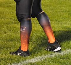
Two days ago I Ticker-linked to this photo of a Wisconsin high school football player and asked, “Is this where football sock design is headed?”
I got a much more thorough answer than I’d anticipated from reader Jeff Bahry, who informed me that the socks are actually leg sleeves with elastic stirrup loops. “The fabric is comparable to higher-end polyester — not cotton,” he wrote. “They also feature a silicon band to
prevent slipping.”
The company behind this is a Wisconsin operation called Dye Sport, which specializes in sublimated graphics. If you click on “Team Sports” and then start poking around from there, you can get an idea of what they’re about — basically, if you have really bad taste some innovative design ideas, they’ll indulge you as far as you want to go.
The socks aren’t mentioned on the Dye Sport site, however, so I gave them a call and found myself talking to company founder Scott Yeomans. Here’s how our chat went down:
Uni Watch: So what’s the story with these socks? I’ve never seen anything like them.
Scott Yeomans: We developed that about four years ago. We test-marketed it on one Wisconsin high school — Lancaster — to see how it performed, how the kids liked it, blah-blah-blah. And they ended up winning the state championship in it. And from there, things really started exploding. And actually, the Lancaster coach told us they didn’t have any kids cramping up with calf cramps that season. Is it the socks, is it that the kids were in better condition or better hydrated? I can’t say it’s definitely the socks”¦
UW: What was the design that you did for them?
SY: I’m trying to remember. I remember how we were watching the state tournament on TV and the commentators and the camera kept focusing on the socks. “Look at those socks!” I think we had a gradient — white down at the shoe and fading up to royal blue — with an arrow design.
UW: And how many teams are wearing the socks now?
SY: Last year we had 30 teams here in Wisconsin. This year it’s close to 50, plus we have a team in Michigan wearing them. And we have a dealer now in Arizona — I just shipped him 70 pairs for a youth soccer team. And we have our own boys’ and girls’ soccer teams wearing them here in town — they’re just lovin’ ’em. So we’re gonna expand more into soccer, girls’ softball. And getting back to football, last year we had six Wisconsin teams wearing our socks in the state tournament, and two of them won their divisions, so we’re getting a lot of good exposure.
UW: Since these socks are open at the bottom, does the player wear an ankle sock under it or what?
SY: Some of ’em wear a full-length sock underneath; some of ’em wear a little ankle or no-show sock. It’s personal preference. But you have that stirrup strap to pull it down into the shoe, so it looks like a full sock.
UW: Why’d you choose to make it that way, instead of making a traditional sock with a toe?
SY: It’s less bulky, and it lasts longer. If a sock develops a tear or wears out, it’s usually in the toe.
UW: And again, just to make sure I understand, you developed this product yourself, and you offer it exclusively?
SY: Yes.
UW: Has there been any negative feedback from people who think these designs are too radical or whatever?
SY: No. You have your old-school coaches, but you have more and more younger coaches, and they seem to like the socks a little more cutting-edge.
UW: And, of course, you can offer this product in a conservative design too — it doesn’t make any difference to you.
SY: Right. If they just want a solid red sock, that’s fine. Most of them, though, they’ll put the helmet logo on the side, or the school logo.
So there you have it, the beginning of the end for football hosiery as we know it, all thanks to my favorite state, which I will henceforth refer to as Hades, the end.
And speaking of sock-related follow-up items: Back on Monday I asked about the sock logo that Maurice Stovall has been wearing. The bad news is that I just played into their hands by giving them free publicity; the good news, I hope, is that some of the NFL’s uni police guys read this site and will now start cracking down on this pernicious logo creep.

Gazoo Boo-Boos Up the Wazoo: I really messed up the part of yesterday’s ESPN column that pertained to the new S100 batting helmet. As originally published around noontime, the column stated that only three players had worn the helmet in a game: David Wright, Ryan Dempster, and Shane Victorino. But then, shortly after the column went live, Guy Serumgard informed me that Carlos Guillen wore the S100 on Sept. 3rd (apparently this was even noted at some point in the comments section on this site, but I either didn’t notice or didn’t remember), so we added a little “Update” graf to that section of the column. That was shortly before 2pm.
Then I went out and didn’t get back to a computer until about 9pm, at which point I found several e-mails from people telling me that Edgar Gonzalez had also worn the S100. Too late to add another update to the column — I’ll just run a correction in my next ESPN piece.
Not sure how I missed the boat so badly on this — I thought I’d been keeping track of the S100 situation. Interestingly, when I interviewed Rawlings exec Mike Thompson for yesterday’s column, the very first question I asked him was, “Just to make sure I have my facts straight, to my knowledge only Dempster, Wright, and Victorino have worn the new helmet — is that right?” He replied, “Yes.” Of course, it’s not his job to keep track of that — it’s mine — so that doesn’t absolve me. If anything, it’s another reminder that I need to do my own homework and not depend on others to confirm things for me.
Anyway: Let the record show that five MLBers have worn the S100 — unless you know of any others who’ve done so.
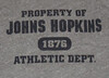
Research Query: Got a note yesterday from Matt DeLeon, who poses a very good question: “I was wondering if you knew the history of the ‘Property of’ T-shirts. Were there shirts that were actually the ‘property of’ certain teams? I would assume so, although a T-shirt would seem to be something worth giving away after a few uses. How far back do these shirts go, and what’s the history behind them?”
Excellent question! Anyone out there know anything about this? If so, give me a shout.
“Turntable? What’s a turntable?”: I’ve put a few more old indie-rock 45s up for auction on eBay, and I’ll continue to add more over the next couple of weeks. You can keep track of everything I’m selling here.
Uni Watch News Ticker: LSU will be wearing purple jerseys this Saturday against Mississippi State. “This is unusual because they generally only wear purple at home for non-conference opponents — this is a conference game on the road,” notes Ben Melancon. ”¦ New mask for Yann Danis. ”¦ The Swedish military has some uni issues (with thanks to Chad Todd). ”¦ Is it OK to wear ONOB is the jersey is given to you by the team? (Nice find by John Brooks.) ”¦ There’s a resurgence in sales of Expos gear, and it’s coming from an unlikely source (with thanks to Graham Bakay). ”¦ Jon Canella notes that Pedro Feliz always has a line of dirt on the back of his road jersey. “I’ve been noticing it since the end of May,” he says. “Superstitious? Not a good enough stain remover by the clubhouse attendant?” And before you propose any theories of your own, remember it only happens on Feliz’s road jersey. Weird. … A few months ago I got some e-mails from a Milwaukee marketing exec who wanted to redesign the Packers’ logo. I didn’t post his designs, because (a) I didn’t think they were very good, and (b) the Packers obviously aren’t going to change their mark. But I guess it was a slow news day at the Milwaukee Journal-Sentinal.
Note to Milwaukee Marketing Executive:
No, see, if you create a new logo for a client it should be BETTER than its predecessor.
—Ricko
Strange, Paul, but the Sweat It Out logo looks a lot like the little icon next to your latest musical offerings on ebay. BTW, the title of the Liz Phair single is spelled incorrectly.
[quote comment=”349947″]the title of the Liz Phair single is spelled incorrectly.[/quote]
Yikes! Thank you!!
my God, that Green Bay logo is terrible!
Feliz probably has that line because of pine tar on his bat. When he streches in the on deck circle, he probably puts his bat behind his shoulders. Just my theory.
Interesting choice of shoe manufacturer to display the support-hose football stockings. BTW, they didn’t appear “sublimated” in that display. They could be read from the last row of the stands.
[quote comment=”349950″]Feliz probably has that line because of pine tar on his bat. When he streches in the on deck circle, he probably puts his bat behind his shoulders. Just my theory.[/quote]
Yes, but why only on the road?
My god was that Packers wanna be just crap or what?
Wonder if the road jersey is the regular material or Cool Base and if there is possibly a problem with using a stronger cleaner on the Cool Base jerseys? Don’t know. Seems odd that it isn’t on the home jersey, as well.
Can’t explain why it might be only the road jersey, but it’s got to be pine tar. We’ve this kind of thing on link before (best pic I could find, sorry). I know Kevin Youkilis has had this “issue” before.
Strange it might be only on the road jersey. No photo evidence of it on the home jersey at all?
That guy does sorta have a point with using a GB instead of just a G…. but, yeah, his logos kinda suck. I think the Packers have been using the G logo for so long now that you pretty much can’t change it, regardless, especially with them being community owned.
…and I kinda hope those socks don’t make it to the NFL – or if they do, that teams at least don’t use all the silly gradients. A solid color with a logo I don’t mind too much. Multi-colored gradients? Ugh.
LSU will be wearing purple jerseys this Saturday against Mississippi State. “This is unusual because they generally only wear purple at home for non-conference opponents – this is a conference game on the road,”
It is unusual, but it happened on LSU\’s last visit to Miss. State two years ago. That was a Thursday night opener in August. What\’s interesting, though, is that State\’s insistence on LSU wearing purple with a different head coach than it had two years ago. Most quirks like this involve the same head coach.
The smir on Pedro Feliz’s jersey is from the pine tar; I’ve noticed a few Orioles and Red Sox players have the “line” on their jerseys as well as their the two teams I follow.
Here’s a picture with the Phillies where you can see Feliz in his home white’s with the smir too…
link
And here’s a picture when he was with the Gigantes in his home whites…
link
[quote comment=”349958″]…on their jerseys as well as their the two teams I follow.
I meant “they’re” instead of “their”…
Two things:
1) In the Feliz photo linked in the article, it looks like a giant Ryan Howard is blocking his way into the dugout. Weirdest screenshot ever
2) LSU needs to wear those sweet white helmets when they wear the purple jerseys…I’m just sayin’
You can sort of see the smudge on his home alt jersey here…
link
I know I’ll be in the minority here, but I like the socks. The sublimation, especially. I’m not in love with the gradiations of color, I think it’s kind of amateur hour looking, but then again, these are high schoolers. It could be worse, they could be link.
… a VERY slow news day in Milwaukee.
What an atrocious story, not worthy of newsprint.
So, does every kid who’s ever scribbled logos deserve such coverage? Then why does some adult?
I won’t even get into the merit of his designs … because they’re below par … but the fact that the paper covered it? Pathetic.
All I’m saying is that if the packers entertain that logo, they’d have some serious ‘splainin to do to a certain German auto conglomerate. Is it me or did that dude just add a curve to the following mark?
link
If so, pathetic to the highest degree.
[quote comment=”349946″]Note to Milwaukee Marketing Executive:
No, see, if you create a new logo for a client it should be BETTER than its predecessor.
—Ricko[/quote]
I feel bad for his firm…they just lost all of their clients.
What an awful idea/logo. And someone please take away Photoshop from people who use bevel and emboss filters on their logos. Ughhh
[quote comment=”349946″]Note to Milwaukee Marketing Executive:
No, see, if you create a new logo for a client it should be BETTER than its predecessor.
—Ricko[/quote]
what he did was sorta like this
only that was a april fool’s gag
[quote comment=”349946″]Note to Milwaukee Marketing Executive:
No, see, if you create a new logo for a client it should be BETTER than its predecessor.
—Ricko[/quote]
Yes, this new proposed design is quite gay, even that matador yesterday would agree. Would like to see the “G” placed on either the jersey or pants, and have the Packers introduce green pants with yellow/white stripes.
LSU should adopt purple pants, and use a yellow jersey from time to time.
Those hip hop people do enjoy wearing sports jerseys of teams and players they’ve never heard of, along with tilting of the hat to the wrong side. It’s really funny, but even more hilarious when white people try dressing that way. So glad I’m not 18 years old anymore growing up in this culture.
I figure if anyone looks enough that the stain will be found on the home whites, too.
Re: Feliz stain… since we see its now on home and road, its probably the pine tar from his follow through when he swings. Martin Prado has two stains on his jersey, one on his shoulder where he taps the bat, and the other on the back of his shoulder from his follow through.
Never noticed it on the home jersey, only the away in varying degrees of “depth of stain”.
[quote comment=”349966″][quote comment=”349946″]Note to Milwaukee Marketing Executive:
No, see, if you create a new logo for a client it should be BETTER than its predecessor.
—Ricko[/quote]
what he did was link
only that was a april fool’s gag[/quote]
I’m thinking that link may have been his inspiration.
~~~~~~~~~~~~~~~~~~~~~~~~~~~~~~
So since his e-mail address was published, what’s the over/under on the number of hate mails that he’s gotten so far?
Oops. I quoted the wrong comment. I meant that as a follow-up to the Bugatti one. (Incidentally, not a German company. They’re headquartered in France.)
WOW! What was that Wisconsin graphic designer on the day he thought up that one? It looks like something one of G.I. Joe’s enemy armies would wear. That is without a doubt the ugliest logo I have ever seen. It makes the “Buffaslug” look logical. Go Joe!
[quote comment=”349967″]Those hip hop people do enjoy wearing sports jerseys of teams and players they’ve never heard of, along with tilting of the hat to the wrong side. It’s really funny, but even more hilarious when white people try dressing that way. So glad I’m not 18 years old anymore growing up in this culture.[/quote]
It’s not all of us dressing like that! Some of us still try to act like a normal person.
Well, as normal as a person can be when they daily check a blog devoted to sports uniforms and logos.
[quote comment=”349972″]Oops. I quoted the wrong comment. I meant that as a follow-up to the Bugatti one. (Incidentally, not a German company. They’re headquartered in France.)[/quote]
Technicalities my man…Bugatti is owned by VW (as is Lamborghini, and a host of other brands not of German origin). But you are correct. They are French.
Still a crappy logo from that guy.
link
link.
This may have been brought up here before, but has No Mas thought about doing a “I Still Call it Enron” shirt for Houston? I’d buy that.
“Leg sleeves”, huh. Can I get ’em argyle?
Well now, those also serve to illustrate (as someone mentioned) what could be one down side of the compression shirt sleeve-stripes idea. Some team might start wearing tie-dyed sleeves (or socks), or “gradiant tones”, or paisley.
Or, y’know…plaid
(wouldn’t be all bad if they were the “Highlanders”, I suppose).
—Ricko
RE: The Wisconsin interview:
It reminded me that particularly Wisconsin is a breeding ground for this type of uni expression especially at the high school level, where the entrepreneurial fervor of the entire state seems focused on the 14-18 year old demographic. I don’t think I’ve ever seen such energy around outfitting high school athletes with stuff of this ilk anywhere else. Note the emphasis on ilk. Of course, I have no secondary sources to back up my assertion.
Quick, somebody mock up Tennessee in leg sleeves that look like their endzones!
I gotta see that.
Well, on second thought, maybe I don’t.
Congrats to the link and there totally hip unis for dodging that 4th quarter McCluster fuck. Getting their first win in quite sometime against a top 5 team. I still can’t figure out why those garnet color helmet stripes look almost silverish at times? Reflection properties of the decal?
Regarding the “property of” shirts:
It was custom for the athletic department to run a laundry for the athletic teams. Athletes would come into the gym, get issued everything from socks to jocks. The t-shirts would have “property of” stamped on them to prevent loss. Eventually, they became more valuable with the school/team name on them.
[quote]Then I went out and didn’t get back to a computer until about 9pm [/quote]
Somebody needs to get the man a blackberry, then he can NEVER miss out. (and no more gone fishin’s either)
I have always though that the Sprecher Beer Logo he developed is what needs changing. Maybe I should run some designs by a few writers at the Journal.
[quote comment=”349981″]Regarding the “property of” shirts:
It was custom for the athletic department to run a laundry for the athletic teams. Athletes would come into the gym, get issued everything from socks to jocks. The t-shirts would have “property of” stamped on them to prevent loss. Eventually, they became more valuable with the school/team name on them.[/quote]
This is strictly a general recollection, but it seems to me teams began marketing the “PROPERTY OF…” shirts in about the early 70’s. Prior to that, if you had one, it had been stolen. LOL
—Ricko
[quote comment=”349975″][quote comment=”349972″]Oops. I quoted the wrong comment. I meant that as a follow-up to the Bugatti one. (Incidentally, not a German company. They’re headquartered in France.)[/quote]
Technicalities my man…Bugatti is owned by VW (as is Lamborghini, and a host of other brands not of German origin). But you are correct. They are French.
Still a crappy logo from that guy.
link
link
Didn’t realize they’re a VW subsidiary. OK, so I guess they’re a German company in the same sense that Volvo’s an American one.
Those logos do indeed suck.
[quote comment=”349963″]… a VERY slow news day in Milwaukee.
What an atrocious story, not worthy of newsprint.
So, does every kid who’s ever scribbled logos deserve such coverage? Then why does some adult?
I won’t even get into the merit of his designs … because they’re below par … but the fact that the paper covered it? Pathetic.[/quote]
This sounds an awful lot like some of the comments that are posted for Paul’s Page 2 pieces.
Y’know, the ones like this:
And that’s one of the kinder ones.
I have been patiently waiting for a “I still call it Enron” shirt as well…
[quote comment=”349946″]Note to Milwaukee Marketing Executive:
No, see, if you create a new logo for a client it should be BETTER than its predecessor.
—Ricko[/quote]
It looks like he’s trying to fit 10 lbs of shit in a 5 lbs bag. If that’s the case, here’s my suggestion for Grambling if they ever decide to change their logo.
link
[quote comment=”349980″]Congrats to the link and there totally hip unis for dodging that 4th quarter McCluster fuck. Getting their first win in quite sometime against a top 5 team. I still can’t figure out why those garnet color helmet stripes look almost silverish at times? Reflection properties of the decal?[/quote]
Yes, the cocks were spurrier than ole miss!
[quote comment=”349980″]Congrats to the link and there totally hip unis for dodging that 4th quarter McCluster fuck. Getting their first win in quite sometime against a top 5 team. I still can’t figure out why those garnet color helmet stripes look almost silverish at times? Reflection properties of the decal?[/quote]
mike,
you are aware the cocks went mono last night, right?
cuz you linked to a white pants photo…and that outfit, despite being made by UA, and having OMBS, is pretty nice…the mono…not so much
As a Wisconsin native and a forever homer, I can only apologize to each and every one of you for the state’s dual embarrassment of today’s column.
Please do not allow these to overshadow the many things that the state still lends to this great country.
Forward!
Frosty
Forward!
Frosty
Don’t you mean “On”?
:)
[quote comment=”349990″][quote comment=”349980″]Congrats to the link and there totally hip unis for dodging that 4th quarter McCluster fuck. Getting their first win in quite sometime against a top 5 team. I still can’t figure out why those garnet color helmet stripes look almost silverish at times? Reflection properties of the decal?[/quote]
mike,
you are aware the cocks link last night, right?
cuz you linked to a white pants photo…and that outfit, despite being made by UA, and having OMBS, is pretty nice…the mono…not so much[/quote]
True true. Just props to their uniform in general.
Granted, the proposed change for the Packers is pretty lame, but it probably is about time for the Packers to change their uniforms.
They suffer from the same problem as the Bears and Browns where they try to pull off a “traditional” look but it just comes across as looking silly with the modern fabrics.
[quote comment=”349964″]All I’m saying is that if the packers entertain that logo, they’d have some serious ‘splainin to do to a certain German auto conglomerate. Is it me or did that dude just add a curve to the following mark?
link
If so, pathetic to the highest degree.[/quote]
I thought the same thing as soon as I saw it.
[quote comment=”349994″]Granted, the proposed change for the Packers is pretty lame, but it probably is about time for the Packers to change their uniforms.
They suffer from the same problem as the Bears and Browns where they try to pull off a “traditional” look but it just comes across as looking silly with the modern fabrics.[/quote]
Silly?
[quote comment=”349994″]Granted, the proposed change for the Packers is pretty lame, but it probably is about time for the Packers to change their uniforms.
They suffer from the same problem as the Bears and Browns where they try to pull off a “traditional” look but it just comes across as looking silly with the modern fabrics.[/quote]
And how is that more offensive than the the newer uniforms that come across as looking silly with the modern fabrics?
Just sayin’, if you say things like that, you can’t ever level a “You just want everyone to look the same” criticism at someone. Because basically that’s what you just said.
—Ricko
Amazing paint job on Yann Danis’ mask. It looks like . . . Yann Danis.
Hmmm. Back in the day of the full goalie mask, wonder if anyone ever thought of having their actual likeness painted on the mask?
[quote comment=”349996″][quote comment=”349994″]Granted, the proposed change for the Packers is pretty lame, but it probably is about time for the Packers to change their uniforms.
They suffer from the same problem as the Bears and Browns where they try to pull off a “traditional” look but it just comes across as looking silly with the modern fabrics.[/quote]
Silly?[/quote]
did you see ricko’s solution?
if you didn’t, take a look…if you did…and you still think it’s “silly,” might you have an alternate suggestion?
I think that this was really his idea… and it came out about as well.
link
With the socks, I really wouldn’t be that surprised to see them start popping up in the NCAA in the near future. I’m kind of surprised that Oregon hasn’t already used them because it’s a great “recruiting tool”.
I know I picked my college based on the socks.
[quote comment=”349946″]Note to Milwaukee Marketing Executive:
No, see, if you create a new logo for a client it should be BETTER than its predecessor.
—Ricko[/quote]
Ricko pretty much said it best. I threw up in my mouth a little when I saw that article. A slow news day indeed.
I too would like to apologize on behalf of the great state of Wisconsin.
P.S – Re comment #49 – The Packers in no way need a uni upgrade, Their football uniforms resemble, well, football uniforms. Unlike say the Broncos or Vikings…
[quote comment=”349955″]Can’t explain why it might be only the road jersey, but it’s got to be pine tar. We’ve this kind of thing on link before (best pic I could find, sorry). I know Kevin Youkilis has had this “issue” before.
Strange it might be only on the road jersey. No photo evidence of it on the home jersey at all?[/quote]
If you look closely at this shot of Feliz’ home alt jersey, you can see a mark near his left shoulder next to the letter “F”. link
Ricko – Here’s a quick and dirty version of the Tennessee Leg Sleeves:
link
As the guy who sent in the original sock photo, may I start a pool on which college and NFL teams will pick it up first?
College – Oregon or Florida A&M
Pro – Jacksonville or Dallas.
Why mess with the Packers’ logo? It is iconic to sports and the NFL. Like taking the Yankees NY and morphing it into who-knows-what? Again, just because you can do it, doesn’t mean you should.
[quote comment=”349992″]Forward!
Frosty
Don’t you mean “On”?
:)[/quote]
No actually…the motto for the state of Wisconsin is in fact “Forward”.
Has it ever been more necessary than today?
This shit happens when you drink as much as we do though…
F
OK. Silly might not be the right word (and of course I saw Ricko’s solution – do you think I would miss a day of UniWatch?)
I think the Bears are the worst – and the problem is the shiny pants. The actual uniforms don’t look bad – they are tons better than the crazy modern ones like the Falcons and Vikings, but people look at them as traditional as if they are the same uniforms Gale Sayers or Forrest Gregg wore and they aren’t the same because of the shiny pants and lack of sleeves.
I just don’t like it.
My suggestion would be to use a duller fabric for the pants and to redesign the jerseys to not try to force traditional stripes where they just don’t work anymore.
Actually, if I ruled the world I would force the NFL to get rid of the tight cut jerseys and have all teams with sleeves.
Heh – Johns Hopkins? Really??
(went to JHU)
creepy on the Expos article because last night, i JUST bought an ‘Spos hat at my local Lids. I wish I had gotten one from Distant Replays before they packed it in, so I’m stuck with a white New Era logo on the side on my Expos hat, but still, a strange coincidence nevertheless.
[quote comment=”349952″][quote comment=”349950″]Feliz probably has that line because of pine tar on his bat. When he streches in the on deck circle, he probably puts his bat behind his shoulders. Just my theory.[/quote]
Yes, but why only on the road?[/quote]
As others have since noted, the stain does also appear on the home jersey, but just lightly. The difference between the home & road stains can easily be explained by who does the laundry. At home it would be the home clubbies and I imagine they put forth a little more effort getting stains out. On the road the other team does the laundry and they probably just throw the stuff in the washer without much, or any, pretreating.
This is simply a “yes or no” question, not an invitation to another political discussion:
Doesn’t this link look like a jammed-together version of this logo (found in the lower right corner)? link
[quote comment=”350008″]OK. Silly might not be the right word (and of course I saw Ricko’s solution – do you think I would miss a day of UniWatch?)
I think the Bears are the worst – and the problem is the shiny pants. The actual uniforms don’t look bad – they are tons better than the crazy modern ones like the Falcons and Vikings, but people look at them as traditional as if they are the same uniforms Gale Sayers or Forrest Gregg wore and they aren’t the same because of the shiny pants and lack of sleeves.
I just don’t like it.
My suggestion would be to use a duller fabric for the pants and to redesign the jerseys to not try to force traditional stripes where they just don’t work anymore.
Actually, if I ruled the world I would force the NFL to get rid of the tight cut jerseys and have all teams with sleeves.[/quote]
You talking about the link they only wear in the preseason anymore? Or are the link too shiny for your tastes as well?
[quote comment=”350007″][quote comment=”349992″]Forward!
Frosty
Don’t you mean “On”?
:)[/quote]
No actually…the motto for the state of Wisconsin is in fact “Forward”.
Has it ever been more necessary than today?
This shit happens when you drink as much as we do though…
F[/quote]
Sorry, I was thinking of the fight song.
Also not from Wisconsin, which places me in a minority status here.
But I have learned something today.
(Now I’ve got to try and figure out what command to click on to send an e-mail I’ve received to someone else).
So much to learn, so little time.
:)
I would like to echo Frosty and say that I am embarrassed to live in the same state as that designer who is trying to change one of the most iconic logos in sports history. If the Packers were to change ANYTHING at all about their logo or uniform, they should go back to this logo:
link
And to Paul… come to Wisconsin, and I will buy you some cheese curds, a butter burger, and a tall glass of frosty Wisconsin beer in exchange for not thinking of the Badger State as “Hades” anymore. Deal?
The Bears whites are way too shiny. Actually, the only shiny pants in the league should be the silver and gold ones. The Giants pull of non-shiny pants, so it should be possible for the rest of the teams to get non-shiny pants as well.
The only non-gold/silver shiny pants that actually look decent are the Dolphins’ aqua pants.
Forrest Gregg played for the Bears?
Those leg sleeves…where have we seen those before?
link
Actually, it’s not a bad idea. It’s just a fancy stirrup. And if you’ve seen some of the bland high school unis I’ve seen, especially the monochrome ones, this might help. Of course I don’t want the designs to go overboard…although those checkerboard and argyle patterns y’all have mentioned might work…
[quote comment=”350004″]Ricko – Here’s a quick and dirty version of the Tennessee Leg Sleeves:
link
Beautiful job.
I think the Croatian soccer team ought to bust something similar. (I think they call it Czecherboard over there).
[quote comment=”350013″][quote comment=”350008″]OK. Silly might not be the right word (and of course I saw Ricko’s solution – do you think I would miss a day of UniWatch?)
I think the Bears are the worst – and the problem is the shiny pants. The actual uniforms don’t look bad – they are tons better than the crazy modern ones like the Falcons and Vikings, but people look at them as traditional as if they are the same uniforms Gale Sayers or Forrest Gregg wore and they aren’t the same because of the shiny pants and lack of sleeves.
I just don’t like it.
My suggestion would be to use a duller fabric for the pants and to redesign the jerseys to not try to force traditional stripes where they just don’t work anymore.
Actually, if I ruled the world I would force the NFL to get rid of the tight cut jerseys and have all teams with sleeves.[/quote]
You talking about the link they only wear in the preseason anymore? Or are the link too shiny for your tastes as well?[/quote]
it’s not just the bears…most of the teams like teh shiny
while i detest this look, i’ve always liked matte finish of the pants, which actually replaced the shiny pants of the last iteration of unis
the sheen makes a big difference…on bright days it looks awful, but at night and under cloudy days, it’s not so bad
The Packers already have a better logo for their helmets:
link
I would love to see that instead of the G, but they have a good thing going, so I wouldn’t mess with it.
[quote comment=”350008″]OK. Silly might not be the right word (and of course I saw Ricko’s solution – do you think I would miss a day of UniWatch?)
I think the Bears are the worst – and the problem is the shiny pants. The actual uniforms don’t look bad – they are tons better than the crazy modern ones like the Falcons and Vikings, but people look at them as traditional as if they are the same uniforms Gale Sayers or Forrest Gregg wore and they aren’t the same because of the shiny pants and lack of sleeves.
I just don’t like it.
My suggestion would be to use a duller fabric for the pants and to redesign the jerseys to not try to force traditional stripes where they just don’t work anymore.
Actually, if I ruled the world I would force the NFL to get rid of the tight cut jerseys and have all teams with sleeves.[/quote]
Ah, with regard to fabrics, yes, we agree.
Shiny jerseys and pants and sparkly helmets work with the newer designs. Well, kinda.
Look absolutely dopey with the more traditional styles, though.
Now, as to the CUT of today’s jerseys, we agree, too. My whole comp sleeve stripes thing was based on, “Well, since we can’t change the muscle shirt look, maybe we can work WITH it.”
—Ricko
the sheen makes a big difference
That reminds me:did anyone catch the scene in “the office” last nite where michael scott tells oscar he is going in for a colonoscopy?
Just terrifically inappropriate. And oh yeah, to keep this uni-topical, how about the jerseys on darrell and his sis?
[quote comment=”350021″]The Packers already have a better logo for their helmets:
link
I would love to see that instead of the G, but they have a good thing going, so I wouldn’t mess with it.[/quote]
Slap! No. Bad.
That logo works as a secondary logo. It is not a good helmet logo.
This is a better helmet logo:
link
and it’s intentionally horrible.
[quote comment=”350019″][quote comment=”350004″]Ricko – Here’s a quick and dirty version of the Tennessee Leg Sleeves:
link
Beautiful job.
I think the Croatian soccer team ought to bust something similar. (I think they call it Czecherboard over there).[/quote]
Looks like the Croatians already use the “czecherboard” design on a portion of their sock.
link
[quote comment=”350023″]the sheen makes a big difference
That reminds me:did anyone catch the scene in “the office” last nite where michael scott tells oscar he is going in for a colonoscopy?
Just terrifically inappropriate. And oh yeah, to keep this uni-topical, how about the jerseys on darrell and his sis?[/quote]
Darrell’s green looked better. Kind of a Randall Cunningham/Reggie White-era look.
How’s this for Packers?
Since sleeves stripes are becoming largely unworkable, and they’ve already removed the stripes from the socks…
Helmets, pants and socks stay exactly the same.
Stripes disappear from sleeves, but stay at neckline (hang on, this is gonna work).
And this (since you can’t flip the state map for two-sided helmet use) on the sleeves…
link
Not huge like shoulder-top Flying Elvis, but not tiny either.
I absolutely do NOT think the Packers’ marketing schtick should be “forward looking”. It should ALWAYS be “We’ve been here as along as anyone…in the smallest market in pro sports, too…so stuff it, all you newcomers with no history.”
—Ricko
[quote comment=”350024″][quote comment=”350021″]The Packers already have a better logo for their helmets:
link
I would love to see that instead of the G, but they have a good thing going, so I wouldn’t mess with it.[/quote]
Slap! No. Bad.
That logo works as a secondary logo. It is not a good helmet logo.
This is a better helmet logo:
link
and it’s intentionally horrible.[/quote]
I said I wouldn’t mess with a good thing and still you slap me? ;)
Hey, how about the secondary logo on the jersey, either on the “sleeves” or the way the Steelers put their logo on the jerseys?
[quote comment=”349993″][quote comment=”349990″][quote comment=”349980″]Congrats to the link and there totally hip unis for dodging that 4th quarter McCluster fuck. Getting their first win in quite sometime against a top 5 team. I still can’t figure out why those garnet color helmet stripes look almost silverish at times? Reflection properties of the decal?[/quote]
mike,
you are aware the cocks link last night, right?
cuz you linked to a white pants photo…and that outfit, despite being made by UA, and having OMBS, is pretty nice…the mono…not so much[/quote]
True true. Just props to their uniform in general.[/quote]
It’s a mystery to me why anyone thinks South Carolina has sharp football uniforms. The logo on the helmet doesn’t stand out, and the uniform is the typical trendy wandering lines pattern which is usually criticized here. My guess is few people can recall those superior Gamecock uniforms of the 1980s, since South Carolina never contended for the national title, and later, fell into trouble with the NCAA.
I’ve had no luck finding those 1980s uniforms with the red helmet and traditional striping on the jersey/pants, but I can’t believe anyone would prefer the modern bland design to the unis worn during the Sterling Sharpe era.
I get so encouraged about the state of athletic uniform asthetics when I see the groundswell stirrup movement, shoulder stripes on HS football unis, the AFC legacy unis, etc. But then after today’s awful news of the gradient graphic sock company and the idiot who thinks the Packers logo needs to be freshened up, I feel like impaling myself on a manure fork. I guess it boils down to opinions. Sadly enough, everyone has one (an opinion, that is).
[quote comment=”350028″][quote comment=”350024″][quote comment=”350021″]The Packers already have a better logo for their helmets:
link
I would love to see that instead of the G, but they have a good thing going, so I wouldn’t mess with it.[/quote]
Slap! No. Bad.
That logo works as a secondary logo. It is not a good helmet logo.
This is a better helmet logo:
link
and it’s intentionally horrible.[/quote]
I said I wouldn’t mess with a good thing and still you slap me? ;)
Hey, how about the secondary logo on the jersey, either on the “sleeves” or the way the Steelers put their logo on the jerseys?[/quote]
I tend to be a little violent sometimes… it’s the black & silver in my blood. Sorry about that.
Honestly, the only place I see that other Packers logo working on the uniform would be on the front of the jersey like the Steelers, and even that’s a bit iffy to me. It’s a great logo for ticket stubs and programs and official team press conference background images, but I really don’t think it belongs on the uniforms.
Darrell’s green looked better.
link
It is not necessarily a slow news day in Milwaukee. The story was by Jim Stingl, a locally known columnist who typically covers the quirky and off-beat. It’s perfectly up his realm of typical coverage. It’s nice that the paper still has him and his counterparts that don’t just cover the crime and politics beats, even if those logos were hideous.
[quote comment=”350031″][quote comment=”350028″][quote comment=”350024″][quote comment=”350021″]The Packers already have a better logo for their helmets:
link
I would love to see that instead of the G, but they have a good thing going, so I wouldn’t mess with it.[/quote]
Slap! No. Bad.
That logo works as a secondary logo. It is not a good helmet logo.
This is a better helmet logo:
link
and it’s intentionally horrible.[/quote]
I said I wouldn’t mess with a good thing and still you slap me? ;)
Hey, how about the secondary logo on the jersey, either on the “sleeves” or the way the Steelers put their logo on the jerseys?[/quote]
I tend to be a little violent sometimes… it’s the black & silver in my blood. Sorry about that.
Honestly, the only place I see that other Packers logo working on the uniform would be on the front of the jersey like the Steelers, and even that’s a bit iffy to me. It’s a great logo for ticket stubs and programs and official team press conference background images, but I really don’t think it belongs on the uniforms.[/quote]
Better idea, put the big “G” on the pants, in the
hip area, then continue the striping below.
[quote comment=”350020″][quote comment=”350013″][quote comment=”350008″]OK. Silly might not be the right word (and of course I saw Ricko’s solution – do you think I would miss a day of UniWatch?)
I think the Bears are the worst – and the problem is the shiny pants. The actual uniforms don’t look bad – they are tons better than the crazy modern ones like the Falcons and Vikings, but people look at them as traditional as if they are the same uniforms Gale Sayers or Forrest Gregg wore and they aren’t the same because of the shiny pants and lack of sleeves.
I just don’t like it.
My suggestion would be to use a duller fabric for the pants and to redesign the jerseys to not try to force traditional stripes where they just don’t work anymore.
Actually, if I ruled the world I would force the NFL to get rid of the tight cut jerseys and have all teams with sleeves.[/quote]
You talking about the link they only wear in the preseason anymore? Or are the link too shiny for your tastes as well?[/quote]
it’s not just the bears…most of the teams like teh shiny
while i detest link, i’ve always liked matte finish of the pants, which actually link of the last iteration of unis
the sheen makes a big link…on bright days it looks awful, but at night and under cloudy days, it’s not so bad[/quote]
I could not agree with you more Phil. I absolutely detest those shiny pants.
On that marketing exec. who re-designed the Packers logo. It’s like he just learned how to make an embossed button in Photoshop, and went to town on the Pack’s logo. Not good.
Don’t know if you guys saw this before, but while searching for nfl retro logos I found this:
link
These are cool too:
link
link
[quote comment=”350029″]I’ve had no luck finding those 1980s uniforms with the red helmet and traditional striping on the jersey/pants, but I can’t believe anyone would prefer the modern bland design to the unis worn during the Sterling Sharpe era.[/quote]
something like this?
or perhaps this?
[quote comment=”350038″][quote comment=”350029″]I’ve had no luck finding those 1980s uniforms with the red helmet and traditional striping on the jersey/pants, but I can’t believe anyone would prefer the modern bland design to the unis worn during the Sterling Sharpe era.[/quote]
link?
or perhaps link?[/quote]
It may be monochrome, but I still really like that second one!
[quote comment=”350037″]Don’t know if you guys saw this before, but while searching for nfl retro logos I found this:
link
These are cool too:
link
link
very nice
[quote comment=”350016″]The only non-gold/silver shiny pants that actually look decent are the Dolphins’ aqua pants.[/quote]
OK, you had me but you totally lost me with that one. link but link and link and link is not?
On the proposed Packer logo:
NO GRADIENT! Unless it’s going to be a “web-only” icon. And am I not seeing something with the first idea? It just looks weird to me. And the second seems to lack creativity.
On Sponsored practice Gear: Who will ever see these? Other than maybe a news clip or a photo, there’s really not too many pics taken of teams in practice gear. Those aren’t memorable. Are teams just smarter than we think? “Sure we’ll put your logo on our ‘practice gear’. (and no one will ever know)
[quote comment=”350039″][quote comment=”350038″][quote comment=”350029″]I’ve had no luck finding those 1980s uniforms with the red helmet and traditional striping on the jersey/pants, but I can’t believe anyone would prefer the modern bland design to the unis worn during the Sterling Sharpe era.[/quote]
link?
or perhaps link?[/quote]
It may be monochrome, but I still really like that second one![/quote]
Touchdown! Yes, those are the ones, I think South Carolina did some mix and matching during that era, the all red version just blows away the garbage we saw last night. I think the more people that actually see this old uniforms will understand why they are superior. The red helmets really made the logo pop, too.
I recall the Gamecock defense also had a great nickname during that era, they were called the “Red Ant” defense.
Hopefully, South Carolina will revert back to this style in the near future.
[quote comment=”350041″][quote comment=”350016″]The only non-gold/silver shiny pants that actually look decent are the Dolphins’ aqua pants.[/quote]
OK, you had me but you totally lost me with that one. link but link and link and link is not?[/quote]
That’s easy. Go look at a dolphin – if they’re not in the water, they’re usually still wet… and shiny. So, dolphins are supposed to be shiny, while bears aren’t. It’s obvious.
[quote comment=”350013″]My suggestion would be to use a duller fabric for the pants[/quote]
Wait until the second quarter of home games in December; I think the “too shiny” problem will go away.
So, dolphins are supposed to be shiny, while bears aren’t.
link
[quote comment=”350041″][quote comment=”350016″]The only non-gold/silver shiny pants that actually look decent are the Dolphins’ aqua pants.[/quote]
OK, you had me but you totally lost me with that one. link but link and link and link is not?[/quote]
Not to put words in his mouth, or speak for him, but I get his point. For lack of a better adjective, let’s call them “jewel” colors or something, but the sheen works for some.
I was thinking it seems okay on the Skins’ burgundy pants, too.
But red, not so much. Red, to me, is flags and fire trucks and the Phillies (and such). Not satiny, no. Same for athletic gold. Old gold or silver, yes. Aqua, sure, as well many of the newer, non-traditional uni colors. Lots of blue gemstones, of course, but colors like navy and royal have been around long in sports we just think of them as matte finish, anything else is a little odd.
Hope you get what I mean, I hope. Really a color-by-color thing.
—Ricko
[quote comment=”350046″]So, dolphins are supposed to be shiny, while bears aren’t.
link
That’s just disturbing…
The retro logo I’d like to see the Packers use more (not on uniforms, but for others items) is the one from 59-74 in the link. It’s an interlocking G and B, (which includes the B, like that damn designer was trying to accomplish) and actually looks nice.
link
And I’m with Johnny O, Paul. If I were still in Wisconsin, I’d be happy to buy you all the cheese curds you can stomach. Don’t call us Hades.
-Greenie
Contributing to the not-so-badness of the Dolphins sheen is that the helmet and jersey are white. In cases were the pant and helmets colors match and “finishes” don’t, then you have a bad deal.
(which may take the Redskins off my “possible” list)
[quote comment=”350047″][quote comment=”350041″][quote comment=”350016″]The only non-gold/silver shiny pants that actually look decent are the Dolphins’ aqua pants.[/quote]
OK, you had me but you totally lost me with that one. link but link and link and link is not?[/quote]
Not to put words in his mouth, or speak for him, but I get his point. For lack of a better adjective, let’s call them “jewel” colors or something, but the sheen works for some.
I was thinking it seems okay on the Skins’ burgundy pants, too.
But red, not so much. Red, to me, is flags and fire trucks and the Phillies (and such). Not satiny, no. Same for athletic gold. Old gold or silver, yes. Aqua, sure, as well many of the newer, non-traditional uni colors. Lots of blue gemstones, of course, but colors like navy and royal have been around long in sports we just think of them as matte finish, anything else is a little odd.
Hope you get what I mean, I hope. Really a color-by-color thing.
—Ricko[/quote]
I’m not arguing for shiny anything in football. I’m a big fan of the Giants’ matte finish. It’s just too bad they had to go and fuck things up with that link.
I’m just saying that the Dolphins’ aqua-trousered ensemble is not a good look.
[quote]Hopefully, South Carolina will revert back to this style in the near future.[/quote]
not so long as UA is their supplier
their target market seems to be people who want to look/feel act like this
not that that’s a bad thing, just that that’s where they’re going with their uni design
/wow…could that sentence have any more “that”‘s in it?
Much Better Socks…
link
[quote comment=”350052″][quote]Hopefully, South Carolina will revert back to this style in the near future.[/quote]
not so long as UA is their supplier
their target market seems to be people who want to look/feel act link
not that that’s a bad thing, just that that’s where they’re going with their uni design
/wow…could that sentence have any more “that”‘s in it?[/quote]
That’s right, the current trends indicate South Carolina won’t be returning to that classic style. That football program just doesn’t have the tradition of a school, like Texas, for example, so that’s a big reason for the trendy uniform. Sad.
[quote comment=”350051″][quote comment=”350047″][quote comment=”350041″][quote comment=”350016″]The only non-gold/silver shiny pants that actually look decent are the Dolphins’ aqua pants.[/quote]
OK, you had me but you totally lost me with that one. link but link and link and link is not?[/quote]
Not to put words in his mouth, or speak for him, but I get his point. For lack of a better adjective, let’s call them “jewel” colors or something, but the sheen works for some.
I was thinking it seems okay on the Skins’ burgundy pants, too.
But red, not so much. Red, to me, is flags and fire trucks and the Phillies (and such). Not satiny, no. Same for athletic gold. Old gold or silver, yes. Aqua, sure, as well many of the newer, non-traditional uni colors. Lots of blue gemstones, of course, but colors like navy and royal have been around long in sports we just think of them as matte finish, anything else is a little odd.
Hope you get what I mean, I hope. Really a color-by-color thing.
—Ricko[/quote]
I’m not arguing for shiny anything in football. I’m a big fan of the Giants’ matte finish. It’s just too bad they had to go and fuck things up with that link.
I’m just saying that the Dolphins’ aqua-trousered ensemble is not a good look.[/quote]
We talkin’ sheen or color?
Cuz I never particularly liked the aqua pants, either.
Just saying I can live with the sheen on them, but on most other teams, forget it.
Now, if you’re an old bugger you remember when pants had satin fronts and matte finish backs; suppliers hadn’t yet figured out to make satin fabric stretch (see Notre Dame, Vikings’ first 60’s purple pants and countless others, well into the 80’s).
—Ricko
That Packer “logo” BBSS.
[quote comment=”350055″]I’m just saying that the Dolphins’ aqua-trousered ensemble is not a good look.[/quote]
here’s what csonk thinks about the aquasheen
[quote comment=”350052″]
/wow…could that sentence have any more “that”‘s in it?[/quote]Ain’t that the truth!
[quote comment=”350057″]here’s what link thinks about the aquasheen[/quote]That was a good cover. I think there was another one of Kiick, Csonka and Mercury Morris when they signed with Memphis (?) of the WFL.
Less and less posed shots for SI covers these days unless it’s a “season preview” edition.
[quote comment=”350053″]Much Better Socks…
link
Aussie Rules… great socks, but more to ship than to buy!!
From the article on the surge in Expos gear:
In the team’s heyday, with their powder-blue road uniforms and tri-colour caps, the Expos look was anything but cool.
LIES!
The powder blue was awesome. It was the boring, uninspired, knockoff-Cubs-but-duller look that they went with afterward that was anything but cool. They even dumped their cool number font. They went from being a distinctive team on the road to Yet Another Dull Gray Team. Bo-ring.
[quote comment=”350055″]
We talkin’ sheen or color?
Cuz I never particularly liked the aqua pants, either.
Just saying I can live with the sheen on them, but on most other teams, forget it.
Now, if you’re an old bugger you remember when pants had satin fronts and matte finish backs; suppliers hadn’t yet figured out to make satin fabric stretch (see Notre Dame, Vikings’ first 60’s purple pants and countless others, well into the 80’s).
—Ricko[/quote]
I’m talking color. I don’t like that combination. But then again, I don’t like it when teams with white helmets wear anything but white pants.
As for the shiny pants in general, they really don’t bother me. Would I prefer to see a matte look? Absolutely. But I grew up watching guys like link and link, so to me, that’s just the way they’ve always looked.
[quote comment=”350060″][quote comment=”350057″]here’s what link thinks about the aquasheen[/quote]That was a good cover. I think there was another one of Kiick, Csonka and Mercury Morris when they signed with Memphis (?) of the WFL.
Less and less posed shots for SI covers these days unless it’s a “season preview” edition.[/quote]
was warfield, not morris
lookie here
Sublimated socks? Big deal. Shit the NBA was sublimating jerseys as early as 1992-93 with the redesign of the Phoenix Suns unis.
link
And other cool sublimated designs followed such as the Hawks:
link
Today a lot of uni design is bland and predictable… but don’t blame the NBA uni designers in the funky early to mid-90’s.
[quote comment=”350063″][quote comment=”350055″]
We talkin’ sheen or color?
Cuz I never particularly liked the aqua pants, either.
Just saying I can live with the sheen on them, but on most other teams, forget it.
Now, if you’re an old bugger you remember when pants had satin fronts and matte finish backs; suppliers hadn’t yet figured out to make satin fabric stretch (see Notre Dame, Vikings’ first 60’s purple pants and countless others, well into the 80’s).
—Ricko[/quote]
I’m talking color. I don’t like that combination. But then again, I don’t like it when teams with white helmets wear anything but white pants.
As for the shiny pants in general, they really don’t bother me. Would I prefer to see a matte look? Absolutely. But I grew up watching guys like link and link, so to me, that’s just the way they’ve always looked.[/quote]
Conversely, I can’t stand link. I think link was infinitely better.
[quote comment=”350064″][quote comment=”350060″][quote comment=”350057″]here’s what link thinks about the aquasheen[/quote]That was a good cover. I think there was another one of Kiick, Csonka and Mercury Morris when they signed with Memphis (?) of the WFL.
Less and less posed shots for SI covers these days unless it’s a “season preview” edition.[/quote]
was warfield, not morris
link[/quote]
Anybody notice no TV numbers on Csonka’s jersey?
Must be a training camp version of sumpin.
YIPES!!! That is some shit design for the Packers…
NICE
link
NICE
link
NICE
link
Easy right?
[quote comment=”350062″]From the article on the surge in Expos gear:
In the team’s heyday, with their powder-blue road uniforms and tri-colour caps, the Expos look was anything but cool.
LIES!
The powder blue was awesome. It was the boring, uninspired, knockoff-Cubs-but-duller look that they went with afterward that was anything but cool. They even dumped their cool number font. They went from being a distinctive team on the road to Yet Another Dull Gray Team. Bo-ring.[/quote]
Totally agree. Whatever you may think of powder blue roads in MLB, they worked for some teams. Expos were one of ’em. Both versions (narrow striped and wide striped).
—Ricko
[quote comment=”350064″]link[/quote]
TY. I should have known that; Morris was the one who was “left behind” in Miami and got a lot of carries IIRC.
I didn’t know you lived in Ohio. :-)
[quote comment=”350065″]Sublimated socks? Big deal. Shit the NBA was sublimating jerseys as early as 1992-93 with the redesign of the Phoenix Suns unis.
link
And other cool sublimated designs followed such as the Hawks:
link
Today a lot of uni design is bland and predictable… but don’t blame the NBA uni designers in the funky early to mid-90’s.[/quote]
link.
[quote comment=”350067″]Anybody notice no TV numbers on Csonka’s jersey?
Must be a training camp version of sumpin.[/quote]
I think Csonk is flashing some gang sign or something too… must be a Memphis thing.
i always wondered if this was intentional
maybe they realize csonk was flippin the bird in the original and wouldn’t let him recreate it
[quote comment=”350073″]i always wondered if link
maybe they realize csonk was flippin the bird in the original and wouldn’t let him recreate it[/quote]
More like, “Everyone knows you got one by us last time, so do TWO fingers this time…okay?”
So Nice.
link
[quote comment=”349946″]Note to Milwaukee Marketing Executive:
No, see, if you create a new logo for a client it should be BETTER than its predecessor.
—Ricko[/quote]
I wonder just how many times the words “a little freshening up” has been used to describe uni changes in the NFL?
[quote comment=”350071″][quote comment=”350065″]Sublimated socks? Big deal. Shit the NBA was sublimating jerseys as early as 1992-93 with the redesign of the Phoenix Suns unis.
link
And other cool sublimated designs followed such as the Hawks:
link
Today a lot of uni design is bland and predictable… but don’t blame the NBA uni designers in the funky early to mid-90’s.[/quote]
link.[/quote]
dont forget this nightmare
link
[quote comment=”350075″]So Nice.
link
and i want to buy that bucks jersey now. that is really nice.
[quote comment=”350075″]So Nice.
link
This guy link didn’t think so. He ranked them the ugliest NBA jersey ever. I don’t know what he’s thinking, because he not only added these link to the list, but these beauties from the Cavs: link
If the antlers weren’t overlapping the names, I might like it more. It definitely isn’t the worst in history, by a long shot.
[quote comment=”350078″][quote comment=”350075″]So Nice.
link
and i want to buy that bucks jersey now. that is really nice.[/quote]
Does a link work for you?
[quote comment=\”350080\”][quote comment=\”350078\”][quote comment=\”350075\”]So Nice.
link
and i want to buy that bucks jersey now. that is really nice.[/quote]
Does a replica work for you?[/quote]
yeah, but its too small and its glen robinson. lol.
[quote comment=”350079″][quote comment=”350075″]So Nice.
link
This guy link didn’t think so. He ranked them the ugliest NBA jersey ever. I don’t know what he’s thinking, because he not only added these link to the list, but these beauties from the Cavs: link
If the antlers weren’t overlapping the names, I might like it more. It definitely isn’t the worst in history, by a long shot.[/quote]
I mean, come on, how do you think the 70s Cavs look worse than this? link
[quote comment=”350064″][quote comment=”350060″][quote comment=”350057″]here’s what link thinks about the aquasheen[/quote]That was a good cover. I think there was another one of Kiick, Csonka and Mercury Morris when they signed with Memphis (?) of the WFL.
Less and less posed shots for SI covers these days unless it’s a “season preview” edition.[/quote]
was warfield, not morris
link[/quote]
Say, has Uniwatch ever done a complete breakdown of WFL uniforms? The Memphis Grizzlies were one of several WFL franchises with sharp uniforms, my favorite was The Hawaiians. Florida, Birmingham, and the Southern California Sun were good, too.
[quote comment=”350082″][quote comment=”350079″][quote comment=”350075″]So Nice.
link
This guy link didn’t think so. He ranked them the ugliest NBA jersey ever. I don’t know what he’s thinking, because he not only added these link to the list, but these beauties from the Cavs: link
If the antlers weren’t overlapping the names, I might like it more. It definitely isn’t the worst in history, by a long shot.[/quote]
I mean, come on, how do you think the 70s Cavs look worse than this? link
Sure, some of those are just awful, but there are at least four that have no business being anywhere near a top 10 list of badness (Cavs, Bucks, Nuggets, even the Thunder).
Speaking of bad NBA jerseys, is there a Hall-of-Famer whose had to wear more terrible unis than Charles Barkley?
link
link
link
[quote comment=”350082″][quote comment=”350079″][quote comment=”350075″]So Nice.
link
This guy link didn’t think so. He ranked them the ugliest NBA jersey ever. I don’t know what he’s thinking, because he not only added these link to the list, but these beauties from the Cavs: link
If the antlers weren’t overlapping the names, I might like it more. It definitely isn’t the worst in history, by a long shot.[/quote]
I mean, come on, how do you think the 70s Cavs look worse than this? link
And these link and these link don’t make the list????
I like the Dye Sport socks. If I were in high school, I would run through a wall with those babies on.
I, too, am from Wisconsin. The alternate Packers logo thing is an embarrassment. Urine tests for all involved!
[quote comment=”350083″][quote comment=”350064″][quote comment=”350060″][quote comment=”350057″]here’s what link thinks about the aquasheen[/quote]That was a good cover. I think there was another one of Kiick, Csonka and Mercury Morris when they signed with Memphis (?) of the WFL.
Less and less posed shots for SI covers these days unless it’s a “season preview” edition.[/quote]
was warfield, not morris
link[/quote]
Say, has Uniwatch ever done a complete breakdown of WFL uniforms? The Memphis Grizzlies were one of several WFL franchises with sharp uniforms, my favorite was The Hawaiians. Florida, Birmingham, and the Southern California Sun were good, too.[/quote]
Girzzlies a.k.a. Memphis Southmen. Hell yea, awesome logo/colors. Detroit Wheels had a pretty cool logo and colors as well.
[quote comment=”349984″][quote comment=”349981″]Regarding the “property of” shirts:
It was custom for the athletic department to run a laundry for the athletic teams. Athletes would come into the gym, get issued everything from socks to jocks. The t-shirts would have “property of” stamped on them to prevent loss. Eventually, they became more valuable with the school/team name on them.[/quote]
This is strictly a general recollection, but it seems to me teams began marketing the “PROPERTY OF…” shirts in about the early 70’s. Prior to that, if you had one, it had been stolen. LOL
—Ricko[/quote]
they’re from usc in the 1930s. check this out:
link
[quote comment=”350083″]Say, has Uniwatch ever done a complete breakdown of WFL uniforms? The Memphis Grizzlies were one of several WFL franchises with sharp uniforms, my favorite was The Hawaiians. Florida, Birmingham, and the Southern California Sun were good, too.[/quote]
paul may have done something in the past (i know he’s done some things on his mothership columns linking to/referencing WFL unis), but i did one on the sun a ways back
i am planning on doing a full WFL article with ricko down the line too
/stay tuned
[quote comment=\”349967\”]LSU should adopt purple pants, and use a yellow jersey from time to time.[/quote]
Ummm, DEFINITELY NOT. If they\’re going to wear gold jerseys at all, wear the white helmets and white pants.
[quote comment=”350085″][quote comment=”350082″][quote comment=”350079″][quote comment=”350075″]So Nice.
link
This guy link didn’t think so. He ranked them the ugliest NBA jersey ever. I don’t know what he’s thinking, because he not only added these link to the list, but these beauties from the Cavs: link
If the antlers weren’t overlapping the names, I might like it more. It definitely isn’t the worst in history, by a long shot.[/quote]
I mean, come on, how do you think the 70s Cavs look worse than this? link
And these link and these link don’t make the list????[/quote]
And to show I’m not bashing anything made after the 80s, these link look good.
[quote comment=”350091″][quote comment=”350085″][quote comment=”350082″][quote comment=”350079″][quote comment=”350075″]So Nice.
link
This guy link didn’t think so. He ranked them the ugliest NBA jersey ever. I don’t know what he’s thinking, because he not only added these link to the list, but these beauties from the Cavs: link
If the antlers weren’t overlapping the names, I might like it more. It definitely isn’t the worst in history, by a long shot.[/quote]
I mean, come on, how do you think the 70s Cavs look worse than this? link
And these link and these link don’t make the list????[/quote]
And to show I’m not bashing anything made after the 80s, these link look good.[/quote]
oops…link
It’s a new Raptors jersey. Look it up, I’m done trying to get it right…
[quote comment=”349976″]This may have been brought up here before, but has No Mas thought about doing a “I Still Call it Enron” shirt for Houston? I’d buy that.[/quote]
I “still” to refer to it as the Ballpark at Union Station…. ummm, yea, I lost that fight. But how cool would that be?
[quote comment=”350093″]It’s a new Raptors jersey. Look it up, I’m done trying to get it right…[/quote]
link
[quote comment=”350095″][quote comment=”350093″]It’s a new Raptors jersey. Look it up, I’m done trying to get it right…[/quote]
link
Thanks. Every now and then, these newfangled typewriter thingys get the best of me…
[quote comment=”350095″][quote comment=”350093″]It’s a new Raptors jersey. Look it up, I’m done trying to get it right…[/quote]
link
I dig it! No pun intended….heh heh
[quote comment=”350089″][quote comment=”350083″]Say, has Uniwatch ever done a complete breakdown of WFL uniforms? The Memphis Grizzlies were one of several WFL franchises with sharp uniforms, my favorite was The Hawaiians. Florida, Birmingham, and the Southern California Sun were good, too.[/quote]
paul may have done something in the past (i know he’s done some things on his mothership columns linking to/referencing WFL unis), but link a ways back
i am planning on doing a full WFL article with ricko down the line too
/stay tuned[/quote]
Looking forward to that article, I always liked the unique color combination of purple and orange for the Sun, thought they pulled it off well.
Has Uniwatch done any articles on the USFL and WLAF, always thought the New York-New Jersey Knights had a great logo and uniform?
Gradients and sports do not belong together.
[quote comment=”350098″][quote comment=”350089″][quote comment=”350083″]Say, has Uniwatch ever done a complete breakdown of WFL uniforms? The Memphis Grizzlies were one of several WFL franchises with sharp uniforms, my favorite was The Hawaiians. Florida, Birmingham, and the Southern California Sun were good, too.[/quote]
paul may have done something in the past (i know he’s done some things on his mothership columns linking to/referencing WFL unis), but link a ways back
i am planning on doing a full WFL article with ricko down the line too
/stay tuned[/quote]
Looking forward to that article, I always liked the unique color combination of purple and orange for the Sun, thought they pulled it off well.
Has Uniwatch done any articles on the USFL and WLAF, always thought the New York-New Jersey Knights had a great logo and uniform?[/quote]
If there hasn’t been a USFL/WLAF article, I hope that will be rectified soon!
This reminded me of an idea – I’d like to see the readers’ thoughts on the ultimate uni football league. In other words, comprise a league of teams based on the best unis from all the different leagues and time frames. Should be interesting.
[quote comment=”350097″][quote comment=”350095″][quote comment=”350093″]It’s a new Raptors jersey. Look it up, I’m done trying to get it right…[/quote]
link
I dig it! No pun intended….heh heh[/quote]
I really wish someone in Toronto would wake up and realize that raptor is another word for bird of prey. There are so many things they can do with their logos that don’t involve dinosaurs.
I suppose link is OK, but link? Come on.
[quote comment=”350101″][quote comment=”350097″][quote comment=”350095″][quote comment=”350093″]It’s a new Raptors jersey. Look it up, I’m done trying to get it right…[/quote]
link
I dig it! No pun intended….heh heh[/quote]
I really wish someone in Toronto would wake up and realize that raptor is another word for bird of prey. There are so many things they can do with their logos that don’t involve dinosaurs.
I suppose link is OK, but link? Come on.[/quote]
Hey now…we must be willing to turn on our imaginations. If we can’t get our minds around a dribbling dinosaur, how can we hope to embrace a ball-spinning, pipe-smoking leprechaun?
Or teams in LA and Utah named “Lakers” and “Jazz”, for that matter?
—Ricko
My Aunt Christine used to wear her black stockings something like this, knotted below the knee. When she was in her 80s.
link
And Can-Can dancers did, too.
Fetching. I’m sure this generation of high school kids has no idea how ladylike and…um, dumb…they look.
Bet they’d think twice if they saw ’em on those French dancin’ girls.
Fersure if they’d seen my Aunt Christine.
—Ricko
I tell ya, this link should be included in every case study on logos that are simple, clean, smart, and effective.
So where are any color on color college football games? I thought the NCAA changed to rule o allow it of both teams agreed.
[quote comment=”350023″]the sheen makes a big difference
That reminds me:did anyone catch the scene in “the office” last nite where michael scott tells oscar he is going in for a colonoscopy?
Just terrifically inappropriate. And oh yeah, to keep this uni-topical, how about the jerseys on darrell and his sis?[/quote]
I am a latecomer to The Office. Just started watching it last year. But now have the dvd and catch reruns on TBS.
Ya how about Darrell and his sisters unis. That part was good
The socks in today’s column sure are something to think about
[quote comment=”350104″]I tell ya, this link should be included in every case study on logos that are simple, clean, smart, and effective.[/quote]
It’s the yang to link yin.
[quote comment=\”350084\”]Exhibit B
[/quote]
Now, while I know many people around here want all teams to look the same–very plain, yet with lots of stripes–I think those Suns jerseys were fantastic. I loved everything about that logo, the fonts, etc. Brilliant.
[quote comment=”350109″][quote comment=\”350084\”]Exhibit B
[/quote]
Now, while I know many people around here want all teams to look the same–very plain, yet with lots of stripes–I think those Suns jerseys were fantastic. I loved everything about that logo, the fonts, etc. Brilliant.[/quote]
link? Is that you?
[quote comment=”350106″][quote comment=”350023″]the sheen makes a big difference
That reminds me:did anyone catch the scene in “the office” last nite where michael scott tells oscar he is going in for a colonoscopy?
Just terrifically inappropriate. And oh yeah, to keep this uni-topical, how about the jerseys on darrell and his sis?[/quote]
I am a latecomer to The Office. Just started watching it last year. But now have the dvd and catch reruns on TBS.
Ya how about Darrell and his sisters unis. That part was good[/quote]
Yeah, that’s what she said. At first I thought Darrell’s jersey looked kinda like a Seahawks alternate, it had blue outlined numbers.
[quote comment=”350110″][quote comment=”350109″][quote comment=\”350084\”]Exhibit B
[/quote]
Now, while I know many people around here want all teams to look the same–very plain, yet with lots of stripes–I think those Suns jerseys were fantastic. I loved everything about that logo, the fonts, etc. Brilliant.[/quote]
link? Is that you?[/quote]
Yeah, in retrospect they’re actually pretty good. Probably the best of the 90s designs.
[quote comment=”350111″][quote comment=”350106″][quote comment=”350023″]the sheen makes a big difference
That reminds me:did anyone catch the scene in “the office” last nite where michael scott tells oscar he is going in for a colonoscopy?
Just terrifically inappropriate. And oh yeah, to keep this uni-topical, how about the jerseys on darrell and his sis?[/quote]
I am a latecomer to The Office. Just started watching it last year. But now have the dvd and catch reruns on TBS.
Ya how about Darrell and his sisters unis. That part was good[/quote]
Yeah, that’s what she said. At first I thought Darrell’s jersey looked kinda like a Seahawks alternate, it had blue outlined numbers.[/quote]
It looked like a late 80’s-early 90’s Jets jersey to me.
Right now TCM has a old football movie on.”Good News” In color with a very colorful football scene or 2
Just started at 3:30
[quote comment=”350108″][quote comment=”350104″]I tell ya, this link should be included in every case study on logos that are simple, clean, smart, and effective.[/quote]
It’s the yang to link yin.[/quote]
Say what you will but as a fifth or sixth grader when that logo came out, I loved it. And really shouldn’t sports in some way appeal to the children? I understand professional, corporate blah blah, but it’s kind of like the Oregon Ducks, where the kids like it and isn’t that what should matter on a certain level.
(yes yes I know I am going to buried for this)
hey rodd, other than the result, how was jerry’s new palace?
[quote comment=”350116″][quote comment=”350108″][quote comment=”350104″]I tell ya, this link should be included in every case study on logos that are simple, clean, smart, and effective.[/quote]
It’s the yang to link yin.[/quote]
Say what you will but as a fifth or sixth grader when that logo came out, I loved it. And really shouldn’t sports in some way appeal to the children? I understand professional, corporate blah blah, but it’s kind of like the Oregon Ducks, where the kids like it and isn’t that what should matter on a certain level.
(yes yes I know I am going to buried for this)[/quote]
And they all should get trophies just for showing up,too. Cuz, y’know, college isn’t about growing up or anything, not about learning you don’t always get to call the shots, or getting patted on the head for trying really, really hard even if you screwed everything up and, say, cost your fellow employees a lot of time and your employer a lot money.
Just sayin’, being an adult’s gotta start sometime, doesn’t it? :)
—Ricko
That Packers thing- first thing it reminded me of was the CFL Edmonton Eskimos.
link
[quote comment=”350116″][quote comment=”350108″][quote comment=”350104″]I tell ya, this link should be included in every case study on logos that are simple, clean, smart, and effective.[/quote]
It’s the yang to link yin.[/quote]
Say what you will but as a fifth or sixth grader when that logo came out, I loved it. And really shouldn’t sports in some way appeal to the children? I understand professional, corporate blah blah, but it’s kind of like the Oregon Ducks, where the kids like it and isn’t that what should matter on a certain level.
(yes yes I know I am going to buried for this)[/quote]
There are so many levels to the Oregon Ducks kids appeal. It’s like, “you don’t like this(Steroidal Super Hero Duck), well, how about this(Donald Duck)? Oh, you like that(Carbon Fibre), we got something like that too(Carbon Fibre Lookin’ Helmets).” It’s just absolutely exhausting at times. Breaking News: Now, something for the parents, throwbacks.
For the record, I’m not crazy about that cartoon Toronto Raptor, however, do like Oregon’s ‘Donald’ Duck.
[quote comment=”350118″][quote comment=”350116″][quote comment=”350108″][quote comment=”350104″]I tell ya, this link should be included in every case study on logos that are simple, clean, smart, and effective.[/quote]
It’s the yang to link yin.[/quote]
Say what you will but as a fifth or sixth grader when that logo came out, I loved it. And really shouldn’t sports in some way appeal to the children? I understand professional, corporate blah blah, but it’s kind of like the Oregon Ducks, where the kids like it and isn’t that what should matter on a certain level.
(yes yes I know I am going to buried for this)[/quote]
And they all should get trophies just for showing up,too. Cuz, y’know, college isn’t about growing up or anything, not about learning you don’t always get to call the shots, or getting patted on the head for trying really, really hard even if you screwed everything up and, say, cost your fellow employees a lot of time and your employer a lot money.
Just sayin’, being an adult’s gotta start sometime, doesn’t it? :)
—Ricko[/quote]
There’s nothing wrong with a logo that appeals to kids. There have been plenty of good ones over the years. The link that Ricko mentioned comes to mind as a “classic” example. The link is a modern one.
I’m not particularly crazy about either one, but they’re both pretty solid.
I can’t find one thing I like about that dribbling dino, though. It’s childish in an over-the-top way, it’s got the OMBS syndrome and it’s just ugly.
This site puts up childhood drawings of make-believe teams from contributors’ pasts but it won’t put up someone’s adult attempts to make over the Packers’ logo? I don’t think it looks very good either, but I’m puzzled sometimes at what does and doesn’t make it through the UniWatch Blog filter. And just to be clear, I dig the childhood art images.
[quote comment=”350120″]For the record, I’m not crazy about that cartoon Toronto Raptor, however, do like Oregon’s ‘Donald’ Duck.[/quote]
Me, too. In fact, I’m still regretting not picking up some Donald swag when I was in Eugene like 15 years ago.
My wife bought a baseball cap with Donald on it and for some reason, I left town empty-handed.
[quote comment=”350121″][quote comment=”350118″][quote comment=”350116″][quote comment=”350108″][quote comment=”350104″]I tell ya, this link should be included in every case study on logos that are simple, clean, smart, and effective.[/quote]
It’s the yang to link yin.[/quote]
Say what you will but as a fifth or sixth grader when that logo came out, I loved it. And really shouldn’t sports in some way appeal to the children? I understand professional, corporate blah blah, but it’s kind of like the Oregon Ducks, where the kids like it and isn’t that what should matter on a certain level.
(yes yes I know I am going to buried for this)[/quote]
And they all should get trophies just for showing up,too. Cuz, y’know, college isn’t about growing up or anything, not about learning you don’t always get to call the shots, or getting patted on the head for trying really, really hard even if you screwed everything up and, say, cost your fellow employees a lot of time and your employer a lot money.
Just sayin’, being an adult’s gotta start sometime, doesn’t it? :)
—Ricko[/quote]
There’s nothing wrong with a logo that appeals to kids. There have been plenty of good ones over the years. The link that Ricko mentioned comes to mind as a “classic” example. The link is a modern one.
I’m not particularly crazy about either one, but they’re both pretty solid.
I can’t find one thing I like about that dribbling dino, though. It’s childish in an over-the-top way, it’s got the OMBS syndrome and it’s just ugly.[/quote]
Top notch post right here. Well said.
[quote comment=”350116″][quote comment=”350108″][quote comment=”350104″]I tell ya, this link should be included in every case study on logos that are simple, clean, smart, and effective.[/quote]
It’s the yang to link yin.[/quote]
Say what you will but as a fifth or sixth grader when that logo came out, I loved it. And really shouldn’t sports in some way appeal to the children? I understand professional, corporate blah blah, but it’s kind of like the Oregon Ducks, where the kids like it and isn’t that what should matter on a certain level.
(yes yes I know I am going to buried for this)[/quote]
I’m with you on this…up to a point. I do prefer a uni that appeals to all ages, but that first Raptors one was too childish.
It would be nice, though, if sports, like comic books, would be made more appealing for kids. Both forms of entertainment seem so geared towards adults now. Yes, the adults spend the money now, but eventually you gotta hook the next generation. So yeah, sports should have the kids’ interest in mind.
[quote comment=”350124″][quote comment=”350121″][quote comment=”350118″][quote comment=”350116″][quote comment=”350108″][quote comment=”350104″]I tell ya, this link should be included in every case study on logos that are simple, clean, smart, and effective.[/quote]
It’s the yang to link yin.[/quote]
Say what you will but as a fifth or sixth grader when that logo came out, I loved it. And really shouldn’t sports in some way appeal to the children? I understand professional, corporate blah blah, but it’s kind of like the Oregon Ducks, where the kids like it and isn’t that what should matter on a certain level.
(yes yes I know I am going to buried for this)[/quote]
And they all should get trophies just for showing up,too. Cuz, y’know, college isn’t about growing up or anything, not about learning you don’t always get to call the shots, or getting patted on the head for trying really, really hard even if you screwed everything up and, say, cost your fellow employees a lot of time and your employer a lot money.
Just sayin’, being an adult’s gotta start sometime, doesn’t it? :)
—Ricko[/quote]
There’s nothing wrong with a logo that appeals to kids. There have been plenty of good ones over the years. The link that Ricko mentioned comes to mind as a “classic” example. The link is a modern one.
I’m not particularly crazy about either one, but they’re both pretty solid.
I can’t find one thing I like about that dribbling dino, though. It’s childish in an over-the-top way, it’s got the OMBS syndrome and it’s just ugly.[/quote]
Top notch post right here. Well said.[/quote]
Thanks.
[quote comment=”350125″]It would be nice, though, if sports, like comic books, would be made more appealing for kids.[/quote]
you first pointed out this one jim (which paul put on the mothership piece)…doesn’t this make the kids think of this…and vice versa
see…sports are for kids
[quote comment=”350117″]hey rodd, other than the result, how was jerry’s new palace?[/quote]
Phenomenal. But it was gawdawful hot. I’m used to heat(it was 105 here the day before I left) butI’m not used to humidity so 90 degrees and humid kills me.
Other than that, the atmosphere was just amazing, it was so loud and the place was big. Very Big.
The wife and I had an amazing time.
[quote comment=”350127″][quote comment=”350125″]It would be nice, though, if sports, like comic books, would be made more appealing for kids.[/quote]
you first pointed out this one jim (which paul put on the mothership piece)…doesn’t link make the kids think of link…and vice versa
see…sports are for kids[/quote]
well, I didn’t mean for toddlers…
If only he’d been wearing a Gazoo s100…..
link
[quote comment=”350118″][quote comment=”350116″][quote comment=”350108″][quote comment=”350104″]I tell ya, this link should be included in every case study on logos that are simple, clean, smart, and effective.[/quote]
It’s the yang to link yin.[/quote]
Say what you will but as a fifth or sixth grader when that logo came out, I loved it. And really shouldn’t sports in some way appeal to the children? I understand professional, corporate blah blah, but it’s kind of like the Oregon Ducks, where the kids like it and isn’t that what should matter on a certain level.
(yes yes I know I am going to buried for this)[/quote]
And they all should get trophies just for showing up,too. Cuz, y’know, college isn’t about growing up or anything, not about learning you don’t always get to call the shots, or getting patted on the head for trying really, really hard even if you screwed everything up and, say, cost your fellow employees a lot of time and your employer a lot money.
Just sayin’, being an adult’s gotta start sometime, doesn’t it? :)
—Ricko[/quote]
Ricko –
I am not saying the players should run the asylum as it were. I am saying that sometimes the appeal of the uniforms is more apparent to the kids than to the alums and more aged observers. I am not saying incorporate every design element possible (which I think Oregon does anyway) but rather that I can see why the uniforms are an added plus.
Hell, I picked my college allegiance based on the fact that of the 2 final schools, one was offering $500 more in scholarship per semester towards books than the other. Go Devils!
My roundabout point is that in the grand scheme of things, what makes absolutely no sense at 30, 40, 50 and beyond, makes a hell of a lot of sense at 17 or 18.
TROPHIES FOR EVERYONE!
I missed the Orioles stirrup club order and have aneed for a pair. If anyone has a pair to sell or can point me in the direction of one, e-mail me at link. Thanks.
[quote comment=”350121″][quote comment=”350118″][quote comment=”350116″][quote comment=”350108″][quote comment=”350104″]I tell ya, this link should be included in every case study on logos that are simple, clean, smart, and effective.[/quote]
It’s the yang to link yin.[/quote]
Say what you will but as a fifth or sixth grader when that logo came out, I loved it. And really shouldn’t sports in some way appeal to the children? I understand professional, corporate blah blah, but it’s kind of like the Oregon Ducks, where the kids like it and isn’t that what should matter on a certain level.
(yes yes I know I am going to buried for this)[/quote]
And they all should get trophies just for showing up,too. Cuz, y’know, college isn’t about growing up or anything, not about learning you don’t always get to call the shots, or getting patted on the head for trying really, really hard even if you screwed everything up and, say, cost your fellow employees a lot of time and your employer a lot money.
Just sayin’, being an adult’s gotta start sometime, doesn’t it? :)
—Ricko[/quote]
There’s nothing wrong with a logo that appeals to kids. There have been plenty of good ones over the years. The link that Ricko mentioned comes to mind as a “classic” example. The link is a modern one.
I’m not particularly crazy about either one, but they’re both pretty solid.
I can’t find one thing I like about that dribbling dino, though. It’s childish in an over-the-top way, it’s got the OMBS syndrome and it’s just ugly.[/quote]
“Growing up” business was in reference to Oregon saying their unis help with recruiting. And I get the appeal to the college players, but letting incoming freshman think they’re somehow entitled to an opinion about what a major college football program chooses to wear isn’t the swiftest idea I’ve ever heard. For a lot of reasons.
And I like the Leprechaun, among others. That was my point. The NBA is all over the map, literally and figuratively, so there are lots of looks to embrace. And, despite what people seem to think, I do NOT think all unis should look alike. Or logos, either. Damn, that’d be boring.
So I musta messed up, because everbody apparently took both posts wrong.
And, finally, I think there’s huge difference between looking at artwork people did when they were kids and the supposedly perceptive, schooled renderings of a “marketing executive” someone deemed covering in metropolitan daily.
—Ricko
I heard an interesting interview on KFAN radio here in Minneapolis this morning (still looking for podcast link, if any). Greg Coleman, former Viking punter and now KFAN sideline reporter, was telling how he is also the NFL’s representative at Viking home games to check out both teams pregame and in-game for uniform violations. He makes notes on violations pregame, submits a report to the Vikings’ designated team contact (happens to be the strength coach) who then is supposed to notify the offending players. Coleman then checks throughout the game for corrections and/or further violations.
In addition the NFL has someones who watches every game from NYC and can also tag players for violations.
That the NFL has an official in NYC checking is not that surprising. What did surprise me was that Coleman is a reporter assigned to cover the team during broadcasts (and throughout the week for call-ins) and he is supposed to police those same players. Does that strike anyone as a conflict of interest? Even if he never has to confront a player on a violation, they know he is the on-site guy and likely the one who reported them, usually leading to a fine.
Comments?
[quote comment=”350133″][quote comment=”350121″][quote comment=”350118″][quote comment=”350116″][quote comment=”350108″][quote comment=”350104″]I tell ya, this link should be included in every case study on logos that are simple, clean, smart, and effective.[/quote]
It’s the yang to link yin.[/quote]
Say what you will but as a fifth or sixth grader when that logo came out, I loved it. And really shouldn’t sports in some way appeal to the children? I understand professional, corporate blah blah, but it’s kind of like the Oregon Ducks, where the kids like it and isn’t that what should matter on a certain level.
(yes yes I know I am going to buried for this)[/quote]
And they all should get trophies just for showing up,too. Cuz, y’know, college isn’t about growing up or anything, not about learning you don’t always get to call the shots, or getting patted on the head for trying really, really hard even if you screwed everything up and, say, cost your fellow employees a lot of time and your employer a lot money.
Just sayin’, being an adult’s gotta start sometime, doesn’t it? :)
—Ricko[/quote]
There’s nothing wrong with a logo that appeals to kids. There have been plenty of good ones over the years. The link that Ricko mentioned comes to mind as a “classic” example. The link is a modern one.
I’m not particularly crazy about either one, but they’re both pretty solid.
I can’t find one thing I like about that dribbling dino, though. It’s childish in an over-the-top way, it’s got the OMBS syndrome and it’s just ugly.[/quote]
“Growing up” business was in reference to Oregon saying their unis help with recruiting. And I get the appeal to the college players, but letting incoming freshman think they’re somehow entitled to an opinion about what a major college football program chooses to wear isn’t the swiftest idea I’ve ever heard. For a lot of reasons.
And I like the Leprechaun, among others. That was my point. The NBA is all over the map, literally and figuratively, so there are lots of looks to embrace. And, despite what people seem to think, I do NOT think all unis should look alike. Or logos, either. Damn, that’d be boring.
So I musta messed up, because everbody apparently took both posts wrong.
And, finally, I think there’s huge difference between looking at artwork people did when they were kids and the supposedly perceptive, schooled renderings of a “marketing executive” someone deemed covering in metropolitan daily.
—Ricko[/quote]
I don’t know if this was necessarily aimed at me, but I wasn’t disagreeing with you. I was trying to elaborate on your point.
[quote comment=”350134″]I heard an interesting interview on KFAN radio here in Minneapolis this morning (still looking for podcast link, if any). Greg Coleman, former Viking punter and now KFAN sideline reporter, was telling how he is also the NFL’s representative at Viking home games to check out both teams pregame and in-game for uniform violations. He makes notes on violations pregame, submits a report to the Vikings’ designated team contact (happens to be the strength coach) who then is supposed to notify the offending players. Coleman then checks throughout the game for corrections and/or further violations.
In addition the NFL has someones who watches every game from NYC and can also tag players for violations.
That the NFL has an official in NYC checking is not that surprising. What did surprise me was that Coleman is a reporter assigned to cover the team during broadcasts (and throughout the week for call-ins) and he is supposed to police those same players. Does that strike anyone as a conflict of interest? Even if he never has to confront a player on a violation, they know he is the on-site guy and likely the one who reported them, usually leading to a fine.
Comments?[/quote]
That’s very strange, I can see Viking players being unwilling to cooperate with Coleman for future interviews. I would also think checking players takes away from his attention as a reporter following the game.
[quote comment=”350134″]I heard an interesting interview on KFAN radio here in Minneapolis this morning (still looking for podcast link, if any). Greg Coleman, former Viking punter and now KFAN sideline reporter, was telling how he is also the NFL’s representative at Viking home games to check out both teams pregame and in-game for uniform violations. He makes notes on violations pregame, submits a report to the Vikings’ designated team contact (happens to be the strength coach) who then is supposed to notify the offending players. Coleman then checks throughout the game for corrections and/or further violations.
In addition the NFL has someones who watches every game from NYC and can also tag players for violations.
That the NFL has an official in NYC checking is not that surprising. What did surprise me was that Coleman is a reporter assigned to cover the team during broadcasts (and throughout the week for call-ins) and he is supposed to police those same players. Does that strike anyone as a conflict of interest? Even if he never has to confront a player on a violation, they know he is the on-site guy and likely the one who reported them, usually leading to a fine.
Comments?[/quote]
Found the podcast link if anyone is interested
link
Because I described a description (post #82) of how possibly to incorporate this logo into the Packer unis…
link
I figured I’d mock something up.
First, with the current stlye short sleeves…
link
On the whites with a “semi-sleeve”…
link
And, with the logo on compression sleeves…
link
Doesn’t look quite as good as I saw it my mind (so what else is new, LOL), cuz it’s a little plain, but that at least fits the historical position of the franchise. But, hey, I wanted to see how it would look, and now I know.
But they’d sell a ton of these in Wisconsin, though…
link
—Ricko
“described a description”?
I gotta read this shit one more time before I hit “Say It’.
(walks away, muttering)
—Ricko
[quote comment=”350138″]Because I described a description (post #82) of how possibly to incorporate this logo into the Packer unis…
link
I figured I’d mock something up.
First, with the current stlye short sleeves…
link
On the whites with a “semi-sleeve”…
link
And, with the logo on compression sleeves…
link
Doesn’t look quite as good as I saw it my mind (so what else is new, LOL), cuz it’s a little plain, but that at least fits the historical position of the franchise. But, hey, I wanted to see how it would look, and now I know.
But they’d sell a ton of these in Wisconsin, though…
link
—Ricko[/quote]
My apologies if this has already been said today – but didn’t Green Bay stick their logo “G” on their sleeves at one time?
I’m catching up on a few things, even though it’s a irrelevant franchise, and the fact that NHL 3rd jerseys tend to breed like rabbits,which takes a lot of the fun out of a uni launch – I quite like Nashville Predators new 3rd jersey.
[quote comment=”350140″][quote comment=”350138″]Because I described a description (post #82) of how possibly to incorporate this logo into the Packer unis…
link
I figured I’d mock something up.
First, with the current stlye short sleeves…
link
On the whites with a “semi-sleeve”…
link
And, with the logo on compression sleeves…
link
Doesn’t look quite as good as I saw it my mind (so what else is new, LOL), cuz it’s a little plain, but that at least fits the historical position of the franchise. But, hey, I wanted to see how it would look, and now I know.
But they’d sell a ton of these in Wisconsin, though…
link
—Ricko[/quote]
My apologies if this has already been said today – but didn’t Green Bay stick their logo “G” on their sleeves at one time?
I’m catching up on a few things, even though it’s a irrelevant franchise, and the fact that NHL 3rd jerseys tend to breed like rabbits,which takes a lot of the fun out of a uni launch – I quite like Nashville Predators new 3rd jersey.[/quote]
“G” on sleeves. Yup, a few years ago. This particular uni notion came up after a comment made in reaction to the story about the guy designing new Packer logos.
—Ricko
[quote comment=”350141″][quote comment=”350140″][quote comment=”350138″]Because I described a description (post #82) of how possibly to incorporate this logo into the Packer unis…
link
I figured I’d mock something up.
First, with the current stlye short sleeves…
link
On the whites with a “semi-sleeve”…
link
And, with the logo on compression sleeves…
link
Doesn’t look quite as good as I saw it my mind (so what else is new, LOL), cuz it’s a little plain, but that at least fits the historical position of the franchise. But, hey, I wanted to see how it would look, and now I know.
But they’d sell a ton of these in Wisconsin, though…
link
—Ricko[/quote]
My apologies if this has already been said today – but didn’t Green Bay stick their logo “G” on their sleeves at one time?
I’m catching up on a few things, even though it’s a irrelevant franchise, and the fact that NHL 3rd jerseys tend to breed like rabbits,which takes a lot of the fun out of a uni launch – I quite like Nashville Predators new 3rd jersey.[/quote]
“G” on sleeves. Yup, a few years ago. This particular uni notion came up after a comment made in reaction to the story about the guy designing new Packer logos.
—Ricko[/quote]
That was during the mid 1980s, back when sleeves were longer. Those were the Lynn Dickey teams with the potent offense. I liked having the “G” elsewhere on the Packer uniform, thought it added something. If the “G” were added to the pants, that would be a good look, IMO.
[quote comment=”350136″][quote comment=”350134″]I heard an interesting interview on KFAN radio here in Minneapolis this morning (still looking for podcast link, if any). Greg Coleman, former Viking punter and now KFAN sideline reporter, was telling how he is also the NFL’s representative at Viking home games to check out both teams pregame and in-game for uniform violations. He makes notes on violations pregame, submits a report to the Vikings’ designated team contact (happens to be the strength coach) who then is supposed to notify the offending players. Coleman then checks throughout the game for corrections and/or further violations.
In addition the NFL has someones who watches every game from NYC and can also tag players for violations.
That the NFL has an official in NYC checking is not that surprising. What did surprise me was that Coleman is a reporter assigned to cover the team during broadcasts (and throughout the week for call-ins) and he is supposed to police those same players. Does that strike anyone as a conflict of interest? Even if he never has to confront a player on a violation, they know he is the on-site guy and likely the one who reported them, usually leading to a fine.
Comments?[/quote]
That’s very strange, I can see Viking players being unwilling to cooperate with Coleman for future interviews. I would also think checking players takes away from his attention as a reporter following the game.[/quote]
Former player Tony McGee performs this same task for the Redskins. While he does not cover them per se, he does have a local show.
Isn’ this on the marquee of a bar in Green Bay? (And if it isn’t, it should be).
link
[quote comment=”349957″]LSU will be wearing purple jerseys this Saturday against Mississippi State. “This is unusual because they generally only wear purple at home for non-conference opponents – this is a conference game on the road,”
It is unusual, but it happened on LSU\’s last visit to Miss. State two years ago. That was a Thursday night opener in August. What\’s interesting, though, is that State\’s insistence on LSU wearing purple with a different head coach than it had two years ago. Most quirks like this involve the same head coach.[/quote]
Miss. State is probably the only SEC school, other than LSU, that even begins to occasionally wear White at home. MSU wore White at home a couple of years ago to start the season against Oregon, who wore their Neon Yellow jersey/pants combo.
In the early-mid 1970s, when LSU would go on the road to play Miss. State every other year, there were a couple of years that LSU would be made to wear their Purple jerseys. I believe that Miss. State at this era wore White jerseys for other home games also.
These would be the ONLY games, with MANY years in between, that the LSU team would wear purple jerseys, other than the occasional bowl game, and it was really an oddity to see LSU in Purple back then.
LSU almost NEVER wore Purple jerseys with any regularity until the late 1980’s when the NCAA mandated White jerseys on the Road, Dark jerseys at Home.
Then, after the NCAA allowed teams to ask home opponents for permission to wear White at home, you would get ocassional grumps like Vandy or Florida that would force LSU to wear dark at home.
Gerry DiNardo so disliked the Purple jerseys that he came up with the idea to petition the NCAA to wear White at home, and also came up with the idea to wear Yellow/Gold jerseys at home when Vandy made them wear dark at home. Then Spurrier wanted to wear White at home for an LSU game, so LSU wore Gold on the road at Florida once.
LSU should have a Yellow/Gold jersey, but with the traditional UCLA inserts (instead of the 1990s version without), paired with the regular Yellow/Gold helmet and White pasnts. That would be a very unique look, and also classy – and it would please the anti-Purple crowd …..
It used to be on the old Packer City Motel on the east side, I think…that was closed down some time ago.
As for the G on the sleeve, that was a Forrest Gregg idea, a bit past the Lynn Dickey era. Gregg also put number patches on the hips, an idea he picked up from the Cowboys. Lindy Infante yanked those off quickly, noting it made it easier to identify linemen for holding calls.
[quote comment=”350138″]Because I described a description (post #82) of how possibly to incorporate this logo into the Packer unis…
link
I figured I’d mock something up.
First, with the current stlye short sleeves…
link
On the whites with a “semi-sleeve”…
link
And, with the logo on compression sleeves…
link
Doesn’t look quite as good as I saw it my mind (so what else is new, LOL), cuz it’s a little plain, but that at least fits the historical position of the franchise. But, hey, I wanted to see how it would look, and now I know.
But they’d sell a ton of these in Wisconsin, though…
link
—Ricko[/quote]
LOL. Might as well finish things.
Here’s a vintage-inspired Packer alternate (sbsolutely NOT a throwback) to go with this set. It goes to school on the navy blue Don Hutson-era unis, which were worn during the 1994 75th anniversary throwback season)…
link
—Ricko
[quote comment=”350146″]It used to be on the old Packer City Motel on the east side, I think…that was closed down some time ago.[/quote]
At one time there was a bar/restaurant in the downtown area that was located in the same building where the Pack had their business offices during the Lombardi era. They had a great deal of Packer items.
OTOH, I suppose it’s hard to find a bar in Green Bay that DOESN’T have a lot of Packer items… :-)
[quote comment=”350145″]
…you would get ocassional grumps like Vandy or Florida that would force LSU to wear dark at home.[/quote]My first reaction is that this is an attempt at gamesmanship.
Similar to when Washington would make the Cowboys wear blue at their place.
[quote comment=”350073″]
maybe they realize csonk was flippin the bird in the original and wouldn’t let him recreate it[/quote]
I never noticed that before! But now that I look at it, I kind of wonder if the second picture was airbrushed to take out Csonka smoking.
Nobody picked up on Memphis and gang signs? Not a lot of Derrick Rose fans here…
What, nobody’s gonna note that they’d sell a lot of these in Wisconsin…
link
…cuz “bib overalls don’t cover up no logos ‘r nuthin’.”
;)
—Ricko
[quote comment=”350150″][quote comment=”350073″]
maybe they realize csonk was flippin the bird in the original and wouldn’t let him recreate it[/quote]
I never noticed that before! But now that I look at it, I kind of wonder if the second picture was airbrushed to take out Csonka smoking.
Nobody picked up on Memphis and gang signs? Not a lot of Derrick Rose fans here…[/quote]
I doubt it. You think after the first fiasco they weren’t watching him like a hawk during the second photo shoot?
[quote comment=”350152″]I doubt it. You think after the first fiasco they weren’t watching him like a hawk during the second photo shoot?[/quote]
Yeah, that’s true. Of course, back then smoking wasn’t quite the “no-no” that it is now.
I wonder if we could trace back the first usage of the term “role model”?
[quote comment=”350149″][quote comment=”350145″]
…you would get ocassional grumps like Vandy or Florida that would force LSU to wear dark at home.[/quote]My first reaction is that this is an attempt at gamesmanship.
Similar to when Washington would make the Cowboys wear blue at their place.[/quote]
Starting with Joe Gibbs, edition 1, the skins wore white whenever they had a choice. Making the Cowboys wear blue was a side effect, albeit a pleasing one.
I agree that a reporter shouldn’t also work for the league, especially in a quasi-disciplinary role.
Some time ago, some reporters were also official scorers for baseball. There was a huge blowup one year over the ruling on a hit-vs-error play during the late innings of a no-hitter and the scorer (reporter) was accused of bias. After that many if not all papers banned their guys from being scorers on the exact grounds mentioned above, their primary job is to report and they didn’t want their scorers jobs (and potential disputes) to get in the way of that.
Chris Berman said today on sportscenter that the seahawks will be wearing their green jerseys on sunday
[quote comment=”350154″][quote comment=”350149″][quote comment=”350145″]
…you would get ocassional grumps like Vandy or Florida that would force LSU to wear dark at home.[/quote]My first reaction is that this is an attempt at gamesmanship.
Similar to when Washington would make the Cowboys wear blue at their place.[/quote]
Starting with Joe Gibbs, edition 1, the skins wore white whenever they had a choice. Making the Cowboys wear blue was a side effect, albeit a pleasing one.[/quote]
Goes back farther than that. Sometime during Kilmer-Jurgenson years NFL began allowing teams to change from game-to-game, and Skins always chose white at home for the Cowboys, forcing them to wear then hated dark jerseys (royal at the time).
When Skins change to current look in 1980, they made white (with burgundy pants) their standard home color.
DID I MISS THIS HERE AT UW???
Chris Berman just said the Seahawks will wear lime green Sunday.
—Ricko
Okay, Curtis, how do we break the News Bulletin tie (7:33)??
How’s your record in your division?
[quote comment=”350142″][quote comment=”350141″][quote comment=”350140″][quote comment=”350138″]Because I described a description (post #82) of how possibly to incorporate this logo into the Packer unis…
link
I figured I’d mock something up.
First, with the current stlye short sleeves…
link
On the whites with a “semi-sleeve”…
link
And, with the logo on compression sleeves…
link
Doesn’t look quite as good as I saw it my mind (so what else is new, LOL), cuz it’s a little plain, but that at least fits the historical position of the franchise. But, hey, I wanted to see how it would look, and now I know.
But they’d sell a ton of these in Wisconsin, though…
link
—Ricko[/quote]
My apologies if this has already been said today – but didn’t Green Bay stick their logo “G” on their sleeves at one time?
I’m catching up on a few things, even though it’s a irrelevant franchise, and the fact that NHL 3rd jerseys tend to breed like rabbits,which takes a lot of the fun out of a uni launch – I quite like Nashville Predators new 3rd jersey.[/quote]
“G” on sleeves. Yup, a few years ago. This particular uni notion came up after a comment made in reaction to the story about the guy designing new Packer logos.
—Ricko[/quote]
That was during the mid 1980s, back when sleeves were longer. Those were the Lynn Dickey teams with the potent offense. I liked having the “G” elsewhere on the Packer uniform, thought it added something. If the “G” were added to the pants, that would be a good look, IMO.[/quote]
something like this?
not sure about that…but interesting
[quote comment=”350157″][quote comment=”350154″][quote comment=”350149″][quote comment=”350145″]
…you would get ocassional grumps like Vandy or Florida that would force LSU to wear dark at home.[/quote]My first reaction is that this is an attempt at gamesmanship.
Similar to when Washington would make the Cowboys wear blue at their place.[/quote]
Starting with Joe Gibbs, edition 1, the skins wore white whenever they had a choice. Making the Cowboys wear blue was a side effect, albeit a pleasing one.[/quote]
Goes back farther than that. Sometime during Kilmer-Jurgenson years NFL began allowing teams to change from game-to-game, and Skins always chose white at home for the Cowboys, forcing them to wear then hated dark jerseys (royal at the time).
When Skins change to current look in 1980, they made white (with burgundy pants) their standard home color.
DID I MISS THIS HERE AT UW???
Chris Berman just said the Seahawks will wear lime green Sunday.
—Ricko[/quote]
Gonna have to disagree with you on this one. Exhibit A:(go to p.19)
link
I just watched the SWC highlights from 1957. I saw about them here a week or ago. I think it was Nick who talked about them. The 1957 show had decent color quality.
I saw online they sell quite a few years of the SWC season highlights. My Timewarner seems to only play the same few over and over. But this year the 1948 and 1957 were new to me.
[quote comment=”350156″]Chris Berman said today on sportscenter that the seahawks will be wearing their green jerseys on sunday[/quote]
funny…i turned to my calendar for sunday…and it’s december 21, 2012 instead
god save us all
[quote comment=”350146″]It used to be on the old Packer City Motel on the east side, I think…that was closed down some time ago.
As for the G on the sleeve, that was a Forrest Gregg idea, a bit past the Lynn Dickey era. Gregg also put number patches on the hips, an idea he picked up from the Cowboys. Lindy Infante yanked those off quickly, noting it made it easier to identify linemen for holding calls.[/quote]
Interesting that Indianapolis had numbers on their pants during that era, inside a horseshoe, it looked ok. As I recall, those were silver pants, with a single blue stripe
Regarding the Packers, 1984-87 was the logo sleeve era, 1984 was Lynn Dickey’s last full time season, before injuries in 1985 hastened his departure from the game. I remember watching a NFL Network classic game from 1985, Pack vs, Bears, and Jim Zorn was forced into action for Green Bay.
[quote comment=”350159″][quote comment=”350142″][quote comment=”350141″][quote comment=”350140″][quote comment=”350138″]Because I described a description (post #82) of how possibly to incorporate this logo into the Packer unis…
link
I figured I’d mock something up.
First, with the current stlye short sleeves…
link
On the whites with a “semi-sleeve”…
link
And, with the logo on compression sleeves…
link
Doesn’t look quite as good as I saw it my mind (so what else is new, LOL), cuz it’s a little plain, but that at least fits the historical position of the franchise. But, hey, I wanted to see how it would look, and now I know.
But they’d sell a ton of these in Wisconsin, though…
link
—Ricko[/quote]
My apologies if this has already been said today – but didn’t Green Bay stick their logo “G” on their sleeves at one time?
I’m catching up on a few things, even though it’s a irrelevant franchise, and the fact that NHL 3rd jerseys tend to breed like rabbits,which takes a lot of the fun out of a uni launch – I quite like Nashville Predators new 3rd jersey.[/quote]
“G” on sleeves. Yup, a few years ago. This particular uni notion came up after a comment made in reaction to the story about the guy designing new Packer logos.
—Ricko[/quote]
That was during the mid 1980s, back when sleeves were longer. Those were the Lynn Dickey teams with the potent offense. I liked having the “G” elsewhere on the Packer uniform, thought it added something. If the “G” were added to the pants, that would be a good look, IMO.[/quote]
link?
not sure about that…but interesting[/quote]
Yes, I think that would not only look good, but not disrupt the traditional Green Bay uniform.
I also would like to see a similar approach with the Colts, Chiefs, Cardinals, Cowboys, and Bills.
als vs. ti-cats could quite possibly be the worst uni matchup of the season
certainly tonight
[quote comment=”350160″][quote comment=”350157″][quote comment=”350154″][quote comment=”350149″][quote comment=”350145″]
…you would get ocassional grumps like Vandy or Florida that would force LSU to wear dark at home.[/quote]My first reaction is that this is an attempt at gamesmanship.
Similar to when Washington would make the Cowboys wear blue at their place.[/quote]
Starting with Joe Gibbs, edition 1, the skins wore white whenever they had a choice. Making the Cowboys wear blue was a side effect, albeit a pleasing one.[/quote]
Goes back farther than that. Sometime during Kilmer-Jurgenson years NFL began allowing teams to change from game-to-game, and Skins always chose white at home for the Cowboys, forcing them to wear then hated dark jerseys (royal at the time).
When Skins change to current look in 1980, they made white (with burgundy pants) their standard home color.
DID I MISS THIS HERE AT UW???
Chris Berman just said the Seahawks will wear lime green Sunday.
—Ricko[/quote]
Gonna have to disagree with you on this one. Exhibit A:(go to p.19)
link
I guess I wasn’t as clear as I could have been. Once the Skins hit upon the idea of wearing white at home for the Cowboys, they never stopped doing it, and I’m pretty sure it started during the gold pants era. Maybe LATE in that era, but in that era.
—Ricko
I guess I wasn’t as clear as I could have been. Once the Skins hit upon the idea of wearing white at home for the Cowboys, they never stopped doing it, and I’m pretty sure it started during the gold pants era. Maybe LATE in that era, but in that era.
–Ricko
The tradition of wearing white jerseys at home was started by Joe Gibbs when he took over as coach in 1981. Gibbs was an assistant for the San Diego Chargers in 1979 and 1980, and the Chargers wore white at home during the tenure of coach Don Coryell in the late 1970s and early 1980s.
[quote comment=”350112″][quote comment=”350110″][quote comment=”350109″][quote comment=\”350084\”]Exhibit B
[/quote]
Now, while I know many people around here want all teams to look the same–very plain, yet with lots of stripes–I think those Suns jerseys were fantastic. I loved everything about that logo, the fonts, etc. Brilliant.[/quote]
link? Is that you?[/quote]
Yeah, in retrospect they’re actually pretty good. Probably the best of the 90s designs.[/quote]
My favorite thing about that jersey was that it would read “SUNS” even if it was upside down.
[quote comment=”350167″]I guess I wasn’t as clear as I could have been. Once the Skins hit upon the idea of wearing white at home for the Cowboys, they never stopped doing it, and I’m pretty sure it started during the gold pants era. Maybe LATE in that era, but in that era.
–Ricko
The tradition of wearing white jerseys at home was started by Joe Gibbs when he took over as coach in 1981. Gibbs was an assistant for the San Diego Chargers in 1979 and 1980, and the Chargers wore white at home during the tenure of coach Don Coryell in the late 1970s and early 1980s.[/quote]
From Timmy B’s link page:
[quote comment=”350167″]I guess I wasn’t as clear as I could have been. Once the Skins hit upon the idea of wearing white at home for the Cowboys, they never stopped doing it, and I’m pretty sure it started during the gold pants era. Maybe LATE in that era, but in that era.
–Ricko
The tradition of wearing white jerseys at home was started by Joe Gibbs when he took over as coach in 1981. Gibbs was an assistant for the San Diego Chargers in 1979 and 1980, and the Chargers wore white at home during the tenure of coach Don Coryell in the late 1970s and early 1980s.[/quote]
White jerseys as the full-time home began with the white jerseys and burgundy pants, I do know tthat, because we didn’t see the burgundy over white uuntil they played in Phila, I think it was. Don’t remember the year. Thought was ’80. So we’re probably saying the same thing.
—Ricko
does anyone know what the green logo on the right sleeves of ncaa football coaches is?
[quote comment=”350169″][quote comment=”350167″]I guess I wasn’t as clear as I could have been. Once the Skins hit upon the idea of wearing white at home for the Cowboys, they never stopped doing it, and I’m pretty sure it started during the gold pants era. Maybe LATE in that era, but in that era.
–Ricko
The tradition of wearing white jerseys at home was started by Joe Gibbs when he took over as coach in 1981. Gibbs was an assistant for the San Diego Chargers in 1979 and 1980, and the Chargers wore white at home during the tenure of coach Don Coryell in the late 1970s and early 1980s.[/quote]
From Timmy B’s link page:
[/quote]
Guess I was wrong. Could swear I remember watching a game from RFK when WR Danny Buggs was with the Skins. Riggins was playing for Skins, too. Thought they were in white (with the gold pants). The images of the game stuck in my mind because Buggs was wearing some kind of cockamammy burgundy high tops…or maybe they were gold…just remember they were odd, cuz dark high tops on wideouts were pretty rare at the time. (Just checked; had to be gold pants; Buggs was there ’76-’79).
Ah, well, hate to think how many games I’ve watched. Some of them bound to run together.
—Ricko
Man, I dunno if I’m buying this lime green jersey story. I found link on a Seahawks message board, but there’s no link to a credible news source to back up the claim.
Anyway, wanna know what would be FANTASTIC? If they do wear them and the Bears wear their orange alts. Wait, what’s the opposite of fantastic? Because if that were to happen, I don’t even think I’d be able to listen to that game on the radio.
[quote comment=”350172″][quote comment=”350169″][quote comment=”350167″]I guess I wasn’t as clear as I could have been. Once the Skins hit upon the idea of wearing white at home for the Cowboys, they never stopped doing it, and I’m pretty sure it started during the gold pants era. Maybe LATE in that era, but in that era.
–Ricko
The tradition of wearing white jerseys at home was started by Joe Gibbs when he took over as coach in 1981. Gibbs was an assistant for the San Diego Chargers in 1979 and 1980, and the Chargers wore white at home during the tenure of coach Don Coryell in the late 1970s and early 1980s.[/quote]
From Timmy B’s link page:
[/quote]
Guess I was wrong. Could swear I remember watching a game from RFK when WR Danny Buggs was with the Skins. Riggins was playing for Skins, too. Thought they were in white (with the gold pants). The images of the game stuck in my mind because Buggs was wearing some kind of cockamammy burgundy high tops…or maybe they were gold…just remember they were odd, cuz dark high tops on wideouts were pretty rare at the time. (Just checked; had to be gold pants; Buggs was there ’76-’79).
Ah, well, hate to think how many games I’ve watched. Some of them bound to run together.
—Ricko[/quote]
Hey Ricko, don’t know if this helps at all, but 1979 was the year the Skins switched from yellow pants to the current red/white pant combination. I remember that year because the Skins missed out on the playoffs when they blew a big lead late against the Cowboys in Dallas.
Ah, well, hate to think how many games I’ve watched. Some of them bound to run together.
As so many times happens, an original premise gets lost. Mine was that the Skins did not wear white at home mearly to f with the cowboys but starting in ’81, did it for all home games and most away games ( as most home teams wore color).
This tradition melted away after gibbs retired the first time. As for gold pants or burgundy pants, i can’t speak to that. If you think they occasionally wore white at home against the cowboys prior to that, i just don’t think they did. Arguably their biggest home game against the cowboys in the 70’s was the ’72 championship game when they definitely wore burgundy.
As for ’64, if this timmy b says they wore white, i have no evidence to the contrary (yet). I can’t figure why they would have done it for just that season unless because it was sonny jurgensen’s first in washington. And you may remember “lightnin” buggs wearing white over gold, but i’ll wager it wasn’t at home. I know what you mean about games running together, though.
I think I really like link. But I think I’d like it even better if it was done as a link.
It might even help me get over my irrational hatred of white jersey/yellow pants combos.
[quote comment=”350173″]Man, I dunno if I’m buying this lime green jersey story. I found link on a Seahawks message board, but there’s no link to a credible news source to back up the claim.
Anyway, wanna know what would be FANTASTIC? If they do wear them and the Bears wear their orange alts. Wait, what’s the opposite of fantastic? Because if that were to happen, I don’t even think I’d be able to listen to that game on the radio.[/quote]
“Woooo baby!! Wear your sunglasses cause we are gonna glow! Win or lose, I’m looking forward to seeing our pimp azzed alternatives!!!!”
Pimp azzed alternatives. That about sizes it up.
[quote comment=”350147″][quote comment=”350138″]LOL. Might as well finish things.
Here’s a vintage-inspired Packer alternate (sbsolutely NOT a throwback) to go with this set. It goes to school on the navy blue Don Hutson-era unis, which were worn during the 1994 75th anniversary throwback season)…
link
—Ricko[/quote]
I LIKE THAT!! That is some real artwork, Ricko.
“mearly” should have been merely
sorry
[quote comment=”350176″]I think I really like link. But I think I’d like it even better if it was done as a link.
It might even help me get over my irrational hatred of white jersey/yellow pants combos.[/quote]
Thanks. I should have mentioned that even though it was lot of athletic gold, it also hints at other past Packer unis…
link
Changing teams: Here’s yet another oddball way a team could use comp sleeves (used a current Giants photo to modify into what a 2009 version of the Alouettes Pepsi unis would look like)…
link
—Ricko
[quote comment=”350171″]does anyone know what the green logo on the right sleeves of ncaa football coaches is?[/quote]
“Coaches vs. Muscular Dystrophy” promotion this weekend. All coaches will probably have this displayed. (It’s a particular subset of Muscular Dystrophy, to be exact.)
[quote comment=”350180″][quote comment=”350176″]I think I really like link. But I think I’d like it even better if it was done as a link.
It might even help me get over my irrational hatred of white jersey/yellow pants combos.[/quote]
Thanks. I should have mentioned that even though it was lot of athletic gold, it also hints at other past Packer unis…
link
Changing teams: Here’s yet another oddball way a team could use comp sleeves (used a current Giants photo to modify into what a 2009 version of the Alouettes Pepsi unis would look like)…
link
—Ricko[/quote]
C’est manifique, monsieur!
As for your first Packer designs, you think it would work better with the 2nd logo over the stripes? I was going to suggest that until you and James floored me with your masterpieces.
According to link, the Steelers will wear their throwbacks October 4 and December 27.
[quote comment=”350122″]This site puts up childhood drawings of make-believe teams from contributors’ pasts but it won’t put up someone’s adult attempts to make over the Packers’ logo? I don’t think it looks very good either, but I’m puzzled sometimes at what does and doesn’t make it through the UniWatch Blog filter. And just to be clear, I dig the childhood art images.[/quote]
Happy to explain: The childhood drawings reflect a youthful enthusiasm that, I think, most of us can relate to. They show an innocence and purity of expression that I suspect is at the root of why most readers of this site got into uniforms in the first place.
I’m much less interested in the speculative efforts of a professional designer, unless his/her design is really, really good. Anyone with a working knowledge of the right software can product something that looks “professional,” so who really gives a shit unless the results are seriously wonderful. A marketing exec trying to rebrand the Packers (good fucking luck) sounds like someone trying to generate publicity for himself more than anything else. And even if his inspiration is sincere, his efforts were badly misguided.
[quote comment=”350182″][quote comment=”350180″][quote comment=”350176″]I think I really like link. But I think I’d like it even better if it was done as a link.
It might even help me get over my irrational hatred of white jersey/yellow pants combos.[/quote]
Thanks. I should have mentioned that even though it was lot of athletic gold, it also hints at other past Packer unis…
link
Changing teams: Here’s yet another oddball way a team could use comp sleeves (used a current Giants photo to modify into what a 2009 version of the Alouettes Pepsi unis would look like)…
link
—Ricko[/quote]
C’est manifique, monsieur!
As for your first Packer designs, you think it would work better with the 2nd logo over the stripes? I was going to suggest that until you and James floored me with your masterpieces.[/quote]
I thought about that, but was easier to visualize it because already had done a comp sleeves one with the “G”. So I did a newbie.
[quote comment=”350183″]According to link, the Steelers will wear their throwbacks October 4 and December 27.[/quote]
Hey Burgh Fan, is it safe to come to town yet? I was thinking of going to Pirates fan appreciation day, but if the G-20 protestors are going to linger, I’ll pass.
Ricko, think you could whip up a Steelers version of your Packers idea, using this 2nd logo? link
Hey Burgh Fan, is it safe to come to town yet? I was thinking of going to Pirates fan appreciation day, but if the G-20 protestors are going to linger, I’ll pass.
Sounds (from TV news) like the last protest os being broken up now, but I’d imagine they’ll gone by Sunday. Of course, you watch the Pirates at your own risk….
[quote comment=”350187″]Hey Burgh Fan, is it safe to come to town yet? I was thinking of going to Pirates fan appreciation day, but if the G-20 protestors are going to linger, I’ll pass.
Sounds (from TV news) like the last protest os being broken up now, but I’d imagine they’ll gone by Sunday. Of course, you watch the Pirates at your own risk….[/quote]
I like the Nationals, Padres and sometimes the Orioles as well, so I’m immune to losing baseball. As long as there’s Iron City, a couple of hotdogs and a decent giveaway, I can handle watching my Buccos.
[quote]as there’s Iron City, a couple of hotdogs and a decent giveaway, I can handle watching my Buccos.[/quote]
all the decent giveaways were gone by the trade deadline
[quote comment=”350175″]As for ’64, if this timmy b says they wore white, i have no evidence to the contrary (yet). I can’t figure why they would have done it for just that season unless because it was sonny jurgensen’s first in washington. And you may remember “lightnin” buggs wearing white over gold, but i’ll wager it wasn’t at home. I know what you mean about games running together, though.[/quote]
leon,
This Timmy B here. Oh, the Skins absolutely wore white for all games at DC Stadium in 1964. Documeted via newspaper photos from the Wash. Post and other newspaper sources from newspaperarchive.com
Now if you’ll excuse me, I gotta watch the 2009 AFL Grand Final. GO CATS!!
[quote comment=”350183″]According to link, the Steelers will wear their throwbacks October 4 and December 27.[/quote]
I love that line “…they will wear them for two home games, including the one Oct. 4 against the team from San Diego.” Strangely put.
[quote comment=”350186″][quote comment=”350183″]According to link, the Steelers will wear their throwbacks October 4 and December 27.[/quote]
Hey Burgh Fan, is it safe to come to town yet? I was thinking of going to Pirates fan appreciation day, but if the G-20 protestors are going to linger, I’ll pass.
Ricko, think you could whip up a Steelers version of your Packers idea, using this 2nd logo? link
You meant the shoulder yoke version?
Here’s a down and dirty…
link
—Ricko
How dare I question the veracity of Berman’s report? link.
[quote comment=”350193″][quote comment=”350186″][quote comment=”350183″]According to link, the Steelers will wear their throwbacks October 4 and December 27.[/quote]
Hey Burgh Fan, is it safe to come to town yet? I was thinking of going to Pirates fan appreciation day, but if the G-20 protestors are going to linger, I’ll pass.
Ricko, think you could whip up a Steelers version of your Packers idea, using this 2nd logo? link
You meant the shoulder yoke version?
Here’s a down and dirty…
link
—Ricko[/quote]
Oh yeah! Very very nice.
“First, combine two yokes…”
Cowboys throwbacks with shoulder yokes scalloped more accurately to the original 1960 jerseys, and the Packers’ “vintage-inspired” road alts…
link
—ricko
[quote comment=”350191″][quote comment=”350183″]According to link, the Steelers will wear their throwbacks October 4 and December 27.[/quote]
I love that line “…they will wear them for two home games, including the one Oct. 4 against the team from San Diego.” Strangely put.[/quote]
Those Steeler throwbacks are sweet, one of the best in the entire league, the yellow helmet is really sharp. Wouldn’t mind seeing an all white road version, like the 1994 49er throwbacks.
[quote comment=”350196″][quote comment=”350193″][quote comment=”350186″][quote comment=”350183″]According to link, the Steelers will wear their throwbacks October 4 and December 27.[/quote]
Hey Burgh Fan, is it safe to come to town yet? I was thinking of going to Pirates fan appreciation day, but if the G-20 protestors are going to linger, I’ll pass.
Ricko, think you could whip up a Steelers version of your Packers idea, using this 2nd logo? link
You meant the shoulder yoke version?
Here’s a down and dirty…
link
—Ricko[/quote]
Oh yeah! Very very nice.[/quote]
I like seeing the old school logo on the Steelers
uniform, but it may be too big for the jersey because of the numbers. It may look better on the hip of the pants, instead.
[quote comment=”350159″][quote comment=”350142″][quote comment=”350141″][quote comment=”350140″][quote comment=”350138″]Because I described a description (post #82) of how possibly to incorporate this logo into the Packer unis…
link
I figured I’d mock something up.
First, with the current stlye short sleeves…
link
On the whites with a “semi-sleeve”…
link
And, with the logo on compression sleeves…
link
Doesn’t look quite as good as I saw it my mind (so what else is new, LOL), cuz it’s a little plain, but that at least fits the historical position of the franchise. But, hey, I wanted to see how it would look, and now I know.
But they’d sell a ton of these in Wisconsin, though…
link
—Ricko[/quote]
My apologies if this has already been said today – but didn’t Green Bay stick their logo “G” on their sleeves at one time?
I’m catching up on a few things, even though it’s a irrelevant franchise, and the fact that NHL 3rd jerseys tend to breed like rabbits,which takes a lot of the fun out of a uni launch – I quite like Nashville Predators new 3rd jersey.[/quote]
“G” on sleeves. Yup, a few years ago. This particular uni notion came up after a comment made in reaction to the story about the guy designing new Packer logos.
—Ricko[/quote]
That was during the mid 1980s, back when sleeves were longer. Those were the Lynn Dickey teams with the potent offense. I liked having the “G” elsewhere on the Packer uniform, thought it added something. If the “G” were added to the pants, that would be a good look, IMO.[/quote]
link?
not sure about that…but interesting[/quote]
Not the logo… but they had numbers on their pants for a while… I also dig the sleeves:
link
Is anyone watching the High School Football game on ESPN2? There is a guy on the De La Salle team with M-COTTON as his NOB or should I say HNOB. I have the screen grab.
Didn’t the Nets wear a gradient uni back in the Derrick Coleman years? Wouldn’t know where to look for visual evidence.
[quote comment=”350203″]Didn’t the Nets wear a gradient uni back in the Derrick Coleman years? Wouldn’t know where to look for visual evidence.[/quote]
they sure did