Relatively quiet day in the NFL yesterday, but there were still a few noteworthy items. To wit:
• Joe Skiba had promised me that the Giants would wear their road gray pants if forced to wear their blue jerseys on the road this year, and sure enough, that’s what they did last night. Personally, I like it.
• Brandon Jacobs’s left-shoulder Reebok logo was sort of ghosted last night. The entire Giants team wore those sotto voce logos in the first preseason game last month, but since then the logos have been white. Not sure that’s all about — I’ll ask Skeebs, but he probably won’t tell me (at least not on the record), because anything involving Reebok is super-touchy.
• It’s official: The Giants’ new jerseys, with their fancy high-tech fabric, are a disaster. (For details on the fabric, look here.) I don’t know if they’re too stretchy or what, but there were all sorts of situations like this and this. Those two shots are both of Jacobs, but I noticed similar problems with other players. A bad scene. (Screen shots courtesy of Phil — thanks, buddy.)
• Meanwhile, the Cowboys unexpectedly (to me, at least) wore a stadium patch, based on this logo. Not sure if they’ll be wearing it at home all season or if it was just a one-game thing — will investigate.
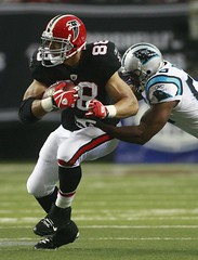
• Those Falcons throwbacks were the bomb, no? Additional images here and here.
• NFL nameplates usually run the full shoulder-to-shoulder wingspan, even for short surnames. But not in San Francisco, where the Niners are using short nameplates for short names.
• Speaking of the Niners, here’s a small detail I’ve been meaning to mention: For the past several years, the Reebok logo on their pants has been black, but now it’s white — much nicer.
• Anyone know what that logo is on Maurice Stovall’s sock?
• Chris Johnson had his belt unbuckled.
• Stupidest move of the day: Many of the coaches were wearing polo shirts with their division noted along the sleeve or shoulder (on the left side for NFC coaches, on the right for AFC coaches). Because hey, nothing says cool like “NFC West” or “AFC West,” right? What a load of crap.
• Even weirder: Jim Zorn’s shirt wasn’t division-specific — it was conference-specific.
• And speaking of coaches, Brad Childress was wearing this rinky-dink headset instead of the usual Motorola rig. Anyone know what that was about?
Raffle Reminder: Today’s the last day for the SoccerPro.com raffle. Details here.
Just Sayin’: Awesome work by Phil over the weekend. In case you missed it, he’s running a cap design contest, plus he and Ricko have proposed an innovative solution to the NFL’s sleeve problem. Great stuff.
Uni Watch News Ticker: Buried on this page is the news that the Browns are going with the chocolate pants on the road all season. Interestingly, the lack of a stripe is cited as a comfort issue (with thanks to Charles Ryals). ”¦ New hoops uniforms for Nebraska (with thanks to David McGee). ”¦ New mask for Steve Mason (with thanks to Matt Lesser). ”¦ Also from Matt: Former Penguins goalie Mathieu Garon is now with Columbus, but he’s still wearing his Pens mask, at least for now. New design presumably forthcoming. ”¦ More new NHL masks, this time for Vesa Toskala and Chris Mason (courtesy of Matthew Gahm). ”¦ Good observation from Ben Beattie, who writes: “Georgia Tech’s Demaryius Thomas is using a ‘B’ first initial. According to his profile on the GT athletic site, his nickname is Bay-Bay, though he could be doing some sort of dedication to his father, who is named Bobby. Last year he had no initial.” ”¦ Got a spare five grand laying around? You can buy yourself over 50 old jerseys. ”¦ Other good eBay stuff: a tennis jacket, bowling sweater, basketball warm-up shirt (additional hoops warm-ups here, here, and here), track and field jacket, and baseball jersey (here’s one more). ”¦ Wait, here’s one more basketball warm-up. Look at that chest logo! ”¦ New hoops uni for Cincinnati. Here’s the rear view. ”¦ Those were some weird-ass trunks that Floyd Mayweather wore on Saturday night — fuzzy on the sides and dimpled in the front. ”¦ New AHL uniforms for the Texas Stars, Bridgeport Sound Tigers, and Abbortsford Heat (with thanks to Kevin Wright). ”¦ Now that’s a geeky look for tossing out a first pitch. “I think it was a game-used Bob Gibson jersey,” says Elena Elms. ”¦ Steve Johnston was at Comiskey on Saturday night and spotted this kid with a converted Joe Crede tee. “His sister did the same thing with her Nick Swisher T-shirt but she taped over the whole thing to turn it into a #15 Gordon Beckham tee, but I didn’t get a photo of that one,” says Steve. … Oh man, check out all these awesome NFL lunchboxes! ”¦ Steve Mandich has posted more pocket schedules from the Seahawks and Mariners, plus he’s begun compiling paperback book cover designs from a seminal category I’d forgotten all about: Bill Gutman’s sports biographies. ”¦ Reprinted from last night’s comments: According to this interview with Jeffrey Loria, the Marlins will have new uniforms and colors for their new stadium in 2012.
I am officially declaring that those Falcon throwbacks are the best uniform that will be worn in the NFL this season.
I am not normally a fan of black jerseys, but that look is absolute perfection, from the simplicity of the jerseys, to the stripes on the pants, to the incredible helmet . . . I just cannot effuse enough on how much I love that look.
Maurice Stovall appears to be wearing a stegosaurus on his sock.
I am not a Giants fan but I always liked their unis since thet switched to the current set. These new jerseys annoyed the crap out if me last night.
link
The new nob font is very bothersome as well.
[quote comment=”349214″]I am not a Giants fan but I always liked their unis since thet switched to the current set. These new jerseys annoyed the crap out if me last night.
link
The new nob font is very bothersome as well.[/quote]
That screen shot captures the problem nicely. Look at the NOB — it’s stretched into a radial arch! Too damn stretchy.
here’s another look at the g-men uni…not only is the material so thin that when the players sweat it stretches too far and doesn’t come back, it “pinches” (for lack of a better word) around the shoulders (on EVERY player, it seems)
it may make them 9% faster, but it looks like shit
The headset worn by Childress was designed for him from Starkey hearing in Minnesota. Apparently he has a hearing disorder and he hears better out of this than the motorola headset. i believe the league approved it
Pretty sure I remember my NFL history correct, but on that 1976 lunch box, why are the Seahawks and Buccaneers in the wrong conferences? Was that the original plan and I’m missing something?
[quote comment=”349216″]link at the g-men uni…not only is the material so thin that when the players sweat it stretches too far and doesn’t come back, it “pinches” (for lack of a better word) around the shoulders (on EVERY player, it seems)
it may make them 9% faster, but it looks like shit[/quote]
Bring back the good thick polyester from decades past. Performance-related clothing is very overrated.
[quote comment=”349218″]Pretty sure I remember my NFL history correct, but on that 1976 lunch box, why are the Seahawks and Buccaneers in the wrong conferences? Was that the original plan and I’m missing something?[/quote]
They played their first season in the opposite conference they intended to stay in so they would play every team in 2 seasons.
[quote comment=”349218″]Pretty sure I remember my NFL history correct, but on that 1976 lunch box, why are the Seahawks and Buccaneers in the wrong conferences? Was that the original plan and I’m missing something?[/quote]
link
They were originally in flipped conferences, but only for the one season.
Tampa started in the AFC West and moved to the NFC Central in 1977, and Seattle started in the NFL West and moved to the AFC West.
-Greenie
Browns need those orange and white vertically striped Oompa Loompa socks on the road.
[quote comment=”349218″]Pretty sure I remember my NFL history correct, but on that 1976 lunch box, why are the Seahawks and Buccaneers in the wrong conferences? Was that the original plan and I’m missing something?[/quote]
IIRC in their first year the Bucs played each AFC team once and Seattle twice (and vice versa) in year one, then they swapped. That way they each had at least one game against each NFL team within the first two years.
Anyone else notice how bad Igor Olshansky looked in his overly-tight jersey? Only the top loops of the digits were visible.
[quote comment=”349218″]Pretty sure I remember my NFL history correct, but on that 1976 lunch box, why are the Seahawks and Buccaneers in the wrong conferences? Was that the original plan and I’m missing something?[/quote]
Seahawks were in NFC their first season, that much I remember. Don’t recall why they flipflopped the Seahawks and Bucs a year later, but pretty sure had to do with realignment of the divisions.
I do have a vague recollection that the Seahawks knew going in that they’d spend only one season in the NFC.
Also remember thinking that evidently someone didn’t want the two Florida teams in the same conference.
—Ricko
[quote comment=”349216″]link at the g-men uni…not only is the material so thin that when the players sweat it stretches too far and doesn’t come back, it “pinches” (for lack of a better word) around the shoulders (on EVERY player, it seems)
it may make them 9% faster, but it looks like shit[/quote]
How much faster are the Browns when they can wear brown pants without those pesky stripes?
Let’s see, based on yesterday…
—Ricko
Jeffrey Loria considers the Marlins “America’s Team”… what bizarro world is he living in??
[quote comment=”349226″]Jeffrey Loria considers the Marlins “America’s Team”… what bizarro world is he living in??[/quote]
I believe he considers the Marlins “the Americas team,” not “America’s Team” like the Braves consider themselves (which is still wrong). That would be because Miami is kind of the U.S. gateway to Central and South America.
However, he is still wrong about that.
One other note on the Loria article:
“Teal is a color for the ’90s. You have to be cognizant of your time.”
Isn’t the main color for the Dolphins (who started play in 1966) teal? I figure teal would be kind of a Florida color.
[quote comment=”349217″]The headset worn by Childress was designed for him from Starkey hearing in Minnesota. Apparently he has a hearing disorder and he hears better out of this than the motorola headset. i believe the league approved it[/quote]
Here’s the story on it:
link
I always thought link was pretty much the norm.
link
link
Proper brown pants for Cleveland…infield dirt included as a bonus.
link
[quote comment=”349228″]One other note on the Loria article:
“Teal is a color for the ’90s. You have to be cognizant of your time.”
Isn’t the main color for the Dolphins (who started play in 1966) teal? I figure teal would be kind of a Florida color.[/quote]
Technically, Dolphins are “aqua”. Not quite the same color. But you’re absolutely right about both colors being appropriate to Florida. As is orange.
And, yes, I get that the Marlins’ black looks more like the actual fish. But it also hints at the very real thuggish, dark side of Miami. You’d think they’d want to stay away from that. Or maybe that’s exactly who they’re courting?
—Ricko
[quote comment=”349212″]I am officially declaring that those Falcon throwbacks are the best uniform that will be worn in the NFL this season.
I am not normally a fan of black jerseys, but that look is absolute perfection, from the simplicity of the jerseys, to the stripes on the pants, to the incredible helmet . . . I just cannot effuse enough on how much I love that look.[/quote]
A great look? Yes.
Better than their regular threads by about a trillion light years? Absolutely.
Perfection? That’s pushing it. interesting provenance for the gold stripes aside, the helmet is a bit busy. Plus, the stripe pattern doesn’t match the pants.
Did anyone see the T-shirt the Texas Longhorn fan was wearing during the Texas Tech game Saturday night? It was on screen for like 10 seconds. It said, “I Cum Orange”.
Stay classy Longhorns.
Re: NFL lunchboxes (1964)
For those of you who weren’t around then, rest assured there were some African-American players in the league then (George Preston Marshall notwithstanding). The number 49 player depicted from the Skins appears to be depicted as Caucasian, which would have to come as a surprise to Bobby Mitchell. Also, the Skins didn’t wear white pants in those days (they would have been “gold”). Actually all the teams are wearing white pants.
I did like seeing Lou the toe kicking though.
Too many “thens” in my first sentence. Sorry.
Jesus Christ, too many “depicteds” in the 2nd sentence. Sorry again.
[quote comment=”349229″][quote comment=”349217″]The headset worn by Childress was designed for him from Starkey hearing in Minnesota. Apparently he has a hearing disorder and he hears better out of this than the motorola headset. i believe the league approved it[/quote]
Here’s the story on it:
link
thanks for those two bits of info…in the words of johnny carson, “i did not know that”
/how long before motorola comes up with something similar and forces him to wear that instead?
On Saturday, there was talk about the Titans uniforms and how they have never worn light blue jersey and white pants. Here is a video clip of the ONLY time it has been worn.
link
Anyone figure out the sweat patch on the stomach of the U of Washington player from game on Saturday?
[quote comment=”349229″]The headset worn by Childress was designed for him from Starkey hearing in Minnesota. Apparently he has a hearing disorder and he hears better out of this than the motorola headset. i believe the league approved it[/quote]
Much better answer than what I was going to say: does he just want to show off that beard for hunting season in Minnesota?
[quote comment=”349232″]Or maybe that’s exactly who they’re courting?[/quote]
Ricko, with their average attendance figures is there a group that they’re NOT courting? ;-)
I was wondering if the reebok logos on the Giants jerseys were just colored with blue sharpie or something, then I saw someone who had one that was half white and half blue. It looks to me like the logo might just be screened on and peels off and leaves that “ghost” behind. I’ll bring the game up after work tonight on the DVR and double check.
[quote comment=”349239″]On Saturday, there was talk about the Titans uniforms and how they have never worn light blue jersey and white pants. Here is a video clip of the ONLY time it has been worn.
link
nice work…obviously, it’s tough to tell how this would look in game action, but i for one would like to see them try
[quote comment=”349244″][quote comment=”349239″]On Saturday, there was talk about the Titans uniforms and how they have never worn light blue jersey and white pants. Here is a video clip of the ONLY time it has been worn.
link
nice work…obviously, it’s tough to tell how link would look in game action, but i for one would like to see them try[/quote]
Why in the name of all that is holy would they choose not wear that? That’s a solid look.
That should be their primary home uniform.
[quote comment=”349245″][quote comment=”349244″][quote comment=”349239″]On Saturday, there was talk about the Titans uniforms and how they have never worn light blue jersey and white pants. Here is a video clip of the ONLY time it has been worn.
link
nice work…obviously, it’s tough to tell how link would look in game action, but i for one would like to see them try[/quote]
Why in the name of all that is holy would they choose not wear that? That’s a solid look.
That should be their primary home uniform.[/quote]
I’m with you. The light blue jersey and navy pants look like a high school team.
No love in the article for Tomlin’s aviators?
Need advice. I have an old replica jersey where the lettering on the name plate is starting to peel off. SHould I just use fabric glue to stick this back down, or is there another (better) fix?
[quote comment=”349235″]Re: NFL lunchboxes (1964)
For those of you who weren’t around then, rest assured there were some African-American players in the league then (George Preston Marshall notwithstanding). The number 49 player depicted from the Skins appears to be depicted as Caucasian, which would have to come as a surprise to Bobby Mitchell. Also, the Skins didn’t wear white pants in those days (they would have been “gold”). Actually all the teams are wearing white pants.
[/quote]
And the Rams & the Cowboys are shown in their 1963 duds. Still an awesome lunchbox.
[quote comment=”349247″]No love in the article for Tomlin’s aviators?[/quote]
I read somewhere that a fan wanted to know where Tomlin got his glasses, because the fan wanted to buy a pair just like them.
Tomlin’s reply was that he purchased all his sunglasses at various gas stations, etc. on the way from his house to Steeler’s training camp. :-))
[quote comment=”349236″]Too many “thens” in my first sentence. Sorry.[/quote]
And then?
Not sure if Ohio State ever wore this jersey. Plain white with no stripes at all?
link
Absolutely loved the Falcons throwbacks. Also, I will admit, something very cool about the uniform combination that Oregon wore. Can’t stop thinking about them.
The Falcons red helmet is so much better than the black one. I actually bought that helmet from my brother. But mine is when they got rid of the extra gold stripe. I think? I have to check it out
I would hardly call the Texas Stars, Bridgeport Sound, and Abbotsford jerseys “new”.
They are recycled from their NHL parents. They are exact matches from their NHL affiliate with the AHL logo slapped on the front.
And yes, that’s disappointing to me. I spoke to a gentleman from the Vancouver Aquarium this past week, and he says that having Abbotsford as the Flames’ affiliate is a kick to the crotch for all non-Vancouver based Canuck fans because everyone hates the Flames in BC.
Made me chuckle. :o)
Seemed like the Giants jerseys were kind of dull looking. Color wise that is. And I really like when the Giants went to the classic look and helmet.
Did anyone else notice Jim Zorn’s belt buckle? I couldn’t tell for sure but it looked like it had a redskin logo on it. If so, does the belt buckle come from Reebok as well?
[quote comment=”349246″][quote comment=”349245″][quote comment=”349244″][quote comment=”349239″]On Saturday, there was talk about the Titans uniforms and how they have never worn light blue jersey and white pants. Here is a video clip of the ONLY time it has been worn.
link
nice work…obviously, it’s tough to tell how link would look in game action, but i for one would like to see them try[/quote]
Why in the name of all that is holy would they choose not wear that? That’s a solid look.
That should be their primary home uniform.[/quote]
I’m with you. The light blue jersey and navy pants look like a high school team.[/quote]
Related question: Do Titans EVER go white over white? think maybe they did once. Oilers sure did, I know.
—Ricko
[quote comment=”349252″]Absolutely loved the Falcons throwbacks. Also, I will admit, something very cool about the uniform combination that Oregon wore. Can’t stop thinking about them.[/quote]
I was thinking the same thing about Oregon. I know it is the “IN” thing to bash Oregon’s unis. I guess they do not bother me as much as most of America does.
“Seemed like the Giants jerseys were kind of dull looking.”
Same for Michigan State’s greens a week ago.
I will likely be the only one to say this, but i like the Browns with the Brown pants. Of course, I HATE HATE HATE the white jersey/white pants colored helmet always, so for me it was easy to improve upon.
A question: Why in the year 2009 can teams not match the hues of their metallics? I believe Dallas does this ON PURPOSE, but do the Saints? Theis jerseys numbers are way more yellow gold than the helmets and pants. The new 49er duds, the pants are way more yellow than the helmets. I’m sure there are probably more. Are these all done on purpose?
Kudos to the Rams for bringing back the best modern uni set in the league yesterday (with the gold pants).
[quote comment=”349216″]link at the g-men uni…not only is the material so thin that when the players sweat it stretches too far and doesn’t come back, it “pinches” (for lack of a better word) around the shoulders (on EVERY player, it seems)
it may make them 9% faster, but it looks like shit[/quote]
So then, in the 100, those jerseys would take more actual time off a nose tackle’s effort than a punt returner’s?
Wow, that is some miracle fabric they got there.
—Ricko
New Blue Helmets next week for Tulsa. Also maybe a new Mascot on the helmet. Details still sketchy.
[quote comment=”349256″]Did anyone else notice Jim Zorn’s belt buckle? I couldn’t tell for sure but it looked like it had a redskin logo on it. If so, does the belt buckle come from Reebok as well?[/quote]
Noticed that also. Owner Dan Snyder reportedly rocks one of those as well, so perhaps it was a gift. (Insert your own joke here).
[quote comment=”349258″][quote comment=”349252″]Absolutely loved the Falcons throwbacks. Also, I will admit, something very cool about the uniform combination that Oregon wore. Can’t stop thinking about them.[/quote]
I was thinking the same thing about Oregon. I know it is the “IN” thing to bash Oregon’s unis. I guess they do not bother me as much as most of America does.[/quote]
Well, it’s like which combination are they going to wear this week, so, it can be a gamble. Yet, I will say this white helmet, green jersey, and dark matte gray pants just worked. Absolutely loved it.
[quote comment=”349257″][quote comment=”349246″][quote comment=”349245″][quote comment=”349244″][quote comment=”349239″]On Saturday, there was talk about the Titans uniforms and how they have never worn light blue jersey and white pants. Here is a video clip of the ONLY time it has been worn.
link
nice work…obviously, it’s tough to tell how link would look in game action, but i for one would like to see them try[/quote]
Why in the name of all that is holy would they choose not wear that? That’s a solid look.
That should be their primary home uniform.[/quote]
I’m with you. The light blue jersey and navy pants look like a high school team.[/quote]
Related question: Do Titans EVER go white over white? think maybe they did once. Oilers sure did, I know.
—Ricko[/quote]
I always felt Tennessee fumbled when choosing the nickname and uniform for switching from the Oilers. The Titans nickname is boring, 99% of people outside the state have no idea what the connection is, and the uniform has always been ugly. Even the logo is dull and lifeless.
Another crappy idea would be for the Cleveland Browns to ever wear brown pants again. Lastly, I would like to see the Cowboys switch to a blue pants with a silver/white stripe. Air Force had this white jersey/blue pant look and it was really sharp.
Pretty sure the ’76 lunch box features John Hadl in that main graphic.
BTW, one thing about the throwback Falcons’ unis that I think sets it off from all the other black jerseys in the league is that the black is not a completely saturated color. It appears almost dark brown, which gives it a distinct look. Well done.
– C.
[quote comment=”349263″][quote comment=”349256″]Did anyone else notice Jim Zorn’s belt buckle? I couldn’t tell for sure but it looked like it had a redskin logo on it. If so, does the belt buckle come from Reebok as well?[/quote]
Noticed that also. Owner Dan Snyder reportedly rocks one of those as well, so perhaps it was a gift. (Insert your own joke here).[/quote]
Sorry, just flashed on the image of Snyder in a cowboy hat, jeans and boots—and his fancy belt buckle—walking into a country western bar humming, “Lookin’ for love in all the wrong places…”
—Ricko
I’d love to know exactly how they determine what percentage these jerseys supposedly improve performance by.
I think it’s a bunch of crap anyway.
…and I’m going to say NO to the Falcons throwbacks. The gold helmet stripes ruin it. They were a stupid thing to have in 1966 and they’re still stupid now. It looks good from a distance. Up close it’s just… why?
[quote comment=”349262″]New Blue Helmets next week for Tulsa. Also maybe a new Mascot on the helmet. Details still sketchy.[/quote]
As someone who attended that institution, I’m wondering how they will “depict” a Golden Hurricane on the side of a helmet. Presumably it won’t be that gumbymuppet looking thing.
i know paul posted this in the main article, but anyone know what this logo is? it’s been bugging me all morning…maybe a hotel chain or a vegas casino? definitely looks like a sun and one of them there “old west” architecture type buildings (like taco bell)…
thanks to all the intrepid UWers in advance…i know we’ll have an answer before lunch
[quote comment=”349268″]I’d love to know exactly how they determine what percentage these jerseys supposedly improve performance by.
I think it’s a bunch of crap anyway.
…and I’m going to say NO to the Falcons throwbacks. The gold helmet stripes ruin it. They were a stupid thing to have in 1966 and they’re still stupid now. It looks good from a distance. Up close it’s just… why?[/quote]
Originally the gold helmet striping was a nod to Georgia Tech (because Falcons had chosen essentially Georgia Bulldog colors). It disappeared early on.
—Ricko
[quote comment=\”349269\”][quote comment=\”349262\”]New Blue Helmets next week for Tulsa. Also maybe a new Mascot on the helmet. Details still sketchy.[/quote]
As someone who attended that institution, I\’m wondering how they will “depict” a Golden Hurricane on the side of a helmet. Presumably it won\’t be that gumbymuppet looking thing.[/quote]
Change the colors of this?
link
[quote comment=”349219″][quote comment=”349216″]link at the g-men uni…not only is the material so thin that when the players sweat it stretches too far and doesn’t come back, it “pinches” (for lack of a better word) around the shoulders (on EVERY player, it seems)
it may make them 9% faster, but it looks like shit[/quote]
Bring back the good thick polyester from decades past. Performance-related clothing is very overrated.[/quote]
You said it! If these guys are as tough as they claim to be, they should say, “I don’t need this performance stuff – give me some heavy polyester!”
[quote comment=”349271″][quote comment=”349268″]I’d love to know exactly how they determine what percentage these jerseys supposedly improve performance by.
I think it’s a bunch of crap anyway.
…and I’m going to say NO to the Falcons throwbacks. The gold helmet stripes ruin it. They were a stupid thing to have in 1966 and they’re still stupid now. It looks good from a distance. Up close it’s just… why?[/quote]
Originally the gold helmet striping was a nod to Georgia Tech (because Falcons had chosen essentially Georgia Bulldog colors). It disappeared early on.
—Ricko[/quote]
I know the reason… I still think it was stupid. :)
Of course I wasn’t born then, so I don’t know how much of an angry mob the GT fans might have been…
[quote comment=”349272″][quote comment=\”349269\”][quote comment=\”349262\”]New Blue Helmets next week for Tulsa. Also maybe a new Mascot on the helmet. Details still sketchy.[/quote]
As someone who attended that institution, I\’m wondering how they will “depict” a Golden Hurricane on the side of a helmet. Presumably it won\’t be that gumbymuppet looking thing.[/quote]
Change the colors of this?
link
I hear you, but that’s not what I’d consider a “mascot”.
i know paul posted this in the main article, but anyone know what this logo is?
Sinclair Gasoline? :)
[quote comment=”349275″][quote comment=”349272″][quote comment=\”349269\”][quote comment=\”349262\”]New Blue Helmets next week for Tulsa. Also maybe a new Mascot on the helmet. Details still sketchy.[/quote]
As someone who attended that institution, I\’m wondering how they will “depict” a Golden Hurricane on the side of a helmet. Presumably it won\’t be that gumbymuppet looking thing.[/quote]
Change the colors of this?
link
I hear you, but that’s not what I’d consider a “mascot”.[/quote]
link
Better? (sorry)
[quote comment=”349274″][quote comment=”349271″][quote comment=”349268″]I’d love to know exactly how they determine what percentage these jerseys supposedly improve performance by.
I think it’s a bunch of crap anyway.
…and I’m going to say NO to the Falcons throwbacks. The gold helmet stripes ruin it. They were a stupid thing to have in 1966 and they’re still stupid now. It looks good from a distance. Up close it’s just… why?[/quote]
Originally the gold helmet striping was a nod to Georgia Tech (because Falcons had chosen essentially Georgia Bulldog colors). It disappeared early on.
—Ricko[/quote]
I know the reason… I still think it was stupid. :)
Of course I wasn’t born then, so I don’t know how much of an angry mob the GT fans might have been…[/quote]
Think it was more preemptive. Plus, you gotta remember, even in 1966 pro football still wasn’t the Goliath it is today. Lotta people in many parts of the country got their backs up about, “This is COLLEGE football country ’round here. We don’t need the PROFESSIONALS.” NFL teams did have to win people over. I know a lot of you can’t believe such a thing was ever true. But, it was.
There are legitimate time filters to use when viewing things.
—Ricko
Atlanta’s throwbacks did look good, but in my nod to “not everything new is bad,” I’d gladly accept the new unis if they kept the red helmet. Even if they use the new logo, I think the red helmet looks better.
[quote comment=”349277″][quote comment=”349275″][quote comment=”349272″][quote comment=\”349269\”][quote comment=\”349262\”]New Blue Helmets next week for Tulsa. Also maybe a new Mascot on the helmet. Details still sketchy.[/quote]
As someone who attended that institution, I\’m wondering how they will “depict” a Golden Hurricane on the side of a helmet. Presumably it won\’t be that gumbymuppet looking thing.[/quote]
Change the colors of this?
link
I hear you, but that’s not what I’d consider a “mascot”.[/quote]
link
Better? (sorry)[/quote]
Are those Cookie Monster eyes? I like it, but you know if they ran with that idea they’d use angry eyes, ’cause it’s not cool to look happy in football these days.
I’ve been reading what everyone’s been saying about the back of the jerseys, what you have to realize is that I velcro the back of the pads as well…In Brandon’s case it gets distorted after certain tackles or grabbing the back of his pads (which I fix when he is back on the sidelines). Hope this solves some question…
Hope all is well with everyone!!!
[quote comment=”349277″][quote comment=”349275″][quote comment=”349272″][quote comment=\”349269\”][quote comment=\”349262\”]New Blue Helmets next week for Tulsa. Also maybe a new Mascot on the helmet. Details still sketchy.[/quote]
As someone who attended that institution, I\’m wondering how they will “depict” a Golden Hurricane on the side of a helmet. Presumably it won\’t be that gumbymuppet looking thing.[/quote]
Change the colors of this?
link
I hear you, but that’s not what I’d consider a “mascot”.[/quote]
link
Better? (sorry)[/quote]
LOL
That’s precisely the sort of thing I’m afraid it will be.
Why you think Miami wears a “U”.
In the early 70s they wanted to remind people they were the University team, not like the professional Dolphins who’d come to town recently.
You may find something on Wiki that says differently, but it’s wrong. I was in pro sports PR at the time and remembering reading a story about it the Miami Herald (we got about a bazillion papers at the office).
—Ricko
Peter King:
“Come to think of it, the Patriots’ old uniforms are far, far better than the new ones. Love the red and whites from Monday night.”
Read more: link
At what point do we start calling these basketball pants “bell bottoms”?
link
Nice to see the one Husker wearing #0. Why exactly did the NFL and NHL stop letting players wear 0 or 00?
[quote comment=”349278″][quote comment=”349274″][quote comment=”349271″][quote comment=”349268″]I’d love to know exactly how they determine what percentage these jerseys supposedly improve performance by.
I think it’s a bunch of crap anyway.
…and I’m going to say NO to the Falcons throwbacks. The gold helmet stripes ruin it. They were a stupid thing to have in 1966 and they’re still stupid now. It looks good from a distance. Up close it’s just… why?[/quote]
Originally the gold helmet striping was a nod to Georgia Tech (because Falcons had chosen essentially Georgia Bulldog colors). It disappeared early on.
—Ricko[/quote]
I know the reason… I still think it was stupid. :)
Of course I wasn’t born then, so I don’t know how much of an angry mob the GT fans might have been…[/quote]
Think it was more preemptive. Plus, you gotta remember, even in 1966 pro football still wasn’t the Goliath it is today. Lotta people in many parts of the country got their backs up about, “This is COLLEGE football country ’round here. We don’t need the PROFESSIONALS.” NFL teams did have to win people over. I know a lot of you can’t believe such a thing was ever true. But, it was.
There are legitimate time filters to use when viewing things.
—Ricko[/quote]
Fair enough. I don’t know, I just don’t see how that little bit of gold would make a difference in the eyes of someone upset over the use of red/gray/black. If they’d used it in the pant stripes as well as the helmets, then maybe.
I had that early 70s lunchbox, and would love to have it again, but that 60s one was awesome! Never saw that one before today.
I noticed Mario Manningham used a red mouthguard last night.
link
Is this ok? Didn’t Chad Johnson get fined for repeatedly using an orange one a year or two ago?
[quote comment=”349285″]At what point do we start calling these basketball pants “bell bottoms”?
link
Nice to see the one Husker wearing #0. Why exactly did the NFL and NHL stop letting players wear 0 or 00?[/quote]
The NHL Rulebook doesn’t explain why. Rule 9.2 states, “Each player and each goalkeeper listed in the line-up of each team shall wear an individual identifying number at least ten inches (10″) high on the back of his sweater. Sweater numbers such as 00, ½ (fractions), .05 (decimals), 101 (three digit) are not permitted. In addition, each player and goalkeeper shall wear his surname in full, in block letters three inches (3″) high, across the back of his sweater at shoulder height.”
hockey helmet gets ripped in half
link
[quote comment=”349288″]I noticed Mario Manningham used a red mouthguard last night.
link
Is this ok? Didn’t Chad Johnson get fined for repeatedly using an orange one a year or two ago?[/quote]
I thought Chad’s fines were for the chinstrap, not the mouthguard. I may be mistaken though (wouldn’t be the first time).
[quote comment=”349283″]You may find something on Wiki that says differently, but it’s wrong. I was in pro sports PR at the time and remembering reading a story about it the Miami Herald (we got about a bazillion papers at the office).[/quote]
Interesting, the official website says roughly the same thing-just wanted something other than a letter “M”.
Long before the Interwebs (and Wikipedia) was invented, I heard the “hurricane symbol” rationale from a Miami alum; I just never looked any further than that.
[quote comment=”349286″][quote comment=”349278″][quote comment=”349274″][quote comment=”349271″][quote comment=”349268″]I’d love to know exactly how they determine what percentage these jerseys supposedly improve performance by.
I think it’s a bunch of crap anyway.
…and I’m going to say NO to the Falcons throwbacks. The gold helmet stripes ruin it. They were a stupid thing to have in 1966 and they’re still stupid now. It looks good from a distance. Up close it’s just… why?[/quote]
Originally the gold helmet striping was a nod to Georgia Tech (because Falcons had chosen essentially Georgia Bulldog colors). It disappeared early on.
—Ricko[/quote]
I know the reason… I still think it was stupid. :)
Of course I wasn’t born then, so I don’t know how much of an angry mob the GT fans might have been…[/quote]
Think it was more preemptive. Plus, you gotta remember, even in 1966 pro football still wasn’t the Goliath it is today. Lotta people in many parts of the country got their backs up about, “This is COLLEGE football country ’round here. We don’t need the PROFESSIONALS.” NFL teams did have to win people over. I know a lot of you can’t believe such a thing was ever true. But, it was.
There are legitimate time filters to use when viewing things.
—Ricko[/quote]
Fair enough. I don’t know, I just don’t see how that little bit of gold would make a difference in the eyes of someone upset over the use of red/gray/black. If they’d used it in the pant stripes as well as the helmets, then maybe.[/quote]
Fair enough right back atcha. I wasn’t meaning to address how they used the gold, just to explain why it was incorporated at all.
—Ricko
[quote comment=”349289″][quote comment=”349285″]At what point do we start calling these basketball pants “bell bottoms”?
link
Nice to see the one Husker wearing #0. Why exactly did the NFL and NHL stop letting players wear 0 or 00?[/quote]
The NHL Rulebook doesn’t explain why. Rule 9.2 states, “Each player and each goalkeeper listed in the line-up of each team shall wear an individual identifying number at least ten inches (10″) high on the back of his sweater. Sweater numbers such as 00, ½ (fractions), .05 (decimals), 101 (three digit) are not permitted. In addition, each player and goalkeeper shall wear his surname in full, in block letters three inches (3”) high, across the back of his sweater at shoulder height.”[/quote]
The only remotely logical reason I can come up with is something to do with early computerized scorekeeping and stat tracking and 0’s causing issues with it. Not being able to tell 0 from 00, etc. Pure speculation though.
Did anyone else notice the Giants wearing their three-stripe road pants last night?
link
They usually wear them with white jerseys and red socks. I never liked these pants, but now that I saw it worn with blue, it kinda’ rocks… Was this an equipment fluke or an official uni change?
[quote comment=”349291″][quote comment=”349288″]I noticed Mario Manningham used a red mouthguard last night.
link
Is this ok? Didn’t Chad Johnson get fined for repeatedly using an orange one a year or two ago?[/quote]
I thought Chad’s fines were for the chinstrap, not the mouthguard. I may be mistaken though (wouldn’t be the first time).[/quote]
You’re right.
[quote comment=”349294″][quote comment=”349289″][quote comment=”349285″]At what point do we start calling these basketball pants “bell bottoms”?
link
Nice to see the one Husker wearing #0. Why exactly did the NFL and NHL stop letting players wear 0 or 00?[/quote]
The NHL Rulebook doesn’t explain why. Rule 9.2 states, “Each player and each goalkeeper listed in the line-up of each team shall wear an individual identifying number at least ten inches (10″) high on the back of his sweater. Sweater numbers such as 00, ½ (fractions), .05 (decimals), 101 (three digit) are not permitted. In addition, each player and goalkeeper shall wear his surname in full, in block letters three inches (3”) high, across the back of his sweater at shoulder height.”[/quote]
The only remotely logical reason I can come up with is something to do with early computerized scorekeeping and stat tracking and 0’s causing issues with it. Not being able to tell 0 from 00, etc. Pure speculation though.[/quote]
That could be. I remember at the old Richfield Coliseum, when a player wore 0 they would put 99 on the jumbo scoreboard – guess a 0 didn’t compute.
[quote comment=”349290″]hockey helmet gets ripped in half
link
Me-thinks RBK will be getting a call from Darroll Powe any time now. Never seen such a thing happen.
[quote comment=”349295″]Did anyone else notice the Giants wearing their three-stripe road pants last night?
link
They usually wear them with white jerseys and red socks. I never liked these pants, but now that I saw it worn with blue, it kinda’ rocks… Was this an equipment fluke or an official uni change?[/quote]
I first reported on the Giants wearing the three-stripe pants on the road, regardless of which jersey they’re wearing, in this post (which also includes details on the new jersey fabric):
link
in regard to the washington dark section. I work for nike and i know alot of our new performance tops have sections of dri-fit material. I think those are new this year to the washington jerseys and oregon jerseys. it rained during the game at autzen on saturday, and i noticed it midway through the 2nd quarter, sorry no picture. the idea behind it maybe be like the majestic baseball jersey’s with the cool fit or whatever in the armpits
Just a random thought I had on the Titans while watching some replays this morning….
With them using the lighter blue so much lately, why don’t they put more of it on the helmet? I like the jersey and uniform as a whole, but it just kinda struck me that the helmet really doesn’t match very well now. I think it needs a light blue facemask.
[quote comment=”349301″]Just a random thought I had on the Titans while watching some replays this morning….
With them using the lighter blue so much lately, why don’t they put more of it on the helmet? I like the jersey and uniform as a whole, but it just kinda struck me that the helmet really doesn’t match very well now. I think it needs a light blue facemask.[/quote]
Better yet, a light blue helmet!
[quote comment=”349302″][quote comment=”349301″]Just a random thought I had on the Titans while watching some replays this morning….
With them using the lighter blue so much lately, why don’t they put more of it on the helmet? I like the jersey and uniform as a whole, but it just kinda struck me that the helmet really doesn’t match very well now. I think it needs a light blue facemask.[/quote]
Better yet, a light blue helmet![/quote]
Throw a Titans logo on these unis and you have a winner, link even with the blue pants.
[quote comment=”349300″]in regard to the washington dark section. I work for nike and i know alot of our new performance tops have sections of dri-fit material. I think those are new this year to the washington jerseys and oregon jerseys. it rained during the game at autzen on saturday, and i noticed it midway through the 2nd quarter, sorry no picture. the idea behind it maybe be like the majestic baseball jersey’s with the cool fit or whatever in the armpits[/quote]
But what’s the rationale for using a material that changes color when wet faster than the other fabric in the garment?
Sweat stains are cool?
On the dance floor, the biggest the pit stain the better—and sexier—the dancer? That’s good news. (eyeroll)
Seriously, doesn’t Nike field test stuff?
—Ricko
[quote comment=”349304″][quote comment=”349300″]in regard to the washington dark section. I work for nike and i know alot of our new performance tops have sections of dri-fit material. I think those are new this year to the washington jerseys and oregon jerseys. it rained during the game at autzen on saturday, and i noticed it midway through the 2nd quarter, sorry no picture. the idea behind it maybe be like the majestic baseball jersey’s with the cool fit or whatever in the armpits[/quote]
But what’s the rationale for using a material that changes color when wet faster than the other fabric in the garment?
Sweat stains are cool?
On the dance floor, the biggest the pit stain the better—and sexier—the dancer? That’s good news. (eyeroll)
Seriously, doesn’t Nike field test stuff?
—Ricko[/quote]
It could be worse… at least they didn’t stick white piping around it and make it another team color. Could you imagine a blue jersey with a white-outlined orange square on the front?
[quote comment=”349305″][quote comment=”349304″][quote comment=”349300″]in regard to the washington dark section. I work for nike and i know alot of our new performance tops have sections of dri-fit material. I think those are new this year to the washington jerseys and oregon jerseys. it rained during the game at autzen on saturday, and i noticed it midway through the 2nd quarter, sorry no picture. the idea behind it maybe be like the majestic baseball jersey’s with the cool fit or whatever in the armpits[/quote]
But what’s the rationale for using a material that changes color when wet faster than the other fabric in the garment?
Sweat stains are cool?
On the dance floor, the biggest the pit stain the better—and sexier—the dancer? That’s good news. (eyeroll)
Seriously, doesn’t Nike field test stuff?
—Ricko[/quote]
It could be worse… at least they didn’t stick white piping around it and make it another team color. Could you imagine a blue jersey with a white-outlined orange square on the front?[/quote]
Why imagine, when you can color it in for yourself?
link
I’m serious. I’d like to know the rationale behind either fuzzy thinking or half-assed R & D.
—Ricko
[quote comment=”349301″]Just a random thought I had on the Titans while watching some replays this morning….
With them using the lighter blue so much lately, why don’t they put more of it on the helmet? I like the jersey and uniform as a whole, but it just kinda struck me that the helmet really doesn’t match very well now. I think it needs a light blue facemask.[/quote]
powder blue helmet
hmm…maybe not (sorry jim)
lemme see about changing the facemask next
titans white helmet w/powder blue mask
no…no, that’s not it either
[quote comment=”349308″][quote comment=”349301″]Just a random thought I had on the Titans while watching some replays this morning….
With them using the lighter blue so much lately, why don’t they put more of it on the helmet? I like the jersey and uniform as a whole, but it just kinda struck me that the helmet really doesn’t match very well now. I think it needs a light blue facemask.[/quote]
link
hmm…maybe not (sorry jim)
lemme see about changing the facemask next[/quote]
White or gray facemask with this?
[quote comment=”349309″]link
no…no, that’s not it either[/quote]
I’m thinking this:
link
[quote comment=”349272″][quote comment=\”349269\”][quote comment=\”349262\”]New Blue Helmets next week for Tulsa. Also maybe a new Mascot on the helmet. Details still sketchy.[/quote]
As someone who attended that institution, I\’m wondering how they will “depict” a Golden Hurricane on the side of a helmet. Presumably it won\’t be that gumbymuppet looking thing.[/quote]
Change the colors of this?
link
I actually saw the helmet. It is a metallic blue similar to the NY Giants…maybe a shade or two lighter. Let’s just hope this isn’t what they put on the side. link
[quote comment=”349309″]link
no…no, that’s not it either[/quote]
Actually, that’s very good.
Intro more powder without screwing with the helmet itself.
A perfect example of a “tweak” that improves things and doesn’t throw the baby out with the bath water.
—Ricko
[quote comment=”349310″][quote comment=”349308″][quote comment=”349301″]Just a random thought I had on the Titans while watching some replays this morning….
With them using the lighter blue so much lately, why don’t they put more of it on the helmet? I like the jersey and uniform as a whole, but it just kinda struck me that the helmet really doesn’t match very well now. I think it needs a light blue facemask.[/quote]
link
hmm…maybe not (sorry jim)
lemme see about changing the facemask next[/quote]
White or gray facemask with this?[/quote]
w/gray mask
nope…still not it…
OOOOOO…i got it i got it!!!
here ya go ;)
[quote comment=”349281″]I’ve been reading what everyone’s been saying about the back of the jerseys, what you have to realize is that I velcro the back of the pads as well…In Brandon’s case it gets distorted after certain tackles or grabbing the back of his pads (which I fix when he is back on the sidelines). Hope this solves some question…
Hope all is well with everyone!!![/quote]
I’m very impressed that the Giants’ equipment manager takes time to read Uni Watch and is responsive to its readers. Thanks, Joe.
[quote comment=”349285″]At what point do we start calling these basketball pants “bell bottoms”?
link
Nice to see the one Husker wearing #0. Why exactly did the NFL and NHL stop letting players wear 0 or 00?[/quote]
The NHL did it because of Neil Sheehy. When he wore the number 0 with the Calgary Flames, he singlehandedly screwed up the NHL’s system of computing penalty minutes because the 0 is used by the league office to signify bench penalties.
Sheehy, naturally, was a Harvard man.
[quote comment=”349314″][quote comment=”349310″][quote comment=”349308″][quote comment=”349301″]Just a random thought I had on the Titans while watching some replays this morning….
With them using the lighter blue so much lately, why don’t they put more of it on the helmet? I like the jersey and uniform as a whole, but it just kinda struck me that the helmet really doesn’t match very well now. I think it needs a light blue facemask.[/quote]
link
hmm…maybe not (sorry jim)
lemme see about changing the facemask next[/quote]
White or gray facemask with this?[/quote]
link
nope…still not it…
OOOOOO…i got it i got it!!!
link ;)[/quote]
That was way too obvious and you should be ashamed of yourself.
[quote comment=”349299″][quote comment=”349295″]Did anyone else notice the Giants wearing their three-stripe road pants last night?
link
They usually wear them with white jerseys and red socks. I never liked these pants, but now that I saw it worn with blue, it kinda’ rocks… Was this an equipment fluke or an official uni change?[/quote]
I first reported on the Giants wearing the three-stripe pants on the road, regardless of which jersey they’re wearing, in this post (which also includes details on the new jersey fabric):
link
Thanks, Paul. I think they should make the three-stripe their only pants, home or road.
I know I sent this to you already, but here’s my uni-tweak of the Giants in white over blue pants:
link
Love it or hate it, I think it looks cool and would bring more blue to Big Blue on the road.
[quote comment=”349316″][quote comment=”349285″]At what point do we start calling these basketball pants “bell bottoms”?
link
Nice to see the one Husker wearing #0. Why exactly did the NFL and NHL stop letting players wear 0 or 00?[/quote]
The NHL did it because of Neil Sheehy. When he wore the number 0 with the Calgary Flames, he singlehandedly screwed up the NHL’s system of computing penalty minutes because the 0 is used by the league office to signify bench penalties.
Sheehy, naturally, was a Harvard man.[/quote]
Good call. Sheehy wore #0 with the Hartford Whalers. Here’s a link.
[quote comment=”349318″][quote comment=”349299″][quote comment=”349295″]Did anyone else notice the Giants wearing their three-stripe road pants last night?
link
They usually wear them with white jerseys and red socks. I never liked these pants, but now that I saw it worn with blue, it kinda’ rocks… Was this an equipment fluke or an official uni change?[/quote]
I first reported on the Giants wearing the three-stripe pants on the road, regardless of which jersey they’re wearing, in this post (which also includes details on the new jersey fabric):
link
Thanks, Paul. I think they should make the three-stripe their only pants, home or road.
I know I sent this to you already, but here’s my uni-tweak of the Giants in white over blue pants:
link
Love it or hate it, I think it looks cool and would bring more blue to Big Blue on the road.[/quote]
I like that. It makes the complete lack of blue on the white jersey more tolerable to me.
[quote comment=”349317″][quote comment=”349314″][quote comment=”349310″][quote comment=”349308″][quote comment=”349301″]Just a random thought I had on the Titans while watching some replays this morning….
With them using the lighter blue so much lately, why don’t they put more of it on the helmet? I like the jersey and uniform as a whole, but it just kinda struck me that the helmet really doesn’t match very well now. I think it needs a light blue facemask.[/quote]
link
hmm…maybe not (sorry jim)
lemme see about changing the facemask next[/quote]
White or gray facemask with this?[/quote]
link
nope…still not it…
OOOOOO…i got it i got it!!!
link ;)[/quote]
That was way too obvious and you should be ashamed of yourself.[/quote]
Well, we didn’t want to be accused of not trying with the new look first, right? ;)
Keeping with the topic of tweaking helmets…
Which looks better?
link
or
link
My 7yo daughter told me when I asked her how she knew the names of so many NFL teams that she “sees them on a lunch box” of a classmate. From the sounds of it, a boy in her class is actually using one of the old metal ones (I made a point to ask her what it was made of). I was pretty surprised to hear that. I might have to visit during lunch just to try to get a glimpse of it…
The closest thing I still have personally is an old 3-ring binder (1 1/2″?) from the early 80s with all of the helmets. Just the helmets lined up in rows on a plain white background. Simple, but cool.
[quote comment=”349320″][quote comment=”349318″][quote comment=”349299″][quote comment=”349295″]Did anyone else notice the Giants wearing their three-stripe road pants last night?
link
They usually wear them with white jerseys and red socks. I never liked these pants, but now that I saw it worn with blue, it kinda’ rocks… Was this an equipment fluke or an official uni change?[/quote]
I first reported on the Giants wearing the three-stripe pants on the road, regardless of which jersey they’re wearing, in this post (which also includes details on the new jersey fabric):
link
Thanks, Paul. I think they should make the three-stripe their only pants, home or road.
I know I sent this to you already, but here’s my uni-tweak of the Giants in white over blue pants:
link
Love it or hate it, I think it looks cool and would bring more blue to Big Blue on the road.[/quote]
I like that. It makes the complete lack of blue on the white jersey more tolerable to me.[/quote]
I like it too, as long as they keep the home uni unchanged. Some may think it looks too much like this, link but I always liked those road unis.
[quote comment=”349323″]Keeping with the topic of tweaking helmets…
Which looks better?
link
or
link
I’m going to assume the first link is the Lions current helmet?
Honestly, unless you want to revert the whole uniform back to the early 80’s, I don’t think the Lions need any adjusting. The black elements they have now are consistent, and it works for me. I could see swapping the black facemask for a blue one, but I’d keep everything else the same, black outlines and all.
[quote comment=”349315″][quote comment=”349281″]I’ve been reading what everyone’s been saying about the back of the jerseys, what you have to realize is that I velcro the back of the pads as well…In Brandon’s case it gets distorted after certain tackles or grabbing the back of his pads (which I fix when he is back on the sidelines). Hope this solves some question…
Hope all is well with everyone!!![/quote]
I’m very impressed that the Giants’ equipment manager takes time to read Uni Watch and is responsive to its readers. Thanks, Joe.[/quote]
Agreed. Skeebs gives me incredible access and follows the developments here — he’s one of us, and we should all feel really good about that.
[quote comment=”349326″][quote comment=”349323″]Keeping with the topic of tweaking helmets…
Which looks better?
link
or
link
I’m going to assume the first link is the Lions current helmet?
Honestly, unless you want to revert the whole uniform back to the early 80’s, I don’t think the Lions need any adjusting. The black elements they have now are consistent, and it works for me. I could see swapping the black facemask for a blue one, but I’d keep everything else the same, black outlines and all.[/quote]
My bad. I am that dunce that just can’t remember to link to the page instead of the photo
link
Maybe Loria’s just a dick?
(Full disclosure: I’m from Montreal)
“We’re sensitive to the history of the site, the Dolphins, Miami. We see ourselves as the Americas Team.”
Nyuk nyuk nyuk. “America’s Team?” Um..they lost last night to the G-Men.
PS- aren’t they gonna re-brand as “Miami Marlins?”
The Kaukauna basketball warm-up is from Kaukauna high school in Kaukauna, Wis. (just east of Appleton, southwest of Green Bay. The team nickname is the Galloping Ghosts, and yes, that’s their logo; it’s even on the village water tower. For big games, a rider wearing a sheet riding a horse (get it, a galloping ghost) will sprint down the field before kickoff.
Also:
“Browns are going with the chocolate pants on the road all season.”
That’s not their biggest problem- Man-genius is. In case anyone’s looked, he’s oh-for his career in Cleveland.
And I read he fined a player 1,700 for swiping a bottled water from a hotel mini-bar. As it was mentioned, that’s like swatting a fly with a sledgehammer. And this is the dope who shoved players onto a bus for ten hours to, ahem, ‘volunteer’ @ a kids fb camp?
One and done for EM.
Meanwhile, in SF…Mike is the Man. The players have drunk the Kool-Aid, and Frank The Tank is on a roll.
[quote comment=”349330″]”We’re sensitive to the history of the site, the Dolphins, Miami. We see ourselves as the Americas Team.”
Nyuk nyuk nyuk. “America’s Team?” Um..they lost last night to the G-Men.
PS- aren’t they gonna re-brand as “Miami Marlins?”[/quote]
Yes, they are. But “Atlanta” on the road uniforms never stopped the Braves.
And he said “the Americas” team. As in marketing to Latin America and beyond.
[quote comment=”349320″][quote comment=”349318″][quote comment=”349299″][quote comment=”349295″]Did anyone else notice the Giants wearing their three-stripe road pants last night?
link
They usually wear them with white jerseys and red socks. I never liked these pants, but now that I saw it worn with blue, it kinda’ rocks… Was this an equipment fluke or an official uni change?[/quote]
I first reported on the Giants wearing the three-stripe pants on the road, regardless of which jersey they’re wearing, in this post (which also includes details on the new jersey fabric):
link
Thanks, Paul. I think they should make the three-stripe their only pants, home or road.
I know I sent this to you already, but here’s my uni-tweak of the Giants in white over blue pants:
link
Love it or hate it, I think it looks cool and would bring more blue to Big Blue on the road.[/quote]
I like that. It makes the complete lack of blue on the white jersey more tolerable to me.[/quote]
And if they changed the numbers and stripes on the current whites to blue, people would bitch about them fucking up a throwback.
Until the Giants go though a uni re-design, can’t really fault them, other than for some to say, “I don’t like it,” which suggests they might have said the same thing in the 50’s or 60’s. Of course, back then the Giants weren’t called the “Big Blue”. That’s an 80’s or 90’s fan moniker that is, as far as know, rarely (ever?) used by the organization to refer to itself.
—Ricko
For big games, a rider wearing a sheet riding a horse (get it, a galloping ghost) will sprint down the field before kickoff.
Bet he wouldn’t do that through the “washington dark section”.
[quote comment=”349219″]Bring back the good thick polyester from decades past. Performance-related clothing is very overrated.[/quote]
Couldn’t disagree more. Performance-related clothing is still in its infancy – it’s not perfect yet, but is already a major improvement over materials from decades past.
Personal note to Teebs (on an ultra-dorky note): Either I raced online against you on Mario Kart this weekend, or someone else is using your moniker … I suppose there could be someone else out there with the same nick name, as well, but I don’t know how likely that is. If that was you, you’re pretty good!
[quote comment=”349259″]”Seemed like the Giants jerseys were kind of dull looking.”
Same for Michigan State’s greens a week ago.[/quote]
I don’t know what the fabric is, but MSU looked dull on TV against Montana State. I was at the MSU – CMU game, and in person they looked good, not dull at all.
[quote comment=”349328″][quote comment=”349326″][quote comment=”349323″]Keeping with the topic of tweaking helmets…
Which looks better?
link
or
link
I’m going to assume the first link is the Lions current helmet?
Honestly, unless you want to revert the whole uniform back to the early 80’s, I don’t think the Lions need any adjusting. The black elements they have now are consistent, and it works for me. I could see swapping the black facemask for a blue one, but I’d keep everything else the same, black outlines and all.[/quote]
My bad. I am that dunce that just can’t remember to link to the page instead of the photo
link
Unfortunately, the Detroit Lions should never have used black in their color scheme in the first place, it has nothing to do with the history of the club. Ditto for other sports teams like the 76ers, Capitals, Mets/A’s/Royals, etc.
It’s fine to tweak the logo, but the Lions should have returned to the blue/silver unique color combination which clearly identified the franchise.
Could be wrong here, but I can’t think of any sports franchise which recently needlessly added black winning a title, outside of the Celtics.
[quote comment=”349338″][quote comment=”349259″]”Seemed like the Giants jerseys were kind of dull looking.”
Same for Michigan State’s greens a week ago.[/quote]
I don’t know what the fabric is, but MSU looked dull on TV against Montana State. I was at the MSU – CMU game, and in person they looked good, not dull at all.[/quote]
Michigan State can be as dull as they want. Nike already tried to mess around with their uni
link
Sometimes, dull is good
[quote comment=”349337″]Personal note to Teebs (on an ultra-dorky note): Either I raced online against you on Mario Kart this weekend, or someone else is using your moniker … I suppose there could be someone else out there with the same nick name, as well, but I don’t know how likely that is. If that was you, you’re pretty good![/quote]
heya jim
hockey wing prez goes by “teebZ” not teebs
so mayby there is teh confusion
How can that last lunchbox be from 1978 when it shows the Bengals’ striped helmet? Didn’t that first see the light of day in 1981?
[quote comment=”349307″]I’m serious. I’d like to know the rationale behind either fuzzy thinking or half-assed R & D.
—Ricko[/quote]
Can there really be rationale behind fuzzy thinking?
[quote comment=”349339″][quote comment=”349328″][quote comment=”349326″][quote comment=”349323″]Keeping with the topic of tweaking helmets…
Which looks better?
link
or
link
I’m going to assume the first link is the Lions current helmet?
Honestly, unless you want to revert the whole uniform back to the early 80’s, I don’t think the Lions need any adjusting. The black elements they have now are consistent, and it works for me. I could see swapping the black facemask for a blue one, but I’d keep everything else the same, black outlines and all.[/quote]
My bad. I am that dunce that just can’t remember to link to the page instead of the photo
link
Unfortunately, the Detroit Lions should never have used black in their color scheme in the first place, it has nothing to do with the history of the club. Ditto for other sports teams like the 76ers, Capitals, Mets/A’s/Royals, etc.
It’s fine to tweak the logo, but the Lions should have returned to the blue/silver unique color combination which clearly identified the franchise.
Could be wrong here, but I can’t think of any sports franchise which recently needlessly added black winning a title, outside of the Celtics.[/quote]
When your history is filled with years and years of SUCK, why not?
[quote comment=”349336″][quote comment=”349219″]Bring back the good thick polyester from decades past. Performance-related clothing is very overrated.[/quote]
Couldn’t disagree more. Performance-related clothing is still in its infancy – it’s not perfect yet, but is already a major improvement over materials from decades past.[/quote]
It just seems like such a waste of time, money and resources. A better uniform is not going to make you a better player. Being in shape, knowing your playbook and practicing will.
Sports shouldn’t be so complicated. Take regular people, put them in regular uniforms and let them play. Why does everything have to be so blown out of proportion?
Hyphen on hyphen action yesterday: link
[quote comment=”349345″][quote comment=”349336″][quote comment=”349219″]Bring back the good thick polyester from decades past. Performance-related clothing is very overrated.[/quote]
Couldn’t disagree more. Performance-related clothing is still in its infancy – it’s not perfect yet, but is already a major improvement over materials from decades past.[/quote]
It just seems like such a waste of time, money and resources. A better uniform is not going to make you a better player. Being in shape, knowing your playbook and practicing will.
Sports shouldn’t be so complicated. Take regular people, put them in regular uniforms and let them play. Why does everything have to be so blown out of proportion?[/quote]
We are also a society where the weekend golfer will spend $5 on a Pro V1 golf ball and swear that it makes him a better golfer.
[quote comment=”349345″][quote comment=”349336″][quote comment=”349219″]Bring back the good thick polyester from decades past. Performance-related clothing is very overrated.[/quote]
Couldn’t disagree more. Performance-related clothing is still in its infancy – it’s not perfect yet, but is already a major improvement over materials from decades past.[/quote]
It just seems like such a waste of time, money and resources. A better uniform is not going to make you a better player. Being in shape, knowing your playbook and practicing will.
Sports shouldn’t be so complicated. Take regular people, put them in regular uniforms and let them play. Why does everything have to be so blown out of proportion?[/quote]
To help this site exist.
[quote comment=”349345″][quote comment=”349336″][quote comment=”349219″]Bring back the good thick polyester from decades past. Performance-related clothing is very overrated.[/quote]
Couldn’t disagree more. Performance-related clothing is still in its infancy – it’s not perfect yet, but is already a major improvement over materials from decades past.[/quote]
It just seems like such a waste of time, money and resources. A better uniform is not going to make you a better player. Being in shape, knowing your playbook and practicing will.
Sports shouldn’t be so complicated. Take regular people, put them in regular uniforms and let them play. Why does everything have to be so blown out of proportion?[/quote]
Like, this.
It’s one thing advancing safety equipment and providing better protection… but “performance enhancing” is a joke. If there actually is a benefit, it’s negated by the fact that everyone else is using it too.
[quote comment=”349270″]i know paul posted this in the main article, but anyone know link? it’s been bugging me all morning…maybe a hotel chain or a vegas casino? definitely looks like a sun and one of them there “old west” architecture type buildings (like taco bell)…
I believe it to be a chunk of turf, look closely and you’ll see grass and dirt up in the air as well, so I say it’s a divot not a logo.
thanks to all the intrepid UWers in advance…i know we’ll have an answer before lunch[/quote]
[quote comment=”349349″][quote comment=”349345″][quote comment=”349336″][quote comment=”349219″]Bring back the good thick polyester from decades past. Performance-related clothing is very overrated.[/quote]
Couldn’t disagree more. Performance-related clothing is still in its infancy – it’s not perfect yet, but is already a major improvement over materials from decades past.[/quote]
It just seems like such a waste of time, money and resources. A better uniform is not going to make you a better player. Being in shape, knowing your playbook and practicing will.
Sports shouldn’t be so complicated. Take regular people, put them in regular uniforms and let them play. Why does everything have to be so blown out of proportion?[/quote]
Like, this.
It’s one thing advancing safety equipment and providing better protection… but “performance enhancing” is a joke. If there actually is a benefit, it’s negated by the fact that everyone else is using it too.[/quote]
Ding! Ding! My point exactly. Although even the safety equipment can fall into this trap. Better protection has led to harder hits, guys leading with their heads, etc. I’m not saying stop improving the equipment, but leave the unis alone.
[quote comment=”349345″][quote comment=”349336″][quote comment=”349219″]Bring back the good thick polyester from decades past. Performance-related clothing is very overrated.[/quote]
Couldn’t disagree more. Performance-related clothing is still in its infancy – it’s not perfect yet, but is already a major improvement over materials from decades past.[/quote]
It just seems like such a waste of time, money and resources. A better uniform is not going to make you a better player. Being in shape, knowing your playbook and practicing will.
Sports shouldn’t be so complicated. Take regular people, put them in regular uniforms and let them play. Why does everything have to be so blown out of proportion?[/quote]
You’ve never played an intensive sport, have you?
Speaking as a guy who plays hockey, performance fabrics are wonderful. They keep you cooler, which makes you more comfortable and allows you body to perform better and longer. Wicking fabrics keep the moisture from building up and getting sticky and hot against your skin, and weighing you down.
It makes things cooler and more comfortable- which leads to better performance, and in sports like football during the summer, less heat related illness like heatstroke, ect.
It makes a difference to the guys playing, and that’s why no matter how much you bitch and moan they’re never going away.
[quote]Performance-related clothing is very overrated.[/quote]
yes…and that’s why it costs so much
Wow, haven’t posted in a while, I screwed that up pretty good. Do-Over=
[quote comment=”349350″][quote comment=”349270″]i know paul posted this in the main article, but anyone know link? it’s been bugging me all morning…maybe a hotel chain or a vegas casino? definitely looks like a sun and one of them there “old west” architecture type buildings (like taco bell)…
thanks to all the intrepid UWers in advance…i know we’ll have an answer before lunch[/quote][/quote]
I believe it to be a chunk of turf, look closely and you’ll see grass and dirt up in the air as well, so I say it’s a divot not a logo.
link – Amazing new font from H&FJ. It’s going to be everywhere, fast.
[quote comment=”349344″][quote comment=”349339″][quote comment=”349328″][quote comment=”349326″][quote comment=”349323″]Keeping with the topic of tweaking helmets…
Which looks better?
link
or
link
I’m going to assume the first link is the Lions current helmet?
Honestly, unless you want to revert the whole uniform back to the early 80’s, I don’t think the Lions need any adjusting. The black elements they have now are consistent, and it works for me. I could see swapping the black facemask for a blue one, but I’d keep everything else the same, black outlines and all.[/quote]
My bad. I am that dunce that just can’t remember to link to the page instead of the photo
link
Unfortunately, the Detroit Lions should never have used black in their color scheme in the first place, it has nothing to do with the history of the club. Ditto for other sports teams like the 76ers, Capitals, Mets/A’s/Royals, etc.
It’s fine to tweak the logo, but the Lions should have returned to the blue/silver unique color combination which clearly identified the franchise.
Could be wrong here, but I can’t think of any sports franchise which recently needlessly added black winning a title, outside of the Celtics.[/quote]
When your history is filled with years and years of SUCK, why not?[/quote]
Yes, but at least Detroit did win a few world titles with using their unique color scheme, I just don’t see how adding black improves anything. It would be like the Chicago Cubs adding black, or the New York Islanders adding black.
On a deeper level, I think using black is yet another example of conformity, what’s wrong with being different? If black wasn’t part of the history of the franchise, is it supposed to make you look tough? Obviously, merchandise sales play a role here.
Even when black isn’t involved, you see this sense of “follow the leader”. The old Tampa Devil Rays had a unique green oriented color scheme, now they’re boring. The Diamondbacks looked better in purple instead of switching to red/yellow. In college football, you see teams switching from yellow to gold for no real reason.
[quote comment=”349349″][quote comment=”349345″][quote comment=”349336″][quote comment=”349219″]Bring back the good thick polyester from decades past. Performance-related clothing is very overrated.[/quote]
Couldn’t disagree more. Performance-related clothing is still in its infancy – it’s not perfect yet, but is already a major improvement over materials from decades past.[/quote]
It just seems like such a waste of time, money and resources. A better uniform is not going to make you a better player. Being in shape, knowing your playbook and practicing will.
Sports shouldn’t be so complicated. Take regular people, put them in regular uniforms and let them play. Why does everything have to be so blown out of proportion?[/quote]
Like, this.
It’s one thing advancing safety equipment and providing better protection… but “performance enhancing” is a joke. If there actually is a benefit, it’s negated by the fact that everyone else is using it too.[/quote]
The point is not necessarily to enhance the game performance of the athlete, though that can be a benefit. The point is to improve the performance of the uniform- a good compression short has been shown to help prevent a ton of groin issues, for example- and again, keeping cool on the field is important.
If everyone is using it, everyone is safer, more comfortable, and happier. Safer protective equipment odes not lead to harder hits- it leads to more of the hit being absorbed by the equipment.
I strongly suggest you try playing a somewhat intensive sport before you make statements like that. Try hockey goalie, and wear a 30’s style chest protector, then try a modern one.
It makes a difference. Feel free to whine about design, that’s valid. However, saying that the newer performance fabrics and equipment doesn’t make a difference at all is flatly wrong.
[quote comment=”349352″][quote comment=”349345″][quote comment=”349336″][quote comment=”349219″]Bring back the good thick polyester from decades past. Performance-related clothing is very overrated.[/quote]
Couldn’t disagree more. Performance-related clothing is still in its infancy – it’s not perfect yet, but is already a major improvement over materials from decades past.[/quote]
It just seems like such a waste of time, money and resources. A better uniform is not going to make you a better player. Being in shape, knowing your playbook and practicing will.
Sports shouldn’t be so complicated. Take regular people, put them in regular uniforms and let them play. Why does everything have to be so blown out of proportion?[/quote]
You’ve never played an intensive sport, have you?
Speaking as a guy who plays hockey, performance fabrics are wonderful. They keep you cooler, which makes you more comfortable and allows you body to perform better and longer. Wicking fabrics keep the moisture from building up and getting sticky and hot against your skin, and weighing you down.
It makes things cooler and more comfortable- which leads to better performance, and in sports like football during the summer, less heat related illness like heatstroke, ect.
It makes a difference to the guys playing, and that’s why no matter how much you bitch and moan they’re never going away.[/quote]
I’ve worked in intensive jobs outside, so I get where you’re coming from, but by and large who usually suffers from heatstroke? I’m willing to guess it’s mostly the out-of-shape linemen. Situational substitution has led to the rise of athletes who are too big for their health. Yes, it can happen to anyone, but how many athletes died of heatstroke in the pre-performance-enhancing-uniform days?
[quote comment=”349212″]I am officially declaring that those Falcon throwbacks are the best uniform that will be worn in the NFL this season.
I am not normally a fan of black jerseys, but that look is absolute perfection, from the simplicity of the jerseys, to the stripes on the pants, to the incredible helmet . . . I just cannot effuse enough on how much I love that look.[/quote]
Concur on all counts. And I like the gold on the helmet, too.
Didn’t Jerry Glanville make the change to black, which led the BFBS movement?
Never much cared for the new logo (too fussy) and really didn’t care for the unis.
Tommy Nobis would be so proud of this set.
[quote comment=”349354″]Wow, haven’t posted in a while, I screwed that up pretty good. Do-Over=
[quote comment=”349350″][quote comment=”349270″]i know paul posted this in the main article, but anyone know link? it’s been bugging me all morning…maybe a hotel chain or a vegas casino? definitely looks like a sun and one of them there “old west” architecture type buildings (like taco bell)…
thanks to all the intrepid UWers in advance…i know we’ll have an answer before lunch[/quote][/quote]
I believe it to be a chunk of turf, look closely and you’ll see grass and dirt up in the air as well, so I say it’s a divot not a logo.[/quote]
i’d agree, except he appears to have that same logo (or something similar), only harder to makeout here
[quote comment=”349337″]Personal note to Teebs (on an ultra-dorky note): Either I raced online against you on Mario Kart this weekend, or someone else is using your moniker … I suppose there could be someone else out there with the same nick name, as well, but I don’t know how likely that is. If that was you, you’re pretty good![/quote]
Not me. I only have my laptop with me on my travels through Portland. I would bet that I’m not the only “Teebz” out there, though. LOL
[quote comment=”349356″][quote comment=”349344″][quote comment=”349339″][quote comment=”349328″][quote comment=”349326″][quote comment=”349323″]Keeping with the topic of tweaking helmets…
Which looks better?
link
or
link
I’m going to assume the first link is the Lions current helmet?
Honestly, unless you want to revert the whole uniform back to the early 80’s, I don’t think the Lions need any adjusting. The black elements they have now are consistent, and it works for me. I could see swapping the black facemask for a blue one, but I’d keep everything else the same, black outlines and all.[/quote]
My bad. I am that dunce that just can’t remember to link to the page instead of the photo
link
Unfortunately, the Detroit Lions should never have used black in their color scheme in the first place, it has nothing to do with the history of the club. Ditto for other sports teams like the 76ers, Capitals, Mets/A’s/Royals, etc.
It’s fine to tweak the logo, but the Lions should have returned to the blue/silver unique color combination which clearly identified the franchise.
Could be wrong here, but I can’t think of any sports franchise which recently needlessly added black winning a title, outside of the Celtics.[/quote]
When your history is filled with years and years of SUCK, why not?[/quote]
Yes, but at least Detroit did win a few world titles with using their unique color scheme, I just don’t see how adding black improves anything. It would be like the Chicago Cubs adding black, or the New York Islanders adding black.
On a deeper level, I think using black is yet another example of conformity, what’s wrong with being different? If black wasn’t part of the history of the franchise, is it supposed to make you look tough? Obviously, merchandise sales play a role here.
Even when black isn’t involved, you see this sense of “follow the leader”. The old Tampa Devil Rays had a unique green oriented color scheme, now they’re boring. The Diamondbacks looked better in purple instead of switching to red/yellow. In college football, you see teams switching from yellow to gold for no real reason.[/quote]
I’m thinking that after going winless, the Lions had the chance to start from scratch. They chose not to. The Honolulu blue is distinctive. It does have history. Since they went that route, it’s too bad they added the black. But they did. All in all, it’s OK. It is consistent, but the sleeves continue to be a disaster. Perhaps thinning the middle stripe would work. Just a tweak. (Won’t go into the font issue.)
[quote comment=”349341″][quote comment=”349337″]Personal note to Teebs (on an ultra-dorky note): Either I raced online against you on Mario Kart this weekend, or someone else is using your moniker … I suppose there could be someone else out there with the same nick name, as well, but I don’t know how likely that is. If that was you, you’re pretty good![/quote]
heya jim
hockey wing prez goes by “teebZ” not teebs
so mayby there is teh confusion[/quote]
There’s actually a reason for the “z”. Everyone from the US says I pronounce is Teebz… like “Beezer”. Hence the “zee”. :o)
[quote comment=”349359″][quote comment=”349212″]I am officially declaring that those Falcon throwbacks are the best uniform that will be worn in the NFL this season.
I am not normally a fan of black jerseys, but that look is absolute perfection, from the simplicity of the jerseys, to the stripes on the pants, to the incredible helmet . . . I just cannot effuse enough on how much I love that look.[/quote]
Concur on all counts. And I like the gold on the helmet, too.
Didn’t Jerry Glanville make the change to black, which led the BFBS movement?
Never much cared for the new logo (too fussy) and really didn’t care for the unis.
Tommy Nobis would be so proud of this set.[/quote]
BFBS? Black for black sake?
I’d blame the trend on Bo Jackson. Bo was everywhere. Raiders clothing became popular. The LA Kings switched to Raiders colors… and it snowballed from there.
Actually Glanville wore black shirts while he was coaching the Oilers too, so I don’t think I’d really count them. I think he’d have done that anyway.
The Charlotte Bobcats have released their new jerseys here. link
They kind of have a little bit of the WNBA jersey feel to them unfortunately, but the colorways are good, the pinstripes are a nice harkening back to the hornets days (Even though the hornets just brought back pinstripes last season), and the italic slant is finally gone!!! All in all an improvement over the old jerseys
[quote comment=”349364″]
I’d blame the trend on Bo Jackson. Bo was everywhere. Raiders clothing became popular. The LA Kings switched to Raiders colors… and it snowballed from there.[/quote]
Actually, the Kings didn’t switch to Raiders colours. The Kings switched to Gretzky colours.
Are you ready to have your mind bent in a way you never thought it could be?
Wayne Gretzky was the owner of the Hull Olympiques when link. Gretzky bought the team in 1985. During his time as owner, the Gretzky-owned Olympiques changed their colours to black-and-silver. Robitaille, of course, was drafted by the purple-and-yellow Los Angeles Kings.
When Peter Pocklington approached Bruce McNall about trading Gretzky to the Kings, there was cause for concern about the move he was going to make. McNall wanted to brand the Gretzky-led Kings as Wayne’s team, and needed a way to sell the Kings as Wayne’s team to Gretzky himself.
Robitaille, remembering Gretzky’s idea of changing Hull’s colours to black-and-silver, suggested to McNall that the Kings rebrand themselves in Gretzky’s team’s image. The rest, as they say, is history.
It had nothing to do with the Los Angeles Raiders or the city of Los Angeles whatsoever. It didn’t even have anything to do with McNall. Luc Robitaille, as it turned out, was the reason the silver-and-black Kings became identified with Wayne Gretzky.
First off the hockey helmet “breaking” in half, not quite, the helmets come in two pieces, adjustable right at the point it comes apart, so the helmet was not screwed together tighlty enough.
Secondly LI Phil, to me that logo looks something like this.
link
[quote comment=”349254″]I would hardly call the Texas Stars, Bridgeport Sound, and Abbotsford jerseys “new”.
They are recycled from their NHL parents. They are exact matches from their NHL affiliate with the AHL logo slapped on the front.
And yes, that’s disappointing to me. I spoke to a gentleman from the Vancouver Aquarium this past week, and he says that having Abbotsford as the Flames’ affiliate is a kick to the crotch for all non-Vancouver based Canuck fans because everyone hates the Flames in BC.
Made me chuckle. :o)[/quote]
Leave it to Teebz to strike up a conversation about hockey at an aquarium…or is that like a common greeting up north? :-)
[quote comment=”349368″][quote comment=”349254″]I would hardly call the Texas Stars, Bridgeport Sound, and Abbotsford jerseys “new”.
They are recycled from their NHL parents. They are exact matches from their NHL affiliate with the AHL logo slapped on the front.
And yes, that’s disappointing to me. I spoke to a gentleman from the Vancouver Aquarium this past week, and he says that having Abbotsford as the Flames’ affiliate is a kick to the crotch for all non-Vancouver based Canuck fans because everyone hates the Flames in BC.
Made me chuckle. :o)[/quote]
Leave it to Teebz to strike up a conversation about hockey at an aquarium…or is that like a common greeting up north? :-)[/quote]
At a zoo and aquarium conference, it’s a greeting for the Great White Northerners. LOL
Actually, he found me in the exhibit hall, and we started talking. He was asking about the Jets and if Winnipeg should get the Coyotes back, and I said no. That caught him off-guard, and I had to explain that Winnipeg is not an NHL city.
Of course, that moved into how the Manitoba Moose and Canucks seem to have a great relationship, and I asked him about having Abbotsford in his backyard. And he responded… candidly. LOL
It’s weird, but a ton of American people still associate the Jets with Winnipeg, and they say that we should have a team. The guys I was talking to from the Lincoln Park Zoo in Chicago said they miss the Jets.
[quote comment=”349366″][quote comment=”349364″]
I’d blame the trend on Bo Jackson. Bo was everywhere. Raiders clothing became popular. The LA Kings switched to Raiders colors… and it snowballed from there.[/quote]
Actually, the Kings didn’t switch to Raiders colours. The Kings switched to Gretzky colours.
Are you ready to have your mind bent in a way you never thought it could be?
Wayne Gretzky was the owner of the Hull Olympiques when link. Gretzky bought the team in 1985. During his time as owner, the Gretzky-owned Olympiques changed their colours to black-and-silver. Robitaille, of course, was drafted by the purple-and-yellow Los Angeles Kings.
When Peter Pocklington approached Bruce McNall about trading Gretzky to the Kings, there was cause for concern about the move he was going to make. McNall wanted to brand the Gretzky-led Kings as Wayne’s team, and needed a way to sell the Kings as Wayne’s team to Gretzky himself.
Robitaille, remembering Gretzky’s idea of changing Hull’s colours to black-and-silver, suggested to McNall that the Kings rebrand themselves in Gretzky’s team’s image. The rest, as they say, is history.
It had nothing to do with the Los Angeles Raiders or the city of Los Angeles whatsoever. It didn’t even have anything to do with McNall. Luc Robitaille, as it turned out, was the reason the silver-and-black Kings became identified with Wayne Gretzky.[/quote]
Interesting story, I never knew that before, I guess timing is everything, that was the best Kings team ever. However, I still think the purple/yellow color combination with the old logo was superior. The original logo/uniform just seemed more suitable. Having said that, I wasn’t in favor of the all yellow Kings uniforms, the all purple was a more regal look.
The other issue I had with the unimaginative Kings uniforms of the Gretzky era was the way they reduced the logo in favor of the word “Kings”. For hockey jerseys, it looks better to have the logo featured instead of the team name, IMO.
[quote comment=”349367″]First off the hockey helmet “breaking” in half, not quite, the helmets come in two pieces, adjustable right at the point it comes apart, so the helmet was not screwed together tighlty enough.
Secondly LI Phil, to me that logo looks something like this.
link
That particular helmet doesn’t even have screws, it has little pop up levers to make adjustment easy. Probably makes it easier to pop it out like that. Still doesn’t really affect function.
[quote comment=”349345″][quote comment=”349336″][quote comment=”349219″]Bring back the good thick polyester from decades past. Performance-related clothing is very overrated.[/quote]
Couldn’t disagree more. Performance-related clothing is still in its infancy – it’s not perfect yet, but is already a major improvement over materials from decades past.[/quote]
It just seems like such a waste of time, money and resources. A better uniform is not going to make you a better player. Being in shape, knowing your playbook and practicing will.
[/quote]
Sincerely, USA Swimming.
Let’s go back to heavy wool suits (and ties!) for working folks. None of this wrinkle-free, poly-cotton blend nonsense!
Marlins are getting new colors? Dare could they be going to royal blue and orange, a la minor league Miami Marlins? I once did an aqua & orange Marlins concept; along with a royal blue & orange one. Posters said the latter looked “too Florida Gators”.
[quote comment=”349360″][quote comment=”349354″]Wow, haven’t posted in a while, I screwed that up pretty good. Do-Over=
[quote comment=”349350″][quote comment=”349270″]i know paul posted this in the main article, but anyone know link? it’s been bugging me all morning…maybe a hotel chain or a vegas casino? definitely looks like a sun and one of them there “old west” architecture type buildings (like taco bell)…
thanks to all the intrepid UWers in advance…i know we’ll have an answer before lunch[/quote][/quote]
I believe it to be a chunk of turf, look closely and you’ll see grass and dirt up in the air as well, so I say it’s a divot not a logo.[/quote]
i’d agree, except he appears to have that same logo (or something similar), only harder to makeout link[/quote]
Yes, that does blow my theory out of the water.
– Stupidest move of the day: Many of the coaches were wearing polo shirts with their division noted along the sleeve or shoulder (on the left side for NFC coaches, on the right for AFC coaches). Because hey, nothing says cool like “NFC West” or “AFC West,” right? What a load of crap.
They’ve had this on some of the sideline apparel since the 2007 season.
link
[quote comment=”349365″]The Charlotte Bobcats have released their new jerseys here. link
They kind of have a little bit of the WNBA jersey feel to them unfortunately, but the colorways are good, the pinstripes are a nice harkening back to the hornets days (Even though the hornets just brought back pinstripes last season), and the italic slant is finally gone!!! All in all an improvement over the old jerseys[/quote]
So they’re wearing five different unis this year?
[quote comment=”349370″]The other issue I had with the unimaginative Kings uniforms of the Gretzky era was the way they reduced the logo in favor of the word “Kings”. For hockey jerseys, it looks better to have the logo featured instead of the team name, IMO.[/quote]
i’d agree 100%, except in one instance…
no way is this or this better than this
/really?
[quote comment=”349373″]Marlins are getting new colors? Dare could they be going to royal blue and orange, a la minor league Miami Marlins? I once did an aqua & orange Marlins concept; along with a royal blue & orange one. Posters said the latter looked “too Florida Gators”.[/quote]
I hope they do retain teal or use aqua/orange, black should be a secondary color with the Marlins. I always liked the all teal hat the Marlins used back in the day, and wish they had gone with a teal jersey instead of a black one later on.
[quote comment=”349373″]Marlins are getting new colors? Dare could they be going to royal blue and orange, a la minor league Miami Marlins? I once did an aqua & orange Marlins concept; along with a royal blue & orange one. Posters said the latter looked “too Florida Gators”.[/quote]
Yeah, I’ve been following Loria’s statements about new colors for two years now, and I’d all but resigned myself to black and orange as the new color scheme. The mention of blue — which I take to be some shade lighter than navy — is new. I like the idea of royal and orange, but isn’t there another team in the NL East that already wears those colors?
Loria’s reference to Miro’s palette is a bit mystifying; is he saying that the Marlins are going to be brown and black with random splotches of bright red, yellow, and blue?
Since Loria started hinting about the new colors, my hope has been that the Marlins will make a bright color their primary identity, including on ballcaps. So if the team switches to black and orange, wear orange caps with a black logo, and orange script with black outlines. Otherwise, they’ll just look like the Giants or Orioles. Maybe the same would work for a blue and orange scheme: Make orange the dominant uniform color, with blue used for highlights and outlines. Alternately, navy and orange might be just distinct enough to avoid looking like Mets copycats.
Those Falcons throwbacks are so cool – add me to the list of people who think this should be their full-time uni!
Of course, they have such great memories attached to their black helmet era – Jerry Glanville, Neon Dion, MC Hammer and crew on the sidelines (at friggin’ RFK no less – and they wonder why the Redskins were “up” for that game), Brett Farve’s early pre-Packer “sucess”, Michael Vick, the list goes on-and-on – they could never go back to the red helmets with THAT history…
[quote comment=”349377″][quote comment=”349370″]The other issue I had with the unimaginative Kings uniforms of the Gretzky era was the way they reduced the logo in favor of the word “Kings”. For hockey jerseys, it looks better to have the logo featured instead of the team name, IMO.[/quote]
i’d agree 100%, except in one instance…
no way is link or link better than link
/link[/quote]
Along those same lines…
Isn’t Title IX supposed to forbid link of link?
link
I can’t quite make out that patch on the right shoulder there. It’s not quite big enough. What does it say again?
Oh, and on the topic of Loria, the Marlins, and Miro, link to Miro’s only known baseball uniform design.
Not many people know that Miro designed the Cubs alt jersey.
Ohio State’s hockey team will wear Block O jerseys this season. Photo linkfrom promotional shoot.
In regards to performance-enhancing uniforms, I suppose I should restate things for clarity.
First, I agree with the safety factor. I’m not against compression shorts, better padding, etc. Heck, I’m the guy who was lamenting the fact that guys don’t wear cups anymore – I always did for any sport I played. BUT, you can’t deny that DBs lead with their head more since the advent of better equipment. As long as the rules committees continue to discourage that practice in more stringent ways, I’m all for safer equipment.
My thing is against the continual tweaking with jerseys and pants. I’ve worn moisture-wicking shirts before and didn’t like them. I don’t think they’re worth the time and effort. I’d rather they just went back to the mesh jerseys for hot weather (not the better-looking polyester or wool ones), so it’s not an aesthetics thing. It’s just a simplicity thing.
[quote comment=”349384″]Ohio State’s hockey team will wear Block O jerseys this season. Photo linkfrom promotional shoot.[/quote]
If those were golfballs I’d throw them away. :)
Not a very imaginative “logo”. And won’t it mess up the system for computing penalty minutes?
[quote comment=”349385″]In regards to performance-enhancing uniforms, I suppose I should restate things for clarity.
First, I agree with the safety factor. I’m not against compression shorts, better padding, etc. Heck, I’m the guy who was lamenting the fact that guys don’t wear cups anymore – I always did for any sport I played. BUT, you can’t deny that DBs lead with their head more since the advent of better equipment. As long as the rules committees continue to discourage that practice in more stringent ways, I’m all for safer equipment.
My thing is against the continual tweaking with jerseys and pants. I’ve worn moisture-wicking shirts before and didn’t like them. I don’t think they’re worth the time and effort. I’d rather they just went back to the mesh jerseys for hot weather (not the better-looking polyester or wool ones), so it’s not an aesthetics thing. It’s just a simplicity thing.[/quote]
How does this look good aesthetically?
link
My Cleveland Browns: awful JV football quality performances mixed with ridiculous looking all brown pants!!!!!!!!! Serenity Now!!!!!!!!!!
[quote comment=”349387″][quote comment=”349385″]In regards to performance-enhancing uniforms, I suppose I should restate things for clarity.
First, I agree with the safety factor. I’m not against compression shorts, better padding, etc. Heck, I’m the guy who was lamenting the fact that guys don’t wear cups anymore – I always did for any sport I played. BUT, you can’t deny that DBs lead with their head more since the advent of better equipment. As long as the rules committees continue to discourage that practice in more stringent ways, I’m all for safer equipment.
My thing is against the continual tweaking with jerseys and pants. I’ve worn moisture-wicking shirts before and didn’t like them. I don’t think they’re worth the time and effort. I’d rather they just went back to the mesh jerseys for hot weather (not the better-looking polyester or wool ones), so it’s not an aesthetics thing. It’s just a simplicity thing.[/quote]
How does this look good aesthetically?
link
Look back at what I said – In hot weather, they can wear the mesh, even though the polyester looked better. Simplicity over aesthetics.
phil/ricko~
i am at a friend’s now, but i have been without the net since late wednesday night, and i don’t know when i will be back up and running, but i look forward to reading that post because i have been thinking compression on the sleeves for some time now.
5 days and counting without uw. wasn’t so bad when paul was on vacation, but it sucks when i know stuff is being posted and i can’t see it. maybe i should find a new group? one that does not rely on the net. there were some nice folks with pamphlets that stopped by the srudio, maybe i should hook up with them. they have a link, so they must be mostly cool.
A uni-centric item buried in the AP’s game notes for yesterday’s A’s-Indians game:
“Henry Rodriguez and John Meloan are wearing numbers 63 and 65 which have never been worn before any A’s player since they moved West in 1968.”
[quote comment=”349257″][quote comment=”349246″][quote comment=”349245″][quote comment=”349244″][quote comment=”349239″]On Saturday, there was talk about the Titans uniforms and how they have never worn light blue jersey and white pants. Here is a video clip of the ONLY time it has been worn.
link
nice work…obviously, it’s tough to tell how link would look in game action, but i for one would like to see them try[/quote]
Why in the name of all that is holy would they choose not wear that? That’s a solid look.
That should be their primary home uniform.[/quote]
I’m with you. The light blue jersey and navy pants look like a high school team.[/quote]
Related question: Do Titans EVER go white over white? think maybe they did once. Oilers sure did, I know.
—Ricko[/quote]
If I remember correctly the short lived Tennesee version of the Oilers always wore all white at home. It seemed as though the name change was in the works and they were downplaying the Oiler identity by wearing all white whenever possible. The columbia blue pants didnt see the light of day for quite some time during the “lame duck” times. Correct me if I am wrong Ricko.
Phil mentioned this back in May, theres about a months worth of uniwatch material here.
link
Ok, Paul what’s with the Holden Caulfield style ranting?
Also, the Falcons throwbacks, when I saw them first, they looked like the Browns to me, Whoops! (Wanna Get Away?)
Anyone have any idea why the Raiders and Chiefs didn’t wear throwbacks yesterday? I’m confused.
I’m pretty sure that “logo” on Maurice Stovall’s sock was just a hole.
[quote comment=”349395″]Anyone have any idea why the Raiders and Chiefs didn’t wear throwbacks yesterday? I’m confused.[/quote]
not every (orig 8) matchup, and not every week
here’s a sked
[quote comment=”349397″][quote comment=”349395″]Anyone have any idea why the Raiders and Chiefs didn’t wear throwbacks yesterday? I’m confused.[/quote]
not every (orig 8) matchup, and not every week
link[/quote]
I had thought the KC fans bitchin about the Texans logo had finally been heard.
[quote comment=”349384″]Ohio State’s hockey team will wear Block O jerseys this season. Photo linkfrom promotional shoot.[/quote]
Sweet
[quote comment=”349386″][quote comment=”349384″]Ohio State’s hockey team will wear Block O jerseys this season. Photo linkfrom promotional shoot.[/quote]
If those were golfballs I’d throw them away. :)
Not a very imaginative “logo”. And won’t it mess up the system for computing penalty minutes?[/quote]
After further review you may be right. I would not throw them away but nothing outstanding about them. Now if only the Buckeyes hockey team would wear the football style helmet more often.
[quote comment=”349334″][quote comment=”349320″][quote comment=”349318″][quote comment=”349299″][quote comment=”349295″]
I know I sent this to you already, but here’s my uni-tweak of the Giants in white over blue pants:
link
Love it or hate it, I think it looks cool and would bring more blue to Big Blue on the road.[/quote]
I like that. It makes the complete lack of blue on the white jersey more tolerable to me.[/quote]
And if they changed the numbers and stripes on the current whites to blue, people would bitch about them fucking up a throwback.
Until the Giants go though a uni re-design, can’t really fault them, other than for some to say, “I don’t like it,” which suggests they might have said the same thing in the 50’s or 60’s. Of course, back then the Giants weren’t called the “Big Blue”. That’s an 80’s or 90’s fan moniker that is, as far as know, rarely (ever?) used by the organization to refer to itself.
—Ricko[/quote]
Nah, the red numbers are too cool to change. They’ll always be Big Blue to me, and that’s what they usually wear at home (link) where it matters… For now, let’s just hope that the Jints narrow it down to one set of gray pants…
[quote comment=”349387″][quote comment=”349385″]In regards to performance-enhancing uniforms, I suppose I should restate things for clarity.
First, I agree with the safety factor. I’m not against compression shorts, better padding, etc. Heck, I’m the guy who was lamenting the fact that guys don’t wear cups anymore – I always did for any sport I played. BUT, you can’t deny that DBs lead with their head more since the advent of better equipment. As long as the rules committees continue to discourage that practice in more stringent ways, I’m all for safer equipment.
My thing is against the continual tweaking with jerseys and pants. I’ve worn moisture-wicking shirts before and didn’t like them. I don’t think they’re worth the time and effort. I’d rather they just went back to the mesh jerseys for hot weather (not the better-looking polyester or wool ones), so it’s not an aesthetics thing. It’s just a simplicity thing.[/quote]
How does this look good aesthetically?
link
Good link for older football pictures
[quote comment=\”349334\”][quote comment=\”349320\”][quote comment=\”349318\”][quote comment=\”349299\”][quote comment=\”349295\”]Did anyone else notice the Giants wearing their three-stripe road pants last night?
link
They usually wear them with white jerseys and red socks. I never liked these pants, but now that I saw it worn with blue, it kinda\’ rocks… Was this an equipment fluke or an official uni change?[/quote]
I first reported on the Giants wearing the three-stripe pants on the road, regardless of which jersey they\’re wearing, in this post (which also includes details on the new jersey fabric):
link
Thanks, Paul. I think they should make the three-stripe their only pants, home or road.
I know I sent this to you already, but here\’s my uni-tweak of the Giants in white over blue pants:
link
Love it or hate it, I think it looks cool and would bring more blue to Big Blue on the road.[/quote]
I like that. It makes the complete lack of blue on the white jersey more tolerable to me.[/quote]
And if they changed the numbers and stripes on the current whites to blue, people would bitch about them fucking up a throwback.
Until the Giants go though a uni re-design, can\’t really fault them, other than for some to say, \”I don\’t like it,\” which suggests they might have said the same thing in the 50\’s or 60\’s. Of course, back then the Giants weren\’t called the \”Big Blue\”. That\’s an 80\’s or 90\’s fan moniker that is, as far as know, rarely (ever?) used by the organization to refer to itself.
—Ricko[/quote]
Nah, the red numbers are too cool to change. They’ll always be Big Blue to me, and that’s what they usually wear at home (link) where it matters… For now, let’s just hope that the Jints narrow it down to one set of gray pants…
[quote comment=”349377″][quote comment=”349370″]The other issue I had with the unimaginative Kings uniforms of the Gretzky era was the way they reduced the logo in favor of the word “Kings”. For hockey jerseys, it looks better to have the logo featured instead of the team name, IMO.[/quote]
i’d agree 100%, except in one instance…
no way is link or link better than link
/link[/quote]
Yes, I prefer the logo or some marriage of logo and team name on hockey jerseys, i.e. the Washington Capitals. As far as the Rangers are concerned, yes, the “liberty head” alternative jersey is superior to the standard Rangers look. Although I’m not a Rangers fan, it’s a great, distinctive logo which says “New York”. Just having the city name or nickname on the front of a hockey jersey just seems lame to me. I would agree with you the one year trial with the shield logo was poor, that may have been 1977. Looking at that 1977 design, I’, struck by how similar it is to the Winnipeg Jets.
[quote comment=”349403″][quote comment=\”349334\”][quote comment=\”349320\”][quote comment=\”349318\”][quote comment=\”349299\”][quote comment=\”349295\”]Did anyone else notice the Giants wearing their three-stripe road pants last night?
link
They usually wear them with white jerseys and red socks. I never liked these pants, but now that I saw it worn with blue, it kinda\’ rocks… Was this an equipment fluke or an official uni change?[/quote]
I first reported on the Giants wearing the three-stripe pants on the road, regardless of which jersey they\’re wearing, in this post (which also includes details on the new jersey fabric):
link
Thanks, Paul. I think they should make the three-stripe their only pants, home or road.
I know I sent this to you already, but here\’s my uni-tweak of the Giants in white over blue pants:
link
Love it or hate it, I think it looks cool and would bring more blue to Big Blue on the road.[/quote]
I like that. It makes the complete lack of blue on the white jersey more tolerable to me.[/quote]
And if they changed the numbers and stripes on the current whites to blue, people would bitch about them fucking up a throwback.
Until the Giants go though a uni re-design, can\’t really fault them, other than for some to say, \”I don\’t like it,\” which suggests they might have said the same thing in the 50\’s or 60\’s. Of course, back then the Giants weren\’t called the \”Big Blue\”. That\’s an 80\’s or 90\’s fan moniker that is, as far as know, rarely (ever?) used by the organization to refer to itself.
—Ricko[/quote]
Nah, the red numbers are too cool to change. They’ll always be Big Blue to me, and that’s what they usually wear at home (link) where it matters… For now, let’s just hope that the Jints narrow it down to one set of gray pants…[/quote]
That red alt jersey link
is the reason the Giants’ road numbers are red. In the early 50’s they had both a blue jersey and a red jersey (should they run up against a red or blue team). When white jerseys were mandated, they kept the blues for home and flipped the colors on the reds to create the road jersey, thereby “keeping” both looks.
P.S., the pants they wore a home until this year were accurate to the early 60’s (both home and road), so the Giants were throwbacking to two different sets.
—Ricko
Hmmm, just noticed. Wrist-length comp sleeves.
link
Who’d ever wear something like that. Certainly not NFL players.
[quote comment=”349405″]… so the Giants were throwbacking to two different sets.[/quote]
Ricko, now you’re making me think of grade school grammar and giving me a headache with all those brother-in-law and brothers-in-law rules.
Throwbacking or throwing back?
[quote comment=”349406″]Hmmm, just noticed. Wrist-length comp sleeves.
link
Who’d ever wear something like that. Certainly not NFL players.[/quote]
You know, although it was linked to some horrible Giants teams, I liked the blue pants with the large white and blue striping, during the mid 1970s. I recall the Giants also wore white pants with a large blue and red stripe. If the Giants didn’t suck during the 1970s, I’m guessing these uniforms would be remembered more fondly.
[quote comment=”349331″]The Kaukauna basketball warm-up is from Kaukauna high school in Kaukauna, Wis. (just east of Appleton, southwest of Green Bay. The team nickname is the Galloping Ghosts, and yes, that’s their logo; it’s even on the village water tower. For big games, a rider wearing a sheet riding a horse (get it, a galloping ghost) will sprint down the field before kickoff.[/quote]
How’re things back in Wisconsin, Ray? Former Kaukauna student here. That’s a sweet basketball warm-up. But it isn’t quite the current logo. They use a white one, and it’s on TWO watertowers in town, north and south side.
link
-Greenie
[quote comment=”349409″][quote comment=”349331″]The Kaukauna basketball warm-up is from Kaukauna high school in Kaukauna, Wis. (just east of Appleton, southwest of Green Bay. The team nickname is the Galloping Ghosts, and yes, that’s their logo; it’s even on the village water tower. For big games, a rider wearing a sheet riding a horse (get it, a galloping ghost) will sprint down the field before kickoff.[/quote]
How’re things back in Wisconsin, Ray? Former Kaukauna student here. That’s a sweet basketball warm-up. But it isn’t quite the current logo. They use a white one, and it’s on TWO watertowers in town, north and south side.
link
-Greenie[/quote]
Red Grange never looked better.
MNF tilt to be played partially on dirt tonite.
[quote comment=”349407″][quote comment=”349405″]… so the Giants were throwbacking to two different sets.[/quote]
Ricko, now you’re making me think of grade school grammar and giving me a headache with all those brother-in-law and brothers-in-law rules.
Throwbacking or throwing back?[/quote]
Throwing back. My bad. LOL
Must be tired. Fell asleep about five minutes after I posted that.
Throwupping is okay, though, right?
—Ricko
[quote comment=”349405″]
That red alt jersey link
is the reason the Giants’ road numbers are red. In the early 50’s they had both a blue jersey and a red jersey (should they run up against a red or blue team). When white jerseys were mandated, they kept the blues for home and flipped the colors on the reds to create the road jersey, thereby “keeping” both looks.
P.S., the pants they wore a home until this year were accurate to the early 60’s (both home and road), so the Giants were throwbacking to two different sets.
—Ricko[/quote]
I can see why they initially went with the 60’s style solid-blue-&-red stripe pants back in 2000, since it was close in design to the white pants of the link used previously. And I like them because they are totally authentic, they match the helmet stripe, and they go with that blue set link. But if it ever comes down to picking one gray pant for all sets, the three stripe is my pick.
I could talk about the Giants uni all day…
[quote comment=”349410″][quote comment=”349409″][quote comment=”349331″]The Kaukauna basketball warm-up is from Kaukauna high school in Kaukauna, Wis. (just east of Appleton, southwest of Green Bay. The team nickname is the Galloping Ghosts, and yes, that’s their logo; it’s even on the village water tower. For big games, a rider wearing a sheet riding a horse (get it, a galloping ghost) will sprint down the field before kickoff.[/quote]
How’re things back in Wisconsin, Ray? Former Kaukauna student here. That’s a sweet basketball warm-up. But it isn’t quite the current logo. They use a white one, and it’s on TWO watertowers in town, north and south side.
link
-Greenie[/quote]
Red Grange never looked better.[/quote]
And he was an action film star, too…
link
—Ricko
[quote comment=”349379″][quote comment=”349373″]Marlins are getting new colors? Dare could they be going to royal blue and orange, a la minor league Miami Marlins? I once did an aqua & orange Marlins concept; along with a royal blue & orange one. Posters said the latter looked “too Florida Gators”.[/quote]
Yeah, I’ve been following Loria’s statements about new colors for two years now, and I’d all but resigned myself to black and orange as the new color scheme. The mention of blue — which I take to be some shade lighter than navy — is new. I like the idea of royal and orange, but isn’t there another team in the NL East that already wears those colors?
Loria’s reference to Miro’s palette is a bit mystifying; is he saying that the Marlins are going to be brown and black with random splotches of bright red, yellow, and blue?
Since Loria started hinting about the new colors, my hope has been that the Marlins will make a bright color their primary identity, including on ballcaps. So if the team switches to black and orange, wear orange caps with a black logo, and orange script with black outlines. Otherwise, they’ll just look like the Giants or Orioles. Maybe the same would work for a blue and orange scheme: Make orange the dominant uniform color, with blue used for highlights and outlines. Alternately, navy and orange might be just distinct enough to avoid looking like Mets copycats.[/quote]
Then they’d look like the Tigers. If the Marlins really wanted a distinctive look, they’d emulate their university counterparts and go with green and orange. Now that’s a combination you rarely see (and perhaps with good reason).
[quote comment=”349412″][quote comment=”349407″][quote comment=”349405″]… so the Giants were throwbacking to two different sets.[/quote]
Ricko, now you’re making me think of grade school grammar and giving me a headache with all those brother-in-law and brothers-in-law rules.
Throwbacking or throwing back?[/quote]
Throwing back. My bad. LOL
Must be tired. Fell asleep about five minutes after I posted that.
Throwupping is okay, though, right?
—Ricko[/quote]
I like “throwbacking.” It fits.
[quote comment=”349415″][quote comment=”349379″][quote comment=”349373″]Marlins are getting new colors? Dare could they be going to royal blue and orange, a la minor league Miami Marlins? I once did an aqua & orange Marlins concept; along with a royal blue & orange one. Posters said the latter looked “too Florida Gators”.[/quote]
Yeah, I’ve been following Loria’s statements about new colors for two years now, and I’d all but resigned myself to black and orange as the new color scheme. The mention of blue — which I take to be some shade lighter than navy — is new. I like the idea of royal and orange, but isn’t there another team in the NL East that already wears those colors?
Loria’s reference to Miro’s palette is a bit mystifying; is he saying that the Marlins are going to be brown and black with random splotches of bright red, yellow, and blue?
Since Loria started hinting about the new colors, my hope has been that the Marlins will make a bright color their primary identity, including on ballcaps. So if the team switches to black and orange, wear orange caps with a black logo, and orange script with black outlines. Otherwise, they’ll just look like the Giants or Orioles. Maybe the same would work for a blue and orange scheme: Make orange the dominant uniform color, with blue used for highlights and outlines. Alternately, navy and orange might be just distinct enough to avoid looking like Mets copycats.[/quote]
Then they’d look like the Tigers. If the Marlins really wanted a distinctive look, they’d emulate their university counterparts and go with green and orange. Now that’s a combination you rarely see (and perhaps with good reason).[/quote]
No, I think the best color scheme would be something along the order of teal or aqua, with orange, and just a touch of black. The current Marlins use way too much black for my tastes, I see nothing wrong with having a color scheme similar to the NFL Dolphins. It’s too bad the Rays have downgraded their logo and uniforms, 2008 must feel like a decade ago for their fans.
I like “throwbacking.” It fits.
Agreed.
Throwing back is a fishing term.
Breaststroking also a favorite.
[quote comment=”349414″]And he was an action film star, too…
link
You just don’t see too many directors named “Breezy” anymore. :-)
(I think there was some discussion last week about cropdusting a fellow employee’s cube: that might be a nickname that would fit.)
[quote comment=”349412″]
Throwing back. My bad. LOL
Must be tired. Fell asleep about five minutes after I posted that.
Throwupping is okay, though, right?
[/quote]
Of course you’re tired, you were probably on the edge of your seat with that exciting Vikes/Lions game yesterday.
Throwupping is fine. I think Seinfeld still has the record on that, doesn’t he? :-)
[quote comment=”349409″] For big games, a rider wearing a sheet riding a horse (get it, a galloping ghost) will sprint down the field before kickoff.[/quote]
Lots of possibilities for misinterpretation on that one.
[quote comment=”349369″]and I had to explain that Winnipeg is not an NHL city.[/quote]
When I look at the standings, I see a lot of towns listed that are not (IMHO) “NHL cities”.
But, here we are.
“Of course you’re tired, you were probably on the edge of your seat with that exciting Vikes/Lions game yesterday.”
Hey, I heard the Lions are ranked third.
Among Michigan teams, anyway.
—Ricko
[quote comment=”349398″]not every (orig 8) matchup, and not every week
link[/quote]
Strictly MHO, but I don’t see any reason why Chiefs/Raiders wouldn’t be a throwback game.
Does anyone know who makes the call on which games are (& are not) designated as “throwback days”?
[quote comment=”349423″]
Hey, I heard the Lions are ranked third.
Among Michigan teams, anyway.
[/quote]
Ye olde can o’ worms officially opened up in the Great Lake State: Lions, UM, MSU and Central Mich. What’s the ranking?
:-))))
[quote comment=”349417″][quote comment=”349415″][quote comment=”349379″][quote comment=”349373″]No, I think the best color scheme would be something along the order of teal or aqua, with orange, and just a touch of black. The current Marlins use way too much black for my tastes, I see nothing wrong with having a color scheme similar to the NFL Dolphins. It’s too bad the Rays have downgraded their logo and uniforms, 2008 must feel like a decade ago for their fans.[/quote]
Yeah, why not use the Dolphins colors? If Pittsburgh can have three black-and-gold teams, why can’t other cities share team colors?
[quote comment=”349424″][quote comment=”349398″]not every (orig 8) matchup, and not every week
link[/quote]
Strictly MHO, but I don’t see any reason why Chiefs/Raiders wouldn’t be a throwback game.
Does anyone know who makes the call on which games are (& are not) designated as “throwback days”?[/quote]
I’m calling them “Throwbacking Days.”
[quote comment=”349212″]I am officially declaring that those Falcon throwbacks are the best uniform that will be worn in the NFL this season.
I am not normally a fan of black jerseys, but that look is absolute perfection, from the simplicity of the jerseys, to the stripes on the pants, to the incredible helmet . . . I just cannot effuse enough on how much I love that look.[/quote]
Agreed. Much as I like the AFL stuff, those Falcons unis are a real winner. I love the helmet, which actually looks better with the gold accents than without. Beautiful set.
[quote comment=”349417″][quote comment=”349415″][quote comment=”349379″][quote comment=”349373″]Marlins are getting new colors? Dare could they be going to royal blue and orange, a la minor league Miami Marlins? I once did an aqua & orange Marlins concept; along with a royal blue & orange one. Posters said the latter looked “too Florida Gators”.[/quote]
Yeah, I’ve been following Loria’s statements about new colors for two years now, and I’d all but resigned myself to black and orange as the new color scheme. The mention of blue — which I take to be some shade lighter than navy — is new. I like the idea of royal and orange, but isn’t there another team in the NL East that already wears those colors?
Loria’s reference to Miro’s palette is a bit mystifying; is he saying that the Marlins are going to be brown and black with random splotches of bright red, yellow, and blue?
Since Loria started hinting about the new colors, my hope has been that the Marlins will make a bright color their primary identity, including on ballcaps. So if the team switches to black and orange, wear orange caps with a black logo, and orange script with black outlines. Otherwise, they’ll just look like the Giants or Orioles. Maybe the same would work for a blue and orange scheme: Make orange the dominant uniform color, with blue used for highlights and outlines. Alternately, navy and orange might be just distinct enough to avoid looking like Mets copycats.[/quote]
Then they’d look like the Tigers. If the Marlins really wanted a distinctive look, they’d emulate their university counterparts and go with green and orange. Now that’s a combination you rarely see (and perhaps with good reason).[/quote]
No, I think the best color scheme would be something along the order of teal or aqua, with orange, and just a touch of black. The current Marlins use way too much black for my tastes, I see nothing wrong with having a color scheme similar to the NFL Dolphins. It’s too bad the Rays have downgraded their logo and uniforms, 2008 must feel like a decade ago for their fans.[/quote]
awhile back, my boy paulie soto did some amazing marlin mocks:
proposed home
proposed road
proposed alt
cap logos
logo prototype
that kinda encapsulates the “sorta-teal” and orange …
great stuff
[quote comment=”349378″][quote comment=”349373″]Marlins are getting new colors? Dare could they be going to royal blue and orange, a la minor league Miami Marlins? I once did an aqua & orange Marlins concept; along with a royal blue & orange one. Posters said the latter looked “too Florida Gators”.[/quote]
I hope they do retain teal or use aqua/orange, black should be a secondary color with the Marlins. I always liked the all teal hat the Marlins used back in the day, and wish they had gone with a teal jersey instead of a black one later on.[/quote]
I’d like to see the Marlins go with link as their link, sort of like the link but without the black cap (think green cap with orange duck foot they used to wear) or sleeveless vest seen in the linked photos.
– No one else in MLB uses it, or has ever used it;
– Only one other MLB team (Oakland) wears green;
– The U, obviously.
Thoughts?
MNF just had a shot of Dwight Freeney and he has his shoulder stripes tapering down to a point.
You can see what I’m talking about in this pic…
link
[quote comment=\”349424\”][quote comment=\”349398\”]not every (orig 8) matchup, and not every week
here\’s a sked[/quote]
Strictly MHO, but I don\’t see any reason why Chiefs/Raiders wouldn\’t be a throwback game.
Does anyone know who makes the call on which games are (& are not) designated as \”throwback days\”?[/quote]
I have no idea what the NFL was thinking when they decided the matchups for it.
Instead of having the Raiders vs Chiefs in throwbacks… they have the Raiders & Chiefs playing against the fracking Cowboys in throwbacks. Because the Cowboys somehow have anything to do with the AFL. Ugh.
Although, the Raiders never played the Dallas Texans while wearing silver helmets. They were already the Chiefs by the time the Raiders switched to those.
[quote comment=”349430″][quote comment=”349378″][quote comment=”349373″]Marlins are getting new colors? Dare could they be going to royal blue and orange, a la minor league Miami Marlins? I once did an aqua & orange Marlins concept; along with a royal blue & orange one. Posters said the latter looked “too Florida Gators”.[/quote]
I hope they do retain teal or use aqua/orange, black should be a secondary color with the Marlins. I always liked the all teal hat the Marlins used back in the day, and wish they had gone with a teal jersey instead of a black one later on.[/quote]
I’d like to see the Marlins go with link as their link, sort of like the link but without the black cap (think green cap with orange duck foot they used to wear) or sleeveless vest seen in the linked photos.
– No one else in MLB uses it, or has ever used it;
– Only one other MLB team (Oakland) wears green;
– The U, obviously.
Thoughts?[/quote]
As somebody who lives in a town with a A affiliate of the Marlins that uses that color scheme, I’ll say it looks good.
link
apparently the interwebs is full of green(ish) and orange marlins mocks…like so
i wouldn’t be averse to those colors, and they’d certainly be unique…
as a goof (well, not really a goof), when i did that city flag as a uni color scheme bit, i put the marlins in red with a bit of orange; but i think the green or teal-ish with orange is probably a good way to go
maybe some weekend in the not too distant future, we can have a “miami marlins” mockup bit, if you guys are up for it
thoughts?
[quote comment=”349434″]apparently the interwebs is full of green(ish) and orange marlins mocks…link
i wouldn’t be averse to those colors, and they’d certainly be unique…
as a goof (well, not really a goof), when i did that link as a link bit, i put the marlins in red with a bit of orange; but i think the green or teal-ish with orange is probably a good way to go
maybe some weekend in the not too distant future, we can have a “miami marlins” mockup bit, if you guys are up for it
thoughts?[/quote]
link
[quote comment=”349428″][quote comment=”349212″]I am officially declaring that those Falcon throwbacks are the best uniform that will be worn in the NFL this season.
I am not normally a fan of black jerseys, but that look is absolute perfection, from the simplicity of the jerseys, to the stripes on the pants, to the incredible helmet . . . I just cannot effuse enough on how much I love that look.[/quote]
Agreed. Much as I like the AFL stuff, those Falcons unis are a real winner. I love the helmet, which actually looks better with the gold accents than without. Beautiful set.[/quote]
Count me in, too. Loved the Falcon throwbacks, and it makes sense for Atlanta to switch back to a better look. Another reason: too many teams already have a black helmet, and Washington is the only other NFC team with a red type of helmet.
The traditional stripes are also a big improvement over the current style.
[quote comment=”349435″]link[/quote]
lol…
yeah…i was never advocating for that…far from it…was just an exercise in putting teams in the colors of their city (or state) flag
im sayin’ i think a green (not a forest or a kelly, but closer to teal) and orange is probably the way to go
Something you guys might be interested in:
link
Archive of football team photos from McGill University in Montreal. There aren’t many football programs that offer a look at uniforms going all the way back to 1874.
[quote comment=”349438″]Something you guys might be interested in:
link
Archive of football team photos from McGill University in Montreal. There aren’t many football programs that offer a look at uniforms going all the way back to 1874.[/quote]
I have a personal connection of football of the 1890s. My great grandfather played in one of the first pro football games in 1895. My grandfather also played professional football, from 1922-27.
[quote comment=”349438″]Something you guys might be interested in:
link
Archive of football team photos from McGill University in Montreal. There aren’t many football programs that offer a look at uniforms going all the way back to 1874.[/quote]
They totally need to do link for a throwback game.
[quote comment=”349436″][quote comment=”349428″][quote comment=”349212″]I am officially declaring that those Falcon throwbacks are the best uniform that will be worn in the NFL this season.
I am not normally a fan of black jerseys, but that look is absolute perfection, from the simplicity of the jerseys, to the stripes on the pants, to the incredible helmet . . . I just cannot effuse enough on how much I love that look.[/quote]
Agreed. Much as I like the AFL stuff, those Falcons unis are a real winner. I love the helmet, which actually looks better with the gold accents than without. Beautiful set.[/quote]
Count me in, too. Loved the Falcon throwbacks, and it makes sense for Atlanta to switch back to a better look. Another reason: too many teams already have a black helmet, and Washington is the only other NFC team with a red type of helmet.
The traditional stripes are also a big improvement over the current style.[/quote]
Yep, that gold seems to work because it emboldens the center stripe, much the same way a stroke accent emboldens a cool font, or, wordmark. Also, love the red helmet because of the fact it’s a flat/matte plastic red, and not this new fangled space age mettalic paint crap.
Good. I’m not the only one who thinks the Divisional name on the coaches’ polo is a one more bumper sticker situation. I would probably get the Bills one if they didn’t have that pointless addition.
[quote comment=”349439″][quote comment=”349438″]Something you guys might be interested in:
link
Archive of football team photos from McGill University in Montreal. There aren’t many football programs that offer a look at uniforms going all the way back to 1874.[/quote]
I have a personal connection of football of the 1890s. My great grandfather played in one of the first pro football games in 1895. My grandfather also played professional football, from 1922-27.[/quote]
wow, these unis look amazing:
link
font i picked is probably too viceish
but somthing like these colors for the marlins
Attention Giants fans!!!
Here’s a DIY idea.
Get yourself a Giants’ Plax jersey.
Remove the nameplate.
Replace it with one with one that reads…
RIVERS
Then put a big red “X” over it.
(I know, I know, that idea’s “retarted”.)
—Ricko
[quote comment=”349440″]They totally need to do link for a throwback game.[/quote]The player in the middle of the front row is definitely a redshirt senior.
[quote comment=”349421″][quote comment=”349409″] For big games, a rider wearing a sheet riding a horse (get it, a galloping ghost) will sprint down the field before kickoff.[/quote]
Lots of possibilities for misinterpretation on that one.[/quote]
It’s even worse when you add in the statue in front of the school.
link
-Greenie
[quote comment=”349447″][quote comment=”349421″][quote comment=”349409″] For big games, a rider wearing a sheet riding a horse (get it, a galloping ghost) will sprint down the field before kickoff.[/quote]
Lots of possibilities for misinterpretation on that one.[/quote]
It’s even worse when you add in the statue in front of the school.
link
-Greenie[/quote]
Head’s not pointy enough.
And neither is the mask.
[quote comment=”349447″][quote comment=”349421″][quote comment=”349409″] For big games, a rider wearing a sheet riding a horse (get it, a galloping ghost) will sprint down the field before kickoff.[/quote]
Lots of possibilities for misinterpretation on that one.[/quote]
It’s even worse when you add in the statue in front of the school.
link
-Greenie[/quote] At least the school isn’t named after Nathan Bedford Forrest.
[quote comment=”349448″]Head’s not pointy enough.
And neither is the mask.[/quote]
Well… I’ll stick to my original thought that a lot of room for misinterpretation exists.
I’ve seen people take far less and blow it up.
[quote comment=”349432″]Instead of having the Raiders vs Chiefs in throwbacks… they have the Raiders & Chiefs playing against the fracking Cowboys in throwbacks. Because the Cowboys somehow have anything to do with the AFL.[/quote]
I just think the Raiders/Chiefs rivalry was the top rivalry in the old AFL: I think the Jets really dominated the East and didn’t have a “single” rival team for as long as KC/Oakland.
Something I just looked up: I knew the Chiefs were considered the last champions of the independent AFL, but the Chiefs and Raiders played the very last game of the AFL.
Still wish I knew which NFL pinhead I should direct a strongly worded, yet ultimately meaningless email towards.
[quote comment=”349440″][quote comment=”349438″]Something you guys might be interested in:
link
Archive of football team photos from McGill University in Montreal. There aren’t many football programs that offer a look at uniforms going all the way back to 1874.[/quote]
They totally need to do link for a throwback game.[/quote]
Nice to see real vests, too.
[quote comment=”349452″]
Nice to see real vests, too.[/quote]You didn’t like the “2 1/2 Men” actor last night? :-)
[quote comment=”349453″][quote comment=”349452″]
Nice to see real vests, too.[/quote]You didn’t like the “2 1/2 Men” actor last night? :-)[/quote]
You mean John Cryer?
Pretty sure was same designer as Bills unis.
link
[quote comment=”349454″][quote comment=”349453″][quote comment=”349452″]
Nice to see real vests, too.[/quote]You didn’t like the “2 1/2 Men” actor last night? :-)[/quote]
You mean John Cryer?
Pretty sure was same designer as Bills unis.
link
or could be from the Hogwarts Collection.
so i don’t know if anyone has said this yet, but the dallas mavericks revealed their new alternate unis:
link
they don’t get many creative points for simply changing the colors from last years alt. but keeping everything else:
link
i personally like last years alts way better. the green was something different and was sort of a mix between a throwback and a new style which i though mixed great.
Overall: disappointment on the new alts and should’ve stuck with the old alts or come up with something completely different.
Watching the game tonight makes me remember the 1995 season, when the Colts wore blue pants with two white stripes. I’m not an expert on Colts history, but it might have been the only time the Colts had that look. Actually, I thought the blue pants were sharp, but Indy retired them the following season.
[quote comment=”349431″]MNF just had a shot of Dwight Freeney and he has his shoulder stripes tapering down to a point.
You can see what I’m talking about in this pic…
link
Looks a little like this, doesn’t it.
 link
[quote comment=”349457″]Watching the game tonight makes me remember the 1995 season, when the Colts wore blue pants with two white stripes. I’m not an expert on Colts history, but it might have been the only time the Colts had that look. Actually, I thought the blue pants were sharp, but Indy retired them the following season.[/quote]
I think they realized looking like Duke was nothing to be proud of.
link
Has anyone talked about Dallas Clark’s new helmet? It looks to be the outcome of a Schutt DNA and Riddell Revolution affair. The best view I found was on Getty images and I can’t link straight to that photo.
[quote comment=”349459″][quote comment=”349457″]Watching the game tonight makes me remember the 1995 season, when the Colts wore blue pants with two white stripes. I’m not an expert on Colts history, but it might have been the only time the Colts had that look. Actually, I thought the blue pants were sharp, but Indy retired them the following season.[/quote]
I think they realized looking like Duke was nothing to be proud of.
link
So… if I’m thinking properly, the only team to wear a white helmet and -not- have colored pants at some point is the Eagles.
[quote comment=”349459″][quote comment=”349457″]Watching the game tonight makes me remember the 1995 season, when the Colts wore blue pants with two white stripes. I’m not an expert on Colts history, but it might have been the only time the Colts had that look. Actually, I thought the blue pants were sharp, but Indy retired them the following season.[/quote]
I think they realized looking like Duke was nothing to be proud of.
link
Point taken, by my recollection was that Duke had a single white stripe with blue pants prior to 1995. Still think it’s a good look, instead of wearing all white all the time.
[quote comment=”349461″]
So… if I’m thinking properly, the only team to wear a white helmet and -not- have colored pants at some point is the Eagles.[/quote]
Doh… and the Cowboys. Blah.
Just ignore me
[quote comment=”349439″][quote comment=”349438″]Something you guys might be interested in:
link
Archive of football team photos from McGill University in Montreal. There aren’t many football programs that offer a look at uniforms going all the way back to 1874.[/quote]
I have a personal connection of football of the 1890s. My great grandfather played in one of the first pro football games in 1895. My grandfather also played professional football, from 1922-27.[/quote]
Anybody that has a connection to the pastlike that should be proud.
[quote comment=”349463″][quote comment=”349461″]
So… if I’m thinking properly, the only team to wear a white helmet and -not- have colored pants at some point is the Eagles.[/quote]
Doh… and the Cowboys. Blah.
Just ignore me[/quote]
and these guys
[quote comment=”349465″][quote comment=”349463″][quote comment=”349461″]
So… if I’m thinking properly, the only team to wear a white helmet and -not- have colored pants at some point is the Eagles.[/quote]
Doh… and the Cowboys. Blah.
Just ignore me[/quote]
and link[/quote]
But the Jets have worn a white helmet with green pants. I don’t think the Bills wore blue pants with the standing buffalo logo either, but the franchise has worn white helmets and blue pants.
Two more I think of…
Browns (going back to 40’s plain white helmets)
49ers (season or two with white helmets in 50’s)
But, yeah, is a short list.
[quote comment=”349243″]I was wondering if the reebok logos on the Giants jerseys were just colored with blue sharpie or something, then I saw someone who had one that was half white and half blue. It looks to me like the logo might just be screened on and peels off and leaves that “ghost” behind. I’ll bring the game up after work tonight on the DVR and double check.[/quote]
I found three examples of what I was talking about this morning, just not the one I was looking for. Somewhere in the third quarter there was a half reebok logo jumping out of the screen at me, but for tonight these pictures of Gartrell Johnson, Mario Manningham and Steve Smith will have to do:
Gartrell Johnson
link
Mario Manningham
link
Steve Smith 1
link
Steve Smith 2
link
Anyone besides me hope to god the Marlins go back to the 50’s style Blue n Orange when they change in 2012 or whenever? I vote for this:
link