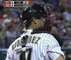
Pudge Rodriguez was at the center of a bizarre sequence of events during last night’s Cards/’Stros game. It began when he announced prior to the game that he was changing his uni number from 12 to — get this — 77. The backstory can be found in this article, which explains:
“That’s my number,” [Rodriguez] said. “I’ve used that number all my career. I respect I cannot wear No. 7 here because (Craig) Biggio retired the jersey. But it’s always a good thing to have two sevens instead of one. You can see seven from the left and seven from the right. You don’t have to turn too much. Just seven all over the place.”
Rodriguez wore No. 7 throughout his major league career until he settled for No. 12 after he was traded late last year to the New York Yankees, who retired No. 7 in honor of Hall of Famer Mickey Mantle. In Houston, No. 7 is retired in honor of Biggio.
“I was just missing my number,” Rodriguez said. “And pretty much all my career it’s been No. 7, so I find it an interesting thing and create something big.”
Uh, whatever you say, Pudgester. I couldn’t find any wire service photos of Rodriguez, so I went to the game video so I could get some shots of his new number (here’s one showing how it looks with his catching gear).
While I was doing that, I noticed that his front uni number appeared to be black, instead of Houston’s usual red. That shot is from the 2nd inning, but maybe it was just poor video quality, because he definitely had a red number in this 7th inning photo, which I found this morning.
Meanwhile, as I was watching all this game footage of Rodriguez, he squibbed a foul ball toward the first base dugout camera. It his the camera right in the lens, leaving an impression of the laces that was visible in the subsequent camera shot. Never seen that before, and never would’ve seen it this time if I hadn’t been hunting for good images of Pudge.
Finally, as you may have noticed in several of those photos, the Astros wore their lunar landing caps last night.
Membership Update: As if it hadn’t been enough to have a sock and stirrup dealer advertising on the site for two months, we now have a Uni Watch Membership Program enrollee who’s requested a card design based on a sock pattern — a request that Scott and I were only too happy to grant. The enrollee is Craig Dodge, and I think you’re all familiar with the sock design in question (which Craig chose because it matches the name of his blog). Nicely done, bud. Kudos also to new member Shaun Ploenzke, who went for the late-’70s Cavs treatment. Like I’ve always said, the most garish uniforms make the most interesting membership cards.
As always, the full gallery of card designs is here, the membership roster is here, and you can have your name added to the roster by signing up here.
Stirrup Club Update: Robert Marshall is continuing his heroic efforts to single-handedly sustain the integrity of baseball hosiery by making stirrups available to the masses in less-than-massive quantities. This month’s designs: old-school A’s and Cardinals. You can order either one, both, or neither (but only a chump would get neither). Full details here.
And Baked Agbayani for Dessert: Remember, live Mets uniform quiz contest tonight, at Two Boots. Festivities begin at 7pm and I’m told that I’ll be going on third, after Greg Prince and Jon Springer, and before Matt Silverman.
And if that’s not enough to entice you, check out this note from the evening’s host, Two Boots manager Phil Hartman:
We’ll be marking the occasion by serving up “The Montañez” — a spicy chorizo and andouille pizza, with a jalapeño pesto swirl. Fitting, I think, for the spicy and over-styled Willie. And at the bar, we will be serving “The Hammer,” the ingredients of which are as inscrutable as John Milner’s career.
I selected these because they sum up my feelings about the Mets. Milner was my favorite Met in the late ’70s, and he was traded for Montañez, perhaps my least favorite player in all of baseball. I specifically remember cursing the baseball gods when I heard about it. Yet within a few weeks of the onset of the ’78 season, I had become a big Monteñez fan — after all, he was now part of the family.
Should be a swell night. Come dressed as your favorite injured Met and get a free cortisone shot! (Free cortisone shot not included.)
Uni Watch News Ticker: Nike conducted a seven-on-seven tourney for high school football players the other day, and Mark Boothby notes that the team names — Land Sharks, Vapor Trail, Zoom Blade, Zoom Fly, Field Sharks, etc. — were all taken from the names of Nike cleats. ”¦ Really interesting piece on the design of money and other finance-related products here. ”¦ Reprinted from yesterday’s comments: The new Royals Hall of Fame includes some prototype logos that were developed by the folks at Hallmark but never used. ”¦ You can’t access the Sports Business Daily site without a subscription, so here’s an excerpt from a story that appeared the other day: “Yankees attorneys are demanding that Long Island resident Steve Lore’s trademarked phrase ‘the house that juice built’ be banned. Lore coined the phrase to ‘express his disgust over steroid use in baseball. The team’s lawyers also want to ban Lore’s T-shirt design that shows the ‘Yankee top hat logo with the bat replaced by a syringe'” (big thanks to Todd Radom). ”¦ Stop whatever you’re doing and check out this amazing promotional trailer produced by Brunswick in 1960. It features all their bowling alley equipment for that year, and it’s totally the bomb. Part One is here, and Part Two continues here. Not to be missed, my friends (major find by Jon Hammer and Karen McBurnie, who went bowling with me on Saturday at Paul’s Bar & Bowling in Paterson, N.J., which, by coincidence, has many of the original fixtures shown in the film). ”¦ Here’s a sport I hadn’t been aware of: Segway polo (as forwarded by Luke Engen). ”¦ Tim Hudson wore stirrups for a minor league rehab start on Sunday (with thanks to Jonathon Binet). ”¦ A little birdie tells me that a fan wearing an “I’m Calling It Shea” T-shirt was recently featured on the Mets’ jumbotron during one of those between-innings quiz segments, much to the consternation of team brass. Bite me, Fred and Jeff! ”¦ Good thing we recently ran all that Tecmo Bowl material, because Nike has just released a new sneaker featuring the Teco Bowl version of Bo Jackson. There’s a baseball version, too. Between my hatred of Nike and my indifference to video games and sneakers, I’d say this is more or less the least likely item ever to have appeared in the Ticker (all credit to Dane Drutis). ”¦ Remember that Royals Hall of Fame sleeve patch? It apparently looked like this (courtesy of Mike Vamosi). ”¦ As I believe many of you are already aware, new football unis in the offing for Arizona State. ”¦ Cycling news from Mike Rich, who writes: “As you probably know, riders in the Tour de France (and the other Pro Tour races, for that matter) wear a special jersey if they are their National Champion in the particular event. Thus, the road racing champions wear their National Champion jersey in most every stage of the Tour de France. Current Italian National Road Racing Champion Filippo Pozzato has worn this jersey for most of the Tour. But the Italian Cycling Federation apparently didn’t approve of the design. On Sunday he was wearing a decidedly different, supposedly approved jersey. Photos are elusive at the moment, but it featured three thick vertical stripes rendered in the colors of the Italian flag.” … Ever wonder what the Apollo 11 landing site would look like superimposed on a baseball diamond? Me neither, but here it is anyway (with thanks to Ryan Connelly).
I’m not sure how put it into a link, but the NYDailyNews.com website has a gallery of sports all time “coolest” uniforms.
link
A further sign the end is near…they gave charlie weis a yankees jersey at the NYS yesterday and it HAD HIS F*CKING NAME ON IT…for that stupid game they will play there in 2010
link
[quote comment=”341225″]http://www.nydailynews.com/sports/galleries/sports_alltime_greatest_uniforms/sports_alltime_greatest_uniforms.html[/quote]
Glad to see PSU made it at #6.
Here is the picture of Pozatto’s new uniform.
link
[quote comment=”341228″]Here is the picture of Pozatto’s new uniform.
link
Pozatto rides for a Russian team and his Italian Champion’s jersey (shown in the ticker) featured a silhouette of Red Square. Maybe that’s why they didn’t like it so much.
All-around fugliness last night with Twins-Athletics (Twins wore navy w/grey pinstriped pants, A’s black caps and jerseys). Twins led 13-2, and choked it away since the 1942 Natinals, losing 13-12.
Check that on #6, it was 14-13, A’s.
That Sun Devils Uniform looks strongly like the Minnesota ones from last year….too bad, I liked their look.
I agree ASU had a good look going. Why mess it up?
Noooooo…. WTH ASU? Why???
Regarding the Nike 7 on 7 tournament:
This spring, Nike was pushing gear designed solely for 7 on 7.
link
link
link
link
Also check out the number treatments on some of these jerseys:
link
Very similar to Florida”s hoops and Boise football unis, no?
link
link
[quote comment=”341236″]Noooooo…. WTH ASU? Why???[/quote]
To be trendy, hip and modern, of course.
[quote comment=”341236″]Noooooo…. WTH ASU? Why???[/quote]
Wait…hold the phone on that. I actually like the sleeve piping. It’s not over the top. It’s a subtle change. Let’s hold off judgment until we see the pants. And let’s hope the helmet stays the same
re: Twins-A’s disaster (both uniwise and final-scorewise) last night…
I just don’t see why it’s so hard for two teams’ equipment managers to determine which nights they’ll will be wearing dark alts and plan so that they don’t go dark-on-dark.
I mean, really, is it that logistically complex?
And any claptrap about coordinating laundry or something is just a bunch of bullshit.
I know, I know, the pitchers get to choose. Also bullshit. It’s the team’s frickin’ uniform, you wear what managment says to wear that night.
—Ricko
[quote comment=”341238″][quote comment=”341236″]Noooooo…. WTH ASU? Why???[/quote]
To be trendy, hip and modern, of course.[/quote]
As an alumnus I do not approve. The collar, the weird seam patterns, the piping that makes it look like a vest with sleeved tacked on.. And what is the deal with the seam just below the numbers?
[quote comment=”341239″][quote comment=”341236″]Noooooo…. WTH ASU? Why???[/quote]
Wait…hold the phone on that. I actually like the sleeve piping. It’s not over the top. It’s a subtle change. Let’s hold off judgment until we see the pants. And let’s hope the helmet stays the same[/quote]
CFCS
(Change for Change’s Sake)
[quote comment=”341242″][quote comment=”341239″][quote comment=”341236″]Noooooo…. WTH ASU? Why???[/quote]
Wait…hold the phone on that. I actually like the sleeve piping. It’s not over the top. It’s a subtle change. Let’s hold off judgment until we see the pants. And let’s hope the helmet stays the same[/quote]
CFCS
(Change for Change’s Sake)[/quote]
Fair enough. You’re right. But the last time they switched up was 1997. In this day and age, that is EONS.
And besides, I’m trying to play Devil’s Advocate. Pun TOTALLY intended!! Get it…? ASU…Sun DEVILS…”Devil’s Advocate”….?? Hello? Anyone? Anyone….?
Segway polo??!?!?!!
HAHAHAHAHA!!!
Can we have these unis back, please?
And lose the maroon pants, too. Especially because sans stripes, they look like something “all the girls in Tempe are wearing to aerobics class these days”.
—Ricko
Forgot link…
link
This Pudge story reminds me of a period of time when Benito Santiago, annoyed by the fact that his catcher’s gear obstructed his uni number of “9,” changed his number to “09” so that the chest protector strap went between the numbers.
[quote comment=”341246″]Forgot link…
link
Well, except with the running Sun Devil on the helmet.
[quote]the pitchers get to choose. Also bullshit[/quote]
ricko’s rule #25?
[quote comment=”341247″]This Pudge story reminds me of a period of time when Benito Santiago, annoyed by the fact that his catcher’s gear obstructed his uni number of “9,” changed his number to “09” so that the chest protector strap went between the numbers.[/quote]
I remember that and thought that that was stupid
[quote comment=”341242″][quote comment=”341239″][quote comment=”341236″]Noooooo…. WTH ASU? Why???[/quote]
Wait…hold the phone on that. I actually like the sleeve piping. It’s not over the top. It’s a subtle change. Let’s hold off judgment until we see the pants. And let’s hope the helmet stays the same[/quote]
CFCS
(Change for Change’s Sake)[/quote]
I REALLY liked ASU’s classic look, and it’s a shame they had to go away from it. But as far as makeovers go, it could have been worse. I actually like the collar striping, and if it was applied to the sleeve ends (omitting the piping of course) as well, this look really wouldn’t be THAT bad. I’m with Cooper’s Dad, though – I really hope the helmet stays the same.
Ahhhh….Woody Green and Danny White. Those were the days, both on the field and uni-wise.
link
In reference to the Yankees’ lawyers’ cease-and-desist requests…wouldn’t that sort of thing be protected by Fair Use? I thought the Fair Use section of US Copyright Law protected satire and parody. This sort of sounds like both.
[quote comment=”341227″][quote comment=”341225″]http://www.nydailynews.com/sports/galleries/sports_alltime_greatest_uniforms/sports_alltime_greatest_uniforms.html[/quote]
Glad to see PSU made it at #6.[/quote]
That UCLA pic is from the Cade McNown era; they don’t wear those numbers anymore. News travels slow from the left coast to NYC, I guess.
Would THIS still make the list? Probably.
link
[quote comment=”341251″][quote comment=”341242″][quote comment=”341239″][quote comment=”341236″]Noooooo…. WTH ASU? Why???[/quote]
Wait…hold the phone on that. I actually like the sleeve piping. It’s not over the top. It’s a subtle change. Let’s hold off judgment until we see the pants. And let’s hope the helmet stays the same[/quote]
CFCS
(Change for Change’s Sake)[/quote]
I REALLY liked ASU’s classic look, and it’s a shame they had to go away from it. But as far as makeovers go, it could have been worse. I actually like the collar striping, and if it was applied to the sleeve ends (omitting the piping of course) as well, this look really wouldn’t be THAT bad. I’m with Cooper’s Dad, though – I really hope the helmet stays the same.[/quote]
Ah-ha! Bernard..!! Coming thru in the clutch!
I’m exactly opposite Pudge.
I’m wearing #77 this season for softball because a more veteran guy on the team wanted #25. I was always #25, and I lost it this year out of respect to another solid player.
But I never changed my number mid-game. LOL
[quote comment=”341239″][quote comment=”341236″]Noooooo…. WTH ASU? Why???[/quote]
Wait…hold the phone on that. I actually like the sleeve piping. It’s not over the top. It’s a subtle change. Let’s hold off judgment until we see the pants. And let’s hope the helmet stays the same[/quote]
It could have been worse (man, that’s some damning praise):
link
[quote comment=”341256″]I’m exactly opposite Pudge.
I’m wearing #77 this season for softball because a more veteran guy on the team wanted #25. I was always #25, and I lost it this year out of respect to another solid player.
But I never changed my number mid-game. LOL[/quote]
66 wasn’t available?
[quote comment=”341243″][quote comment=”341242″][quote comment=”341239″][quote comment=”341236″]Noooooo…. WTH ASU? Why???[/quote]
Wait…hold the phone on that. I actually like the sleeve piping. It’s not over the top. It’s a subtle change. Let’s hold off judgment until we see the pants. And let’s hope the helmet stays the same[/quote]
CFCS
(Change for Change’s Sake)[/quote]
Fair enough. You’re right. But the last time they switched up was 1997. In this day and age, that is EONS.
And besides, I’m trying to play Devil’s Advocate. Pun TOTALLY intended!! Get it…? ASU…Sun DEVILS…”Devil’s Advocate”….?? Hello? Anyone? Anyone….?[/quote]
I think the adidas disasters were more recent, like early 2000s:
link
[quote comment=”341259″][quote comment=”341243″][quote comment=”341242″][quote comment=”341239″][quote comment=”341236″]Noooooo…. WTH ASU? Why???[/quote]
Wait…hold the phone on that. I actually like the sleeve piping. It’s not over the top. It’s a subtle change. Let’s hold off judgment until we see the pants. And let’s hope the helmet stays the same[/quote]
CFCS
(Change for Change’s Sake)[/quote]
Fair enough. You’re right. But the last time they switched up was 1997. In this day and age, that is EONS.
And besides, I’m trying to play Devil’s Advocate. Pun TOTALLY intended!! Get it…? ASU…Sun DEVILS…”Devil’s Advocate”….?? Hello? Anyone? Anyone….?[/quote]
I think the adidas disasters were more recent, like early 2000s:
link
you are correct. My bad
[quote comment=”341259″][quote comment=”341243″][quote comment=”341242″][quote comment=”341239″][quote comment=”341236″]Noooooo…. WTH ASU? Why???[/quote]
Wait…hold the phone on that. I actually like the sleeve piping. It’s not over the top. It’s a subtle change. Let’s hold off judgment until we see the pants. And let’s hope the helmet stays the same[/quote]
CFCS
(Change for Change’s Sake)[/quote]
Fair enough. You’re right. But the last time they switched up was 1997. In this day and age, that is EONS.
And besides, I’m trying to play Devil’s Advocate. Pun TOTALLY intended!! Get it…? ASU…Sun DEVILS…”Devil’s Advocate”….?? Hello? Anyone? Anyone….?[/quote]
I think the adidas disasters were more recent, like early 2000s:
link
“One more bumper sticker and my car will be perfect.”
[quote comment=”341259″][quote comment=”341243″][quote comment=”341242″][quote comment=”341239″][quote comment=”341236″]Noooooo…. WTH ASU? Why???[/quote]
Wait…hold the phone on that. I actually like the sleeve piping. It’s not over the top. It’s a subtle change. Let’s hold off judgment until we see the pants. And let’s hope the helmet stays the same[/quote]
CFCS
(Change for Change’s Sake)[/quote]
Fair enough. You’re right. But the last time they switched up was 1997. In this day and age, that is EONS.
And besides, I’m trying to play Devil’s Advocate. Pun TOTALLY intended!! Get it…? ASU…Sun DEVILS…”Devil’s Advocate”….?? Hello? Anyone? Anyone….?[/quote]
I think the adidas disasters were more recent, like early 2000s:
link
Yeah that’s the one Andrew Walter wore. Say around 04?
[quote comment=”341254″][quote comment=”341227″][quote comment=”341225″]http://www.nydailynews.com/sports/galleries/sports_alltime_greatest_uniforms/sports_alltime_greatest_uniforms.html[/quote]
Glad to see PSU made it at #6.[/quote]
That UCLA pic is from the Cade McNown era; they don’t wear those numbers anymore. News travels slow from the left coast to NYC, I guess.
Would THIS still make the list? Probably.
link
jonathon,
in defense of the title of the article (tho i disagree with a number of the choices, and as UWers, these articles are kind of a joke), it was called Sports All-Time Greatest Uniforms, so the cade mcnown era does apply (plus they threw in the garbage from the magic and had an old ‘diques, plus ‘stros tequila sunrise)…
of course, when you lazily (tho i agree they are great) throw in yankees, penn state & alabama, you could show a pic from 30 years ago or today
cowboys “all time greatest”? sorry…that uni fails on so many levels
[quote comment=\”341263\”]
cowboys \”all time greatest\”? sorry…that uni fails on so many levels[/quote]
PSHAW! Thou dost offend me good sir.
I think Paul may hate the Mets more that he hates Nike or the color Purple.
Interesting idea over at PD…
link
I think the current logo on the alternate jersey would be the best. I love the contrasting shoulder yoke (sp?) on hockey jerseys. I wish the Caps would use them.
link
Wasn’t Mrs. Landingcap the President’s secretary on THE WEST WING?
[quote comment=”341242″]
CFCS
(Change for Change’s Sake)[/quote]
Ricko, allow me to suggest CFPS.
Change For Profit’s Sake.
(Or CFRS using the word Revenue; either way works.)
[quote comment=”341263″]
of course, when you lazily (tho i agree they are great) throw in yankees, penn state & alabama, you could show a pic from 30 years ago or today
[/quote]
I like the idea that a lot of the uni’s on that list could have pictures from either today or the 1950’s, and 99.99% of the people couldn’t tell the difference. Yanks, Tigers, Leafs, Canadians, some of the college football teams: good stuff.
JMHO, but when you find a classic you should hold on to it.
[quote comment=”341258″]66 wasn’t available?[/quote]
I just look for the most slimming number.
Still looking… :-)
[quote comment=”341269″][quote comment=”341263″]
of course, when you lazily (tho i agree they are great) throw in yankees, penn state & alabama, you could show a pic from 30 years ago or today
[/quote]
I like the idea that a lot of the uni’s on that list could have pictures from either today or the 1950’s, and 99.99% of the people couldn’t tell the difference. Yanks, Tigers, Leafs, Canadians, some of the college football teams: good stuff.
JMHO, but when you find a classic you should hold on to it.[/quote]
Precisely why powder blue tuxedos with huge ruffled shirts are virtually extinct.
Except maybe on MY NAME IS EARL.
[quote comment=”341270″][quote comment=”341258″]66 wasn’t available?[/quote]
I just look for the most slimming number.
Still looking… :-)[/quote]
Try a different bar.
Oh, wait, you meant a numeral.
Never mind.
How long do you think it will be before Nike trys to sue the Boy Scouts? This is from Northern Tier, the Boy Scout High Adventure Camp in Minnesota and Canada.
link
I’ll be on the field for the first ASU game this year (they play Idaho State). I’m betting money the sleeves don’t end up looking like that….guess I’ll have the digital camera handy!
Frank
Wow, after seeing the NY Daily News “coolest” uniforms – and seeing how hockey uniforms dominate the top 10, (keeping in mind New York is not exactly a hockey mecca) – is another indication, the best looking uniforms in team sports are in hockey.
I was surprised to see the Quebec Nordiques on the list – that uniform I always thought was pretty forgettable.
[quote comment=”341253″]In reference to the Yankees’ lawyers’ cease-and-desist requests…wouldn’t that sort of thing be protected by Fair Use? I thought the Fair Use section of US Copyright Law protected satire and parody. This sort of sounds like both.[/quote]
I’m not a lawyer, but I believe his protected right to parody ends at selling the shirts.
[quote comment=”341271″]
Precisely why powder blue tuxedos with huge ruffled shirts are virtually extinct.
Except maybe on MY NAME IS EARL.[/quote]
Anybody else remember the era when weddings not only had the ruffled shirts, but also a rainbow of shirt colors designed to coordinate with the color of the women’s dresses? :-))
That should be somewhere on one of those “awful pictures” websites.
[quote comment=”341276″]I’m not a lawyer, but I believe his protected right to parody ends at selling the shirts.[/quote]
Not a lawyer either, but wouldn’t a TV show parody of the steriod era have the right to sell commercials on the show?
With low stirrups and tight (non-blousing) pants, this is about as good as you can get.
link
[quote comment=”341273″]How long do you think it will be before Nike trys to sue the Boy Scouts? This is from Northern Tier, the Boy Scout High Adventure Camp in Minnesota and Canada.[/quote]
Nike will sue & get publicity; and then drop the suit and donate shoes to the scouts in the camp.
[quote comment=”341279″]With low stirrups and tight (non-blousing) pants, this is about as good as you can get.
link
Although, looks like stirrups just might be on backwards.
Damn.
[quote comment=”341264″][quote comment=\”341263\”]
cowboys \”all time greatest\”? sorry…that uni fails on so many levels[/quote]
PSHAW! Thou dost offend me good sir.[/quote]
i disliked their unis long before i ever read paul’s piece on them
i hated them even more afterwards
/just MHO…
[quote comment=”341263″][quote comment=”341254″][quote comment=”341227″][quote comment=”341225″]http://www.nydailynews.com/sports/galleries/sports_alltime_greatest_uniforms/sports_alltime_greatest_uniforms.html[/quote]
Glad to see PSU made it at #6.[/quote]
That UCLA pic is from the Cade McNown era; they don’t wear those numbers anymore. News travels slow from the left coast to NYC, I guess.
Would THIS still make the list? Probably.
link
jonathon,
in defense of the title of the article (tho i disagree with a number of the choices, and as UWers, these articles are kind of a joke), it was called Sports All-Time Greatest Uniforms, so the cade mcnown era does apply (plus they threw in the garbage from the magic and had an old ‘diques, plus ‘stros tequila sunrise)…
of course, when you lazily (tho i agree they are great) throw in yankees, penn state & alabama, you could show a pic from 30 years ago or today
cowboys “all time greatest”? sorry…that uni fails on so many levels[/quote]
that’s true. good call phil. how were those late 90s ucla unis really better than the ones they wear now, or the troy aikman threads, which were truly their best look?
link
link
link
[quote comment=”341274″]I’ll be on the field for the first ASU game this year (they play Idaho State). I’m betting money the sleeves don’t end up looking like that….guess I’ll have the digital camera handy!
Frank[/quote]
I’m in favor of the previous Nike versions, but I think Frank’s right. The replica jersey’s sleeves do not represent the actual uni’s sleeves, which will be short shoulder pad covers. If that’s the case the piping may actually look good with a short sleeve end. I’ll hold my verdict on the black outline numbers, something the football team has never had. The basketball team has had black outlines numbers before in the Adidas days.
Considering the pressure these schools get from Nike, players and marketing types to go “modern”, these are rather subtle changes, much more so than the bad Adidas ones. Considering they could have gone crazy with stripes starting in front then merging in the back (like UofA, Clemson) I’ll live with this. Even Michigan has partly given in to “modern” uniforms on their whites.
The Pontiac School District in Pontiac, MI has merged their two High Schools due to declining enrollment. The two High Schools Pontiac Northern Huskies (Colors Red and White) and Pontiac Central Chiers (Colors Black and Orange) will now be the Pontiac High Phoenix.
The Phoenix will be done in purple, black and silver – the new colors for the combined Pontiac High School that will open in September in the existing Northern High School building. The first football game is Aug. 22.
Above paragraph is from the article linked below.
link
Why does moving to number 77 make Pudge weird? Ray Bourque removed his #7 sweater revealing one with #77 when the Boston Bruins retired #7 in honor of Phil Epsosito.
[quote comment=”341282″][quote comment=”341264″][quote comment=\”341263\”]
cowboys \”all time greatest\”? sorry…that uni fails on so many levels[/quote]
PSHAW! Thou dost offend me good sir.[/quote]
i disliked their unis link
i hated them even more afterwards
/just MHO…[/quote]
Oh I get where you are coming from Sir Hecken, I just disagree, on principle.
[quote comment=”341279″]With low stirrups and tight (non-blousing) pants, this is about as good as you can get.
link
Yes, it’s a solid look for the Myrtle Beach Pelicans of the Carolina League.
link
link
I don’t see what the big deal is with the Arizona St unis. I mean, the piping is new, but at the same time, its different but in a good way. If it just rings the sleeve and doesn’t do any weird shit on the back or anything like that, I’ll actually really like it. Its an interesting concept that could be pretty cool. However, if Nike went all Miami Hurricanes on them and added a pointless horizontal stripe to the end of the ring, it gets a giant STUPID for a rating.
As it was said before, it could be worse. Just look at the VT jerseys (sans the throwback, of course) and you can see how bad it could be. In Nike terms, this was a conservative approach to a jersey redesign.
[quote comment=”341286″]Why does moving to number 77 make Pudge weird? Ray Bourque removed his #7 sweater revealing one with #77 when the Boston Bruins retired #7 in honor of Phil Epsosito.[/quote]
Seeing as the Astros were at home with all their clubhouse equipment right there, any possibility the new 77 was made up hurriedly and someone f’ed up, using the black TVs? Then during the game the mistake was noticed. “Give us your jersey during our next at-bat, Pudge, we gotta fix something on it”…and the TVs were replaced?
Seems plausible.
[quote comment=”341285″]The Pontiac School District in Pontiac, MI has merged their two High Schools due to declining enrollment. The two High Schools Pontiac Northern Huskies (Colors Red and White) and Pontiac Central Chiers (Colors Black and Orange) will now be the Pontiac High Phoenix.
The Phoenix will be done in purple, black and silver – the new colors for the combined Pontiac High School that will open in September in the existing Northern High School building. The first football game is Aug. 22.
Above paragraph is from the article linked below.
link
1. The new logo looks a whole lot like the hood of a Firebird, which, for a town named Pontiac, is completely awesome.
2. What a wasted opportunity to honor the legacy of both schools by adopting one color from each, red and black (one of my favorite looks when executed properly).
[quote comment=”341263″][quote comment=”341254″][quote comment=”341227″][quote comment=”341225″]http://www.nydailynews.com/sports/galleries/sports_alltime_greatest_uniforms/sports_alltime_greatest_uniforms.html[/quote]
Glad to see PSU made it at #6.[/quote]
That UCLA pic is from the Cade McNown era; they don’t wear those numbers anymore. News travels slow from the left coast to NYC, I guess.
Would THIS still make the list? Probably.
link
jonathon,
in defense of the title of the article (tho i disagree with a number of the choices, and as UWers, these articles are kind of a joke), it was called Sports All-Time Greatest Uniforms, so the cade mcnown era does apply (plus they threw in the garbage from the magic and had an old ‘diques, plus ‘stros tequila sunrise)…
of course, when you lazily (tho i agree they are great) throw in yankees, penn state & alabama, you could show a pic from 30 years ago or today
cowboys “all time greatest”? sorry…that uni fails on so many levels[/quote]
Why did this get addressed to Jonathan? even though it was a different spelling…i thought something was being said to me. I didn’t see a Jonathon as a poster today.
[quote comment=”341291″][quote comment=”341285″]The Pontiac School District in Pontiac, MI has merged their two High Schools due to declining enrollment. The two High Schools Pontiac Northern Huskies (Colors Red and White) and Pontiac Central Chiers (Colors Black and Orange) will now be the Pontiac High Phoenix.
The Phoenix will be done in purple, black and silver – the new colors for the combined Pontiac High School that will open in September in the existing Northern High School building. The first football game is Aug. 22.
Above paragraph is from the article linked below.
link
1. The new logo looks a whole lot like the hood of a Firebird, which, for a town named Pontiac, is completely awesome.
2. What a wasted opportunity to honor the legacy of both schools by adopting one color from each, red and black (one of my favorite looks when executed properly).[/quote]
Let’s hope there’s a team in Arizona called the Phoenix High Pontiacs.
It would there was some kind of balance in the world.
[quote comment=”341292″][quote comment=”341263″][quote comment=”341254″][quote comment=”341227″][quote comment=”341225″]http://www.nydailynews.com/sports/galleries/sports_alltime_greatest_uniforms/sports_alltime_greatest_uniforms.html[/quote]
Glad to see PSU made it at #6.[/quote]
That UCLA pic is from the Cade McNown era; they don’t wear those numbers anymore. News travels slow from the left coast to NYC, I guess.
Would THIS still make the list? Probably.
link
jonathon,
in defense of the title of the article (tho i disagree with a number of the choices, and as UWers, these articles are kind of a joke), it was called Sports All-Time Greatest Uniforms, so the cade mcnown era does apply (plus they threw in the garbage from the magic and had an old ‘diques, plus ‘stros tequila sunrise)…
of course, when you lazily (tho i agree they are great) throw in yankees, penn state & alabama, you could show a pic from 30 years ago or today
cowboys “all time greatest”? sorry…that uni fails on so many levels[/quote]
Why did this get addressed to Jonathan?
even though it was a different spelling…i thought something was being said to me. I didn’t see a Jonathon as a poster today.[/quote]
My name is Jonathon. War Damn Eagle is my nom de plume.
[quote comment=”341285″]The Pontiac School District in Pontiac, MI has merged their two High Schools due to declining enrollment. The two High Schools Pontiac Northern Huskies (Colors Red and White) and Pontiac Central Chiers (Colors Black and Orange) will now be the Pontiac High Phoenix.
The Phoenix will be done in purple, black and silver – the new colors for the combined Pontiac High School that will open in September in the existing Northern High School building. The first football game is Aug. 22.
Above paragraph is from the article linked below.
link
A phoenix, eh? I don’t think that is too fitting for the Pontiac area. They have done the part of destroying the city, but I doubt they are going to rise from the ashes any time soon.
[quote comment=”341294″] War Damn Eagle is my nom de plume.[/quote]
Hmmm, there was a book out long ago about someone with the first name of Jonathon, last name of a bird… his middle name wasn’t “Damn” though.
:-)
When will the Mets sport these badboys as a throwback?
link
[quote comment=”341285″]…Pontiac Central Chiers…
[/quote]
Is that a misspelling: and if not, is there a story behind “Chiers”?
[quote comment=”341297″]When will the Mets sport these badboys as a throwback?
link that regardless of the uniform, Joe Torre is not particularly proud of that picture. :-)
[quote comment=”341297″]When will the Mets sport these badboys as a throwback?
link
ack…never i hope
that picture, of course, has nothing to do with the date or the year…the mets sported those unis from ’78-’81, and that was when torre was managing the mets, not playing for them; he was a player from 75-77 (traded from cards to mets after 74 season), and did something like 20 games as player/manager before deciding he couldn’t do
either one wellboth at the same time[quote comment=”341293″][quote comment=”341291″][quote comment=”341285″]The Pontiac School District in Pontiac, MI has merged their two High Schools due to declining enrollment. The two High Schools Pontiac Northern Huskies (Colors Red and White) and Pontiac Central Chiers (Colors Black and Orange) will now be the Pontiac High Phoenix.
The Phoenix will be done in purple, black and silver – the new colors for the combined Pontiac High School that will open in September in the existing Northern High School building. The first football game is Aug. 22.
Above paragraph is from the article linked below.
link
1. The new logo looks a whole lot like the hood of a Firebird, which, for a town named Pontiac, is completely awesome.
2. What a wasted opportunity to honor the legacy of both schools by adopting one color from each, red and black (one of my favorite looks when executed properly).[/quote]
Let’s hope there’s a team in Arizona called the Phoenix High Pontiacs.
It would there was some kind of balance in the world.[/quote]
Alas.. there is not. There not even a Phoenix High any longer.
How can you have a list of Sports’ All-Time Coolest Uniforms and limit it to the four big pro sports in the U.S. and almost nothing vintage?
(OK, vintage isn’t the word I’m looking for. Maybe “not currently in use.”)
I’ll admit these lists are usually pretty useless, but do they have to be so limited in scope?
[quote comment=”341301″]Alas.. there is not. There not even a Phoenix High any longer.[/quote]
Well there’s always hope that it will rise.
Teh guys at AstrosDaily.com posted an interesting take on changing the Astros uniforms to take on a retro meets modern look. link
My first complaint is the use of the Black jersey. My second is using that 70s era Block font “ASTROS” on the front and not the current Script “Astros”. Lastly, the lack of Houston on the road uni is just wrong. It is an interesting take on the Retro-meets-Modern look…even though the Astros current unis are retro-ish to begin with.
[quote comment=”341302″]How can you have a list of Sports’ All-Time Coolest Uniforms and limit it to the four big pro sports in the U.S. and almost nothing vintage?
(OK, vintage isn’t the word I’m looking for. Maybe “not currently in use.”)[/quote]
Squiddie, any nominations?
If I went with a list of “unfortunate new uniforms” at the top would be the Phoenix Cardinals, Minnesota Vikings and Atlanta Falcons. IMHO, the Cards might be a candidate for the SI list if they had their old unis.
Maybe the Vikes too.
[quote comment=”341303″][quote comment=”341301″]Alas.. there is not. There not even a Phoenix High any longer.[/quote]
Well there’s always hope that it will rise.[/quote]
Well played sir.
[quote comment=”341298″][quote comment=”341285″]…Pontiac Central Chiers…
[/quote]
Is that a misspelling: and if not, is there a story behind “Chiers”?[/quote]
I wondered the same thing at first, but it should read “Chiefs”.
[quote comment=”341304″]Teh guys at AstrosDaily.com posted an interesting take on changing the Astros uniforms to take on a retro meets modern look. link
My first complaint is the use of the Black jersey. My second is using that 70s era Block font “ASTROS” on the front and not the current Script “Astros”. Lastly, the lack of Houston on the road uni is just wrong. It is an interesting take on the Retro-meets-Modern look…even though the Astros current unis are retro-ish to begin with.[/quote]
I like going back to the block script and older logo. I also like the H-star hat. But you have to put “Houston” on the road unis. I think it would look good in that older font.
[quote comment=”341307″][quote comment=”341298″][quote comment=”341285″]…Pontiac Central Chiers…
[/quote]
Is that a misspelling: and if not, is there a story behind “Chiers”?[/quote]
I wondered the same thing at first, but it should read “Chiefs”.[/quote]
That’s great, but who are the Chefs?
[quote comment=”341258″][quote comment=”341256″]I’m exactly opposite Pudge.
I’m wearing #77 this season for softball because a more veteran guy on the team wanted #25. I was always #25, and I lost it this year out of respect to another solid player.
But I never changed my number mid-game. LOL[/quote]
66 wasn’t available?[/quote]
I used to wear that number, but I hated the Juan Guzman reference when I was pitching.
[quote comment=”341310″][quote comment=”341258″][quote comment=”341256″]I’m exactly opposite Pudge.
I’m wearing #77 this season for softball because a more veteran guy on the team wanted #25. I was always #25, and I lost it this year out of respect to another solid player.
But I never changed my number mid-game. LOL[/quote]
66 wasn’t available?[/quote]
I used to wear that number, but I hated the Juan Guzman reference when I was pitching.[/quote]
Coulda said, “Nah, it means 6-for-6.”
“Uh, whatever you say, Pudgester.”
Never thought I’d see the day when UniWatch would be giving a player a hard time for putting some thought into his own uniform number.
[quote comment=”341275″]
I was surprised to see the Quebec Nordiques on the list – that uniform I always thought was pretty forgettable.[/quote]
They are the ONLY hockey team that looked amazingly great in light blue.
The Thrashers can kiss my posterior in using that colour.
[quote comment=”341286″]Why does moving to number 77 make Pudge weird? Ray Bourque removed his #7 sweater revealing one with #77 when the Boston Bruins retired #7 in honor of Phil Epsosito.[/quote]
Bourque didn’t do it between shifts, though.
[quote comment=”341307″]I wondered the same thing at first, but it should read “Chiefs”.[/quote]I definitely considered that as a strong possibility, not only because of the proximity on the keyboard but Pontiac and Indian imagery go together.
Just wanted to hear one way or another. Thanks.
[quote comment=”341309″][quote comment=”341307″][quote comment=”341298″][quote comment=”341285″]…Pontiac Central Chiers…
[/quote]
Is that a misspelling: and if not, is there a story behind “Chiers”?[/quote]
I wondered the same thing at first, but it should read “Chiefs”.[/quote]
That’s great, but who are the Chefs?[/quote]
Happy Chef used to sponsor a pretty good softball team.
[quote comment=”341311″][quote comment=”341310″][quote comment=”341258″][quote comment=”341256″]I’m exactly opposite Pudge.
I’m wearing #77 this season for softball because a more veteran guy on the team wanted #25. I was always #25, and I lost it this year out of respect to another solid player.
But I never changed my number mid-game. LOL[/quote]
66 wasn’t available?[/quote]
I used to wear that number, but I hated the Juan Guzman reference when I was pitching.[/quote]
Coulda said, “Nah, it means 6-for-6.”[/quote]
I’ll stick with 7-fer-7. LOL
[quote comment=”341308″][quote comment=”341304″]Teh guys at AstrosDaily.com posted an interesting take on changing the Astros uniforms to take on a retro meets modern look. link
My first complaint is the use of the Black jersey. My second is using that 70s era Block font “ASTROS” on the front and not the current Script “Astros”. Lastly, the lack of Houston on the road uni is just wrong. It is an interesting take on the Retro-meets-Modern look…even though the Astros current unis are retro-ish to begin with.[/quote]
I like going back to the block script and older logo. I also like the H-star hat. But you have to put “Houston” on the road unis. I think it would look good in that older font.[/quote]
Going WAY back.
link
Love the stirrups, too.
link
—Ricko
[quote comment=”341312″]“Uh, whatever you say, Pudgester.”
Never thought I’d see the day when UniWatch would be giving a player a hard time for putting some thought into his own uniform number.[/quote]
Haha, I know!
Maybe CFCS could mean “Complaining for complaining’s sake”?
[quote comment=”341305″]
If I went with a list of “unfortunate new uniforms” at the top would be the Phoenix Cardinals, Minnesota Vikings and Atlanta Falcons. IMHO, the Cards might be a candidate for the SI list if they had their old unis.
Maybe the Vikes too.[/quote]
I’d include the Vikings, but if you grow up around people wearing purple, you get used to it.
Perhaps I’m stuck in the past, but have any new football uniforms been an improvement over the unis they replaced? I think some have been draws, but unless a team has gone back to an older design I can’t think of too many improvements.
[quote comment=”341309″][quote comment=”341307″][quote comment=”341298″][quote comment=”341285″]…Pontiac Central Chiers…
[/quote]
Is that a misspelling: and if not, is there a story behind “Chiers”?[/quote]
I wondered the same thing at first, but it should read “Chiefs”.[/quote]
That’s great, but who are the Chefs?[/quote]
Great googly moogly. Haha
link
[quote comment=”341316″][quote comment=”341309″][quote comment=”341307″][quote comment=”341298″][quote comment=”341285″]…Pontiac Central Chiers…
[/quote]
Is that a misspelling: and if not, is there a story behind “Chiers”?[/quote]
I wondered the same thing at first, but it should read “Chiefs”.[/quote]
That’s great, but who are the Chefs?[/quote]
Happy Chef used to sponsor a pretty good softball team.[/quote]
wasn’t that a veiled reference to this?
[quote comment=”341313″][quote comment=”341275″]
I was surprised to see the Quebec Nordiques on the list – that uniform I always thought was pretty forgettable.[/quote]
They are the ONLY hockey team that looked amazingly great in light blue.
The Thrashers can kiss my posterior in using that colour.[/quote]
Thrashers wouldn’t be so bad if not for just about everything they do other than the light blue color. Stripe on one sleeve only? Ugly as Joan Rivers logos? A color combination that includes navy blue, orange, yellow, and maroon? Ugh…
If they were to simplify it, ditch the shoulder stripe, add a wordmark to the chest (instead of the logo) that was maroon on navy blue with the yellow/orange as a piping that outlines the maroon. Keep the stripe they have on the hemline, those are nice. Make a cuff stripe of navy blue and you’ll have a pretty good jersey. Certainly better than the crap they have now.
Link FAIL!
Fixed:
link
Did you see that David Beckham got into a yelling match with some L.A. Riot Squad members? At one point they even threw a Galaxy jersey at him.
You know things are pretty bad when fans are throwing away perfectly good jerseys. (Insert Herbalife sponsorship jokes here.)
Maybe they’re upset that he’s wearing short sleeves.
When the A’s first wore the black alts a few years back i thought they were cool. Back then they wore their regular batting helmets with the black alts which kept an acceptable amount of green in the uni. Last night’s black helmets combined with the blue Twins jerseys have put me off the black alts altogether. I’d rather see a yellow or kelly green alt.
[quote comment=”341322″][quote comment=”341316″][quote comment=”341309″][quote comment=”341307″][quote comment=”341298″][quote comment=”341285″]…Pontiac Central Chiers…
[/quote]
Is that a misspelling: and if not, is there a story behind “Chiers”?[/quote]
I wondered the same thing at first, but it should read “Chiefs”.[/quote]
That’s great, but who are the Chefs?[/quote]
Happy Chef used to sponsor a pretty good softball team.[/quote]
wasn’t that a link?[/quote]
Give that man a Snickers!
[quote comment=”341325″]Did you see that David Beckham got into a yelling match with some L.A. Riot Squad members? At one point they even threw a Galaxy jersey at him.
You know things are pretty bad when fans are throwing away perfectly good jerseys. (Insert Herbalife sponsorship jokes here.)
Maybe they’re upset that he’s wearing short sleeves.[/quote]
After the game, they all put on their ’99’ Dodgers jerseys and headed over to Dodgers Stadium to spend a few hours in Mannywood while giving the steroids user standing ovations upon his return….
although i do not mind the new Arizona St unis
the set they have been wearing was so classic and clean. i really do not like all of the piping that has been going on either stripes on sleeves, “northwestern stripes” or just numbers-but have an original identity. these new unis are looking the same and like crap. i am glad ohio state, oklahoma, penn state, ‘bama and others have not let nike try to do the “piping thing” to them. and notre dame going back to a more plain jersey was great too.
-Stoops
Random thoughts: (not deep)
re: Twins-A’s disaster (both uniwise and final-scorewise) last night…
softball unis produce a softball score
Wasn’t Mrs. Landingcap the President’s secretary on THE WEST WING?
good one!
Thought the greatest unis or whatever it was called was just lazy.
the article on Pudge reminded me of 2 things:
1. I have sported a seam print just like the one on the camera lens on my legs many times.
2. Wasn’t Gretzky the first hockey player to have a ginormous number and wasn’t 99 an homage to Hull and Howe? (Be gentle here, I didn’t grow up in hockey culture).
[quote comment=”341322″][quote comment=”341316″][quote comment=”341309″][quote comment=”341307″][quote comment=”341298″][quote comment=”341285″]…Pontiac Central Chiers…
[/quote]
Is that a misspelling: and if not, is there a story behind “Chiers”?[/quote]
I wondered the same thing at first, but it should read “Chiefs”.[/quote]
That’s great, but who are the Chefs?[/quote]
Happy Chef used to sponsor a pretty good softball team.[/quote]
wasn’t that a link?[/quote]
Huh? Who own da Chiefs?
[quote comment=”341330″]
2. Wasn’t Gretzky the first hockey player to have a ginormous number and wasn’t 99 an homage to Hull and Howe? (Be gentle here, I didn’t grow up in hockey culture).[/quote]
No. There were several players who wore #99 before Gretzky did in the NHL. He chose #99 as a player on the Soo Greyhounds already wore #9 – the number of Gordie Howe, Gretzky’s hero.
“2. Wasn’t Gretzky the first hockey player to have a ginormous number and wasn’t 99 an homage to Hull and Howe? (Be gentle here, I didn’t grow up in hockey culture).”
Didn’t number change coincide with a big new contract that ran through ’99? Thought that’s what I heard at the time.
Teebz?
Oakland 14, Minnesota 13 ?
I though Favre was supposed to generate some offense for those guys.
—Ricko
That Teebz. He’s quick.
[quote comment=”341334″]That Teebz. He’s quick.[/quote]
Ricko, keep Hockey Day In Minnesota (Feb. 23, 2010) open. I might make the trek down that day. I was thinking it would be awesome to spend a few days watching pond hockey and a Gophers game.
[quote comment=”341313″][quote comment=”341275″]
I was surprised to see the Quebec Nordiques on the list – that uniform I always thought was pretty forgettable.[/quote]
They are the ONLY hockey team that looked amazingly great in light blue.
The Thrashers can kiss my posterior in using that colour.[/quote]
I would pick the Penguins current retro uni, as the best light blue uni, although I’m not as in love with it, as some are.
The Nordiques uniform had several big strikes against it, in my books:
1. Far too nationalistic
2. A logo that looks like it was designed by someone with no natural artistic ability
3. A strange use of the colour red, major splash in the logo, and then hardly non-existent.
I agree with the Thrashers rebuke, for many of the reasons Beardface points out – it a total mess, with an incredibly annoying one arm striping pattern.
[quote comment=”341336″][quote comment=”341313″][quote comment=”341275″]
I was surprised to see the Quebec Nordiques on the list – that uniform I always thought was pretty forgettable.[/quote]
They are the ONLY hockey team that looked amazingly great in light blue.
The Thrashers can kiss my posterior in using that colour.[/quote]
I would pick the Penguins current retro uni, as the best light blue uni, although I’m not as in love with it, as some are.
The Nordiques uniform had several big strikes against it, in my books:
1. Far too nationalistic
2. A logo that looks like it was designed by someone with no natural artistic ability
3. A strange use of the colour red, major splash in the logo, and then hardly non-existent.
I agree with the Thrashers rebuke, for many of the reasons Beardface points out – it a total mess, with an incredibly annoying one arm striping pattern.[/quote]
Nordiques were more Air Force Blue than Powder Blue, right?
Well, okay the very first ones were powder, I guess. With red breezers. Not a good look. Got much better with all Air Force Blue. Logo, good or bad, is distinctly ’70s, that’s for sure.
—Ricko
[quote comment=”341335″][quote comment=”341334″]That Teebz. He’s quick.[/quote]
Ricko, keep Hockey Day In Minnesota (Feb. 23, 2010) open. I might make the trek down that day. I was thinking it would be awesome to spend a few days watching pond hockey and a Gophers game.[/quote]
Deal. I keep better in the winter, too.
[quote comment=”341338″][quote comment=”341335″][quote comment=”341334″]That Teebz. He’s quick.[/quote]
Ricko, keep Hockey Day In Minnesota (Feb. 23, 2010) open. I might make the trek down that day. I was thinking it would be awesome to spend a few days watching pond hockey and a Gophers game.[/quote]
Deal. I keep better in the winter, too.[/quote]
I found all those WHA newspapers, btw.
[quote comment=”341279″]With low stirrups and tight (non-blousing) pants, this is about as good as you can get.
link
Love it.
[quote comment=”341331″]
Huh? Who own da Chiefs?[/quote]
Well, I think it’s the son of Lamar Hunt. I don’t think his first name is Mike though.
[quote comment=”341336″]
1. Far too nationalistic[/quote]
Nationalistic? The name means “Northman”, and was an homage to the native peoples in the Ungava region of Quebec before representing all the northern peoples of Quebec. It’s a highly regional logo, and has little to do with anything else in Canada.
[quote comment=”341336″]2. A logo that looks like it was designed by someone with no natural artistic ability[/quote]
The logo, according to the media guides, is an igloo with a hockey stick in the front as the entrance/exit to the igloo – again, referring to the native peoples in the Ungava region. It was designed to look like Inuit or native peoples’ drawings. It’s supposed to look simplistic. That’s the beauty of it.
[quote comment=”341336″]3. A strange use of the colour red, major splash in the logo, and then hardly non-existent.[/quote]
The red colour was introduced during their WHA days. The blue and white is clearly referencing the blue-and-white flag of the province of Quebec. It’s also where they get the fleur-de-lis from. However, the logo and jerseys have changed a number of times. The link has them all, and red gets moved and changed on the jerseys often. However, it clearly stands out, and makes the logo that much more noticeable – entirely what you’d like any logo to be. Ask Nike how well that works. ;o)
No. There were several players who wore #99 before Gretzky did in the NHL. He chose #99 as a player on the Soo Greyhounds already wore #9 – the number of Gordie Howe, Gretzky’s hero.
thank you, that didn’t hurt a bit.
On another topic:
I always thought the UCLA helmet logo made no sense. Shouldn’t it read U C L A, not Ucla like it’s the word “Ucla”. Is there more here than meets my eye? (Have also never been a fan of script helmet markings: “Terrapins” and 90’s “Beavers” come to mind).
[quote comment=”341292″][quote comment=”341263″][quote comment=”341254″][quote comment=”341227″][quote comment=”341225″]http://www.nydailynews.com/sports/galleries/sports_alltime_greatest_uniforms/sports_alltime_greatest_uniforms.html[/quote]
Glad to see PSU made it at #6.[/quote]
That UCLA pic is from the Cade McNown era; they don’t wear those numbers anymore. News travels slow from the left coast to NYC, I guess.
Would THIS still make the list? Probably.
link
jonathon,
in defense of the title of the article (tho i disagree with a number of the choices, and as UWers, these articles are kind of a joke), it was called Sports All-Time Greatest Uniforms, so the cade mcnown era does apply (plus they threw in the garbage from the magic and had an old ‘diques, plus ‘stros tequila sunrise)…
of course, when you lazily (tho i agree they are great) throw in yankees, penn state & alabama, you could show a pic from 30 years ago or today
cowboys “all time greatest”? sorry…that uni fails on so many levels[/quote]
Why did this get addressed to Jonathan?
even though it was a different spelling…i thought something was being said to me. I didn’t see a Jonathon as a poster today.[/quote]
I was surprised to see the new Chargers’ unis on the list rather than the Lance Alworth-John Hadl versions.
[quote comment=”341336″]
The Nordiques uniform had several big strikes against it, in my books:
1. Far too nationalistic…[/quote]
Which WHA team had the maple leaf in the middle of the oval letter: Ottawa or Quebec?
I personally liked that logo. It comes from the era of the Chicago Cougars “stepping on his own tail” logo.
[quote comment=”341345″][quote comment=”341336″]
The Nordiques uniform had several big strikes against it, in my books:
1. Far too nationalistic…[/quote]
Which WHA team had the maple leaf in the middle of the oval letter: Ottawa or Quebec?
I personally liked that logo. It comes from the era of the Chicago Cougars “stepping on his own tail” logo.[/quote]
link.
[quote comment=”341339″][quote comment=”341338″][quote comment=”341335″][quote comment=”341334″]That Teebz. He’s quick.[/quote]
Ricko, keep Hockey Day In Minnesota (Feb. 23, 2010) open. I might make the trek down that day. I was thinking it would be awesome to spend a few days watching pond hockey and a Gophers game.[/quote]
Deal. I keep better in the winter, too.[/quote]
I found all those WHA newspapers, btw.[/quote]
For those interested, I’m talking about THE HOCKEY SPECTATOR, an WHA-oriented weekly tabloid initiated with beginning of WHA (kinda of an “oh, yeah” THE HOCKEY NEWS, which largely ignored the WHA). Existed for first season-and-a-half. I was part owner and editor and have, to my knowledge anyway, the only complete set of every issue. Partners/Teams sold virtually no ads, so I had room to run lots of photos, big. Black & white, sadly, but I guarantee many of them have never been seen anywhere else.
Includes all the box scores from every game during the time we published, too. Added coverage of NHL in ”73-’74 until the pub folded, so some pretty nice NHL photos in those issues, too.
Every once in a while an issue shows up on ebay, but couldn’t find one today.
—Ricko
[quote comment=”341346″][quote comment=”341345″][quote comment=”341336″]
The Nordiques uniform had several big strikes against it, in my books:
1. Far too nationalistic…[/quote]
Which WHA team had the maple leaf in the middle of the oval letter: Ottawa or Quebec?
I personally liked that logo. It comes from the era of the Chicago Cougars “stepping on his own tail” logo.[/quote]
link.[/quote]
Crap… link. Nationals are there.
[quote comment=”341291″][quote comment=”341285″]The Pontiac School District in Pontiac, MI has merged their two High Schools due to declining enrollment. The two High Schools Pontiac Northern Huskies (Colors Red and White) and Pontiac Central Chiers (Colors Black and Orange) will now be the Pontiac High Phoenix.
The Phoenix will be done in purple, black and silver – the new colors for the combined Pontiac High School that will open in September in the existing Northern High School building. The first football game is Aug. 22.
Above paragraph is from the article linked below.
link
1. The new logo looks a whole lot like the hood of a Firebird, which, for a town named Pontiac, is completely awesome.
2. What a wasted opportunity to honor the legacy of both schools by adopting one color from each, red and black (one of my favorite looks when executed properly).[/quote]
yep:
link
[quote comment=”341332″]
No. There were several players who wore #99 before Gretzky did in the NHL. He chose #99 as a player on the Soo Greyhounds already wore #9 – the number of Gordie Howe, Gretzky’s hero.[/quote]
IIRC, one of the stories about Gretzky and 99 was that it related to when his original contract would run out, the year 1999. Long term contracts were pretty much unknown at that point; his was outrageous.
[quote comment=”341340″][quote comment=”341279″]With low stirrups and tight (non-blousing) pants, this is about as good as you can get.
link
Love it.[/quote]
This got me to thinking. Has Columbia blue ever been used in the big leagues? If not, it’s a worthy consideration. Ditto for maroon-and-gold. Any other combos that haven’t been used, but should?
[quote comment=”341343″]No. There were several players who wore #99 before Gretzky did in the NHL. He chose #99 as a player on the Soo Greyhounds already wore #9 – the number of Gordie Howe, Gretzky’s hero.
thank you, that didn’t hurt a bit.
On another topic:
I always thought the UCLA helmet logo made no sense. Shouldn’t it read U C L A, not Ucla like it’s the word “Ucla”. Is there more here than meets my eye? (Have also never been a fan of script helmet markings: “Terrapins” and 90’s “Beavers” come to mind).[/quote]
UCLA band spells out “Ucla” in script on the field, similar to the Ohio State routine, and was doing it for years before that “look” was added to the side of the plain gold Bruin helmets.
Didn’t just come from nowhere, that’s my point.
(And since, thankfully, we rarely have to endure marching band half-time shows anymore, hardly anyone knows about “Ucla” in human form).
—Ricko
BTW Ricko, my compliments on Benchies.
I tried to catch you Sunday but I don’t know if you saw my post.
Has Columbia blue ever been used in the big leagues?
No. Other than 70’s pb unis, of course.
Ditto for maroon-and-gold.
No. Only for Tampa Bay throwbacks last year (St. Pete Pelicans of he short-lived Senior League).
As far as I know, anyway.
—Ricko
[quote comment=”341348″]
link. Nationals are there.[/quote]
There it is, thanks.
Not too anything for me. Subtle, a play on the theme of “Nationals”-no problem at all IMHO.
Wait, Dodgers might have messed around with pb in ’20s or so.
[quote comment=”341355″]Not too anything for me. Subtle, a play on the theme of “Nationals”-no problem at all IMHO.[/quote]
And I should have added “if any logo could be called nationalistic, it would be that one” to go back to the original point.
But since IMHO that one isn’t too nationalistic, none of them are.
[quote comment=”341355″][quote comment=”341348″]
link. Nationals are there.[/quote]
There it is, thanks.
Not too anything for me. Subtle, a play on the theme of “Nationals”-no problem at all IMHO.[/quote]
In patch form…
link
(I have one of these buggers. Had it since 1972)
—Ricko
UCLA band spells out “Ucla” in script on the field, similar to the Ohio State routine, and was doing it for years before that “look” was added to the side of the plain gold Bruin helmets.
Didn’t just come from nowhere, that’s my point.
It doesn’t make sense to me that it would be represented that way by the band, either. Just sayin…
:)
Oh, and doesn’t the Ohio State band just spell out “Ohio”? Never got that one either. After all, there is an Ohio University. Ferris…, anyone?
In patch form…
link…
(I have one of these buggers. Had it since 1972)
Is that spelled correctly?
[quote comment=”341351″][quote comment=”341340″][quote comment=”341279″]With low stirrups and tight (non-blousing) pants, this is about as good as you can get.
link
Love it.[/quote]
This got me to thinking. Has Columbia blue ever been used in the big leagues? If not, it’s a worthy consideration. Ditto for maroon-and-gold. Any other combos that haven’t been used, but should?[/quote]
Do you mean athletic gold or metallic? Maroon and metallic gold was used by the Redskins from 1937-1969. They sport athletic gold today.
As for Columbia blue, the Chargers use it in their throwbacks and fauxbacks (if not necessarily back in the day). The Houston/Tennessee Oilers wore it for almost fofty years.
[quote comment=”341298″][quote comment=”341285″]…Pontiac Central Chiers…
[/quote]
Is that a misspelling: and if not, is there a story behind “Chiers”?[/quote]
Misspelling it is the Chiefs.
I believe that “ON” logo actually was designed while they were still planning to play in Hamilton as the Ontario Nationals. But lack of a venue forced them to move to Ottawa…where the graphic could remain.
Has Columbia blue ever been used in the big leagues?
Phillies sans-a-belts?
White Sox back in the day?
[quote comment=”341361″][quote comment=”341351″][quote comment=”341340″][quote comment=”341279″]With low stirrups and tight (non-blousing) pants, this is about as good as you can get.
link
Love it.[/quote]
This got me to thinking. Has Columbia blue ever been used in the big leagues? If not, it’s a worthy consideration. Ditto for maroon-and-gold. Any other combos that haven’t been used, but should?[/quote]
Do you mean athletic gold or metallic? Maroon and metallic gold was used by the Redskins from 1937-1969. They sport athletic gold today.
As for Columbia blue, the Chargers use it in their throwbacks and fauxbacks (if not necessarily back in the day). The Houston/Tennessee Oilers wore it for almost fofty years.[/quote]
Ah, of course. You ment the real Big Leagues.
The only one I can think of off the top of my head is the link.
[quote comment=”341364″]Has Columbia blue ever been used in the big leagues?
Phillies sans-a-belts?
White Sox back in the day?[/quote]
Not what he’s talking about, was it? He meant as a team color. As in hats, sleeves, stirrups. Blue Jays may have listed it as a color at one point but never wore as the dominant color.
[quote comment=”341365″][quote comment=”341361″][quote comment=”341351″][quote comment=”341340″][quote comment=”341279″]With low stirrups and tight (non-blousing) pants, this is about as good as you can get.
link
Love it.[/quote]
This got me to thinking. Has Columbia blue ever been used in the big leagues? If not, it’s a worthy consideration. Ditto for maroon-and-gold. Any other combos that haven’t been used, but should?[/quote]
Do you mean athletic gold or metallic? Maroon and metallic gold was used by the Redskins from 1937-1969. They sport athletic gold today.
As for Columbia blue, the Chargers use it in their throwbacks and fauxbacks (if not necessarily back in the day). The Houston/Tennessee Oilers wore it for almost fofty years.[/quote]
Ah, of course. You ment the real Big Leagues.
The only one I can think of off the top of my head is the link.[/quote]
That was somewhere between Air Force and Royal. I was thinking of the 20s. Remember in Okkonen some light blue stirrups with white stripes. Think was Dodgers.
The Redskins wear burgundy, not maroon.
And no, they aren’t the same.
Have you hailed your skins today?
[quote comment=”341353″]BTW Ricko, my compliments on Benchies.
I tried to catch you Sunday but I don’t know if you saw my post.[/quote]
Thank you. Did see your post.
—Rcko
Okay, wasn’t socks. Was big “B” and bill of cap.
link
—Ricko
[quote comment=”341305″][quote comment=”341302″]How can you have a list of Sports’ All-Time Coolest Uniforms and limit it to the four big pro sports in the U.S. and almost nothing vintage?
(OK, vintage isn’t the word I’m looking for. Maybe “not currently in use.”)[/quote]
Squiddie, any nominations?
If I went with a list of “unfortunate new uniforms” at the top would be the Phoenix Cardinals, Minnesota Vikings and Atlanta Falcons. IMHO, the Cards might be a candidate for the SI list if they had their old unis.
Maybe the Vikes too.[/quote]
The St. Louis Football Cardinals and the Metropolitan Stadium-era Vikings do indeed deserve a place on the SI list. So do the classic Rams and the USFL Michigan Panthers. Just to throw in another sport, how about the Seattle Sounders? And don’t even get me started on indoor soccer…
[quote comment=”341370″]Okay, wasn’t socks. Was big “B” and bill of cap.
link
—Ricko[/quote]
Let’s try that link again (if doesn’t work, it’s 1931 Dodgers at DTTN)…
link
–Ricko
[quote comment=”341372″][quote comment=”341370″]Okay, wasn’t socks. Was big “B” and bill of cap.
link
—Ricko[/quote]
Let’s try that link again (if doesn’t work, it’s 1931 Dodgers at DTTN)…
link
–Ricko[/quote]
Are we not counting link in the Columbia blue discussion?
“Kudos also to new member Shaun Ploenzke, who went for the late-’70s Cavs treatment. Like I’ve always said, the most garish uniforms make the most interesting membership cards.”
I’ve seen garisher…
Loved that uniform! Great call, Shaun. That was one of my card ideas. I was going to get my brother a card with that treatment since he liked Campy Russell. After seeing the early ’80s Knicks (where Campy ended up in a trade), though, I may have to go with that one.
(Yes, I know “garisher” isn’t a word…)
[quote comment=”341373″][quote comment=”341372″][quote comment=”341370″]Okay, wasn’t socks. Was big “B” and bill of cap.
link
—Ricko[/quote]
Let’s try that link again (if doesn’t work, it’s 1931 Dodgers at DTTN)…
link
–Ricko[/quote]
Are we not counting link in the Columbia blue discussion?[/quote]
Don’t think he meant a trim color, but yeah if we count the Blue Jays we’d have to count that.
As already pointed out by Jim at 10:56 and by Leon at 12:39, there is nothing weird about a player taking a number that is similar to his preferred number if the preferred number is unavailable, as we see here on the part of Ivan Rodriguez. (Please, kiddies: “Pudge” is Carlton Fisk.)
Others:
* Keith Hernandez: no. 37 with Cards; took no. 17 with Mets because no. 37 is retired for Stengel.
* Lou Piniella: no. 14 with Yanks; took no. 41 with Reds because no. 14 remains unused since Pete Rose.
* Shaq: no. 32 with Orlando; took no. 34 with Lakers because nos. 32 and 33 are retired for Magic and Kareem; returned to no. 32 with Miami and Phoenix; took no. 33 with Cleveland because no. 32 taken by Joe Smith.
Then there are the players who switched to a different number in order to pay some homage:
* Reggie Jackson: no. 9 with A’s and O’s, but found no. 9 worn by Nettles with Yanks. Reggie adopted no. 44, in honour of Henry Aaron. Reggie became more known for his new number than his old, and even wore it upon his return to the A’s. However the A’s retired Reggie’s original number, the no. 9.
* Rickey Henderson: no. 35 with A’s; took no. 24 with Yanks in honour of Mays because Phil Niekro had no. 35. Like Reggie, Rickey went on to become more identified with his new number, which he wore everywhere it was available, even with the Mets and even on subsequent trips back to Oakland. (Unlike the Reggie situation, the A’s will retire no. 24, not no. 35, for Rickey this season.)
* Ron Darling: best known for no. 12 with the Mets, but also wore nos. 44 and 15. Upon joining A’s he took no. 17 in homage to Keith Hernandez.
* David Cone: no. 44 with the Mets; changed to no. 17 in Hernandez’s honour after Hernandez left the Mets, and kept this number for one year in Kansas City.
[quote comment=”341376″]As already pointed out by Jim at 10:56 and by Leon at 12:39, there is nothing weird about a player taking a number that is similar to his preferred number if the preferred number is unavailable, as we see here on the part of Ivan Rodriguez. (Please, kiddies: “Pudge” is Carlton Fisk.)
Others:
* Keith Hernandez: no. 37 with Cards; took no. 17 with Mets because no. 37 is retired for Stengel.
* Lou Piniella: no. 14 with Yanks; took no. 41 with Reds because no. 14 remains unused since Pete Rose.
* Shaq: no. 32 with Orlando; took no. 34 with Lakers because nos. 32 and 33 are retired for Magic and Kareem; returned to no. 32 with Miami and Phoenix; took no. 33 with Cleveland because no. 32 taken by Joe Smith.
Then there are the players who switched to a different number in order to pay some homage:
* Reggie Jackson: no. 9 with A’s and O’s, but found no. 9 worn by Nettles with Yanks. Reggie adopted no. 44, in honour of Henry Aaron. Reggie became more known for his new number than his old, and even wore it upon his return to the A’s. However the A’s retired Reggie’s original number, the no. 9.
* Rickey Henderson: no. 35 with A’s; took no. 24 with Yanks in honour of Mays because Phil Niekro had no. 35. Like Reggie, Rickey went on to become more identified with his new number, which he wore everywhere it was available, even with the Mets and even on subsequent trips back to Oakland. (Unlike the Reggie situation, the A’s will retire no. 24, not no. 35, for Rickey this season.)
* Ron Darling: best known for no. 12 with the Mets, but also wore nos. 44 and 15. Upon joining A’s he took no. 17 in homage to Keith Hernandez.
* David Cone: no. 44 with the Mets; changed to no. 17 in Hernandez’s honour after Hernandez left the Mets, and kept this number for one year in Kansas City.[/quote]
As pointed out, none of them did it mid-inning/quarter.
Columbia blue is a light blue tertiary color. The typical Columbia blue is defined by Pantone as Columbia Blue 3 (PANTONE 292).
Hex triplet #75B2DD
RGBB (r, g, b) (117, 178, 221)
The Tampa Bay Rays selected Columbia blue as one of its three color symbols in September 2007. The color is used in the team’s logos, uniforms and official merchandise.
The Kansas City Royals “powder blue” uniforms that debuted in 2008 are actually Columbia blue.
The Houston Oilers ,now Tennesee Titans used Columbia blue from 1960 to 1998 as a primary color.
[quote comment=”341342″][quote comment=”341336″]
1. Far too nationalistic[/quote]
Nationalistic? The name means “Northman”, and was an homage to the native peoples in the Ungava region of Quebec before representing all the northern peoples of Quebec. It’s a highly regional logo, and has little to do with anything else in Canada.
[quote comment=”341336″]2. A logo that looks like it was designed by someone with no natural artistic ability[/quote]
The logo, according to the media guides, is an igloo with a hockey stick in the front as the entrance/exit to the igloo – again, referring to the native peoples in the Ungava region. It was designed to look like Inuit or native peoples’ drawings. It’s supposed to look simplistic. That’s the beauty of it.
[quote comment=”341336″]3. A strange use of the colour red, major splash in the logo, and then hardly non-existent.[/quote]
The red colour was introduced during their WHA days. The blue and white is clearly referencing the blue-and-white flag of the province of Quebec. It’s also where they get the fleur-de-lis from. However, the logo and jerseys have changed a number of times. The link has them all, and red gets moved and changed on the jerseys often. However, it clearly stands out, and makes the logo that much more noticeable – entirely what you’d like any logo to be. Ask Nike how well that works. ;o)[/quote]
In terms of point 1, Nationalism in this context meaans Quebec nationalism, i.e. separating from Canada.) The Fleur de lys, which is on the provincial flag, is a symbol of that desire. I would have no problem with it appearing on a uniform, provided there was balance, in much the manner the Flames currently do (although in that case, both can go). Clearly the proliferation of the fleur-de-lys , with no sign of anything Canadian was making a political statement in a sports uniform. Which the owners have the right to do, but I was glad to see it go. The Quebec provincial flag is the same blue and white of the Nordiques uni, and I think the dropping of the red, was deliberate, to again distinguish itself as the team that represented a proud and separate Quebec.
As to the comment of Inuit art being simplistic, I think you should stick to commenting on hockey.
[quote comment=”341276″][quote comment=”341253″]In reference to the Yankees’ lawyers’ cease-and-desist requests…wouldn’t that sort of thing be protected by Fair Use? I thought the Fair Use section of US Copyright Law protected satire and parody. This sort of sounds like both.[/quote]
I’m not a lawyer, but I believe his protected right to parody ends at selling the shirts.[/quote]
If it’s legal to sell these:
link
I don’t see how the Yankees could have a case…
And Pudge Rodriguez honored Carlton Fisk by accepting his sobriquet. BTW, Fisk reversed his number when he went to the White Sox. And I’m no Kiddie!
:)
That was a great promo trailer for Brunswick bowling! Loved the old orchestral documentary music they used. Thanks for sharing.
Makes me want to go roll a few frames, then head to the nearest diner. Hmm, wonder if I could get my wife to wear a skirt for bowling like that lady’s…
[quote comment=”341380″][quote comment=”341276″][quote comment=”341253″]In reference to the Yankees’ lawyers’ cease-and-desist requests…wouldn’t that sort of thing be protected by Fair Use? I thought the Fair Use section of US Copyright Law protected satire and parody. This sort of sounds like both.[/quote]
I’m not a lawyer, but I believe his protected right to parody ends at selling the shirts.[/quote]
If it’s legal to sell these:
link
I don’t see how the Yankees could have a case…[/quote]
You’re presuming that it is legal to sell those.
My two cents on Ivan Rodriguez’s number change:
Where does it say he switched in the middle of the game? Based on what I read, I assumed he switched before the game.
In-season switches (not counting trades) are always bizarre, but not unprecedented. I’m not counting Xavier Nady’s first Yankee game, wearing #29 while waiting on LaTroy Hawkins to get traded away, freeing his normal #22. But speaking of Hawkins, he insisted on #21, only to surrender to the Paul O’Neill chants and take #22. Edgar Renteria and David Wells (Red Sox teammates at the time) traded their #3 and 16 between themselves after rough starts. Even Harold Reynolds went from #6 to #25 in the middle of a year in Baltimore (or vice versa?).
But unless it was a marketing move (Listen Ivan, we made all this #12 merchandise, so please wear it until we sell out, then we’ll gladly give you #77.), I have to wonder why I-Rod couldn’t get his number “right” the first time.
Sidebar: Ivan Rodriguez could have been another example of a player who needed a new Yankee number, only to keep it for future teams. Reggie Jackson (#44 from #9), Rickey Henderson (#24 from #35), Wade Boggs (#12 from #26), and Roger Clemens (#22 from #21) all come to mind. Counter-examples include Dwight Gooden (who never kept his Yankee #11) and Randy Johnson (who didn’t “become” #41). Anybody got more examples?
[quote comment=”341343″]No. There were several players who wore #99 before Gretzky did in the NHL. He chose #99 as a player on the Soo Greyhounds already wore #9 – the number of Gordie Howe, Gretzky’s hero.
thank you, that didn’t hurt a bit.
On another topic:
I always thought the UCLA helmet logo made no sense. Shouldn’t it read U C L A, not Ucla like it’s the word “Ucla”. Is there more here than meets my eye? (Have also never been a fan of script helmet markings: “Terrapins” and 90’s “Beavers” come to mind).[/quote]
I think the “Terps” script on the Maryland helmet is great. The problem is that the jersey has too many sharp angles of colors and stripes, so it clashes with the script on the helmet. The Nike jersey that preceded the Under Armour uni was much better.
Nike –
link
Under Armour –
link
And the white helmet is much better than the black one they had before it:
link
[quote comment=”341383″][quote comment=”341380″][quote comment=”341276″][quote comment=”341253″]In reference to the Yankees’ lawyers’ cease-and-desist requests…wouldn’t that sort of thing be protected by Fair Use? I thought the Fair Use section of US Copyright Law protected satire and parody. This sort of sounds like both.[/quote]
I’m not a lawyer, but I believe his protected right to parody ends at selling the shirts.[/quote]
If it’s legal to sell these:
link
I don’t see how the Yankees could have a case…[/quote]
You’re presuming that it is legal to sell those.[/quote]
Well they’ve been around for awhile and people have reported it to the Dolphins, so either the Dolphins don’t care that they are using their logo to promote violence or it’s legal. Doesn’t really seem like it should be legal to me, but I guess we’ll see.
Lance armstrong just twittered that there woul dbe a new American team sponsor announced on Thursday for Team Astana. Could it be Nike…?
[quote comment=”341379″]
In terms of point 1, Nationalism in this context meaans Quebec nationalism, i.e. separating from Canada.) The Fleur de lys, which is on the provincial flag, is a symbol of that desire. I would have no problem with it appearing on a uniform, provided there was balance, in much the manner the Flames currently do (although in that case, both can go). Clearly the proliferation of the fleur-de-lys , with no sign of anything Canadian was making a political statement in a sports uniform.
Which the owners have the right to do, but I was glad to see it go. The Quebec provincial flag is the same blue and white of the Nordiques uni, and I think the dropping of the red, was deliberate, to again distinguish itself as the team that represented a proud and separate Quebec.[/quote]
Les Quebecois are a distinct culture unlike any in Canada. However, I fail to see how designing your uniforms after something like flag is a political statement instead of a point of pride – something all Quebecers are blessed in spades with.
Marcel Aubut and Paul Racine were the original owners, and despite your seemingly overwhelming hatred for all things Quebec. Aubut, in case you haven’t kept up with any hockey news, is the President of the Canadian Olympic Committee, because, y’know, you want a separatist in that role. He’s also an Officer of Canada (Canada’s highest civilian honour), an appointment he accepted in 1993 – again, something you give to a separatist.
Now if you want to split hairs over the fleur-de-lis, that must also mean that Louisiana is looking to leave the USA. It’s a symbol of french culture, not of separatists. Just because you associate it to separatists doesn’t mean that its true symbolism is dead.
In 1979-80, in their first year in the NHL, the Nordiques used a white logo surrounded by a red outline on their road jerseys. The following seasons, until they moved to Colorado, they always had a red logo. In 1991, they added more red as they outlined their numbers in red as well. So, therefore, they actuallyADDED more red to their jersey while in the NHL rather than having it removed. And for what it’s worth, the cleaner, less-cluttered jersey looks much sharper.
[quote comment=”341379″]As to the comment of Inuit art being simplistic, I think you should stick to commenting on hockey.[/quote]
I never said it was simplistic, so please don’t paraphrase what I wrote. I said it was reflective of Inuit art. I own several pieces of Inuit work, and they are gorgeous. But the Inuit carvings rarely have an immense amount of detail on them.
I then stated that “it’s supposed to look simplistic” in that regard. That’s why it is so good – it doesn’t do too much, but says so much. It stands on its own as a perfect representation of an iconic structure in the north.
If you interpreted that as a slight, my apologies. But when I have the Nordiques jerseys as one of my all-time favorite jerseys in all sports – and several readers here know this – you might want to take a step back.
For whoever is interested i’ve scanned in a bunch of historical cricket photos and drawings dating back to the 1800’s here:
link
I also liked these Maryland unis over the current Under Armour set:
link
link
[quote comment=”341300″][quote comment=”341297″]When will the Mets sport these badboys as a throwback?
link
ack…never i hope
[/quote]
Correct answer. Henleys suck. Either full-length buttons (or zippers) or pullovers. BP tops are henleys nowadays. I hate that look. End.
been off line for over a week. came back and uniwatch looks terrible. both at home and work. something happen? no banner at the top etc. site looks like it has been hacked (at least on my computers). what’s the word on this?
[quote comment=”341392″]been off line for over a week. came back and uniwatch looks terrible. both at home and work. something happen? no banner at the top etc. site looks like it has been hacked (at least on my computers). what’s the word on this?[/quote]
Adblock Plus. Turn it off, and you’re fine.
What if Maryland painted their helmets to look like the shells of real terrapins? They could incorporate all 4 Maryland flag colors. I grew up a Maryland fan but “Terps” just never made it for me, script or otherwise. I prefer “Pins”.
re: yesterdays ‘rup banter
cubs 1 will be the 1927~1956 model. yes i know there were variations, but all blue with red stripes. i may make the bottom white, but doubtful.
cub 2 will be 1957, blue with white stripes, not opening day white bottom hose.
sox 1 and 2 are the 59 go go sox regular season and world series hose.
oh by the way, i may totally change my mind in the next two weeks and drop a 57 reds, 62 colt 45’s, and 69 padres hammer on your asses.
[quote comment=”341393″][quote comment=”341392″]been off line for over a week. came back and uniwatch looks terrible. both at home and work. something happen? no banner at the top etc. site looks like it has been hacked (at least on my computers). what’s the word on this?[/quote]
Adblock Plus. Turn it off, and you’re fine.[/quote]
thank you very much.
[quote comment=”341243″][quote comment=”341242″][quote comment=”341239″][quote comment=”341236″]Noooooo…. WTH ASU? Why???[/quote]
Wait…hold the phone on that. I actually like the sleeve piping. It’s not over the top. It’s a subtle change. Let’s hold off judgment until we see the pants. And let’s hope the helmet stays the same[/quote]
CFCS
(Change for Change’s Sake)[/quote]
Fair enough. You’re right. But the last time they switched up was 1997. In this day and age, that is EONS.
And besides, I’m trying to play Devil’s Advocate. Pun TOTALLY intended!! Get it…? ASU…Sun DEVILS…”Devil’s Advocate”….?? Hello? Anyone? Anyone….?[/quote]
Coop Daddy — Last time Penn State and the Yankees changed was . . . when? They both made the Daily News’ list, and for good reason.
ASU had really good uniforms; why change? Besides, I’m old enough to remember 1997. Isn’t that they year they almost won the national title in the Rose Bowl? — G.
[quote comment=”341396″][quote comment=”341393″][quote comment=”341392″]been off line for over a week. came back and uniwatch looks terrible. both at home and work. something happen? no banner at the top etc. site looks like it has been hacked (at least on my computers). what’s the word on this?[/quote]
Adblock Plus. Turn it off, and you’re fine.[/quote]
thank you very much.[/quote]
They did an upgrade, and it blocks basically everything now. LOL
But you’re very welcome.
Does anybody know if the Steelers plan on wearing their 1960’s throwbacks again this year and if so, in which games?
[quote comment=”341354″]Has Columbia blue ever been used in the big leagues?
No. Other than 70’s pb unis, of course.
Ditto for maroon-and-gold.
No. Only for Tampa Bay throwbacks last year (St. Pete Pelicans of he short-lived Senior League).
As far as I know, anyway.
—Ricko[/quote]
I was thinking MLB. Columbia blue such a terrific color, just wondered why no team has used it as a dominant color. I saw the St. Pete Pelicans throwbacks last year and it was a good look. Just wondering what other color combos haven’t been tried but should.
[quote comment=”341388″][quote comment=”341379″]
In terms of point 1, Nationalism in this context meaans Quebec nationalism, i.e. separating from Canada.) The Fleur de lys, which is on the provincial flag, is a symbol of that desire. I would have no problem with it appearing on a uniform, provided there was balance, in much the manner the Flames currently do (although in that case, both can go). Clearly the proliferation of the fleur-de-lys , with no sign of anything Canadian was making a political statement in a sports uniform.
Which the owners have the right to do, but I was glad to see it go. The Quebec provincial flag is the same blue and white of the Nordiques uni, and I think the dropping of the red, was deliberate, to again distinguish itself as the team that represented a proud and separate Quebec.[/quote]
Les Quebecois are a distinct culture unlike any in Canada. However, I fail to see how designing your uniforms after something like flag is a political statement instead of a point of pride – something all Quebecers are blessed in spades with.
Marcel Aubut and Paul Racine were the original owners, and despite your seemingly overwhelming hatred for all things Quebec. Aubut, in case you haven’t kept up with any hockey news, is the President of the Canadian Olympic Committee, because, y’know, you want a separatist in that role. He’s also an Officer of Canada (Canada’s highest civilian honour), an appointment he accepted in 1993 – again, something you give to a separatist.
Now if you want to split hairs over the fleur-de-lis, that must also mean that Louisiana is looking to leave the USA. It’s a symbol of french culture, not of separatists. Just because you associate it to separatists doesn’t mean that its true symbolism is dead.
In 1979-80, in their first year in the NHL, the Nordiques used a white logo surrounded by a red outline on their road jerseys. The following seasons, until they moved to Colorado, they always had a red logo. In 1991, they added more red as they outlined their numbers in red as well. So, therefore, they actuallyADDED more red to their jersey while in the NHL rather than having it removed. And for what it’s worth, the cleaner, less-cluttered jersey looks much sharper.
[quote comment=”341379″]As to the comment of Inuit art being simplistic, I think you should stick to commenting on hockey.[/quote]
I never said it was simplistic, so please don’t paraphrase what I wrote. I said it was reflective of Inuit art. I own several pieces of Inuit work, and they are gorgeous. But the Inuit carvings rarely have an immense amount of detail on them.
I then stated that “it’s supposed to look simplistic” in that regard. That’s why it is so good – it doesn’t do too much, but says so much. It stands on its own as a perfect representation of an iconic structure in the north.
If you interpreted that as a slight, my apologies. But when I have the Nordiques jerseys as one of my all-time favorite jerseys in all sports – and several readers here know this – you might want to take a step back.[/quote]
Your comments are utter rubbish. I have no idea how you jump to ” I hate Quebec” from my suggestion their uniform should have had some balance – to avoid being construed as being political.
View any Separatist rally – and what you would see are fleur-de-lys being waved on mass. What Marcel Aubut is, is irrelevant – and I said nothing anti – Quebec, and take offence to you saying that. The Fleur-de-lys and the Quebec flag were clearly the symbols of the national movement in Quebec, and the Owners were overtly catering to that audience in the design of the uniform, partly to help differentiate themselves from Montreal Canadiens – who were perceived to represent the establishment. There really is no doubt to the issue. And as I don’t think politics and sports mix, I was glad to see it go – that not anti-Quebec – I meant it strictly from an uni perspective.
Oh… and I just may need my Uni Watch membership revoked. I was at the NASA Night Astros game, did not notice Pudge’s new number or even the fact that they had on the NASA caps… Massive Fail on my part! I do offer that I was pretty high up, could not see much of anything, and was quite fixated on link. Please have mercy on me!
btw, i just been teased, so in case you missed it yesterday…
i own a pair of crocks that i wear in the studio, and i don’t care who knows it. that’s right, i said it, i love crocks, they are flippin comfy:)
I’m checking out the New York Times’ list of *worst* uniforms, which is linked from the “best” list, and it includes this:
link
I had no idea that (a) the Warriors used the same bizarre-looking “2” as the Astros did when they had the number in that circle on their rainbow jerseys, and (b) it looks like the numbers differ in size and positioning from player to player. Wow.
Unlike some on here, I like the script writing on football helmets. Would like to see a mock-up of the turtle shell idea though. I like Washington State with the script Cougars, link
The Ole Miss looks good too, I think. link
Florida is OK, not my favorite though: (I Prefer the big “F”) link
Who can honestly say they don’t prefer this to what Pitt currently has? link (or with their newer colors: link )
Cal is nice: link Without all the other stuff on it they added recently…
[quote comment=”341240″]re: Twins-A’s disaster (both uniwise and final-scorewise) last night…
I just don’t see why it’s so hard for two teams’ equipment managers to determine which nights they’ll will be wearing dark alts and plan so that they don’t go dark-on-dark.
I mean, really, is it that logistically complex?
And any claptrap about coordinating laundry or something is just a bunch of bullshit.
I know, I know, the pitchers get to choose. Also bullshit. It’s the team’s frickin’ uniform, you wear what managment says to wear that night.
—Ricko[/quote]
The A’s have no biz wearing black anyway. Green jerseys would be a decent contrast with navy, but gold would be even better.
[quote comment=”341395″]re: yesterdays ‘rup banter
cubs 1 will be the 1927~1956 model. yes i know there were variations, but all blue with red stripes. i may make the bottom white, but doubtful.
cub 2 will be 1957, blue with white stripes, not opening day white bottom hose.
sox 1 and 2 are the 59 go go sox regular season and world series hose.
oh by the way, i may totally change my mind in the next two weeks and drop a 57 reds, 62 colt 45’s, and 69 padres hammer on your asses.[/quote]
Cubs 1 and 2? Sox 1 and 2?
Wait, what? You’re thinking about doing two of each?
P.S. fuck anyone who’s dissing the Crocs.
[quote comment=\”341400\”][quote comment=\”341354\”]Has Columbia blue ever been used in the big leagues?
No. Other than 70\’s pb unis, of course.
Ditto for maroon-and-gold.
No. Only for Tampa Bay throwbacks last year (St. Pete Pelicans of he short-lived Senior League).
As far as I know, anyway.
—Ricko[/quote]
I was thinking MLB. Columbia blue such a terrific color, just wondered why no team has used it as a dominant color. I saw the St. Pete Pelicans throwbacks last year and it was a good look. Just wondering what other color combos haven\’t been tried but should.[/quote]
Agreed. If the Titans or Rays would just use a decent design, navy and columbia blue would be a great combo. the Titans\’ Super Bowl unis were good absent that light blue shoulder block.
link
[quote comment=”341320″][quote comment=”341305″]
If I went with a list of “unfortunate new uniforms” at the top would be the Phoenix Cardinals, Minnesota Vikings and Atlanta Falcons. IMHO, the Cards might be a candidate for the SI list if they had their old unis.
Maybe the Vikes too.[/quote]
I’d include the Vikings, but if you grow up around people wearing purple, you get used to it.
Perhaps I’m stuck in the past, but have any new football uniforms been an improvement over the unis they replaced? I think some have been draws, but unless a team has gone back to an older design I can’t think of too many improvements.[/quote]
Still thinking…
[quote]P.S. fuck anyone who’s dissing the Crocs.[/quote]
how about mandals?
[quote comment=”341397″][quote comment=”341243″][quote comment=”341242″][quote comment=”341239″][quote comment=”341236″]Noooooo…. WTH ASU? Why???[/quote]
Wait…hold the phone on that. I actually like the sleeve piping. It’s not over the top. It’s a subtle change. Let’s hold off judgment until we see the pants. And let’s hope the helmet stays the same[/quote]
CFCS
(Change for Change’s Sake)[/quote]
Fair enough. You’re right. But the last time they switched up was 1997. In this day and age, that is EONS.
And besides, I’m trying to play Devil’s Advocate. Pun TOTALLY intended!! Get it…? ASU…Sun DEVILS…”Devil’s Advocate”….?? Hello? Anyone? Anyone….?[/quote]
Coop Daddy — Last time Penn State and the Yankees changed was . . . when? They both made the Daily News’ list, and for good reason.
ASU had really good uniforms; why change? Besides, I’m old enough to remember 1997. Isn’t that they year they almost won the national title in the Rose Bowl? — G.[/quote]
’96, but technically the ’97 Rose Bowl
[quote comment=”341401″]
Your comments are utter rubbish. I have no idea how you jump to ” I hate Quebec” from my suggestion their uniform should have had some balance – to avoid being construed as being political.[/quote]
Based on your Quebec-is-Anti-Canadian-for-removing-red remarks? Your thoughts of how the team chose a political stance for the betterment of Quebec by choosing to use the fleur-de-lis on their uniforms?
[quote comment=”341401″]View any Separatist rally – and what you would see are fleur-de-lys being waved on mass.[/quote]
Yeah, because the Quebec flag has four of them… and they’re the ones trying to separate. I’m guessing that they’d probably rally behind their provincial flag as a sign of unity. You know, that one with all the fleur-de-lis all over it.
When the USA broke free from England, they rallied behind the 13 stars and stripes on their flag representing the 13 colonies. It stood for America in the same way that the flag of Quebec stands for Quebec. It’s a rallying point for those behind the cause, and it’s a symbol of that country/people’s push for independence.
[quote comment=”341401″]What Marcel Aubut is, is irrelevant – and I said nothing anti – Quebec, and take offence to you saying that.[/quote]
Again, my apologies, but it comes across strongly when you make statements like “[c]learly the proliferation of the fleur-de-lys , with no sign of anything Canadian was making a political statement in a sports uniform” and “I think the dropping of the red, was deliberate, to again distinguish itself as the team that represented a proud and separate Quebec”. Both of your statements carry a heavy anti-Quebec sentiment based on your choice of vernacular.
[quote comment=”341401″]The Fleur-de-lys and the Quebec flag were clearly the symbols of the national movement in Quebec, and the Owners were overtly catering to that audience in the design of the uniform, partly to help differentiate themselves from Montreal Canadiens – who were perceived to represent the establishment. There really is no doubt to the issue. And as I don’t think politics and sports mix, I was glad to see it go – that not anti-Quebec – I meant it strictly from an uni perspective.[/quote]
I don’t know how you can make that statement when Montreal was a city-based team, and Quebec represented the population as a whole. They weren’t the Quebec City Nordiques. They were the Quebec Nordiques.
Again, the history of the team’s name and symbol show that it represents the entire provincial province of Quebec and not just the Montreal region. That’s the reason for making the push for the symbol of Quebec – they represent the entire province and not just one city/region/area.
It has nothing… and I repeat NOTHING… to do with politics.
[quote comment=”341402″]Oh… and I just may need my Uni Watch membership revoked. I was at the NASA Night Astros game, did not notice Pudge’s new number or even the fact that they had on the NASA caps… Massive Fail on my part! I do offer that I was pretty high up, could not see much of anything, and was quite fixated on link. Please have mercy on me![/quote]
The picture of that play is probably about the right size from where you were sitting, Susan. It’s like I was there! LOL
[quote comment=”341405″]Unlike some on here, I like the script writing on football helmets. [/quote]
JSS, I think the problem with “Ucla” is not the script itself, but he fact that you just can’t write an acronym (which should be in all capitals) in script without it looking bizarre. It’s four letters, U, C, L, A, not a single two-syllable word “Ucla”.
Mark: I Completely understand the UCLA argument….I wonder what the historical reasoning was behind making it script (and lowercase). I may have to do a little research on it… :)
[quote comment=”341379″][quote comment=”341342″][quote comment=”341336″]
1. Far too nationalistic[/quote]
Nationalistic? The name means “Northman”, and was an homage to the native peoples in the Ungava region of Quebec before representing all the northern peoples of Quebec. It’s a highly regional logo, and has little to do with anything else in Canada.
[quote comment=”341336″]2. A logo that looks like it was designed by someone with no natural artistic ability[/quote]
The logo, according to the media guides, is an igloo with a hockey stick in the front as the entrance/exit to the igloo – again, referring to the native peoples in the Ungava region. It was designed to look like Inuit or native peoples’ drawings. It’s supposed to look simplistic. That’s the beauty of it.
[quote comment=”341336″]3. A strange use of the colour red, major splash in the logo, and then hardly non-existent.[/quote]
The red colour was introduced during their WHA days. The blue and white is clearly referencing the blue-and-white flag of the province of Quebec. It’s also where they get the fleur-de-lis from. However, the logo and jerseys have changed a number of times. The link has them all, and red gets moved and changed on the jerseys often. However, it clearly stands out, and makes the logo that much more noticeable – entirely what you’d like any logo to be. Ask Nike how well that works. ;o)[/quote]
In terms of point 1, Nationalism in this context meaans Quebec nationalism, i.e. separating from Canada.) The Fleur de lys, which is on the provincial flag, is a symbol of that desire. I would have no problem with it appearing on a uniform, provided there was balance, in much the manner the Flames currently do (although in that case, both can go). Clearly the proliferation of the fleur-de-lys , with no sign of anything Canadian was making a political statement in a sports uniform.
Which the owners have the right to do, but I was glad to see it go. The Quebec provincial flag is the same blue and white of the Nordiques uni, and I think the dropping of the red, was deliberate, to again distinguish itself as the team that represented a proud and separate Quebec.
As to the comment of Inuit art being simplistic, I think you should stick to commenting on hockey.[/quote]
[quote comment=”341342″][quote comment=”341336″]
1. Far too nationalistic[/quote]
Nationalistic? The name means “Northman”, and was an homage to the native peoples in the Ungava region of Quebec before representing all the northern peoples of Quebec. It’s a highly regional logo, and has little to do with anything else in Canada.
+1
[quote comment=\”341412\”]
When the USA broke free from England, they rallied behind the 13 stars and stripes on their flag representing the 13 colonies. It stood for America in the same way that the flag of Quebec stands for Quebec. It’s a rallying point for those behind the cause, and it’s a symbol of that country/people’s push for independence.[/quote]
Whoa there boy. Ever body know there is 53 states not no 13. Why don’t yew stick that that there Canadia histry since thats where yew be frum.
[quote comment=”341379″][quote comment=”341342″][quote comment=”341336″]
1. Far too nationalistic[/quote]
Nationalistic? The name means “Northman”, and was an homage to the native peoples in the Ungava region of Quebec before representing all the northern peoples of Quebec. It’s a highly regional logo, and has little to do with anything else in Canada.
[quote comment=”341336″]2. A logo that looks like it was designed by someone with no natural artistic ability[/quote]
The logo, according to the media guides, is an igloo with a hockey stick in the front as the entrance/exit to the igloo – again, referring to the native peoples in the Ungava region. It was designed to look like Inuit or native peoples’ drawings. It’s supposed to look simplistic. That’s the beauty of it.
[quote comment=”341336″]3. A strange use of the colour red, major splash in the logo, and then hardly non-existent.[/quote]
The red colour was introduced during their WHA days. The blue and white is clearly referencing the blue-and-white flag of the province of Quebec. It’s also where they get the fleur-de-lis from. However, the logo and jerseys have changed a number of times. The link has them all, and red gets moved and changed on the jerseys often. However, it clearly stands out, and makes the logo that much more noticeable – entirely what you’d like any logo to be. Ask Nike how well that works. ;o)[/quote]
In terms of point 1, Nationalism in this context meaans Quebec nationalism, i.e. separating from Canada.) The Fleur de lys, which is on the provincial flag, is a symbol of that desire. I would have no problem with it appearing on a uniform, provided there was balance, in much the manner the Flames currently do (although in that case, both can go). Clearly the proliferation of the fleur-de-lys , with no sign of anything Canadian was making a political statement in a sports uniform.
Which the owners have the right to do, but I was glad to see it go. The Quebec provincial flag is the same blue and white of the Nordiques uni, and I think the dropping of the red, was deliberate, to again distinguish itself as the team that represented a proud and separate Quebec.
As to the comment of Inuit art being simplistic, I think you should stick to commenting on hockey.[/quote]
+2
[quote comment=”341405″]Unlike some on here, I like the script writing on football helmets. Would like to see a mock-up of the turtle shell idea though. I like Washington State with the script Cougars, link
The Ole Miss looks good too, I think. link
Florida is OK, not my favorite though: (I Prefer the big “F”) link
Who can honestly say they don’t prefer this to what Pitt currently has? link (or with their newer colors: link )
Cal is nice: link Without all the other stuff on it they added recently…[/quote]
I take the side of anyone who likes the script Pitt helmet!
Other scripts are good, too. I think the script Cougars looks better than this link
Just for fun, Johns Hopkins or some other school with a strong medical program should have script football helmets…with really bad handwriting.
@Teebz
Grumble. I meant to say, @Teebz, I am going home and rocking my #27 HEXTALL blue Nords chandail on my afternoon walk, just for you.
[quote comment=”341420″]@Teebz[/quote]
Oui, monsieur?
[quote comment=”341419″][quote comment=”341405″]Unlike some on here, I like the script writing on football helmets. Would like to see a mock-up of the turtle shell idea though. I like Washington State with the script Cougars, link
The Ole Miss looks good too, I think. link
Florida is OK, not my favorite though: (I Prefer the big “F”) link
Who can honestly say they don’t prefer this to what Pitt currently has? link (or with their newer colors: link )
Cal is nice: link Without all the other stuff on it they added recently…[/quote]
I take the side of anyone who likes the script Pitt helmet!
Other scripts are good, too. I think the script Cougars looks better than this link
Just for fun, Johns Hopkins or some other school with a strong medical program should have script football helmets…with really bad handwriting.[/quote]
(script Cougars look better than THIS, that is) link
[quote comment=”341409″][quote comment=”341320″][quote comment=”341305″]
If I went with a list of “unfortunate new uniforms” at the top would be the Phoenix Cardinals, Minnesota Vikings and Atlanta Falcons. IMHO, the Cards might be a candidate for the SI list if they had their old unis.
Maybe the Vikes too.[/quote]
I’d include the Vikings, but if you grow up around people wearing purple, you get used to it.
Perhaps I’m stuck in the past, but have any new football uniforms been an improvement over the unis they replaced? I think some have been draws, but unless a team has gone back to an older design I can’t think of too many improvements.[/quote]
Still thinking…[/quote]
The Chargers almost managed to pull it off with their most recent update.
I think they took a step forward when link replaced link.
Unfortunately they took a step backwards when link replaced link.
And they took two giant leaps backwards when link replaced link.
Speaking of stirrups, the latest issue of Baseball America has a cover photo of Marlins prospect Mike Stanton rocking some gorgeous blue stirrups with white stripes. Can’t find it online; if someone has the mag and more tech capability than I, it’s worth scanning.
Re best unis no longer in use: 64-75 San Francisco 49ers (before they went to those bizarrely wide pants stripes); San Francisco Warriors (with “The City” on the front and the cable car on the back); 71 Astros (orange, pre-sansabelt); early 70s Atlanta Hawks (yes, the lime green/blue/white ones – guilty pleasure!!!); early 70s Baltimore Bullets (red/blue/white “J” stripes); 61-71 Minnesota Twins; 68-71 Washington Senators.
Re Nordiques and red: yeah, they used red throughout their history. The one that really gets me is the Dodgers, who are completely blue and white except for the front numbers, which are red. Why??? Why don’t they match the numbers on the back?
There is no such thing as “Quebec City” in the province of Quebec. Everyone calls the city “Quebec”.
OK, I can’t get a WSU Cougar logo that shows up, but you know the one I mean…
[quote comment=”341421″]Grumble. I meant to say, @Teebz, I am going home and rocking my #27 HEXTALL blue Nords chandail on my afternoon walk, just for you.[/quote]
SWEET! The power of the Nordiques – and their separatist-loving ways – compel you! LOL
[quote comment=”341402″]Oh… and I just may need my Uni Watch membership revoked. I was at the NASA Night Astros game, did not notice Pudge’s new number or even the fact that they had on the NASA caps… Massive Fail on my part! I do offer that I was pretty high up, could not see much of anything, and was quite fixated on link. Please have mercy on me![/quote]
And you can’t even blame it on Ausmus playing for the Astros any more…
For shame…
[quote comment=”341426″]There is no such thing as “Quebec City” in the province of Quebec. Everyone calls the city “Quebec”.[/quote]
Sure, the same way we call New York City as New York. But there is a clear difference when one factors in the flag colours and the logo representing the northern people.
Your point?
[quote comment=”341426″]There is no such thing as “Quebec City” in the province of Quebec. Everyone calls the city “Quebec”.[/quote]
Oh, and -1.
Make that -2.
[quote comment=”341415″]Mark: I Completely understand the UCLA argument….I wonder what the historical reasoning was behind making it script (and lowercase). I may have to do a little research on it… :)[/quote]
For some reason, though, it works. UCLA had a basketball uniform with that script on it once.
[quote comment=”341410″][quote]P.S. fuck anyone who’s dissing the Crocs.[/quote]
how about mandals?[/quote]
That’s a rather broad category, sir. You gotta be more specific.
Just a side note about the Cards/Astros game last night. The Cards TV guys (Young guy and the formerly Mad Hungarian) were talking about the birth of the Astrodome, and showed the footage of the construction. It was a great overhead shot of old Colt Stadium right beside the nearly finished Harris County Domed Stadium. Also great footage of Mantle swatting the first homer in the dome…
link
The UCLA Graphic Identity Program
This does not provide me why they use Ucla the way they do though…
“I don’t know how you can make that statement when Montreal was a city-based team, and Quebec represented the population as a whole. They weren’t the Quebec City Nordiques. They were the Quebec Nordiques.”
Teebz –
So by using your same logic, the New York Mets and New Yankees represent the entire state of New York because they are not called the New York City Yankees/Mets?
[quote comment=”341436″]”I don’t know how you can make that statement when Montreal was a city-based team, and Quebec represented the population as a whole. They weren’t the Quebec City Nordiques. They were the Quebec Nordiques.”
Teebz –
So by using your same logic, the New York Mets and New Yankees represent the entire state of New York because they are not called the New York City Yankees/Mets?[/quote]
It’s funny how their following extends outside of the region known as New York City. You know, the same way that the Quebec Nordiques’ following did.
Thanks for reinforcing my point.
[quote comment=”341412″][quote comment=”341401″]
Your comments are utter rubbish. I have no idea how you jump to ” I hate Quebec” from my suggestion their uniform should have had some balance – to avoid being construed as being political.[/quote]
Based on your Quebec-is-Anti-Canadian-for-removing-red remarks? Your thoughts of how the team chose a political stance for the betterment of Quebec by choosing to use the fleur-de-lis on their uniforms?
[quote comment=”341401″]View any Separatist rally – and what you would see are fleur-de-lys being waved on mass.[/quote]
Yeah, because the Quebec flag has four of them… and they’re the ones trying to separate. I’m guessing that they’d probably rally behind their provincial flag as a sign of unity. You know, that one with all the fleur-de-lis all over it.
When the USA broke free from England, they rallied behind the 13 stars and stripes on their flag representing the 13 colonies. It stood for America in the same way that the flag of Quebec stands for Quebec. It’s a rallying point for those behind the cause, and it’s a symbol of that country/people’s push for independence.
[quote comment=”341401″]What Marcel Aubut is, is irrelevant – and I said nothing anti – Quebec, and take offence to you saying that.[/quote]
Again, my apologies, but it comes across strongly when you make statements like “[c]learly the proliferation of the fleur-de-lys , with no sign of anything Canadian was making a political statement in a sports uniform” and “I think the dropping of the red, was deliberate, to again distinguish itself as the team that represented a proud and separate Quebec”. Both of your statements carry a heavy anti-Quebec sentiment based on your choice of vernacular.
[quote comment=”341401″]The Fleur-de-lys and the Quebec flag were clearly the symbols of the national movement in Quebec, and the Owners were overtly catering to that audience in the design of the uniform, partly to help differentiate themselves from Montreal Canadiens – who were perceived to represent the establishment. There really is no doubt to the issue. And as I don’t think politics and sports mix, I was glad to see it go – that not anti-Quebec – I meant it strictly from an uni perspective.[/quote]
I don’t know how you can make that statement when Montreal was a city-based team, and Quebec represented the population as a whole. They weren’t the Quebec City Nordiques. They were the Quebec Nordiques.
Again, the history of the team’s name and symbol show that it represents the entire provincial province of Quebec and not just the Montreal region. That’s the reason for making the push for the symbol of Quebec – they represent the entire province and not just one city/region/area.
It has nothing… and I repeat NOTHING… to do with politics.[/quote]
I think your opinion would if you were to survey hockey fans in Quebec, would be by far in the minority.
In a politically charged environment – common sense would dictate – that you should simply stay away from making any statement – to make sure you are viewed as neutral on a very sensitive issue. The Quebec Nordiques did not do that – they deliberately waved the flag – the Quebec flag – leaving it very open and reasonable to make the interpretation they were pro-Separatist. Keep in mind, Quebec City – where they played – is and always has been largely Separtist.
That the last I say on it.
[quote comment=”341407″][quote comment=”341395″]re: yesterdays ‘rup banter
cubs 1 will be the 1927~1956 model. yes i know there were variations, but all blue with red stripes. i may make the bottom white, but doubtful.
cub 2 will be 1957, blue with white stripes, not opening day white bottom hose.
sox 1 and 2 are the 59 go go sox regular season and world series hose.
oh by the way, i may totally change my mind in the next two weeks and drop a 57 reds, 62 colt 45’s, and 69 padres hammer on your asses.[/quote]
Cubs 1 and 2? Sox 1 and 2?
Wait, what? You’re thinking about doing two of each?
P.S. fuck anyone who’s dissing the Crocs.[/quote]
that’s right friend. we did 1-success. we are trying 2-successish. why not 4? am i mad? aha ahhahahha hahgahhahhha ahha ahahah
[quote comment=”341434″]Just a side note about the Cards/Astros game last night. The Cards TV guys (Young guy and the formerly Mad Hungarian) were talking about the birth of the Astrodome, and showed the footage of the construction. It was a great overhead shot of old Colt Stadium right beside the nearly finished Harris County Domed Stadium. Also great footage of Mantle swatting the first homer in the dome…[/quote]
If a paragraph includes the words “Colt Stadium” and “swatting,” how can it not also include “mosquitos”?
[quote comment=”341424″][quote comment=”341409″][quote comment=”341320″][quote comment=”341305″]
If I went with a list of “unfortunate new uniforms” at the top would be the Phoenix Cardinals, Minnesota Vikings and Atlanta Falcons. IMHO, the Cards might be a candidate for the SI list if they had their old unis.
Maybe the Vikes too.[/quote]
I’d include the Vikings, but if you grow up around people wearing purple, you get used to it.
Perhaps I’m stuck in the past, but have any new football uniforms been an improvement over the unis they replaced? I think some have been draws, but unless a team has gone back to an older design I can’t think of too many improvements.[/quote]
Still thinking…[/quote]
The Chargers almost managed to pull it off with their most recent update.
I think they took a step forward when link replaced link.
Unfortunately they took a step backwards when link replaced link.
And they took two giant leaps backwards when link replaced link.[/quote]
Agreed. It’s not like the Chargers were starting from scratch.
[quote comment=”341427″]OK, I can’t get a WSU Cougar logo that shows up, but you know the one I mean…[/quote]
link
[quote comment=”341440″][quote comment=”341434″]Just a side note about the Cards/Astros game last night. The Cards TV guys (Young guy and the formerly Mad Hungarian) were talking about the birth of the Astrodome, and showed the footage of the construction. It was a great overhead shot of old Colt Stadium right beside the nearly finished Harris County Domed Stadium. Also great footage of Mantle swatting the first homer in the dome…[/quote]
If a paragraph includes the words “Colt Stadium” and “swatting,” how can it not also include “mosquitos”?[/quote]
I considered it!
[quote comment=”341435″]http://www.identity.ucla.edu/overview/athleticscript.shtml
The UCLA Graphic Identity Program
This does not provide me why they use Ucla the way they do though…[/quote]
Certainly works on cheerleader uniforms.
[quote comment=”341433″][quote comment=”341410″][quote]P.S. fuck anyone who’s dissing the Crocs.[/quote]
how about mandals?[/quote]
That’s a rather broad category, sir. You gotta be more specific.[/quote]
in the general sense of the term, and for the purpose they serve, a simple yea or nay will suffice, my esteemed colleague
[quote comment=”341444″][quote comment=”341435″]http://www.identity.ucla.edu/overview/athleticscript.shtml
The UCLA Graphic Identity Program
This does not provide me why they use Ucla the way they do though…[/quote]
Certainly works on cheerleader uniforms.[/quote]
One more time, with a link
link
[quote comment=”341438″]
I think your opinion would if you were to survey hockey fans in Quebec, would be by far in the minority.[/quote]
I can’t believe I have to say this, but the Montreal Canadiens – the “establishment” as you called them – had a far larger fanbase than the Nordiques did at any time in the NHL’s history. That would mean more people want the establishment, and less people were aligned as separatists.
Yet they’ve held referendums to separate as recently as 1995.
How can this be??? This is a direct contradiction of the riling establishment and the aligned separatists! World are colliding.
Or simply that the Nordiques were not aligned politically whatsoever.
I’ll opt for the latter since it’s way easier to explain and comprehend.
[quote comment=”341438″]In a politically charged environment – common sense would dictate – that you should simply stay away from making any statement – to make sure you are viewed as neutral on a very sensitive issue. The Quebec Nordiques did not do that – they deliberately waved the flag – the Quebec flag – leaving it very open and reasonable to make the interpretation they were pro-Separatist. Keep in mind, Quebec City – where they played – is and always has been largely Separtist.[/quote]
I’m not a political activist, but it’s usually a good idea to have large numbers of people in large, capital cities for things like demonstrations and rallies. Which is what Quebec City is. Again, I’m no political activist, but you rarely see people in small towns that are hundreds of miles away from the government center making an impact on government with political messages.
Marching on your capital city? Worked for Julius Caesar. Where do people in the US go when they want to drive home a political message for change? Washington, DC.
[quote comment=”341438″]That the last I say on it.[/quote]
Let the insanity end.
[quote comment=”341437″][quote comment=”341436″]”I don’t know how you can make that statement when Montreal was a city-based team, and Quebec represented the population as a whole. They weren’t the Quebec City Nordiques. They were the Quebec Nordiques.”
Teebz –
So by using your same logic, the New York Mets and New Yankees represent the entire state of New York because they are not called the New York City Yankees/Mets?[/quote]
It’s funny how their following extends outside of the region known as New York City. You know, the same way that the Quebec Nordiques’ following did.
Thanks for reinforcing my point.[/quote]
Huh? I think it’s the opposite. I’m sure if you polled people in Rochester NY, and asked them whether they feel an affinity to the NY Jets, because they’re called the New York Jets as opposed to the New York City Jets, they would tell you to jump in a lake. Rochester is generally a Buffalo Bills city.
Setting the record straight on ASU’s new unis.
link
[quote comment=”341444″][quote comment=”341435″]http://www.identity.ucla.edu/overview/athleticscript.shtml
The UCLA Graphic Identity Program
This does not provide me why they use Ucla the way they do though…[/quote]
Certainly works on cheerleader uniforms.[/quote]
Hard to argue with you, sir.
[quote comment=”341448″][quote comment=”341437″][quote comment=”341436″]”I don’t know how you can make that statement when Montreal was a city-based team, and Quebec represented the population as a whole. They weren’t the Quebec City Nordiques. They were the Quebec Nordiques.”
Teebz –
So by using your same logic, the New York Mets and New Yankees represent the entire state of New York because they are not called the New York City Yankees/Mets?[/quote]
It’s funny how their following extends outside of the region known as New York City. You know, the same way that the Quebec Nordiques’ following did.
Thanks for reinforcing my point.[/quote]
Huh? I think it’s the opposite. I’m sure if you polled people in Rochester NY, and asked them whether they feel an affinity to the NY Jets, because they’re called the New York Jets as opposed to the New York City Jets, they would tell you to jump in a lake. Rochester is generally a Buffalo Bills city.[/quote]
And I’m sure if you polled people in Rimouski, Quebec, they would say they are for the Montreal Canadiens.
It’s the way hockey works. Fanbases in hockey rarely change. You grow up cheering for a team, and you rarely deviate from that allegiance. As it so happened in the older days, nearly everyone in Quebec was a Canadiens fan until the Nords came along. Sure a few thousand jumped aboard the Nordiques’ bandwagon, but the large majority of people in Quebec are still Habs fans to this day.
Ask people in Buffalo if they are fans of the Rangers. The answer is a resounding “no”. Ask people on Long Island if they are a fan of the Islanders, and it’s a resounding “no”.
What does it all mean? People from Quebec are still generally Canadiens fans. But for a few short years, the Nordiques made inroads with players like Stastny, Goulet, Sakic, and Forsberg.
And it had nothing to do with politics.
[quote comment=”341446″][quote comment=”341444″][quote comment=”341435″]http://www.identity.ucla.edu/overview/athleticscript.shtml
The UCLA Graphic Identity Program
This does not provide me why they use Ucla the way they do though…[/quote]
Certainly works on cheerleader uniforms.[/quote]
One more time, with a link
link
[quote comment=”341445″][quote comment=”341433″][quote comment=”341410″][quote]P.S. fuck anyone who’s dissing the Crocs.[/quote]
how about mandals?[/quote]
That’s a rather broad category, sir. You gotta be more specific.[/quote]
in the general sense of the term, and for the purpose they serve, a simple yea or nay will suffice, my esteemed colleague[/quote]
Well, considering that…
1) I had to part with a pair of link recently becuause the soles had finally worn out
B) I’ve got a pair of link that I’ll wear from time to time
III) When I golf and it’s warm enough, I wear link.
…I’ll have to cast a yea vote.
[quote]Ask people on Long Island if they are a fan of the Islanders, and it’s a resounding “no”.[/quote]
wait…what?
aight…you win
[quote comment=”341454″][quote]Ask people on Long Island if they are a fan of the Islanders, and it’s a resounding “no”.[/quote]
wait…what?
aight…you win[/quote]
I was reading a report today about that very topic, Phil. It was heartbreaking from a Fisherman’s point of view. LOL
the Astros Apollo hat is great. As an Astros fan and collector of 59fifty authentic hats I feel I have to have this hat. Unfortunately, I haven’t been able to find it. Who can I contact to convince these hats NEED to be sold. they gave out shitty adjustable hats, but sorry that’s not good enough. The real deal is pretty sweet.
[quote comment=”341453″][quote comment=”341445″][quote comment=”341433″][quote comment=”341410″][quote]P.S. fuck anyone who’s dissing the Crocs.[/quote]
how about mandals?[/quote]
That’s a rather broad category, sir. You gotta be more specific.[/quote]
in the general sense of the term, and for the purpose they serve, a simple yea or nay will suffice, my esteemed colleague[/quote]
Well, considering that…
1) I had to part with a pair of link recently becuause the soles had finally worn out
B) I’ve got a pair of link that I’ll wear from time to time
III) When I golf and it’s warm enough, I wear link.
…I’ll have to cast a yea vote.[/quote]
I was never much of a sandal guy, until I got a pair of these:
link
Not so much for the comfort or style, but for the feature in the sole:
link
For those scoring at home, that’s a bottle opener.
[quote comment=”341457″][quote comment=”341453″][quote comment=”341445″][quote comment=”341433″][quote comment=”341410″][quote]P.S. fuck anyone who’s dissing the Crocs.[/quote]
how about mandals?[/quote]
That’s a rather broad category, sir. You gotta be more specific.[/quote]
in the general sense of the term, and for the purpose they serve, a simple yea or nay will suffice, my esteemed colleague[/quote]
Well, considering that…
1) I had to part with a pair of link recently becuause the soles had finally worn out
B) I’ve got a pair of link that I’ll wear from time to time
III) When I golf and it’s warm enough, I wear link.
…I’ll have to cast a yea vote.[/quote]
I was never much of a sandal guy, until I got a pair of these:
link
Not so much for the comfort or style, but for the feature in the sole:
link
For those scoring at home, that’s a bottle opener.[/quote]
Yeah the reefs are sweet, but a bit pricy
[quote comment=”341457″]
link
For those scoring at home, that’s a bottle opener.[/quote]
Greatest innovation in beach footwear EVER!
[quote comment=”341458″][quote comment=”341457″][quote comment=”341453″][quote comment=”341445″][quote comment=”341433″][quote comment=”341410″][quote]P.S. fuck anyone who’s dissing the Crocs.[/quote]
how about mandals?[/quote]
That’s a rather broad category, sir. You gotta be more specific.[/quote]
in the general sense of the term, and for the purpose they serve, a simple yea or nay will suffice, my esteemed colleague[/quote]
Well, considering that…
1) I had to part with a pair of link recently becuause the soles had finally worn out
B) I’ve got a pair of link that I’ll wear from time to time
III) When I golf and it’s warm enough, I wear link.
…I’ll have to cast a yea vote.[/quote]
I was never much of a sandal guy, until I got a pair of these:
link
Not so much for the comfort or style, but for the feature in the sole:
link
For those scoring at home, that’s a bottle opener.[/quote]
Yeah the reefs are sweet, but a bit pricy[/quote]
No question. Fortunately for me, mine were a gift. :)
[quote comment=”341435″]http://www.identity.ucla.edu/overview/athleticscript.shtml
The UCLA Graphic Identity Program
This does not provide me why they use Ucla the way they do though…[/quote]
If it originated as a marching band move (which I believe it did), writing script is far more interesting that forming four separate capital letters. I’m guessing that’s all there is to it.
—Ricko
[quote comment=”341410″][quote]P.S. fuck anyone who’s dissing the Crocs.[/quote]
how about mandals?[/quote]
tease me, it is fine, i can take it. i too think they are pretty friggin stupid. but damn if they ain’t comfy. and you can’t get a better shoe for the studio. they can get trashed etc. they are also perfect for cleaning my brushes, again etc.
so in summation…crocks are stupid, i have crocks, so link. but i am not giving them up, and will wear them proud.
Check the lead picture on TSN right now.
link, anyone?
these are fun too
[quote comment=”341463″]Check the lead picture on TSN right now.
link, anyone?[/quote]
Damn, if it doesn’t look like Rock is wearing powder blue in that pic.
[quote comment=”341464″]these link[/quote]
i need some of those!
The Quebec Nordiques did not do that – they deliberately waved the flag – the Quebec flag – leaving it very open and reasonable to make the interpretation they were pro-Separatist. Keep in mind, Quebec City – where they played – is and always has been largely Separtist.
I also recall the Nordiques got a special dispensation from the NHL to give their PA announcements solely in French (they had a small intercom installed in the pressbox and the visitor’s bench area which would relay English language announcements for convenience). Canadiens players of the time, especially the French-Canadians, really resented what they saw as the Nordiques’ attempt to brand themselves as the “French” team — and, by contrast, the Canadiens as the “English” team.
Me, I liked the Nordiques jerseys. FWIW.
1)john stearns
2)art shamsky
3)cleon jones
4)lenny randle
5)nino espinosa
6)bob apodaka
7)ron swaboda(and on behalf of the aO’s, screw him)
…i’m psychic paul, must be the crocks.
[quote comment=”341467″]The Quebec Nordiques did not do that – they deliberately waved the flag – the Quebec flag – leaving it very open and reasonable to make the interpretation they were pro-Separatist. Keep in mind, Quebec City – where they played – is and always has been largely Separtist.
I also recall the Nordiques got a special dispensation from the NHL to give their PA announcements solely in French (they had a small intercom installed in the pressbox and the visitor’s bench area which would relay English language announcements for convenience). Canadiens players of the time, especially the French-Canadians, really resented what they saw as the Nordiques’ attempt to brand themselves as the “French” team — and, by contrast, the Canadiens as the “English” team.
Me, I liked the Nordiques jerseys. FWIW.[/quote]
That is due to Quebec being a mostly French city. They have no English-speaking radio stations or English-written daily newspapers to this date. Because of their high number of French citizens (said to be nearly 80%), they asked that announcements for NHL games be in French for as much as possible.
International events, such as Rendez-Vous ’87, didn’t get the same treatment.
Montreal has a very distinct English segment of the population, and it counts for approximately 40% of the city’s population.
Question:
Would it be considered a throwback if a MLB team were to break out their Turn Ahead The Clock unis?
Something for you fools to ponder.
Gibbets…I am not allowed to wear my crocs off of my property although I LOVE THEM!
As for the Reef Fannings with the bottle opener underneath: Does anyone else have a fundamental problem opening something that will placed before your lips with an object that is constantly in contact with the ground?
Actually sometime ago I did hear the Florida Marlins were so named for Florida and not Miami because they were to represent the entire state of Florida, and may have done so until the Rays entered the league. I moved here in 2000 (central florida) so always thougth it was odd they were called Florida and not Miami.
[quote comment=”341472″]As for the Reef Fannings with the bottle opener underneath: Does anyone else have a fundamental problem opening something that will placed before your lips with an object that is constantly in contact with the ground?[/quote]
if you’re opening a bottle with the bottom of a shoe, do you really put that much thought into the possible repercussions?
I also liked these Maryland unis over the current Under Armour set:
link…
link…
War Damn Eagle, me too!
What ever happened to Bruce Perry and EJ Henderson?
ANd Phil, we here at UW, would consider these gimmicks when possible purchasing such an object!
[quote comment=”341413″][quote comment=”341402″]Oh… and I just may need my Uni Watch membership revoked. I was at the NASA Night Astros game, did not notice Pudge’s new number or even the fact that they had on the NASA caps… Massive Fail on my part! I do offer that I was pretty high up, could not see much of anything, and was quite fixated on link. Please have mercy on me![/quote]
The picture of that play is probably about the right size from where you were sitting, Susan. It’s like I was there! LOL[/quote]
Actually… I think the picture might be bigger. I could not even discern the blue stripes in those stirrups… I just knew they were there!
Who uses a bottle opener anymore?
Can I get a “I’m Calling it Giants Stadium” t-shirt to wear at games this year?
[quote comment=”341471″]Gibbets…I am not allowed to wear my crocs off of my property although I LOVE THEM![/quote]
With some of the ridiculous-looking footwear in your collection, it’s the Crocs she objects to you wearing in public?
And the Phils wore belts in the 1970s and 1980,s merci beau coup.
[quote comment=”341447″][quote comment=”341438″]
I think your opinion would if you were to survey hockey fans in Quebec, would be by far in the minority.[/quote]
I can’t believe I have to say this, but the Montreal Canadiens – the “establishment” as you called them – had a far larger fanbase than the Nordiques did at any time in the NHL’s history. That would mean more people want the establishment, and less people were aligned as separatists.
Yet they’ve held referendums to separate as recently as 1995.
How can this be??? This is a direct contradiction of the riling establishment and the aligned separatists! World are colliding.
Or simply that the Nordiques were not aligned politically whatsoever.
I’ll opt for the latter since it’s way easier to explain and comprehend.
[quote comment=”341438″]In a politically charged environment – common sense would dictate – that you should simply stay away from making any statement – to make sure you are viewed as neutral on a very sensitive issue. The Quebec Nordiques did not do that – they deliberately waved the flag – the Quebec flag – leaving it very open and reasonable to make the interpretation they were pro-Separatist. Keep in mind, Quebec City – where they played – is and always has been largely Separtist.[/quote]
I’m not a political activist, but it’s usually a good idea to have large numbers of people in large, capital cities for things like demonstrations and rallies. Which is what Quebec City is. Again, I’m no political activist, but you rarely see people in small towns that are hundreds of miles away from the government center making an impact on government with political messages.
Marching on your capital city? Worked for Julius Caesar. Where do people in the US go when they want to drive home a political message for change? Washington, DC.
[quote comment=”341438″]That the last I say on it.[/quote]
Let the insanity end.[/quote]
To be honest – I’m having a hard time time following the logic of what you’re saying.
My point was – if you ask hockey fans in Quebec “Did the Quebec Nordiques uniform have political overtones – the majority would say “Yes it did” – that’s it.
I’m not sure what the point is – in stating the majority of Quebecois still pulled for the Habs? It’s irrelevant to the point I’m making. It has nothing to do with how as a hockey team they were run.
I will elaborate on a small point – there is a small movement in Western Canada that wants to separate, nothing compared to the movement in Quebec. Alberta is – if there is a hot-bed – which is an over-statement – probably where the movement is most active. I guarantee the reason the Flames stuck both the Provincial and National logo on, as opposed to just the Provincial – was to avoid any chance of being accused of making a Political statement.
I have no clue as what you meant by the next paragraph: (fyi – the heart of the Separtist support is in rural Quebec – Quebec City relative to Montreal votes more in favour of sovereignty.
I’m not a political activist, but it’s usually a good idea to have large numbers of people in large, capital cities for things like demonstrations and rallies. Which is what Quebec City is. Again, I’m no political activist, but you rarely see people in small towns that are hundreds of miles away from the government center making an impact on government with political messages.
link
[quote comment=”341481″]fyi – the heart of the Separtist support is in rural Quebec – Quebec City relative to Montreal votes more in favour of sovereignty.[/quote]
Because they have a larger French population than Montreal does. And, politically, it was the French that wanted to separate. Not just Quebec City Francophones, but the majority of the French – both Habs and Nords fans. The link, and would have a much smaller effect on the demographics of the vote.
[quote comment=”341470″]Question:
Would it be considered a throwback if a MLB team were to break out their Turn Ahead The Clock unis?
Something for you fools to ponder.[/quote]
I’m SO-O-O-O confused link
Anyone know where I might buy the white/green special St. Patrick’s edition of the NY Giants cap? I sent this request out a few days ago and if you posted a reply, I’m sorry — I’ve been having trouble with my computer. Thanks.
[quote comment=”341470″]Question:
Would it be considered a throwback if a MLB team were to break out their Turn Ahead The Clock unis?
Something for you fools to ponder.[/quote]
How about “throwup?”
[quote comment=”341468″]1)john stearns
2)art shamsky
3)cleon jones
4)lenny randle
5)nino espinosa
6)bob apodaka
7)ron swaboda(and on behalf of the aO’s, screw him)
…i’m psychic paul, must be the crocks.[/quote]
Not to twist the knife in your stomach, but where’s Tommie Agee in that lineup?
[quote comment=”341485″]Anyone know where I might buy the white/green special St. Patrick’s edition of the NY Giants cap? I sent this request out a few days ago and if you posted a reply, I’m sorry — I’ve been having trouble with my computer. Thanks.[/quote]
somewhere beyond the gates of hell.
[quote comment=”341486″][quote comment=”341470″]Question:
Would it be considered a throwback if a MLB team were to break out their Turn Ahead The Clock unis?
Something for you fools to ponder.[/quote]
How about “throwup?”
[quote comment=”341468″]1)john stearns
2)art shamsky
3)cleon jones
4)lenny randle
5)nino espinosa
6)bob apodaka
7)ron swaboda(and on behalf of the aO’s, screw him)
…i’m psychic paul, must be the crocks.[/quote]
Not to twist the knife in your stomach, but where’s Tommie Agee in that lineup?[/quote]
noooooooooooooooooooooooooooooooooooo! koosman, clendenon, kranepool, grote, gentry, seaver, clendenon, clendenon, clendenon, bastards!!!
[quote comment=”341459″][quote comment=”341457″]
link
For those scoring at home, that’s a bottle opener.[/quote]
Greatest innovation in beach footwear EVER![/quote]
True. That is, until these came along…
link
[quote comment=”341377″][quote comment=”341376″]As already pointed out by Jim at 10:56 and by Leon at 12:39, there is nothing weird about a player taking a number that is similar to his preferred number if the preferred number is unavailable, as we see here on the part of Ivan Rodriguez. (Please, kiddies: “Pudge” is Carlton Fisk.)
Others:
* Keith Hernandez: no. 37 with Cards; took no. 17 with Mets because no. 37 is retired for Stengel.
* Lou Piniella: no. 14 with Yanks; took no. 41 with Reds because no. 14 remains unused since Pete Rose.
* Shaq: no. 32 with Orlando; took no. 34 with Lakers because nos. 32 and 33 are retired for Magic and Kareem; returned to no. 32 with Miami and Phoenix; took no. 33 with Cleveland because no. 32 taken by Joe Smith.
Then there are the players who switched to a different number in order to pay some homage:
* Reggie Jackson: no. 9 with A’s and O’s, but found no. 9 worn by Nettles with Yanks. Reggie adopted no. 44, in honour of Henry Aaron. Reggie became more known for his new number than his old, and even wore it upon his return to the A’s. However the A’s retired Reggie’s original number, the no. 9.
* Rickey Henderson: no. 35 with A’s; took no. 24 with Yanks in honour of Mays because Phil Niekro had no. 35. Like Reggie, Rickey went on to become more identified with his new number, which he wore everywhere it was available, even with the Mets and even on subsequent trips back to Oakland. (Unlike the Reggie situation, the A’s will retire no. 24, not no. 35, for Rickey this season.)
* Ron Darling: best known for no. 12 with the Mets, but also wore nos. 44 and 15. Upon joining A’s he took no. 17 in homage to Keith Hernandez.
* David Cone: no. 44 with the Mets; changed to no. 17 in Hernandez’s honour after Hernandez left the Mets, and kept this number for one year in Kansas City.[/quote]
As pointed out, none of them did it mid-inning/quarter.[/quote]
Neither did Pudge. Where are people getting the idea that he switched his number in the middle of the game?
Here is a look at the Plymouth Whalers 20th anniversary logo. This is the 20th season for the franchise although they haven’t always used the Whalers name during that time.
link
[quote comment=”341462″][quote comment=”341410″][quote]P.S. fuck anyone who’s dissing the Crocs.[/quote]
how about mandals?[/quote]
tease me, it is fine, i can take it. i too think they are pretty friggin stupid. but damn if they ain’t comfy. and you can’t get a better shoe for the studio. they can get trashed etc. they are also perfect for cleaning my brushes, again etc.
so in summation…crocks are stupid, i have crocks, so link. but i am not giving them up, and will wear them proud.[/quote]
Crocs are ugly as a mud fence, but they are functional. You’d be surprised how many surgeons and surgery personnel swear by them (rather than just about them) for work – don’t want your feet to be taking your mind off someone else’s surgery. I only wear them at home myself.
[quote comment=”341492″][quote comment=”341462″][quote comment=”341410″][quote]P.S. fuck anyone who’s dissing the Crocs.[/quote]
how about mandals?[/quote]
tease me, it is fine, i can take it. i too think they are pretty friggin stupid. but damn if they ain’t comfy. and you can’t get a better shoe for the studio. they can get trashed etc. they are also perfect for cleaning my brushes, again etc.
so in summation…crocks are stupid, i have crocks, so link. but i am not giving them up, and will wear them proud.[/quote]
Crocs are ugly as a mud fence, but they are functional. You’d be surprised how many surgeons and surgery personnel swear by them (rather than just about them) for work – don’t want your feet to be taking your mind off someone else’s surgery. I only wear them at home myself.[/quote]
Y’all just need these in your sneakers link
Saw a food vendor at PNC Park (I’m Calling It Forbes Field?) dressed in baggy old-time baseball unis and hats. High socks but no stirrups, though. Is this new, or do they just dress like that for the section behind home plate? Sorry I couldn’t get a screen grab.
[quote comment=”341479″][quote comment=”341471″]Gibbets…I am not allowed to wear my crocs off of my property although I LOVE THEM![/quote]
With some of the ridiculous-looking footwear in your collection, it’s the Crocs she objects to you wearing in public?[/quote]
how do we know he’s allowed to wear any of those in public?
[quote comment=”341493″][quote comment=”341492″][quote comment=”341462″][quote comment=”341410″][quote]P.S. fuck anyone who’s dissing the Crocs.[/quote]
how about mandals?[/quote]
tease me, it is fine, i can take it. i too think they are pretty friggin stupid. but damn if they ain’t comfy. and you can’t get a better shoe for the studio. they can get trashed etc. they are also perfect for cleaning my brushes, again etc.
so in summation…crocks are stupid, i have crocks, so link. but i am not giving them up, and will wear them proud.[/quote]
Crocs are ugly as a mud fence, but they are functional. You’d be surprised how many surgeons and surgery personnel swear by them (rather than just about them) for work – don’t want your feet to be taking your mind off someone else’s surgery. I only wear them at home myself.[/quote]
Y’all just need these in your sneakers link
I have a pair of those. Your feet still get tired after a while. Not as fast, sure, but Crocs are still better.
Do they make a crocks insole though? Because I could really see them rinventing themselves in that department.
[quote comment=”341490″]
Neither did Pudge. Where are people getting the idea that he switched his number in the middle of the game?[/quote]
I was simply pointing out the lack of a press conference to highlight this monumental change in the planet’s orbit. lol
Out on the West Coast, those who attend “Ucla” are called “Uclans” (pronounced YOU-clans).
[quote comment=”341331″][quote comment=”341322″][quote comment=”341316″][quote comment=”341309″][quote comment=”341307″][quote comment=”341298″][quote comment=”341285″]…Pontiac Central Chiers…
[/quote]
Is that a misspelling: and if not, is there a story behind “Chiers”?[/quote]
I wondered the same thing at first, but it should read “Chiefs”.[/quote]
That’s great, but who are the Chefs?[/quote]
Happy Chef used to sponsor a pretty good softball team.[/quote]
wasn’t that a link?[/quote]
Huh? Who own da Chiefs?[/quote]
owwwnZUH! owwwnZUH!
Matchup made in uni-hell to start the 2010 College Football Season
link
I don’t know if anyone has posted this yet but the Seattle Mariners bullpen has three helmets like the ones the Spartans wore in the movie 300 cause they are warriors. Sorry no screen grabs.
That Uniwatch program card design also matches the uniforms of reigning champions (premiers) of the Australian Football League’s Hawthorn Hawks.
link
link
[quote comment=”341285″]The Pontiac School District in Pontiac, MI has merged their two High Schools due to declining enrollment. The two High Schools Pontiac Northern Huskies (Colors Red and White) and Pontiac Central Chiers (Colors Black and Orange) will now be the Pontiac High Phoenix.
The Phoenix will be done in purple, black and silver – the new colors for the combined Pontiac High School that will open in September in the existing Northern High School building. The first football game is Aug. 22.
Above paragraph is from the article linked below.
link
WTF? Are you my neighbor or something? Michiganhelmetproject.org doesn’t have the helmet up yet though.
It isn’t quite as clear as the Houston camera lens, but here’s a seam print left on the press-box window at Comerica Park:
link
[quote comment=”341503″]WTF? Are you my neighbor or something? Michiganhelmetproject.org doesn’t have the helmet up yet though.[/quote]
He must not be the only one – I used to live a half-mile from Pontiac Northern.
The Rangers have now worn their white jerseys at home for 3 nights in a row for the first time since May. Could be because of the heat?
[quote comment=”341331″][quote comment=”341322″][quote comment=”341316″][quote comment=”341309″][quote comment=”341307″][quote comment=”341298″][quote comment=”341285″]…Pontiac Central Chiers…
[/quote]
Is that a misspelling: and if not, is there a story behind “Chiers”?[/quote]
I wondered the same thing at first, but it should read “Chiefs”.[/quote]
That’s great, but who are the Chefs?[/quote]
Happy Chef used to sponsor a pretty good softball team.[/quote]
wasn’t that a link?[/quote]
Huh? Who own da Chiefs?[/quote]
OWNS! OWNS!
[quote comment=”341506″]The Rangers have now worn their white jerseys at home for 3 nights in a row for the first time since May. Could be because of the heat?[/quote]
No sun at night
[quote comment=”341503″][quote comment=”341285″]The Pontiac School District in Pontiac, MI has merged their two High Schools due to declining enrollment. The two High Schools Pontiac Northern Huskies (Colors Red and White) and Pontiac Central Chiers (Colors Black and Orange) will now be the Pontiac High Phoenix.
The Phoenix will be done in purple, black and silver – the new colors for the combined Pontiac High School that will open in September in the existing Northern High School building. The first football game is Aug. 22.
Above paragraph is from the article linked below.
link
WTF? Are you my neighbor or something? Michiganhelmetproject.org doesn’t have the helmet up yet though.[/quote]
Well, I have no idea where you live but I am from Clarkston.
[quote comment=”341508″][quote comment=”341506″]The Rangers have now worn their white jerseys at home for 3 nights in a row for the first time since May. Could be because of the heat?[/quote]
No sun at night[/quote]
100 degrees at game time.
link