At the risk of having Teebz cross me off of his Christmas card list, I have to admit that my knowledge of NHL jersey patches is somewhat less than encyclopedic. But that may change now that John Muir has pointed me toward NHL Patches, a site devoted to, um, what was the name of the site again? Right.
There’s tons of good stuff documented here. Did you know, for example, that the Red Wings wore a war bonds patch during WWII? Or that the Bruins celebrated their 50th anniversary with a really creepy-looking bear?
You could waste a whole day clicking through the site. Fortunately for you, I’ve already done that, so here are some highlights, in roughly chronological order:
• Never seen an egg shaped sports patch before.
• And speaking of unusual shapes, I really like the shape and alignment of the Flames’ 10th-anniversary patch.
• Several teams have worn Olympics-based patches over the years, including the Canadiens, Sabres, Islanders, and Flames. Canadian teams have also promoted the Canada Games.
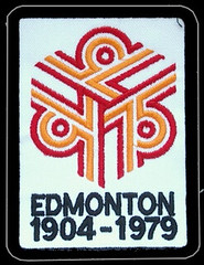
• I love — love — this Edmonton 75th-anniversary patch design. The following year, the Oilers wore a similar patch for the province of Alberta, but the design wasn’t as good.
• When the Red Sox wore the Massachusetts bicentennial patch, it was rendered in Red Sox colors. But the Bruins wore it in Bruins colors.
• You know how stores and businesses will proudly say how they’re “family-owned”? So did the Red Wings, in the early 1980s. Never seen anything like that. (Ten years later, the Wings celebrated their 60th anniversary with a direct-embroidered design instead of a patch — unusual.)
• Something else I’d never seen: a patch honoring disabled people.
• Somehow this Whalers 10th-anniversary patch is perfectly in keeping with the team’s endearingly simple graphics program. Awesome!
• I really like the color-coordination of these simple memorial patches.
• I knew about the Leafs’ King Clancy patch. But I didn’t know they’d worn heart disease patch that same season.
• Man, that is one busy patch design.
• Now that’s an all-star patch!
• Very interesting to see that that Harold Ballard’s memorial patches had his name rendered in white-on-white and blue-on-blue — a posthumous nod to his infamous color-on-color NOB stunt, perhaps?
• Speaking of the Leafs, here’s probably the best stadium/arena patch I’ve ever seen (much better than the one they wore a few years later).
• Very nice, very simple — I like.
• Here’s an oddity: The Flames celebrated their 15th season in Calgary with a small design direct-embroidered on their shirttail.
• The 1995 All-Star Game patch was supposed to look like this (excellent concept, not so sure about the execution). But that game was never played, because of the lockout. San Jose got to host the next ASG, but the patch design was revised to look like this.
• Here’s an excellent look at all the millennium patches from the 1999-2000 season.
• And I’m saving the best for last: quite possibly the coolest patch design ever. Wow.
There’s more, mostly from the last decade, but I’ll let you explore those for yourself. Just don’t blame me if you don’t get anything else done today.
In case you didn’t notice the new ad on the left: You can now access all of the Naming Wrongs shirts from this page, and I don’t mind saying I think they look pretty damn nifty. Collect ’em all, buy lots for your friends, etc. (and big thanks to those of you who’ve already rung the cash register on this one).
Seriously, you won’t even know what hit you: I spent the weekend putting the finishing touches on the Mets-centric uniform quiz I’ll be conducting tomorrow night, 7pm, at Two Boots. It’s gonna be a doozy — I’ve got 25 questions with a total of 32 answers (i.e., some questions are “Name the three players who did blah-blah-blah”), and I’ll be impressed if anyone has more than 10 correct responses, although I’ll be very pleased if I’m proven wrong on that account. The prize will be a copy of Keith Hernandez’s new book, Pardon Me While I Snort the Third Base Line Shea Goodbye, and the book’s co-author, Matt Silverman, will be one of the other Two Boots speakers, so he can autograph it for the winning contestant on the spot. I’ll also have plenty of “I’m Calling It Shea” tees to sell, natch. See you there.
Uni Watch News Ticker: The Astros will wear lunar landing caps tonight (as reported by Maury Brown). ”¦ Check out this shot of the 1891 WVU football team! Love that little awning over the window on the building in the background (big thanks to Jason Bernard). ”¦ Awesome Chargers throwback slideshow — including throwback cheerleader uniforms! — available here. ”¦ Tommy Murray was at Magic Kingdom and stopped in for a bite at Casey’s, where the staffers wore baseball uniforms, including stirrups. ”¦ Marty Hick found a bunch of old indoor soccer uni drawings that he did as a kid. “My favorite parts are the collars, and the trendy indoor soccer shoes of the day.” Naturally, my favorite part is the socks. ”¦ New kits for Inter Milan. Further info here (with thanks to B. Mitchell. ”¦ Lots of cool old photos of the U. of Minnesota’s Memorial Stadium (with thanks to Tris Wykes). ”¦ Is there really a high school team called the Nikes? Yeesh (with thanks to Steven Wojtowicz). ”¦ As most of you probably know by now, Dwyane Wade has switched from Converse to Jordan. And as goes Wade, so goes his alma mater. ”¦ Some info on Nebraska’s basketball uniforms here (with thanks to David McGee). ”¦ Good roundup of the latest Premier League uniforms here. ”¦ Best photos yet of the new New Mexico football unis here (big thanks to Rob Montoya). ”¦ Really interesting video about the history of corporate logo design here (great find by Matthew Robins). ”¦ Interesting note from Tyler Kepner, who writes: “Had a great time at the McCartney concert at the Mets’ ballpark on Friday night and couldn’t help noticing a Detroit Red Wings sticker on the guitar he used while playing ‘Yesterday.’ I googled it and came across some sites that said a fan gave it to him in 1976. Maybe he liked it for the ‘Wings’ connection. Anyone know the real story?” ”¦ Ben Teaford notes that there’s a lot of orange in the logo for the groundbreaking on the Marlins’ new stadium (yes, even groundbreakings have logos now). “I also saw a video of the groundbreaking with people wearing orange shirts. Is this a hint of things to come or just an odd choice?” Hmmm. ”¦ More pics of those tuxedo jerseys here (with thanks to Paul Barrett. ”¦ Aaron Johnson reports that there was a Royals Hall of Fame game in KC on Friday. Participants wore the team’s current powder blue alternate jersey and matching pants and caps. Looks like they had a Royals HoF sleeve patch, too. ”¦ Some really interesting photos of keirin (Japanese short-track cycling) here (with thanks to Jeremy Brahm). ”¦ Here’s the new Celtic road kit (gracias to James Chaney). ”¦ Check out the Hannibal (Missouri) Cavemen, a summer league team that wears very nice northwestern-striped stirrups (big thanks to Bob Southon).
“because of the lockout. San Jose got to hose the next ASG…”
Funny… I thought the Sharks got “hosed” when they didn’t get to host their first All-Star Game. :)
Not that alot of you car about the subject, but D-Wade switching isint such a big deal since both Converse and Jordan are owned by Nike he’s really only changing logos as the designers would be pretty much the same throught
Ben Teaford notes that there’s a lot of orange in the logo for the groundbreaking on the Marlins’ new stadium (yes, even groundbreakings have logos now). “I also saw a video of the groundbreaking with people wearing orange shirts. Is this a hint of things to come or just an odd choice?”
They are building the stadium on the site of the Orange Bowl, after all…
Or that the Bruins celebrated their 50th anniversary with a really creepy-looking bear?
Hmmm… where have I seen this before?
link
That link brings back memories. In the early ’80s, most of the out-of-state license plates in Denver looked like that.
After seeing that Marlin’s logo, I too am wondering if we are seeing a change in their colors. Looked like Orange, Black, and Green going by the patch alone…which would be an odd combo with their current unis. Hell, how would that work with their marlin logo anyway?
Any of the photoshopere care to take a stab at what the Marlin’s new duds could look like?
Looking at those restaurant baseball-themed uniforms, Paul, if you ever get out here to Japan, you need to come to the Baseball Cafe near the Tokyo Dome. The staff all have baseball-style uniforms, and the girls wear dead ringers for the 1940s-50s link. They look fantastic!
The high school team might not (necessarily) be named after Paul’s least-favorite athletic apparel company. We have a Nike Park back home – so named because it used to house Nike missiles back in the old days.
So what do you guys think of the Royals’ alt powder blue jersey with the powder blue pants? I like ’em. Put the regular royal cap on those guys, and you’ve got a winner.
Maddux’s retired #31 at Turner Field.
link
They also had a logo on the field behind homeplate, a small white jersey with “31,” but the number had a drop shadow to it, which was kinda weird.
Hell, how would that work with their marlin logo anyway?
If you are questioning the color for the marlin, I submit that it won’t be any different from a red buffalo, a silver lion, a white elephant or a blue bear cub. Besides, haven’t you ever enjoyed a serving of marlin l’orange?
:)
Will the Columbus Blue Jackets and Minnesota Wild have a 10-yr anniversary patch this season or next season (because of 2004-05 lockout)?
So, did the Rangers not wear the patch for the Lake Placid games while the Isles and Sabres did? Strange…..
Also, those new Celtic away kits are some sort of spectacular….
[quote comment=”341056″]The high school team might not (necessarily) be named after Paul’s least-favorite athletic apparel company. We have a Nike Park back home – so named because it used to house Nike missiles back in the old days.[/quote]
Oakland Community College in Michigan use to have a sports program for each of their three campuses with gyms. The Auburn Hills campus nickname was the Nike after the Nike missle base it was built on. In 1974 when they merge into one sports program they went with the Raiders the nickname of the Orchard Ridge Campus. The Highland Lakes Campus nickname was the Highlanders.
re: Paul McCartney’s Red Wings acoustic guitar…here’s some info and pics:
link
OK, the Charger helmet on the far left (the one with #15 on it is my new favorite helmet.
Loved the patch site.
[quote comment=”341051″] Ben Teaford notes that there’s a lot of orange in the logo for the groundbreaking on the Marlins’ new stadium (yes, even groundbreakings have logos now). “I also saw a video of the groundbreaking with people wearing orange shirts. Is this a hint of things to come or just an odd choice?”
They are building the stadium on the site of the Orange Bowl, after all…[/quote]
This is a recurring rumor that just won’t go away. Now this evidence suggests it even more, particularly the orange outline on “Marlins”. And they didn’t put “Florida” anywhere either, since “Miami” will take over then.
As a Marlin fan, I truly dislike this apparent orange/black scheme. The current black, silver, and a touch of teal is perfect in my opinion, and I will dread the day when all that goes away. It won’t be worse than “San Antonio”, “Portland”, or “Las Vegas” might’ve been, but still won’t be welcomed by me.
It’s ok, Paul. I’m not crossing you off my Christmas card list.
There are a number of patches that I’ve spoken to that gentleman about, and he and I collaborated on a few patches he was missing.
There are still some teams that he’s missing patches for (Babe Dye – Toronto St. Pats, for example), but his site is extremely impressive.
Great dude to work with, and his site is top-notch. Glad it is being featured here. :o)
Has the new Firefox update (to 3.5.1) “broken” Uniwatch for anyone besides me?
Yeah, that Boston Bruins patch is weak. Funny thing about the Bruins, despite having some hall of famers on that franchise, they’ve only won five Stanley Cups. That’s a remarkably low total, considering they were around about four decades before the Expansion Six era of 1967. During the Original Six, era, losing teams twice won titles, something that would never happen today. By contrast, the Pittsburgh Penguins have already claimed three Cups.
I’d like to see Uniwatch retell the Bruins 1980 embarrassing protest to the NHL when they actually wanted to prevent the Penguins from switching to black and gold unis. Unbelievable.
[quote comment=”341056″]The high school team might not (necessarily) be named after Paul’s least-favorite athletic apparel company. We have a Nike Park back home – so named because it used to house Nike missiles back in the old days.[/quote]
Or maybe the team was named after what the missiles were named after – that is, the Greek goddess of victory.
The Brewers have a pretty cool sounding promotion coming up. Nothing special… just cutting ticket prices. But the name is fun:
link
[quote comment=”341064″]OK, the Charger helmet on the far left (the one with #15 on it is my new favorite helmet.
Loved the patch site.[/quote]
Yup, the Los Angeles Chargers’ helmet. Wore that only in 1960.
—Ricko
[quote comment=”341070″]The Brewers have a pretty cool sounding promotion coming up. Nothing special… just cutting ticket prices. But the name is fun:
link
In keeping with Natinals tradition, should have called it,
“Swat the Nuts”
Just came across this on the Chris Creamer boards, from MLB’s 1999 TATC debacle – Jason Isringhausen, NNOB.
link
[quote comment=”341065″][quote comment=”341051″] Ben Teaford notes that there’s a lot of orange in the logo for the groundbreaking on the Marlins’ new stadium (yes, even groundbreakings have logos now). “I also saw a video of the groundbreaking with people wearing orange shirts. Is this a hint of things to come or just an odd choice?”
They are building the stadium on the site of the Orange Bowl, after all…[/quote]
This is a recurring rumor that just won’t go away. Now this evidence suggests it even more, particularly the orange outline on “Marlins”. And they didn’t put “Florida” anywhere either, since “Miami” will take over then.
As a Marlin fan, I truly dislike this apparent orange/black scheme. The current black, silver, and a touch of teal is perfect in my opinion, and I will dread the day when all that goes away. It won’t be worse than “San Antonio”, “Portland”, or “Las Vegas” might’ve been, but still won’t be welcomed by me.[/quote]
And, of course, all the debate it would start here…
“I never saw an ORANGE Marlin.”
“Well, Jim, on today’s ‘Wild Kingdom’ we’ll be in the Serengeti National Park, tracking the rare Honolulu Blue and Silver lion…”
mccartney’s guitar is a rightie being played by a southpaw. note pick guard location. (included that because my anti-spam word is “pick”).
my day to state the obvious
[quote comment=”341071″][quote comment=”341064″]OK, the Charger helmet on the far left (the one with #15 on it is my new favorite helmet.
Loved the patch site.[/quote]
Yup, the Los Angeles Chargers’ helmet. Wore that only in 1960.
—Ricko[/quote]
So it might come back again in a few years when the team moves back north?
[quote comment=”341070″]The Brewers have a pretty cool sounding promotion coming up. Nothing special… just cutting ticket prices. But the name is fun:
link
this whole apostrophe catastrophe thing has me so confused…but isn’t this like, wrong?
I took some photos of the Royals new Hall of Fame – take a look link.
My favorite photo is of the logo designs that Hallmark employees came up with for the team back before the team took the field in 1969. link.
[quote comment=”341075″]”Well, Jim, on today’s ‘Wild Kingdom’ we’ll be in the Serengeti National Park, tracking the rare Honolulu Blue and Silver lion…”[/quote]
Shouldn’t be hard to find. Look in the back of their own end zone. The leader of the pack of Lions will be running out the back of it.
[quote comment=”341078″]Uni Watch News Ticker: The Astros will wear lunar landing caps tonight…
[/quote]Disappointing: I thought they’d play the entire game in helmets with a gold-tinted full-face visor.
:-)
[quote comment=”341080″]”Well, Jim, on today’s ‘Wild Kingdom’ we’ll be in the Serengeti National Park, tracking the rare Honolulu Blue and Silver lion…”[/quote]”Jim will be engaged in mano-a-mano wrestling with the drunk Lions fans in the upper deck of the end zone; while I enjoy a refreshing gin and tonic in the shade of a private suite…”
When the Chargers cheerleaders wear their uni for the retro games, will they wear saddle shoes?
[quote comment=”341082″][quote comment=”341080″]”Well, Jim, on today’s ‘Wild Kingdom’ we’ll be in the Serengeti National Park, tracking the rare Honolulu Blue and Silver lion…”[/quote]”Jim will be engaged in mano-a-mano wrestling with the drunk Lions fans in the upper deck of the end zone; while I enjoy a refreshing gin and tonic in the shade of a private suite…”[/quote]
You forgot about the beautiful native girls.
[quote comment=”341078″][quote comment=”341070″]The Brewers have a pretty cool sounding promotion coming up. Nothing special… just cutting ticket prices. But the name is fun:
link
this whole apostrophe catastrophe thing has me so confused…but link?[/quote]
You may have a point.
If their name was, say, “The Misters”, would the shortcut be “Mr.’s” or “Mrs.”
So would it be:
Come see the crew swat the Mr.’s or;
Come see the crew swat the Mrs. ?
I hope this clarifies things.
[quote comment=”341079″]I took some photos of the Royals new Hall of Fame – take a look link.
My favorite photo is of the logo designs that Hallmark employees came up with for the team back before the team took the field in 1969. link.[/quote]
Thanks: nice to see the two logos that were kind of combined to get to the final product.
While I know that money drives every decision, it’s still a bit jarring to see those outfield seats after so many years of a “park” over the walls in KC.
Glad they highlighted the uni’s and look of their Brett-led playoff years. Simple and to the point.
That baseball academy was YEARS ahead of it’s time: first training field that duplicated the precise dimensions of the big-league field.
BTW, good pic of Arrowhead: and AFAIK, that’s one of the only two “named” scoreboards in any major sport. :-)
[quote comment=”341065″][quote comment=”341051″] Ben Teaford notes that there’s a lot of orange in the logo for the groundbreaking on the Marlins’ new stadium (yes, even groundbreakings have logos now). “I also saw a video of the groundbreaking with people wearing orange shirts. Is this a hint of things to come or just an odd choice?”
They are building the stadium on the site of the Orange Bowl, after all…[/quote]
This is a recurring rumor that just won’t go away. [/quote]
“Recurring rumors” started by the team itself have a way of hanging around.
[quote comment=”341084″]You forgot about the beautiful native girls.[/quote]
In the upper deck of Ford Field???
[quote comment=”341069″][quote comment=”341056″]The high school team might not (necessarily) be named after Paul’s least-favorite athletic apparel company. We have a Nike Park back home – so named because it used to house Nike missiles back in the old days.[/quote]
Or maybe the team was named after what the missiles were named after – that is, the Greek goddess of victory.[/quote]
I guess that must be it… although it remains curious, not to say ironical… The school is called Notre Dame, which I assume refers to its Catholic background. And then they nickname their sports teams after a Greek goddess? They probably think it’s best to have all basis covered…
[quote comment=”341078″][quote comment=”341070″]The Brewers have a pretty cool sounding promotion coming up. Nothing special… just cutting ticket prices. But the name is fun:
link
this whole apostrophe catastrophe thing has me so confused…but link?[/quote]
Well, it’s a complete sentence, so a punctuation mark isn’t out of line.
I would expect to see a hyperbolic “!” at the end, but this is the Midwest we’re talking about. Understated and modest, even in the swagger.
[quote comment=”341074″]
“I never saw an ORANGE Marlin.”[/quote]
OTOH, I saw plenty of Purple Marlins when I was growing up.
[quote comment=”341067″]Has the new Firefox update (to 3.5.1) “broken” Uniwatch for anyone besides me?[/quote]
It is broken for me too …
[quote comment=”341089″]I guess that must be it… although it remains curious, not to say ironical… The school is called Notre Dame, which I assume refers to its Catholic background. And then they nickname their sports teams after a Greek goddess? [/quote]Probably an all-boys school.
[quote comment=”341079″]I took some photos of the Royals new Hall of Fame – take a look link.
My favorite photo is of the logo designs that Hallmark employees came up with for the team back before the team took the field in 1969. link.[/quote]
I’m looking forward to booking a trip to the new K. Looks like the Royals pretty much got everything right coming out of the chute. In addition, they had the foundation to a pretty damned good team.
[quote comment=”341054″]After seeing that Marlin’s logo, I too am wondering if we are seeing a change in their colors. Looked like Orange, Black, and Green going by the patch alone…which would be an odd combo with their current unis. Hell, how would that work with their marlin logo anyway?
Any of the photoshopere care to take a stab at what the Marlin’s new duds could look like?[/quote]
Here’s an attempt at the Miami Marlins logo with colors. I’d say the letters would also be outlined in black, but I can only do so much on MS Paint.
link
[quote comment=”341057″]So what do you guys think of the Royals’ alt powder blue jersey with the powder blue pants? I like ’em. Put the regular royal cap on those guys, and you’ve got a winner.[/quote]
Can’t say I disagree. Though I’m concerned about the way players today wear the cut of the uniform. I’m thinking the all-powder blue may look wretched when there’s too much of it. For instance, I’m unimpressed with the Blue Jays’ throwbacks as they’re worn today. Back in Joe Carter’s day, it was a good look.
All in all, for now, I’d say the Royals have their look down pretty good. Good home whites, good away grays, two good alts. Now, a team …
[quote comment=”341069″][quote comment=”341056″]The high school team might not (necessarily) be named after Paul’s least-favorite athletic apparel company. We have a Nike Park back home – so named because it used to house Nike missiles back in the old days.[/quote]
Or maybe the team was named after what the missiles were named after – that is, the Greek goddess of victory.[/quote]
I can confirm the goddes of victory source. The ND Nikes have been around for a good long while.
[quote comment=”341093″][quote comment=”341089″]I guess that must be it… although it remains curious, not to say ironical… The school is called Notre Dame, which I assume refers to its Catholic background. And then they nickname their sports teams after a Greek goddess? [/quote]Probably an all-boys school.[/quote]
Funny you should mention that, my wife went to Notre Dame Academy (no. KY) and it’s an all girls school.
And for more information you didn’t want to know about them, their nickname is the Pandas…chosen because the school’s initials (NDA) is in the word panda.
Finally, great entry today. I’m no hockey fan, but those patches were pretty good. My favorite was the Chicago All-Star.
The Minnesota Memorial Stadium Web site was pretty sad. Like Joni Mitchell sang, “you don’t know whatcha got til it’s gone ….”
[quote comment=”341079″]I took some photos of the Royals new Hall of Fame – take a look link.
My favorite photo is of the logo designs that Hallmark employees came up with for the team back before the team took the field in 1969. link.[/quote]
awesome, chris
i particularly love your closeup on the logos
very interesting concepts — sort of a “playing card king,” some lions and, in the “coat of arms” it looks like bulls…yes?
[quote comment=”341052″]Or that the Bruins celebrated their 50th anniversary with a really creepy-looking bear?
Hmmm… where have I seen this before?
link
I have too . . .
link
okay, first things first: Since when do the Marlins have any orange on their logo? Come on… I’ve never seen an orange marlin in my life, so that doesn’t make any sense.
Also, the Ironpigs jerseys looked okay, but couldn’t they just have the Ironpigs logo, on the right chest instead of the wordmark? It would look a bit less conflicting and I wouldn’t have a headache
I apologize for posting any ebay auction, for any potential bidders hoping to keep a hush on it, yet, this is relevant to a discussion we had a few weeks back that I found interesting. I believe it was Gary Roenicke (Baltimore Orioles) that wore a batting helmet that had a football facemask attached to it in order to protect his jaw? This mask was supposedly taken from the Colts locker room and was actually Bert Jone’s facemask? Well, here’s an auction for a supposed link with a similar mask attached to it, however, this mask is more of a youth’s model mask, and not the pro Riddell BD-9 type mask Bert Jones would have worn. Thus, the Bert Jones story is probably bogus. If, in fact, this batting helmet is the real deal?
[quote comment=”341082″][quote comment=”341080″]“Well, Jim, on today’s ‘Wild Kingdom’ we’ll be in the Serengeti National Park, tracking the rare Honolulu Blue and Silver lion…”[/quote]
“Jim will be engaged in mano-a-mano wrestling with the drunk Lions fans in the upper deck of the end zone; while I enjoy a refreshing gin and tonic in the shade of a private suite…”[/quote]
“Speaking aout the benefits of long-term life insurance from Mutual of Oamha.”
[quote comment=”341102″]okay, first things first: Since when do the Marlins have any orange on their logo? Come on… I’ve never seen an orange marlin in my life, so that doesn’t make any sense.
Also, the Ironpigs jerseys looked okay, but couldn’t they just have the Ironpigs logo, on the right chest instead of the wordmark? It would look a bit less conflicting and I wouldn’t have a headache[/quote]
Actually, I didn’t notice this until I started tinkering with the logo, but orange is present. The stitches on the baseball are actually an orange color rather than red. link
[quote comment=”341101″][quote comment=”341052″]Or that the Bruins celebrated their 50th anniversary with a really creepy-looking bear?
Hmmm… where have I seen this before?
link
I have too . . .
link
I have too!
link
I think the old Miami Marlins wore a color scheme that featured orange and blue, something close to the University of Florida colors. link Here’s another: link
I’m not a big fan of the teal, so if they went back to this I’d be excited, especially since there’s no team with those colors.
I am new to the concept of the stirrup club and missed the Orioles stirrup order. Is there enough interest out there in a second Orile stirrup order?
[quote comment=”341102″]okay, first things first: Since when do the Marlins have any orange on their logo? Come on… I’ve never seen an orange marlin in my life, so that doesn’t make any sense.
Also, the Ironpigs jerseys looked okay, but couldn’t they just have the Ironpigs logo, on the right chest instead of the wordmark? It would look a bit less conflicting and I wouldn’t have a headache[/quote]
Really? In the same comment you question the existance of an orange marlin and come out in favor of an “ironpig” jersey? Ok…haha
[quote comment=”341092″][quote comment=”341067″]Has the new Firefox update (to 3.5.1) “broken” Uniwatch for anyone besides me?[/quote]
It is broken for me too …[/quote]
And me, but I’m still on 3.0.11, so I don’t think it’s firefox.
The Hannibal Cavemen have everything right. Great!
The NHL patch site is fantastic. The All-Star patch that San Jose eventually wore is cool, the dorsal fin as the top point of the star. But I think it gets lost in the business of the rest of the logo. Imagine how much more striking that patch would be without any text at all? The image alone tells all.
“Jim will be engaged in mano-a-mano wrestling with the drunk Lions fans in the upper deck of the end zone; while I enjoy a refreshing gin and tonic in the shade of a private suite…”
Jim never seemed to wear shoes. But his khakis were always crisply pressed-until he jumped overboard.
Miami Marlins, International League, home and road….
link
link
Colors: Royal and Orange
—Ricko
[quote comment=”341093″] Probably an all-boys school.[/quote]
If they’re “Notre Dame” anything they’re already named after a woman.
[quote comment=”341111″][quote comment=”341092″][quote comment=”341067″]Has the new Firefox update (to 3.5.1) “broken” Uniwatch for anyone besides me?[/quote]
It is broken for me too …[/quote]
And me, but I’m still on 3.0.11, so I don’t think it’s firefox.[/quote]
I’m using 3.5.1 and have no issues…
“Jim will be engaged in mano-a-mano wrestling with the drunk Lions fans in the upper deck of the end zone; while I enjoy a refreshing gin and tonic in the shade of a private suite…”
“Jim never seemed to wear shoes. But his khakis were always crisply pressed-until he jumped overboard.”
Jim always got the short end of the stick.
Worst sponsorship deal EVER.
link
[quote comment=”341114″]Miami Marlins, International League, home and road….
link
link
Colors: Royal and Orange
—Ricko[/quote]
So we’d be looking at 2 teams in the NL East with orange and royal blue color schemes?
Then again, it’s not like the Mets actually wear orange and blue on the field anymore……
I know we brought this up last week, but New Mexico has now OFFICIALLY released its new football uniforms.
link
To me, they seem like old Air Force football uniforms in different colors.
[quote comment=”341117″]“Jim will be engaged in mano-a-mano wrestling with the drunk Lions fans in the upper deck of the end zone; while I enjoy a refreshing gin and tonic in the shade of a private suite…”
“Jim never seemed to wear shoes. But his khakis were always crisply pressed-until he jumped overboard.”
Jim always got the short end of the stick.[/quote]
“While I’m at the spa, Jim will begin a new search, seeking the Teal Jaguar and Black and Bright Blue Panther. And be sure to join us next week, back in the States, when he’ll track numerous Wildcats…Purple, Royal…even an occasional Red one seen in Arizona.
“in meantime, the local chief told us the custom was to provide each quest with a wife for his stay. We began telling it was not OUR way, but…when in Rome…”
[quote comment=”341119″][quote comment=”341114″]Miami Marlins, International League, home and road….
link
link
Colors: Royal and Orange
—Ricko[/quote]
So we’d be looking at 2 teams in the NL East with orange and royal blue color schemes?
Then again, it’s not like the Mets actually wear orange and blue on the field anymore……[/quote]
Happens (has happened) often, but most times it’s with navy and red. 1962 American League, for example: Twins, Angels, KC A’s, Indians, Red Sox, Senators all wore navy and red…and the White Sox wore black and red.
—Ricko
link
Check out #7.
Never seen an ORANGE marlin.
I’ve never seen a navy blue tiger either.
How about a honolulu blue lion?
More importantly, I’ve never seen a school of marlin referred to as marlins.
It would be great if someone could find more about this orange Marlins color scheme.
[quote comment=”341120″]I know we brought this up last week, but New Mexico has now OFFICIALLY released its new football uniforms.
link
To me, they seem like old Air Force football uniforms in different colors.[/quote]
Nicer number typeface for the Lobos.
[quote comment=”341126″][quote comment=”341120″]I know we brought this up last week, but New Mexico has now OFFICIALLY released its new football uniforms.
link
To me, they seem like old Air Force football uniforms in different colors.[/quote]
Nicer number typeface for the Lobos.[/quote]
Hey, wait a second. Who’s ever seen a red wolf?
I can’t believe I’m saying this, but I hope MPowers appreciates those Nike Genoas in those indoor soccer drawings.
[quote comment=”341124″]
More importantly, I’ve never seen a school of marlin referred to as marlins.[/quote]
Marli?
A Perkins of Marilin?
Striking bumblebee look for Celtic. It’s cool that their online team store offers sponsor-less kits for sale. I’ve never seen a soccer team offer that before. Makes so much sense, why should us soccer fans have to walk wearing the jersey of our favorite team but providing free advertising for a company AND pay for the privilege?
More importantly, I’ve never seen a school of marlin referred to as marlins.
Marlin don’t travel in schools (unless you’re referring to Va. Wesleyan U.)
And while we’re at it, what about “Leafs”?
[quote comment=”341118″]Worst sponsorship deal EVER.
link
Pretty funny putting that creepy Burger King guy on the inside of the T-Shirt. Give that guy in marketing a bonus.
Otherwise, bad idea.
One other thing: Notre Dame High School is co-ed; the Catholic pre-school is called Little Nike Preschool.
Hey, wait a second. Who’s ever seen a red wolf?
link
:)
[quote comment=”341131″]More importantly, I’ve never seen a school of marlin referred to as marlins.
Marlin don’t travel in schools (unless you’re referring to Va. Wesleyan U.)
And while we’re at it, what about “Leafs”?[/quote]
What is it? A group?
[quote comment=”341131″]More importantly, I’ve never seen a school of marlin referred to as marlins.
Marlin don’t travel in schools (unless you’re referring to Va. Wesleyan U.)
And while we’re at it, what about “Leafs”?[/quote]
Might be splitting hairs on this one, but I always sort of figured the Leafs were named after the symbol of Canada, rather than after than a tree full of leaves, or a leaf itself, for that matter. So, if the notion is that each player is wearing the symbol of Canada, IS a symbol of Canada, then its okay to call the team the Maple Leafs. I dunno, that’s how I can kinda justify, anyway.
Besides, “maple leaves” sound like something you might add to your dining room table when everyone and their freakin’ brother is coming over for Thanksgiving.
—Ricko
and what about….
link
Am also having problems with viewing the site in Firefox today. But it’s ok in Safari. Any idea why?
“Perkins Marlin defeat Notre Dame Nikes on walk-off. Leaf for the Orange Bowl where they hope to swat the Gnationals.”
The Minnesota Memorial Stadium Web site was pretty sad. Like Joni Mitchell sang, “you don’t know whatcha got til it’s gone ….”
As Ricko can probably attest, it’s particularly sad when you see the hideous “modern” copper-clad alumni center that takes up much of the site now. At least the new stadium will be up and running in less than 2 months.
[quote comment=”341136″]and what about….
link
And, in the late ’50s, it was red.
link|66%3A2|39%3A1|72%3A1240|293%3A1|294%3A50
[quote comment=”341140″][quote comment=”341136″]and what about….
link
And, in the late ’50s, it was red.
link|66%3A2|39%3A1|72%3A1240|293%3A1|294%3A50[/quote]
Okay, you wanna see the stirrups, too.
link
[quote comment=”341139″]The Minnesota Memorial Stadium Web site was pretty sad. Like Joni Mitchell sang, “you don’t know whatcha got til it’s gone ….”
As Ricko can probably attest, it’s particularly sad when you see the hideous “modern” copper-clad alumni center that takes up much of the site now. At least the new stadium will be up and running in less than 2 months.[/quote]
Getting in and out of the old Brickyard was a nightmare. You walked in at street level, and everyone–I mean everyone–had to walk up a ramp, for where they then walked up or down to their seats. But once inside, it was a great experience.
Nice to have the band marching down University Avenue past all the fraternity houses toward the stadium again on Saturday afternoons. THAT is something that’s been missing. Nothing quite like it. Certainly not in pro football.
—Ricko
[quote comment=”341139″]As Ricko can probably attest, it’s particularly sad when you see the hideous “modern” copper-clad alumni center that takes up much of the site now. At least the new stadium will be up and running in less than 2 months.[/quote]
I thought there was some sort of swimming building on the site, or at least near it.
I once read how much they thought they were going to “save” by moving to the Metrodome. Obviously it was much much much less than what they’ve now decided to spend on a new outdoor stadium.
Paul — If you haven’t seen this, all I can say is WTF?
link
[quote comment=”341057″]So what do you guys think of the Royals’ alt powder blue jersey with the powder blue pants? I like ’em. Put the regular royal cap on those guys, and you’ve got a winner.[/quote]
I think just changing the bill to royal blue and leaving the rest as is would be a winner. I wouldn’t complain either way, though.
[quote comment=”341114″]Miami Marlins, International League, home and road….
link
link
Colors: Royal and Orange
—Ricko[/quote]
Nothing wrong with royal and orange . . . unless you’re the Mets brass and you need to screw it up by adding a bunch of black.
If the Marlins were to add orange, I think they’d keep the teal/aqua color (instead of royal), and sport color scheme mirroring the Dolphins (and the Miami city flag). They’d probably keep black in there, too, which is even worse than the Dolphins’ use of navy in recent years.
[quote comment=”341121″][quote comment=”341117″]“Jim will be engaged in mano-a-mano wrestling with the drunk Lions fans in the upper deck of the end zone; while I enjoy a refreshing gin and tonic in the shade of a private suite…”
“Jim never seemed to wear shoes. But his khakis were always crisply pressed-until he jumped overboard.”
Jim always got the short end of the stick.[/quote]
“While I’m at the spa, Jim will begin a new search, seeking the Teal Jaguar and Black and Bright Blue Panther. And be sure to join us next week, back in the States, when he’ll track numerous Wildcats…Purple, Royal…even an occasional Red one seen in Arizona.
“in meantime, the local chief told us the custom was to provide each quest with a wife for his stay. We began telling it was not OUR way, but…when in Rome…”[/quote]
You don’t have to find a teal jaguar, per se, just a jaguar with a teal tongue.
link
[quote comment=”341130″]Striking bumblebee look for Celtic. It’s cool that their online team store offers sponsor-less kits for sale. I’ve never seen a soccer team offer that before. Makes so much sense, why should us soccer fans have to walk wearing the jersey of our favorite team but providing free advertising for a company AND pay for the privilege?[/quote]
[quote comment=”341146″][quote comment=”341114″]Miami Marlins, International League, home and road….
link
link
Colors: Royal and Orange
—Ricko[/quote]
Nothing wrong with royal and orange . . . unless you’re the Mets brass and you need to screw it up by adding a bunch of black.
If the Marlins were to add orange, I think they’d keep the teal/aqua color (instead of royal), and sport color scheme mirroring the Dolphins (and the Miami city flag). They’d probably keep black in there, too, which is even worse than the Dolphins’ use of navy in recent years.[/quote]
Yup, doubt they’d go with royal and orange. One of the things I learned spending a few winters in Florida is that they wouldn’t want to appear to pick a favorite among Miami, Florida and Florida State. Mixing a little orange in with the teal, black, etc, probably could be made to work, if done with some intelligence in the design.
Oh, wait, what am I thinking??? That’s probably too much to expect.
—Ricko
[quote comment=”341149″][quote comment=”341130″]Striking bumblebee look for Celtic. It’s cool that their online team store offers sponsor-less kits for sale. I’ve never seen a soccer team offer that before. Makes so much sense, why should us soccer fans have to walk wearing the jersey of our favorite team but providing free advertising for a company AND pay for the privilege?[/quote][/quote]
Exactly. Great move by Celtic. I knew I liked them for a reason (still would like to see someone besides them or Rangers win the SPL, though).
[quote comment=”341147″][quote comment=”341121″][quote comment=”341117″]“Jim will be engaged in mano-a-mano wrestling with the drunk Lions fans in the upper deck of the end zone; while I enjoy a refreshing gin and tonic in the shade of a private suite…”
“Jim never seemed to wear shoes. But his khakis were always crisply pressed-until he jumped overboard.”
Jim always got the short end of the stick.[/quote]
“While I’m at the spa, Jim will begin a new search, seeking the Teal Jaguar and Black and Bright Blue Panther. And be sure to join us next week, back in the States, when he’ll track numerous Wildcats…Purple, Royal…even an occasional Red one seen in Arizona.
“in meantime, the local chief told us the custom was to provide each quest with a wife for his stay. We began telling it was not OUR way, but…when in Rome…”[/quote]
You don’t have to find a teal jaguar, per se, just a jaguar with a teal tongue.
link
We’re going only by the logos?
Love the photos and blueprints of Minnesota’s Memorial Stadium, especially link of the equipment room. Look at all the spikes hanging from the ceiling!
[quote comment=”341153″]Love the photos and blueprints of Minnesota’s Memorial Stadium, especially link of the equipment room. Look at all the spikes hanging from the ceiling![/quote]
looks like powers’ attic
Site looks fine in IE 8, both 32 and 64 bit.
Firefox 3.5.1 with default settings and Adblock Plus the formatting is gone.
Running 64-bit Windows 7 RC.
Additional: disabling Adblock Plus for the site makes everything look as it should.
(ABP updated over the weekend, IIRC)
Marty, great job on those indoor soccer unis! I miss the old collared V-neck design.
Aside from the late-70s White Sox, did any baseball team go with a collared jersey?
okay, i am sucking it up, and going to the post office, i should bring a book. but, everybody should have their stirrups in a few days.cards and a’s up now. sox, sox, cubs, and cubs next month.
…which means ricko, you’ll get your 57.
[quote comment=”341108″]I think the old Miami Marlins wore a color scheme that featured orange and blue, something close to the University of Florida colors. link Here’s another: link
I’m not a big fan of the teal, so if they went back to this I’d be excited, especially since there’s no team with those colors.[/quote]
I would love to see them wear those, and I am a diehard Gator Hater.
[quote comment=”341160″]…which means ricko, you’ll get your 57.[/quote]
:)
Ya think they’ll go like Pros Vs Joes and put him different Unis?
link
[quote comment=”341160″]…which means ricko, you’ll get your 57.[/quote]
He means these…
link|66%3A2|39%3A1|72%3A1240|293%3A2|294%3A50
(offered here as a sort of Stirrup Club preview)
–Ricko
[quote comment=”341164″][quote comment=”341160″]…which means ricko, you’ll get your 57.[/quote]
He means these…
link|66%3A2|39%3A1|72%3A1240|293%3A2|294%3A50
(offered here as a sort of Stirrup Club preview)
–Ricko[/quote]
so wait…link says they look like the ones pixtured on the baseball card ricko posted…but link shows the sox being worn on the players on opening day, 1957
were those special socks? did they switch midseason? obviously the life photo is black and white, but they sure don’t look like those on the 58 topps
anyone? ricko? thoughts…
David Beckham wore short sleeves again last night. Maybe he has decided this is his summer line now.
link
[quote comment=”341139″]The Minnesota Memorial Stadium Web site was pretty sad. Like Joni Mitchell sang, “you don’t know whatcha got til it’s gone ….”
As Ricko can probably attest, it’s particularly sad when you see the hideous “modern” copper-clad alumni center that takes up much of the site now. At least the new stadium will be up and running in less than 2 months.[/quote]
I’m convinced the alumni center has sinister intent.
– It looks like it was designed by someone from a Lovecraft short story
– There are strange pentagon shaped windows
– There’s a wall made up of ancient books and tomes
– It was originally referred to as the gateway center
– That copper. What would happen if it were to be struck by lightning?
– It’s a little too close to the natatorium
I’m just saying if the stars are ever right and Minnesota should win the BCS I’m thinking that’s the bridgehead for the cosmic invasion. Luckily, there’s little chance of the Gophers winning a BCS in our lifetimes.
Before I forget, link
[quote comment=”341116″][quote comment=”341111″][quote comment=”341092″][quote comment=”341067″]Has the new Firefox update (to 3.5.1) “broken” Uniwatch for anyone besides me?[/quote]
It is broken for me too …[/quote]
And me, but I’m still on 3.0.11, so I don’t think it’s firefox.[/quote]
I’m using 3.5.1 and have no issues…[/quote]
As someone else noted it seems to be an issue with Adblock Plus. Disabling ABP for Uniwatch makes everything look normal again.
[quote comment=”341164″]He means these…
link|66%3A2|39%3A1|72%3A1240|293%3A2|294%3A50
[/quote]
Some of those poses look very strange today.
[quote comment=”341167″]…natatorium…[/quote]THERE’S the word I wasn’t even going to attempt to spell in post #94. TY Squiddie.
:-)
[quote comment=”341109″]I am new to the concept of the stirrup club and missed the Orioles stirrup order. Is there enough interest out there in a second Orile stirrup order?[/quote]
Yes.
Possible uni-update for the Calgary Flames?
EA just released a NHL 10 with the flames wearing traditional striping on their socks after wearing the flared reebok template stripes during the last 2 seasons. link
I know video game screens aren’t reliable especially in early builds, but it’s something to watch out for!
Celtic FC is sponsored by Carling, which is a beer. I believe they are required to provide shirts w/o sponsor (in France no teams are allowed to have an alcaholic beverage sponsor, even teams from other countries must follow this rule when playing in France). If there is no requirement, I assume Celtic FC does it as a courtesty to those who have a problem promoting alcahol. You would think that all the kids kits would come w/o the sponsor.
That is supposed to read alcohol, not alcahol.
Calgary Flames redesigned socks?
Sorry fixed link link
As for the hs team named the Nikes, the term was around long before the company name.
I mean, sure it is not as common a term, but its been around. They are as much named after the company as all the teams named Trojans are named after condoms.
Speaking of league logos, the UFL logo would be a decent one if it wasn’t for it’s 3-D embossed look.
New Mexico uni’s = ugly number font. Same reason the Steeler uniform suffers.
[quote comment=”341150″][quote comment=”341146″][quote comment=”341114″]Miami Marlins, International League, home and road….
link
link
Colors: Royal and Orange
—Ricko[/quote]
Nothing wrong with royal and orange . . . unless you’re the Mets brass and you need to screw it up by adding a bunch of black.
If the Marlins were to add orange, I think they’d keep the teal/aqua color (instead of royal), and sport color scheme mirroring the Dolphins (and the Miami city flag). They’d probably keep black in there, too, which is even worse than the Dolphins’ use of navy in recent years.[/quote]
Yup, doubt they’d go with royal and orange. One of the things I learned spending a few winters in Florida is that they wouldn’t want to appear to pick a favorite among Miami, Florida and Florida State. Mixing a little orange in with the teal, black, etc, probably could be made to work, if done with some intelligence in the design.
Oh, wait, what am I thinking??? That’s probably too much to expect.
—Ricko[/quote]
I really loved the concept uniform by Paul Soto. Aqua and orange ;)!! Eliminated the black all together. Hell, i’ll take the teal if aqua isn’t available.
One thing you can’t deny about the Royals is when you think of powder blue, you think of the Royals. I suppose they ought to capitalize on that.
link
But doesn’t that look too similar to Atlanta’s pb’s link
[quote comment=”341097″][quote comment=”341069″][quote comment=”341056″]The high school team might not (necessarily) be named after Paul’s least-favorite athletic apparel company. We have a Nike Park back home – so named because it used to house Nike missiles back in the old days.[/quote]
Or maybe the team was named after what the missiles were named after – that is, the Greek goddess of victory.[/quote]
I can confirm the goddes of victory source. The ND Nikes have been around for a good long while.[/quote]
The story behind how Nike was named:
A Nike VP, Jeff Johnson, woke up in the middle of the night and the word “Nike” was in his head. Didn’t know what it meant at the time. The brand was going to be called “Dimension 6” if they didn’t come up with another name- they were literally going into production. Knight didn’t like the logo- it “looked like a fat checkmark.”
[quote comment=”341095″][quote comment=”341054″]After seeing that Marlin’s logo, I too am wondering if we are seeing a change in their colors. Looked like Orange, Black, and Green going by the patch alone…which would be an odd combo with their current unis. Hell, how would that work with their marlin logo anyway?
Any of the photoshopere care to take a stab at what the Marlin’s new duds could look like?[/quote]
Here’s an attempt at the Miami Marlins logo with colors. I’d say the letters would also be outlined in black, but I can only do so much on MS Paint.
link
They’ve already said a uni change and name change is in the works. Timeline unknown, but they’re gonna be Miami Marlins.
[quote comment=”341180″]I really loved the concept uniform by Paul Soto. Aqua and orange ;)!! Eliminated the black all together. Hell, i’ll take the teal if aqua isn’t available.[/quote]
indeed…all of his concepts were very well conceived and executed
even the logos were spot on
[quote comment=”341142″][quote comment=”341139″]The Minnesota Memorial Stadium Web site was pretty sad. Like Joni Mitchell sang, “you don’t know whatcha got til it’s gone ….”
As Ricko can probably attest, it’s particularly sad when you see the hideous “modern” copper-clad alumni center that takes up much of the site now. At least the new stadium will be up and running in less than 2 months.[/quote]
Getting in and out of the old Brickyard was a nightmare. You walked in at street level, and everyone–I mean everyone–had to walk up a ramp, for where they then walked up or down to their seats. But once inside, it was a great experience.
Nice to have the band marching down University Avenue past all the fraternity houses toward the stadium again on Saturday afternoons. THAT is something that’s been missing. Nothing quite like it. Certainly not in pro football.
—Ricko[/quote]
BTW Ricko, which direction did the open end of the old stadium face? I shudder to think it was open to the north (though not shaking as badly as those poor souls must’ve been watching games in November).
[quote comment=”341174″]Celtic FC is sponsored by Carling, which is a beer. I believe they are required to provide shirts w/o sponsor (in France no teams are allowed to have an alcaholic beverage sponsor, even teams from other countries must follow this rule when playing in France). If there is no requirement, I assume Celtic FC does it as a courtesty to those who have a problem promoting alcahol. You would think that all the kids kits would come w/o the sponsor.[/quote]
You are exactly correct sir. Children’s kits in the UK cannot have alcohol or tobacco sponsorships on them; they have just provided sponsorless kits in adult sizes as well for the first time I believe.
Liverpool (Carlsberg beer) is also affected by this regulation.
[quote comment=”341185″][quote comment=”341142″][quote comment=”341139″]The Minnesota Memorial Stadium Web site was pretty sad. Like Joni Mitchell sang, “you don’t know whatcha got til it’s gone ….”
As Ricko can probably attest, it’s particularly sad when you see the hideous “modern” copper-clad alumni center that takes up much of the site now. At least the new stadium will be up and running in less than 2 months.[/quote]
Getting in and out of the old Brickyard was a nightmare. You walked in at street level, and everyone–I mean everyone–had to walk up a ramp, for where they then walked up or down to their seats. But once inside, it was a great experience.
Nice to have the band marching down University Avenue past all the fraternity houses toward the stadium again on Saturday afternoons. THAT is something that’s been missing. Nothing quite like it. Certainly not in pro football.
—Ricko[/quote]
BTW Ricko, which direction did the open end of the old stadium face? I shudder to think it was open to the north (though not shaking as badly as those poor souls must’ve been watching games in November).[/quote]
The field was set up more or less east to west. I thought the east end was closed off and that the west end was open, but with other buildings near by. It’s been 20 years, so I should check.
link
This is a pre-WWII illustration of Memorial.
The building with the rounded roof on the left would be Williams Arena. Pretty everything other than Williams is gone now. The little red building in the upper right corner is still there.
[quote comment=”341188″]link
This is a pre-WWII illustration of Memorial.
The building with the rounded roof on the left would be Williams Arena. Pretty everything other than Williams is gone now. The little red building in the upper right corner is still there.[/quote]
Ah, Williams Arena! Great place. I got to cover an Akron/Minnesota basketball game back in ’91. The Gophers’ radio announcer was calling his 1000th game. Wish I had the picture from the paper, because they gave him a jersey with the number 1000 on it.
Does anybody remember the UW entry from a while back that featured a picture of Paul’s cat with digitally-added stirrups? I wanted to show somebody the picture but I can’t find the entry. Any help?
[quote comment=”341179″]New Mexico uni’s = ugly number font. Same reason the Steeler uniform suffers.[/quote]
ILO, you’re certainly entitled to your opinion, some Steeler fans agree with you. However, I love the unusual font for another reason-it matches the style on the helmet. I never understood why the Steelers had two different styles of number fonts on the helmet and jersey. The rounded style on the jerseys really sets the team apart from others in the NFL.
[quote comment=”341181″]One thing you can’t deny about the Royals is when you think of powder blue, you think of the Royals. I suppose they ought to capitalize on that.
link
But doesn’t that look too similar to Atlanta’s pb’s link
the Royals’ GM Dayton Moore worked for the Braves from 94-06. and there’s no secret that he still has ties back there (constant trade rumors with ATL). i dont think there would be such a thing as too simialr for him.
and as a Royals fan, i like the powder blues, especially with the royal cap. but im sot sure about the powder blue pants.
oh yeah, and thanks to Chris for sharing the pictures of the newly opened Royals HOF. great stuff.
and i finally got my “I still call it mile high” shirt in the mail, and it kicks ass! thanks no mas! (yes, i am a Broncos fan living in kansas who also happens to be a Royals fan)
once again the link were ready. but i actually needed my “hump strap” from when i worked as a mover when i was in grad school to get them to the post office. pineapple said i looked like some sort of mean link as i walked out with my pack. needless to say i pissed them off at the post office. the hispanic lady behind the counter cursed me pretty good. my spanish isn’t perfect, but i knew some of her choice words over the hour+ i was there.
later, time to ump the doughnuts
[quote comment=”341188″]link
This is a pre-WWII illustration of Memorial.
The building with the rounded roof on the left would be Williams Arena. Pretty everything other than Williams is gone now. The little red building in the upper right corner is still there.[/quote]
The building in the lower left still stands too. You can see it to the left of the newer Rec Ctr building in the link below. Not sure what’s in there – it’s between the Rec Ctr and the old Fieldhouse, so I guess it must have some recreational space or maybe just storage space. The new Rec Center stands on what was the open (west) end. The natatorium is connected to the Rec Center (would be to the right of the picture linked below) and is generally where the old playing field was. The Alumni Center is where the stands on the closed (east) end were. There’s a parking ramp where most of the stands on the north sideline were.
link
Anyone else notice the 75th anniversary of the NHL logo is a complete rip off of the 75th anniversary of Alberta logo.
[quote comment=”341158″]Marty, great job on those indoor soccer unis! I miss the old collared V-neck design.
Aside from the late-70s White Sox, did any baseball team go with a collared jersey?[/quote]
Thanks, Jimmy V.
And I’m glad you liked the original BNB. Wasn’t that you?
[quote comment=”341196″]Anyone else notice the 75th anniversary of the NHL logo is a complete rip off of the 75th anniversary of Alberta logo.[/quote]
Totally. So’s this FIBA logo:
link
Liverpool’s team store does not sell kits without the Carling Beer sponsor. Also, their child and infant replica kits feature the Carling logo.
link
[quote comment=”341197″][quote comment=”341158″]Marty, great job on those indoor soccer unis! I miss the old collared V-neck design.
Aside from the late-70s White Sox, did any baseball team go with a collared jersey?[/quote]
Thanks, Jimmy V.
And I’m glad you liked the original BNB. Wasn’t that you?[/quote]
Bad News Bears? I was asking about it before, but I still haven’t seen it. My son’s baseball season is finished, so once the free MLB preview’s over I’ll probably be renting it.
[quote comment=”341165″][quote comment=”341164″][quote comment=”341160″]…which means ricko, you’ll get your 57.[/quote]
He means these…
link|66%3A2|39%3A1|72%3A1240|293%3A2|294%3A50
(offered here as a sort of Stirrup Club preview)
–Ricko[/quote]
so wait…link says they look like the ones pixtured on the baseball card ricko posted…but link shows the sox being worn on the players on opening day, 1957
were those special socks? did they switch midseason? obviously the life photo is black and white, but they sure don’t look like those on the 58 topps
anyone? ricko? thoughts…[/quote]
Okay, here are my thoughts. For virtually the entire season, the Cubs wore the blue stirrups with at last nine narrow white stripes.
link
But at least once (and judging by all the photos in this set from the LIFE Archives, one time was their home opener) they wore a version where the stirrup portion of the sock was white.
link
However, from this ’59 card (an old ’57 spring training photo; they wore the red letters and white piping hats only in ’57) they apparently also tried a red-and-royal version of the socks wore for their home opener.
link
That’s the best answer I have.
—Ricko
Guys I can id in this photo…
link
Cather in dugout: Cal Neeman.
1b, in foreground: Dee Fondy
SS, just over Fondy’s head: Ernie Banks.
3B, Gene Baker
OF, Walt Moryn (#43)
pitcher (shown in other photos from that set, Bob Rush
—Ricko
All set to enjoy my free MLB preview…and the Athletics are wearing black hats and jerseys against the Twins and their dark blue softball jerseys. So much for that…
Good thing my Pirates are still on. I’d ALMOST like the Brewers unis, but the numbers are too hard to read from a distance. Go back to the old ball-in-glove hats and unis.
This is my first chance to hear the new Pirates announcer Tim Neverett. What do you ‘Burgh people think of him? Lanny was my favorite, but this guy sounds all right. It’s nice having him paired with John Wehner and his Pittsburgh accent.
Anyone seeing this thing on Rachel Maddow about Ebbets Field Flannels making uniforms for the Iraqi national baseball team?
[quote comment=”341204″]Anyone seeing this thing on Rachel Maddow about Ebbets Field Flannels making uniforms for the Iraqi national baseball team?[/quote]
Paul mentioned it the other day, I think.
Texas Sports Image has added some new photos to the USFL Houston Gamblers gallery. Some really nice shots of the Oklahoma Outlaws vs. the Gamblers from 5/20/84.
link
[quote comment=”341200″][quote comment=”341197″][quote comment=”341158″]Marty, great job on those indoor soccer unis! I miss the old collared V-neck design.
Aside from the late-70s White Sox, did any baseball team go with a collared jersey?[/quote]
Thanks, Jimmy V.
And I’m glad you liked the original BNB. Wasn’t that you?[/quote]
Bad News Bears? I was asking about it before, but I still haven’t seen it. My son’s baseball season is finished, so once the free MLB preview’s over I’ll probably be renting it.[/quote]
Rats.
I thought you watched it.
Don’t even rent it. Buy it.
It’s so good.
[quote comment=”341207″][quote comment=”341200″][quote comment=”341197″][quote comment=”341158″]Marty, great job on those indoor soccer unis! I miss the old collared V-neck design.
Aside from the late-70s White Sox, did any baseball team go with a collared jersey?[/quote]
Thanks, Jimmy V.
And I’m glad you liked the original BNB. Wasn’t that you?[/quote]
Bad News Bears? I was asking about it before, but I still haven’t seen it. My son’s baseball season is finished, so once the free MLB preview’s over I’ll probably be renting it.[/quote]
Rats.
I thought you watched it.
Don’t even rent it. Buy it.
It’s so good.[/quote]
Well, Tuesday night’s usually my late-night grocery outing, and I tend to hang around the video section. If I see it for sale I may have to take you up on that.
[quote comment=”341203″]All set to enjoy my free MLB preview…and the Athletics are wearing black hats and jerseys against the Twins and their dark blue softball jerseys. So much for that…
Good thing my Pirates are still on. I’d ALMOST like the Brewers unis, but the numbers are too hard to read from a distance. Go back to the old ball-in-glove hats and unis.
This is my first chance to hear the new Pirates announcer Tim Neverett. What do you ‘Burgh people think of him? Lanny was my favorite, but this guy sounds all right. It’s nice having him paired with John Wehner and his Pittsburgh accent.[/quote]
I am look at MLB.com- where is this free trial link?
And since we have a lot of NY-area folks, check out the Gamblers vs. NJ Generals gallery link
[quote comment=”341209″][quote comment=”341203″]All set to enjoy my free MLB preview…and the Athletics are wearing black hats and jerseys against the Twins and their dark blue softball jerseys. So much for that…
Good thing my Pirates are still on. I’d ALMOST like the Brewers unis, but the numbers are too hard to read from a distance. Go back to the old ball-in-glove hats and unis.
This is my first chance to hear the new Pirates announcer Tim Neverett. What do you ‘Burgh people think of him? Lanny was my favorite, but this guy sounds all right. It’s nice having him paired with John Wehner and his Pittsburgh accent.[/quote]
I am look at MLB.com- where is this free trial link?[/quote]
It’s on DirecTV. I think some cable companies have it too.
[quote comment=”341178″]Speaking of league logos, the UFL logo would be a decent one if it wasn’t for it’s 3-D embossed look.[/quote]
speaking of the UFL, when are they releasing the team names/logos/uniforms?
[quote comment=”341211″][quote comment=”341209″][quote comment=”341203″]All set to enjoy my free MLB preview…and the Athletics are wearing black hats and jerseys against the Twins and their dark blue softball jerseys. So much for that…
Good thing my Pirates are still on. I’d ALMOST like the Brewers unis, but the numbers are too hard to read from a distance. Go back to the old ball-in-glove hats and unis.
This is my first chance to hear the new Pirates announcer Tim Neverett. What do you ‘Burgh people think of him? Lanny was my favorite, but this guy sounds all right. It’s nice having him paired with John Wehner and his Pittsburgh accent.[/quote]
I am look at MLB.com- where is this free trial link?[/quote]
It’s on DirecTV. I think some cable companies have it too.[/quote]
yup…on cable
watching the unitrocity that is twins vs. a’s right now
[quote comment=”341213″]
watching the unitrocity that is twins vs. a’s right now[/quote]
I can’t do it – it’s just so bad. Soon as the Brewers and Bucs are done I’ll watch the Dodgers. Can’t believe Vin Scully can still do a game, all by himself, at his age. He still sounds just as good, too. I’m surprised (and a little glad) they don’t have another announcer with him.
[quote comment=”341214″][quote comment=”341213″]
watching the unitrocity that is twins vs. a’s right now[/quote]
I can’t do it – it’s just so bad. Soon as the Brewers and Bucs are done I’ll watch the Dodgers. Can’t believe Vin Scully can still do a game, all by himself, at his age. He still sounds just as good, too. I’m surprised (and a little glad) they don’t have another announcer with him.[/quote]
it’s one thing to favor one leg, but you can’t favor two…
[quote comment=”341215″][quote comment=”341214″][quote comment=”341213″]
watching the unitrocity that is twins vs. a’s right now[/quote]
I can’t do it – it’s just so bad. Soon as the Brewers and Bucs are done I’ll watch the Dodgers. Can’t believe Vin Scully can still do a game, all by himself, at his age. He still sounds just as good, too. I’m surprised (and a little glad) they don’t have another announcer with him.[/quote]
it’s one thing to favor one leg, but you can’t favor two…[/quote]
I like this quote: “Andre Dawson has a bruised knee and is listed as day-to-day (pause). Aren’t we all?”
[quote comment=”341198″][quote comment=”341196″]Anyone else notice the 75th anniversary of the NHL logo is a complete rip off of the 75th anniversary of Alberta logo.[/quote]
Totally. So’s this FIBA logo:
link
I noticed that as well. I also noticed that link looks like it could be a “salute to the pearl necklace”.
– Here’s an excellent look at all the millennium patches from the 1999-2000 season.
Not all… they dont mention which one the Islanders wore. I presume blue since there is no orange?
A note regarding yesterday’s Cinco de Mayo Rangers uniform …shouldn’t it have simply said “TEXAS” on the front, since the Texas American League Baseball Club does not use the “RANGERS” wordmark on their uniforms?
[quote comment=”341218″]- Here’s an excellent look at all the millennium patches from the 1999-2000 season.
Not all… they dont mention which one the Islanders wore. I presume blue since there is no orange?[/quote]
link.
[quote comment=”341219″]A note regarding yesterday’s Cinco de Mayo Rangers uniform …shouldn’t it have simply said “TEXAS” on the front, since the Texas American League Baseball Club does not use the “RANGERS” wordmark on their uniforms?[/quote]
Tejas?
[quote comment=”341124″]Never seen an ORANGE marlin.
I’ve never seen a navy blue tiger either.
How about a honolulu blue lion?
More importantly, I’ve never seen a school of marlin referred to as marlins.[/quote]
Good point. However, I have seen more than one mermaid at the same time, and in South Florida they call them “Mermaids” :)
link
Any reason why this photo of Sage Rosenfels and Tarvaris Jackson shows them wearing grey facemasks? It looks like a training camp type of photo.
link